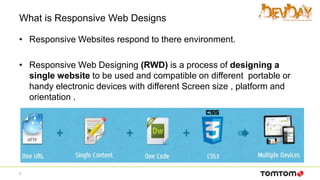
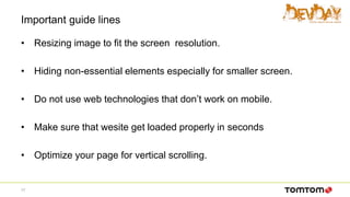
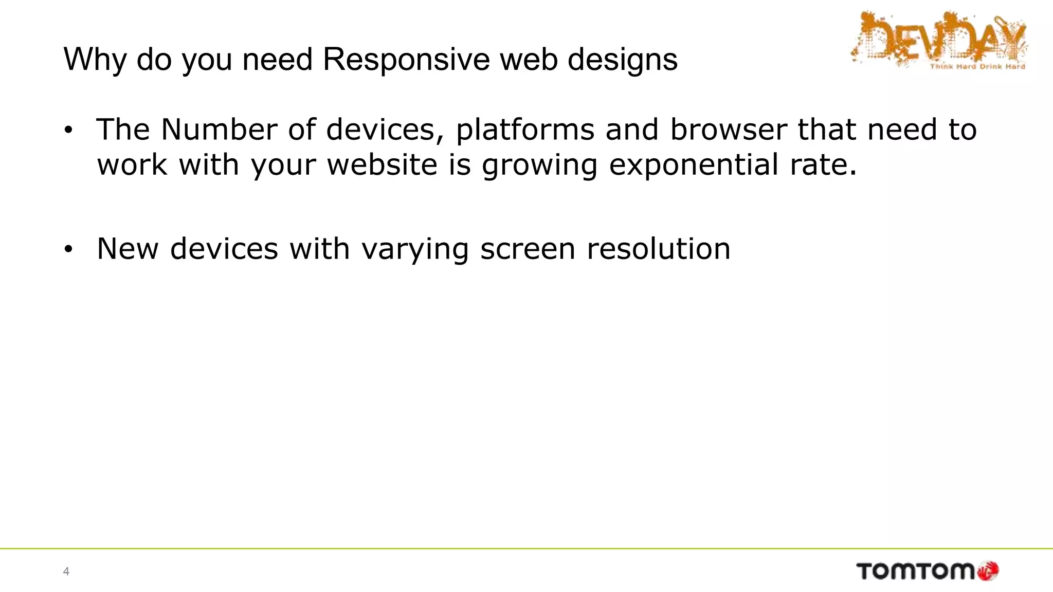
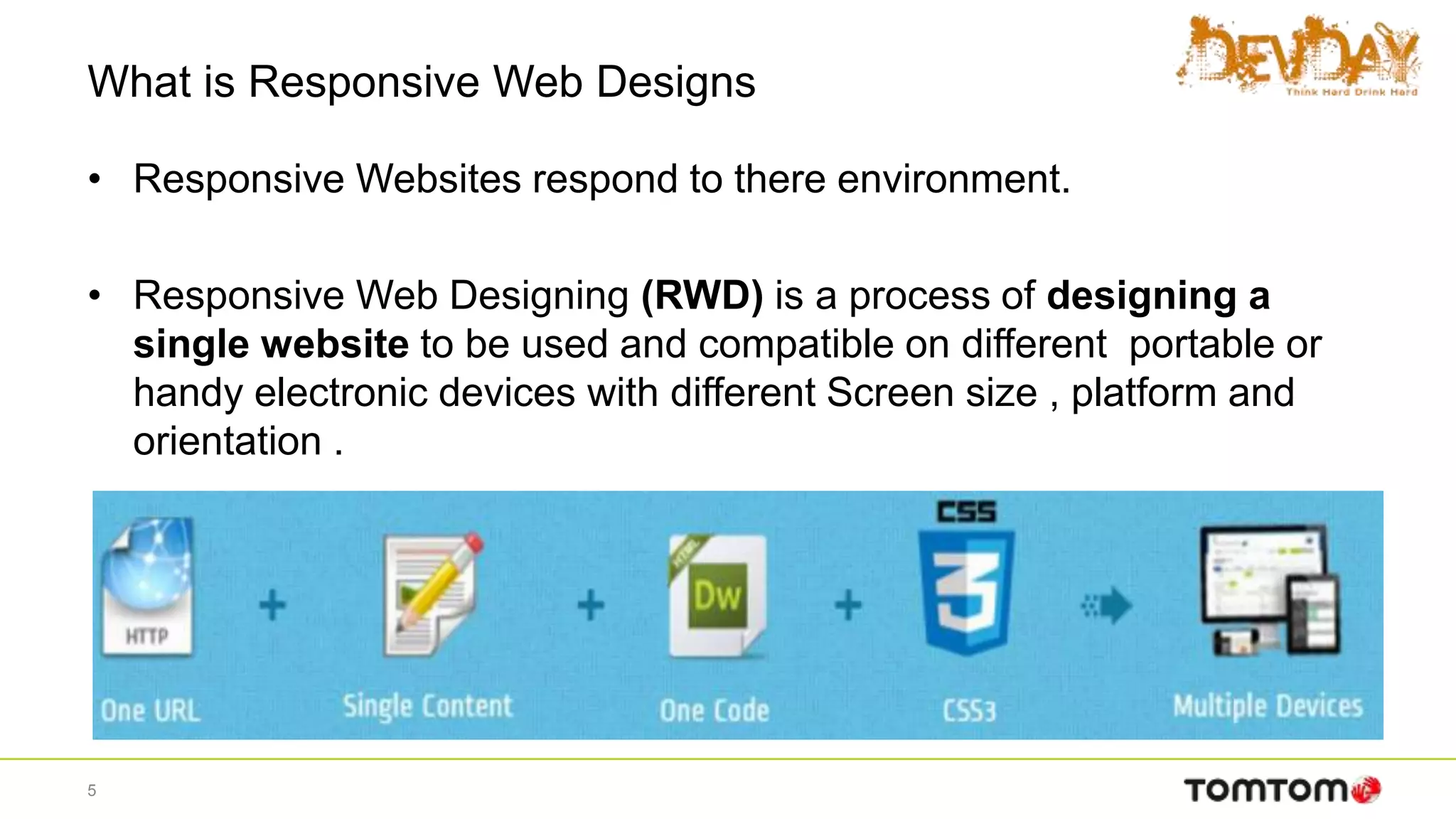
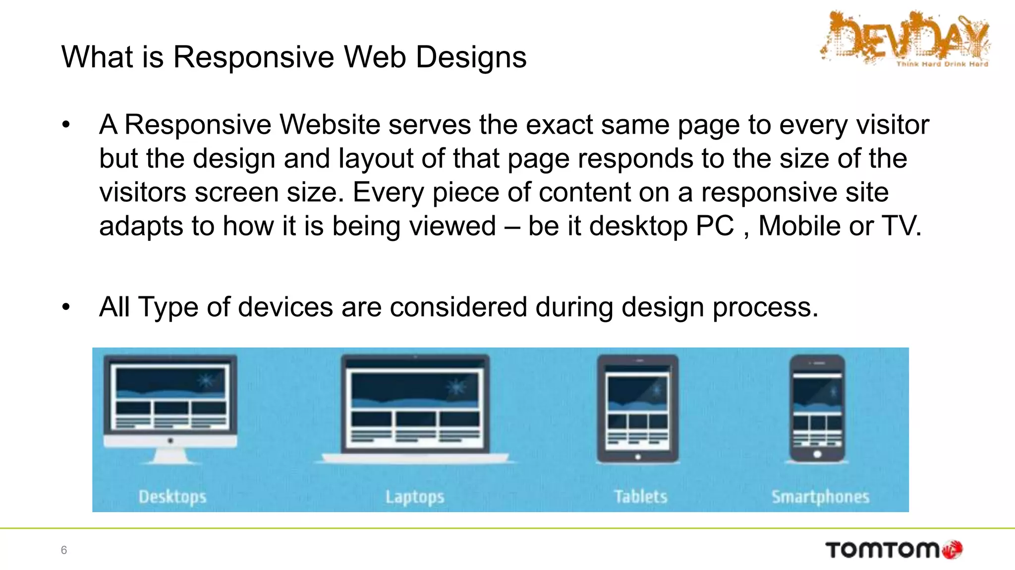
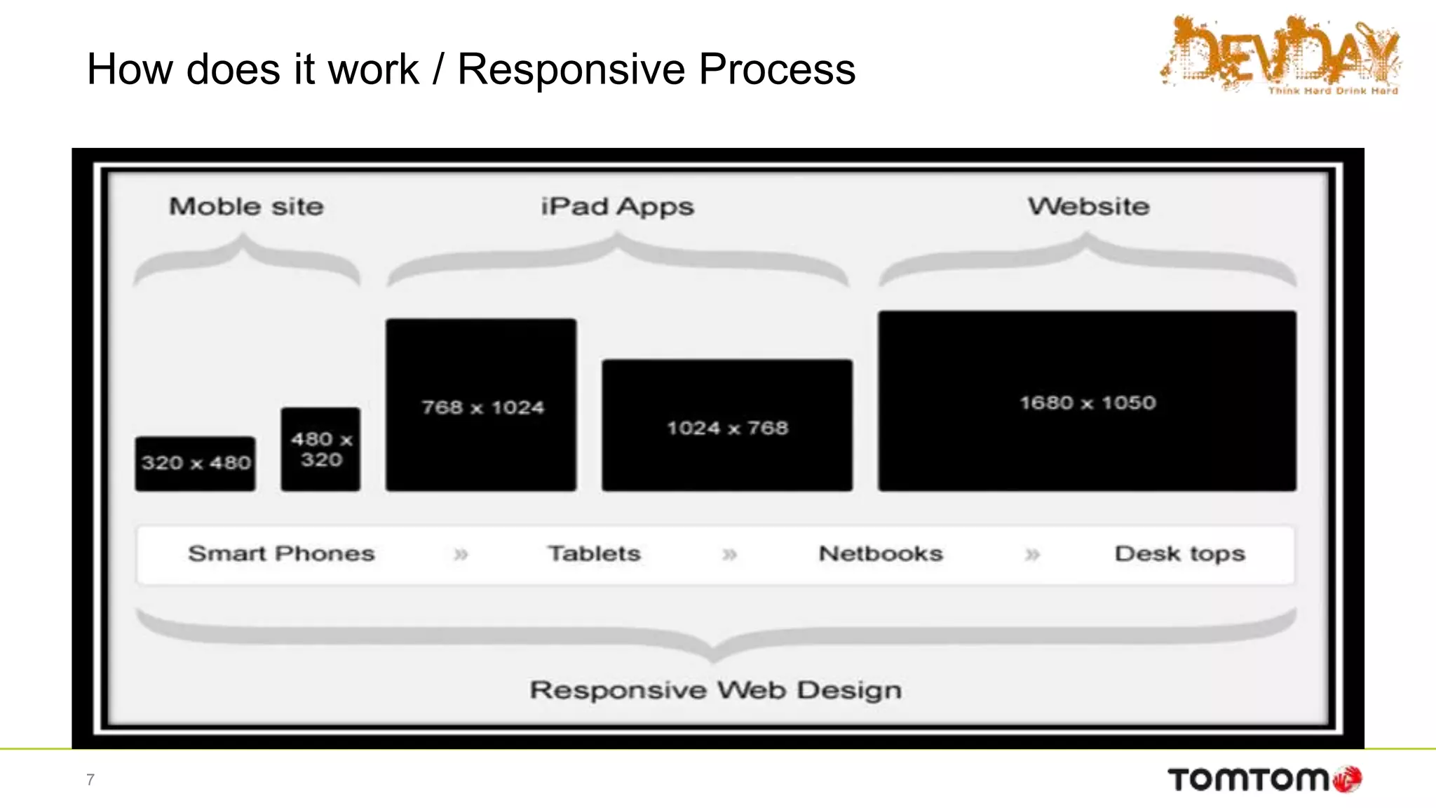
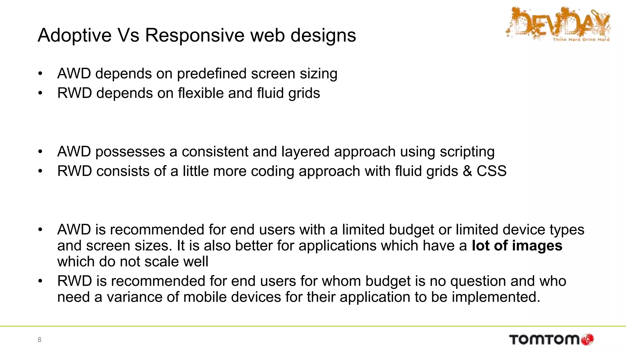
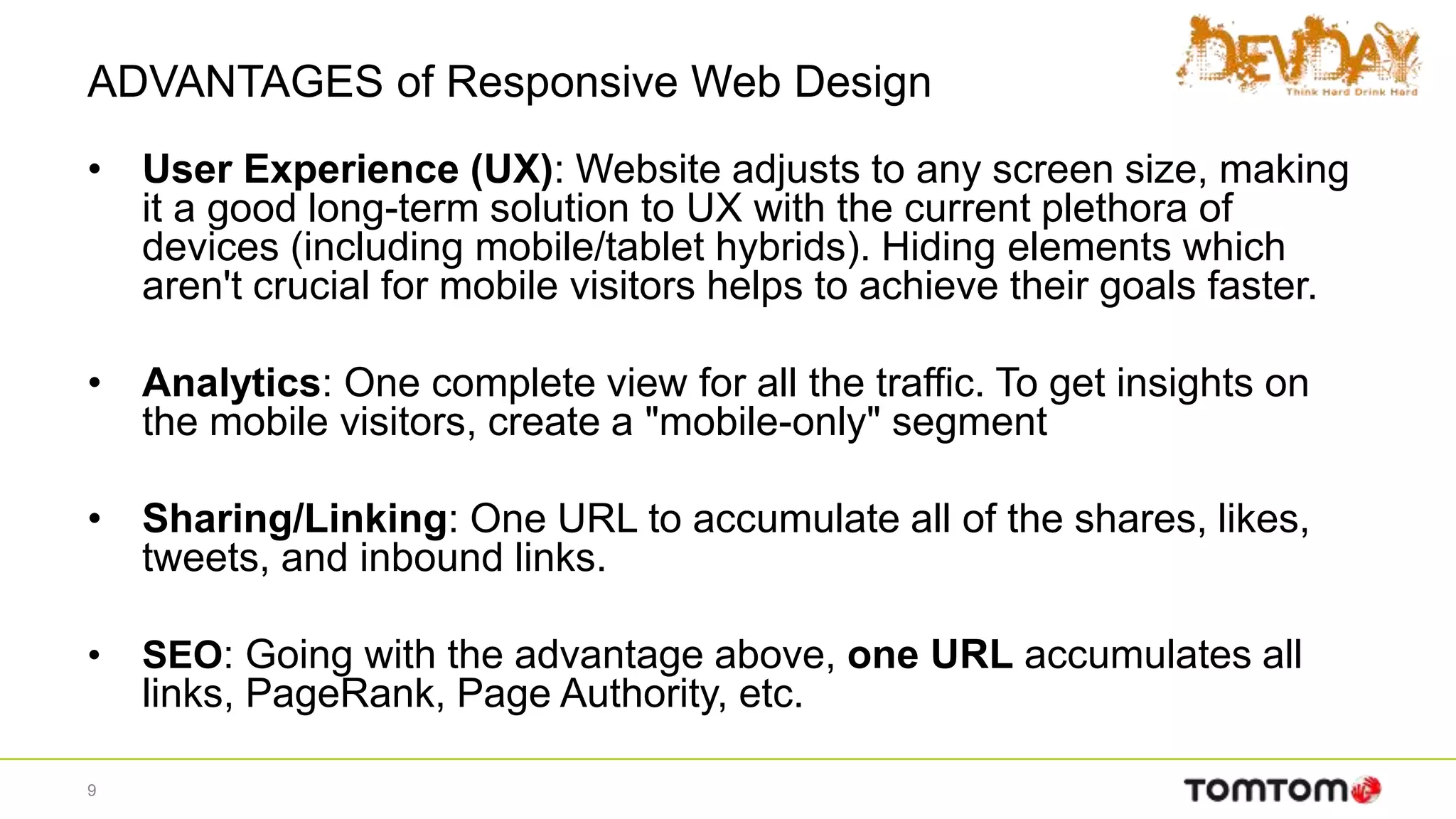
KEMBAR78
Reponsive web design (HTML5 + css3) | PPTX
Responsive Web Designing Using CSS3 & HTML5
-Sandip Jadhav
“We are building a web, for all device ”
Contents
• Mobile is Future
• What is Responsive Web Designs
• Why do you need Responsive web designs
• Adoptive vs Responsive web designs
• Key benefits of Responsive web designs
• How does it works
• How you can implement Responsive Websites
• Frameworks.
• Demo
2
Mobile is Future
• In the Year 2013 Mobile users accessing internet were more than
computer users.
3
Why do you need Responsive web designs
• The Number of devices, platforms and browser that need to
work with your website is growing exponential rate.
• New devices with varying screen resolution
4
What is Responsive Web Designs
• Responsive Websites respond to there environment.
• Responsive Web Designing (RWD) is a process of designing a
single website to be used and compatible on different portable or
handy electronic devices with different Screen size , platform and
orientation .
5
What is Responsive Web Designs
• A Responsive Website serves the exact same page to every visitor
but the design and layout of that page responds to the size of the
visitors screen size. Every piece of content on a responsive site
adapts to how it is being viewed – be it desktop PC , Mobile or TV.
• All Type of devices are considered during design process.
6
How does it work / Responsive Process
7
Adoptive Vs Responsive web designs
• AWD depends on predefined screen sizing
• RWD depends on flexible and fluid grids
• AWD possesses a consistent and layered approach using scripting
• RWD consists of a little more coding approach with fluid grids & CSS
• AWD is recommended for end users with a limited budget or limited device types
and screen sizes. It is also better for applications which have a lot of images
which do not scale well
• RWD is recommended for end users for whom budget is no question and who
need a variance of mobile devices for their application to be implemented.
8
ADVANTAGES of Responsive Web Design
• User Experience (UX): Website adjusts to any screen size, making
it a good long-term solution to UX with the current plethora of
devices (including mobile/tablet hybrids). Hiding elements which
aren't crucial for mobile visitors helps to achieve their goals faster.
• Analytics: One complete view for all the traffic. To get insights on
the mobile visitors, create a "mobile-only" segment
• Sharing/Linking: One URL to accumulate all of the shares, likes,
tweets, and inbound links.
• SEO: Going with the advantage above, one URL accumulates all
links, PageRank, Page Authority, etc.
9
ADVANTAGES of Responsive Web Design
• Development: RWD involves no redirects to take care of, no user-agent
targeting.
• Maintenance: Once your website is responsive, there's very little
maintenance involved, as opposed to up-keeping a separate mobile site. It
is not required to up-keep a user-agent list with all of the up-to-date mobile
devices.
• Information Architecture (IA): With a 1-to-1 relationship to the desktop
site, mobile mimics the full site's IA, reducing the learning curve to get
accustomed to using the mobile version.
10
Key benefits of Responsive web designs
• Save money
• Save Time
• Better performance
• Improved SEO
• Wider browser support
11
How do we design for RWD
Use the Mobile First Approach and favor
Progressive Enhancement instead of the
traditional Graceful Degradation
12
How does it works
• A flexible grid
– A flexible grid-based layout is one of the cornerstones of responsive
design.
– Stop using pixel-based layouts and start using percentages or the em for
sizing
• Flexible images and media
– Adapt your images or other media to load differently depending on the
device, either by scaling or by using the CSS overflow property
• CSS3 media queries
– You can use media queries to scope styles to specific capabilities,
applying different styles based on the capabilities that match your query
13
Media Query example
body {
background-color: blue;
}
@media screen and (max-width: 960px) {
body {
background-color: red;
}
}
@media screen and (max-width: 768px) {
body {
background-color: blue;
}
}
@media screen and (max-width: 320px) {
body {
background-color: green;
}
}
14
Media Query example
15
Media Query example
16
Important guide lines
• Resizing image to fit the screen resolution.
• Hiding non-essential elements especially for smaller screen.
• Do not use web technologies that don’t work on mobile.
• Make sure that wesite get loaded properly in seconds
• Optimize your page for vertical scrolling.
17
Frameworks
18
Frameworks
19
Thank you
Any questions?

Reponsive web design (HTML5 + css3)

  • 1.
    Responsive Web DesigningUsing CSS3 & HTML5 -Sandip Jadhav “We are building a web, for all device ”
  • 2.
    Contents • Mobile isFuture • What is Responsive Web Designs • Why do you need Responsive web designs • Adoptive vs Responsive web designs • Key benefits of Responsive web designs • How does it works • How you can implement Responsive Websites • Frameworks. • Demo 2
  • 3.
    Mobile is Future •In the Year 2013 Mobile users accessing internet were more than computer users. 3
  • 4.
    Why do youneed Responsive web designs • The Number of devices, platforms and browser that need to work with your website is growing exponential rate. • New devices with varying screen resolution 4
  • 5.
    What is ResponsiveWeb Designs • Responsive Websites respond to there environment. • Responsive Web Designing (RWD) is a process of designing a single website to be used and compatible on different portable or handy electronic devices with different Screen size , platform and orientation . 5
  • 6.
    What is ResponsiveWeb Designs • A Responsive Website serves the exact same page to every visitor but the design and layout of that page responds to the size of the visitors screen size. Every piece of content on a responsive site adapts to how it is being viewed – be it desktop PC , Mobile or TV. • All Type of devices are considered during design process. 6
  • 7.
    How does itwork / Responsive Process 7
  • 8.
    Adoptive Vs Responsiveweb designs • AWD depends on predefined screen sizing • RWD depends on flexible and fluid grids • AWD possesses a consistent and layered approach using scripting • RWD consists of a little more coding approach with fluid grids & CSS • AWD is recommended for end users with a limited budget or limited device types and screen sizes. It is also better for applications which have a lot of images which do not scale well • RWD is recommended for end users for whom budget is no question and who need a variance of mobile devices for their application to be implemented. 8
  • 9.
    ADVANTAGES of ResponsiveWeb Design • User Experience (UX): Website adjusts to any screen size, making it a good long-term solution to UX with the current plethora of devices (including mobile/tablet hybrids). Hiding elements which aren't crucial for mobile visitors helps to achieve their goals faster. • Analytics: One complete view for all the traffic. To get insights on the mobile visitors, create a "mobile-only" segment • Sharing/Linking: One URL to accumulate all of the shares, likes, tweets, and inbound links. • SEO: Going with the advantage above, one URL accumulates all links, PageRank, Page Authority, etc. 9
  • 10.
    ADVANTAGES of ResponsiveWeb Design • Development: RWD involves no redirects to take care of, no user-agent targeting. • Maintenance: Once your website is responsive, there's very little maintenance involved, as opposed to up-keeping a separate mobile site. It is not required to up-keep a user-agent list with all of the up-to-date mobile devices. • Information Architecture (IA): With a 1-to-1 relationship to the desktop site, mobile mimics the full site's IA, reducing the learning curve to get accustomed to using the mobile version. 10
  • 11.
    Key benefits ofResponsive web designs • Save money • Save Time • Better performance • Improved SEO • Wider browser support 11
  • 12.
    How do wedesign for RWD Use the Mobile First Approach and favor Progressive Enhancement instead of the traditional Graceful Degradation 12
  • 13.
    How does itworks • A flexible grid – A flexible grid-based layout is one of the cornerstones of responsive design. – Stop using pixel-based layouts and start using percentages or the em for sizing • Flexible images and media – Adapt your images or other media to load differently depending on the device, either by scaling or by using the CSS overflow property • CSS3 media queries – You can use media queries to scope styles to specific capabilities, applying different styles based on the capabilities that match your query 13
  • 14.
    Media Query example body{ background-color: blue; } @media screen and (max-width: 960px) { body { background-color: red; } } @media screen and (max-width: 768px) { body { background-color: blue; } } @media screen and (max-width: 320px) { body { background-color: green; } } 14
  • 15.
  • 16.
  • 17.
    Important guide lines •Resizing image to fit the screen resolution. • Hiding non-essential elements especially for smaller screen. • Do not use web technologies that don’t work on mobile. • Make sure that wesite get loaded properly in seconds • Optimize your page for vertical scrolling. 17
  • 18.
  • 19.
  • 20.