Download as PDF, PPTX


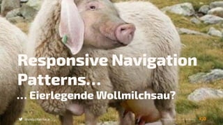


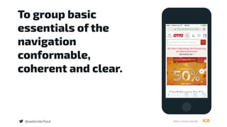

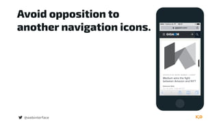

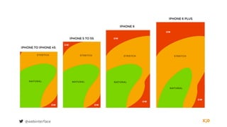


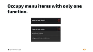
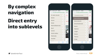
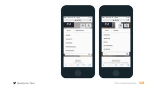


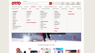
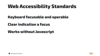

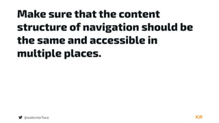


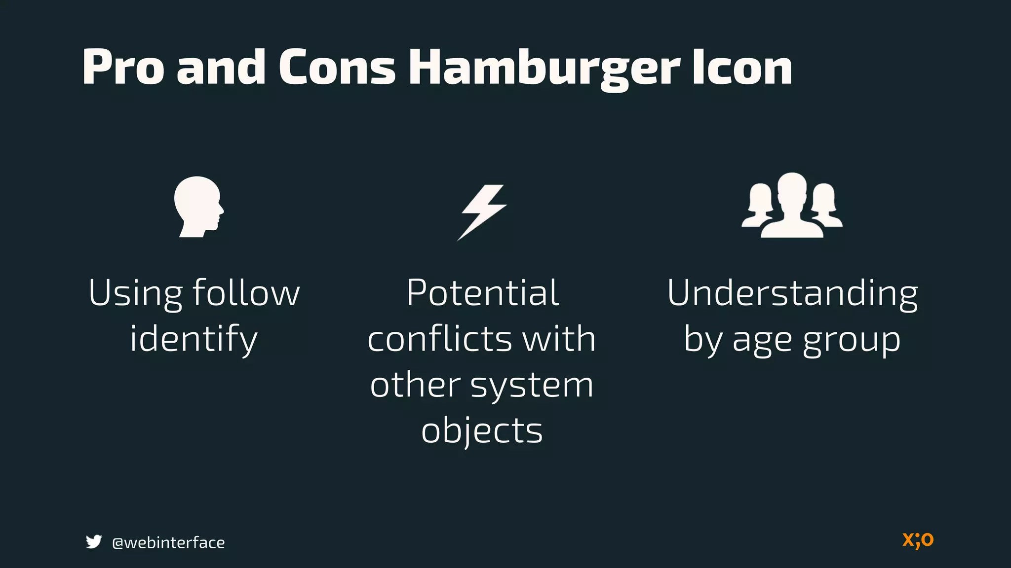


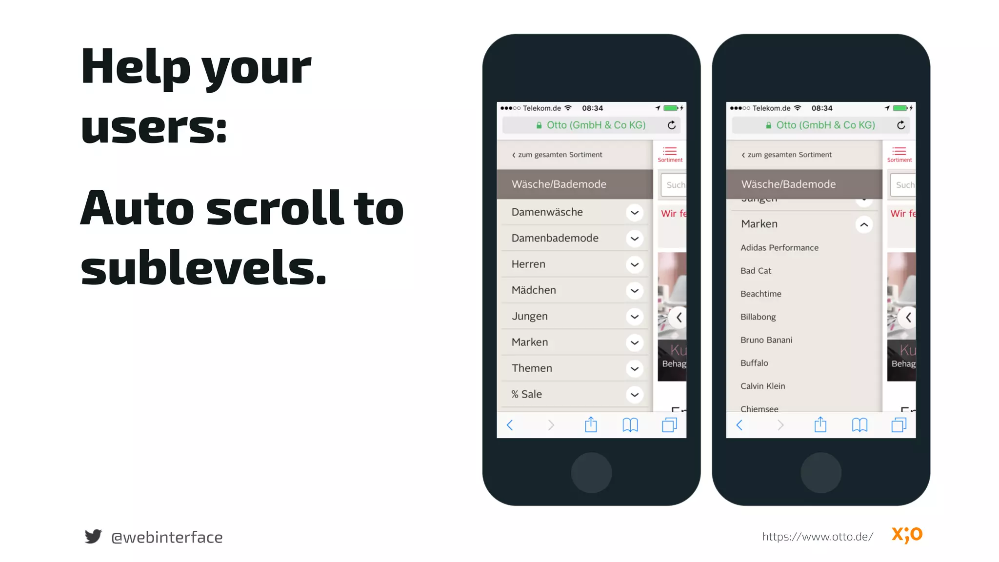


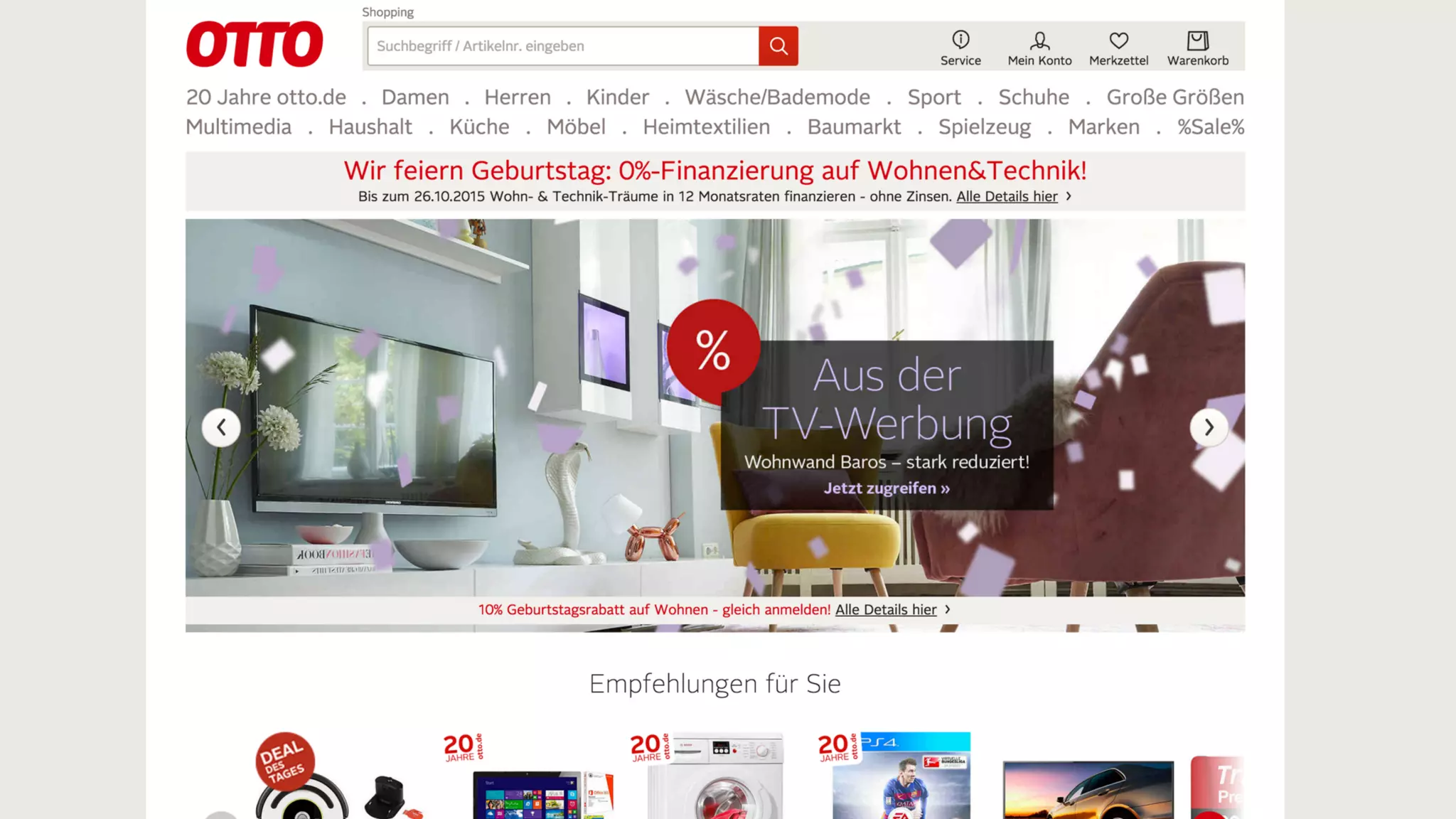
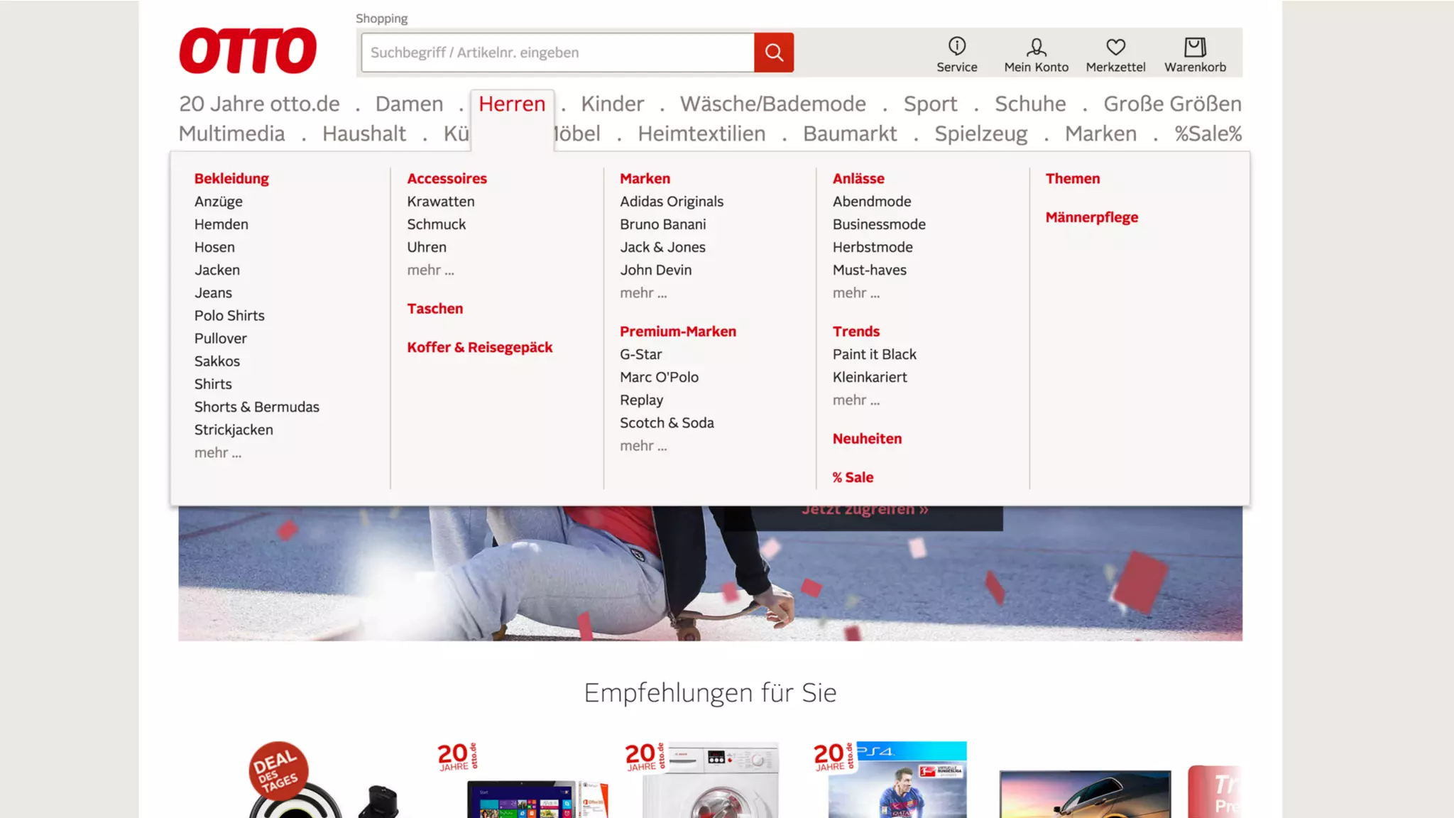
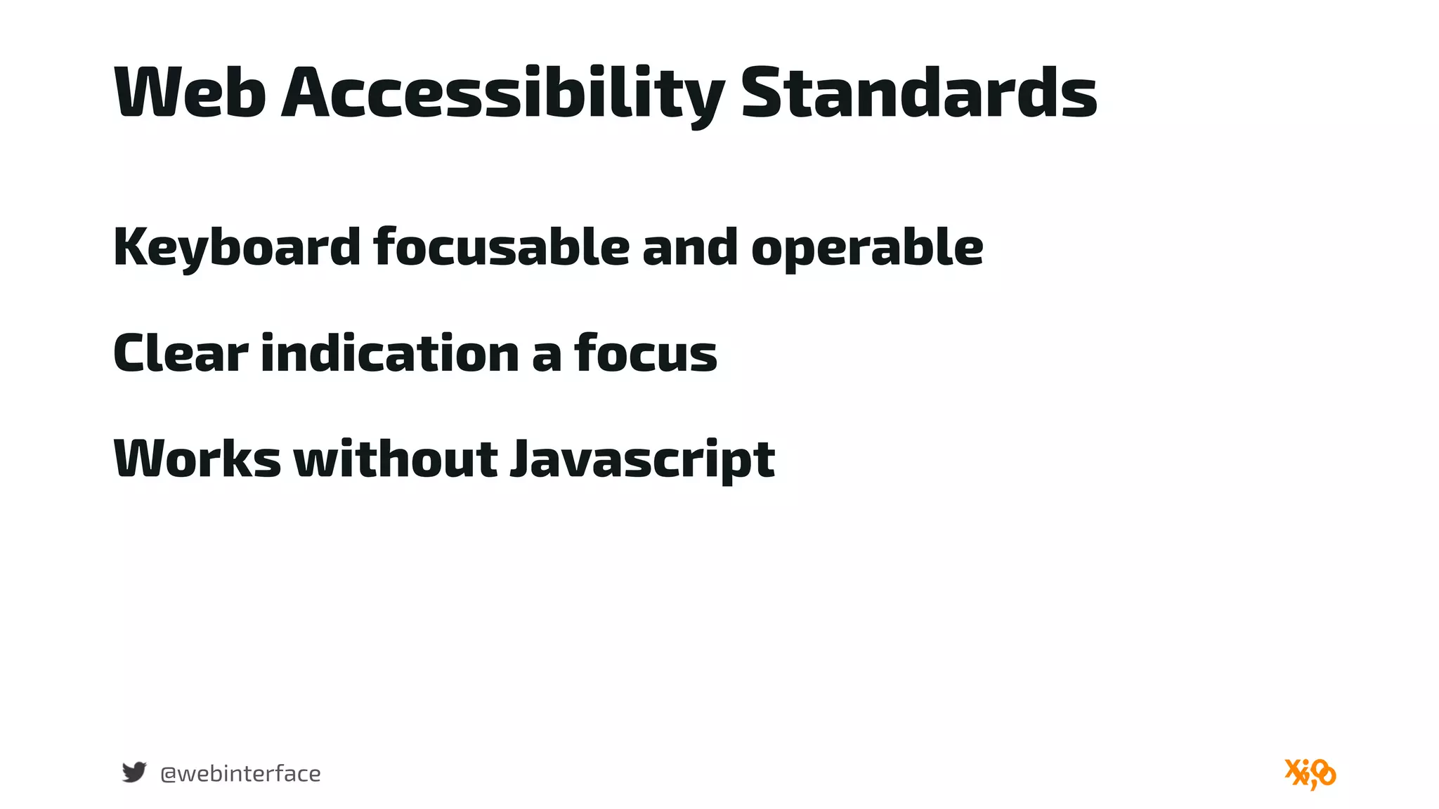


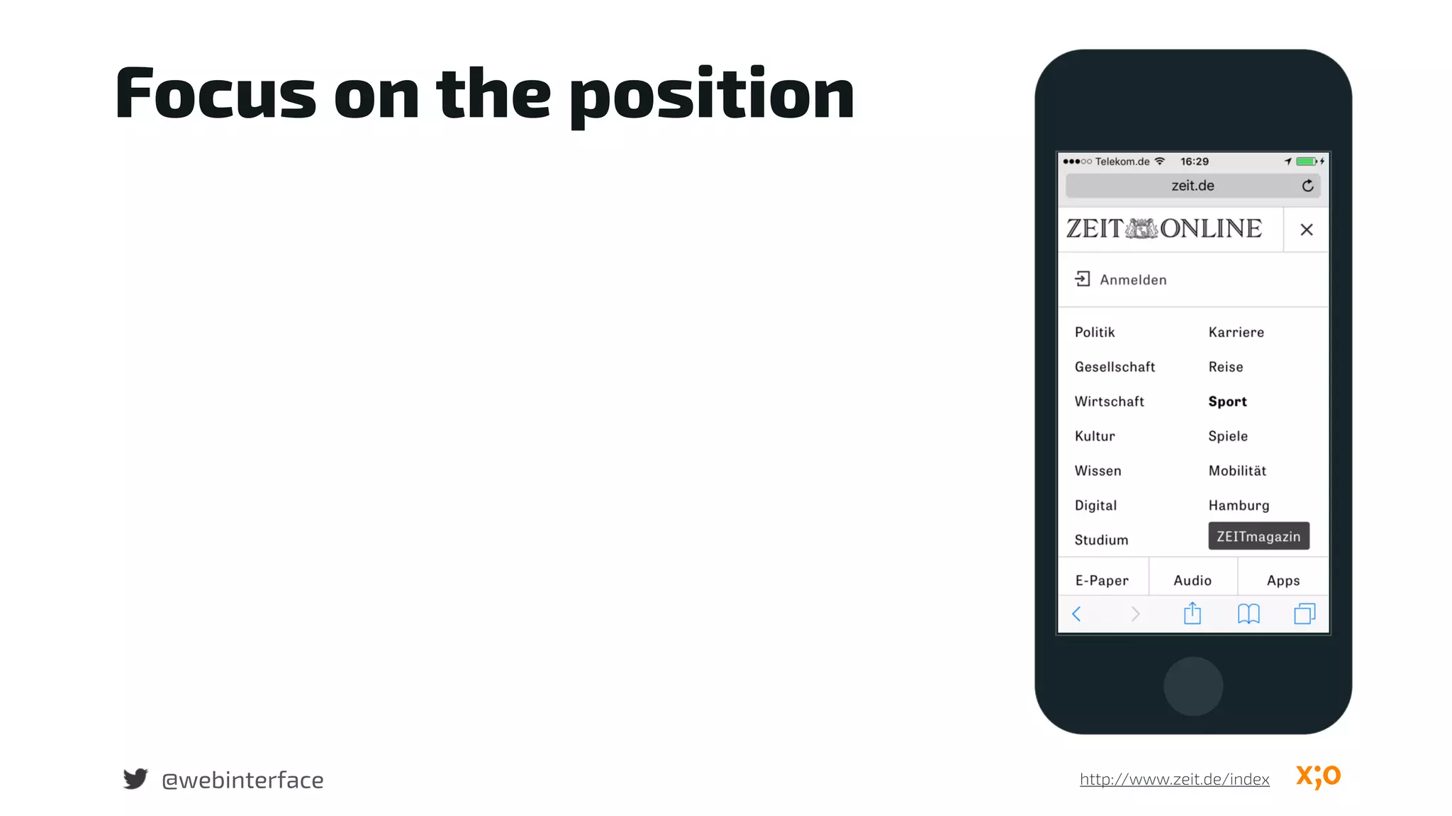
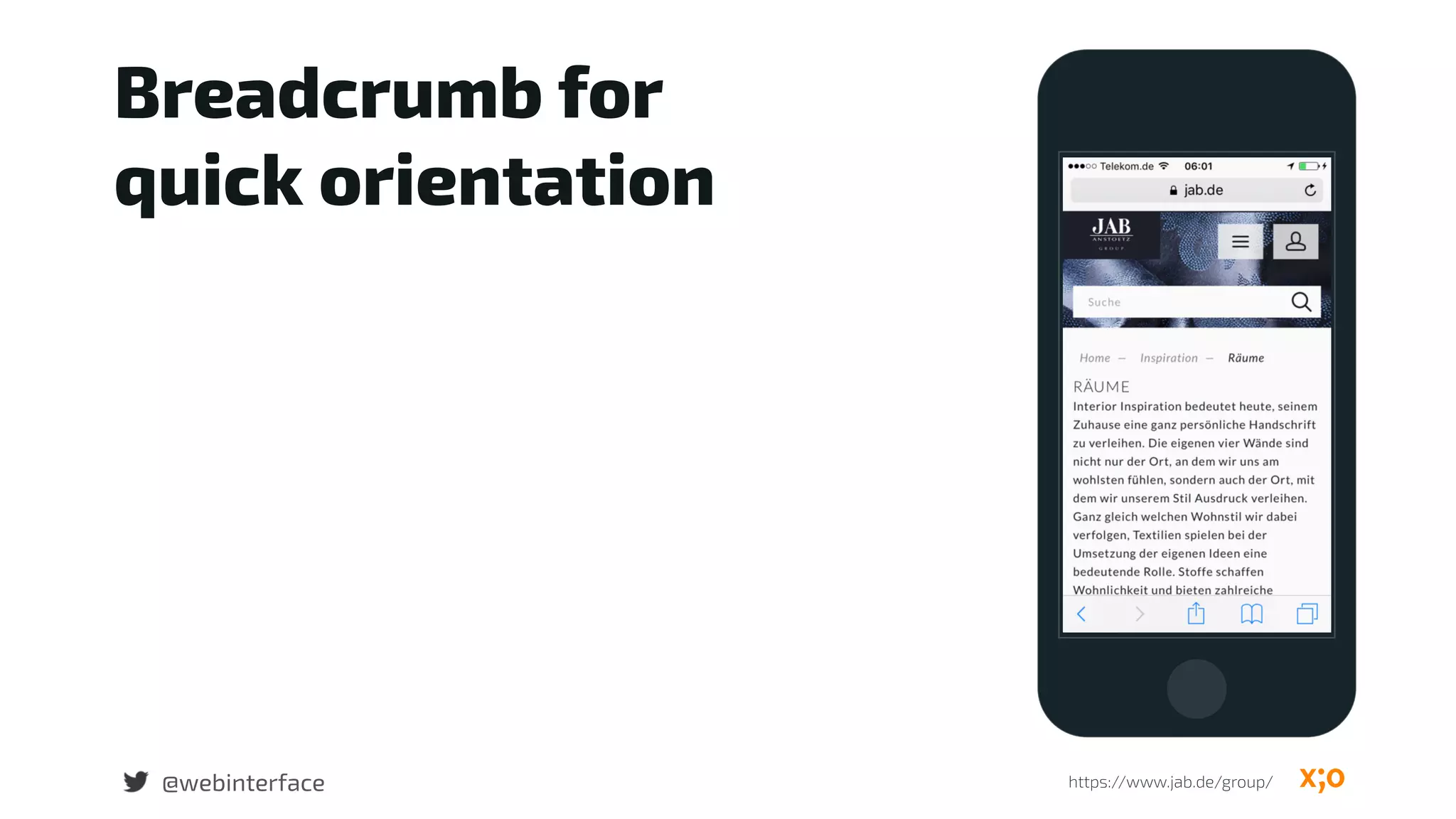
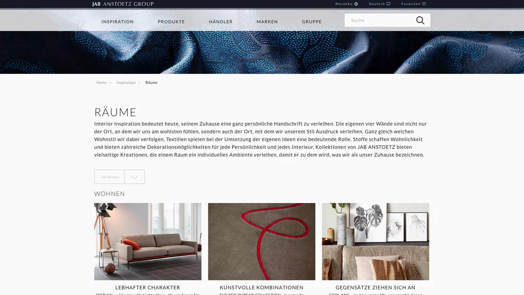


The document discusses responsive navigation patterns and user experience guidelines, emphasizing the importance of usability and accessibility in design. It highlights challenges with common navigation elements such as the hamburger icon and advocates for clear, coherent navigation structures that cater to user needs. The main takeaway is to prioritize user interactions and ensure a seamless experience over simply meeting technical responsiveness standards.


![Progressive Enhancement & Mobile [Funka 2012]](https://cdn.slidesharecdn.com/ss_thumbnails/progressiveenhancementmobile-120418173201-phpapp01-thumbnail.jpg?width=600ounds&width=560&fit=bounds)


