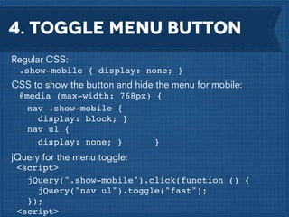
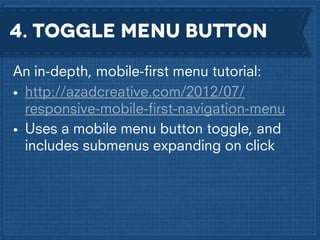
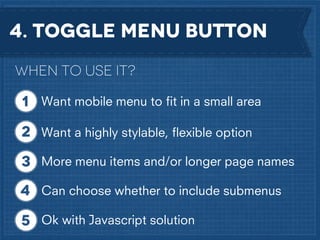
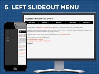
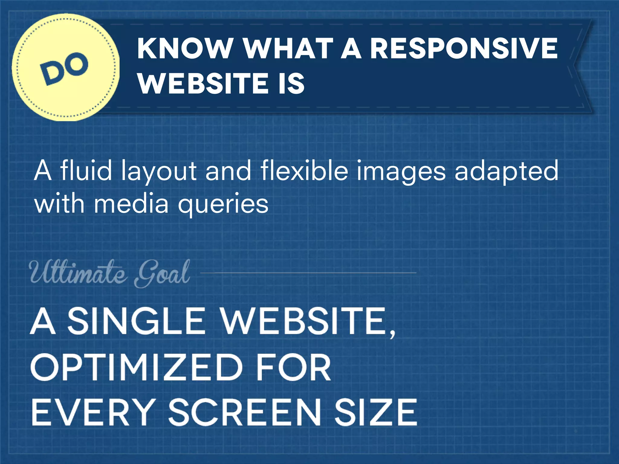
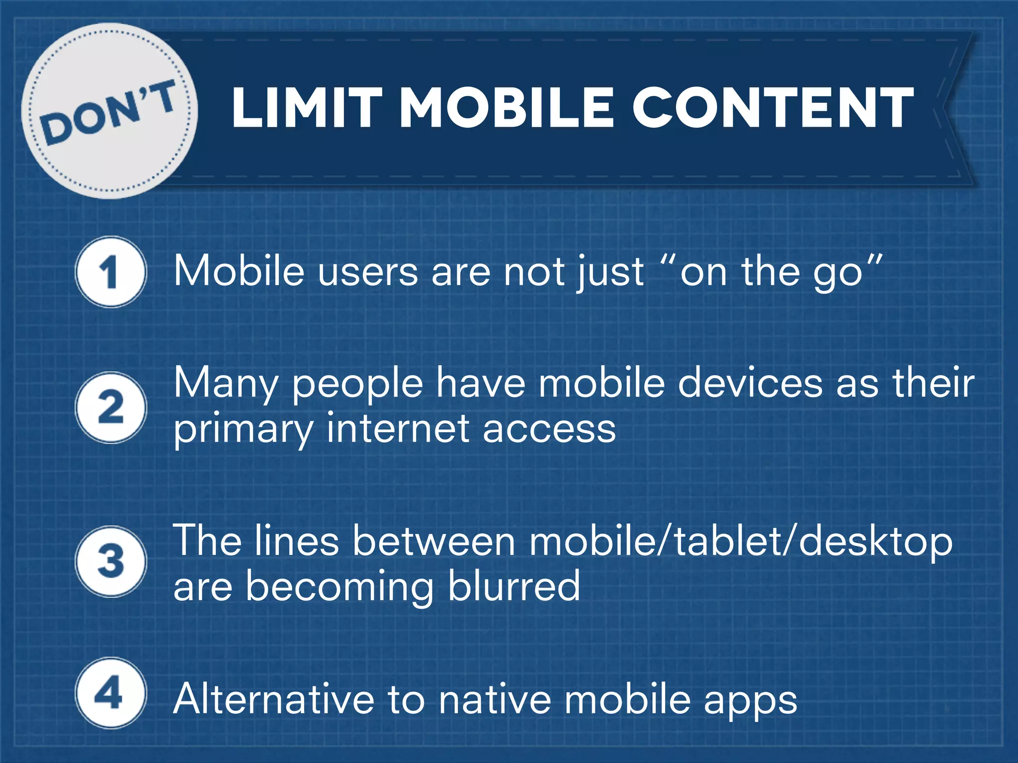
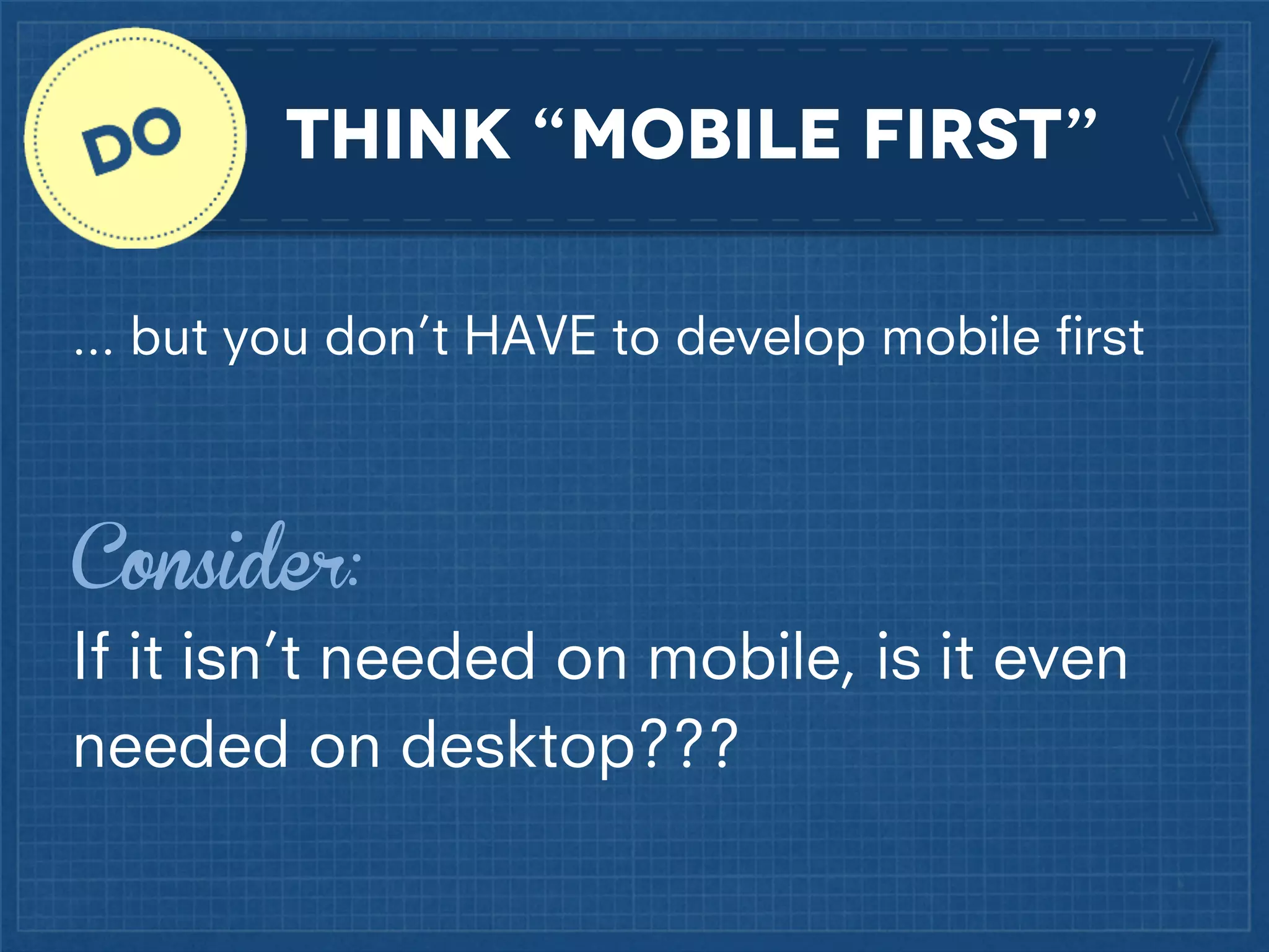
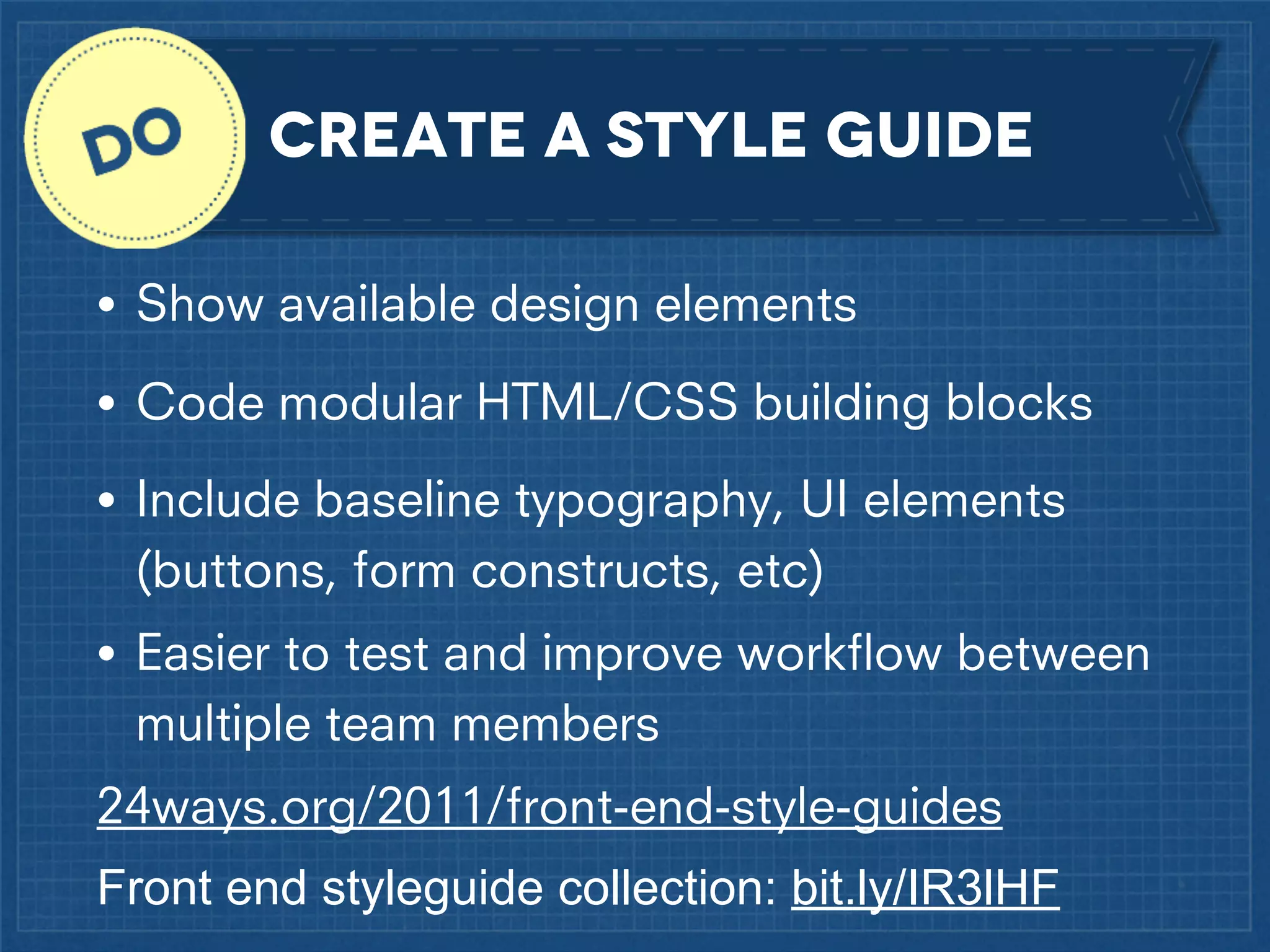
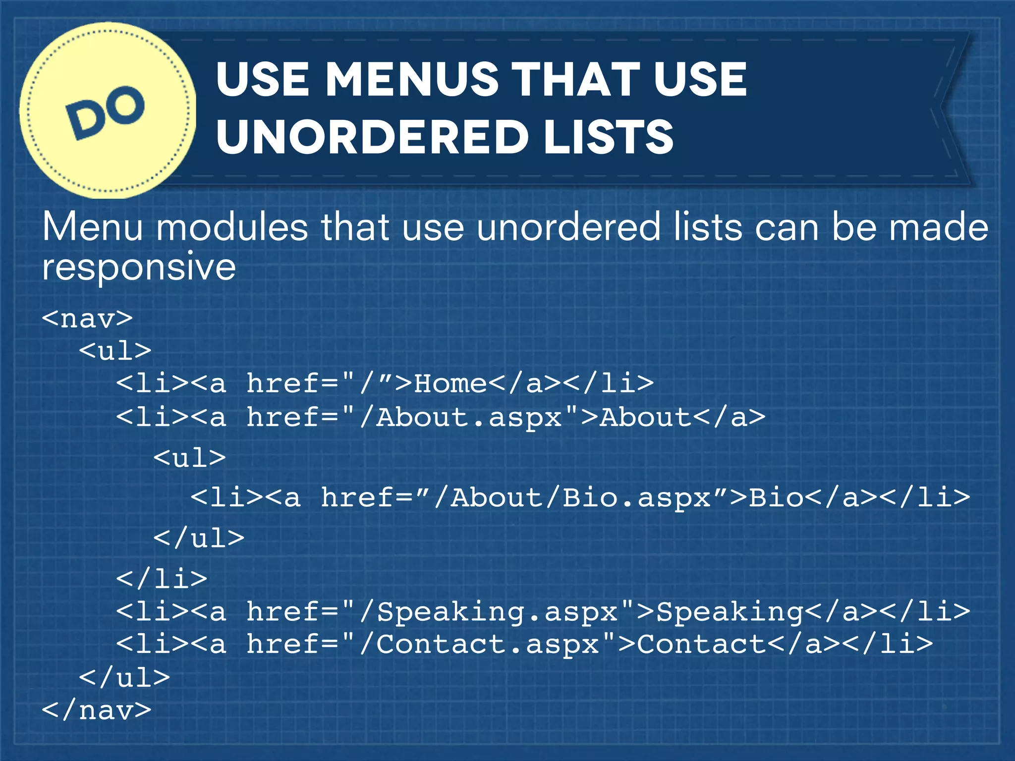
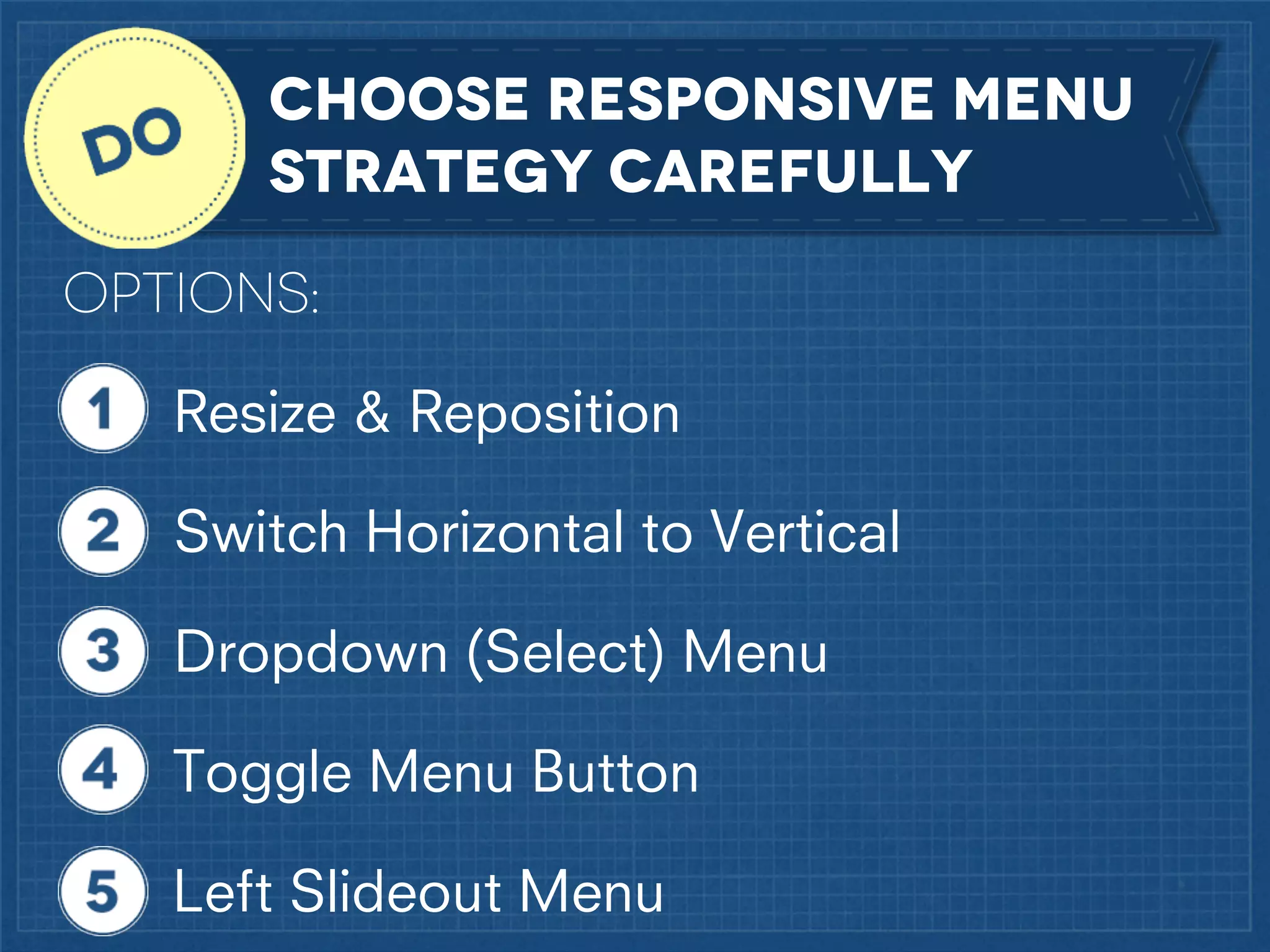
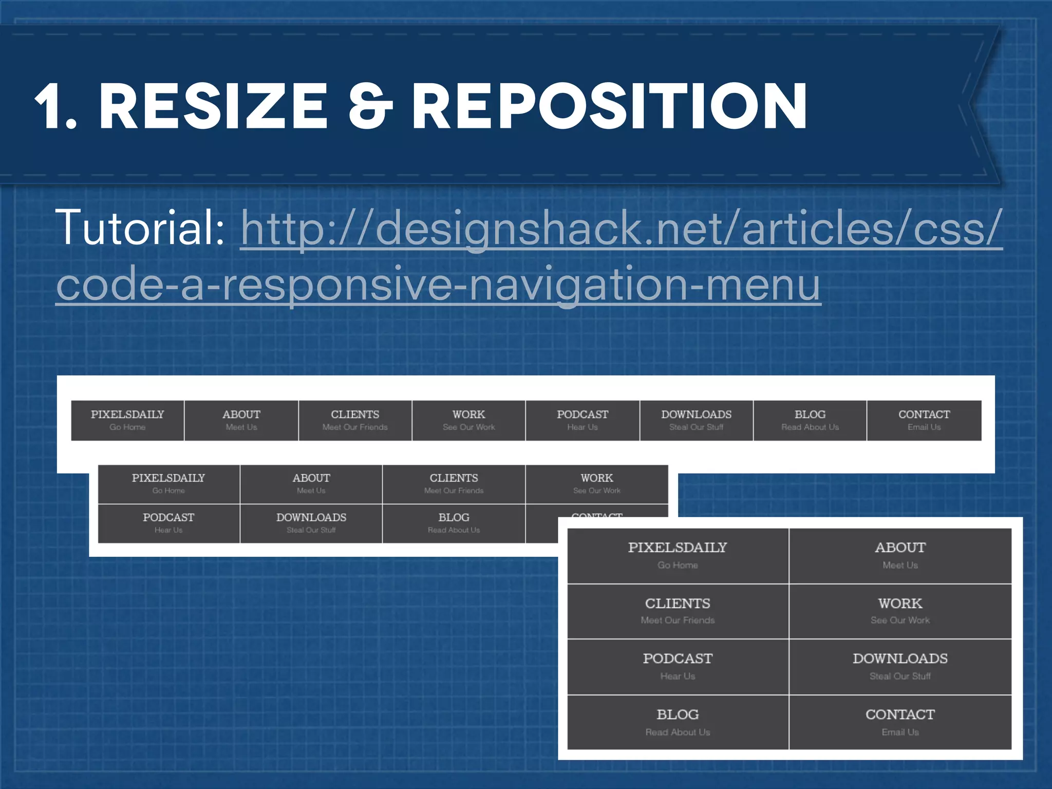
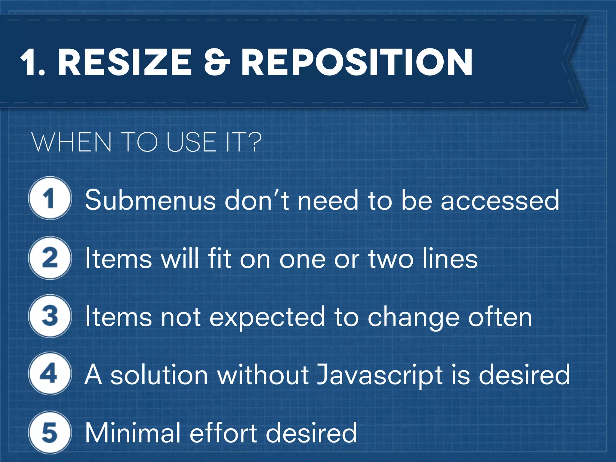
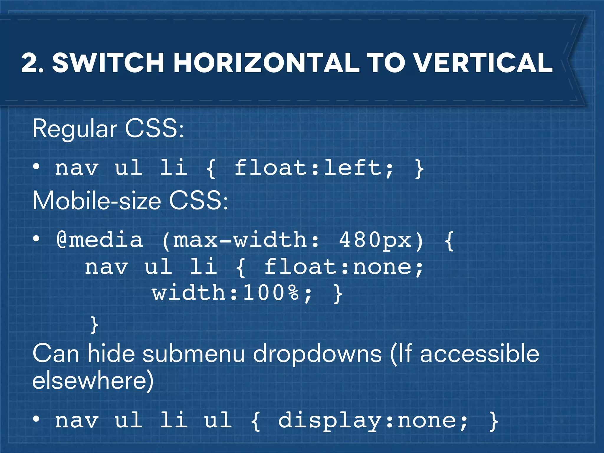
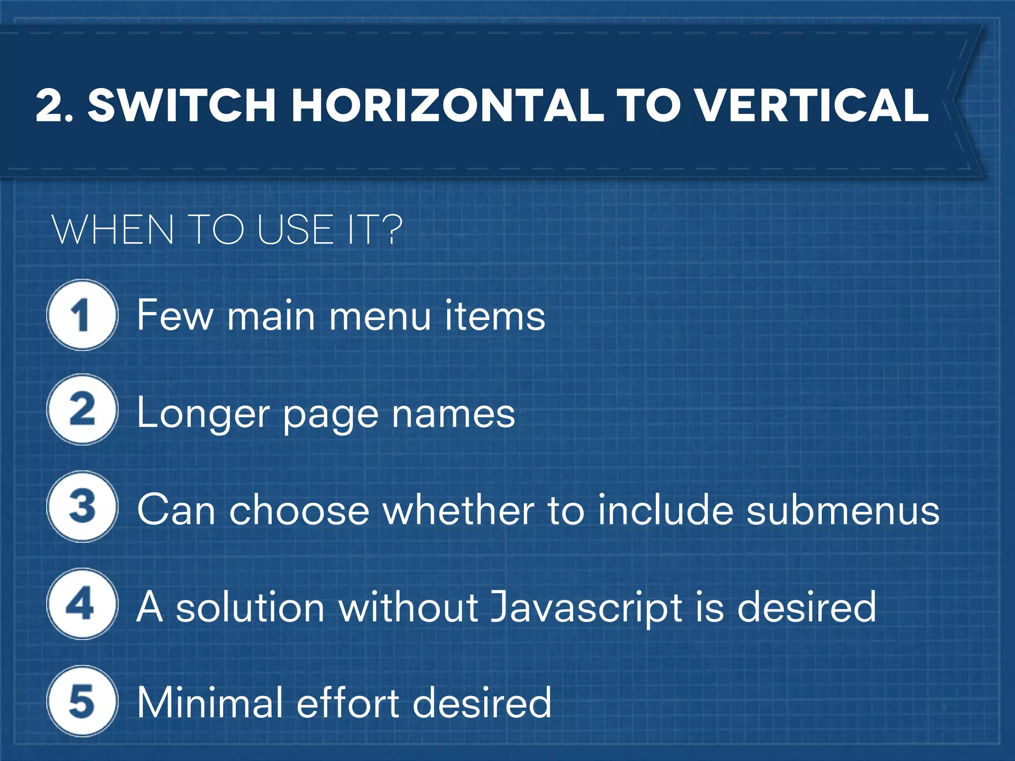
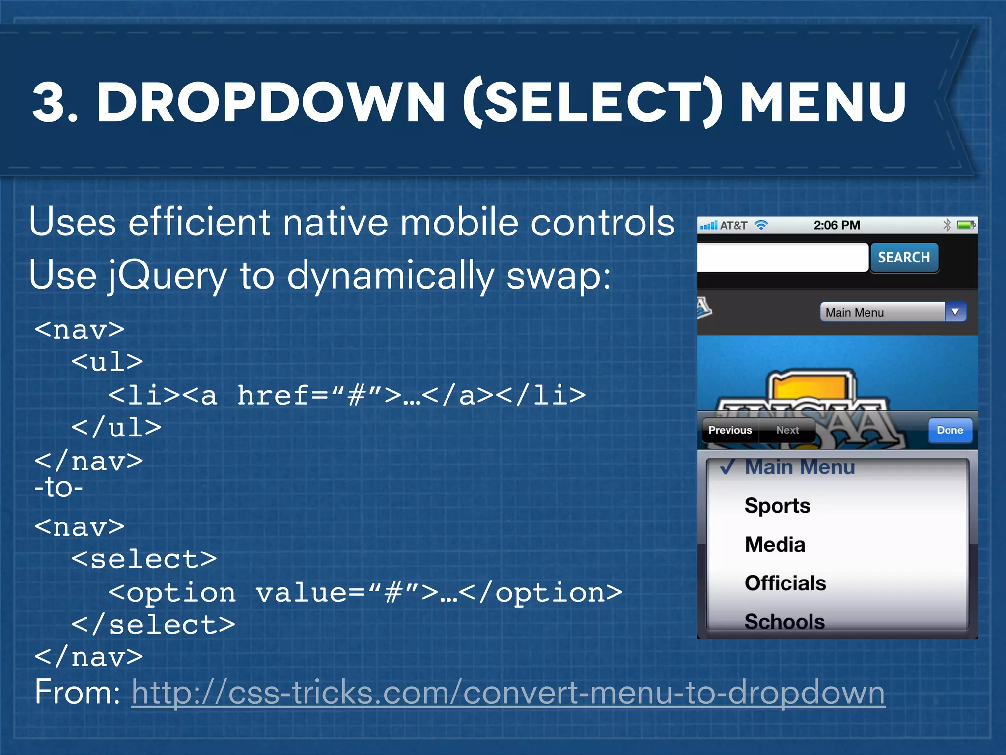
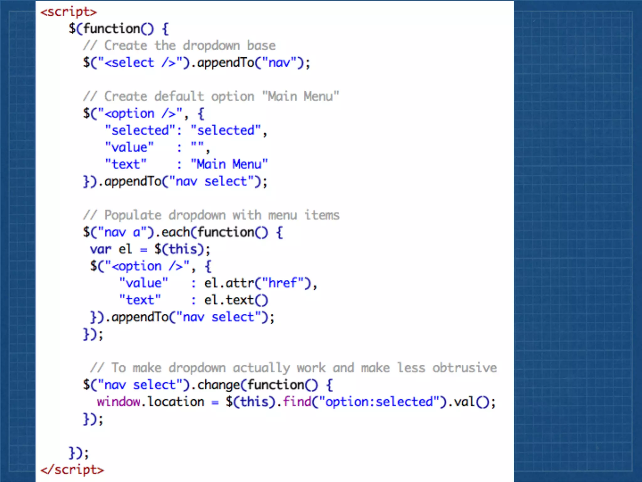
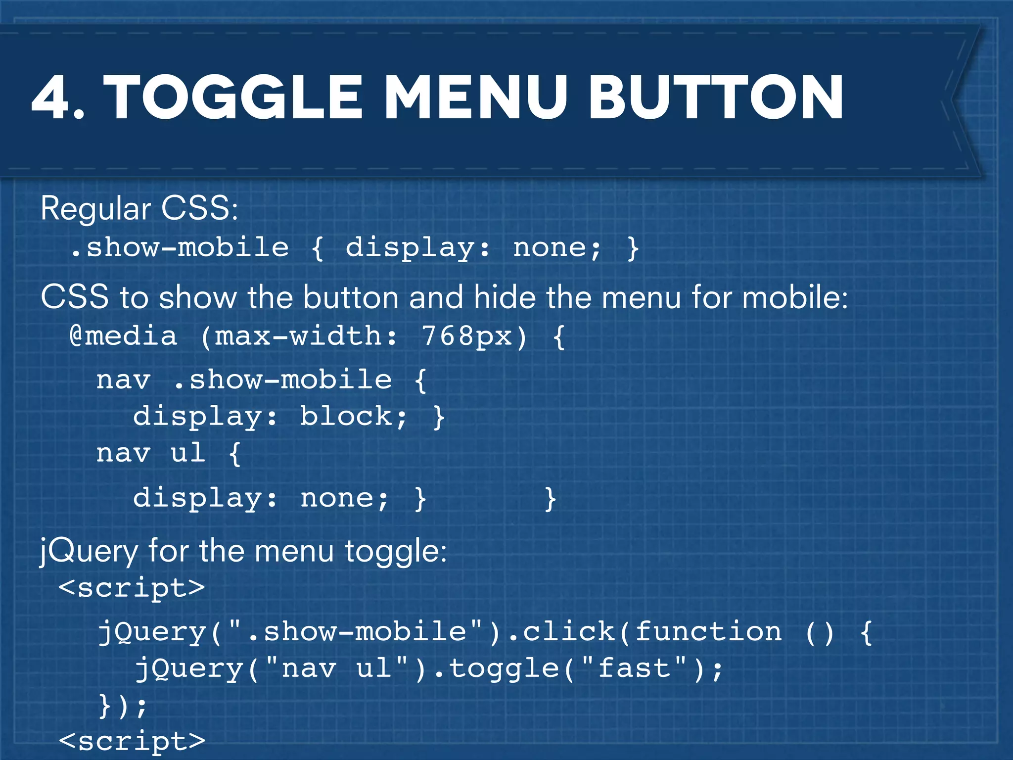
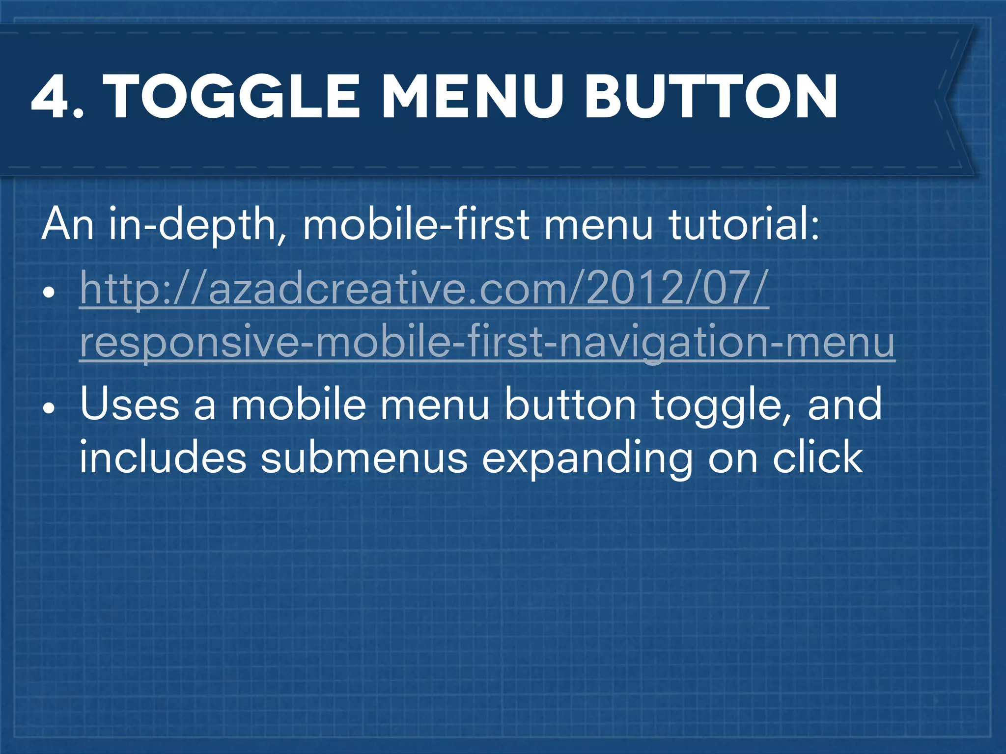
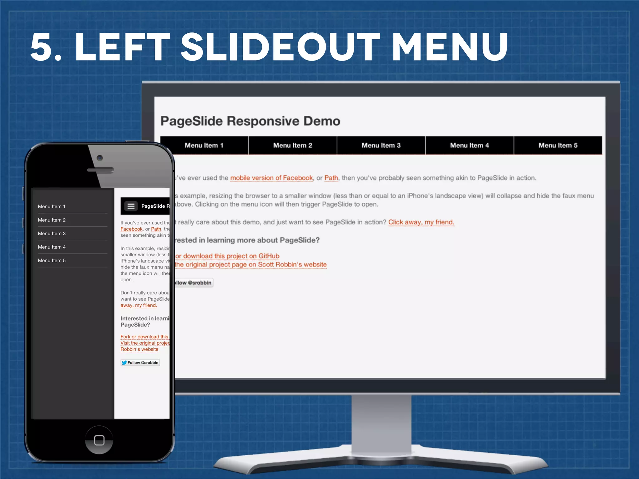
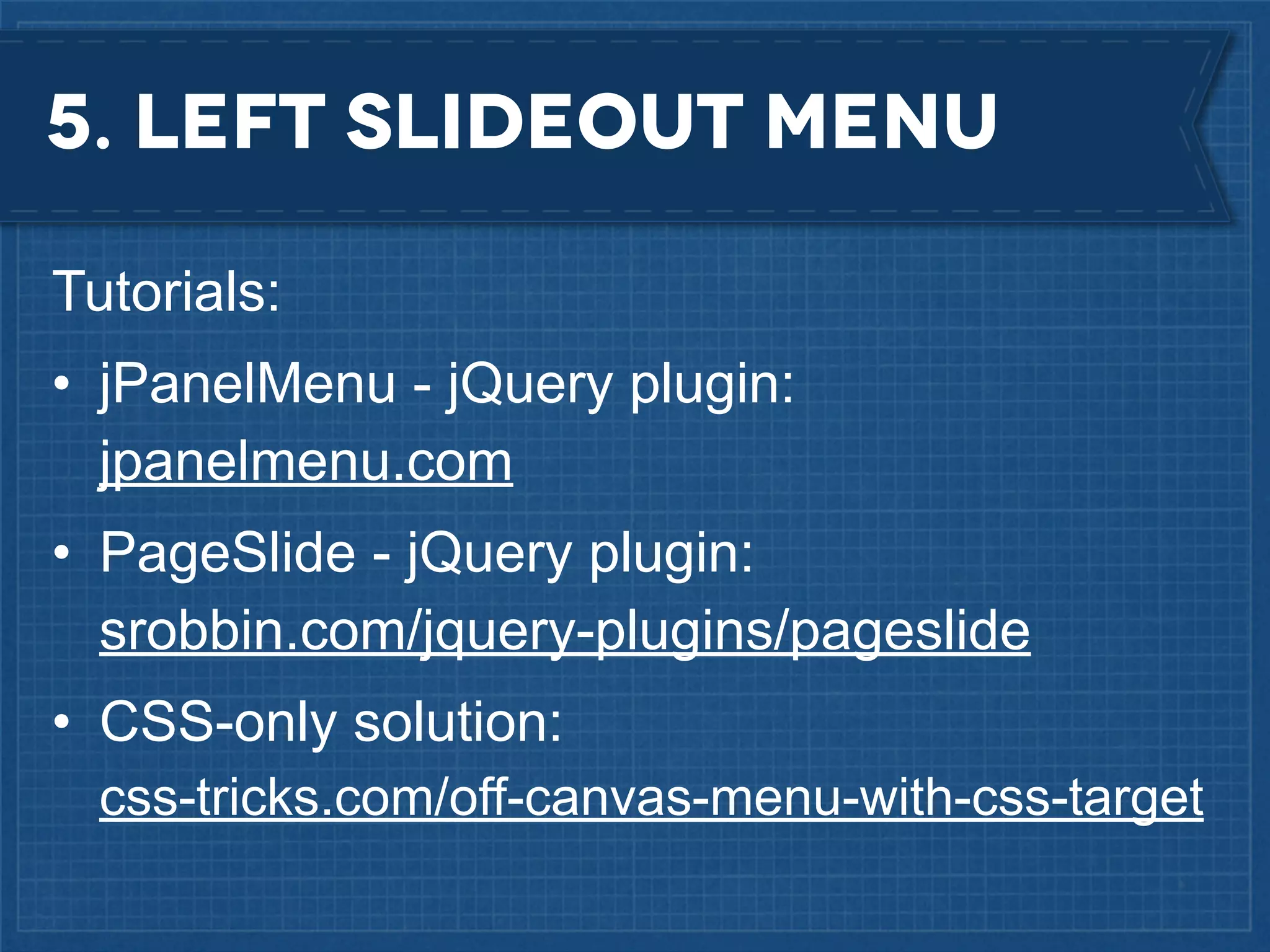
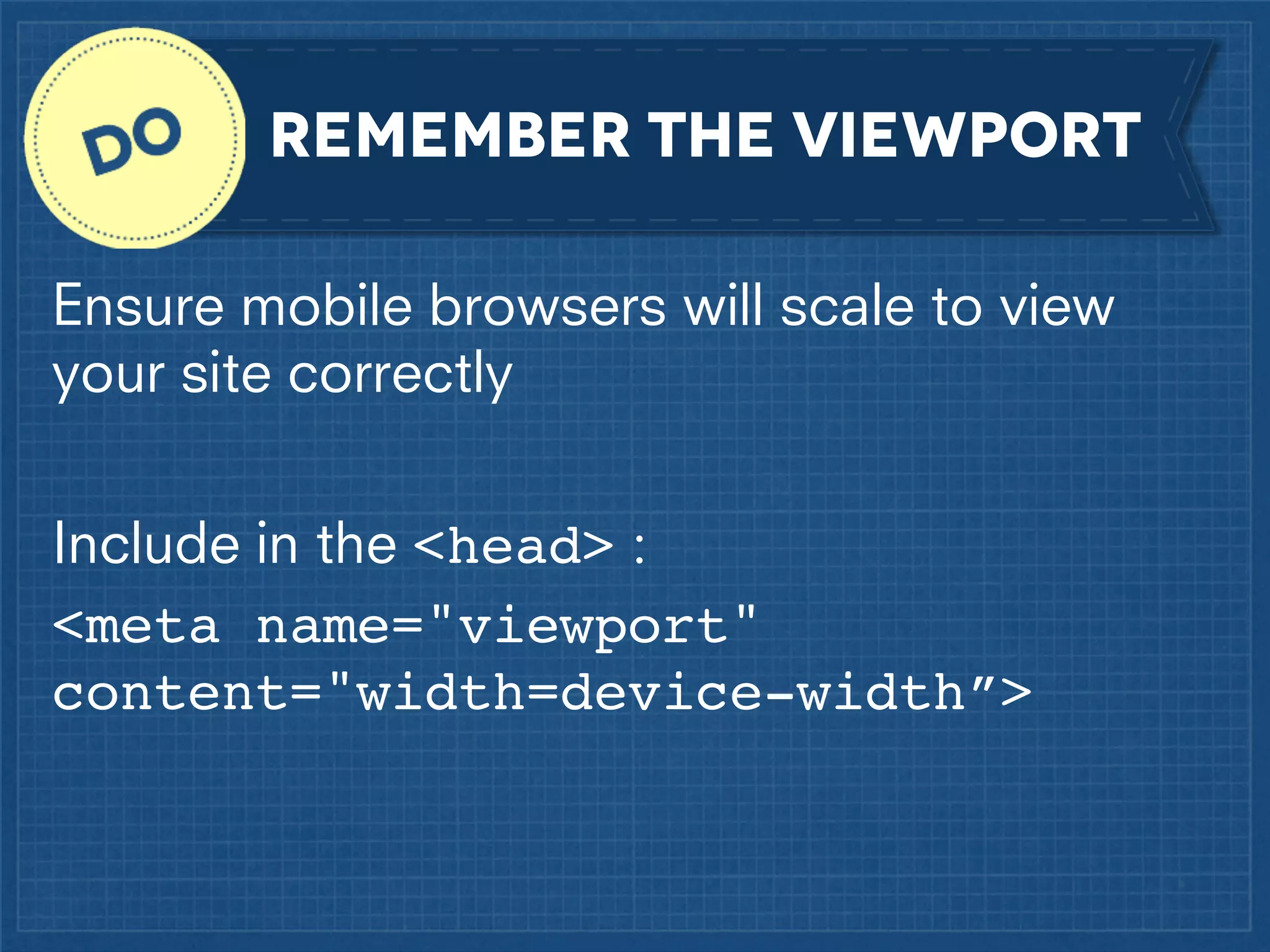
KEMBAR78
Responsive & Responsible Web Design in DNN | PDF
Responsive
and

Responsible

web design
in

DNN
PLAN & DESIGN
KNOW What A Responsive
WebSITE is
A fluid layout and flexible images adapted
with media queries
MISUSe the TERM
Responsive

vs.

Adaptive

A fluid grid layout

Multiple fixed width
layouts

Additional changes
applied with Media
Queries

Layout changes at set
breakpoints
(with Media Queries)
LIMIT MOBILE CONTENT
Mobile users are not just “on the go”
Many people have mobile devices as their
primary internet access
The lines between mobile/tablet/desktop
are becoming blurred
Alternative to native mobile apps
Prioritize Content
Do a content audit and prioritization before
any layout or design
Think “mobile first”
... but you don’t HAVE to develop mobile first

Consider:
If it isn’t needed on mobile, is it even
needed on desktop???
USE HTML wireframes
http://foundation.zurb.com

Example
BANISH PHOTOSHOP
.....
expect pixel-perfect
matching code
Design with dev in mind
Pay attention to order and flow
Limit large or complex graphics
Know what CSS can do
Create a style Guide
•

Show available design elements

•

Code modular HTML/CSS building blocks

•

Include baseline typography, UI elements
(buttons, form constructs, etc)

•

Easier to test and improve workflow between
multiple team members

24ways.org/2011/front-end-style-guides
Front end styleguide collection: bit.ly/IR3lHF
DEVELOP
Use a fluid grid
<div class=”row”>
<div id="ContentPane" runat="server"
class=”col two-third” />
<div id="SmallRightPane" runat="server"
class=”col third” />
</div>
<div class=”row”>
<div id="LeftPane" runat="server"
class=”col half” />
<div id="RightPane" runat="server"
class=”col half” />
</div>
Use a fluid grid
.half {
.third {
.two-third {
.fourth {
.three-fourth{
.fifth {
.two-fifth {
.three-fifth {
.four-fifth {
.col {

width: 50%; }
width: 33.333333333333%;}
width: 66.66666666667%;}
width: 25%; }
width: 75%; }
width: 20%; }
width: 40%; }
width: 60%; }
width: 80%; }
padding: 10px;
float: left;
box-sizing: border-box; }
Use the new box model
Standard box model:

New box model:

Padding & border
added on to the
width/height

Padding & border
subtracted from
width/height

box-sizing:
border-box

box-sizing:
border-box
Set fixed-width spacing
#LeftColumn {
padding: 10px 20px;!
-moz-box-sizing:border-box;
-webkit-box-sizing:border-box;!
box-sizing:border-box; }
#RightColumn {
padding: 10px;!
-moz-box-sizing:border-box;
-webkit-box-sizing:border-box;!
box-sizing:border-box;
border: 1px solid #627A7E; }
IE Polyfill: (Natively supported in IE8+)
https://github.com/Schepp/box-sizing-polyfill
DO a lot of math
Widths set with percentage are relative to
their container element
Keep it simple
#ContentLeft {
  float: left;
width: 60%;
padding-right: 40px;
box-sizing: border-box; }
#ContentRight {
   float: left;
width: 40%;
box-sizing: border-box; }
use media queries
Media queries serve different CSS based on
your browser size or type.
In your Skin CSS file, define regular (desktop)
styles, then:
•
•
•
•

@media
@media
@media
@media

(max-width:
(max-width:
(max-width:
(max-width:

900px)
720px)
480px)
320px)

{
{
{
{

}
}
}
}
use media queries
Or, go “mobile first”:
• @media (min-width: 480px) {
• @media (min-width: 720px) {
• Etc…
Better for performance!

}
}
USE pre-determined,
Specific breakpoints
Set breakpoints when you need them!
use browser fallbacks
@media only works in IE 9 +
• Javascript polyfill for IE 8 and below:
– https://github.com/scottjehl/Respond
– Adds support for media queries set with
min-width/max-width

• For wider media query support:
– http://code.google.com/p/css3-mediaqueries-js

• Or use conditional comments to link to IE CSS
set font sizes with rem’s
• html { font-size: 62.5%; }
• body { font-size:
font-size:
{ font-size:
• h1
font-size:

14px;
1.4rem; }
24px;
2.4rem; }

• Can change body size % in @media to
adjust all site fonts
create scalable headlines
Fittextjs.com: for text headlines that dynamically
fit the width of its surrounding element.
USE ICON FONTS
Always crisp, no pixelization or multiple
image sizes needed
Easily change size, color, and shadows
using CSS

IcoMoon.io

Pictos.cc

MORE
(css-tricks.com/flat-icons-icon-fonts)
Set media max-widths
Ensure media does not break outside of set
container:
• img, object, embed, iframe, video
{ max-width:100%; }
set inline media sizes
Do not set height or width of images or
media in the DNN editor
Do not upload media larger than the
maximum size that you want it to display
create scalable video
Fitvidsjs.com: for fluid width video embeds
OVERuse display:none
display:none
• Hide unnecessary content for mobile
• Add mobile only content with
display:none in the regular CSS
Use Sparingly!

Don’t limit content
OVERuse display:none
Important Note:
display:none hides content but
(generally) does not improve performance!
Hiding images:
Setting parent element to display:none
will prevent the image from being loaded.
Use menus that use
unordered lists
Menu modules that use unordered lists can be made
responsive
<nav>
<ul>
<li><a href="/”>Home</a></li>
<li><a href="/About.aspx">About</a>
<ul>
<li><a href=”/About/Bio.aspx”>Bio</a></li>
</ul>
</li>
<li><a href="/Speaking.aspx">Speaking</a></li>
<li><a href="/Contact.aspx">Contact</a></li>
</ul>
</nav>
Choose responsive menu
strategy carefully
OPTIONS:
Resize & Reposition
Switch Horizontal to Vertical
Dropdown (Select) Menu
Toggle Menu Button
Left Slideout Menu
1. RESIZE & REposition (aka “do NOTHING”)
1. RESIZE & REposition
What a horizontal unordered list will naturally
do
Can hide submenu dropdowns (If accessible
elsewhere)
• nav ul li ul { display:none; }
Use media queries to shrink fonts and
margins before, or to avoid, breaking to
multiple lines
1. RESIZE & REposition
Tutorial: http://designshack.net/articles/css/
code-a-responsive-navigation-menu
1. RESIZE & REposition
When to use it?
Submenus don’t need to be accessed
Items will fit on one or two lines
Items not expected to change often
A solution without Javascript is desired
Minimal effort desired
2. Switch horizontal to vertical
Regular CSS:
• nav ul li { float:left; }
Mobile-size CSS:
• @media (max-width: 480px) {
nav ul li { float:none; !!
!
width:100%; }
}

Can hide submenu dropdowns (If accessible
elsewhere)
• nav ul li ul { display:none; }
2. Switch horizontal to vertical
Tutorial to include dropdown submenus:
http://ejhansel.com/a-responsive-drop-down-navigation-menu

• Based on Suckerfish dropdowns
• Uses :hover to expand submenus
2. Switch horizontal to vertical
When to use it?
Few main menu items
Longer page names
Can choose whether to include submenus
A solution without Javascript is desired
Minimal effort desired
3. dropdown (select) menu
Uses efficient native mobile controls
Use jQuery to dynamically swap:
<nav>
<ul>
<li><a href=“#”>…</a></li>
</ul>
</nav>
-to<nav>
<select>
<option value=“#”>…</option>
</select>
</nav>

From: http://css-tricks.com/convert-menu-to-dropdown
3. dropdown (select) menu
Similar options that switch <ul> to <select>:
• TinyNav.js:
– Uses jQuery, small file size
– https://github.com/viljamis/TinyNav.js

• Responsive Menu:
– Uses jQuery, supports submenus, lots of settings
– https://github.com/mattkersley/Responsive-Menu

• SelectNav.js:
– Inspired by TinyNav, Independent (no jQuery),
supports submenus
– http://lukaszfiszer.github.com/selectnav.js
3. dropdown (select) menu
When to use it?
Want mobile menu to fit in a small area
Want native controls for the mobile menu
More menu items and/or longer page names
Want submenus included
Ok with Javascript solution
4. Toggle menu button
Similar to switching a horizontal menu
to vertical, with the addition of hiding
the menu until clicked/touched
The markup:
<nav>! !
!
<a href="#" class=”
show-mobile">Main Menu</a>!
<ul><li>…</li></ul>!
</nav>
4. Toggle menu button
Regular CSS:
.show-mobile { display: none; }
CSS to show the button and hide the menu for mobile:
@media (max-width: 768px) {! !
nav .show-mobile {
display: block; }
nav ul {!
display: none; }
}
jQuery for the menu toggle:
<script>! !
jQuery(".show-mobile").click(function () {
jQuery("nav ul").toggle("fast");!
});
<script>
4. Toggle menu button
An in-depth, mobile-first menu tutorial:
• http://azadcreative.com/2012/07/
responsive-mobile-first-navigation-menu
• Uses a mobile menu button toggle, and
includes submenus expanding on click
4. Toggle menu button
When to use it?
Want mobile menu to fit in a small area
Want a highly stylable, flexible option
More menu items and/or longer page names
Can choose whether to include submenus
Ok with Javascript solution
5. Left slideout Menu
Tutorials:
• jPanelMenu - jQuery plugin:
jpanelmenu.com
• PageSlide - jQuery plugin:
srobbin.com/jquery-plugins/pageslide
• CSS-only solution:
css-tricks.com/off-canvas-menu-with-css-target
5. Left slideout Menu
When to use it?
Want mobile menu to fit in a small area
Want a sleek mobile menu option
More menu items and/or longer page names
Ok with more advanced coding
Ok with Javascript (or CSS with limited browser support)
remember the viewport
Ensure mobile browsers will scale to view
your site correctly
Include in the <head> :
<meta name="viewport"
content="width=device-width”>
CHoose modules wisely
Choose modules that are have template
systems and easy-to-modify layouts.
Download demos and test
Avoid modules that use table layouts, inline
styling, and lack stylable classes and IDs
Expect to customize module layouts and
allow time for testing
Resources
• Responsive Web Design (A Book Apart 4):
Ethan Marcotte
• Implementing Responsive Design:
Tim Kadlec
• This is Responsive: Patterns, resources, news
http://bradfrost.github.io/this-is-responsive/
• http://bdconf.com/newsletter
• MediaQueri.es
Questions?
Amelia Marschall-Miller
Gravity Works Design + Development
Partner & Creative Director

GravityWorksDesign.com
AmeliaMarschall.com
@MimiAmelia

Responsive & Responsible Web Design in DNN

  • 1.
  • 2.
  • 3.
    KNOW What AResponsive WebSITE is A fluid layout and flexible images adapted with media queries
  • 4.
    MISUSe the TERM Responsive vs. Adaptive Afluid grid layout Multiple fixed width layouts Additional changes applied with Media Queries Layout changes at set breakpoints (with Media Queries)
  • 5.
    LIMIT MOBILE CONTENT Mobileusers are not just “on the go” Many people have mobile devices as their primary internet access The lines between mobile/tablet/desktop are becoming blurred Alternative to native mobile apps
  • 6.
    Prioritize Content Do acontent audit and prioritization before any layout or design
  • 7.
    Think “mobile first” ...but you don’t HAVE to develop mobile first Consider: If it isn’t needed on mobile, is it even needed on desktop???
  • 8.
  • 9.
  • 10.
  • 11.
    Design with devin mind Pay attention to order and flow Limit large or complex graphics Know what CSS can do
  • 12.
    Create a styleGuide • Show available design elements • Code modular HTML/CSS building blocks • Include baseline typography, UI elements (buttons, form constructs, etc) • Easier to test and improve workflow between multiple team members 24ways.org/2011/front-end-style-guides Front end styleguide collection: bit.ly/IR3lHF
  • 13.
  • 14.
    Use a fluidgrid <div class=”row”> <div id="ContentPane" runat="server" class=”col two-third” /> <div id="SmallRightPane" runat="server" class=”col third” /> </div> <div class=”row”> <div id="LeftPane" runat="server" class=”col half” /> <div id="RightPane" runat="server" class=”col half” /> </div>
  • 15.
    Use a fluidgrid .half { .third { .two-third { .fourth { .three-fourth{ .fifth { .two-fifth { .three-fifth { .four-fifth { .col { width: 50%; } width: 33.333333333333%;} width: 66.66666666667%;} width: 25%; } width: 75%; } width: 20%; } width: 40%; } width: 60%; } width: 80%; } padding: 10px; float: left; box-sizing: border-box; }
  • 16.
    Use the newbox model Standard box model: New box model: Padding & border added on to the width/height Padding & border subtracted from width/height box-sizing: border-box box-sizing: border-box
  • 17.
    Set fixed-width spacing #LeftColumn{ padding: 10px 20px;! -moz-box-sizing:border-box; -webkit-box-sizing:border-box;! box-sizing:border-box; } #RightColumn { padding: 10px;! -moz-box-sizing:border-box; -webkit-box-sizing:border-box;! box-sizing:border-box; border: 1px solid #627A7E; } IE Polyfill: (Natively supported in IE8+) https://github.com/Schepp/box-sizing-polyfill
  • 18.
    DO a lotof math Widths set with percentage are relative to their container element
  • 19.
    Keep it simple #ContentLeft{   float: left; width: 60%; padding-right: 40px; box-sizing: border-box; } #ContentRight {    float: left; width: 40%; box-sizing: border-box; }
  • 20.
    use media queries Mediaqueries serve different CSS based on your browser size or type. In your Skin CSS file, define regular (desktop) styles, then: • • • • @media @media @media @media (max-width: (max-width: (max-width: (max-width: 900px) 720px) 480px) 320px) { { { { } } } }
  • 21.
    use media queries Or,go “mobile first”: • @media (min-width: 480px) { • @media (min-width: 720px) { • Etc… Better for performance! } }
  • 22.
    USE pre-determined, Specific breakpoints Setbreakpoints when you need them!
  • 23.
    use browser fallbacks @mediaonly works in IE 9 + • Javascript polyfill for IE 8 and below: – https://github.com/scottjehl/Respond – Adds support for media queries set with min-width/max-width • For wider media query support: – http://code.google.com/p/css3-mediaqueries-js • Or use conditional comments to link to IE CSS
  • 24.
    set font sizeswith rem’s • html { font-size: 62.5%; } • body { font-size: font-size: { font-size: • h1 font-size: 14px; 1.4rem; } 24px; 2.4rem; } • Can change body size % in @media to adjust all site fonts
  • 25.
    create scalable headlines Fittextjs.com:for text headlines that dynamically fit the width of its surrounding element.
  • 26.
    USE ICON FONTS Alwayscrisp, no pixelization or multiple image sizes needed Easily change size, color, and shadows using CSS IcoMoon.io Pictos.cc MORE (css-tricks.com/flat-icons-icon-fonts)
  • 27.
    Set media max-widths Ensuremedia does not break outside of set container: • img, object, embed, iframe, video { max-width:100%; }
  • 28.
    set inline mediasizes Do not set height or width of images or media in the DNN editor Do not upload media larger than the maximum size that you want it to display
  • 29.
    create scalable video Fitvidsjs.com:for fluid width video embeds
  • 30.
    OVERuse display:none display:none • Hideunnecessary content for mobile • Add mobile only content with display:none in the regular CSS Use Sparingly! Don’t limit content
  • 31.
    OVERuse display:none Important Note: display:nonehides content but (generally) does not improve performance! Hiding images: Setting parent element to display:none will prevent the image from being loaded.
  • 32.
    Use menus thatuse unordered lists Menu modules that use unordered lists can be made responsive <nav> <ul> <li><a href="/”>Home</a></li> <li><a href="/About.aspx">About</a> <ul> <li><a href=”/About/Bio.aspx”>Bio</a></li> </ul> </li> <li><a href="/Speaking.aspx">Speaking</a></li> <li><a href="/Contact.aspx">Contact</a></li> </ul> </nav>
  • 33.
    Choose responsive menu strategycarefully OPTIONS: Resize & Reposition Switch Horizontal to Vertical Dropdown (Select) Menu Toggle Menu Button Left Slideout Menu
  • 34.
    1. RESIZE &REposition (aka “do NOTHING”)
  • 35.
    1. RESIZE &REposition What a horizontal unordered list will naturally do Can hide submenu dropdowns (If accessible elsewhere) • nav ul li ul { display:none; } Use media queries to shrink fonts and margins before, or to avoid, breaking to multiple lines
  • 36.
    1. RESIZE &REposition Tutorial: http://designshack.net/articles/css/ code-a-responsive-navigation-menu
  • 37.
    1. RESIZE &REposition When to use it? Submenus don’t need to be accessed Items will fit on one or two lines Items not expected to change often A solution without Javascript is desired Minimal effort desired
  • 38.
  • 39.
    2. Switch horizontalto vertical Regular CSS: • nav ul li { float:left; } Mobile-size CSS: • @media (max-width: 480px) { nav ul li { float:none; !! ! width:100%; } } Can hide submenu dropdowns (If accessible elsewhere) • nav ul li ul { display:none; }
  • 40.
    2. Switch horizontalto vertical Tutorial to include dropdown submenus: http://ejhansel.com/a-responsive-drop-down-navigation-menu • Based on Suckerfish dropdowns • Uses :hover to expand submenus
  • 41.
    2. Switch horizontalto vertical When to use it? Few main menu items Longer page names Can choose whether to include submenus A solution without Javascript is desired Minimal effort desired
  • 42.
  • 43.
    3. dropdown (select)menu Uses efficient native mobile controls Use jQuery to dynamically swap: <nav> <ul> <li><a href=“#”>…</a></li> </ul> </nav> -to<nav> <select> <option value=“#”>…</option> </select> </nav> From: http://css-tricks.com/convert-menu-to-dropdown
  • 45.
    3. dropdown (select)menu Similar options that switch <ul> to <select>: • TinyNav.js: – Uses jQuery, small file size – https://github.com/viljamis/TinyNav.js • Responsive Menu: – Uses jQuery, supports submenus, lots of settings – https://github.com/mattkersley/Responsive-Menu • SelectNav.js: – Inspired by TinyNav, Independent (no jQuery), supports submenus – http://lukaszfiszer.github.com/selectnav.js
  • 46.
    3. dropdown (select)menu When to use it? Want mobile menu to fit in a small area Want native controls for the mobile menu More menu items and/or longer page names Want submenus included Ok with Javascript solution
  • 47.
  • 48.
    4. Toggle menubutton Similar to switching a horizontal menu to vertical, with the addition of hiding the menu until clicked/touched The markup: <nav>! ! ! <a href="#" class=” show-mobile">Main Menu</a>! <ul><li>…</li></ul>! </nav>
  • 49.
    4. Toggle menubutton Regular CSS: .show-mobile { display: none; } CSS to show the button and hide the menu for mobile: @media (max-width: 768px) {! ! nav .show-mobile { display: block; } nav ul {! display: none; } } jQuery for the menu toggle: <script>! ! jQuery(".show-mobile").click(function () { jQuery("nav ul").toggle("fast");! }); <script>
  • 50.
    4. Toggle menubutton An in-depth, mobile-first menu tutorial: • http://azadcreative.com/2012/07/ responsive-mobile-first-navigation-menu • Uses a mobile menu button toggle, and includes submenus expanding on click
  • 51.
    4. Toggle menubutton When to use it? Want mobile menu to fit in a small area Want a highly stylable, flexible option More menu items and/or longer page names Can choose whether to include submenus Ok with Javascript solution
  • 52.
  • 53.
    5. Left slideoutMenu Tutorials: • jPanelMenu - jQuery plugin: jpanelmenu.com • PageSlide - jQuery plugin: srobbin.com/jquery-plugins/pageslide • CSS-only solution: css-tricks.com/off-canvas-menu-with-css-target
  • 54.
    5. Left slideoutMenu When to use it? Want mobile menu to fit in a small area Want a sleek mobile menu option More menu items and/or longer page names Ok with more advanced coding Ok with Javascript (or CSS with limited browser support)
  • 55.
    remember the viewport Ensuremobile browsers will scale to view your site correctly Include in the <head> : <meta name="viewport" content="width=device-width”>
  • 56.
    CHoose modules wisely Choosemodules that are have template systems and easy-to-modify layouts. Download demos and test Avoid modules that use table layouts, inline styling, and lack stylable classes and IDs Expect to customize module layouts and allow time for testing
  • 57.
    Resources • Responsive WebDesign (A Book Apart 4): Ethan Marcotte • Implementing Responsive Design: Tim Kadlec • This is Responsive: Patterns, resources, news http://bradfrost.github.io/this-is-responsive/ • http://bdconf.com/newsletter • MediaQueri.es
  • 58.
    Questions? Amelia Marschall-Miller Gravity WorksDesign + Development Partner & Creative Director GravityWorksDesign.com AmeliaMarschall.com @MimiAmelia