Download as PDF, PPTX


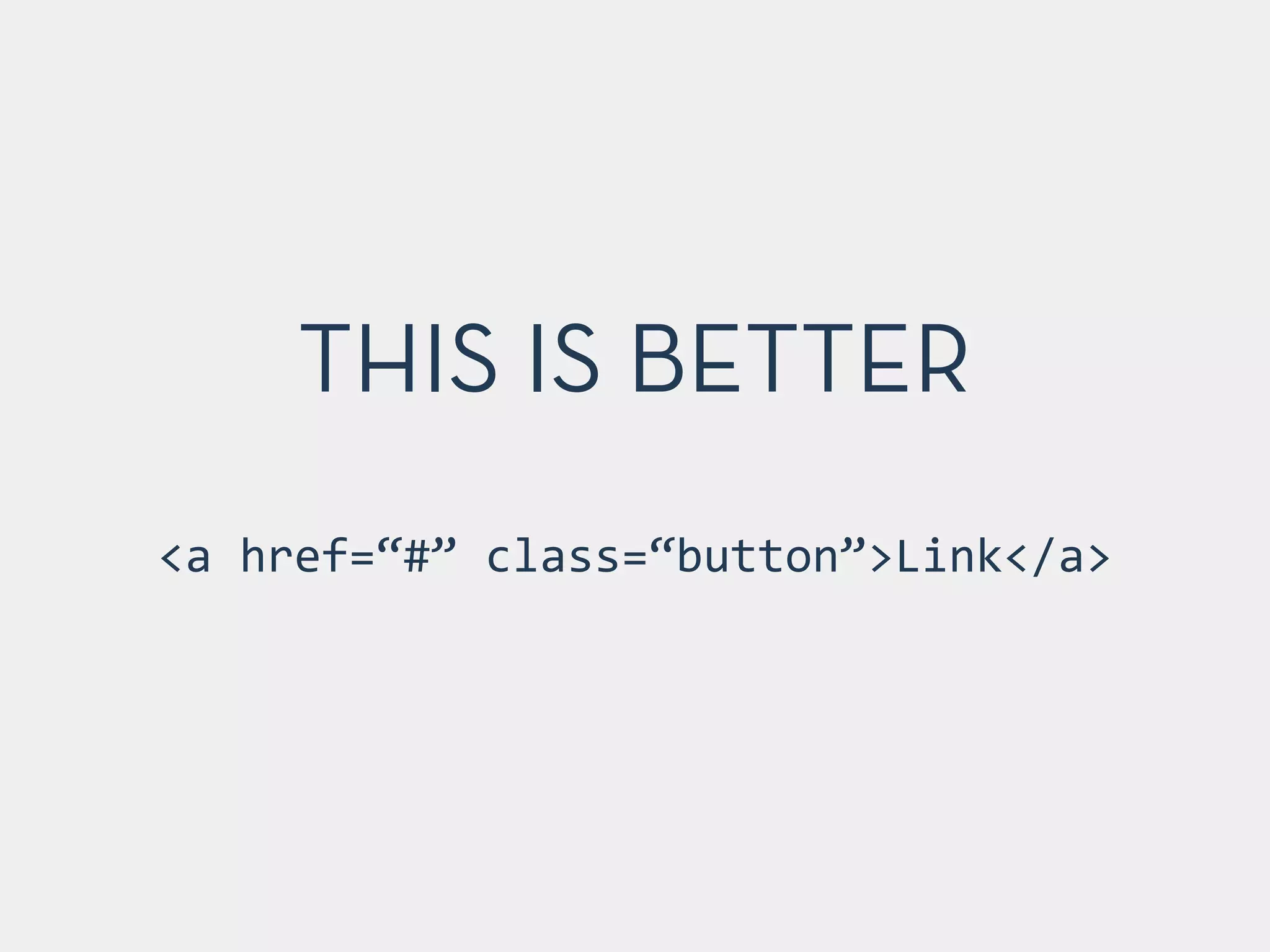

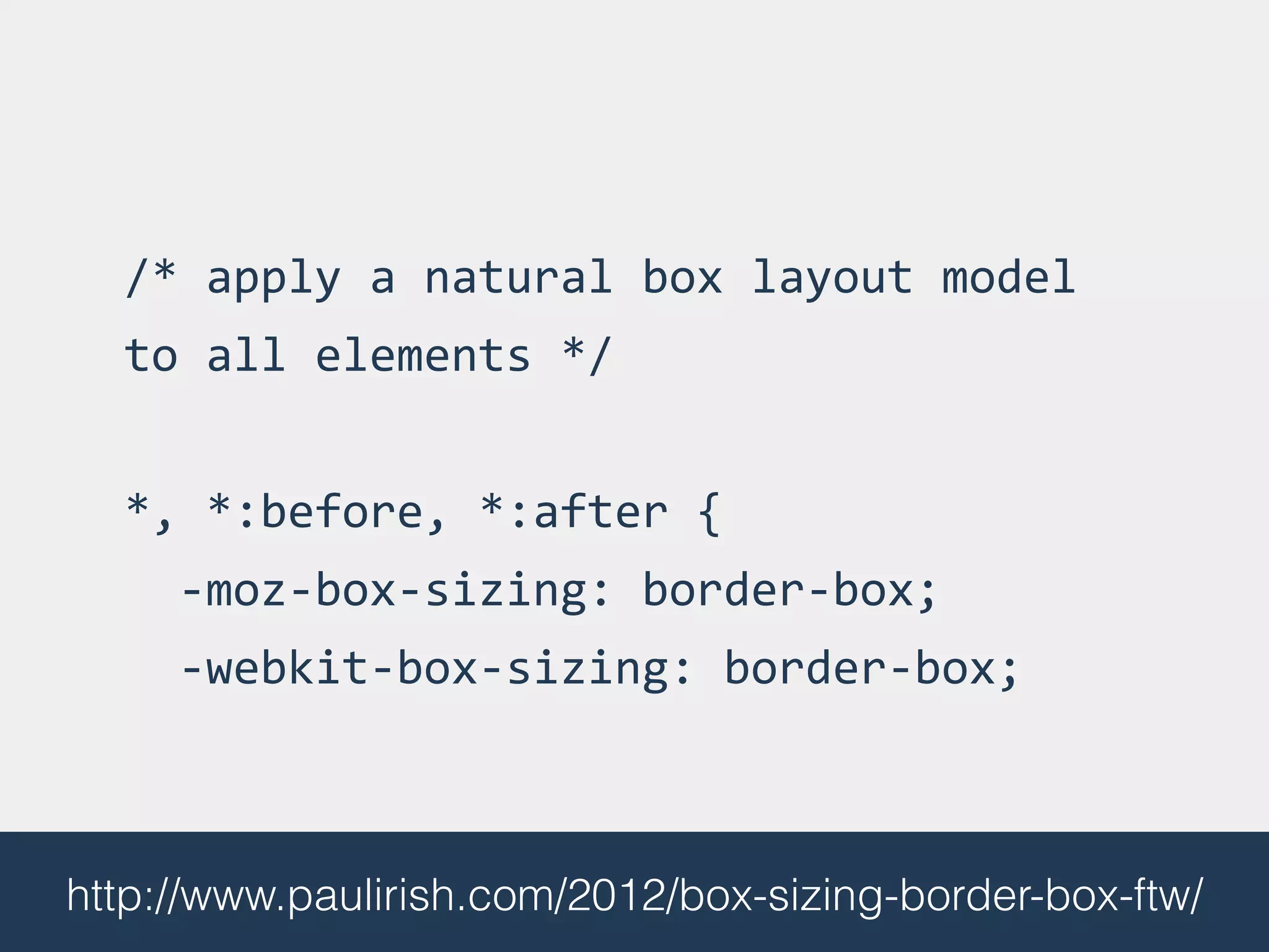
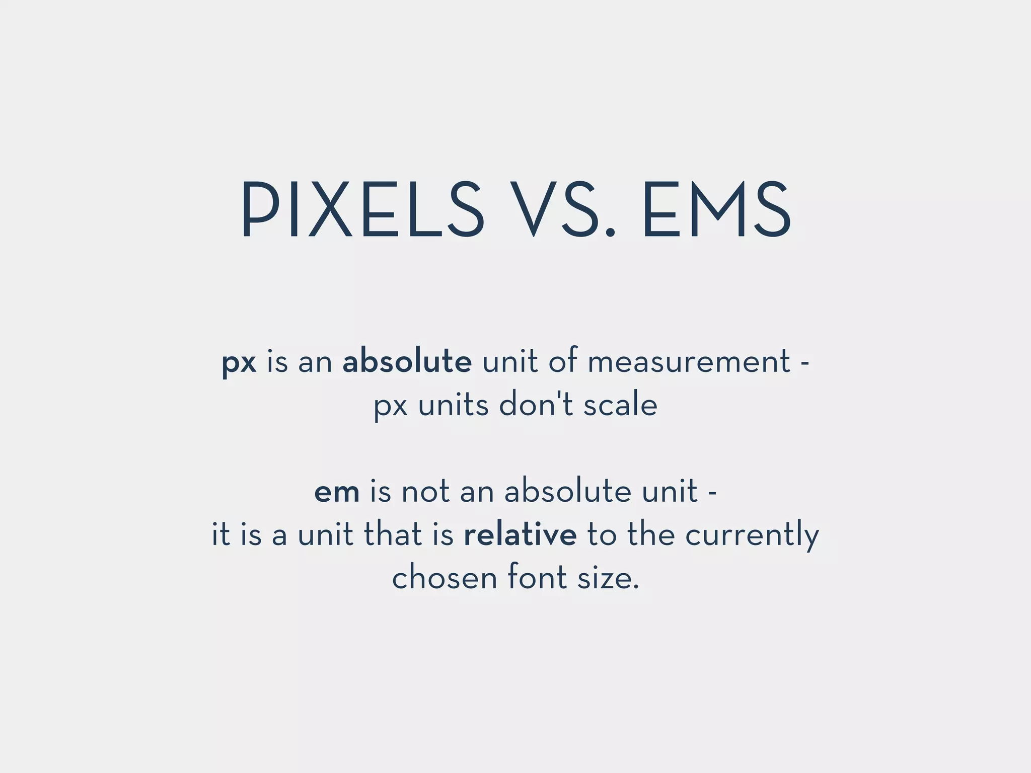
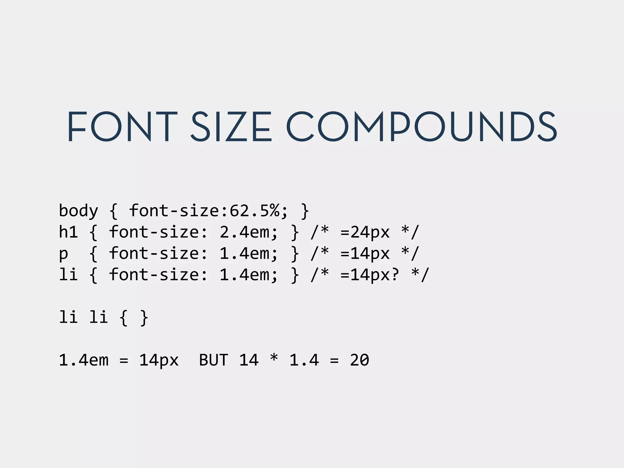


This document provides best practices, tips, and methodologies for front-end development, focusing on HTML, CSS, and JavaScript. Key topics include validation, reducing markup, naming conventions, and performance optimization, as well as tools like SMACSS, BEM, and CSS preprocessors. The presentation emphasizes the importance of image optimization, responsive design, and properly managing CSS and JavaScript for improved web performance.


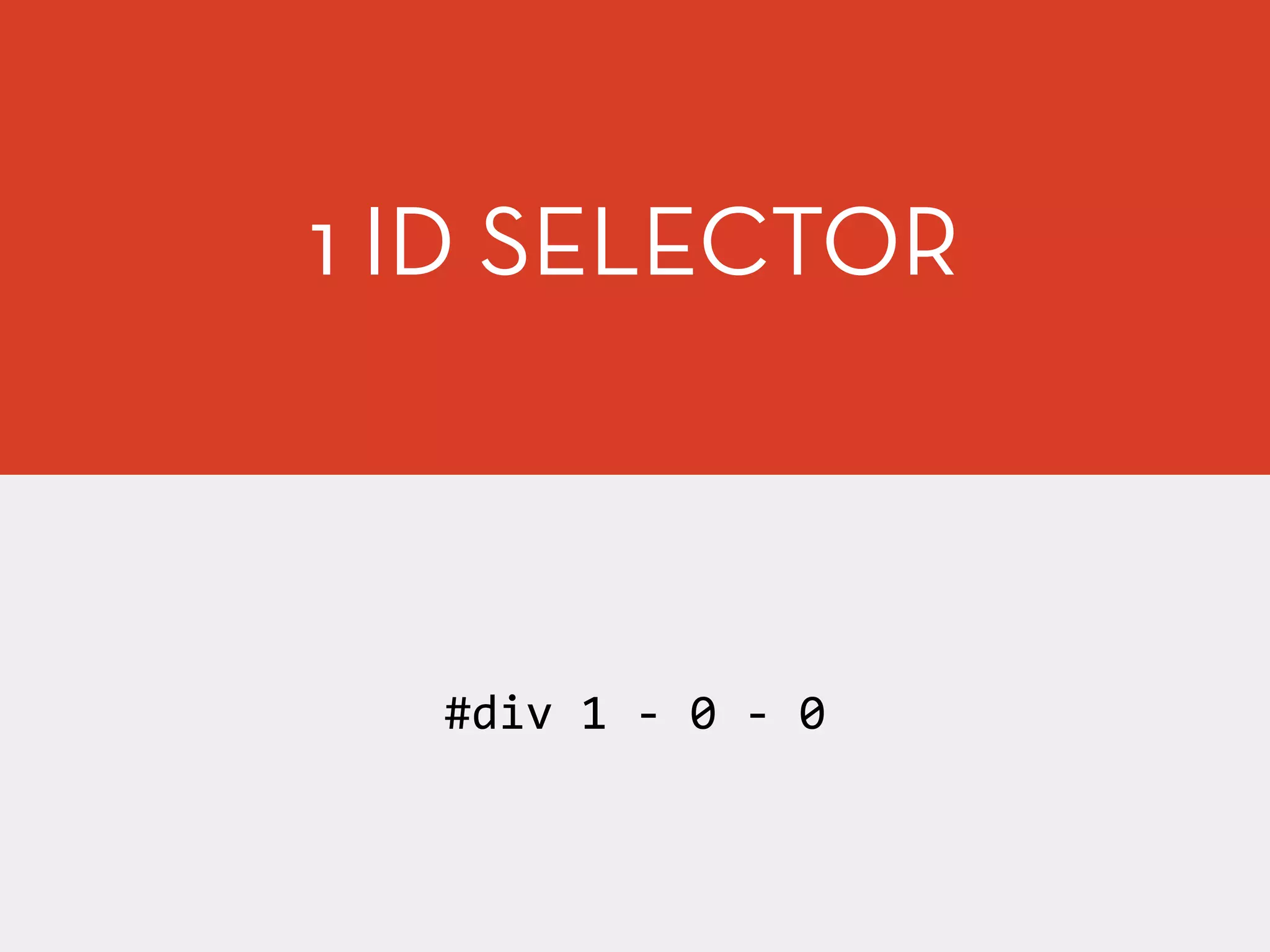
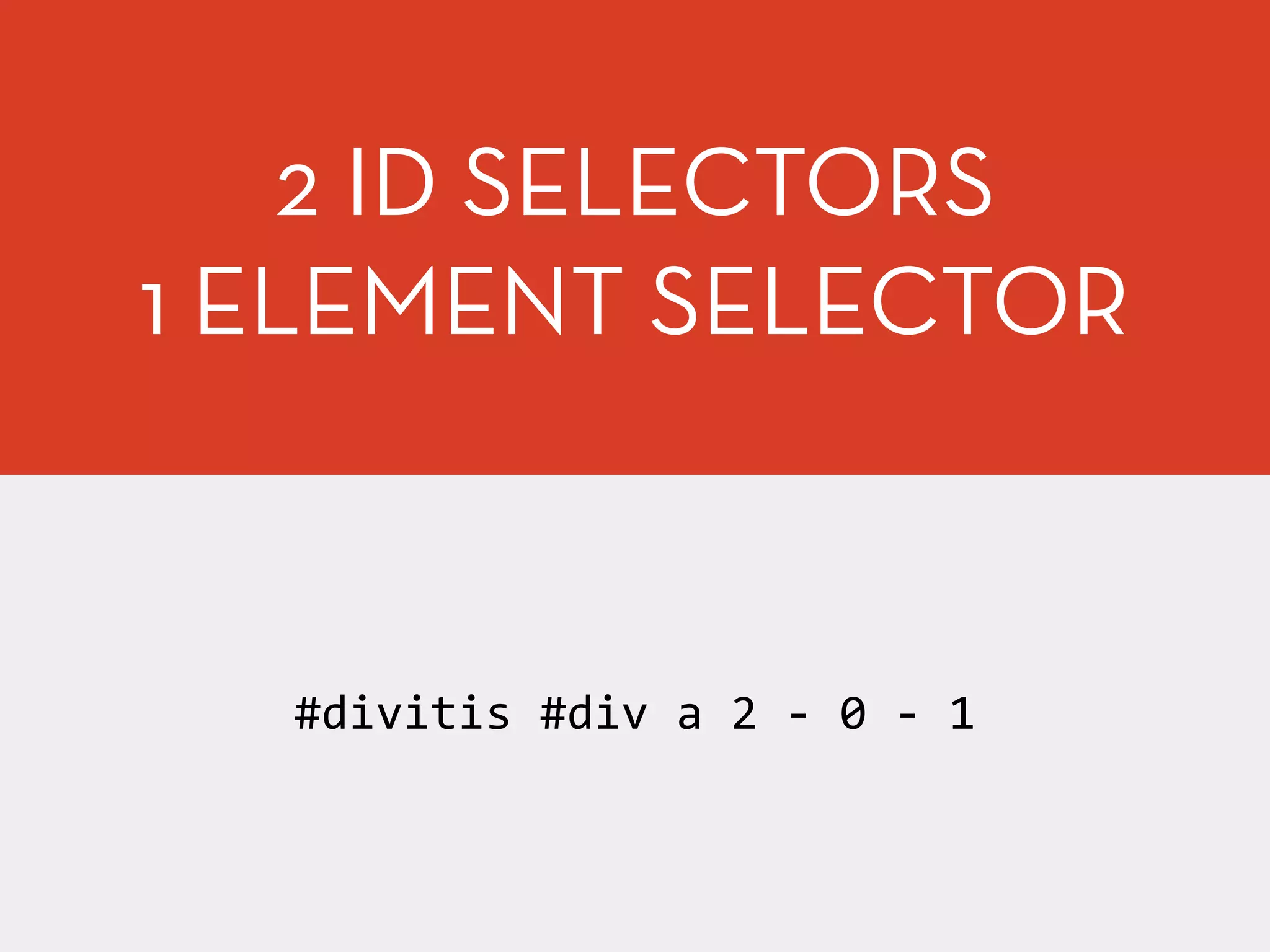
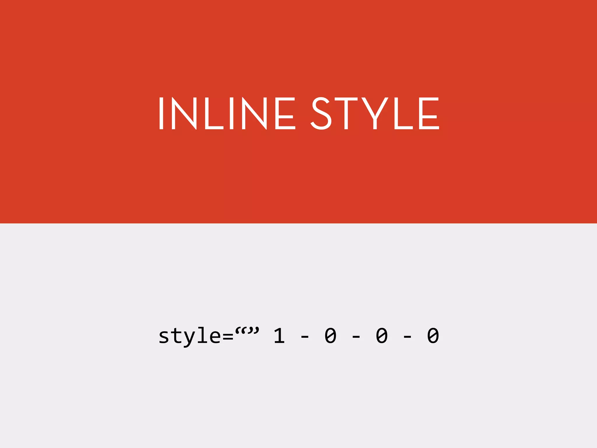
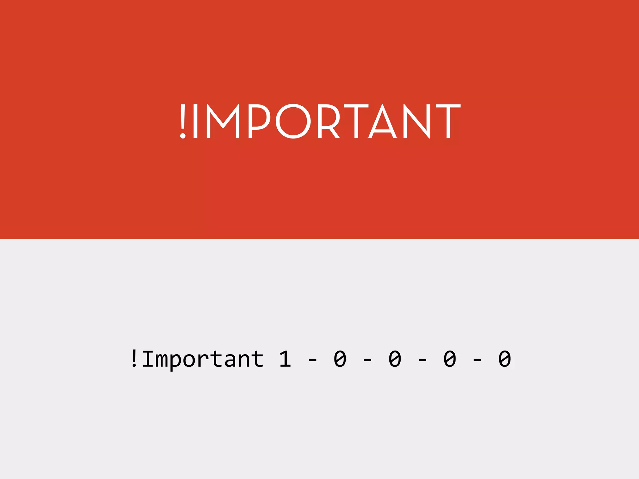
![[Basic HTML/CSS] 5. css - selector, units](https://cdn.slidesharecdn.com/ss_thumbnails/5-170304052513-thumbnail.jpg?width=600ounds&width=560&fit=bounds)


