Download as PDF, PPTX


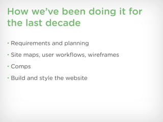
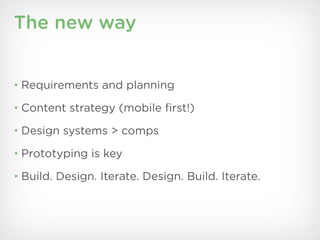


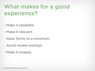
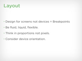


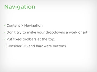


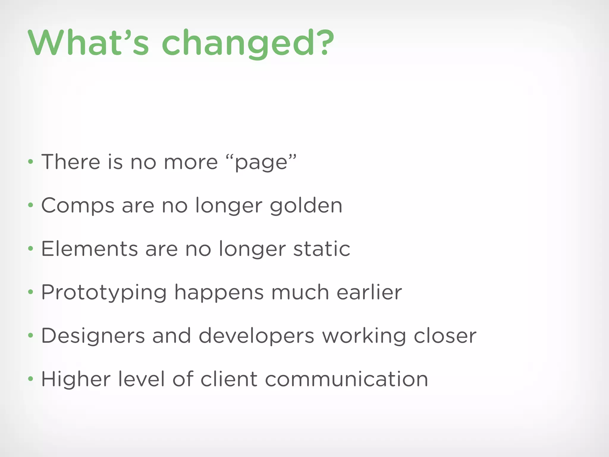

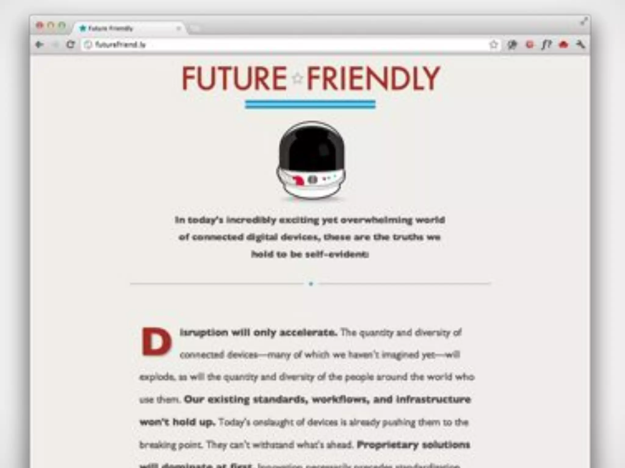
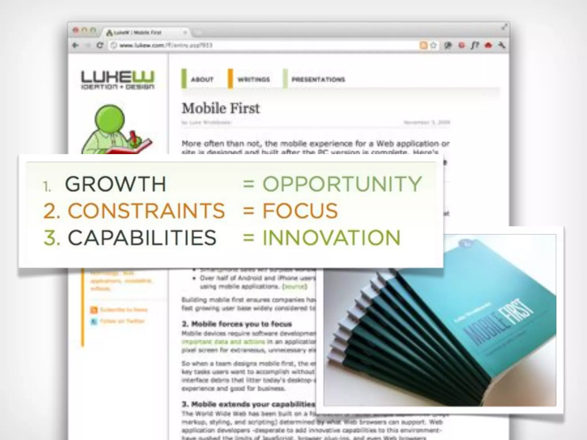
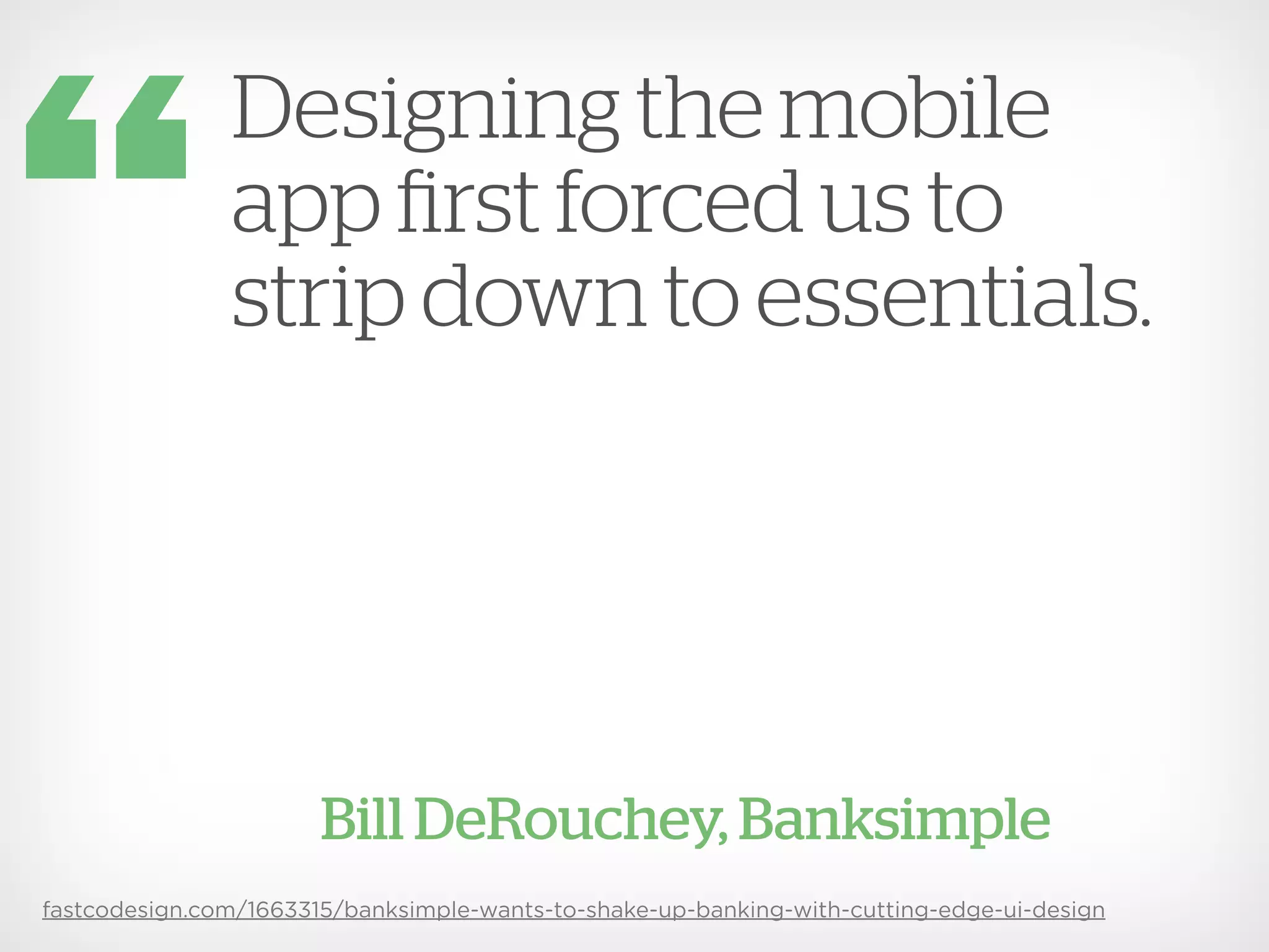


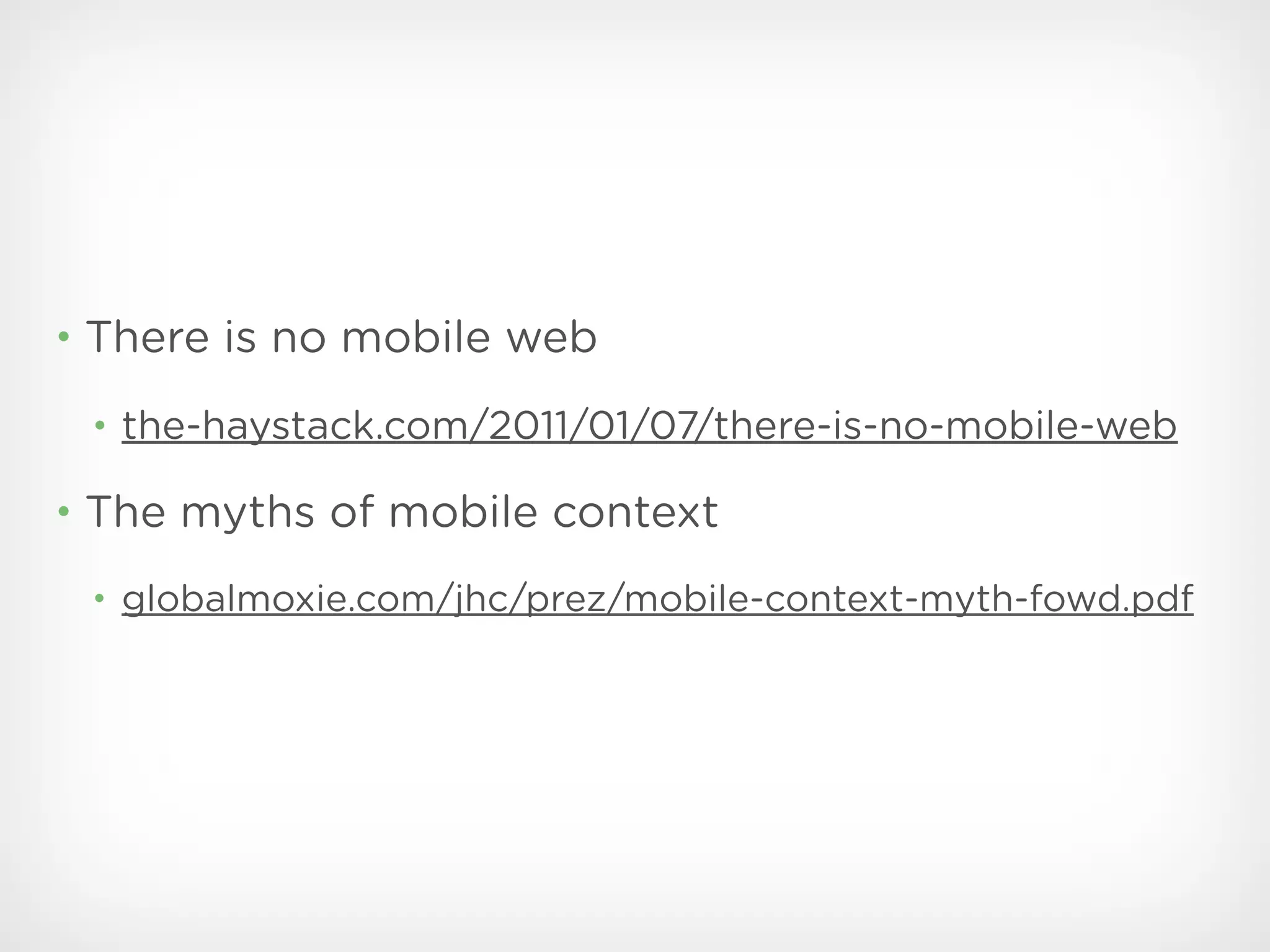
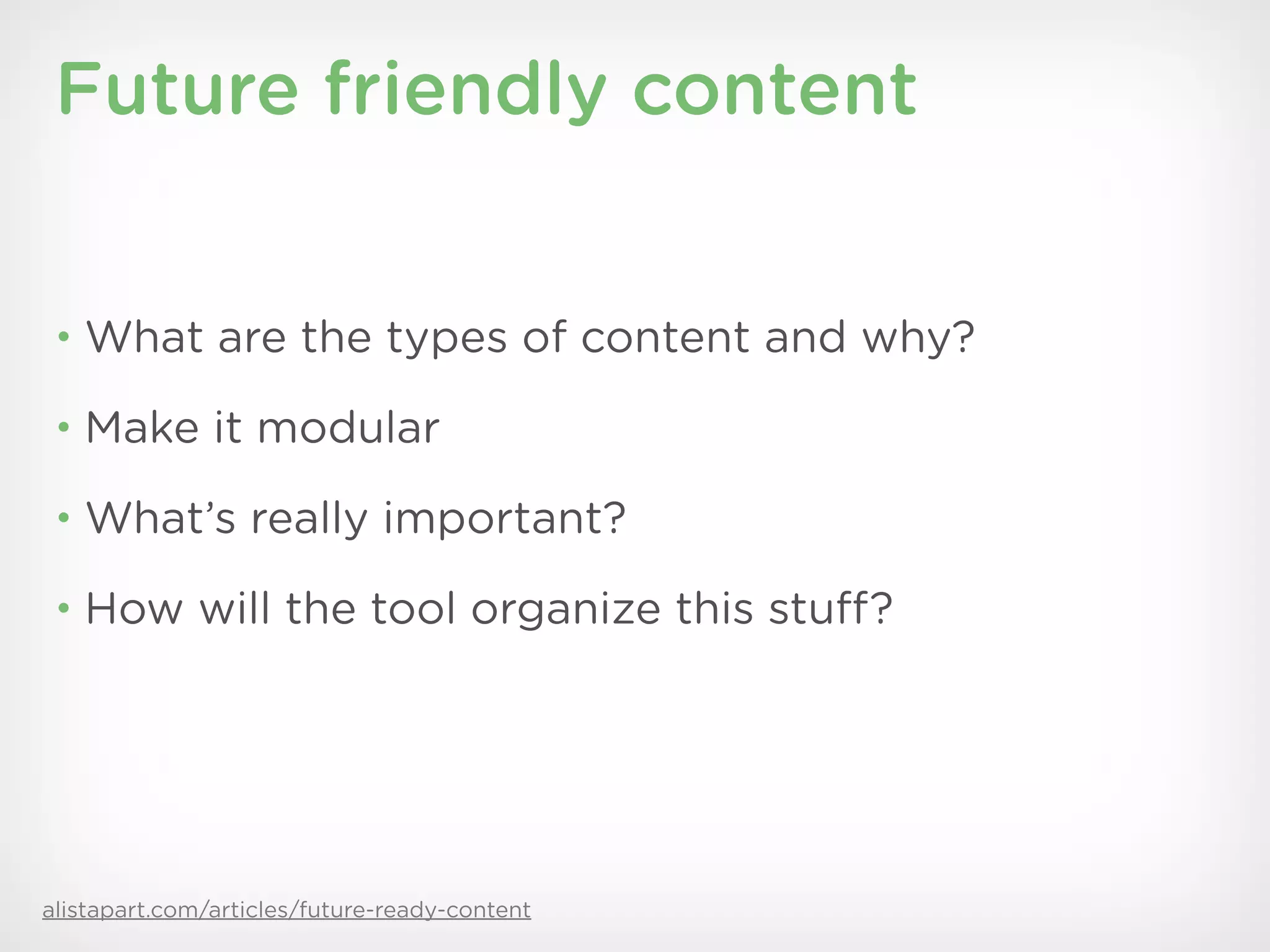


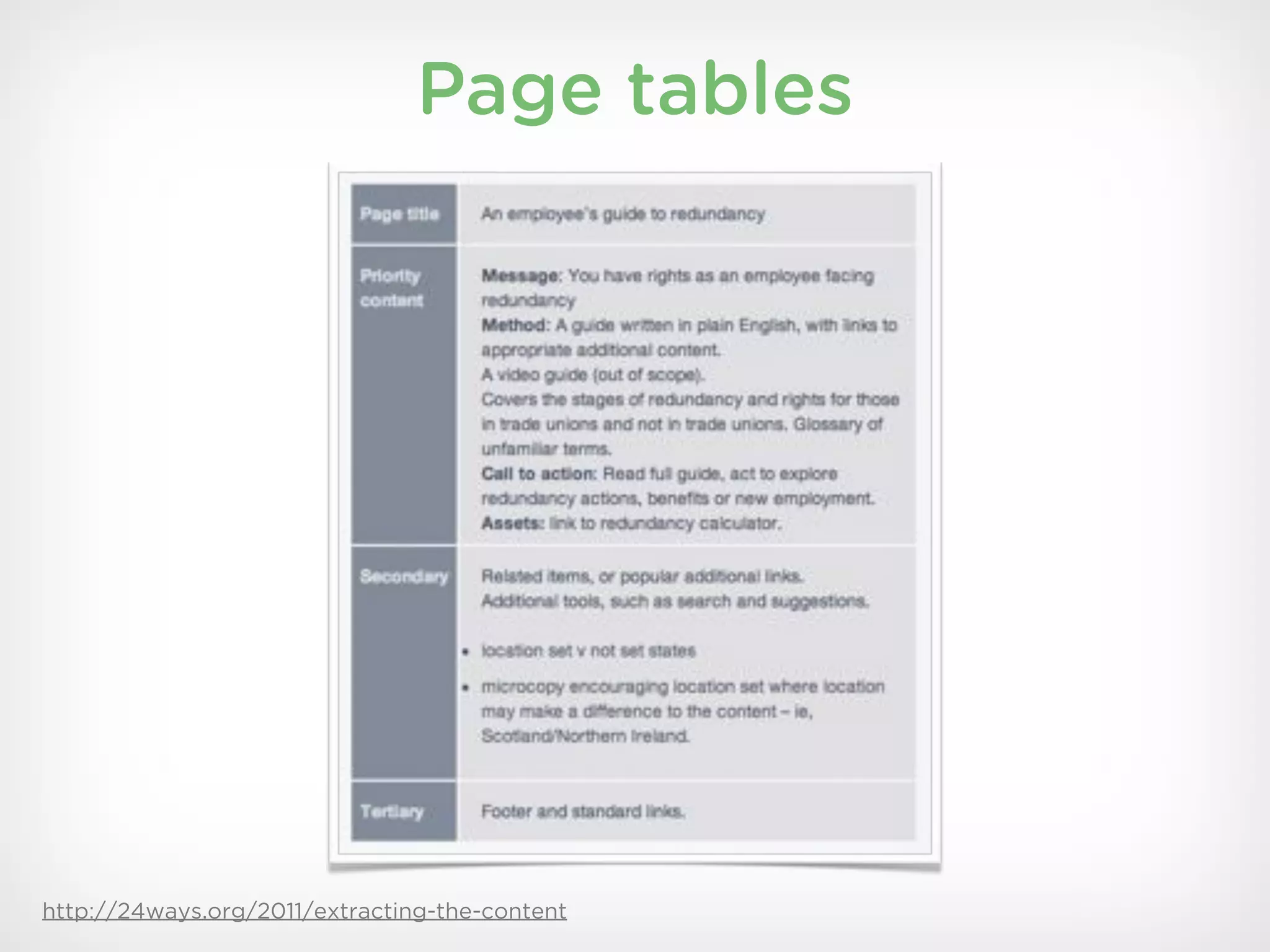


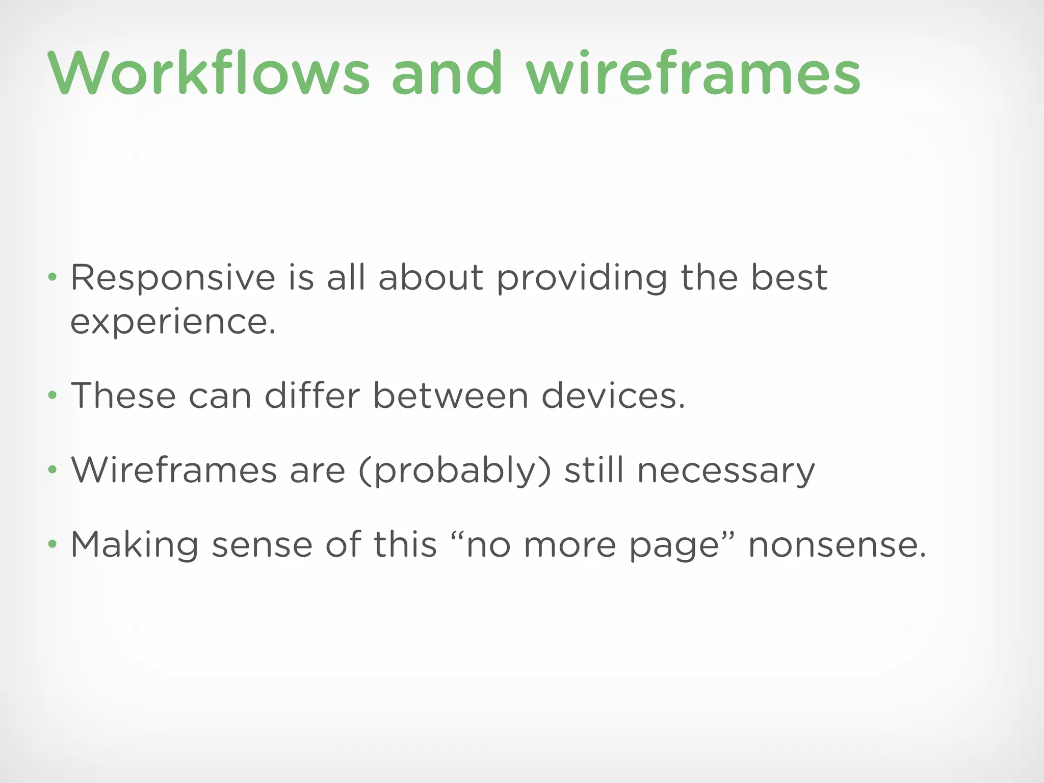
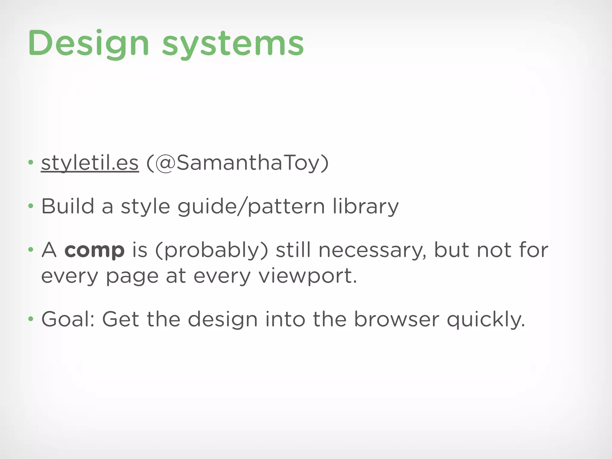
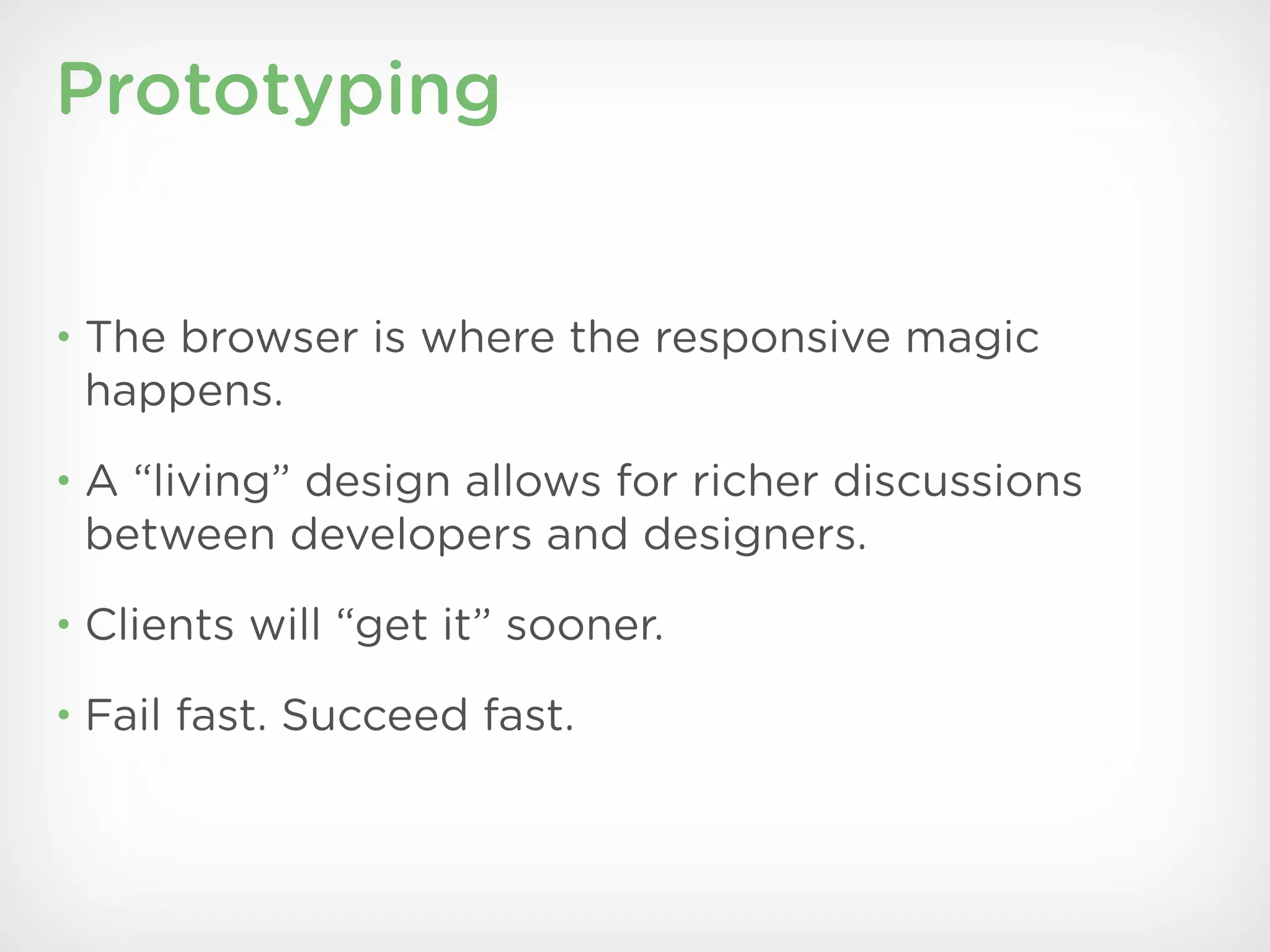

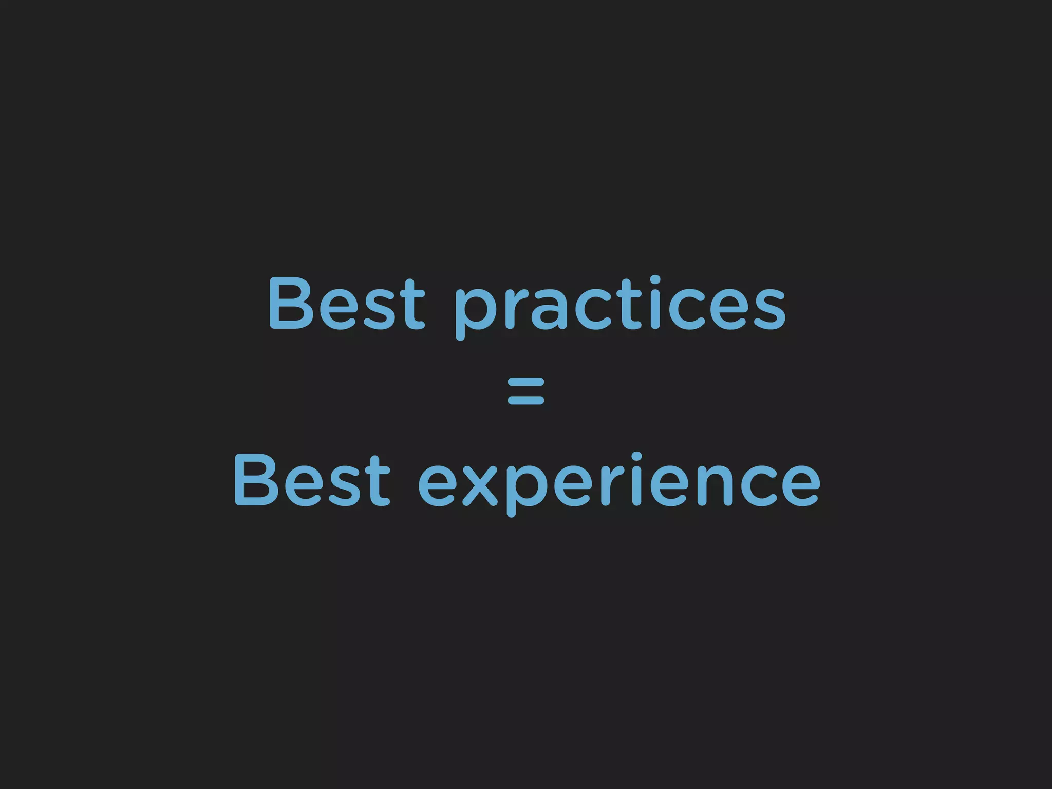
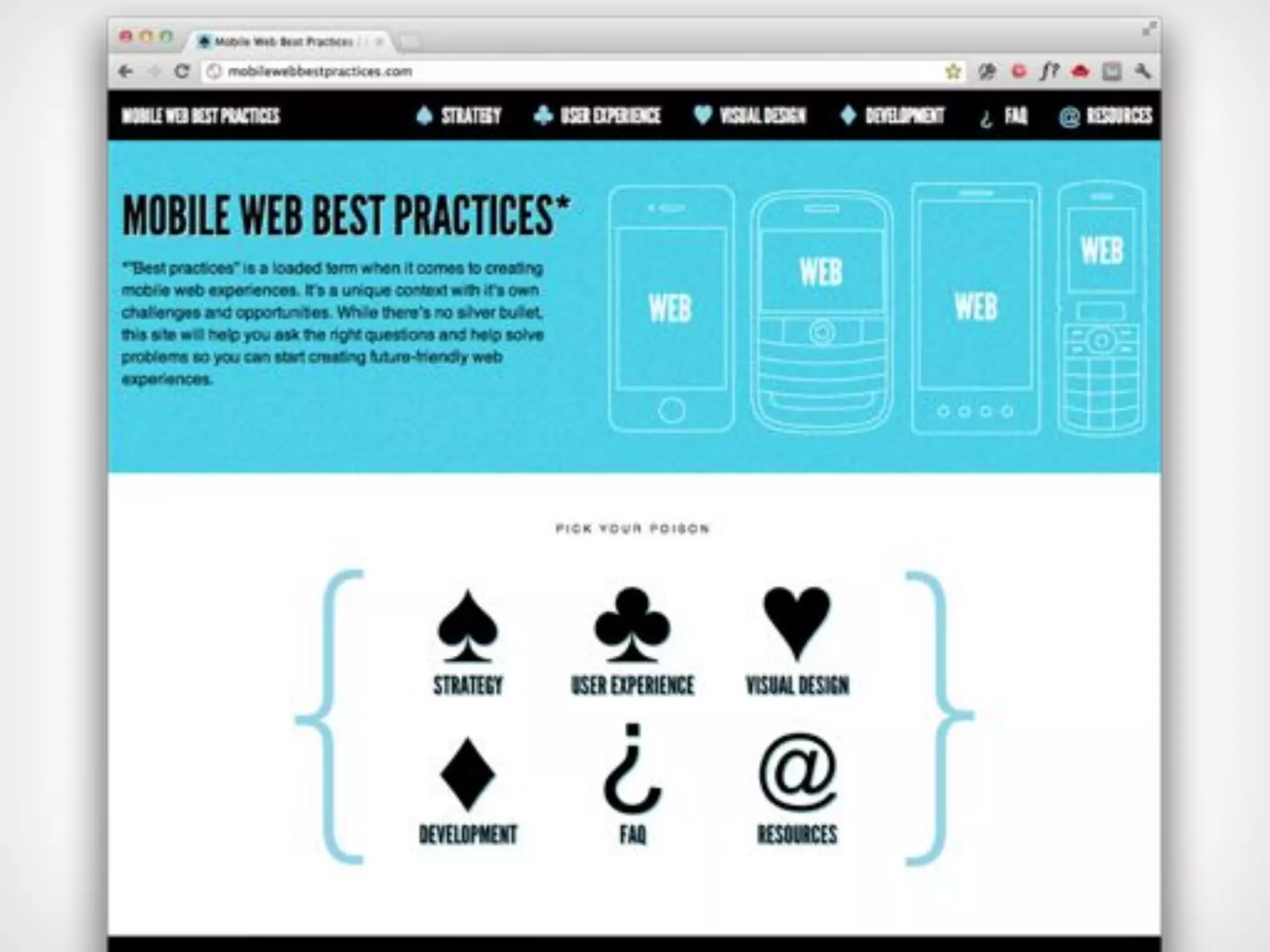
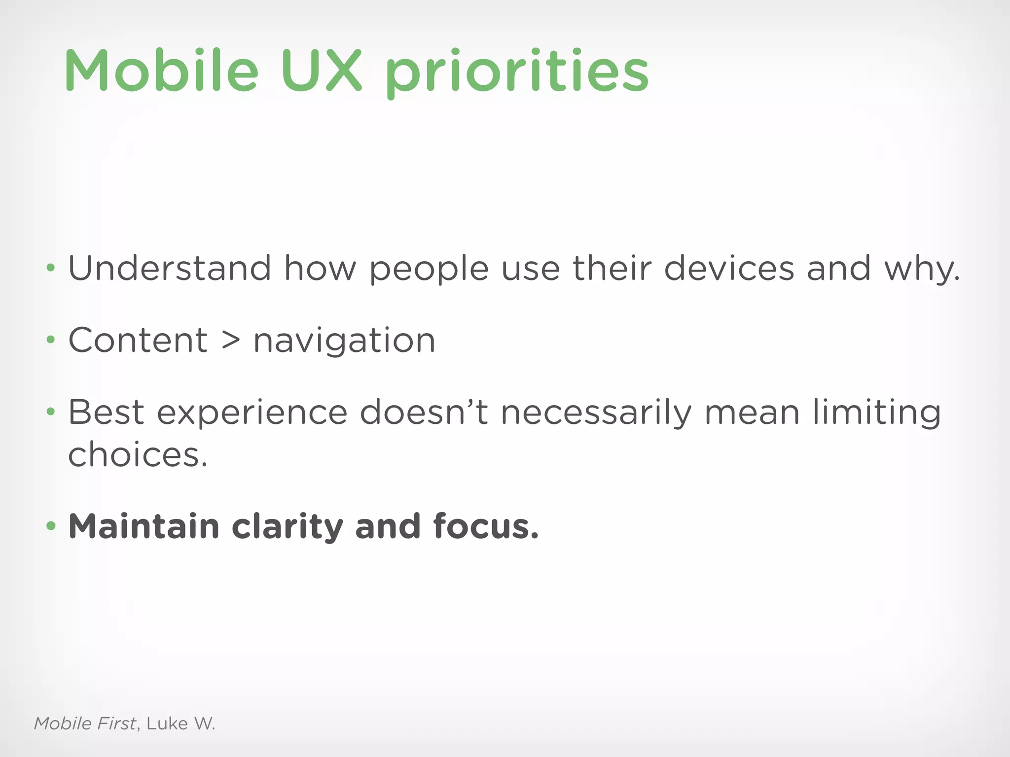
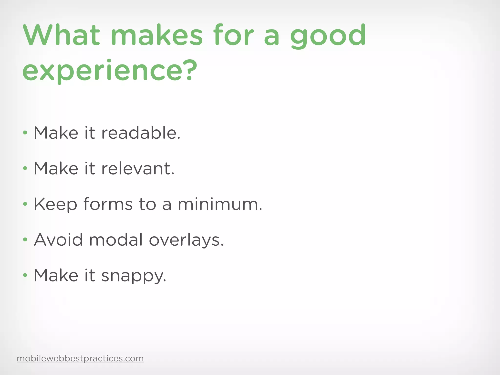
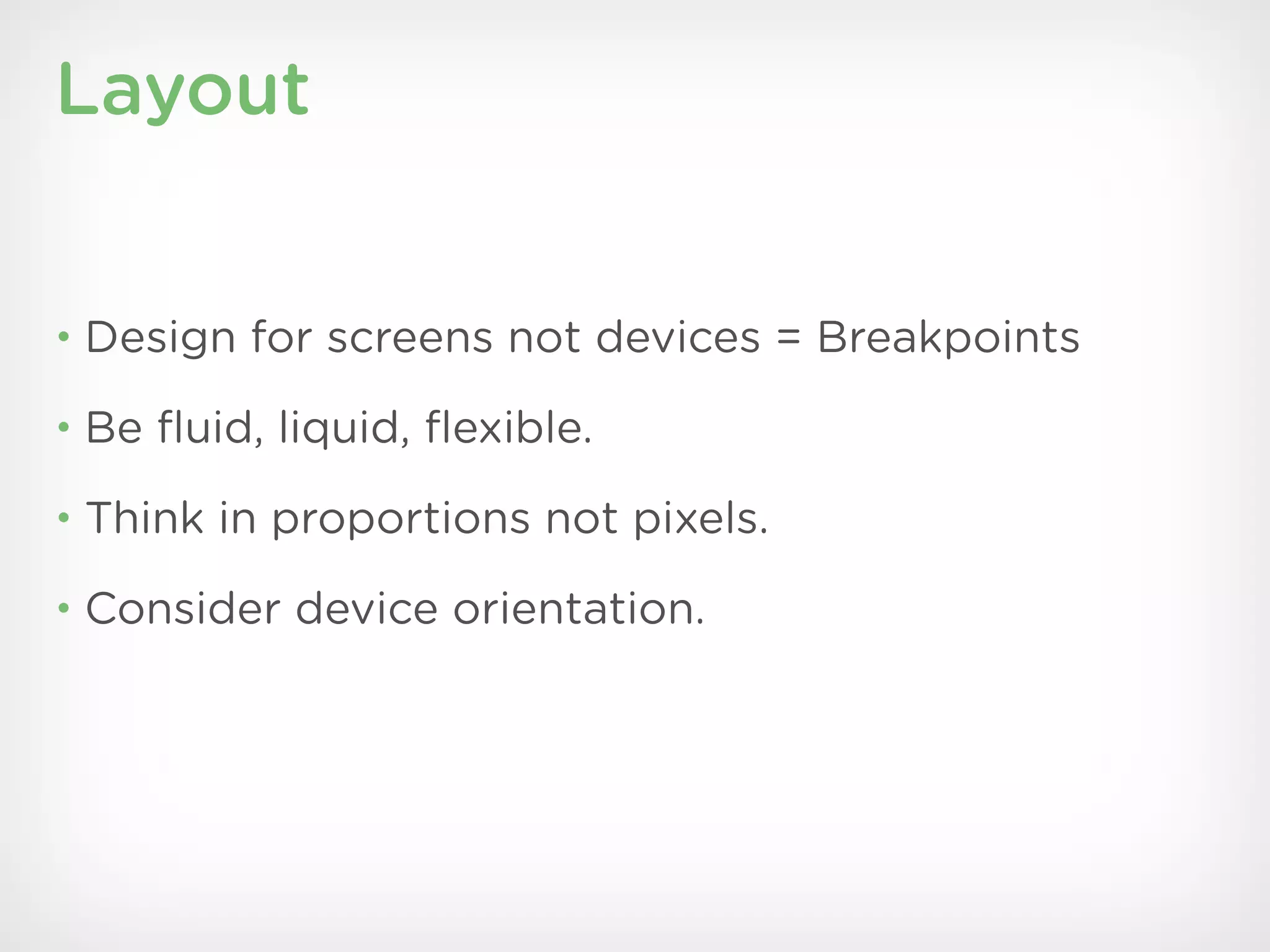


The document discusses a new approach to UX design focused on responsive websites, emphasizing a mobile-first strategy and content-driven design. Key processes include prototyping early, using design systems, and fostering collaboration between designers and developers to create optimal user experiences across various devices. The presentation also highlights best practices for mobile UX, responsive layouts, and testing strategies to ensure usability and clarity.


![[Srijan Wednesday Webinars] Drupal 8: Goodbye to 10 Years of Theming Headaches](https://cdn.slidesharecdn.com/ss_thumbnails/drupal8-theming-webinar-150806150902-lva1-app6892-thumbnail.jpg?width=600ounds&width=560&fit=bounds)


![Responsive Design Studio [Mountain View 2013]](https://cdn.slidesharecdn.com/ss_thumbnails/responsivedesignstudiomountainview-131018101452-phpapp01-thumbnail.jpg?width=600ounds&width=560&fit=bounds)


