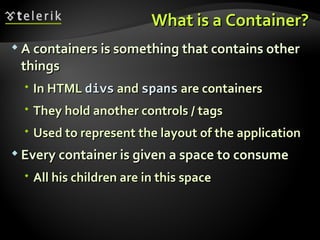
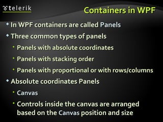
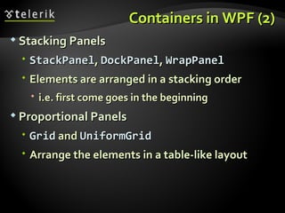
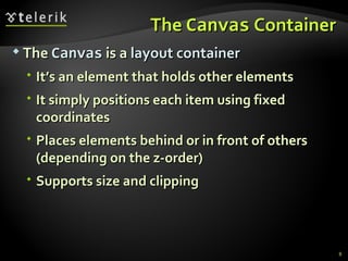
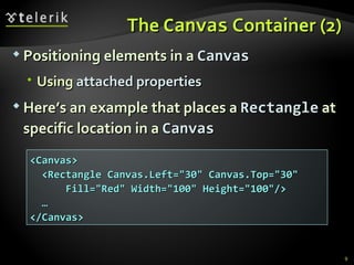
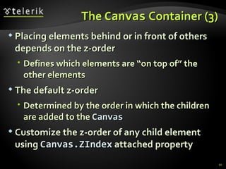
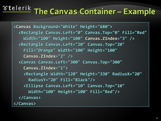
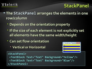
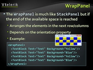
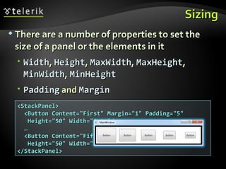
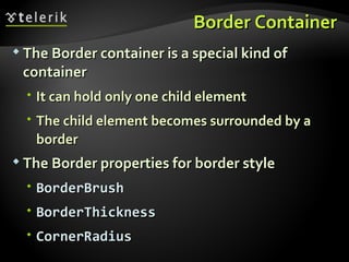
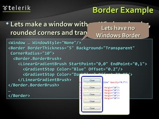
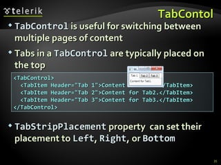
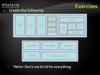
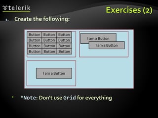
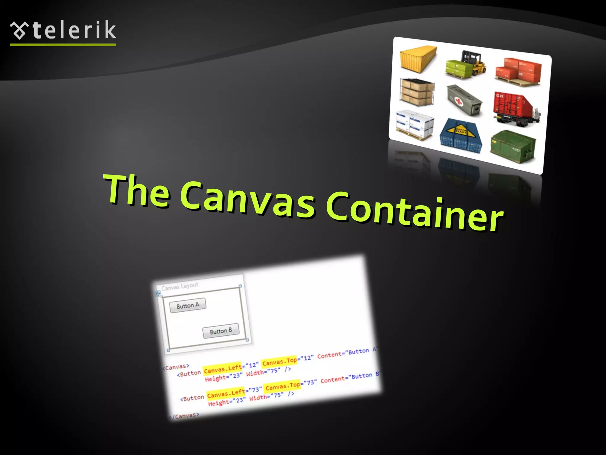
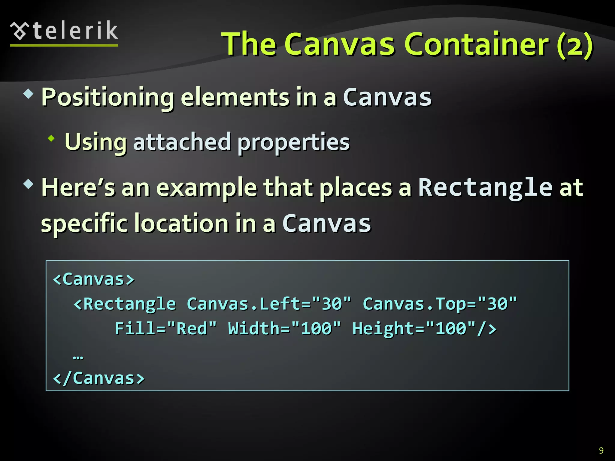
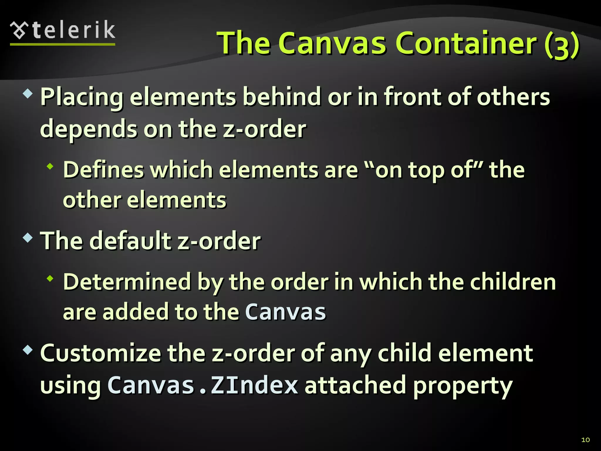
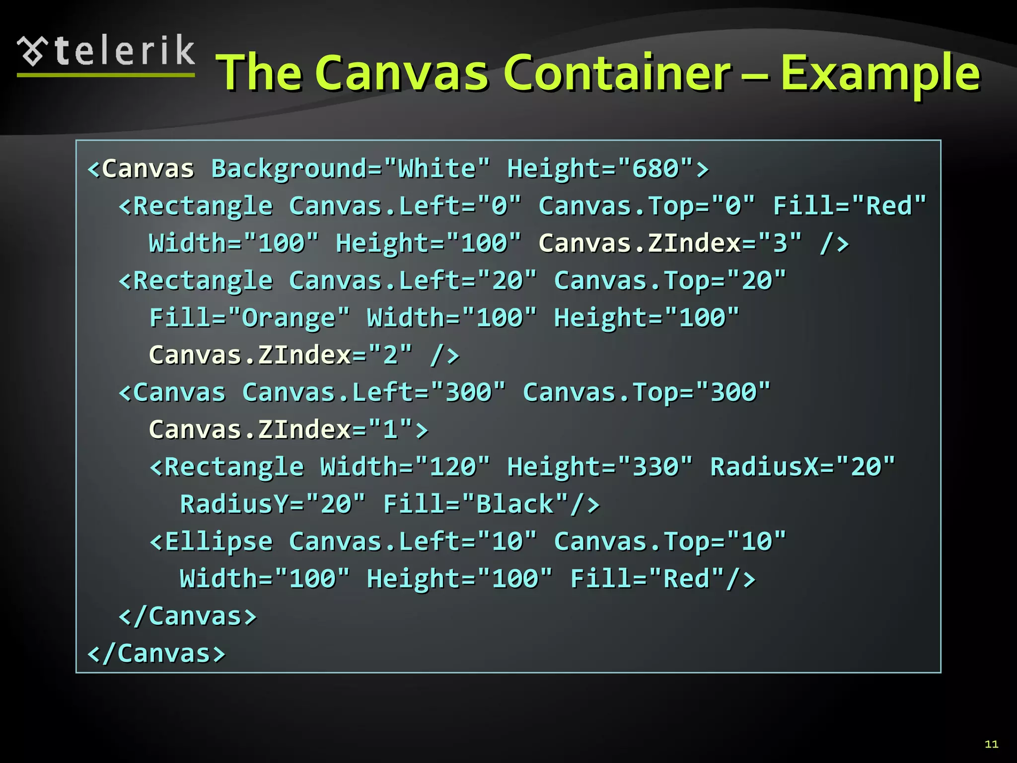
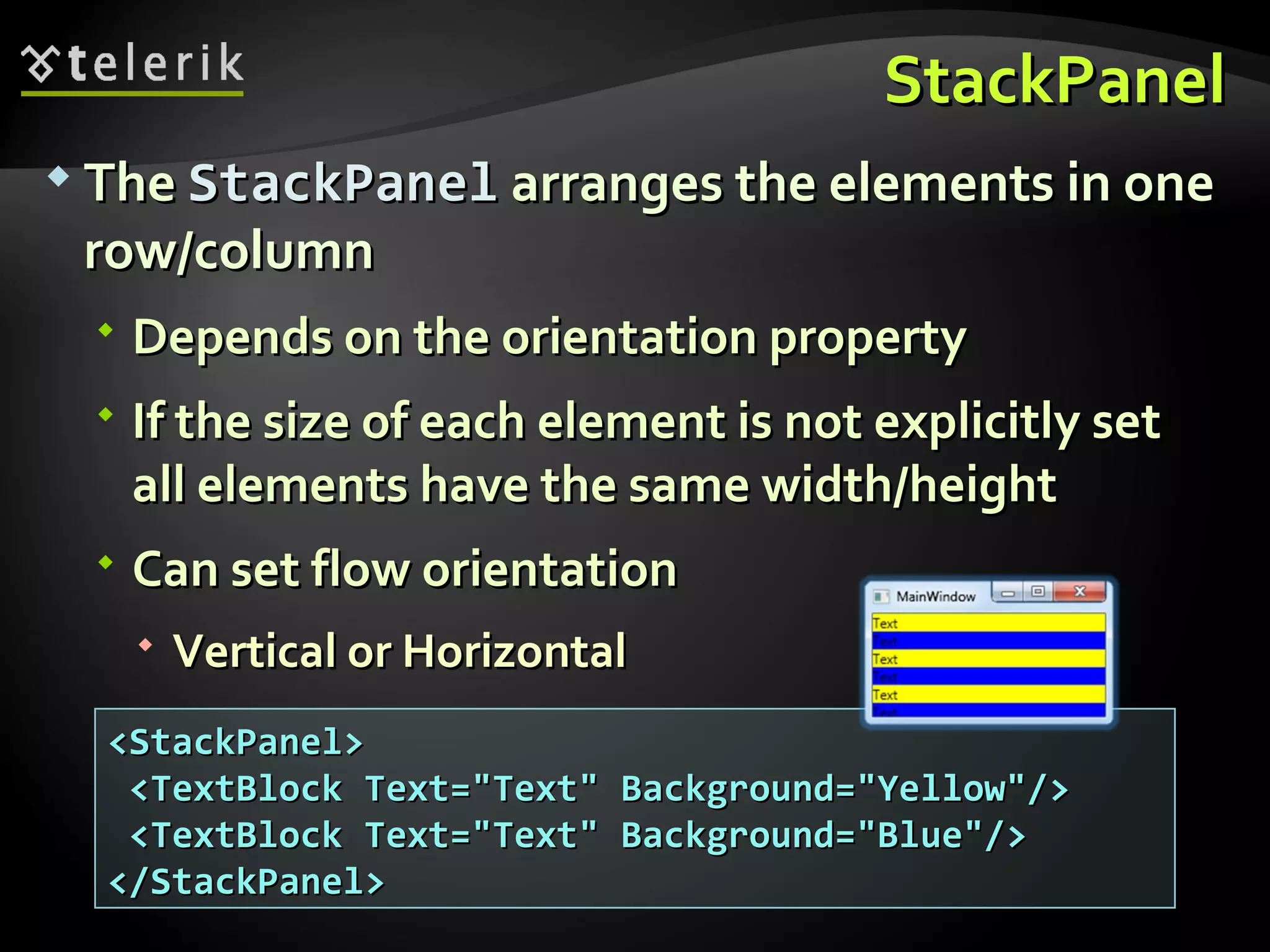
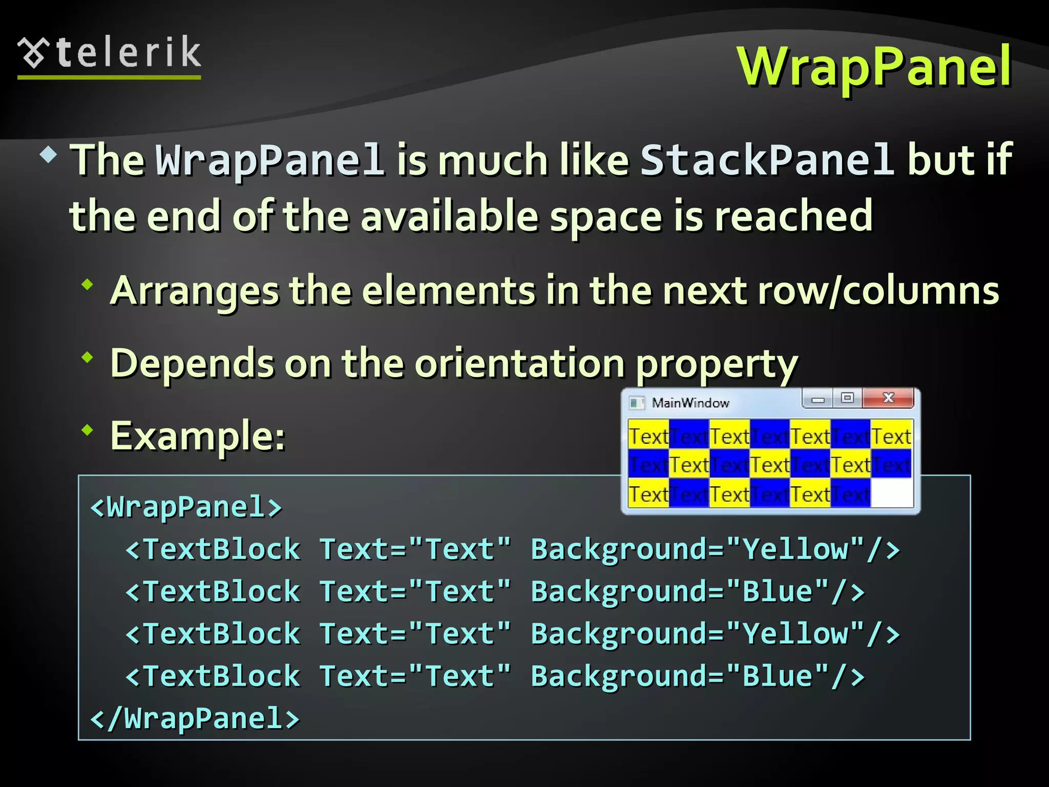
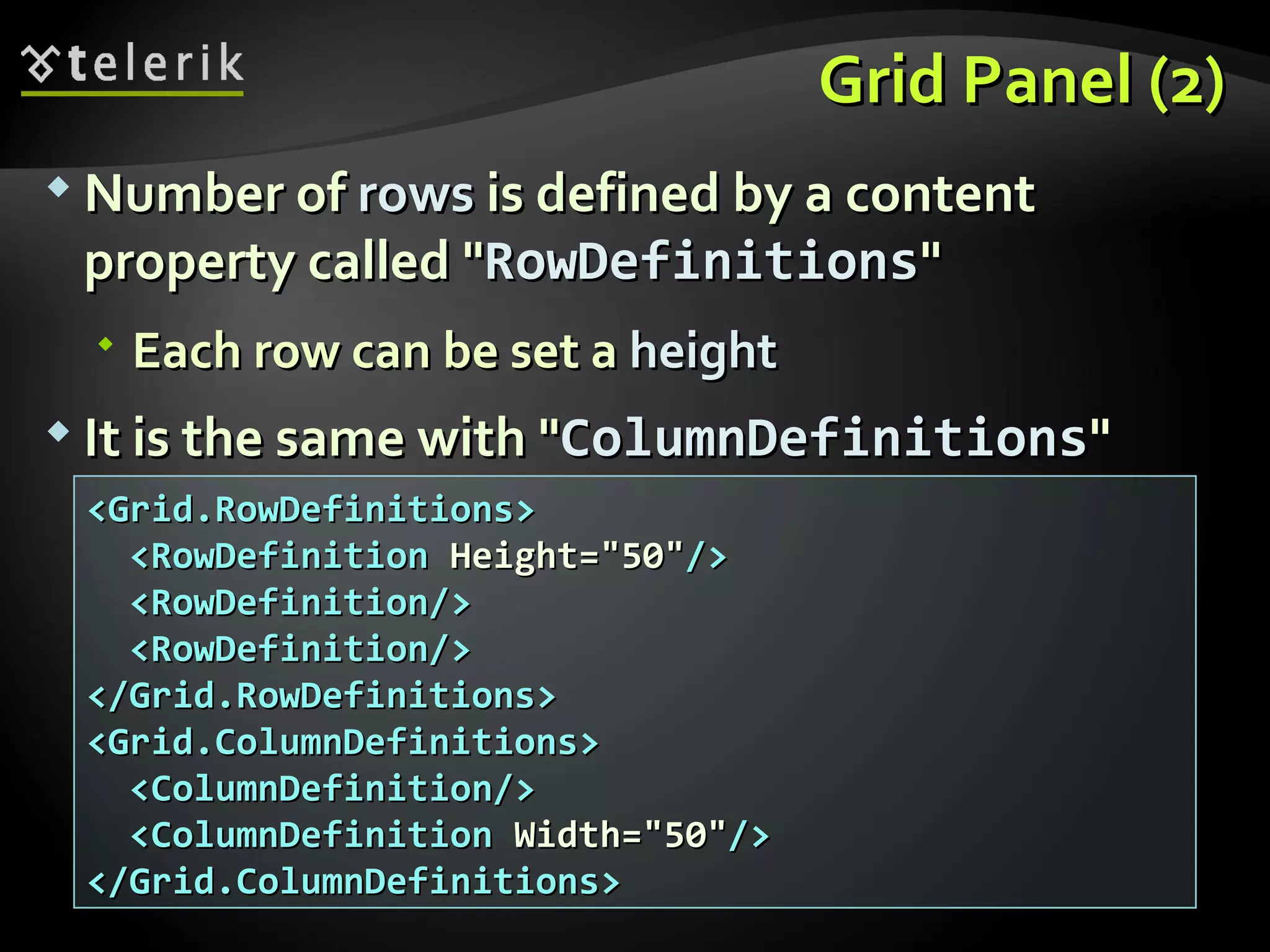
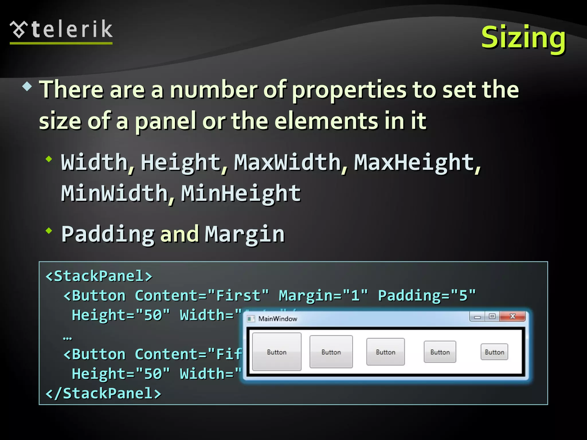
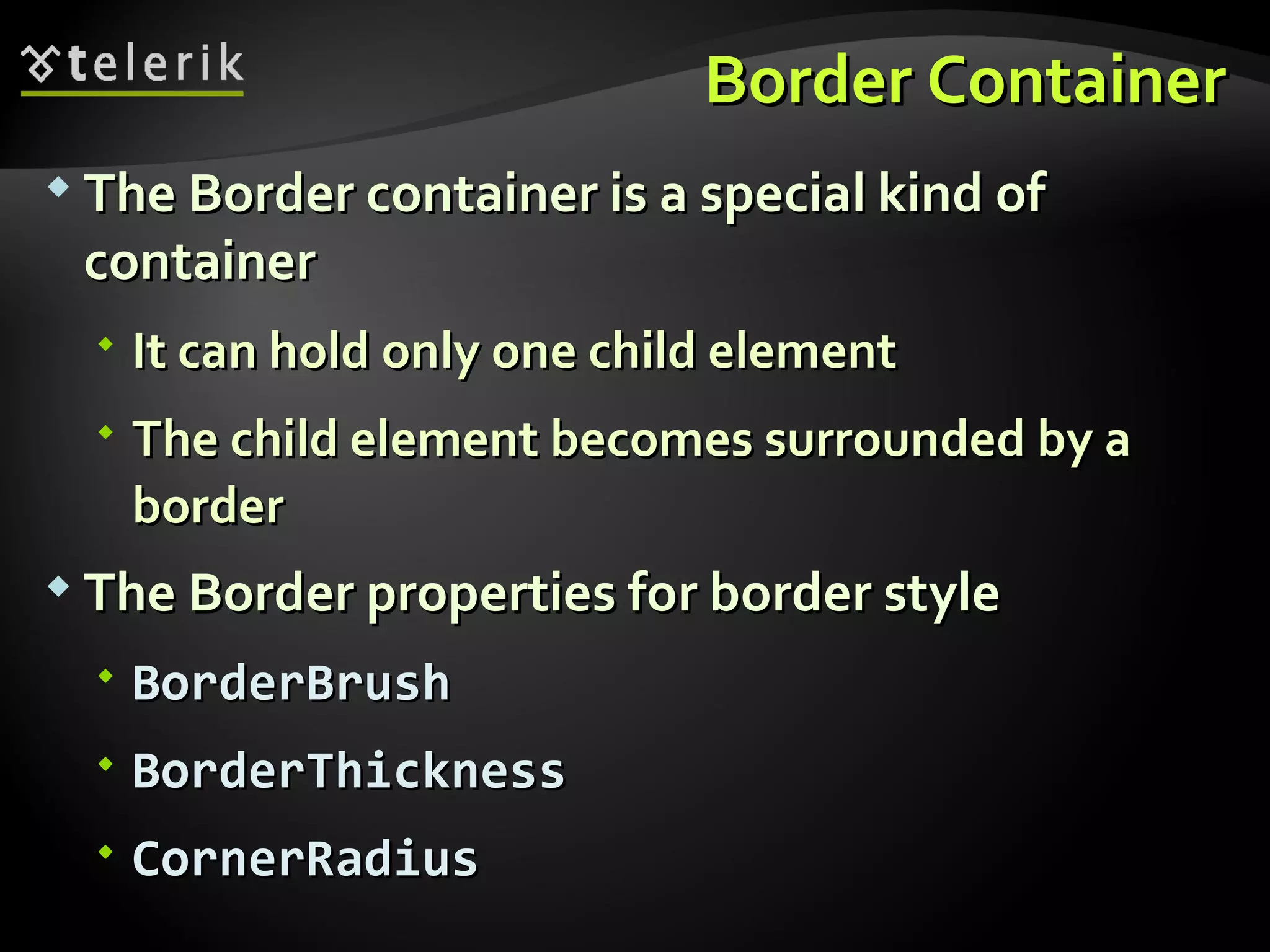
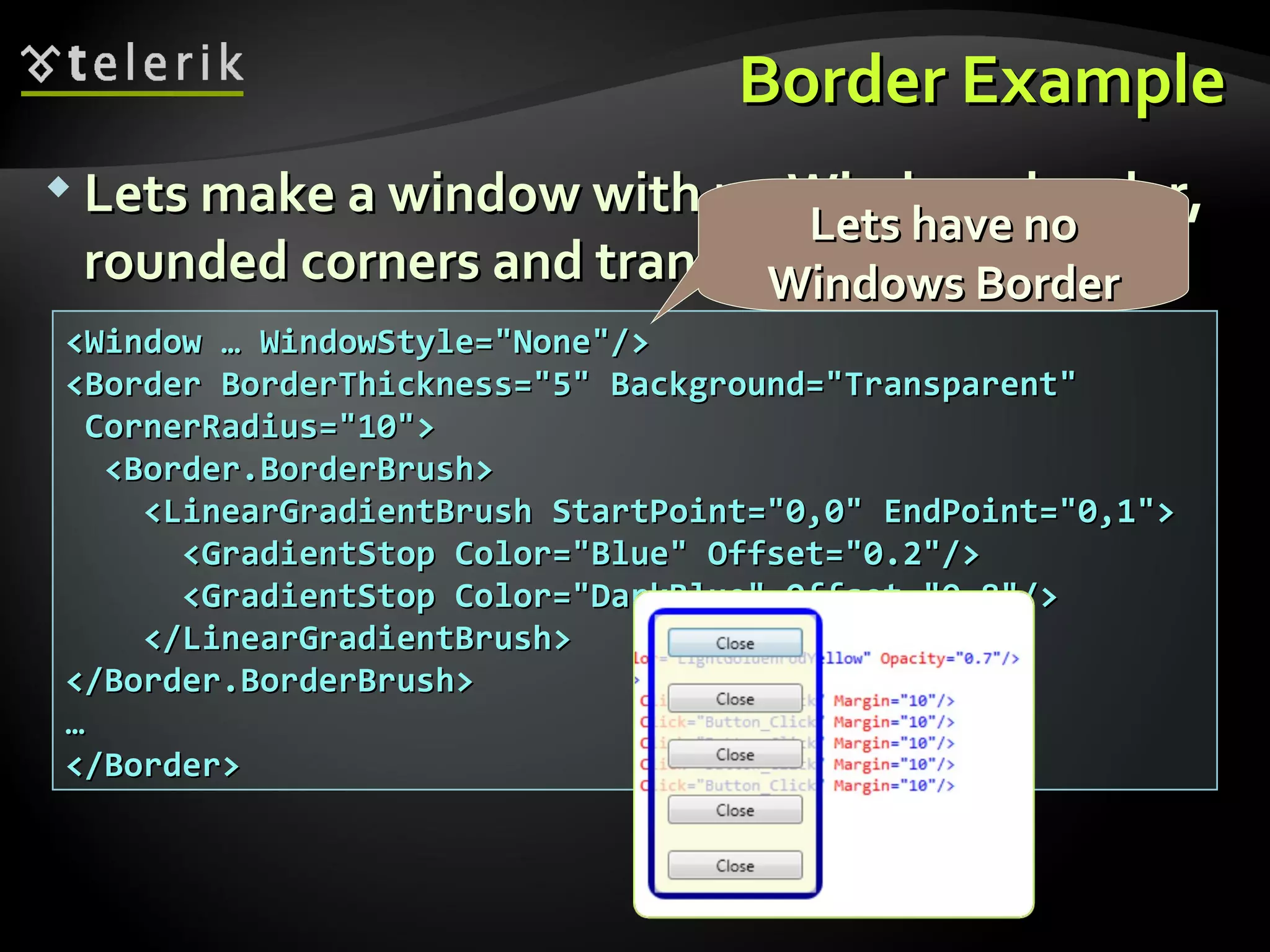
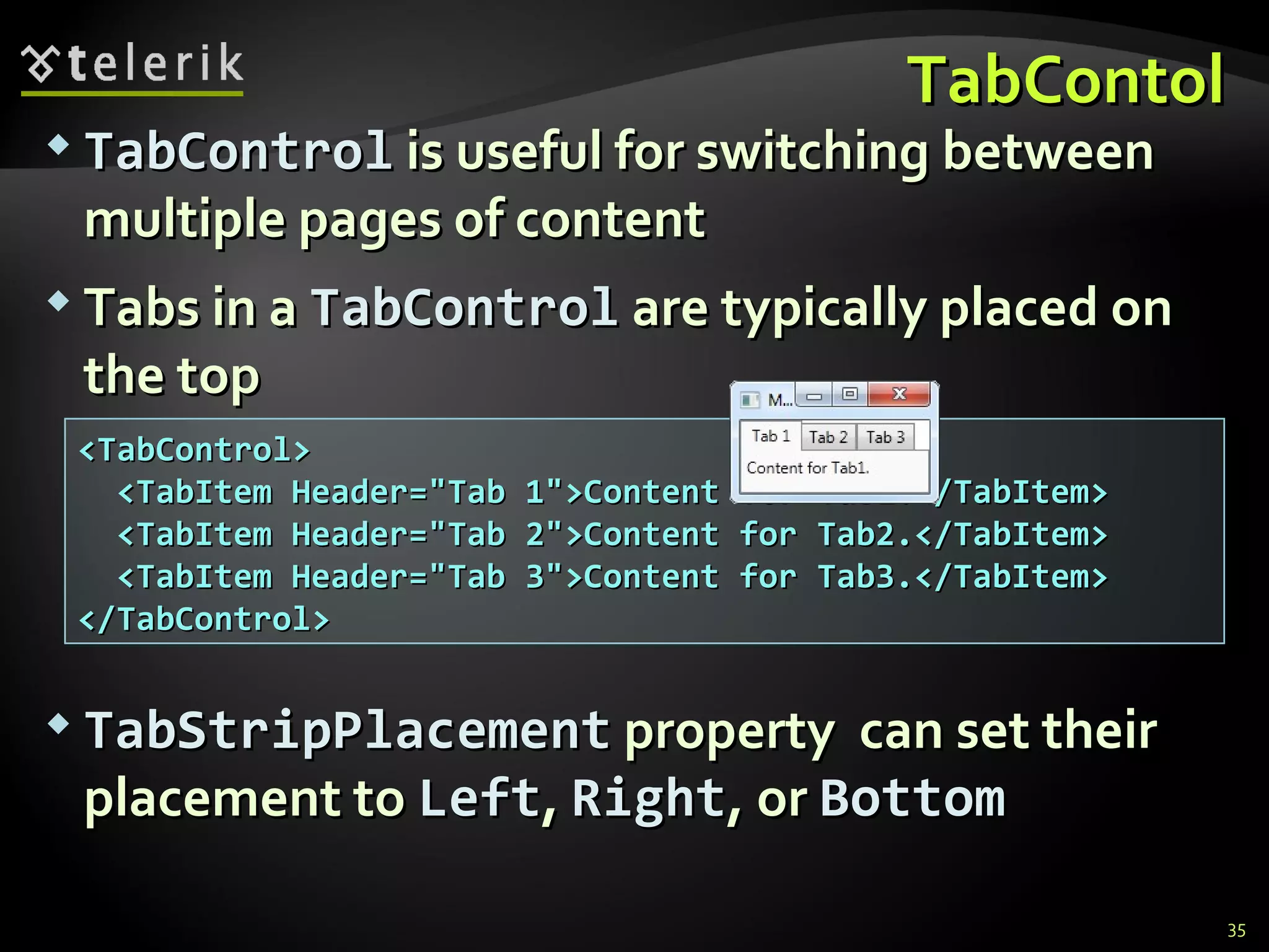
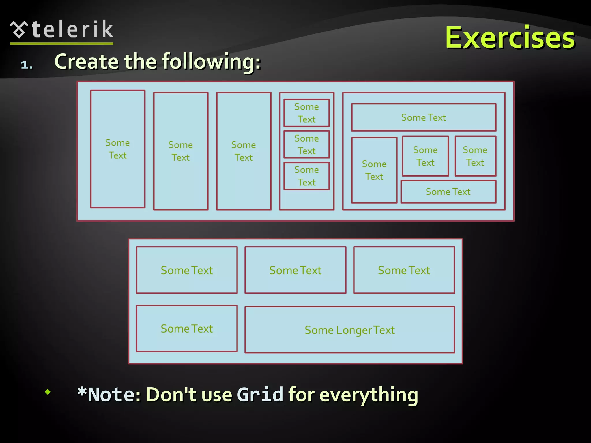
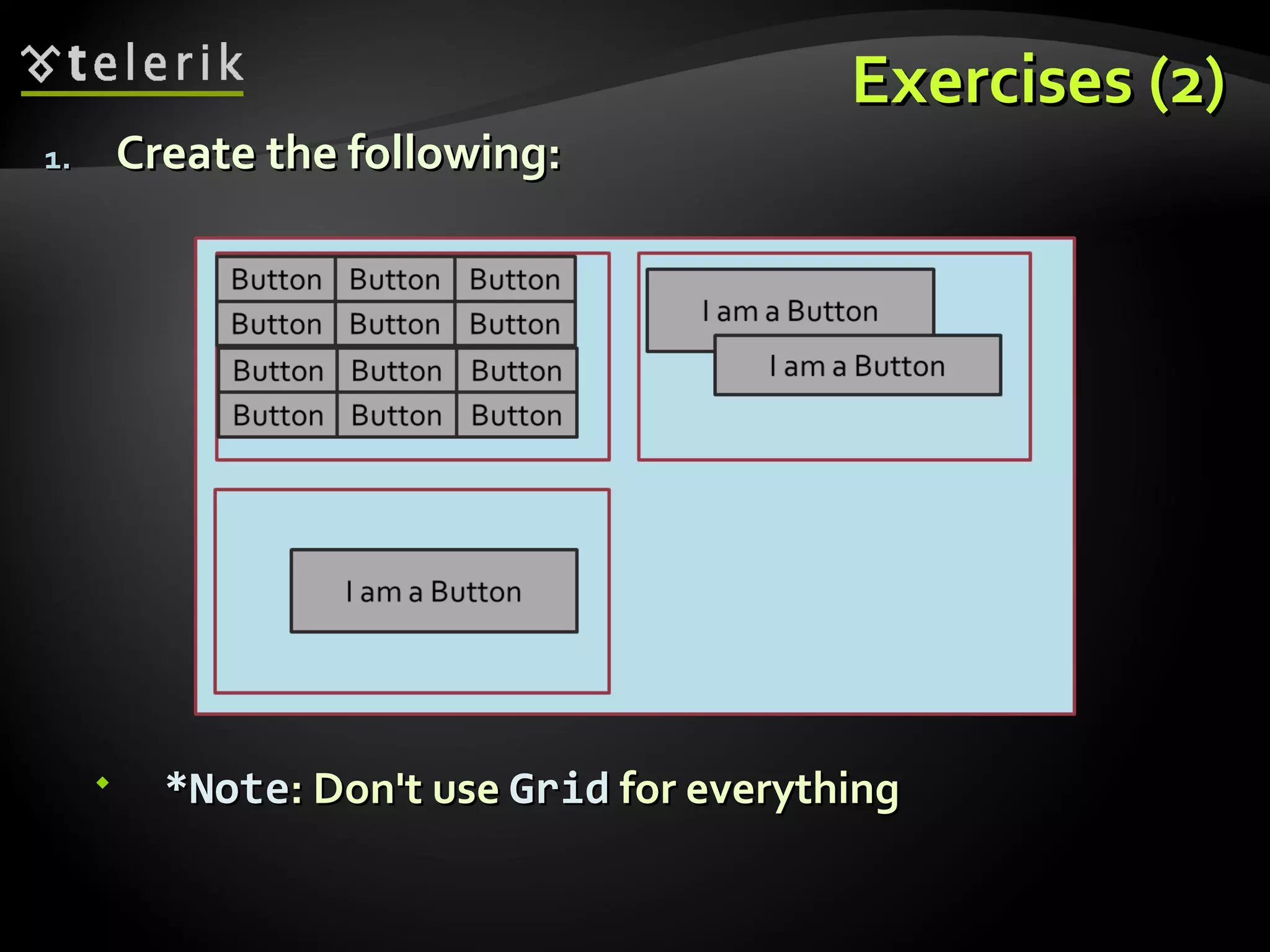
KEMBAR78
WPF Layout Containers | PPT
WPF Layout Containers Panels, Tab Containers Doncho Minkov Telerik School Academy schoolacademy.telerik.com   Technical Trainer h ttp://www.minkov.it
Table of Contents Containers Overview Containers in XAML Three Kinds of Containers (Panels) Absolute coordinates, Stacking, Proportional GridSplitters and Sizing XAML Tab Containers
Containers Overview What is a Container? Containers in XAML
What is a Container? A containers is something that contains other things In HTML  divs   and  spans  are containers They hold another controls / tags Used to represent the layout of the application Every container is given a space to consume All his children are in this space
Containers in WPF  In WPF containers are called  Panels Three common types of panels Panels with absolute coordinates Panels with stacking order Panels with proportional or with rows/columns Absolute coordinates Panels Canvas Controls inside the canvas are arranged based on the  Canvas  position and size
Containers in WPF (2) Stacking Panels StackPanel ,  DockPanel ,  WrapPanel Elements are arranged in a stacking order i.e. first come goes in the beginning Proportional Panels Grid  and  UniformGrid Arrange the elements in a table-like layout
The  Canvas  Container
The  Canvas  Container The  Canvas  is a  layout   container It’s an element that holds  other elements It simply positions each item using fixed coordinates Places elements behind or in front of others (depending on the z-order) Supports size and clipping
The  Canvas  Container (2) Positioning elements in a  Canvas Using  attached properties Here’s an example that places a  Rectangle   at specific  location in a  Canvas <Canvas> <Rectangle Canvas.Left=&quot;30&quot; Canvas.Top=&quot;30&quot; Fill=&quot;Red&quot; Width=&quot;100&quot; Height=&quot;100&quot;/> … </Canvas>
The  Canvas  Container (3) Placing elements behind or in front of others depends on the z-order Defines which elements are “on top of” the other elements The default z-order  Determined by the order in which the children are added to the  Canvas Customize the z-order of any child element using  Canvas.ZIndex  attached property
The  Canvas  Container – Example < Canvas  Background=&quot;White&quot; Height=&quot;680&quot;> <Rectangle Canvas.Left=&quot;0&quot; Canvas.Top=&quot;0&quot; Fill=&quot;Red&quot; Width=&quot;100&quot; Height=&quot;100&quot;  Canvas.ZIndex =&quot;3&quot; /> <Rectangle Canvas.Left=&quot;20&quot; Canvas.Top=&quot;20&quot; Fill=&quot;Orange&quot; Width=&quot;100&quot; Height=&quot;100&quot; Canvas.ZIndex =&quot;2&quot; /> <Canvas Canvas.Left=&quot;300&quot; Canvas.Top=&quot;300&quot; Canvas.ZIndex =&quot;1&quot;> <Rectangle Width=&quot;120&quot; Height=&quot;330&quot; RadiusX=&quot;20&quot; RadiusY=&quot;20&quot; Fill=&quot;Black&quot;/> <Ellipse Canvas.Left=&quot;10&quot; Canvas.Top=&quot;10&quot; Width=&quot;100&quot; Height=&quot;100&quot; Fill=&quot;Red&quot;/> </Canvas> </Canvas>
Customize the Z-order and  Multiple   Canvas  Elements Live Demo
Stacking Panels StackPanel, DockPanel, Wrap Panel
StackPanel The  StackPanel  arranges the elements in one row/column  Depends on the orientation property If the size of each element is not explicitly set all elements have the same width/height Can set flow orientation Vertical or Horizontal <StackPanel> <TextBlock Text=&quot;Text&quot; Background=&quot;Yellow&quot;/> <TextBlock Text=&quot;Text&quot; Background=&quot;Blue&quot;/> </StackPanel>
WrapPanel The  WrapPanel  is much like  StackPanel  but if the end of the available space is reached Arranges the elements in the next row/columns Depends on the orientation property Example: <WrapPanel> <TextBlock Text=&quot;Text&quot; Background=&quot;Yellow&quot;/>  <TextBlock Text=&quot;Text&quot; Background=&quot;Blue&quot;/> <TextBlock Text=&quot;Text&quot; Background=&quot;Yellow&quot;/> <TextBlock Text=&quot;Text&quot; Background=&quot;Blue&quot;/> </WrapPanel>
DockPanel The  DockPanel   provides docking of elements to the  left ,  right ,  top ,  bottom  of the panel Defined by the attached property  Dock To dock an element to the center of the panel, it must be the last child of the panel  LastChildFill   property must be set to true. <DockPanel LastChildFill=&quot;True&quot;> <Button Content=&quot;Top&quot; DockPanel.Dock=&quot;Top&quot;/> <Button Content=&quot;Bottom&quot; DockPanel.Dock=&quot;Bottom&quot;/> <Button Content=&quot;Left&quot;/> <Button Content=&quot;Right&quot; DockPanel.Dock=&quot;Right&quot;/> <Button Content=&quot; LastChildFill=True &quot;/> </DockPanel>
Stacking Panels Live Demo
Proportional Panels Grid and UniformGrid
Grid Panel The most powerful layout container in WPF Everything can be done with  Grid Sometimes a way harder than using  StackPanel Arranges the elements in a  table-like  layout Predefined  number of rows and columns Each element has  explicitly  set grid row/column Using the attached properties  Grid.Row   and  Grid.Column If no columns/rows are defined, works the like canvas
Grid Panel (2) Number of  rows  is defined by a content property called &quot; RowDefinitions &quot; Each row can be set a  height It is the same with &quot; ColumnDefinitions &quot; <Grid.RowDefinitions> <RowDefinition  Height=&quot;50&quot; /> <RowDefinition/> <RowDefinition/> </Grid.RowDefinitions> <Grid.ColumnDefinitions> <ColumnDefinition/> <ColumnDefinition  Width=&quot;50&quot; /> </Grid.ColumnDefinitions>
Grid Panel (3) Each of the elements in a  Grid  should have a  Grid.Row  and/or  Grid.Column  property set <Grid> … <Button Grid.Row=&quot;0&quot; Grid.Column=&quot;0&quot; Content=&quot;{0, 0}&quot;/> <Button Grid.Row=&quot;0&quot; Grid.Column=&quot;1&quot; Content=&quot;{0, 1}&quot;/> <Button Grid.Row=&quot;1&quot; Grid.Column=&quot;0&quot; Content=&quot;{1, 0}&quot;/> <Button Grid.Row=&quot;1&quot; Grid.Column=&quot;1&quot; Content=&quot;{1, 1}&quot;/> <Button Grid.Row=&quot;2&quot; Grid.Column=&quot;0&quot; Content=&quot;{2, 0}&quot;/> <Button Grid.Row=&quot;2&quot; Grid.Column=&quot;1&quot; Content=&quot;{2, 1}&quot;/> </Grid>
UniformGrid Panel Much like the common  Grid  panel Cannot set position explicitly Each elements is with the  same size Fills the elements depending of the number of rows/columns FlowDirection  property sets the arrange style of the elements <UniformGrid Rows=&quot;3&quot;> <Button  Content=&quot;First&quot;/> … <Button Content=&quot;Seventh&quot;/> </UniformGrid>
Proportional Panels Live Demo
GridSplitters
GridSplitter Offer the user a way to adjust the layout of your application  Changing the size of a column or row in a grid Use  GridSplitter  only to rearrange a Grid panel <Grid Height=&quot;100&quot; Width=&quot;400&quot;> <Grid.ColumnDefinitions>…</Grid.ColumnDefinitions> <Ellipse Grid.Column=&quot;0&quot; Fill=&quot;Red&quot; /> <GridSplitter Grid.Column=&quot;1&quot; HorizontalAlignment=&quot;Stretch&quot; /> <Ellipse Grid.Column=&quot;2&quot; Fill=&quot;Blue&quot; /> </Grid>
GridSplitter Live Demo
Sizing
Sizing There are a number of properties to set the size of a panel or the elements in it Width ,  Height ,  MaxWidth ,  MaxHeight ,  MinWidth ,  MinHeight Padding  and  Margin <StackPanel> <Button Content=&quot;First&quot; Margin=&quot;1&quot; Padding=&quot;5&quot;  Height=&quot;50&quot; Width=&quot;Auto&quot;/> … <Button Content=&quot;Fifth&quot; Margin=&quot;5&quot; Padding=&quot;1&quot;  Height=&quot;50&quot; Width=&quot;Auto&quot;/> </StackPanel>
Sizing Live Demo
Border Container
Border Container The Border container is a special kind of container It can hold only one child element The child element becomes surrounded by a border The Border properties for border style BorderBrush BorderThickness CornerRadius
Border Example Lets make a window with no Windows border, rounded corners and transparent background <Window … WindowStyle=&quot;None&quot;/> <Border BorderThickness=&quot;5&quot; Background=&quot;Transparent&quot;  CornerRadius=&quot;10&quot;> <Border.BorderBrush> <LinearGradientBrush StartPoint=&quot;0,0&quot; EndPoint=&quot;0,1&quot;> <GradientStop Color=&quot;Blue&quot; Offset=&quot;0.2&quot;/> <GradientStop Color=&quot;DarkBlue&quot; Offset=&quot;0.8&quot;/> </LinearGradientBrush> </Border.BorderBrush> … </Border> Lets have no Windows Border
Border Container Live Demo
TabControl
TabContol TabControl  is useful for switching between multiple pages of content Tabs in a  TabControl  are typically placed on the top TabStripPlacement  property  can set their placement to  Left ,  Right , or  Bottom <TabControl> <TabItem Header=&quot;Tab 1&quot;>Content for Tab1.</TabItem> <TabItem Header=&quot;Tab 2&quot;>Content for Tab2.</TabItem> <TabItem Header=&quot;Tab 3&quot;>Content for Tab3.</TabItem> </TabControl>
TabControl Live Demo
XAML Layout Containers
Exercises Create the following: *Note : Don't use  Grid  for everything
Exercises (2) Create the following: *Note : Don't use  Grid  for everything
Exercises (3) Using Tabs create the previous XAMLs in tab controls Add  GridSplitter   whenever you used Grid as a panel

WPF Layout Containers

  • 1.
    WPF Layout ContainersPanels, Tab Containers Doncho Minkov Telerik School Academy schoolacademy.telerik.com Technical Trainer h ttp://www.minkov.it
  • 2.
    Table of ContentsContainers Overview Containers in XAML Three Kinds of Containers (Panels) Absolute coordinates, Stacking, Proportional GridSplitters and Sizing XAML Tab Containers
  • 3.
    Containers Overview Whatis a Container? Containers in XAML
  • 4.
    What is aContainer? A containers is something that contains other things In HTML divs and spans are containers They hold another controls / tags Used to represent the layout of the application Every container is given a space to consume All his children are in this space
  • 5.
    Containers in WPF In WPF containers are called Panels Three common types of panels Panels with absolute coordinates Panels with stacking order Panels with proportional or with rows/columns Absolute coordinates Panels Canvas Controls inside the canvas are arranged based on the Canvas position and size
  • 6.
    Containers in WPF(2) Stacking Panels StackPanel , DockPanel , WrapPanel Elements are arranged in a stacking order i.e. first come goes in the beginning Proportional Panels Grid and UniformGrid Arrange the elements in a table-like layout
  • 7.
    The Canvas Container
  • 8.
    The Canvas Container The Canvas is a layout container It’s an element that holds other elements It simply positions each item using fixed coordinates Places elements behind or in front of others (depending on the z-order) Supports size and clipping
  • 9.
    The Canvas Container (2) Positioning elements in a Canvas Using attached properties Here’s an example that places a Rectangle at specific location in a Canvas <Canvas> <Rectangle Canvas.Left=&quot;30&quot; Canvas.Top=&quot;30&quot; Fill=&quot;Red&quot; Width=&quot;100&quot; Height=&quot;100&quot;/> … </Canvas>
  • 10.
    The Canvas Container (3) Placing elements behind or in front of others depends on the z-order Defines which elements are “on top of” the other elements The default z-order Determined by the order in which the children are added to the Canvas Customize the z-order of any child element using Canvas.ZIndex attached property
  • 11.
    The Canvas Container – Example < Canvas Background=&quot;White&quot; Height=&quot;680&quot;> <Rectangle Canvas.Left=&quot;0&quot; Canvas.Top=&quot;0&quot; Fill=&quot;Red&quot; Width=&quot;100&quot; Height=&quot;100&quot; Canvas.ZIndex =&quot;3&quot; /> <Rectangle Canvas.Left=&quot;20&quot; Canvas.Top=&quot;20&quot; Fill=&quot;Orange&quot; Width=&quot;100&quot; Height=&quot;100&quot; Canvas.ZIndex =&quot;2&quot; /> <Canvas Canvas.Left=&quot;300&quot; Canvas.Top=&quot;300&quot; Canvas.ZIndex =&quot;1&quot;> <Rectangle Width=&quot;120&quot; Height=&quot;330&quot; RadiusX=&quot;20&quot; RadiusY=&quot;20&quot; Fill=&quot;Black&quot;/> <Ellipse Canvas.Left=&quot;10&quot; Canvas.Top=&quot;10&quot; Width=&quot;100&quot; Height=&quot;100&quot; Fill=&quot;Red&quot;/> </Canvas> </Canvas>
  • 12.
    Customize the Z-orderand Multiple Canvas Elements Live Demo
  • 13.
    Stacking Panels StackPanel,DockPanel, Wrap Panel
  • 14.
    StackPanel The StackPanel arranges the elements in one row/column Depends on the orientation property If the size of each element is not explicitly set all elements have the same width/height Can set flow orientation Vertical or Horizontal <StackPanel> <TextBlock Text=&quot;Text&quot; Background=&quot;Yellow&quot;/> <TextBlock Text=&quot;Text&quot; Background=&quot;Blue&quot;/> </StackPanel>
  • 15.
    WrapPanel The WrapPanel is much like StackPanel but if the end of the available space is reached Arranges the elements in the next row/columns Depends on the orientation property Example: <WrapPanel> <TextBlock Text=&quot;Text&quot; Background=&quot;Yellow&quot;/> <TextBlock Text=&quot;Text&quot; Background=&quot;Blue&quot;/> <TextBlock Text=&quot;Text&quot; Background=&quot;Yellow&quot;/> <TextBlock Text=&quot;Text&quot; Background=&quot;Blue&quot;/> </WrapPanel>
  • 16.
    DockPanel The DockPanel provides docking of elements to the left , right , top , bottom of the panel Defined by the attached property Dock To dock an element to the center of the panel, it must be the last child of the panel LastChildFill property must be set to true. <DockPanel LastChildFill=&quot;True&quot;> <Button Content=&quot;Top&quot; DockPanel.Dock=&quot;Top&quot;/> <Button Content=&quot;Bottom&quot; DockPanel.Dock=&quot;Bottom&quot;/> <Button Content=&quot;Left&quot;/> <Button Content=&quot;Right&quot; DockPanel.Dock=&quot;Right&quot;/> <Button Content=&quot; LastChildFill=True &quot;/> </DockPanel>
  • 17.
  • 18.
    Proportional Panels Gridand UniformGrid
  • 19.
    Grid Panel Themost powerful layout container in WPF Everything can be done with Grid Sometimes a way harder than using StackPanel Arranges the elements in a table-like layout Predefined number of rows and columns Each element has explicitly set grid row/column Using the attached properties Grid.Row and Grid.Column If no columns/rows are defined, works the like canvas
  • 20.
    Grid Panel (2)Number of rows is defined by a content property called &quot; RowDefinitions &quot; Each row can be set a height It is the same with &quot; ColumnDefinitions &quot; <Grid.RowDefinitions> <RowDefinition Height=&quot;50&quot; /> <RowDefinition/> <RowDefinition/> </Grid.RowDefinitions> <Grid.ColumnDefinitions> <ColumnDefinition/> <ColumnDefinition Width=&quot;50&quot; /> </Grid.ColumnDefinitions>
  • 21.
    Grid Panel (3)Each of the elements in a Grid should have a Grid.Row and/or Grid.Column property set <Grid> … <Button Grid.Row=&quot;0&quot; Grid.Column=&quot;0&quot; Content=&quot;{0, 0}&quot;/> <Button Grid.Row=&quot;0&quot; Grid.Column=&quot;1&quot; Content=&quot;{0, 1}&quot;/> <Button Grid.Row=&quot;1&quot; Grid.Column=&quot;0&quot; Content=&quot;{1, 0}&quot;/> <Button Grid.Row=&quot;1&quot; Grid.Column=&quot;1&quot; Content=&quot;{1, 1}&quot;/> <Button Grid.Row=&quot;2&quot; Grid.Column=&quot;0&quot; Content=&quot;{2, 0}&quot;/> <Button Grid.Row=&quot;2&quot; Grid.Column=&quot;1&quot; Content=&quot;{2, 1}&quot;/> </Grid>
  • 22.
    UniformGrid Panel Muchlike the common Grid panel Cannot set position explicitly Each elements is with the same size Fills the elements depending of the number of rows/columns FlowDirection property sets the arrange style of the elements <UniformGrid Rows=&quot;3&quot;> <Button Content=&quot;First&quot;/> … <Button Content=&quot;Seventh&quot;/> </UniformGrid>
  • 23.
  • 24.
  • 25.
    GridSplitter Offer theuser a way to adjust the layout of your application Changing the size of a column or row in a grid Use GridSplitter only to rearrange a Grid panel <Grid Height=&quot;100&quot; Width=&quot;400&quot;> <Grid.ColumnDefinitions>…</Grid.ColumnDefinitions> <Ellipse Grid.Column=&quot;0&quot; Fill=&quot;Red&quot; /> <GridSplitter Grid.Column=&quot;1&quot; HorizontalAlignment=&quot;Stretch&quot; /> <Ellipse Grid.Column=&quot;2&quot; Fill=&quot;Blue&quot; /> </Grid>
  • 26.
  • 27.
  • 28.
    Sizing There area number of properties to set the size of a panel or the elements in it Width , Height , MaxWidth , MaxHeight , MinWidth , MinHeight Padding and Margin <StackPanel> <Button Content=&quot;First&quot; Margin=&quot;1&quot; Padding=&quot;5&quot; Height=&quot;50&quot; Width=&quot;Auto&quot;/> … <Button Content=&quot;Fifth&quot; Margin=&quot;5&quot; Padding=&quot;1&quot; Height=&quot;50&quot; Width=&quot;Auto&quot;/> </StackPanel>
  • 29.
  • 30.
  • 31.
    Border Container TheBorder container is a special kind of container It can hold only one child element The child element becomes surrounded by a border The Border properties for border style BorderBrush BorderThickness CornerRadius
  • 32.
    Border Example Letsmake a window with no Windows border, rounded corners and transparent background <Window … WindowStyle=&quot;None&quot;/> <Border BorderThickness=&quot;5&quot; Background=&quot;Transparent&quot; CornerRadius=&quot;10&quot;> <Border.BorderBrush> <LinearGradientBrush StartPoint=&quot;0,0&quot; EndPoint=&quot;0,1&quot;> <GradientStop Color=&quot;Blue&quot; Offset=&quot;0.2&quot;/> <GradientStop Color=&quot;DarkBlue&quot; Offset=&quot;0.8&quot;/> </LinearGradientBrush> </Border.BorderBrush> … </Border> Lets have no Windows Border
  • 33.
  • 34.
  • 35.
    TabContol TabControl is useful for switching between multiple pages of content Tabs in a TabControl are typically placed on the top TabStripPlacement property can set their placement to Left , Right , or Bottom <TabControl> <TabItem Header=&quot;Tab 1&quot;>Content for Tab1.</TabItem> <TabItem Header=&quot;Tab 2&quot;>Content for Tab2.</TabItem> <TabItem Header=&quot;Tab 3&quot;>Content for Tab3.</TabItem> </TabControl>
  • 36.
  • 37.
  • 38.
    Exercises Create thefollowing: *Note : Don't use Grid for everything
  • 39.
    Exercises (2) Createthe following: *Note : Don't use Grid for everything
  • 40.
    Exercises (3) UsingTabs create the previous XAMLs in tab controls Add GridSplitter whenever you used Grid as a panel

Editor's Notes

  • #8 * (c) 2008 National Academy for Software Development - http://academy.devbg.org. All rights reserved. Unauthorized copying or re-distribution is strictly prohibited.* ##
  • #13 * (c) 2008 National Academy for Software Development - http://academy.devbg.org. All rights reserved. Unauthorized copying or re-distribution is strictly prohibited.* ##
  • #27 * 02/25/12 07/16/96 (c) 2005 National Academy for Software Development - http://academy.devbg.org. All rights reserved. Unauthorized copying or re-distribution is strictly prohibited.* ##