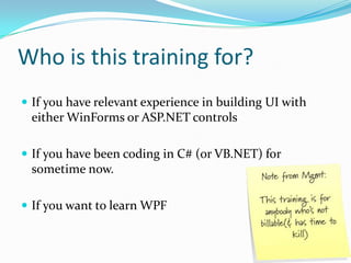
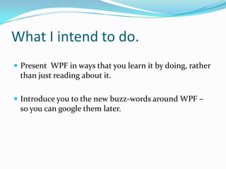
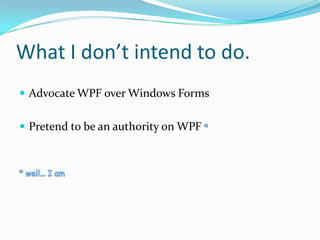
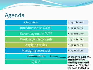
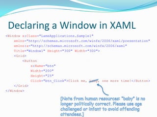
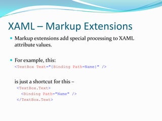
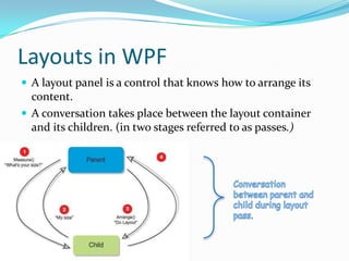
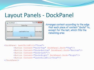
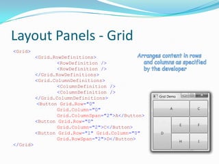
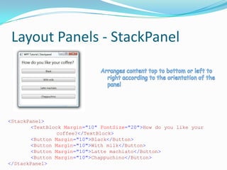
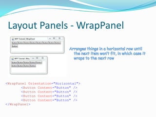
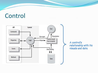
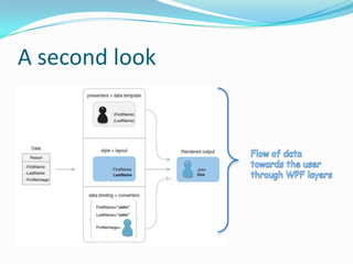
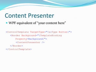
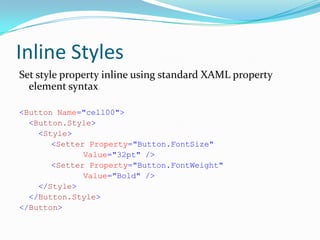
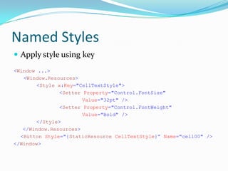
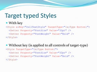
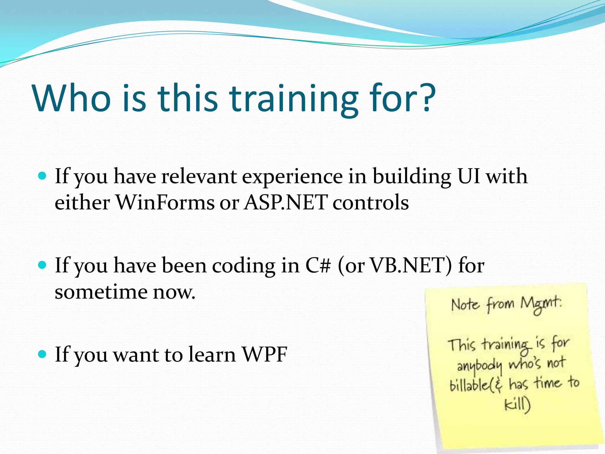
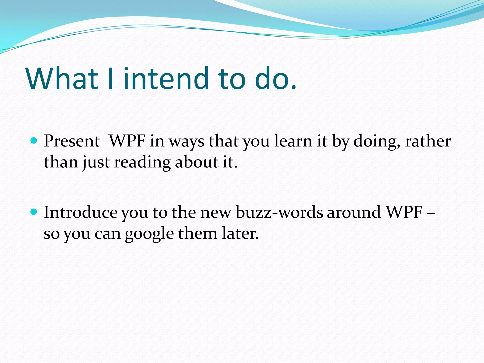
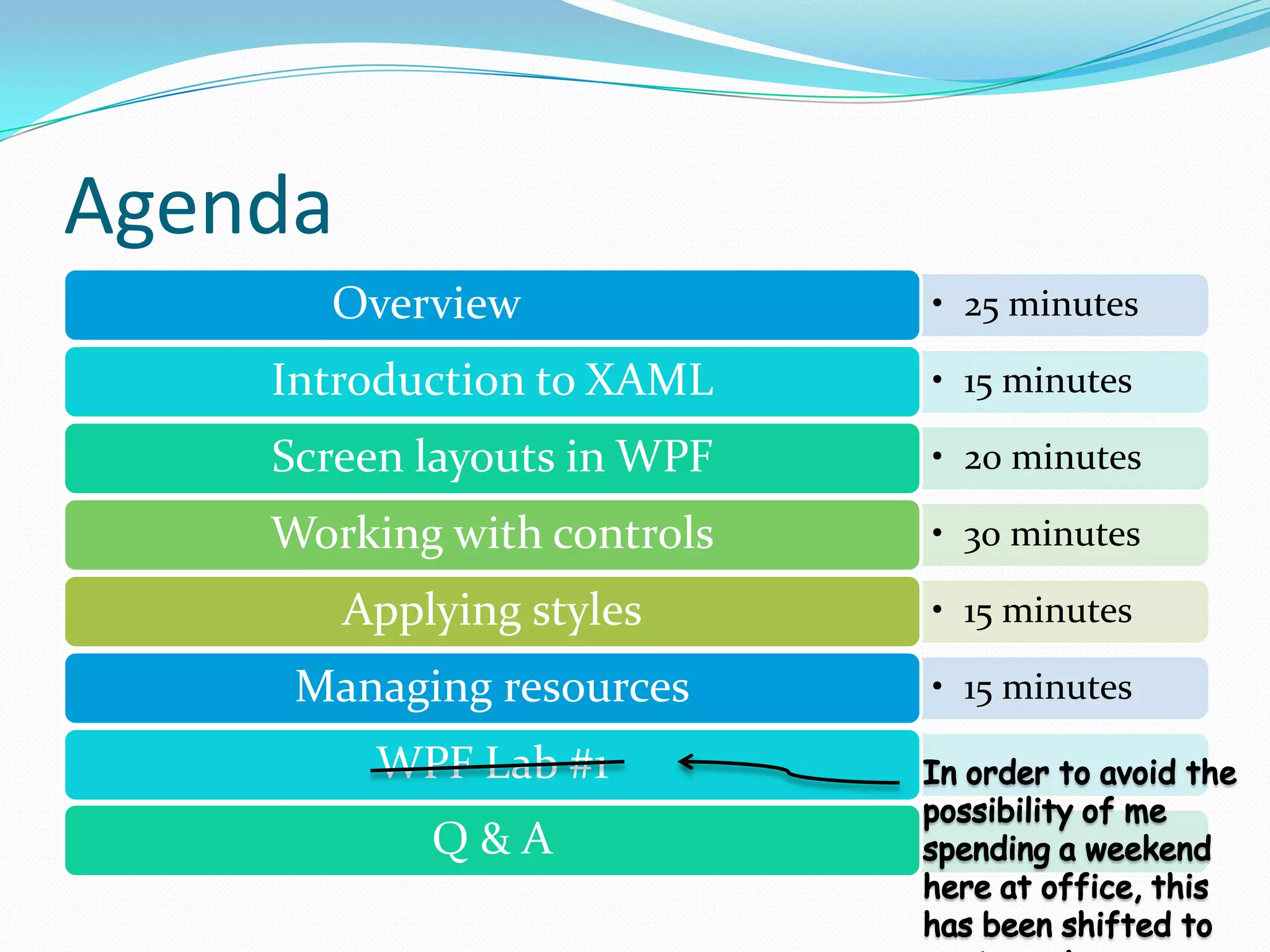
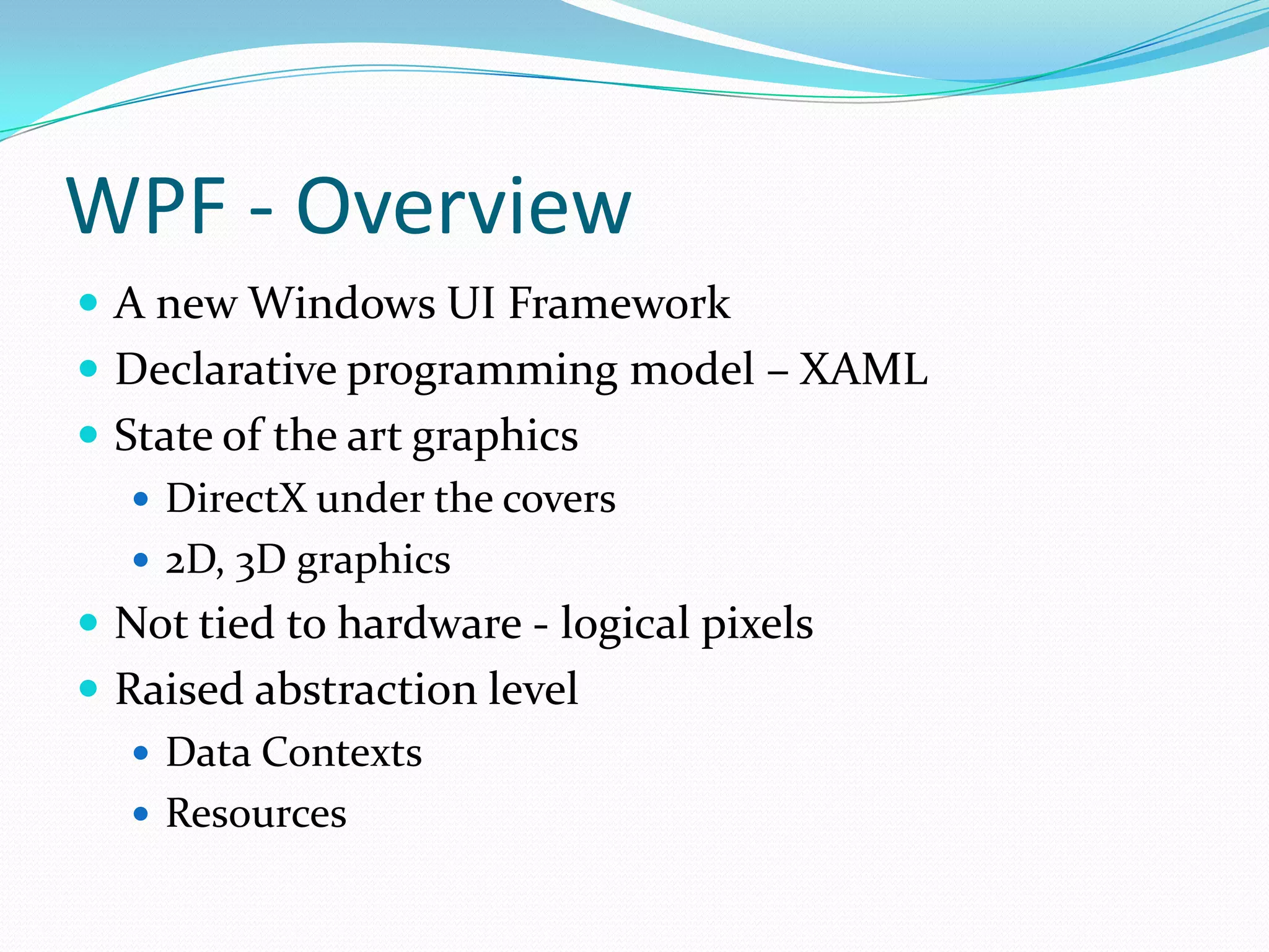
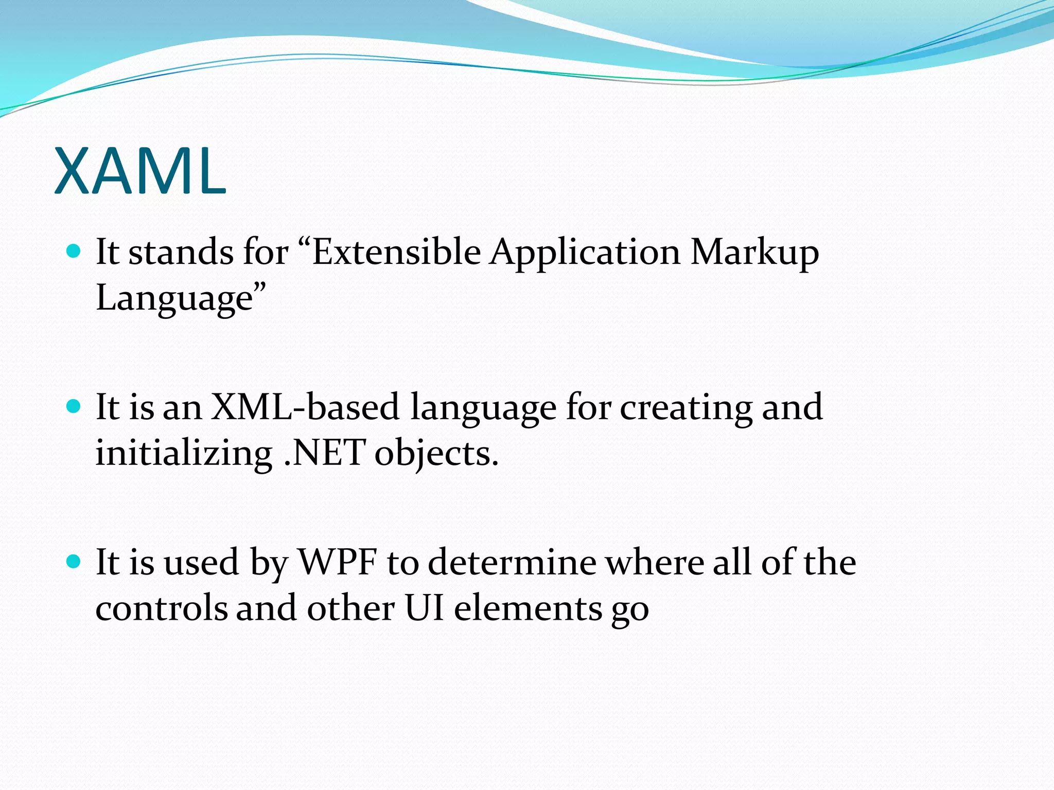
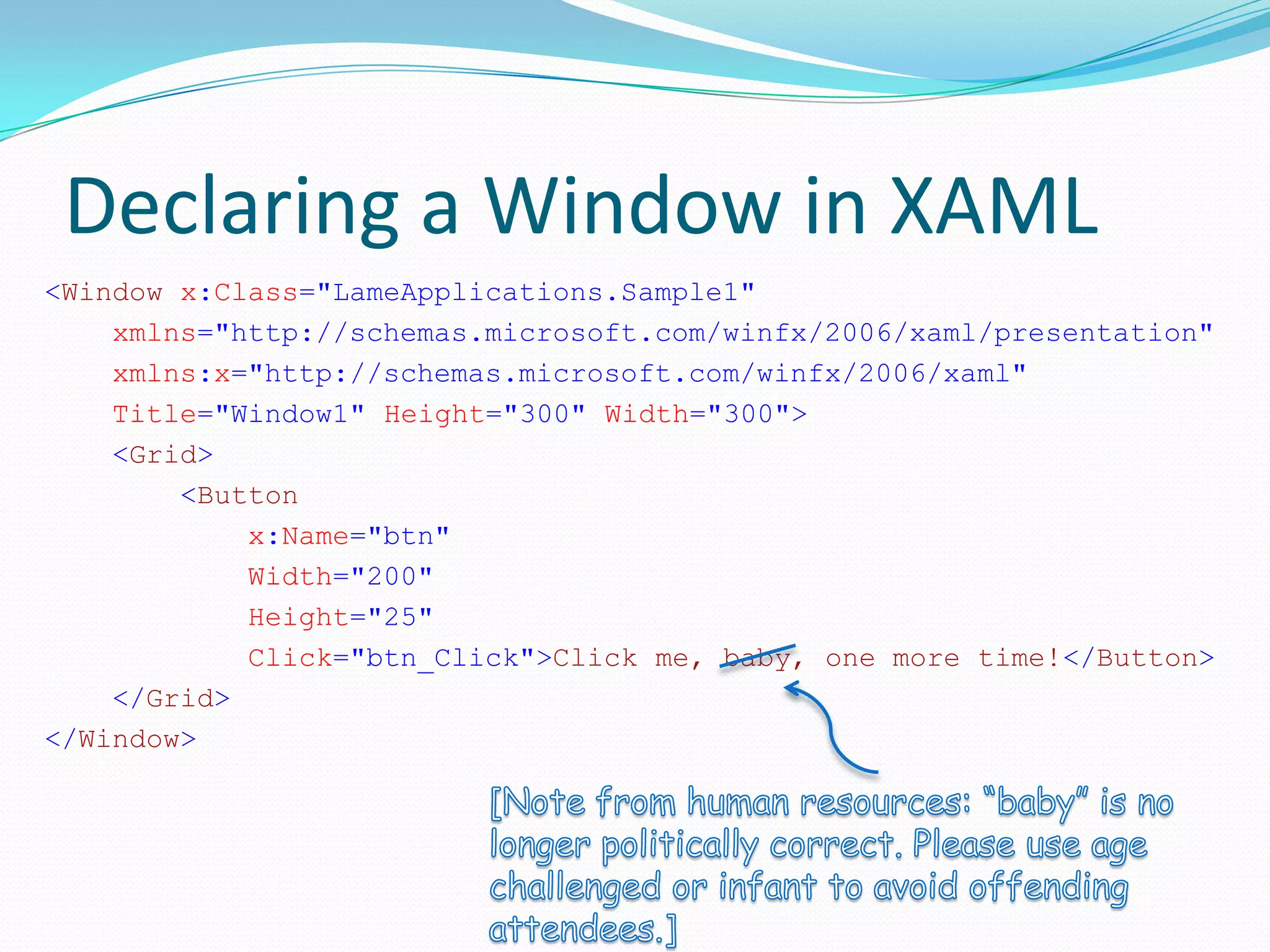
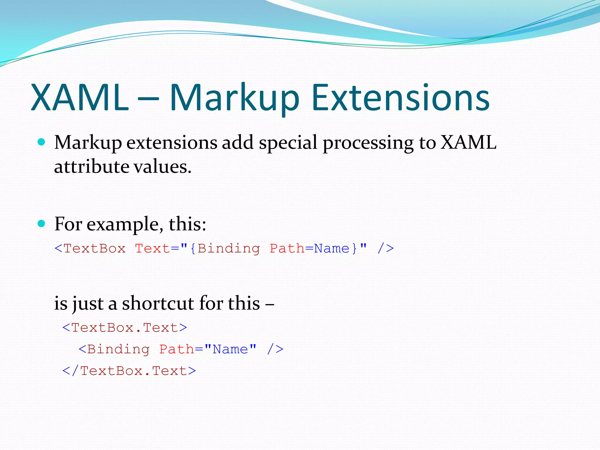
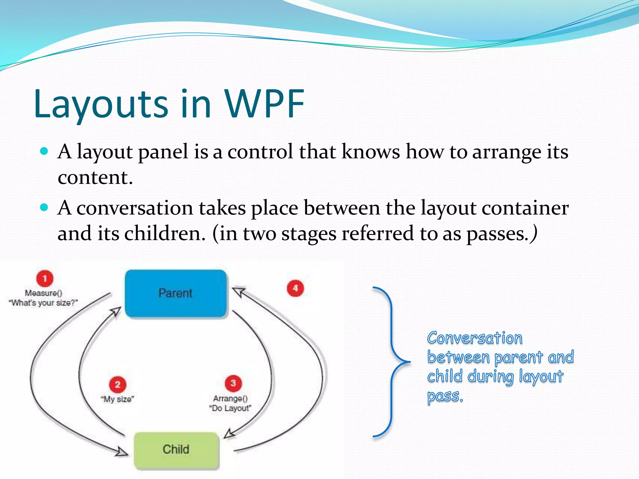
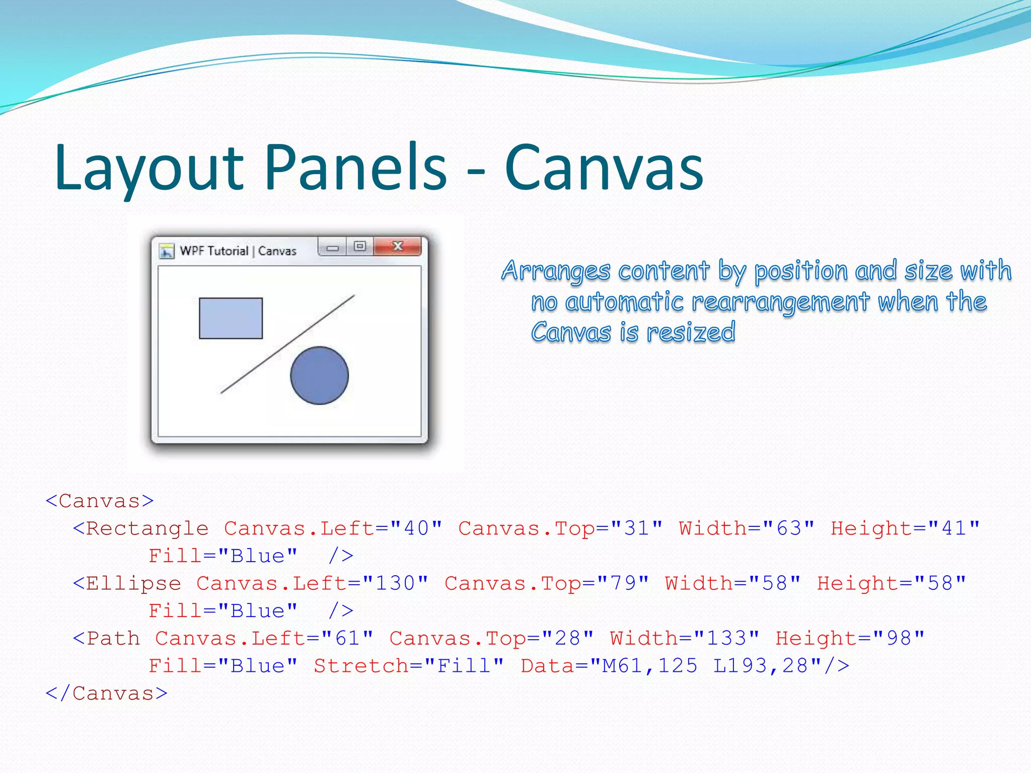
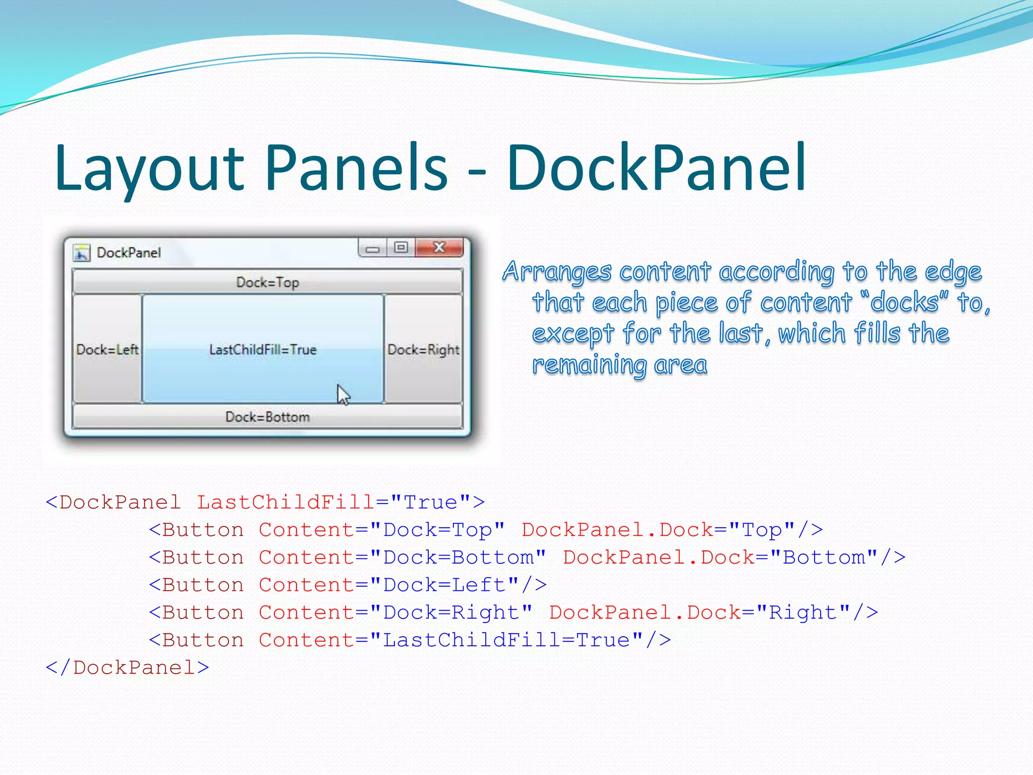
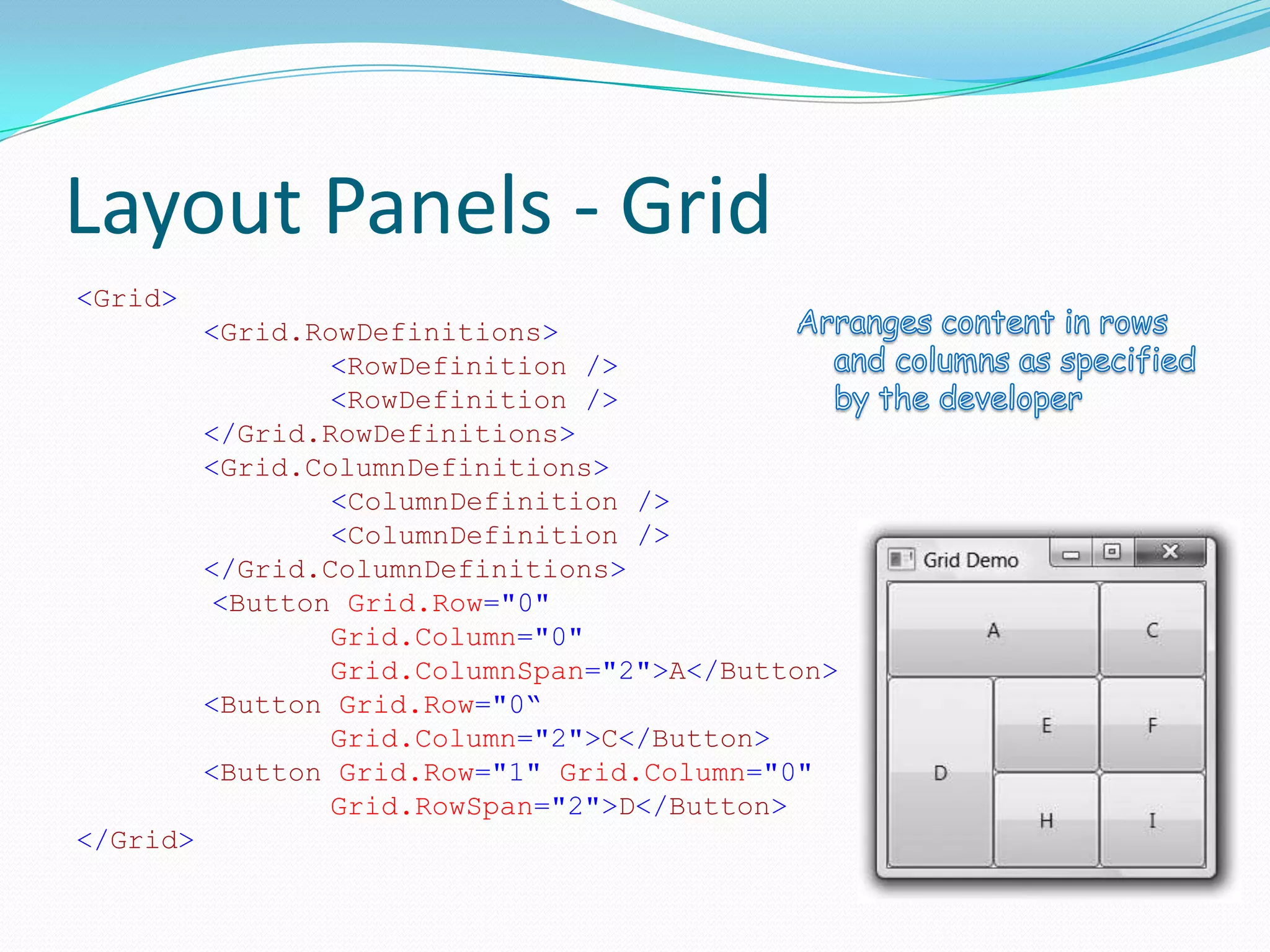
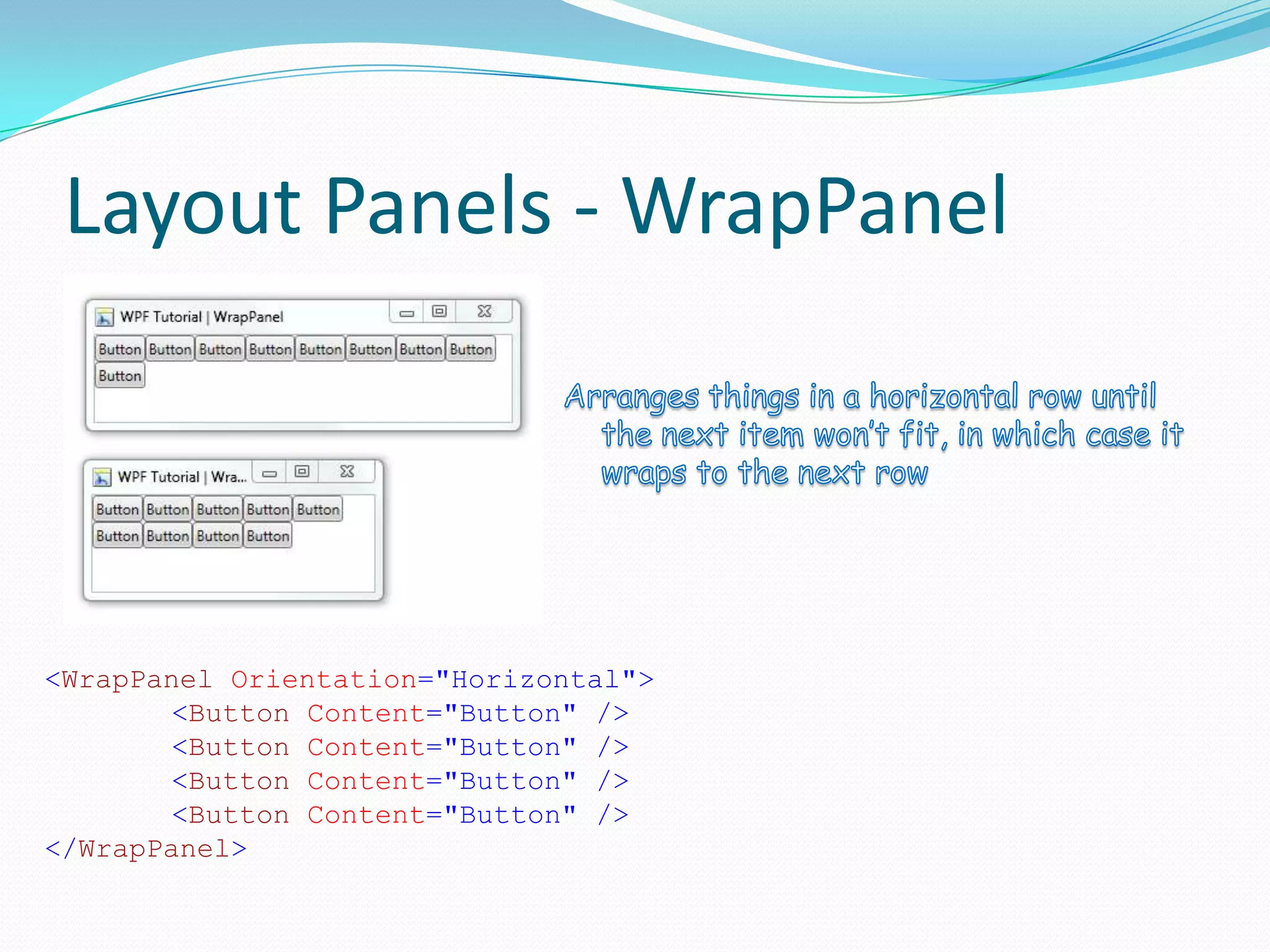
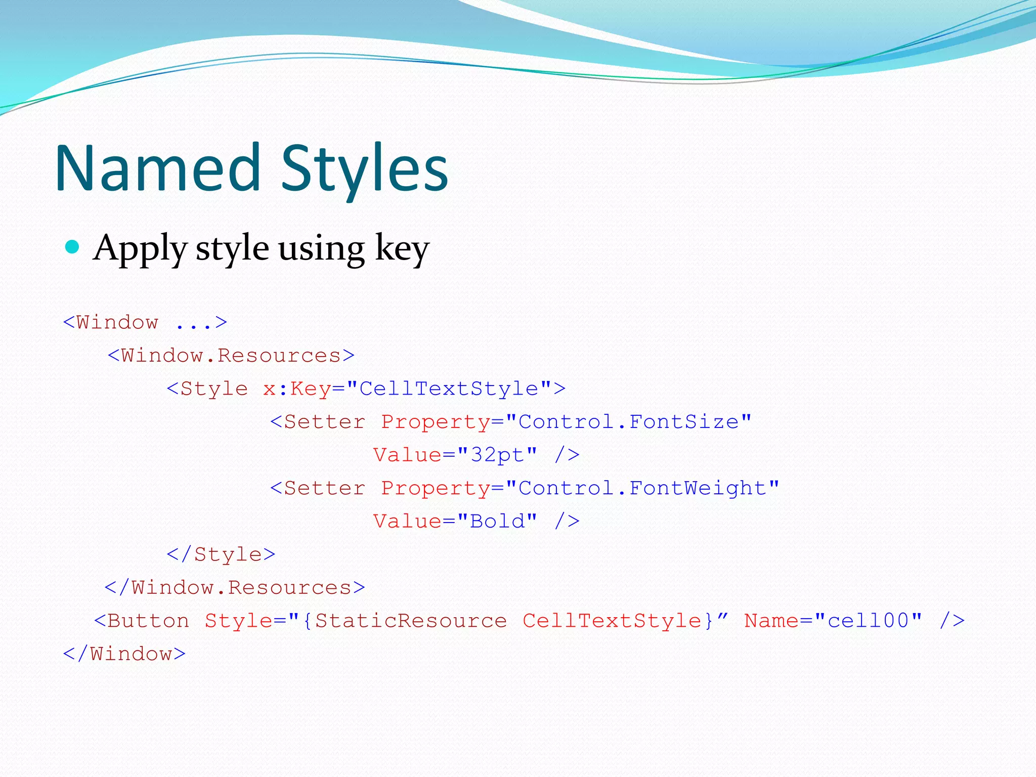
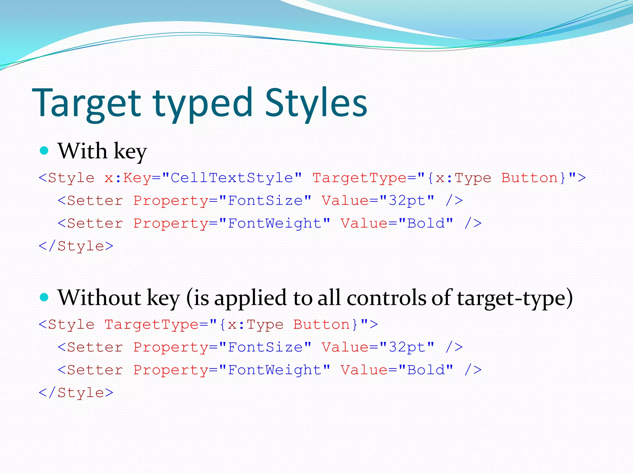
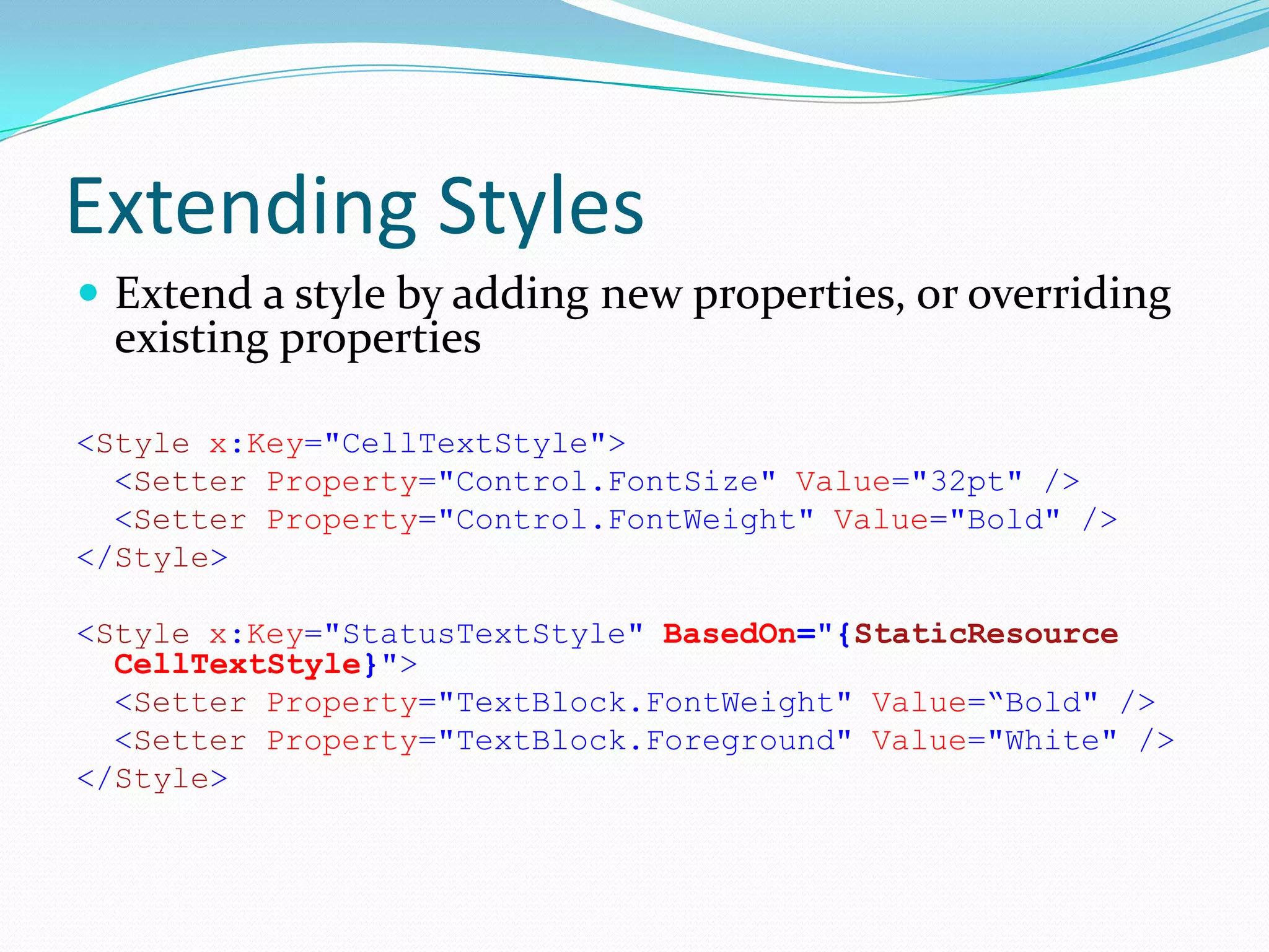
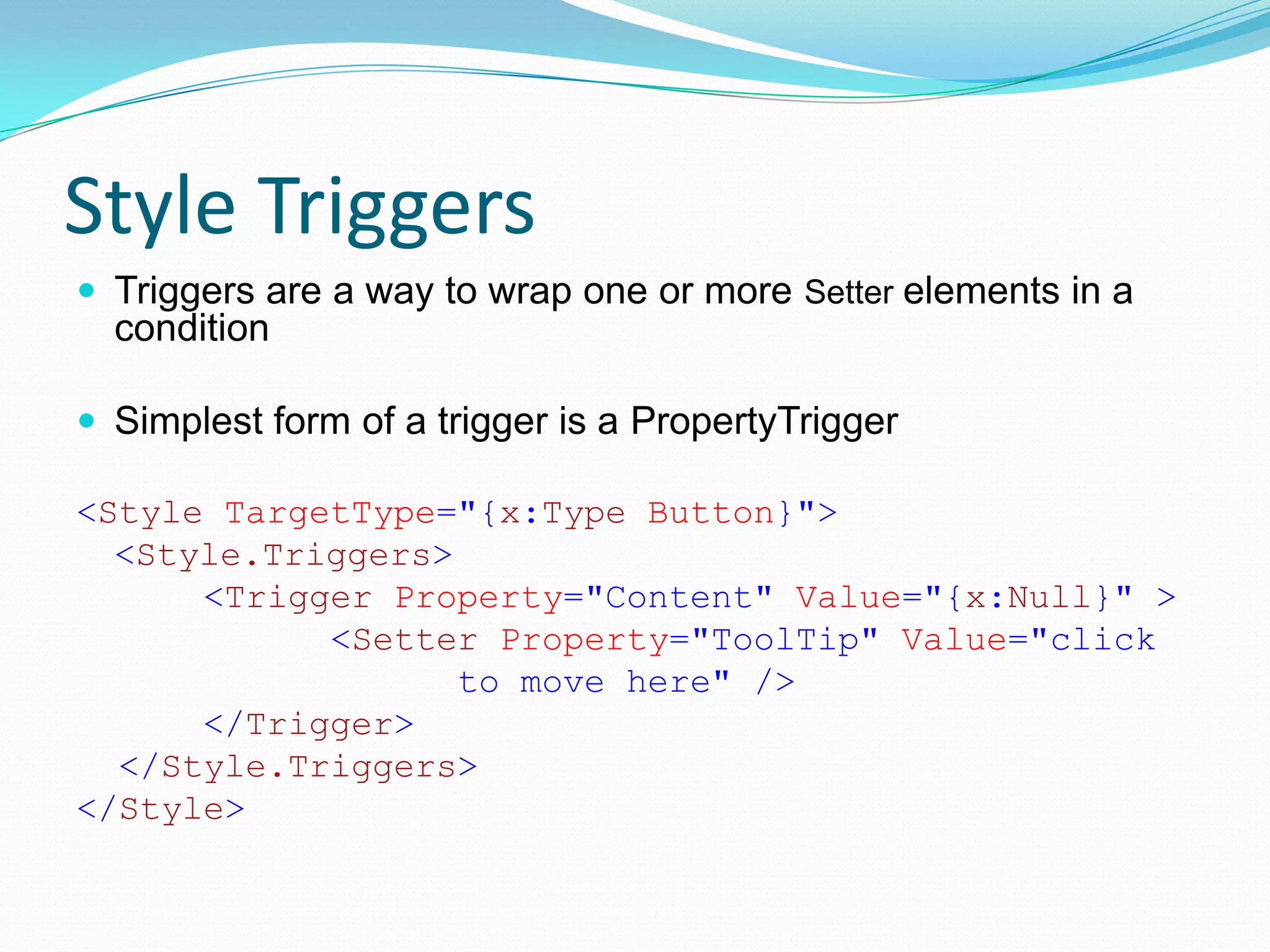
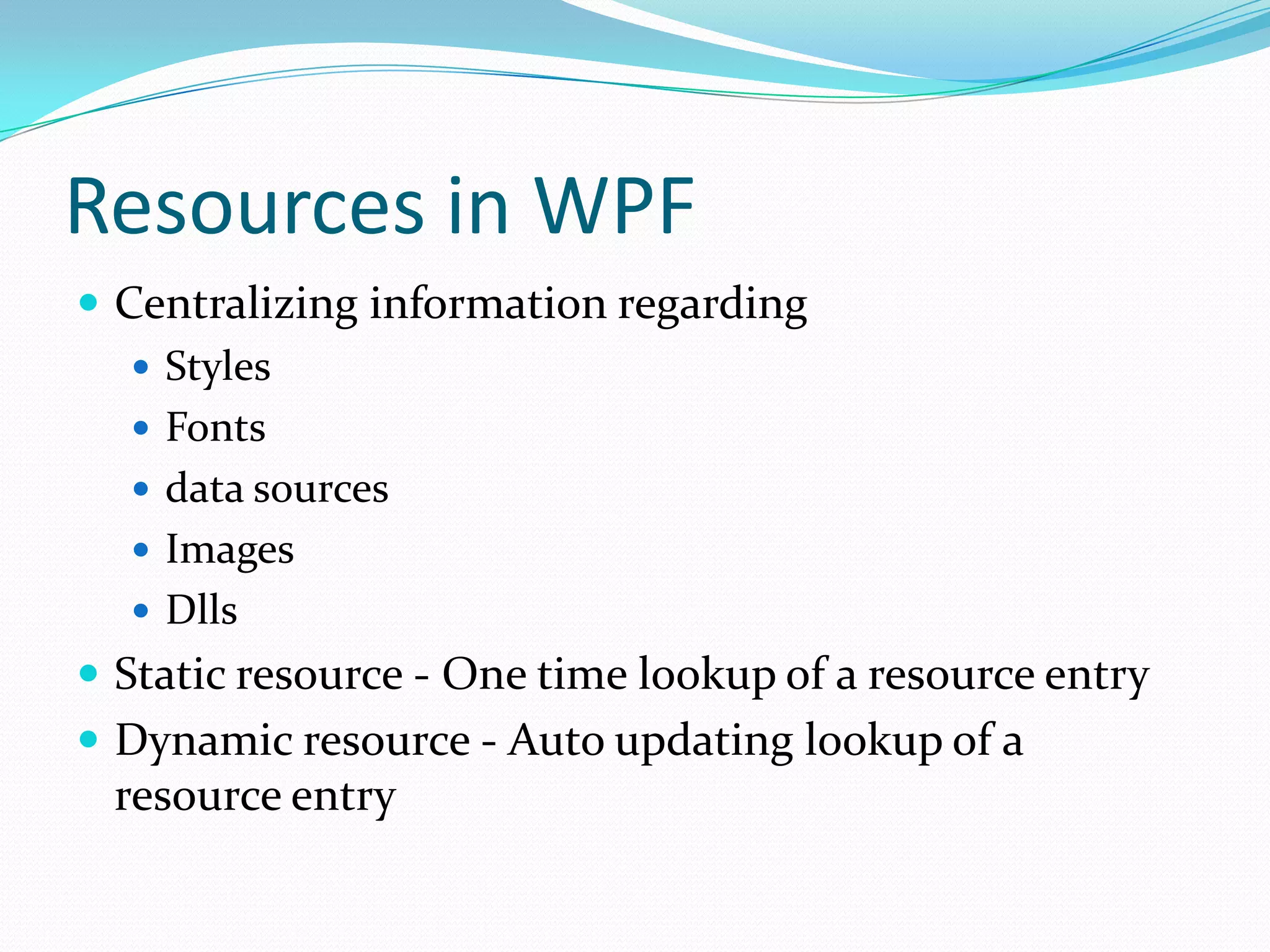
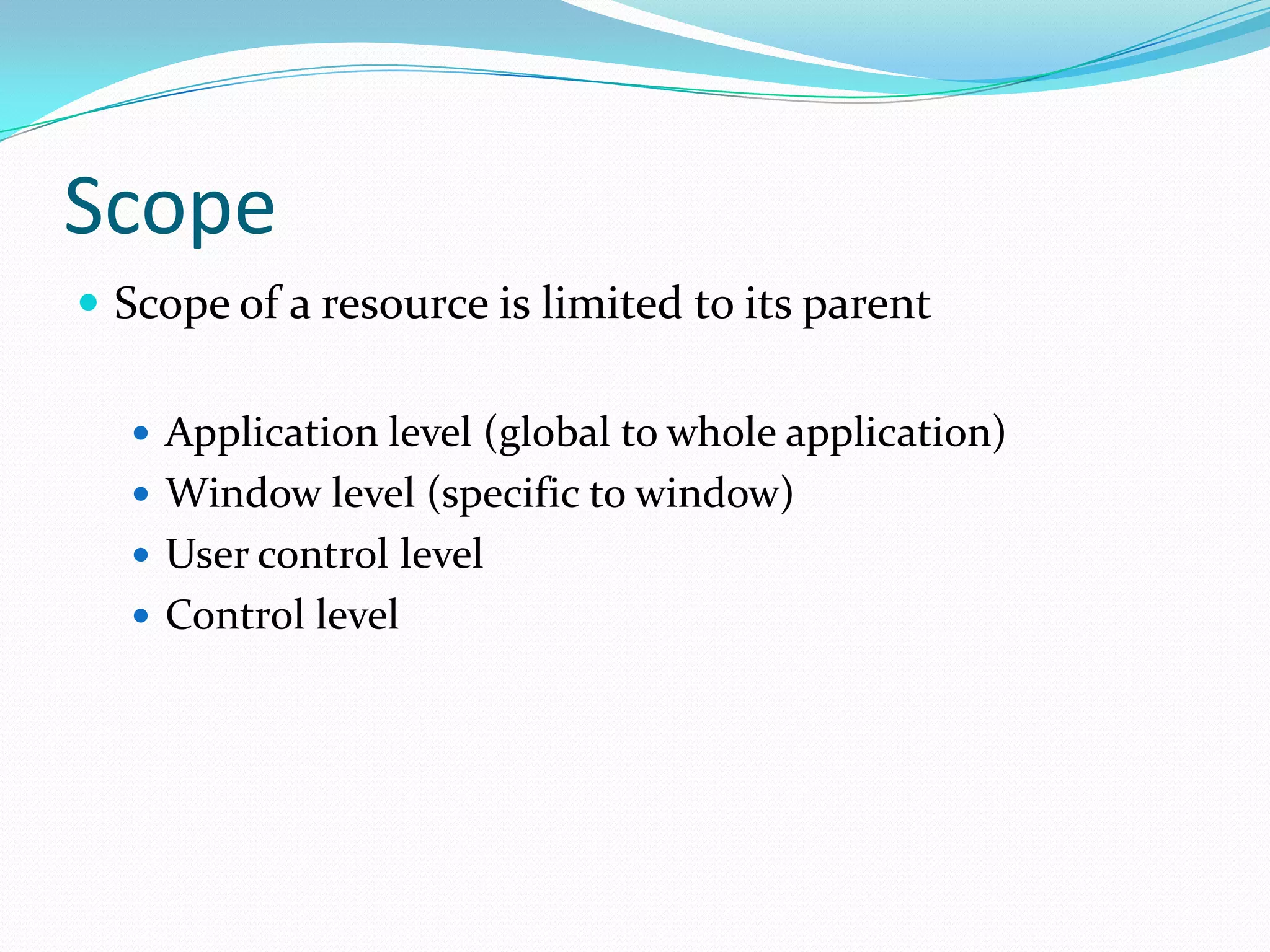
KEMBAR78
WPF - An introduction | PPTX
Presented by G. Sharada
Who is this training for?
 If you have relevant experience in building UI with
 either WinForms or ASP.NET controls

 If you have been coding in C# (or VB.NET) for
 sometime now.

 If you want to learn WPF
What I intend to do.
 Present WPF in ways that you learn it by doing, rather
 than just reading about it.

 Introduce you to the new buzz-words around WPF –
 so you can google them later.
What I don’t intend to do.
 Advocate WPF over Windows Forms


 Pretend to be an authority on WPF
Agenda
      Overview              • 25 minutes

    Introduction to XAML    • 15 minutes

    Screen layouts in WPF   • 20 minutes

    Working with controls   • 30 minutes

         Applying styles    • 15 minutes

     Managing resources     • 15 minutes

          WPF Lab #1
             Q&A
WPF - Overview
 A new Windows UI Framework
 Declarative programming model – XAML
 State of the art graphics
    DirectX under the covers
    2D, 3D graphics
 Not tied to hardware - logical pixels
 Raised abstraction level
    Data Contexts
    Resources
Will Microsoft dump WinForms?
         No, WinForms is here to stay.

         WPF is not intended to replace
          WinForms.

         Microsoft will continue to enhance and
          support WinForms for years to come.

         We have high interoperability between
          WinForms and WPF.
Issues with WPF
 Learning curve can be a bit steep


 Its easier to find WinForms developers then WPF
 developers

 Comparatively, WinForms has much larger online
 resources and developer community support.
So, is WPF worth it all?
WPF Pros
 Superior Data Binding
 Clean separation between UI and business logic
 Easy UI extensibility through Data/Control
  templates/Attached behaviors
 Powerful support for styles and themes
 In-built UI virtualization
 Can incorporate various media types, videos,
  documents, 3D content, or dynamically load portions
  of a user interface from web
XAML
 It stands for “Extensible Application Markup
 Language”

 It is an XML-based language for creating and
 initializing .NET objects.

 It is used by WPF to determine where all of the
 controls and other UI elements go
Declaring a Window in XAML
<Window x:Class="LameApplications.Sample1"
    xmlns="http://schemas.microsoft.com/winfx/2006/xaml/presentation"
    xmlns:x="http://schemas.microsoft.com/winfx/2006/xaml"
    Title="Window1" Height="300" Width="300">
    <Grid>
        <Button
            x:Name="btn"
            Width="200"
            Height="25"
            Click="btn_Click">Click me, baby, one more time!</Button>
    </Grid>
</Window>
XAML – Markup Extensions
 Markup extensions add special processing to XAML
  attribute values.

 For example, this:
  <TextBox Text="{Binding Path=Name}" />


  is just a shortcut for this –
   <TextBox.Text>
     <Binding Path="Name" />
   </TextBox.Text>
Layouts in WPF
 A layout panel is a control that knows how to arrange its
  content.
 A conversation takes place between the layout container
  and its children. (in two stages referred to as passes.)
Layout Panels - Canvas


<Canvas>
  <Rectangle Canvas.Left="40" Canvas.Top="31" Width="63" Height="41"
        Fill="Blue" />
  <Ellipse Canvas.Left="130" Canvas.Top="79" Width="58" Height="58"
        Fill="Blue" />
  <Path Canvas.Left="61" Canvas.Top="28" Width="133" Height="98"
        Fill="Blue" Stretch="Fill" Data="M61,125 L193,28"/>
</Canvas>
Layout Panels - DockPanel


<DockPanel LastChildFill="True">
        <Button Content="Dock=Top" DockPanel.Dock="Top"/>
        <Button Content="Dock=Bottom" DockPanel.Dock="Bottom"/>
        <Button Content="Dock=Left"/>
        <Button Content="Dock=Right" DockPanel.Dock="Right"/>
        <Button Content="LastChildFill=True"/>
</DockPanel>
Layout Panels - Grid
<Grid>
          <Grid.RowDefinitions>
                  <RowDefinition />
                  <RowDefinition />
          </Grid.RowDefinitions>
          <Grid.ColumnDefinitions>
                  <ColumnDefinition />
                  <ColumnDefinition />
          </Grid.ColumnDefinitions>
           <Button Grid.Row="0"
                  Grid.Column="0"
                  Grid.ColumnSpan="2">A</Button>
          <Button Grid.Row="0“
                  Grid.Column="2">C</Button>
          <Button Grid.Row="1" Grid.Column="0"
                  Grid.RowSpan="2">D</Button>
</Grid>
Layout Panels - StackPanel


<StackPanel>
        <TextBlock Margin="10" FontSize="20">How do you like your
                coffee?</TextBlock>
        <Button Margin="10">Black</Button>
        <Button Margin="10">With milk</Button>
        <Button Margin="10">Latte machiato</Button>
        <Button Margin="10">Chappuchino</Button>
</StackPanel>
Layout Panels - WrapPanel


<WrapPanel Orientation="Horizontal">
        <Button Content="Button" />
        <Button Content="Button" />
        <Button Content="Button" />
        <Button Content="Button" />
</WrapPanel>
WPF Control Tree
Control
A second look
Types of controls
 ContentControl - is a control that has an
  additional Content property. This is often used for simple
  containers. Example: Window

 HeaderedContentControl - is a control that has
  an Content and a Header property. This is used for controls with
  a header like TabControl.

 ItemsControl - a control that has an
  additional Items collection. This is a good choice for controls
  that display a dynamic list of items without selection.

 Selector - an ItemsControl whose items can be indexed and
  selected. This is used for ListBox, ComboBox.
Control Template
 Modify the visual appearance of a control, while
  maintaining the behavior

<Button Margin="0,0,2,2" Grid.Row="0"
  Grid.Column="0" Name="cell00">
  <Button.Template>
      <ControlTemplate>
            <Grid>
                  <Rectangle />
            </Grid>
      </ControlTemplate>
  </Button.Template>
</Button>
Content Presenter
 WPF equivalent of “your content here”

<ControlTemplate TargetType="{x:Type Button}">
   <Border Background="{TemplateBinding
       Property=Background}">
       <ContentPresenter />
   </Border>
</ControlTemplate>
Styles
 A set of properties applied to content used for visual
  rendering
 The ability to apply different visual effects based on
  user events
 A collection property setter elements
Inline Styles
Set style property inline using standard XAML property
  element syntax

<Button Name="cell00">
  <Button.Style>
    <Style>
       <Setter Property="Button.FontSize"
              Value="32pt" />
       <Setter Property="Button.FontWeight"
              Value="Bold" />
    </Style>
  </Button.Style>
</Button>
Named Styles
 Apply style using key
<Window ...>
   <Window.Resources>
        <Style x:Key="CellTextStyle">
                <Setter Property="Control.FontSize"
                       Value="32pt" />
                <Setter Property="Control.FontWeight"
                       Value="Bold" />
        </Style>
   </Window.Resources>
  <Button Style="{StaticResource CellTextStyle}” Name="cell00" />
</Window>
Target typed Styles
 With key
<Style x:Key="CellTextStyle" TargetType="{x:Type Button}">
  <Setter Property="FontSize" Value="32pt" />
  <Setter Property="FontWeight" Value="Bold" />
</Style>


 Without key (is applied to all controls of target-type)
<Style TargetType="{x:Type Button}">
  <Setter Property="FontSize" Value="32pt" />
  <Setter Property="FontWeight" Value="Bold" />
</Style>
Extending Styles
 Extend a style by adding new properties, or overriding
  existing properties

<Style x:Key="CellTextStyle">
  <Setter Property="Control.FontSize" Value="32pt" />
  <Setter Property="Control.FontWeight" Value="Bold" />
</Style>

<Style x:Key="StatusTextStyle" BasedOn="{StaticResource
  CellTextStyle}">
  <Setter Property="TextBlock.FontWeight" Value=“Bold" />
  <Setter Property="TextBlock.Foreground" Value="White" />
</Style>
Style Triggers
 Triggers are a way to wrap one or more Setter elements in a
  condition

 Simplest form of a trigger is a PropertyTrigger

<Style TargetType="{x:Type Button}">
  <Style.Triggers>
      <Trigger Property="Content" Value="{x:Null}" >
            <Setter Property="ToolTip" Value="click
                   to move here" />
      </Trigger>
  </Style.Triggers>
</Style>
Resources in WPF
 Centralizing information regarding
    Styles
    Fonts
    data sources
    Images
    Dlls
 Static resource - One time lookup of a resource entry
 Dynamic resource - Auto updating lookup of a
 resource entry
Scope
 Scope of a resource is limited to its parent

   Application level (global to whole application)
   Window level (specific to window)
   User control level
   Control level
WPF - An introduction

WPF - An introduction

  • 1.
  • 2.
    Who is thistraining for?  If you have relevant experience in building UI with either WinForms or ASP.NET controls  If you have been coding in C# (or VB.NET) for sometime now.  If you want to learn WPF
  • 3.
    What I intendto do.  Present WPF in ways that you learn it by doing, rather than just reading about it.  Introduce you to the new buzz-words around WPF – so you can google them later.
  • 4.
    What I don’tintend to do.  Advocate WPF over Windows Forms  Pretend to be an authority on WPF
  • 5.
    Agenda Overview • 25 minutes Introduction to XAML • 15 minutes Screen layouts in WPF • 20 minutes Working with controls • 30 minutes Applying styles • 15 minutes Managing resources • 15 minutes WPF Lab #1 Q&A
  • 7.
    WPF - Overview A new Windows UI Framework  Declarative programming model – XAML  State of the art graphics  DirectX under the covers  2D, 3D graphics  Not tied to hardware - logical pixels  Raised abstraction level  Data Contexts  Resources
  • 8.
    Will Microsoft dumpWinForms?  No, WinForms is here to stay.  WPF is not intended to replace WinForms.  Microsoft will continue to enhance and support WinForms for years to come.  We have high interoperability between WinForms and WPF.
  • 9.
    Issues with WPF Learning curve can be a bit steep  Its easier to find WinForms developers then WPF developers  Comparatively, WinForms has much larger online resources and developer community support.
  • 10.
    So, is WPFworth it all?
  • 11.
    WPF Pros  SuperiorData Binding  Clean separation between UI and business logic  Easy UI extensibility through Data/Control templates/Attached behaviors  Powerful support for styles and themes  In-built UI virtualization  Can incorporate various media types, videos, documents, 3D content, or dynamically load portions of a user interface from web
  • 13.
    XAML  It standsfor “Extensible Application Markup Language”  It is an XML-based language for creating and initializing .NET objects.  It is used by WPF to determine where all of the controls and other UI elements go
  • 14.
    Declaring a Windowin XAML <Window x:Class="LameApplications.Sample1" xmlns="http://schemas.microsoft.com/winfx/2006/xaml/presentation" xmlns:x="http://schemas.microsoft.com/winfx/2006/xaml" Title="Window1" Height="300" Width="300"> <Grid> <Button x:Name="btn" Width="200" Height="25" Click="btn_Click">Click me, baby, one more time!</Button> </Grid> </Window>
  • 15.
    XAML – MarkupExtensions  Markup extensions add special processing to XAML attribute values.  For example, this: <TextBox Text="{Binding Path=Name}" /> is just a shortcut for this – <TextBox.Text> <Binding Path="Name" /> </TextBox.Text>
  • 17.
    Layouts in WPF A layout panel is a control that knows how to arrange its content.  A conversation takes place between the layout container and its children. (in two stages referred to as passes.)
  • 18.
    Layout Panels -Canvas <Canvas> <Rectangle Canvas.Left="40" Canvas.Top="31" Width="63" Height="41" Fill="Blue" /> <Ellipse Canvas.Left="130" Canvas.Top="79" Width="58" Height="58" Fill="Blue" /> <Path Canvas.Left="61" Canvas.Top="28" Width="133" Height="98" Fill="Blue" Stretch="Fill" Data="M61,125 L193,28"/> </Canvas>
  • 19.
    Layout Panels -DockPanel <DockPanel LastChildFill="True"> <Button Content="Dock=Top" DockPanel.Dock="Top"/> <Button Content="Dock=Bottom" DockPanel.Dock="Bottom"/> <Button Content="Dock=Left"/> <Button Content="Dock=Right" DockPanel.Dock="Right"/> <Button Content="LastChildFill=True"/> </DockPanel>
  • 20.
    Layout Panels -Grid <Grid> <Grid.RowDefinitions> <RowDefinition /> <RowDefinition /> </Grid.RowDefinitions> <Grid.ColumnDefinitions> <ColumnDefinition /> <ColumnDefinition /> </Grid.ColumnDefinitions> <Button Grid.Row="0" Grid.Column="0" Grid.ColumnSpan="2">A</Button> <Button Grid.Row="0“ Grid.Column="2">C</Button> <Button Grid.Row="1" Grid.Column="0" Grid.RowSpan="2">D</Button> </Grid>
  • 21.
    Layout Panels -StackPanel <StackPanel> <TextBlock Margin="10" FontSize="20">How do you like your coffee?</TextBlock> <Button Margin="10">Black</Button> <Button Margin="10">With milk</Button> <Button Margin="10">Latte machiato</Button> <Button Margin="10">Chappuchino</Button> </StackPanel>
  • 22.
    Layout Panels -WrapPanel <WrapPanel Orientation="Horizontal"> <Button Content="Button" /> <Button Content="Button" /> <Button Content="Button" /> <Button Content="Button" /> </WrapPanel>
  • 24.
  • 25.
  • 26.
  • 27.
    Types of controls ContentControl - is a control that has an additional Content property. This is often used for simple containers. Example: Window  HeaderedContentControl - is a control that has an Content and a Header property. This is used for controls with a header like TabControl.  ItemsControl - a control that has an additional Items collection. This is a good choice for controls that display a dynamic list of items without selection.  Selector - an ItemsControl whose items can be indexed and selected. This is used for ListBox, ComboBox.
  • 28.
    Control Template  Modifythe visual appearance of a control, while maintaining the behavior <Button Margin="0,0,2,2" Grid.Row="0" Grid.Column="0" Name="cell00"> <Button.Template> <ControlTemplate> <Grid> <Rectangle /> </Grid> </ControlTemplate> </Button.Template> </Button>
  • 29.
    Content Presenter  WPFequivalent of “your content here” <ControlTemplate TargetType="{x:Type Button}"> <Border Background="{TemplateBinding Property=Background}"> <ContentPresenter /> </Border> </ControlTemplate>
  • 31.
    Styles  A setof properties applied to content used for visual rendering  The ability to apply different visual effects based on user events  A collection property setter elements
  • 32.
    Inline Styles Set styleproperty inline using standard XAML property element syntax <Button Name="cell00"> <Button.Style> <Style> <Setter Property="Button.FontSize" Value="32pt" /> <Setter Property="Button.FontWeight" Value="Bold" /> </Style> </Button.Style> </Button>
  • 33.
    Named Styles  Applystyle using key <Window ...> <Window.Resources> <Style x:Key="CellTextStyle"> <Setter Property="Control.FontSize" Value="32pt" /> <Setter Property="Control.FontWeight" Value="Bold" /> </Style> </Window.Resources> <Button Style="{StaticResource CellTextStyle}” Name="cell00" /> </Window>
  • 34.
    Target typed Styles With key <Style x:Key="CellTextStyle" TargetType="{x:Type Button}"> <Setter Property="FontSize" Value="32pt" /> <Setter Property="FontWeight" Value="Bold" /> </Style>  Without key (is applied to all controls of target-type) <Style TargetType="{x:Type Button}"> <Setter Property="FontSize" Value="32pt" /> <Setter Property="FontWeight" Value="Bold" /> </Style>
  • 35.
    Extending Styles  Extenda style by adding new properties, or overriding existing properties <Style x:Key="CellTextStyle"> <Setter Property="Control.FontSize" Value="32pt" /> <Setter Property="Control.FontWeight" Value="Bold" /> </Style> <Style x:Key="StatusTextStyle" BasedOn="{StaticResource CellTextStyle}"> <Setter Property="TextBlock.FontWeight" Value=“Bold" /> <Setter Property="TextBlock.Foreground" Value="White" /> </Style>
  • 36.
    Style Triggers  Triggersare a way to wrap one or more Setter elements in a condition  Simplest form of a trigger is a PropertyTrigger <Style TargetType="{x:Type Button}"> <Style.Triggers> <Trigger Property="Content" Value="{x:Null}" > <Setter Property="ToolTip" Value="click to move here" /> </Trigger> </Style.Triggers> </Style>
  • 38.
    Resources in WPF Centralizing information regarding  Styles  Fonts  data sources  Images  Dlls  Static resource - One time lookup of a resource entry  Dynamic resource - Auto updating lookup of a resource entry
  • 39.
    Scope  Scope ofa resource is limited to its parent  Application level (global to whole application)  Window level (specific to window)  User control level  Control level

Editor's Notes

  • #2 Hi everybody.. Welcome to the very first session in our WPF/WCF Training series.I am G. Sharada, I will be your presenter for today’s session. Normally at this point I conduct an introduction round – but as we have a lot to cover in the next 2 hrs; so we are going to just skip it for now and have it during the Q&amp;A round. Moving on…
  • #3 Just to line-out a few pre-requisites – The assumption here is that you have at least some level of experience with UI building and developing custom controls. It could be anything from WinForms, ASP.NET, or even HTML DOM. You of course have to be well-versed with C# This one’s really important. Because, WPF’s got a steep learning curve, and you really have to dedicate some time and effort here to master it.
  • #4 Would like to state my intensions hereBasically, what I really want to do here is present wpf in we would be actually building an entire sample application while going through each topic in our agenda-Secondly, with the limited time we have, I will be floating around a lot of keywords that will prove useful in your research and study for WPF
  • #5 What I really won’t be doing is advocate WPF over WinForms. We will be discussing about this topic in the coming slides. Also, WPF is a vast powerful technology and I am still having my fun exploring it; It’s a continuous process. So, lets make this a mutual learning experience for all of us.
  • #6 Our agenda for this session. After a brief overview about WPF – we will jump right into coding XAML, building controls, creating screen layouts, styling and all.While doing that we will be building a application alongside. So, you can see the theory in action. Once we are done with all of that - there will be a Q&amp;A round wherein I will try my best to answer your queries.
  • #8 So what WPF really is?Its Microsoft’s latest generation platform for building visual applicationsIt has XML declared layout – i.e. XAML A totally new system for controls, 2D-3D graphics, animations Get the benefits of hardware acceleration for smoother graphics and all around better performance This is due to work being offloaded to graphics processing units [GPUs] instead of central processor units [CPUs]).There’s separation between the control logic and data/business logic
  • #20 Order of the elements is important here.
  • #21 Order of the elements is important here.
  • #22 Order of the elements is important here.
  • #23 Order of the elements is important here.