Download as PDF, PPTX


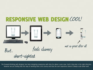
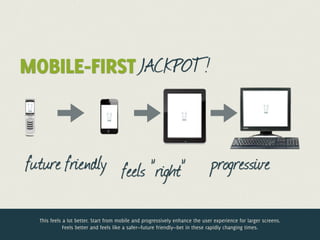

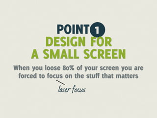
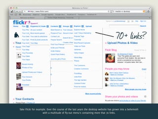


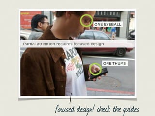
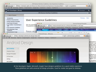
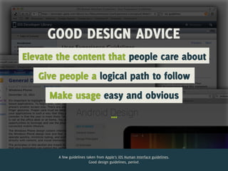


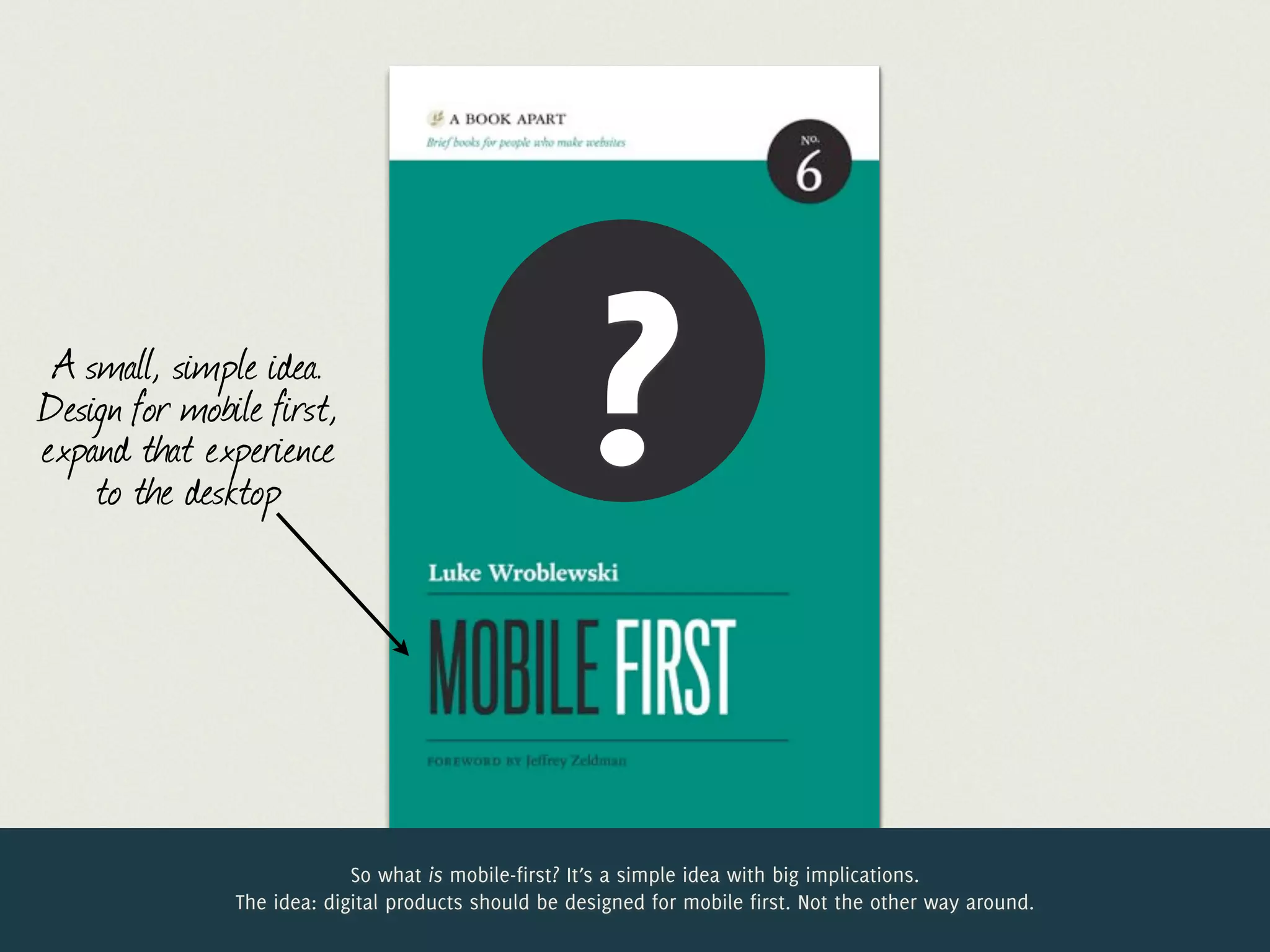


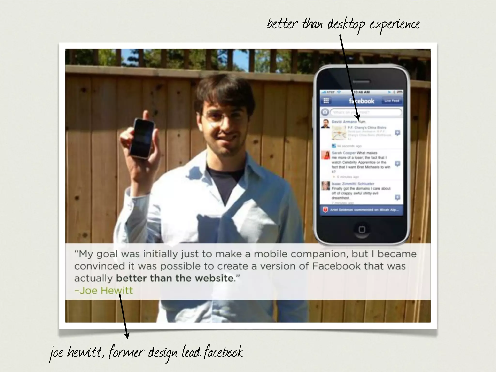
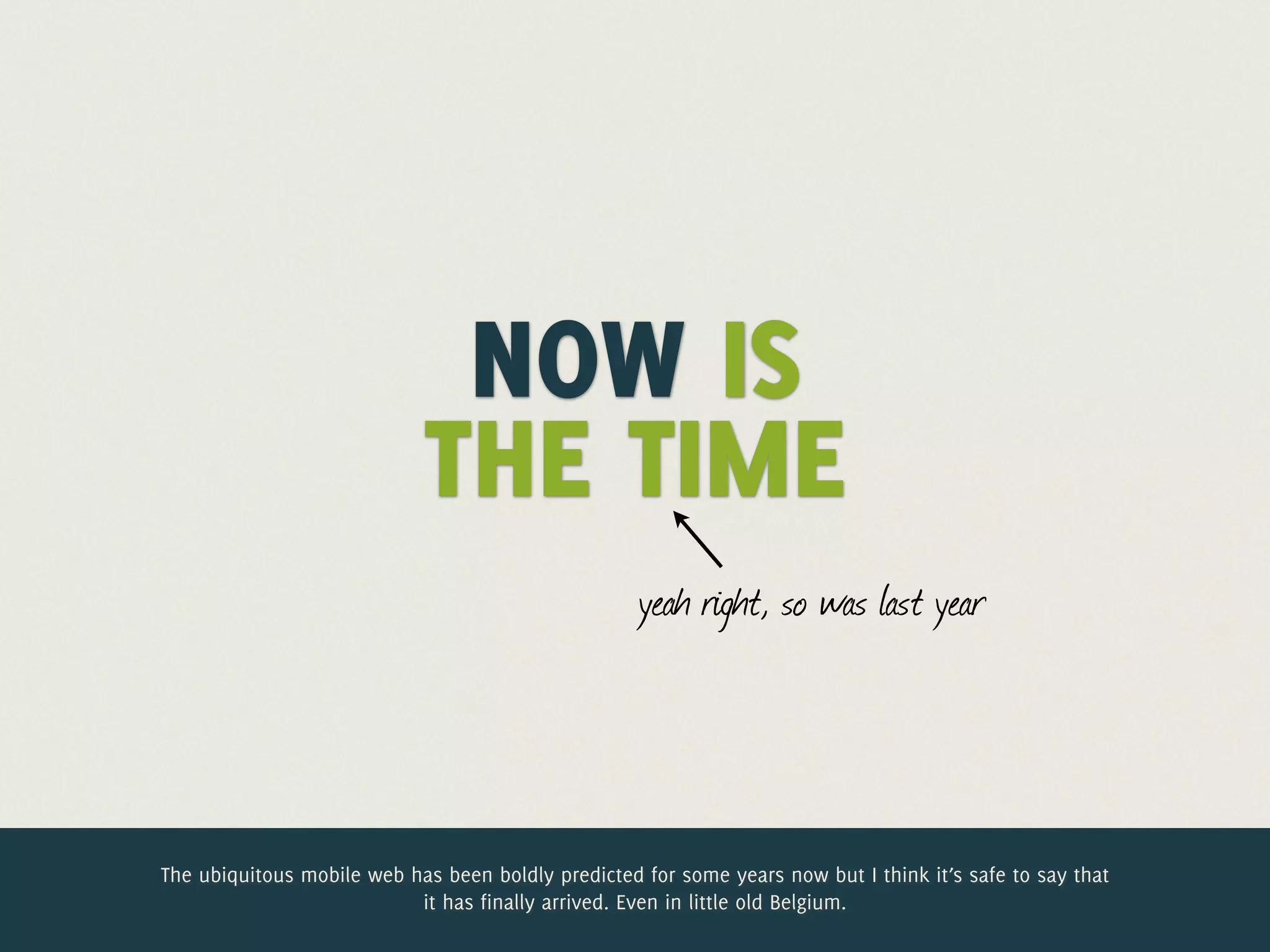

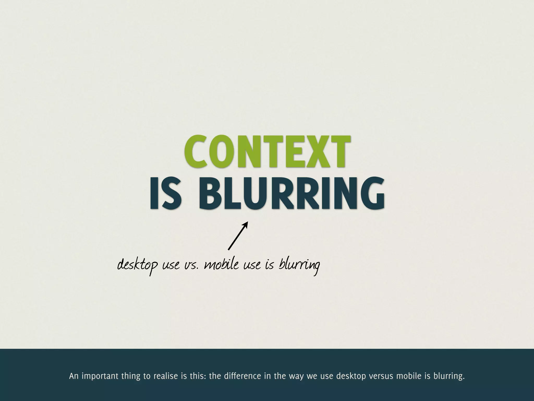

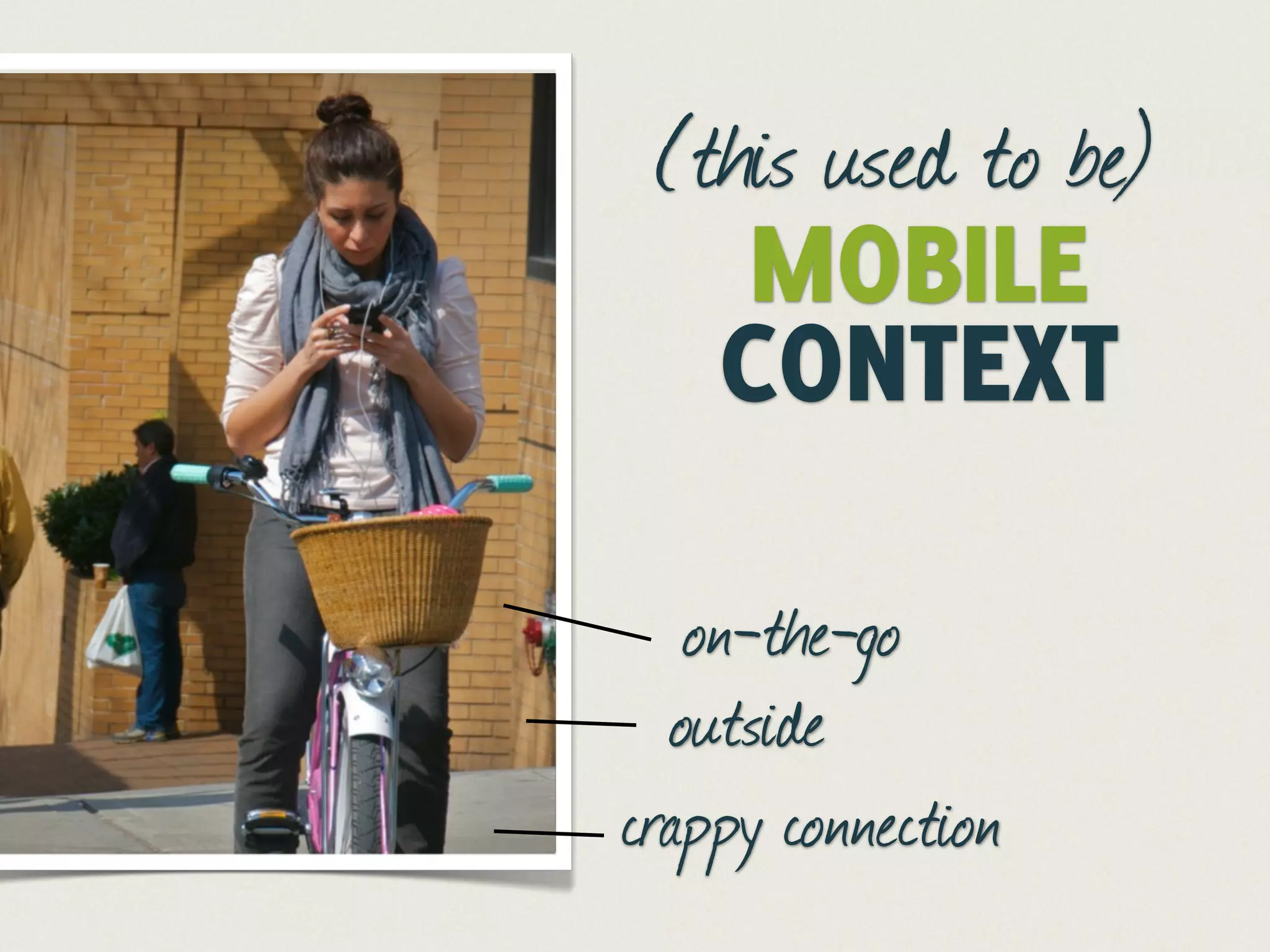
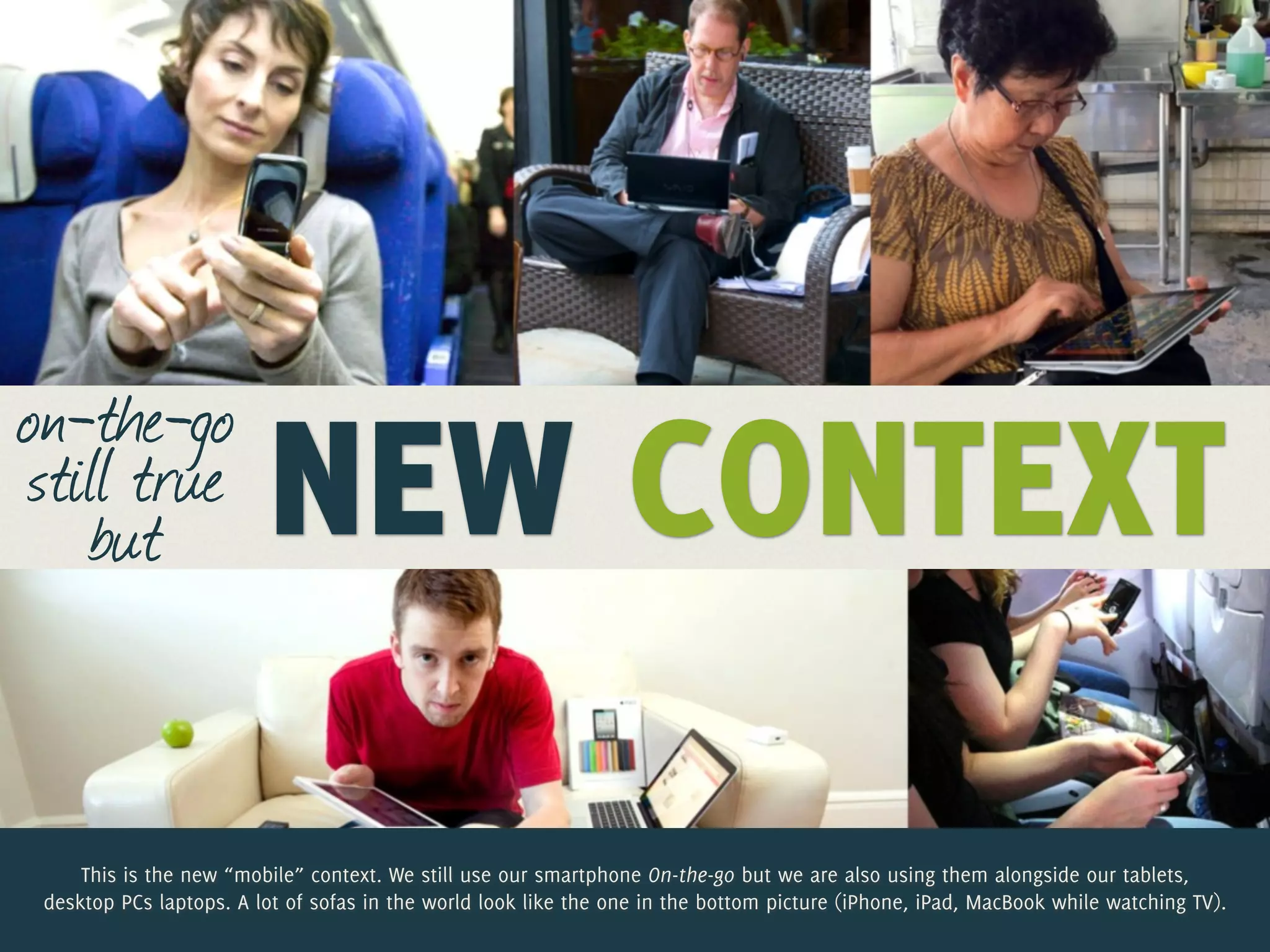

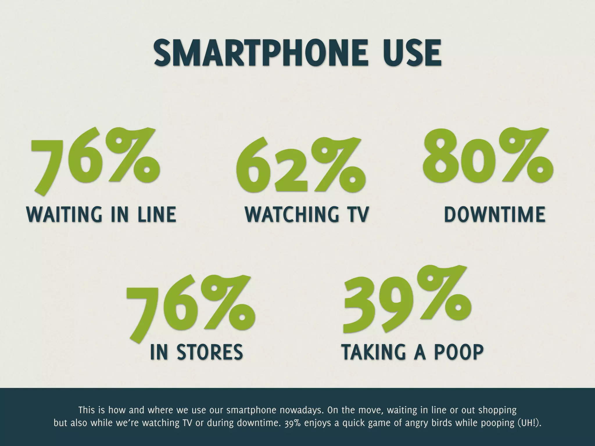
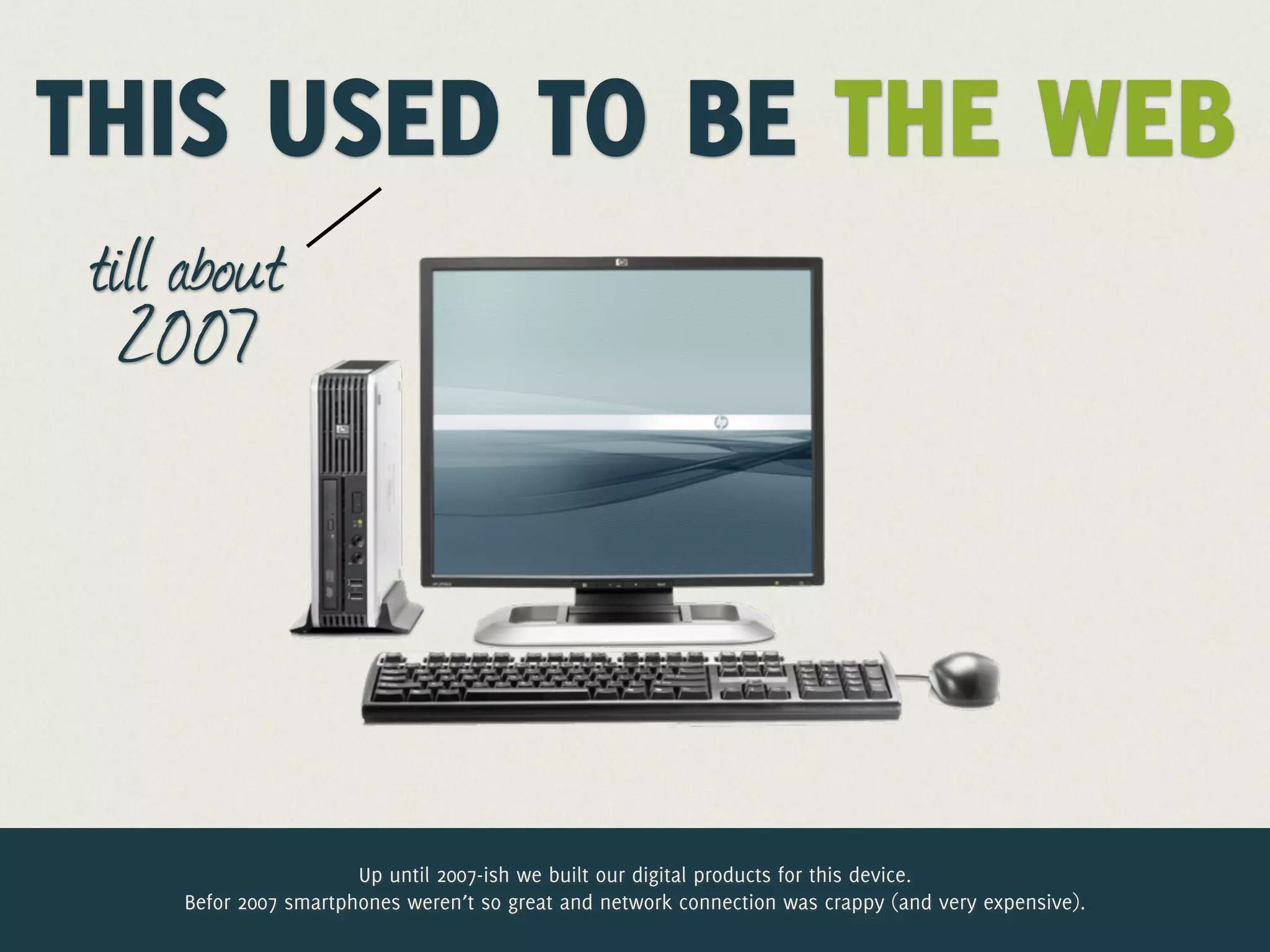
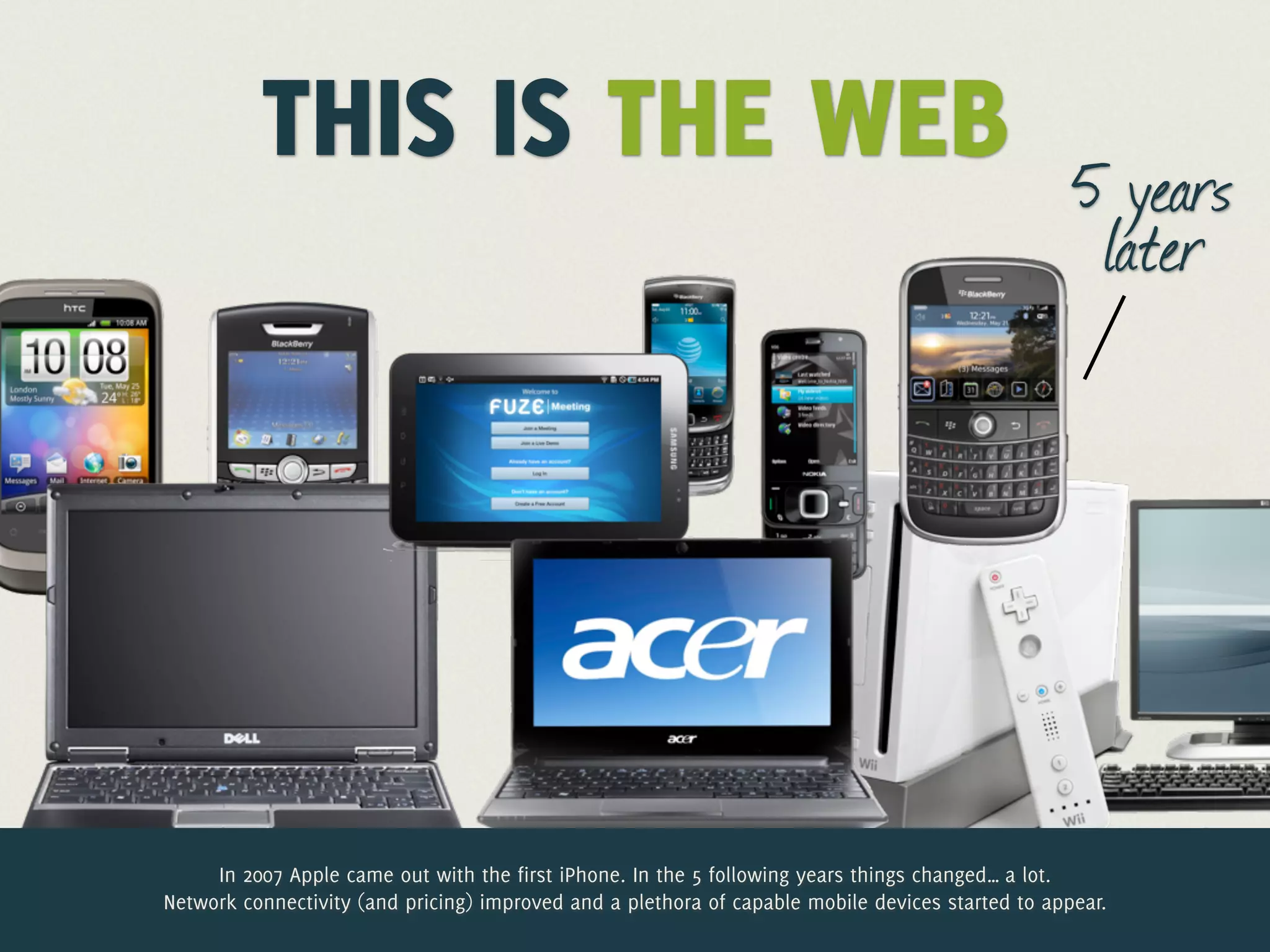

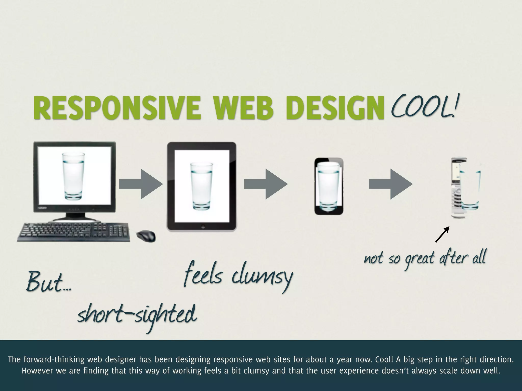
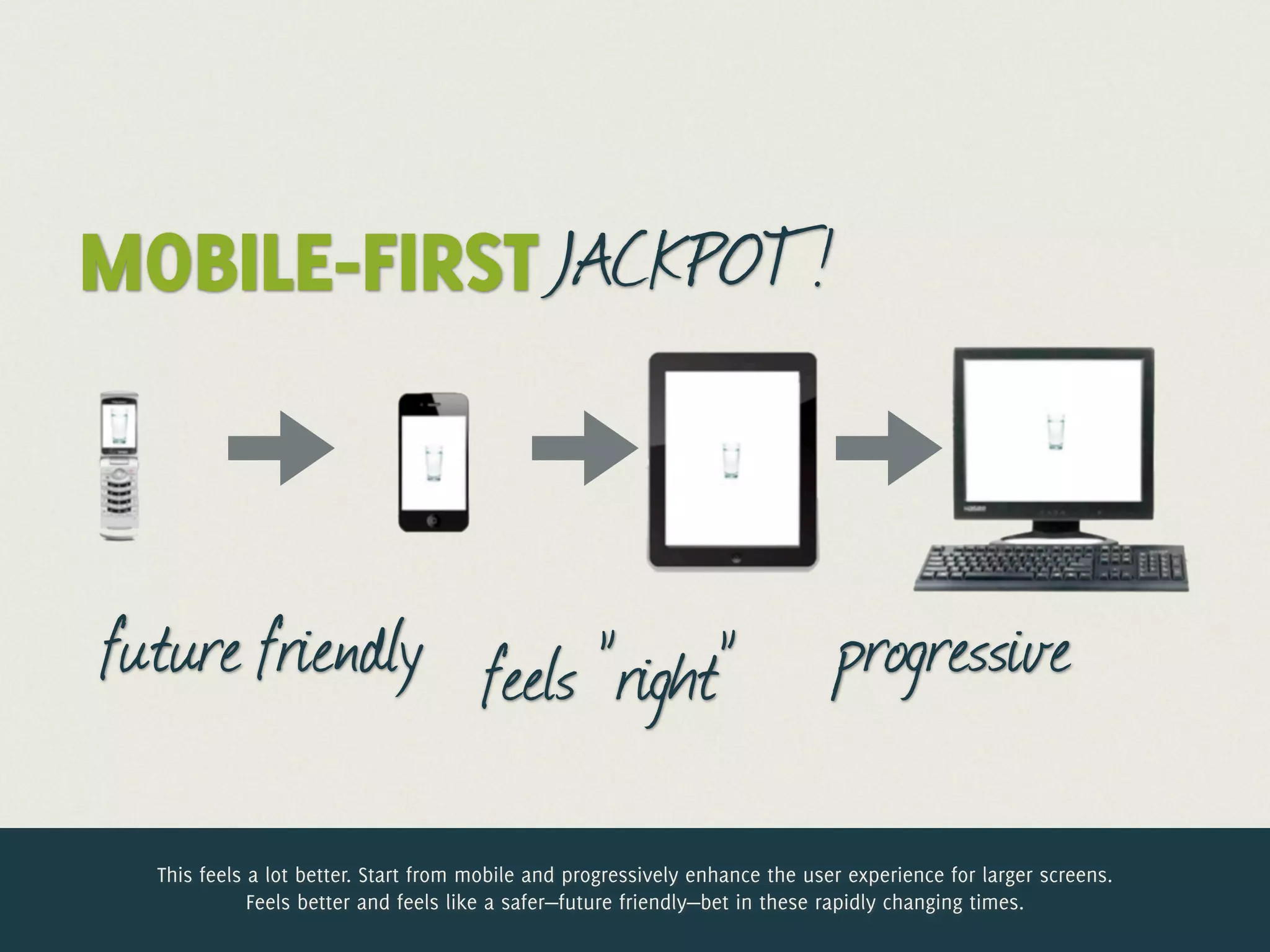

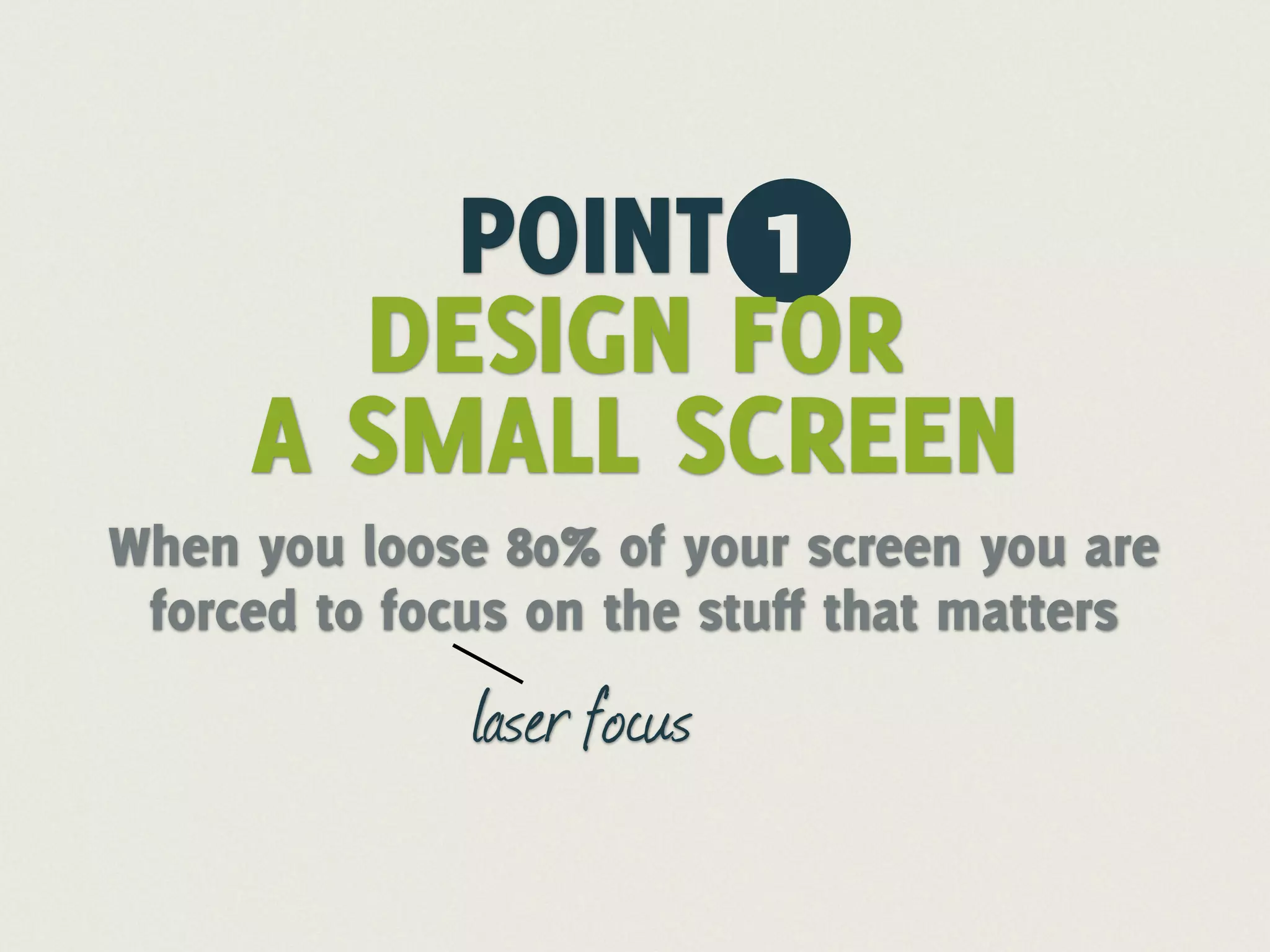
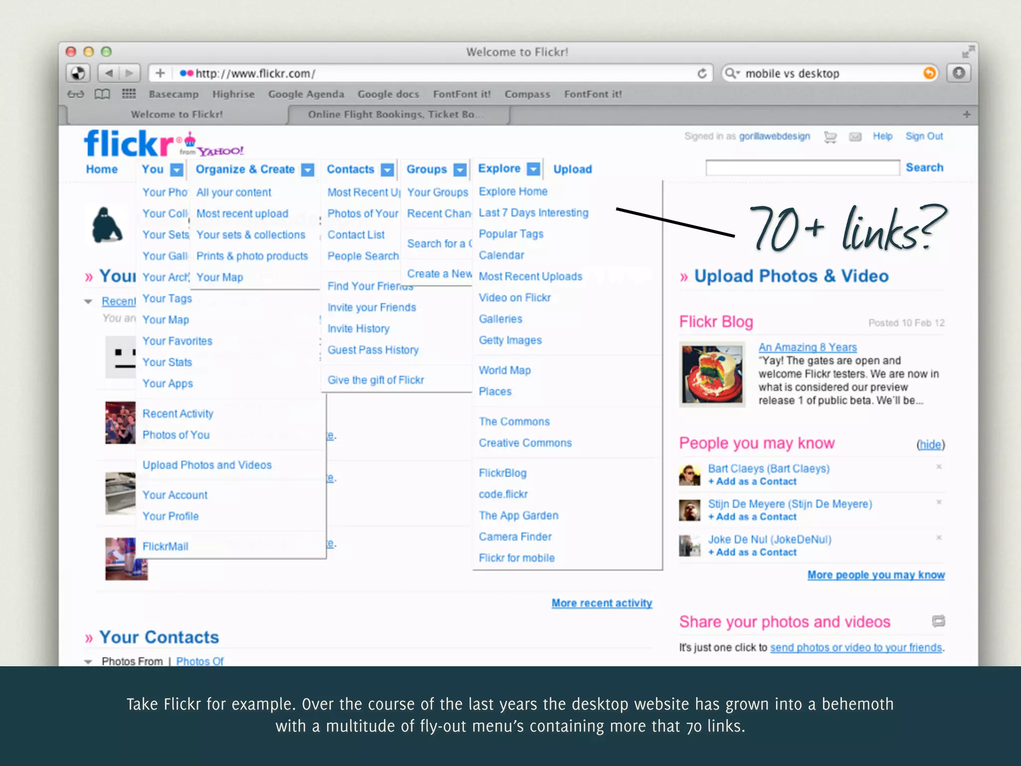
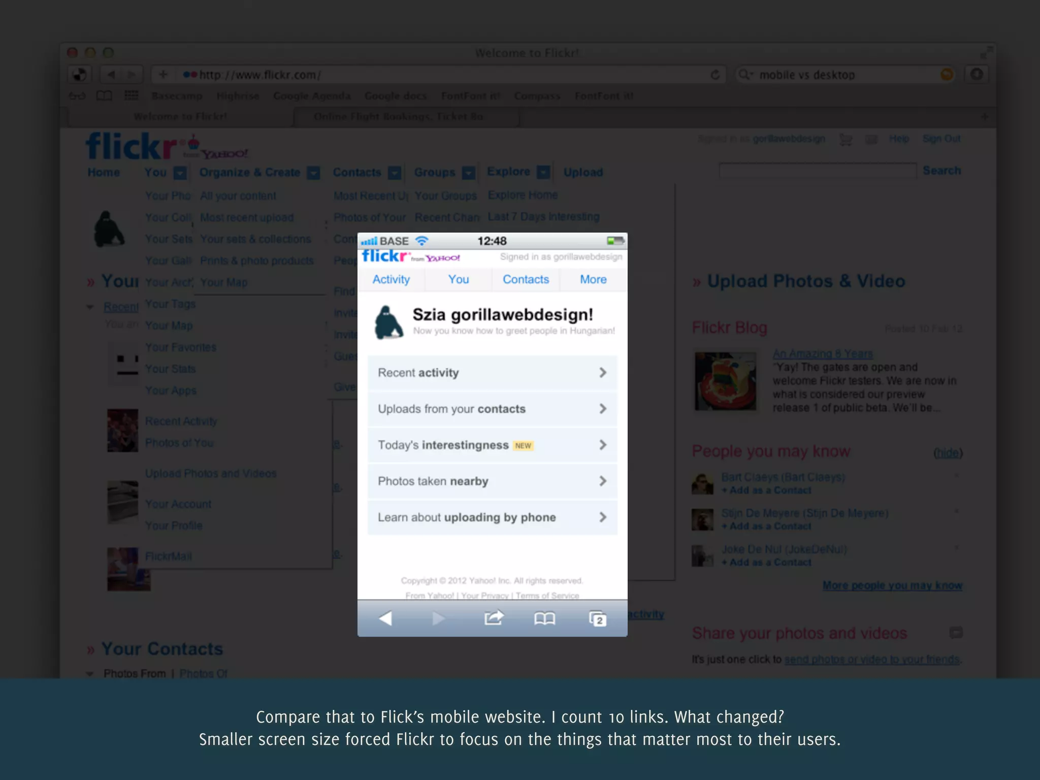


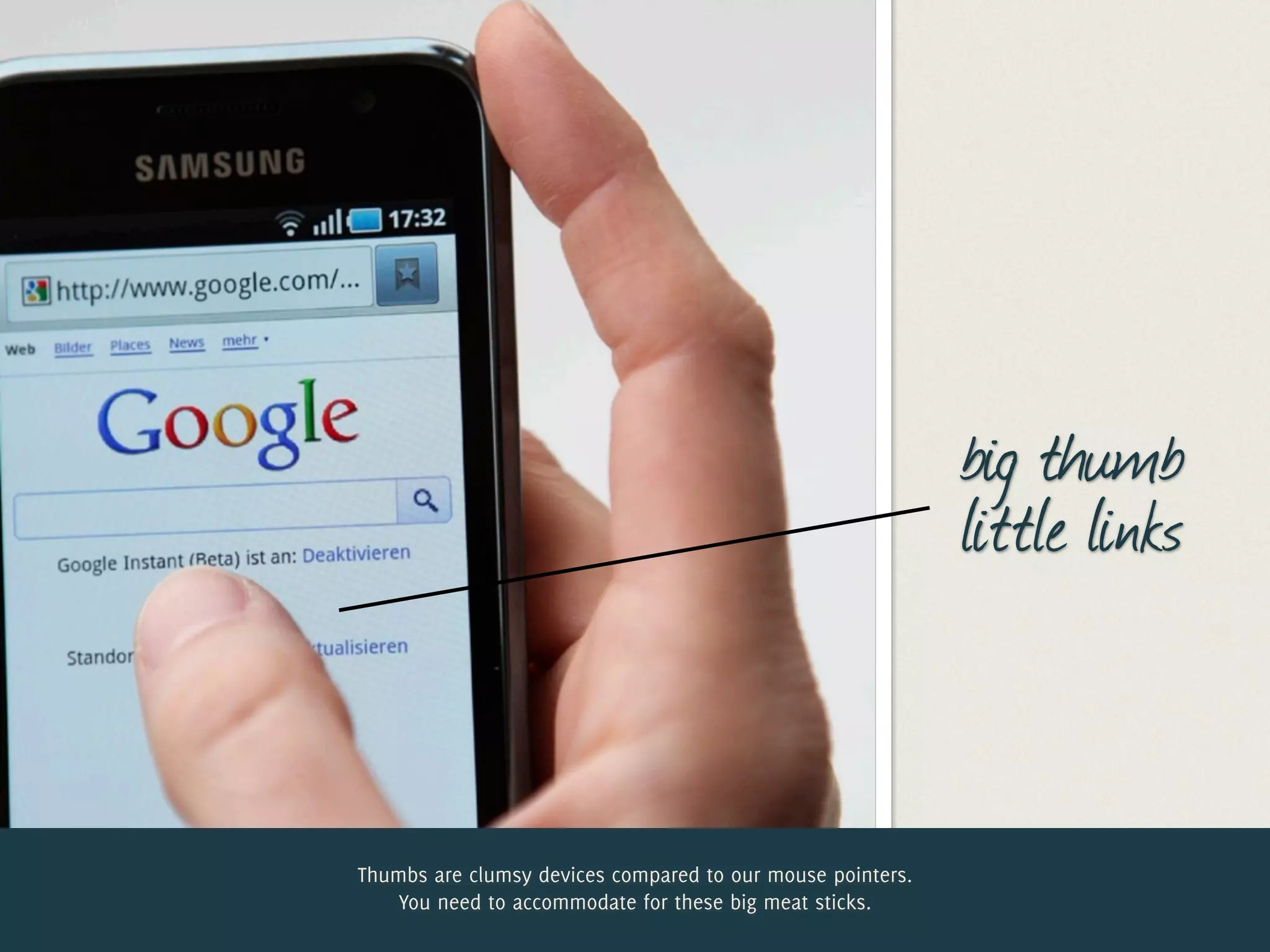
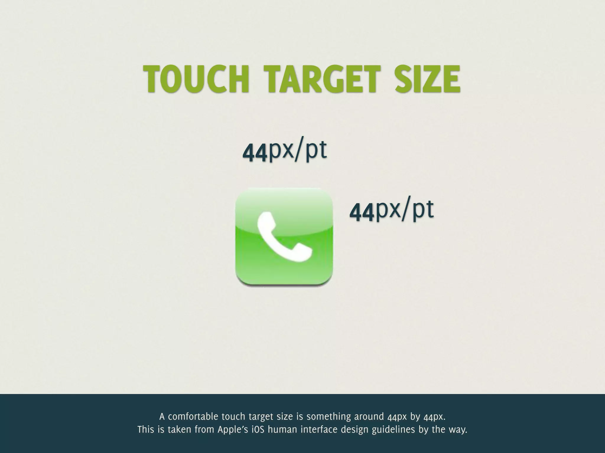
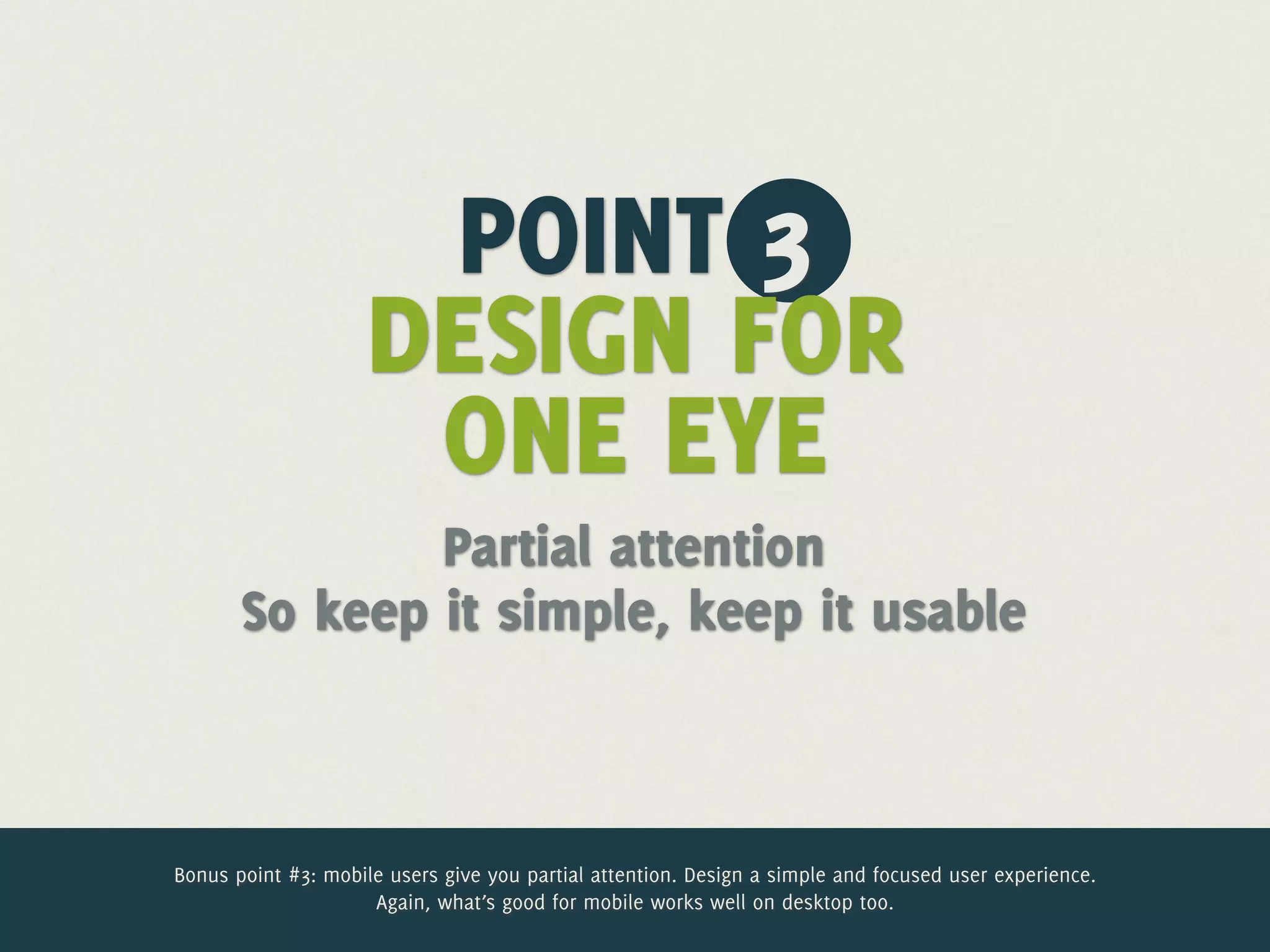
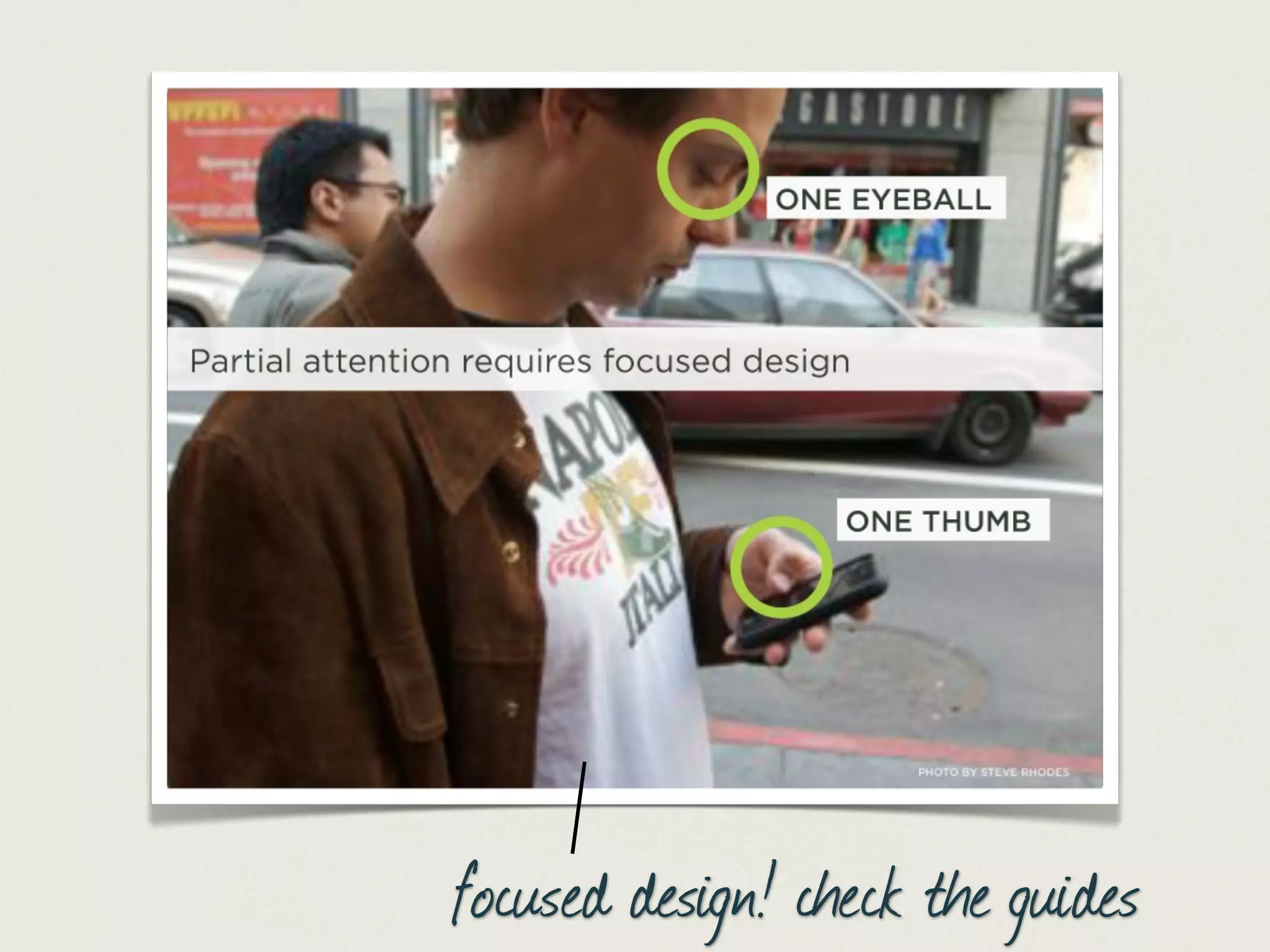
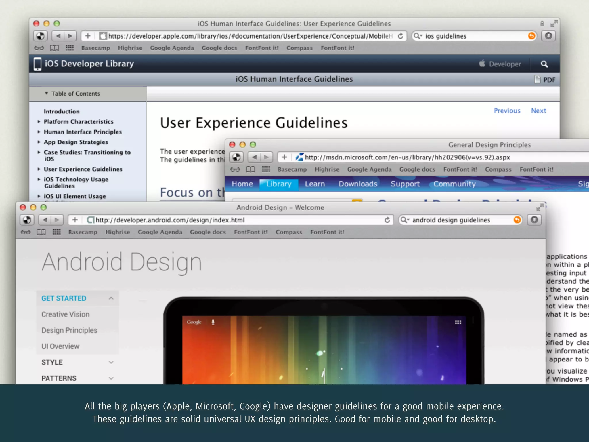
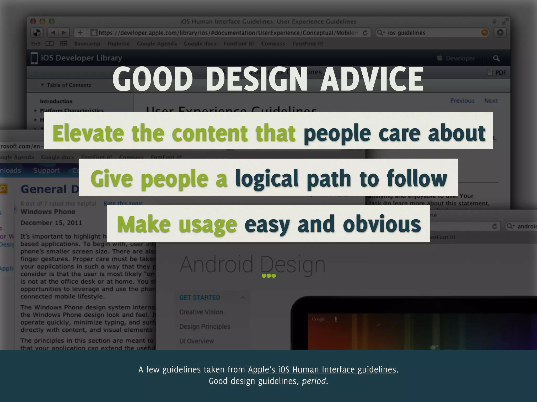


The document presents a presentation on the mobile-first design concept by Jelle Desramaults, emphasizing the importance of designing digital products for mobile devices before adapting them for desktop. It outlines various principles of mobile-first design, including focusing on essential content, accommodating touch usability, simplifying user experiences, and considering network limitations. The presentation advocates for a progressive enhancement approach to ensure a better user experience across all devices.


