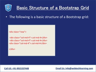
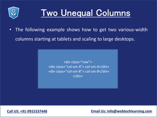
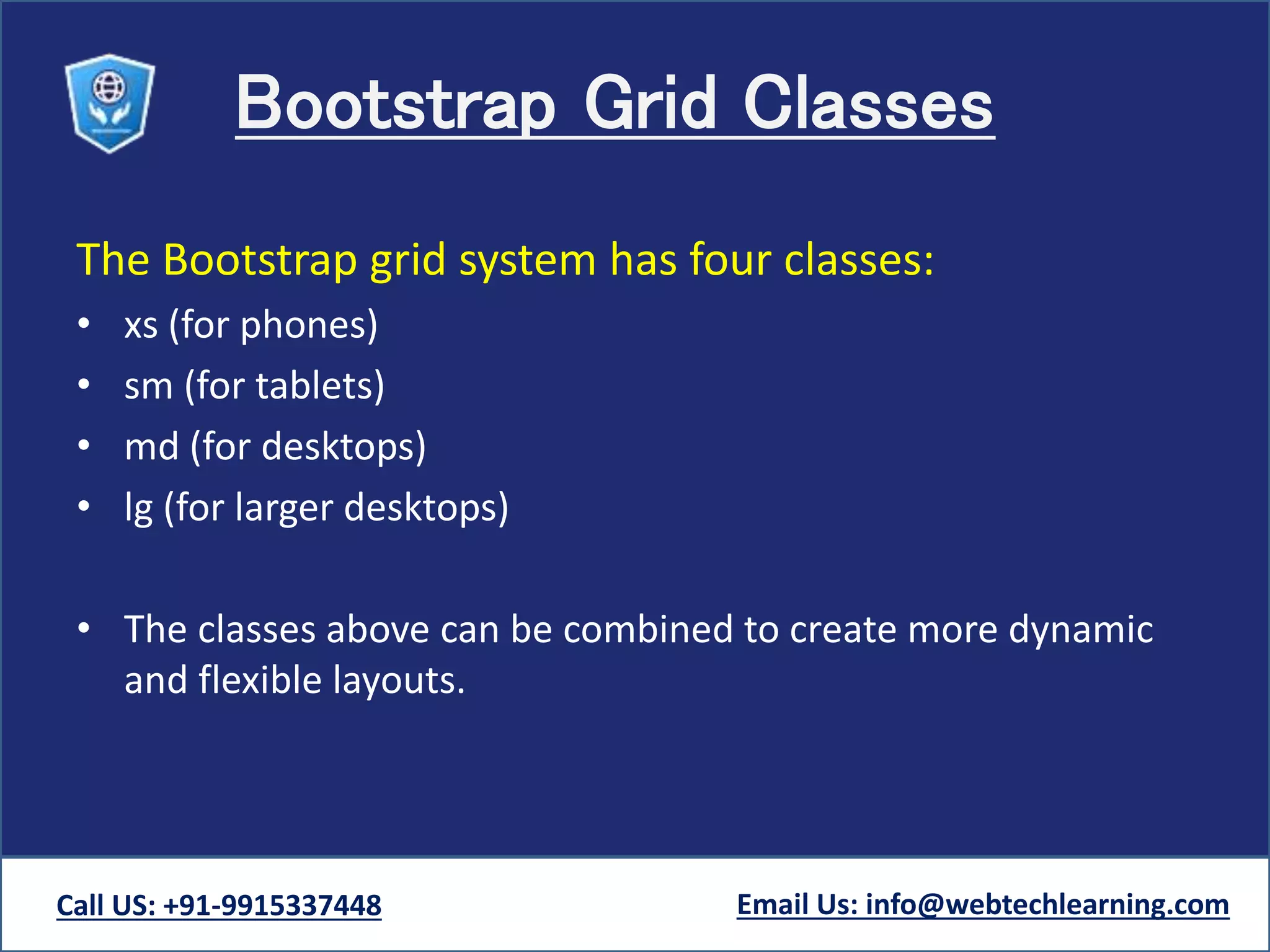
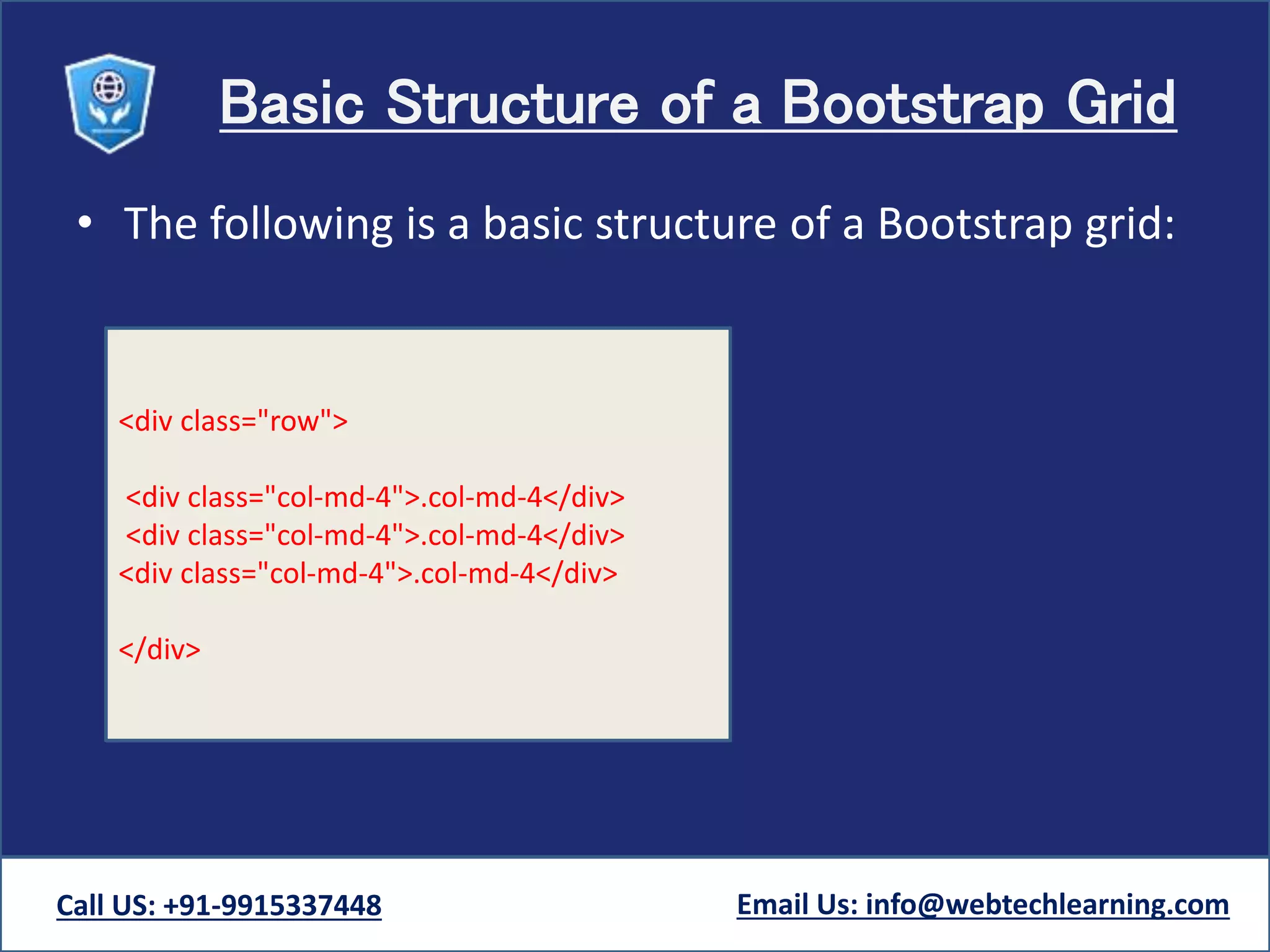
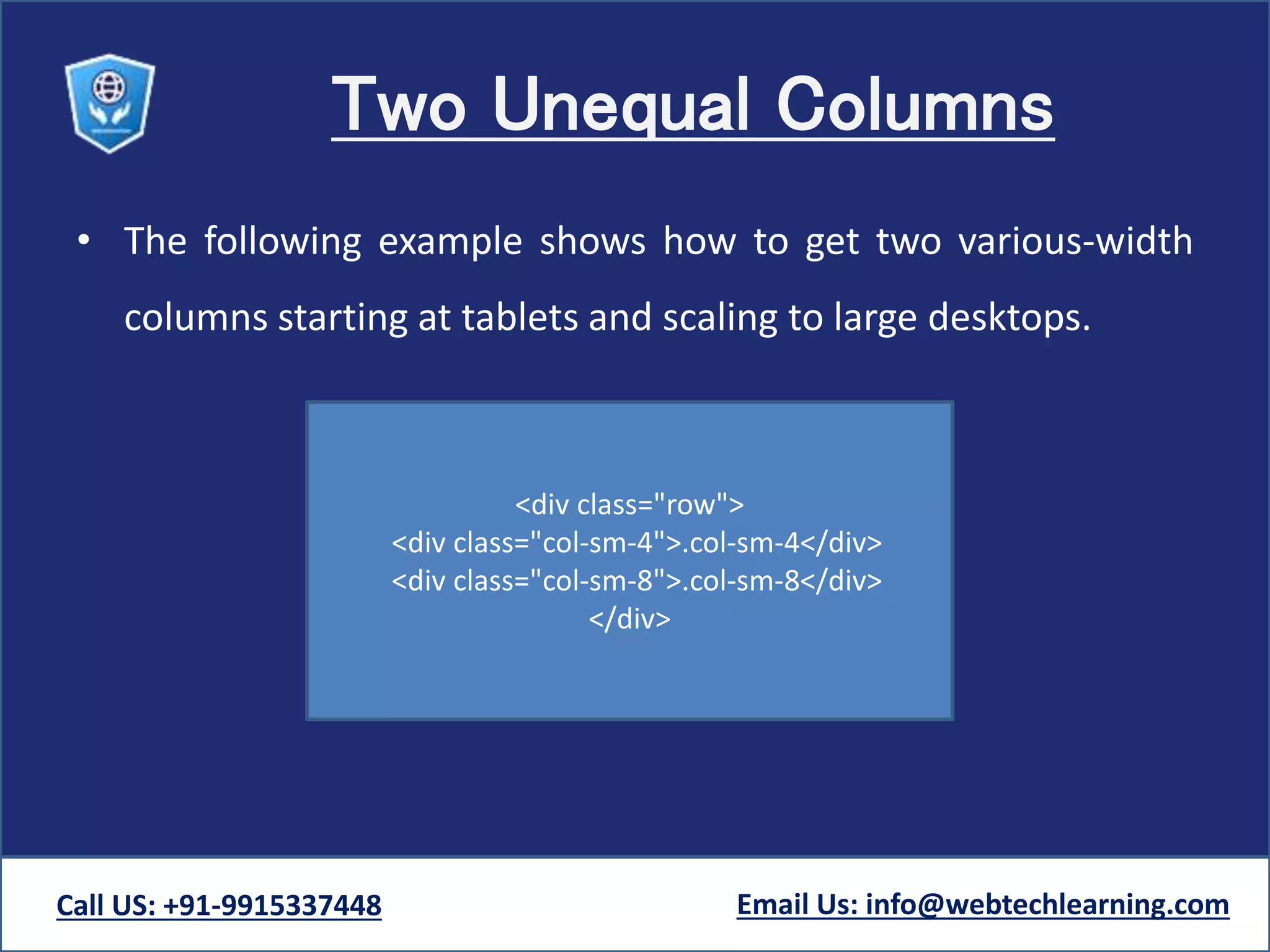
KEMBAR78
Bootstrap grids | PPTX
TWITTER BOOTSTRAP
Bootstrap Grid system
Call US: +91-9915337448 Email Us: info@webtechlearning.com
Grid system Introduction
• Bootstrap's grid system allows up to 12 columns
across the page.
• If you do not want to use all 12 column individually,
you can group the columns together to create wider
columns:
Call US: +91-9915337448 Email Us: info@webtechlearning.com
Grid system Introduction
• Rows must be placed within a .container (fixed-width) or .container-
fluid (full-width) for proper alignment and padding.
• Use rows to create horizontal groups of columns.
• Grid columns are created by specifying the number of twelve available
columns you wish to span. For example, three equal columns would use
three .col-xs-4.
• Content should be placed within columns, and only columns may be
immediate children of rows.
Call US: +91-9915337448 Email Us: info@webtechlearning.com
Grid system Introduction
• Columns create gutters (gaps between column content) via padding. That
padding is offset in rows for the first and last column via negative margin
on .rows.
• If more than 12 columns are placed within a single row, each group of
extra columns will, as one unit, wrap onto a new line.
• Bootstrap's grid system is responsive, and the columns will re-arrange
automatically depending on the screen size.
Call US: +91-9915337448 Email Us: info@webtechlearning.com
Bootstrap Grid Classes
The Bootstrap grid system has four classes:
• xs (for phones)
• sm (for tablets)
• md (for desktops)
• lg (for larger desktops)
• The classes above can be combined to create more dynamic
and flexible layouts.
Call US: +91-9915337448 Email Us: info@webtechlearning.com
Basic Structure of a Bootstrap Grid
• The following is a basic structure of a Bootstrap grid:
Call US: +91-9915337448 Email Us: info@webtechlearning.com
<div class="row">
<div class="col-md-4">.col-md-4</div>
</div>
Two Unequal Columns
• The following example shows how to get two various-width
columns starting at tablets and scaling to large desktops.
Call US: +91-9915337448 Email Us: info@webtechlearning.com
<div class="row">
<div class="col-sm-4">.col-sm-4</div>
<div class="col-sm-8">.col-sm-8</div>
</div>
Bootstrap grids

Bootstrap grids

  • 1.
    TWITTER BOOTSTRAP Bootstrap Gridsystem Call US: +91-9915337448 Email Us: info@webtechlearning.com
  • 2.
    Grid system Introduction •Bootstrap's grid system allows up to 12 columns across the page. • If you do not want to use all 12 column individually, you can group the columns together to create wider columns: Call US: +91-9915337448 Email Us: info@webtechlearning.com
  • 3.
    Grid system Introduction •Rows must be placed within a .container (fixed-width) or .container- fluid (full-width) for proper alignment and padding. • Use rows to create horizontal groups of columns. • Grid columns are created by specifying the number of twelve available columns you wish to span. For example, three equal columns would use three .col-xs-4. • Content should be placed within columns, and only columns may be immediate children of rows. Call US: +91-9915337448 Email Us: info@webtechlearning.com
  • 4.
    Grid system Introduction •Columns create gutters (gaps between column content) via padding. That padding is offset in rows for the first and last column via negative margin on .rows. • If more than 12 columns are placed within a single row, each group of extra columns will, as one unit, wrap onto a new line. • Bootstrap's grid system is responsive, and the columns will re-arrange automatically depending on the screen size. Call US: +91-9915337448 Email Us: info@webtechlearning.com
  • 5.
    Bootstrap Grid Classes TheBootstrap grid system has four classes: • xs (for phones) • sm (for tablets) • md (for desktops) • lg (for larger desktops) • The classes above can be combined to create more dynamic and flexible layouts. Call US: +91-9915337448 Email Us: info@webtechlearning.com
  • 6.
    Basic Structure ofa Bootstrap Grid • The following is a basic structure of a Bootstrap grid: Call US: +91-9915337448 Email Us: info@webtechlearning.com <div class="row"> <div class="col-md-4">.col-md-4</div> <div class="col-md-4">.col-md-4</div> <div class="col-md-4">.col-md-4</div> </div>
  • 7.
    Two Unequal Columns •The following example shows how to get two various-width columns starting at tablets and scaling to large desktops. Call US: +91-9915337448 Email Us: info@webtechlearning.com <div class="row"> <div class="col-sm-4">.col-sm-4</div> <div class="col-sm-8">.col-sm-8</div> </div>