Download to read offline


![BOOTSTRAPTOOLTIP PLUGIN
How toCreate a Tooltip
WebTechLearning,Chandigarh
To create a tooltip, add the data-toggle="tooltip" attribute to an element.
Use the title attribute to specify the text that should be displayed inside the
tooltip:
<a href="#" data-toggle="tooltip" title="Hooray!">Hover over me</a>
Note: Tooltips must be initialized with jQuery: select the specified element and
call the tooltip() method.
The following code will enable all tooltips in the document:
Example
<script>
$(document).ready(function(){
$('[data-toggle="tooltip"]').tooltip();
});
</script>](https://image.slidesharecdn.com/bootstrap-webtechpresentation-new-161122043833/85/Bootstrap-webtech-presentation-new-11-320.jpg)


![BOOTSTRAPTOOLTIP PLUGIN
How toCreate a Tooltip
WebTechLearning,Chandigarh
To create a tooltip, add the data-toggle="tooltip" attribute to an element.
Use the title attribute to specify the text that should be displayed inside the
tooltip:
<a href="#" data-toggle="tooltip" title="Hooray!">Hover over me</a>
Note: Tooltips must be initialized with jQuery: select the specified element and
call the tooltip() method.
The following code will enable all tooltips in the document:
Example
<script>
$(document).ready(function(){
$('[data-toggle="tooltip"]').tooltip();
});
</script>](https://image.slidesharecdn.com/bootstrap-webtechpresentation-new-161122043833/75/Bootstrap-webtech-presentation-new-11-2048.jpg)


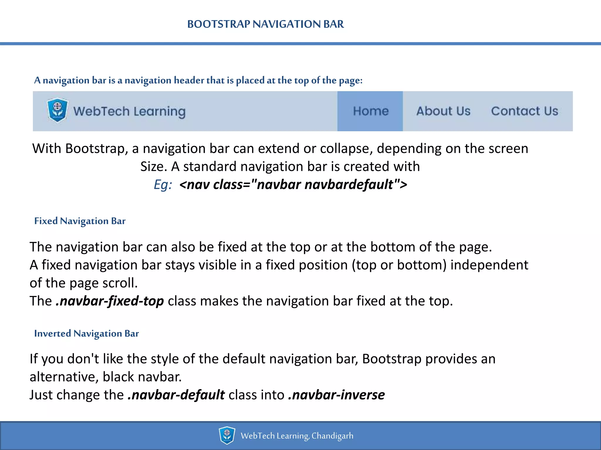
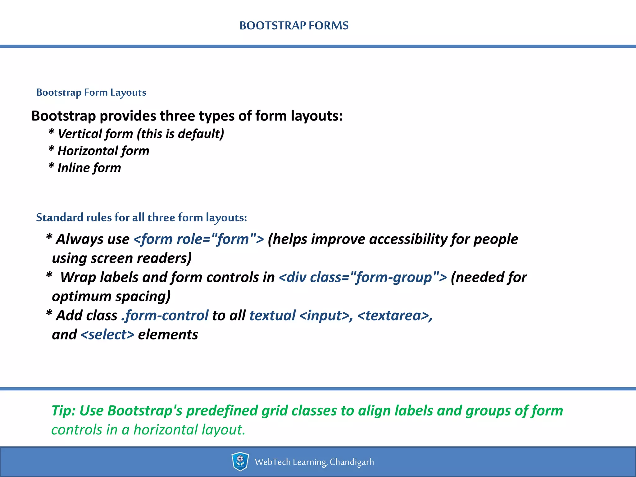
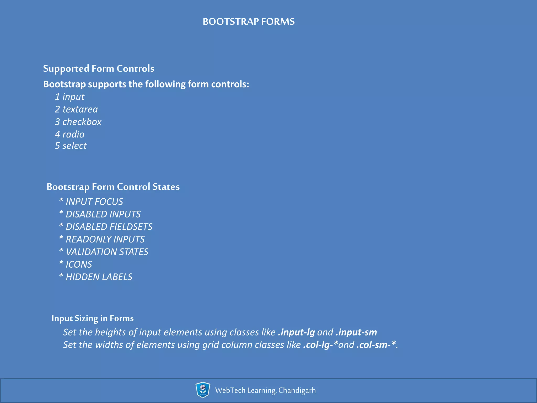
The document provides an overview of Bootstrap, a popular front-end framework for developing responsive, mobile-first websites using HTML, CSS, and JavaScript. It details Bootstrap's grid system, responsive design capabilities, and various components like buttons, navigation bars, and forms, all aimed at enhancing web development efficiency. Additionally, it discusses the use of contextual colors, image responsiveness, and tooltips, outlining essential classes and their implementations.


![Bootstrap [part 2]](https://cdn.slidesharecdn.com/ss_thumbnails/javanik-170208155331-thumbnail.jpg?width=600ounds&width=560&fit=bounds)
![Bootstrap [part 1]](https://cdn.slidesharecdn.com/ss_thumbnails/bootstrappart-11-170208154053-thumbnail.jpg?width=600ounds&width=560&fit=bounds)


