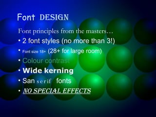
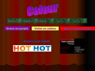
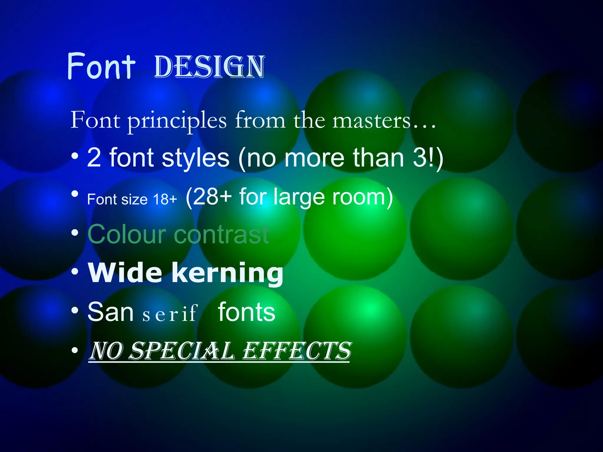
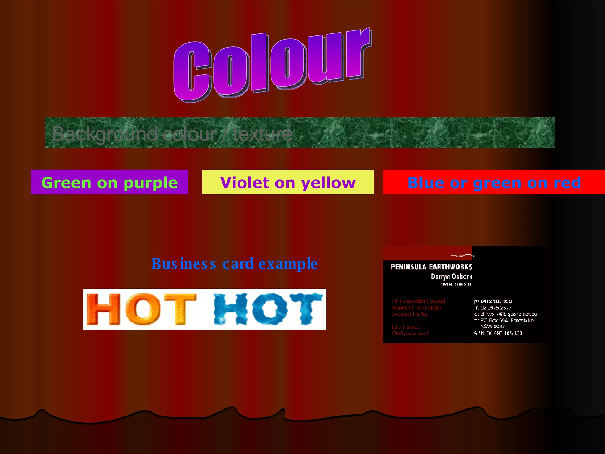
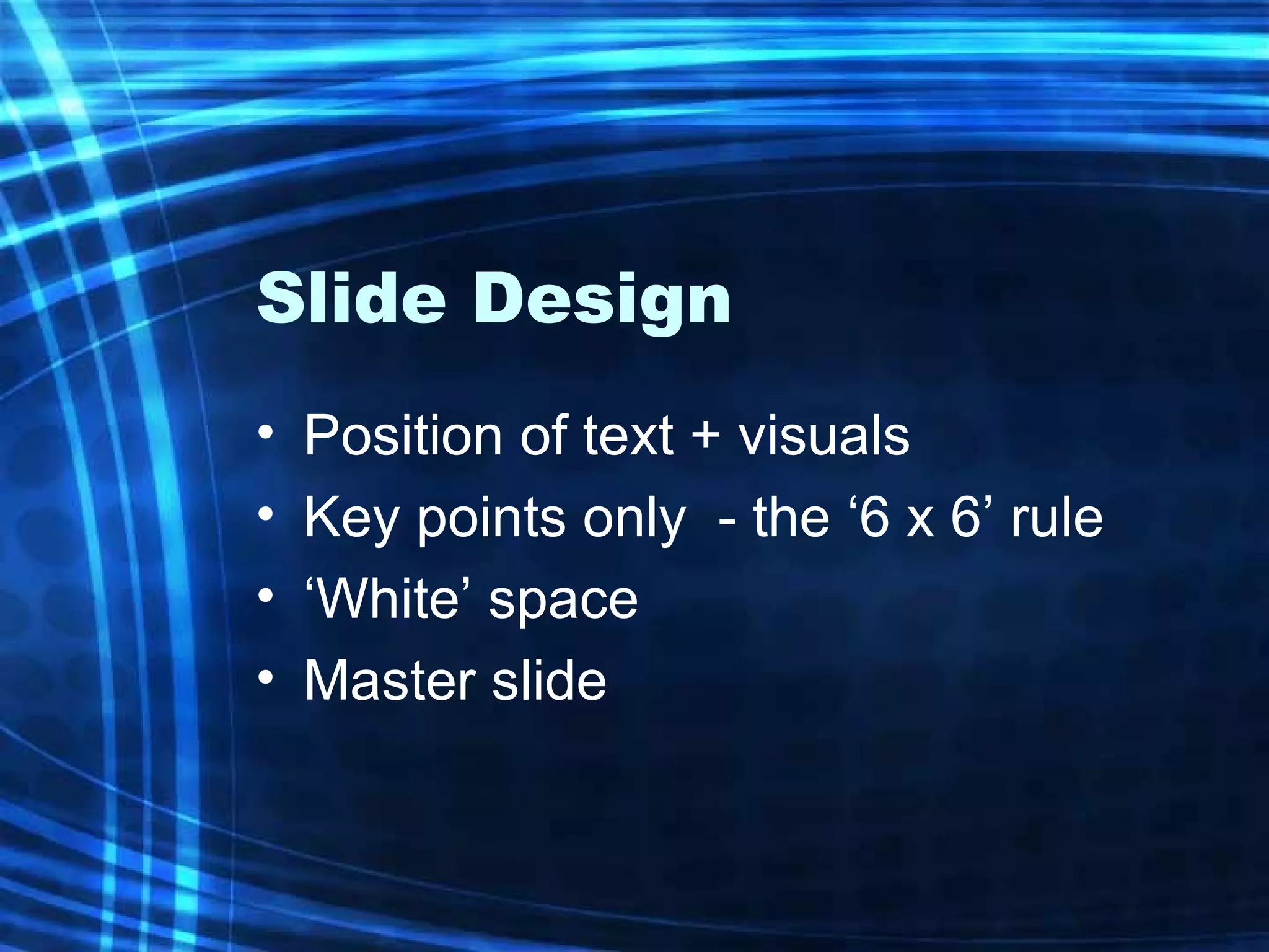
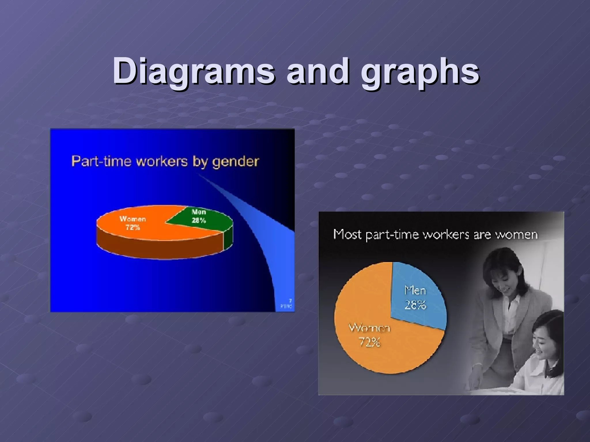
KEMBAR78
Bridgit Ppt Part2 | PPT
Font   Design Font principles from the masters… 2 font styles (no more than 3!) Font size 18+   (28+ for large room) Colour contrast Wide kerning San  serif  fonts No special effects
Colour Background colour / texture Business card example Green on purple Violet on yellow Blue or green on red
Too much information! It’s best to minimise the amount of text in your PowerPoint presentation because the presentation is exactly that… a presentation and you don’t have to spell every detail out on screen because you do that when you talk! It’s also good to minimise bullet points because if you have a lot of them and start running out of time for your presentation, everyone can see what you are missing out when you start rushing through them. Instead put extra points in your notes to talk about if you have time. You only need key points in your presentation – put the detail in your notes page which you could then use as a handout Remember, the PowerPoint presentation forms the basis of your discussion and is not a document for your audience to sit down and read through with you. Us eit for key points only and use visual images for interest. The aim is to use minimal text and striking visuals.
Slide Design Position of text + visuals Key points only  - the ‘6 x 6’ rule ‘White’ space Master slide
 
Diagrams and graphs

Bridgit Ppt Part2

  • 1.
    Font Design Font principles from the masters… 2 font styles (no more than 3!) Font size 18+ (28+ for large room) Colour contrast Wide kerning San serif fonts No special effects
  • 2.
    Colour Background colour/ texture Business card example Green on purple Violet on yellow Blue or green on red
  • 3.
    Too much information!It’s best to minimise the amount of text in your PowerPoint presentation because the presentation is exactly that… a presentation and you don’t have to spell every detail out on screen because you do that when you talk! It’s also good to minimise bullet points because if you have a lot of them and start running out of time for your presentation, everyone can see what you are missing out when you start rushing through them. Instead put extra points in your notes to talk about if you have time. You only need key points in your presentation – put the detail in your notes page which you could then use as a handout Remember, the PowerPoint presentation forms the basis of your discussion and is not a document for your audience to sit down and read through with you. Us eit for key points only and use visual images for interest. The aim is to use minimal text and striking visuals.
  • 4.
    Slide Design Positionof text + visuals Key points only - the ‘6 x 6’ rule ‘White’ space Master slide
  • 5.
  • 6.

Editor's Notes

  • #2 Font Design 2 Fonts More than 2 font styles can look messy and gaudy. 3 styles max! Font size 18 pt OK for close computer screen viewing; 28 pt+ for large room viewing Colour Ensure contrast is readable from a distance. Dark background requires light font colour and vice versa Kerning Use fonts with wide kerning (white space between each letter; ie: Verdana) Sans serif Typeface without features (ie: Staccato, Times New Roman) Special Effects Avoid shadow text, capitals and too much underline and italics