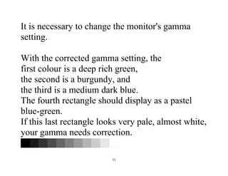
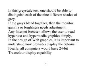
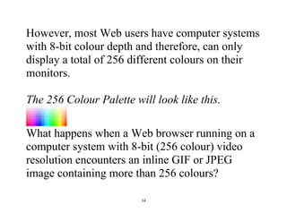
Download as PDF, PPTX


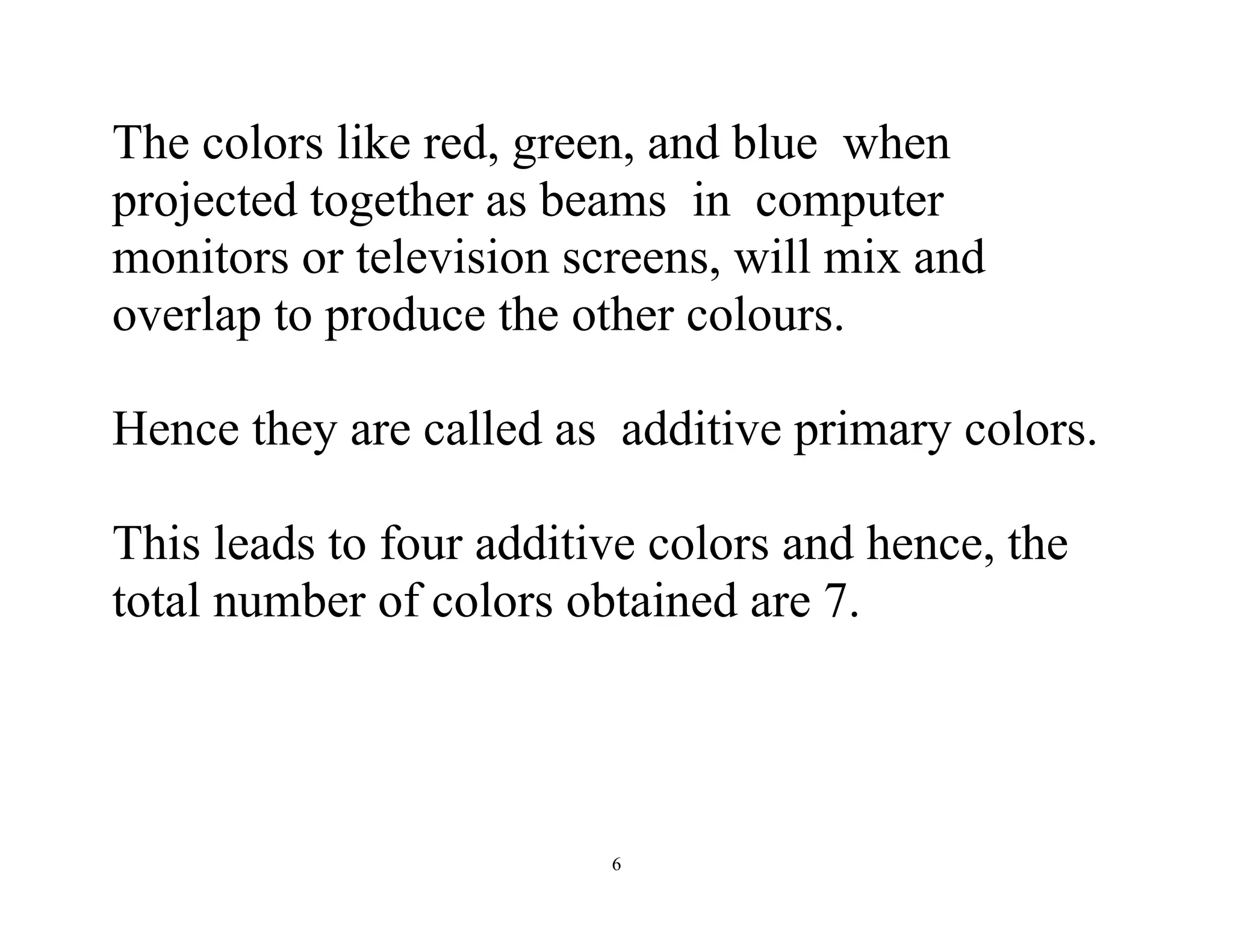
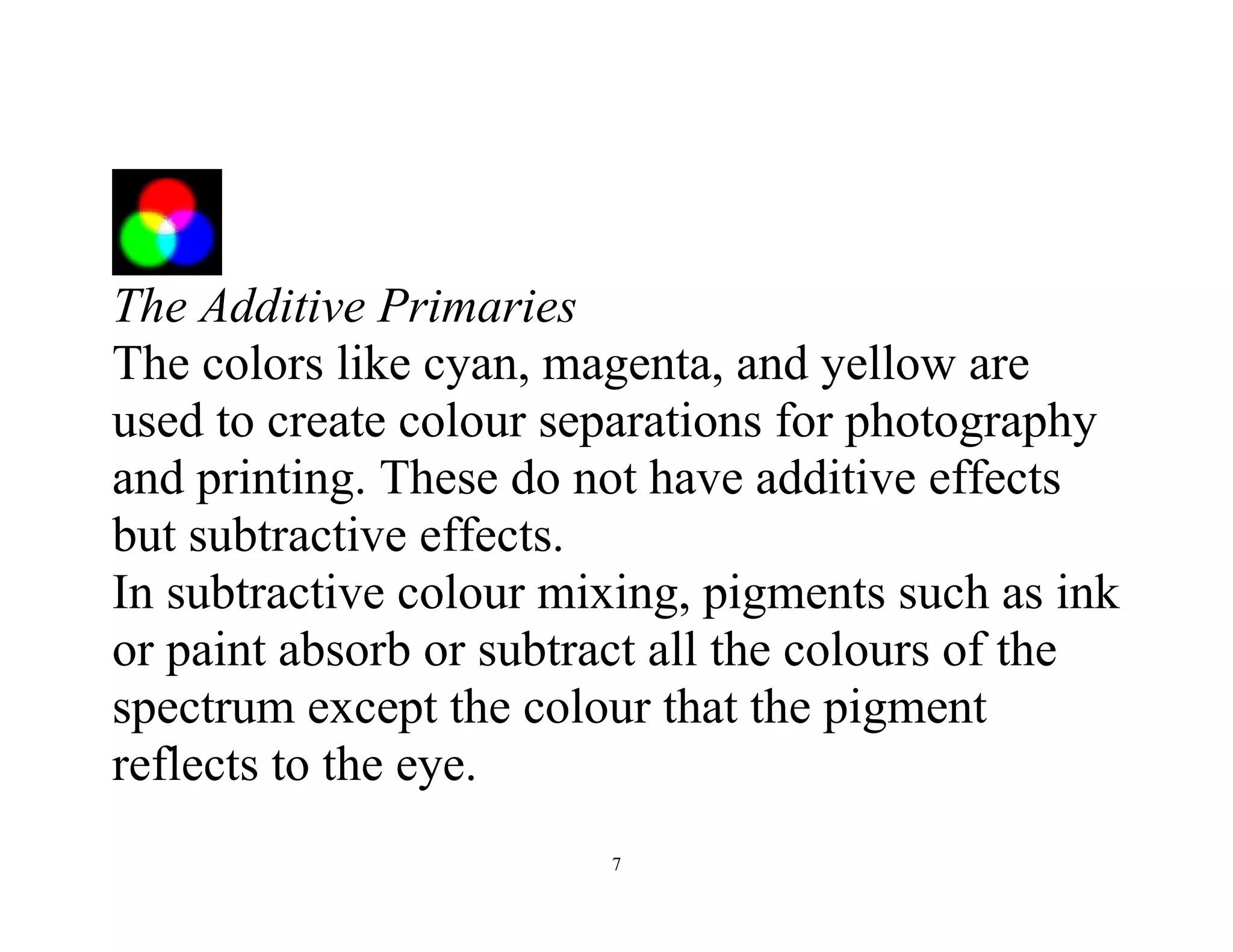
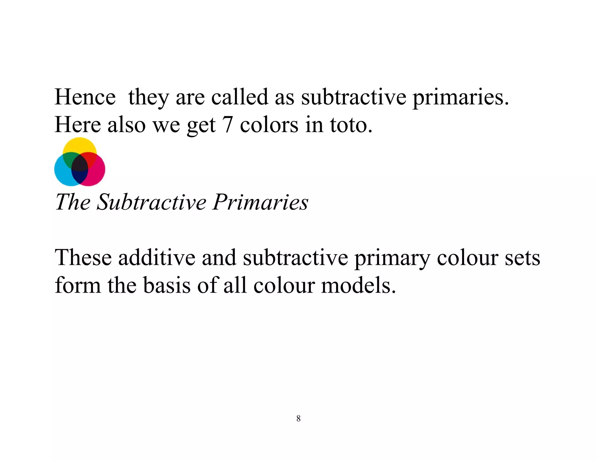


The document discusses the significance of color models in computer graphics, outlining various color concepts, types of color models, and their applications across different media. It delves into additive and subtractive color mixing, color theory, and the impact of colors on design, emphasizing the importance of appropriate color usage in visual communication. Additionally, it addresses technical aspects of color management in graphic design and the effective use of software tools for color manipulation.


