Downloaded 118 times
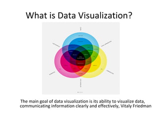
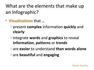
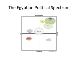
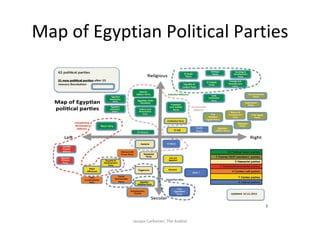
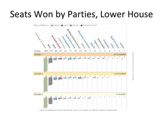
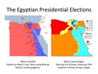

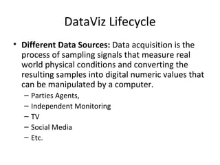
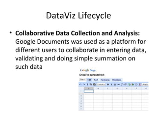


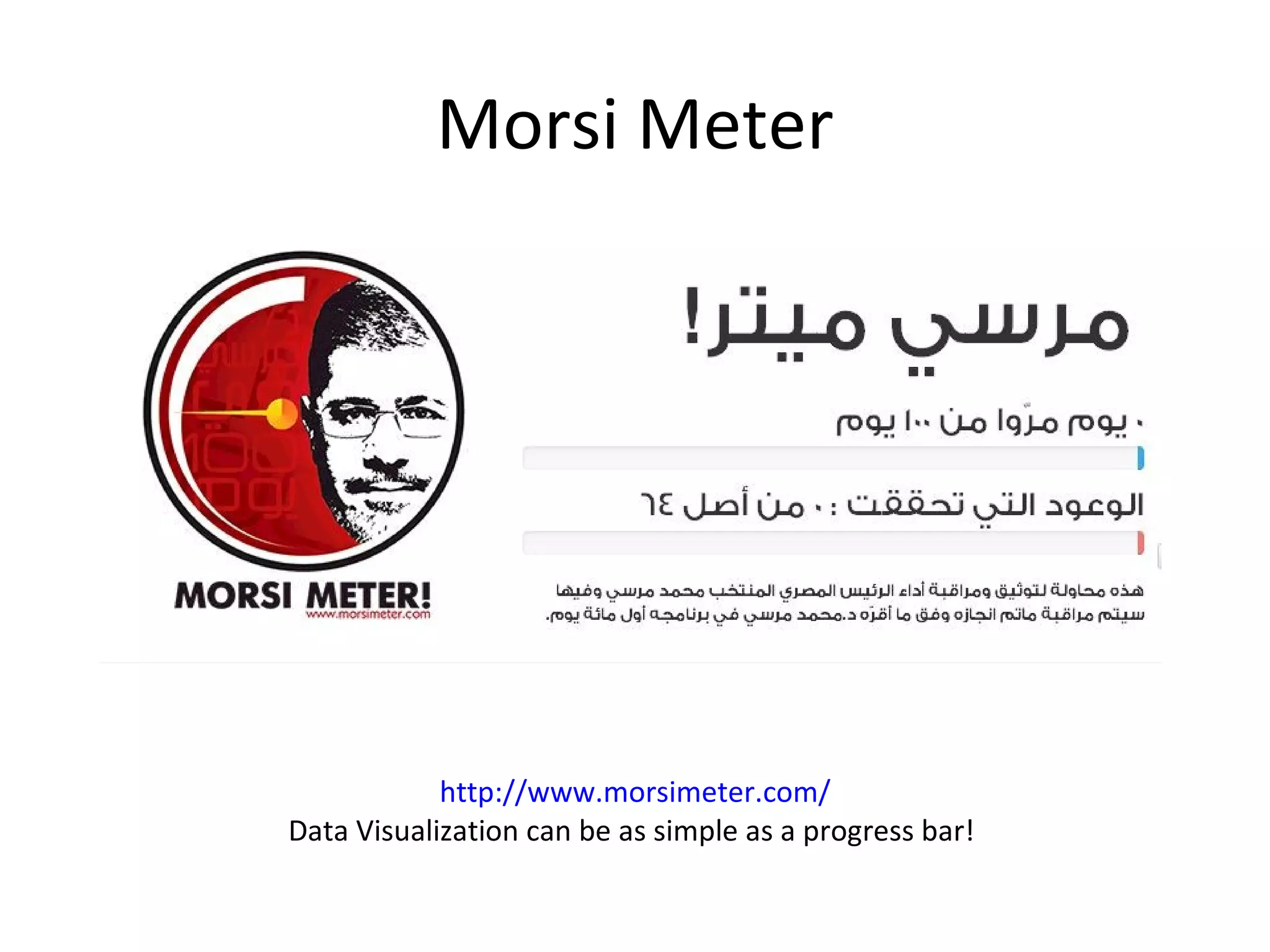
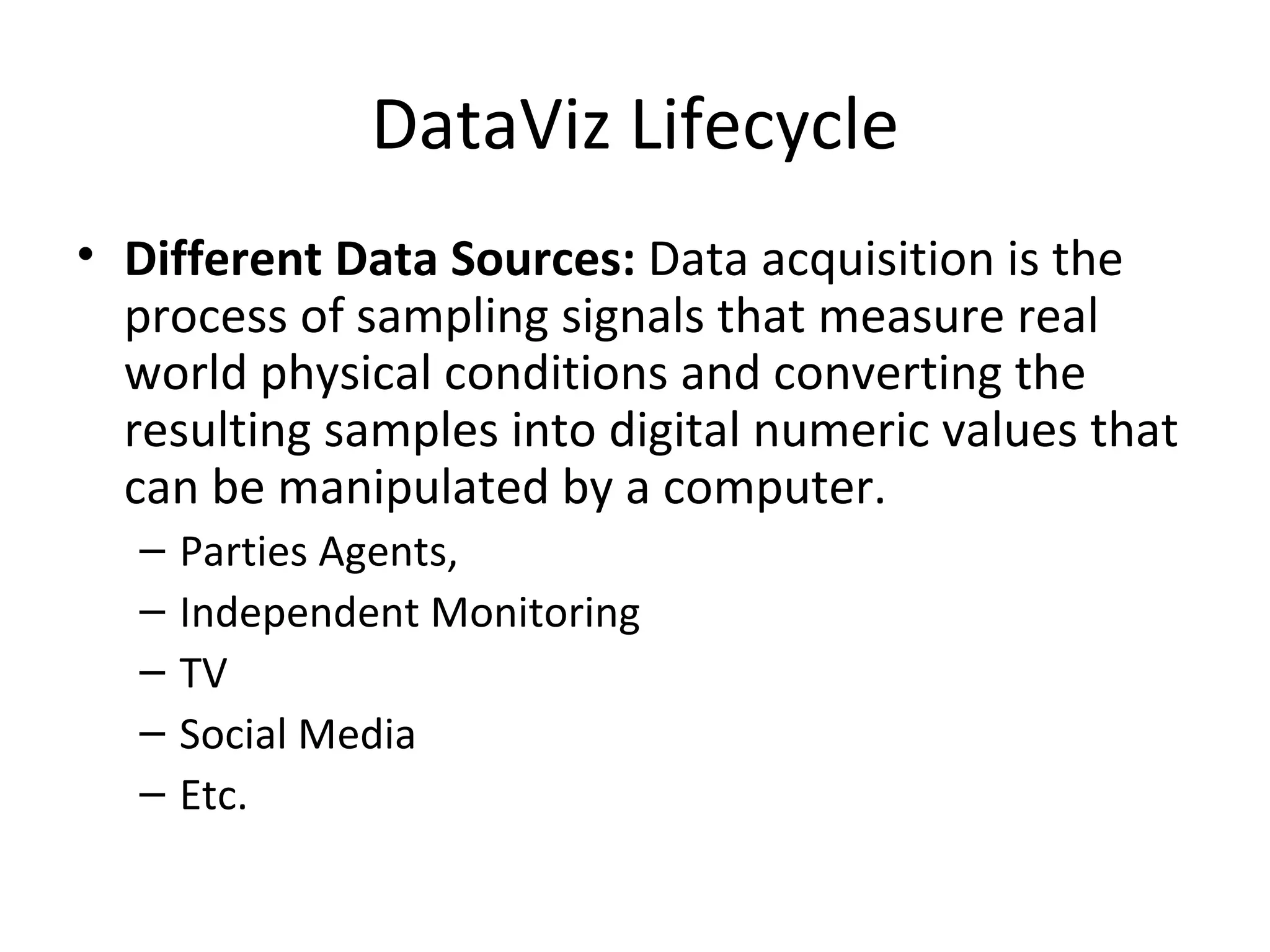

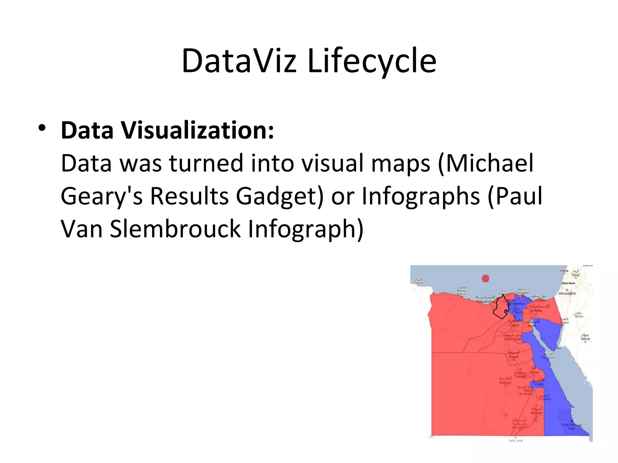

This document discusses data visualization and provides examples related to Egyptian elections. It defines data visualization as visually communicating information clearly and effectively. It also outlines the elements of an effective infographic. Several examples are presented that visualize Egyptian political party maps, election results, and presidential election results. Tools for creating visualizations like Infogr.am, Visual.ly, and Gephi are also mentioned. Finally, it describes the data visualization lifecycle from data collection to analysis to creating visualizations.


