Downloaded 29 times


Data visualization is a modern branch of descriptive statistics focused on effectively communicating information through graphical means, combining aesthetic form and functionality. Its applications span several fields, enhancing software development and user engagement, and it employs various techniques and tools to display complex data intuitively. The document highlights the importance of data visualization in recognizing patterns and sharing information while discussing tools and methods used in visual data representation.
Overview of data visualization focusing on its meaning, goals, and applications in research and software.
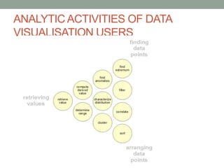
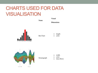
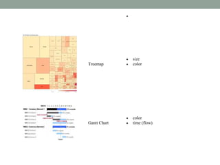
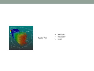
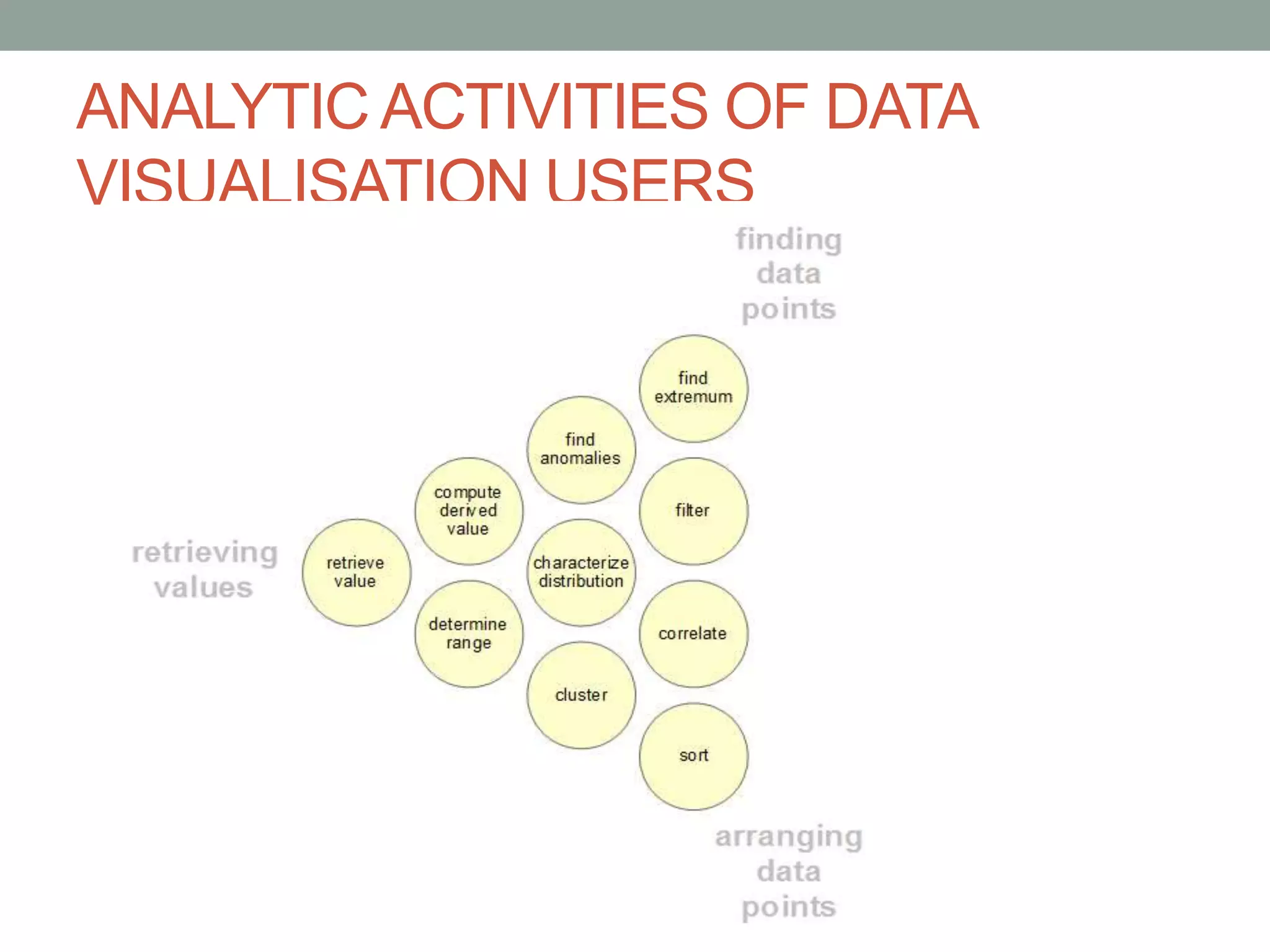
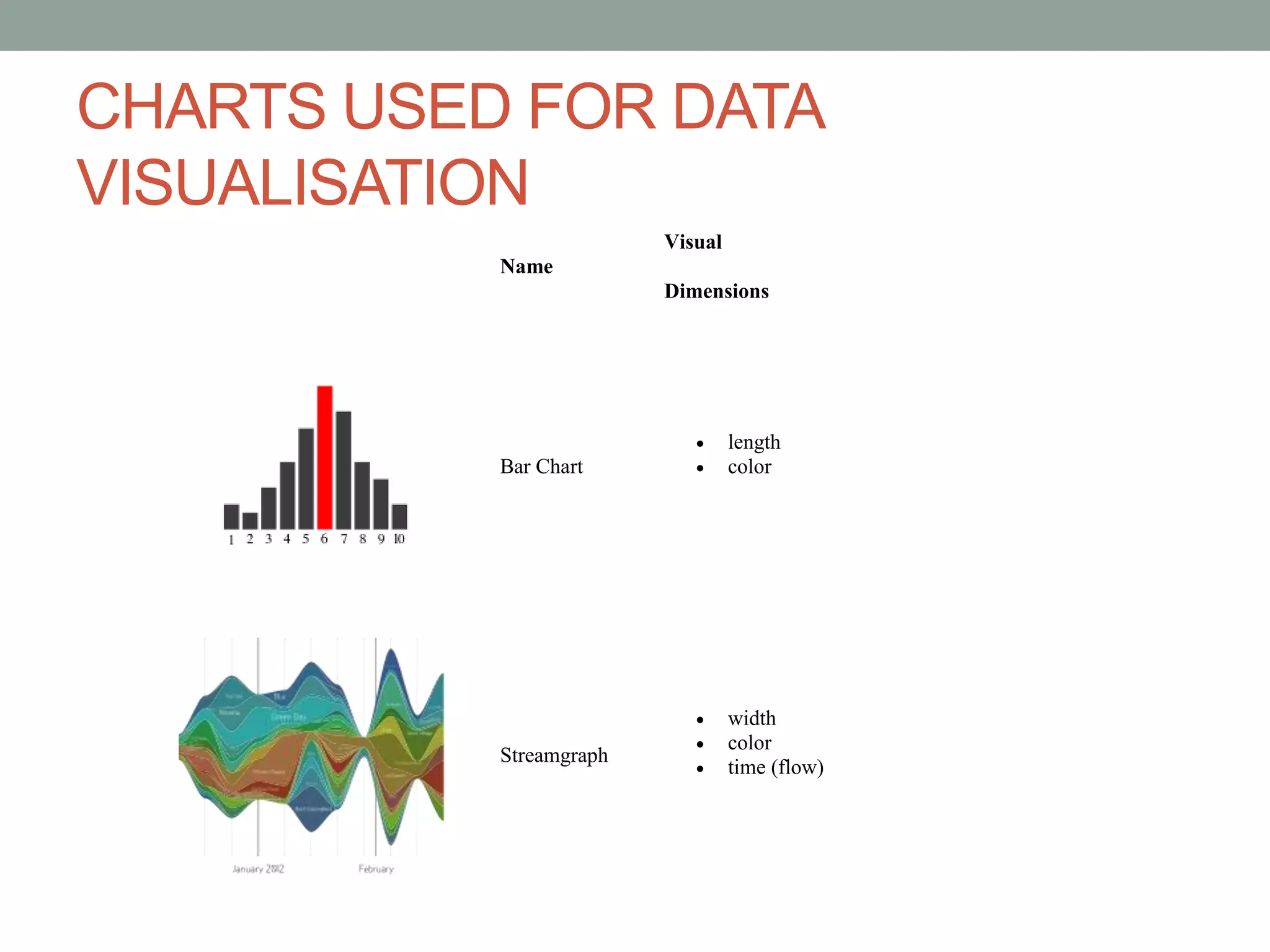
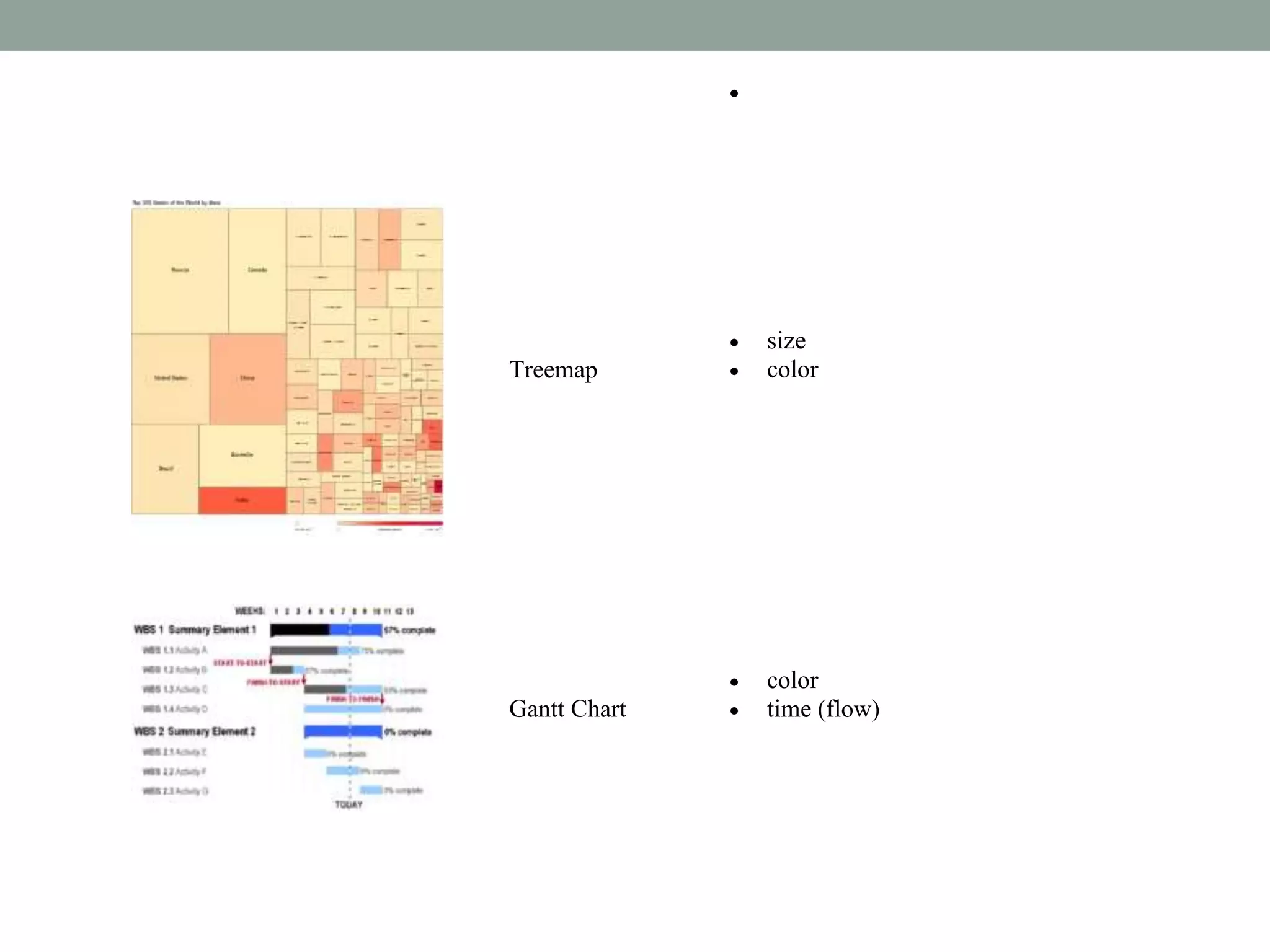
Discussion on analytic activities and various chart types such as bar charts, treemaps, scatter plots for effective data representation.
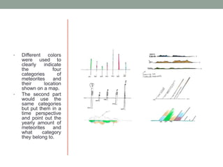
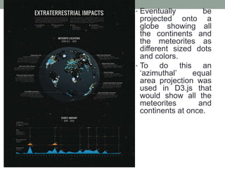
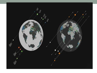
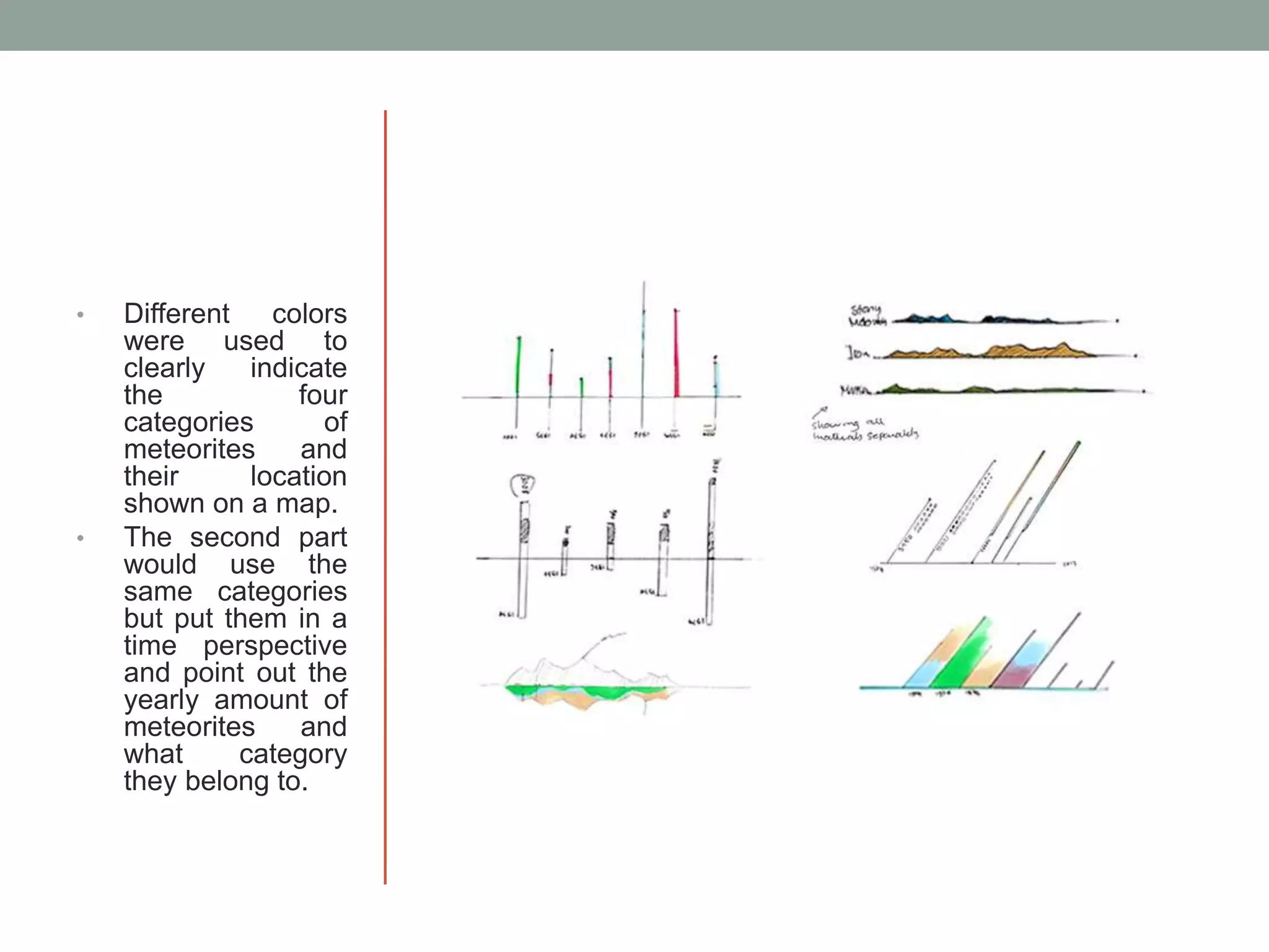
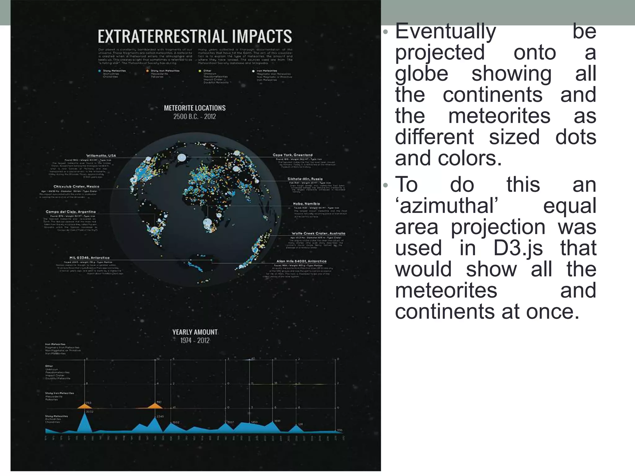
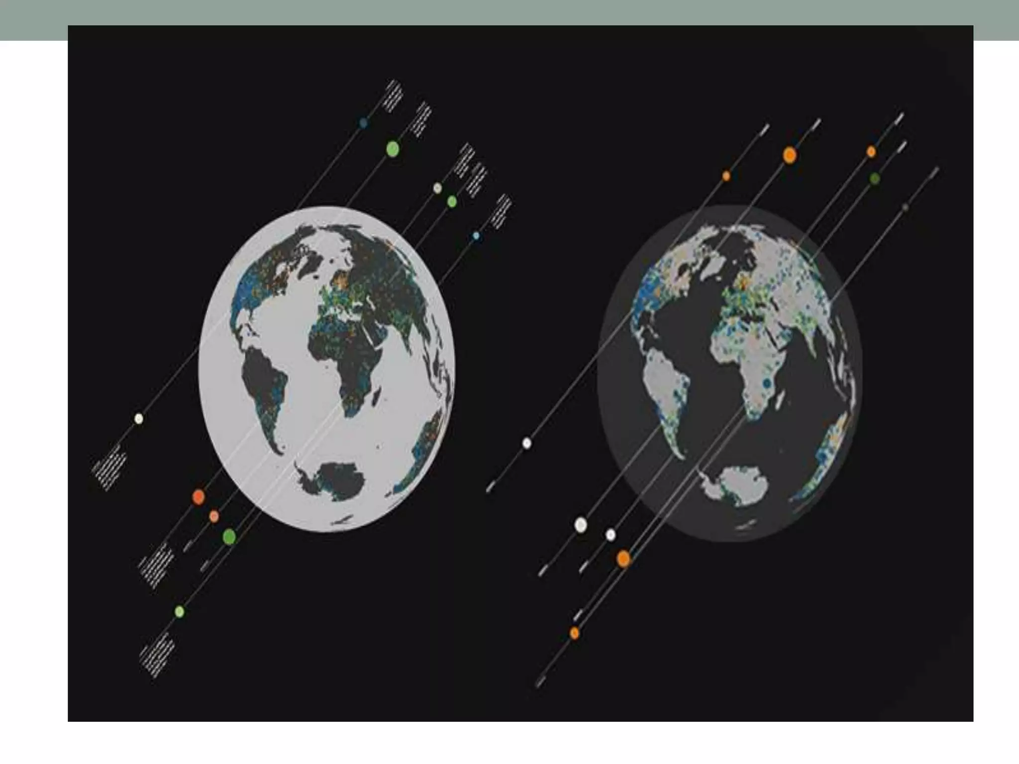
Insights into meteorite data visualization, including meteorite categories, origin hints, and using colored representations on a globe.
Importance of data visualization in spotting patterns quickly and techniques to effectively convey data to the audience.
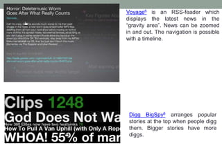
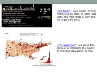
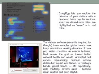
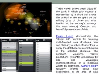
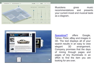
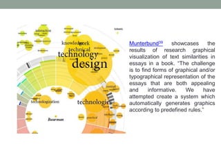
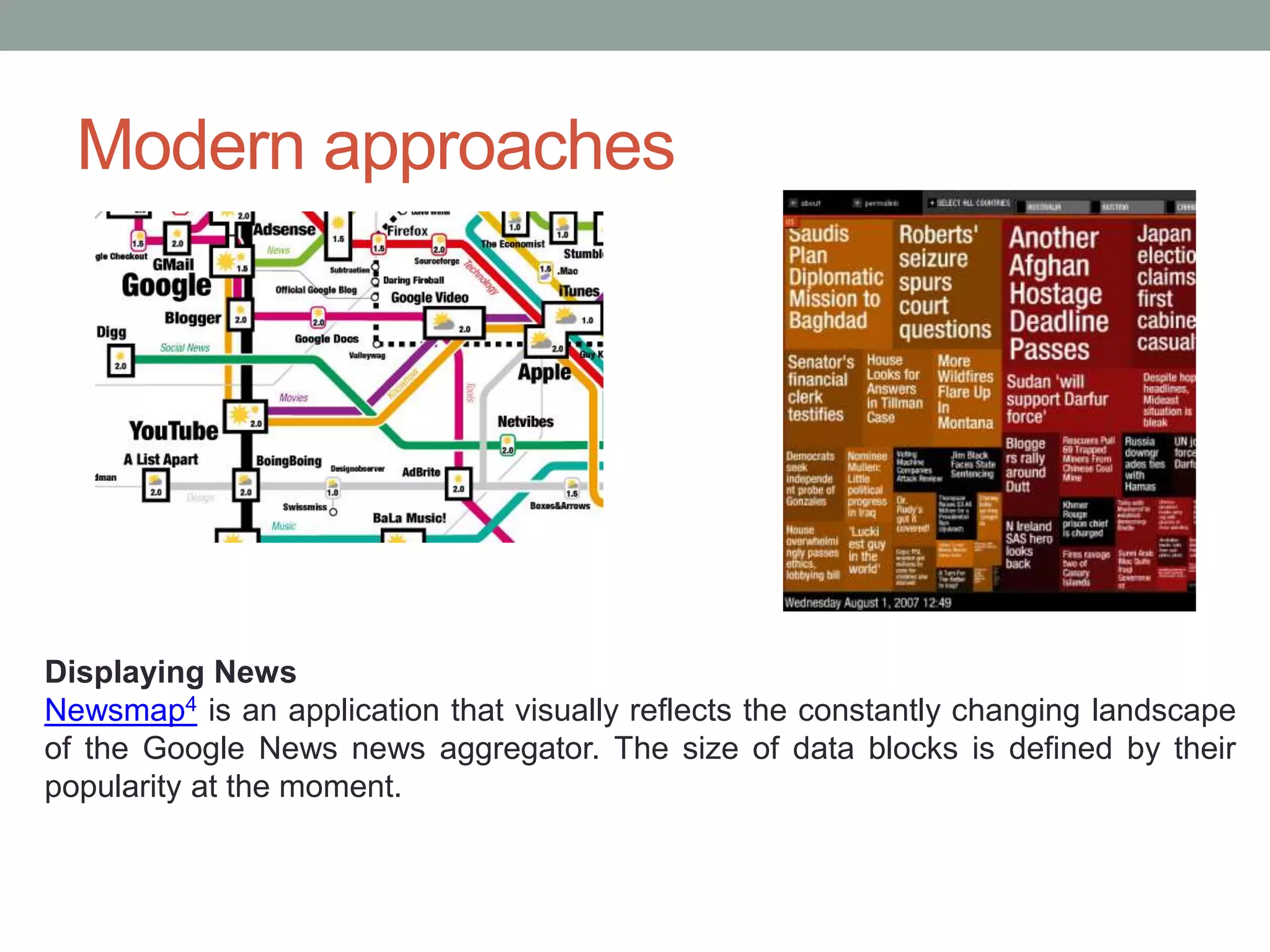
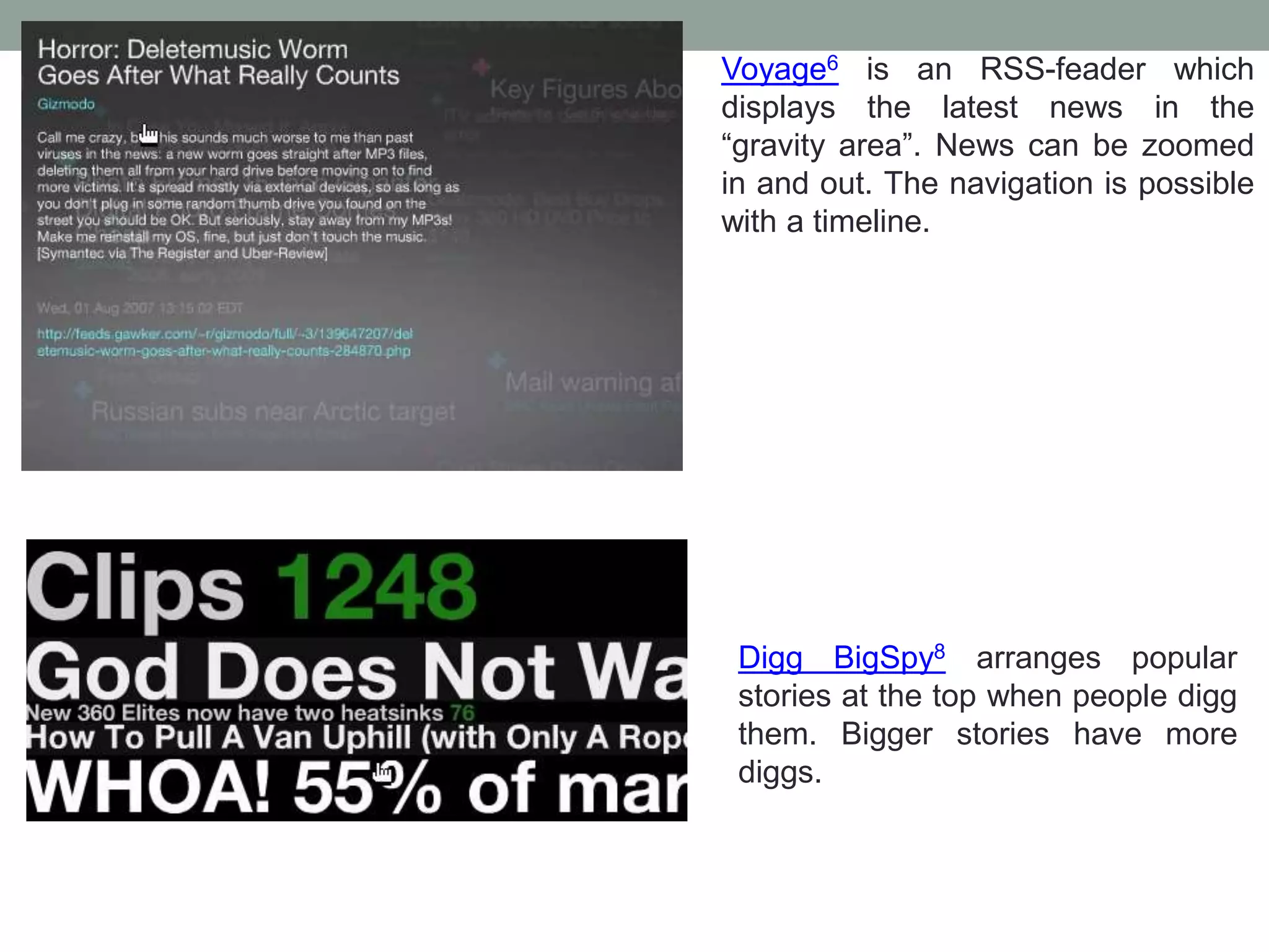
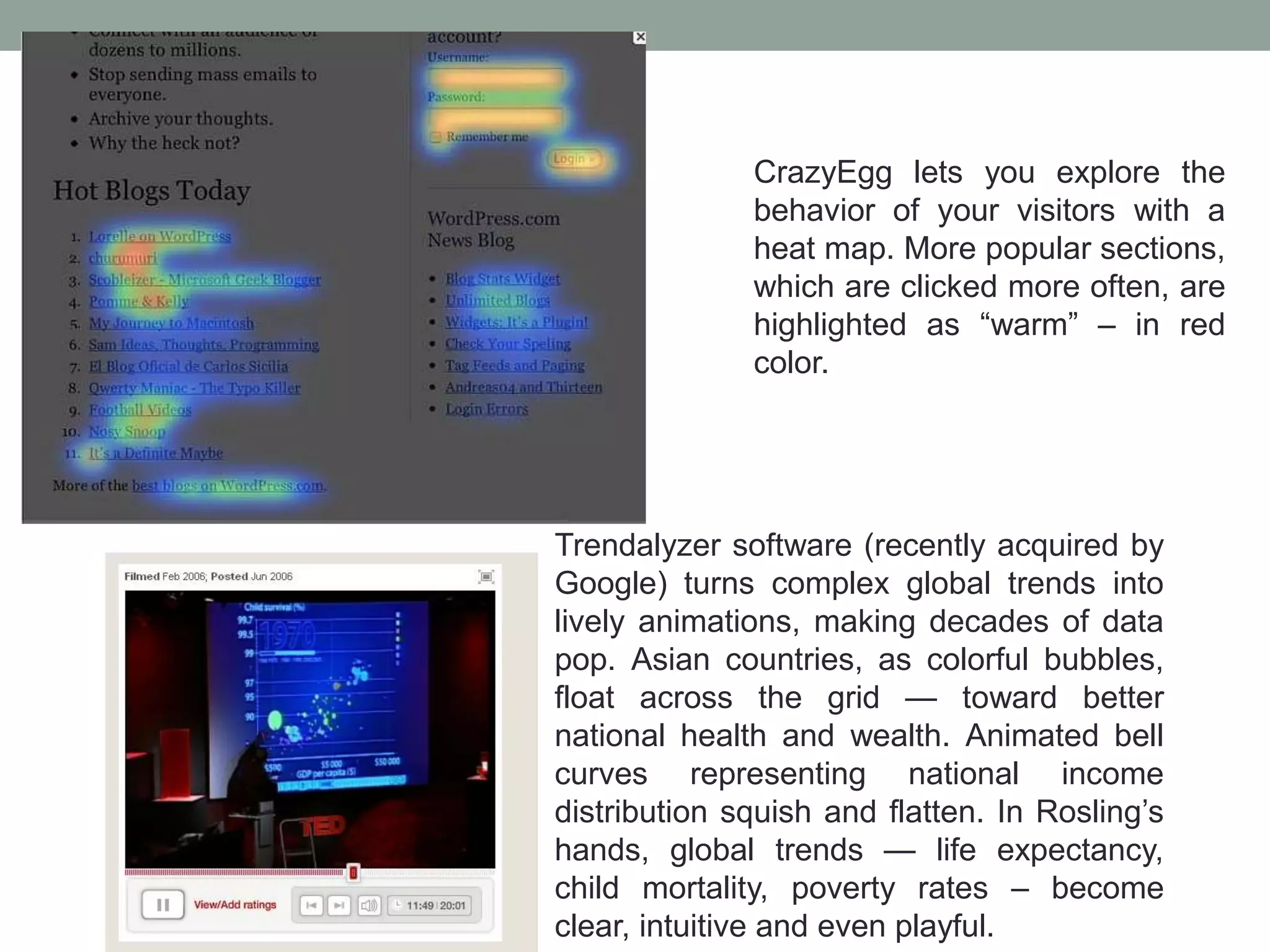
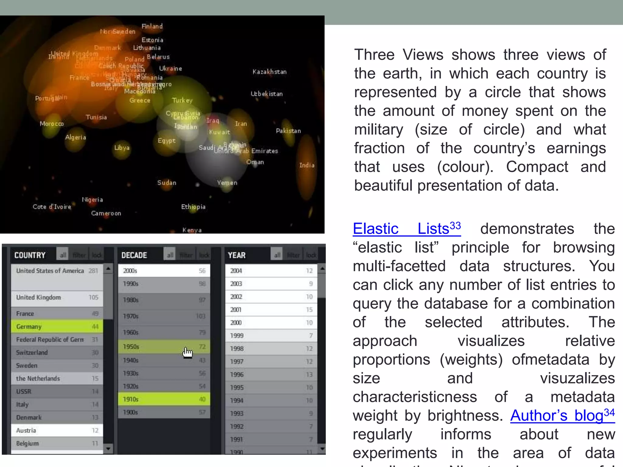
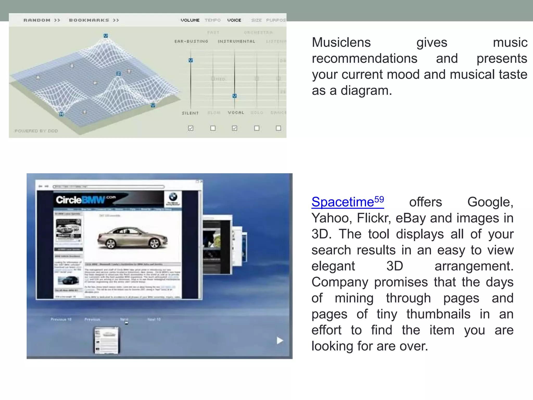
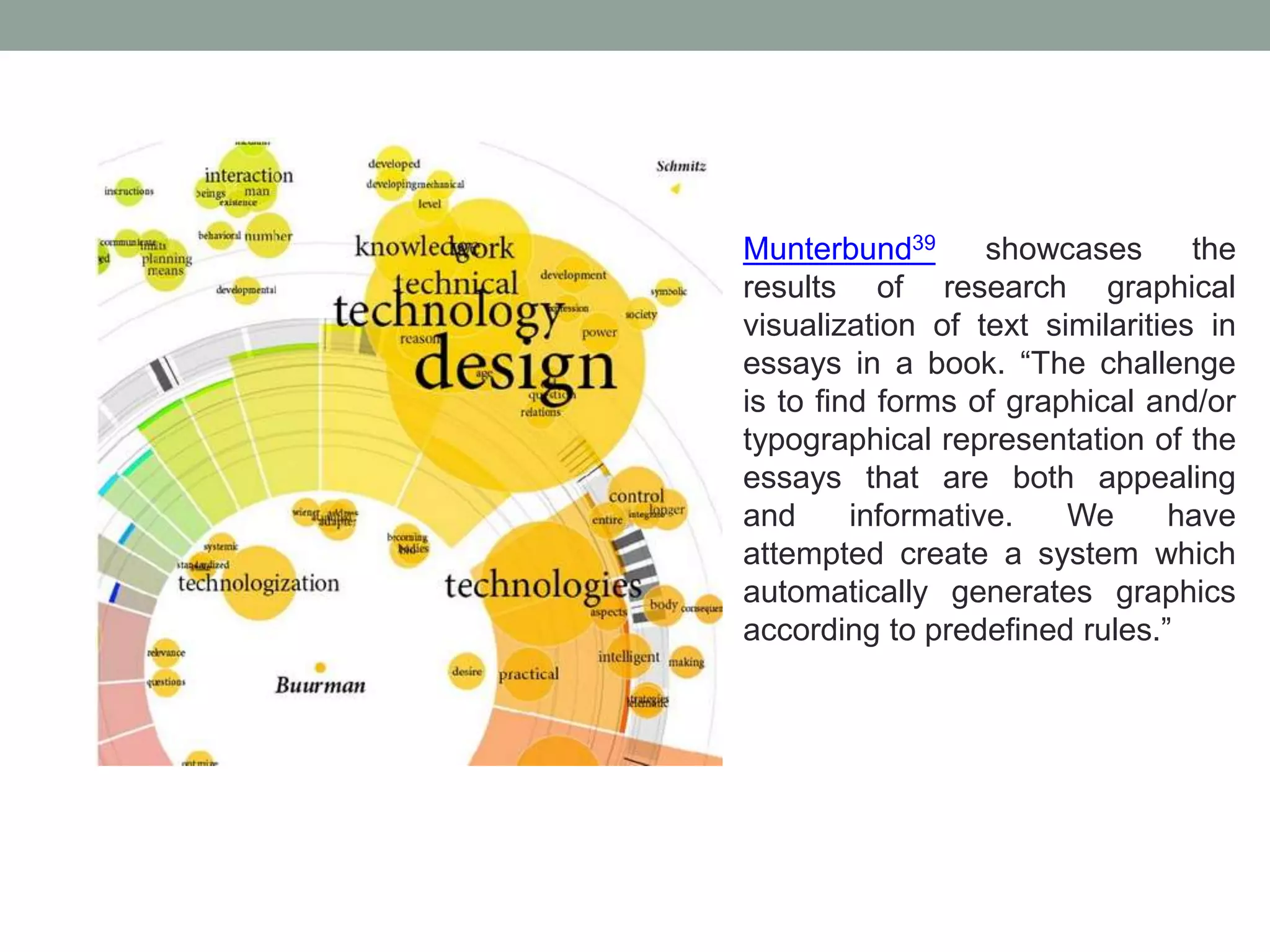
Examples of modern visualization tools and their applications in news, behavior tracking, and complex data representations.


