Download as PDF, PPTX


![D3.js · Non- Binding API
var quant = [0, 5, 10, 15, 20];
var qual = ["big", "small", "medium"];
var qScale = d3.scale.linear()
.domain(d3.extent(quant))
.range([10, 100])
quantValue = qScale(7);
@Enjalot
Tutorial:](https://image.slidesharecdn.com/datavisualizationinanutshell-150805212035-lva1-app6892/85/Data-visualization-in-a-nutshell-136-320.jpg)
![D3.geo
function draw(geo_data) {
"use strict";
var margin = 75,
width = 1400 - margin,
height = 600 - margin;
var svg = d3.select("body")
.append("svg")
.attr("width", width + margin)
.attr("height", height + margin)
.append('g')
.attr('class', 'map');
var projection = d3.geo.mercator()
.scale(150)
.translate( [width / 2, height / 1.5]);
var path = d3.geo.path().projection(projection);
var map = svg.selectAll('path')
.data(geo_data.features)
.enter()
.append('path')
.attr('d', path)
.style('fill', 'lightBlue')
.style('stroke', 'black')
.style('stroke-width', 0.5);
};](https://image.slidesharecdn.com/datavisualizationinanutshell-150805212035-lva1-app6892/85/Data-visualization-in-a-nutshell-137-320.jpg)


![D3.js · Non- Binding API
var quant = [0, 5, 10, 15, 20];
var qual = ["big", "small", "medium"];
var qScale = d3.scale.linear()
.domain(d3.extent(quant))
.range([10, 100])
quantValue = qScale(7);
@Enjalot
Tutorial:](https://image.slidesharecdn.com/datavisualizationinanutshell-150805212035-lva1-app6892/75/Data-visualization-in-a-nutshell-136-2048.jpg)
![D3.geo
function draw(geo_data) {
"use strict";
var margin = 75,
width = 1400 - margin,
height = 600 - margin;
var svg = d3.select("body")
.append("svg")
.attr("width", width + margin)
.attr("height", height + margin)
.append('g')
.attr('class', 'map');
var projection = d3.geo.mercator()
.scale(150)
.translate( [width / 2, height / 1.5]);
var path = d3.geo.path().projection(projection);
var map = svg.selectAll('path')
.data(geo_data.features)
.enter()
.append('path')
.attr('d', path)
.style('fill', 'lightBlue')
.style('stroke', 'black')
.style('stroke-width', 0.5);
};](https://image.slidesharecdn.com/datavisualizationinanutshell-150805212035-lva1-app6892/75/Data-visualization-in-a-nutshell-137-2048.jpg)


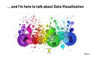
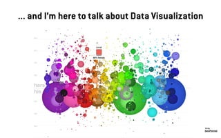
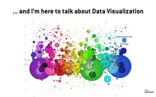
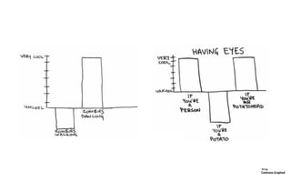
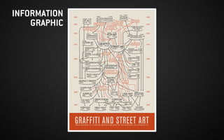
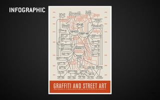
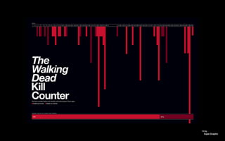
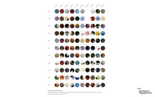
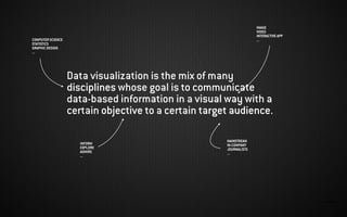
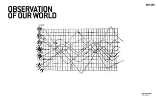
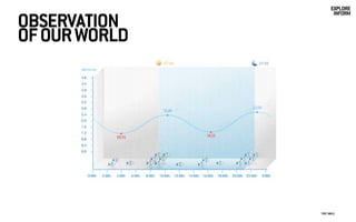
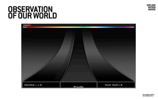
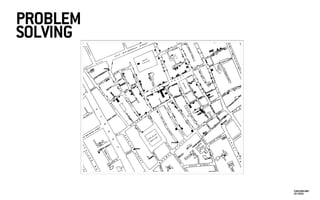
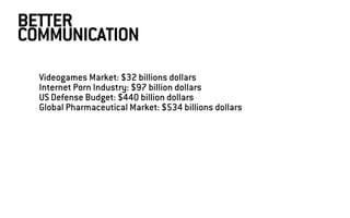
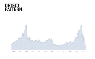
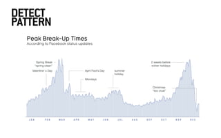
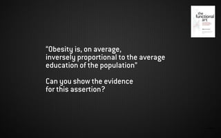
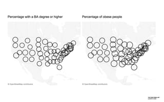
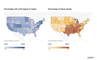
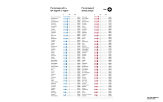
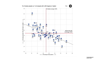
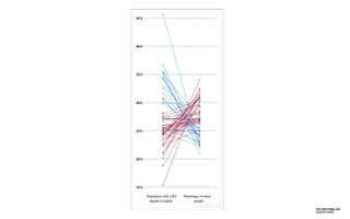
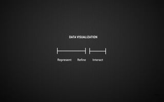
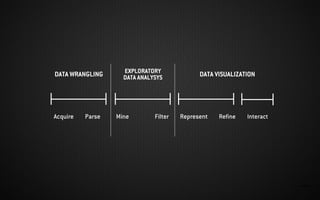
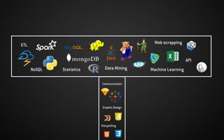
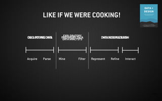
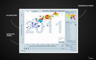
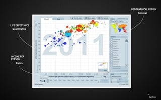
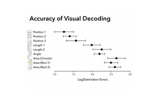
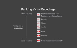
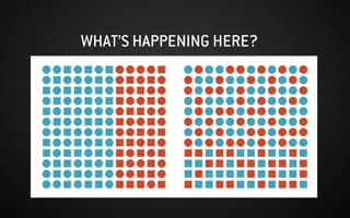
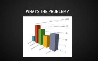
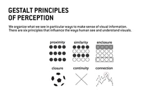
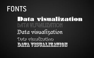
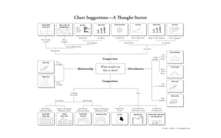
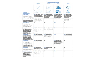
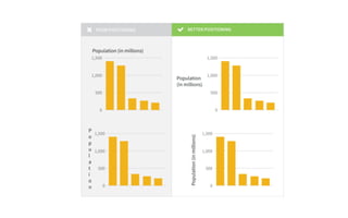
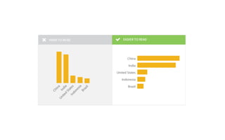
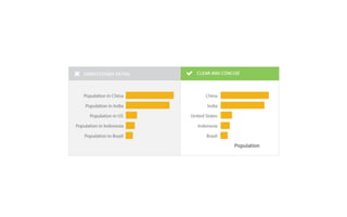
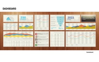
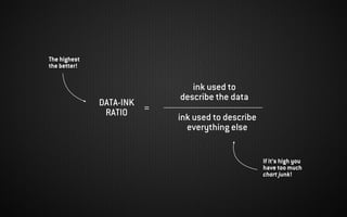
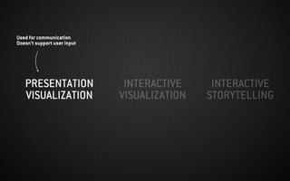
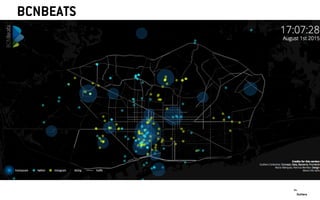
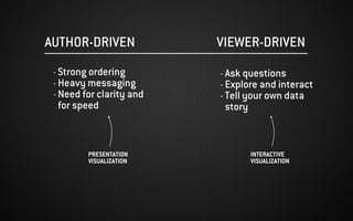
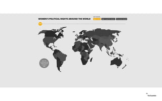
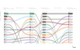
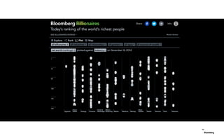
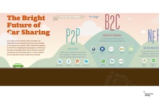
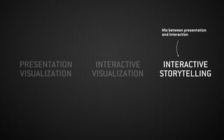
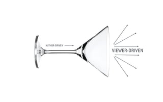
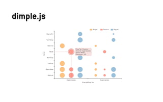
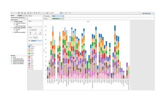
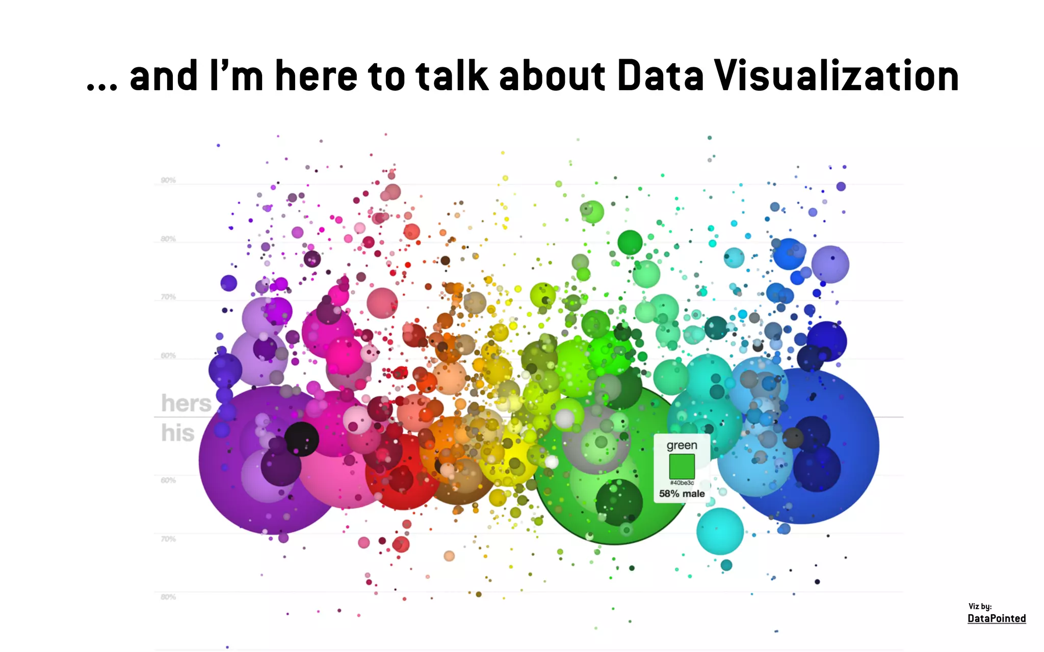
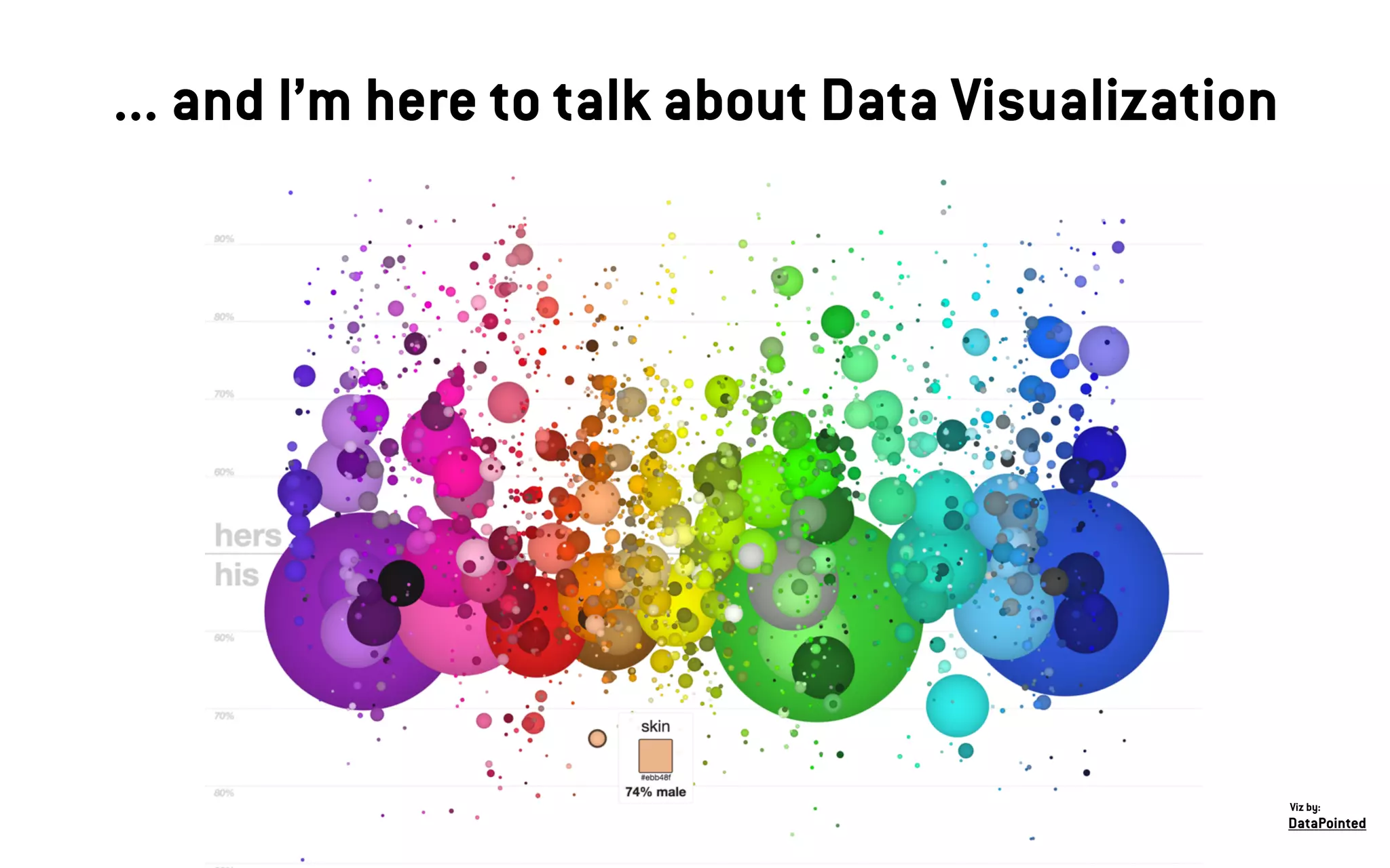
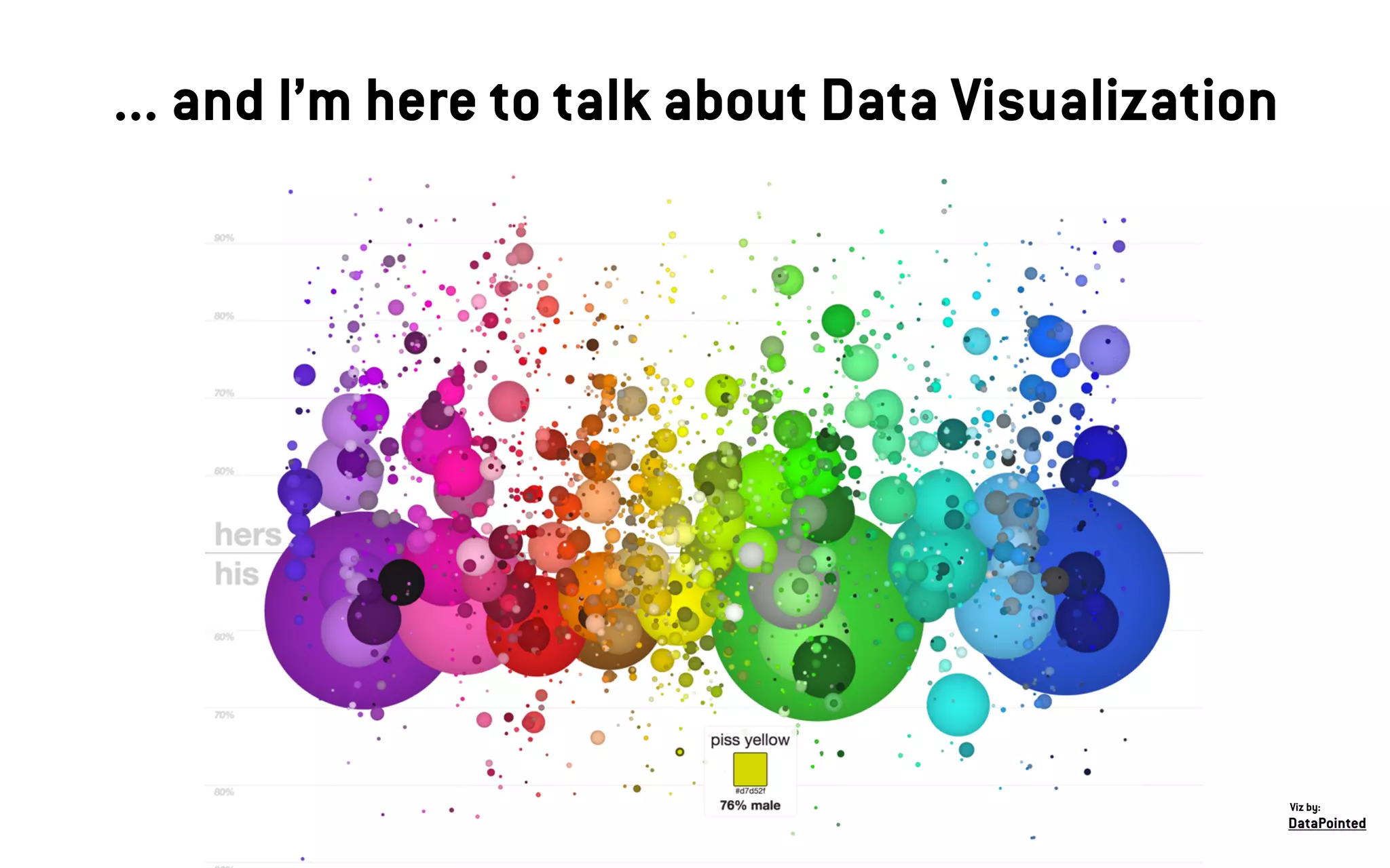
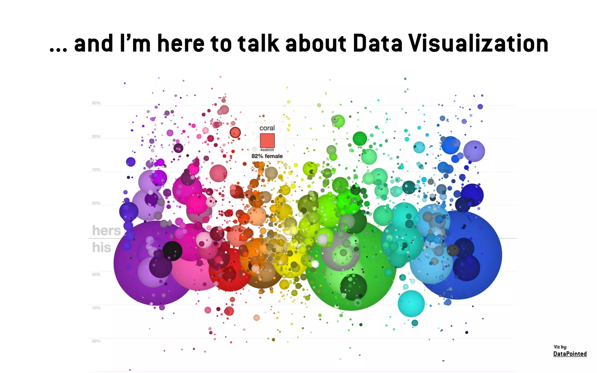
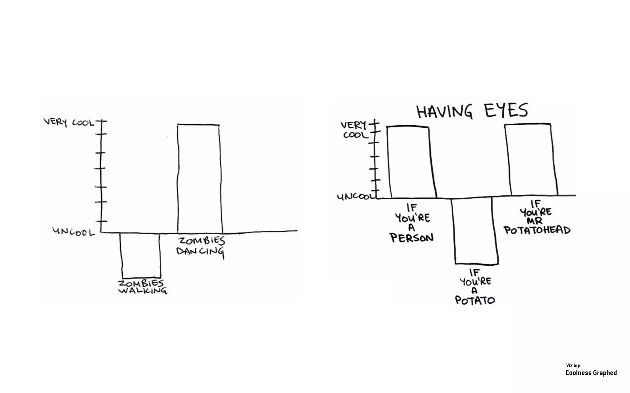
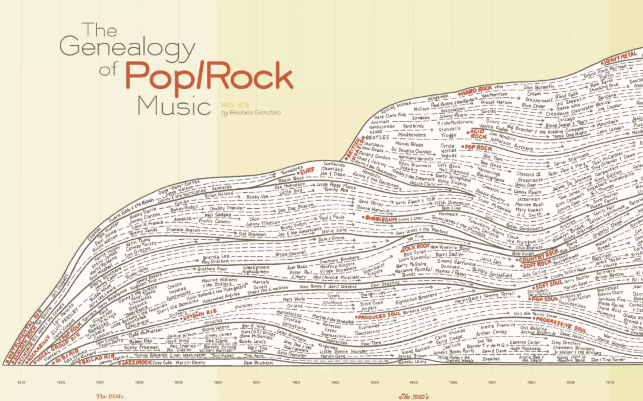
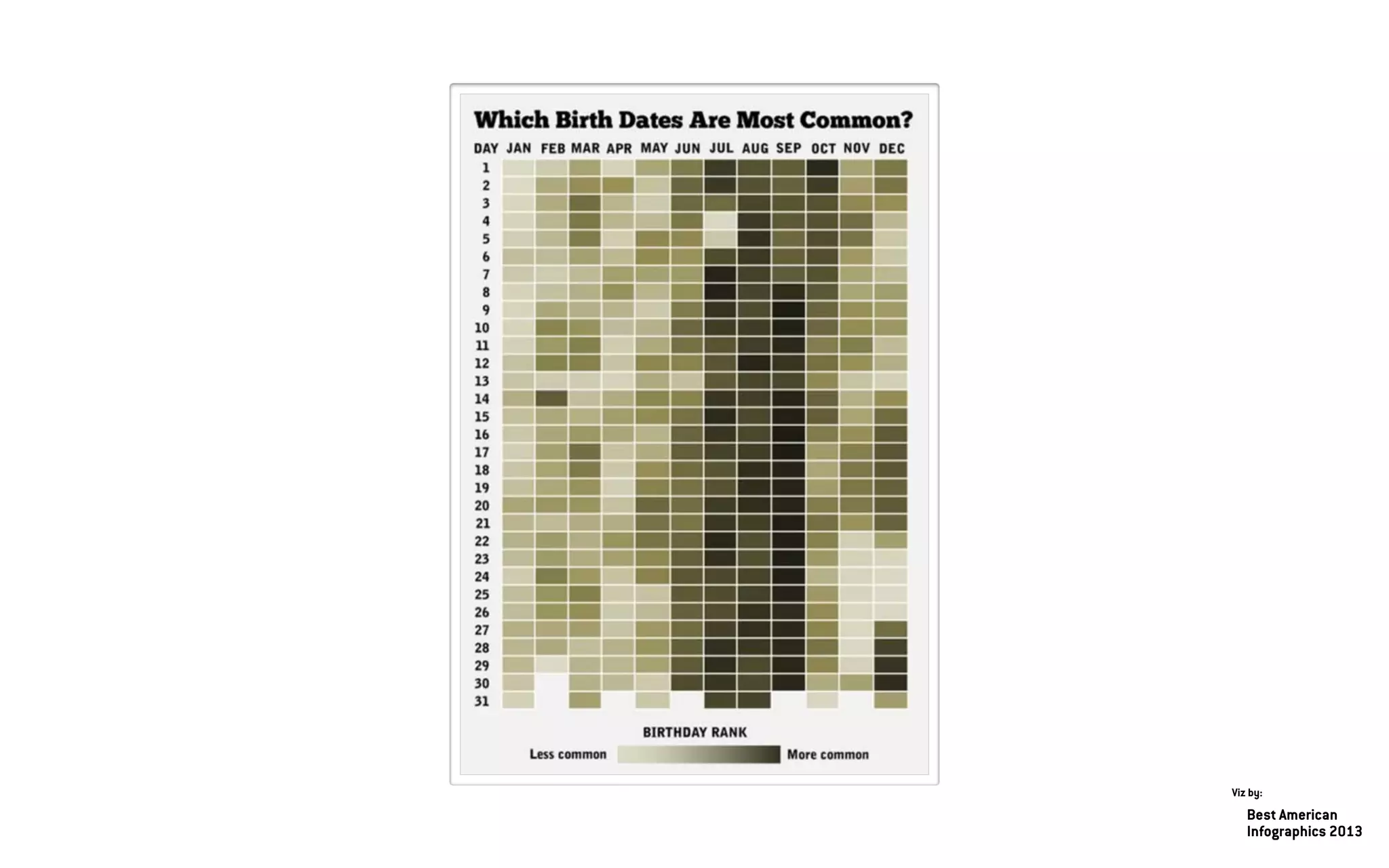
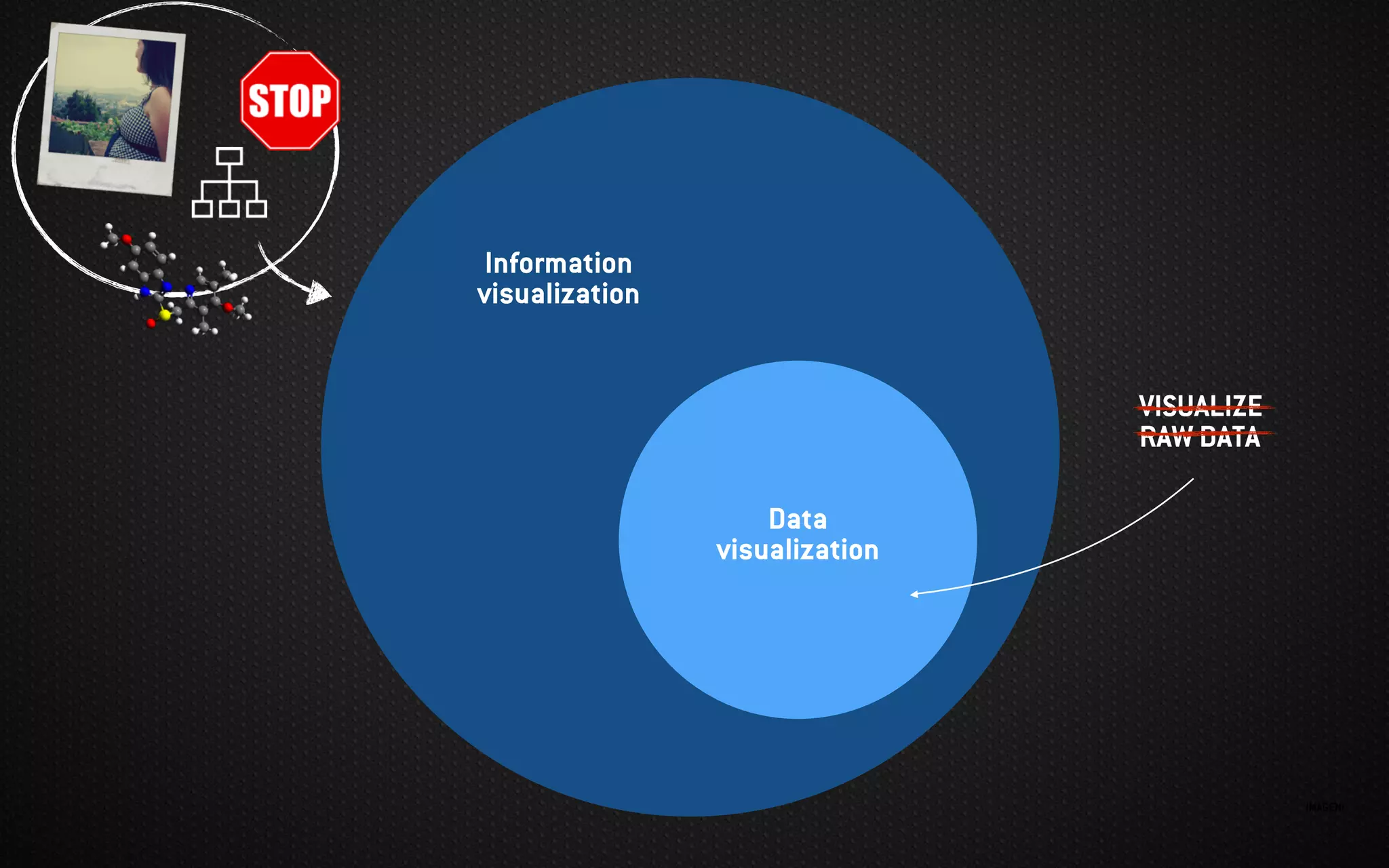
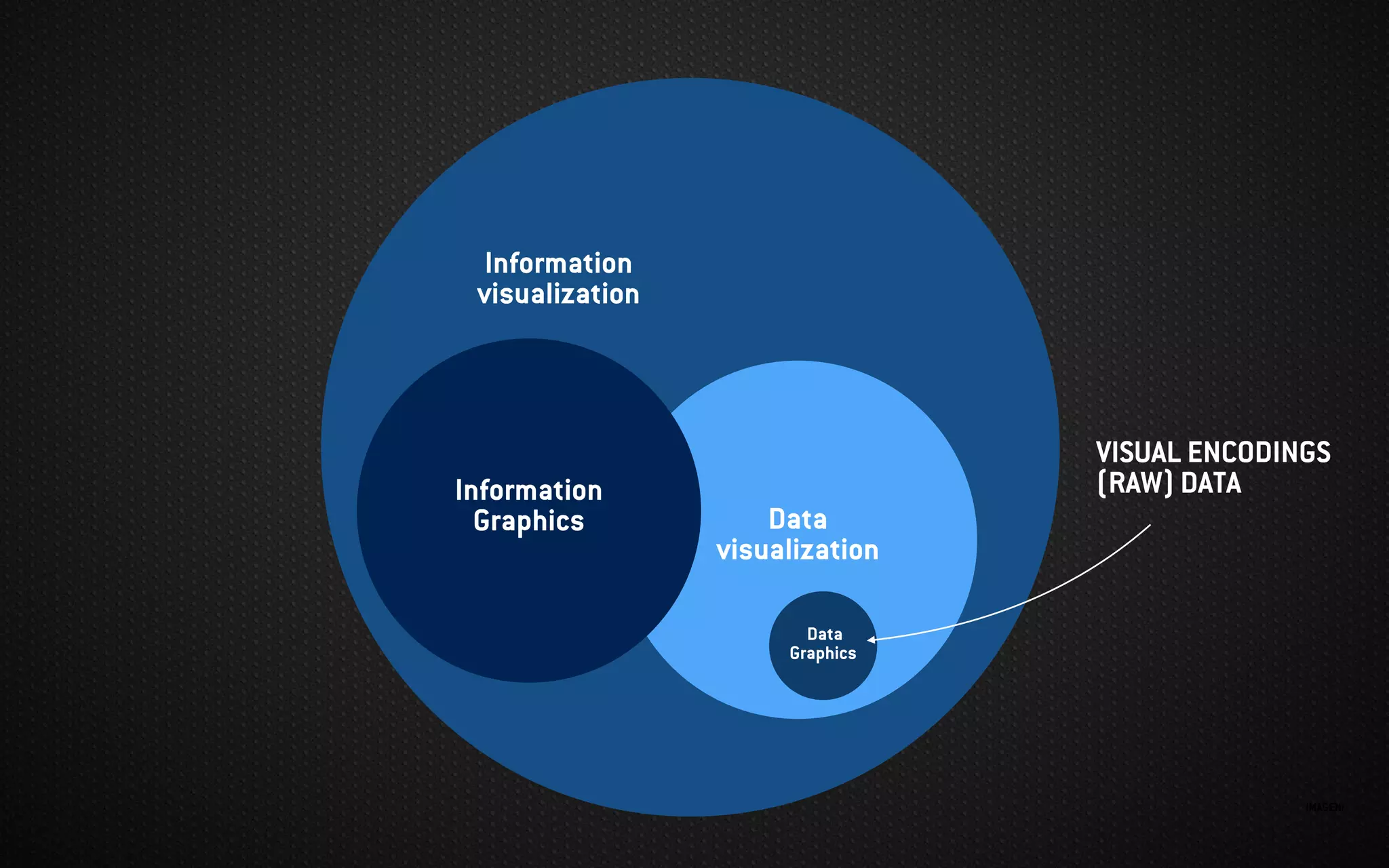
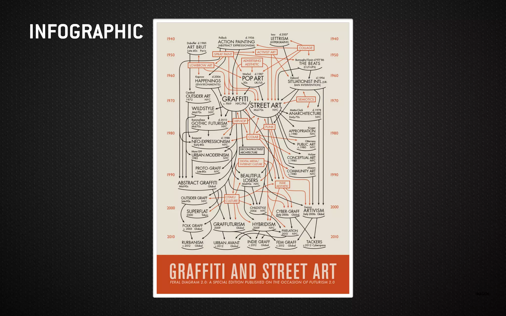
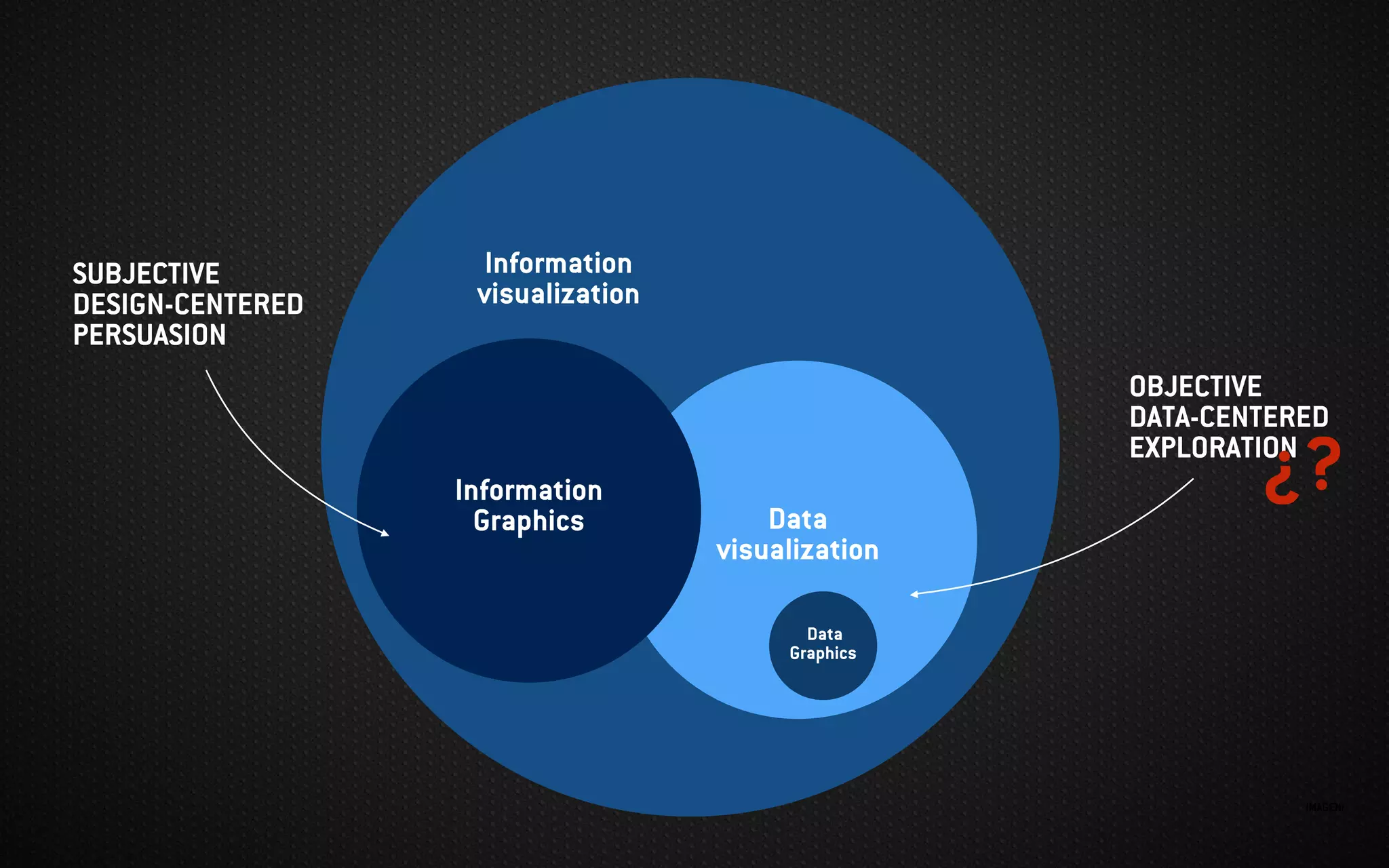
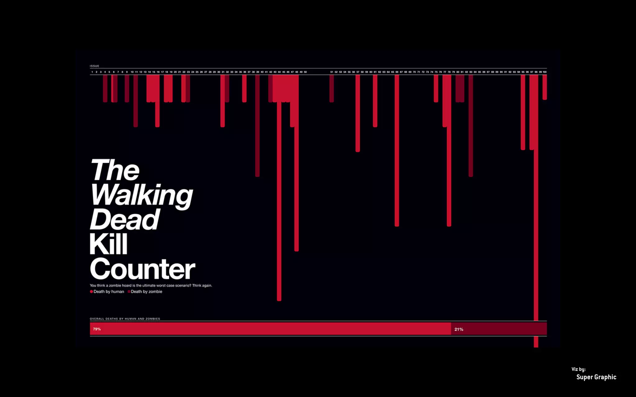
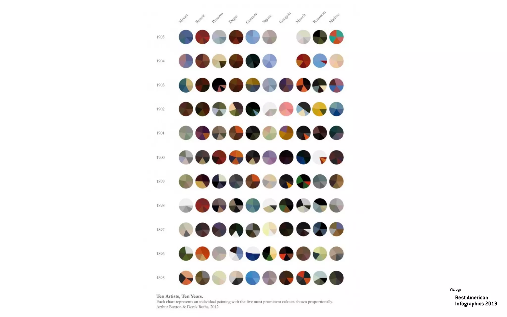
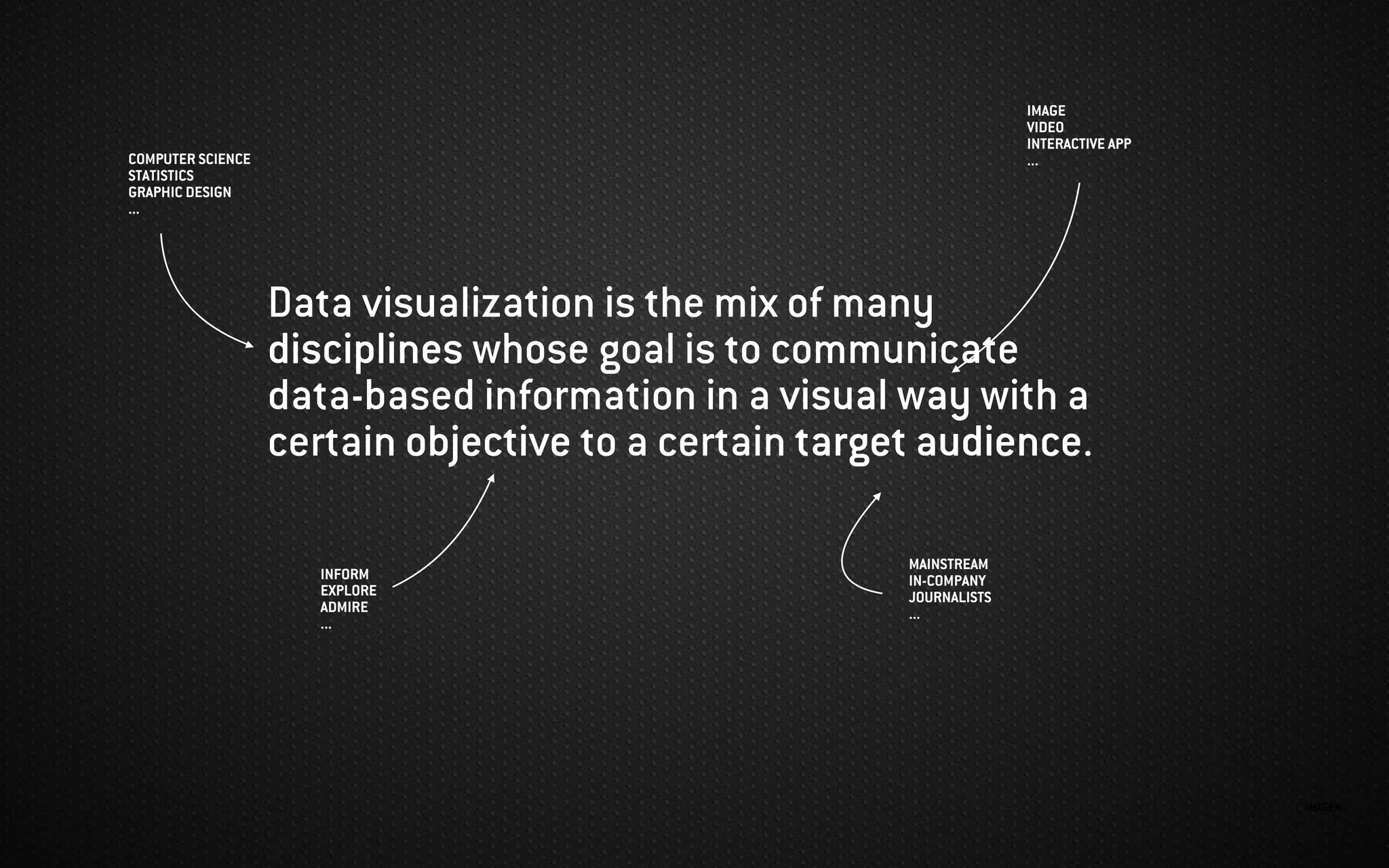
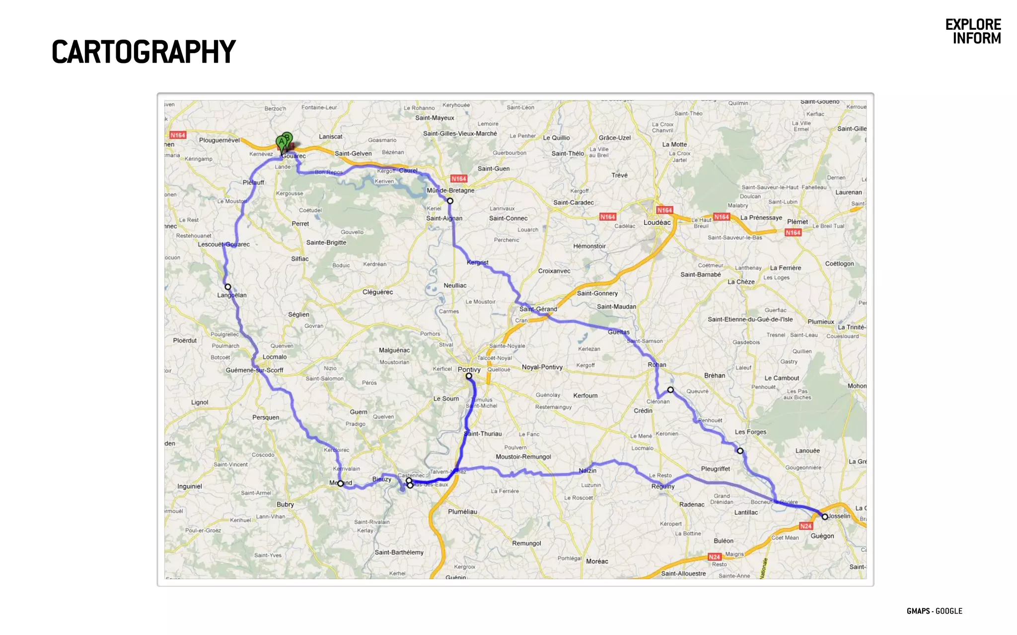
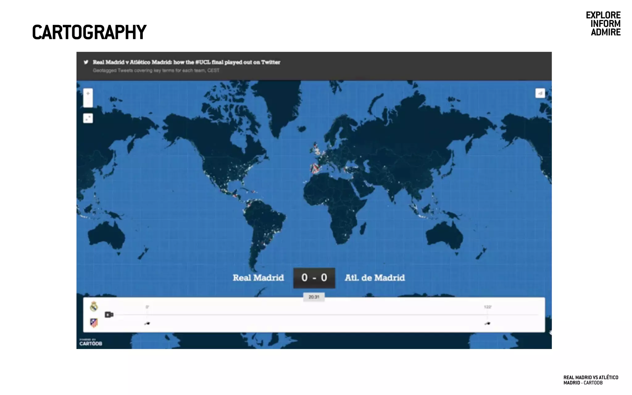
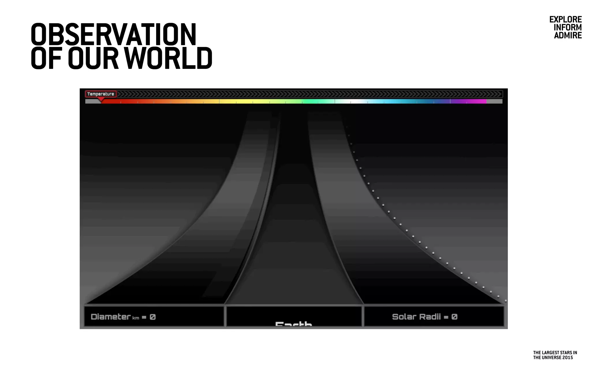
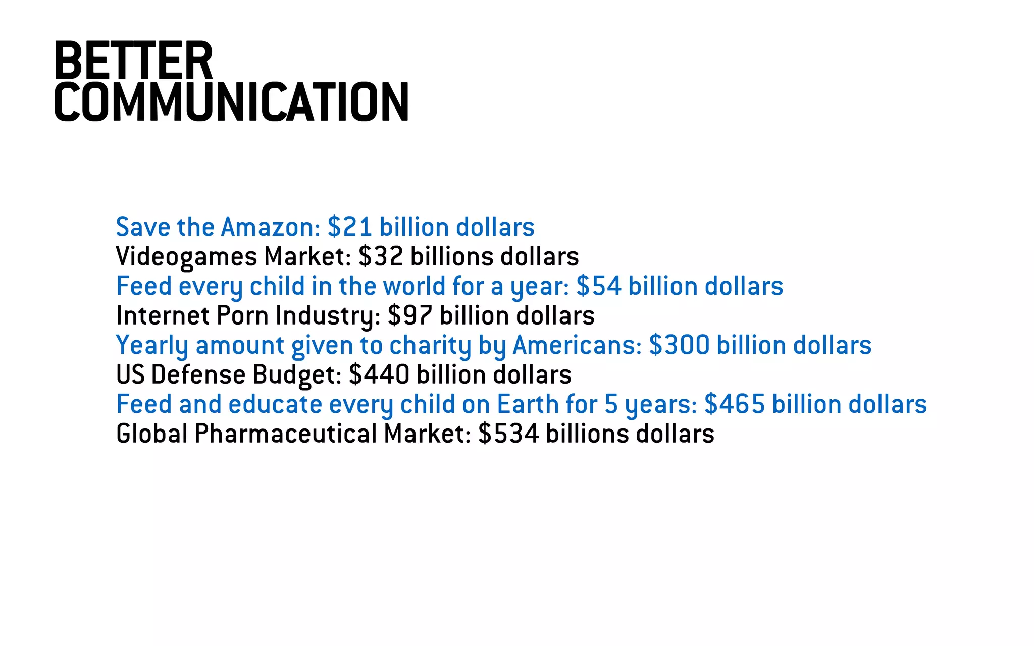
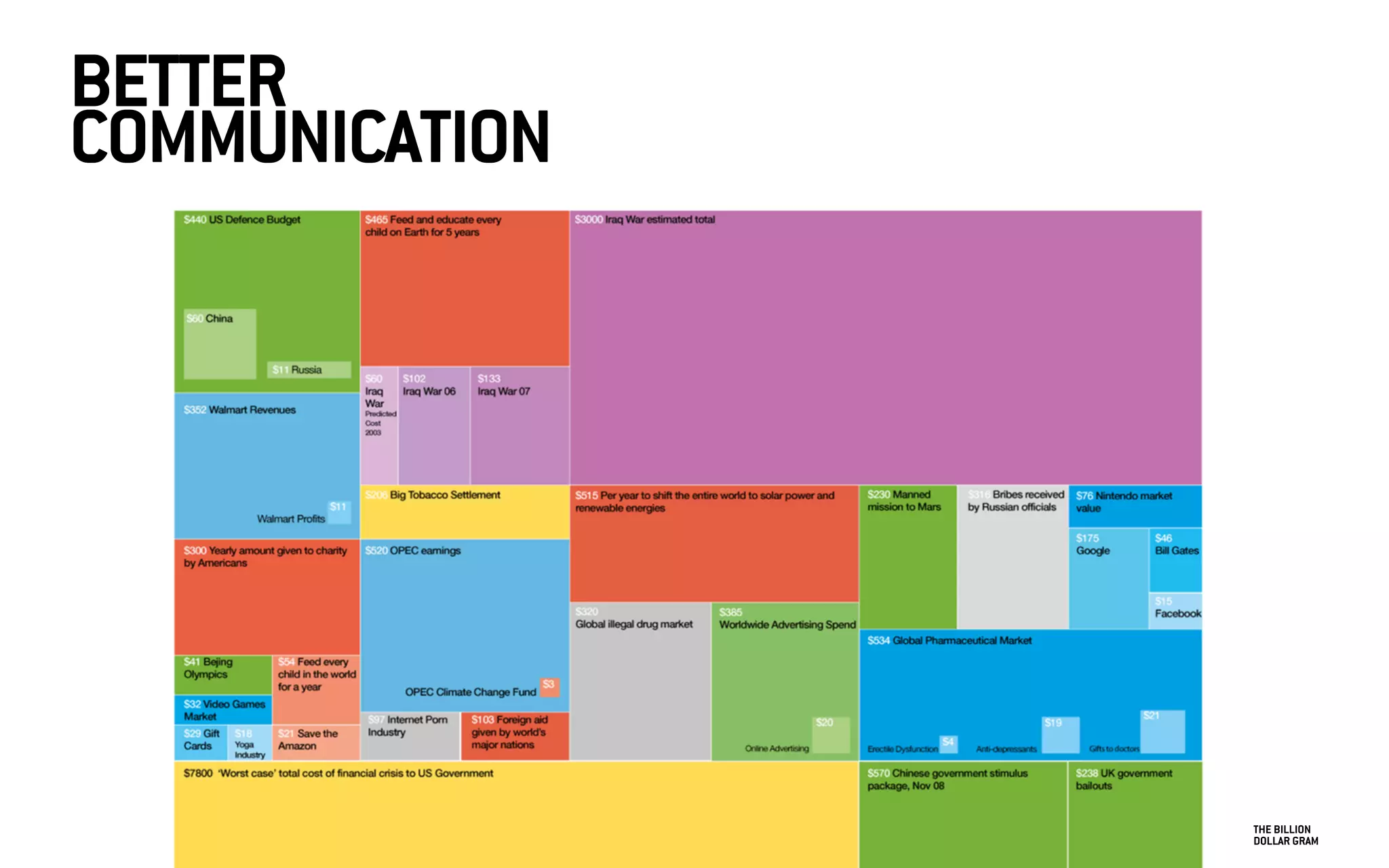
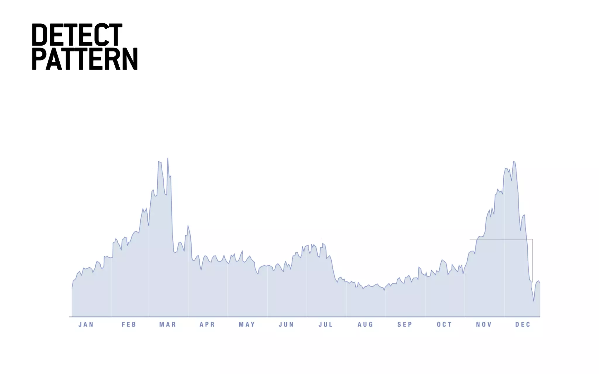
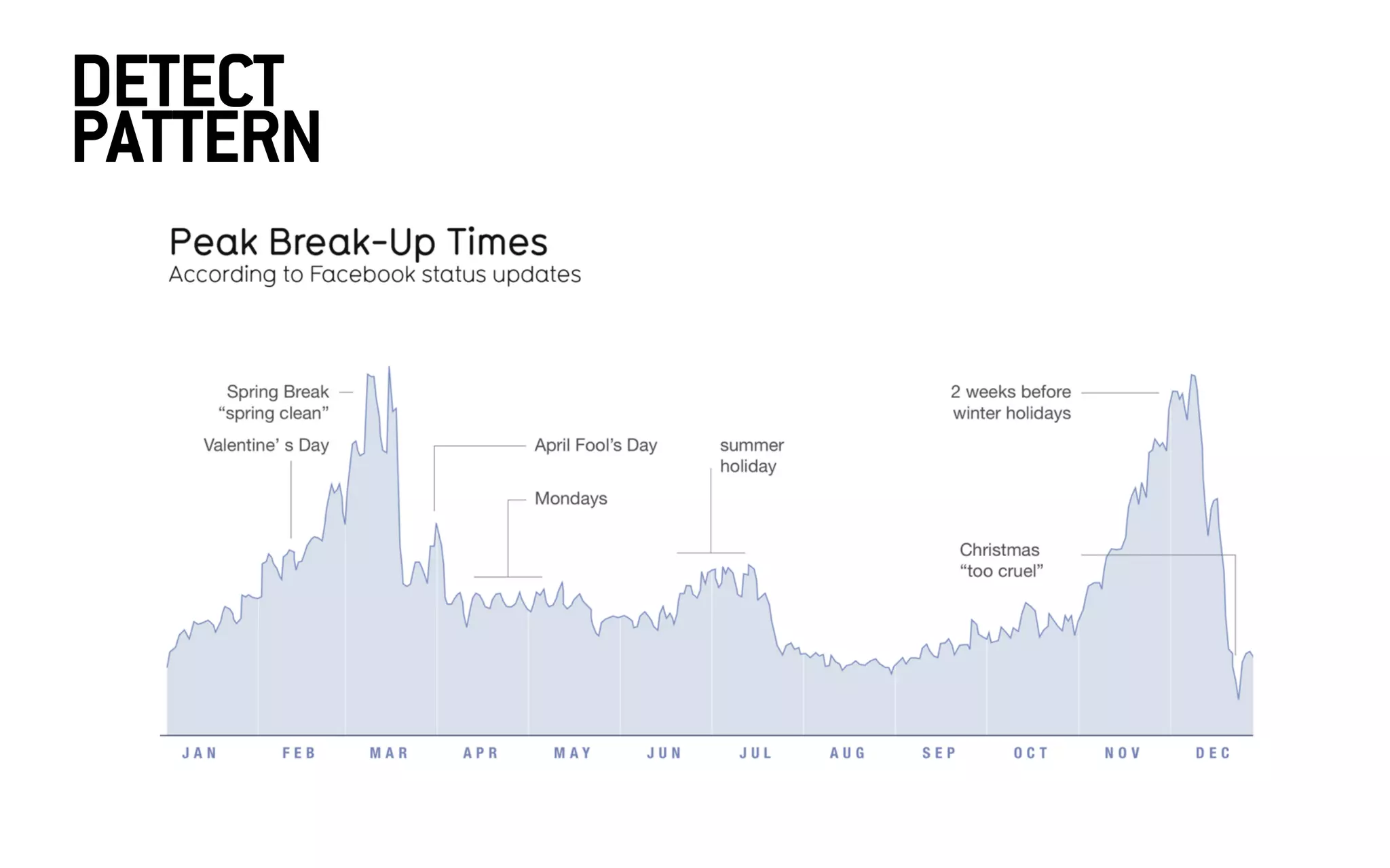
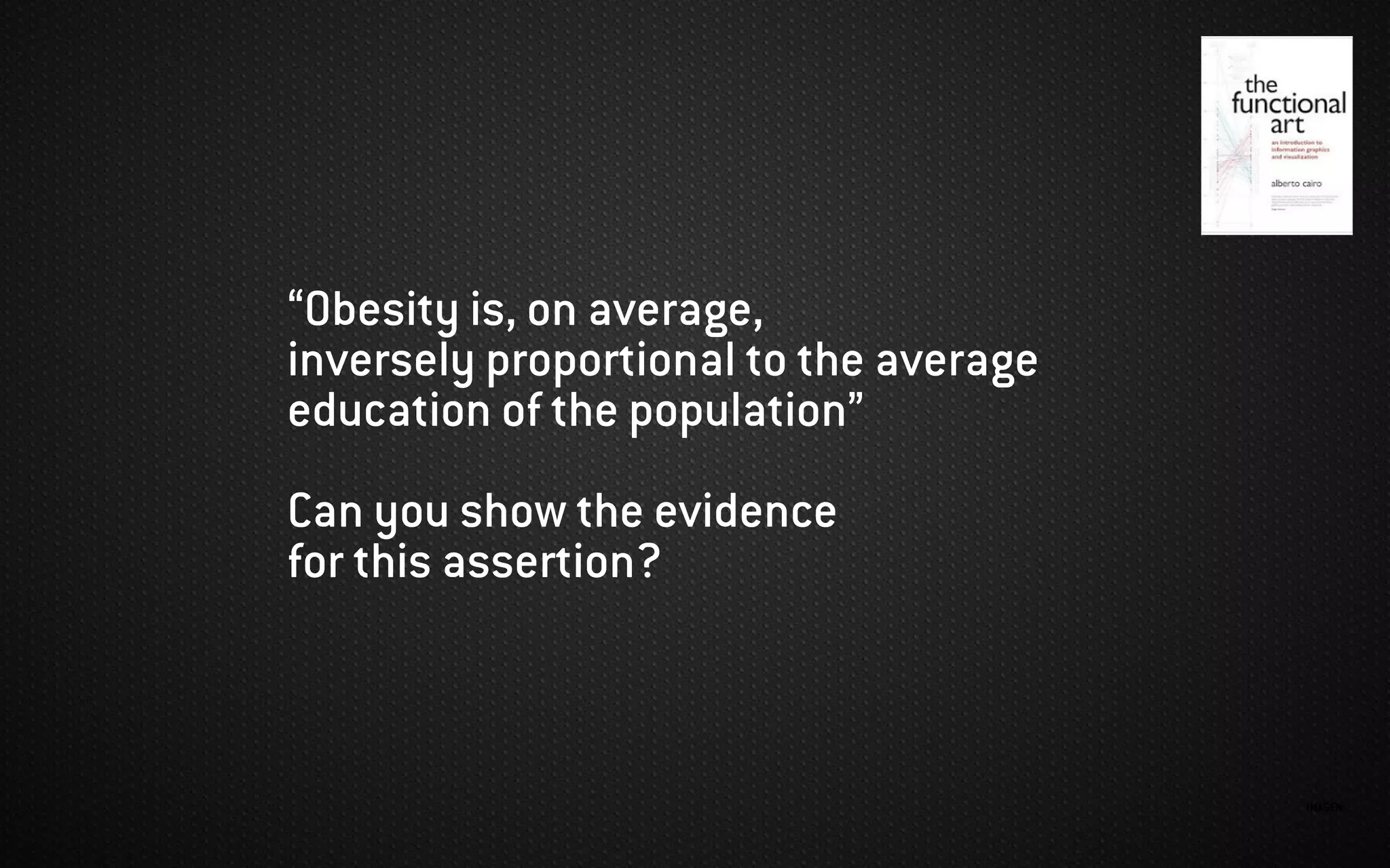
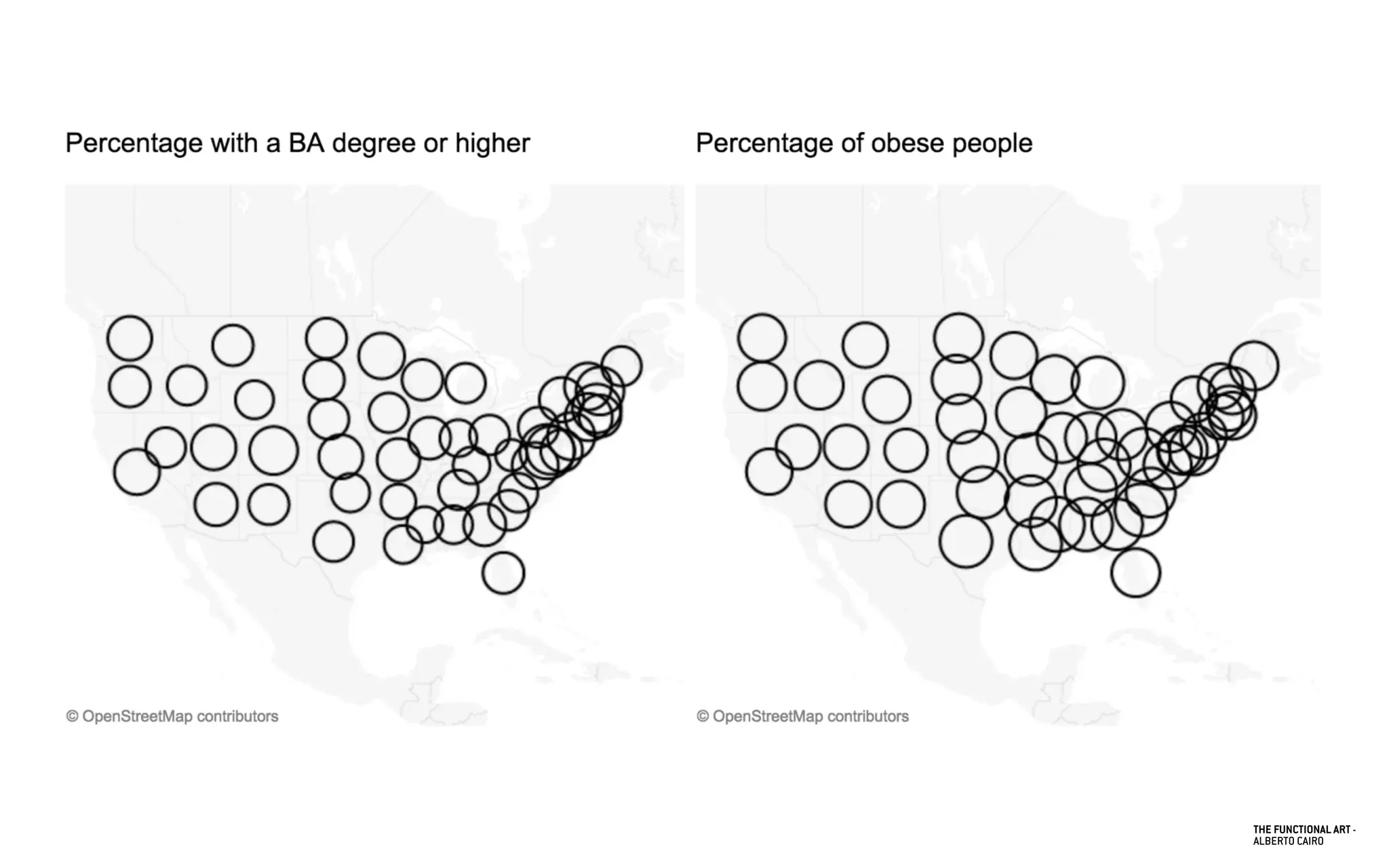
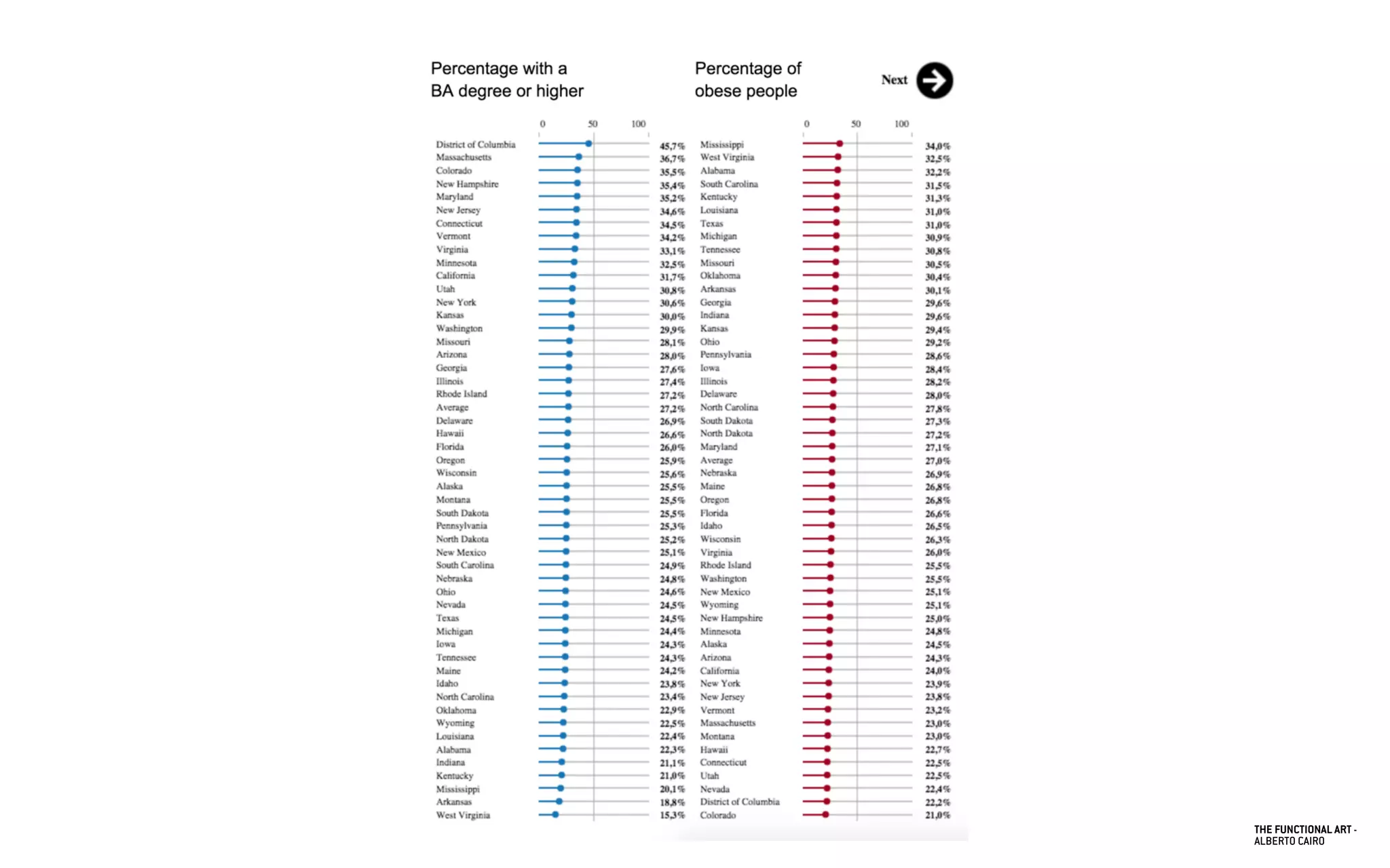
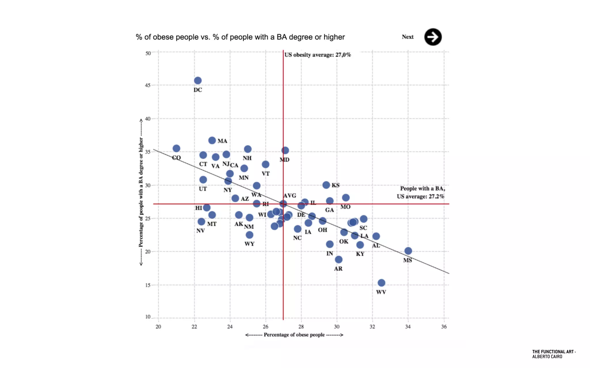
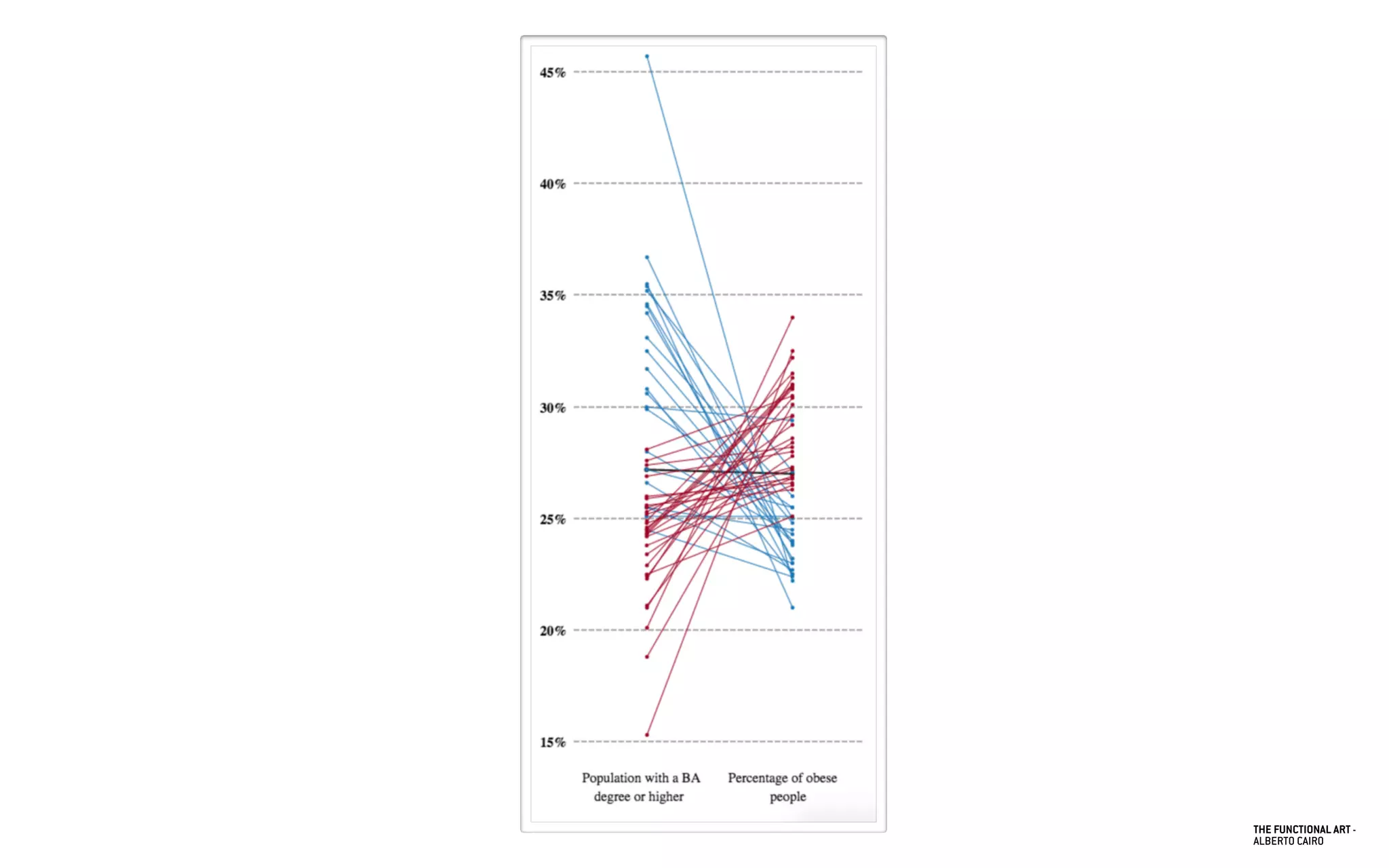
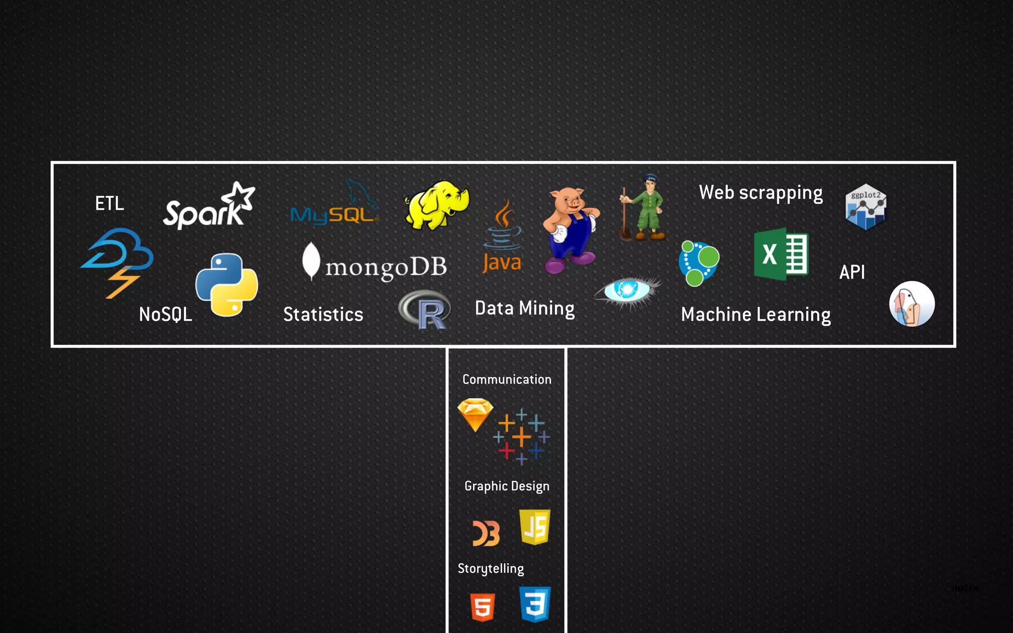
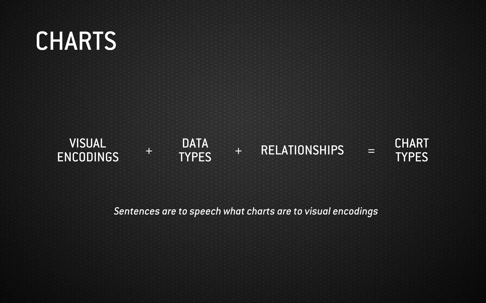
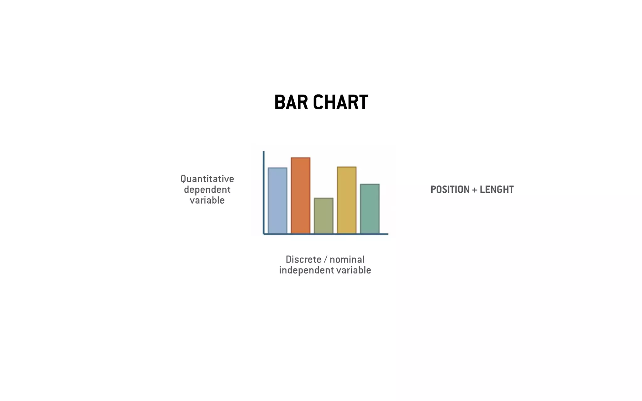
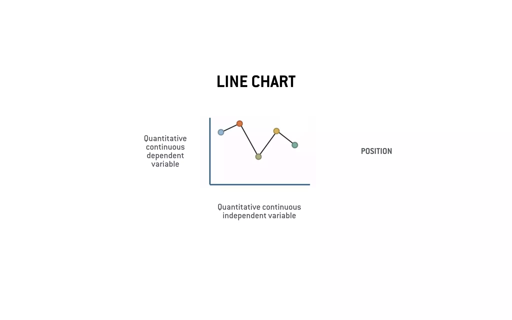
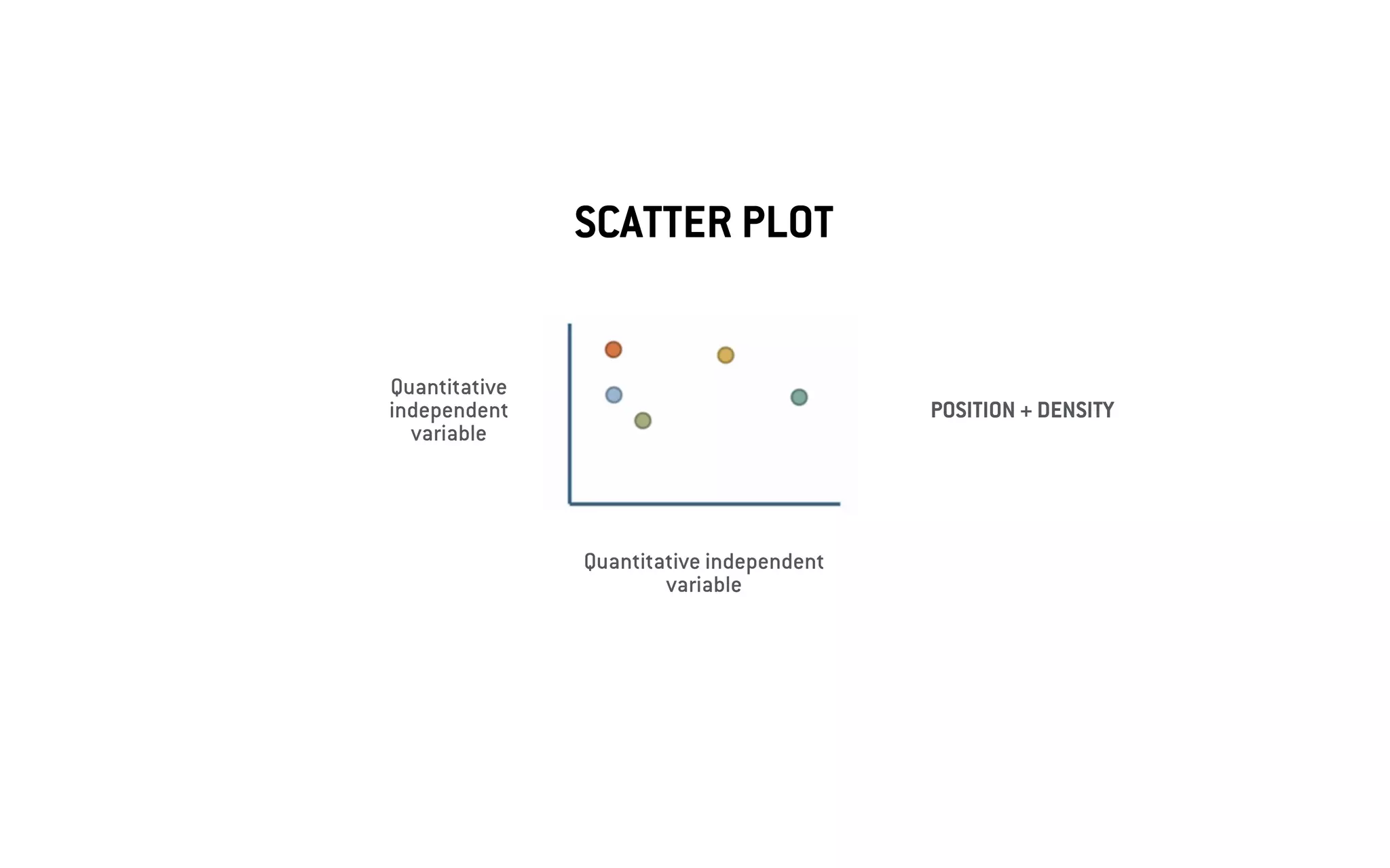
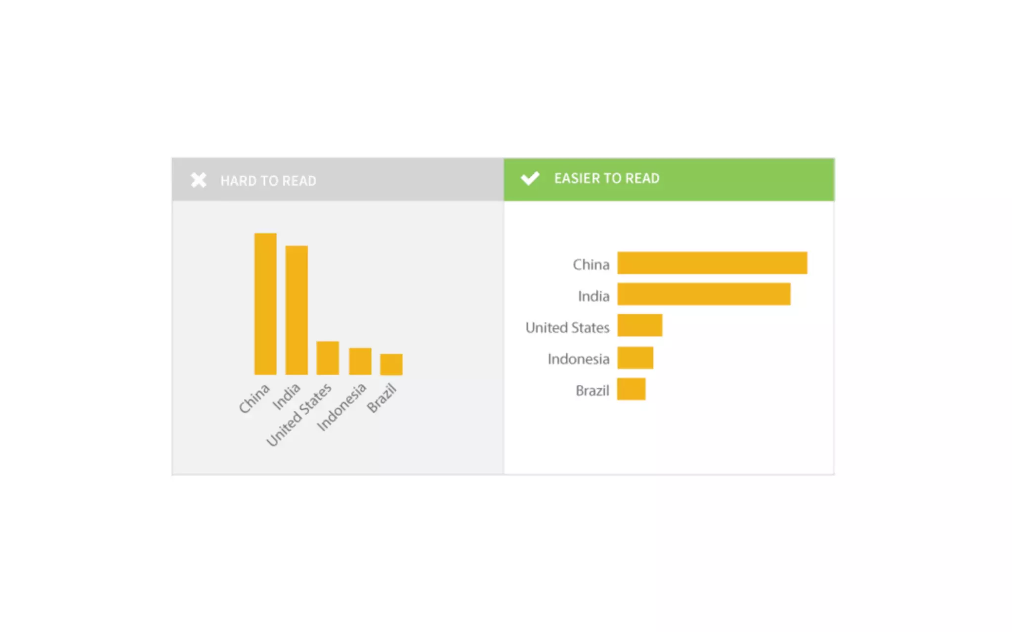
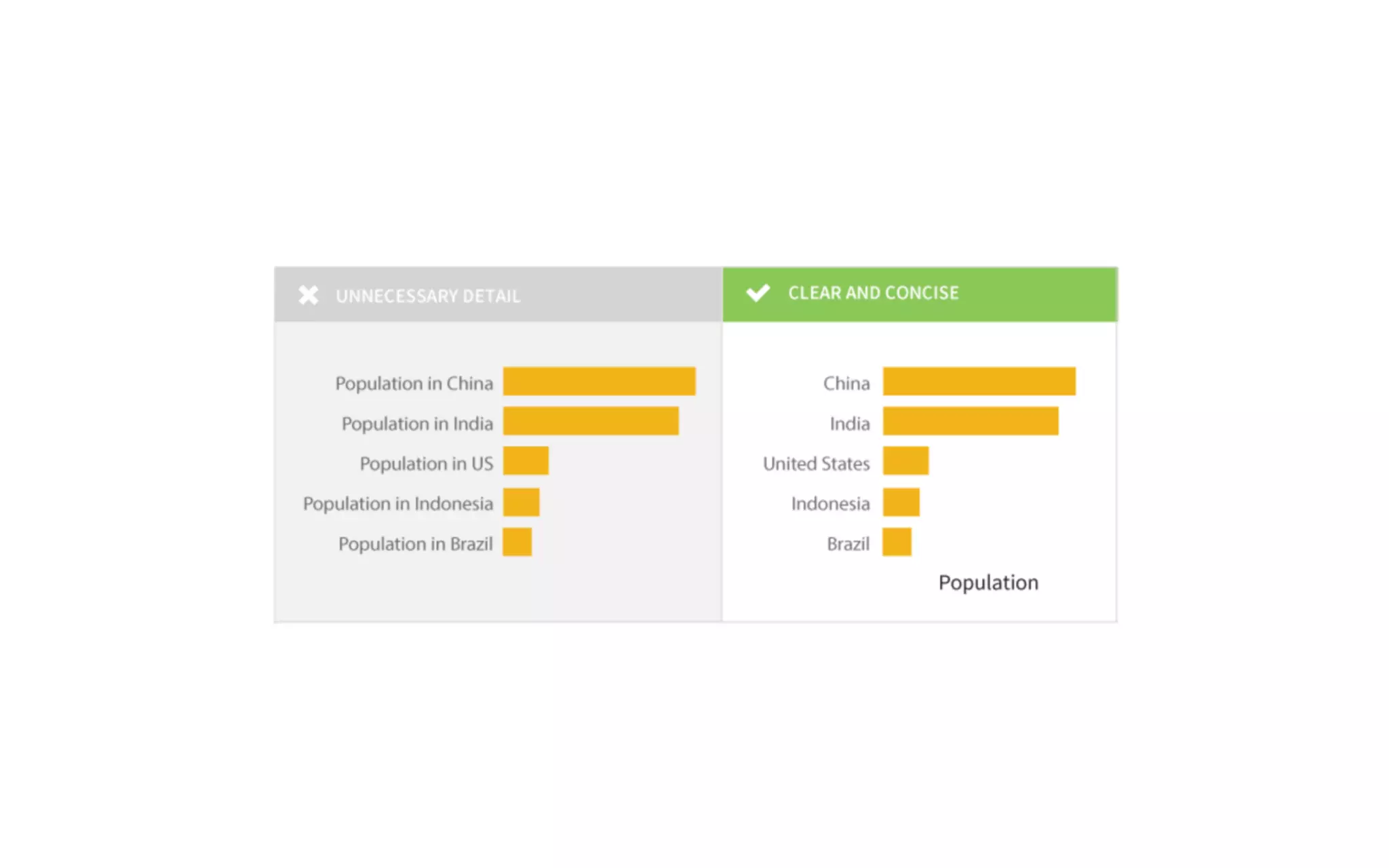
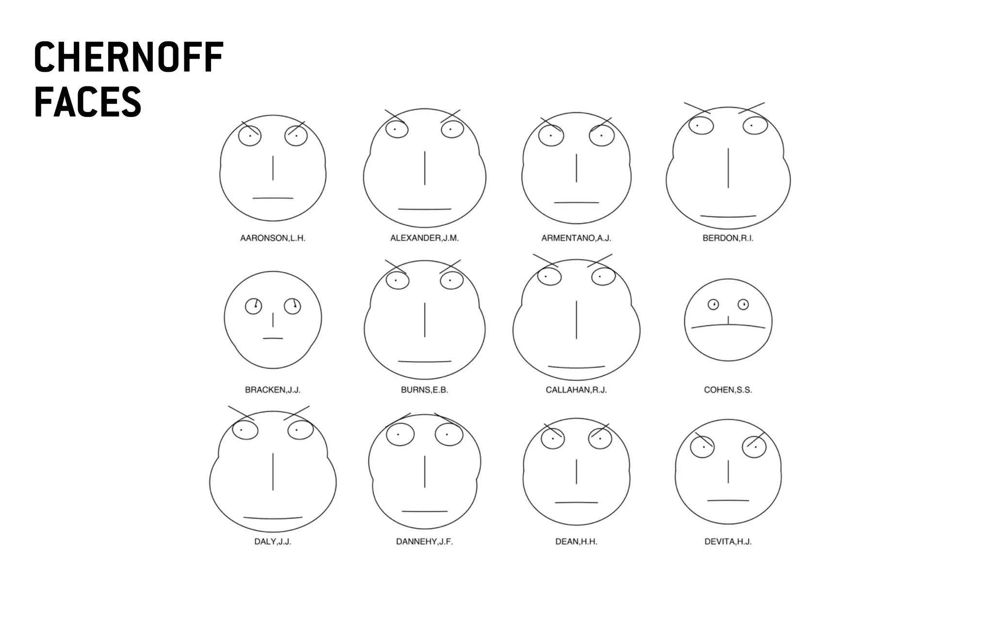
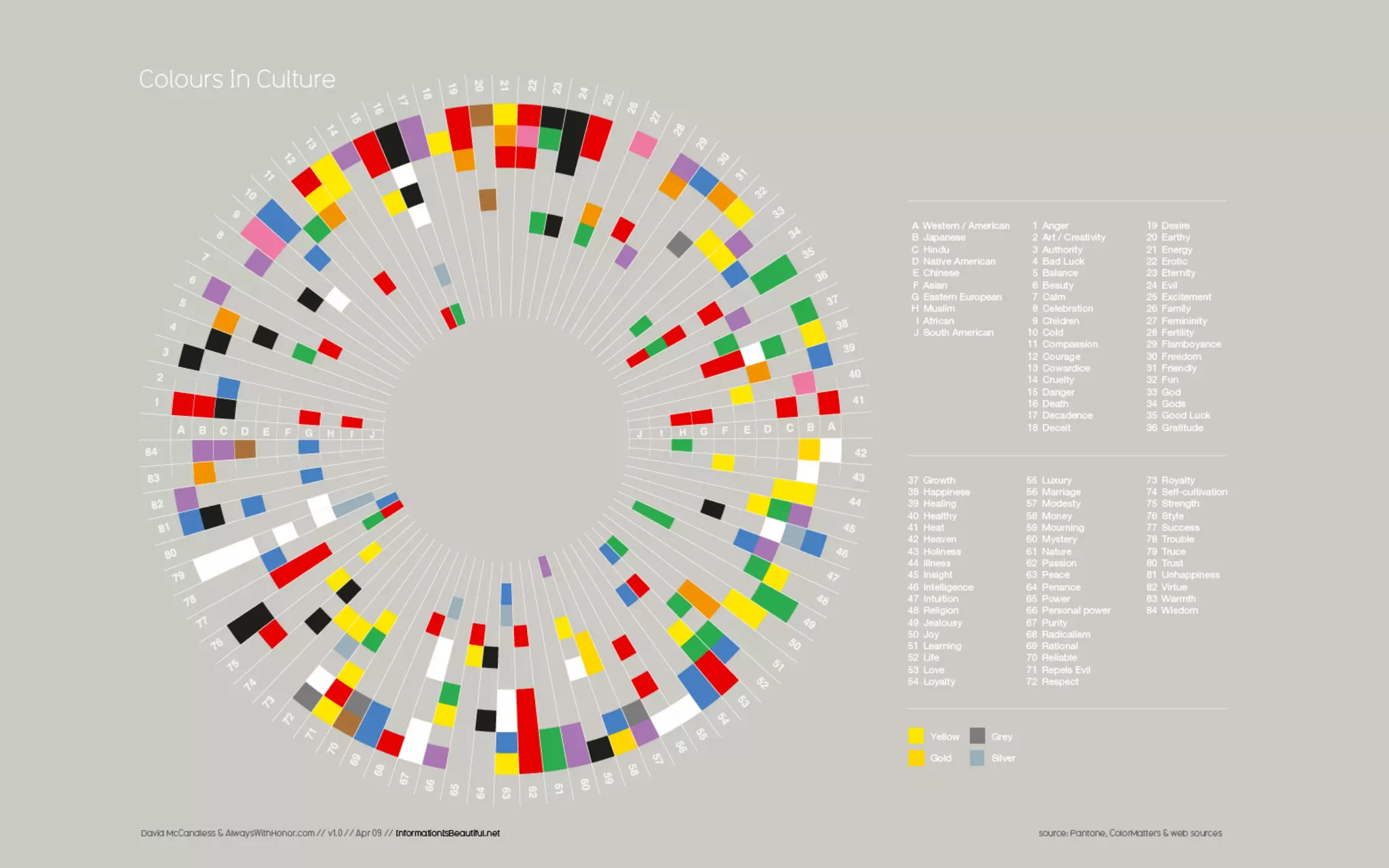
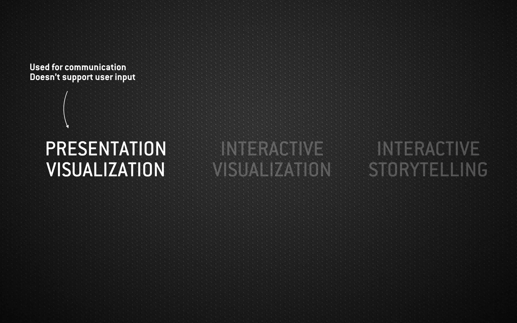
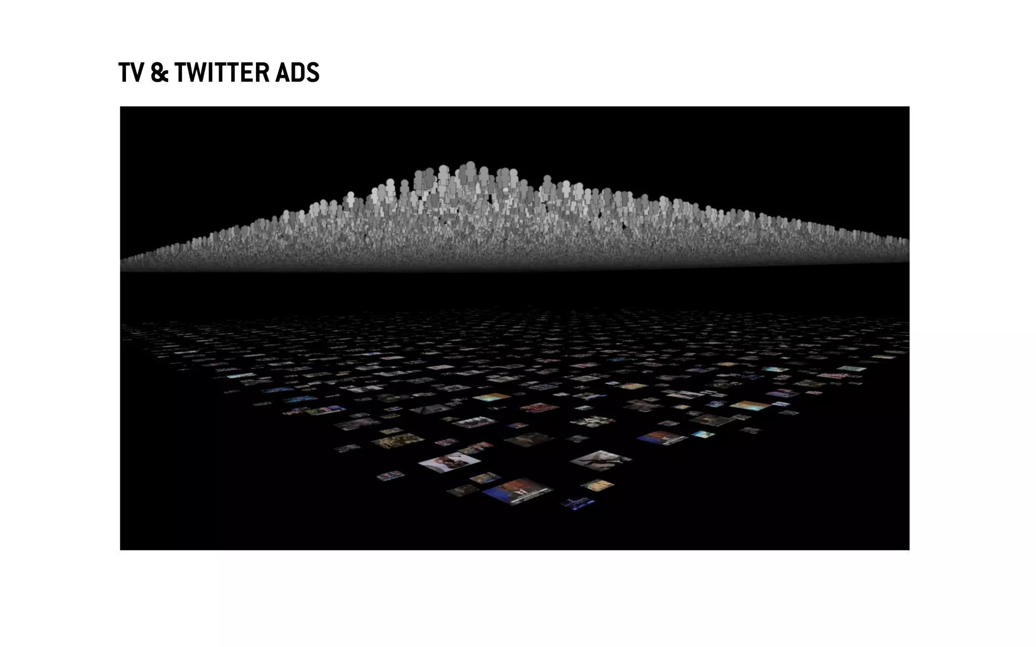
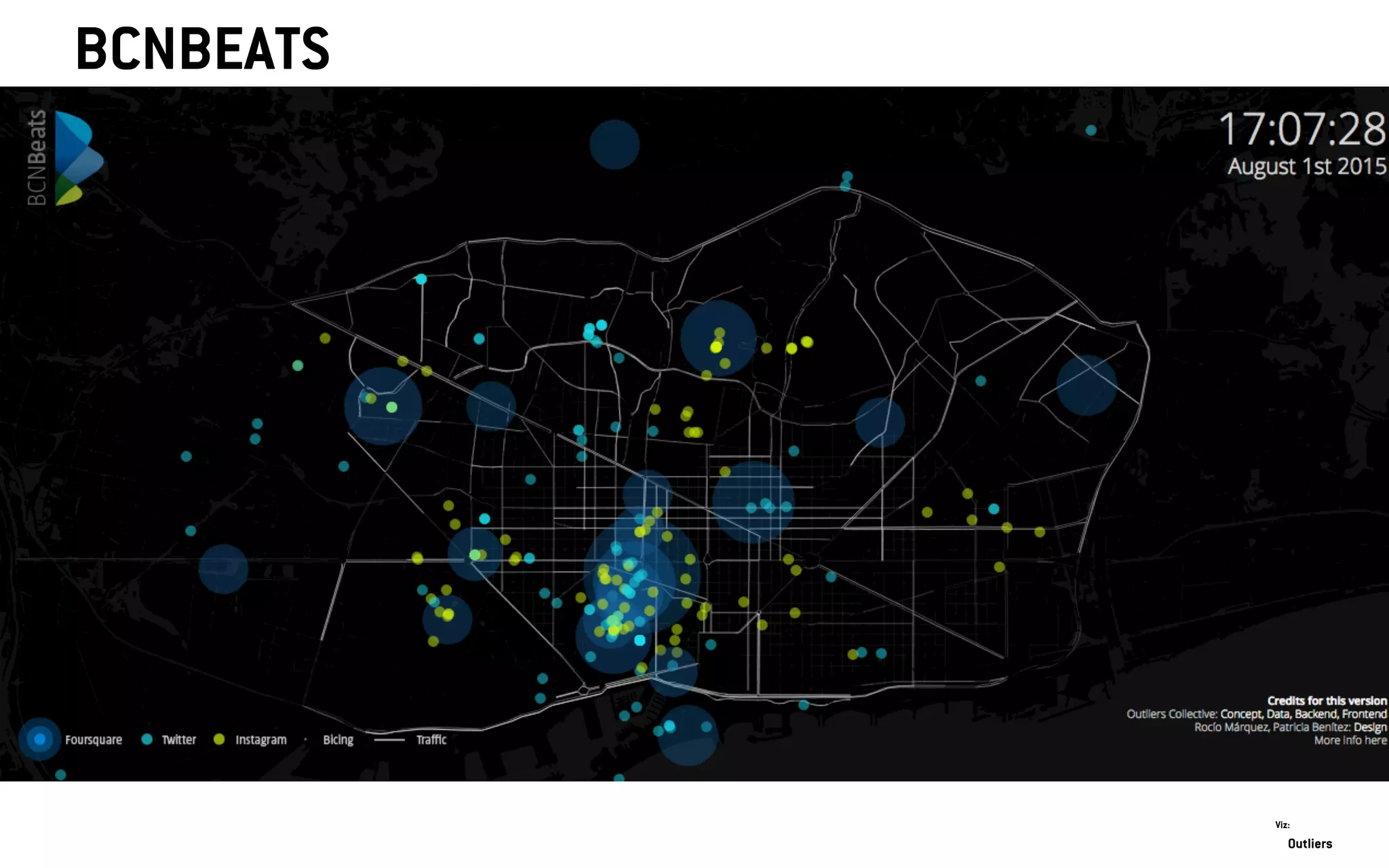
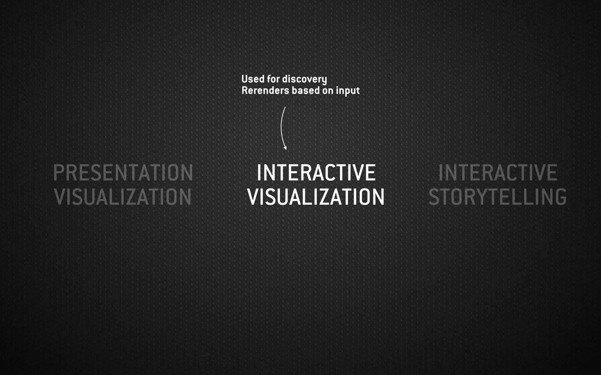
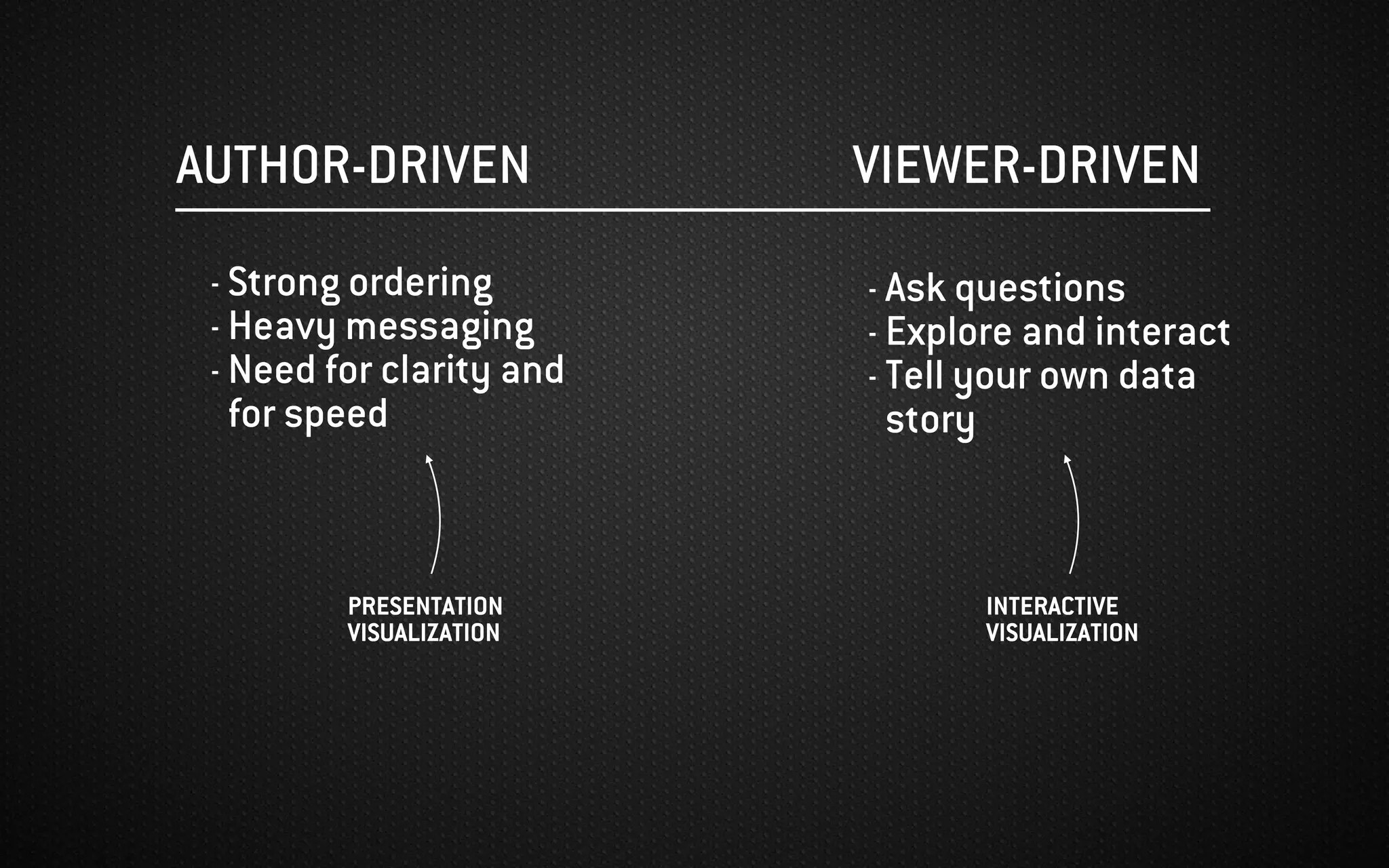
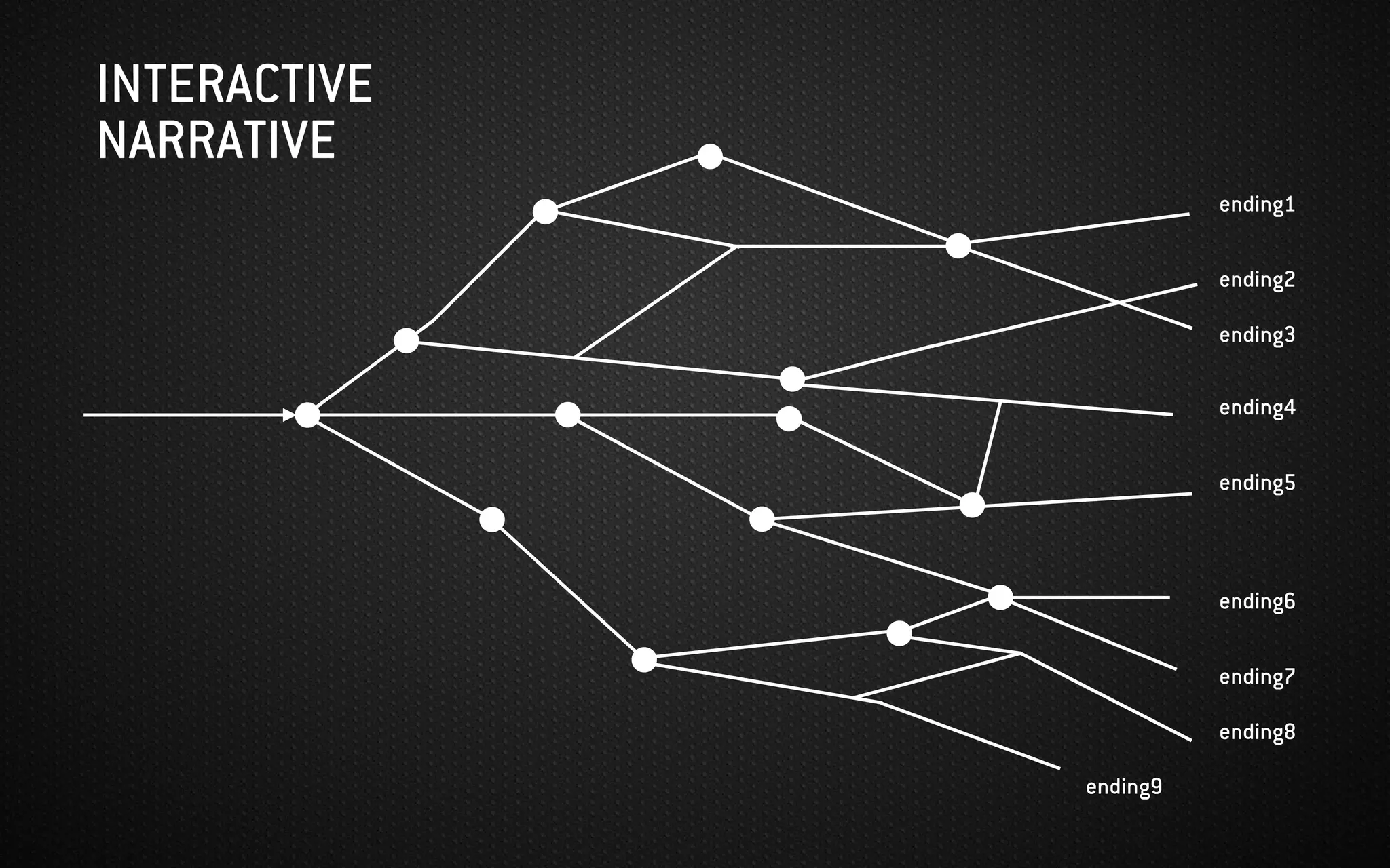
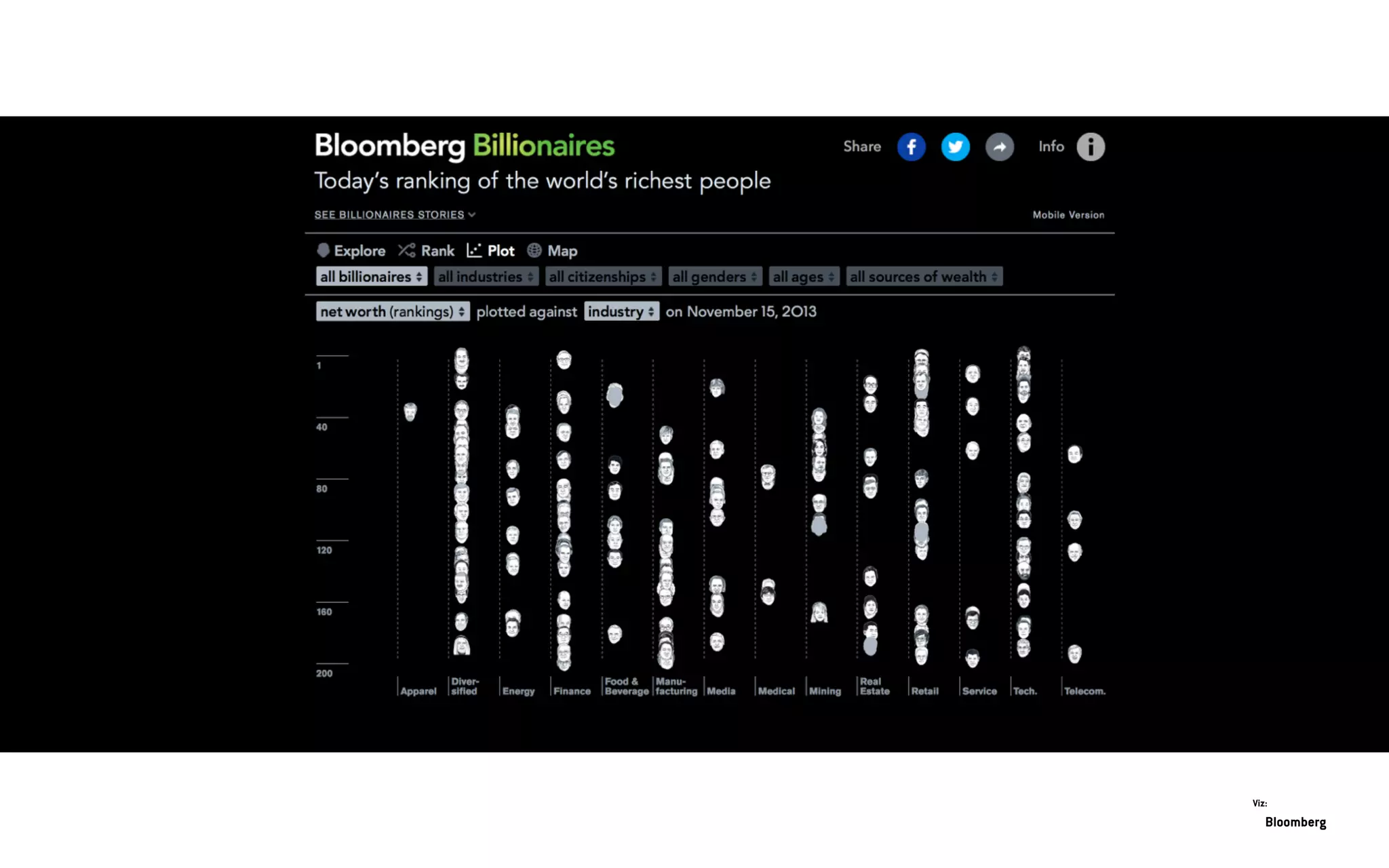
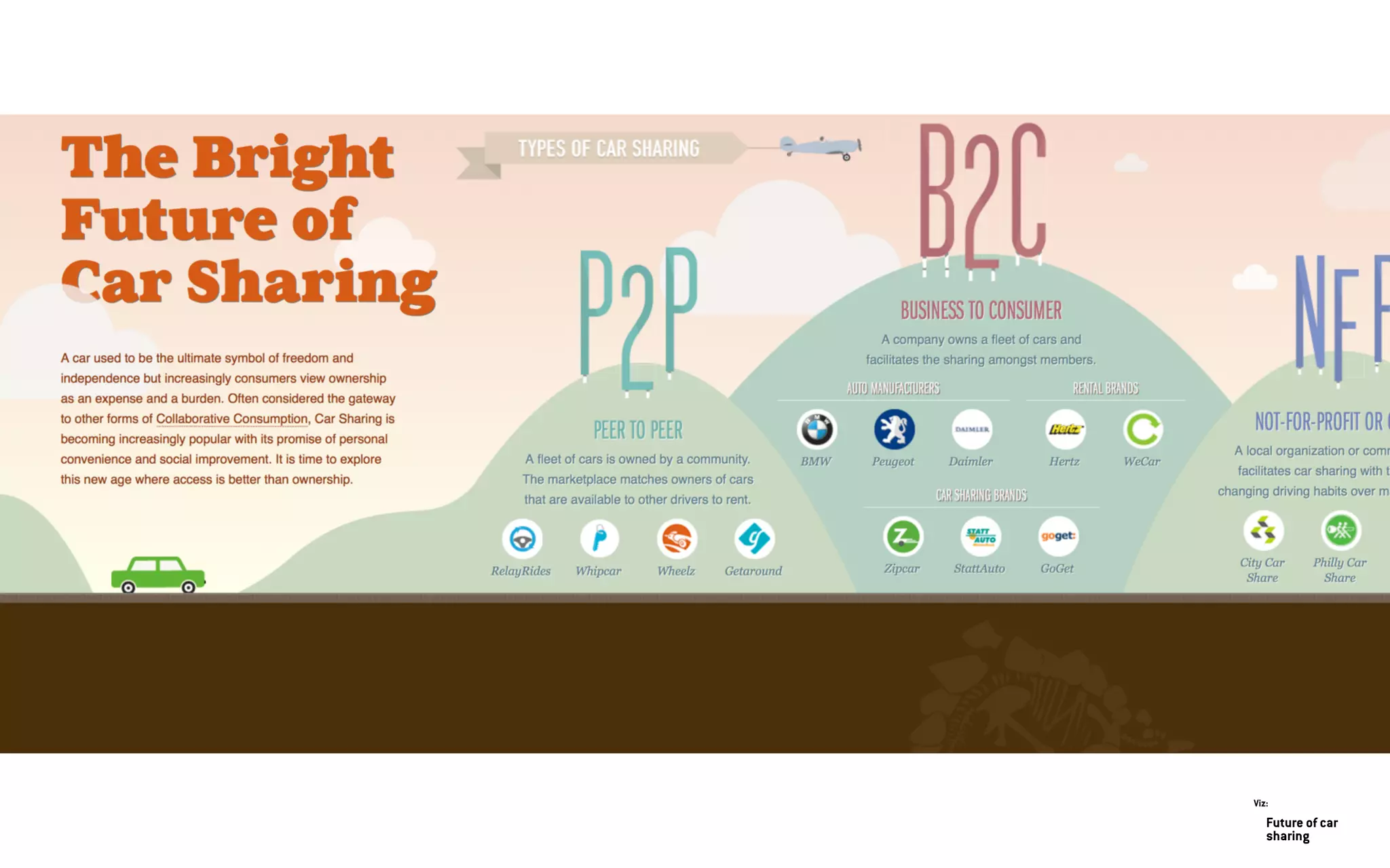
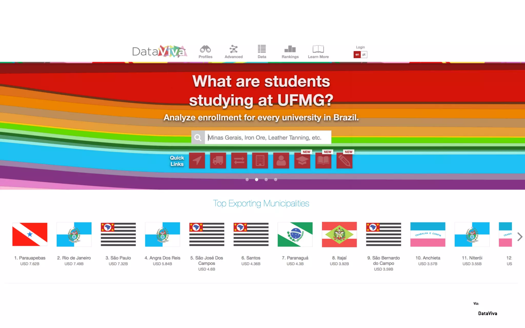
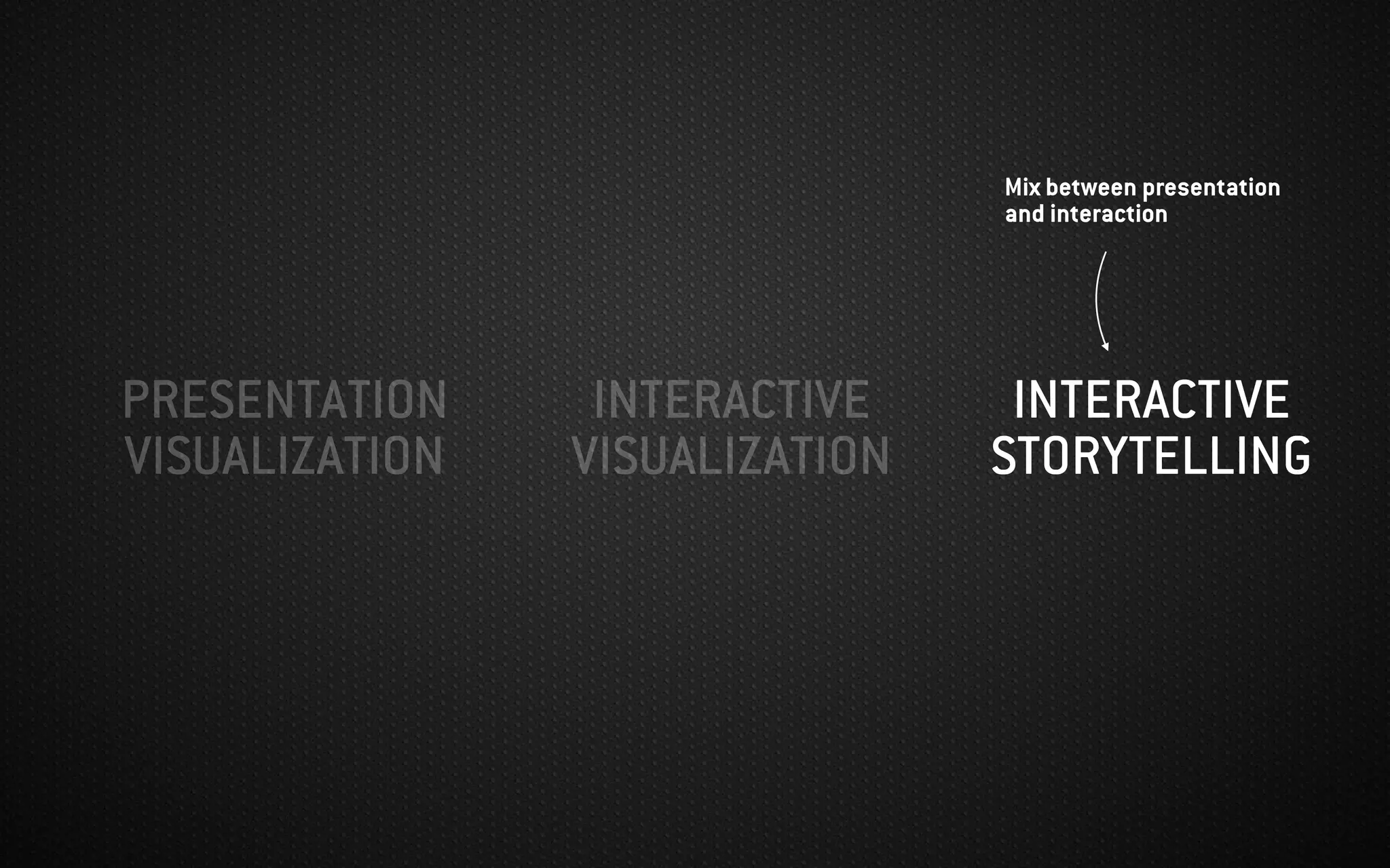
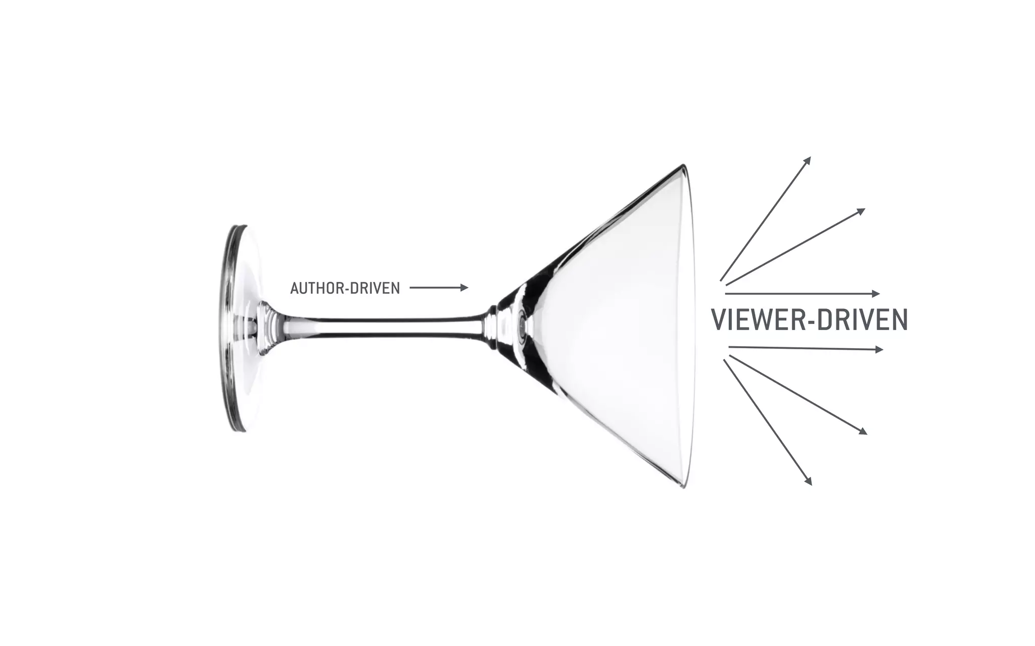
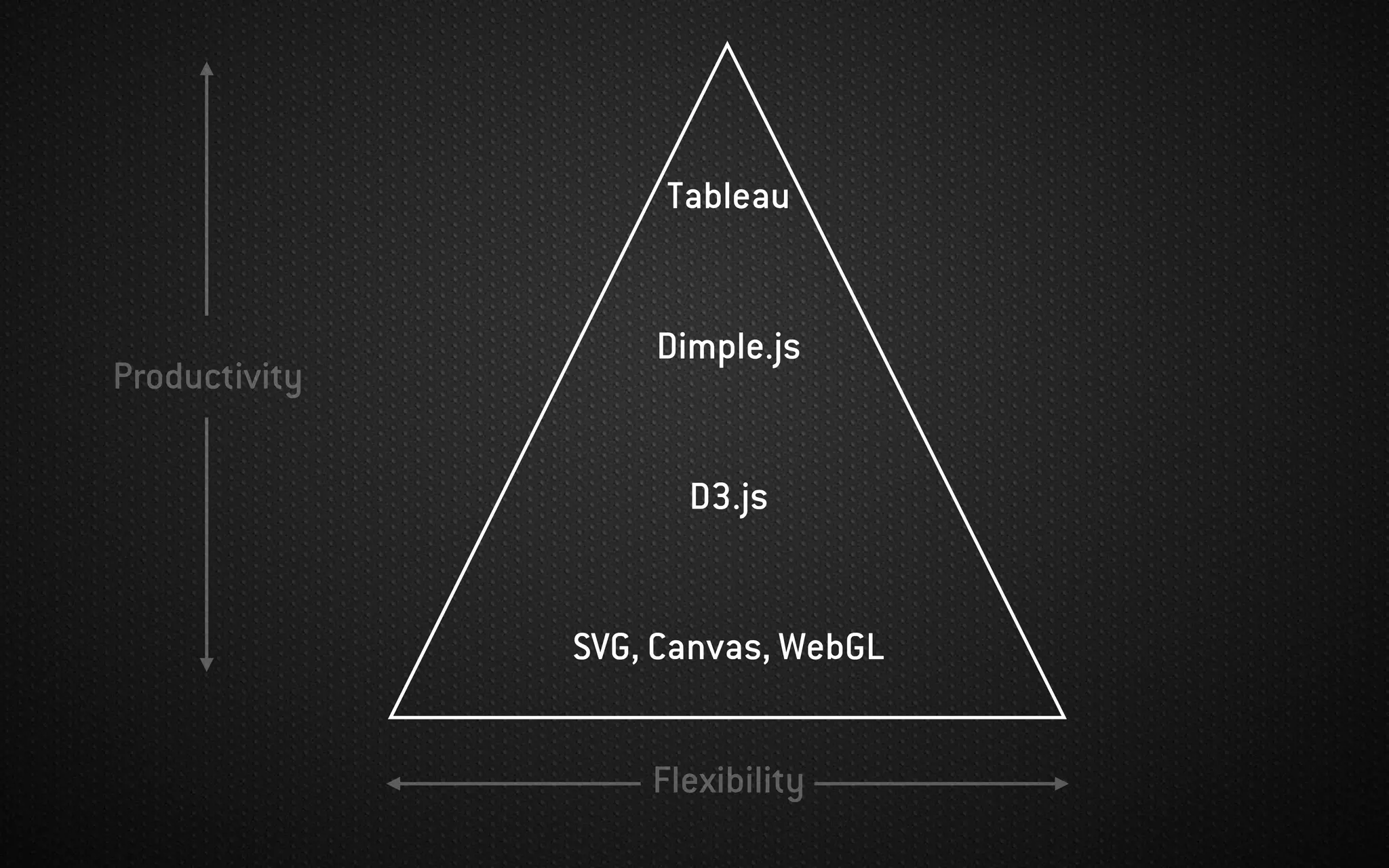
The document discusses the concept and importance of data visualization, emphasizing its role in clearly communicating complex information through various visual formats. It covers disciplines involved in data visualization, effective techniques for representing data, and tools like D3.js for creating dynamic visualizations. Additionally, it highlights key principles and types of data to consider when designing effective visual graphics.


