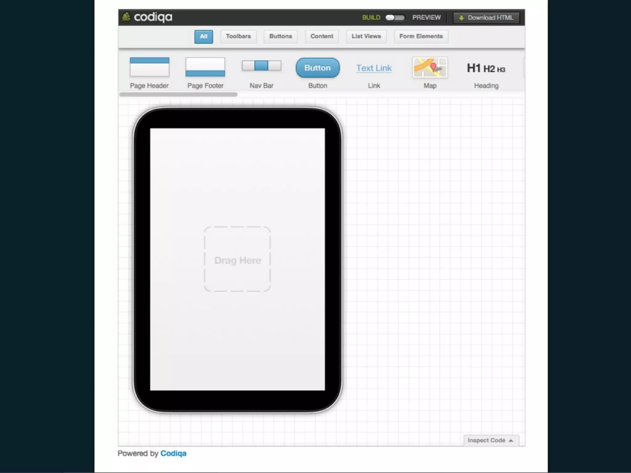
Download as PDF, PPTX


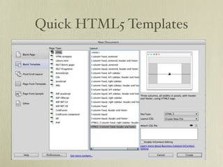


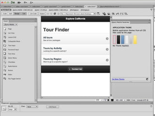
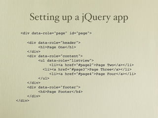
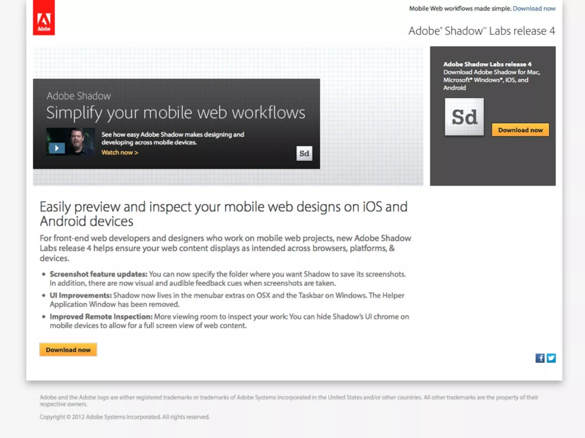
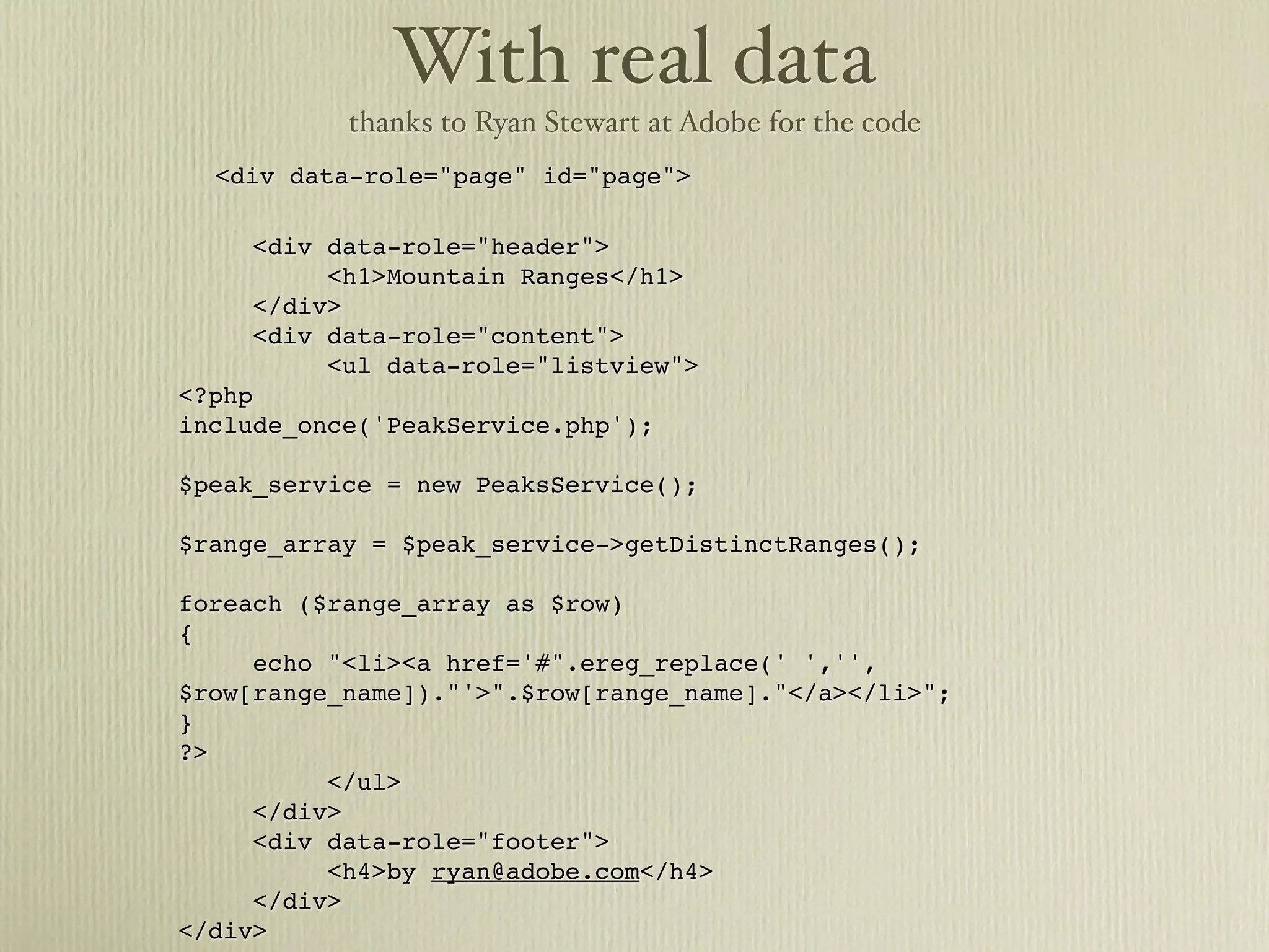
![With real data
thanks to Ryan Stewart at Adobe for the code
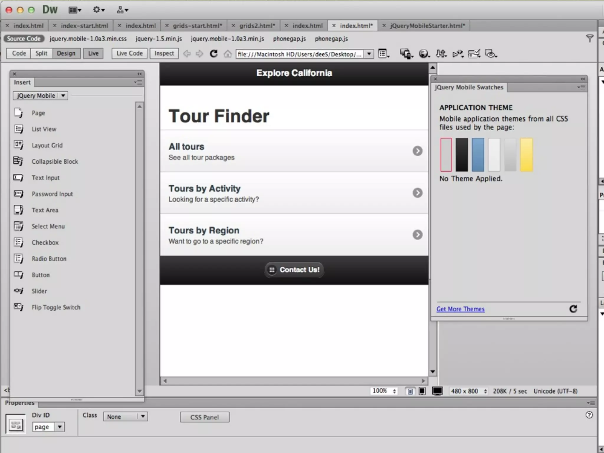
<div data-role="page" id="page">
<div data-role="header">
<h1>Mountain Ranges</h1>
</div>
<div data-role="content">
<ul data-role="listview">
<?php
include_once('PeakService.php');
$peak_service = new PeaksService();
$range_array = $peak_service->getDistinctRanges();
foreach ($range_array as $row)
{
echo "<li><a href='#".ereg_replace(' ','',
$row[range_name])."'>".$row[range_name]."</a></li>";
}
?>
</ul>
</div>
<div data-role="footer">
<h4>by ryan@adobe.com</h4>
</div>
</div>](https://image.slidesharecdn.com/dwjquery-120913132333-phpapp02/85/Dreamweaver-CS6-jQuery-PhoneGap-mobile-design-68-320.jpg)


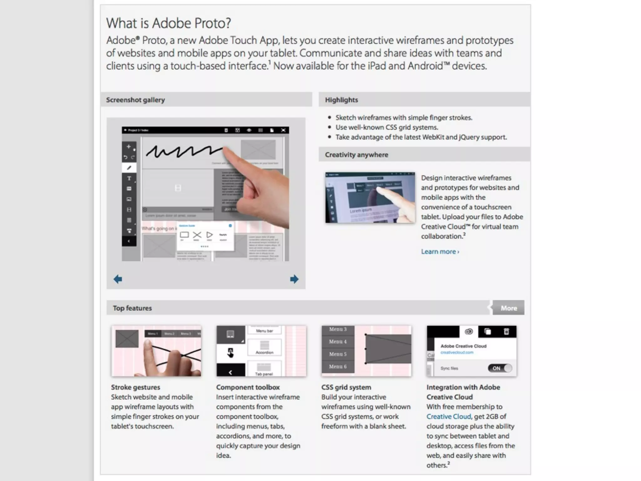


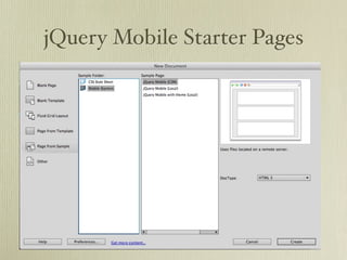
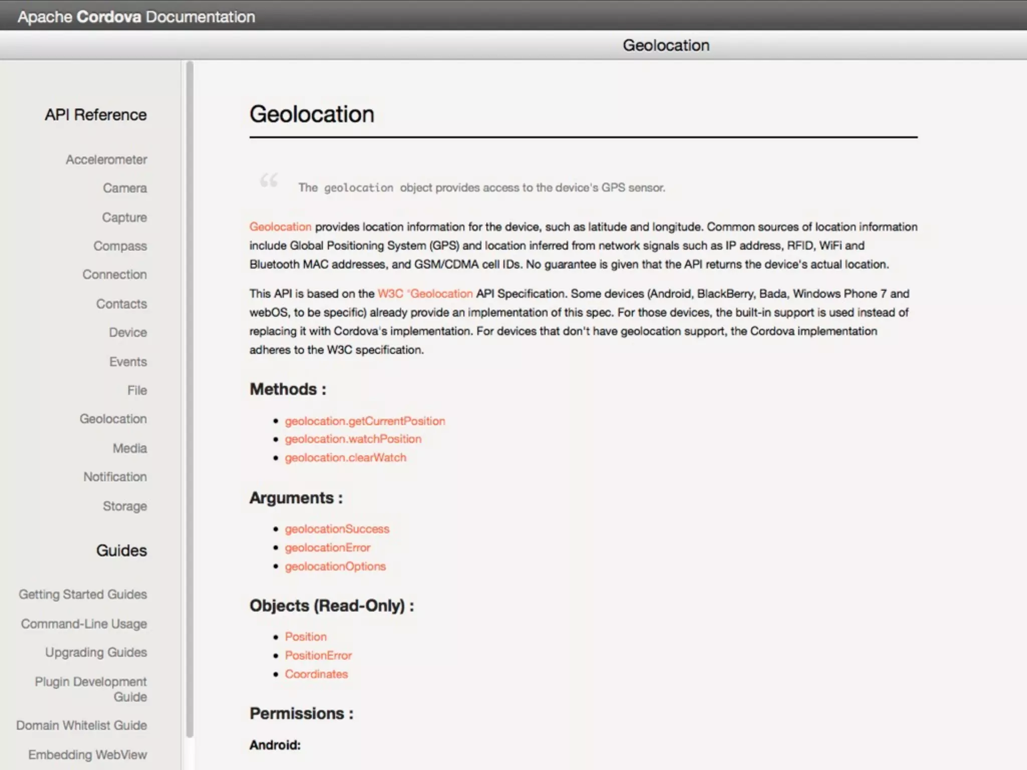
![With real data
thanks to Ryan Stewart at Adobe for the code
<div data-role="page" id="page">
<div data-role="header">
<h1>Mountain Ranges</h1>
</div>
<div data-role="content">
<ul data-role="listview">
<?php
include_once('PeakService.php');
$peak_service = new PeaksService();
$range_array = $peak_service->getDistinctRanges();
foreach ($range_array as $row)
{
echo "<li><a href='#".ereg_replace(' ','',
$row[range_name])."'>".$row[range_name]."</a></li>";
}
?>
</ul>
</div>
<div data-role="footer">
<h4>by ryan@adobe.com</h4>
</div>
</div>](https://image.slidesharecdn.com/dwjquery-120913132333-phpapp02/75/Dreamweaver-CS6-jQuery-PhoneGap-mobile-design-68-2048.jpg)
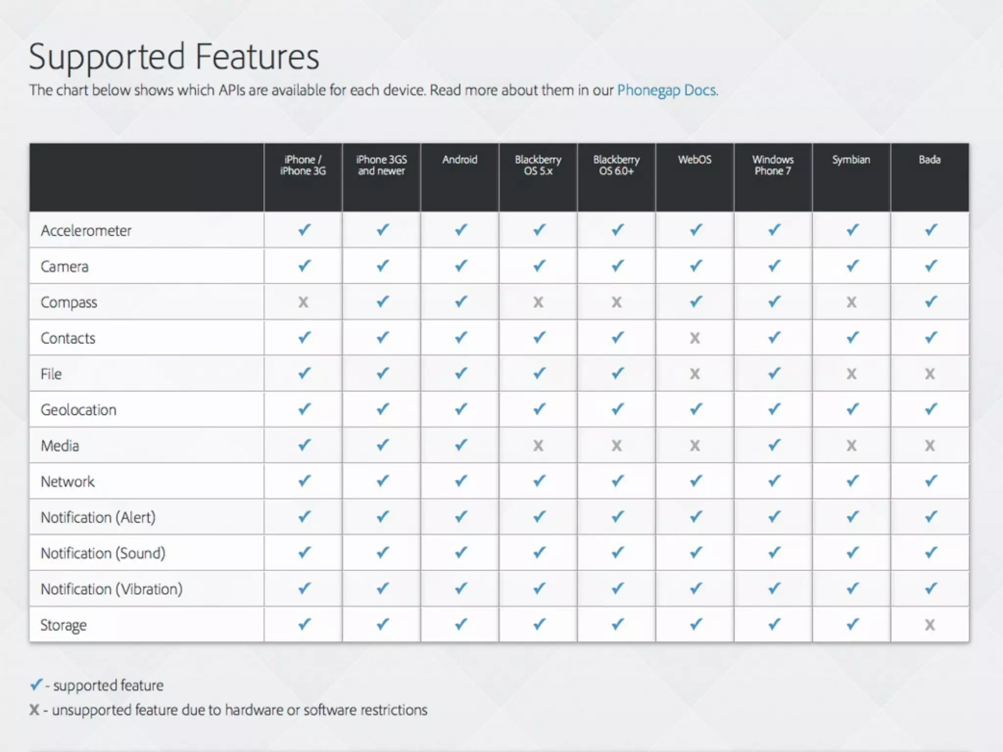
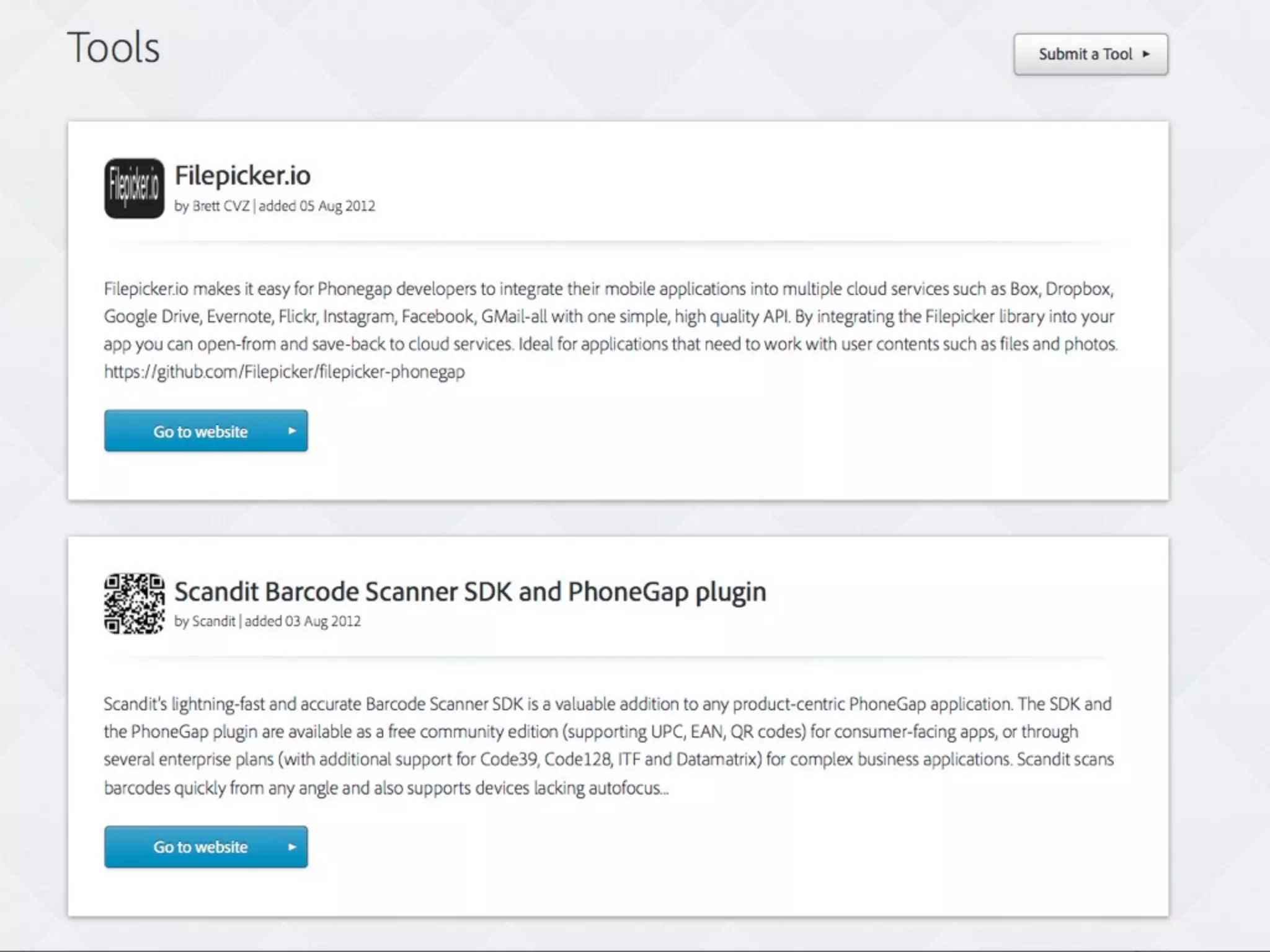
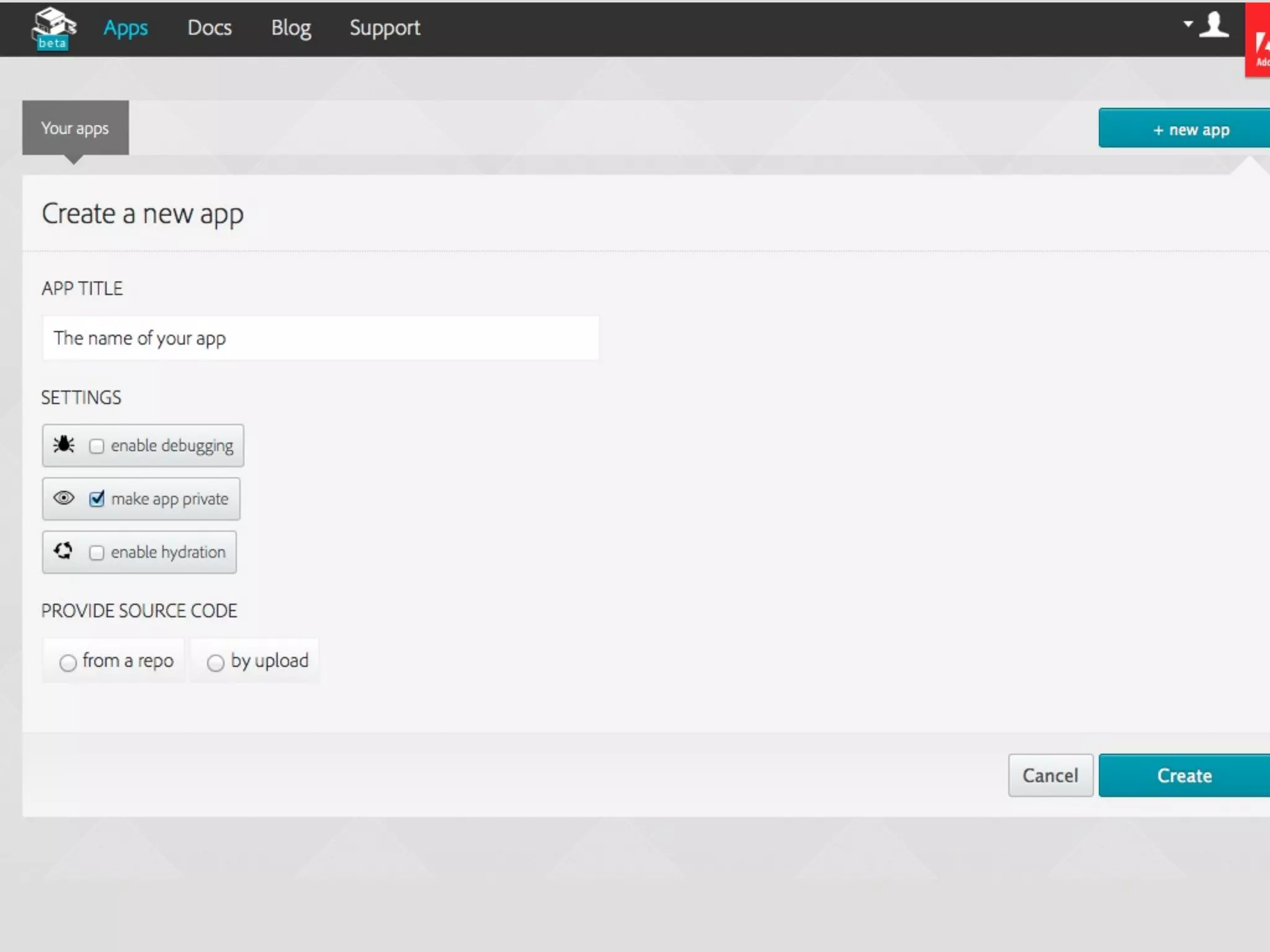
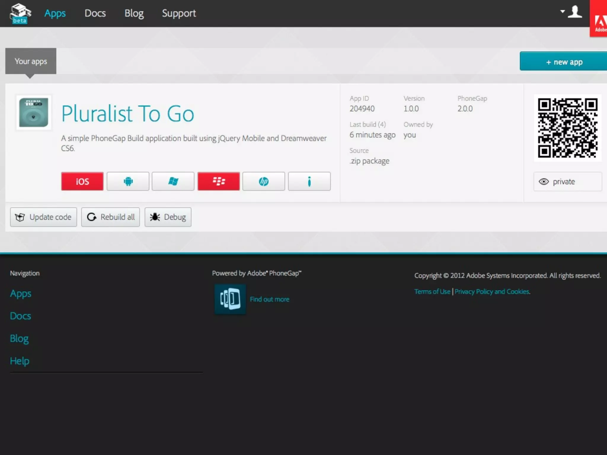


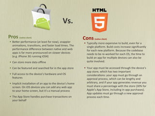
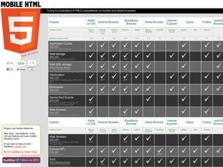
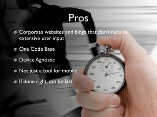
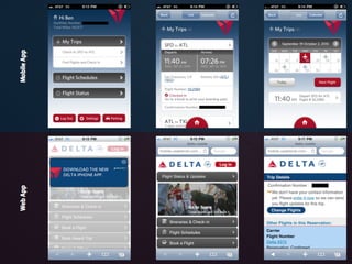
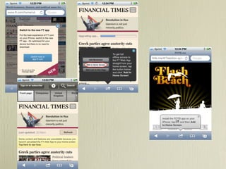
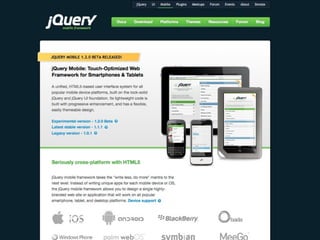
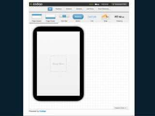
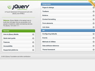
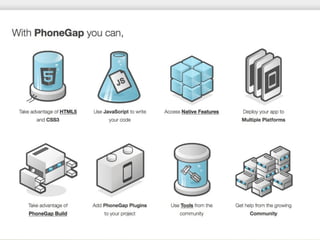
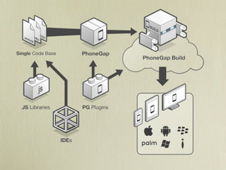
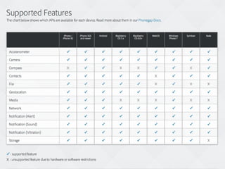
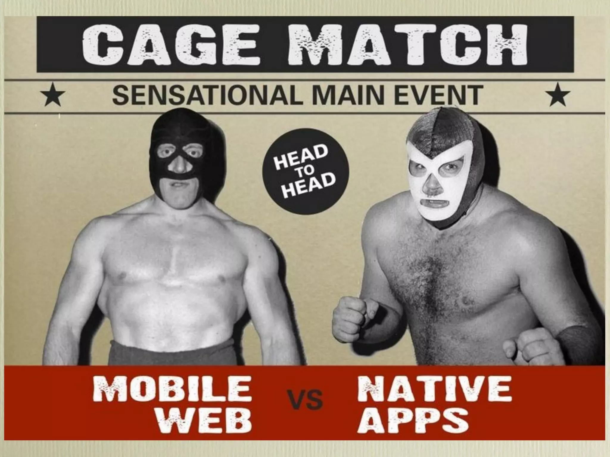
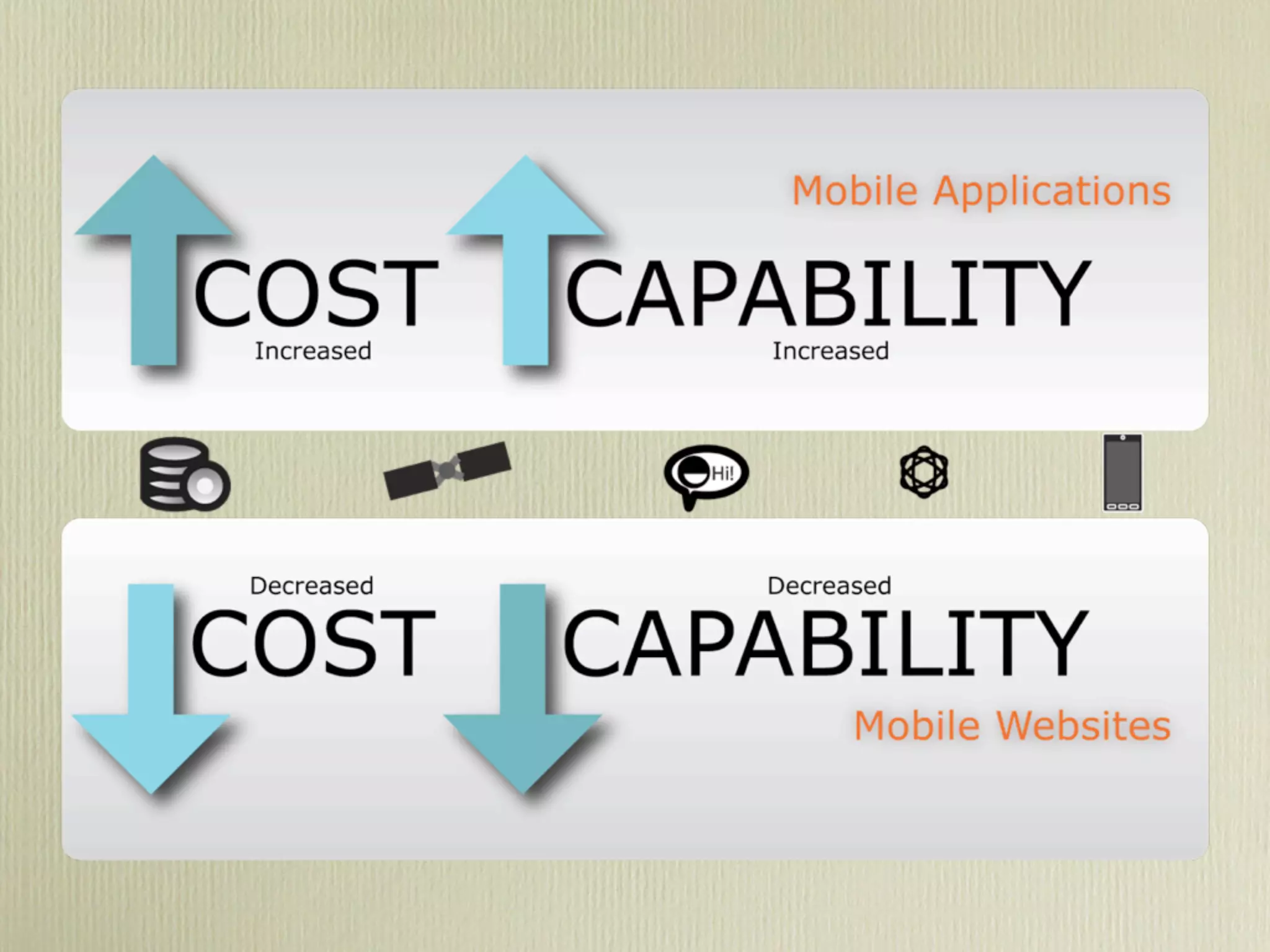
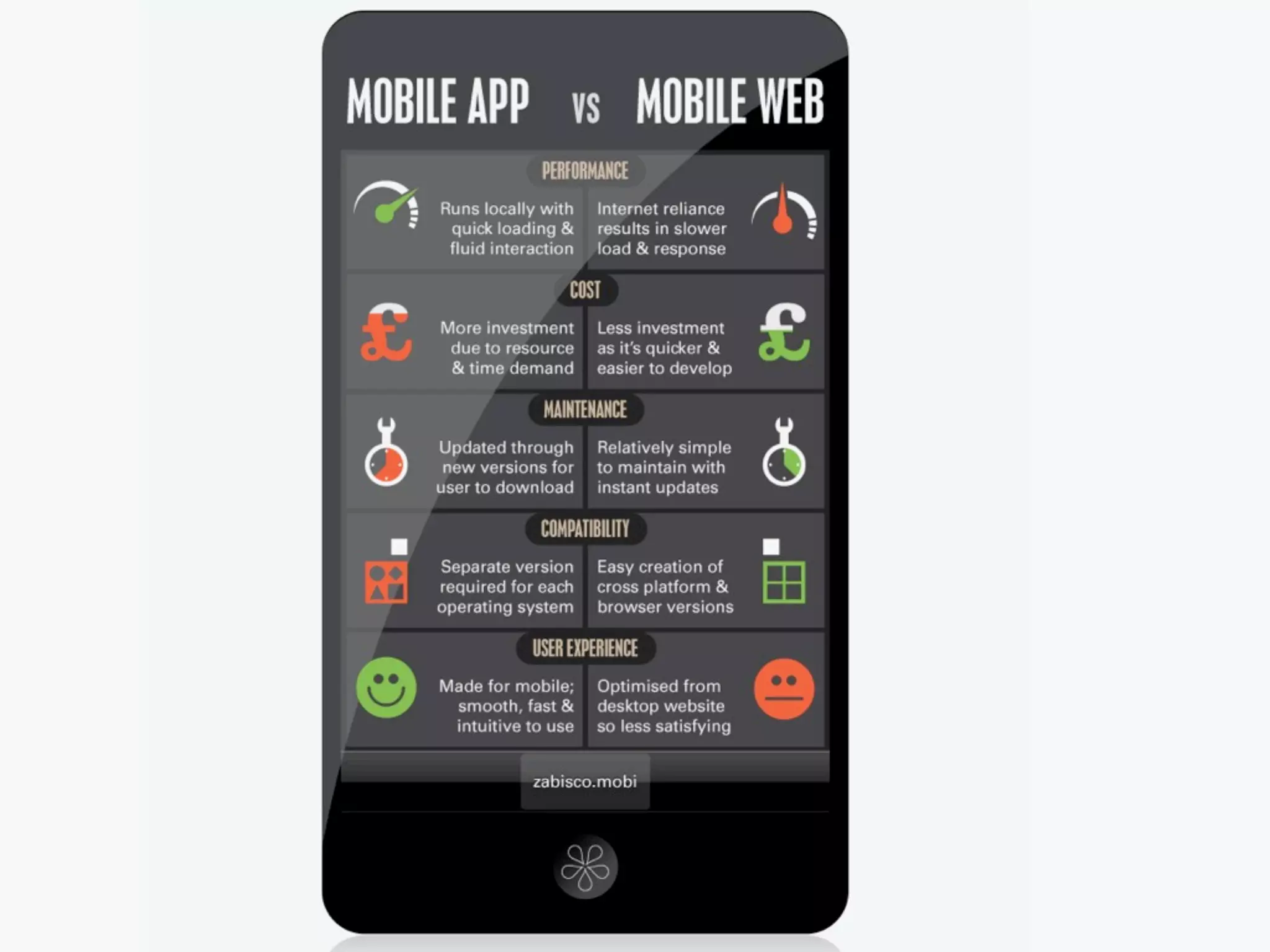
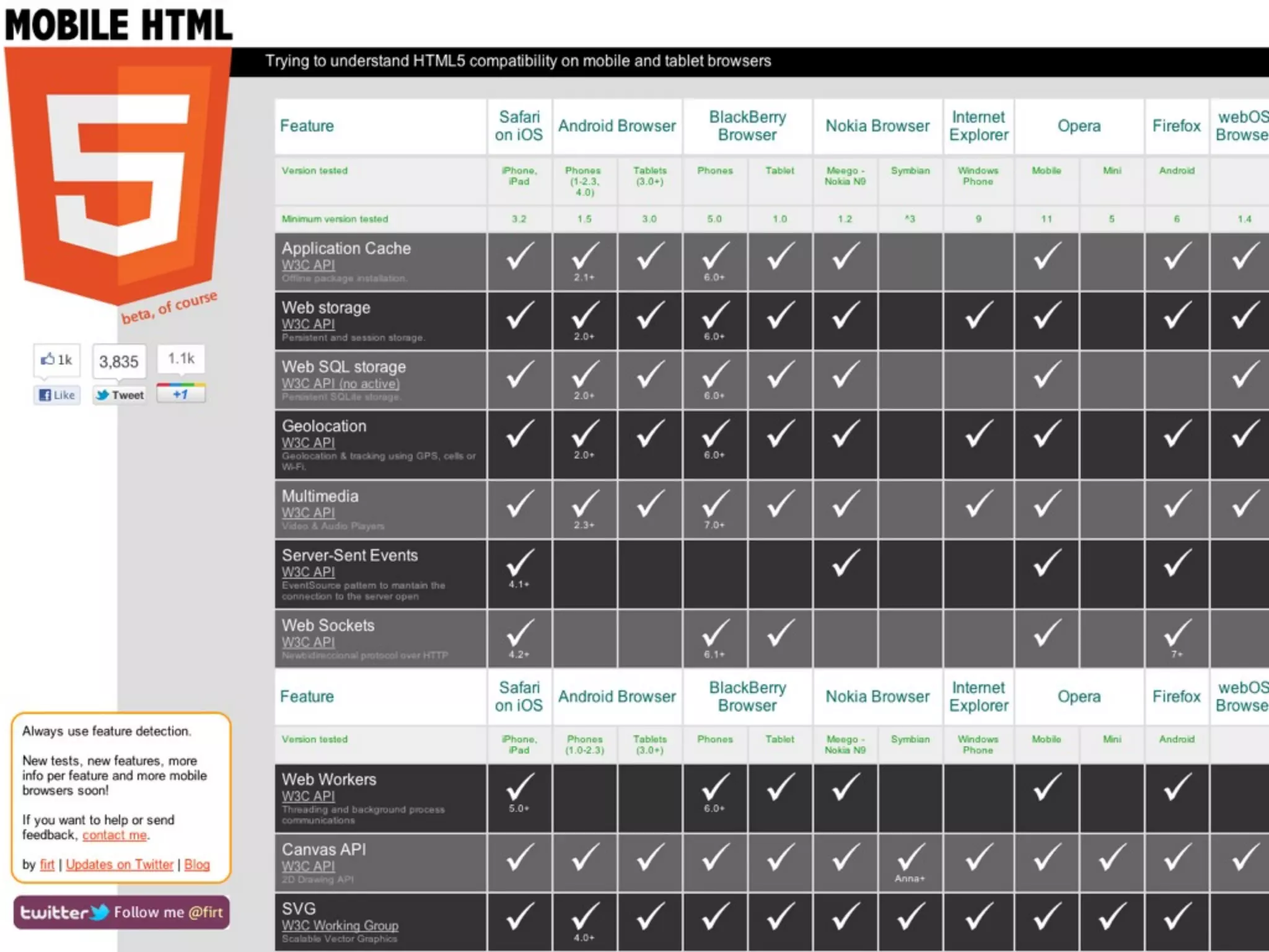
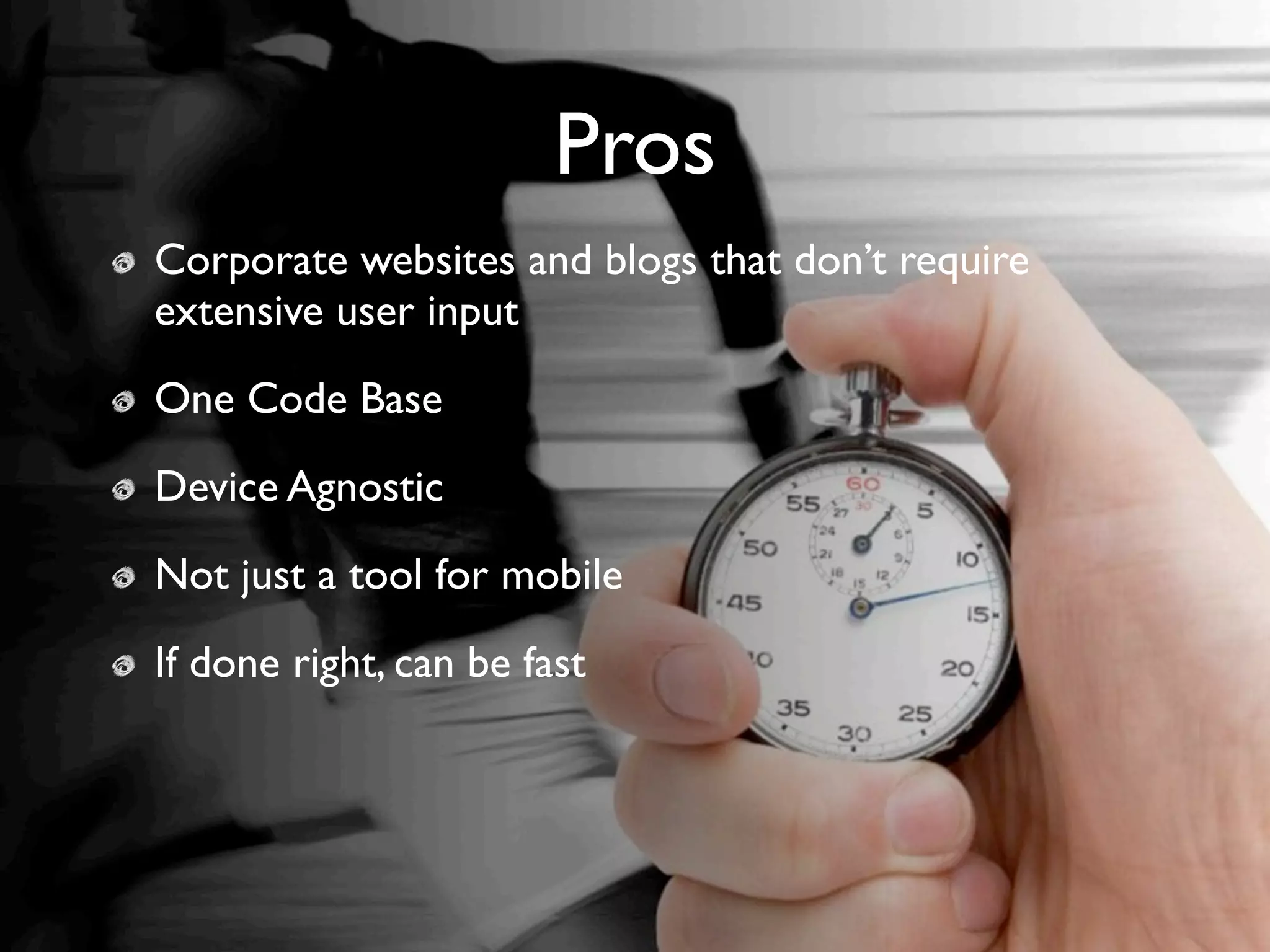
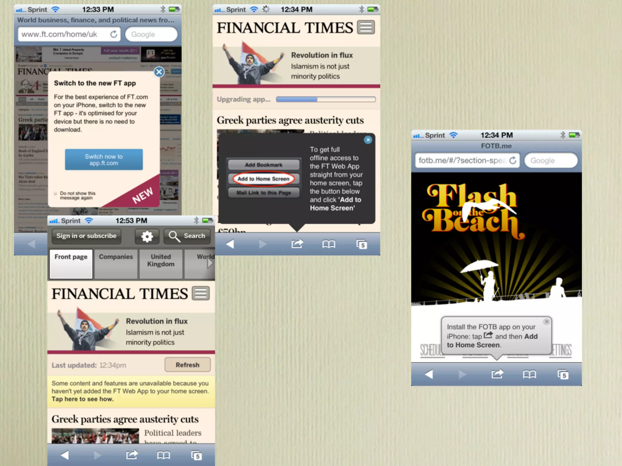
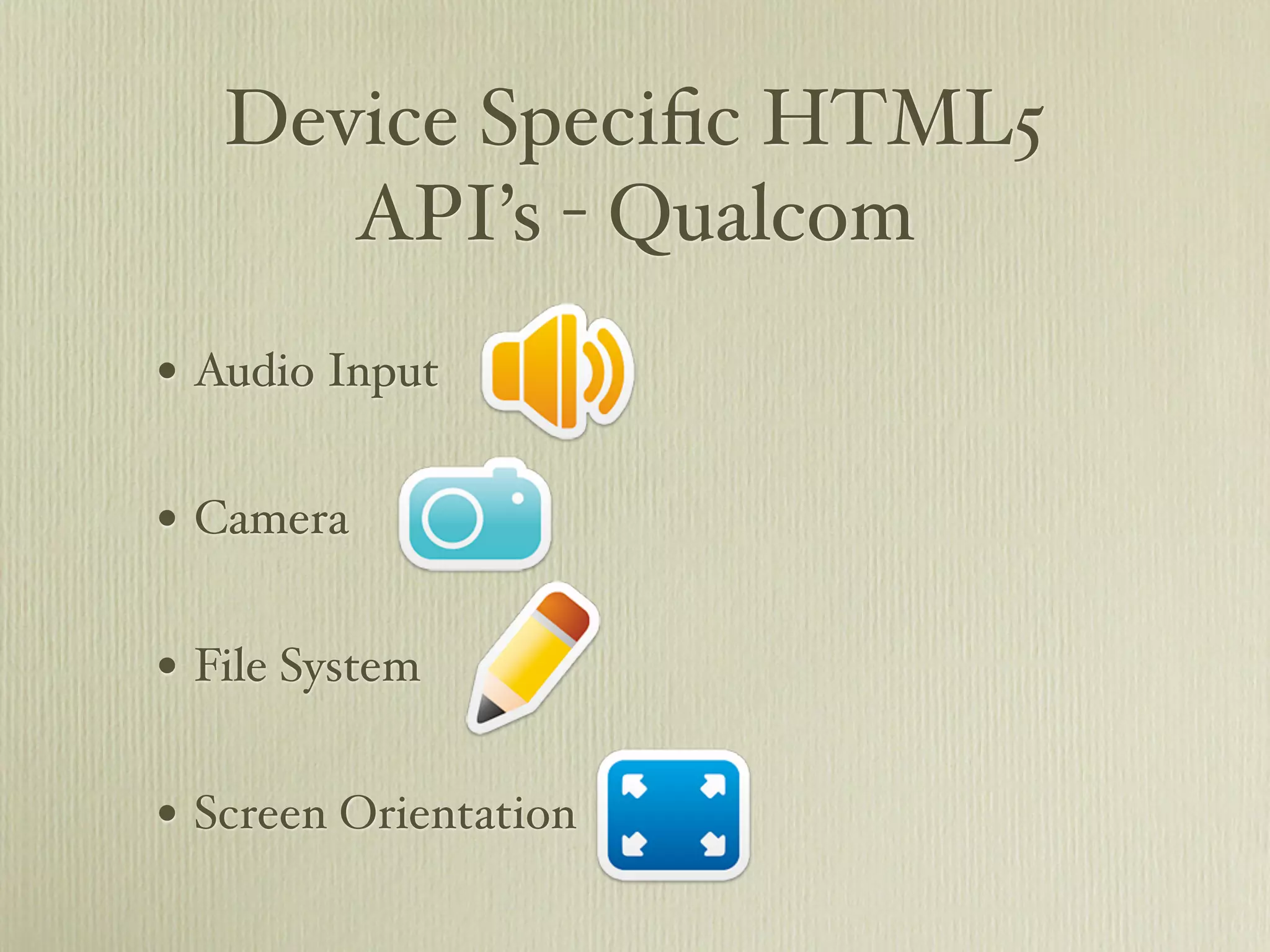
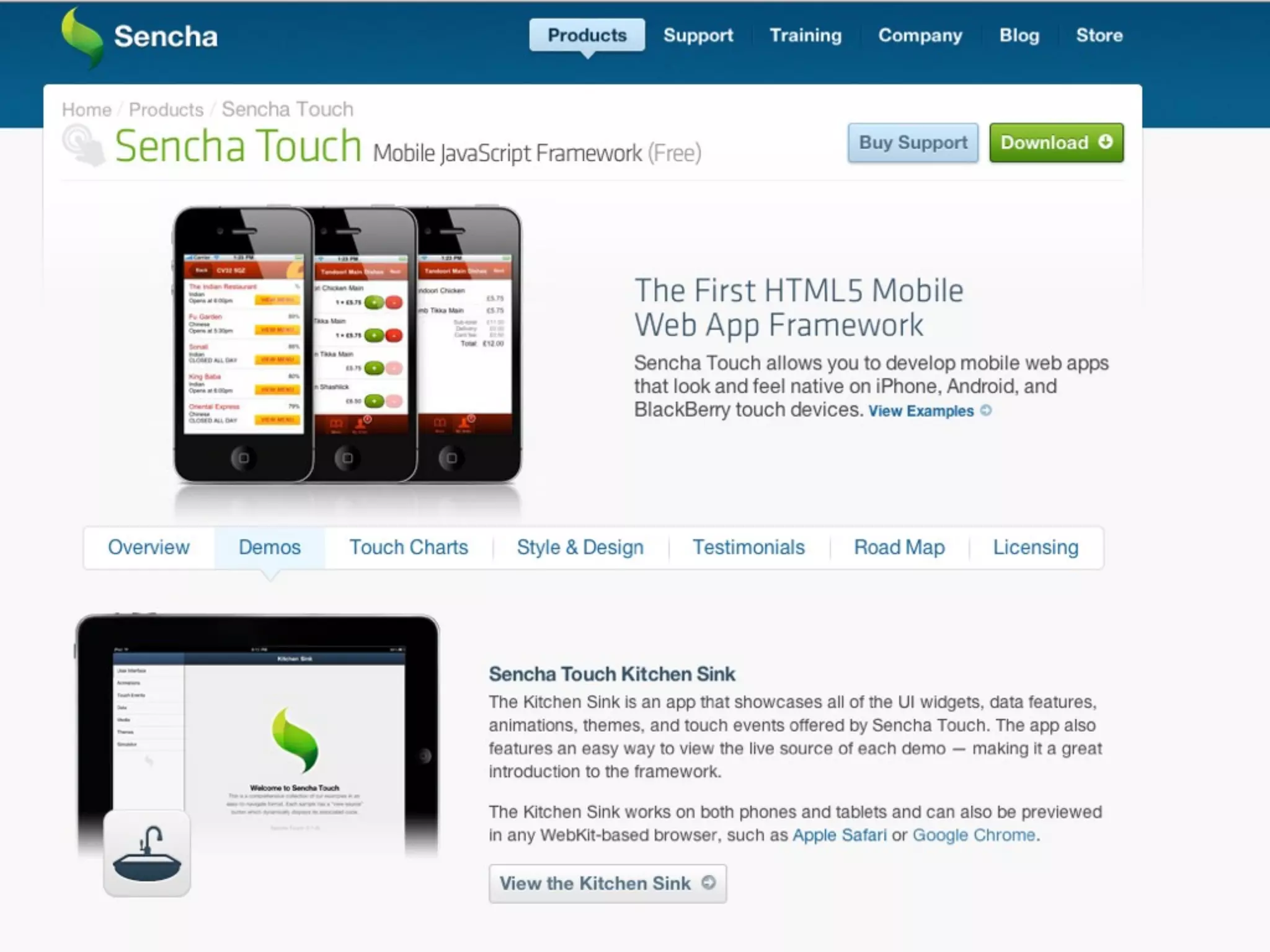
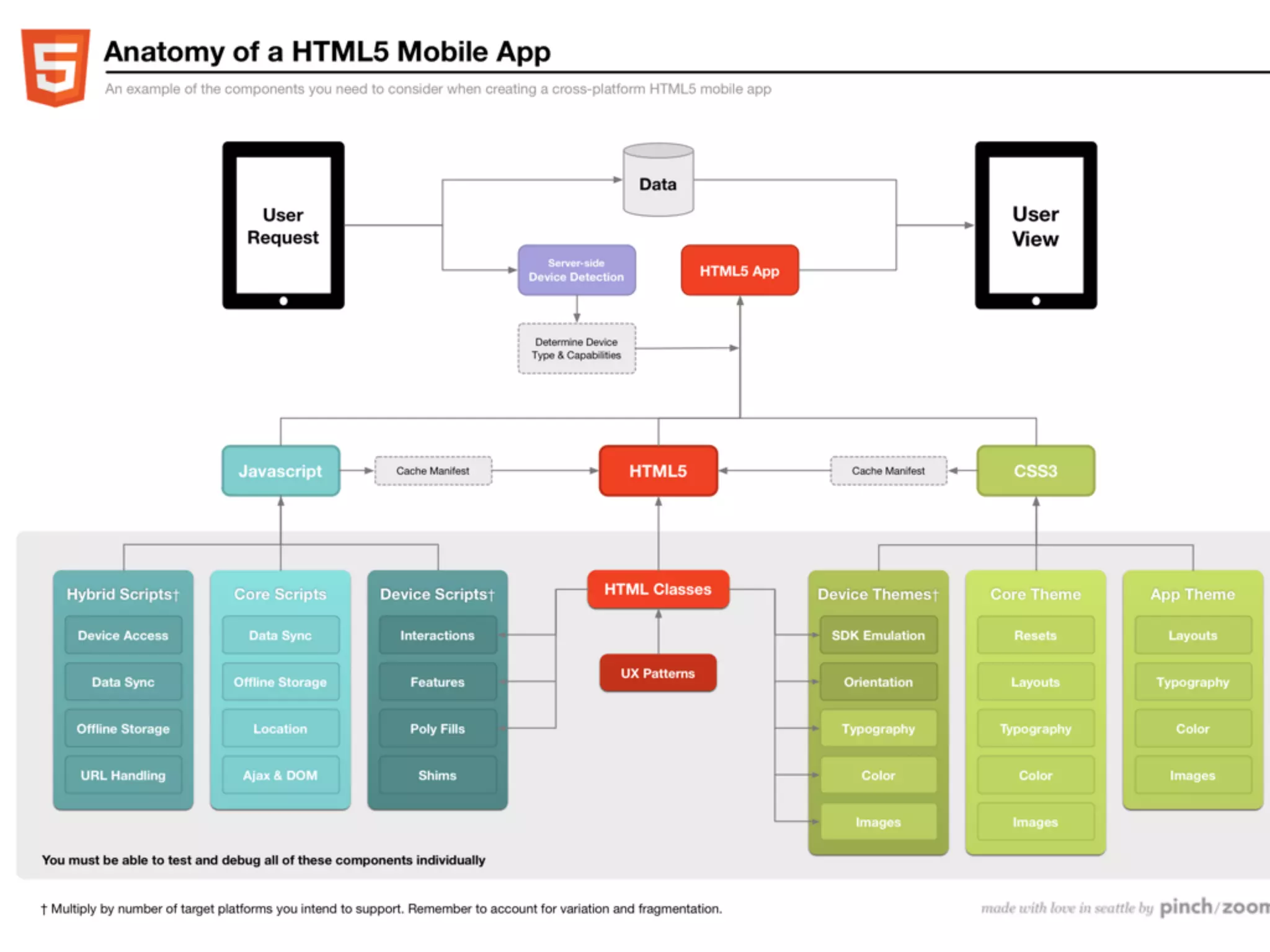
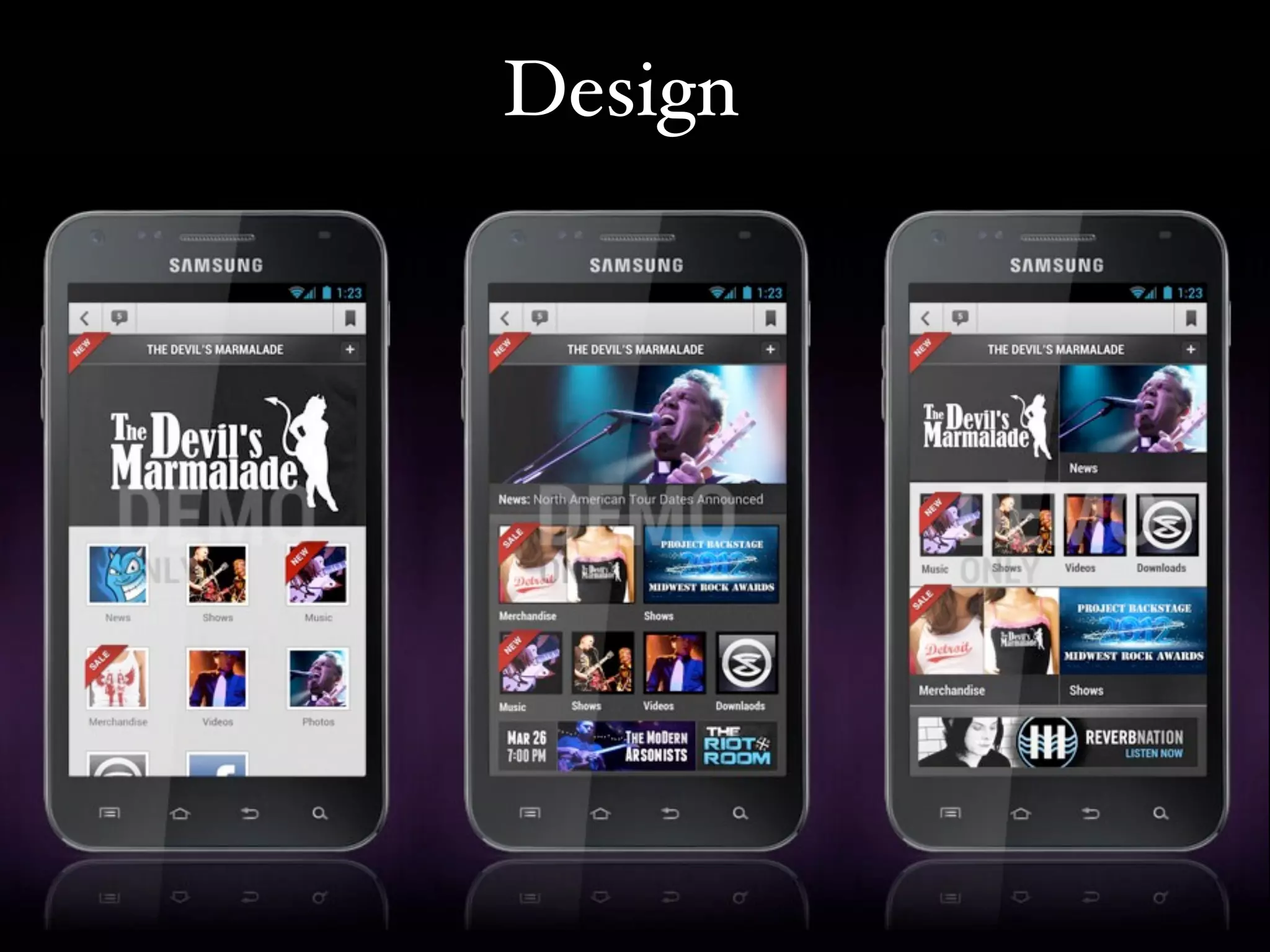
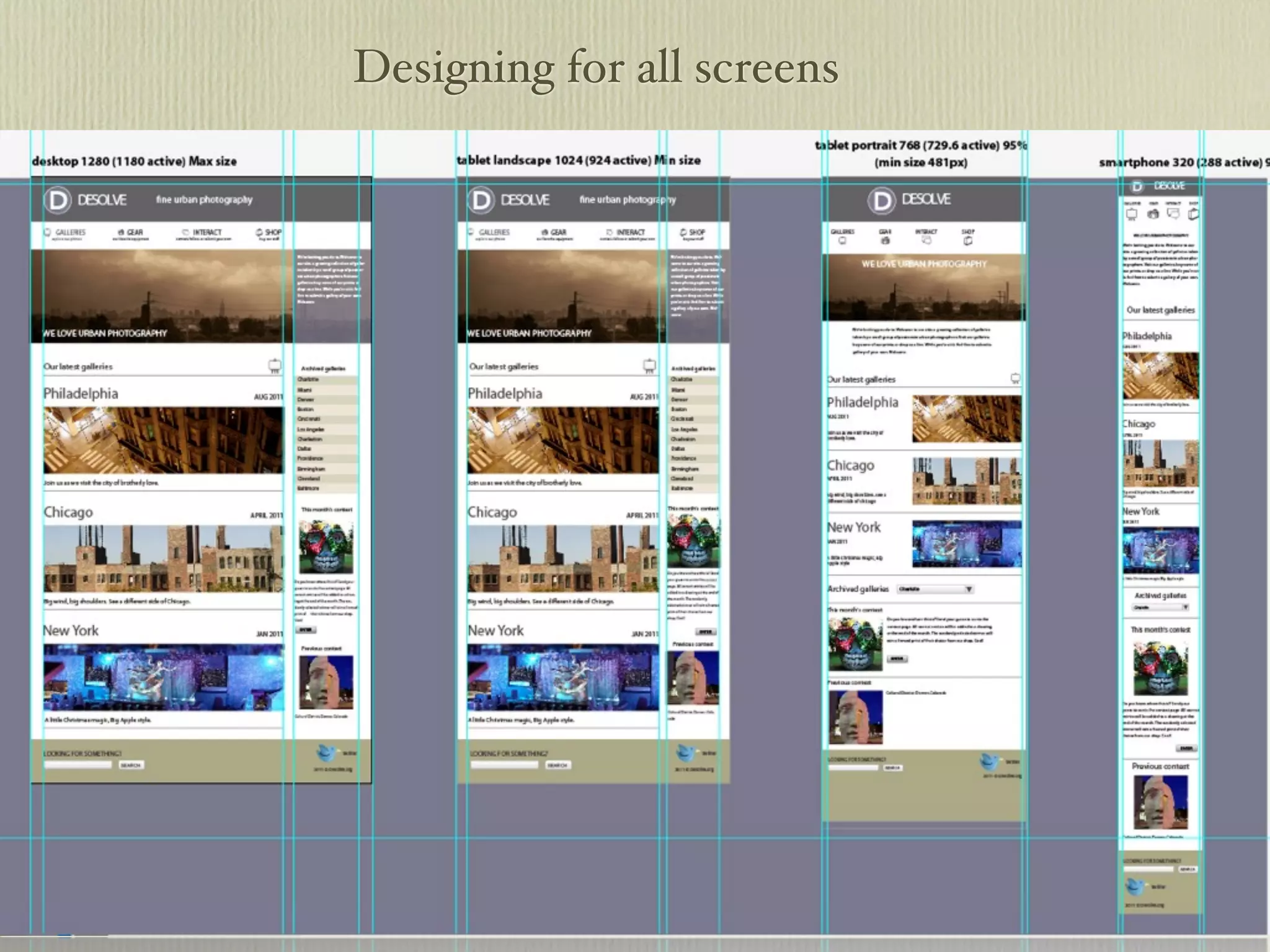
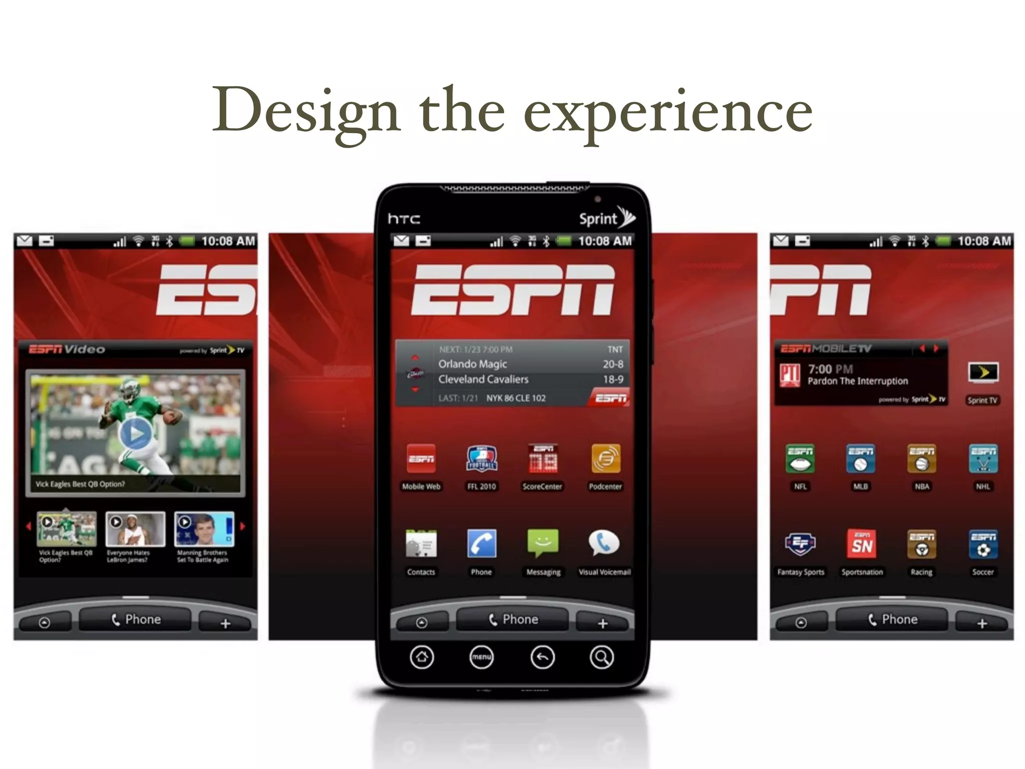
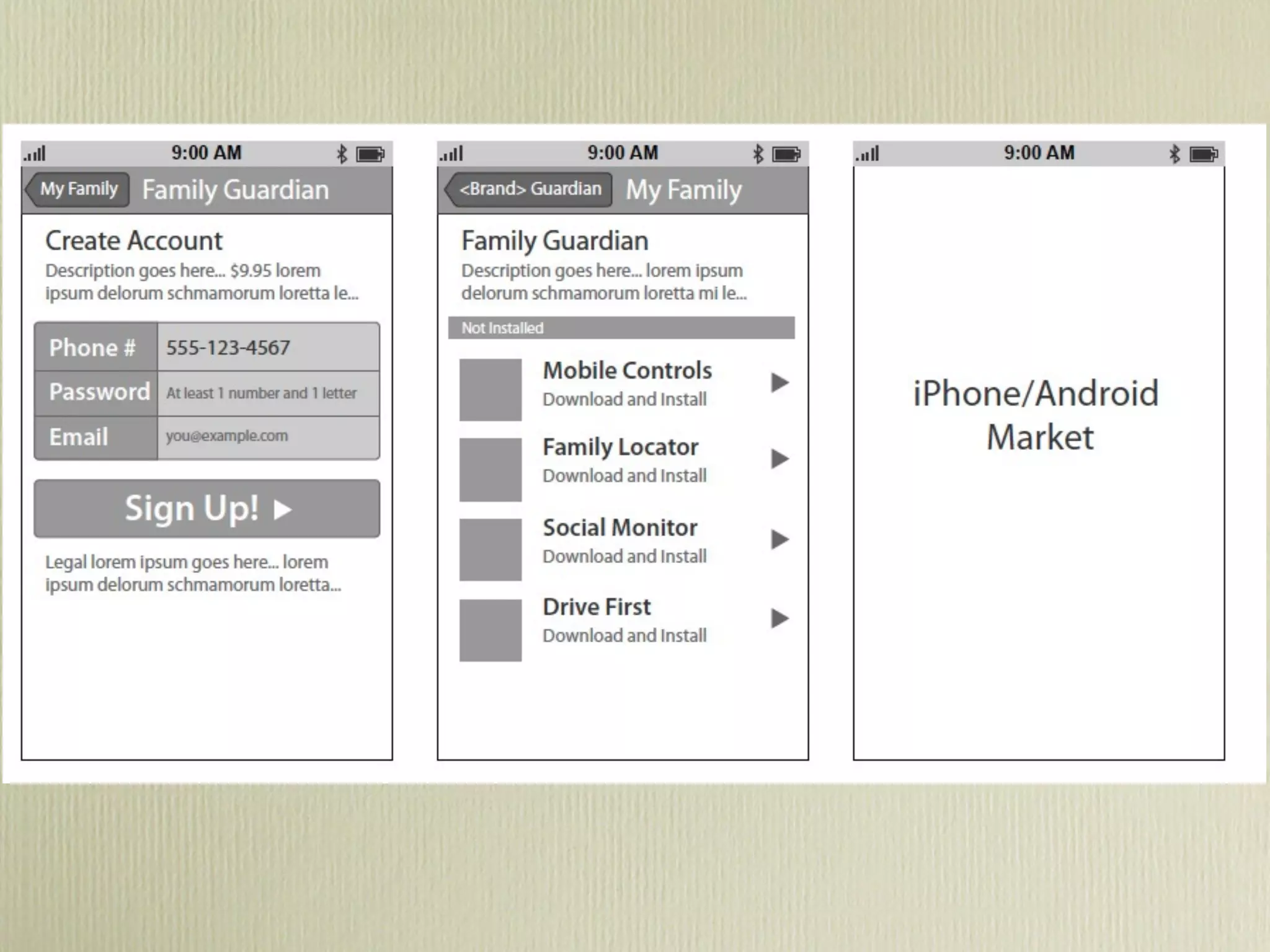
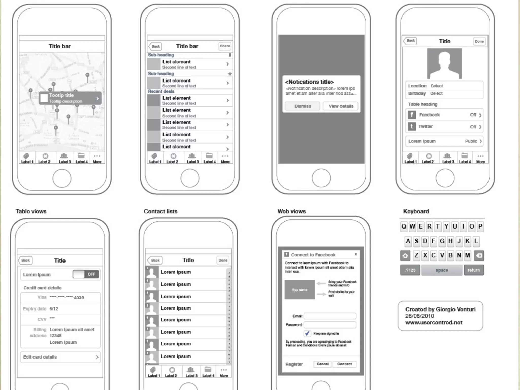
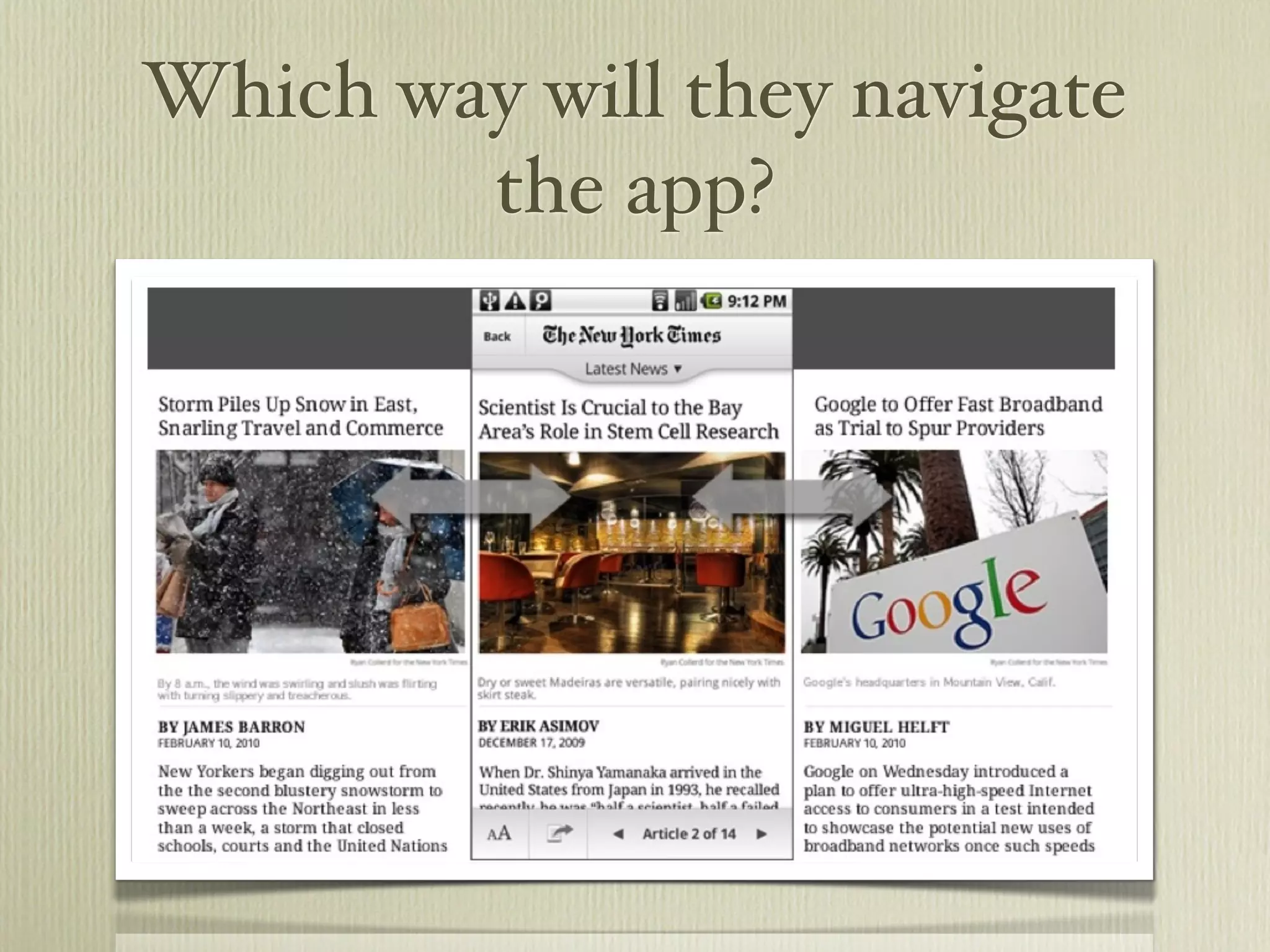
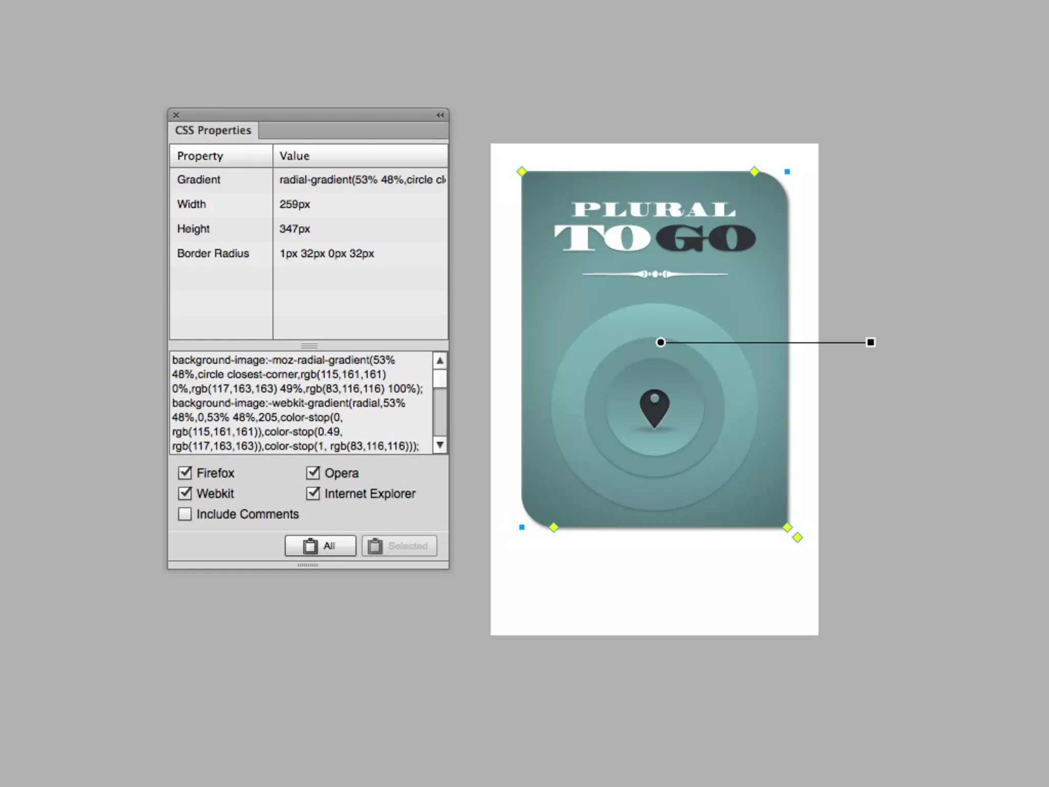
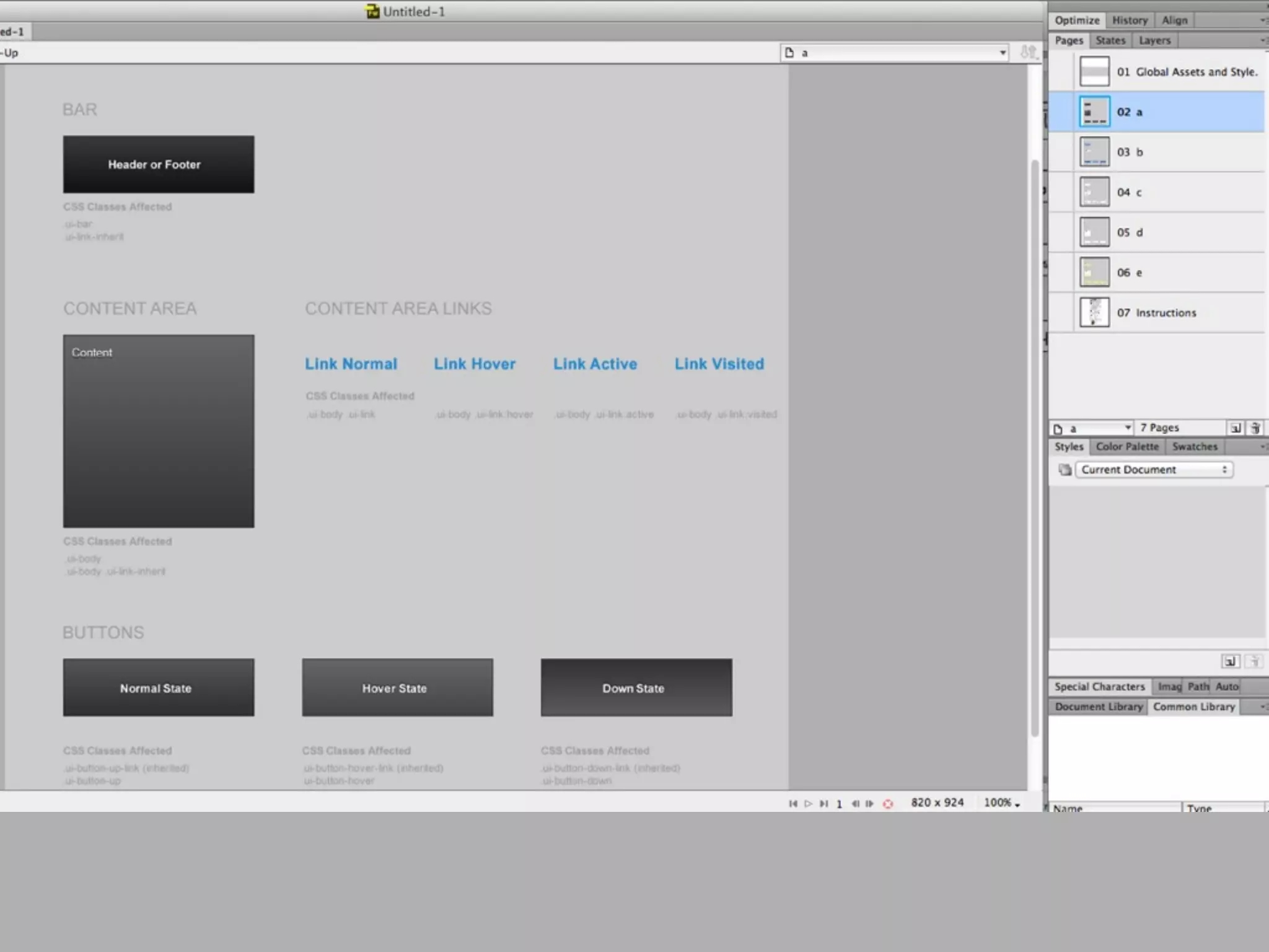
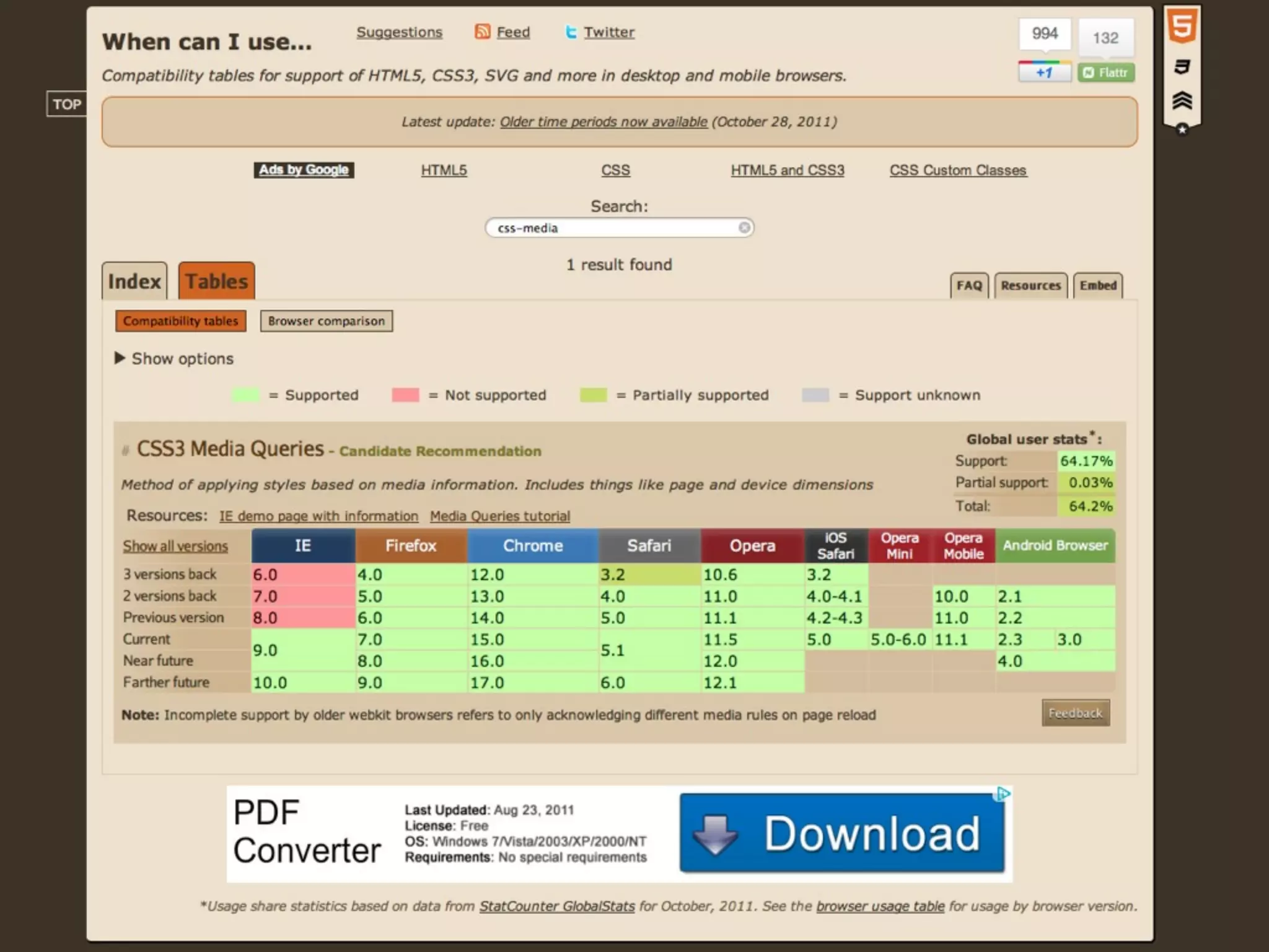
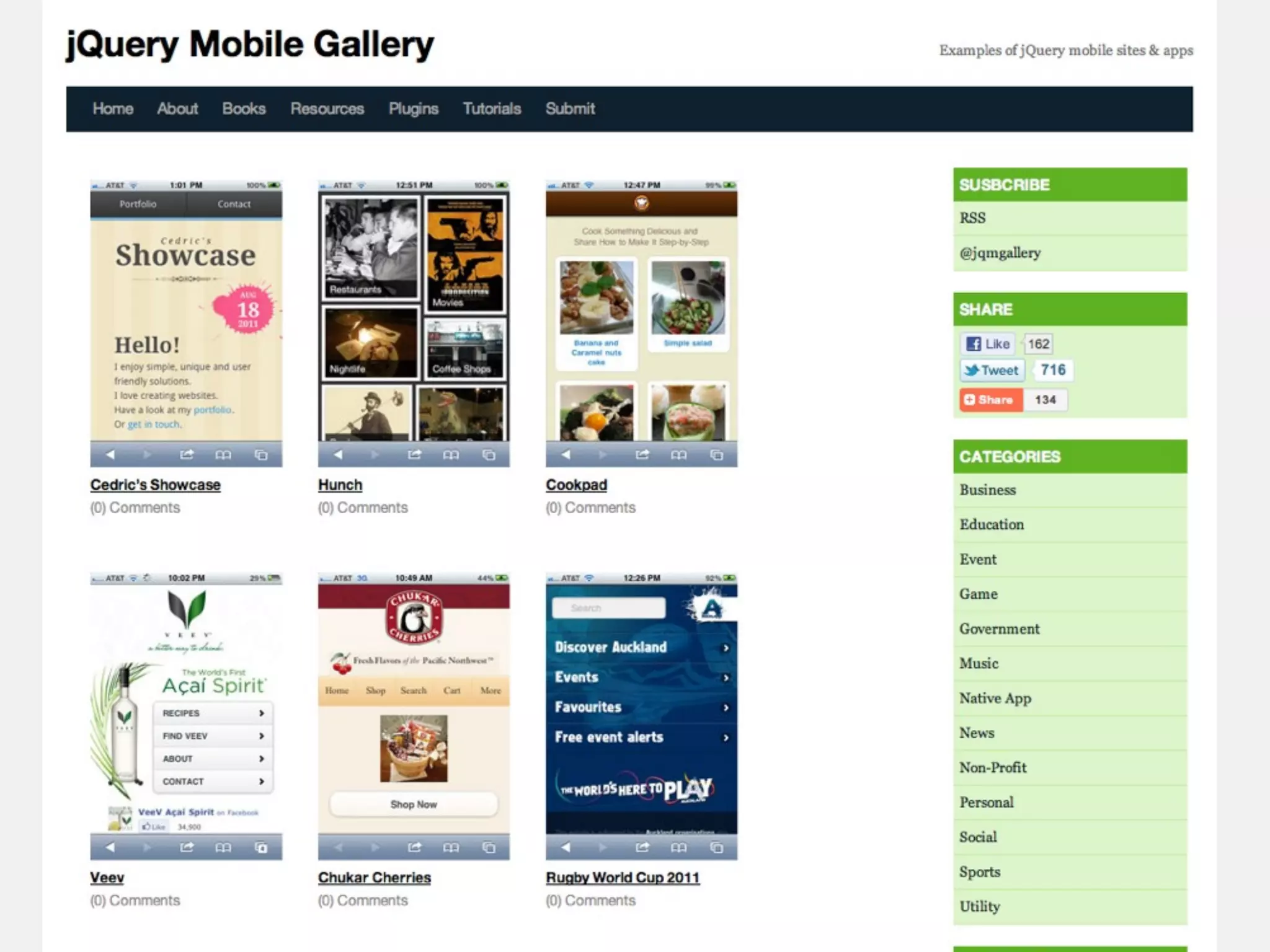
The document discusses the creation of mobile applications using tools like jQuery Mobile, PhoneGap, and Dreamweaver CS6, emphasizing the differences between native and hybrid apps. It covers various aspects such as app design, performance, and the intricacies of app store submissions. Additionally, it highlights helpful tools and methods for efficient app development, including HTML5 features and responsive design techniques.


![Web Standards: Fueling Innovation [Web Design World Boston '08]](https://cdn.slidesharecdn.com/ss_thumbnails/web-standards-fueling-innovation-1228796603037960-8-thumbnail.jpg?width=600ounds&width=560&fit=bounds)


![UiPath Automation Suite Installation (Hands-On) [2/3]](https://cdn.slidesharecdn.com/ss_thumbnails/automationsuitecommunitysession2-251015095633-a6d862f1-thumbnail.jpg?width=600ounds&width=560&fit=bounds)

