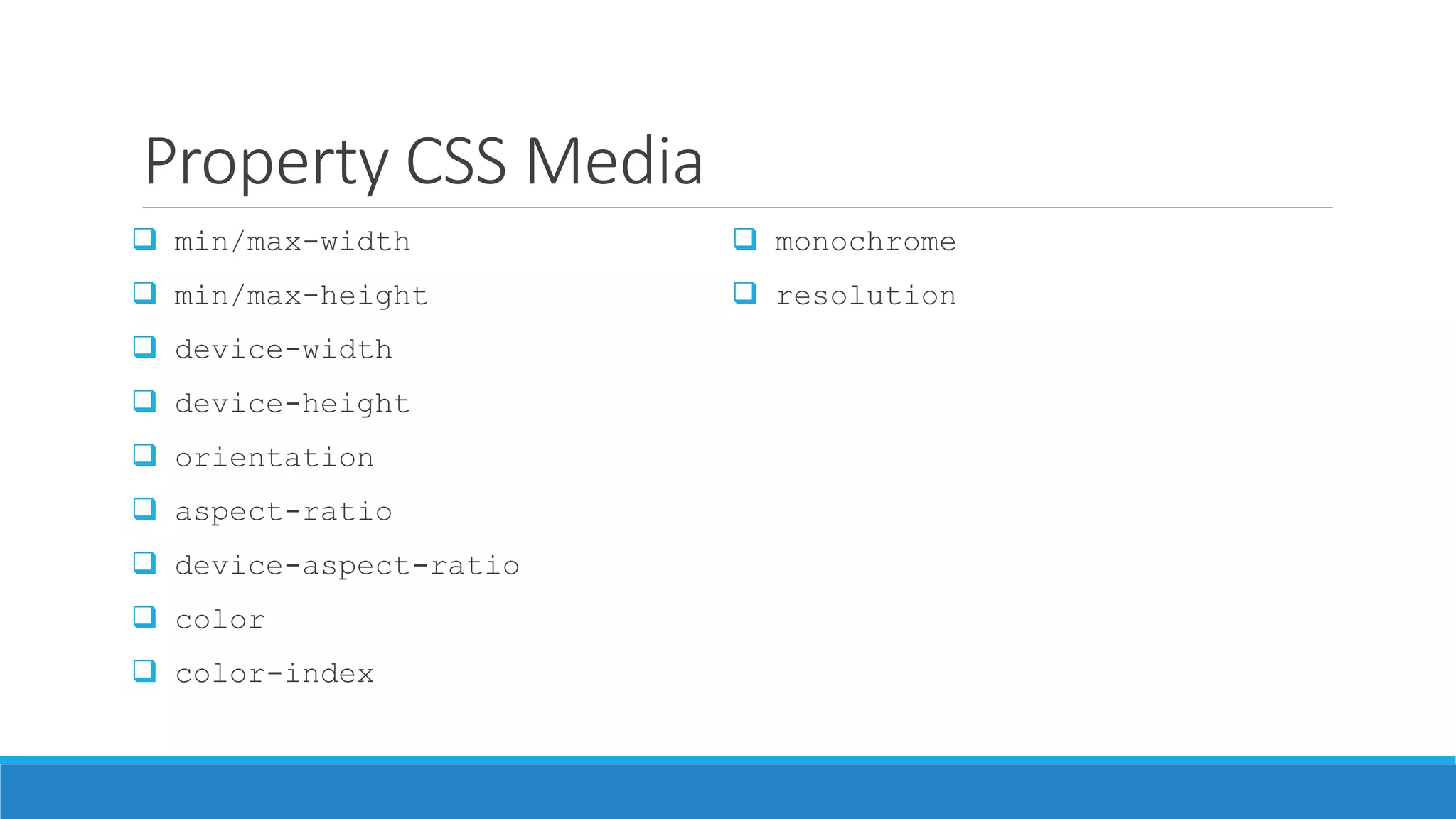
Downloaded 1,422 times


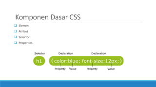
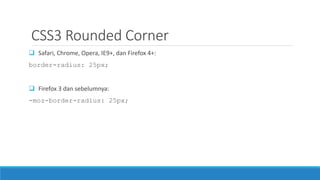
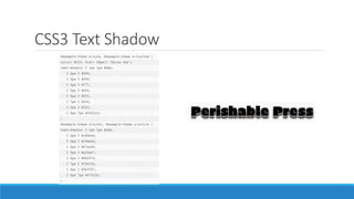
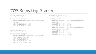
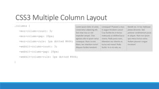
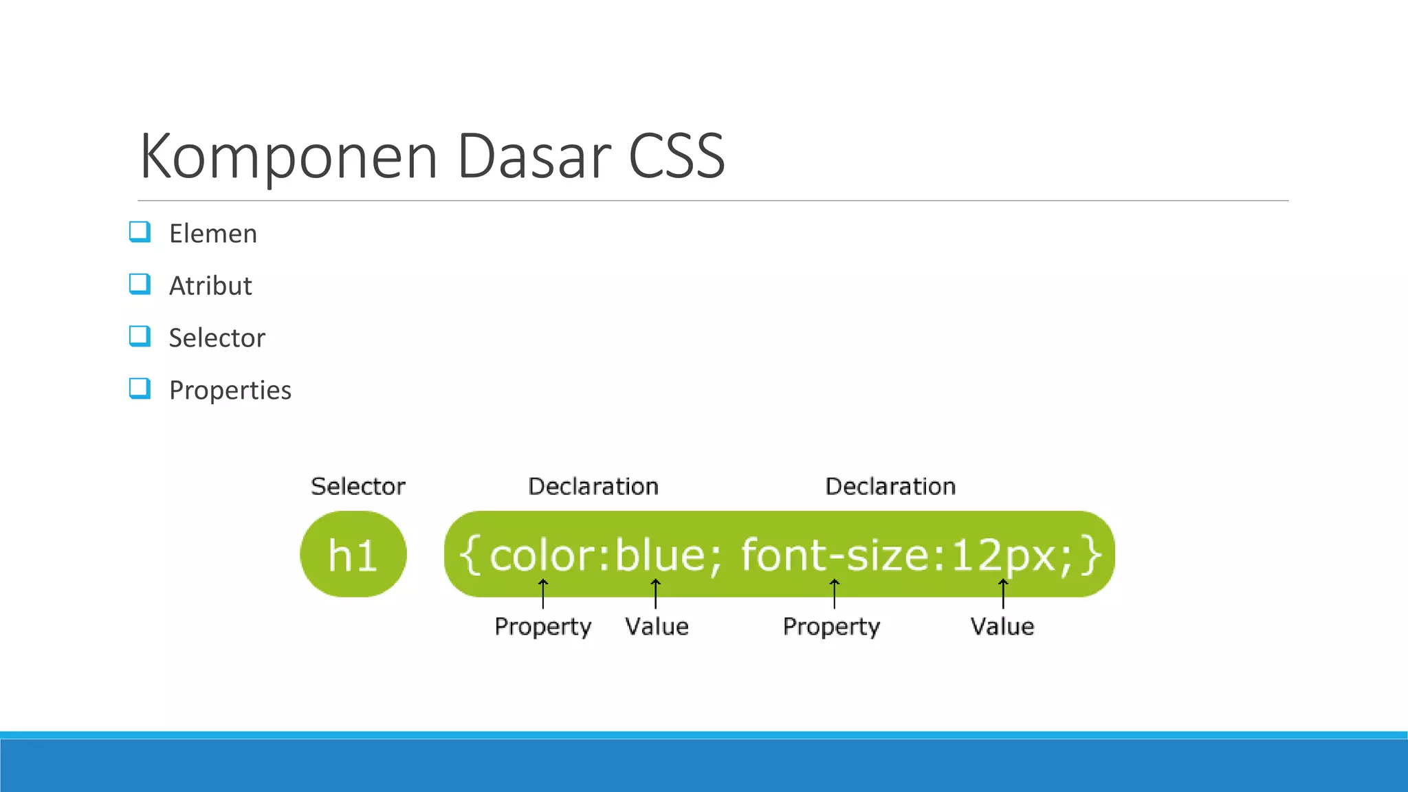
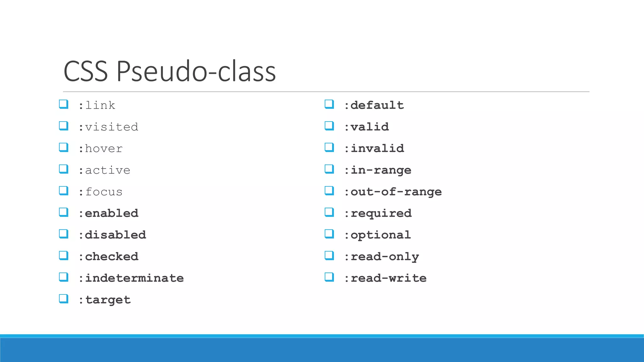
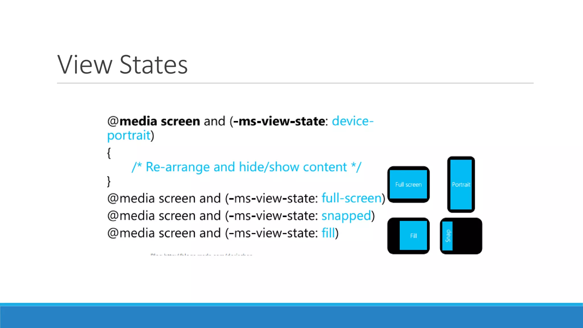
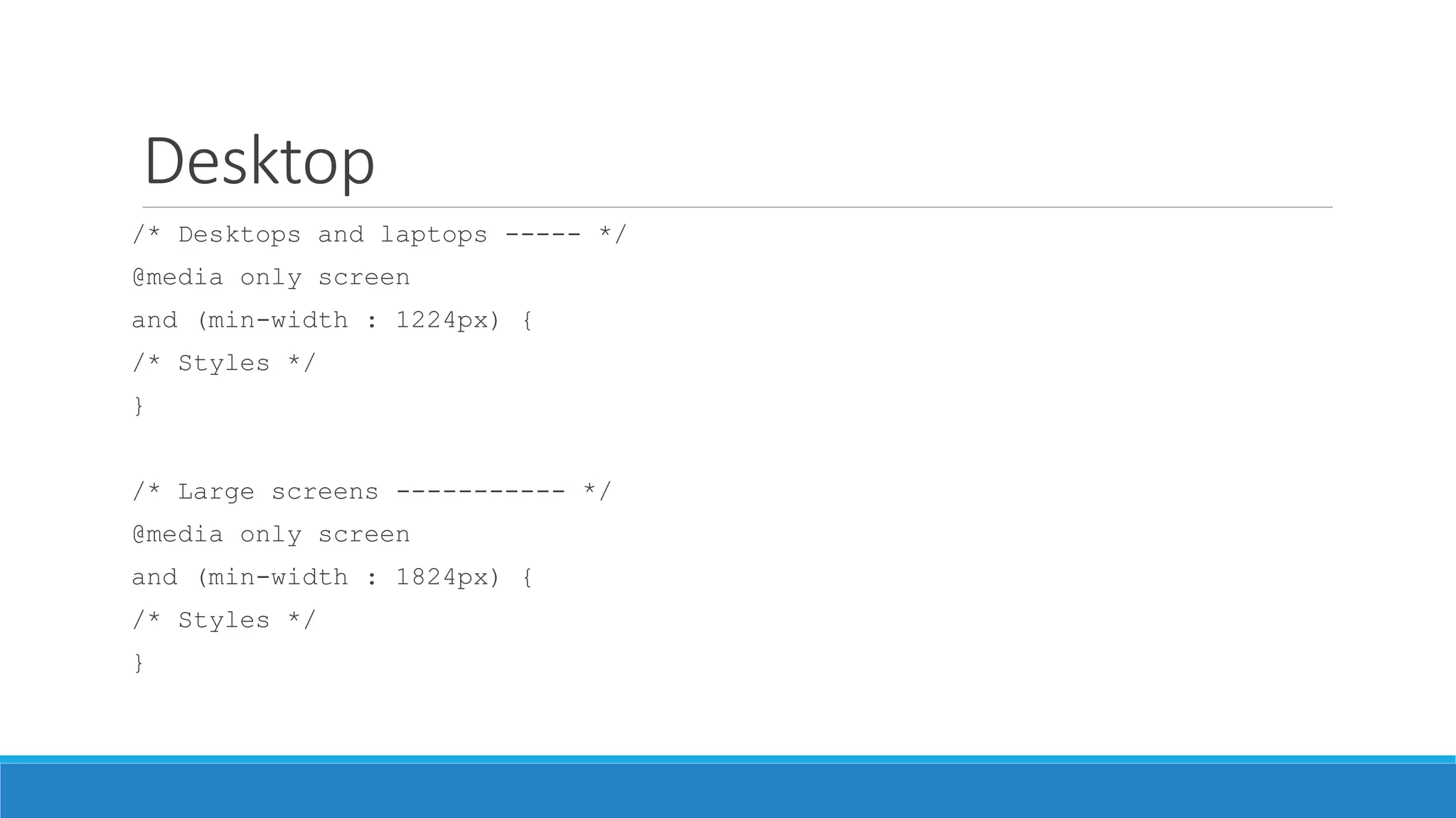
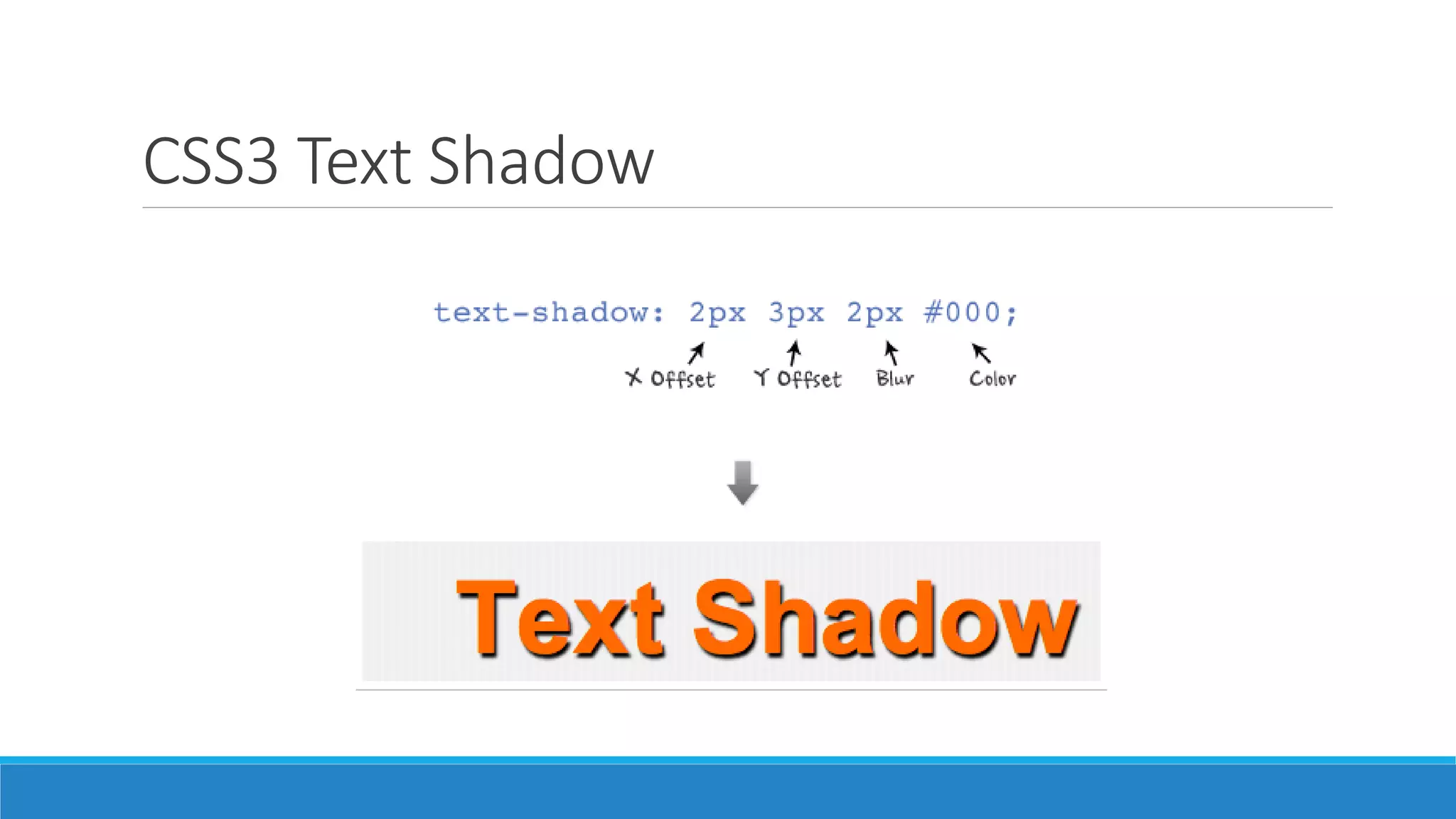
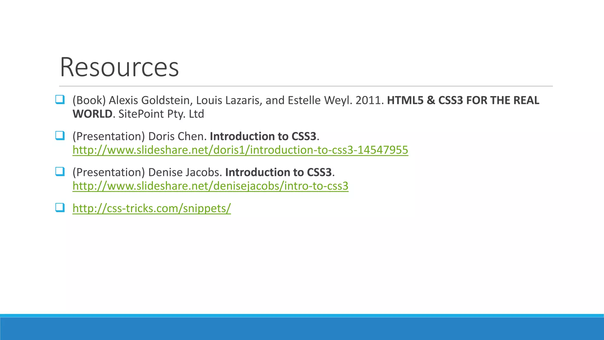
![Atribute Selector
E[attr]
Seleksi semua selector E yang memiliki atribut ‘attr’
Contoh: input[required]
E[attr = val]
Seleksi semua selector E yang memiliki atribut ‘attr’ dengan nilai ‘val’
Contoh: input[type=checkbox]
E[attr |= val]
Seleksi semua selector E yang memiliki atribut ‘attr’ dan value sama atau diawali dengan ‘val’
Contoh: p[lang |= “en”]
E[attr ~= val]
Seleksi semua selector E yang memiliki atribut ‘attr’ dan value mengandung kata ‘val’
Contoh: .info[title ~= “more”]](https://image.slidesharecdn.com/02fundamentalcss3-140629235948-phpapp01/85/Fundamental-CSS3-8-320.jpg)
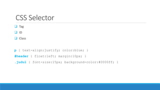
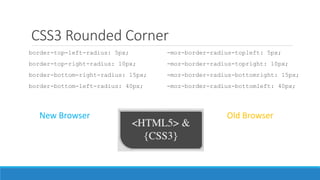
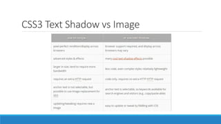
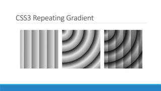
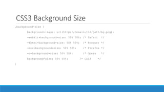
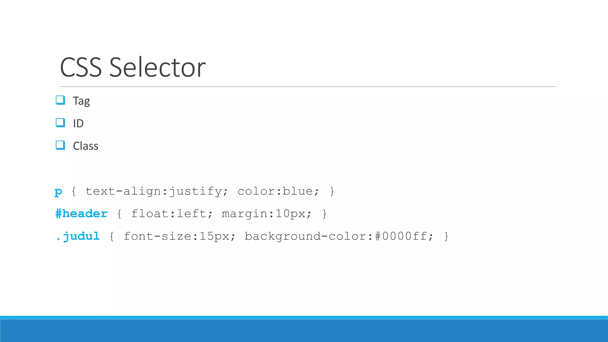
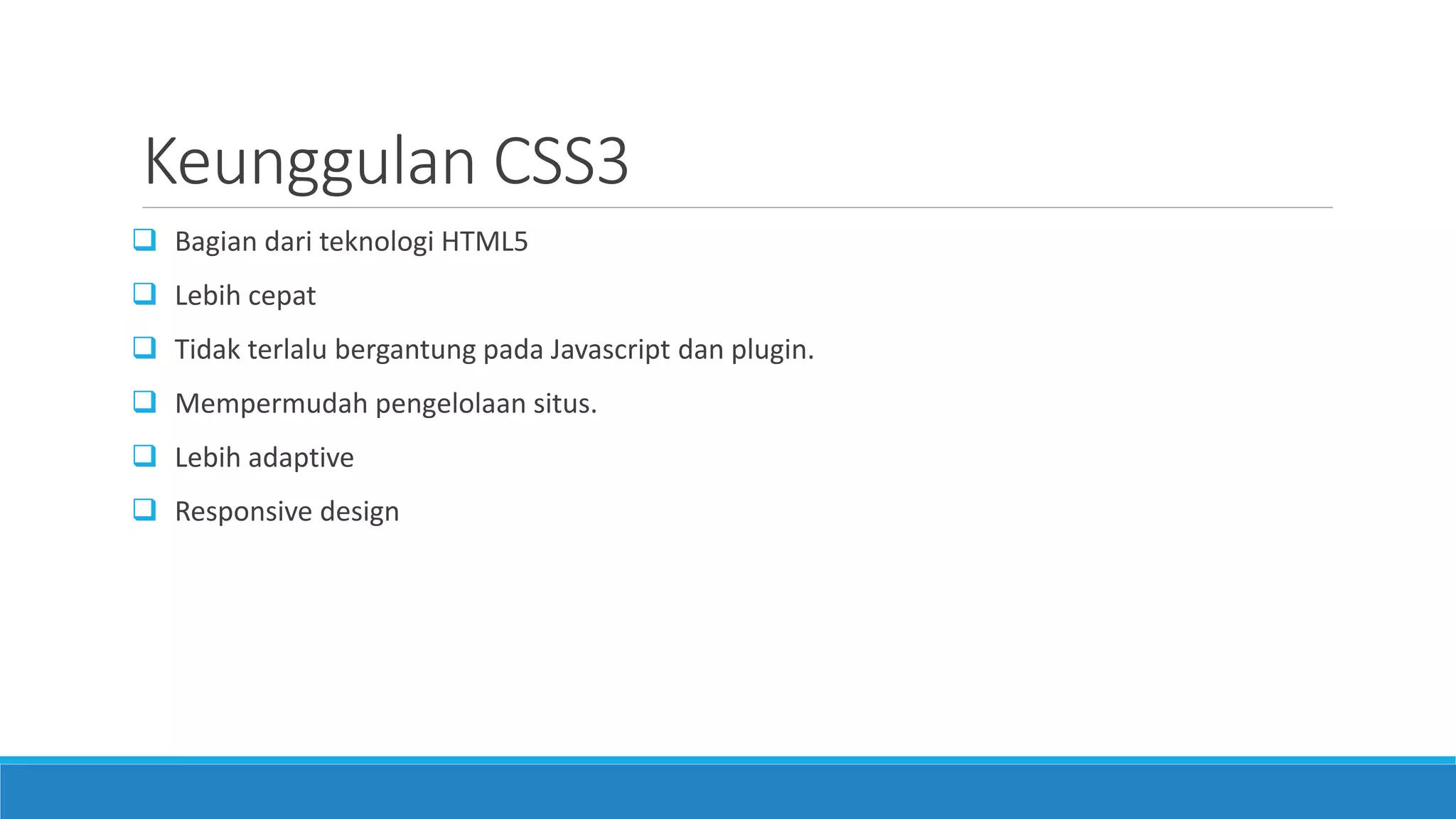
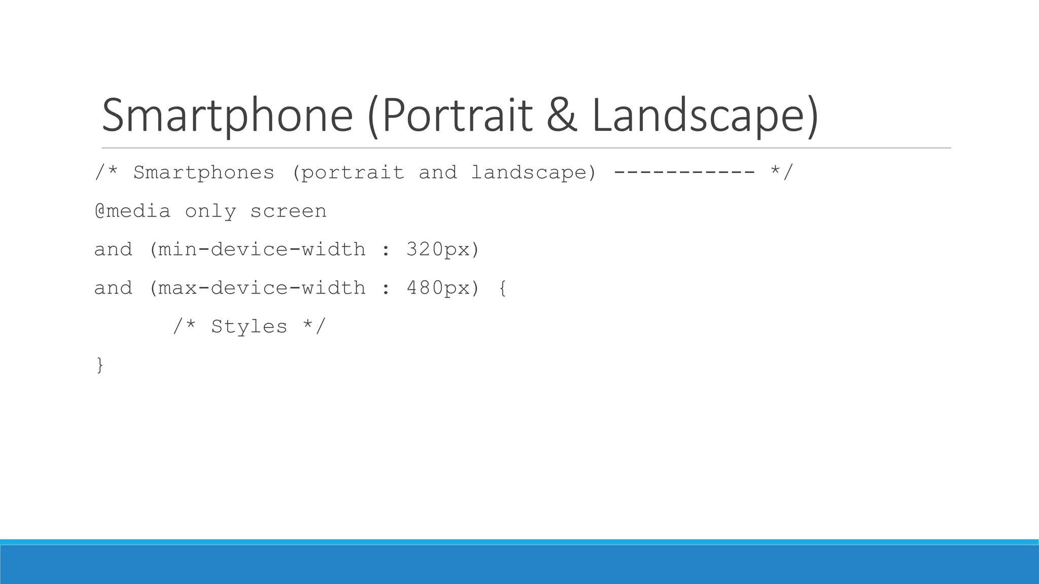
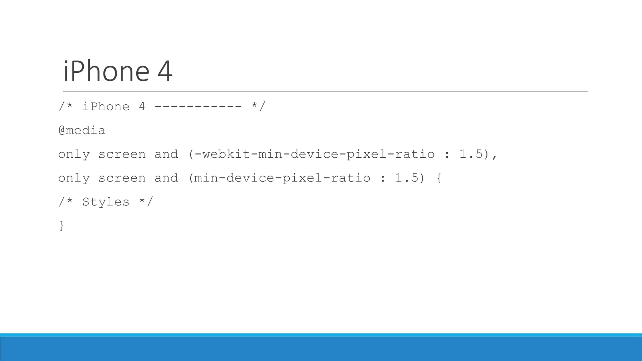
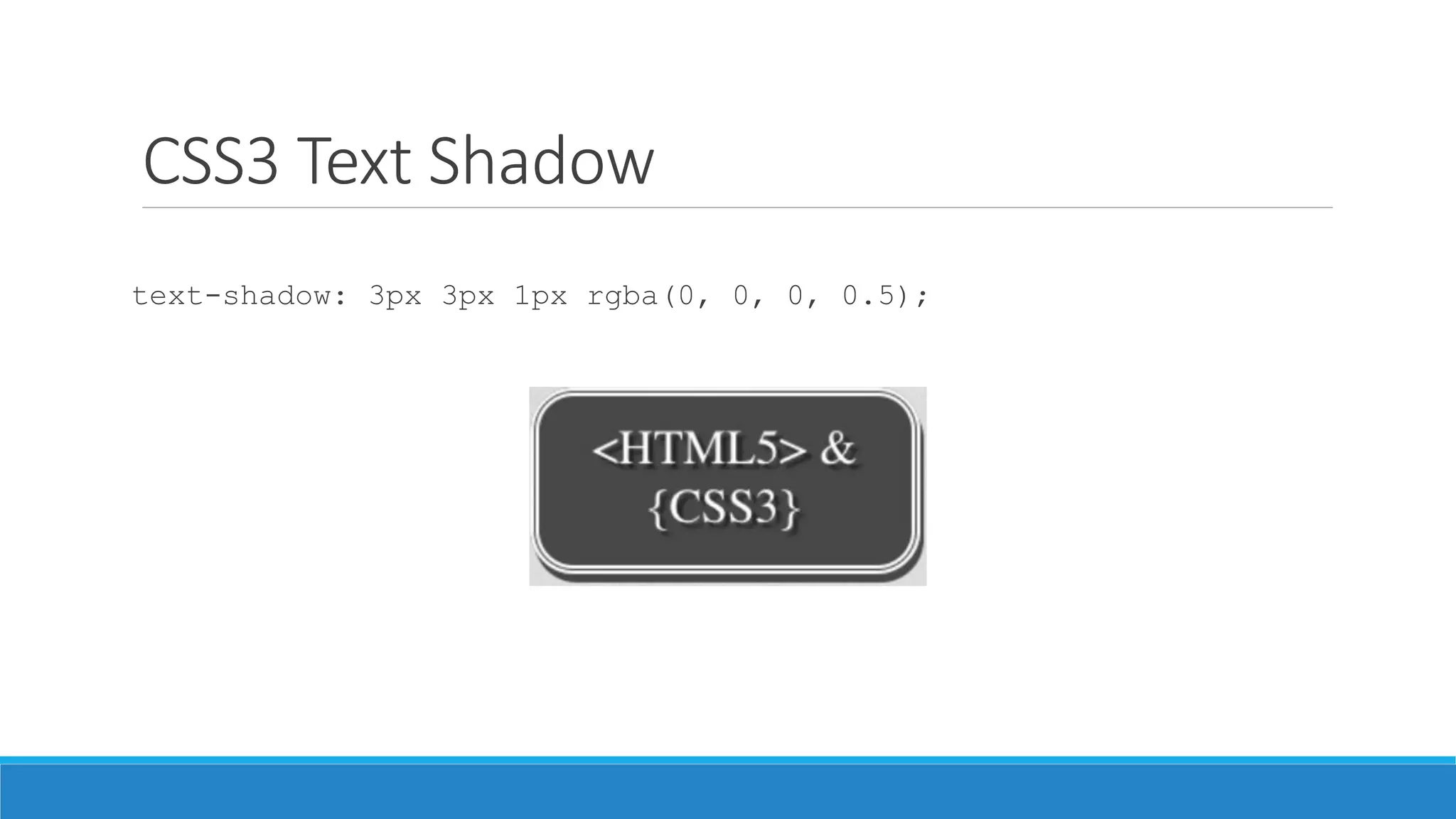
![Atribute Selector
E[attr ^= val]
Seleksi semua selector E yang memiliki atribut ‘attr’ dan value diawali dengan ‘val’
E[attr $= val]
Seleksi semua selector E yang memiliki atribut ‘attr’ dan value diakhiri dengan ‘val’
E[attr *= val]
Seleksi semua selector E yang memiliki atribut ‘attr’ dan value mengandung kata ‘val’](https://image.slidesharecdn.com/02fundamentalcss3-140629235948-phpapp01/85/Fundamental-CSS3-9-320.jpg)


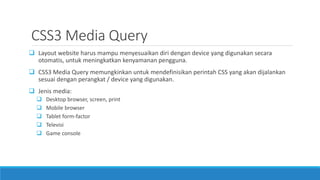


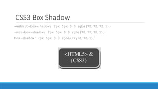
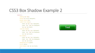

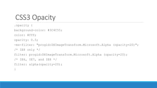

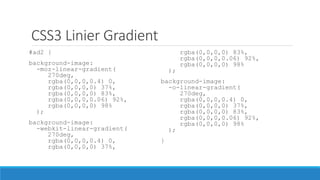
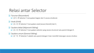
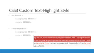
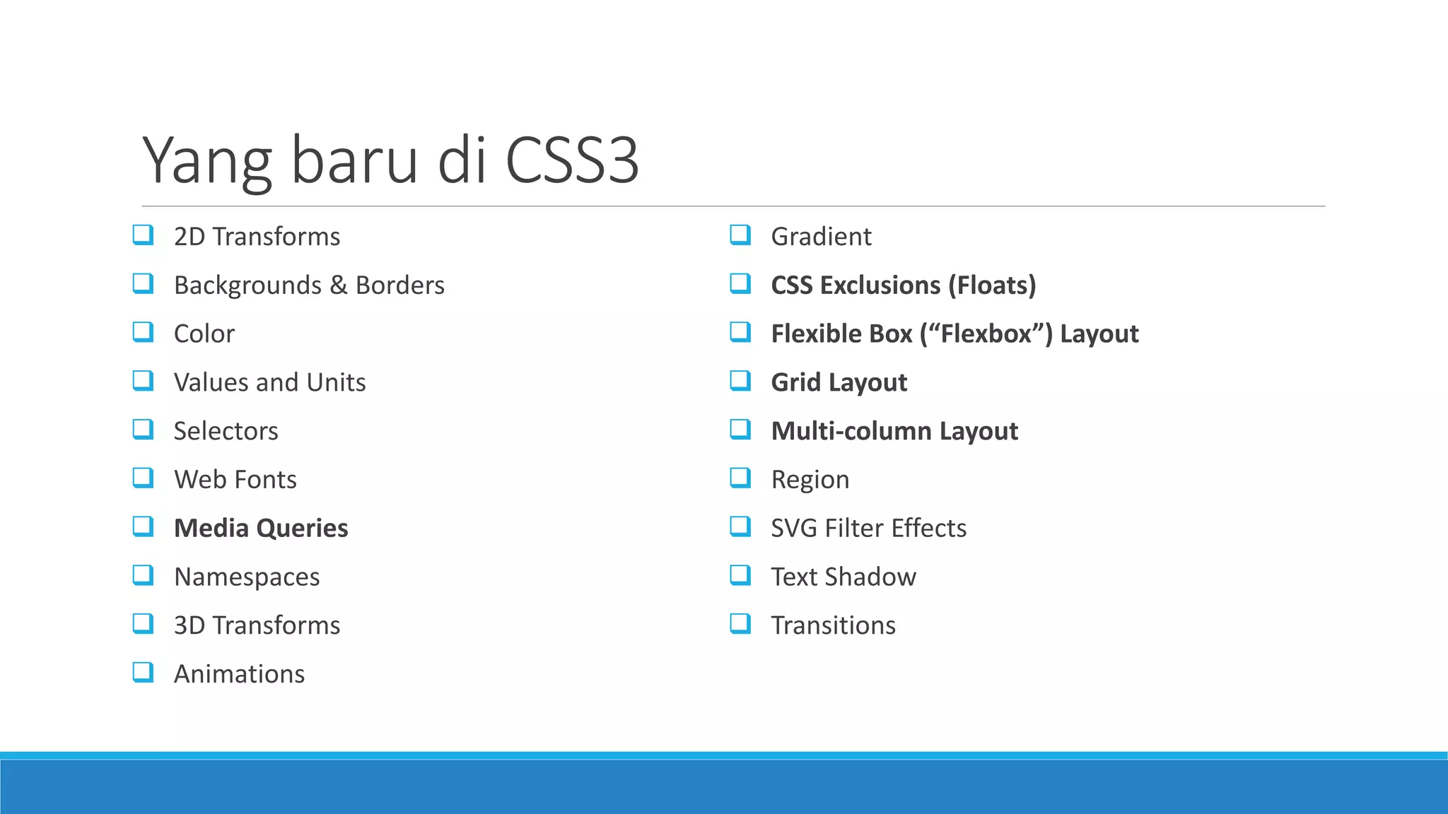
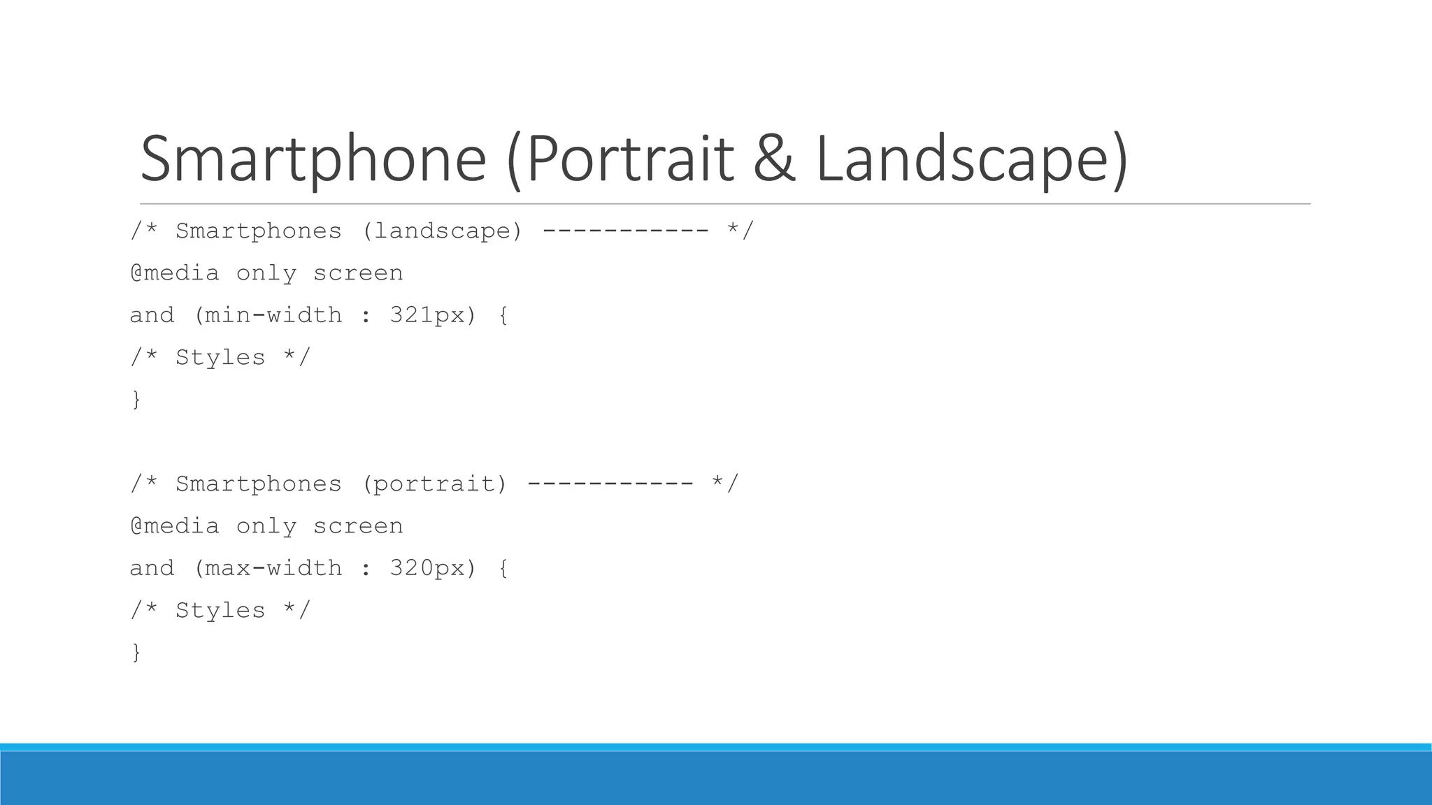
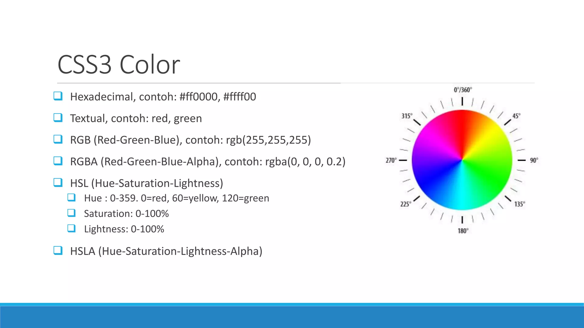
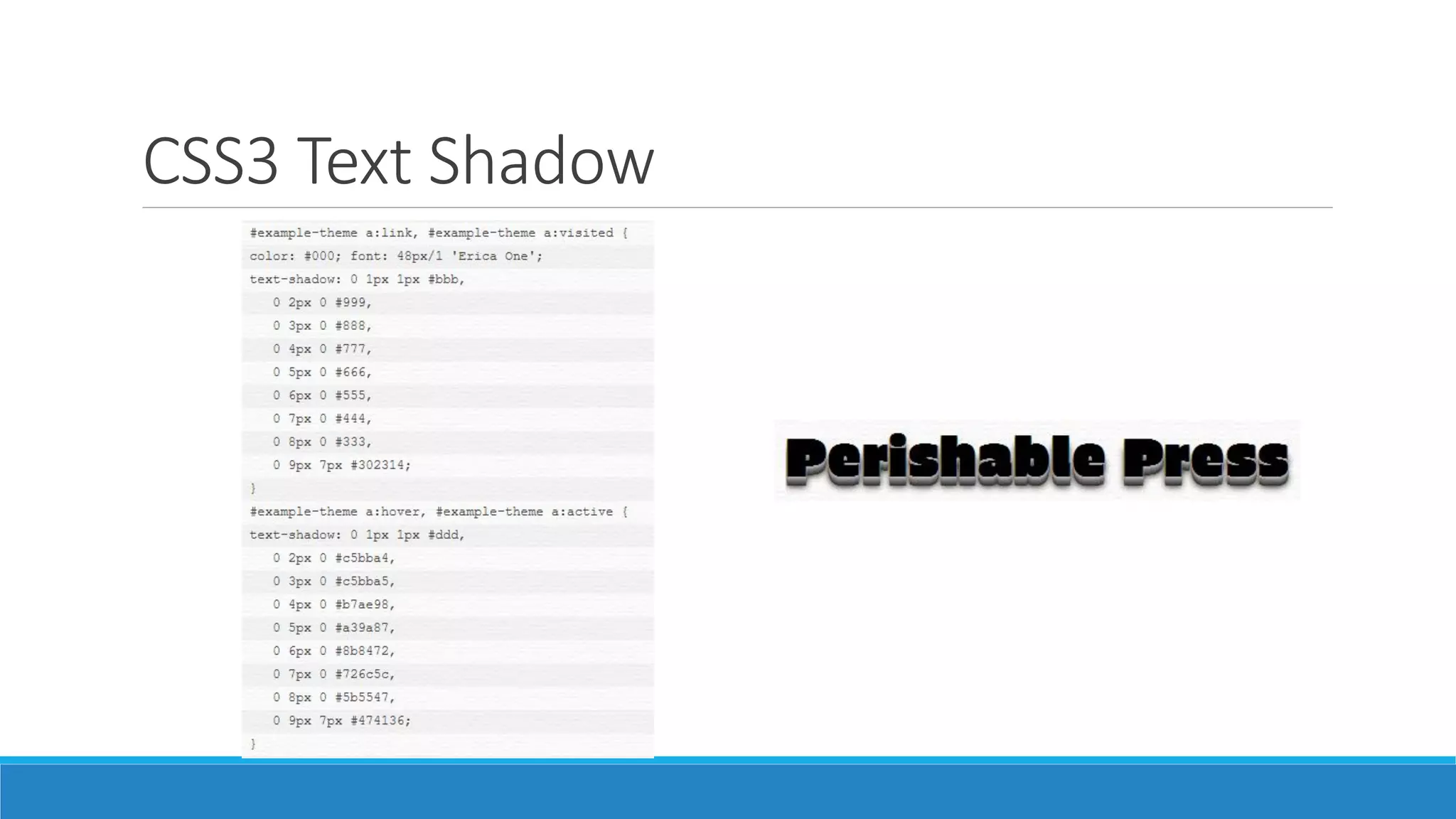
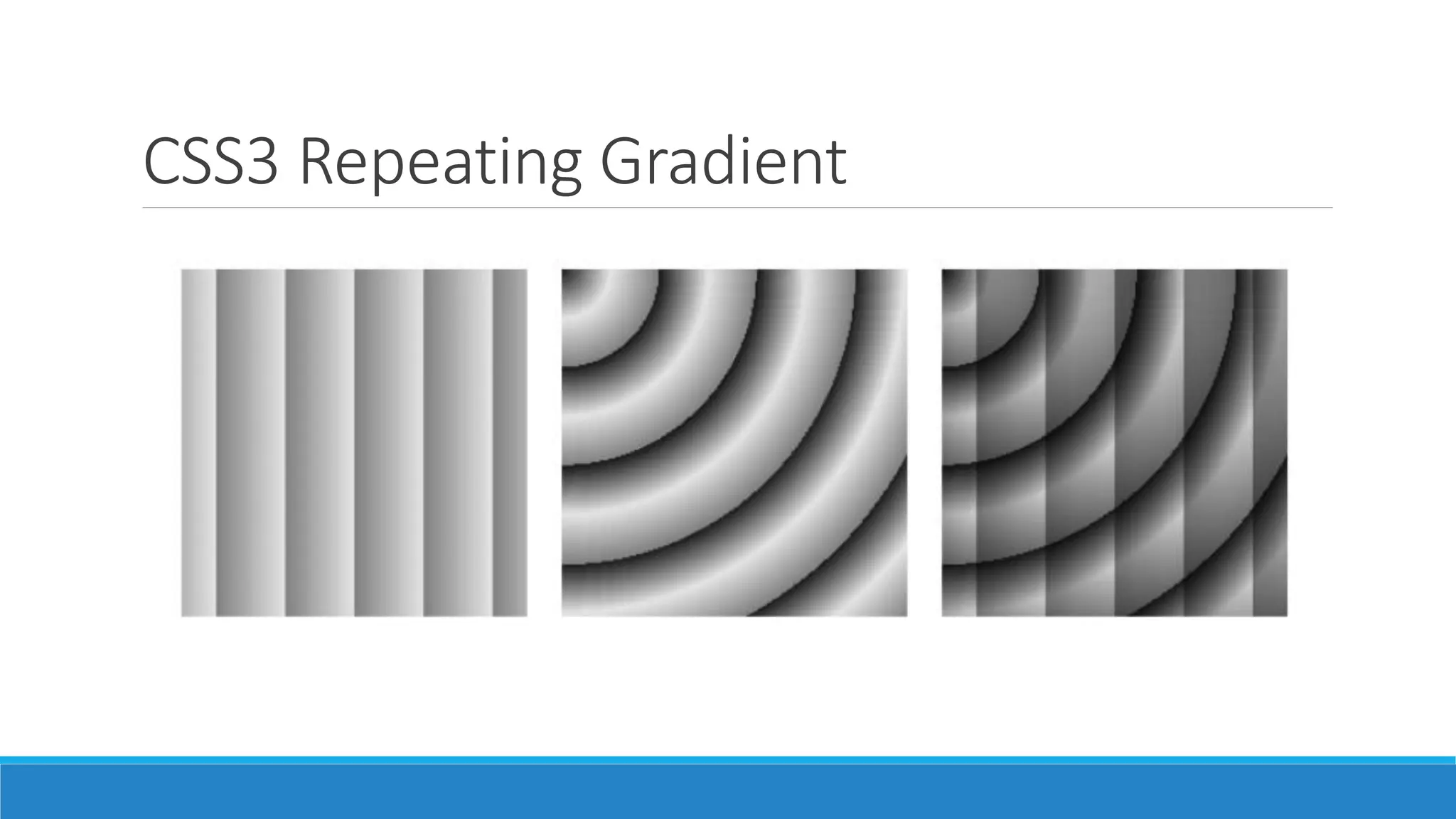
![CSS3 Radial Gradient
input[type=submit] {
background-color: #333;
/* Old WebKit */
background-image: -webkit-
gradient(radial, 30% 120%, 0, 30%
120%, 100,
color-stop(0,rgba(144,144,144,1)),
color-stop(1,rgba(72,72,72,1)));
/* W3C for Mozilla */
background-image: -moz-radial-
gradient(30% 120%, circle,
rgba(144,144,144,1) 0%,
rgba(72,72,72,1) 50%);
/* W3C for new WebKit */
background-image: -webkit-radial-
gradient(30% 120%, circle,
rgba(144,144,144,1) 0%,
rgba(72,72,72,1) 50%);
/* W3C unprefixed */
background-image: radial-
gradient(30% 120%, circle,
rgba(144,144,144,1) 0%,
rgba(72,72,72,1) 50%);
}](https://image.slidesharecdn.com/02fundamentalcss3-140629235948-phpapp01/85/Fundamental-CSS3-51-320.jpg)


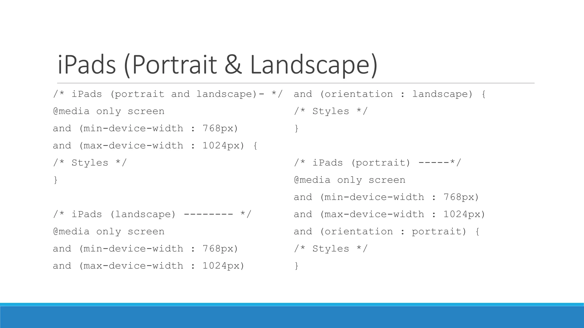
![Atribute Selector
E[attr]
Seleksi semua selector E yang memiliki atribut ‘attr’
Contoh: input[required]
E[attr = val]
Seleksi semua selector E yang memiliki atribut ‘attr’ dengan nilai ‘val’
Contoh: input[type=checkbox]
E[attr |= val]
Seleksi semua selector E yang memiliki atribut ‘attr’ dan value sama atau diawali dengan ‘val’
Contoh: p[lang |= “en”]
E[attr ~= val]
Seleksi semua selector E yang memiliki atribut ‘attr’ dan value mengandung kata ‘val’
Contoh: .info[title ~= “more”]](https://image.slidesharecdn.com/02fundamentalcss3-140629235948-phpapp01/75/Fundamental-CSS3-8-2048.jpg)
![Atribute Selector
E[attr ^= val]
Seleksi semua selector E yang memiliki atribut ‘attr’ dan value diawali dengan ‘val’
E[attr $= val]
Seleksi semua selector E yang memiliki atribut ‘attr’ dan value diakhiri dengan ‘val’
E[attr *= val]
Seleksi semua selector E yang memiliki atribut ‘attr’ dan value mengandung kata ‘val’](https://image.slidesharecdn.com/02fundamentalcss3-140629235948-phpapp01/75/Fundamental-CSS3-9-2048.jpg)


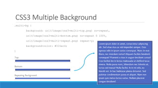
![CSS3 Radial Gradient
input[type=submit] {
background-color: #333;
/* Old WebKit */
background-image: -webkit-
gradient(radial, 30% 120%, 0, 30%
120%, 100,
color-stop(0,rgba(144,144,144,1)),
color-stop(1,rgba(72,72,72,1)));
/* W3C for Mozilla */
background-image: -moz-radial-
gradient(30% 120%, circle,
rgba(144,144,144,1) 0%,
rgba(72,72,72,1) 50%);
/* W3C for new WebKit */
background-image: -webkit-radial-
gradient(30% 120%, circle,
rgba(144,144,144,1) 0%,
rgba(72,72,72,1) 50%);
/* W3C unprefixed */
background-image: radial-
gradient(30% 120%, circle,
rgba(144,144,144,1) 0%,
rgba(72,72,72,1) 50%);
}](https://image.slidesharecdn.com/02fundamentalcss3-140629235948-phpapp01/75/Fundamental-CSS3-51-2048.jpg)
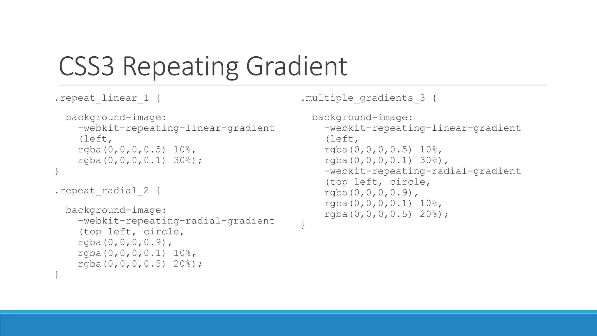

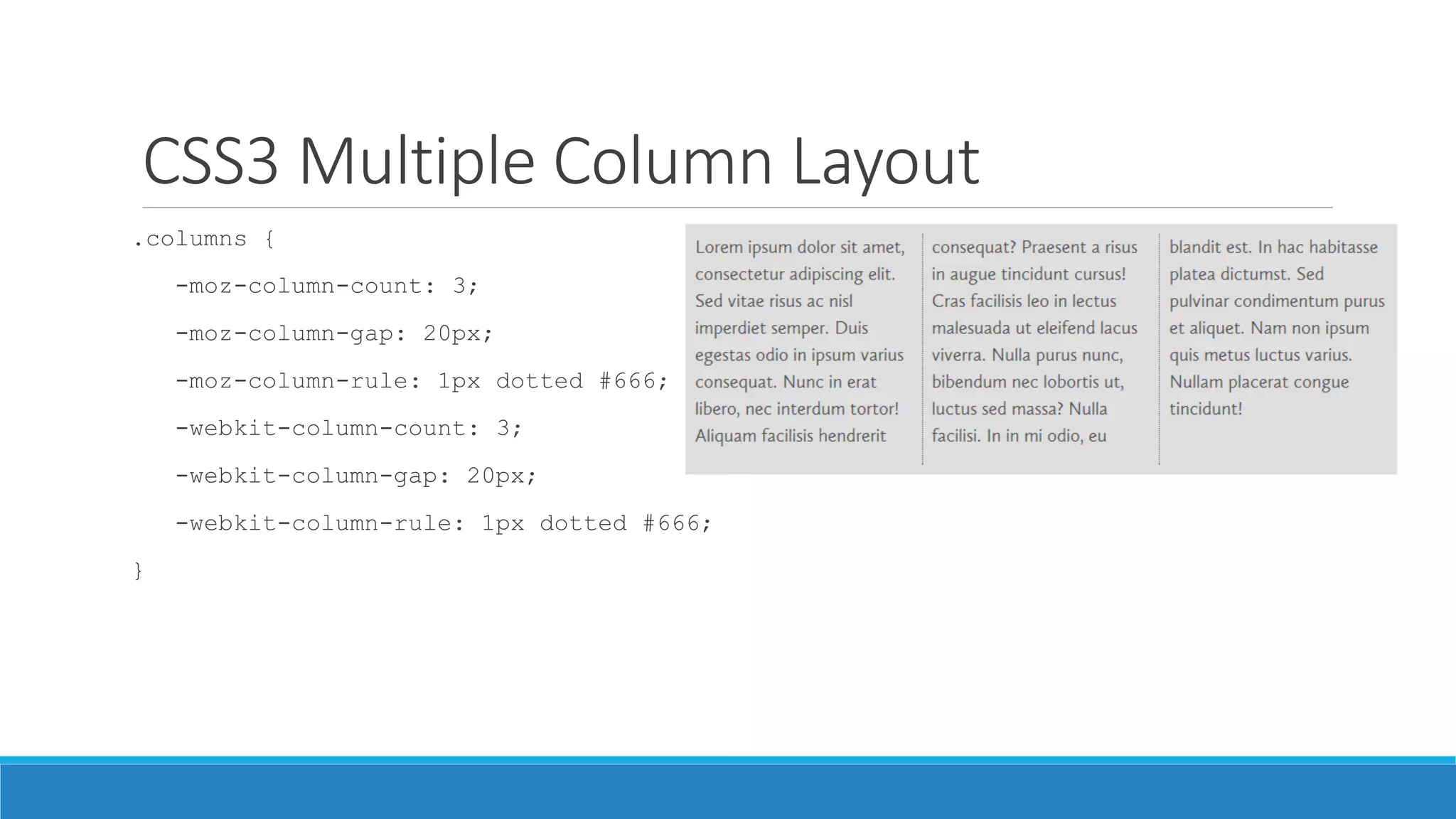
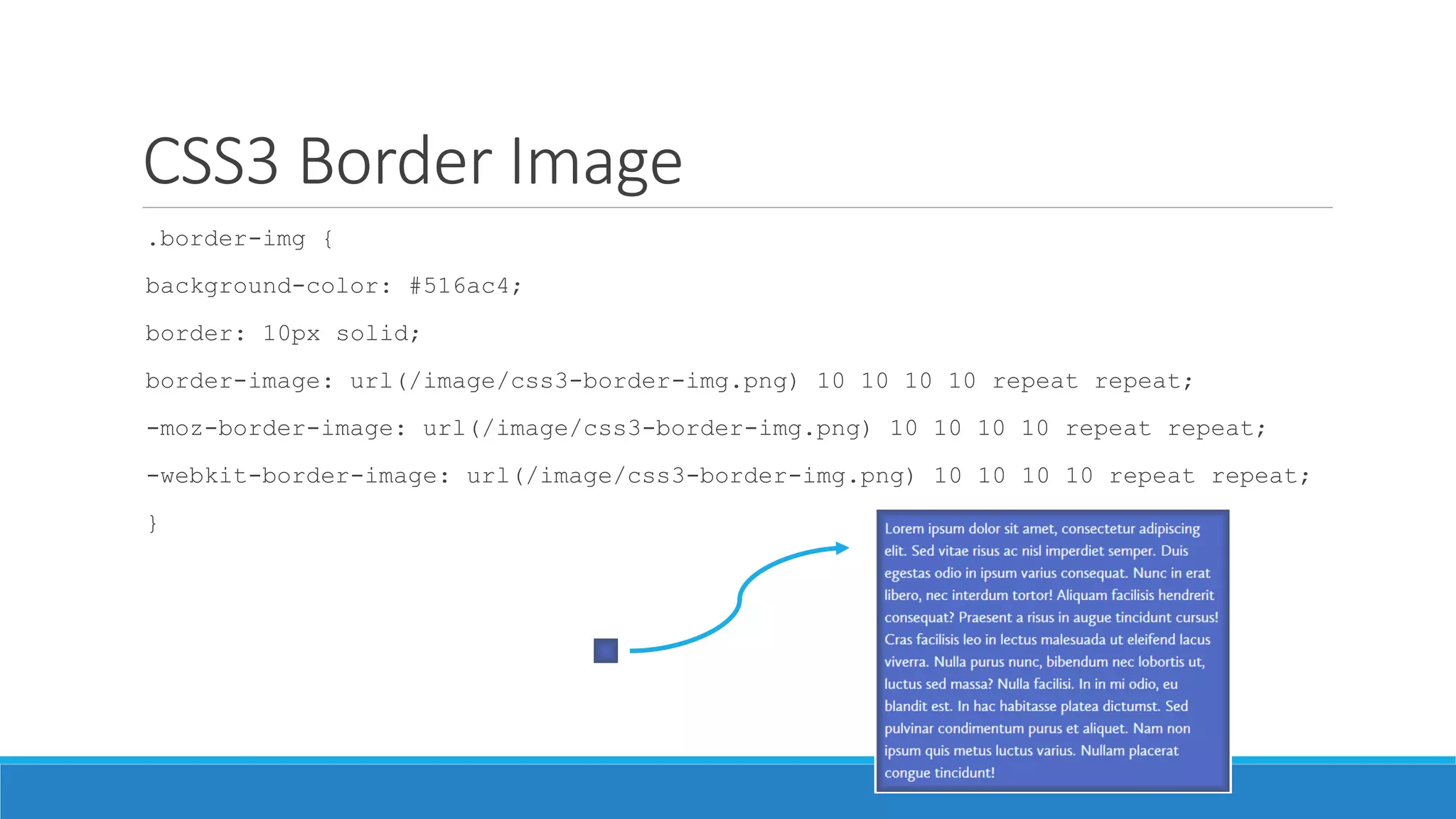
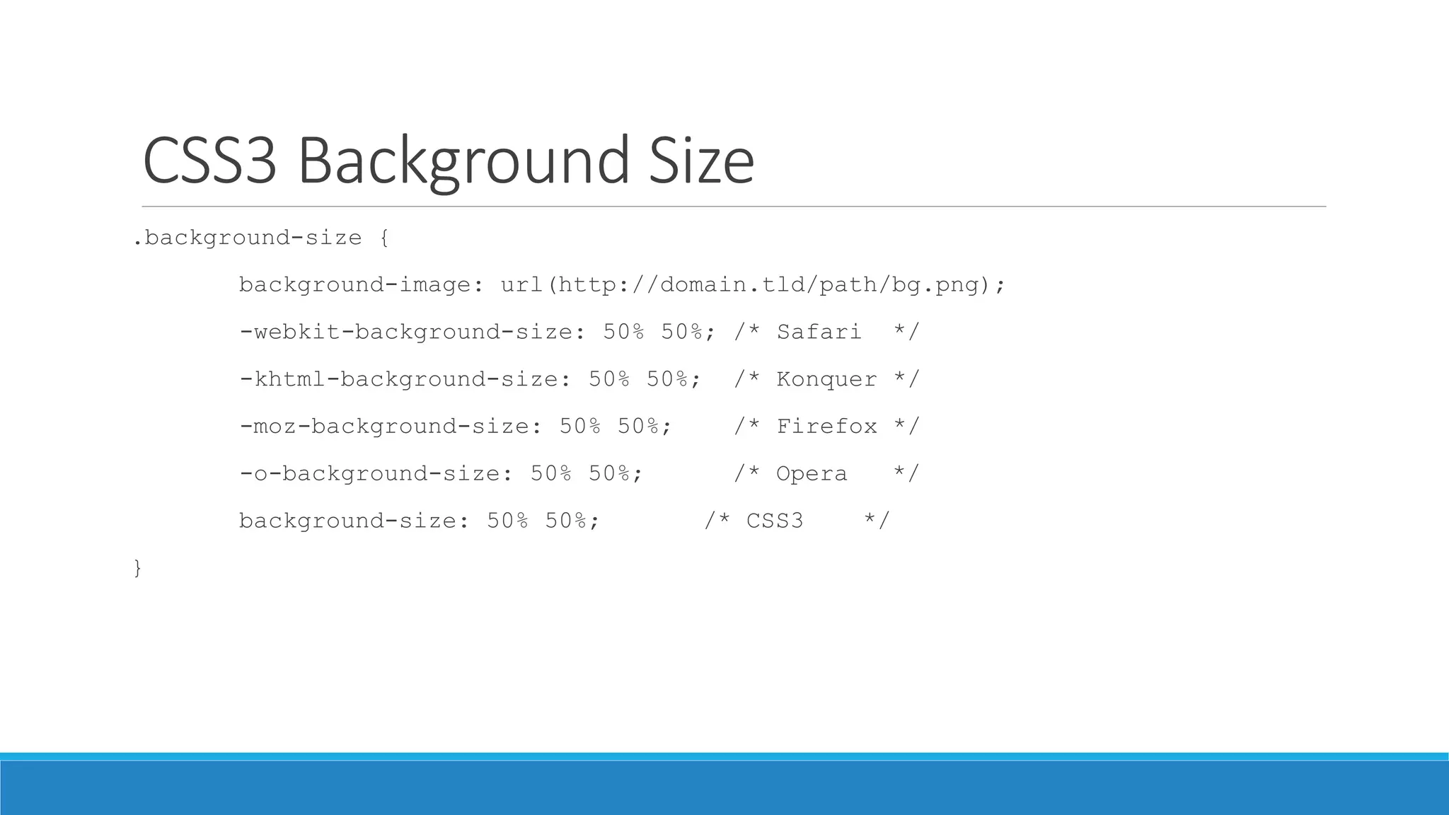

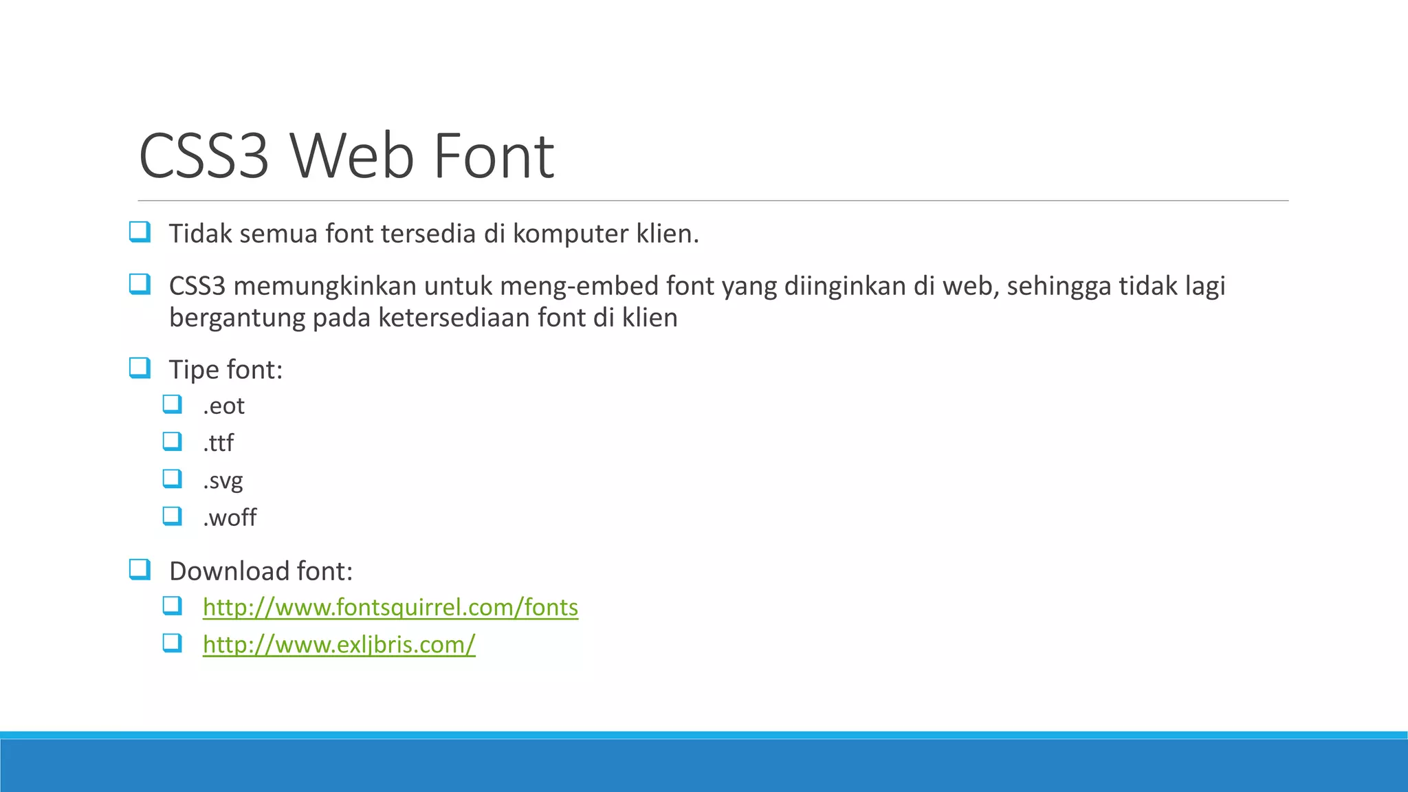
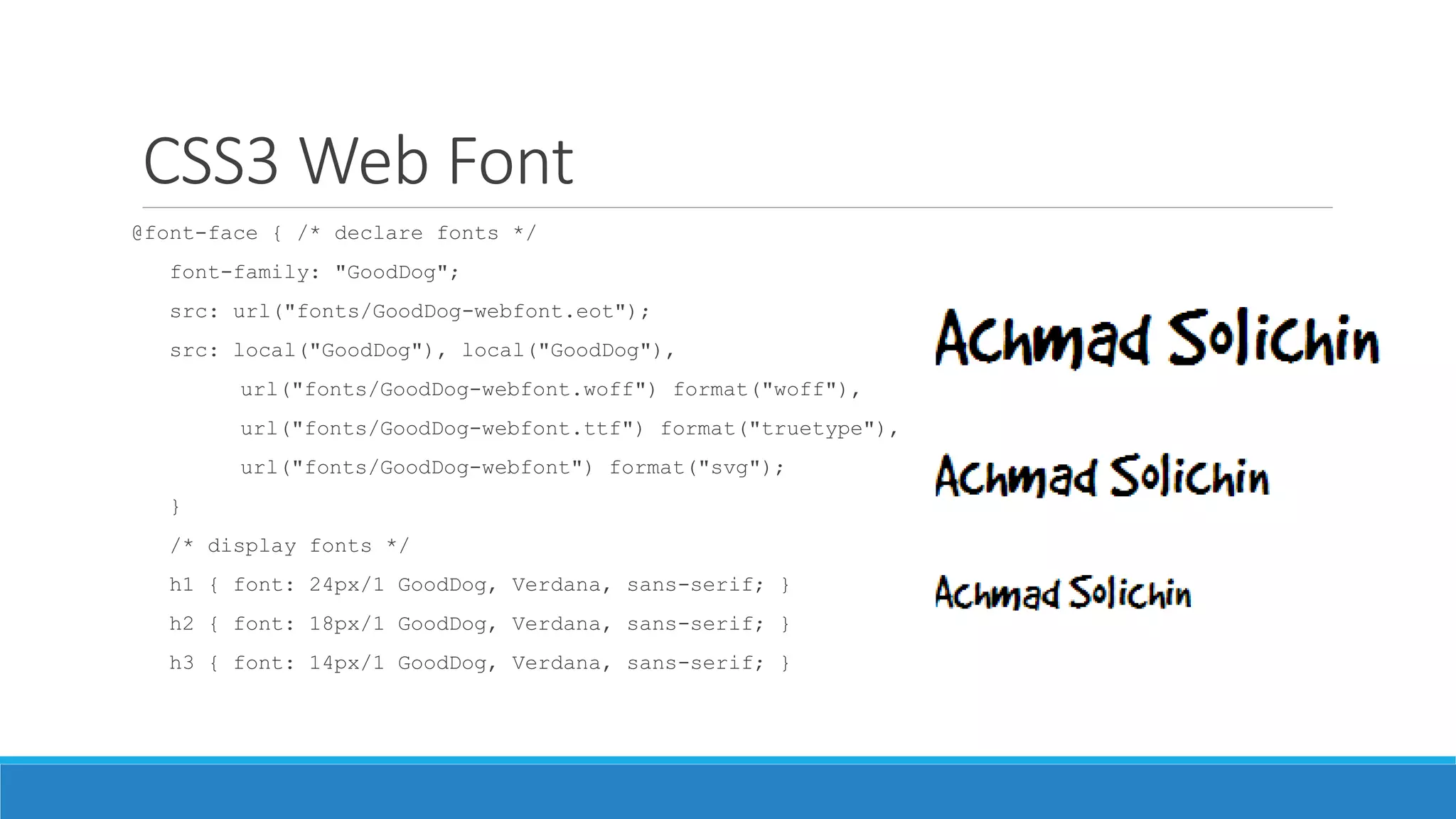

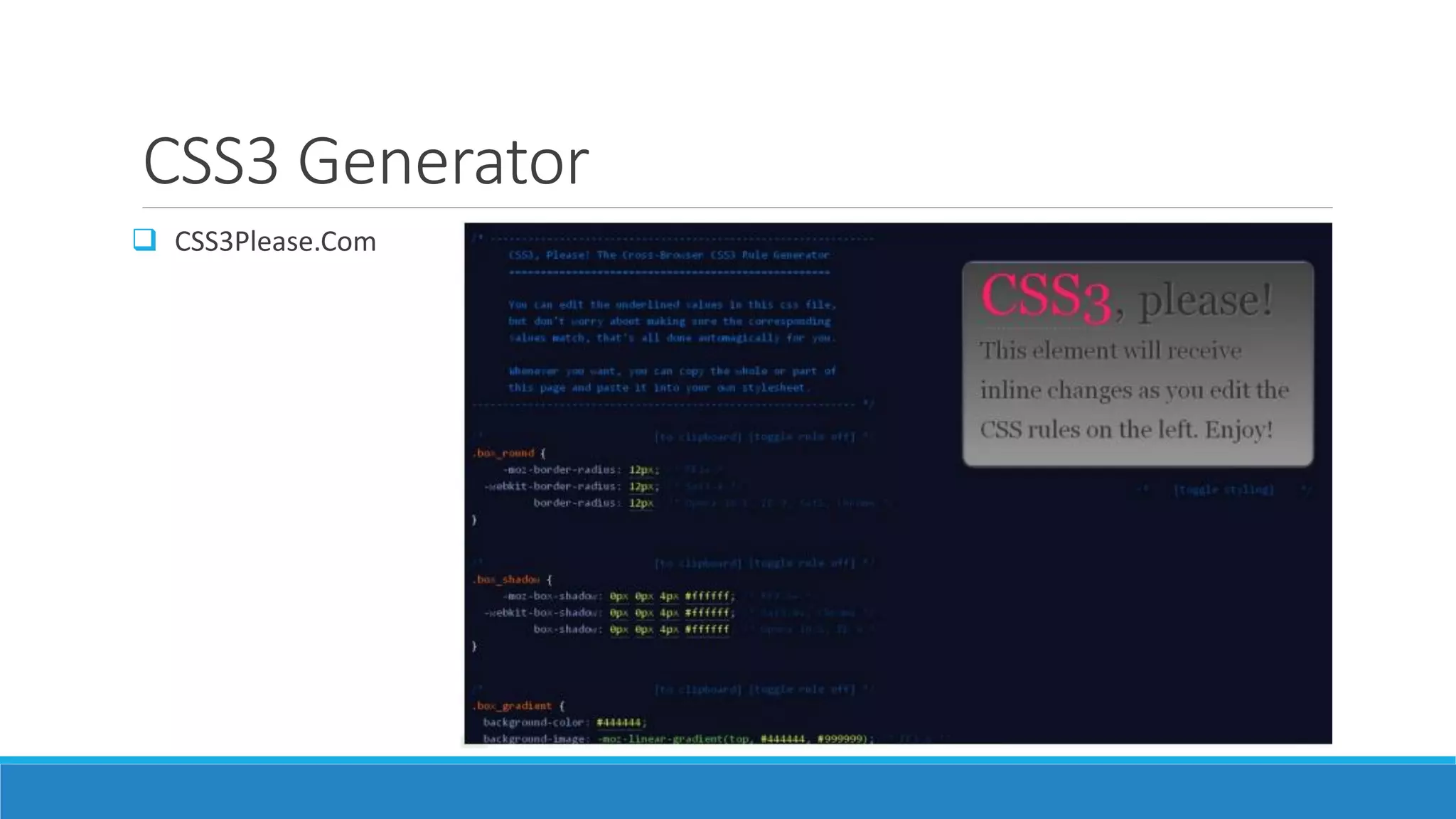
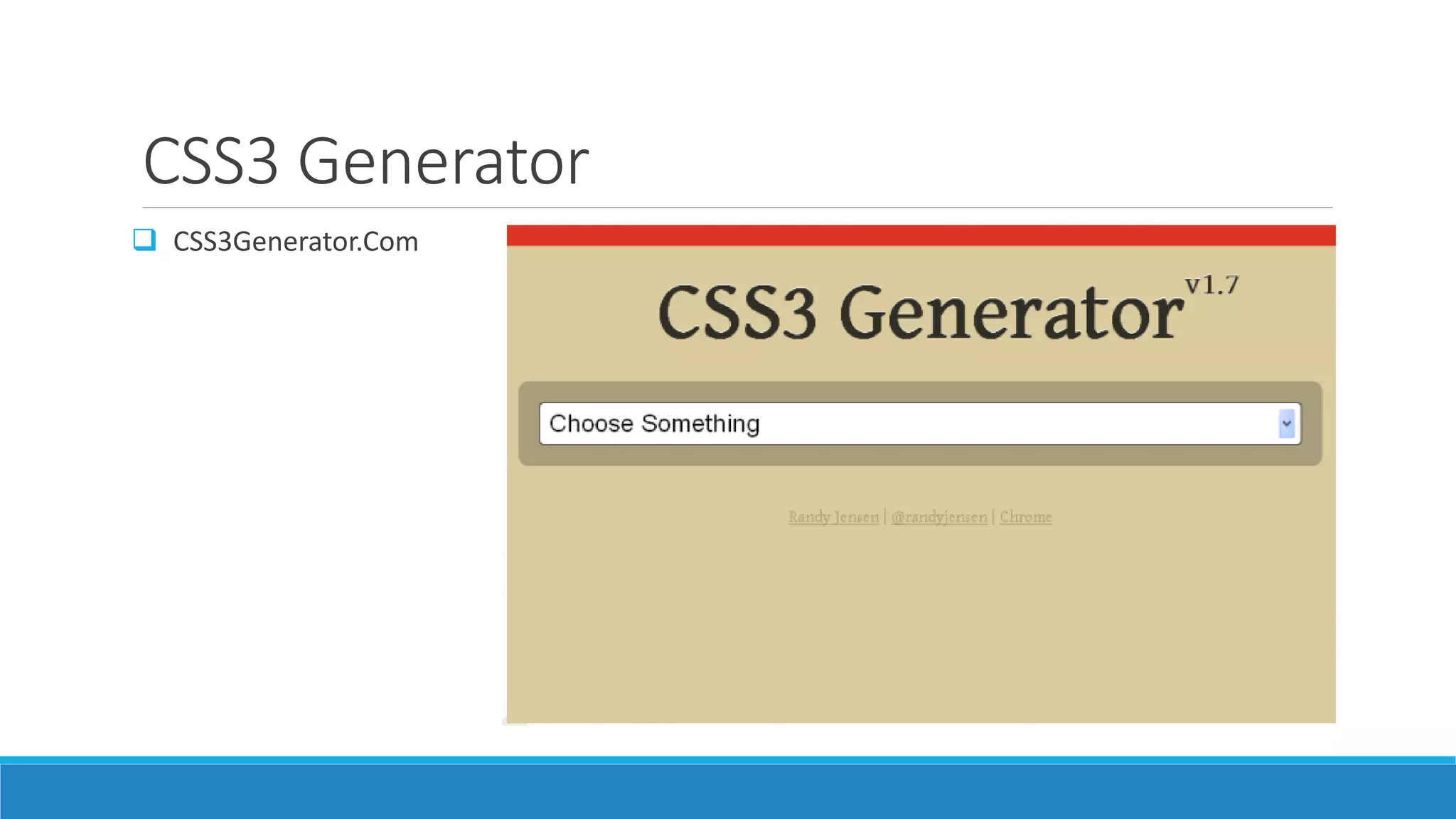


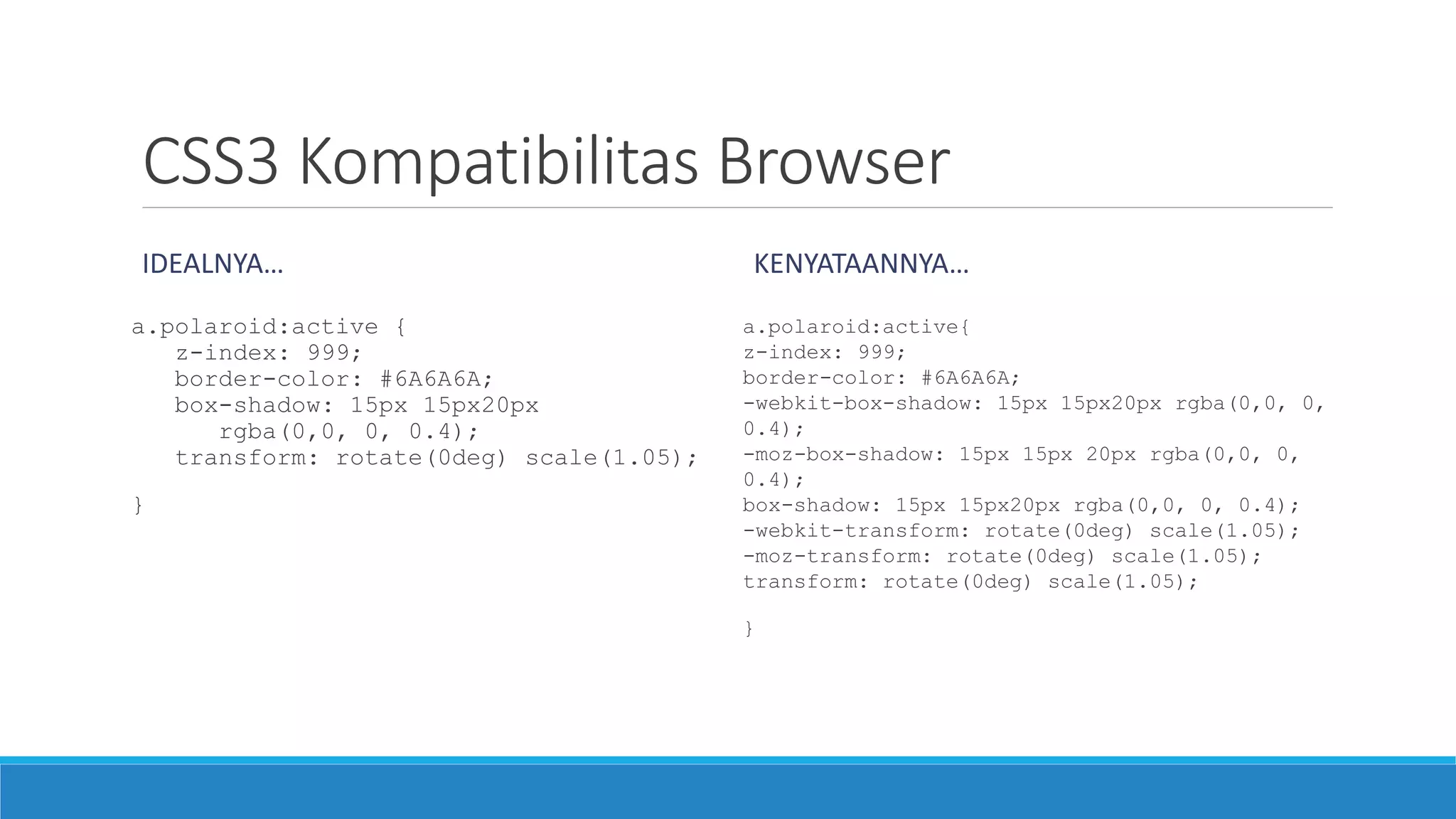
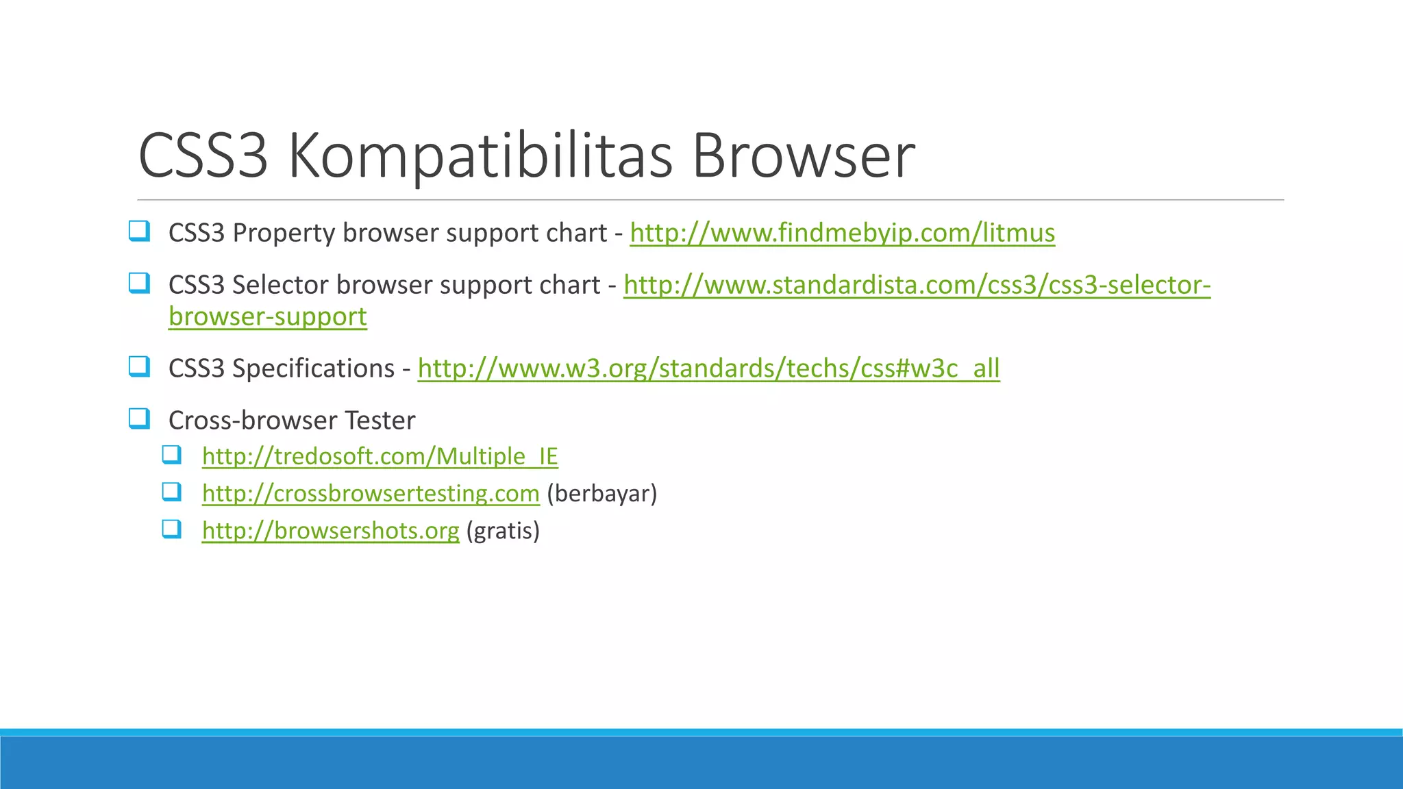
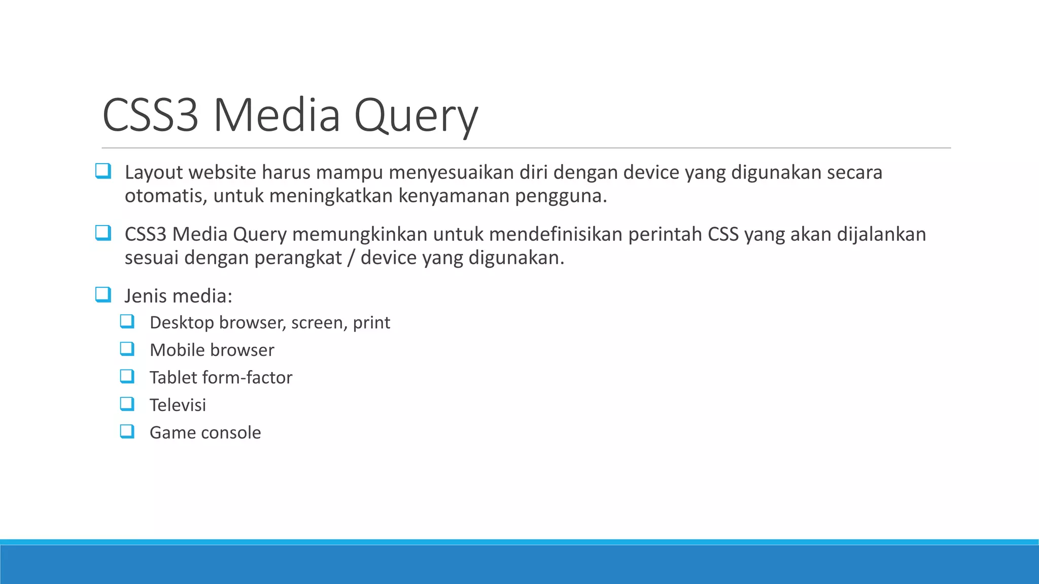
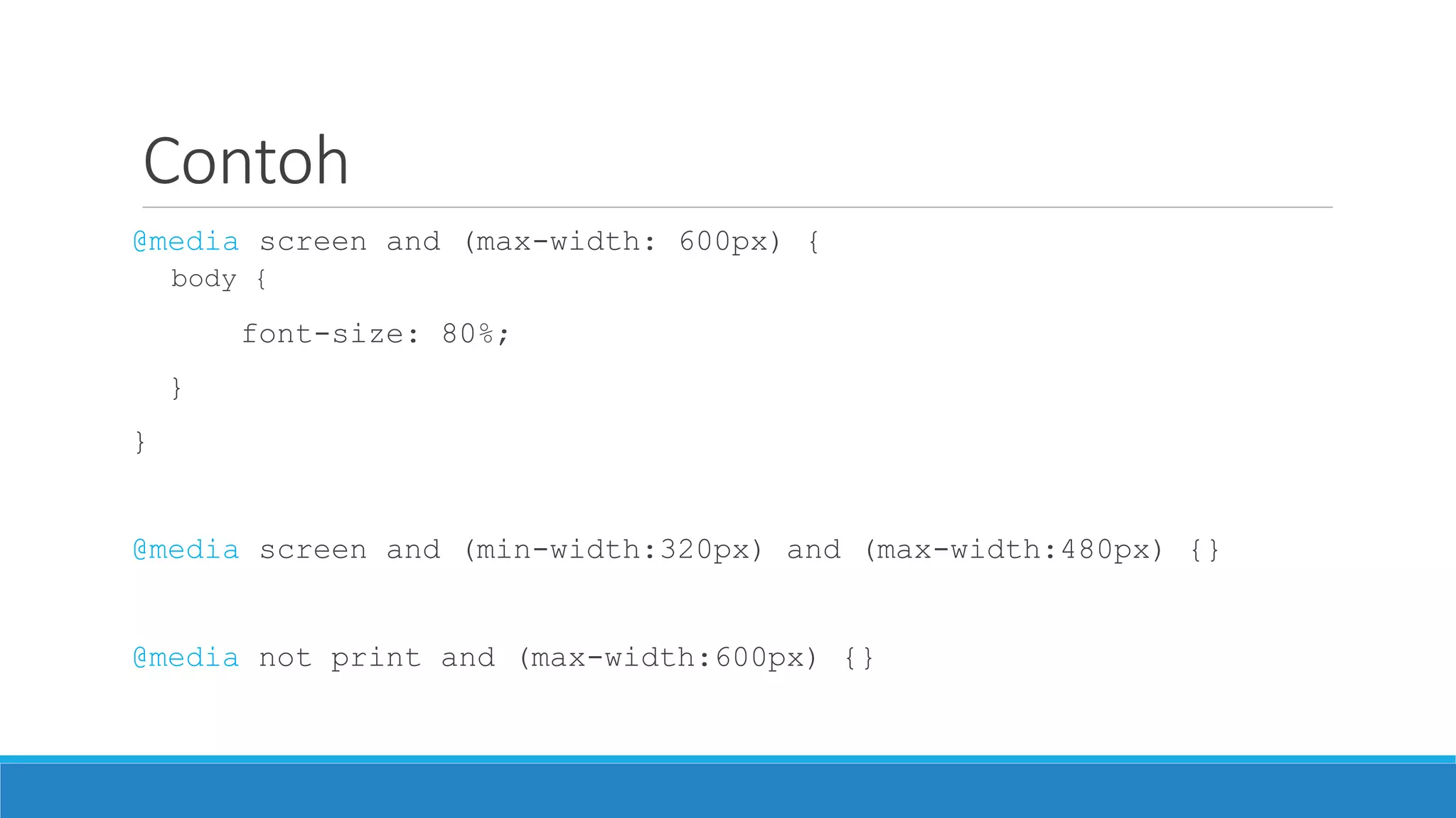
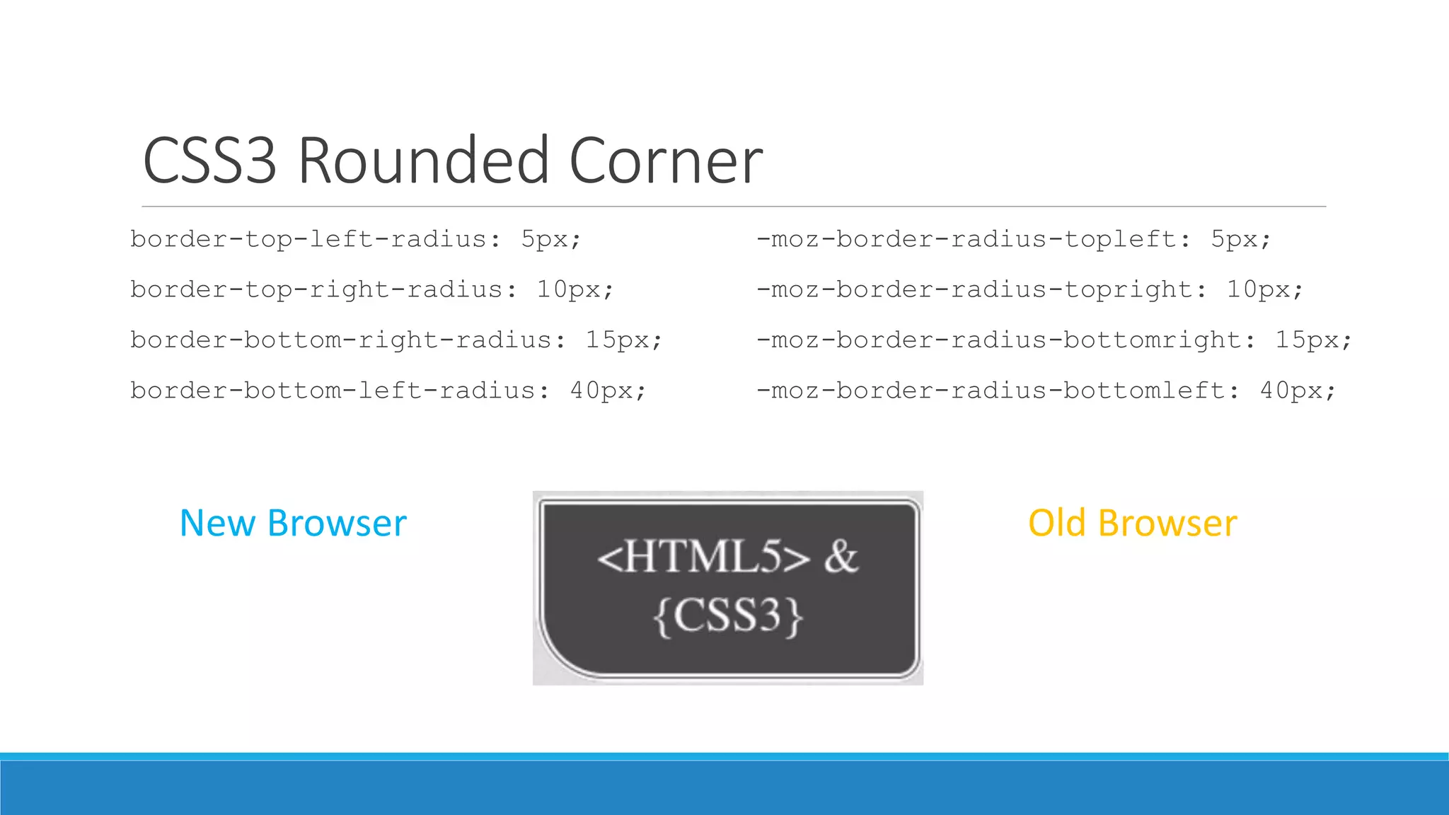
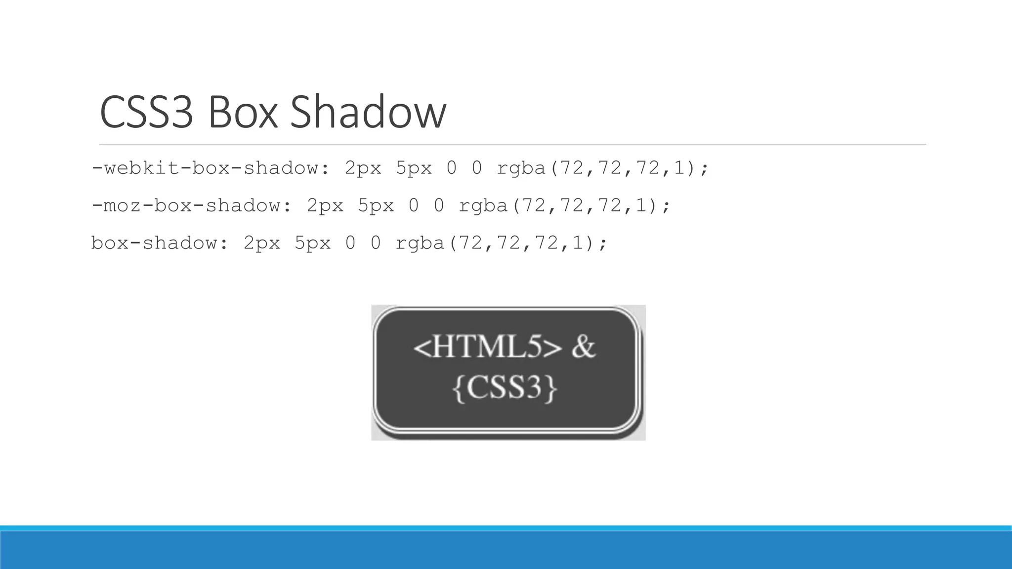
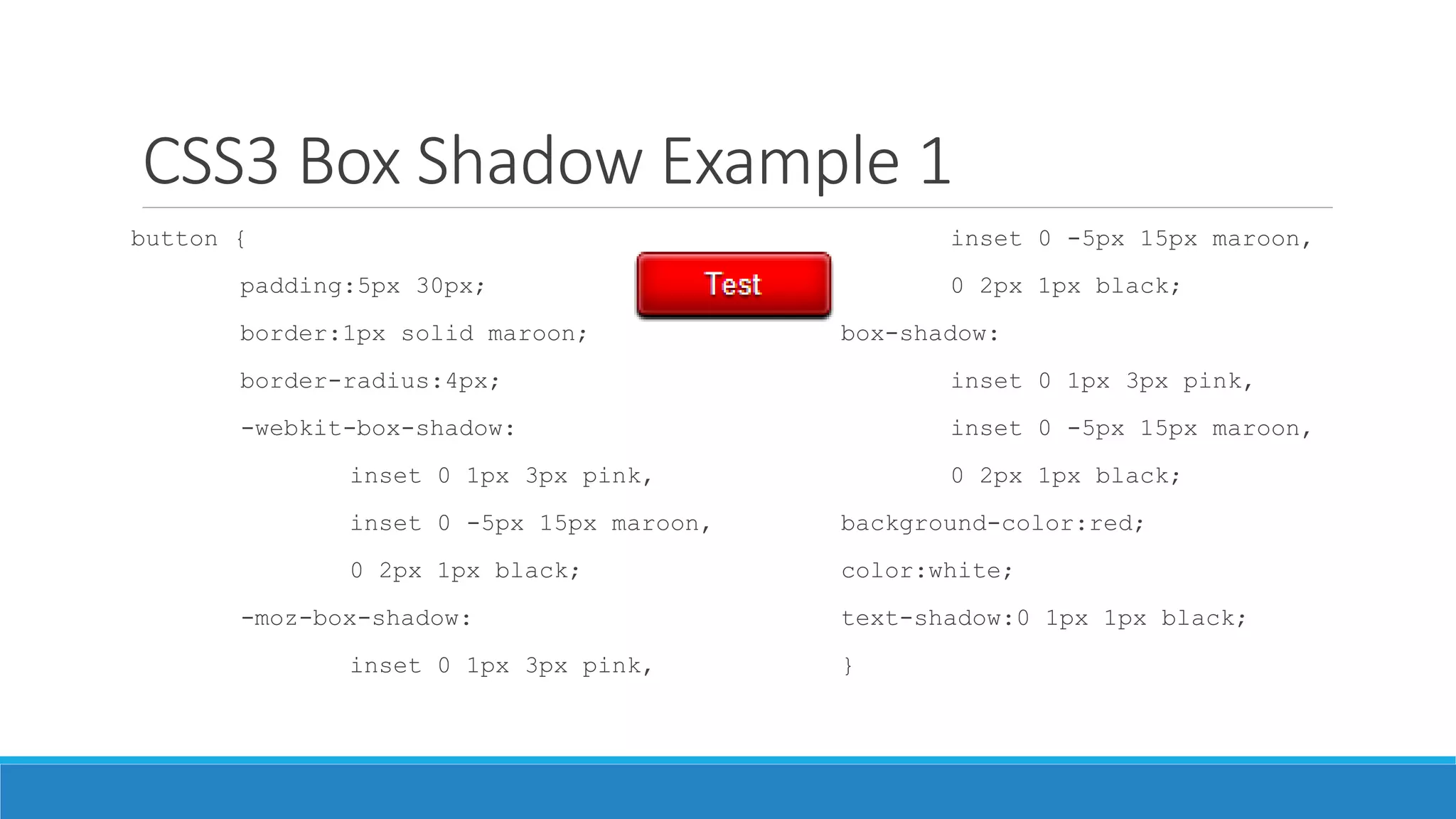
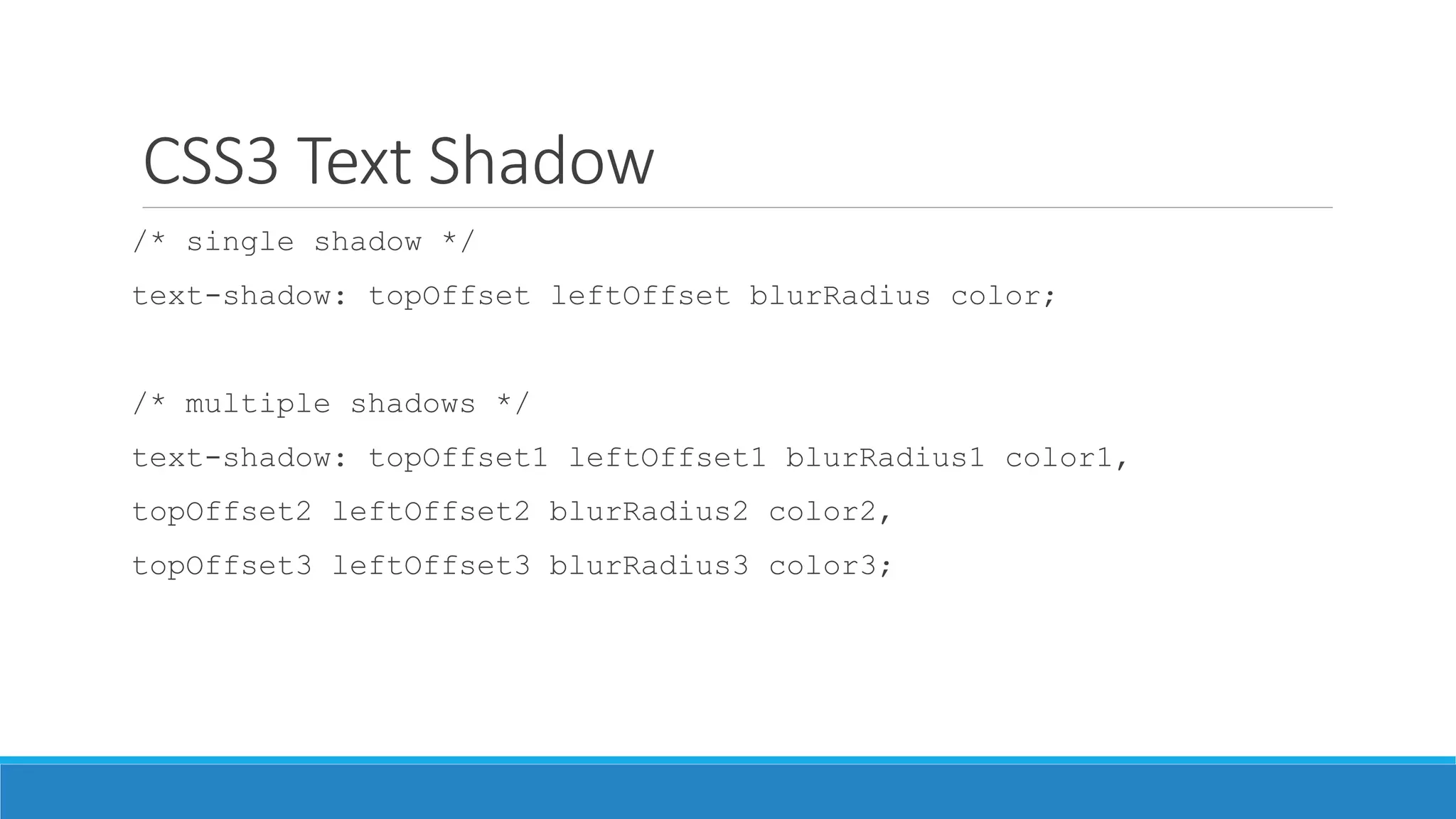
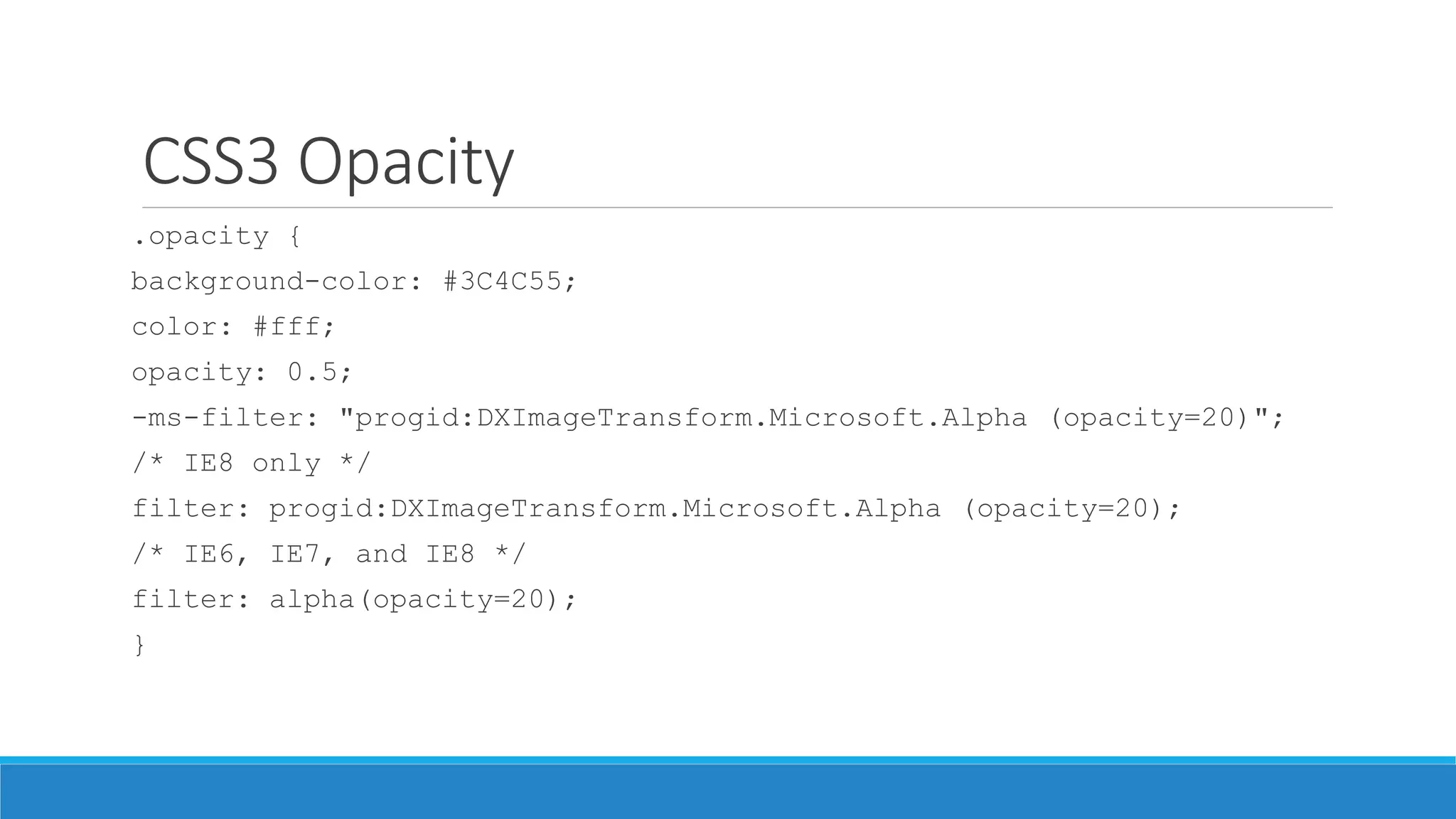
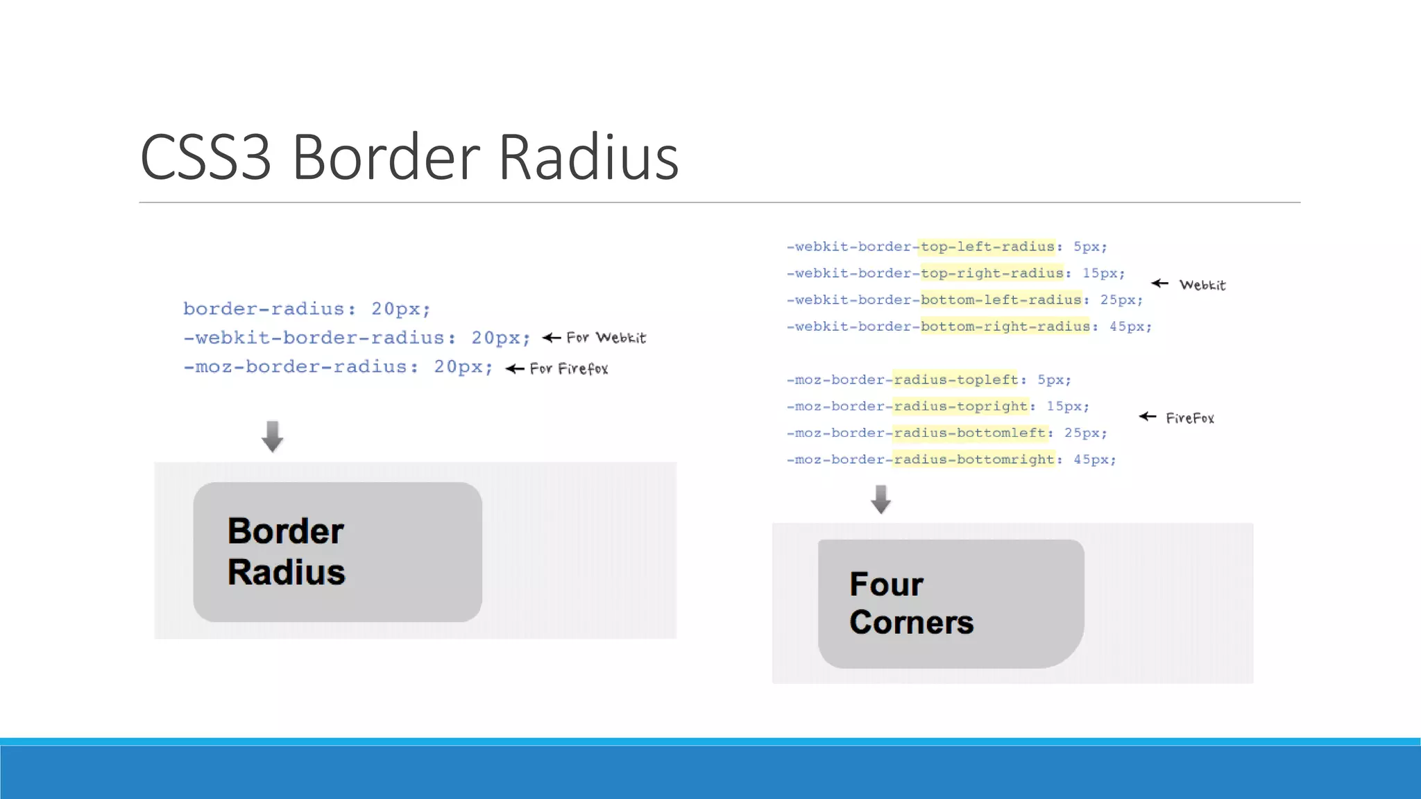
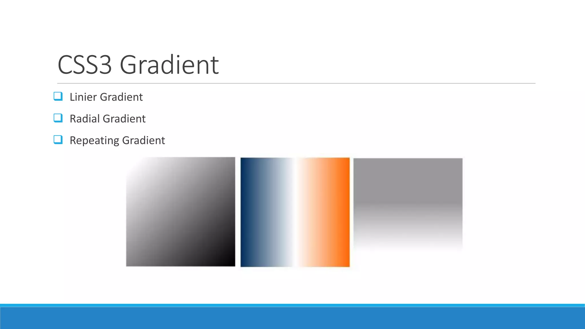
The document discusses various topics in CSS3 including selectors, properties, media queries, and visual effects. It provides examples and explanations of CSS3 concepts like gradients, rounded corners, box shadow, text shadow, opacity, and more. Browser support and cross-browser compatibility of CSS3 features are also covered.


![[Worskhop Summits] CSS3 Workshop](https://cdn.slidesharecdn.com/ss_thumbnails/schmitt-css3-v4-100114155033-phpapp02-thumbnail.jpg?width=600ounds&width=560&fit=bounds)


![Learn to Love CSS3 [English]](https://cdn.slidesharecdn.com/ss_thumbnails/tpjab12css3-120521050202-phpapp01-thumbnail.jpg?width=600ounds&width=560&fit=bounds)


