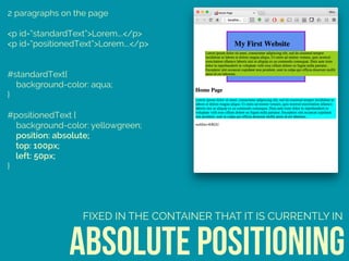
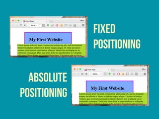
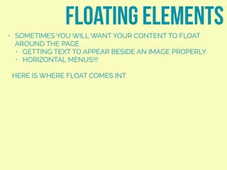
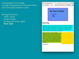
Download as PDF, PPTX


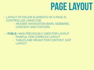
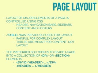
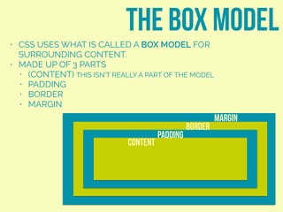
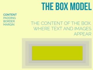
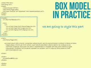
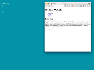

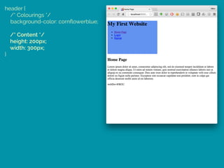
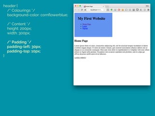

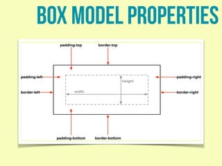
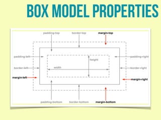


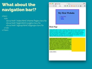

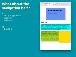
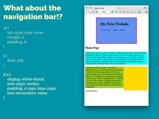
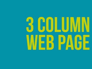


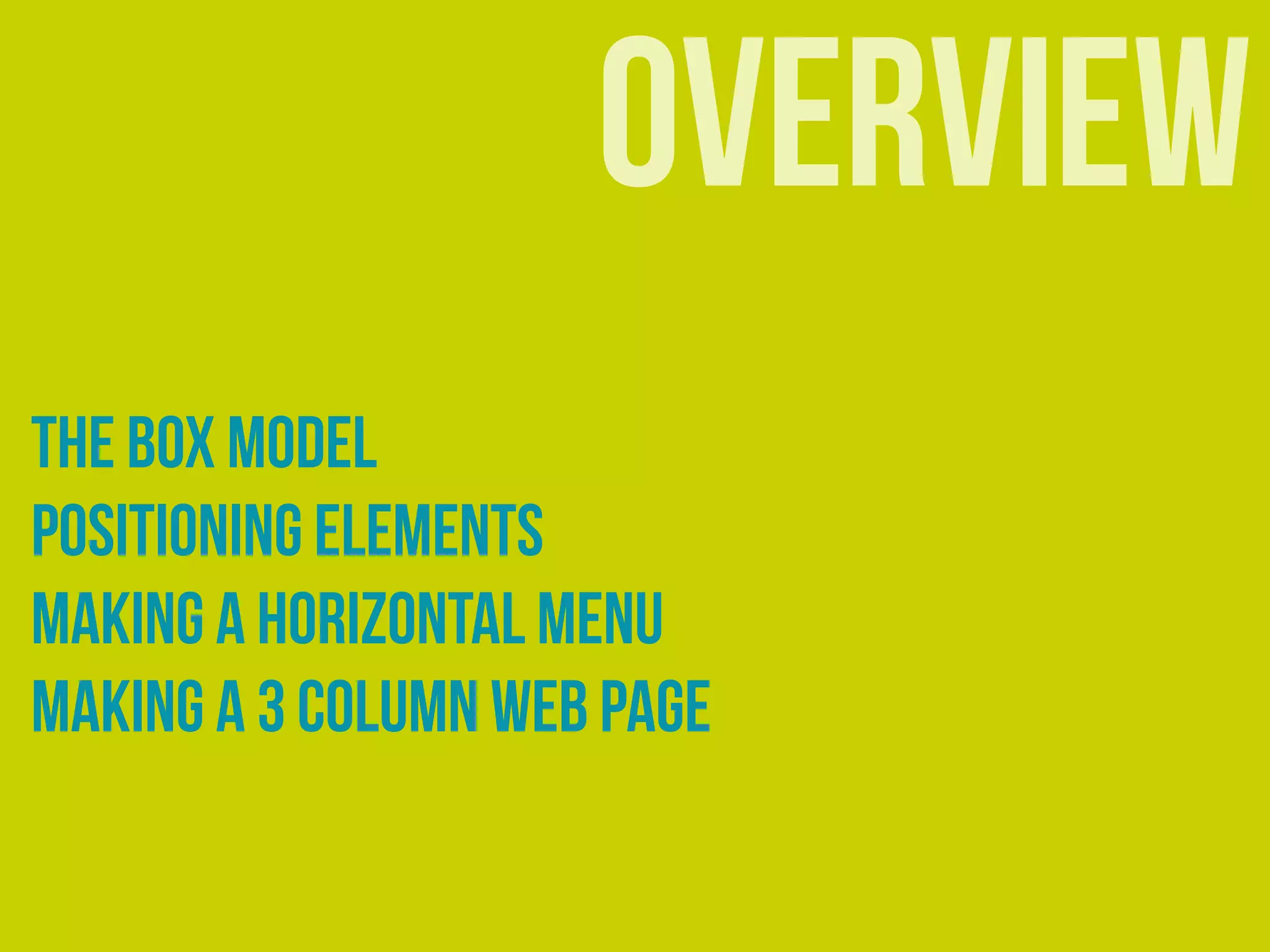


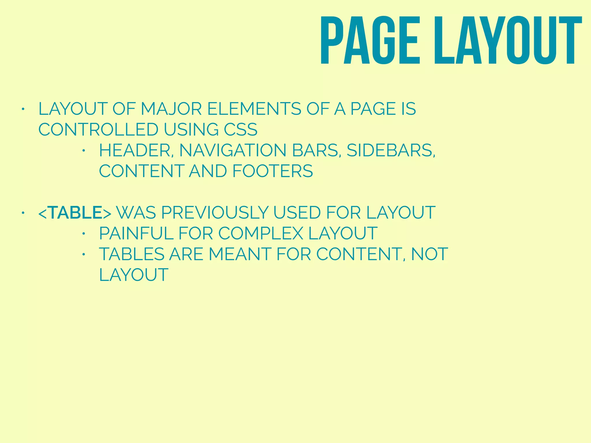

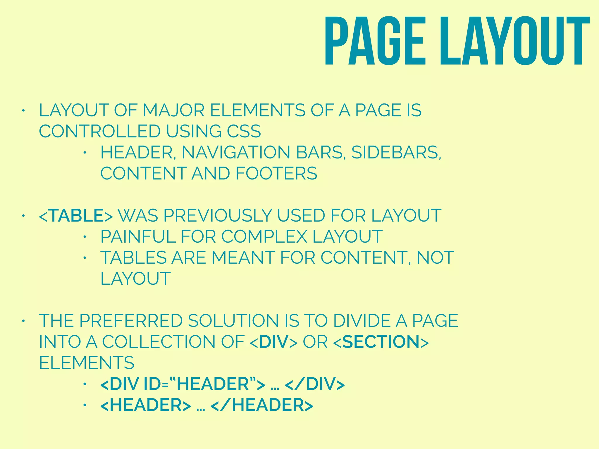


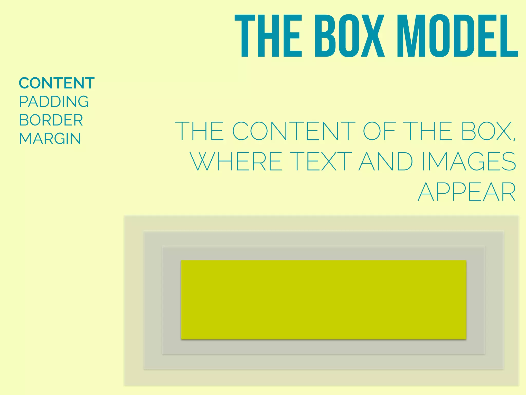
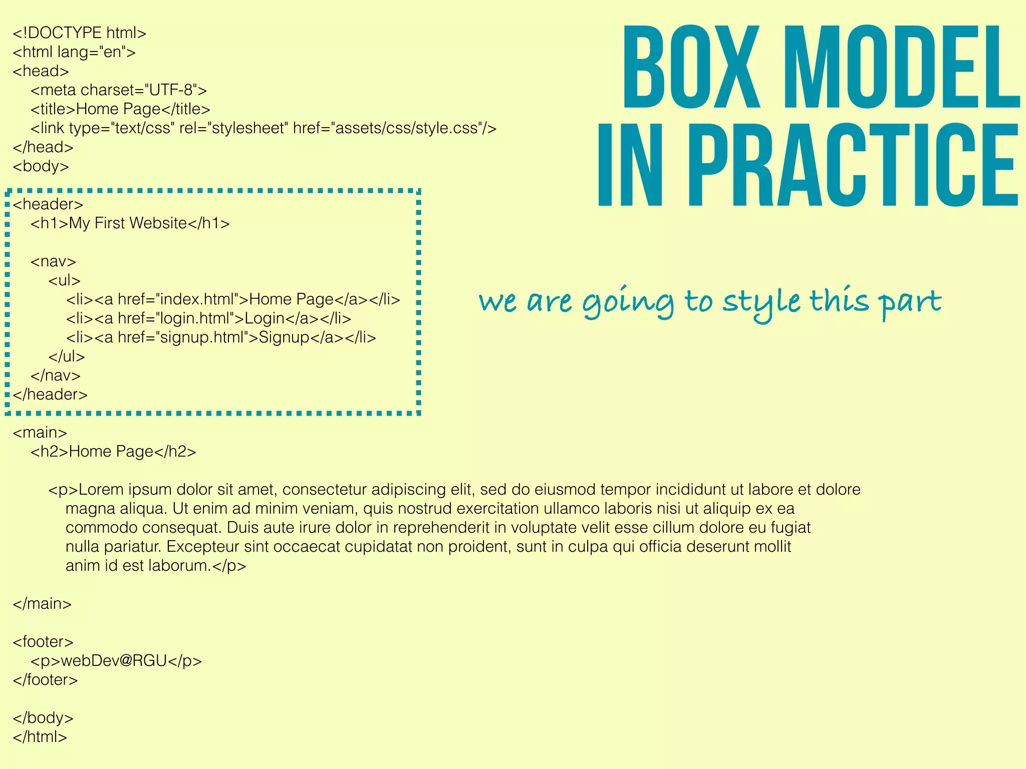

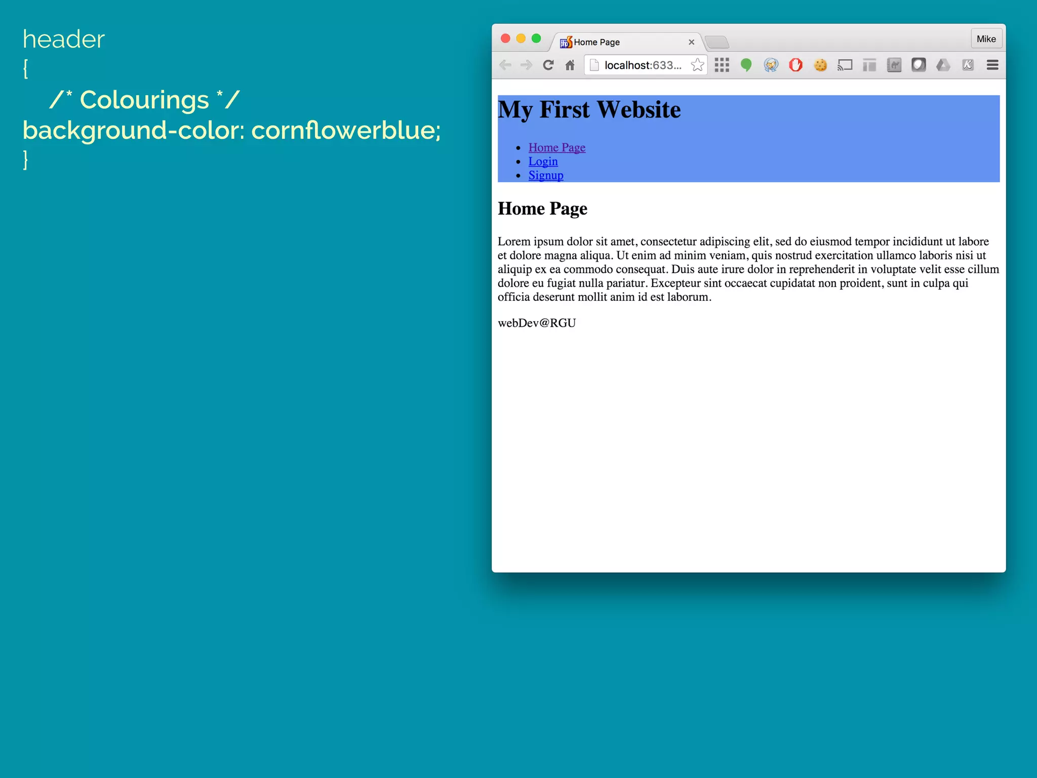
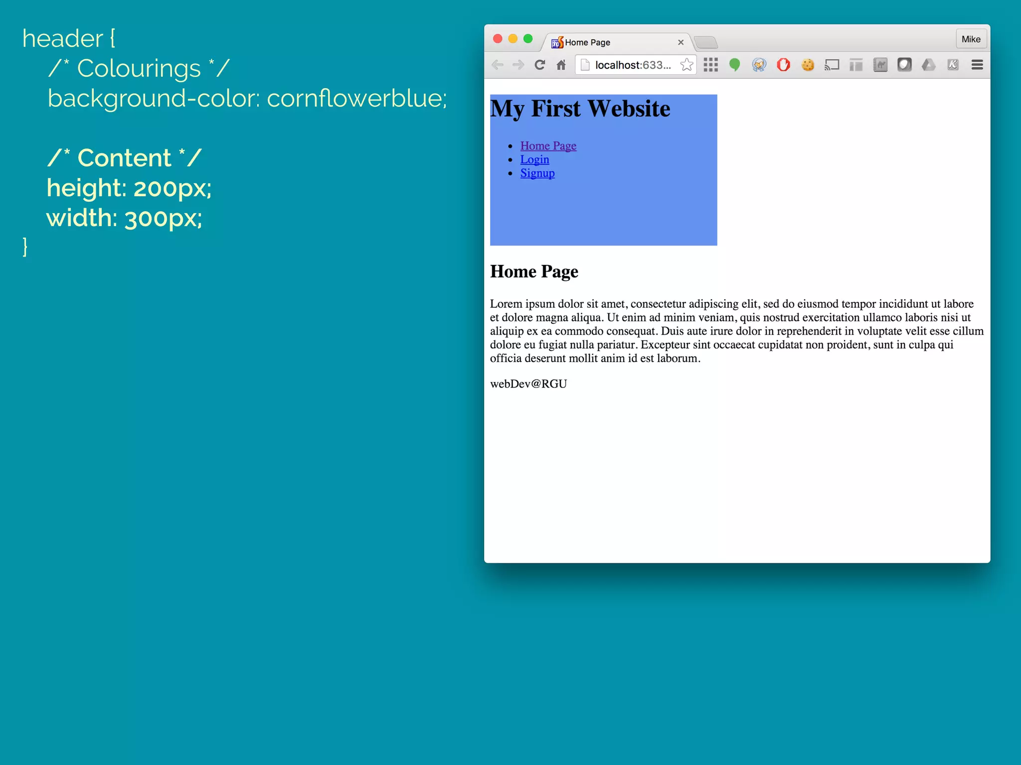

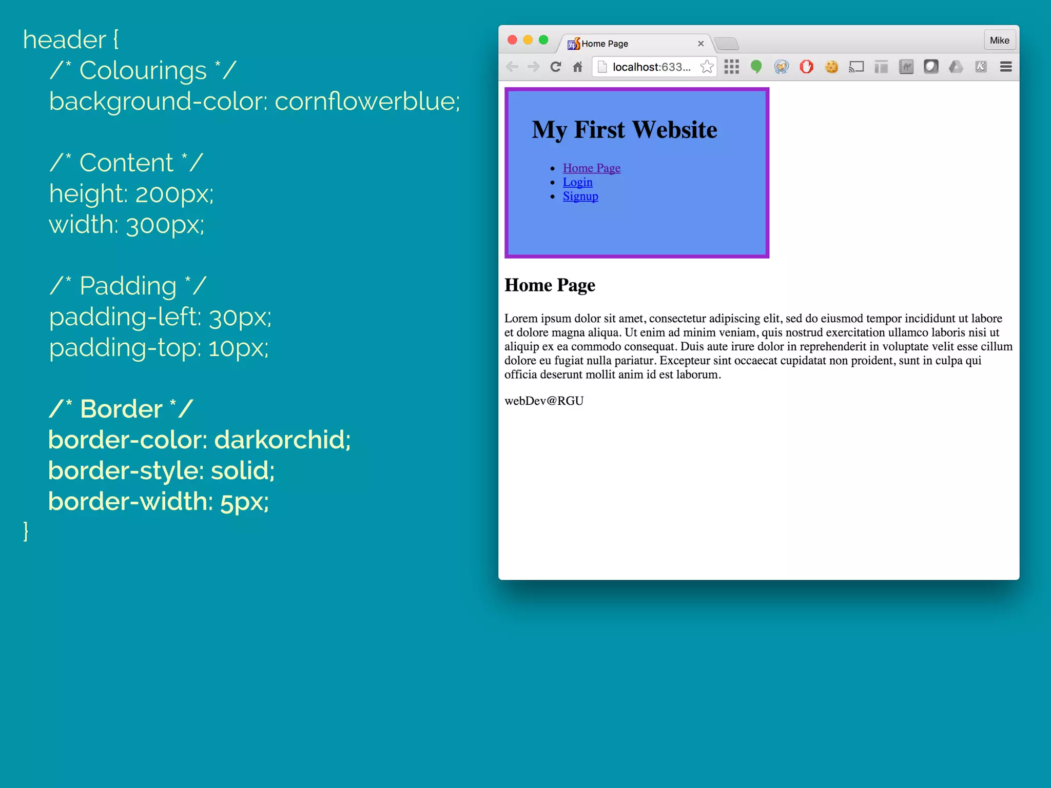


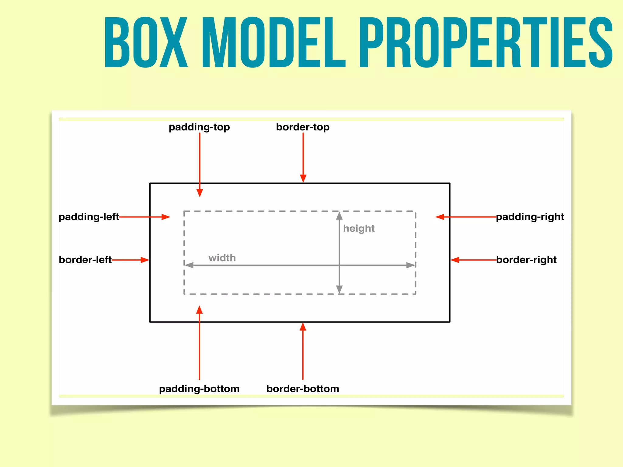
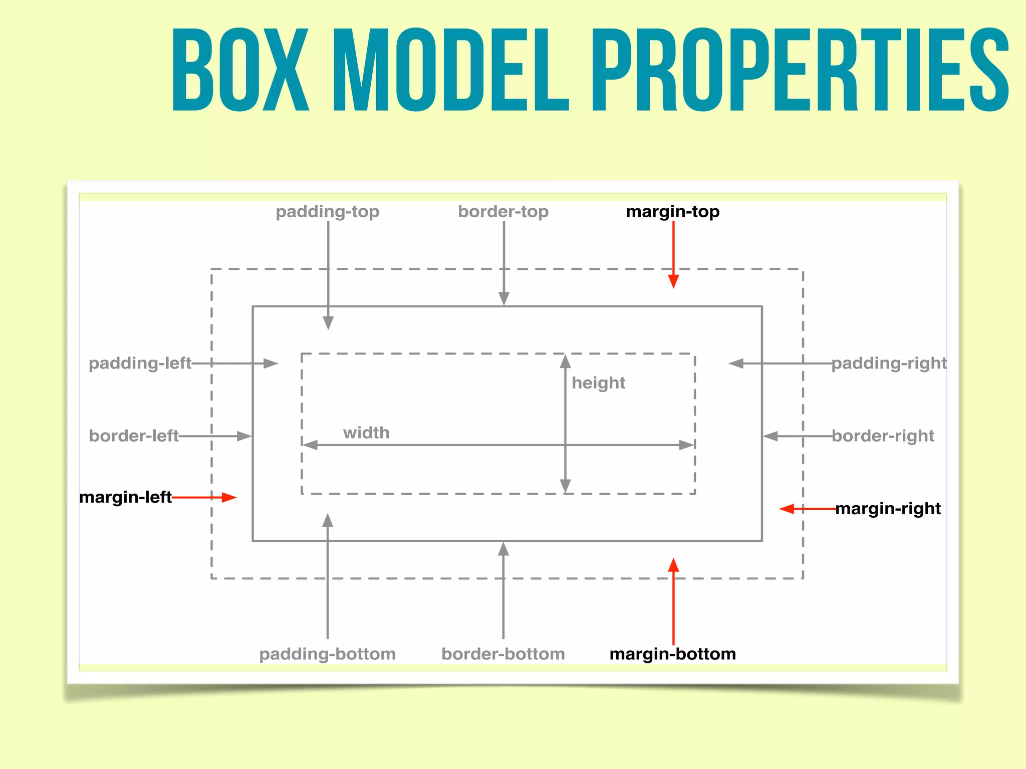

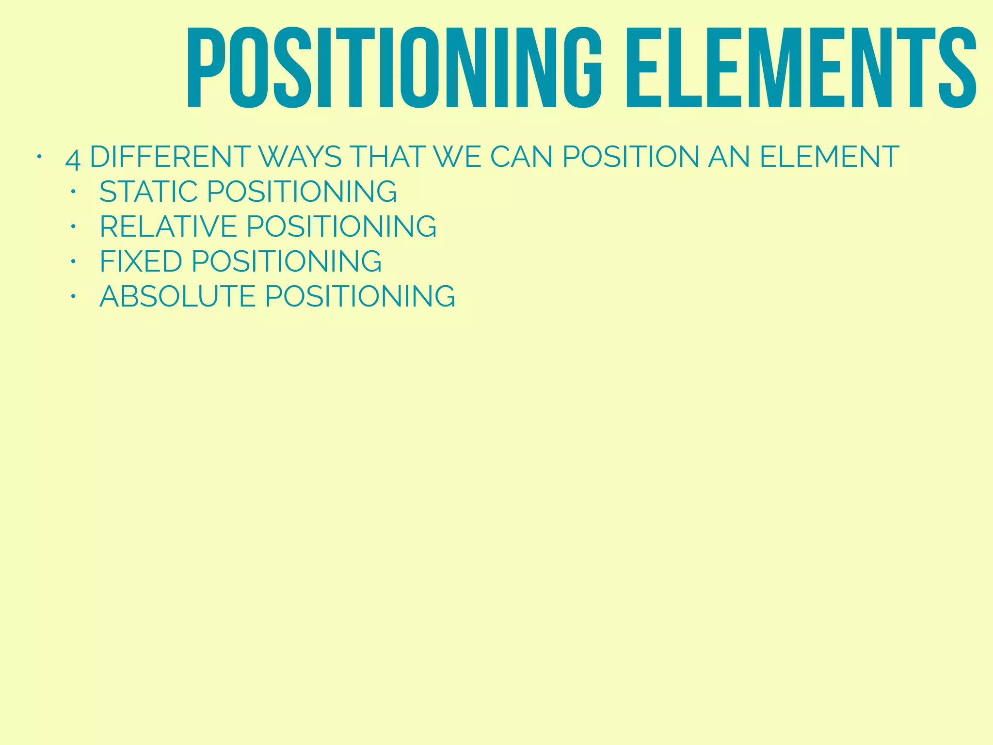


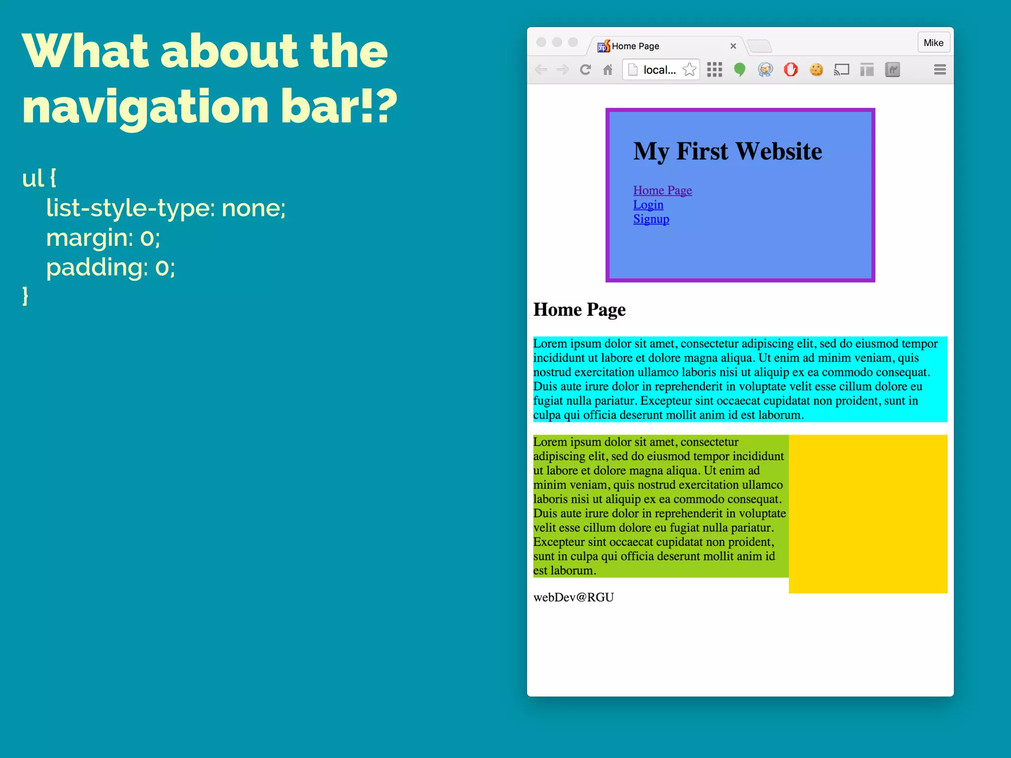

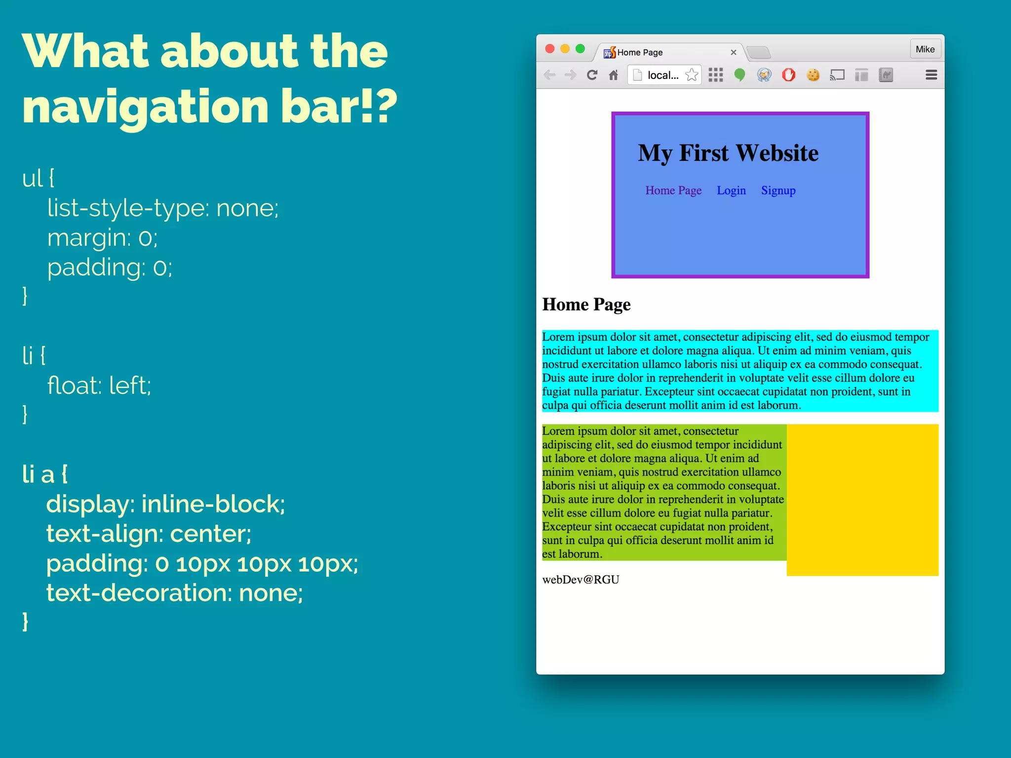
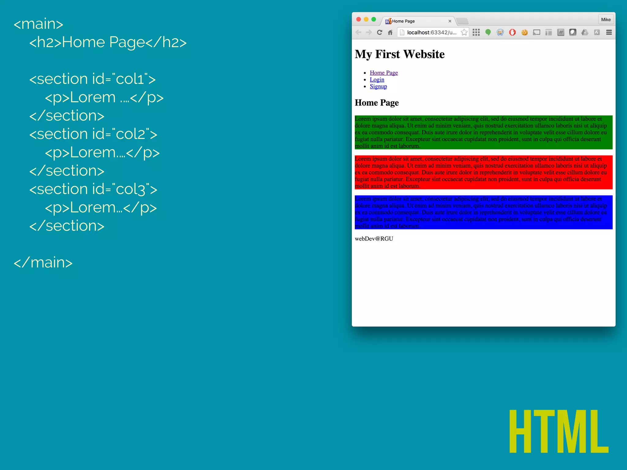
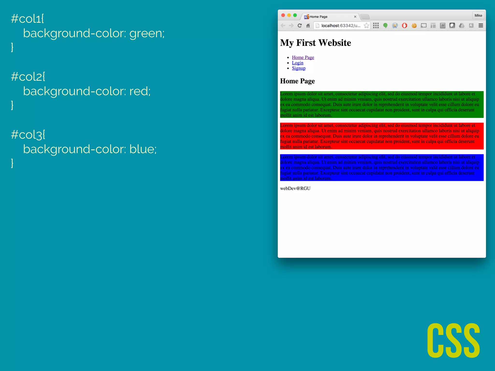
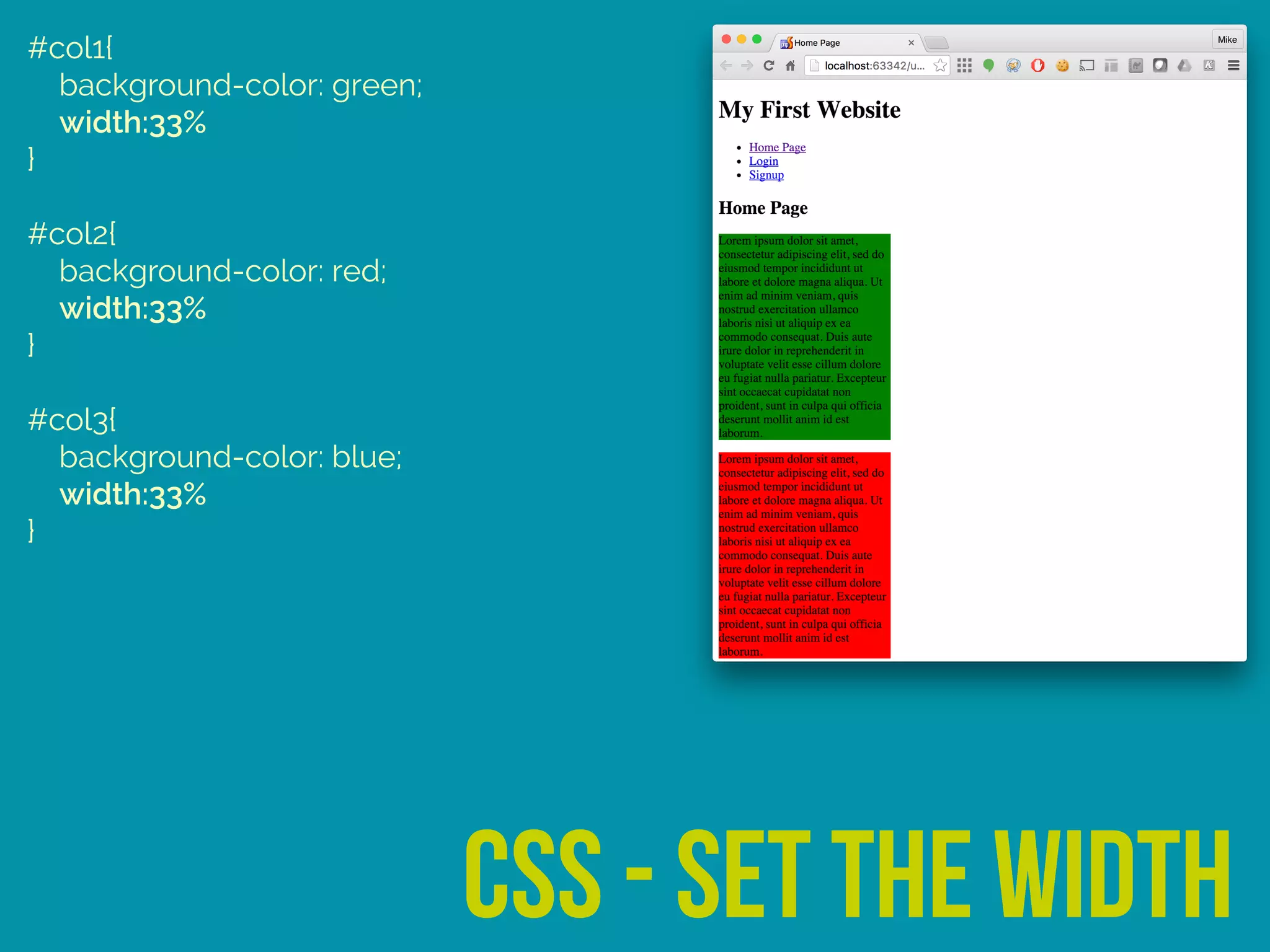
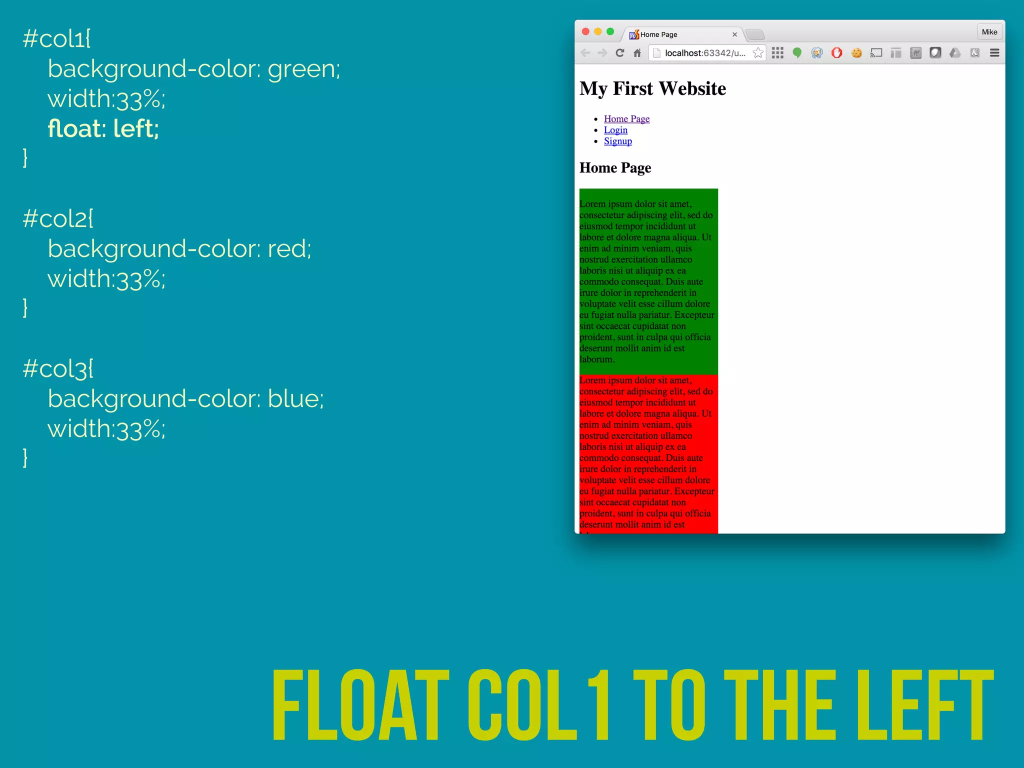

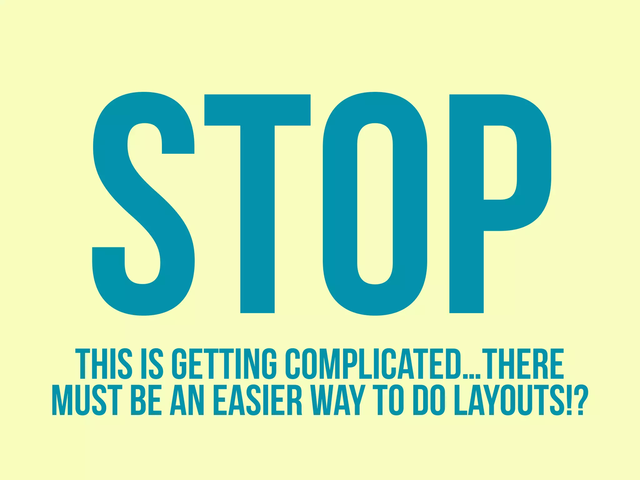

This document provides an overview of web page layout using CSS, emphasizing the importance of the box model and various positioning methods for elements. It discusses the transition from table-based layouts to using <div> and <section> elements for structuring content, as well as practical examples of styling headers, footers, and creating three-column web pages. It concludes by hinting at future tools for simplifying layouts.


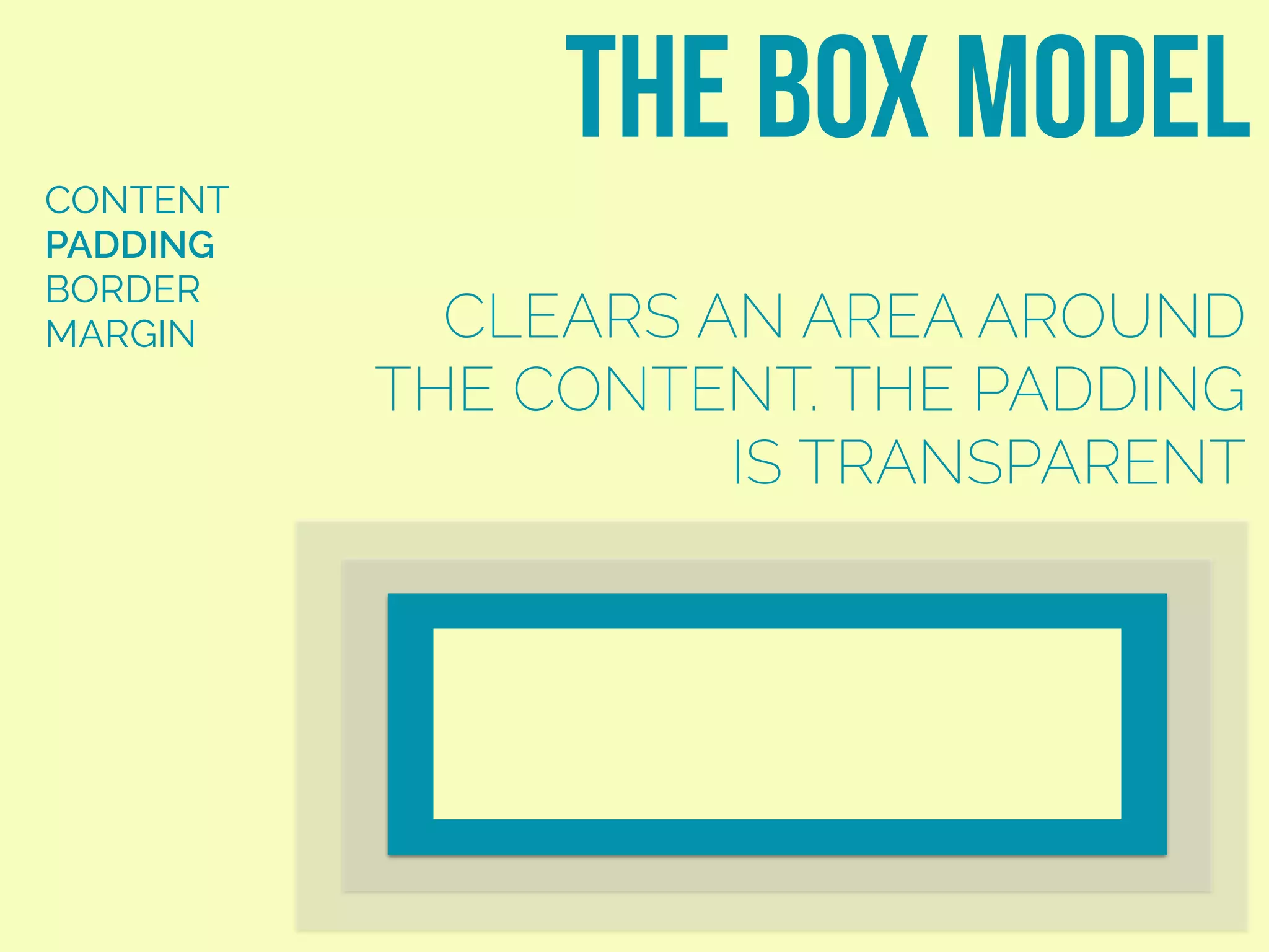
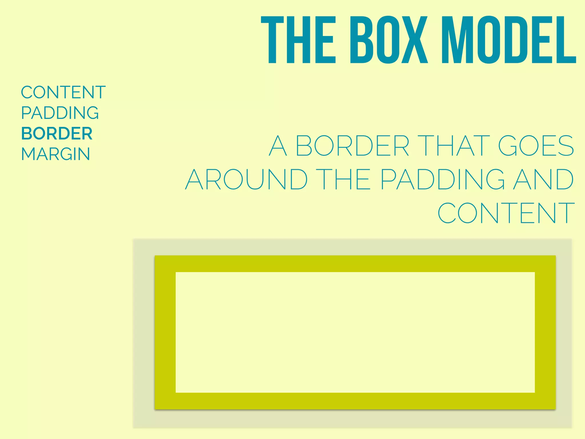
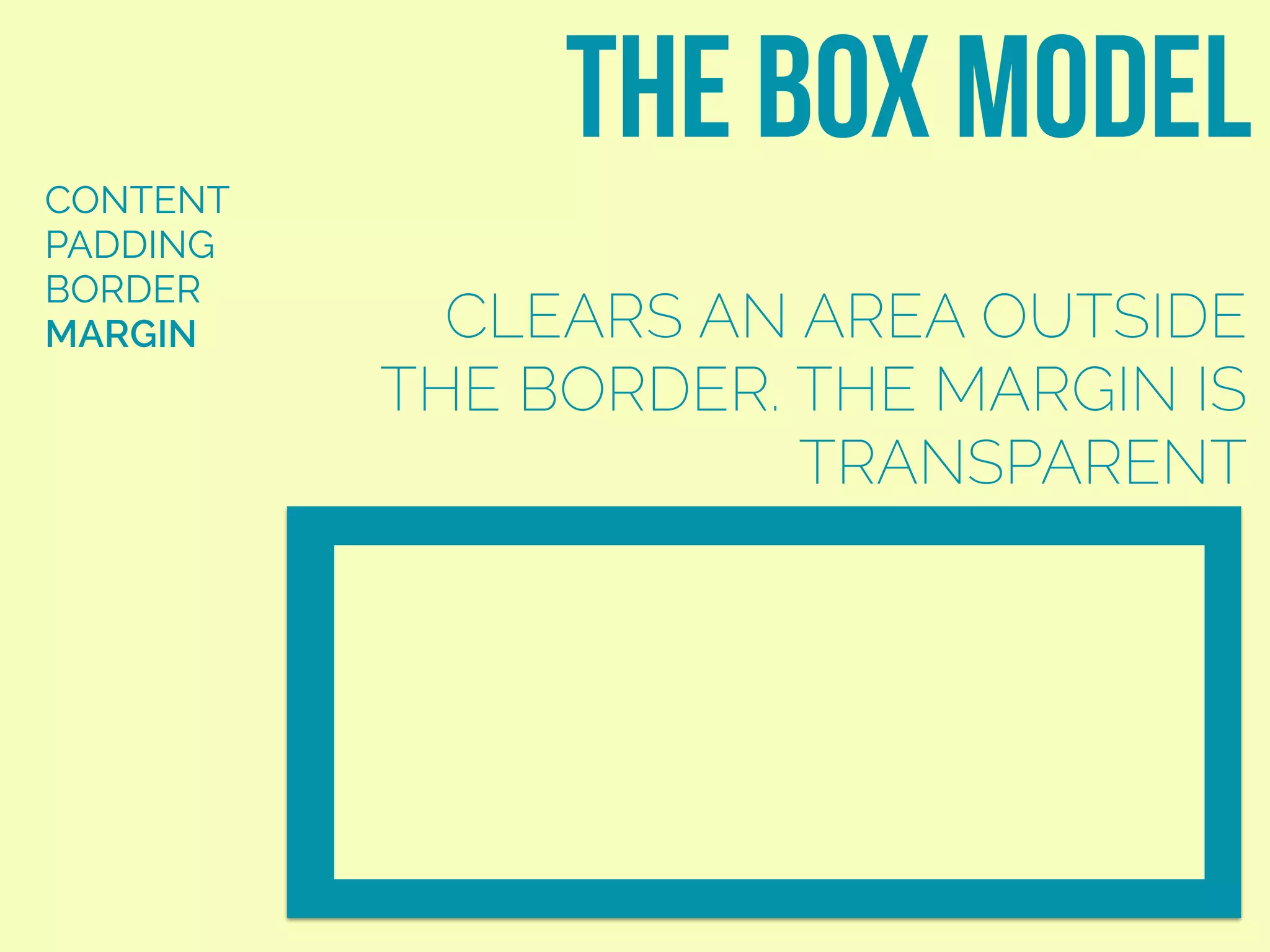
![The Box Model [CSS Introduction]](https://cdn.slidesharecdn.com/ss_thumbnails/chapter3-part2-boxmodel-150120083129-conversion-gate01-thumbnail.jpg?width=600ounds&width=560&fit=bounds)


