Downloaded 158 times


The document outlines essential guidelines for creating effective presentations, focusing on idea clarity, information collection, content formatting, and design styling. It emphasizes the importance of knowing the audience, keeping slides structured with concise text, and utilizing appropriate templates and visuals. Tips for avoiding common pitfalls, such as excessive text and poor design choices, are also provided to enhance presentation quality.
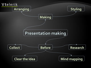
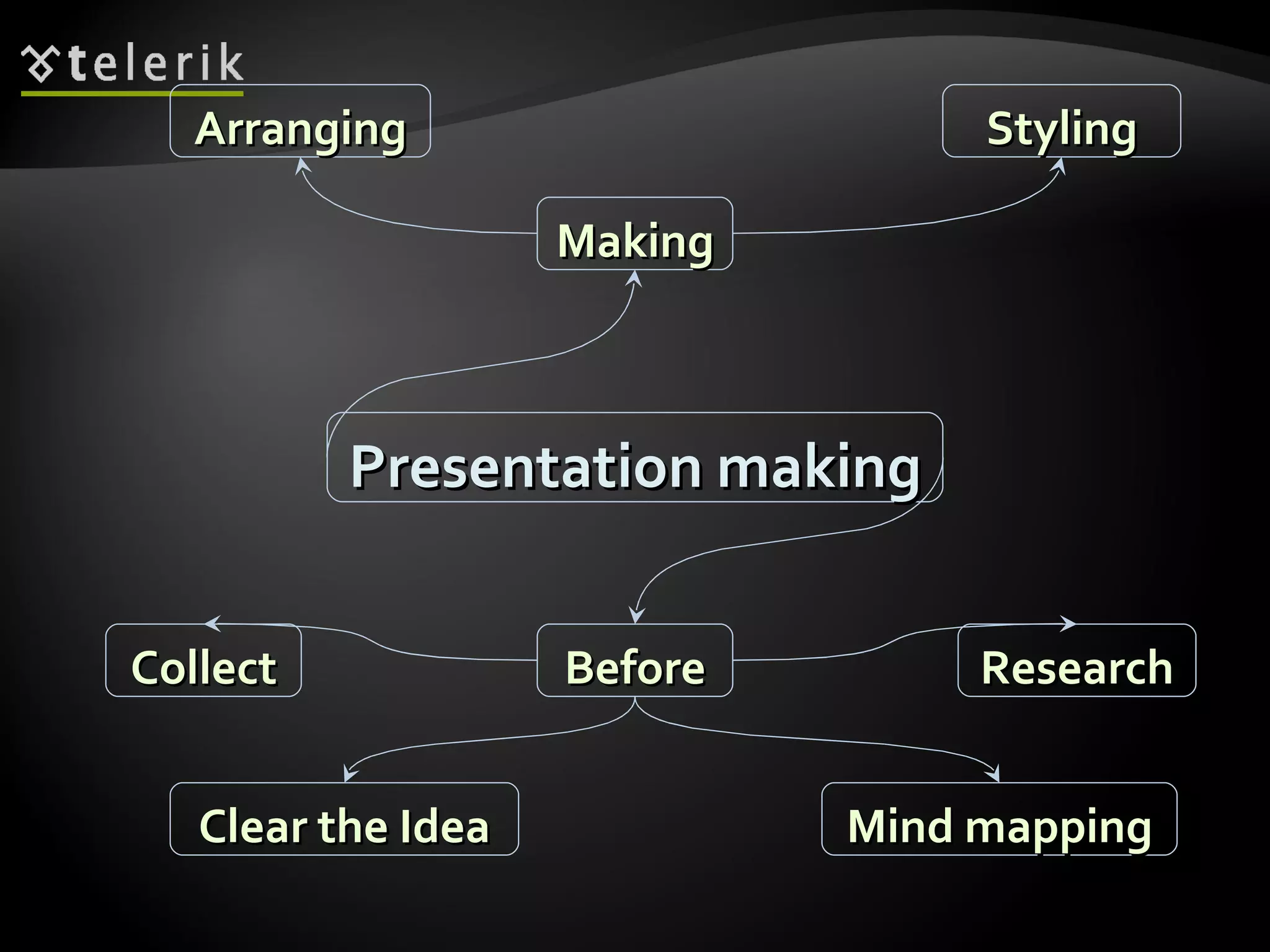
Introduction to presentation making focusing on key points and structured content organization.
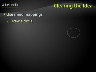
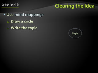
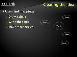
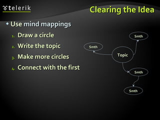
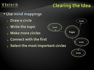
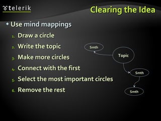
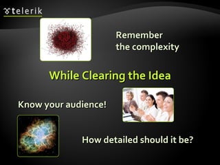
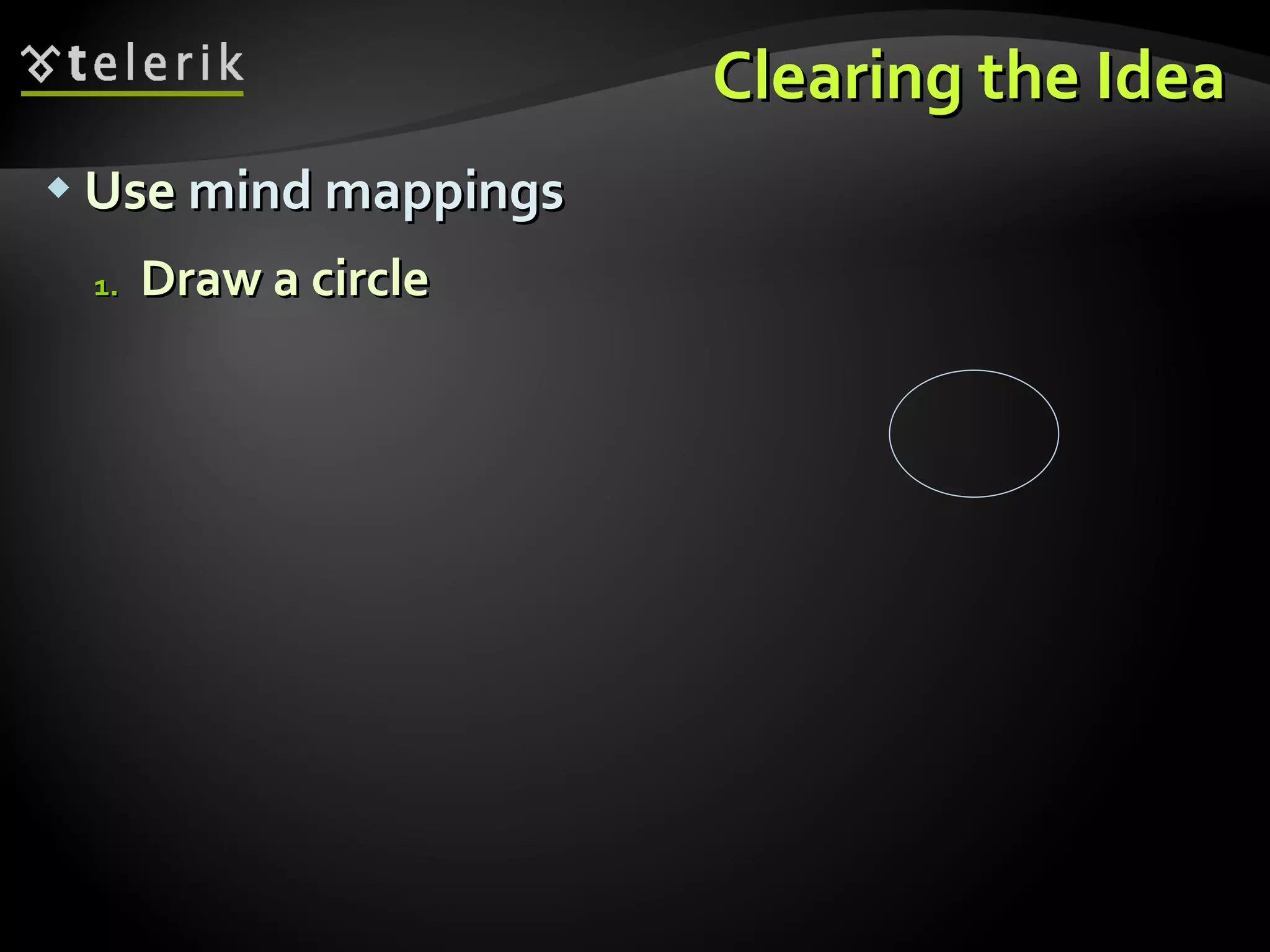
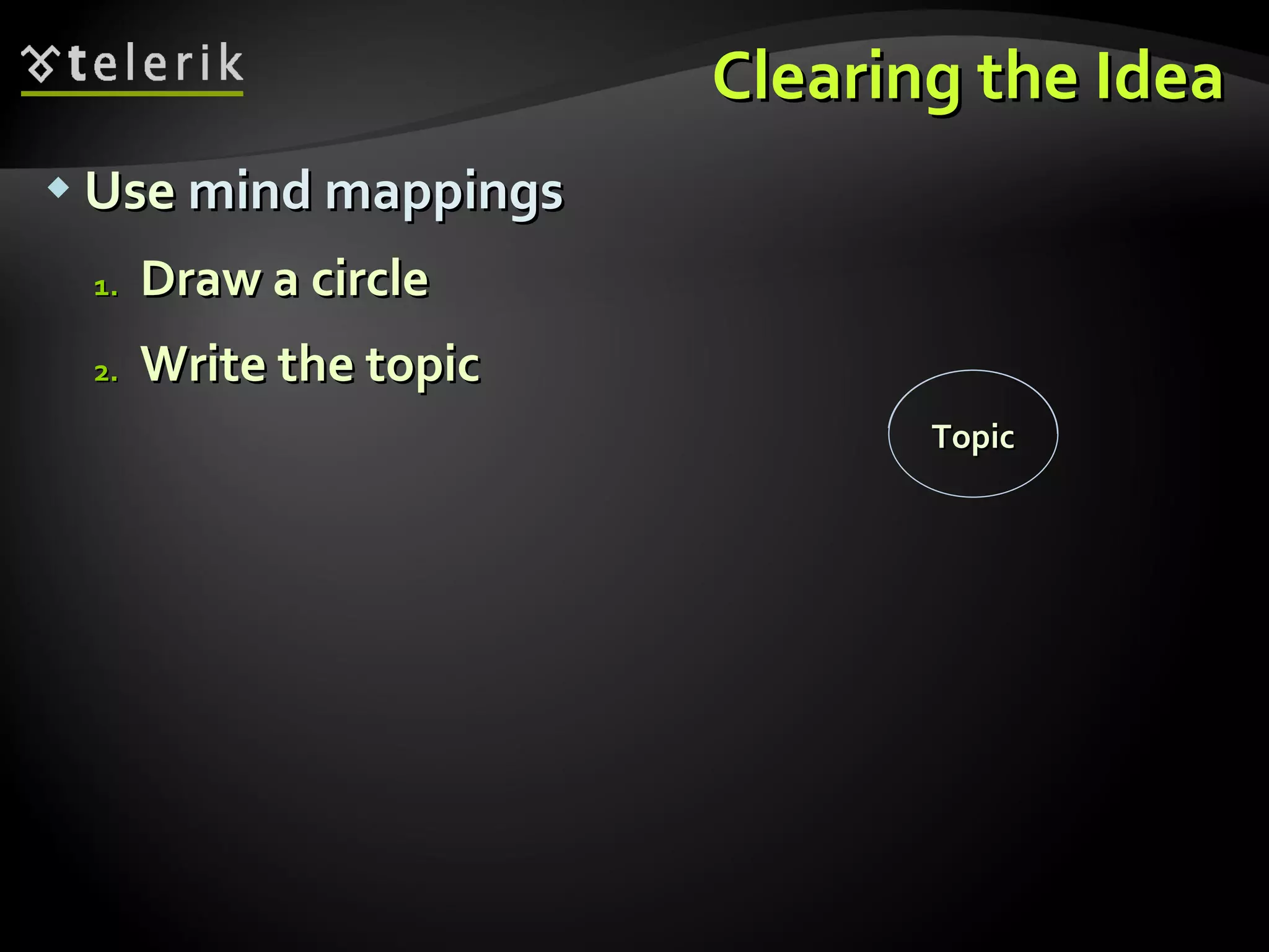
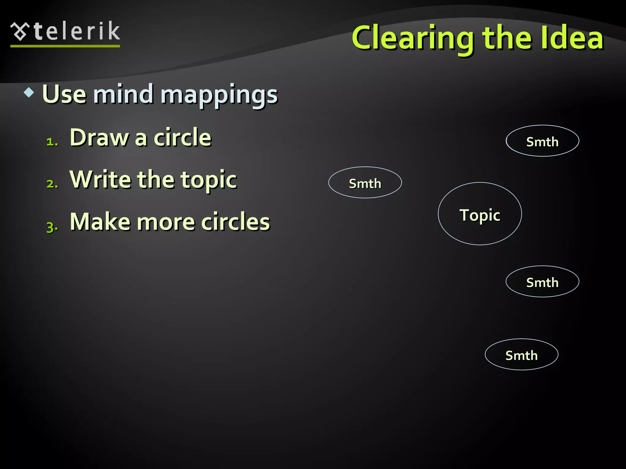
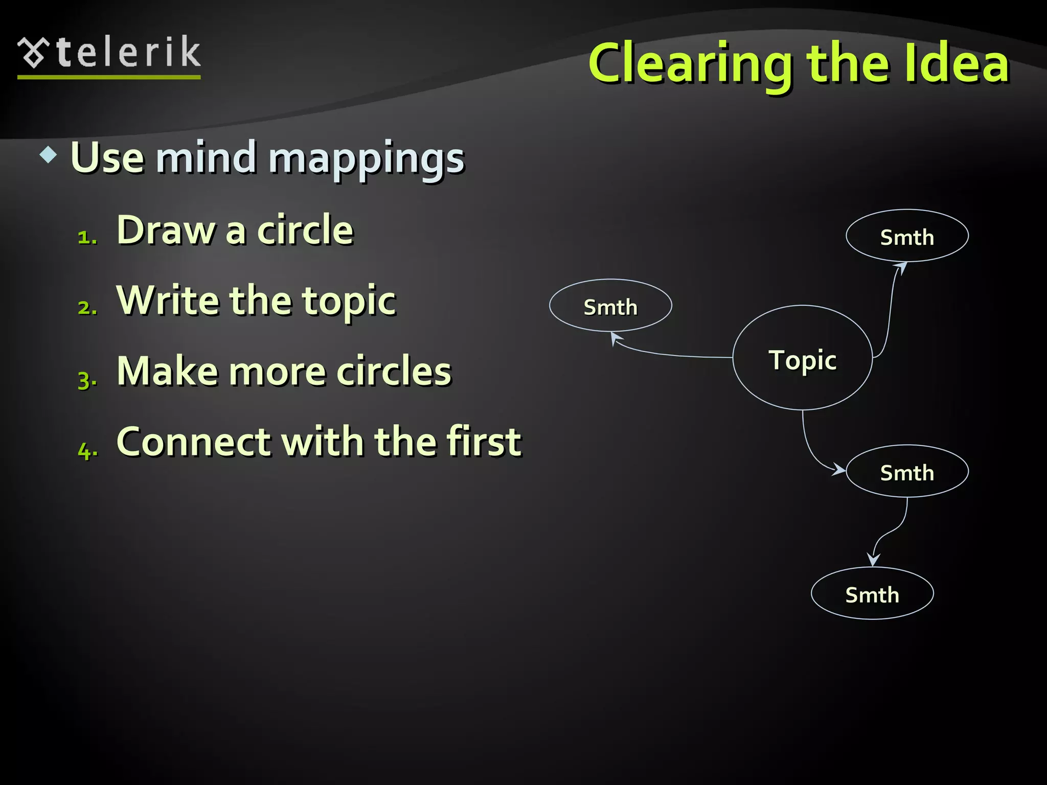
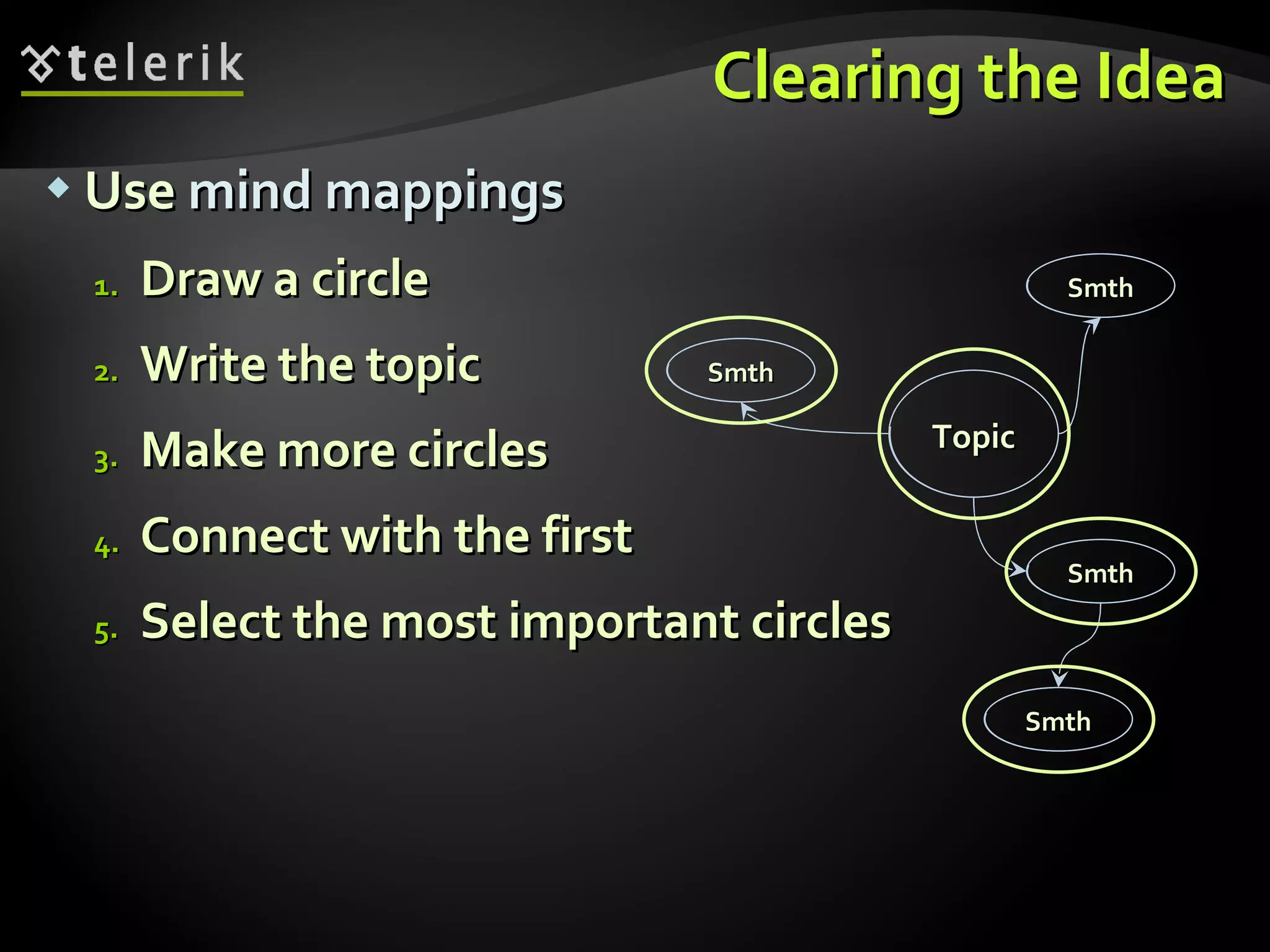
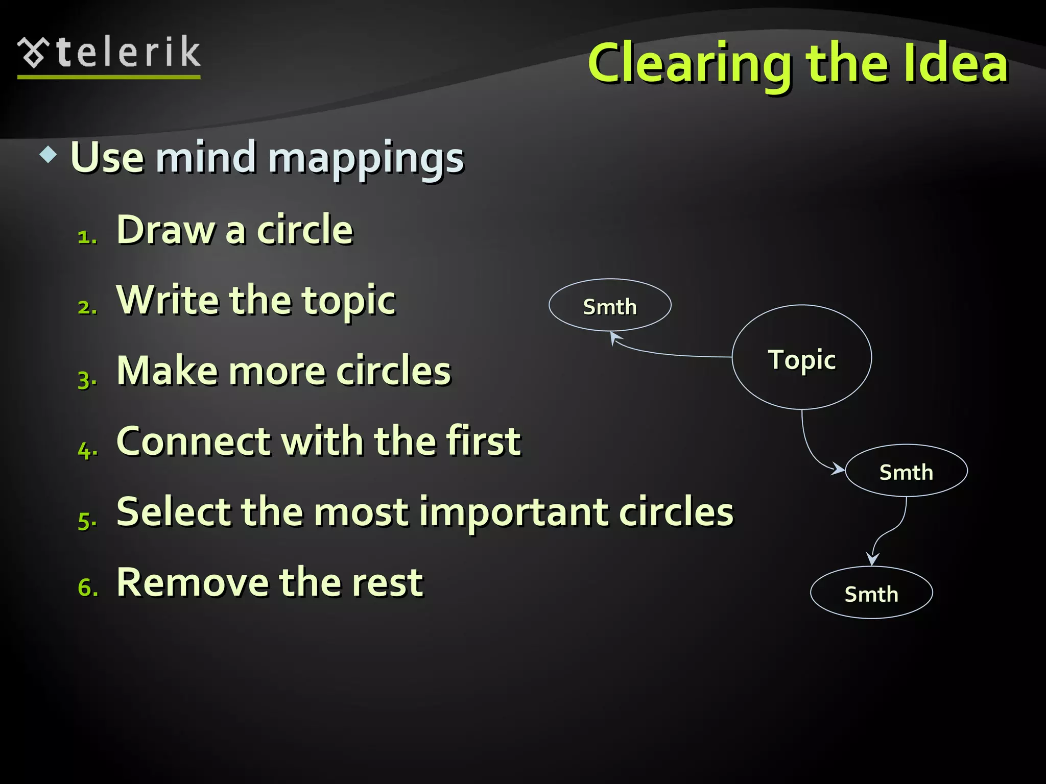
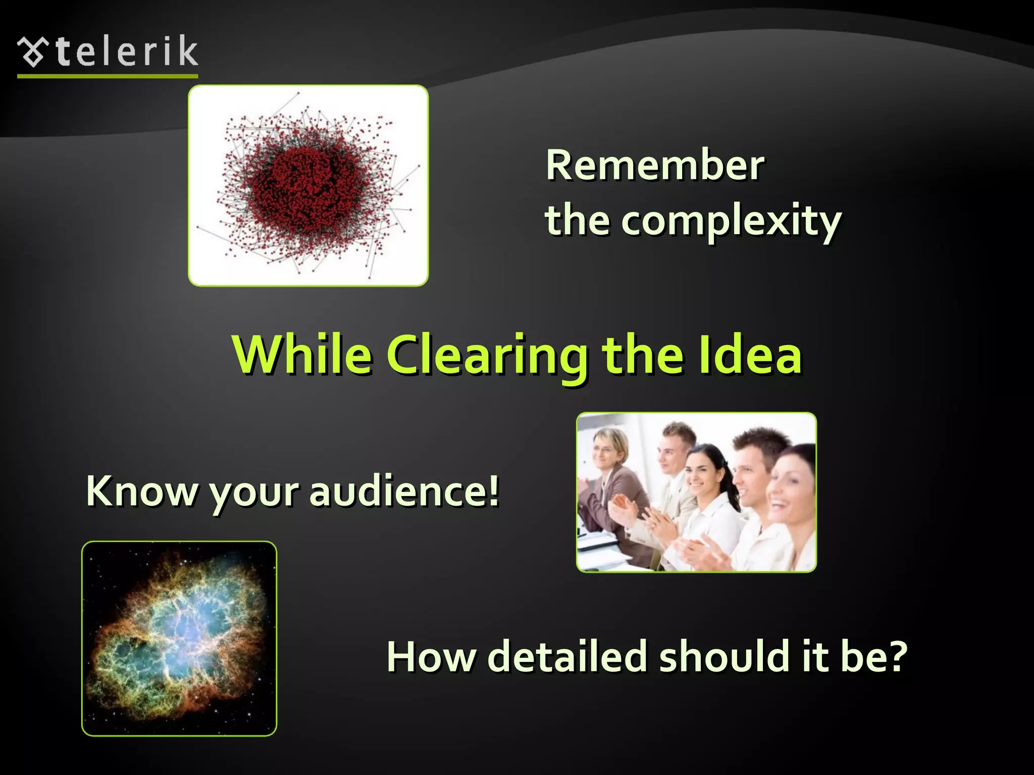
Guide on defining core topic ideas utilizing mind mapping; emphasizes on clarity for audience engagement.
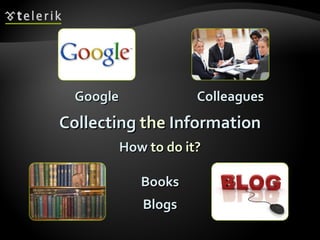
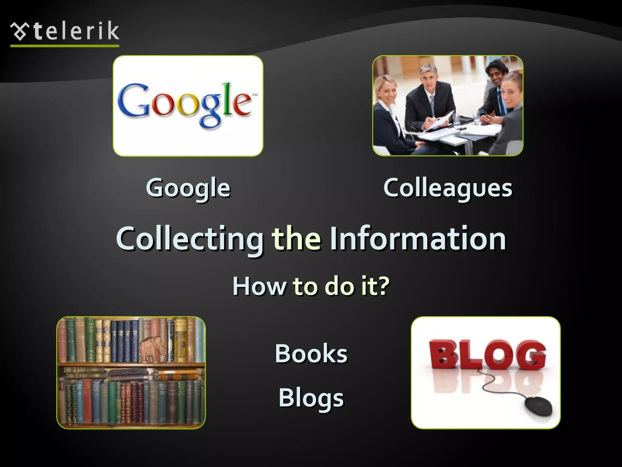
Methods for gathering presentation content through various sources such as blogs and colleagues.
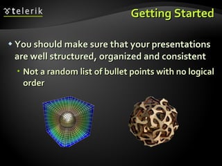
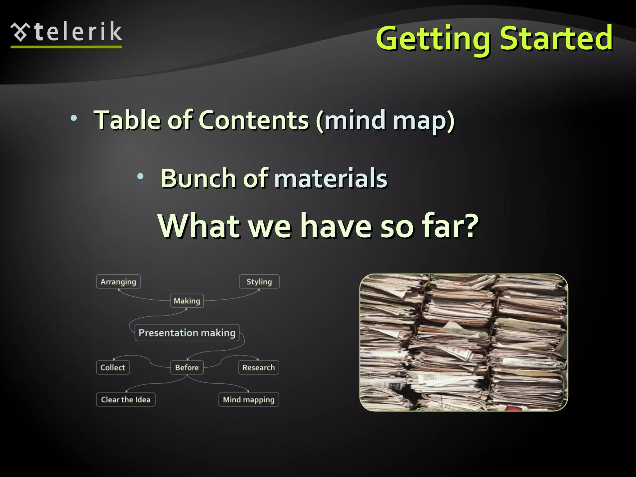
Importance of organized content structure and the initial steps to create a presentation framework.
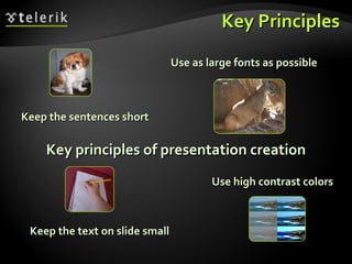
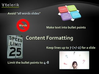
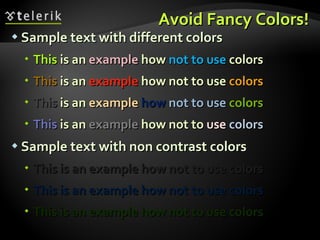
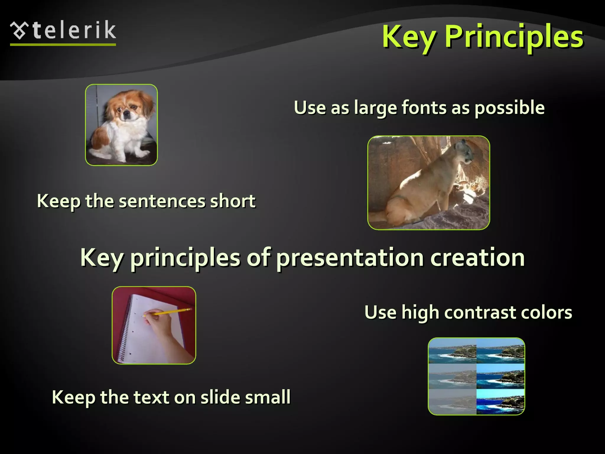
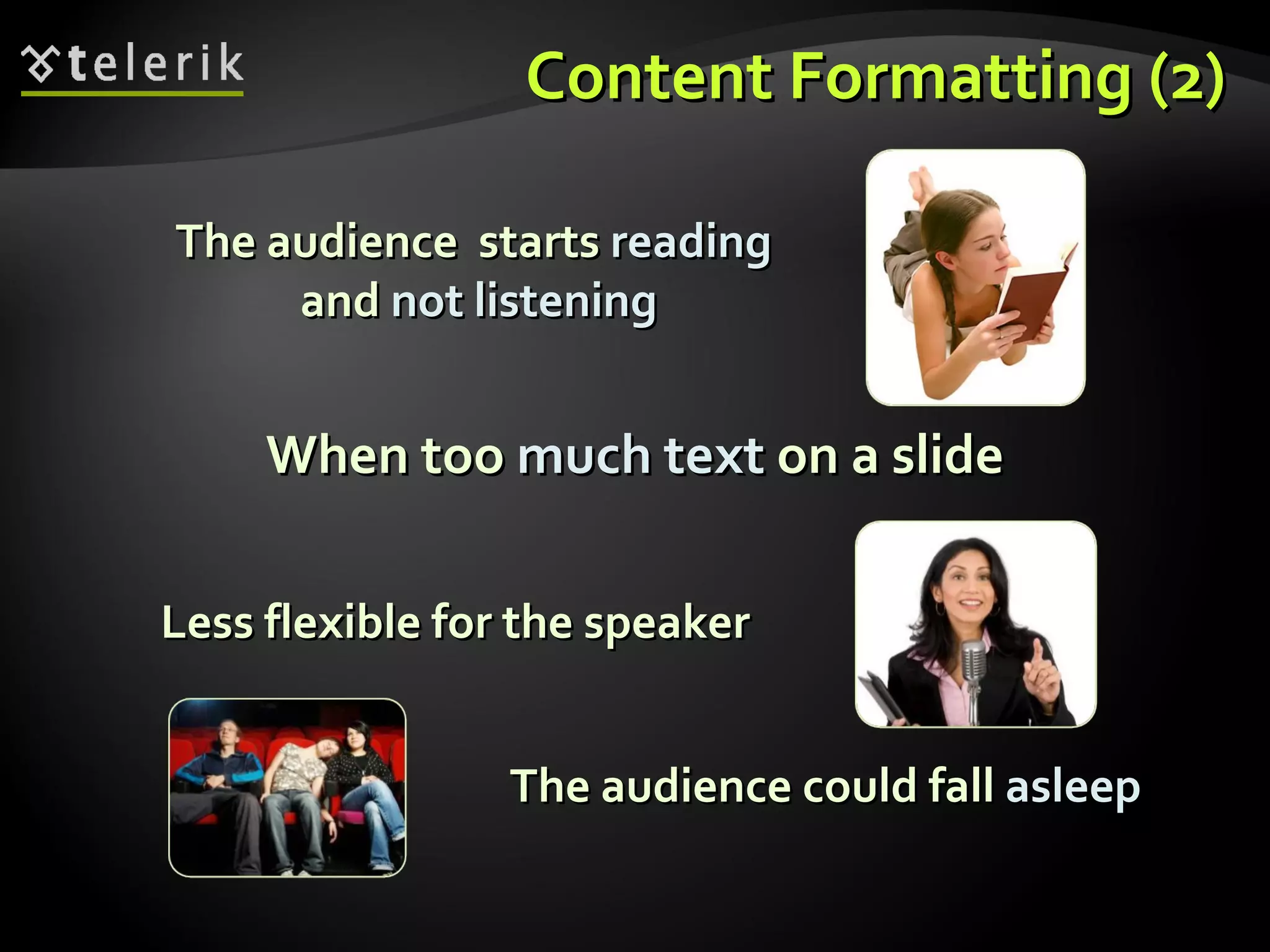
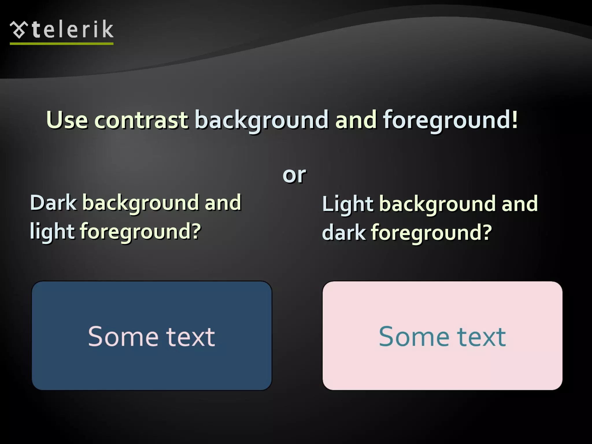
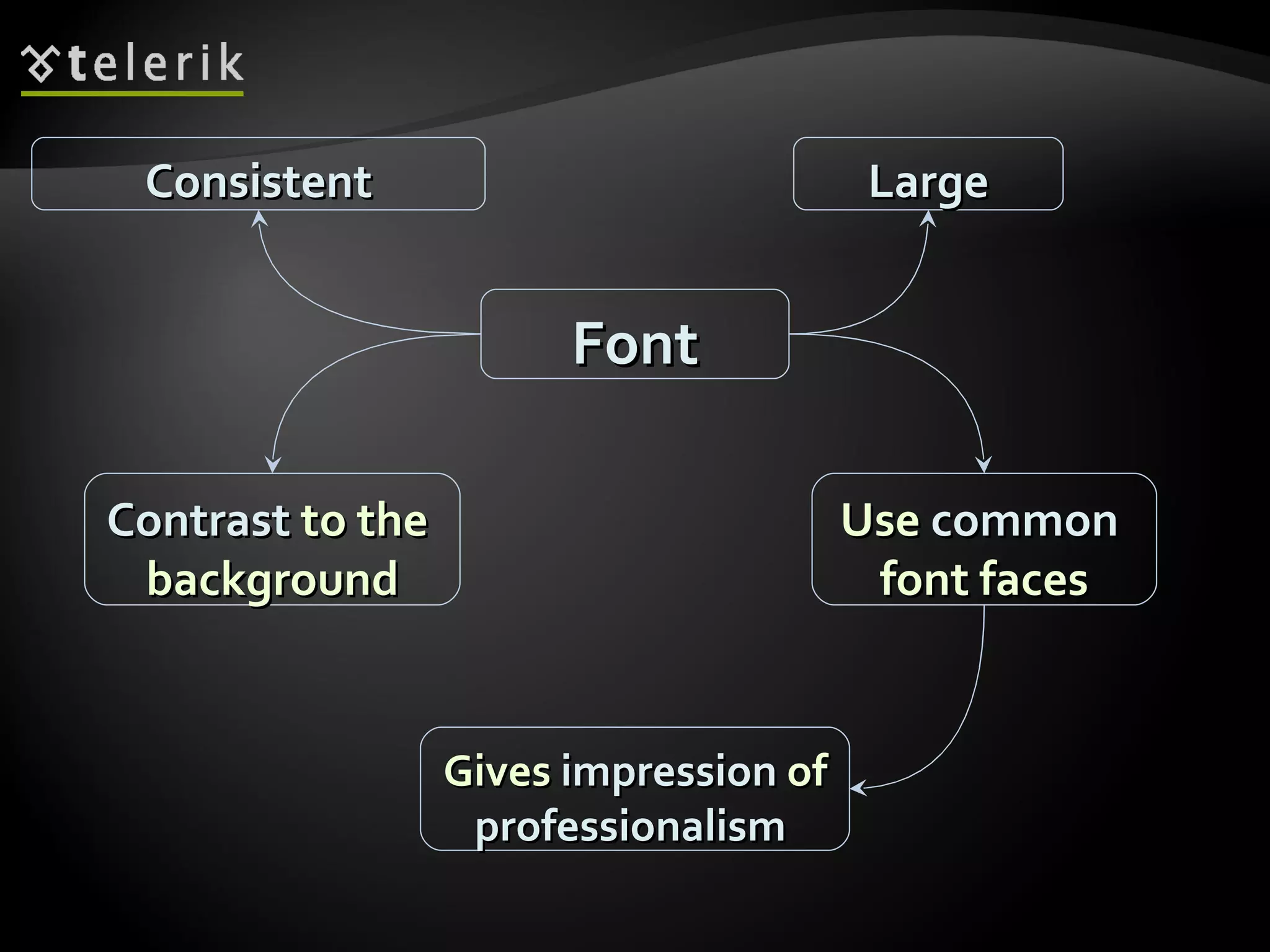
Key principles in text formatting including sentence length, contrasting colors, and slide text limits.
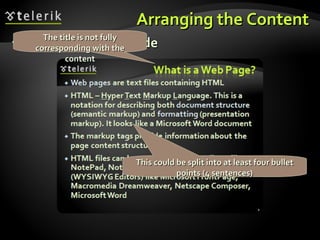
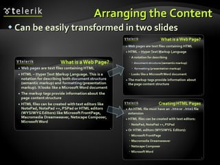
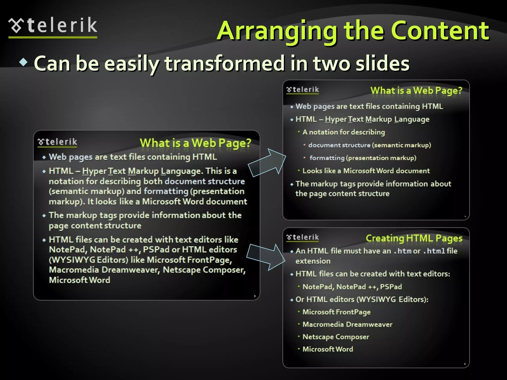
Strategies for effectively arranging and splitting content into digestible slides for better understanding.
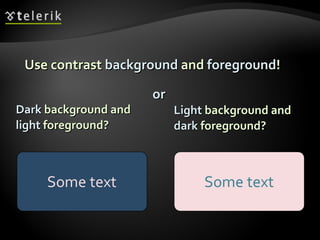
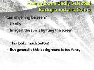
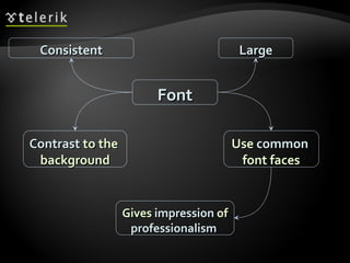
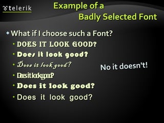
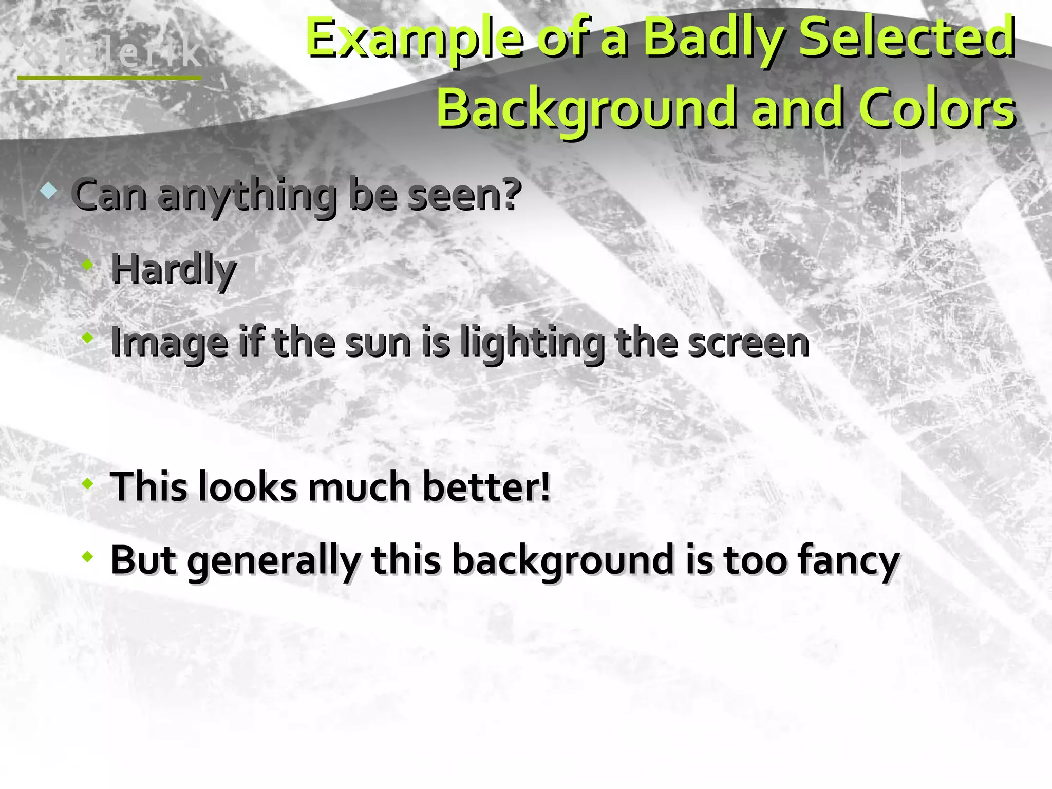
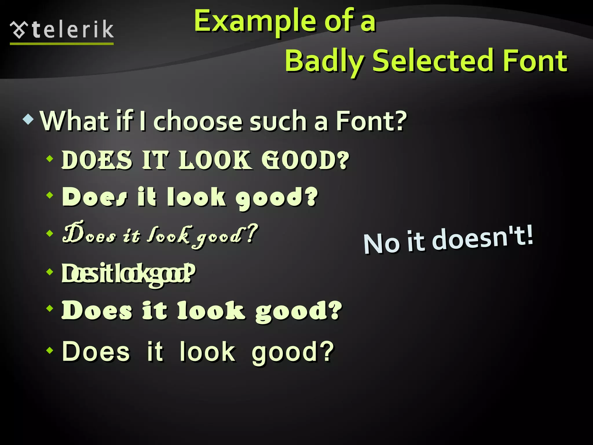
Guidelines on appropriate background, font, and colors to enhance presentation visibility and professionalism.
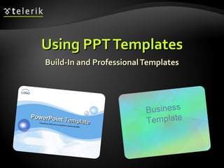
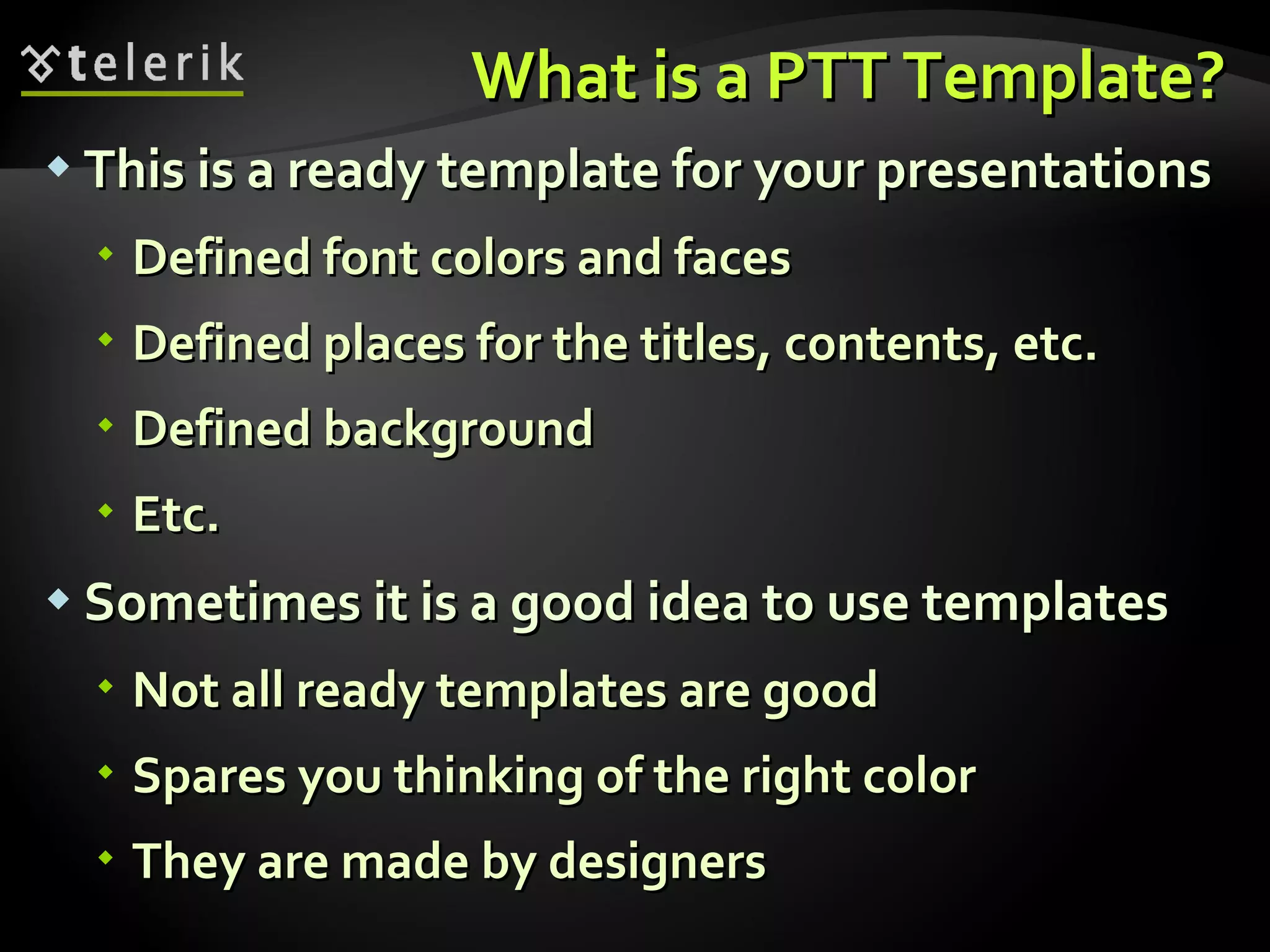
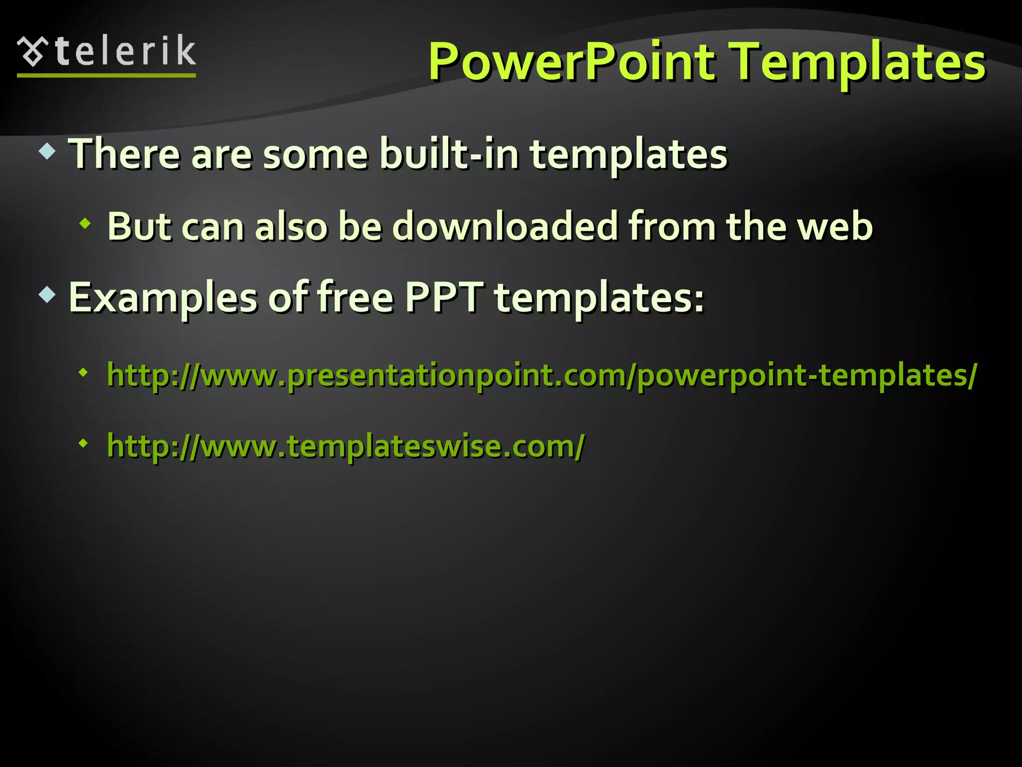
Definition and benefits of using PowerPoint templates for efficient presentation design and layout.
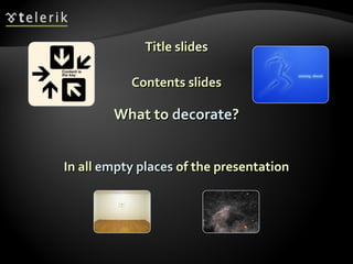
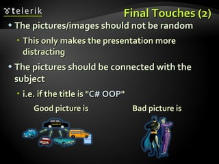
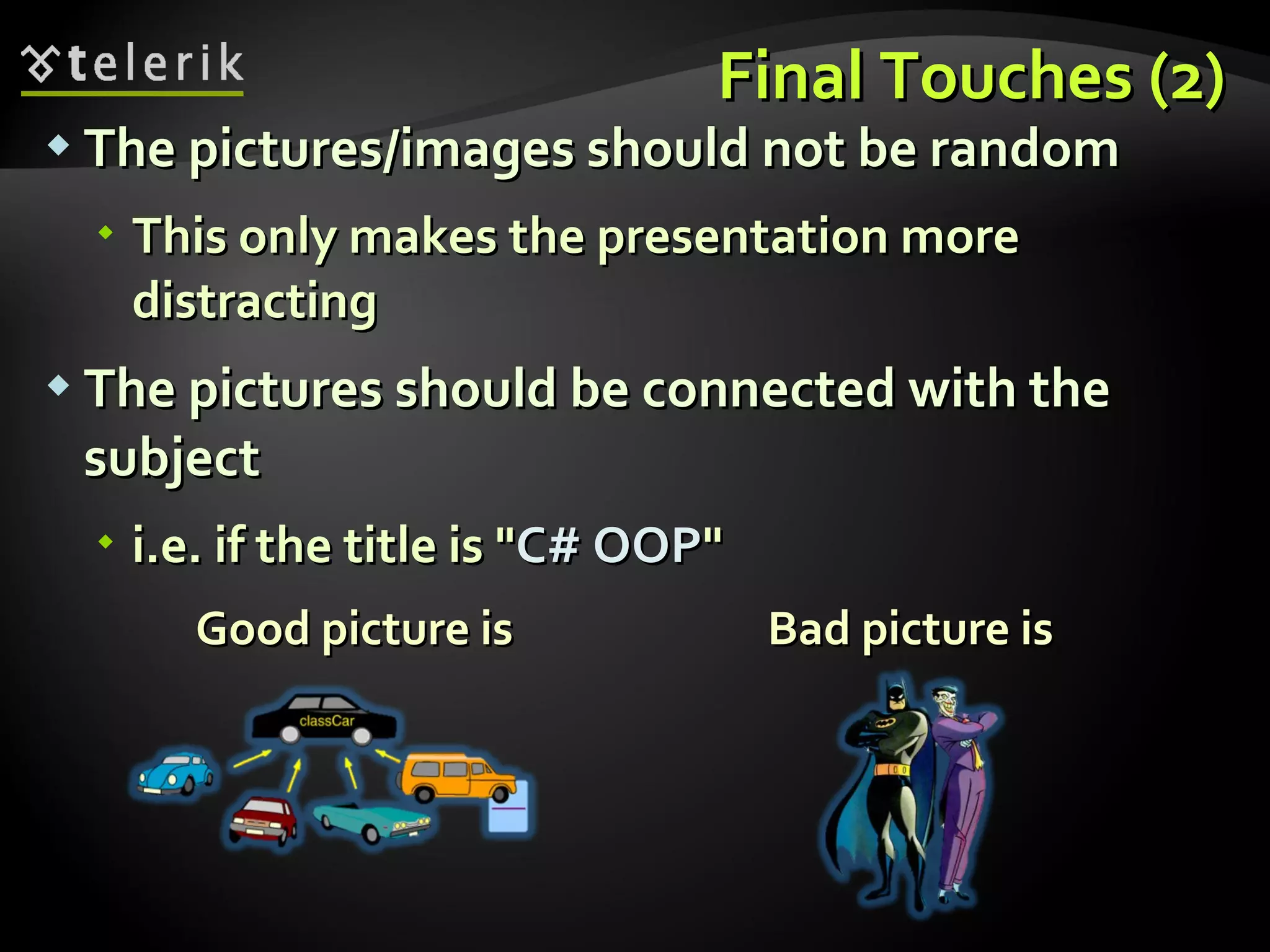
Recommendations on visually enhancing presentations without distractions and keeping relevance to the topic.
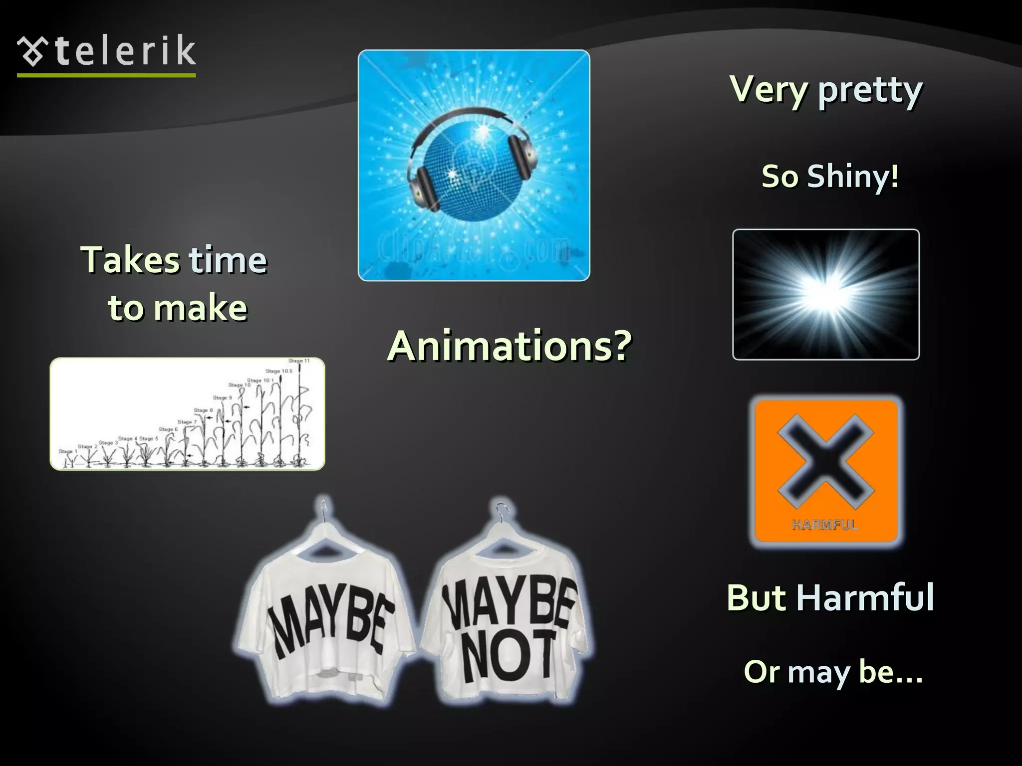
Advice on using media and animations effectively while summarizing the key aspects discussed in the presentation.
Recap of main topics covered in the presentation making guidelines.


