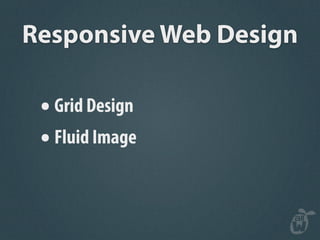
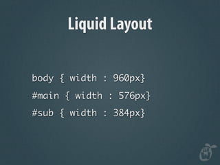
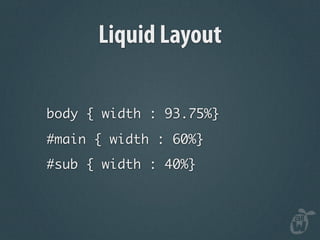
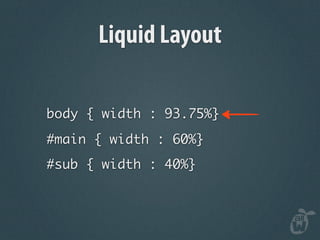
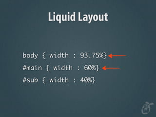
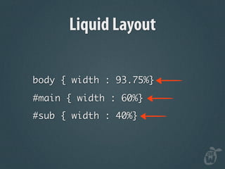
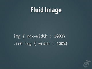
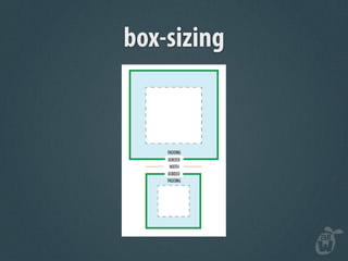
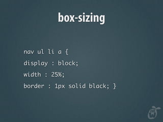
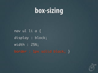
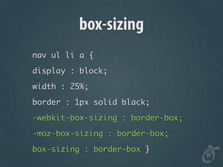
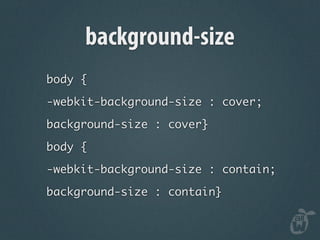
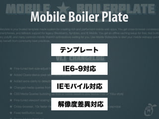
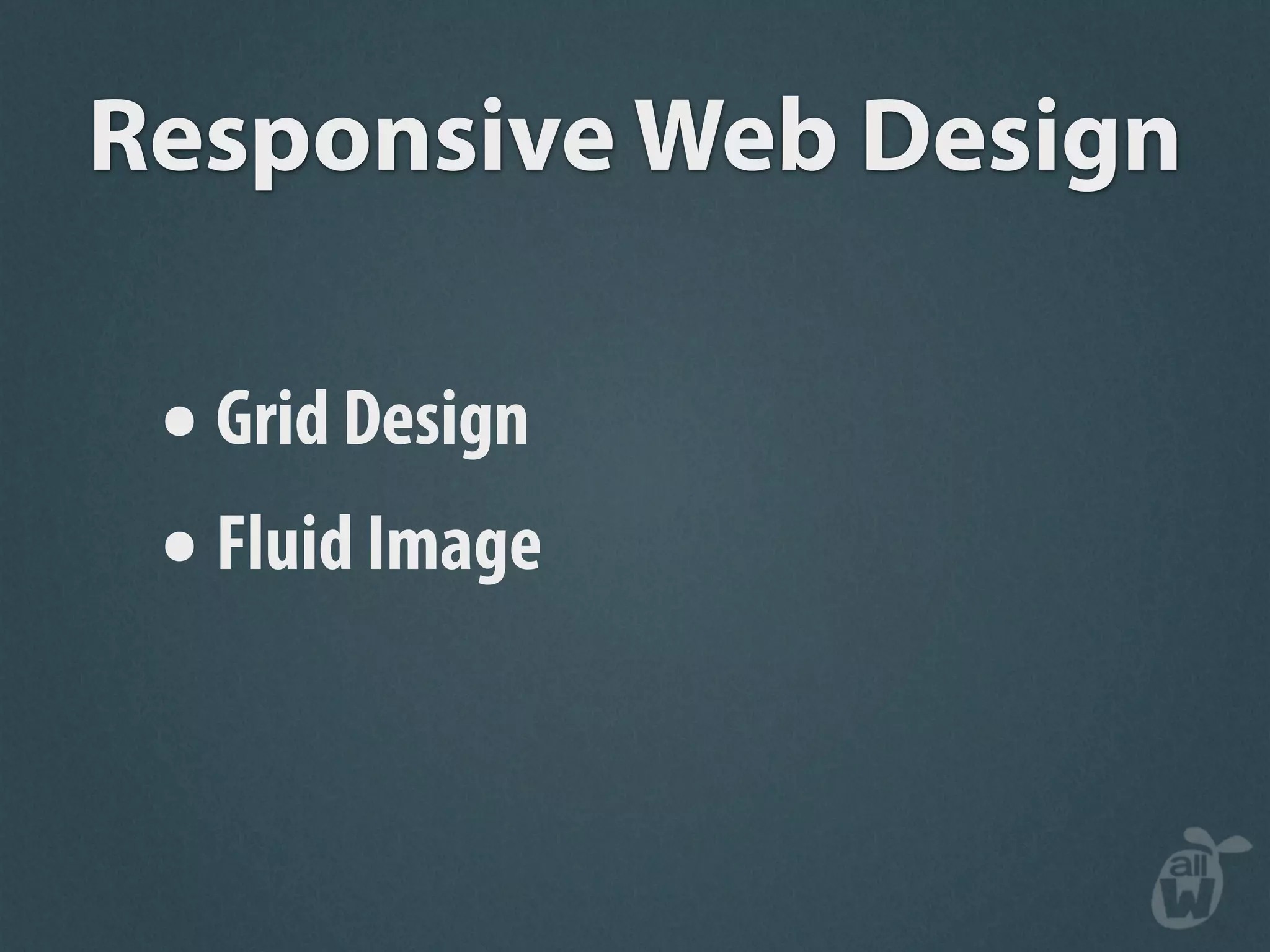
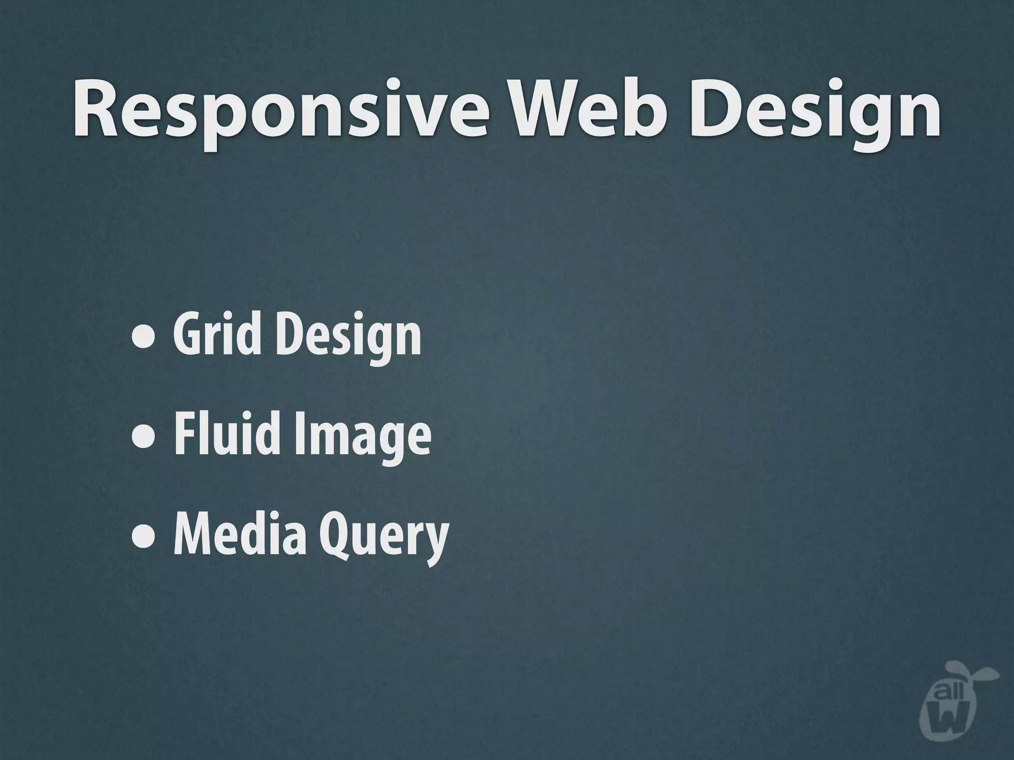
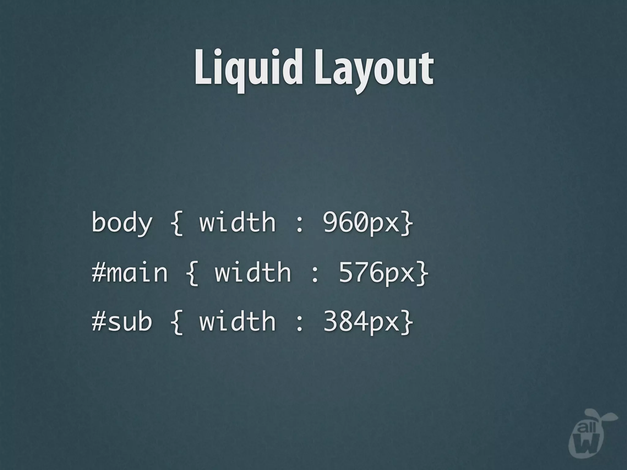
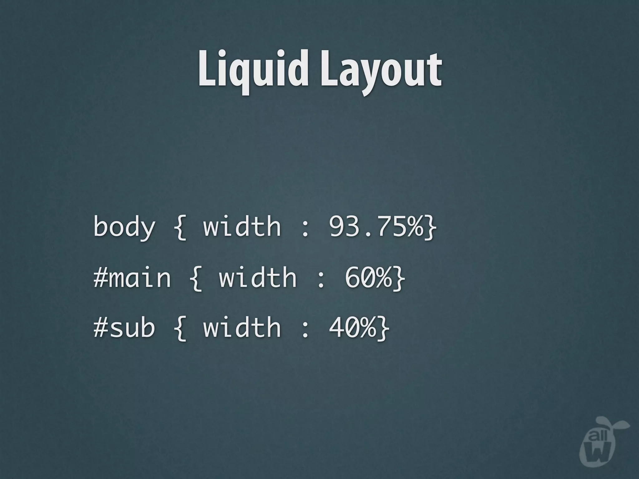
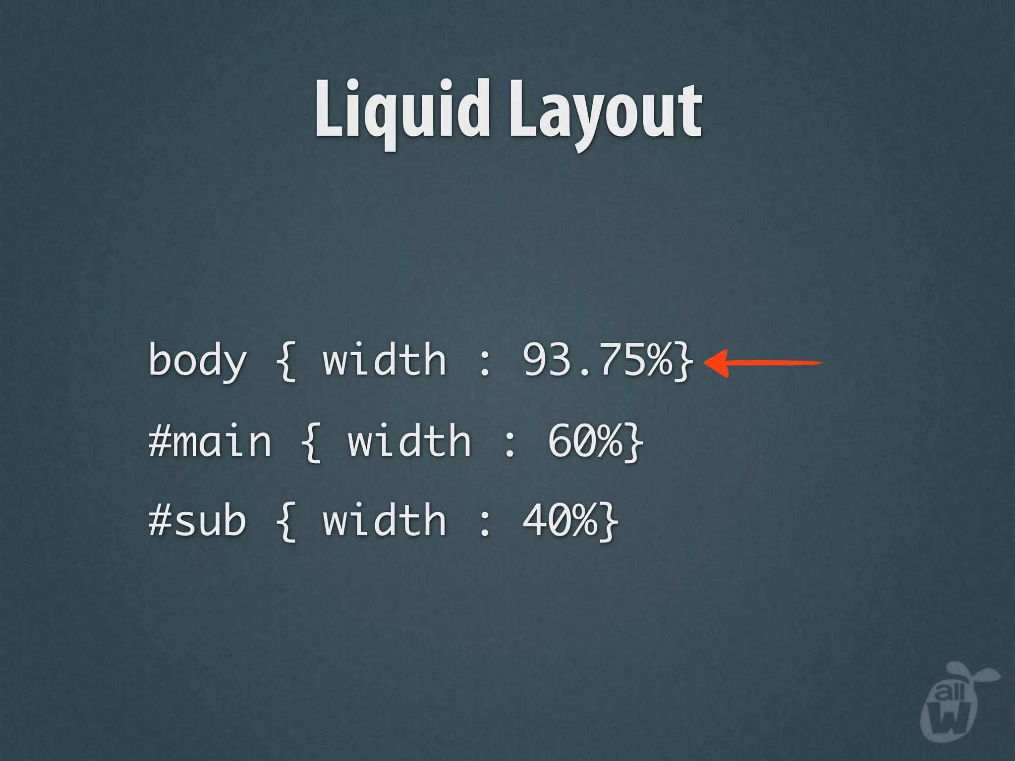
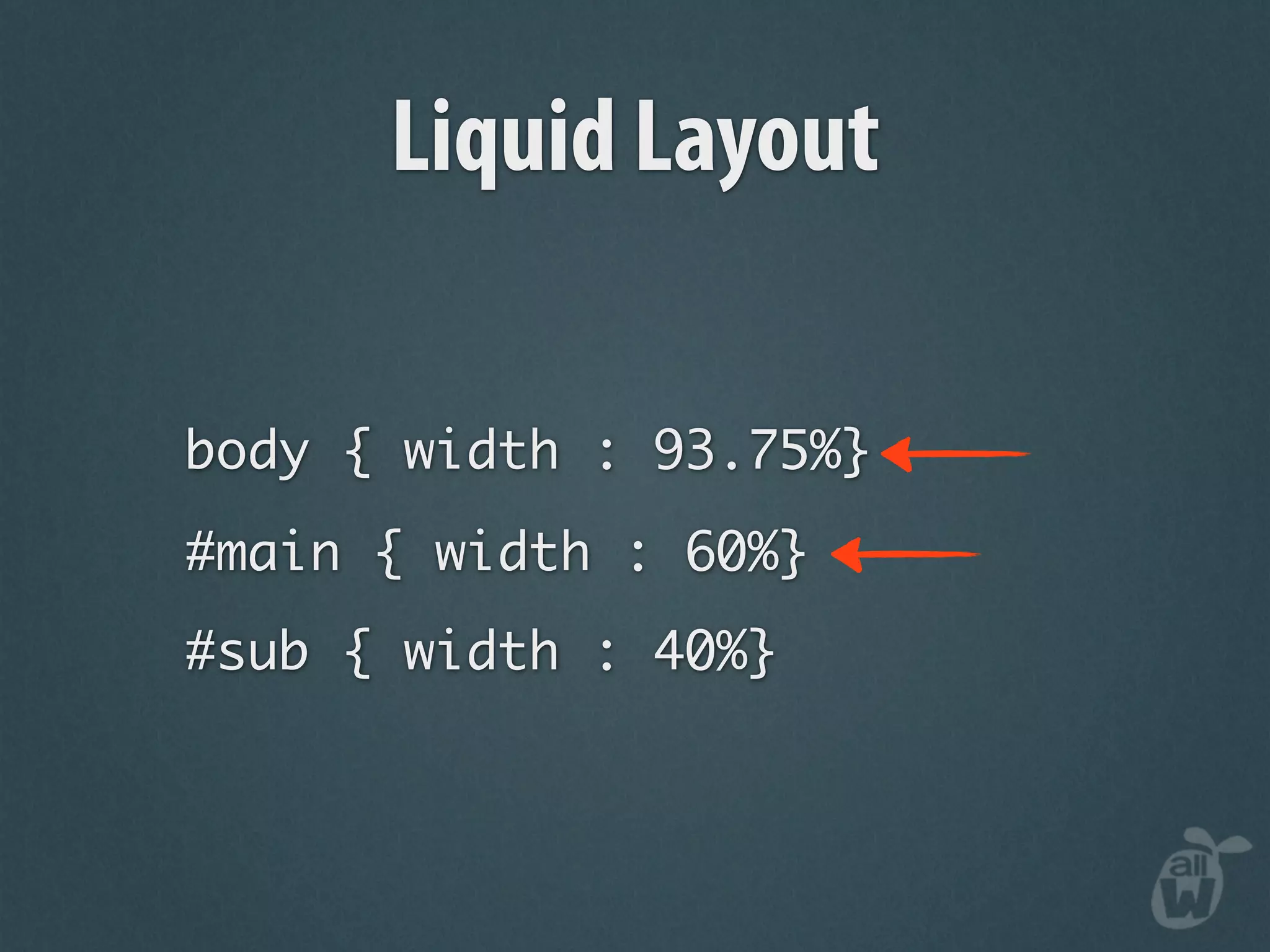
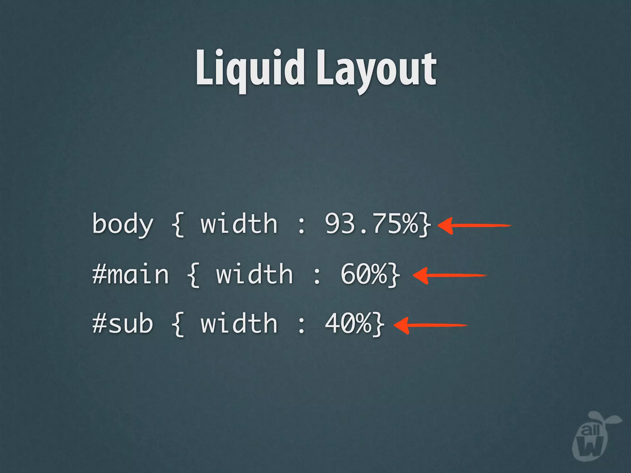
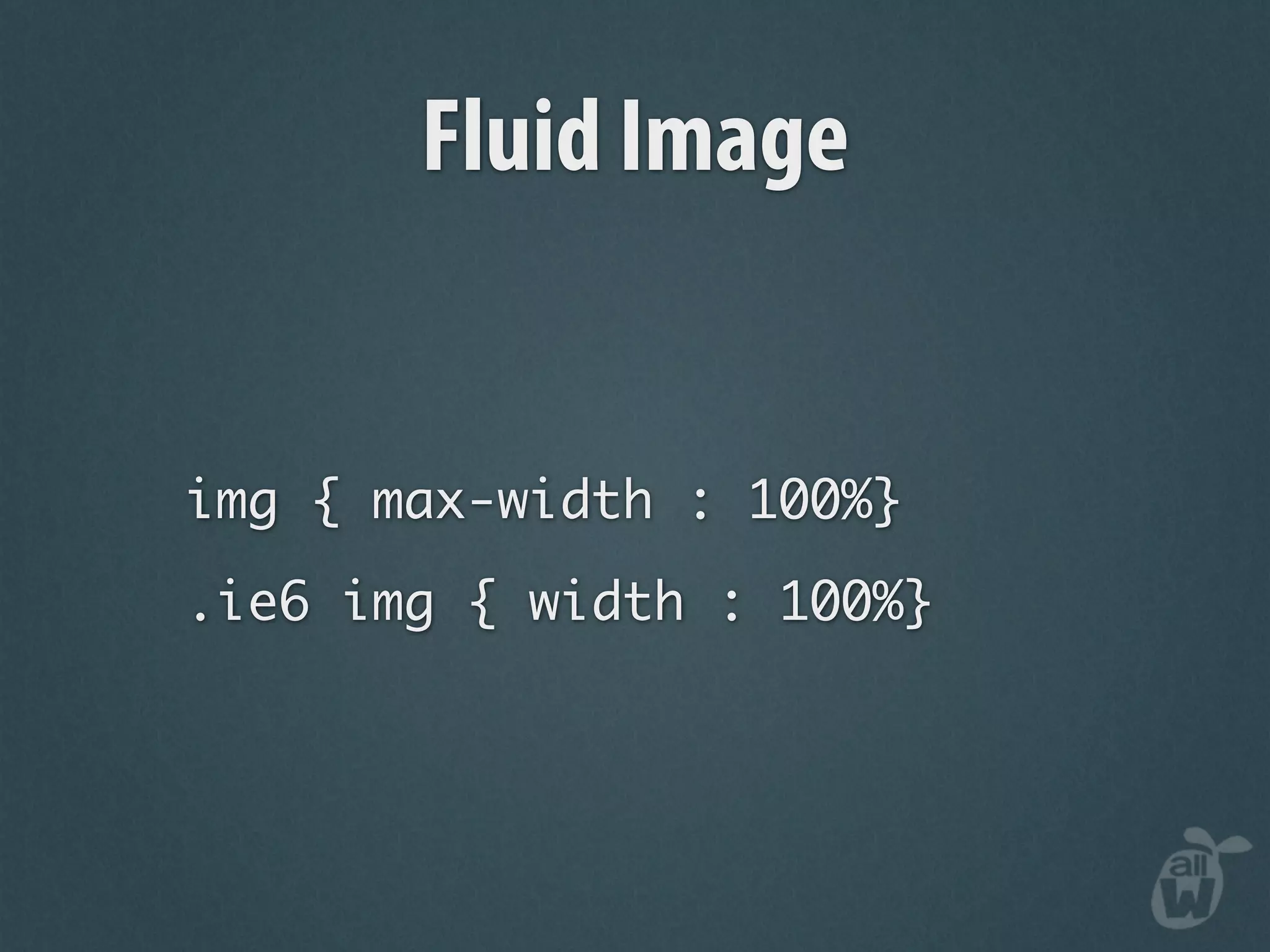
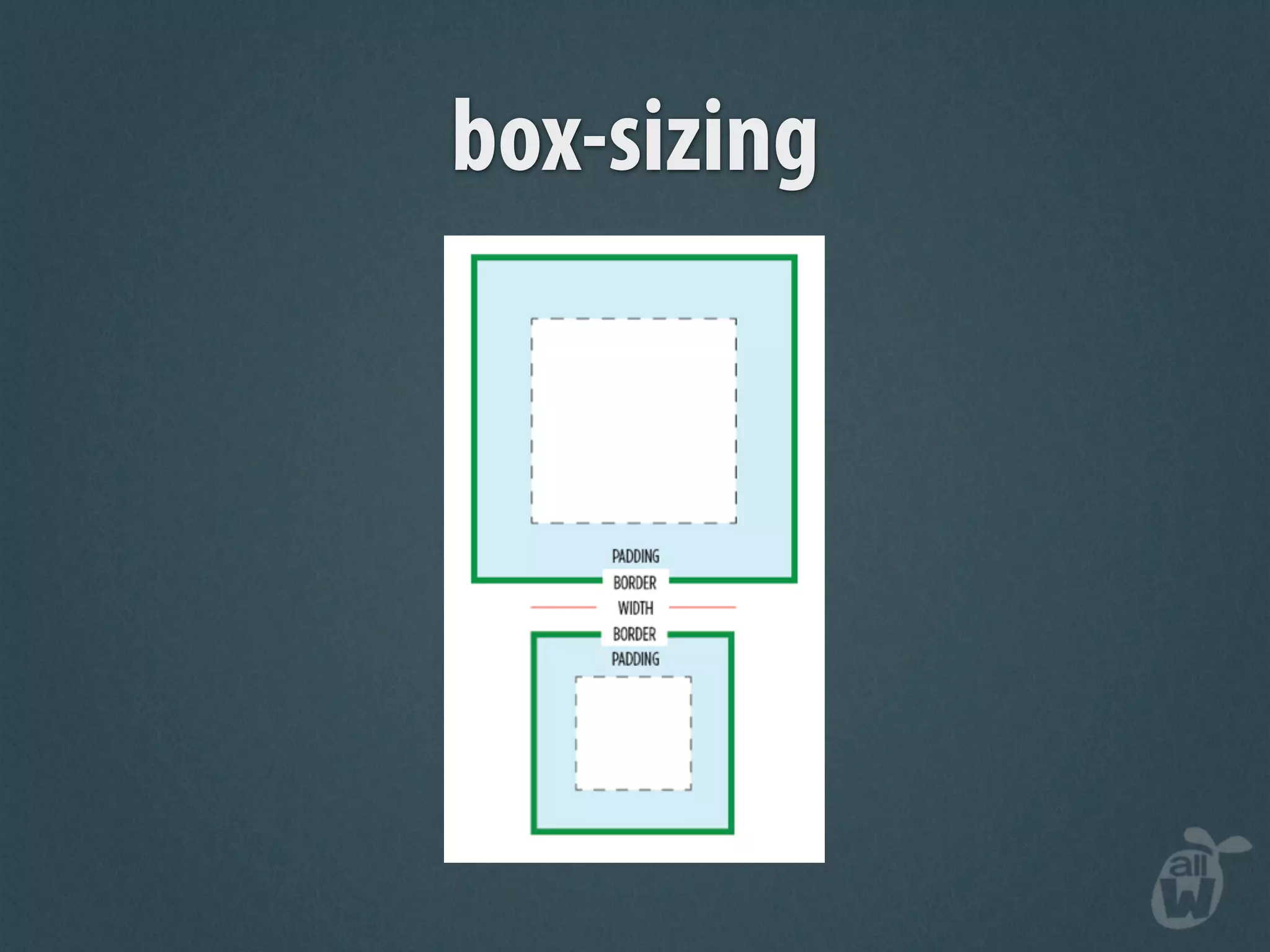
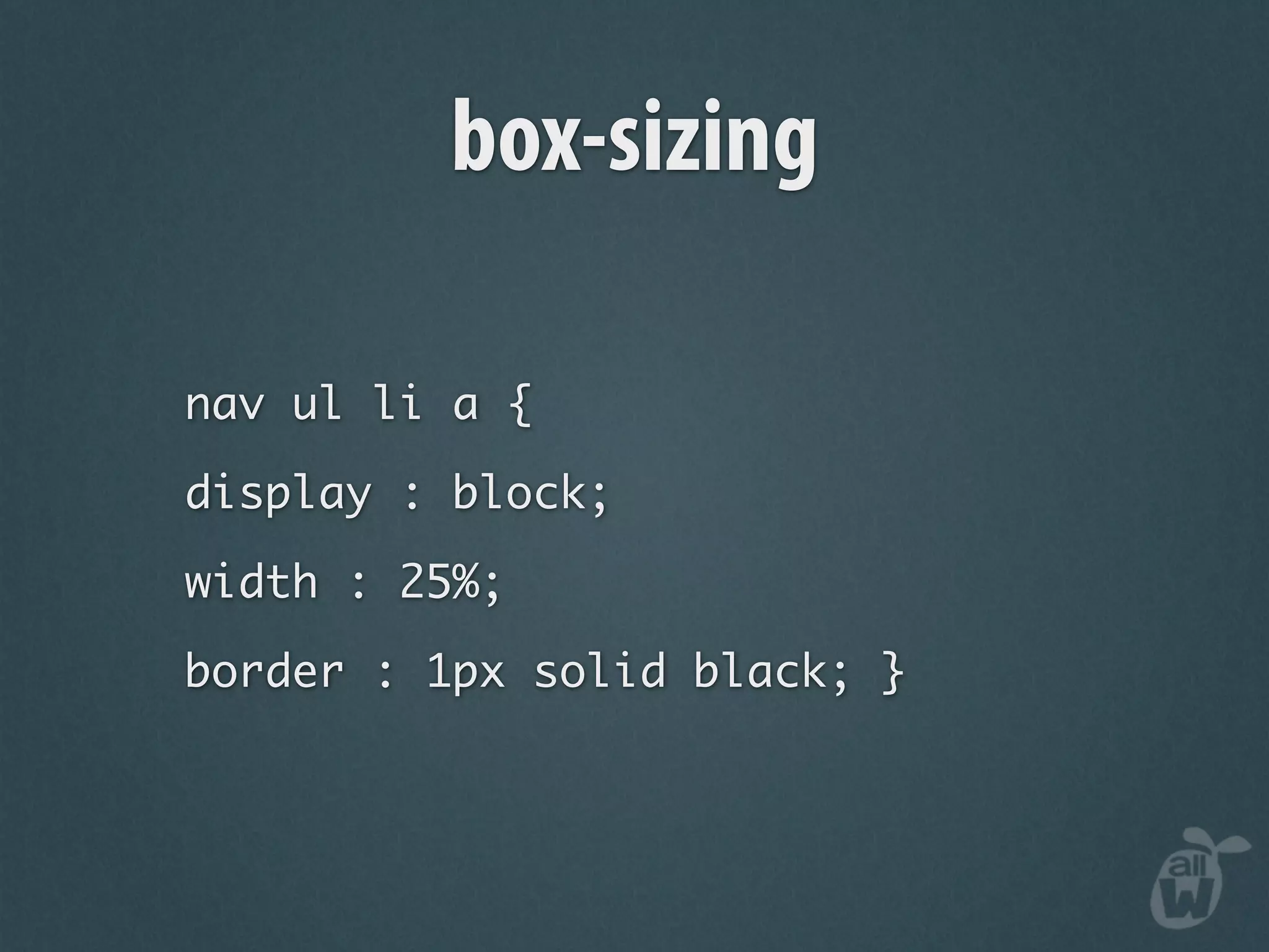
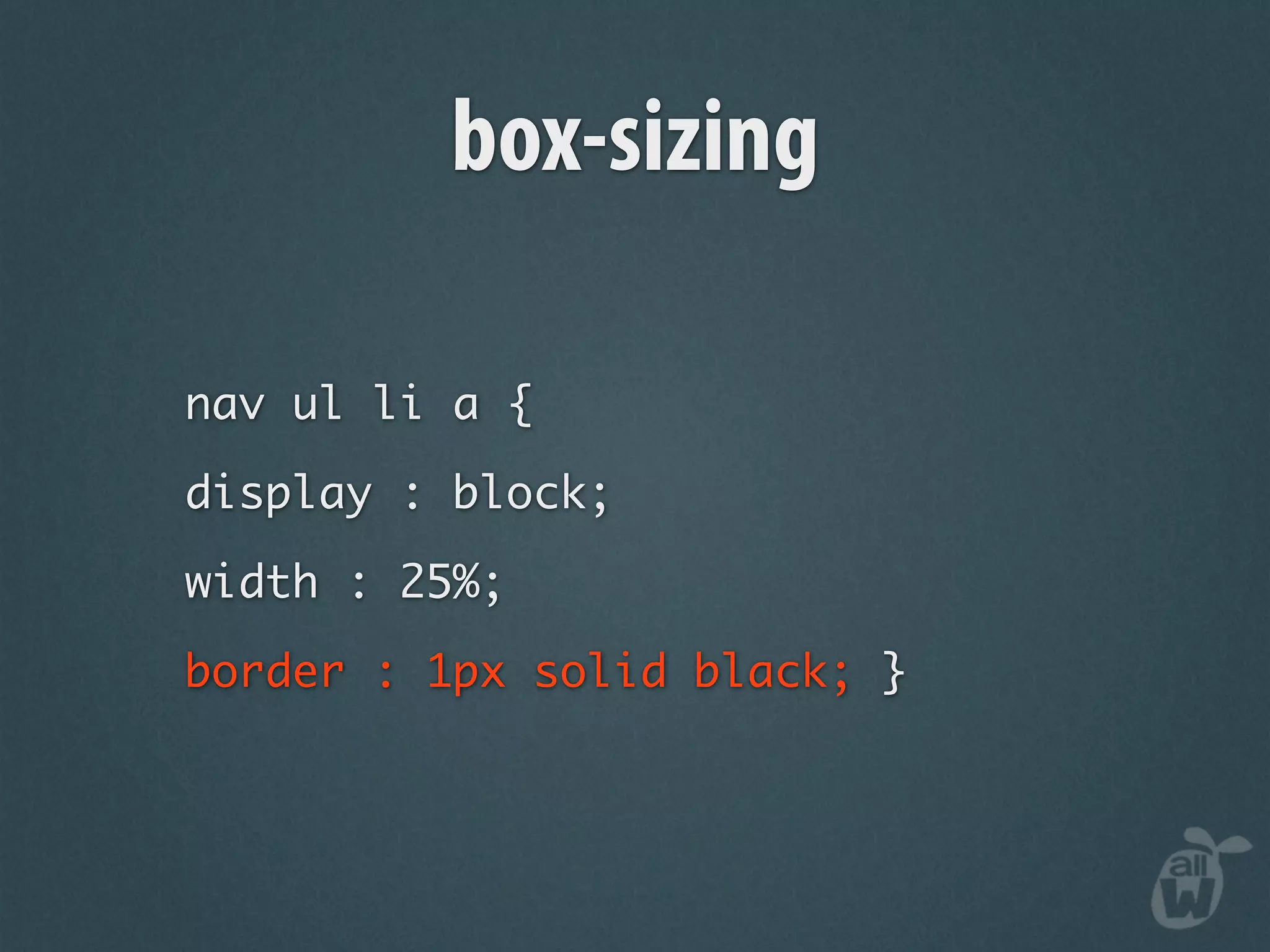
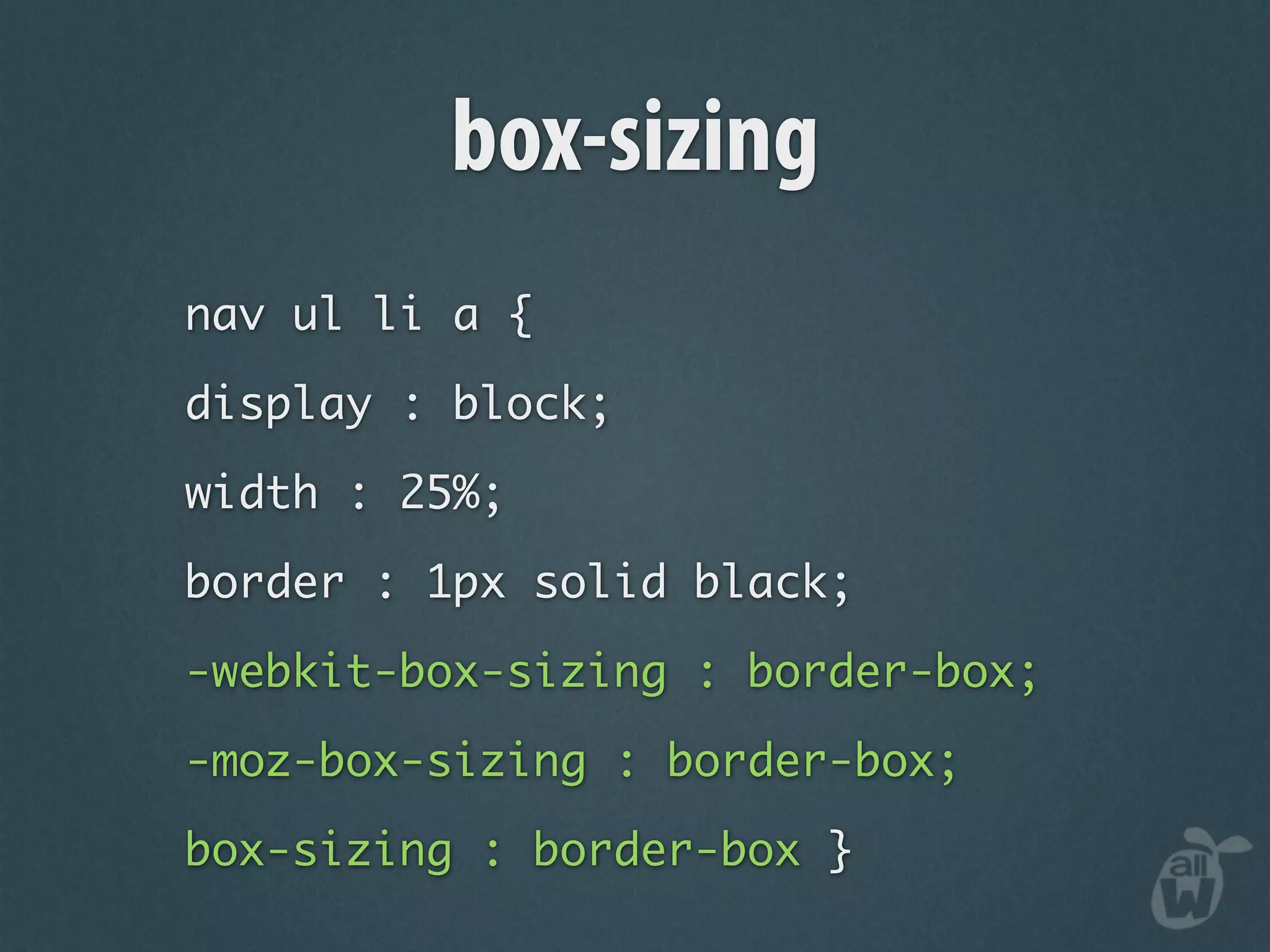
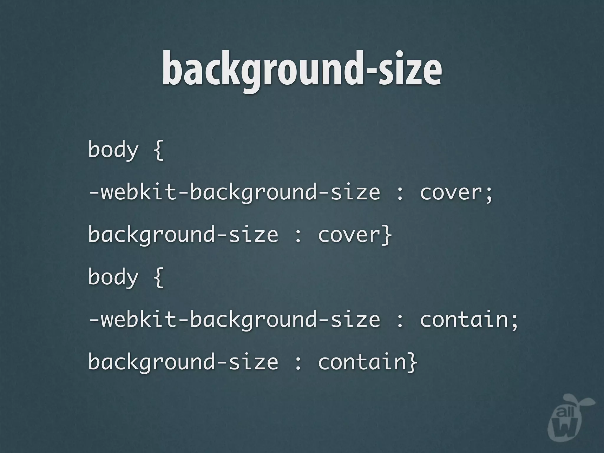
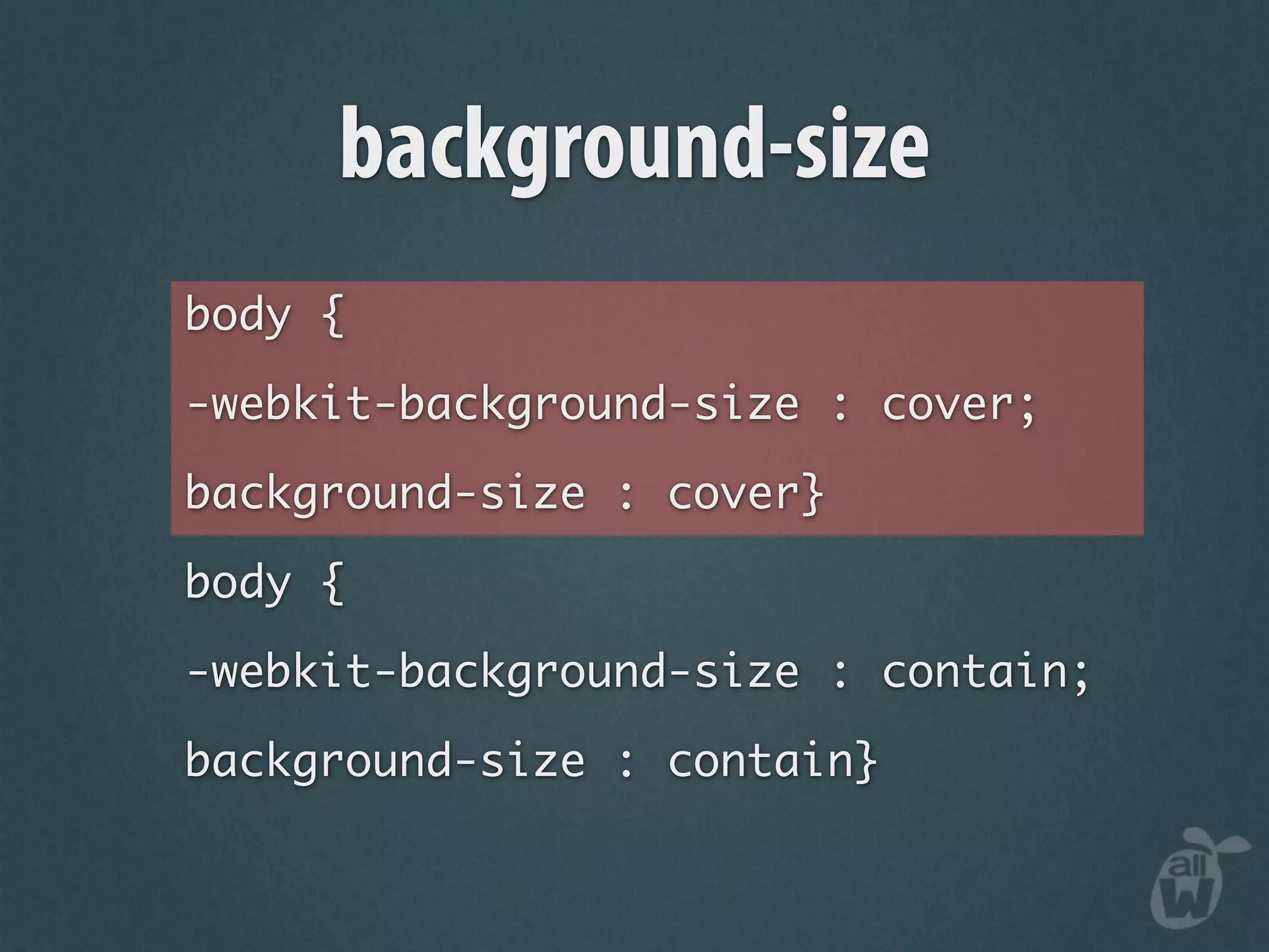
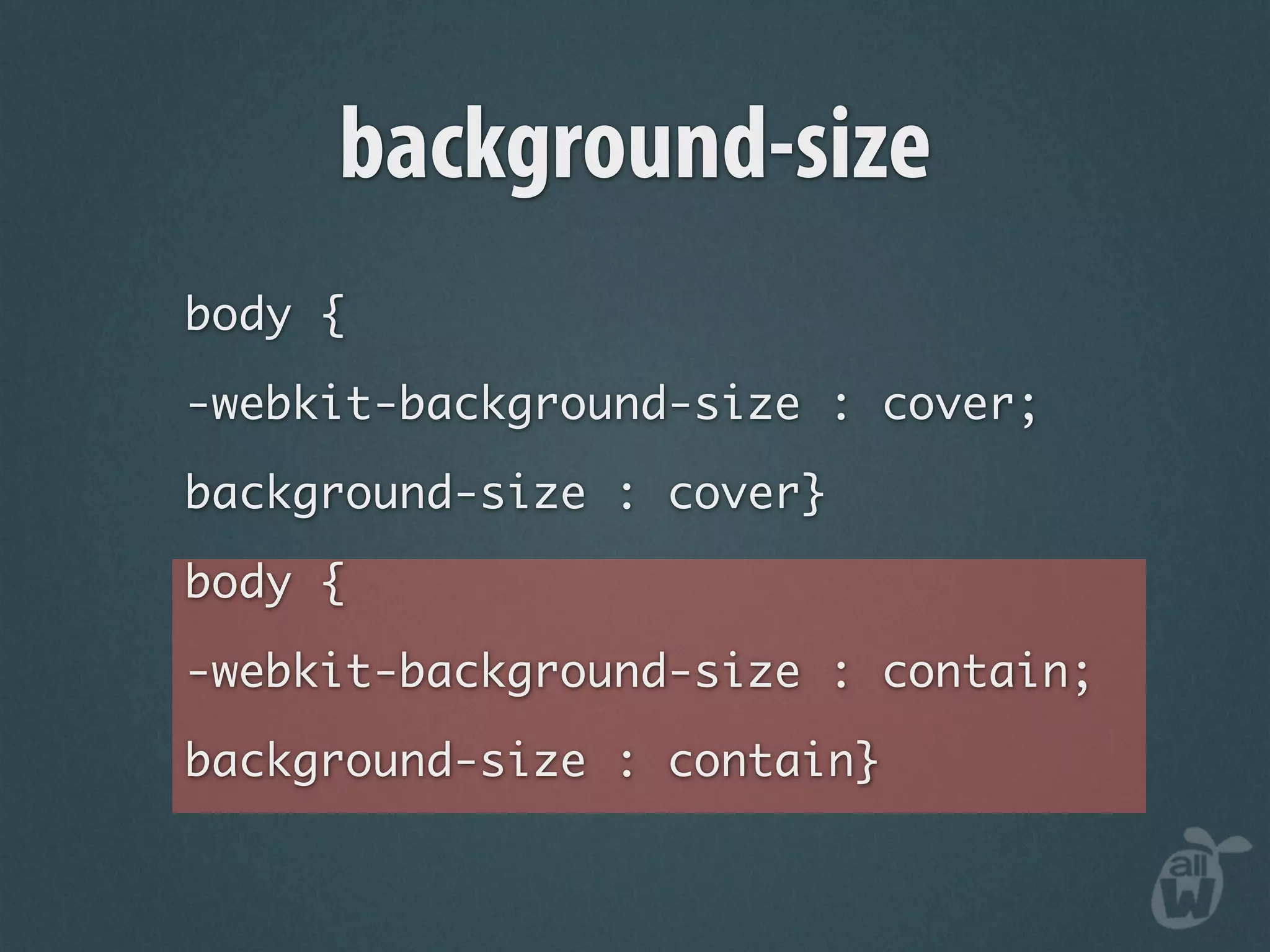
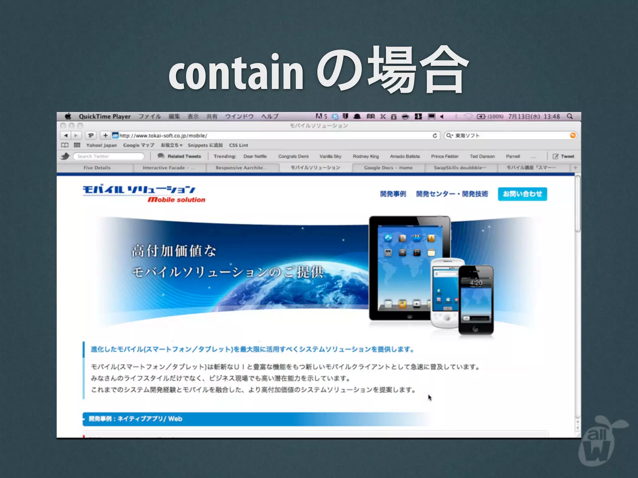
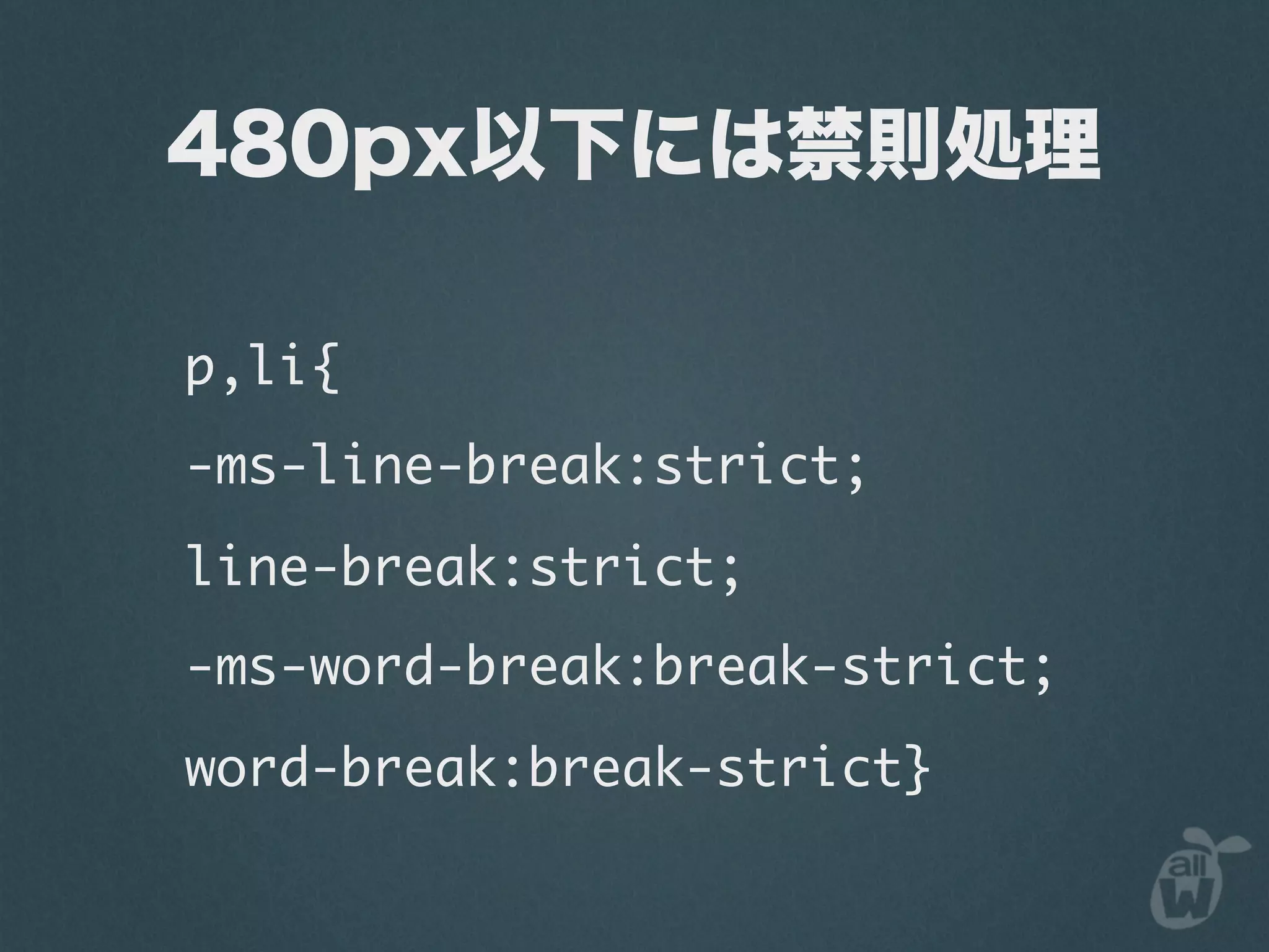
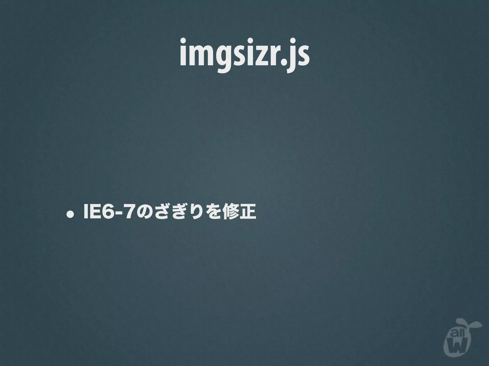
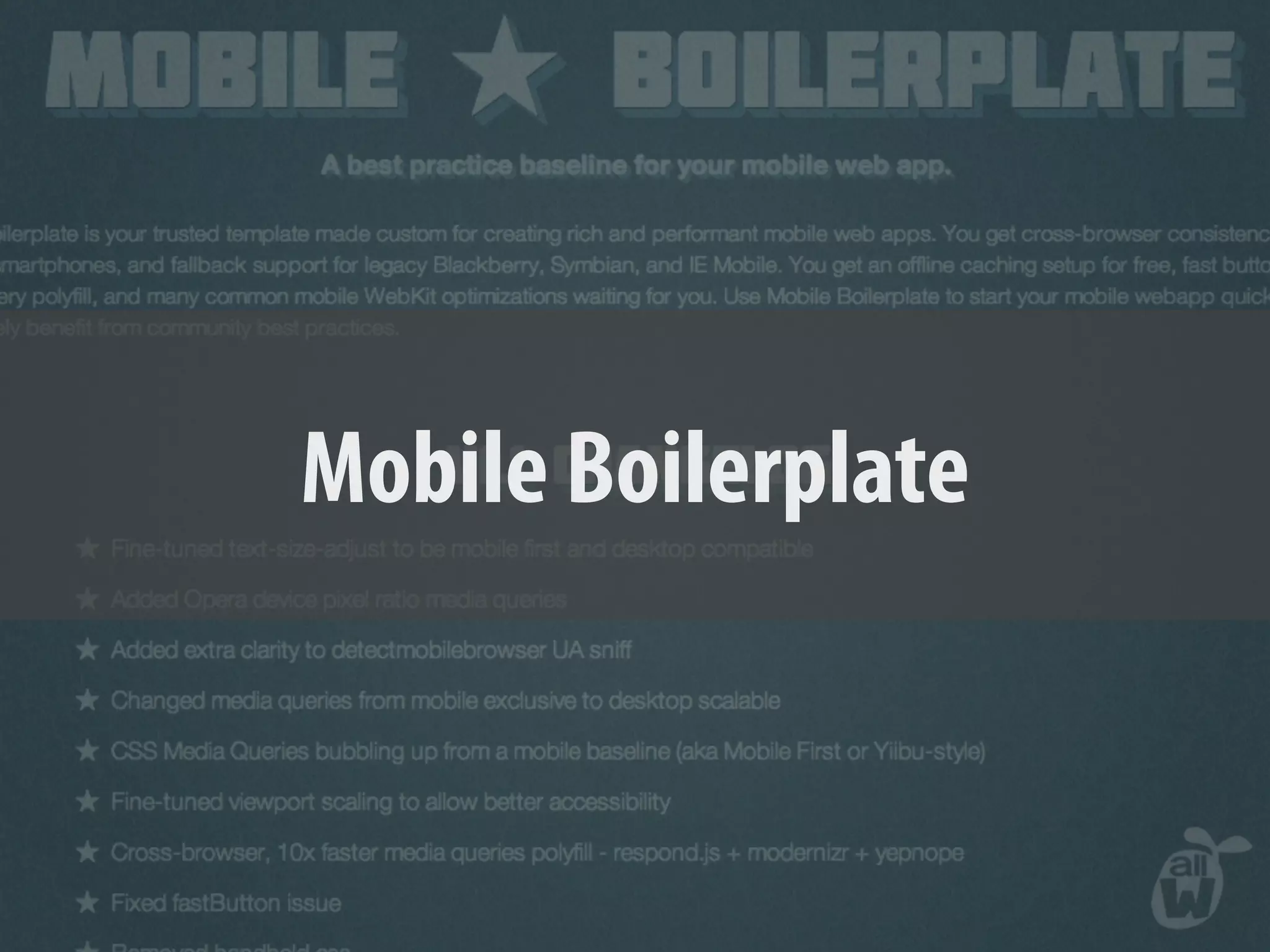
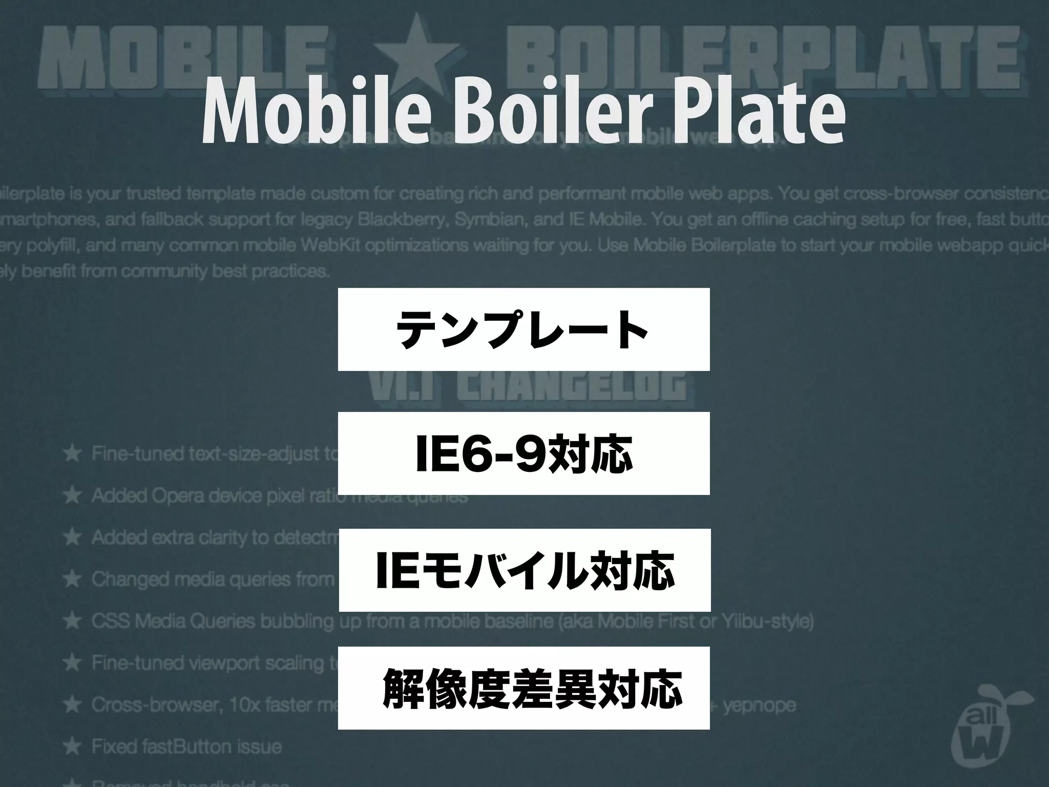
KEMBAR78
Responsive Web Design HTML5勉強会 | KEY
Responsive Web Design
         HTML5
2010.05
win.html
android.html       ie7.html
       win.html
                  mac-safari.html
  ie6.html
   ie8.html


                  iphone.html
 opera.html
win.html
android.html            ie7.html webm
 ie8.html
            win.html
                       mac-safari.html
   ie6.html                  H264
                       iphone.html
 opera.html
win.html
android.html            ie7.html webm
 ie8.html
            win.html
                       mac-safari.html
   ie6.html                  H264
                       iphone.html
 opera.html
Android
Ginger Bread
Android2.3
Android3.0
Android2.3
smart TV
TV in the bath
car navigation
Yes We Can
I’ve always thought of myself as an 80 percenter. I like to
throw myself passionately into a sport or activity until I reach
80 percent proficiency level. To go beyond that requires an
obsession and degree of specialization that doesn’t appeal to
me.


         80 percenter
Responsive Web Design
Responsive Architecture
W3C
Opera
Responsive Web Design

 • Grid Design
Responsive Web Design

 • Grid Design
 • Fluid Image
Responsive Web Design

 • Grid Design
 • Fluid Image
 • Media Query
Fluid Grid
Grid Design
Liquid Layout
Liquid Layout

body { width : 960px}
#main { width : 576px}
#sub { width : 384px}
Liquid Layout

body { width : 93.75%}
#main { width : 60%}
#sub { width : 40%}
Liquid Layout

body { width : 93.75%}
#main { width : 60%}
#sub { width : 40%}
Liquid Layout

body { width : 93.75%}
#main { width : 60%}
#sub { width : 40%}
Liquid Layout

body { width : 93.75%}
#main { width : 60%}
#sub { width : 40%}
Fluid Image
Fluid Image


img { max-width : 100%}
.ie6 img { width : 100%}
box-sizing
box-sizing
box-sizing

nav ul li a {

display : block;

width : 25%;

border : 1px solid black; }
box-sizing

nav ul li a {

display : block;

width : 25%;

border : 1px solid black; }
box-sizing
nav ul li a {

display : block;

width : 25%;

border : 1px solid black;

-webkit-box-sizing : border-box;

-moz-box-sizing : border-box;

box-sizing : border-box }
background-size
background-size
body {

-webkit-background-size : cover;

background-size : cover}

body {

-webkit-background-size : contain;

background-size : contain}
background-size
body {

-webkit-background-size : cover;

background-size : cover}

body {

-webkit-background-size : contain;

background-size : contain}
background-size
body {

-webkit-background-size : cover;

background-size : cover}

body {

-webkit-background-size : contain;

background-size : contain}
cover
contain
p,li{
-ms-line-break:strict;
line-break:strict;
-ms-word-break:break-strict;
word-break:break-strict}
imgsizr.js
imgsizr.js
imgsizr.js
respond.js IE6-8
respond.js IE6-8
respond.js IE6-8
respond.js IE6-8
Mobile Boilerplate
Mobile Boiler Plate
320andUp
320andUp
mantangs@gmail.com
mantangs@gmail.com

Responsive Web Design HTML5勉強会