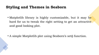
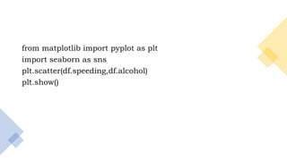
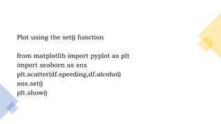
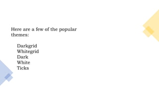
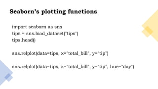
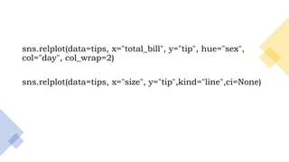
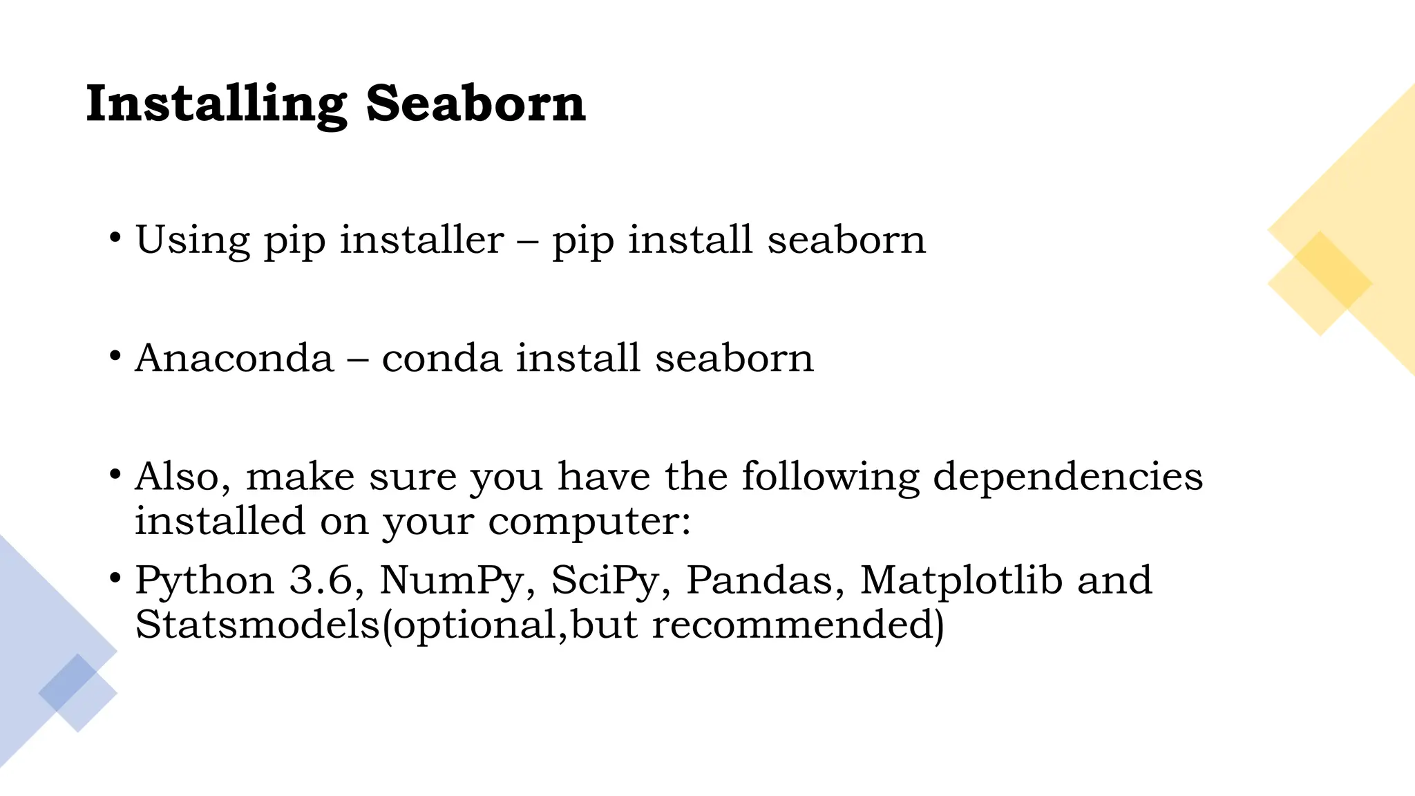
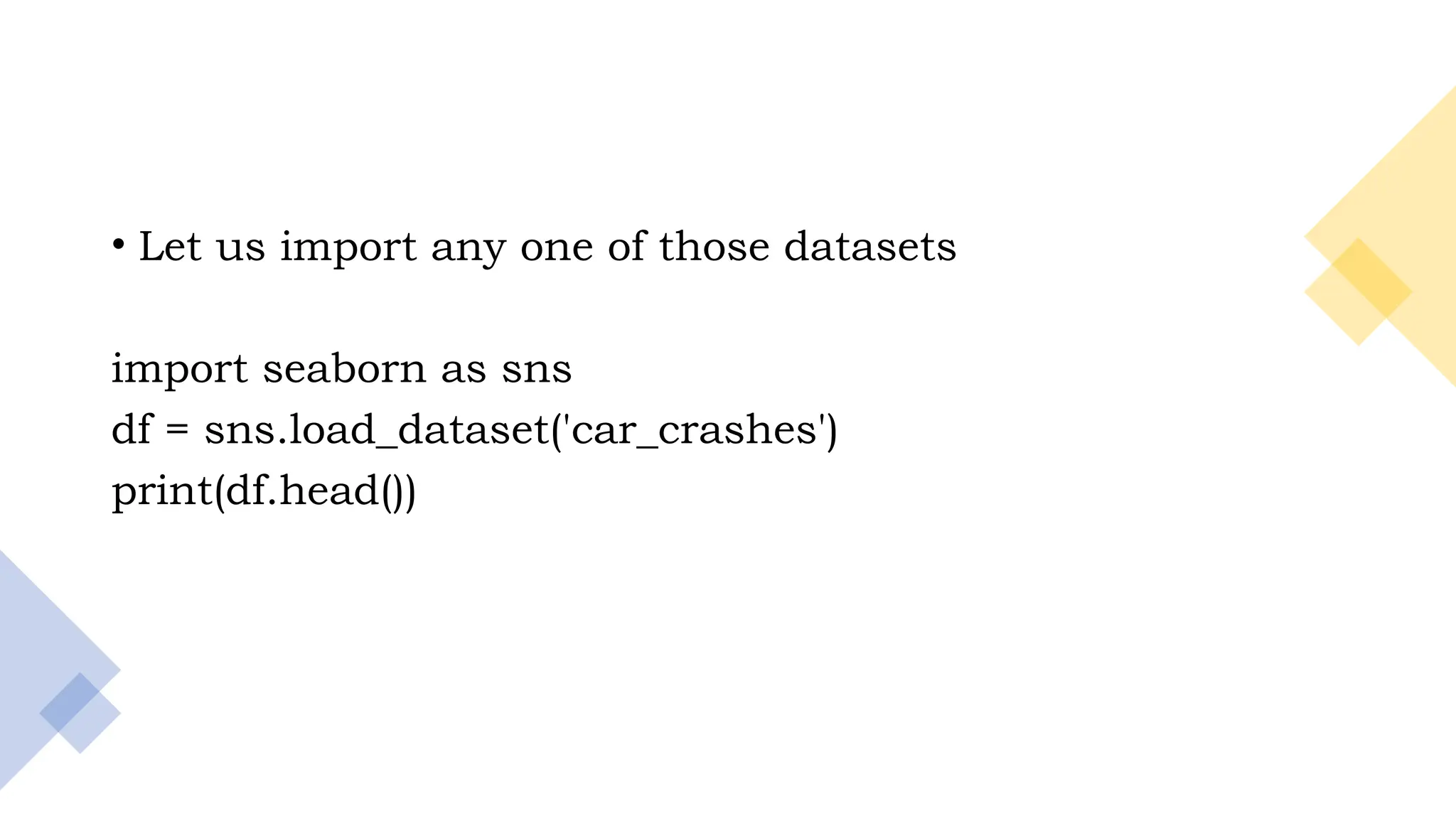
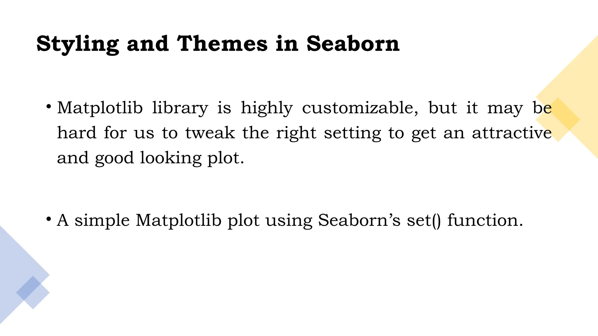
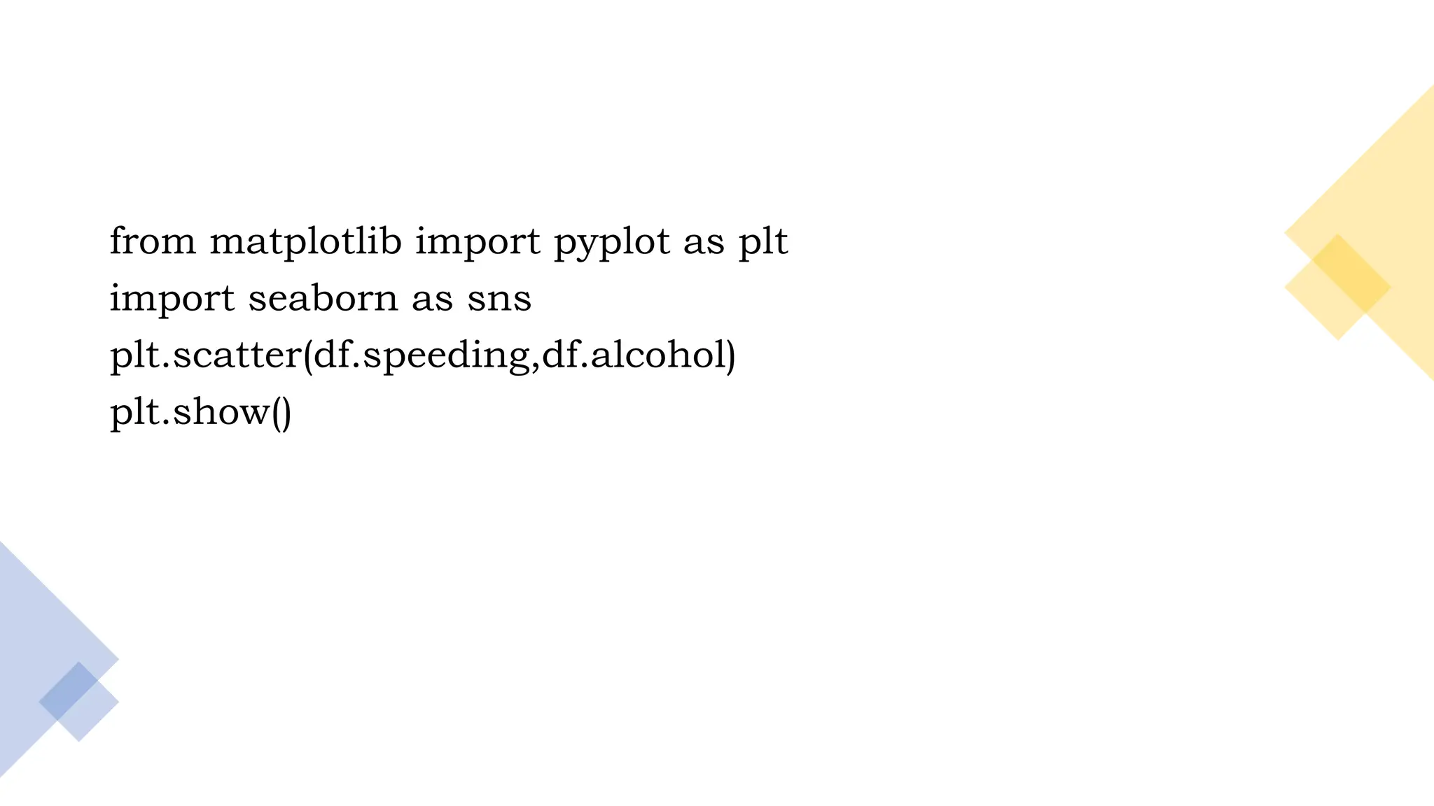
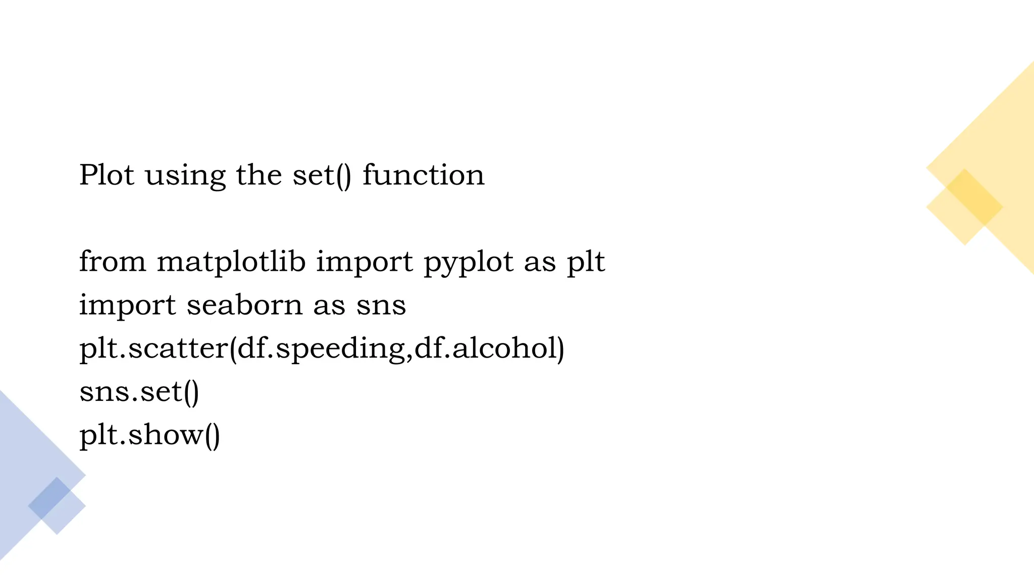
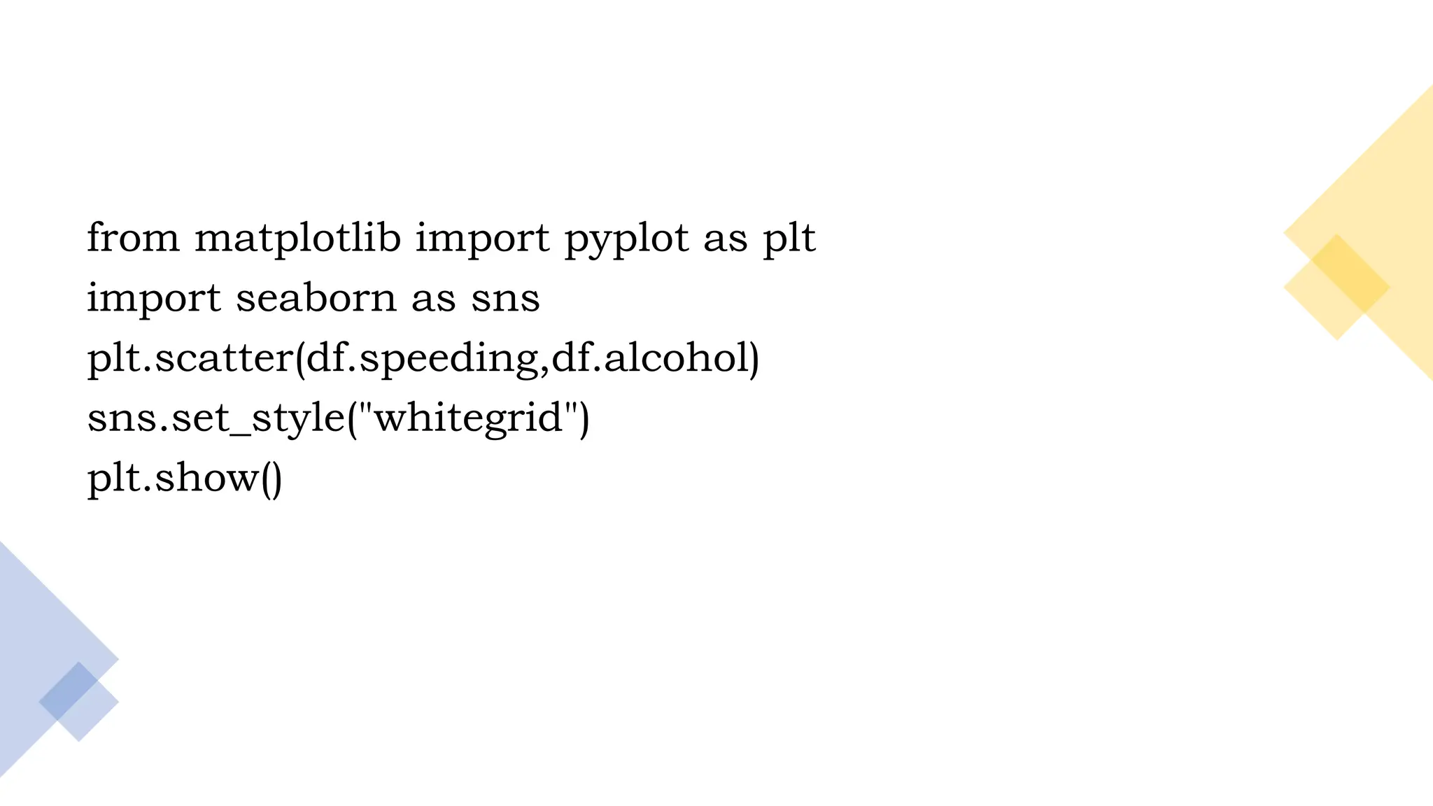
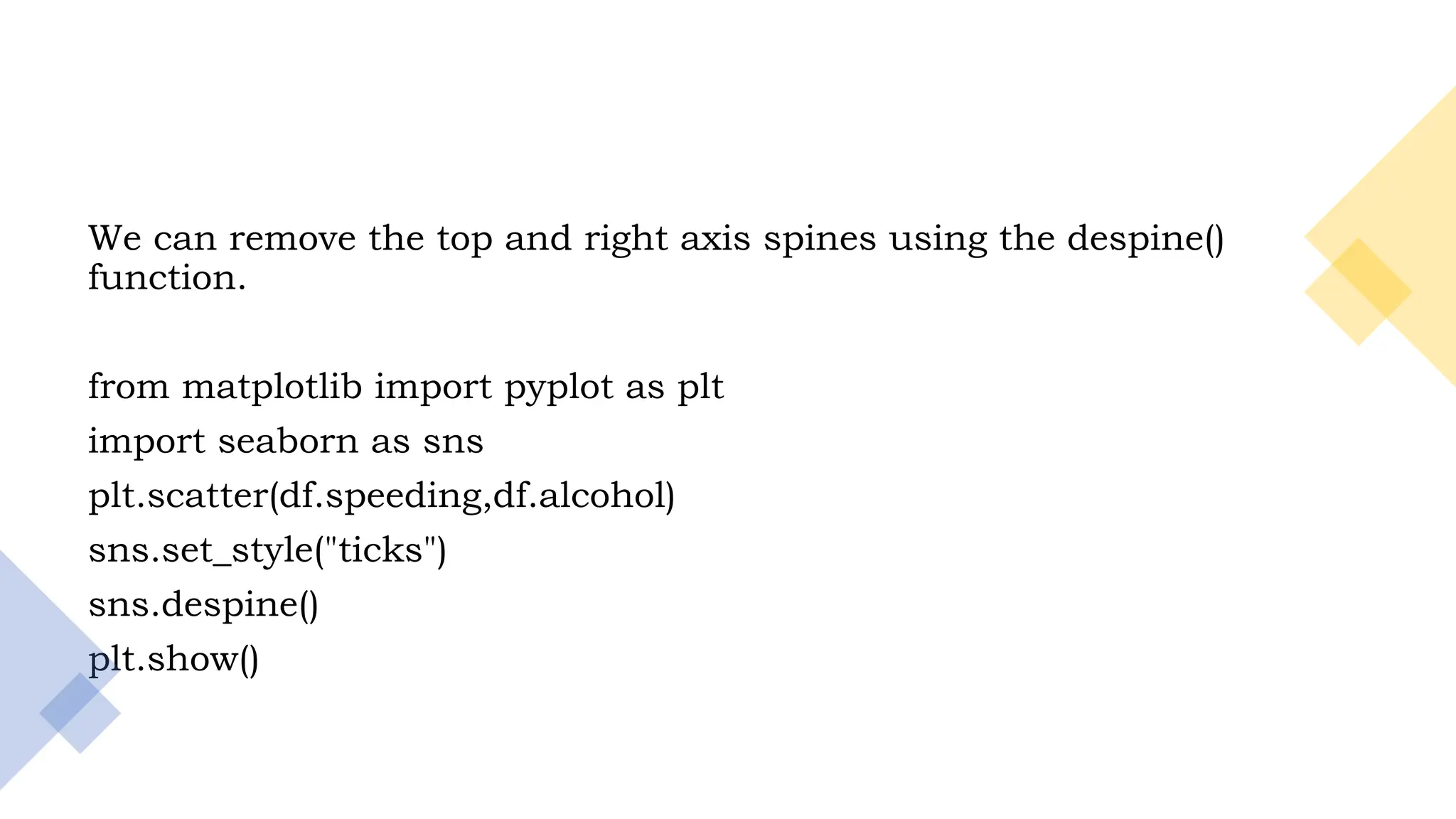
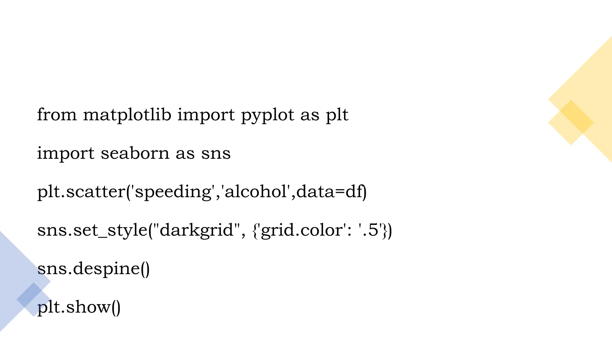
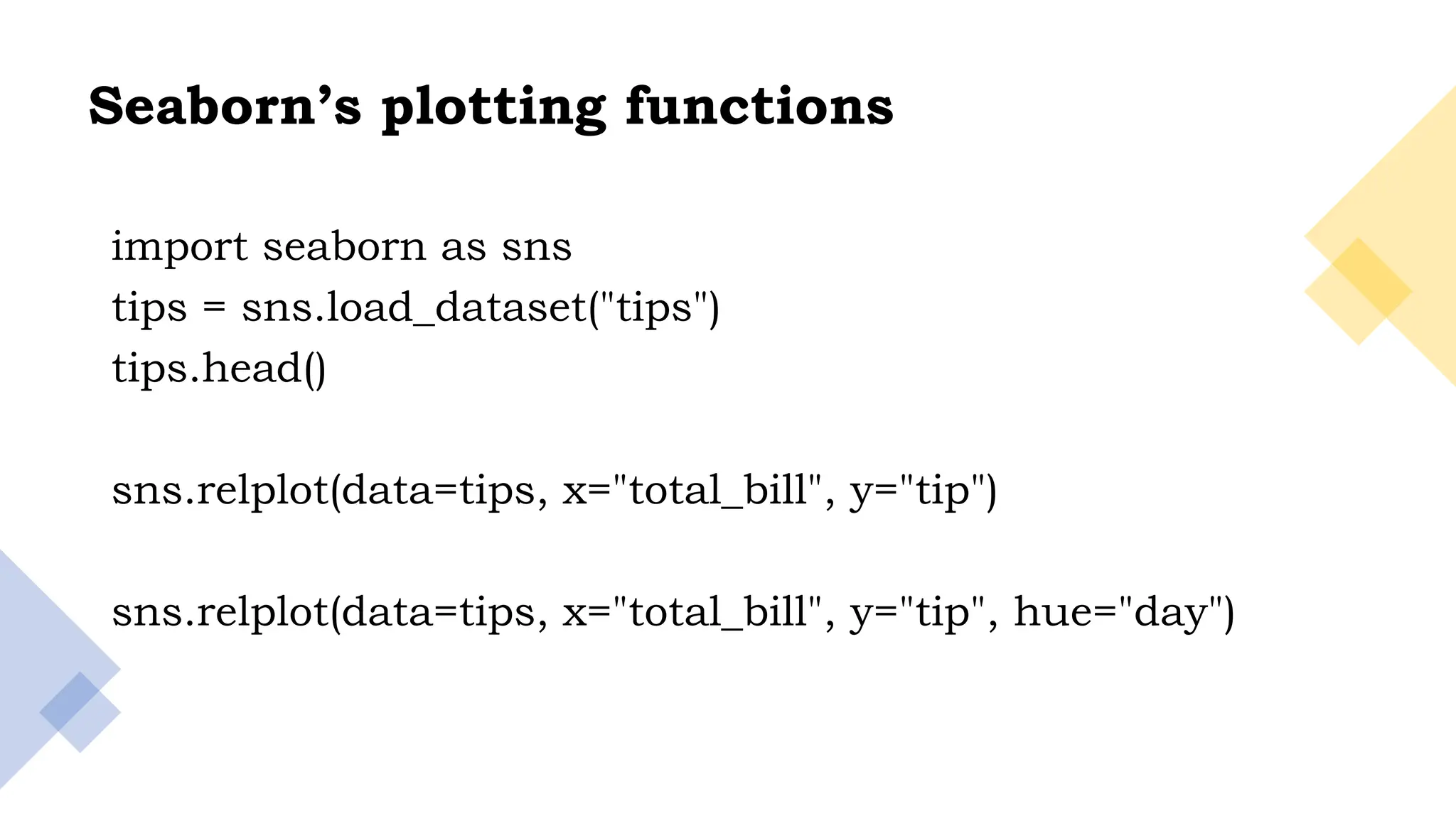
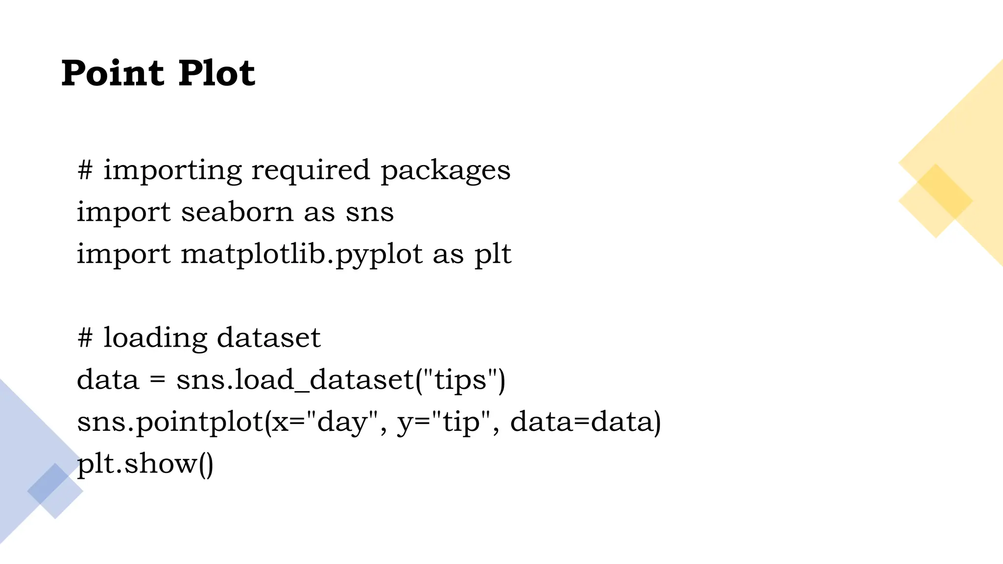
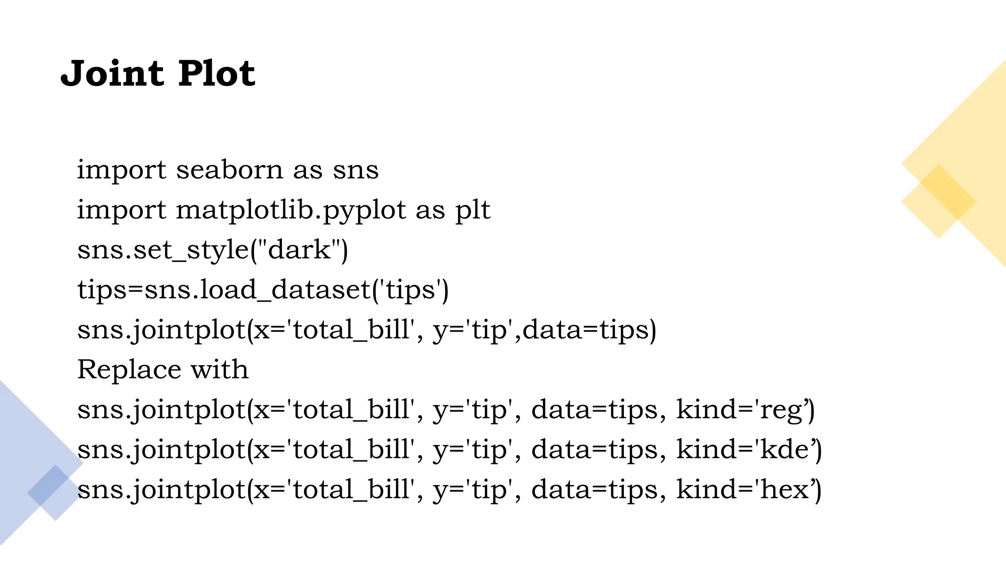
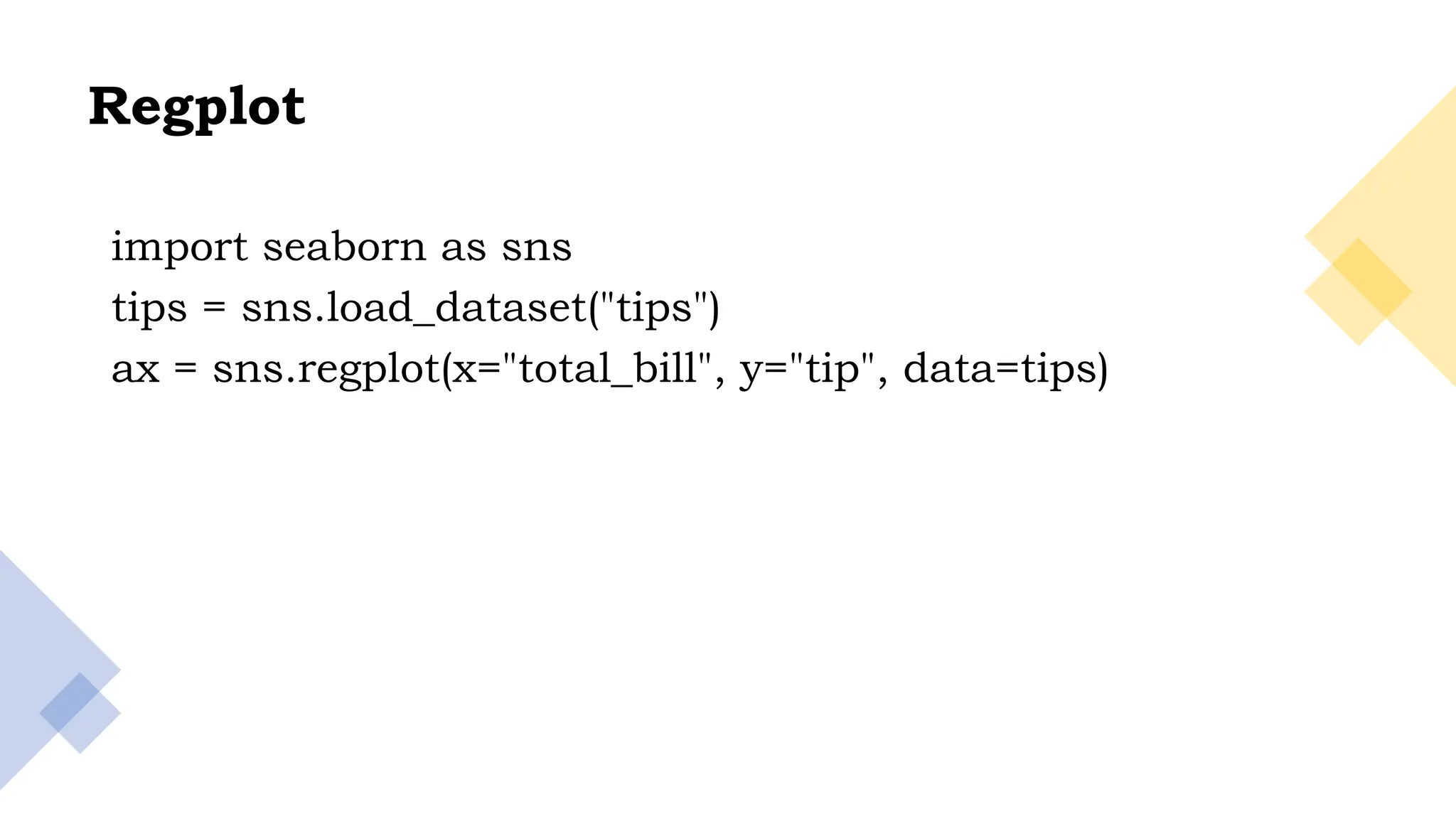
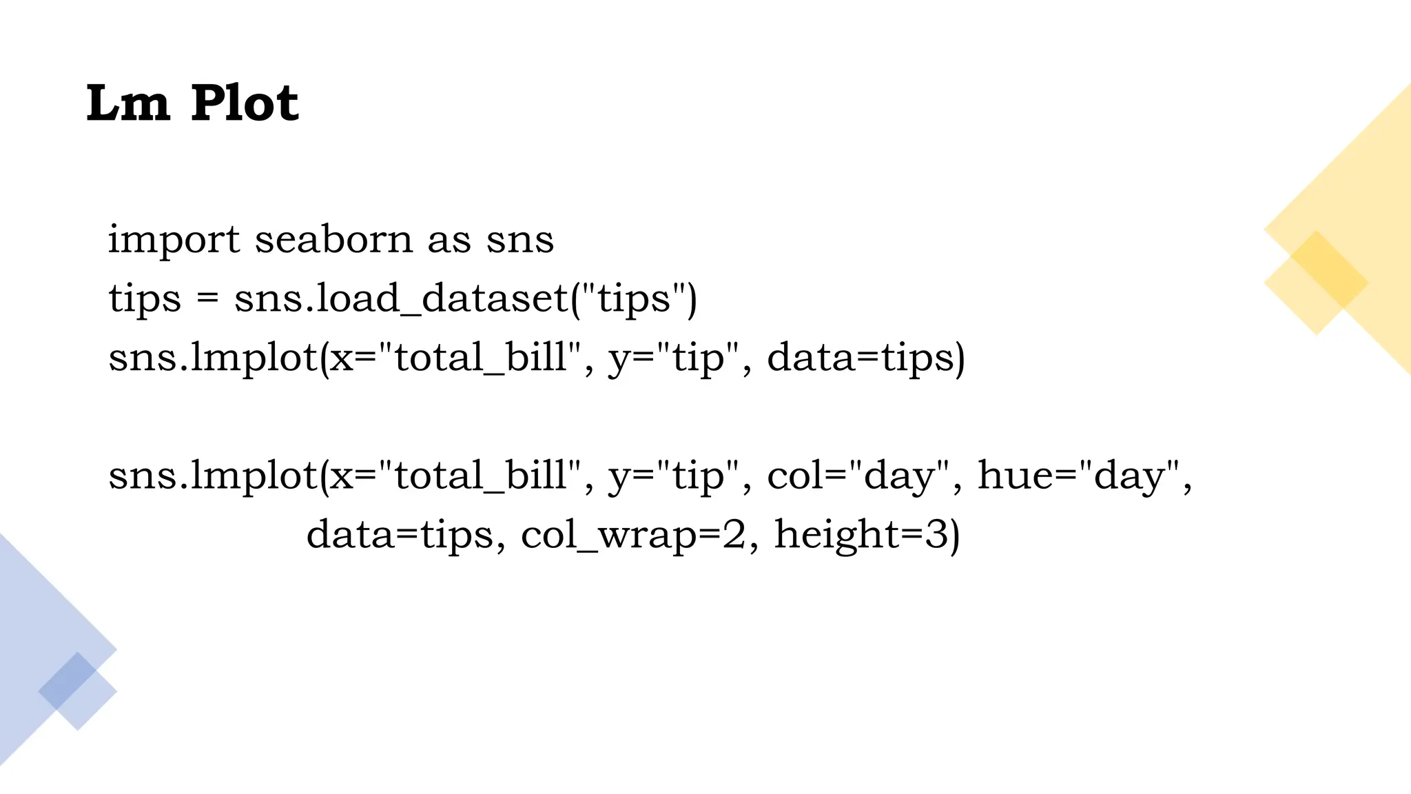
KEMBAR78
Seaborn for data visualization using python.pptx
Dr. M. Kriushanth
Assistant Professor
Department of Data Science
St. Joseph’s College (Autonomous)
Tiruchirappalli - 2
Data Visualization using
Seaborn
2
Agenda
• Seaborn Intro
• Installation
• Load Datasets
• Seaborn Color Palette
• Seaborn Plotting Functions
3
• Seaborn is an amazing data visualization library for
statistical graphics plotting in Python.
• It provides beautiful default styles and colour palettes to
make statistical plots more attractive.
• It is built on the top of the matplotlib library and also
closely integrated to the data structures from pandas.
Seaborn
4
Installing Seaborn
• Using pip installer – pip install seaborn
• Anaconda – conda install seaborn
• Also, make sure you have the following dependencies
installed on your computer:
• Python 3.6, NumPy, SciPy, Pandas, Matplotlib and
Statsmodels(optional,but recommended)
5
Load Data To Construct Seaborn Plots
import pandas
import matplotlib
import scipy
import seaborn as sns
print(sns.get_dataset_names())
6
• Let us import any one of those datasets
import seaborn as sns
df = sns.load_dataset('car_crashes')
print(df.head())
7
Styling and Themes in Seaborn
• Matplotlib library is highly customizable, but it may be
hard for us to tweak the right setting to get an attractive
and good looking plot.
• A simple Matplotlib plot using Seaborn’s set() function.
8
from matplotlib import pyplot as plt
import seaborn as sns
plt.scatter(df.speeding,df.alcohol)
plt.show()
9
Plot using the set() function
from matplotlib import pyplot as plt
import seaborn as sns
plt.scatter(df.speeding,df.alcohol)
sns.set()
plt.show()
10
Here are a few of the popular
themes:
Darkgrid
Whitegrid
Dark
White
Ticks
11
from matplotlib import pyplot as plt
import seaborn as sns
plt.scatter(df.speeding,df.alcohol)
sns.set_style("whitegrid")
plt.show()
12
We can remove the top and right axis spines using the despine()
function.
from matplotlib import pyplot as plt
import seaborn as sns
plt.scatter(df.speeding,df.alcohol)
sns.set_style("ticks")
sns.despine()
plt.show()
13
Axes Style
import seaborn as sns
param=sns.axes_style()
param
14
from matplotlib import pyplot as plt
import seaborn as sns
plt.scatter('speeding','alcohol',data=df)
sns.set_style("darkgrid", {'grid.color': '.5'})
sns.despine()
plt.show()
15
Seaborn has a reputation for making plots and graphs more
attractive using attractive colors and color combinations.
Some of the color palettes out of the 170 palettes offered by
Seaborn.
Seaborn Color Palette
16
• sns.palplot(sns.color_palette("deep", 10))
• sns.palplot(sns.color_palette("PiYG", 10))
• sns.palplot(sns.color_palette("GnBu", 10))
17
'Accent', 'Accent_r', 'Blues', 'Blues_r', 'BrBG’, 'BrBG_r', 'BuGn', 'BuGn_r', 'BuPu',
'BuPu_r', 'CMRmap', 'CMRmap_r', 'Dark2', 'Dark2_r', 'GnBu', 'GnBu_r’, ‘'Greens',
'Greens_r', 'Greys', 'Greys_r', 'OrRd', 'OrRd_r', 'Oranges', 'Oranges_r', 'PRGn', 'PRGn_r’,
'Paired', 'Paired_r', 'Pastel1', 'Pastel1_r', 'Pastel2’, 'Pastel2_r', 'PiYG', 'PiYG_r', 'PuBu',
'PuBuGn', 'PuBuGn_r', 'PuBu_r', 'PuOr', 'PuOr_r', 'PuRd', 'PuRd_r', 'Purples', 'Purples_r',
'RdBu', 'RdBu_r', 'RdGy', 'RdGy_r', 'RdPu’, 'RdPu_r', 'RdYlBu', 'RdYlBu_r', 'RdYlGn',
'RdYlGn_r’, 'Reds', 'Reds_r', 'Set1', 'Set1_r', 'Set2', 'Set2_r', 'Set3', 'Set3_r', 'Spectral',
'Spectral_r', 'Wistia’, 'Wistia_r', 'YlGn', 'YlGnBu', 'YlGnBu_r', 'YlGn_r’, 'YlOrBr',
'YlOrBr_r', 'YlOrRd', 'YlOrRd_r', 'afmhot’, 'afmhot_r', 'autumn', 'autumn_r', 'binary',
'binary_r’, 'bone', 'bone_r', 'brg', 'brg_r', 'bwr', 'bwr_r', 'cividis’, 'cividis_r', 'cool', 'cool_r',
'coolwarm', 'coolwarm_r', 'copper', 'copper_r', 'cubehelix', 'cubehelix_r', 'flag’, 'flag_r',
'gist_earth', 'gist_earth_r', 'gist_gray', 'gist_gray_r', 'gist_heat', 'gist_heat_r', 'gist_ncar’,
'gist_ncar_r', 'gist_rainbow', 'gist_rainbow_r', 'gist_stern', 'gist_stern_r', 'gist_yarg',
'gist_yarg_r’, 'gnuplot', 'gnuplot2','gnuplot2_r', 'gnuplot_r’, 'gray', 'gray_r', 'hot', 'hot_r',
'hsv’, 'hsv_r', 'icefire', 'icefire_r', 'inferno', 'inferno_r', 'jet', 'jet_r', 'magma', 'magma_r',
'mako', 'mako_r',
18
Seaborn’s plotting functions
import seaborn as sns
tips = sns.load_dataset("tips")
tips.head()
sns.relplot(data=tips, x="total_bill", y="tip")
sns.relplot(data=tips, x="total_bill", y="tip", hue="day")
19
sns.relplot(data=tips, x="total_bill", y="tip", hue="sex",
col="day", col_wrap=2)
sns.relplot(data=tips, x="size", y="tip",kind="line",ci=None)
20
Histogram
import seaborn as sns
from matplotlib import pyplot as plt
df = sns.load_dataset('iris')
sns.distplot(df['petal_length'],kde = False)
21
Bar Plot
import matplotlib.pyplot as plt
import seaborn as sns
sns.set_context('paper')
# load dataset
titanic = sns.load_dataset('titanic')
# create plot
sns.barplot(x = 'embark_town', y = 'age', data = titanic,
palette = 'PuRd',ci=None
)
plt.legend()
plt.show()
print(titanic.columns)
22
Bar Plot
Horizontal barplot
import matplotlib.pyplot as plt
import seaborn as sns
sns.set_context('paper')
sns.barplot(x = 'age', y = 'embark_town', data = titanic,
palette = 'PuRd', orient = 'h',
)
plt.show()
23
Horizontal barplot
import matplotlib.pyplot as plt
import seaborn as sns
sns.set_context('paper')
sns.barplot(x = 'age', y = 'embark_town', data = titanic,
palette = 'PuRd', orient = 'h',
)
plt.show()
24
Count plot
import matplotlib.pyplot as plt
import seaborn as sns
sns.set_context('paper')
# load dataset
titanic = sns.load_dataset('titanic')
# create plot
sns.countplot(x = 'class', hue = 'who', data = titanic, palette = 'magma')
plt.title('Survivors')
plt.show()
25
Point Plot
# importing required packages
import seaborn as sns
import matplotlib.pyplot as plt
# loading dataset
data = sns.load_dataset("tips")
sns.pointplot(x="day", y="tip", data=data)
plt.show()
26
Joint Plot
import seaborn as sns
import matplotlib.pyplot as plt
sns.set_style("dark")
tips=sns.load_dataset('tips')
sns.jointplot(x='total_bill', y='tip',data=tips)
Replace with
sns.jointplot(x='total_bill', y='tip', data=tips, kind='reg’)
sns.jointplot(x='total_bill', y='tip', data=tips, kind='kde’)
sns.jointplot(x='total_bill', y='tip', data=tips, kind='hex’)
27
Regplot
import seaborn as sns
tips = sns.load_dataset("tips")
ax = sns.regplot(x="total_bill", y="tip", data=tips)
28
Lm Plot
import seaborn as sns
tips = sns.load_dataset("tips")
sns.lmplot(x="total_bill", y="tip", data=tips)
sns.lmplot(x="total_bill", y="tip", col="day", hue="day",
data=tips, col_wrap=2, height=3)
29
KDE plot
import seaborn as sns
import matplotlib.pyplot as plt
sns.set_style("dark")
iris = sns.load_dataset("iris")
# Plotting the KDE Plot
sns.kdeplot(iris.loc[(iris['species']=='setosa'),
'sepal_length'], color='b', shade=True, Label='setosa')
sns.kdeplot(iris.loc[(iris['species']=='virginica'),
'sepal_length'], color='r', shade=True, Label='virginica')
30
Box Plot
import seaborn as sns
tips = sns.load_dataset("tips")
sns.boxplot(x="day", y="total_bill", data=tips)
31
Violin Plot
import seaborn as sns
tips = sns.load_dataset("tips")
ax = sns.violinplot(x=tips["total_bill"])
32
Heatmap
flights=sns.load_dataset("flights")
flights = flights.pivot("month", "year", "passengers")
print(flights)
sns.heatmap(flights,linewidths=.5,cmap="YlGnBu")
33
Cluster map
import seaborn as sns
flights=sns.load_dataset("flights")
flights = flights.pivot("month", "year", "passengers")
sns.clustermap(flights,linewidths=.5,cmap="coolwarm")
import seaborn as sns
flights=sns.load_dataset("flights")
flights = flights.pivot("month", "year", "passengers")
sns.clustermap(flights,linewidths=.5,cmap="coolwarm",col_cluster=
False)
34
Pair Plot
import seaborn as sns
from matplotlib import pyplot as plt
df = sns.load_dataset('iris')
sns.set_style("ticks")
sns.pairplot(df,hue = 'species',diag_kind = "kde",kind =
"scatter",palette = "husl")
plt.show()
35
Thank you

Seaborn for data visualization using python.pptx

  • 1.
    Dr. M. Kriushanth AssistantProfessor Department of Data Science St. Joseph’s College (Autonomous) Tiruchirappalli - 2 Data Visualization using Seaborn
  • 2.
    2 Agenda • Seaborn Intro •Installation • Load Datasets • Seaborn Color Palette • Seaborn Plotting Functions
  • 3.
    3 • Seaborn isan amazing data visualization library for statistical graphics plotting in Python. • It provides beautiful default styles and colour palettes to make statistical plots more attractive. • It is built on the top of the matplotlib library and also closely integrated to the data structures from pandas. Seaborn
  • 4.
    4 Installing Seaborn • Usingpip installer – pip install seaborn • Anaconda – conda install seaborn • Also, make sure you have the following dependencies installed on your computer: • Python 3.6, NumPy, SciPy, Pandas, Matplotlib and Statsmodels(optional,but recommended)
  • 5.
    5 Load Data ToConstruct Seaborn Plots import pandas import matplotlib import scipy import seaborn as sns print(sns.get_dataset_names())
  • 6.
    6 • Let usimport any one of those datasets import seaborn as sns df = sns.load_dataset('car_crashes') print(df.head())
  • 7.
    7 Styling and Themesin Seaborn • Matplotlib library is highly customizable, but it may be hard for us to tweak the right setting to get an attractive and good looking plot. • A simple Matplotlib plot using Seaborn’s set() function.
  • 8.
    8 from matplotlib importpyplot as plt import seaborn as sns plt.scatter(df.speeding,df.alcohol) plt.show()
  • 9.
    9 Plot using theset() function from matplotlib import pyplot as plt import seaborn as sns plt.scatter(df.speeding,df.alcohol) sns.set() plt.show()
  • 10.
    10 Here are afew of the popular themes: Darkgrid Whitegrid Dark White Ticks
  • 11.
    11 from matplotlib importpyplot as plt import seaborn as sns plt.scatter(df.speeding,df.alcohol) sns.set_style("whitegrid") plt.show()
  • 12.
    12 We can removethe top and right axis spines using the despine() function. from matplotlib import pyplot as plt import seaborn as sns plt.scatter(df.speeding,df.alcohol) sns.set_style("ticks") sns.despine() plt.show()
  • 13.
    13 Axes Style import seabornas sns param=sns.axes_style() param
  • 14.
    14 from matplotlib importpyplot as plt import seaborn as sns plt.scatter('speeding','alcohol',data=df) sns.set_style("darkgrid", {'grid.color': '.5'}) sns.despine() plt.show()
  • 15.
    15 Seaborn has areputation for making plots and graphs more attractive using attractive colors and color combinations. Some of the color palettes out of the 170 palettes offered by Seaborn. Seaborn Color Palette
  • 16.
    16 • sns.palplot(sns.color_palette("deep", 10)) •sns.palplot(sns.color_palette("PiYG", 10)) • sns.palplot(sns.color_palette("GnBu", 10))
  • 17.
    17 'Accent', 'Accent_r', 'Blues','Blues_r', 'BrBG’, 'BrBG_r', 'BuGn', 'BuGn_r', 'BuPu', 'BuPu_r', 'CMRmap', 'CMRmap_r', 'Dark2', 'Dark2_r', 'GnBu', 'GnBu_r’, ‘'Greens', 'Greens_r', 'Greys', 'Greys_r', 'OrRd', 'OrRd_r', 'Oranges', 'Oranges_r', 'PRGn', 'PRGn_r’, 'Paired', 'Paired_r', 'Pastel1', 'Pastel1_r', 'Pastel2’, 'Pastel2_r', 'PiYG', 'PiYG_r', 'PuBu', 'PuBuGn', 'PuBuGn_r', 'PuBu_r', 'PuOr', 'PuOr_r', 'PuRd', 'PuRd_r', 'Purples', 'Purples_r', 'RdBu', 'RdBu_r', 'RdGy', 'RdGy_r', 'RdPu’, 'RdPu_r', 'RdYlBu', 'RdYlBu_r', 'RdYlGn', 'RdYlGn_r’, 'Reds', 'Reds_r', 'Set1', 'Set1_r', 'Set2', 'Set2_r', 'Set3', 'Set3_r', 'Spectral', 'Spectral_r', 'Wistia’, 'Wistia_r', 'YlGn', 'YlGnBu', 'YlGnBu_r', 'YlGn_r’, 'YlOrBr', 'YlOrBr_r', 'YlOrRd', 'YlOrRd_r', 'afmhot’, 'afmhot_r', 'autumn', 'autumn_r', 'binary', 'binary_r’, 'bone', 'bone_r', 'brg', 'brg_r', 'bwr', 'bwr_r', 'cividis’, 'cividis_r', 'cool', 'cool_r', 'coolwarm', 'coolwarm_r', 'copper', 'copper_r', 'cubehelix', 'cubehelix_r', 'flag’, 'flag_r', 'gist_earth', 'gist_earth_r', 'gist_gray', 'gist_gray_r', 'gist_heat', 'gist_heat_r', 'gist_ncar’, 'gist_ncar_r', 'gist_rainbow', 'gist_rainbow_r', 'gist_stern', 'gist_stern_r', 'gist_yarg', 'gist_yarg_r’, 'gnuplot', 'gnuplot2','gnuplot2_r', 'gnuplot_r’, 'gray', 'gray_r', 'hot', 'hot_r', 'hsv’, 'hsv_r', 'icefire', 'icefire_r', 'inferno', 'inferno_r', 'jet', 'jet_r', 'magma', 'magma_r', 'mako', 'mako_r',
  • 18.
    18 Seaborn’s plotting functions importseaborn as sns tips = sns.load_dataset("tips") tips.head() sns.relplot(data=tips, x="total_bill", y="tip") sns.relplot(data=tips, x="total_bill", y="tip", hue="day")
  • 19.
    19 sns.relplot(data=tips, x="total_bill", y="tip",hue="sex", col="day", col_wrap=2) sns.relplot(data=tips, x="size", y="tip",kind="line",ci=None)
  • 20.
    20 Histogram import seaborn assns from matplotlib import pyplot as plt df = sns.load_dataset('iris') sns.distplot(df['petal_length'],kde = False)
  • 21.
    21 Bar Plot import matplotlib.pyplotas plt import seaborn as sns sns.set_context('paper') # load dataset titanic = sns.load_dataset('titanic') # create plot sns.barplot(x = 'embark_town', y = 'age', data = titanic, palette = 'PuRd',ci=None ) plt.legend() plt.show() print(titanic.columns)
  • 22.
    22 Bar Plot Horizontal barplot importmatplotlib.pyplot as plt import seaborn as sns sns.set_context('paper') sns.barplot(x = 'age', y = 'embark_town', data = titanic, palette = 'PuRd', orient = 'h', ) plt.show()
  • 23.
    23 Horizontal barplot import matplotlib.pyplotas plt import seaborn as sns sns.set_context('paper') sns.barplot(x = 'age', y = 'embark_town', data = titanic, palette = 'PuRd', orient = 'h', ) plt.show()
  • 24.
    24 Count plot import matplotlib.pyplotas plt import seaborn as sns sns.set_context('paper') # load dataset titanic = sns.load_dataset('titanic') # create plot sns.countplot(x = 'class', hue = 'who', data = titanic, palette = 'magma') plt.title('Survivors') plt.show()
  • 25.
    25 Point Plot # importingrequired packages import seaborn as sns import matplotlib.pyplot as plt # loading dataset data = sns.load_dataset("tips") sns.pointplot(x="day", y="tip", data=data) plt.show()
  • 26.
    26 Joint Plot import seabornas sns import matplotlib.pyplot as plt sns.set_style("dark") tips=sns.load_dataset('tips') sns.jointplot(x='total_bill', y='tip',data=tips) Replace with sns.jointplot(x='total_bill', y='tip', data=tips, kind='reg’) sns.jointplot(x='total_bill', y='tip', data=tips, kind='kde’) sns.jointplot(x='total_bill', y='tip', data=tips, kind='hex’)
  • 27.
    27 Regplot import seaborn assns tips = sns.load_dataset("tips") ax = sns.regplot(x="total_bill", y="tip", data=tips)
  • 28.
    28 Lm Plot import seabornas sns tips = sns.load_dataset("tips") sns.lmplot(x="total_bill", y="tip", data=tips) sns.lmplot(x="total_bill", y="tip", col="day", hue="day", data=tips, col_wrap=2, height=3)
  • 29.
    29 KDE plot import seabornas sns import matplotlib.pyplot as plt sns.set_style("dark") iris = sns.load_dataset("iris") # Plotting the KDE Plot sns.kdeplot(iris.loc[(iris['species']=='setosa'), 'sepal_length'], color='b', shade=True, Label='setosa') sns.kdeplot(iris.loc[(iris['species']=='virginica'), 'sepal_length'], color='r', shade=True, Label='virginica')
  • 30.
    30 Box Plot import seabornas sns tips = sns.load_dataset("tips") sns.boxplot(x="day", y="total_bill", data=tips)
  • 31.
    31 Violin Plot import seabornas sns tips = sns.load_dataset("tips") ax = sns.violinplot(x=tips["total_bill"])
  • 32.
    32 Heatmap flights=sns.load_dataset("flights") flights = flights.pivot("month","year", "passengers") print(flights) sns.heatmap(flights,linewidths=.5,cmap="YlGnBu")
  • 33.
    33 Cluster map import seabornas sns flights=sns.load_dataset("flights") flights = flights.pivot("month", "year", "passengers") sns.clustermap(flights,linewidths=.5,cmap="coolwarm") import seaborn as sns flights=sns.load_dataset("flights") flights = flights.pivot("month", "year", "passengers") sns.clustermap(flights,linewidths=.5,cmap="coolwarm",col_cluster= False)
  • 34.
    34 Pair Plot import seabornas sns from matplotlib import pyplot as plt df = sns.load_dataset('iris') sns.set_style("ticks") sns.pairplot(df,hue = 'species',diag_kind = "kde",kind = "scatter",palette = "husl") plt.show()
  • 35.