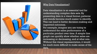
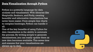
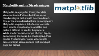
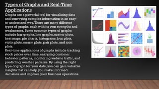
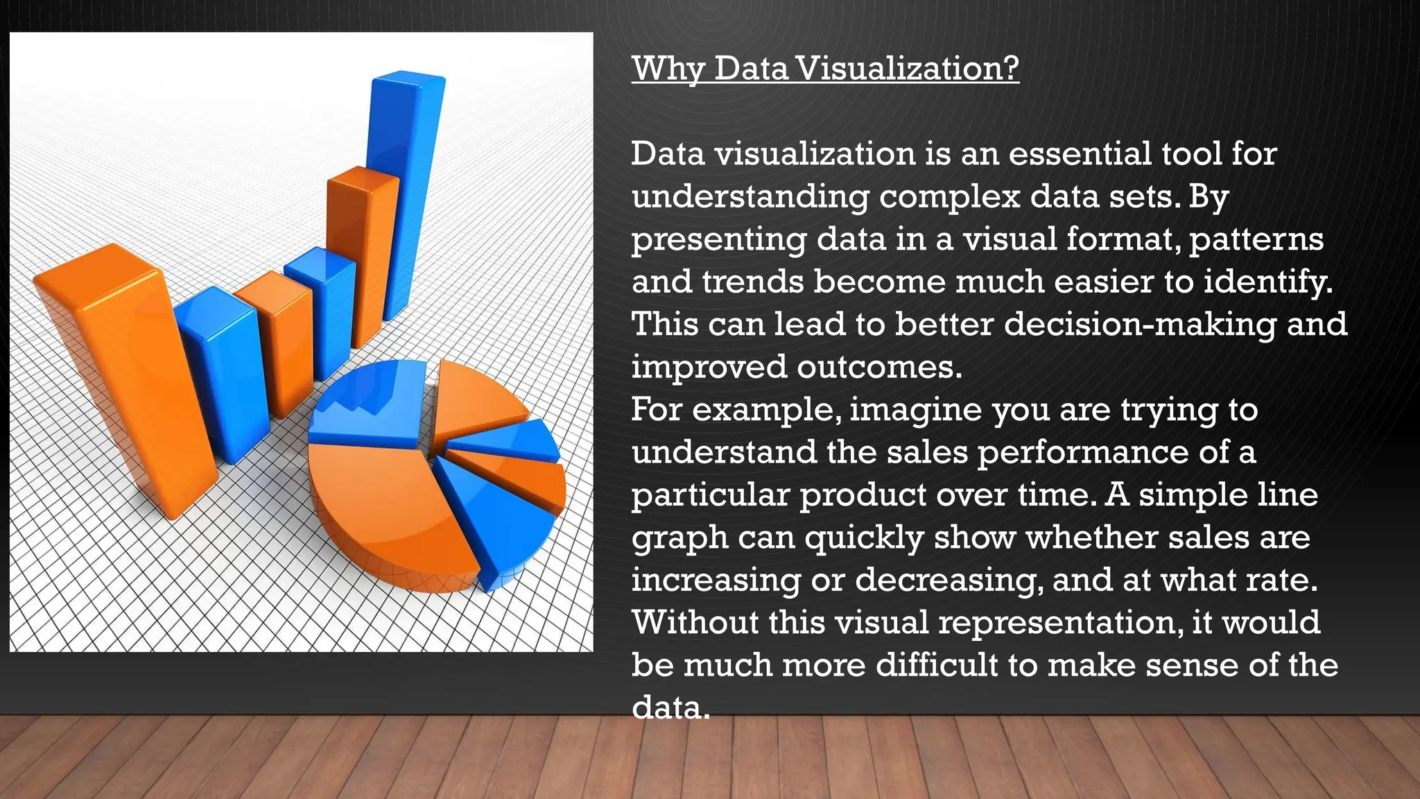
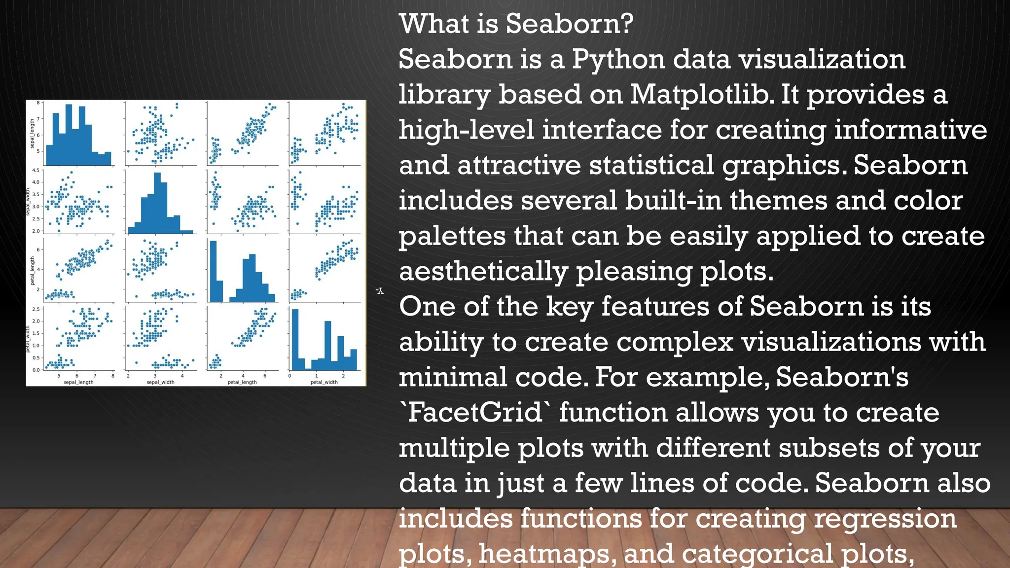
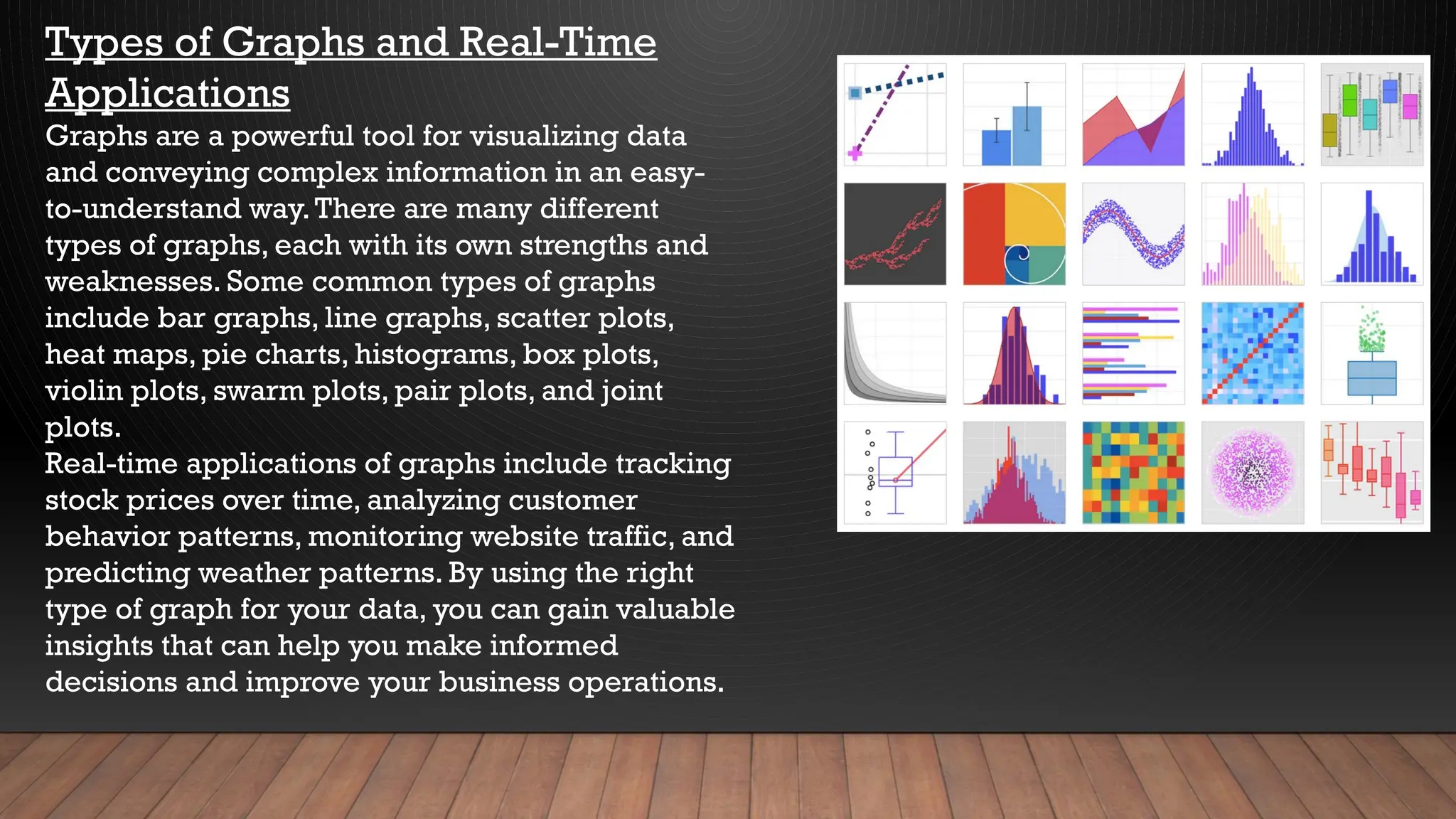
KEMBAR78
python libray for data analytics seaborn[1].pptx
Visualizing Data with
Python: Seaborn
Library
by-
 E YUGANDHAR SAI
CHOWDARY (CSE
dept)
 GRITAEYU P
NISVAN(CSE dept)
TOPICS:
• Introduction to Data Visualization
• Why Data Visualization?
• Library Functions and Types
• Data Visualization in Python
• Matplotlib and its Disadvantages
• Seaborn and its Advantages
• Comparison of Seaborn and Matplotlib
• Pandas Overview
• Using Pandas with Seaborn
• Instantiation and Importing Seaborn
• Line Graphs
• Scatter Plots
• Heat Maps
• Pie Charts
• Histograms
• Box Plots
• Violin Plots
• Swarm Plots
• Pair Plots
• Joint Plots
• Conclusion
• References
INTRODUCTION TO DATA
VISUALIZATION
Data visualization is the graphical
representation of information and data. It
allows us to see patterns, trends, and
relationships that might not be apparent from
looking at raw data alone.
In today's world, where we are inundated with
data from various sources, data visualization
has become an essential tool for decision-
making. It helps us understand complex data
sets quickly and make informed decisions
based on the insights derived from them.
Why Data Visualization?
Data visualization is an essential tool for
understanding complex data sets. By
presenting data in a visual format, patterns
and trends become much easier to identify.
This can lead to better decision-making and
improved outcomes.
For example, imagine you are trying to
understand the sales performance of a
particular product over time. A simple line
graph can quickly show whether sales are
increasing or decreasing, and at what rate.
Without this visual representation, it would
be much more difficult to make sense of the
data.
Data Visualization through Python
Python is a powerful language for data
analysis and visualization.With libraries like
Matplotlib, Seaborn, and Plotly, creating
beautiful and informative visualizations has
never been easier. From simple line charts
to complex heatmaps, Python can handle it
all.
One of the key benefits of using Python for
data visualization is the ability to automate
the process. By writing scripts to generate
visualizations, you can easily update them as
new data becomes available.This saves time
and ensures that your visualizations are
always up-to-date.
6
Library Functions in Python
Library functions are pre-written code that
can be used to perform specific tasks.These
functions are created by developers and
made available for others to use in their own
programs.
There are several types of library functions,
including built-in functions, external
functions, and user-defined functions. Built-
in functions are part of the programming
language and can be used without any
additional setup. External functions are
provided by third-party libraries and must
be imported before they can be used. User-
defined functions are created by the
programmer and can be customized to fit
Matplotlib and its Disadvantages
Matplotlib is a popular library for data
visualization in Python, but it has some
disadvantages that should be considered.
One of the main drawbacks is its complexity.
Matplotlib requires a lot of code to create
even simple visualizations, and this can
make it difficult to use for beginners.
While it offers a wide range of chart types,
customizing them can be challenging.This
can be frustrating for users who want to
create unique visualizations that stand out
from the crowd.
What is Seaborn?
Seaborn is a Python data visualization
library based on Matplotlib. It provides a
high-level interface for creating informative
and attractive statistical graphics. Seaborn
includes several built-in themes and color
palettes that can be easily applied to create
aesthetically pleasing plots.
One of the key features of Seaborn is its
ability to create complex visualizations with
minimal code. For example, Seaborn's
`FacetGrid` function allows you to create
multiple plots with different subsets of your
data in just a few lines of code. Seaborn also
includes functions for creating regression
plots, heatmaps, and categorical plots,
Y-
Seaborn VS Matplotlib
Seaborn and Matplotlib are two popular libraries used for data visualization in
Python.While they share many similarities, there are also some key differences
between the two.
Matplotlib is a more basic library that provides a wide range of plotting functions. It is
highly customizable but requires more coding to achieve advanced visualizations. On
the other hand, Seaborn is a higher-level library that offers more complex
visualizations with less code. It also has built-in themes and color palettes, making it
easier to create aesthetically pleasing graphs.
Pandas Overview
Pandas is a powerful open-source data analysis
and manipulation tool that provides fast,
flexible, and expressive data structures
designed to work with relational or labeled
data both easily and intuitively. It allows you to
perform data cleaning, merging, reshaping,
slicing, and filtering operations on your
datasets in a simple yet effective way.
With Pandas, you can easily import data from
various file formats such as CSV, Excel, SQL
databases, and JSON.You can also handle
missing data, group data, and perform
statistical functions on your data. Moreover,
Pandas offers a wide range of visualization
tools that allow you to create beautiful and
Using Pandas with Seaborn
Pandas is a powerful library for data manipulation and analysis in Python.
It provides easy-to-use data structures and data analysis tools that make
it an ideal choice for working with large datasets.When used in
combination with Seaborn, Pandas can be used to create stunning
visualizations that help to reveal insights in the data.
One of the key advantages of using Pandas with Seaborn is the ability to
easily manipulate and filter the data before creating visualizations.This
allows for more targeted and meaningful visualizations that can uncover
hidden patterns and relationships within the data. Additionally, Pandas
provides a wide range of statistical functions that can be used to further
analyze the data and create even more insightful visualizations.
Instantiation and Importing Seaborn
To instantiate and import Seaborn into a Python
project, you first need to install the library.This can
be done using pip, a package installer for Python.
Once installed, you can import Seaborn by using
the command 'import seaborn as sns'.
To instantiate Seaborn, you must first create a figure
with the desired size and style.You can then use the
various functions available in Seaborn to create
your desired plot. For example, if you want to create
a scatter plot, you can use the 'sns.scatterplot()'
function.
Seaborn Functions
Seaborn is a Python data visualization library based on
Matplotlib. It provides a high-level interface for drawing
attractive and informative statistical graphics. Seaborn
functions are built on top of Matplotlib, which means that
they can be used in combination with Matplotlib to create
complex visualizations.
Seaborn provides several functions for visualizing
univariate and bivariate distributions, regression models,
categorical data, and timeseries data. Some of the most
commonly used Seaborn functions include distplot,
jointplot, pairplot, lmplot, catplot, boxplot, swarmplot, and
tsplot. Each function has its own unique set of parameters
that can be used to customize the plot according to your
needs.
Types of Graphs and Real-Time
Applications
Graphs are a powerful tool for visualizing data
and conveying complex information in an easy-
to-understand way.There are many different
types of graphs, each with its own strengths and
weaknesses. Some common types of graphs
include bar graphs, line graphs, scatter plots,
heat maps, pie charts, histograms, box plots,
violin plots, swarm plots, pair plots, and joint
plots.
Real-time applications of graphs include tracking
stock prices over time, analyzing customer
behavior patterns, monitoring website traffic, and
predicting weather patterns. By using the right
type of graph for your data, you can gain valuable
insights that can help you make informed
decisions and improve your business operations.
python libray for data analytics seaborn[1].pptx

python libray for data analytics seaborn[1].pptx

  • 1.
    Visualizing Data with Python:Seaborn Library by-  E YUGANDHAR SAI CHOWDARY (CSE dept)  GRITAEYU P NISVAN(CSE dept)
  • 2.
    TOPICS: • Introduction toData Visualization • Why Data Visualization? • Library Functions and Types • Data Visualization in Python • Matplotlib and its Disadvantages • Seaborn and its Advantages • Comparison of Seaborn and Matplotlib • Pandas Overview • Using Pandas with Seaborn • Instantiation and Importing Seaborn • Line Graphs • Scatter Plots • Heat Maps • Pie Charts • Histograms • Box Plots • Violin Plots • Swarm Plots • Pair Plots • Joint Plots • Conclusion • References
  • 3.
    INTRODUCTION TO DATA VISUALIZATION Datavisualization is the graphical representation of information and data. It allows us to see patterns, trends, and relationships that might not be apparent from looking at raw data alone. In today's world, where we are inundated with data from various sources, data visualization has become an essential tool for decision- making. It helps us understand complex data sets quickly and make informed decisions based on the insights derived from them.
  • 4.
    Why Data Visualization? Datavisualization is an essential tool for understanding complex data sets. By presenting data in a visual format, patterns and trends become much easier to identify. This can lead to better decision-making and improved outcomes. For example, imagine you are trying to understand the sales performance of a particular product over time. A simple line graph can quickly show whether sales are increasing or decreasing, and at what rate. Without this visual representation, it would be much more difficult to make sense of the data.
  • 5.
    Data Visualization throughPython Python is a powerful language for data analysis and visualization.With libraries like Matplotlib, Seaborn, and Plotly, creating beautiful and informative visualizations has never been easier. From simple line charts to complex heatmaps, Python can handle it all. One of the key benefits of using Python for data visualization is the ability to automate the process. By writing scripts to generate visualizations, you can easily update them as new data becomes available.This saves time and ensures that your visualizations are always up-to-date.
  • 6.
    6 Library Functions inPython Library functions are pre-written code that can be used to perform specific tasks.These functions are created by developers and made available for others to use in their own programs. There are several types of library functions, including built-in functions, external functions, and user-defined functions. Built- in functions are part of the programming language and can be used without any additional setup. External functions are provided by third-party libraries and must be imported before they can be used. User- defined functions are created by the programmer and can be customized to fit
  • 7.
    Matplotlib and itsDisadvantages Matplotlib is a popular library for data visualization in Python, but it has some disadvantages that should be considered. One of the main drawbacks is its complexity. Matplotlib requires a lot of code to create even simple visualizations, and this can make it difficult to use for beginners. While it offers a wide range of chart types, customizing them can be challenging.This can be frustrating for users who want to create unique visualizations that stand out from the crowd.
  • 8.
    What is Seaborn? Seabornis a Python data visualization library based on Matplotlib. It provides a high-level interface for creating informative and attractive statistical graphics. Seaborn includes several built-in themes and color palettes that can be easily applied to create aesthetically pleasing plots. One of the key features of Seaborn is its ability to create complex visualizations with minimal code. For example, Seaborn's `FacetGrid` function allows you to create multiple plots with different subsets of your data in just a few lines of code. Seaborn also includes functions for creating regression plots, heatmaps, and categorical plots, Y-
  • 9.
    Seaborn VS Matplotlib Seabornand Matplotlib are two popular libraries used for data visualization in Python.While they share many similarities, there are also some key differences between the two. Matplotlib is a more basic library that provides a wide range of plotting functions. It is highly customizable but requires more coding to achieve advanced visualizations. On the other hand, Seaborn is a higher-level library that offers more complex visualizations with less code. It also has built-in themes and color palettes, making it easier to create aesthetically pleasing graphs.
  • 10.
    Pandas Overview Pandas isa powerful open-source data analysis and manipulation tool that provides fast, flexible, and expressive data structures designed to work with relational or labeled data both easily and intuitively. It allows you to perform data cleaning, merging, reshaping, slicing, and filtering operations on your datasets in a simple yet effective way. With Pandas, you can easily import data from various file formats such as CSV, Excel, SQL databases, and JSON.You can also handle missing data, group data, and perform statistical functions on your data. Moreover, Pandas offers a wide range of visualization tools that allow you to create beautiful and
  • 11.
    Using Pandas withSeaborn Pandas is a powerful library for data manipulation and analysis in Python. It provides easy-to-use data structures and data analysis tools that make it an ideal choice for working with large datasets.When used in combination with Seaborn, Pandas can be used to create stunning visualizations that help to reveal insights in the data. One of the key advantages of using Pandas with Seaborn is the ability to easily manipulate and filter the data before creating visualizations.This allows for more targeted and meaningful visualizations that can uncover hidden patterns and relationships within the data. Additionally, Pandas provides a wide range of statistical functions that can be used to further analyze the data and create even more insightful visualizations.
  • 12.
    Instantiation and ImportingSeaborn To instantiate and import Seaborn into a Python project, you first need to install the library.This can be done using pip, a package installer for Python. Once installed, you can import Seaborn by using the command 'import seaborn as sns'. To instantiate Seaborn, you must first create a figure with the desired size and style.You can then use the various functions available in Seaborn to create your desired plot. For example, if you want to create a scatter plot, you can use the 'sns.scatterplot()' function.
  • 13.
    Seaborn Functions Seaborn isa Python data visualization library based on Matplotlib. It provides a high-level interface for drawing attractive and informative statistical graphics. Seaborn functions are built on top of Matplotlib, which means that they can be used in combination with Matplotlib to create complex visualizations. Seaborn provides several functions for visualizing univariate and bivariate distributions, regression models, categorical data, and timeseries data. Some of the most commonly used Seaborn functions include distplot, jointplot, pairplot, lmplot, catplot, boxplot, swarmplot, and tsplot. Each function has its own unique set of parameters that can be used to customize the plot according to your needs.
  • 14.
    Types of Graphsand Real-Time Applications Graphs are a powerful tool for visualizing data and conveying complex information in an easy- to-understand way.There are many different types of graphs, each with its own strengths and weaknesses. Some common types of graphs include bar graphs, line graphs, scatter plots, heat maps, pie charts, histograms, box plots, violin plots, swarm plots, pair plots, and joint plots. Real-time applications of graphs include tracking stock prices over time, analyzing customer behavior patterns, monitoring website traffic, and predicting weather patterns. By using the right type of graph for your data, you can gain valuable insights that can help you make informed decisions and improve your business operations.