Create an associativearray representing a person's information, including
name, age, and email.
Create an associative array of fruits and their corresponding colors. Loop
through the array and print out each fruit and its color.
TRY THIS
3.
• CSS transitionsallow you to smoothly animate changes to properties
over a specified duration,
• Creating more engaging and interactive user experiences.
• Improper use of transitions can impact performance
4.
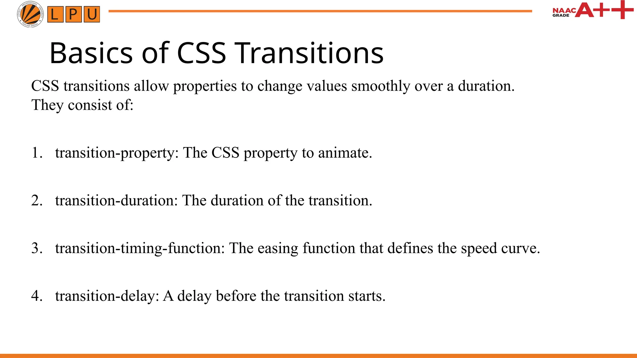
Basics of CSSTransitions
CSS transitions allow properties to change values smoothly over a duration.
They consist of:
1. transition-property: The CSS property to animate.
2. transition-duration: The duration of the transition.
3. transition-timing-function: The easing function that defines the speed curve.
4. transition-delay: A delay before the transition starts.
• Web animationscan significantly enhance user experience by making
websites more engaging and interactive.
• Poorly optimized animations can lead to slow performance, frustrating
users and driving them away.
• Optimizing web animations is crucial to ensure that they run smoothly
across all devices and browsers.
7.
• Animations, whilevisually appealing, can have a significant impact on the
performance of your website.
• They consume computational resources, which can slow down page loading
times and lead to laggy interactions.
8.
Key Metrics toMonitor
To optimize web animations effectively, it’s essential to monitor key
performance metrics. These include:
1. frame rate,
2. load time,
3. responsiveness.
Tools like Google Lighthouse and browser developer tools can help you
analyze these metrics and identify areas for improvement.
9.
Frame Rate andJank
• The frame rate measures how smoothly an animation runs, typically aiming
for 60 frames per second (FPS).
• Jank occurs when the frame rate drops, causing stuttery or choppy
animations.
Maintaining a consistent frame rate is crucial for a smooth user experience.
10.
Optimizing CSS Animations
Choosingthe Right Properties
1. When creating CSS animations, it’s important to animate properties that do not
trigger layout recalculations.
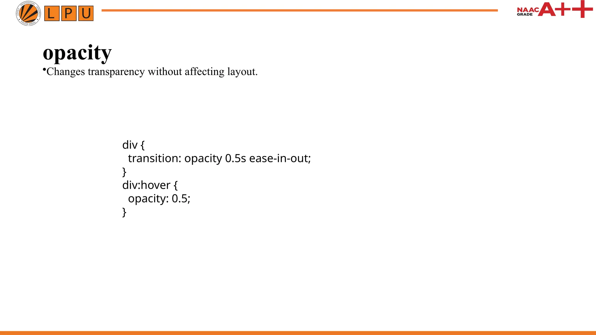
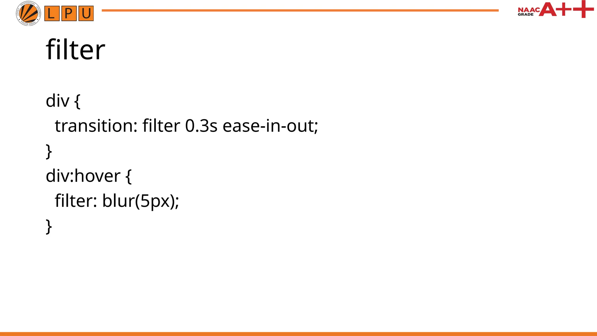
2. Properties like transform and opacity are good
3. because they can be animated without affecting the layout, making them more
performance-friendly.
11.
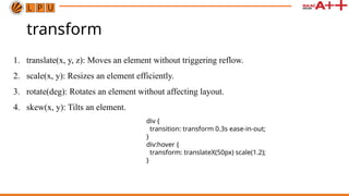
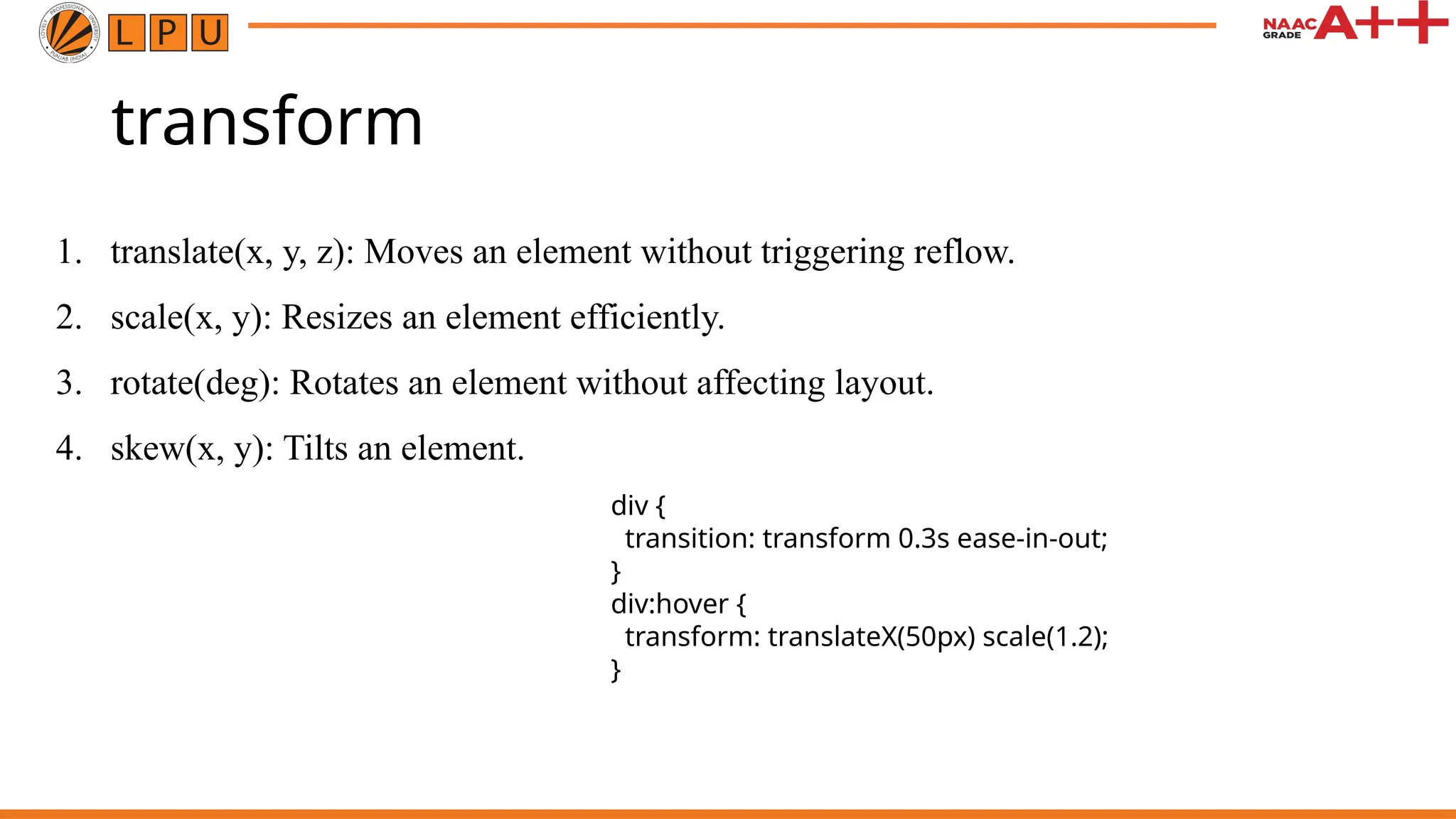
transform
1. translate(x, y,z): Moves an element without triggering reflow.
2. scale(x, y): Resizes an element efficiently.
3. rotate(deg): Rotates an element without affecting layout.
4. skew(x, y): Tilts an element.
div {
transition: transform 0.3s ease-in-out;
}
div:hover {
transform: translateX(50px) scale(1.2);
}
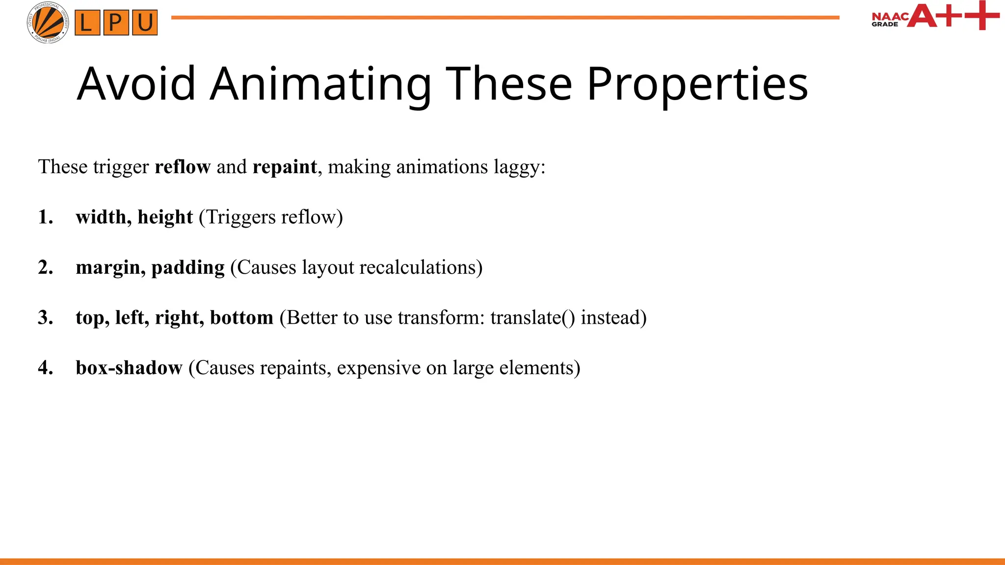
Avoid Animating TheseProperties
These trigger reflow and repaint, making animations laggy:
1. width, height (Triggers reflow)
2. margin, padding (Causes layout recalculations)
3. top, left, right, bottom (Better to use transform: translate() instead)
4. box-shadow (Causes repaints, expensive on large elements)
16.
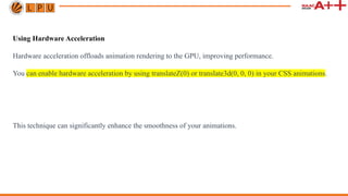
Using Hardware Acceleration
Hardwareacceleration offloads animation rendering to the GPU, improving performance.
You can enable hardware acceleration by using translateZ(0) or translate3d(0, 0, 0) in your CSS animations.
This technique can significantly enhance the smoothness of your animations.
17.
Minimizing Repaints andReflows
1. Repaints and reflows occur when changes to an element affect the layout or visual appearance of the
entire page.
2. Avoid animating properties that cause these events, such as width, height, margin, and padding.
3. Stick to properties that affect only the specific element being animated.
18.
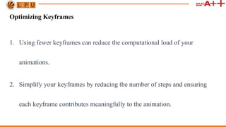
Optimizing Keyframes
1. Usingfewer keyframes can reduce the computational load of your
animations.
2. Simplify your keyframes by reducing the number of steps and ensuring
each keyframe contributes meaningfully to the animation.
19.
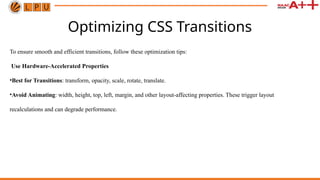
Optimizing CSS Transitions
Toensure smooth and efficient transitions, follow these optimization tips:
Use Hardware-Accelerated Properties
•Best for Transitions: transform, opacity, scale, rotate, translate.
•Avoid Animating: width, height, top, left, margin, and other layout-affecting properties. These trigger layout
recalculations and can degrade performance.
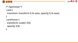
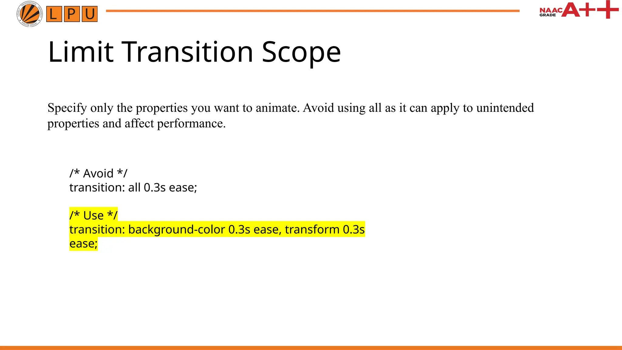
Limit Transition Scope
Specifyonly the properties you want to animate. Avoid using all as it can apply to unintended
properties and affect performance.
/* Avoid */
transition: all 0.3s ease;
/* Use */
transition: background-color 0.3s ease, transform 0.3s
ease;
22.
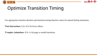
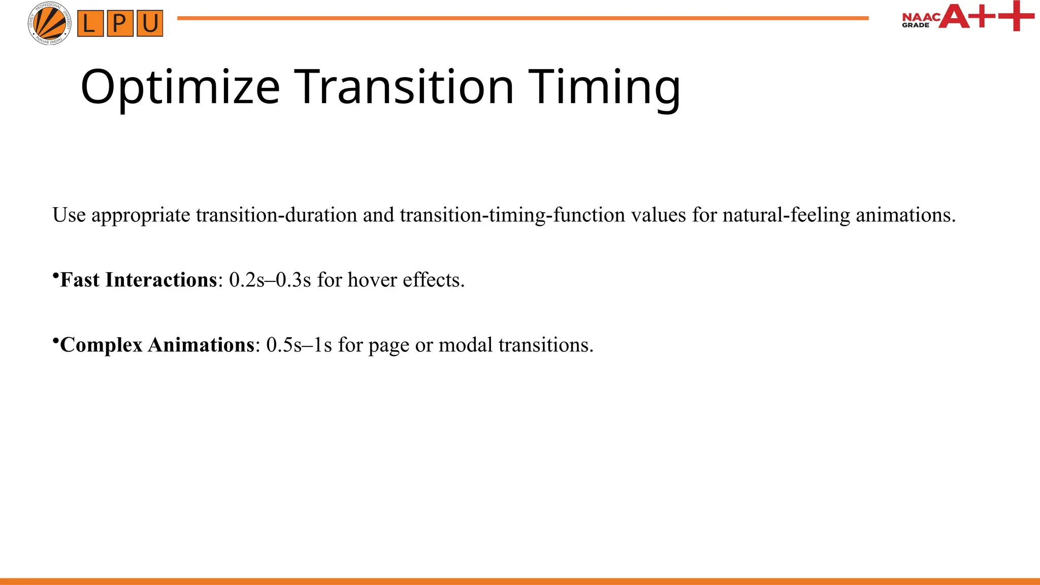
Optimize Transition Timing
Useappropriate transition-duration and transition-timing-function values for natural-feeling animations.
•Fast Interactions: 0.2s–0.3s for hover effects.
•Complex Animations: 0.5s–1s for page or modal transitions.
23.
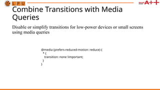
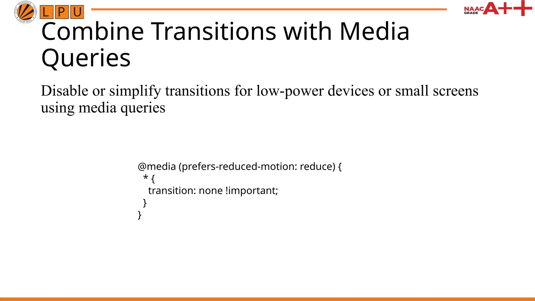
Combine Transitions withMedia
Queries
Disable or simplify transitions for low-power devices or small screens
using media queries
@media (prefers-reduced-motion: reduce) {
* {
transition: none !important;
}
}
24.
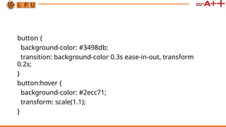
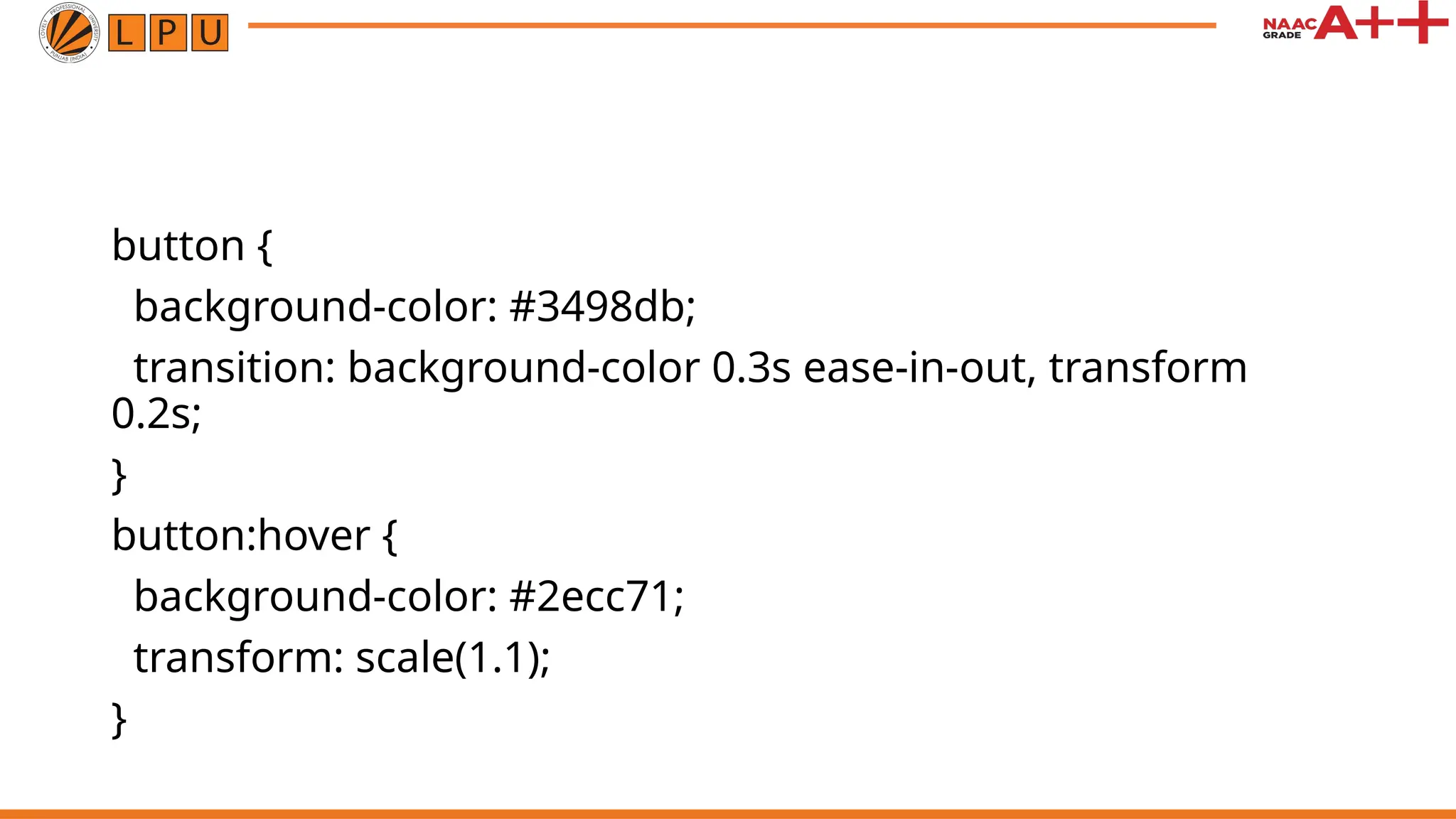
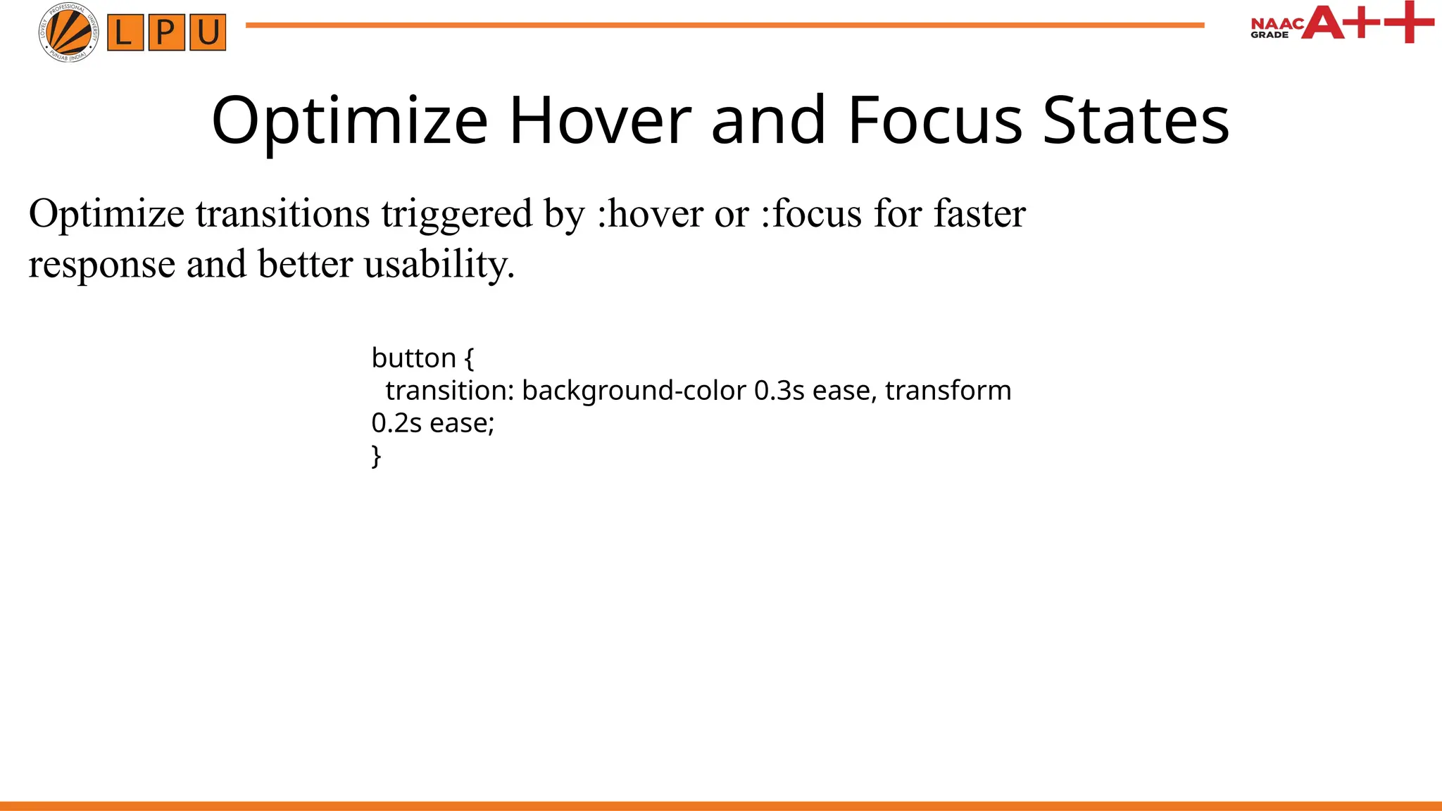
Optimize Hover andFocus States
Optimize transitions triggered by :hover or :focus for faster
response and better usability.
button {
transition: background-color 0.3s ease, transform
0.2s ease;
}