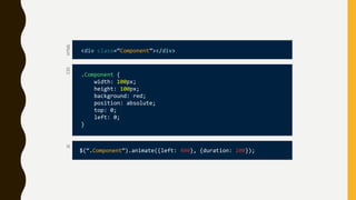
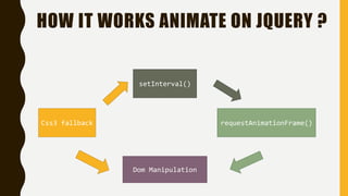
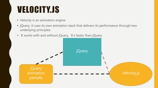
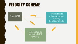
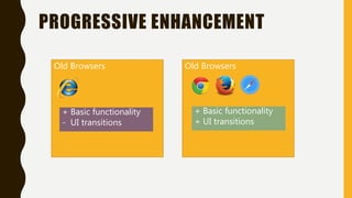
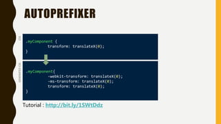
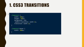
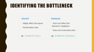
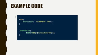
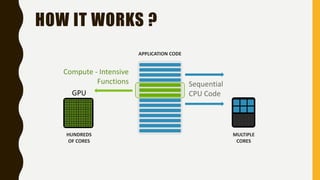
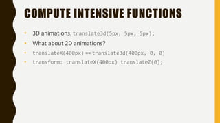
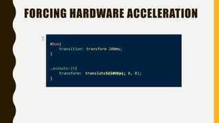
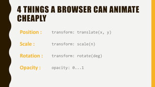
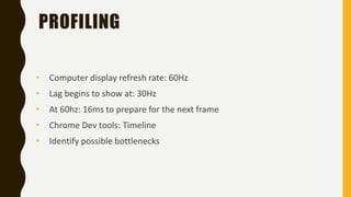
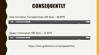
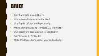
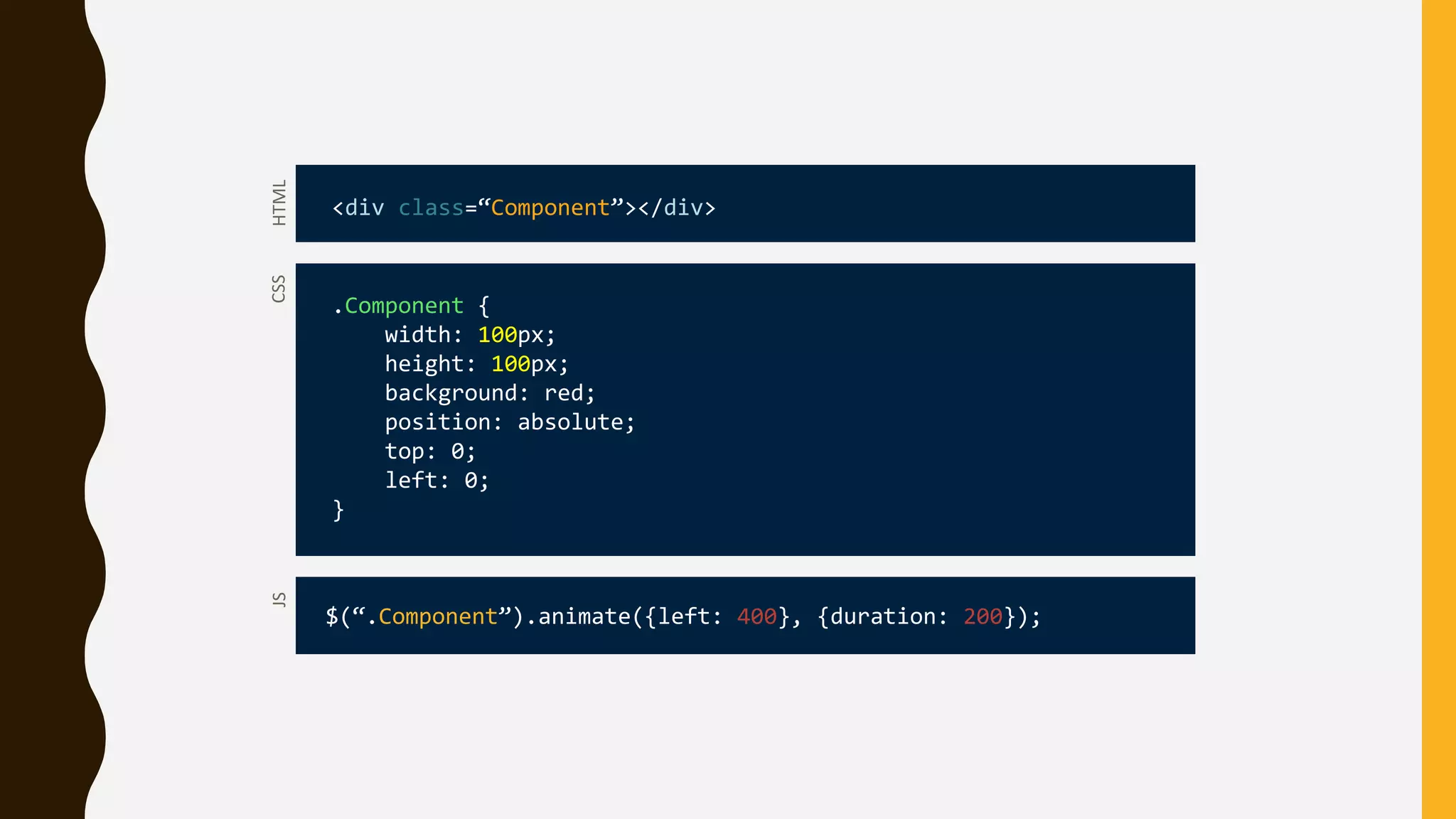
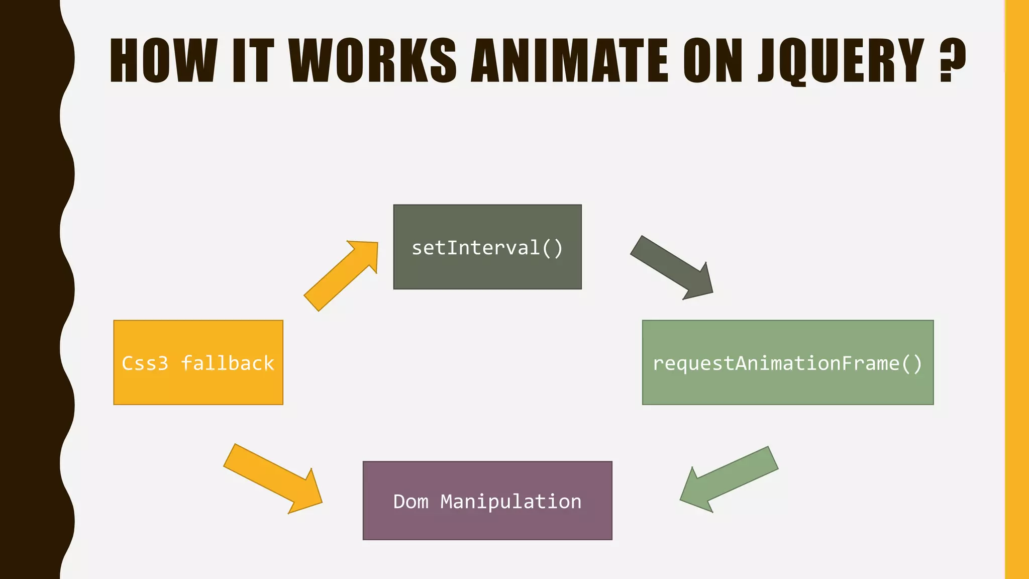
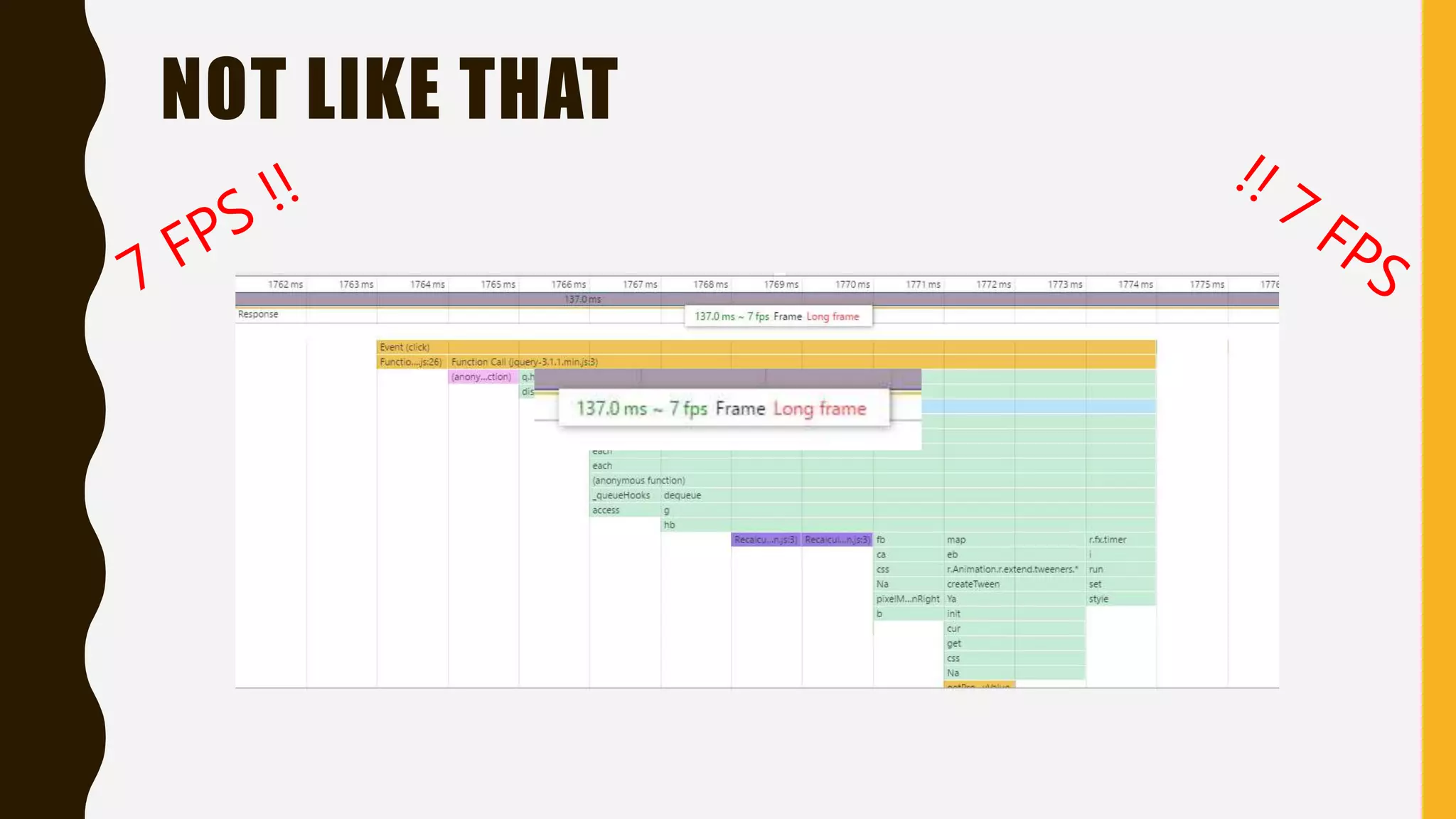
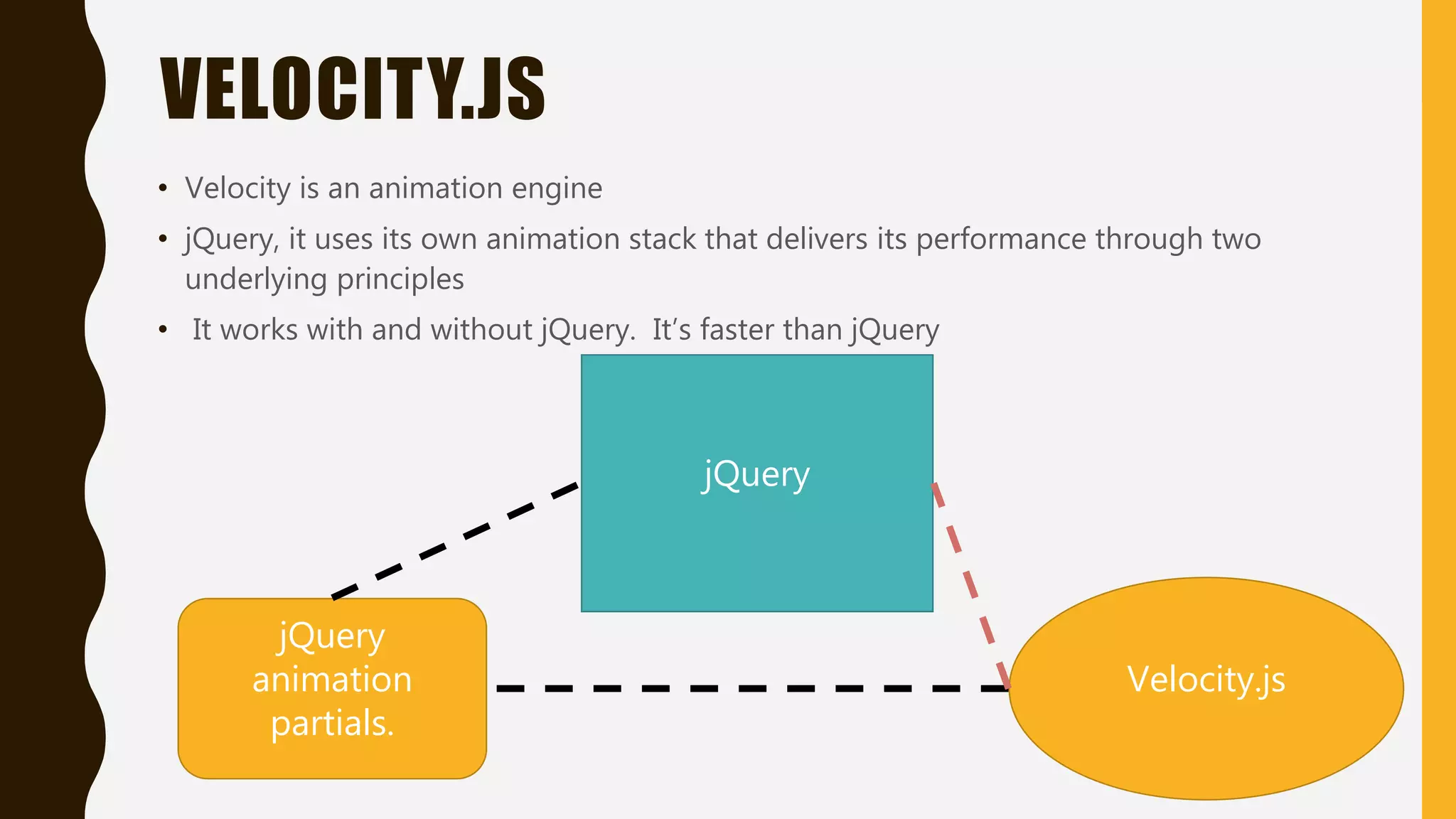
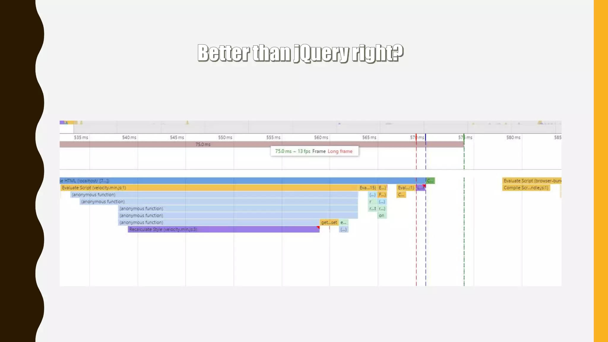
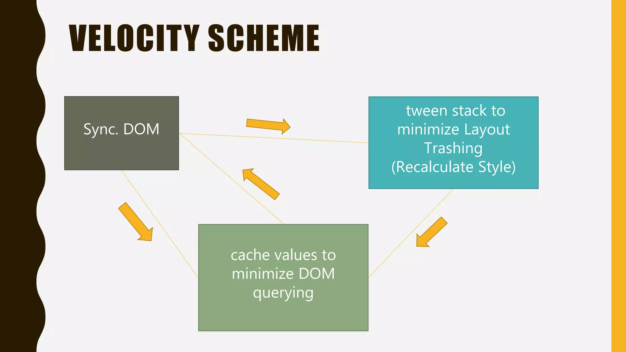
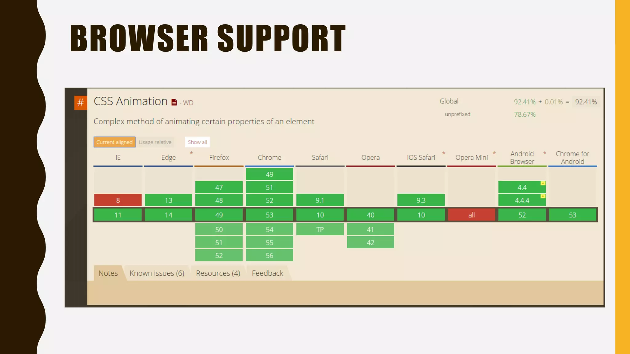
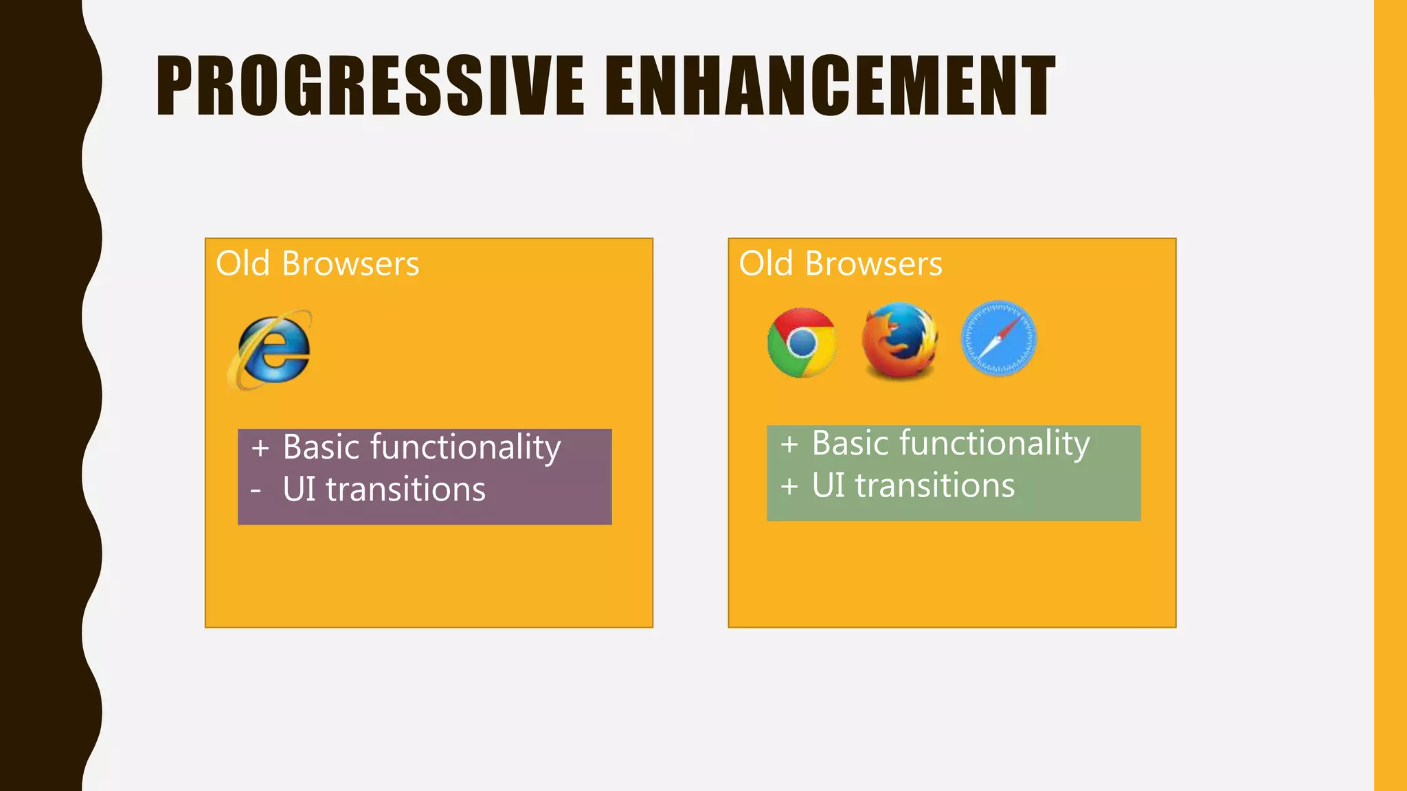
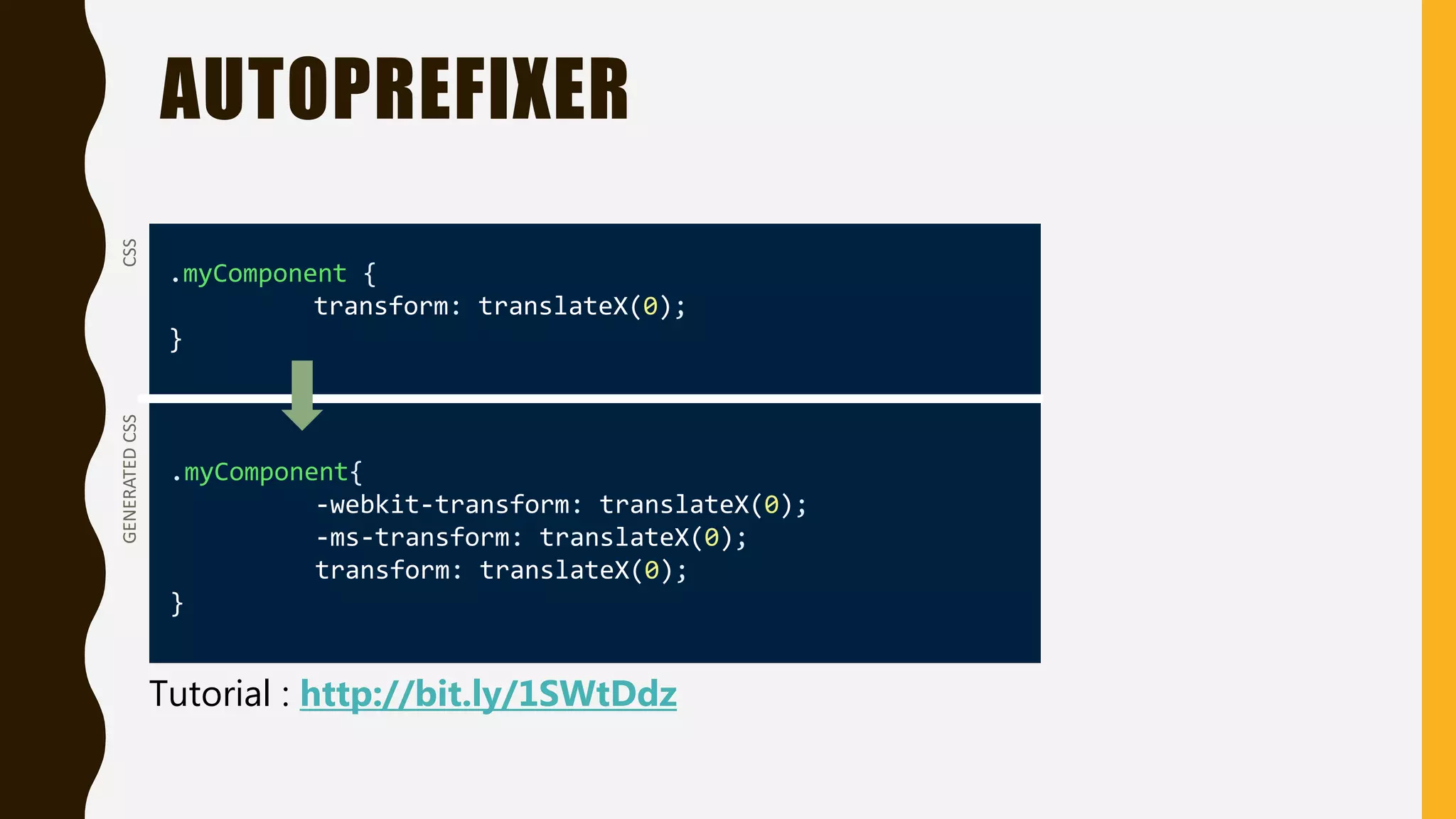
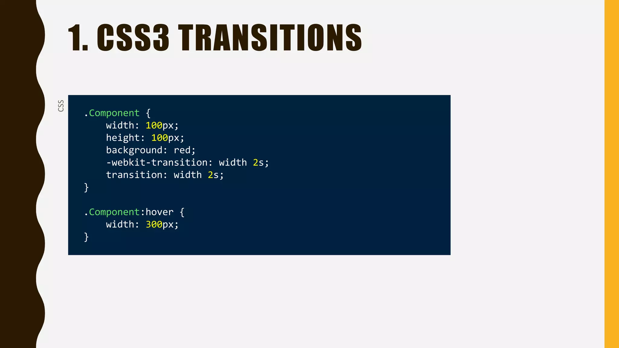
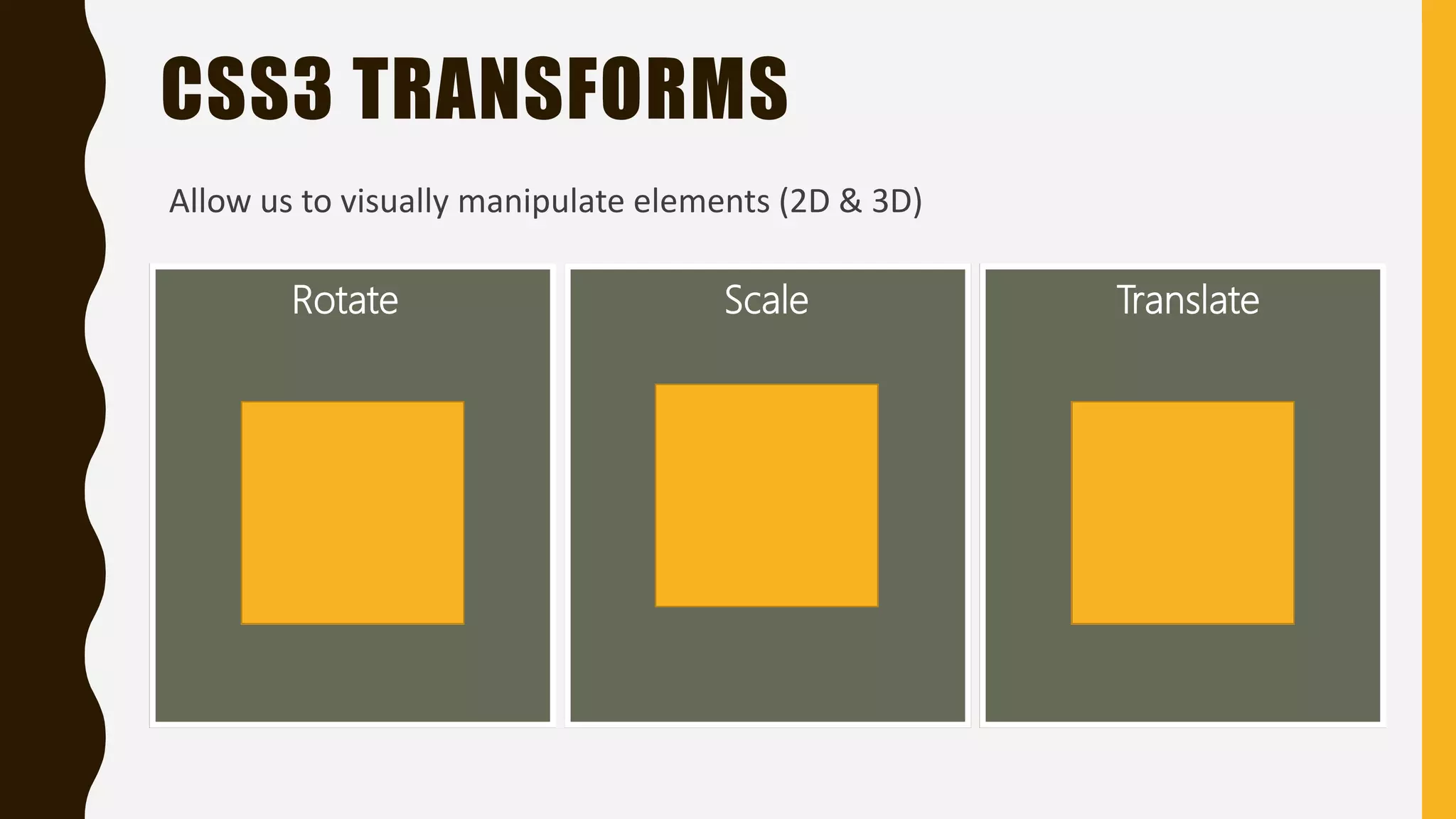
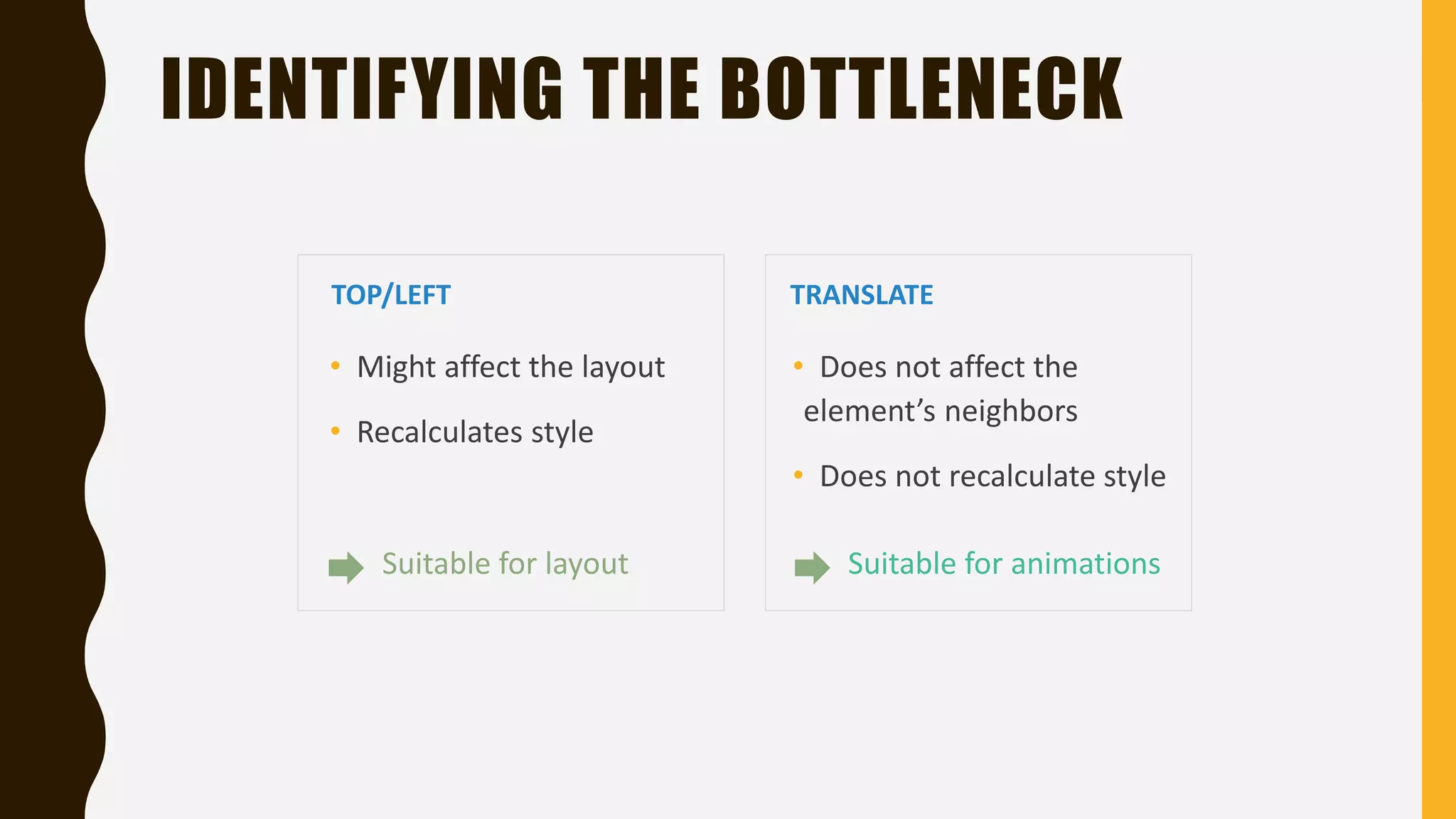
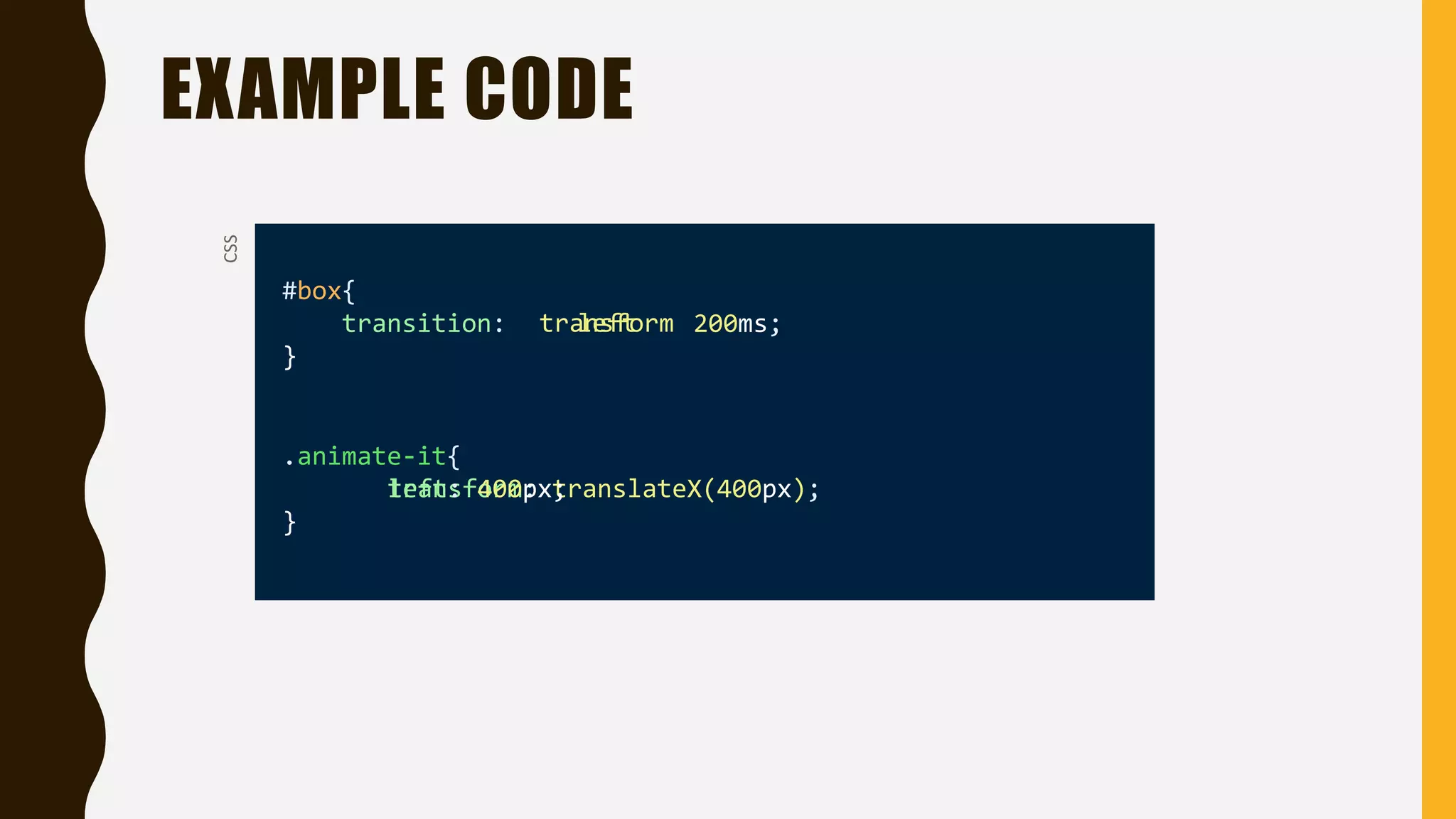
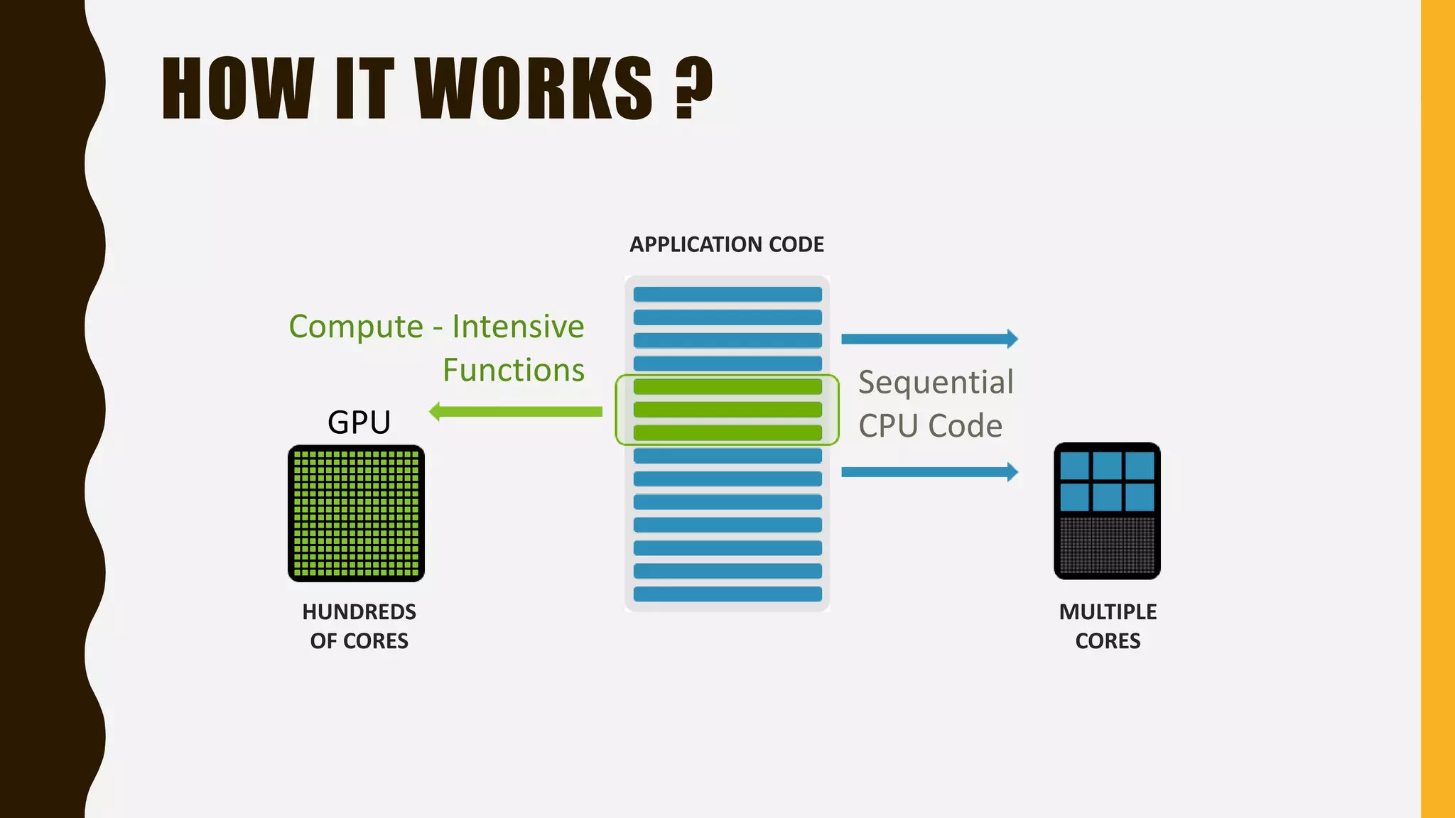
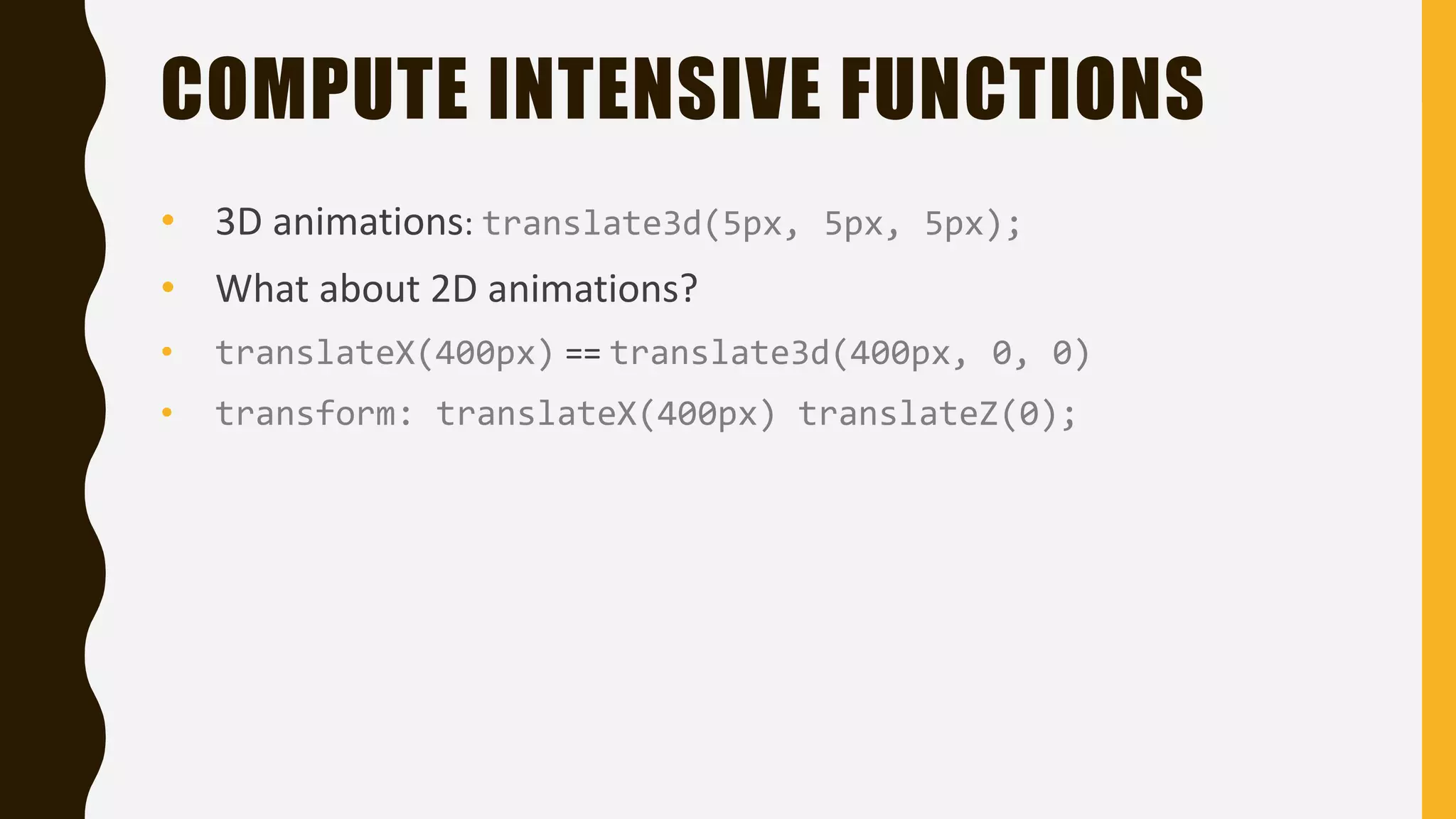
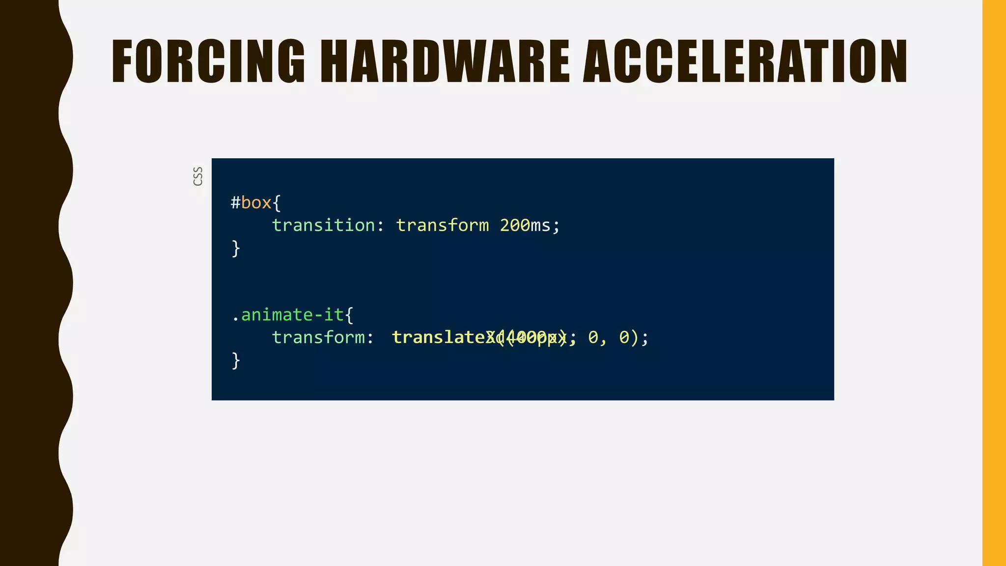
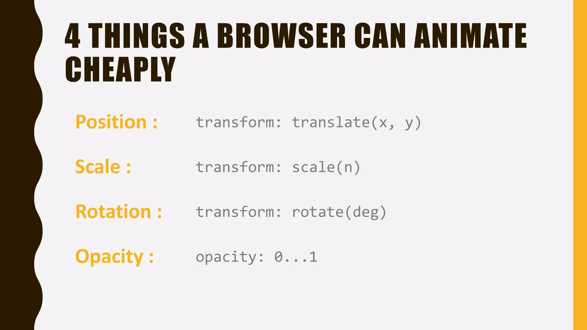
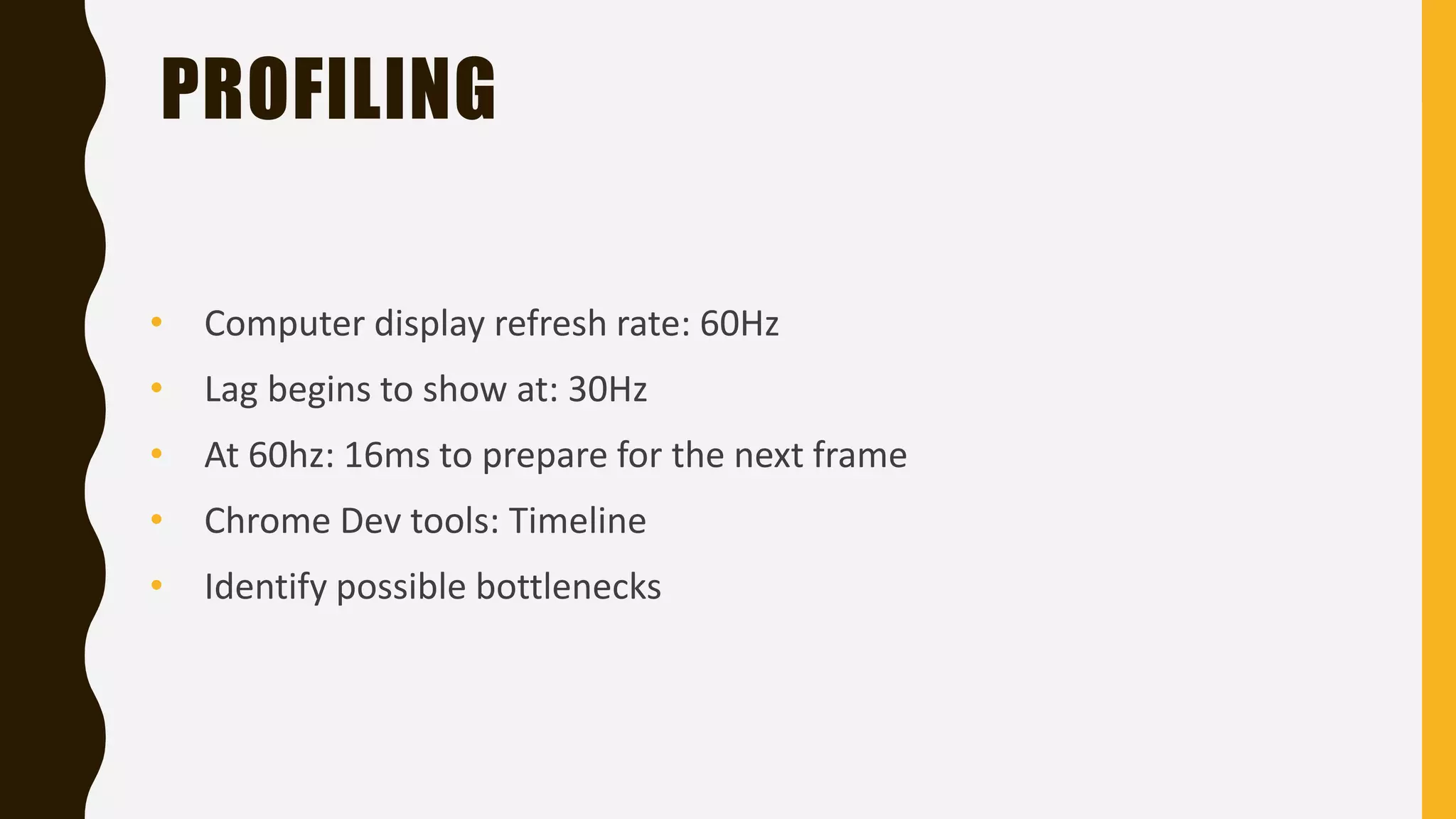
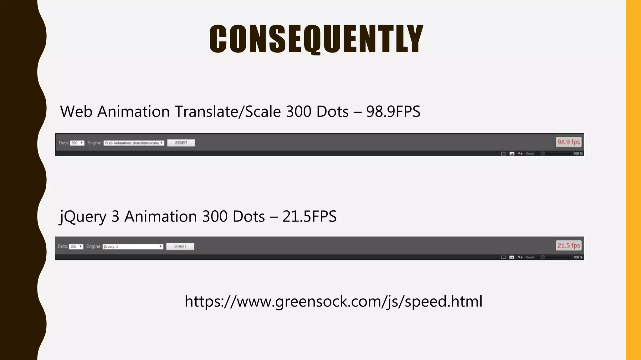
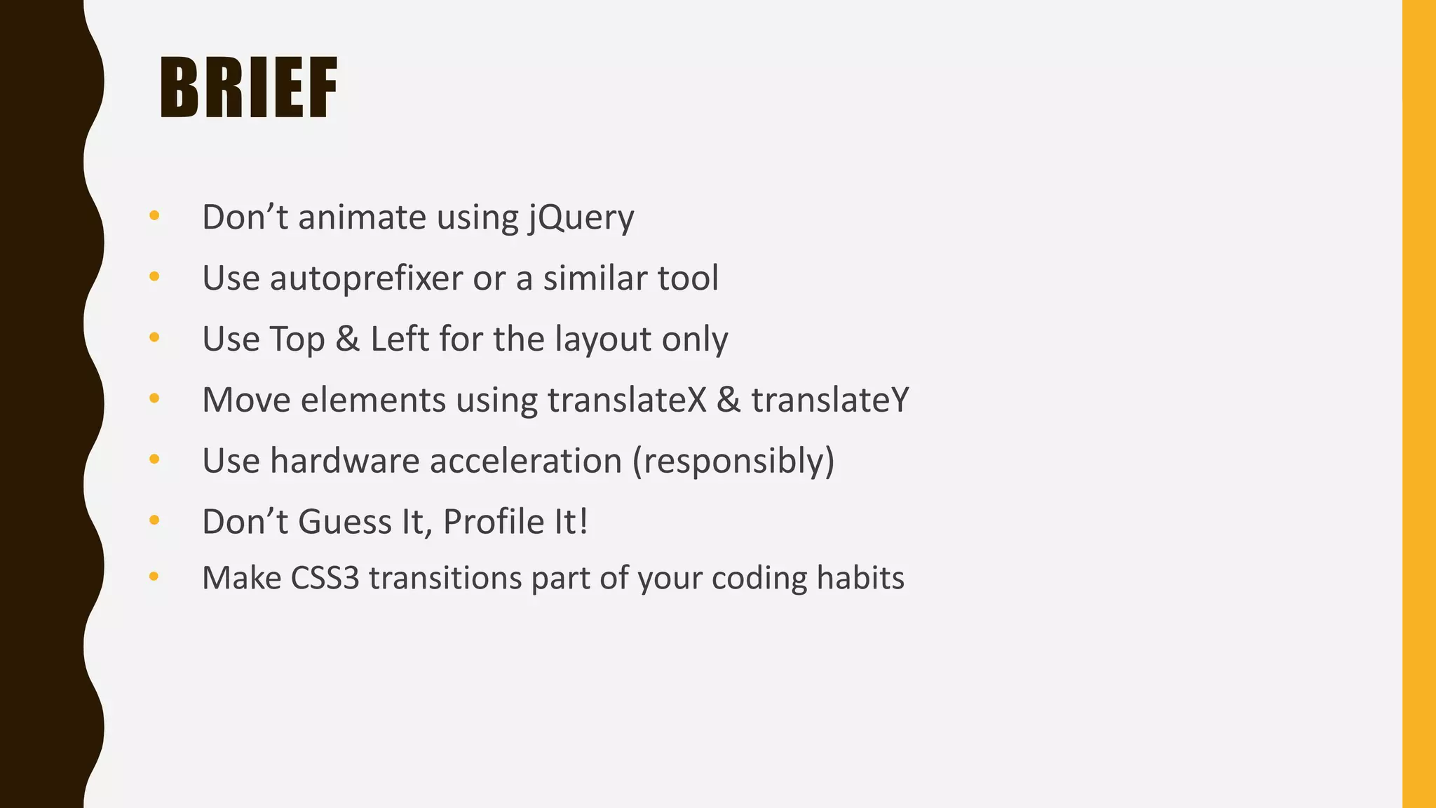
KEMBAR78
Fastest css3 animations | PPTX
FASTEST CSS3
ANIMATIONS
Berkay Beyaz - @berkaybeyaz6
WHO AM I ?
• At 17
• Entrepreneur @Splashup - http://splashup.in
• Backend Developer
WHY ANIMATE ?
• Delightful user experience
• Hiding possible loading times
• For attract attention
SCROLLING
UNPLEASANT UX DELIGHTFUL UX
jQuery way
400px
CSS
.Component {
width: 100px;
height: 100px;
background: red;
position: absolute;
top: 0;
left: 0;
}
HTML
<div class=“Component”></div>
JS
$(“.Component”).animate({left: 400}, {duration: 200});
HOW IT WORKS ANIMATE ON JQUERY ?
Css3 fallback requestAnimationFrame()
setInterval()
Dom Manipulation
THAT'S ALL
RIGHT ?
NOT LIKE THAT
WHAT WE DO
NOW ?
VELOCITY.JS
• Velocity is an animation engine
• jQuery, it uses its own animation stack that delivers its performance through two
underlying principles
• It works with and without jQuery. It’s faster than jQuery
jQuery
jQuery
animation
partials.
Velocity.js
VELOCITY SCHEME
Sync. DOM
tween stack to
minimize Layout
Trashing
(Recalculate Style)
cache values to
minimize DOM
querying
BROWSER SUPPORT
PROGRESSIVE ENHANCEMENT
Old Browsers
+ Basic functionality
- UI transitions
Old Browsers
+ Basic functionality
+ UI transitions
TESTING ON BROWSERS
RESULTS
SOLUTION ?
AUTOPREFIXER
• Add the desired vendor prefixes and remove unnecessary in your CSS
• Violates D.R.Y. principle
• Compatible with all browsers
• Using with Grunt
http://bitly.com/2ejNcjs
AUTOPREFIXER
.myComponent {
transform: translateX(0);
}
.myComponent{
-webkit-transform: translateX(0);
-ms-transform: translateX(0);
transform: translateX(0);
}
CSSGENERATEDCSS
Tutorial : http://bit.ly/1SWtDdz
Basic
Animations
1. CSS3 TRANSITIONSCSS
.Component {
width: 100px;
height: 100px;
background: red;
-webkit-transition: width 2s;
transition: width 2s;
}
.Component:hover {
width: 300px;
}
2. CSS3 Transforms
CSS3 TRANSFORMS
Rotate Scale Translate
Allow us to visually manipulate elements (2D & 3D)
IDENTIFYING THE BOTTLENECK
TOP/LEFT
• Might affect the layout
• Recalculates style
TRANSLATE
• Does not affect the
element’s neighbors
• Does not recalculate style
Suitable for layout Suitable for animations
EXAMPLE CODE
#box{
transition: 200ms;
}
.animate-it{
}
CSS
transform: translateX(400px);left: 400px;
lefttransform
3. HARDWARE ACCELERATION
HOW IT WORKS ?
Compute - Intensive
Functions Sequential
CPU Code
MULTIPLE
CORES
HUNDREDS
OF CORES
APPLICATION CODE
GPU
COMPUTE INTENSIVE FUNCTIONS
• 3D animations: translate3d(5px, 5px, 5px);
• What about 2D animations?
• translateX(400px) == translate3d(400px, 0, 0)
• transform: translateX(400px) translateZ(0);
FORCING HARDWARE ACCELERATION
#box{
transition: transform 200ms;
}
.animate-it{
transform:
}
CSS
translateX(400px);translate3d(400px, 0, 0);
4 THINGS A BROWSER CAN ANIMATE
CHEAPLY
Position : transform: translate(x, y)
Scale :
Rotation :
Opacity :
transform: scale(n)
transform: rotate(deg)
opacity: 0...1
PROFILING
PROFILING
• Computer display refresh rate: 60Hz
• At 60hz: 16ms to prepare for the next frame
• Chrome Dev tools: Timeline
• Identify possible bottlenecks
• Lag begins to show at: 30Hz
CONSEQUENTLY
Web Animation Translate/Scale 300 Dots – 98.9FPS
jQuery 3 Animation 300 Dots – 21.5FPS
https://www.greensock.com/js/speed.html
CHOOSE IT !
BRIEF
• Don’t animate using jQuery
• Use autoprefixer or a similar tool
• Use Top & Left for the layout only
• Move elements using translateX & translateY
• Use hardware acceleration (responsibly)
• Don’t Guess It, Profile It!
• Make CSS3 transitions part of your coding habits
THANK YOU
@berkaybeyaz1
@berkaybeyaz6
.in
QUESTIONS ?

Fastest css3 animations