Together, UI/UX design transforms complex systems into seamless experiences. It’s not just about how things look—but how they work, how they feel, and how they empower users to achieve their goals with ease.
UI/UX DESIGN –CREATING EXPERIENCESTHAT
MATTER
DESIGNING FOR PEOPLE, NOT JUST SCREENS
BY
VENKATESAN B
2.
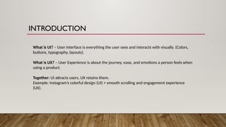
INTRODUCTION
What is UI?– User Interface is everything the user sees and interacts with visually. (Colors,
buttons, typography, layouts).
What is UX? – User Experience is about the journey, ease, and emotions a person feels when
using a product.
Together: UI attracts users, UX retains them.
Example: Instagram’s colorful design (UI) + smooth scrolling and engagement experience
(UX).
3.
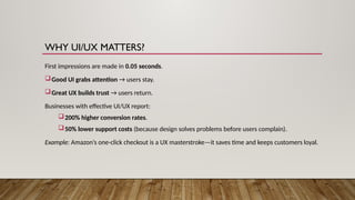
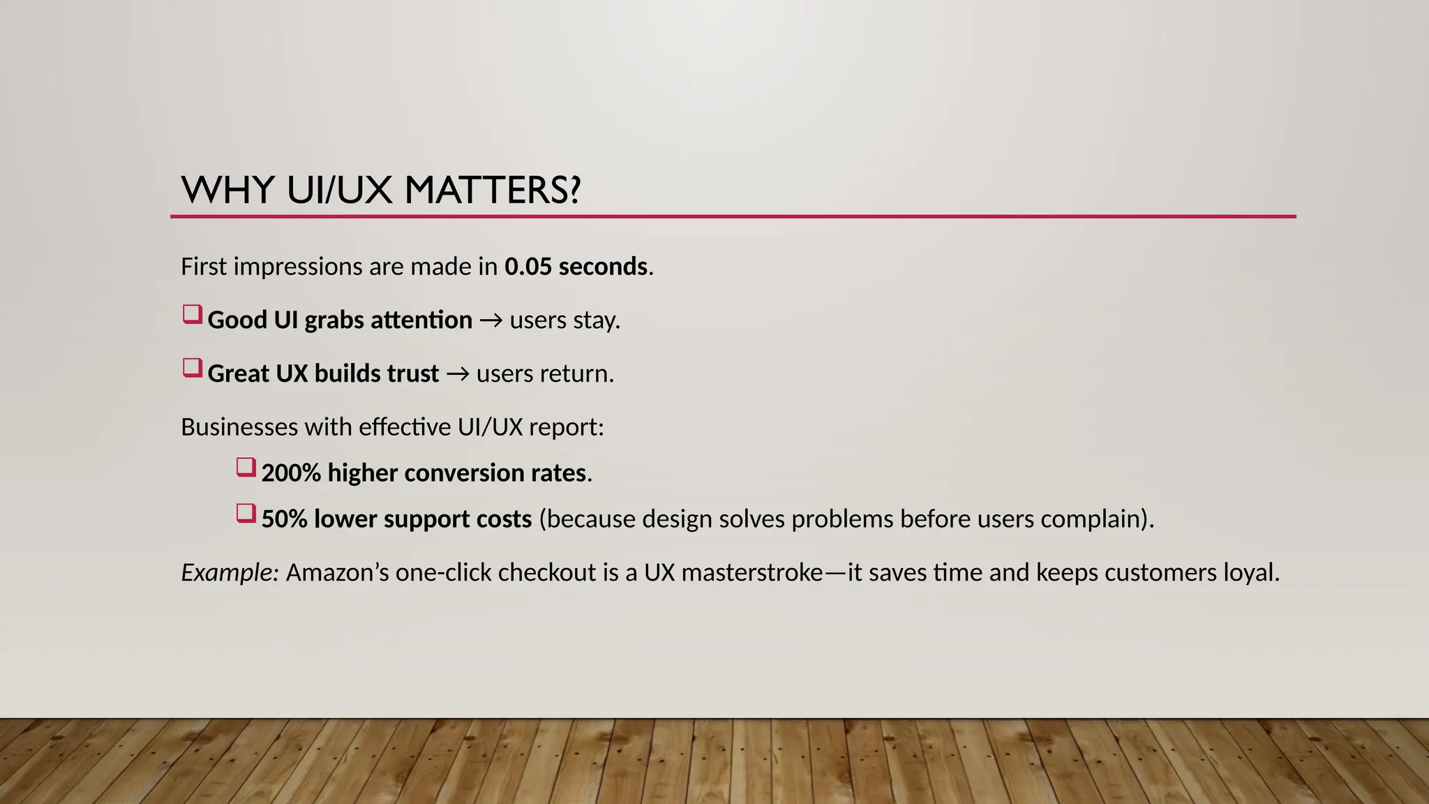
WHY UI/UX MATTERS?
Firstimpressions are made in 0.05 seconds.
Good UI grabs attention → users stay.
Great UX builds trust → users return.
Businesses with effective UI/UX report:
200% higher conversion rates.
50% lower support costs (because design solves problems before users complain).
Example: Amazon’s one-click checkout is a UX masterstroke—it saves time and keeps customers loyal.
4.
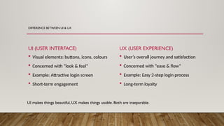
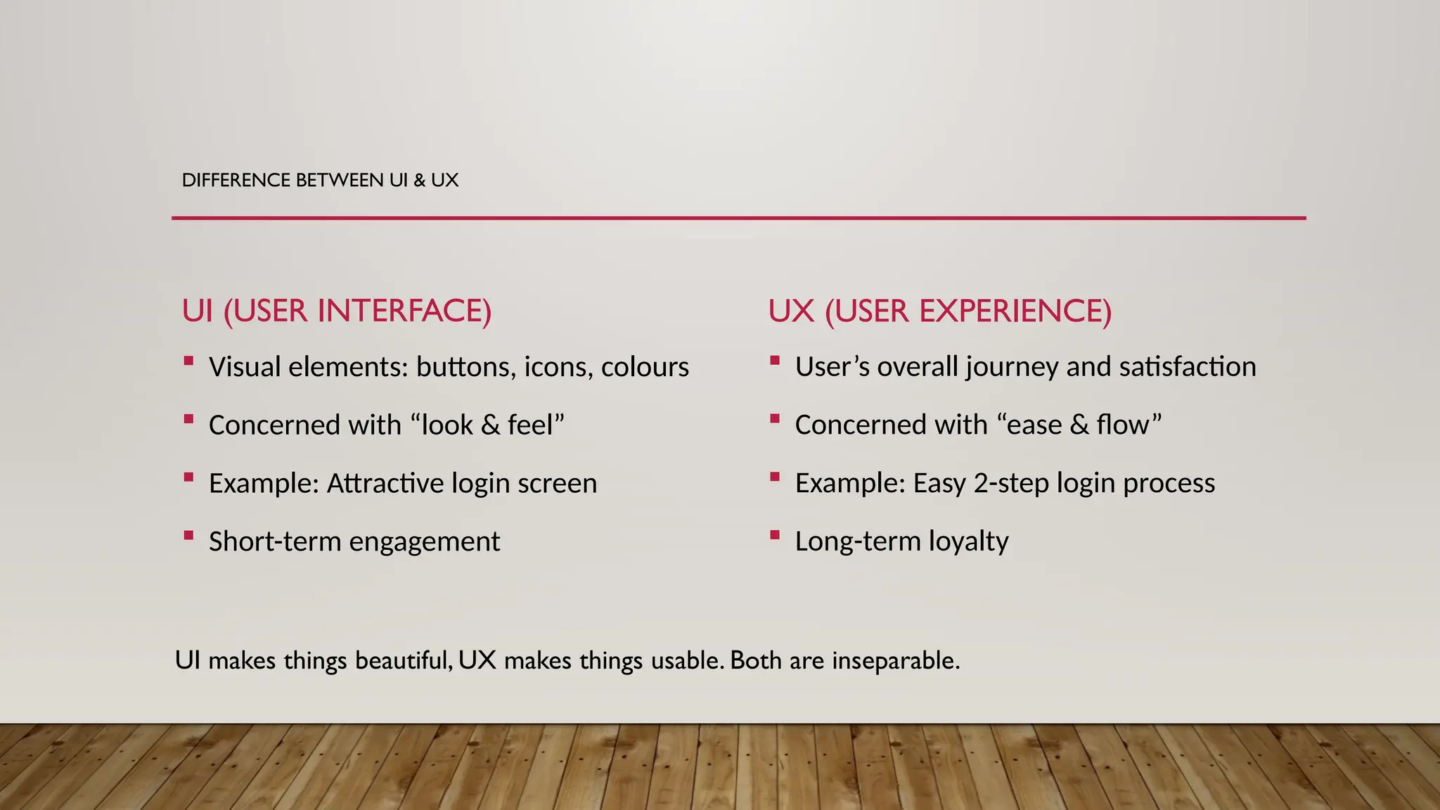
DIFFERENCE BETWEEN UI& UX
UI (USER INTERFACE)
Visual elements: buttons, icons, colours
Concerned with “look & feel”
Example: Attractive login screen
Short-term engagement
UX (USER EXPERIENCE)
User’s overall journey and satisfaction
Concerned with “ease & flow”
Example: Easy 2-step login process
Long-term loyalty
UI makes things beautiful, UX makes things usable. Both are inseparable.
5.
PRINCIPLES OF GOODUI DESIGN
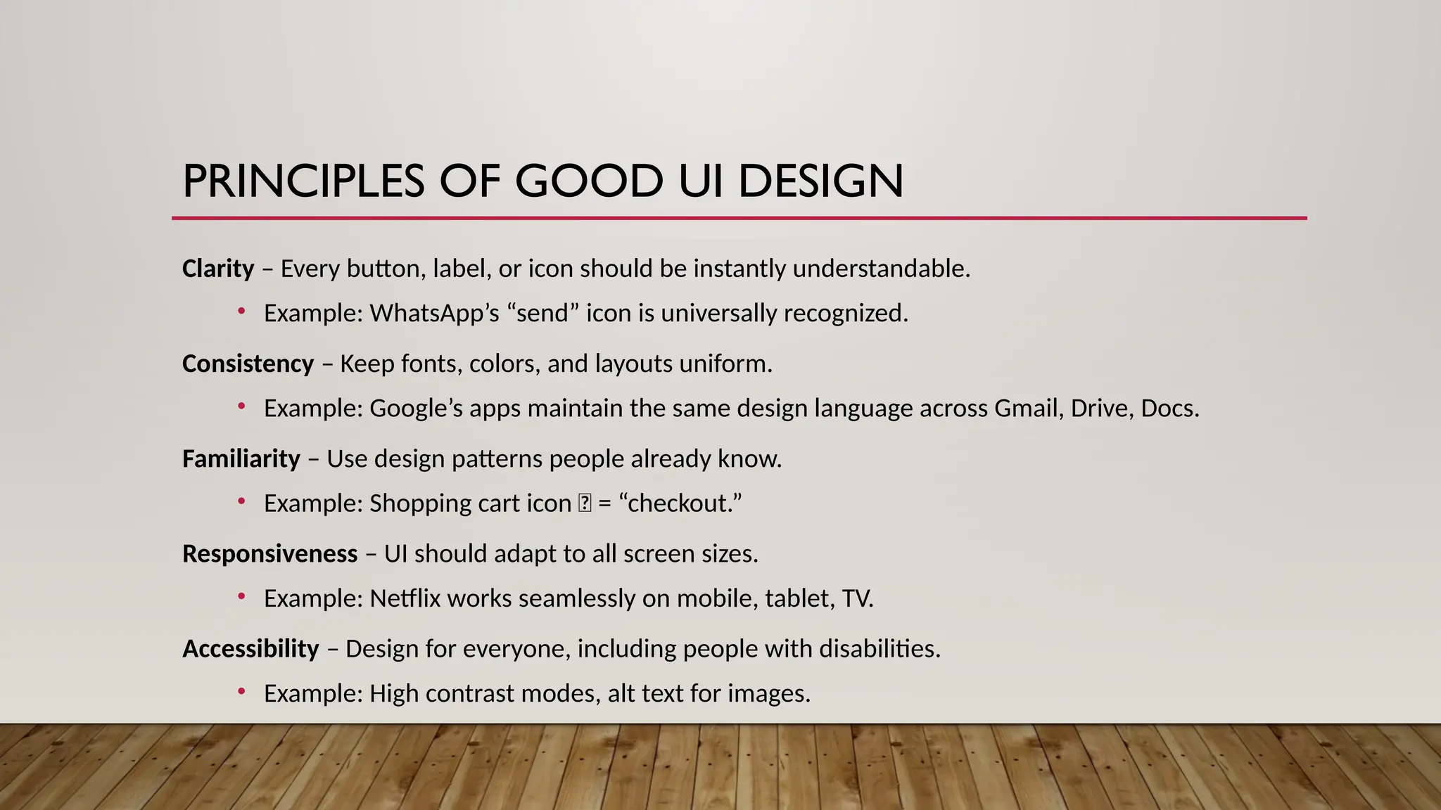
Clarity – Every button, label, or icon should be instantly understandable.
• Example: WhatsApp’s “send” icon is universally recognized.
Consistency – Keep fonts, colors, and layouts uniform.
• Example: Google’s apps maintain the same design language across Gmail, Drive, Docs.
Familiarity – Use design patterns people already know.
• Example: Shopping cart icon 🛒 = “checkout.”
Responsiveness – UI should adapt to all screen sizes.
• Example: Netflix works seamlessly on mobile, tablet, TV.
Accessibility – Design for everyone, including people with disabilities.
• Example: High contrast modes, alt text for images.
6.
PRINCIPLES OF GREATUX DESIGN
User-Centered – Understand real needs, not assumptions.
• Example: Uber simplified booking to “set pickup + destination.”
Simplicity – Don’t make users think too much.
• Example: Google’s homepage is just a search bar.
Feedback – Users should know what’s happening.
• Example: Progress bars during file uploads.
Efficiency – Help users' complete tasks faster.
• Example: Auto-fill for forms saves time.
Flexibility – Allow personalization.
• Example: Spotify playlists tailored to listening habits.
8.
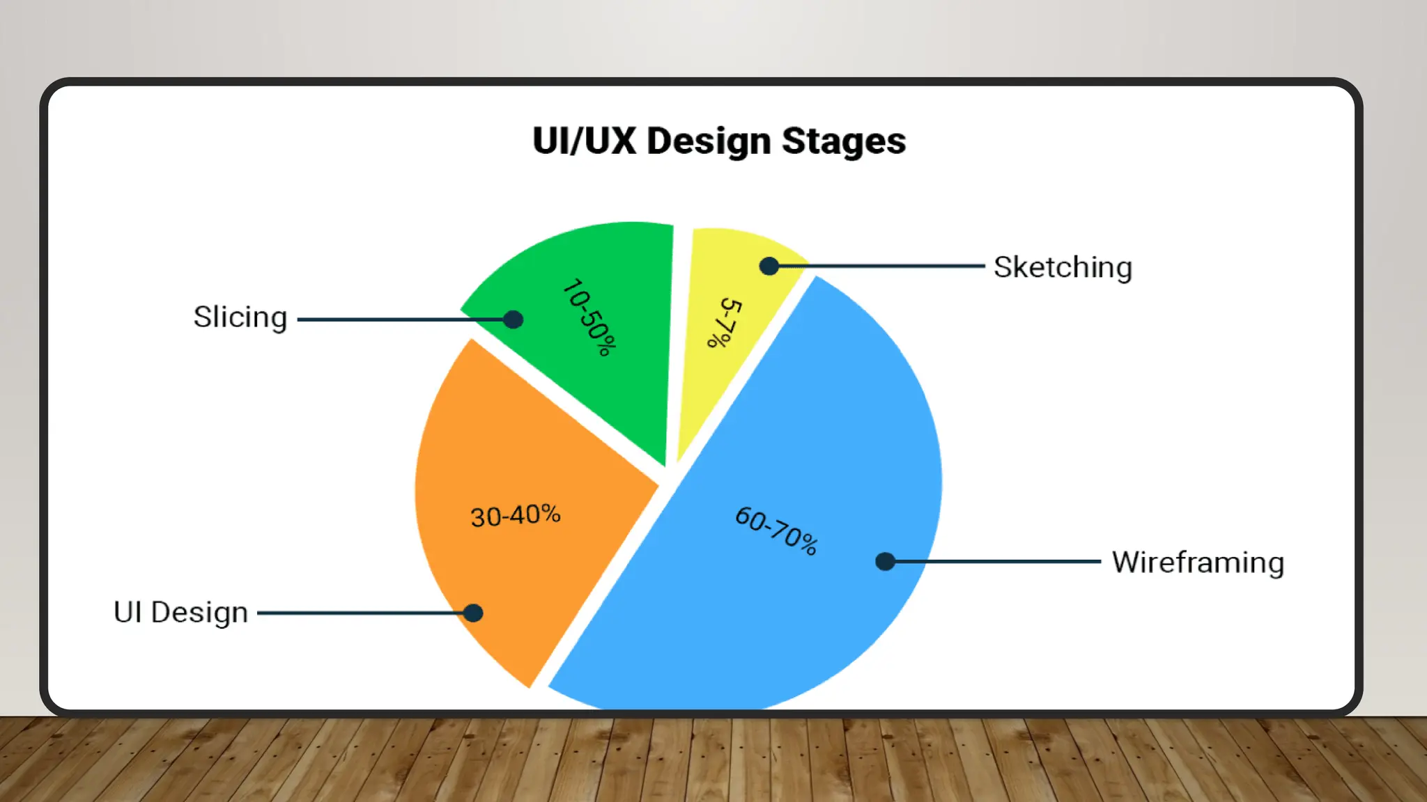
UI/UX DESIGN PROCESS
Research– User interviews, competitor analysis, surveys.
Goal: Understand user pain points.
Define – Create personas & problem statements.
Example: “Busy professionals need faster food ordering.”
Wireframing – Rough sketches of layouts & flows.
Low-fidelity = basic structure; High-fidelity = detailed look.
Prototyping – Clickable demo models.
Example: Using Figma or Adobe XD.
Usability Testing – Let real user's test.
Find where they struggle → improve it.
Iteration – Refine based on feedback.
UI/UX is never final, it evolves with users.
9.
CONCLUSION
UI/UX isthe bridge between technology and people.
A good UI attracts users, but great UX keeps them loyal.
Design should be simple, clear, and human-centered.
Businesses grow when users enjoy seamless experiences.
In the digital era, experience is the true product.