Downloaded 150 times


This document discusses key principles of map design including selection of colors, symbols, labeling, and overall layout. It emphasizes that while there are scientific rules of map design, there is also an artistic element. The document outlines topics to be covered such as map scale and generalization, symbolization, choropleth mapping, use of color, and labeling. It provides guidelines for map elements like titles, legends, and orientation indicators. It also discusses classification schemes, issues with choropleth maps, effective use of color, and best practices for labeling and typography. Ethical practices of map design to avoid deception are highlighted.
Introduction of Asib Ahmed and the context of the presentation.
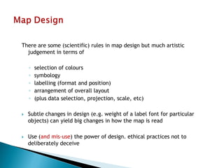
Map design combines scientific rules with artistic choices including colors, symbology, and layout.
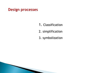
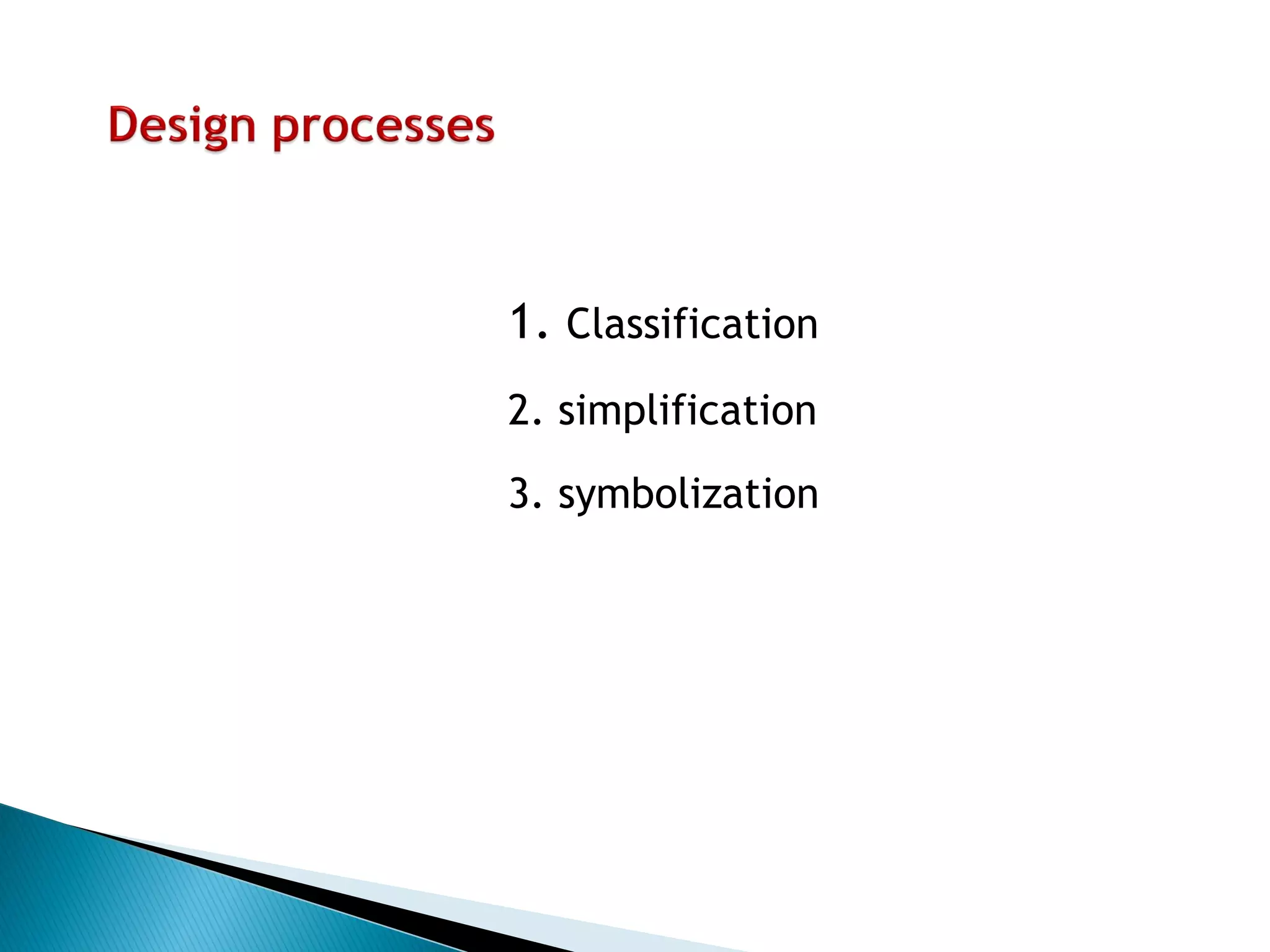
Important concepts include classification, simplification, and symbolization for effective maps.
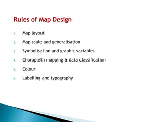
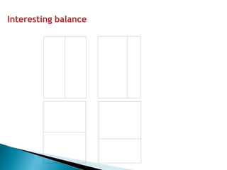
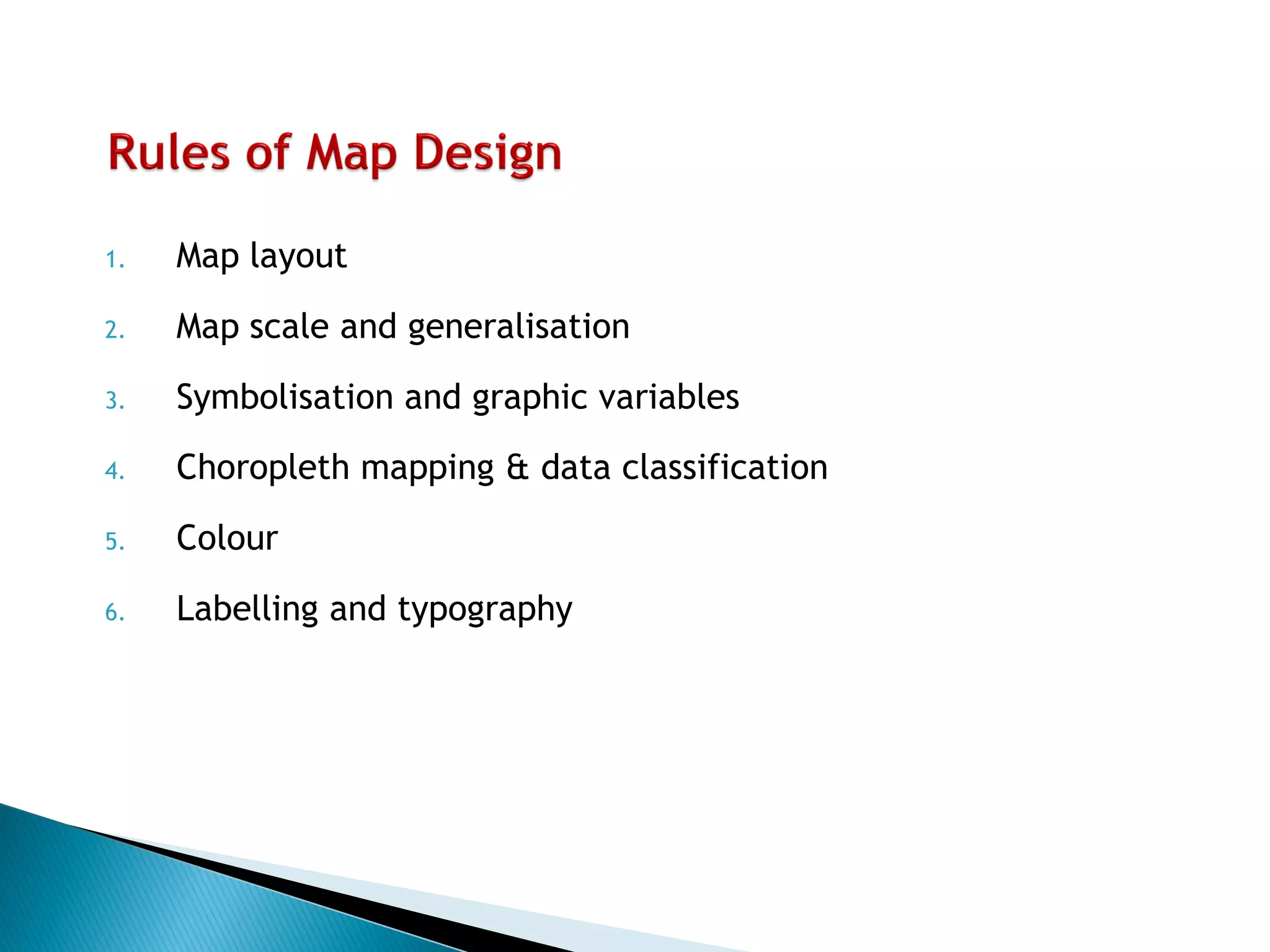
Key elements include layout, scale, symbolization, choropleth mapping, color, and typography.
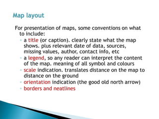
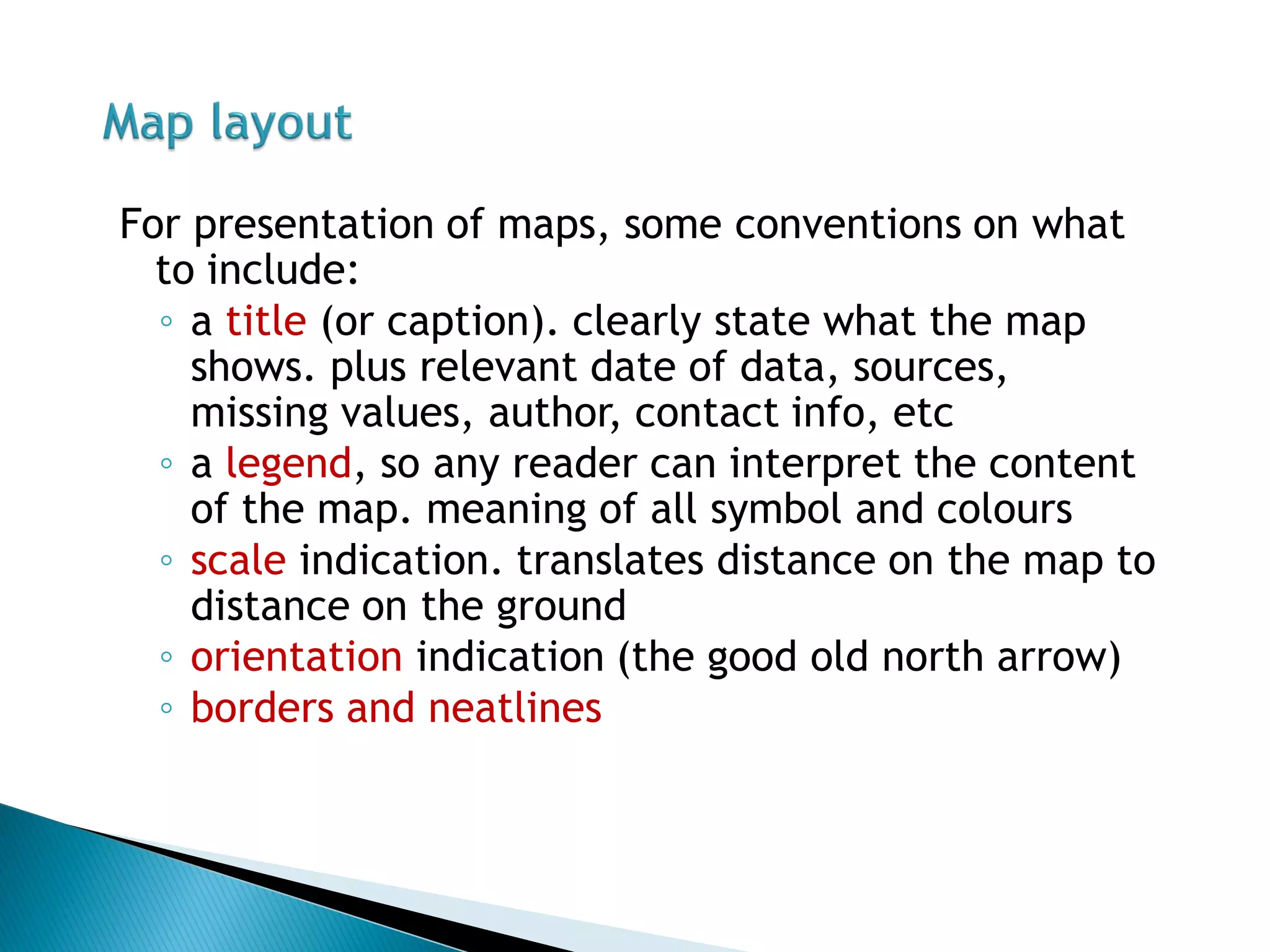
Includes title, legend, scale indication, orientation, and neatlines for effective map presentation.
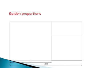
Introduction of the Golden Ratio (1.618) in visual design.
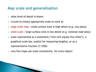
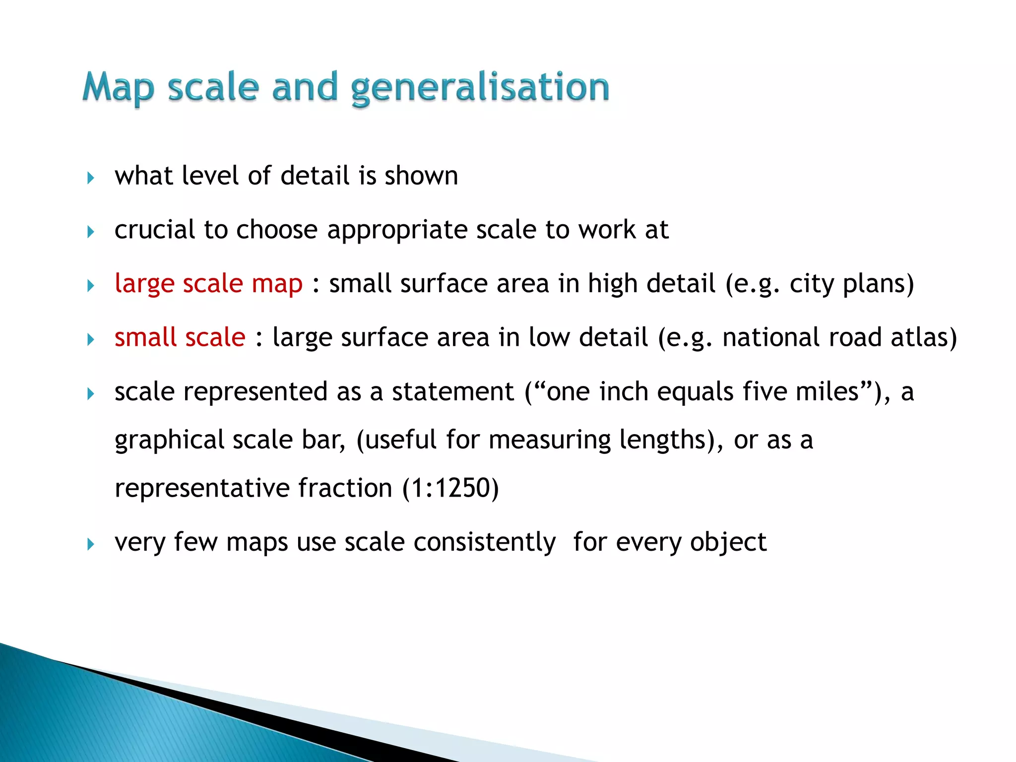
Choosing appropriate scale is crucial; affects detail on maps (large vs. small scale).
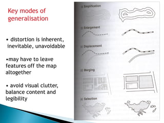
Generalization involves distortion and balance of content for clarity and legibility.
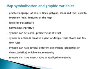
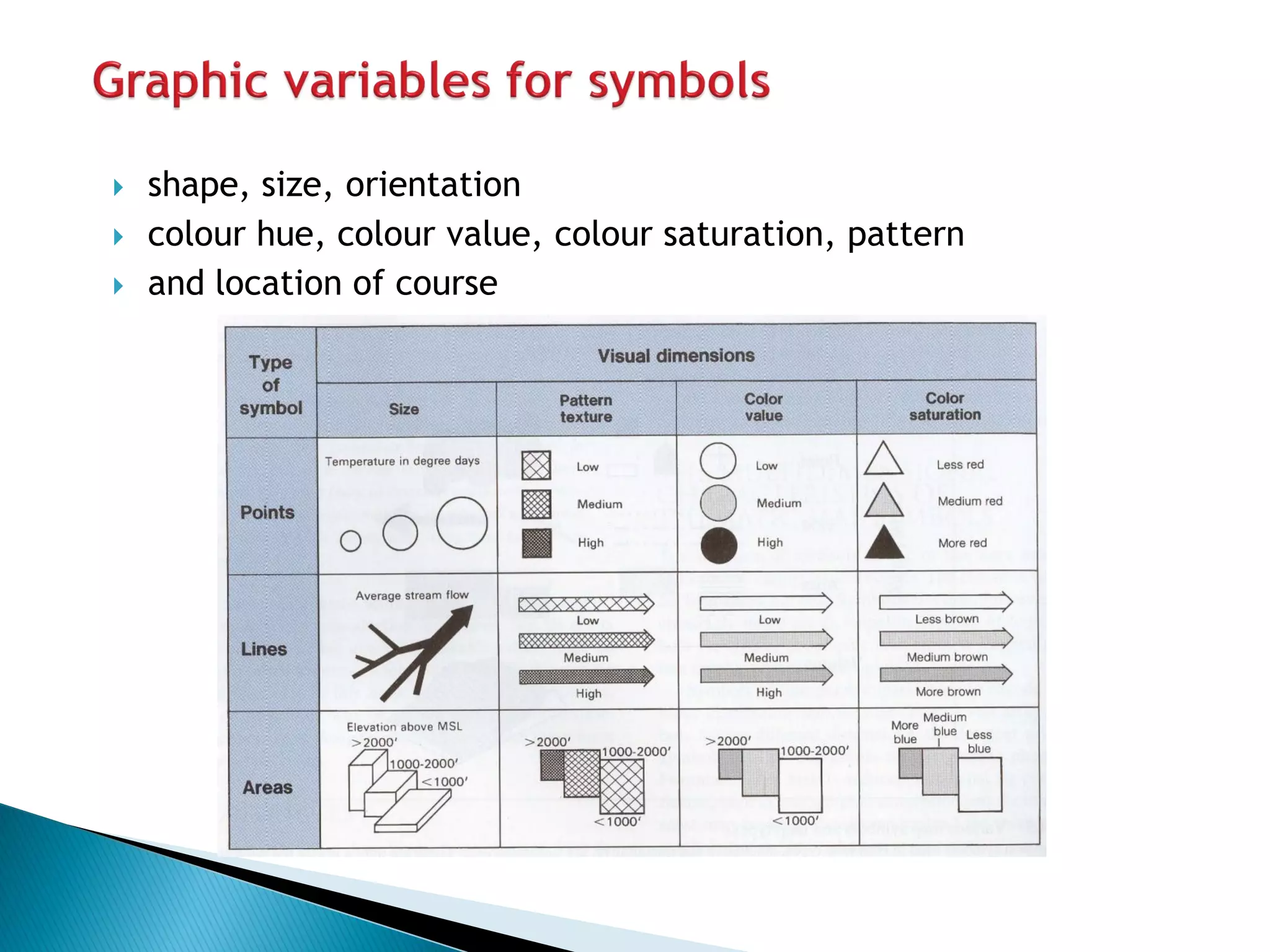
Explains the visual language (points, lines, polygons) and different symbol types used in maps.
Explores properties like shape, size, color, and location that describe symbols on a map.
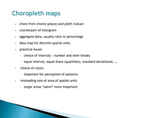
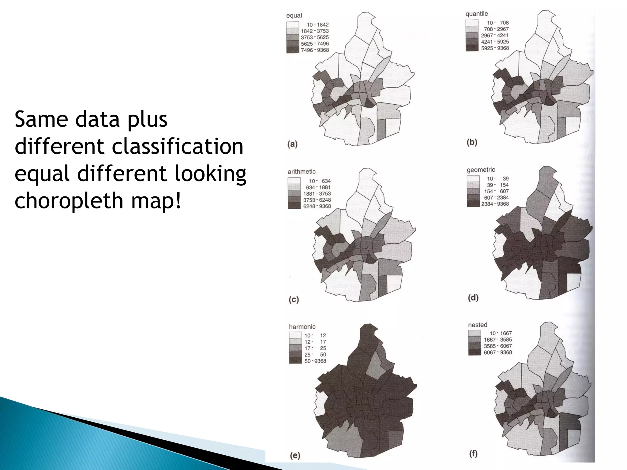
Choropleth maps represent aggregated data; details on classification and color choice.
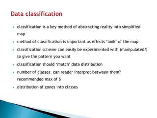
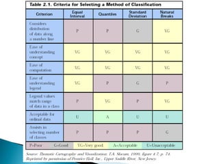
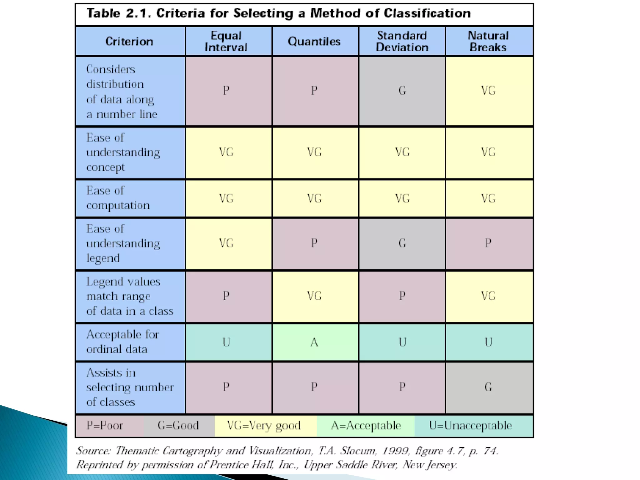
Importance of classification schemes for abstracting reality and visual representation in maps.
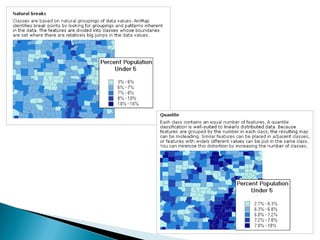
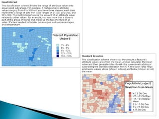
Demonstrates how different classification methods can visually alter choropleth maps.
Different methods: natural breaks, quantiles, equal intervals, and standard deviation.
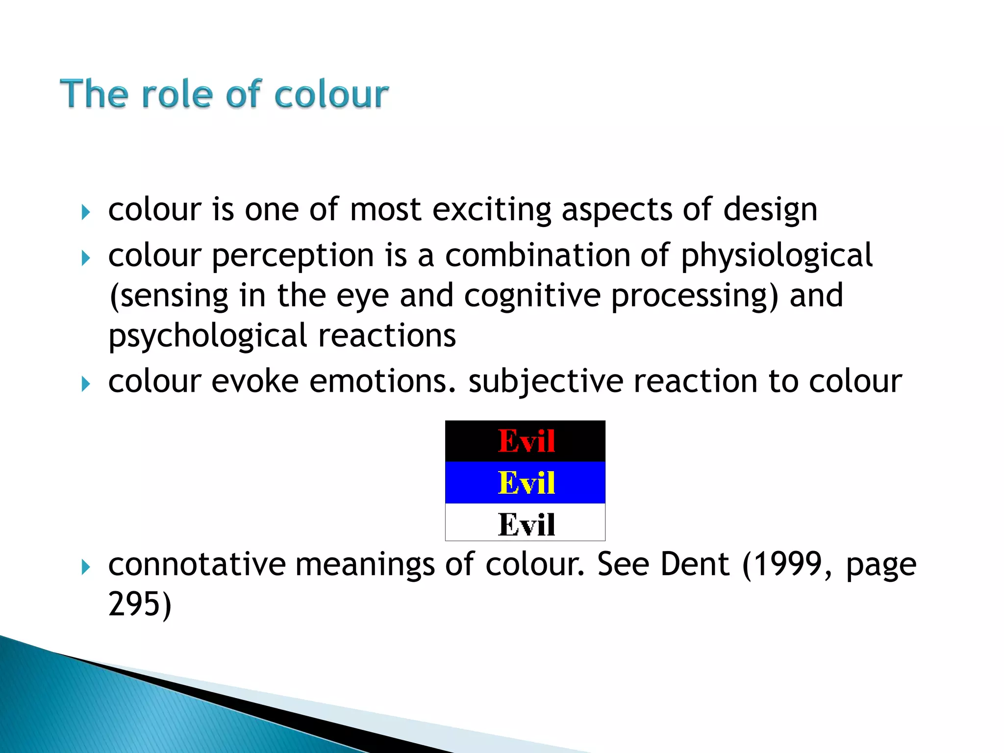
Discusses the psychological and physiological aspects of color perception in map design.
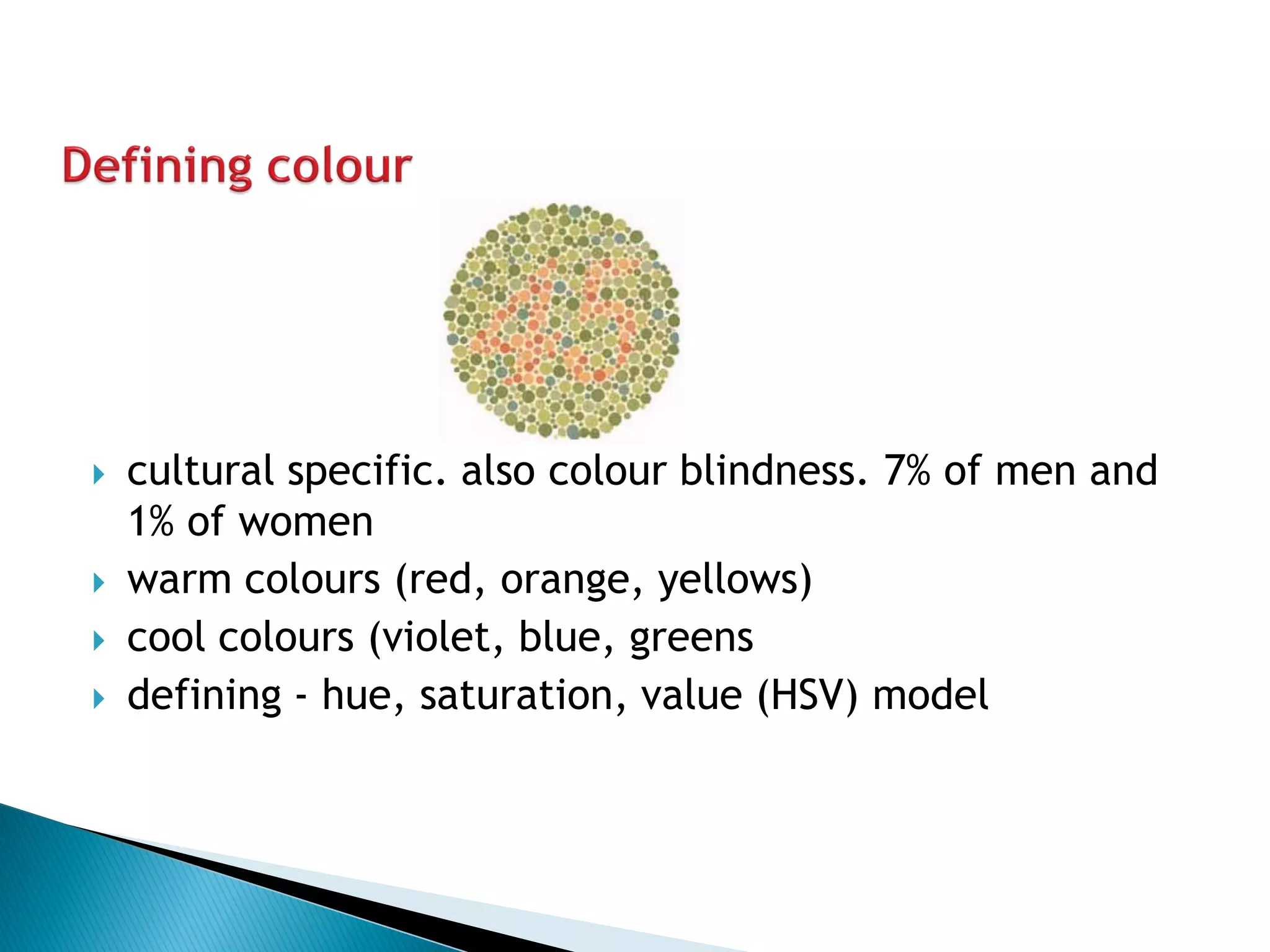
Describes cultural significance of colors and potential issues like color blindness.
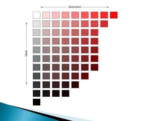
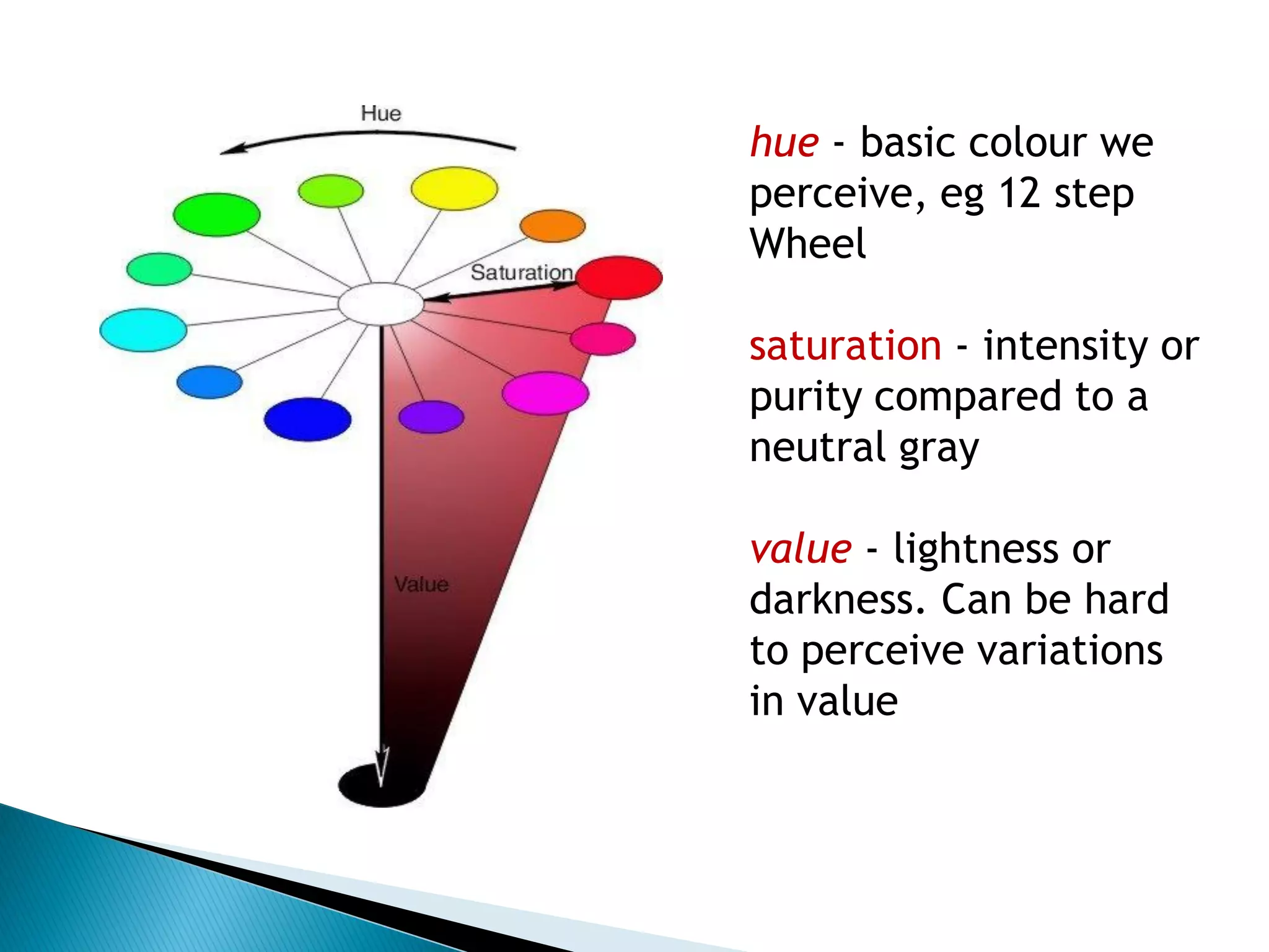
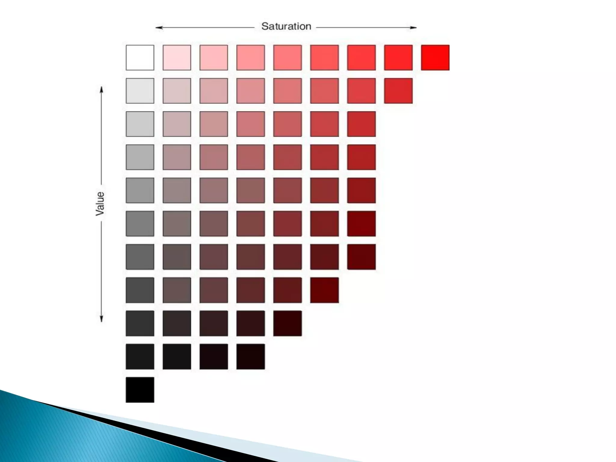
Key attributes of color: hue, saturation, and value, important for visual communication.
Color aids readability and distinguishes map features; describes qualitative conventions for color.
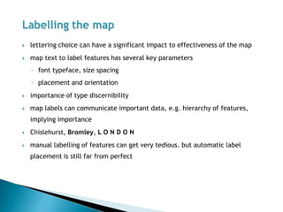
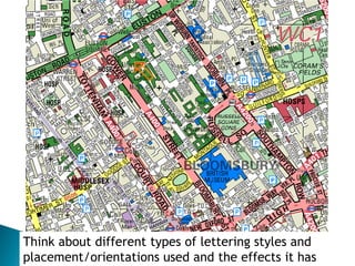
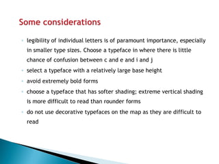
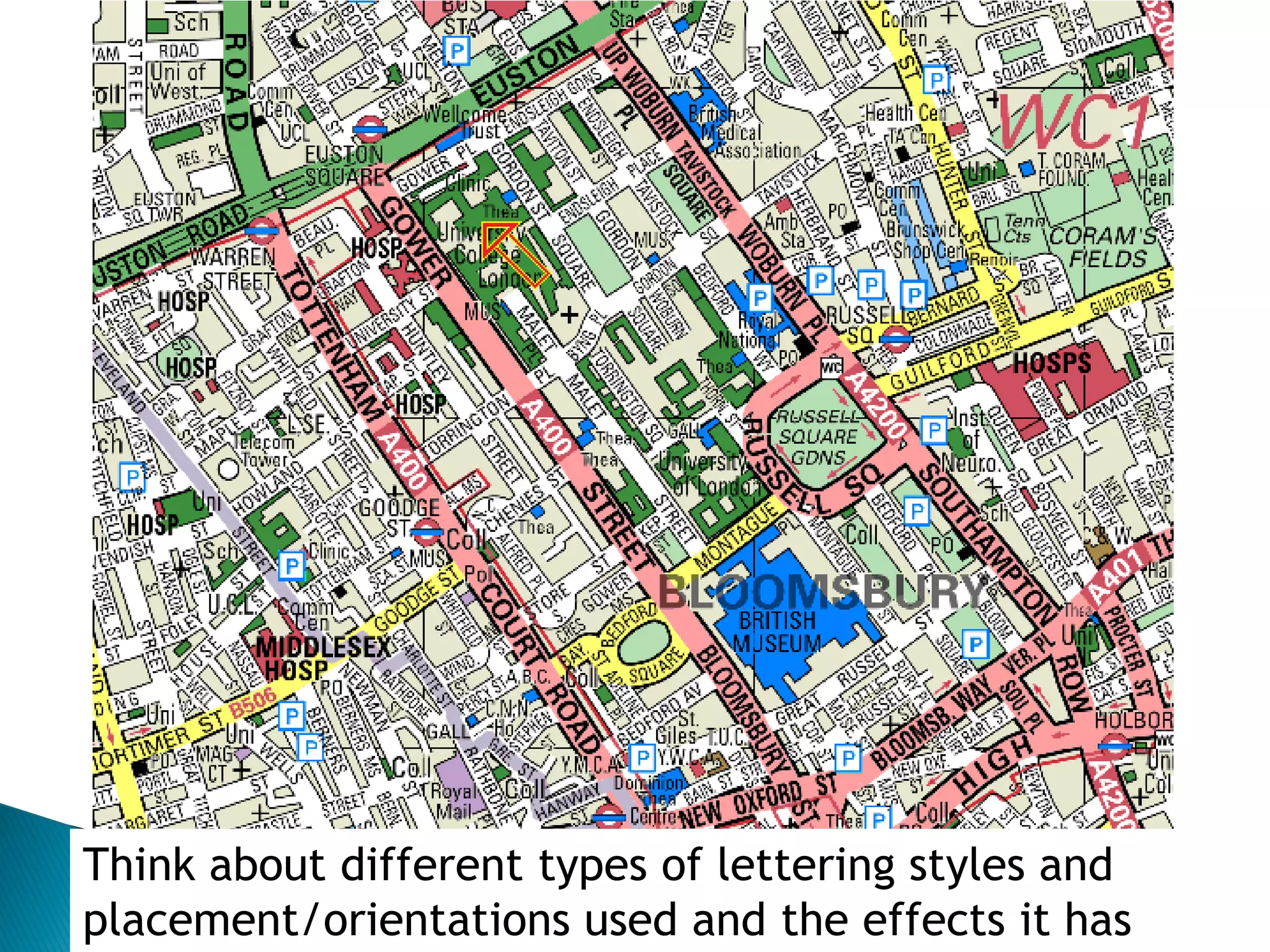
Key parameters for effective map text: font type, size, spacing, and placement.
The impact of different lettering styles and placements on map effectiveness.
Legibility is critical; choose typefaces carefully to avoid confusion and enhance readability.
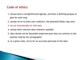
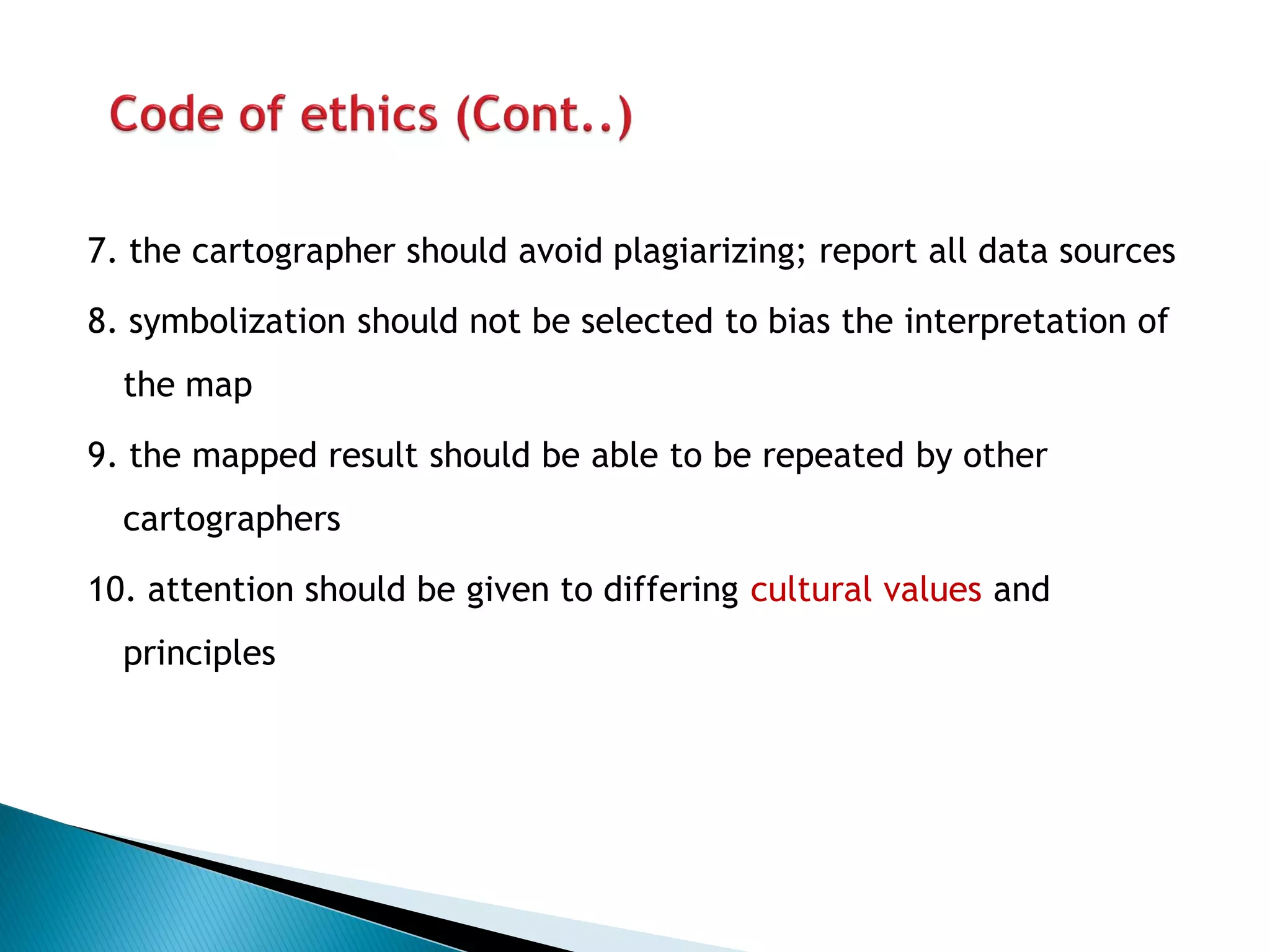
Guidelines for ethical cartography, emphasizing honesty, data relevance, and accuracy.
Recommendations for ethical practices including source reporting and cultural awareness.
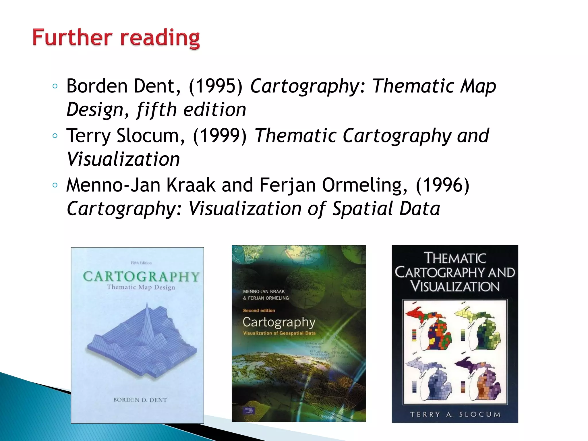
Citations of key texts in cartography and thematic map design.


