Download to read offline


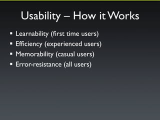
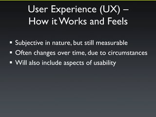

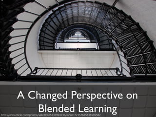
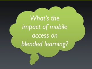


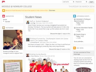
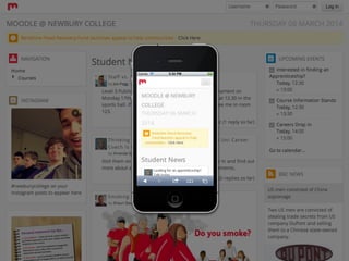
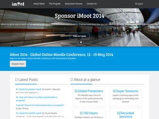

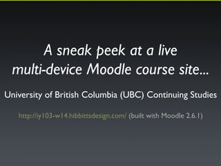


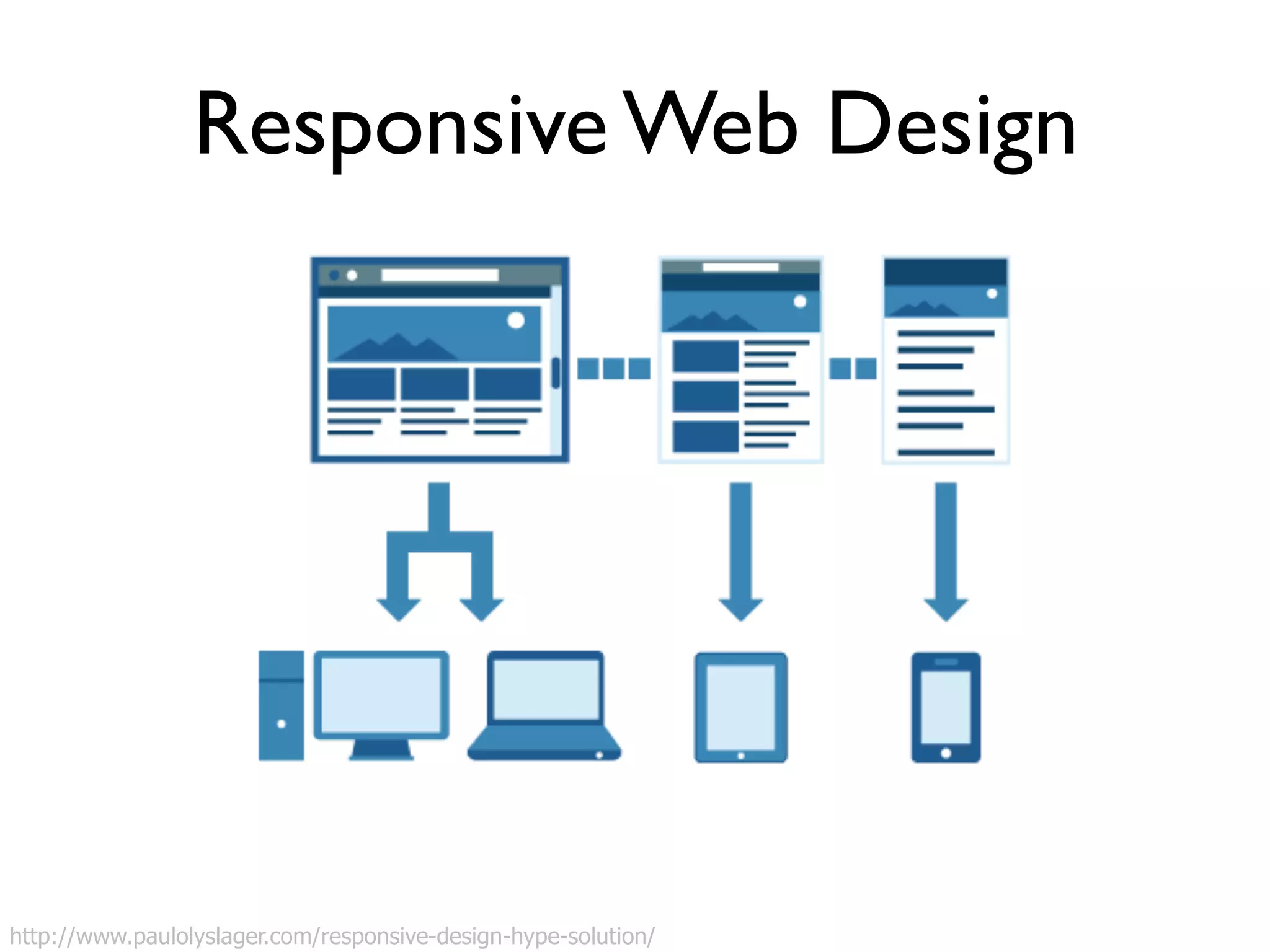

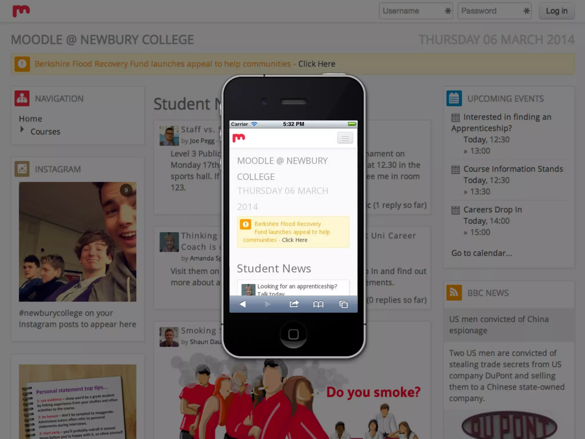


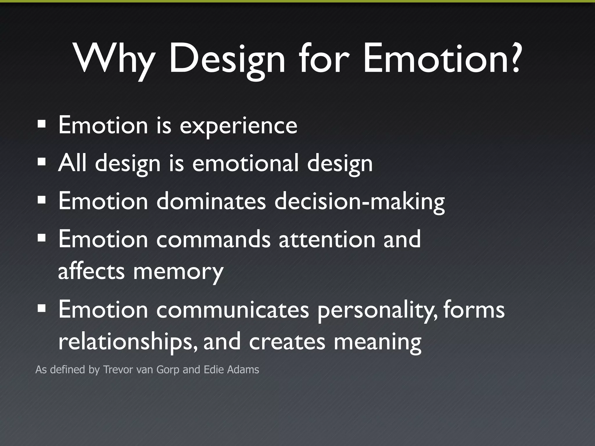
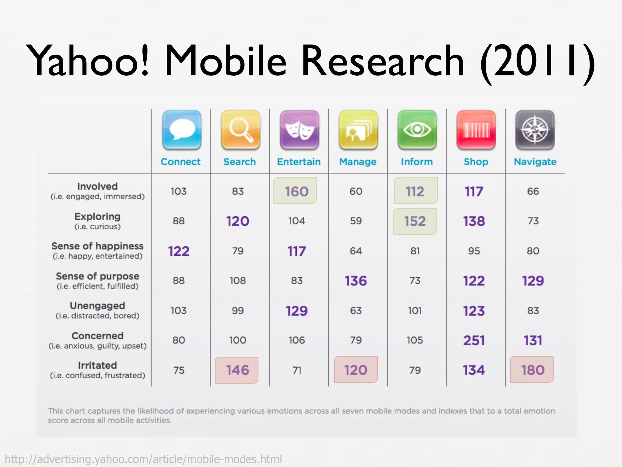

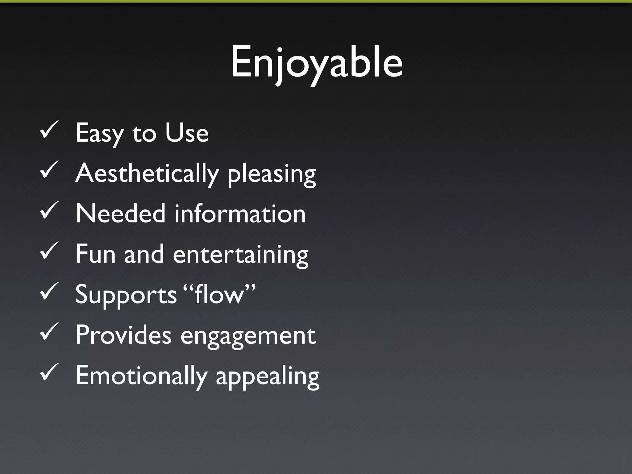
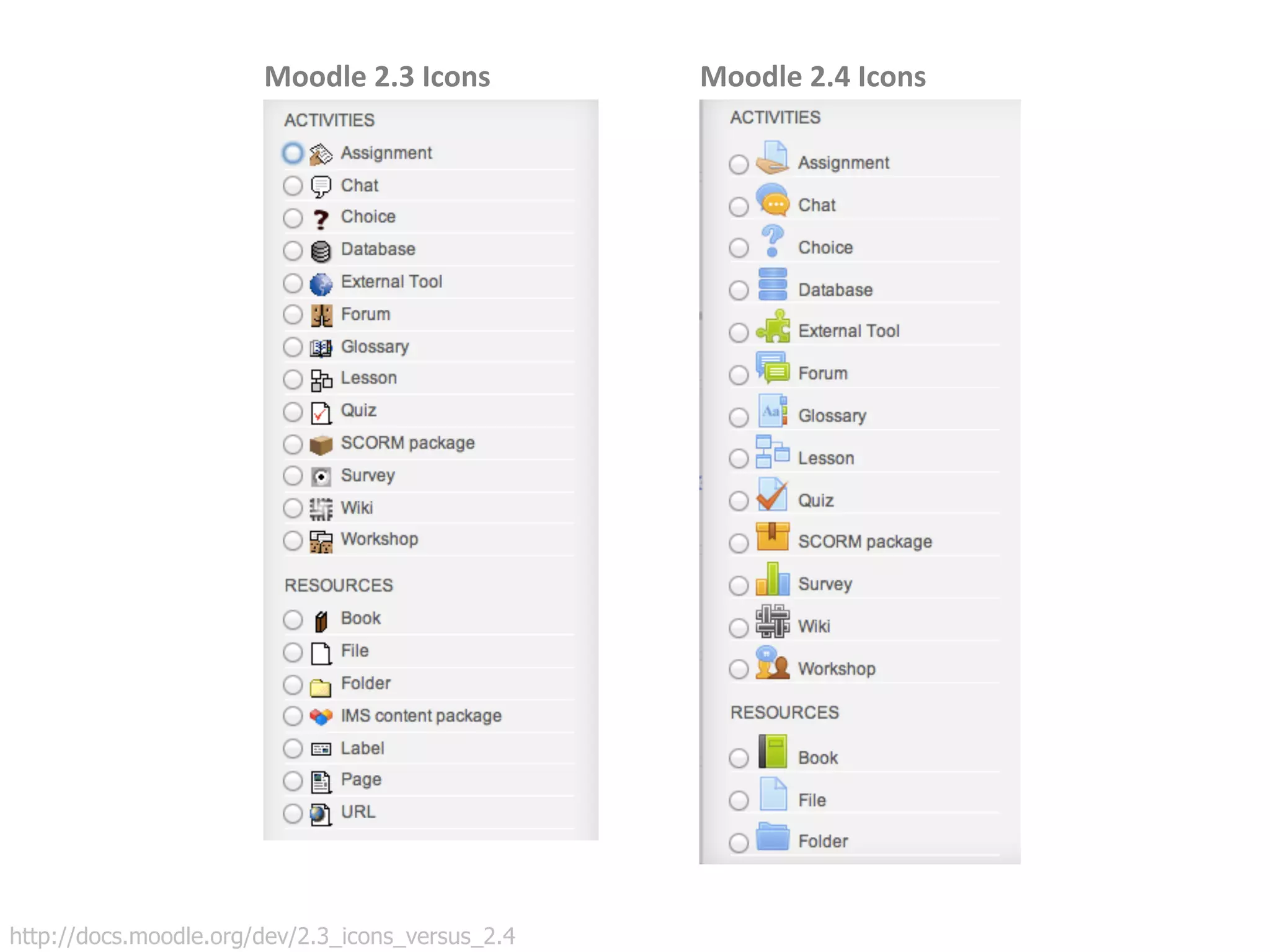
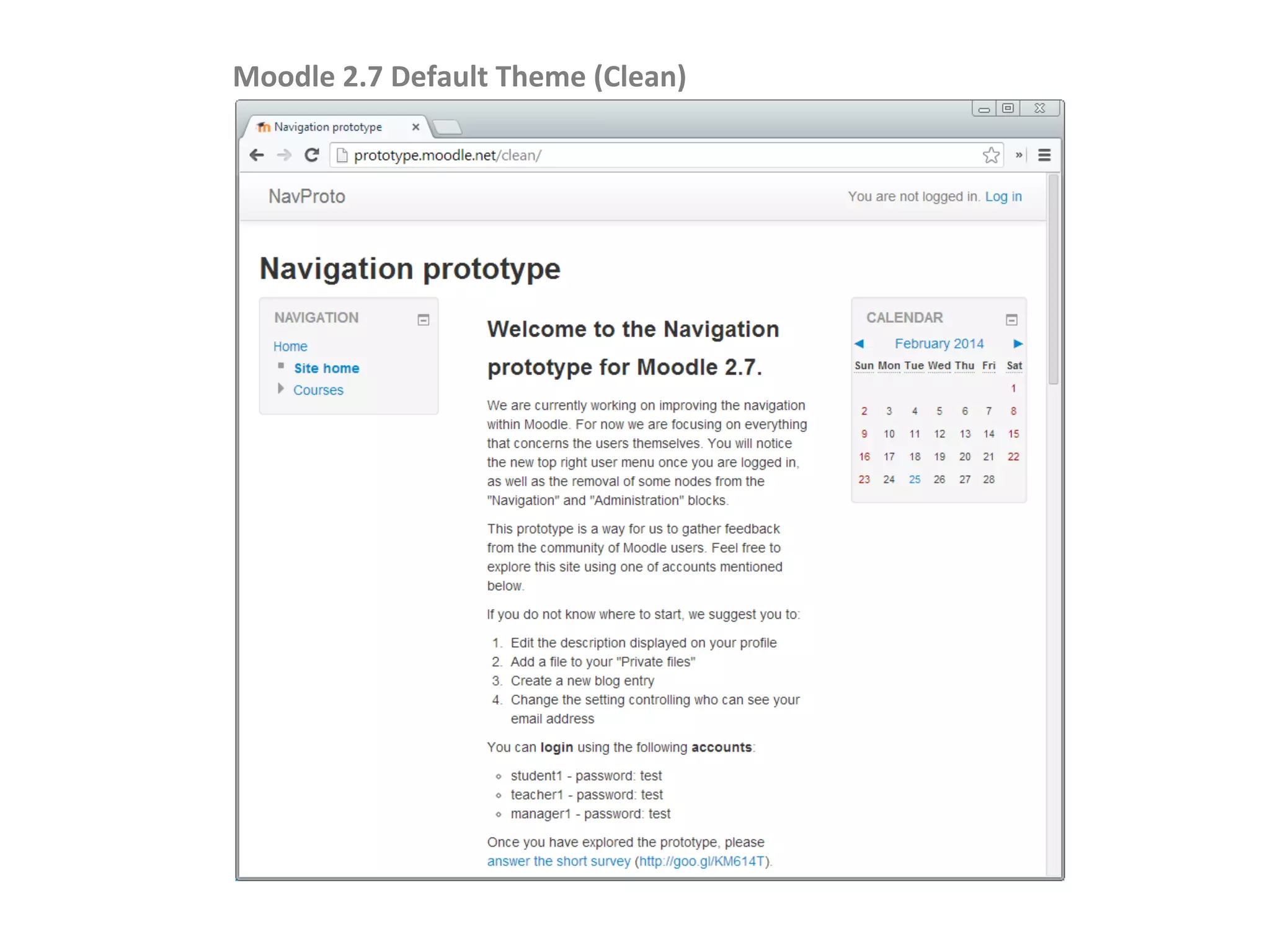


The document is a presentation on mobile learning, focusing on user experience and its impact on blended learning. It discusses the evolution of mobile education, the significance of Moodle 2.5 as a mobile-friendly platform, and offers principles for creating effective multi-device learning experiences. Key themes include the importance of emotion in design, usability, and the need for responsive course sites.


