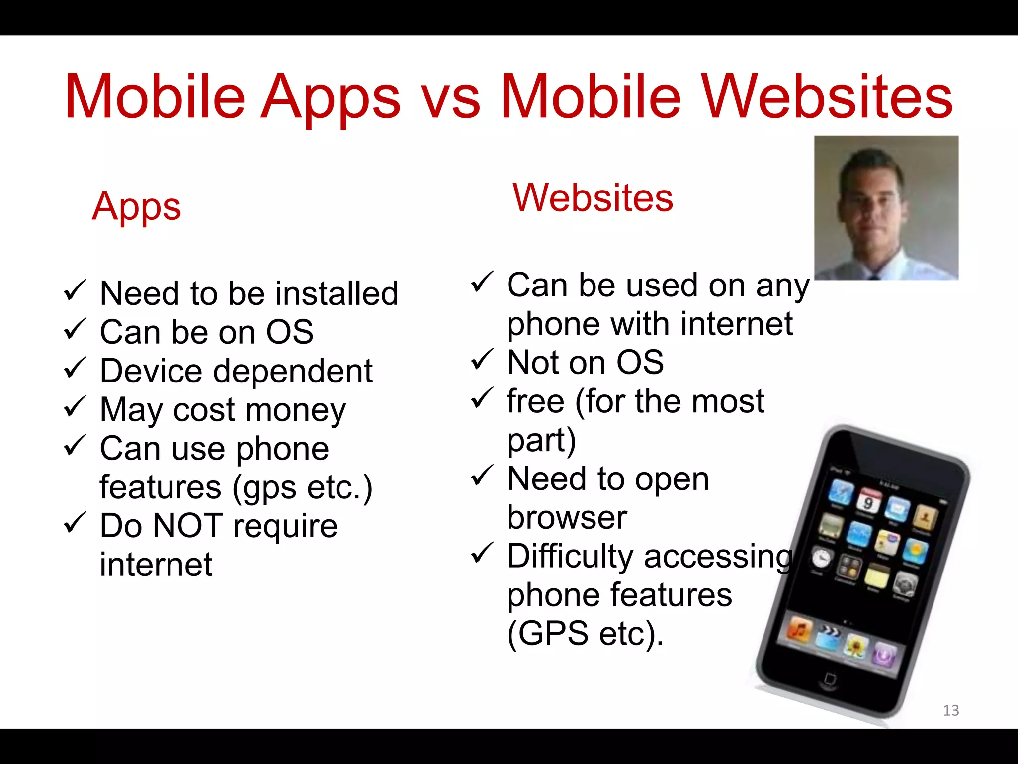
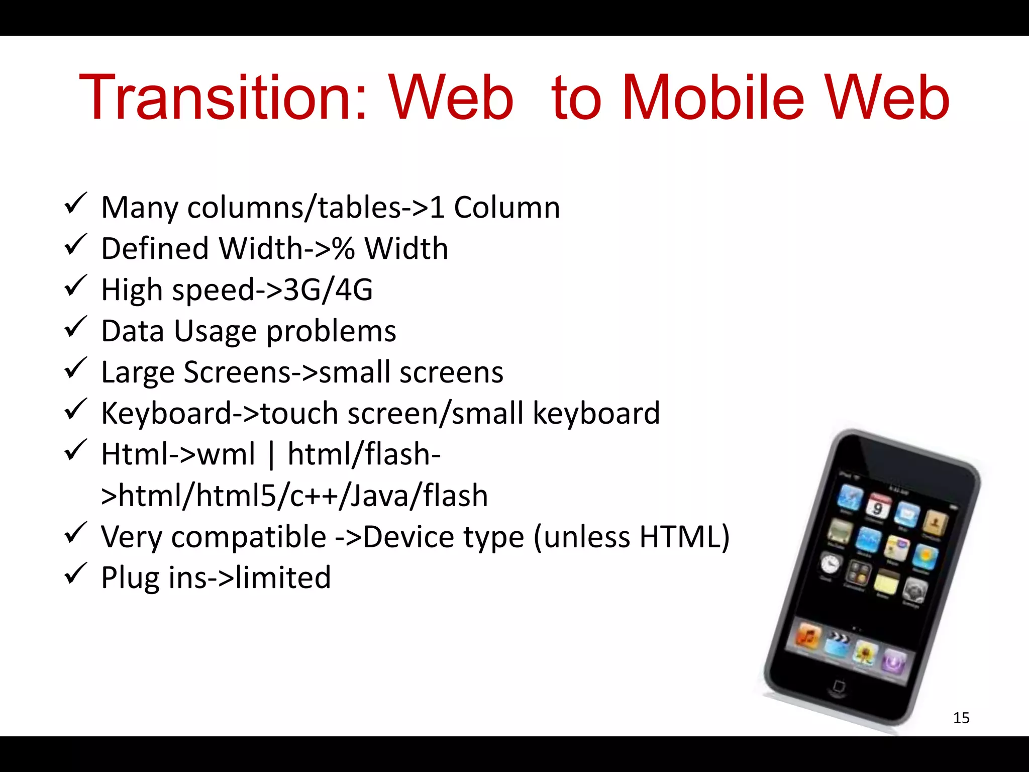
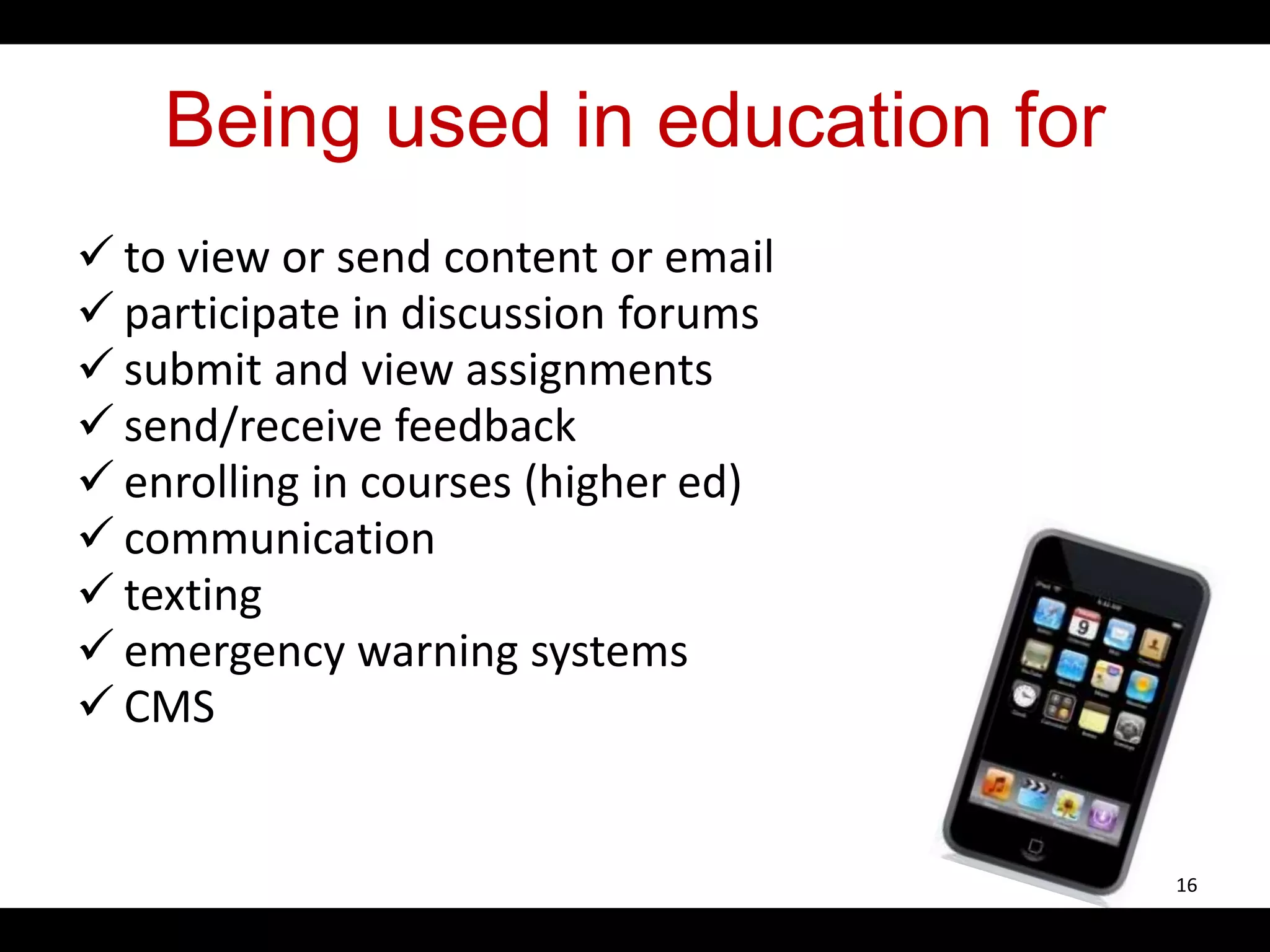
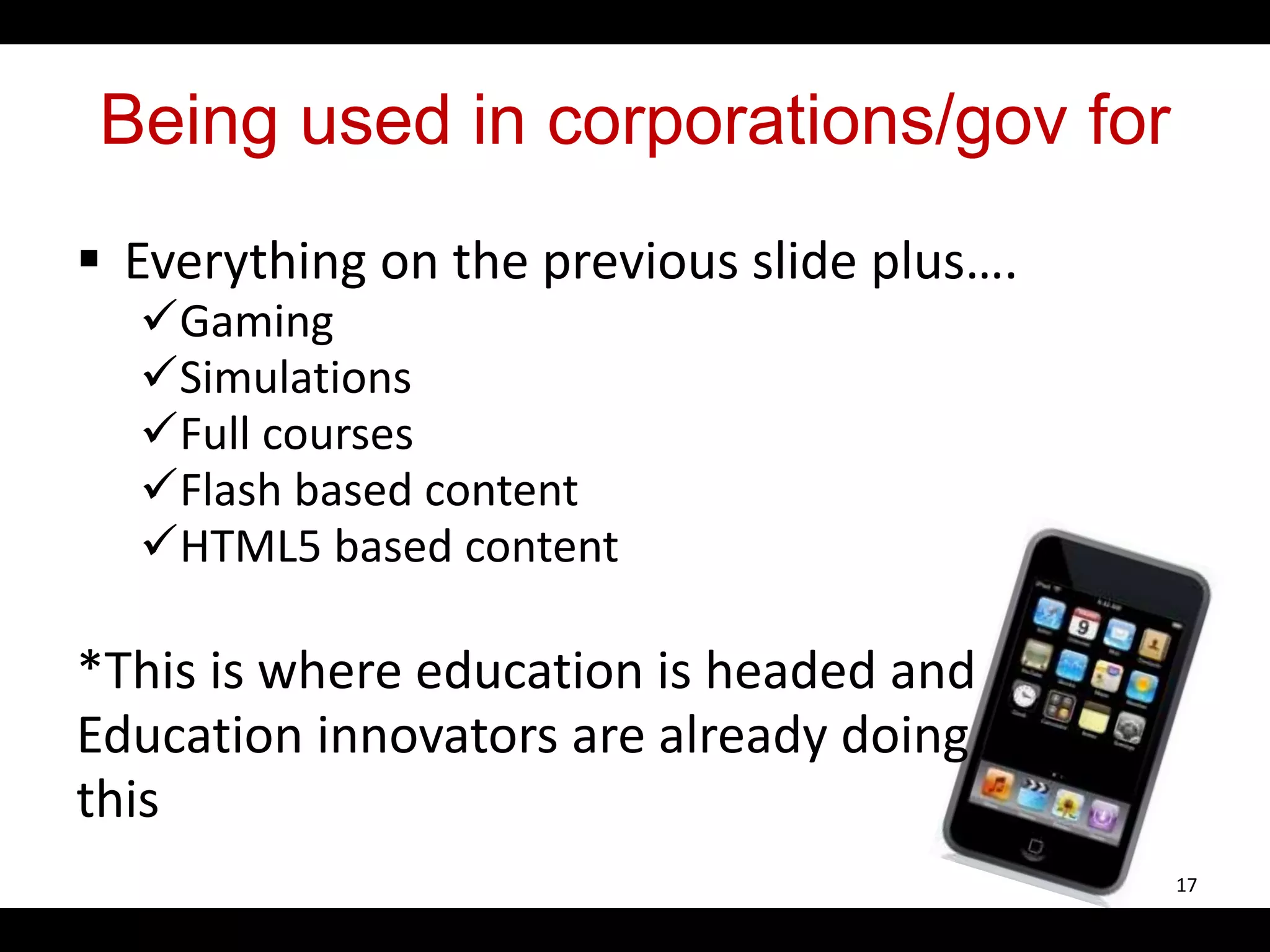
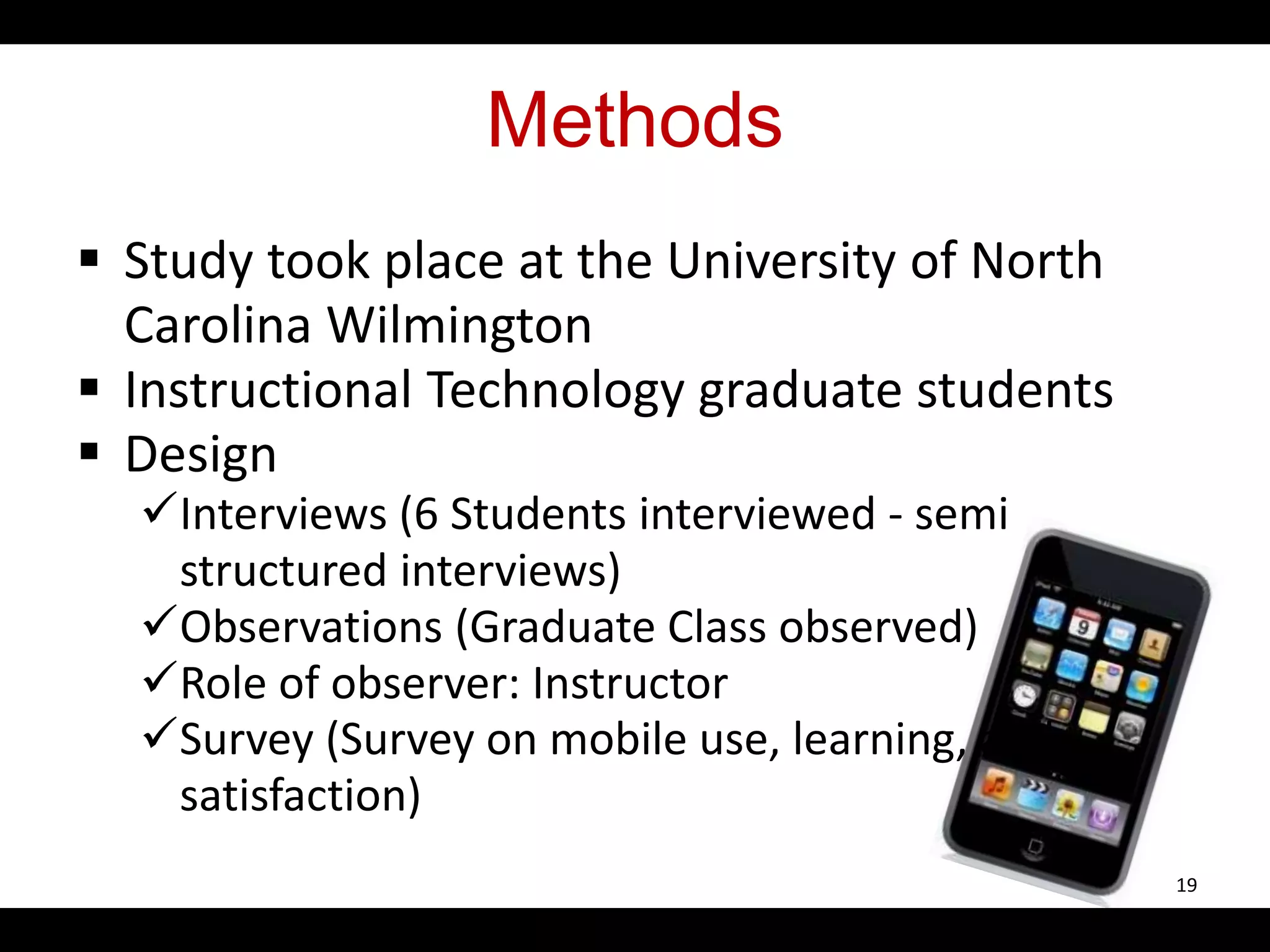
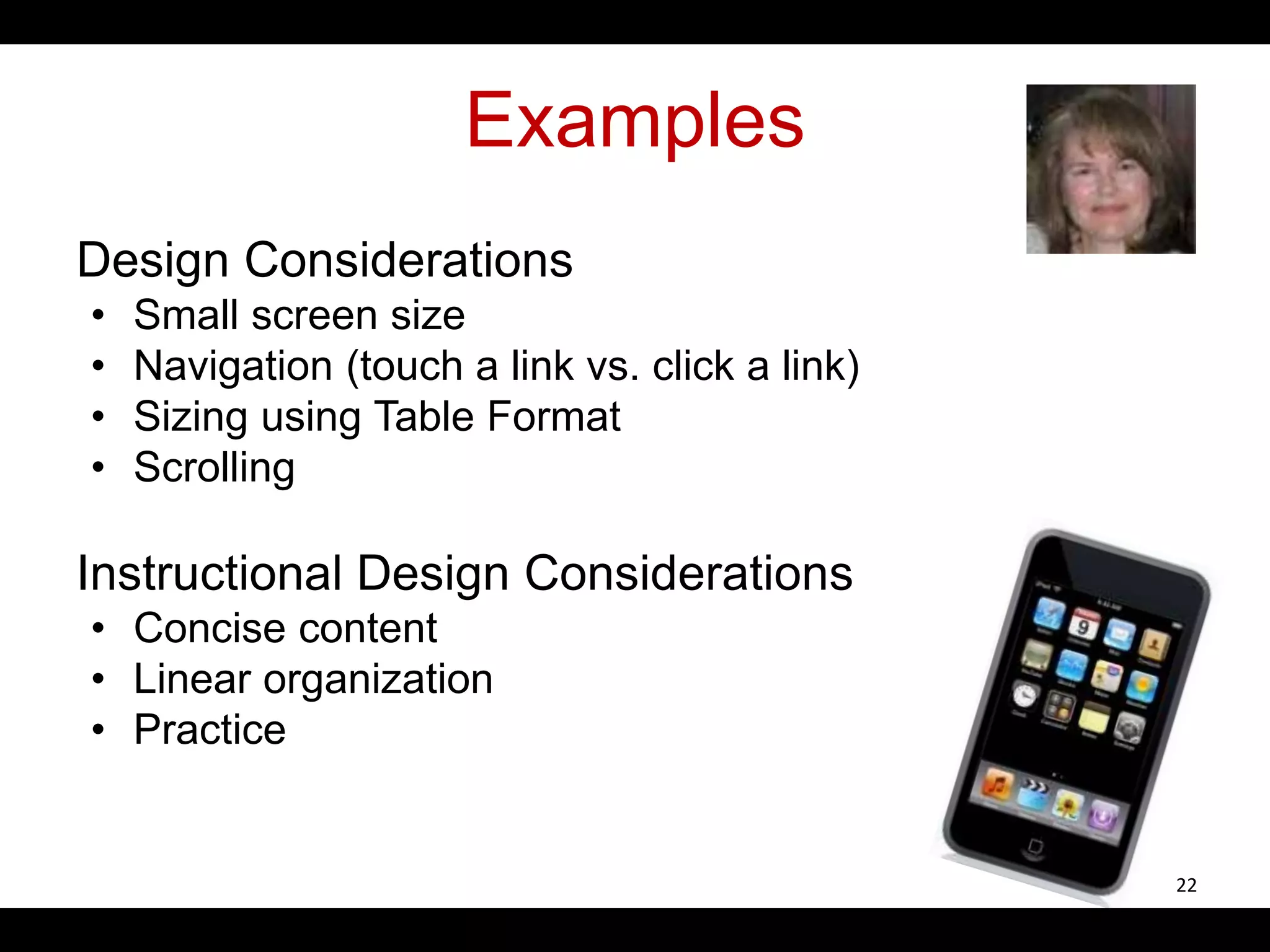
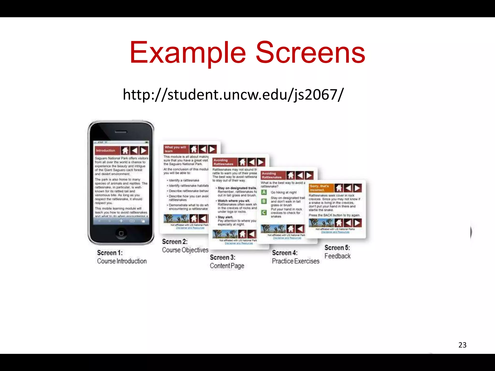
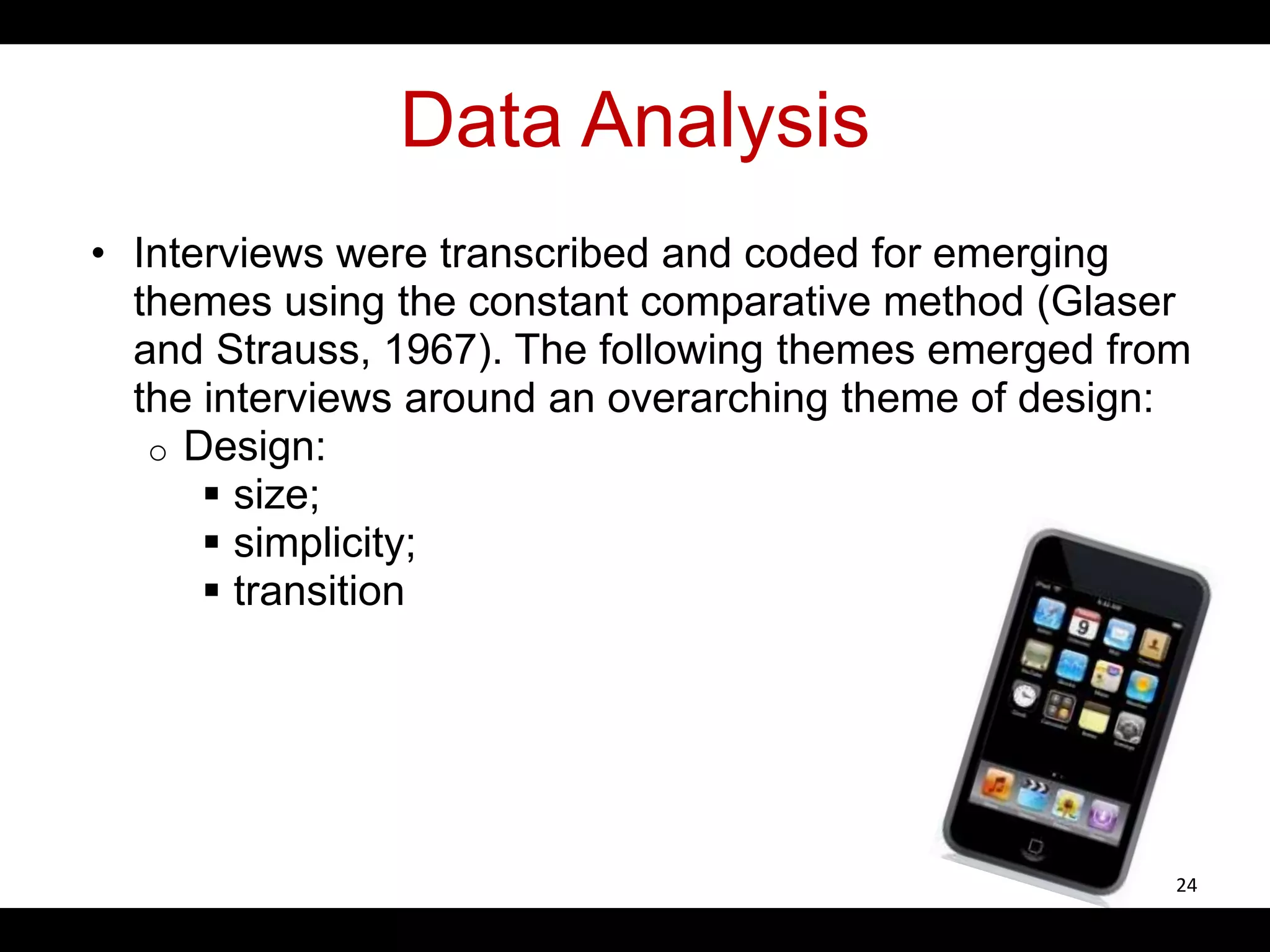
KEMBAR78
Developing Mobile Learnigng | PPTX
Developing Mobile Learning
for IPOD Touches
Florence Martin
Ray Pastore
Jean Snider
University of North Carolina Wilmington
1
Introduction
 This presentation addresses mobile learning
by discussing the design and development of
mobile websites
 Describes a case of mobile web
development in a Master’s level Instructional
Technology course at University of North
Carolina Wilmington
2
What is Mobile Learning?
 M-learning is the intersection of mobile
computing and e-learning and includes
anytime, anywhere resources; strong
search capabilities; rich interaction;
powerful support for effective learning; and
performance-based assessment (Quinn,
2000)
3
Defining Mobile Learning
 Stevens and Kitchenham (2011) define
mobile learning as
“the use of a wireless handheld device; a
cell phone, personal digital assistant (PDA),
mini-computer, or iPod to engage in some
form of meaningful learning (p.3)”.
4
Defining Mobile Learning
 ELearning Guild 360 Mobile Learning
Research Report, 2007)
“Any activity that allows individuals to be
more productive when consuming,
interacting with, or creating information,
mediated through a compact digital portable
device that the individual carries on a
regular basis, has reliable connectivity, and
fits in a pocket or purse.’’
5
Emerging Mobile Learning
Categories
Traxler (2009) identifies six emerging
mobile learning categories
 Technology driven m-learning
 Miniature but portable e-learning
 connected classroom learning
 Informal/personalized/situated mobile
learning
 Mobile training/ performance support
 remote/rural/development mobile learning
6
Design Recommendations
Ally (2009) recommendations: Mobile devices
 include multimedia capabilities, and course
designers should take advantage of this and
design courses to make the learning
experience stimulating
 help in student-student and student-instructor
interaction and can be used as a
communication tool
 are used for informal learning
 the learning material should be in
manageable chunks
7
Design Recommendations
Griffin (2011) lists ten
steps that makes great
mobile content
 two minutes of content
 animation
 conversational style
 deliver some smarts
 target the 5% remedial
behavior
 participate
 characterize content
 resist the
temptation to put
it all into push
mode
 encourage users
to self-diagnose
 make the
experience
elegant and
emotional
8
More Design Recommendations
 Bradley et al (2009) took into consideration
design principles such as interface design,
navigational techniques and interactive
functionality suggested by Flash Lite
templates
 Baird and Whitear (2006) recommend
splitting the content into bite size chunks so
that they don’t overcrowd the screen
 Pierre and Diamantini (2009) used the
Mobile Learning Objects approach where
modules were ten minutes long, and
included text and audio format
9
What are Mobile Application?
 A software that runs on a handheld device that can connect to WIFI
or wireless carrier networks, and has an operating system that
supports standalone software” (Gahran, 2011)
 Can be downloaded directly onto a mobile device using the
application store on the mobile device or can be downloaded from a
computer (i.e. Apple iTunes) and connected to a mobile device
10
What are Mobile Websites?
 Mobile websites also known as Mobile web applications
are custom built sites designed and developed to be
accessed via the mobile device.
11
Limitations of Mobile Web
 Accessing the web from mobile devices
a large number of limitations
 Small screen size
 lack of multiple windows
 navigation
 lack of javascript (browser dependent)
and cookies
 types of pages accessible
 speed
 broken and compressed pages
 size of messages
 cost involved
12
Mobile Apps vs Mobile Websites
Apps
 Need to be installed
 Can be on OS
 Device dependent
 May cost money
 Can use phone
features (gps etc.)
 Do NOT require
internet
Websites
 Can be used on any
phone with internet
 Not on OS
 free (for the most
part)
 Need to open
browser
 Difficulty accessing
phone features
(GPS etc).
13
Developing on a Mobile Device
 Google's Android
Java
Programming
 Apple's iOS:
iPod/iPhone/iPad
C, C++
 Other Options?
Android
Google App Inventor
Flash
HTML
Apple
HTML
All phones (apple,
android, blackberry,
windows)
HTML – HTML5
14
Transition: Web to Mobile Web
 Many columns/tables->1 Column
 Defined Width->% Width
 High speed->3G/4G
 Data Usage problems
 Large Screens->small screens
 Keyboard->touch screen/small keyboard
 Html->wml | html/flash-
>html/html5/c++/Java/flash
 Very compatible ->Device type (unless HTML)
 Plug ins->limited
15
Being used in education for
 to view or send content or email
 participate in discussion forums
 submit and view assignments
 send/receive feedback
 enrolling in courses (higher ed)
 communication
 texting
 emergency warning systems
 CMS
16
Being used in corporations/gov for
 Everything on the previous slide plus….
Gaming
Simulations
Full courses
Flash based content
HTML5 based content
*This is where education is headed and
Education innovators are already doing
this
17
Research Problem
 Mobile learning is in it's infancy
 Research on mobile use and design is just
starting to emerge
 Much of this research focuses on mobile use
rather than mobile devices for learning
 The purpose of this study was to examine
students perceptions of developing and using
instruction for the mobile web
18
Methods
 Study took place at the University of North
Carolina Wilmington
 Instructional Technology graduate students
 Design
Interviews (6 Students interviewed - semi
structured interviews)
Observations (Graduate Class observed)
Role of observer: Instructor
Survey (Survey on mobile use, learning, and
satisfaction)
19
Case
 Computer Based Instruction course at UNCW
 Develop mobile based instruction via Dreamweaver
 Students were web development novice
 Students were presented lesson on web and mobile
development using Dreamweaver (3 Class periods)
 They were asked to read several articles on mobile
learning
 Assignment
 10 minute instructional tutorials to be developed for
smartphones
 Published to UNCW webspace
 Tested sites on iPod touches
20
Case
 Obtained through school grant
 Students went through parts of the ISD
process to develop the instruction:
– Analysis->Design->Development
 Students had 3, 3 hour courses of in class time
to develop and test with instructor present
(labs)
21
Examples
Design Considerations
• Small screen size
• Navigation (touch a link vs. click a link)
• Sizing using Table Format
• Scrolling
Instructional Design Considerations
• Concise content
• Linear organization
• Practice
22
Example Screens
23
http://student.uncw.edu/js2067/
Data Analysis
• Interviews were transcribed and coded for emerging
themes using the constant comparative method (Glaser
and Strauss, 1967). The following themes emerged from
the interviews around an overarching theme of design:
o Design:
 size;
 simplicity;
 transition
24
Data Analysis
• Survey data will be analyzed in SPSS (survey results
preliminary as only 8 students have taken it. We
anticipate 30+ responses at the end of this semester.)
o Survey designed as 7 point Likert-scale survey asking
participants how important design and usability
features were when developing/using mobile
websites
25
Survey: Items on “Design”
 Text requires zooming for reading
 Text is legible without zooming
 Site fits my screen size without adjustment
 open new browser windows during site use/pop up windows
 Elements of the site require you to download/install plugins
 Scrolling up and down to view content
 Scrolling to the left or right to view content
 Single column layout
 Multiple column layout
 link location on top of screen
 link location on bottom of screen
 link location on left or right of screen
 Text entry
 drop down menus
26
Survey: Items on “Usability”
 Quick access to the information
 Good site organization
 The sequence of obtaining information was clear
 Site is user friendly
 The site offers clear and understandable goals
 The site uses media appropriately to communicate the content
 The site offers content that is relevant to the audience
 The site provides current and timely information
 The site provides the precise information you need
 The site provides accurate information
 The site allows you to control the pace at which you interact with the
information
27
Semi-Structured Interview
Questions
 Describe your experience developing for the mobile web?
 What design issues did you encounter when developing for the
mobile web?
 What are the major differences developing a website for the
computer and developing for the mobile web?
 What’s the importance of user interface (UI) in mobile web
development?
 What recommendations do you have for developers looking to
develop for the mobile web?
 What recommendations do you have for instructional designers
seeking to implement mobile learning in training and
development?
 What did you enjoy about this experience?
 What did you dislike about this experience?
 Is there anything else you would like to add?
28
Design: Size (Sample Quotes)
• “.. you know, the size of a phone, of an Android or iPhone or
something, then you don’t have as much room. You have to really
make good choices about what it is you are going to put in there. ..it
can get cluttered really quick. And because everything is so much
smaller, obviously it looks different on the computer than it does on
the phones."
• "The first thing you have to realize is that almost all of the users are
gonna have touch screens, which is a lot different than using a
mouse. So, I think you have to make it…you have to design the
difference in the user interface for a mobile app is that you have to
take into account that the, uh, buttons have to be legible at size and
the user has to be able to use his finger, his or her finger to actually
navigate through the site."
• "Something I kind of feel when I’m on my smartphone is I feel
like im looking at things through a telescope because you’ve got
this big page but yet you’ve got this little small viewing area so
your trying to move that viewing area around so you can find out
where you going. But that on pages not set up for mobile devices.
So its like looking through a telescope."
29
Design: Simplicity (Sample Quotes)
 "Just having the one column made it a lot
easier"
 "I would tell people to keep, keep it simple, to
really keep it simple, because when you are
looking at something on a computer screen,
you just have a lot more space"
 "You have to take out all the fluff and, uh, try
to fit as much content on the actual screen
without the user having to scroll as much. And,
the use of a header, a content and a footer, an
actual framework, um, was really important so
that you could have consistency through each
page."
30
Design: Transition (Sample
Quotes)
 "I think the differences from going from that where
you use a keyboard and a mouse to the touch is that
you realize how big your fingers are and just a link is
not going to be very effective anymore. You need big
buttons. You need to direct the learner on where
they need to touch to go to the next screen. There is
really no pop ups, no imbedded flash type things, its
like going from one screen to the next. It seems very
linear. “
 "I don’t know that you’re going to be able to do a lot
other than just quick reference job aids. I’m not sure
you’d want to have a whole instructional system
through the, for the iPhone, though maybe,, a
SmartPhone. You could do it for maybe tablets, but
again you’ve got some Flash limitations. So I would
think that job aids and things that you can learn
quickly are the realm of smart phone development."
31
Conclusion
 At this point in this study,
We are finding significant differences for Computer
based training design and Mobile based design
32
Future Research
 Should examine best design practices of
mobile learning
 Specifically should focus on multimedia
principles of learning
 Observed during study that many needed to
changed or did not apply to the mobile
environment
 Additionally there need to be studies
examining the impact of cognitive load in the
use of these devices
33
References
 Ally, M. (2009). Mobile Learning: Transforming the delivery of education and
training, AU Press
 Baird, P. & Whitear, C. (2006). Mobile charting with Flash Lite 2: Designing for the
mobile device interface. Adobe mobile and device developer center.
http://www.adobe.com/devnet/devices/articles/fl2_charting_components.html
 Bradley, C., Haynes, R., Cook, J., Boyle, T. & Smith, C. (2009). Design and
development of multimedia learning objects for mobile phones. In A. Mohamed
(Ed.), Mobile learning: Transforming the delivery of education and training (pp. 157-
181). dmonton, Canada: Athabasca University Press.
 Gahran, A. (2011). What’s a mobile app? Retrieved online from
http://www.contentious.com/2011/03/02/whats-a-mobile-app/
 Griffin, G. (2011). Ten tips for designing mobile learning content. Learning solutions
magazine. Retrieved online from
http://www.learningsolutionsmag.com/articles/700/ten-tips-for-designing-mobile-
learning-content
34
References
 Pierre, M., & Diamantini, D. (2009). From E-learning to Mobile
Learning: New Opportunities. In M. Ally (Ed.), Mobile learning:
Transforming the delivery of education and training (pp. 247–
264).
 Quin, C. (2000). mLearning: Mobile, Wireless, In-Your-Pocket
Learning.
 Quinn, C. (2011). Designing mLearning: tapping into the
mobile revolution for organizational performance, Pfeiffer
Publishing, USA
 Stevens, D. and Kitchenham, A. (2011). An analysis of mobile
learning in education, business and medicine. In Kitchenham
(Ed.) Models for Interdisciplinary Mobile Learning: Delivering
Information to Students, IGI publication. Pp. 1 – 25
 Traxler (2009) Current state of mobile learning . In M. Ally
(Ed.), Mobile learning: Transforming the delivery of education
and training (pp. 247–264).
35
Questions?
 Presentation can be found at:
 http://raypastore.com/wordpress/2011/11/a
ect-mobile-learning-presentation/
36

Developing Mobile Learnigng

  • 1.
    Developing Mobile Learning forIPOD Touches Florence Martin Ray Pastore Jean Snider University of North Carolina Wilmington 1
  • 2.
    Introduction  This presentationaddresses mobile learning by discussing the design and development of mobile websites  Describes a case of mobile web development in a Master’s level Instructional Technology course at University of North Carolina Wilmington 2
  • 3.
    What is MobileLearning?  M-learning is the intersection of mobile computing and e-learning and includes anytime, anywhere resources; strong search capabilities; rich interaction; powerful support for effective learning; and performance-based assessment (Quinn, 2000) 3
  • 4.
    Defining Mobile Learning Stevens and Kitchenham (2011) define mobile learning as “the use of a wireless handheld device; a cell phone, personal digital assistant (PDA), mini-computer, or iPod to engage in some form of meaningful learning (p.3)”. 4
  • 5.
    Defining Mobile Learning ELearning Guild 360 Mobile Learning Research Report, 2007) “Any activity that allows individuals to be more productive when consuming, interacting with, or creating information, mediated through a compact digital portable device that the individual carries on a regular basis, has reliable connectivity, and fits in a pocket or purse.’’ 5
  • 6.
    Emerging Mobile Learning Categories Traxler(2009) identifies six emerging mobile learning categories  Technology driven m-learning  Miniature but portable e-learning  connected classroom learning  Informal/personalized/situated mobile learning  Mobile training/ performance support  remote/rural/development mobile learning 6
  • 7.
    Design Recommendations Ally (2009)recommendations: Mobile devices  include multimedia capabilities, and course designers should take advantage of this and design courses to make the learning experience stimulating  help in student-student and student-instructor interaction and can be used as a communication tool  are used for informal learning  the learning material should be in manageable chunks 7
  • 8.
    Design Recommendations Griffin (2011)lists ten steps that makes great mobile content  two minutes of content  animation  conversational style  deliver some smarts  target the 5% remedial behavior  participate  characterize content  resist the temptation to put it all into push mode  encourage users to self-diagnose  make the experience elegant and emotional 8
  • 9.
    More Design Recommendations Bradley et al (2009) took into consideration design principles such as interface design, navigational techniques and interactive functionality suggested by Flash Lite templates  Baird and Whitear (2006) recommend splitting the content into bite size chunks so that they don’t overcrowd the screen  Pierre and Diamantini (2009) used the Mobile Learning Objects approach where modules were ten minutes long, and included text and audio format 9
  • 10.
    What are MobileApplication?  A software that runs on a handheld device that can connect to WIFI or wireless carrier networks, and has an operating system that supports standalone software” (Gahran, 2011)  Can be downloaded directly onto a mobile device using the application store on the mobile device or can be downloaded from a computer (i.e. Apple iTunes) and connected to a mobile device 10
  • 11.
    What are MobileWebsites?  Mobile websites also known as Mobile web applications are custom built sites designed and developed to be accessed via the mobile device. 11
  • 12.
    Limitations of MobileWeb  Accessing the web from mobile devices a large number of limitations  Small screen size  lack of multiple windows  navigation  lack of javascript (browser dependent) and cookies  types of pages accessible  speed  broken and compressed pages  size of messages  cost involved 12
  • 13.
    Mobile Apps vsMobile Websites Apps  Need to be installed  Can be on OS  Device dependent  May cost money  Can use phone features (gps etc.)  Do NOT require internet Websites  Can be used on any phone with internet  Not on OS  free (for the most part)  Need to open browser  Difficulty accessing phone features (GPS etc). 13
  • 14.
    Developing on aMobile Device  Google's Android Java Programming  Apple's iOS: iPod/iPhone/iPad C, C++  Other Options? Android Google App Inventor Flash HTML Apple HTML All phones (apple, android, blackberry, windows) HTML – HTML5 14
  • 15.
    Transition: Web toMobile Web  Many columns/tables->1 Column  Defined Width->% Width  High speed->3G/4G  Data Usage problems  Large Screens->small screens  Keyboard->touch screen/small keyboard  Html->wml | html/flash- >html/html5/c++/Java/flash  Very compatible ->Device type (unless HTML)  Plug ins->limited 15
  • 16.
    Being used ineducation for  to view or send content or email  participate in discussion forums  submit and view assignments  send/receive feedback  enrolling in courses (higher ed)  communication  texting  emergency warning systems  CMS 16
  • 17.
    Being used incorporations/gov for  Everything on the previous slide plus…. Gaming Simulations Full courses Flash based content HTML5 based content *This is where education is headed and Education innovators are already doing this 17
  • 18.
    Research Problem  Mobilelearning is in it's infancy  Research on mobile use and design is just starting to emerge  Much of this research focuses on mobile use rather than mobile devices for learning  The purpose of this study was to examine students perceptions of developing and using instruction for the mobile web 18
  • 19.
    Methods  Study tookplace at the University of North Carolina Wilmington  Instructional Technology graduate students  Design Interviews (6 Students interviewed - semi structured interviews) Observations (Graduate Class observed) Role of observer: Instructor Survey (Survey on mobile use, learning, and satisfaction) 19
  • 20.
    Case  Computer BasedInstruction course at UNCW  Develop mobile based instruction via Dreamweaver  Students were web development novice  Students were presented lesson on web and mobile development using Dreamweaver (3 Class periods)  They were asked to read several articles on mobile learning  Assignment  10 minute instructional tutorials to be developed for smartphones  Published to UNCW webspace  Tested sites on iPod touches 20
  • 21.
    Case  Obtained throughschool grant  Students went through parts of the ISD process to develop the instruction: – Analysis->Design->Development  Students had 3, 3 hour courses of in class time to develop and test with instructor present (labs) 21
  • 22.
    Examples Design Considerations • Smallscreen size • Navigation (touch a link vs. click a link) • Sizing using Table Format • Scrolling Instructional Design Considerations • Concise content • Linear organization • Practice 22
  • 23.
  • 24.
    Data Analysis • Interviewswere transcribed and coded for emerging themes using the constant comparative method (Glaser and Strauss, 1967). The following themes emerged from the interviews around an overarching theme of design: o Design:  size;  simplicity;  transition 24
  • 25.
    Data Analysis • Surveydata will be analyzed in SPSS (survey results preliminary as only 8 students have taken it. We anticipate 30+ responses at the end of this semester.) o Survey designed as 7 point Likert-scale survey asking participants how important design and usability features were when developing/using mobile websites 25
  • 26.
    Survey: Items on“Design”  Text requires zooming for reading  Text is legible without zooming  Site fits my screen size without adjustment  open new browser windows during site use/pop up windows  Elements of the site require you to download/install plugins  Scrolling up and down to view content  Scrolling to the left or right to view content  Single column layout  Multiple column layout  link location on top of screen  link location on bottom of screen  link location on left or right of screen  Text entry  drop down menus 26
  • 27.
    Survey: Items on“Usability”  Quick access to the information  Good site organization  The sequence of obtaining information was clear  Site is user friendly  The site offers clear and understandable goals  The site uses media appropriately to communicate the content  The site offers content that is relevant to the audience  The site provides current and timely information  The site provides the precise information you need  The site provides accurate information  The site allows you to control the pace at which you interact with the information 27
  • 28.
    Semi-Structured Interview Questions  Describeyour experience developing for the mobile web?  What design issues did you encounter when developing for the mobile web?  What are the major differences developing a website for the computer and developing for the mobile web?  What’s the importance of user interface (UI) in mobile web development?  What recommendations do you have for developers looking to develop for the mobile web?  What recommendations do you have for instructional designers seeking to implement mobile learning in training and development?  What did you enjoy about this experience?  What did you dislike about this experience?  Is there anything else you would like to add? 28
  • 29.
    Design: Size (SampleQuotes) • “.. you know, the size of a phone, of an Android or iPhone or something, then you don’t have as much room. You have to really make good choices about what it is you are going to put in there. ..it can get cluttered really quick. And because everything is so much smaller, obviously it looks different on the computer than it does on the phones." • "The first thing you have to realize is that almost all of the users are gonna have touch screens, which is a lot different than using a mouse. So, I think you have to make it…you have to design the difference in the user interface for a mobile app is that you have to take into account that the, uh, buttons have to be legible at size and the user has to be able to use his finger, his or her finger to actually navigate through the site." • "Something I kind of feel when I’m on my smartphone is I feel like im looking at things through a telescope because you’ve got this big page but yet you’ve got this little small viewing area so your trying to move that viewing area around so you can find out where you going. But that on pages not set up for mobile devices. So its like looking through a telescope." 29
  • 30.
    Design: Simplicity (SampleQuotes)  "Just having the one column made it a lot easier"  "I would tell people to keep, keep it simple, to really keep it simple, because when you are looking at something on a computer screen, you just have a lot more space"  "You have to take out all the fluff and, uh, try to fit as much content on the actual screen without the user having to scroll as much. And, the use of a header, a content and a footer, an actual framework, um, was really important so that you could have consistency through each page." 30
  • 31.
    Design: Transition (Sample Quotes) "I think the differences from going from that where you use a keyboard and a mouse to the touch is that you realize how big your fingers are and just a link is not going to be very effective anymore. You need big buttons. You need to direct the learner on where they need to touch to go to the next screen. There is really no pop ups, no imbedded flash type things, its like going from one screen to the next. It seems very linear. “  "I don’t know that you’re going to be able to do a lot other than just quick reference job aids. I’m not sure you’d want to have a whole instructional system through the, for the iPhone, though maybe,, a SmartPhone. You could do it for maybe tablets, but again you’ve got some Flash limitations. So I would think that job aids and things that you can learn quickly are the realm of smart phone development." 31
  • 32.
    Conclusion  At thispoint in this study, We are finding significant differences for Computer based training design and Mobile based design 32
  • 33.
    Future Research  Shouldexamine best design practices of mobile learning  Specifically should focus on multimedia principles of learning  Observed during study that many needed to changed or did not apply to the mobile environment  Additionally there need to be studies examining the impact of cognitive load in the use of these devices 33
  • 34.
    References  Ally, M.(2009). Mobile Learning: Transforming the delivery of education and training, AU Press  Baird, P. & Whitear, C. (2006). Mobile charting with Flash Lite 2: Designing for the mobile device interface. Adobe mobile and device developer center. http://www.adobe.com/devnet/devices/articles/fl2_charting_components.html  Bradley, C., Haynes, R., Cook, J., Boyle, T. & Smith, C. (2009). Design and development of multimedia learning objects for mobile phones. In A. Mohamed (Ed.), Mobile learning: Transforming the delivery of education and training (pp. 157- 181). dmonton, Canada: Athabasca University Press.  Gahran, A. (2011). What’s a mobile app? Retrieved online from http://www.contentious.com/2011/03/02/whats-a-mobile-app/  Griffin, G. (2011). Ten tips for designing mobile learning content. Learning solutions magazine. Retrieved online from http://www.learningsolutionsmag.com/articles/700/ten-tips-for-designing-mobile- learning-content 34
  • 35.
    References  Pierre, M.,& Diamantini, D. (2009). From E-learning to Mobile Learning: New Opportunities. In M. Ally (Ed.), Mobile learning: Transforming the delivery of education and training (pp. 247– 264).  Quin, C. (2000). mLearning: Mobile, Wireless, In-Your-Pocket Learning.  Quinn, C. (2011). Designing mLearning: tapping into the mobile revolution for organizational performance, Pfeiffer Publishing, USA  Stevens, D. and Kitchenham, A. (2011). An analysis of mobile learning in education, business and medicine. In Kitchenham (Ed.) Models for Interdisciplinary Mobile Learning: Delivering Information to Students, IGI publication. Pp. 1 – 25  Traxler (2009) Current state of mobile learning . In M. Ally (Ed.), Mobile learning: Transforming the delivery of education and training (pp. 247–264). 35
  • 36.
    Questions?  Presentation canbe found at:  http://raypastore.com/wordpress/2011/11/a ect-mobile-learning-presentation/ 36

Editor's Notes

  • #4 Mobile learning, also called m-learning, is seen as the natural evolution of e-learning.  
  • #7 In this study we focus on the miniature but portable e-learning.