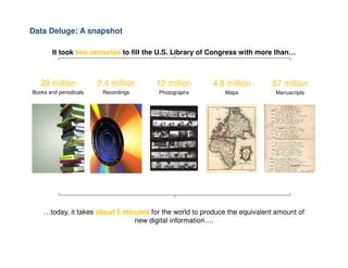
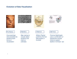
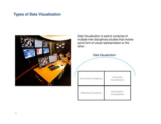
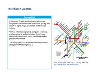
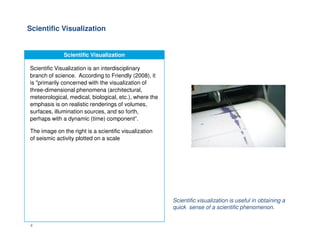
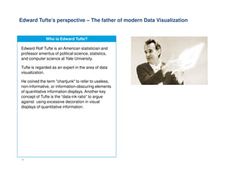
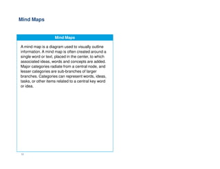
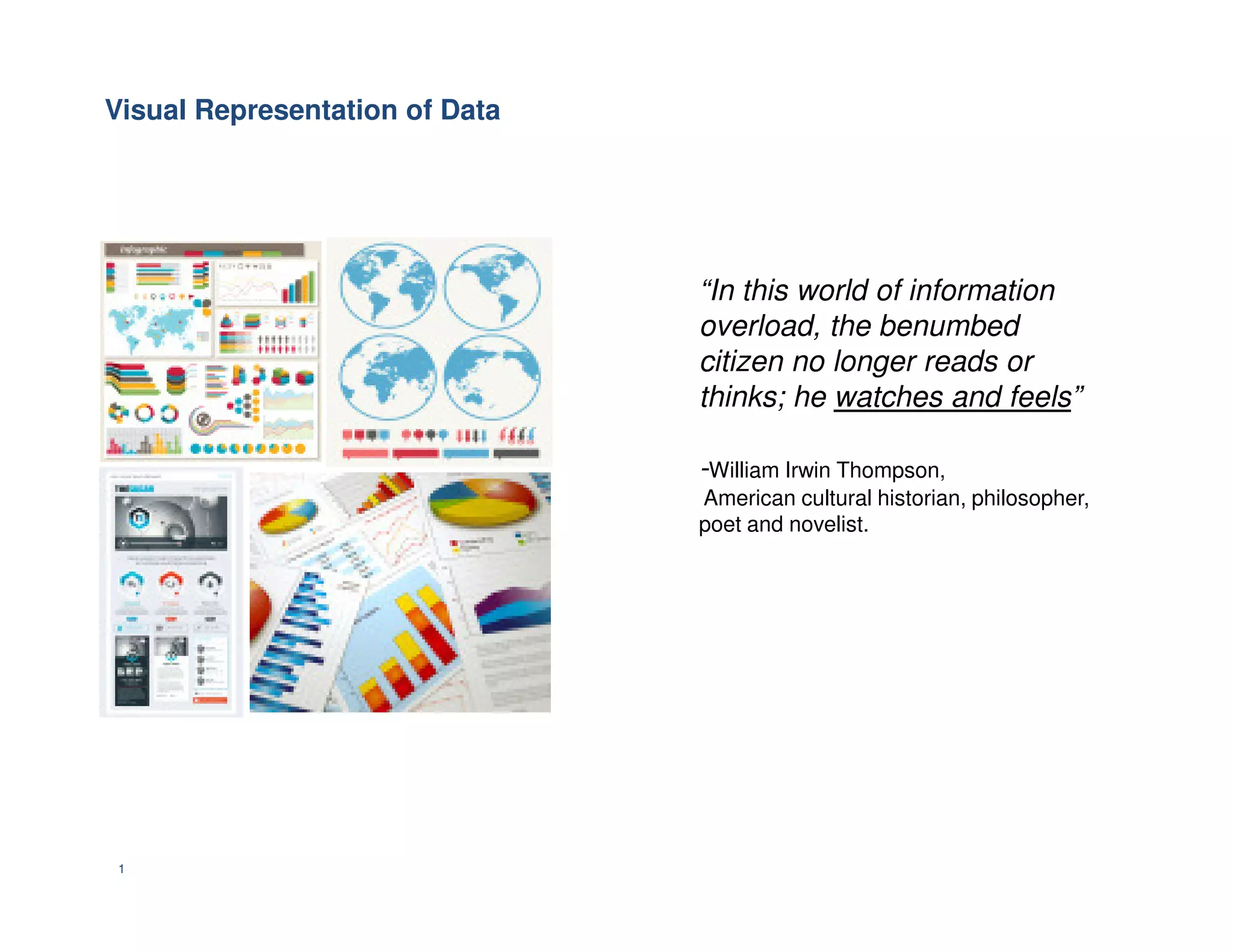
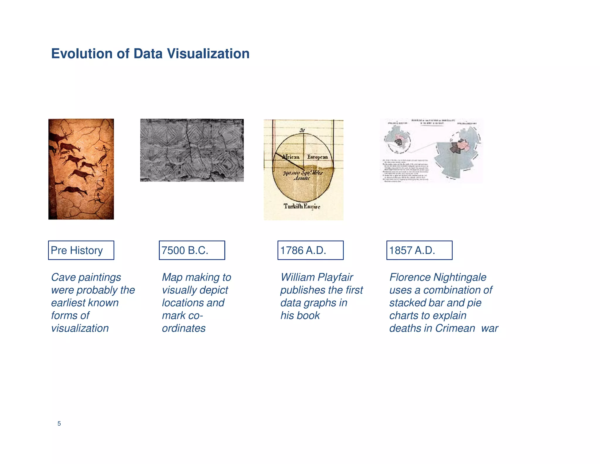
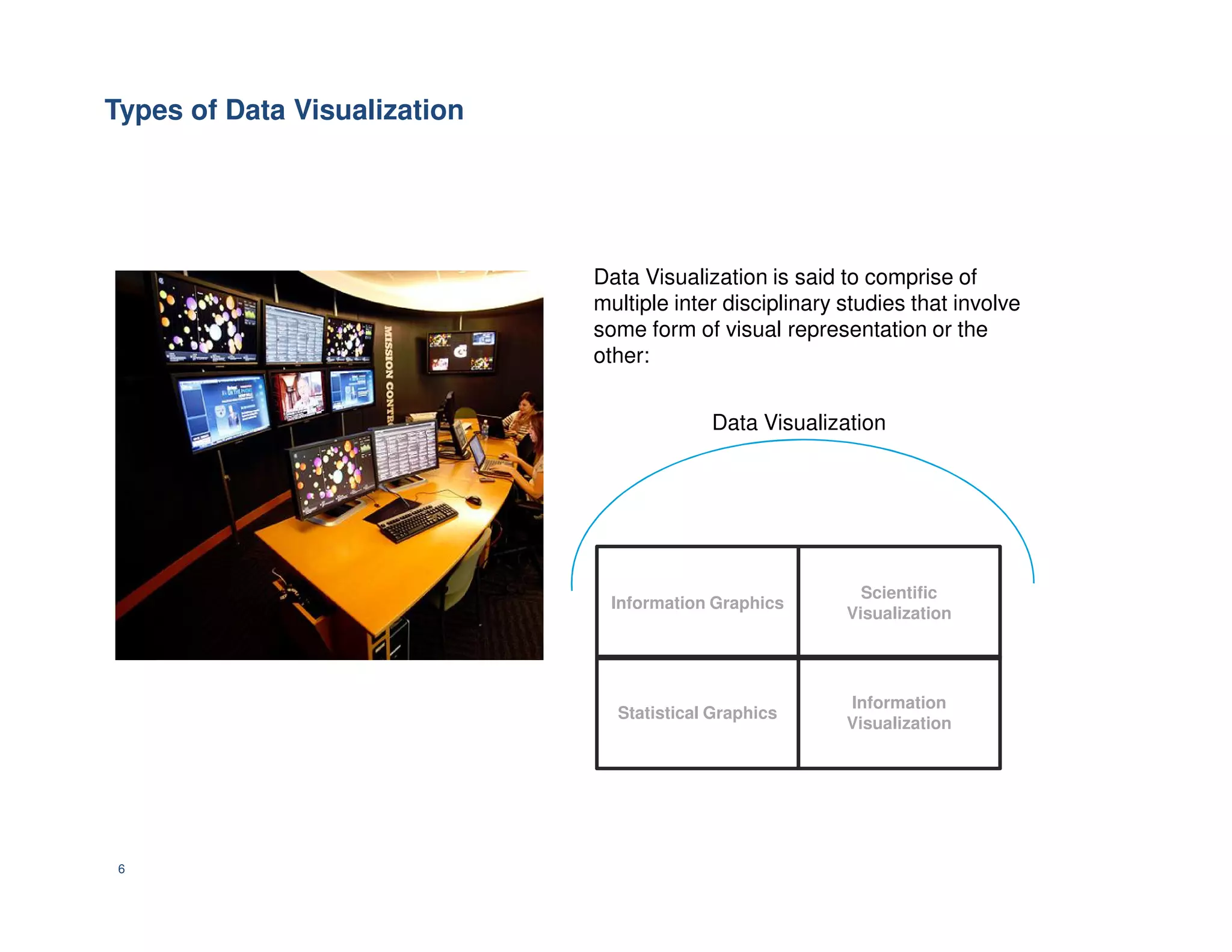
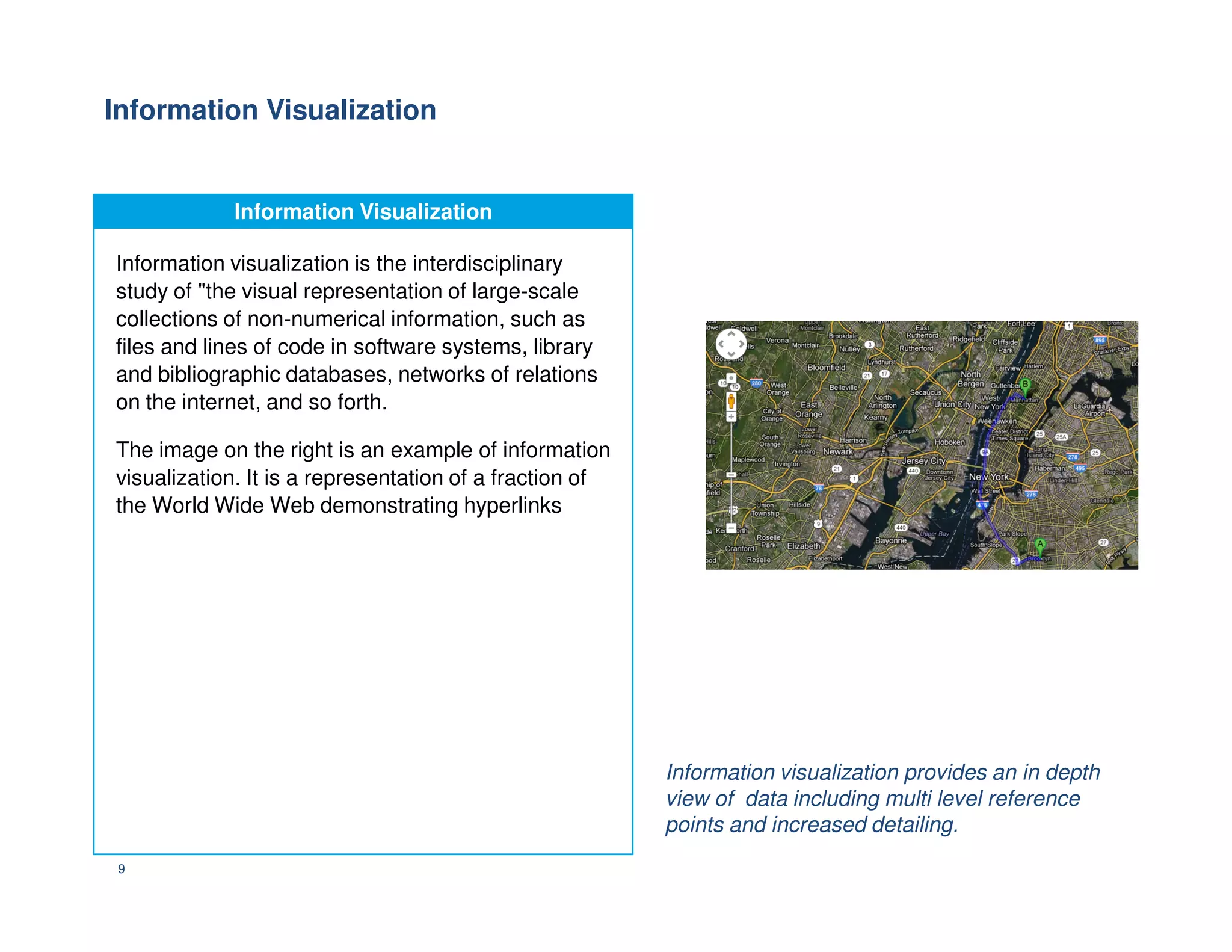
KEMBAR78
Class 3 visual representation of data | PDF
Visual Representation of Data
0
Visual Representation of Data
“In this world of information
overload, the benumbed
citizen no longer reads or
thinks; he watches and feels”
-William Irwin Thompson,
1
-William Irwin Thompson,
American cultural historian, philosopher,
poet and novelist.
An introduction to Data Visualization
What is Data Visualization?
One of the key themes underlying any form of
performance reporting is that of visual depiction.
This makes us delve a bit deeper into the concept
of Data Visualization.
Data Visualization is the process of creating
visual representation of meaningful information -
which has been abstracted in a schematic form.
2
In order to convey ideas effectively, both aesthetic
form and functionality need to go hand in hand,
providing insights about complex data sets by
communicating its key aspects in a more appealing
manner.
An example of Data Visualization is the
a map that helps one to graphically
comprehend a location
The need for Data Visualization
“Clutter and confusion are not
attributes of data – they are
shortcomings of design.”
-Edward Tufte
The need for Data Visualization
Even as the quantity of information generated
across the web reaches astronomical proportions,
there is a dire need to devise ways and means to
digest this information in a manner that is more
intuitive.
It doesn’t mean that data visualization needs to
look boring to be functional or extremely
sophisticated to look beautiful.
3
sophisticated to look beautiful.
According to Friedman (2008), the main goal of
data visualization is to communicate information
intuitively and effectively through graphical means.
Yet designers often find it challenging to achieve a
balance between design and function, and at time
end up creating gorgeous data visualizations which
fail to serve their main purpose — to communicate
information.
29 million
Books and periodicals
2.4 million
Recordings
12 million
Photographs
4.8 million
Maps
57 million
Manuscripts
It took two centuries to fill the U.S. Library of Congress with more than…
Data Deluge: A snapshot
…today, it takes about 5 minutes for the world to produce the equivalent amount of
new digital information….
Evolution of Data Visualization
5
Pre History 7500 B.C. 1786 A.D. 1857 A.D.
Cave paintings
were probably the
earliest known
forms of
visualization
Map making to
visually depict
locations and
mark co-
ordinates
William Playfair
publishes the first
data graphs in
his book
Florence Nightingale
uses a combination of
stacked bar and pie
charts to explain
deaths in Crimean war
Types of Data Visualization
Data Visualization is said to comprise of
multiple inter disciplinary studies that involve
some form of visual representation or the
other:
Data Visualization
6
Information Graphics
Scientific
Visualization
Information
Visualization
Statistical Graphics
Information Graphics
Infographics
Information Graphics or Infographics includes
imagery to present complex information quickly and
clearly in signs, maps, journalism and technical
writing.
With an information graphic, computer scientists,
mathematicians, and statisticians develop and
communicate concepts using a single symbol to
process information.
7
process information.
The infographic on the right represents the metro
rail system of Washington D.C.
This infographic helps you identify and plot
your route in an easier fashion.
Scientific Visualization
Scientific Visualization is an interdisciplinary
branch of science. According to Friendly (2008), it
is "primarily concerned with the visualization of
three-dimensional phenomena (architectural,
meteorological, medical, biological, etc.), where the
emphasis is on realistic renderings of volumes,
surfaces, illumination sources, and so forth,
perhaps with a dynamic (time) component”.
8
The image on the right is a scientific visualization
of seismic activity plotted on a scale
Scientific visualization is useful in obtaining a
quick sense of a scientific phenomenon.
Information Visualization
Information visualization is the interdisciplinary
study of "the visual representation of large-scale
collections of non-numerical information, such as
files and lines of code in software systems, library
and bibliographic databases, networks of relations
on the internet, and so forth.
The image on the right is an example of information
visualization. It is a representation of a fraction of
9
visualization. It is a representation of a fraction of
the World Wide Web demonstrating hyperlinks
Information visualization provides an in depth
view of data including multi level reference
points and increased detailing.
Statistical Graphics
While routine statistics and data analysis
procedures yield their output in numeric or tabular
form, graphical techniques allow such results to be
displayed in some sort of pictorial form. They
include representation such as scatter plots,
histograms, probability plots, spaghetti plots,
residual plots and box plots.
The image on the right depicts the number of
10
The image on the right depicts the number of
Walmart and Starbucks stores per million people.
Statistical graphics provides an analysis of
everyday phenomena and events , and their
impact ..
Edward Tufte’s perspective – The father of modern Data Visualization
Who is Edward Tufte?
Edward Rolf Tufte is an American statistician and
professor emeritus of political science, statistics,
and computer science at Yale University.
Tufte is regarded as an expert in the area of data
visualization.
He coined the term "chartjunk" to refer to useless,
non-informative, or information-obscuring elements
11
non-informative, or information-obscuring elements
of quantitative information displays. Another key
concept of Tufte is the “data-ink ratio” to argue
against using excessive decoration in visual
displays of quantitative information.
Mind Maps
Mind Maps
A mind map is a diagram used to visually outline
information. A mind map is often created around a
single word or text, placed in the center, to which
associated ideas, words and concepts are added.
Major categories radiate from a central node, and
lesser categories are sub-branches of larger
branches. Categories can represent words, ideas,
tasks, or other items related to a central key word
or idea.
12
or idea.
Mindmaps
13
Prezi
14

Class 3 visual representation of data

  • 1.
  • 2.
    Visual Representation ofData “In this world of information overload, the benumbed citizen no longer reads or thinks; he watches and feels” -William Irwin Thompson, 1 -William Irwin Thompson, American cultural historian, philosopher, poet and novelist.
  • 3.
    An introduction toData Visualization What is Data Visualization? One of the key themes underlying any form of performance reporting is that of visual depiction. This makes us delve a bit deeper into the concept of Data Visualization. Data Visualization is the process of creating visual representation of meaningful information - which has been abstracted in a schematic form. 2 In order to convey ideas effectively, both aesthetic form and functionality need to go hand in hand, providing insights about complex data sets by communicating its key aspects in a more appealing manner. An example of Data Visualization is the a map that helps one to graphically comprehend a location
  • 4.
    The need forData Visualization “Clutter and confusion are not attributes of data – they are shortcomings of design.” -Edward Tufte The need for Data Visualization Even as the quantity of information generated across the web reaches astronomical proportions, there is a dire need to devise ways and means to digest this information in a manner that is more intuitive. It doesn’t mean that data visualization needs to look boring to be functional or extremely sophisticated to look beautiful. 3 sophisticated to look beautiful. According to Friedman (2008), the main goal of data visualization is to communicate information intuitively and effectively through graphical means. Yet designers often find it challenging to achieve a balance between design and function, and at time end up creating gorgeous data visualizations which fail to serve their main purpose — to communicate information.
  • 5.
    29 million Books andperiodicals 2.4 million Recordings 12 million Photographs 4.8 million Maps 57 million Manuscripts It took two centuries to fill the U.S. Library of Congress with more than… Data Deluge: A snapshot …today, it takes about 5 minutes for the world to produce the equivalent amount of new digital information….
  • 6.
    Evolution of DataVisualization 5 Pre History 7500 B.C. 1786 A.D. 1857 A.D. Cave paintings were probably the earliest known forms of visualization Map making to visually depict locations and mark co- ordinates William Playfair publishes the first data graphs in his book Florence Nightingale uses a combination of stacked bar and pie charts to explain deaths in Crimean war
  • 7.
    Types of DataVisualization Data Visualization is said to comprise of multiple inter disciplinary studies that involve some form of visual representation or the other: Data Visualization 6 Information Graphics Scientific Visualization Information Visualization Statistical Graphics
  • 8.
    Information Graphics Infographics Information Graphicsor Infographics includes imagery to present complex information quickly and clearly in signs, maps, journalism and technical writing. With an information graphic, computer scientists, mathematicians, and statisticians develop and communicate concepts using a single symbol to process information. 7 process information. The infographic on the right represents the metro rail system of Washington D.C. This infographic helps you identify and plot your route in an easier fashion.
  • 9.
    Scientific Visualization Scientific Visualization ScientificVisualization is an interdisciplinary branch of science. According to Friendly (2008), it is "primarily concerned with the visualization of three-dimensional phenomena (architectural, meteorological, medical, biological, etc.), where the emphasis is on realistic renderings of volumes, surfaces, illumination sources, and so forth, perhaps with a dynamic (time) component”. 8 The image on the right is a scientific visualization of seismic activity plotted on a scale Scientific visualization is useful in obtaining a quick sense of a scientific phenomenon.
  • 10.
    Information Visualization Information Visualization Informationvisualization is the interdisciplinary study of "the visual representation of large-scale collections of non-numerical information, such as files and lines of code in software systems, library and bibliographic databases, networks of relations on the internet, and so forth. The image on the right is an example of information visualization. It is a representation of a fraction of 9 visualization. It is a representation of a fraction of the World Wide Web demonstrating hyperlinks Information visualization provides an in depth view of data including multi level reference points and increased detailing.
  • 11.
    Statistical Graphics Statistical Graphics Whileroutine statistics and data analysis procedures yield their output in numeric or tabular form, graphical techniques allow such results to be displayed in some sort of pictorial form. They include representation such as scatter plots, histograms, probability plots, spaghetti plots, residual plots and box plots. The image on the right depicts the number of 10 The image on the right depicts the number of Walmart and Starbucks stores per million people. Statistical graphics provides an analysis of everyday phenomena and events , and their impact ..
  • 12.
    Edward Tufte’s perspective– The father of modern Data Visualization Who is Edward Tufte? Edward Rolf Tufte is an American statistician and professor emeritus of political science, statistics, and computer science at Yale University. Tufte is regarded as an expert in the area of data visualization. He coined the term "chartjunk" to refer to useless, non-informative, or information-obscuring elements 11 non-informative, or information-obscuring elements of quantitative information displays. Another key concept of Tufte is the “data-ink ratio” to argue against using excessive decoration in visual displays of quantitative information.
  • 13.
    Mind Maps Mind Maps Amind map is a diagram used to visually outline information. A mind map is often created around a single word or text, placed in the center, to which associated ideas, words and concepts are added. Major categories radiate from a central node, and lesser categories are sub-branches of larger branches. Categories can represent words, ideas, tasks, or other items related to a central key word or idea. 12 or idea.
  • 14.
  • 15.