Downloaded 1,664 times


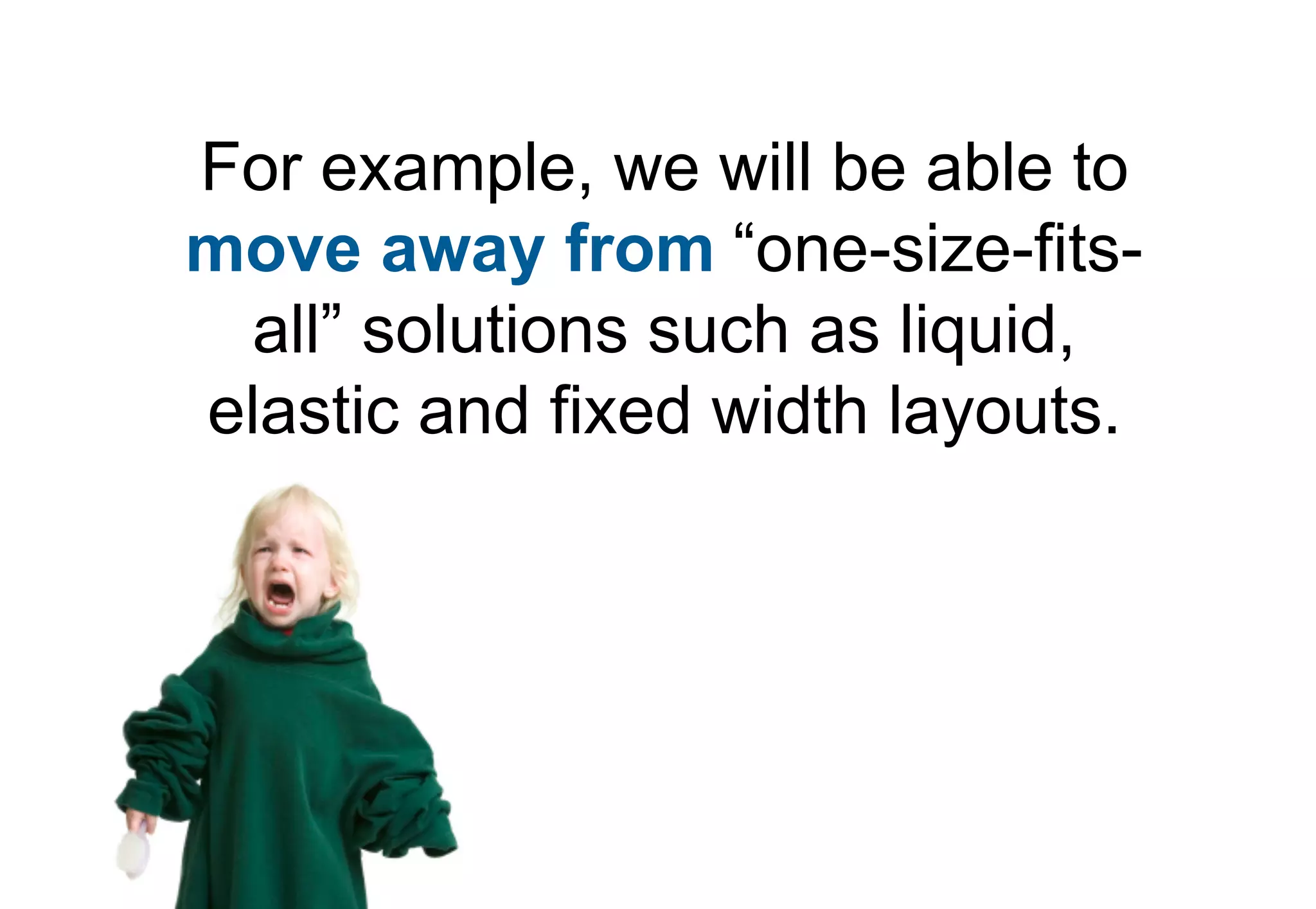


Media queries allow CSS styles to be applied conditionally based on characteristics of the device viewing the content, like screen width. They provide a way to target specific devices and change layouts without changing the HTML. The document discusses the syntax of media queries, including using media types, features, expressions, and keywords. It provides examples of using media queries to load different style sheets or apply different CSS rules for different screen widths.
Introduction to CSS3 media queries and their significance in adapting layouts for different devices.
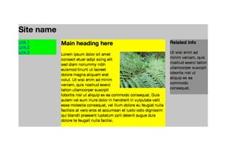
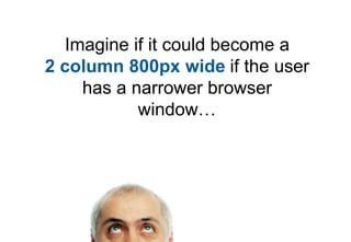
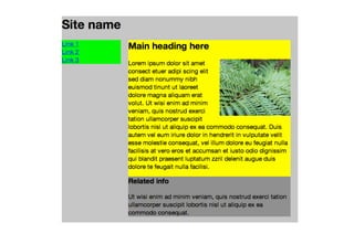
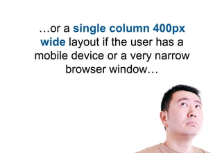
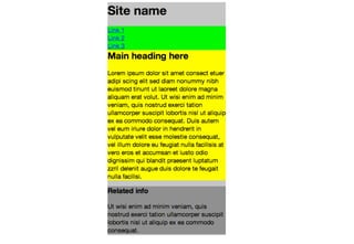
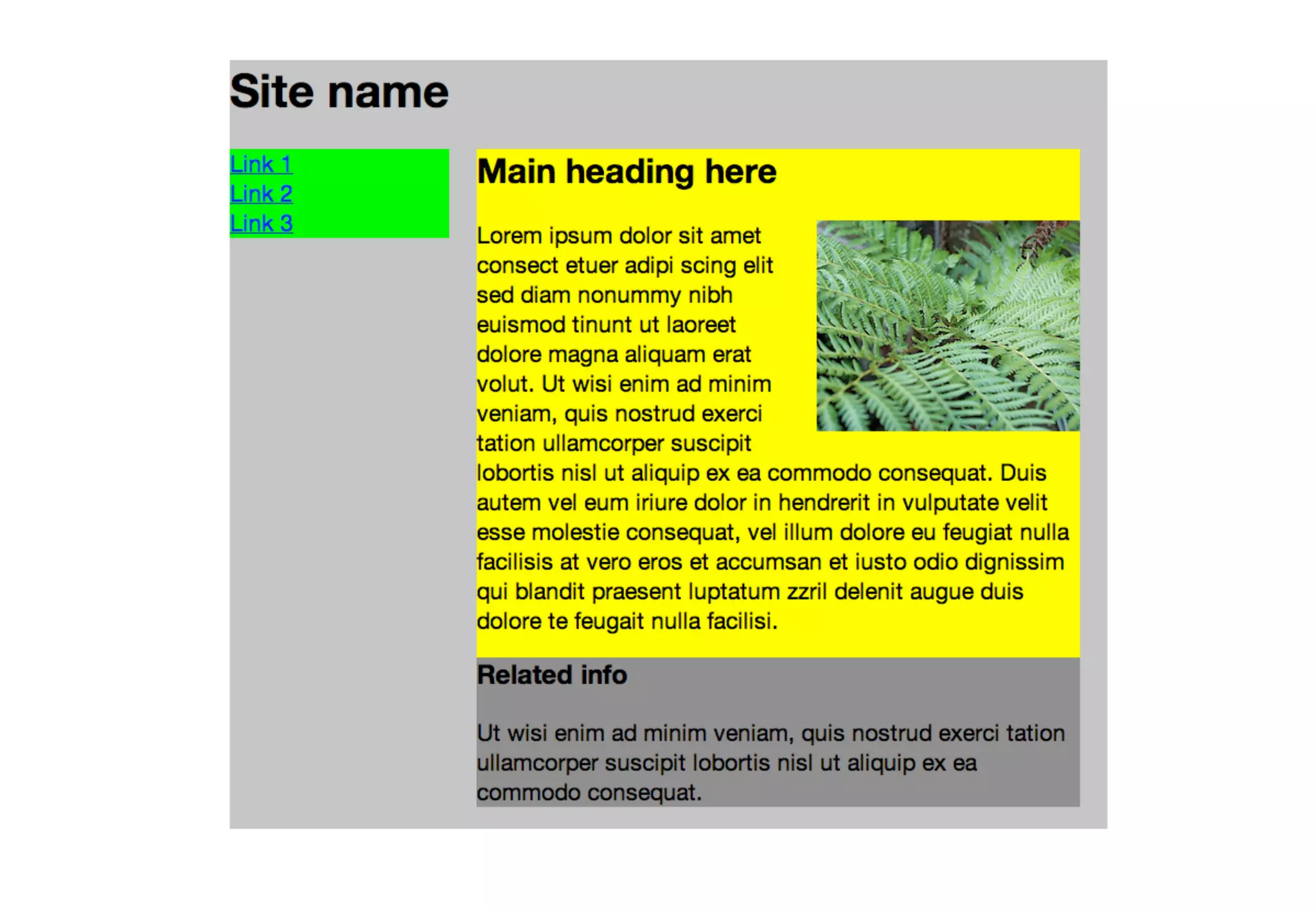
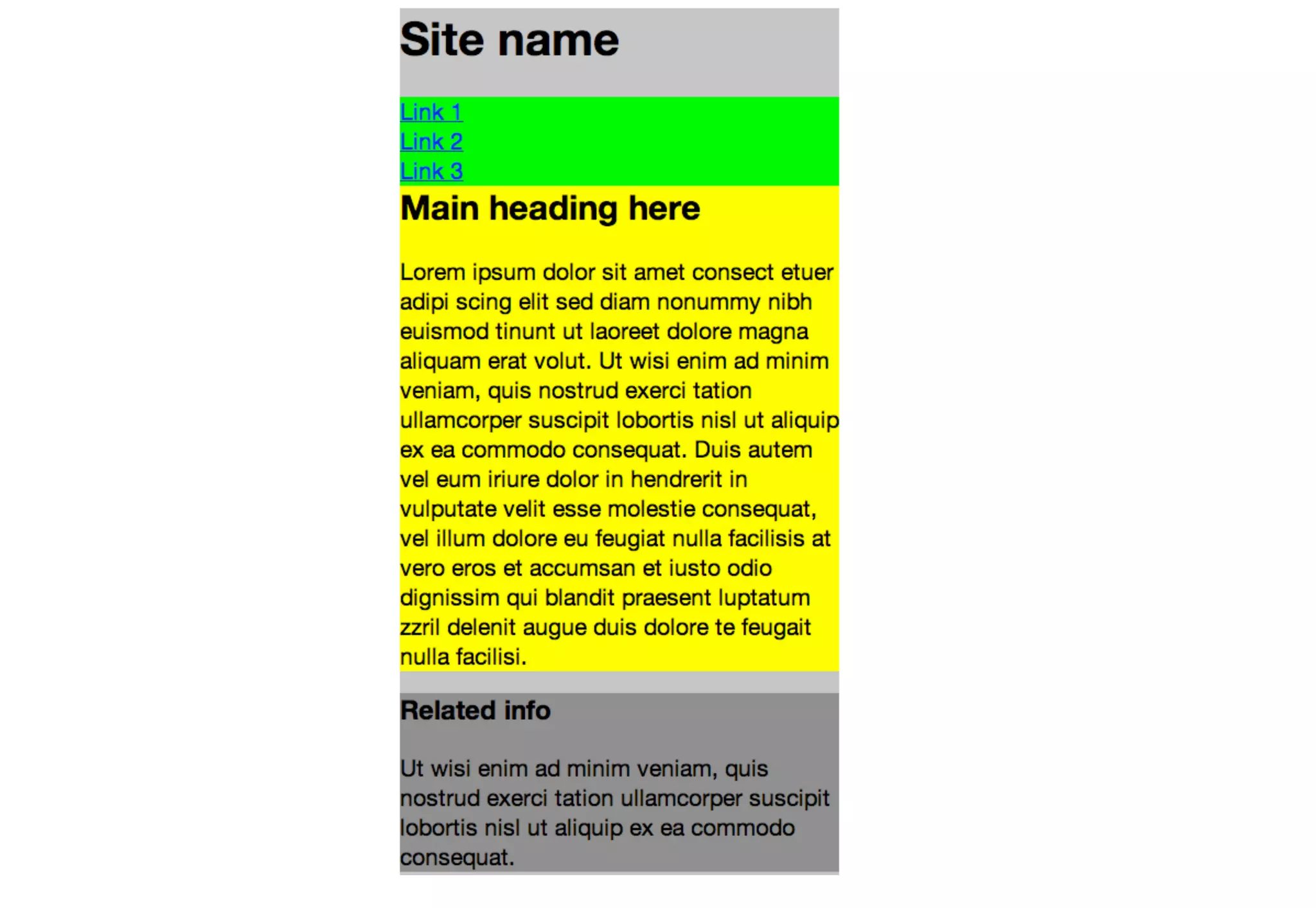
Demonstrates how media queries can modify layout configurations based on screen width, enhancing responsiveness.
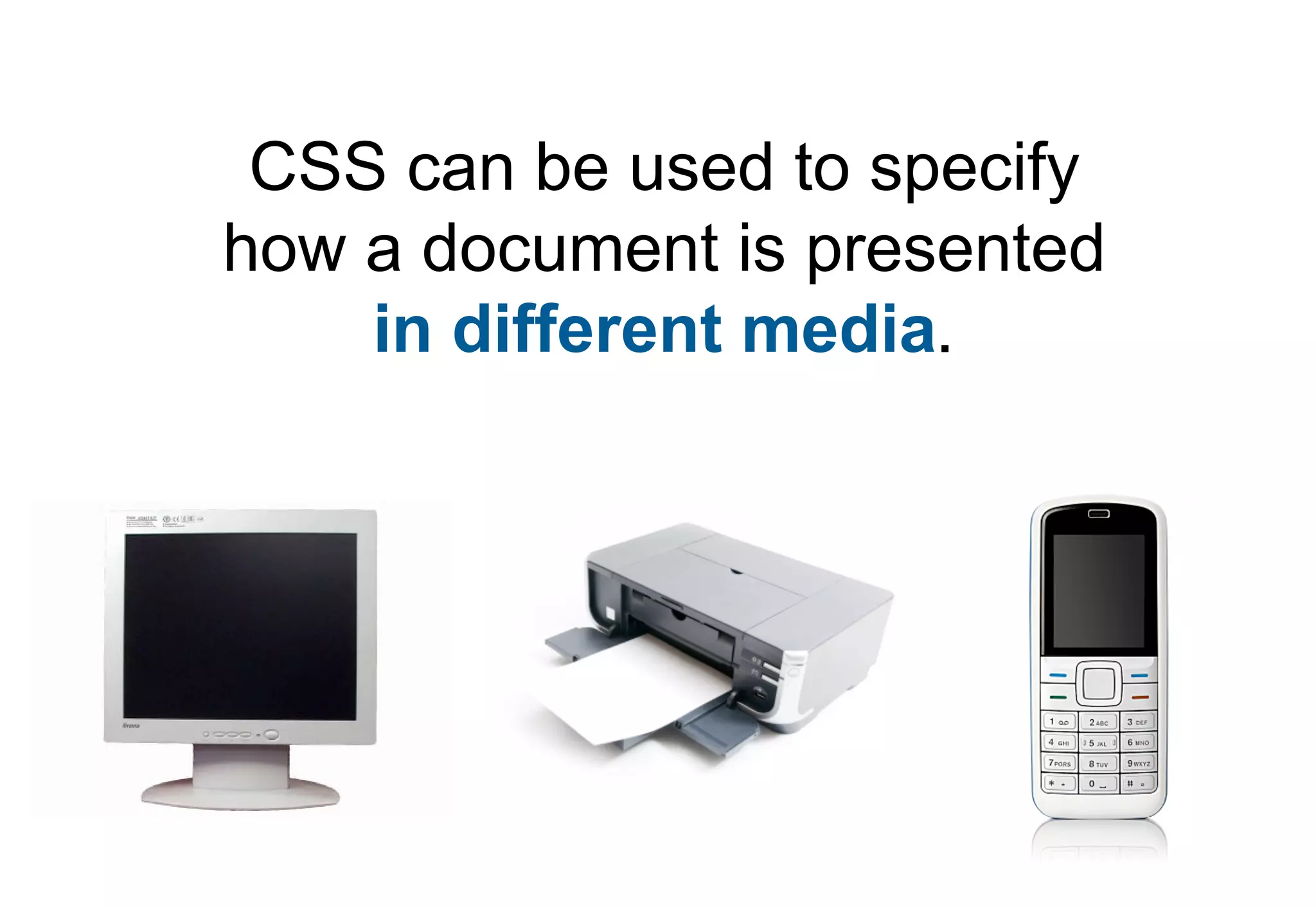
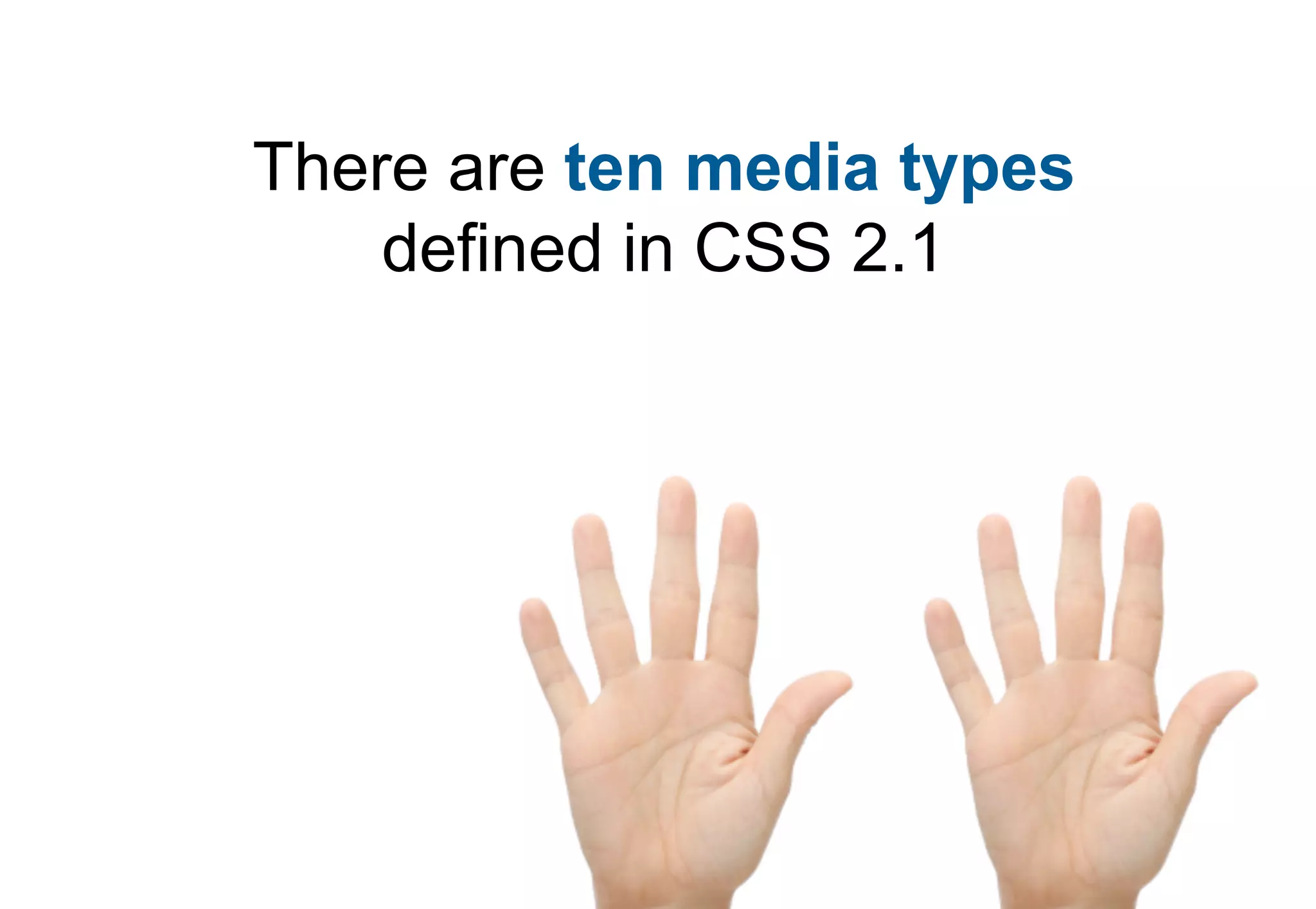
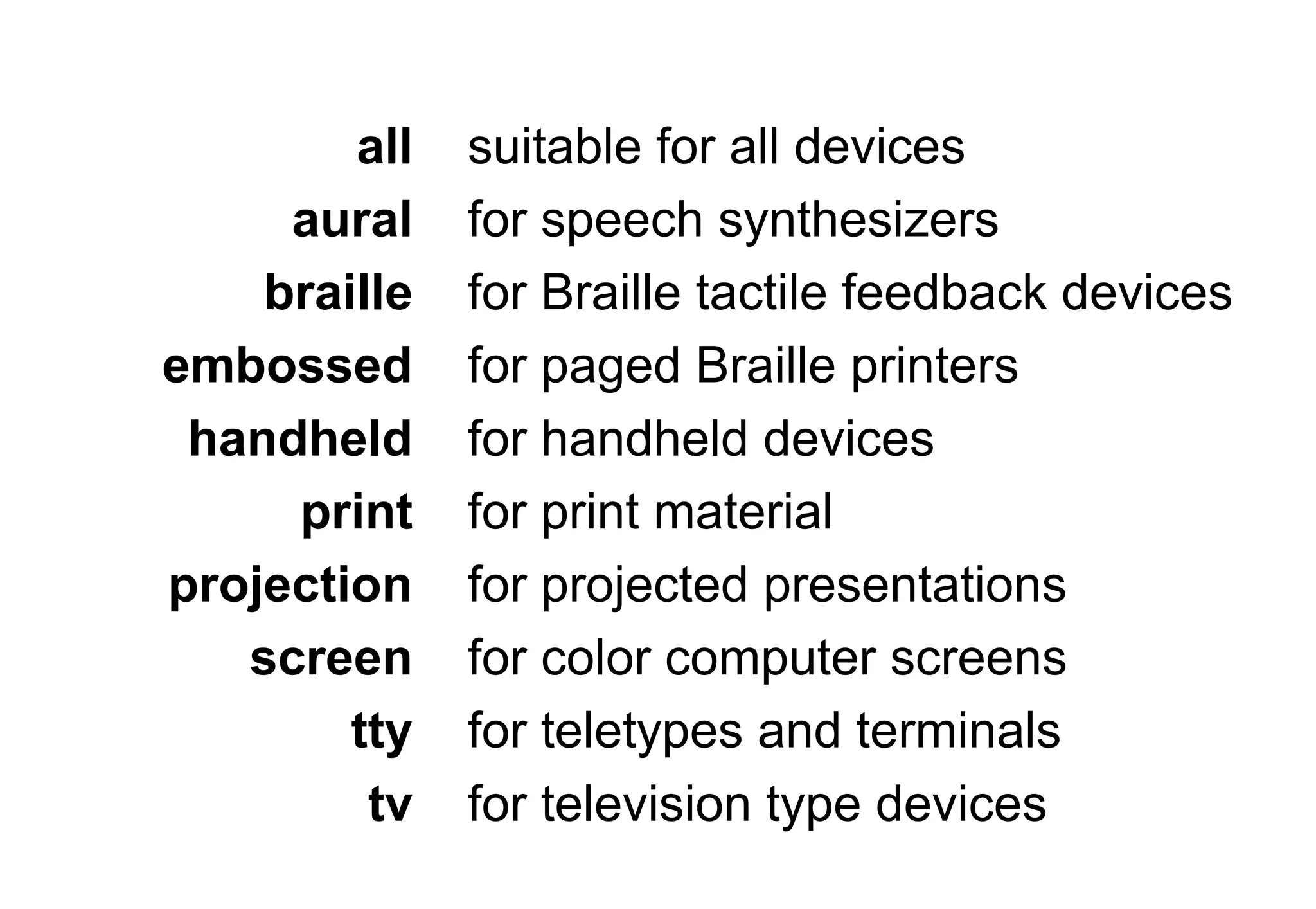
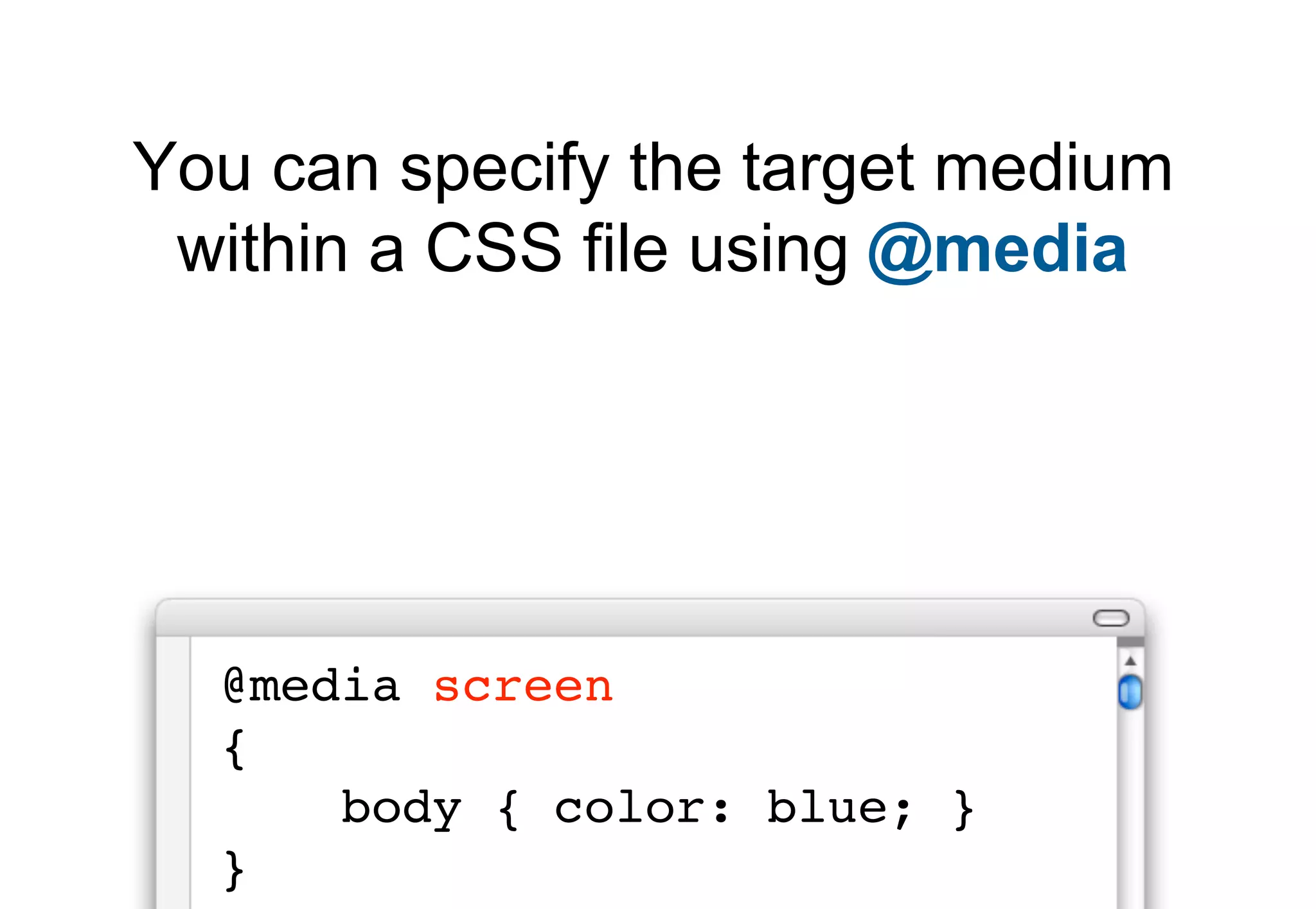
Explains media types in CSS and lists the ten types defined in CSS 2.1 for varied device presentations.
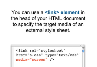
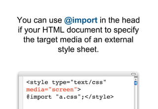
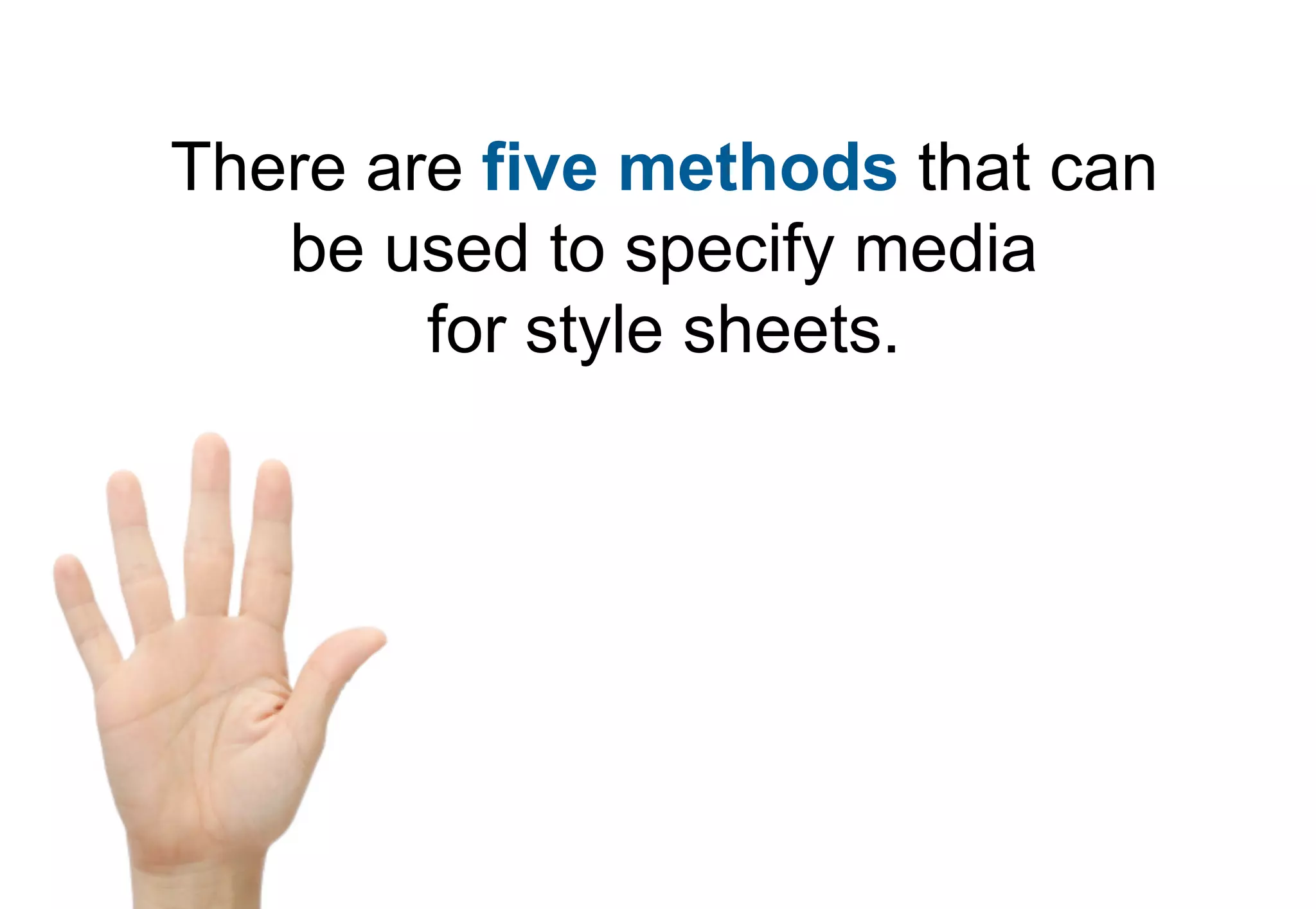
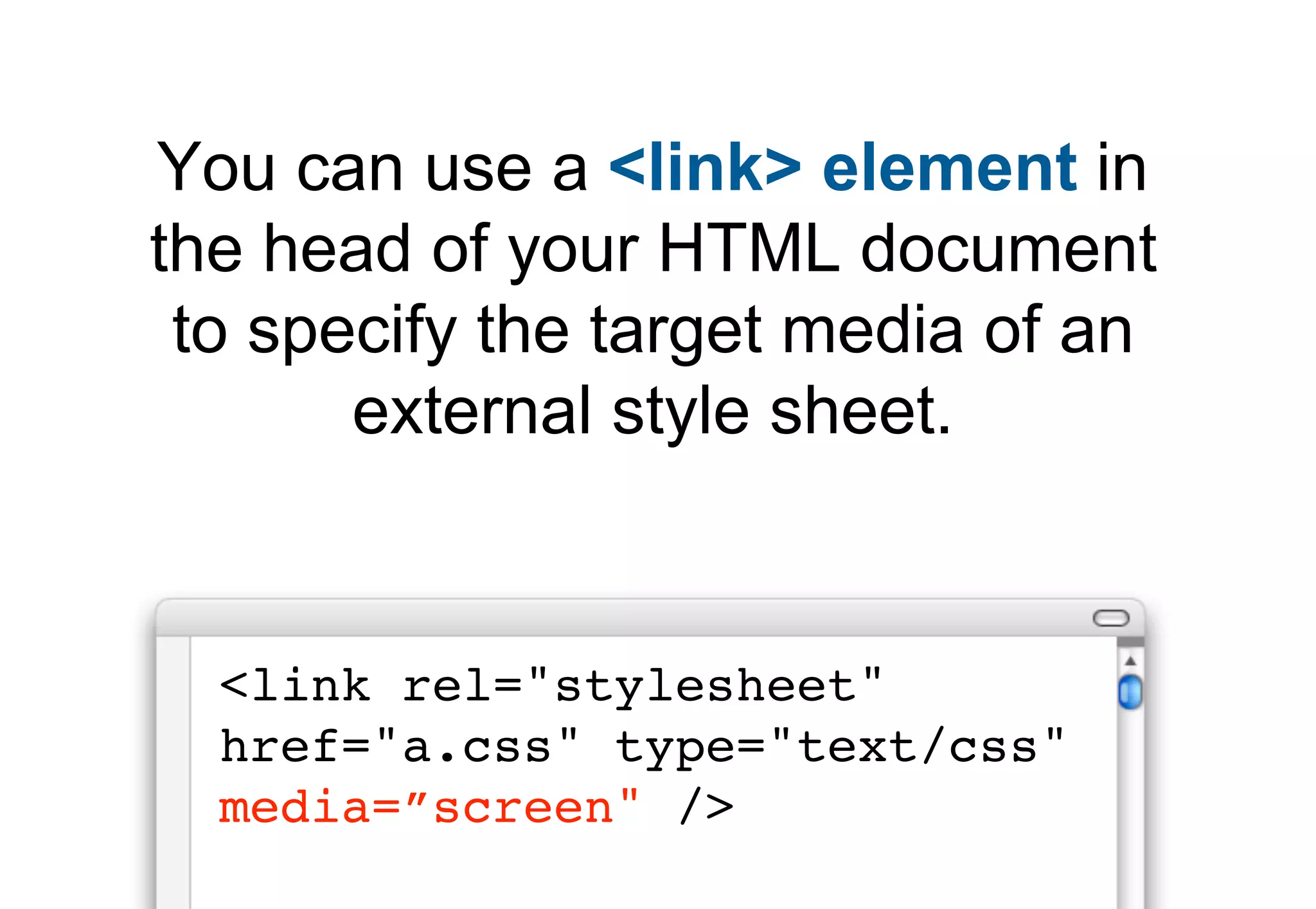
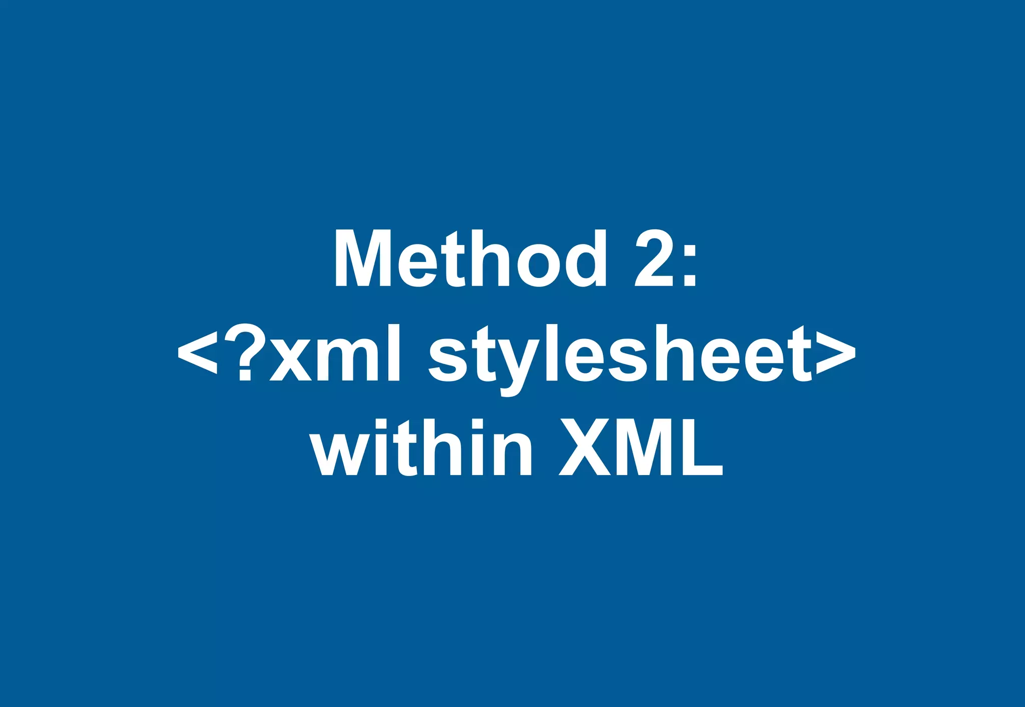
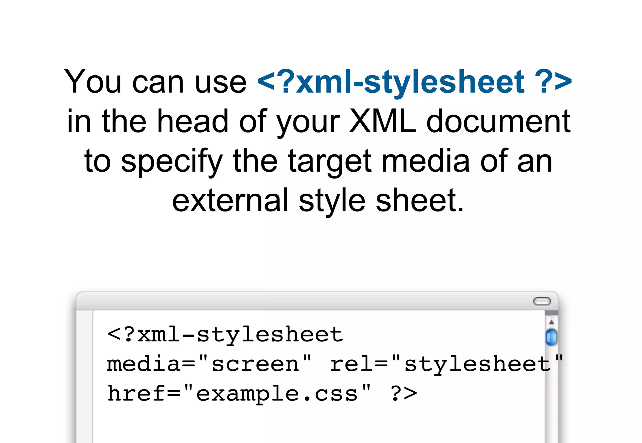
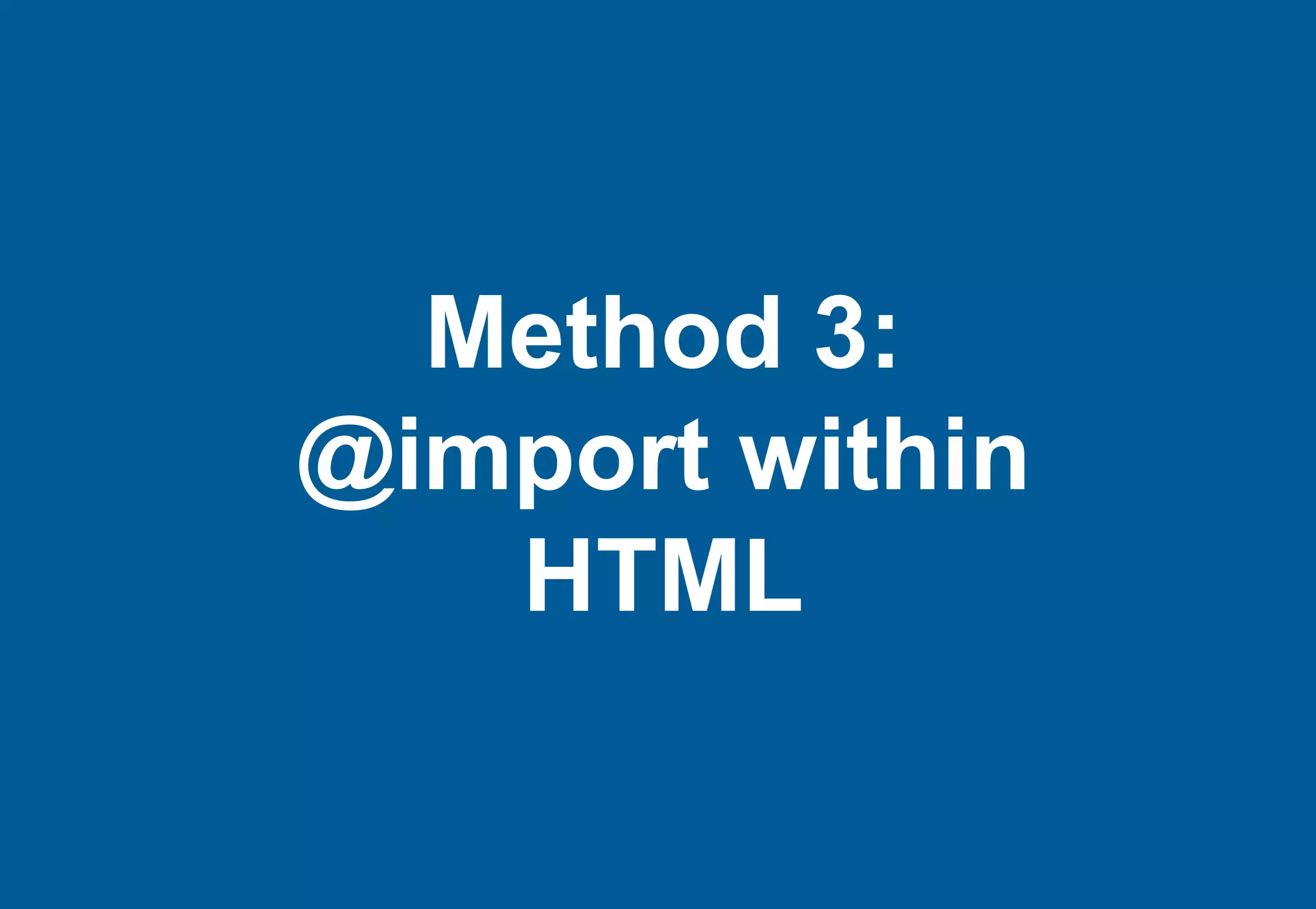
Details five methods for specifying media types and transitions into introducing media queries.
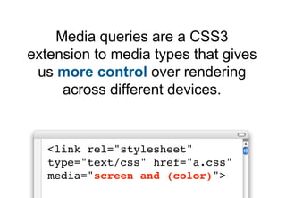
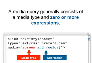
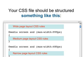
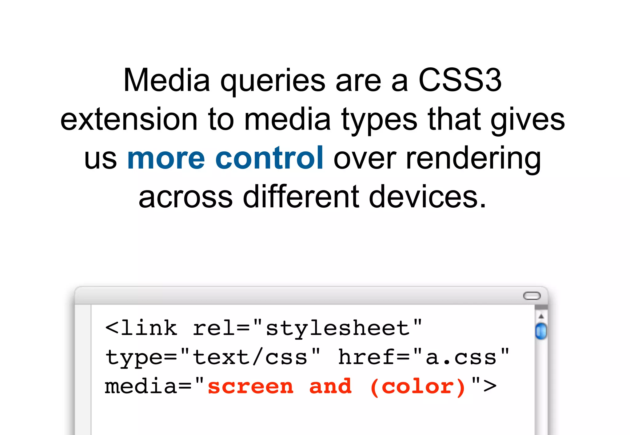
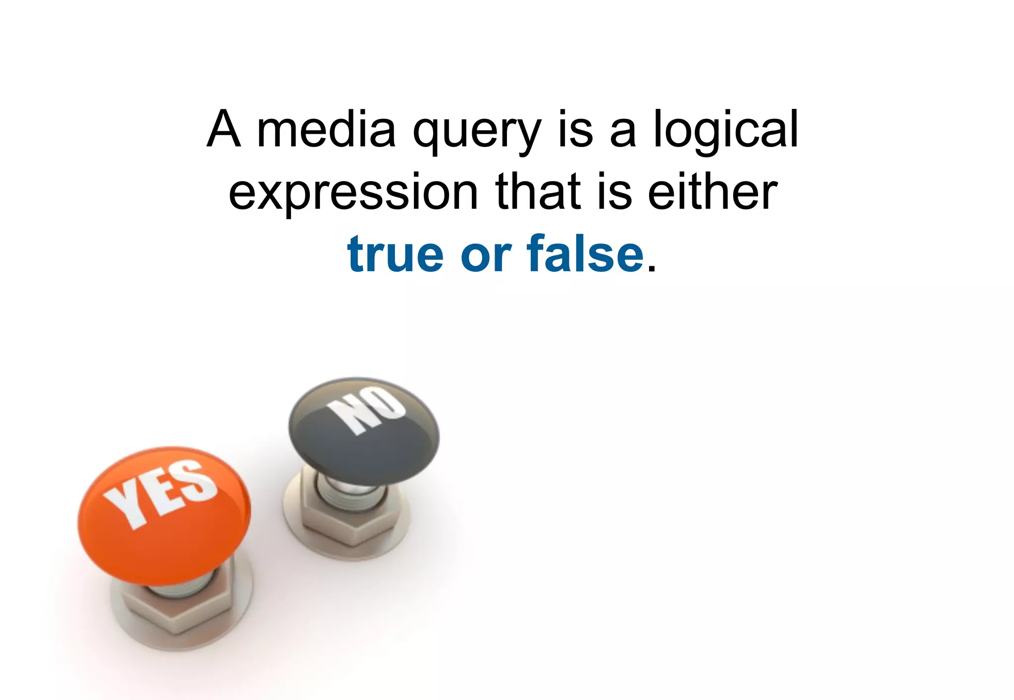
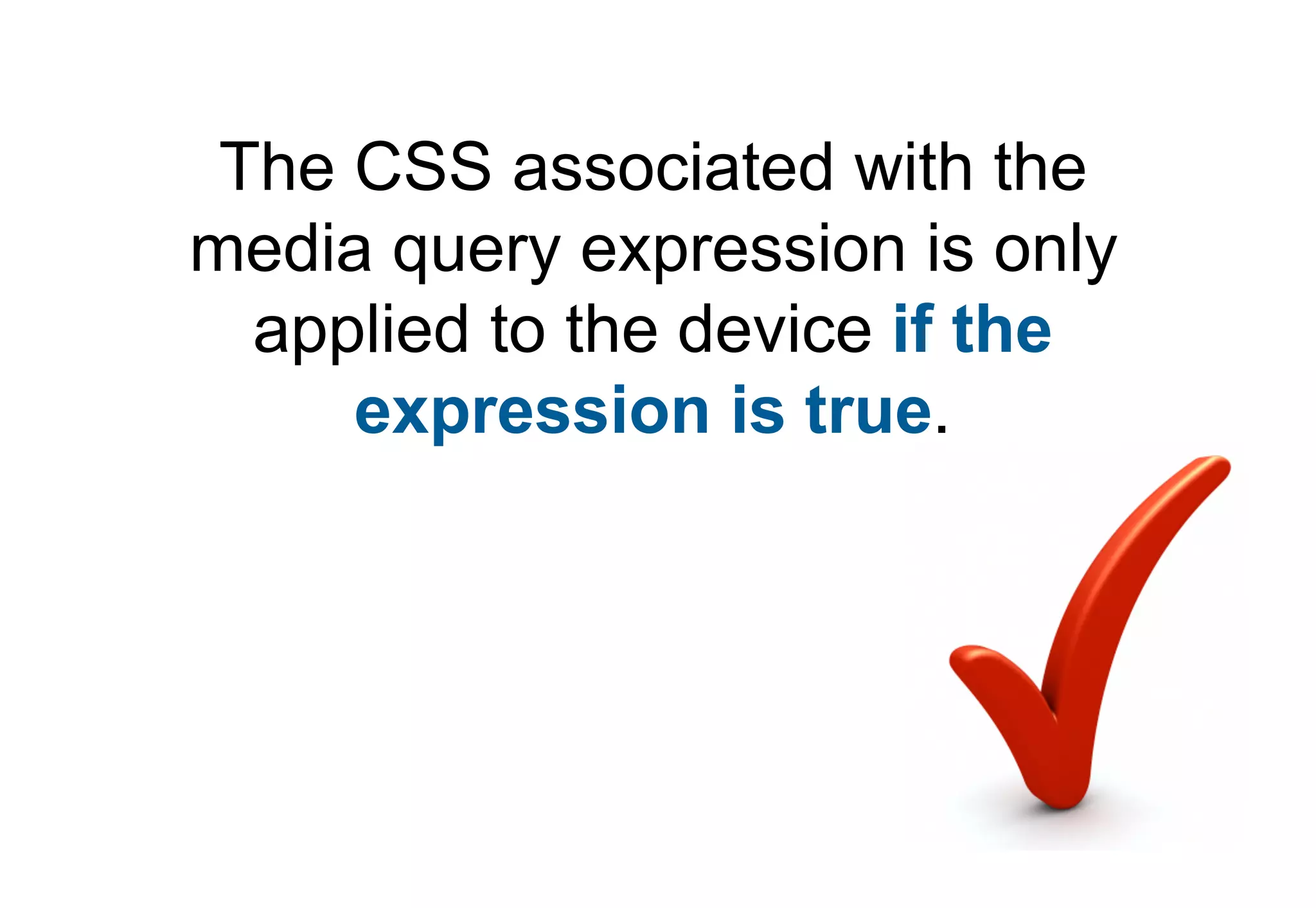
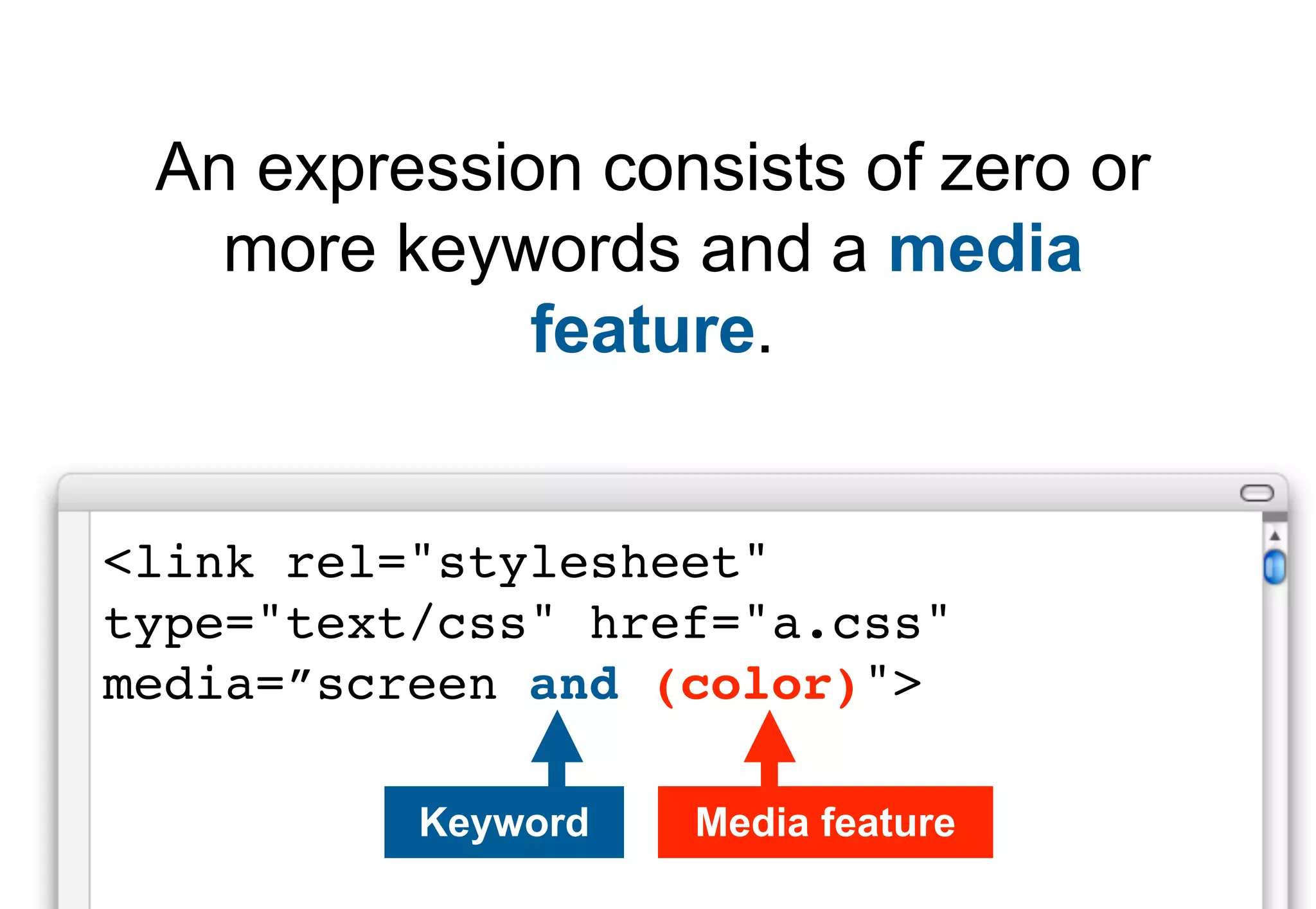
Explains the concept, syntax, and structure of media queries in CSS, enhancing control for different devices.
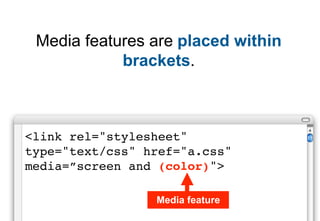
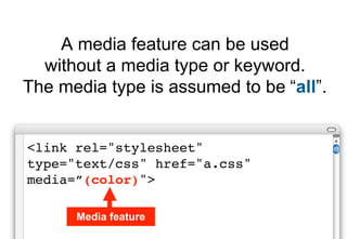
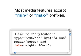
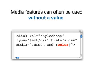
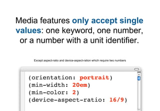
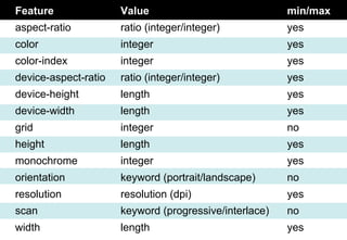
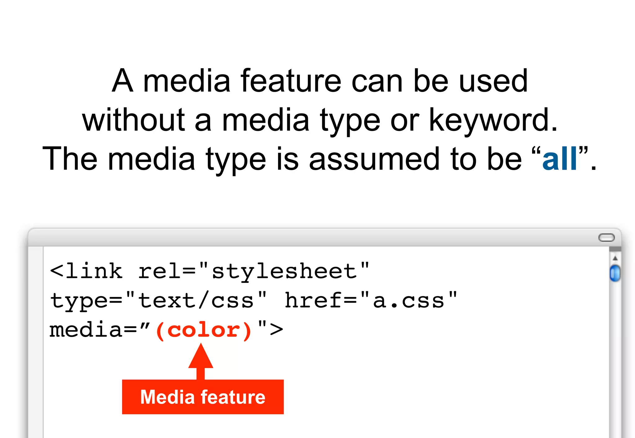
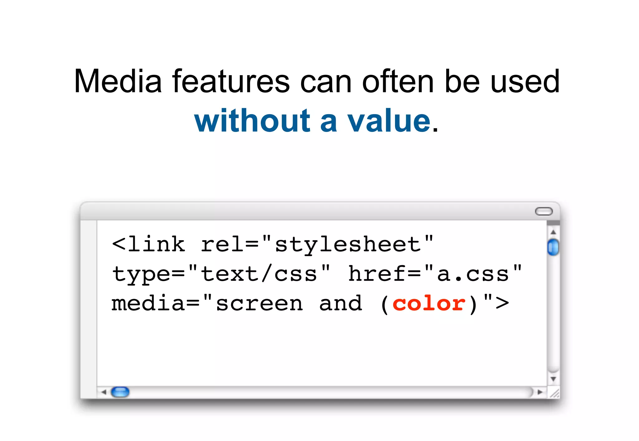
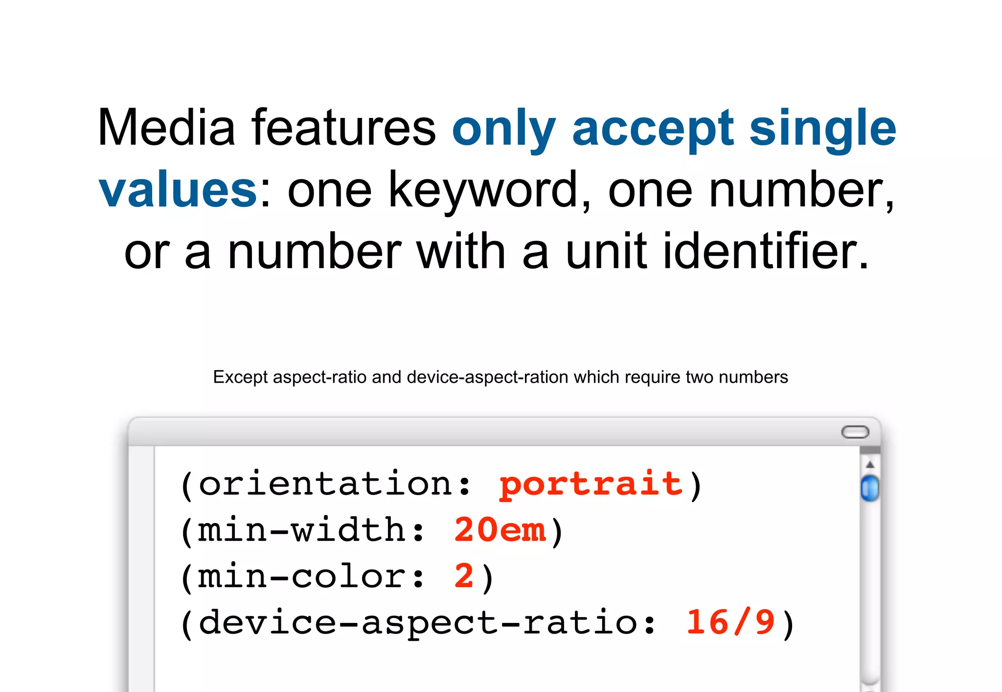
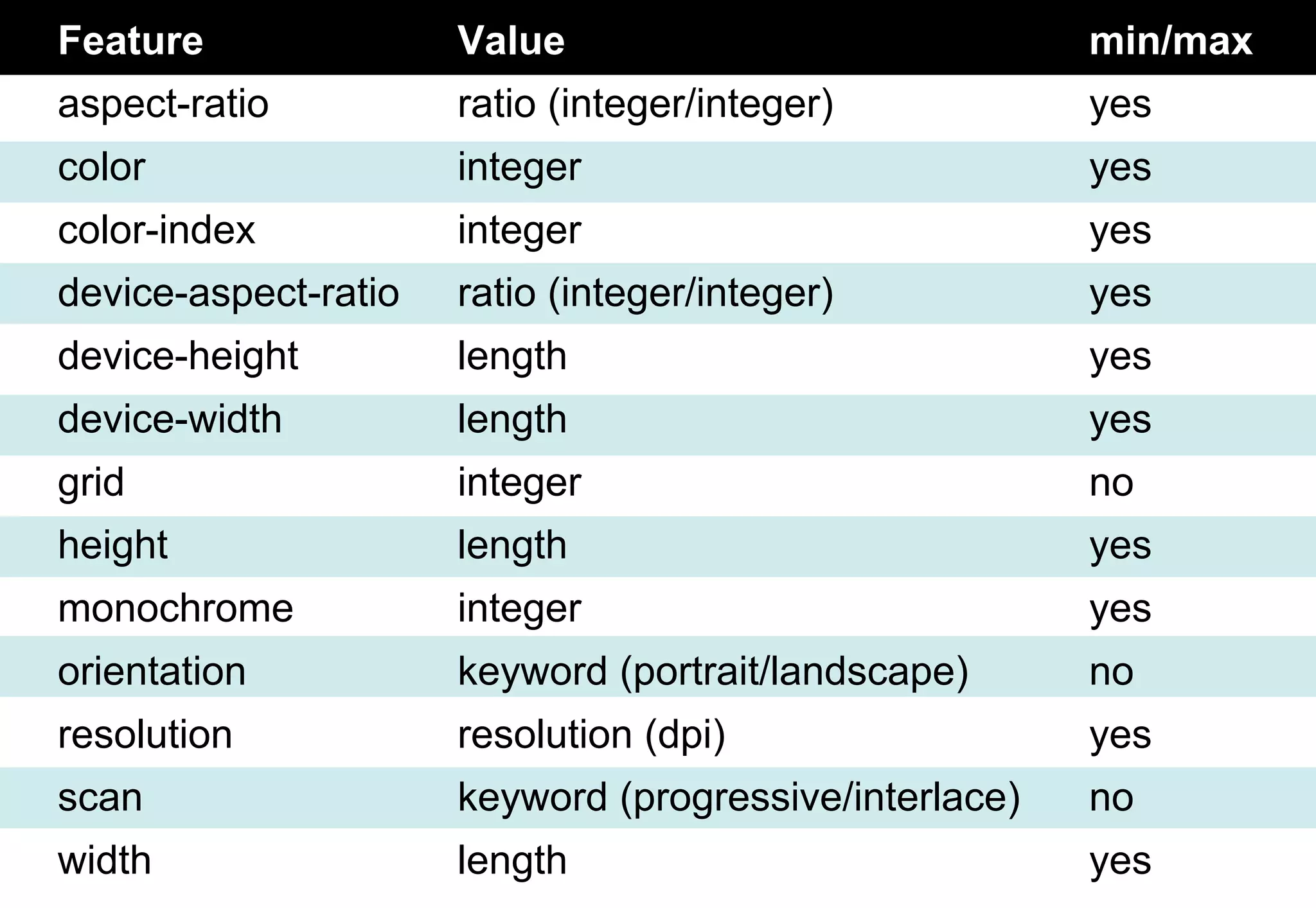
A list of media features with values allowing fine control over CSS application according to device properties.
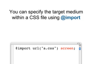
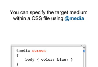
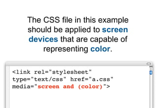
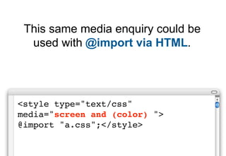
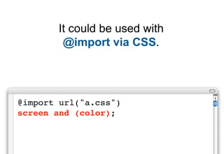
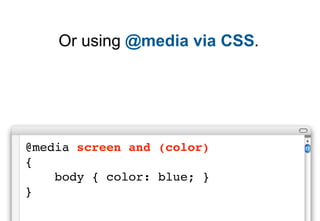
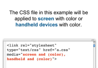
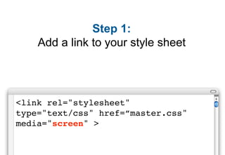
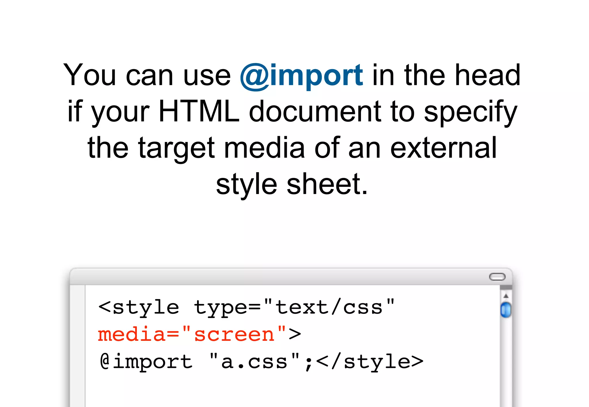
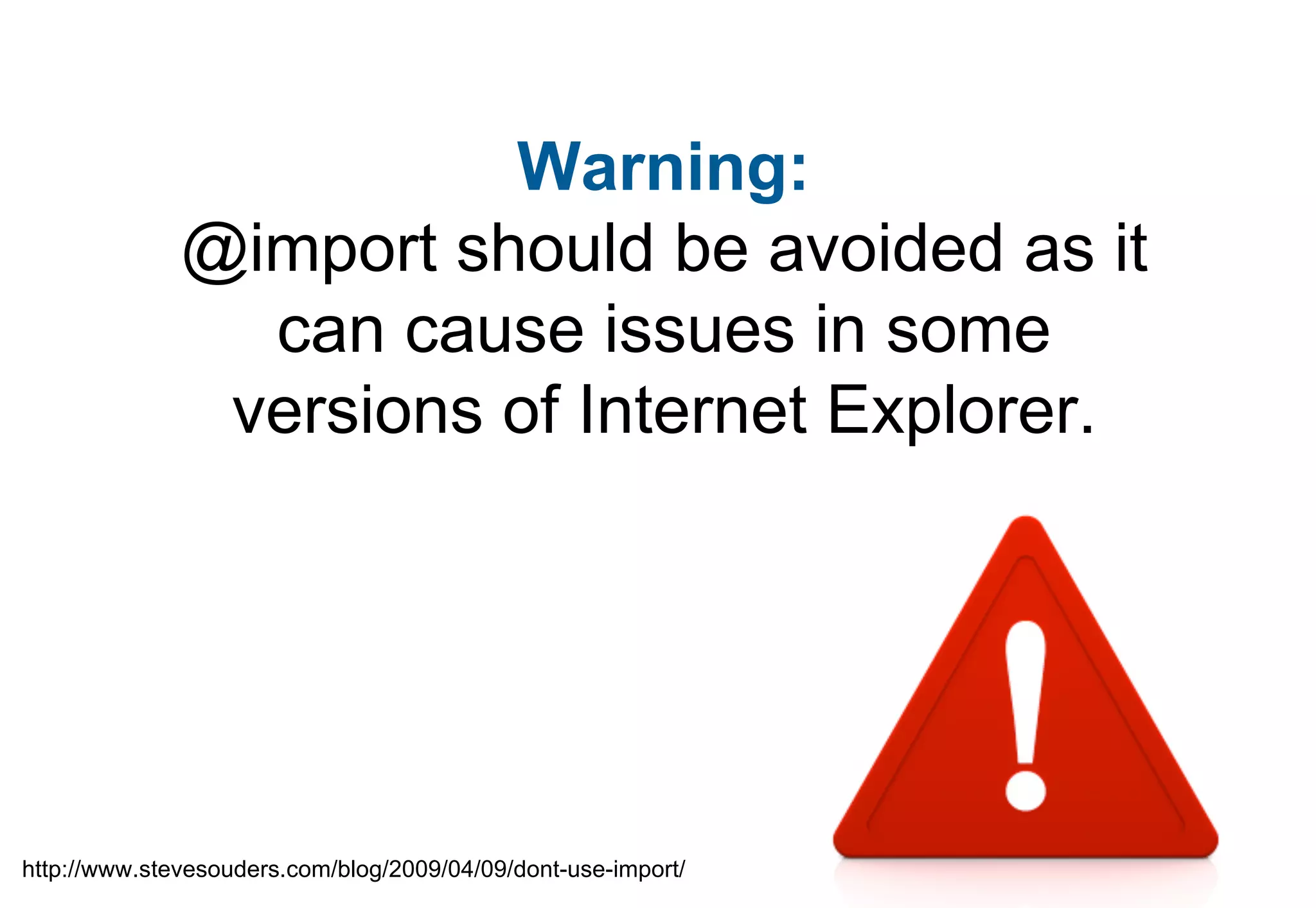
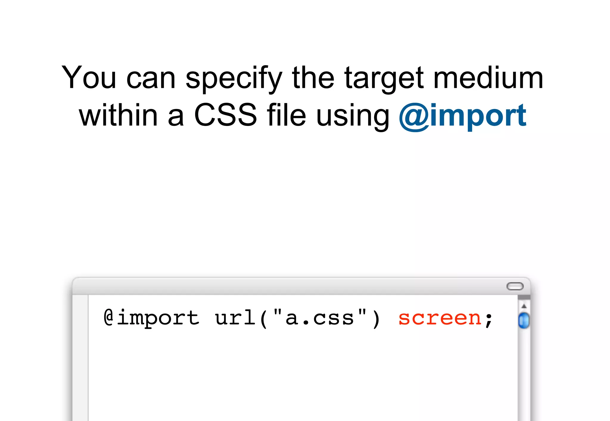
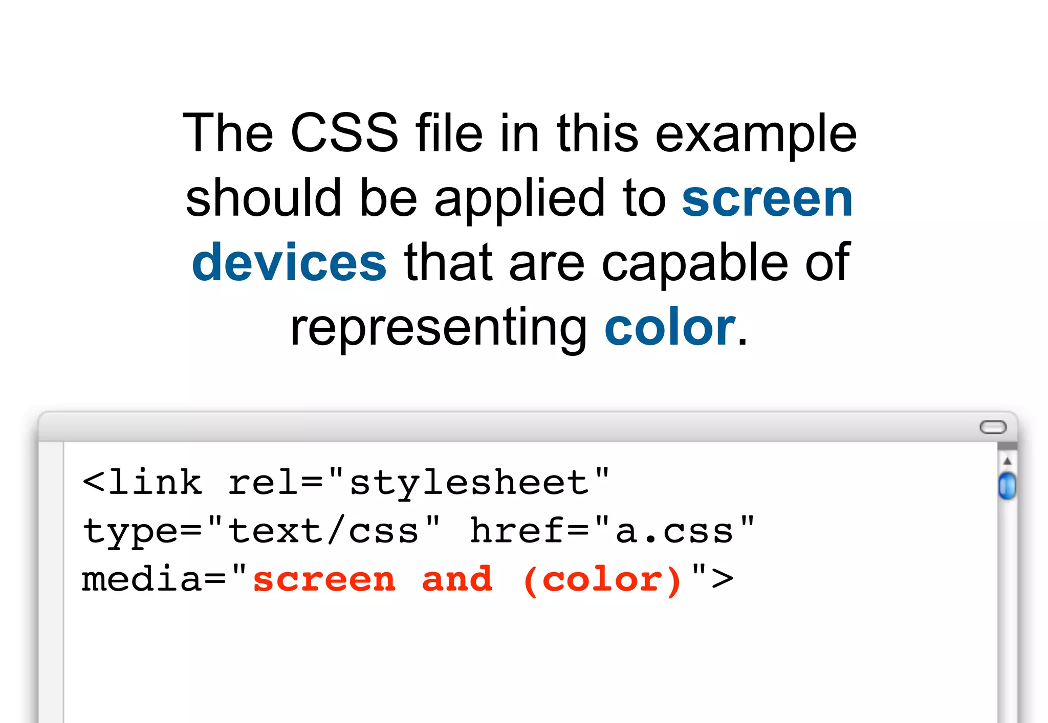
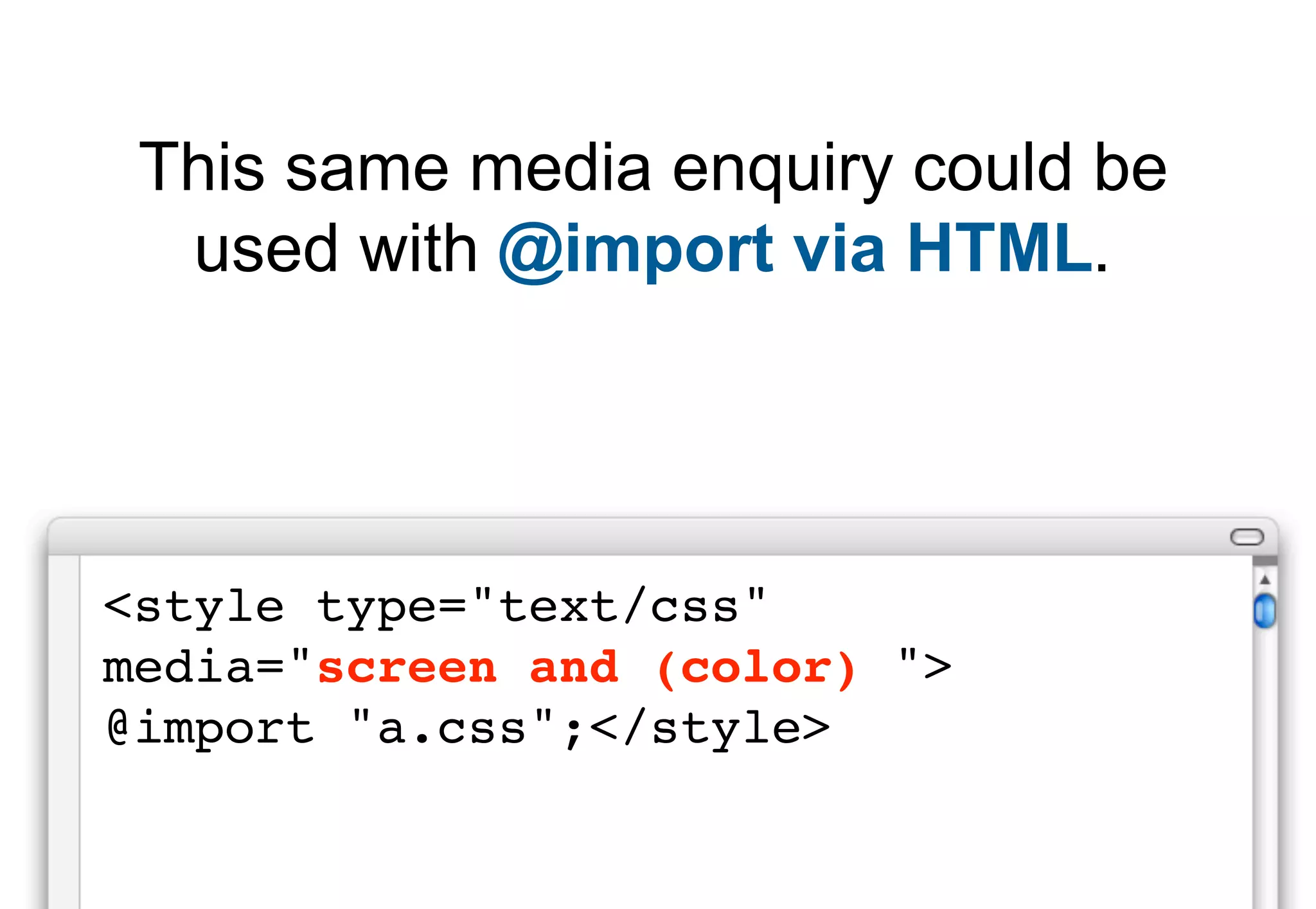
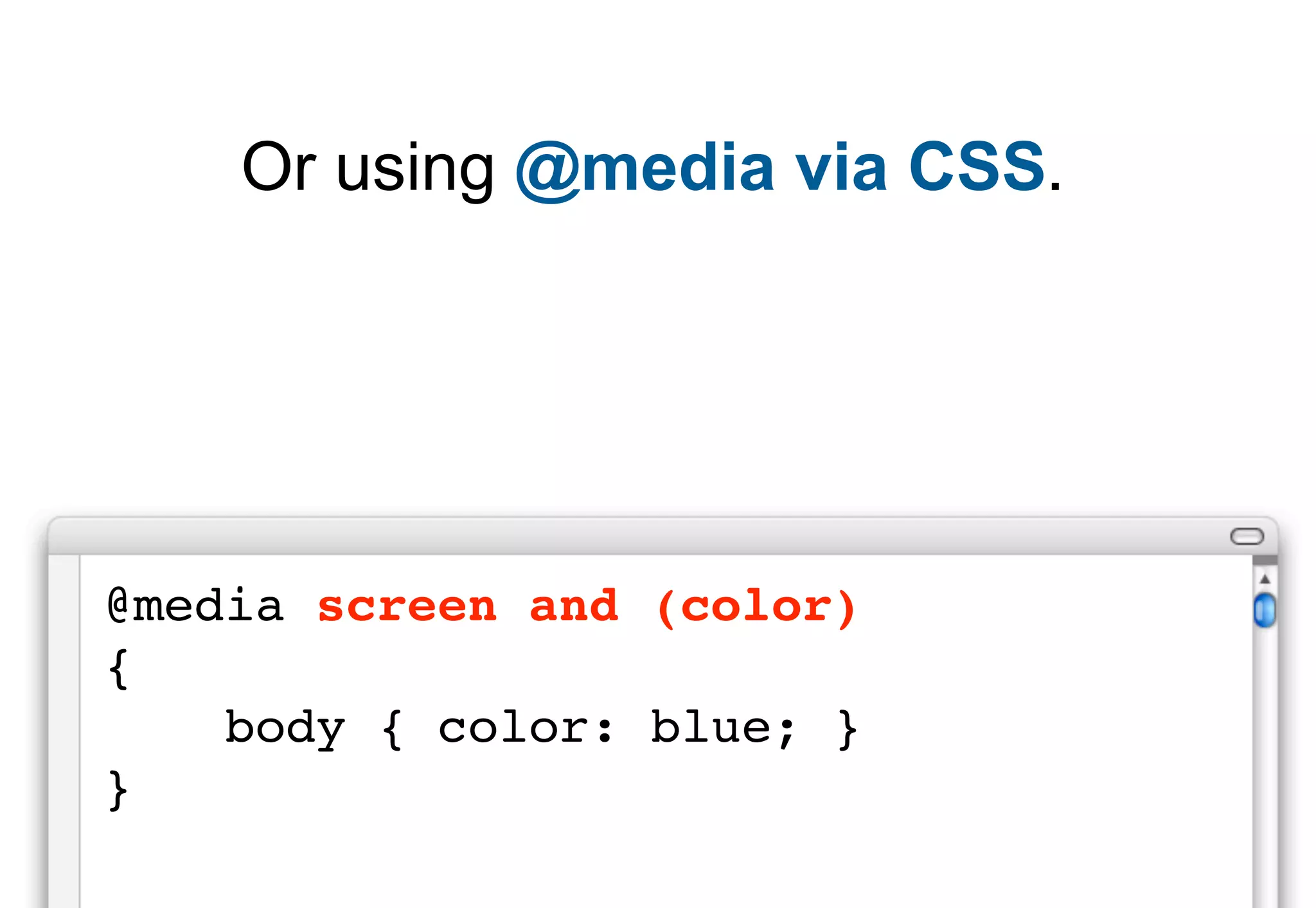
Demonstrates media query applications using different methods such as @import and @media to conditionally apply CSS.
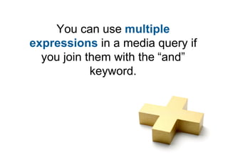
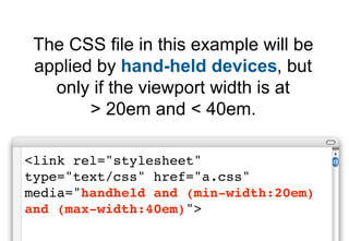
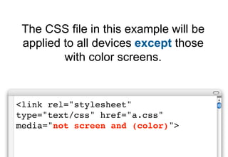
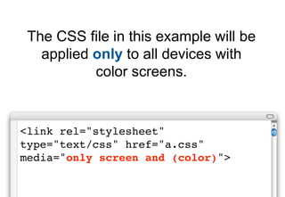
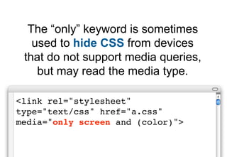
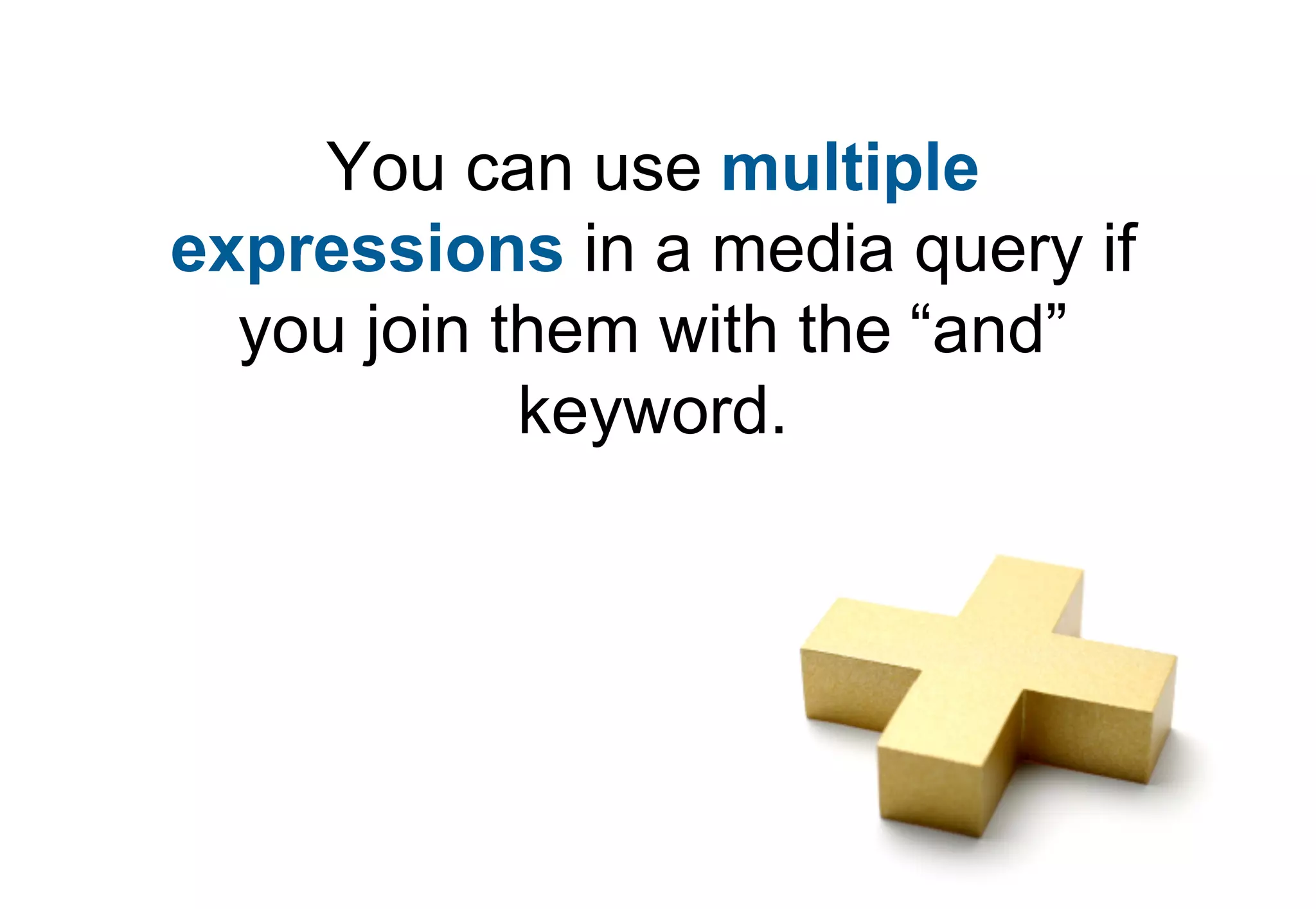
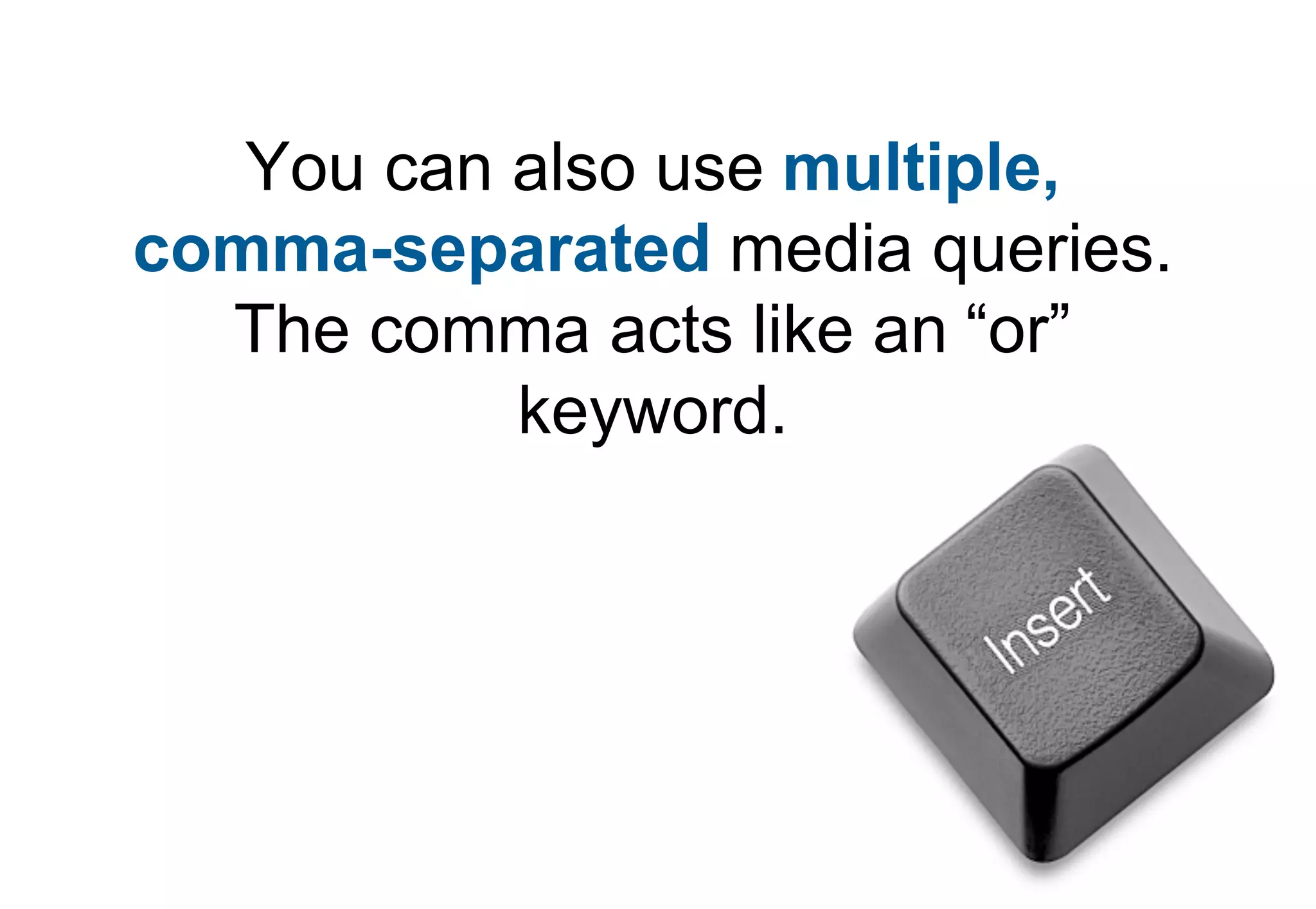
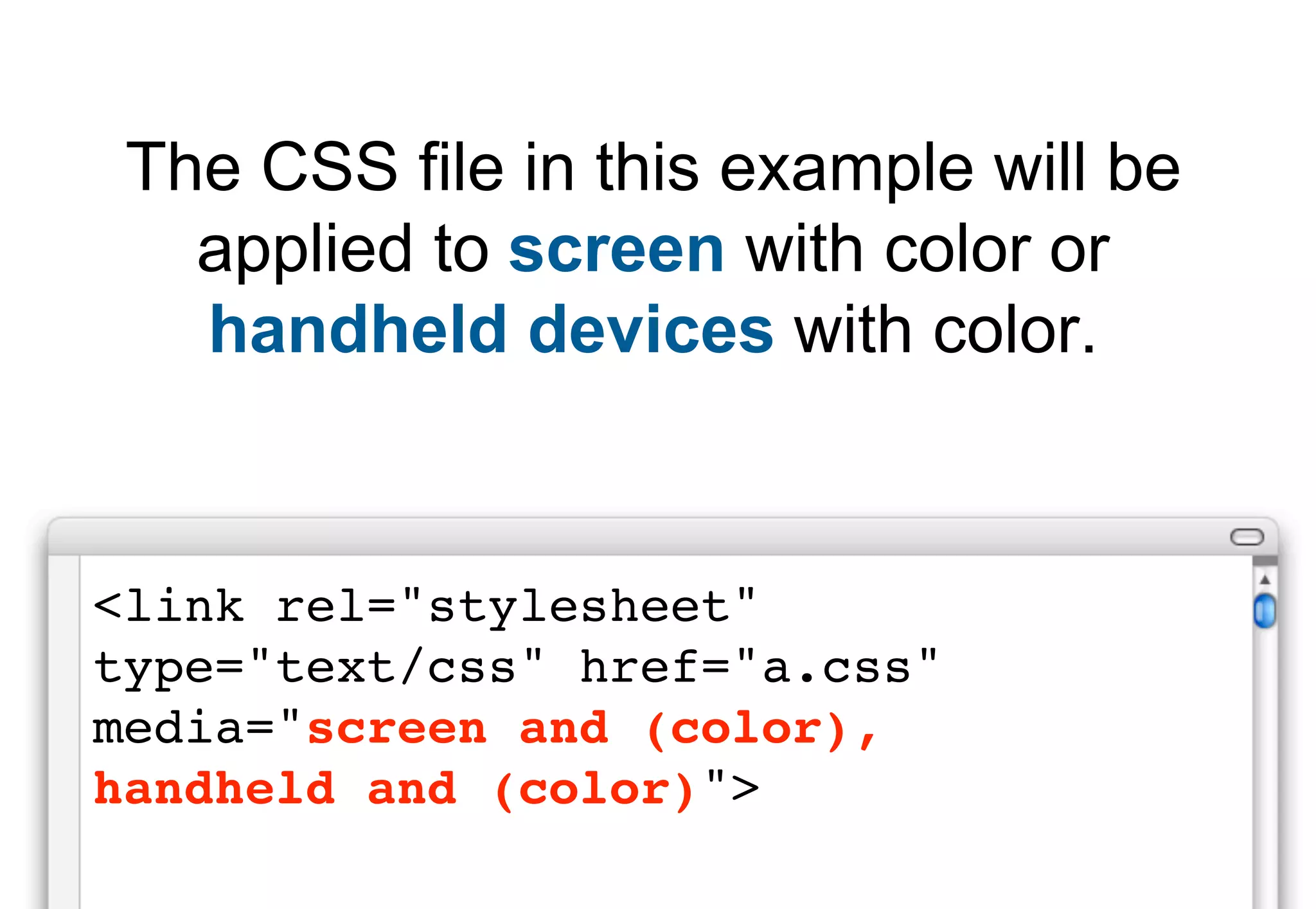
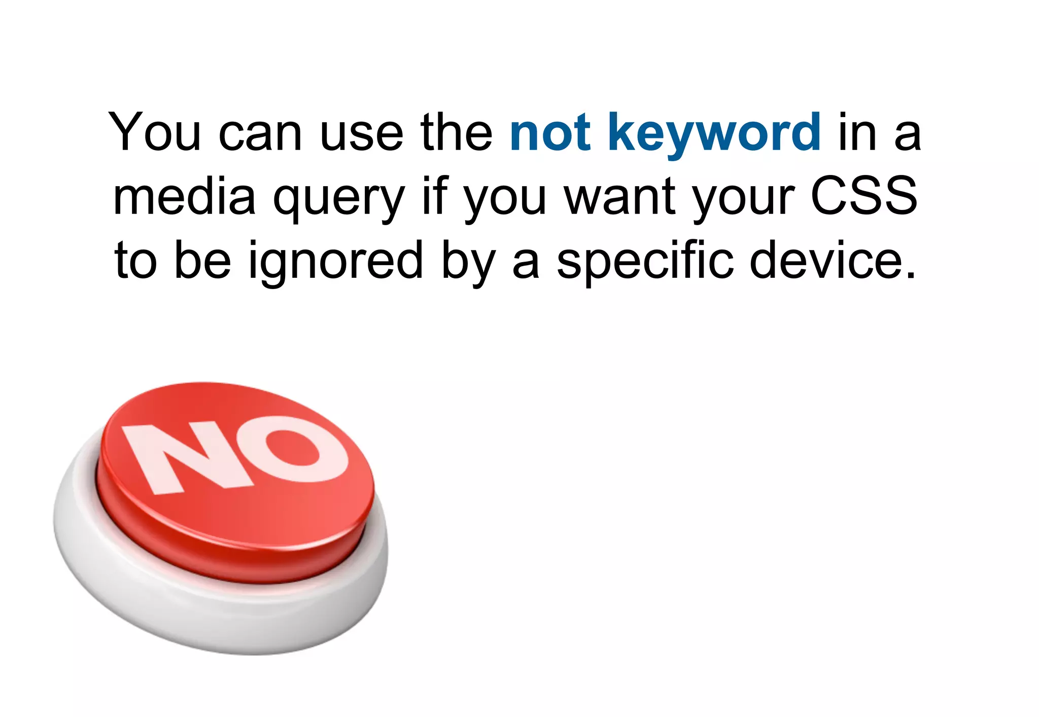
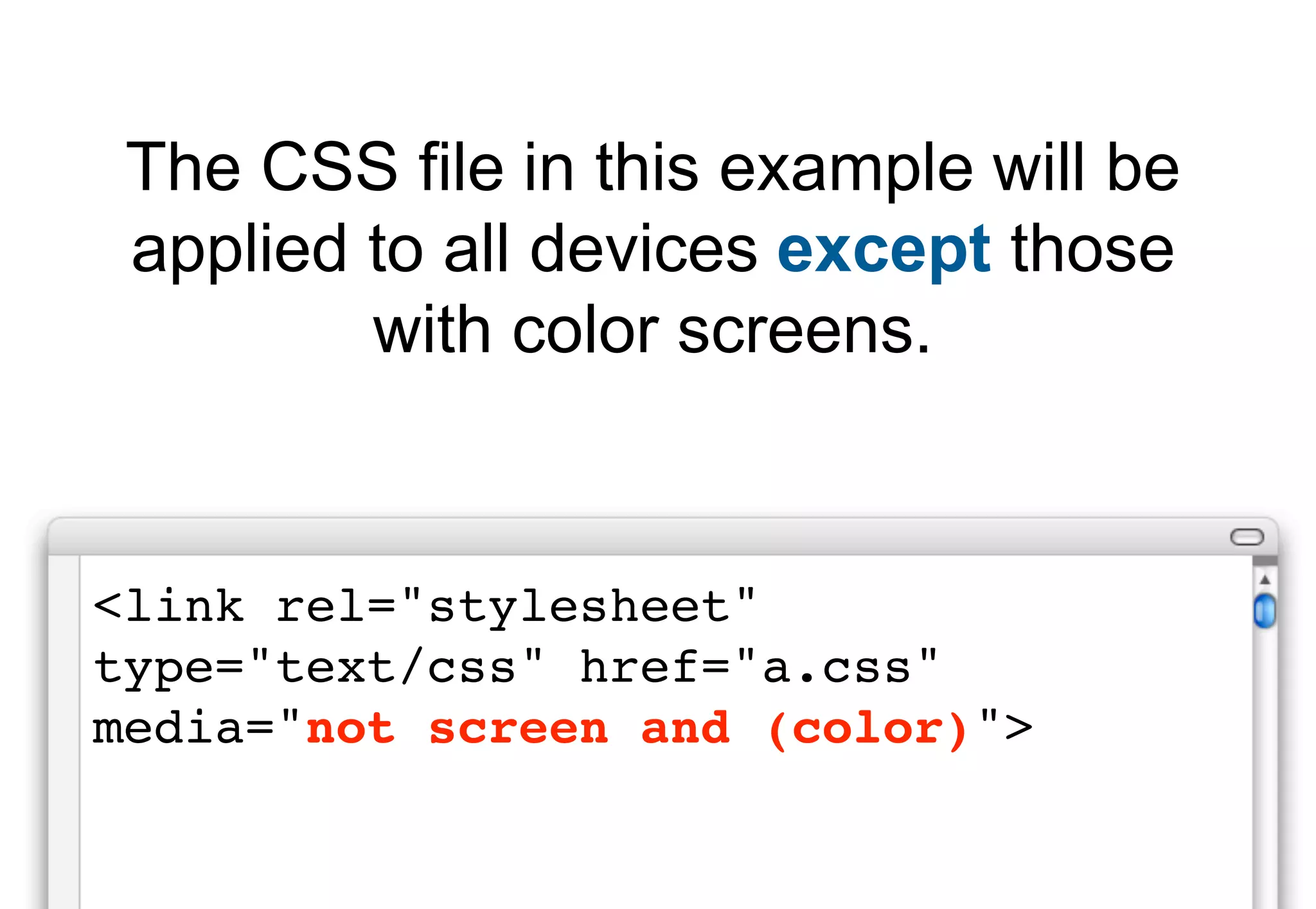
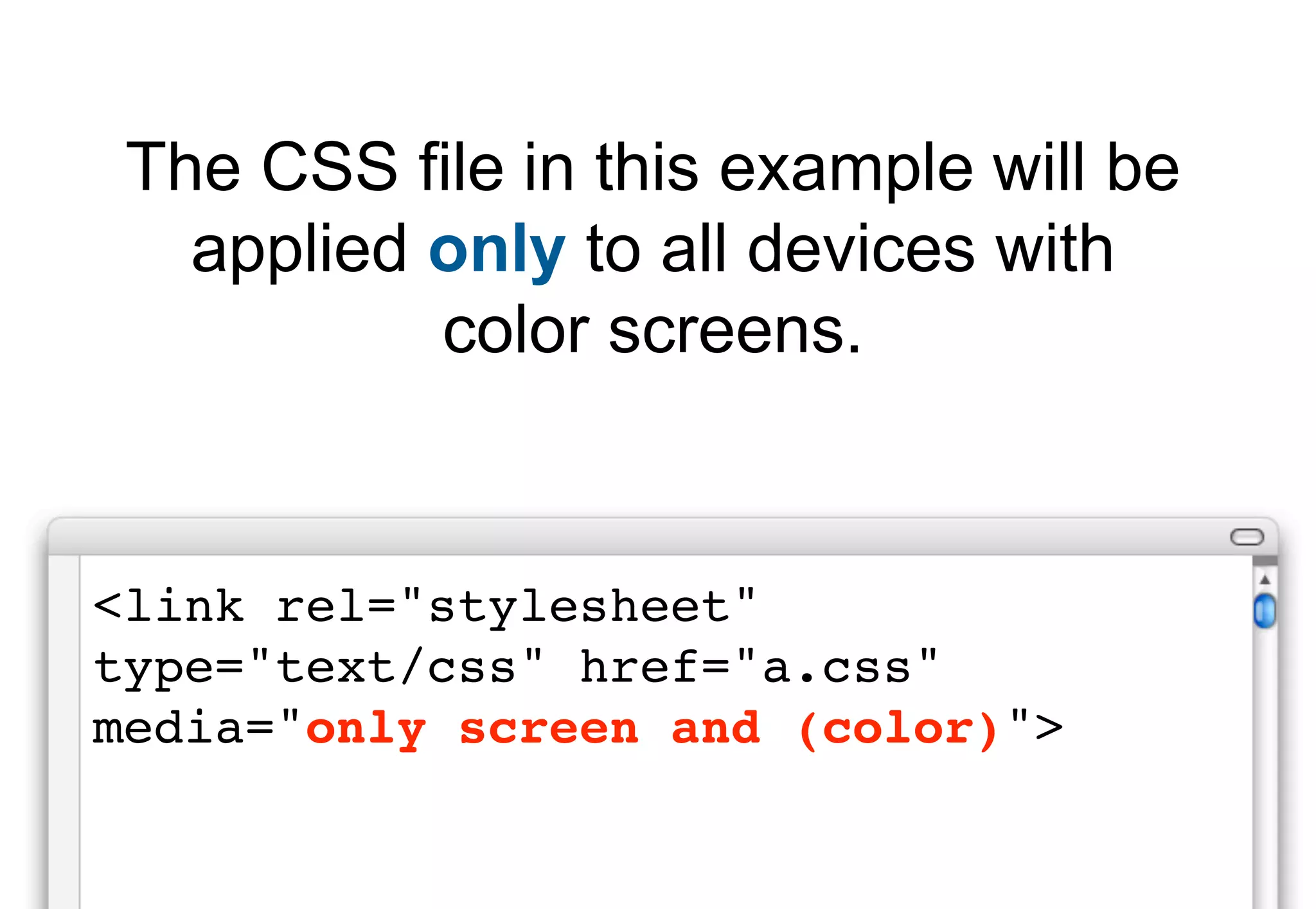
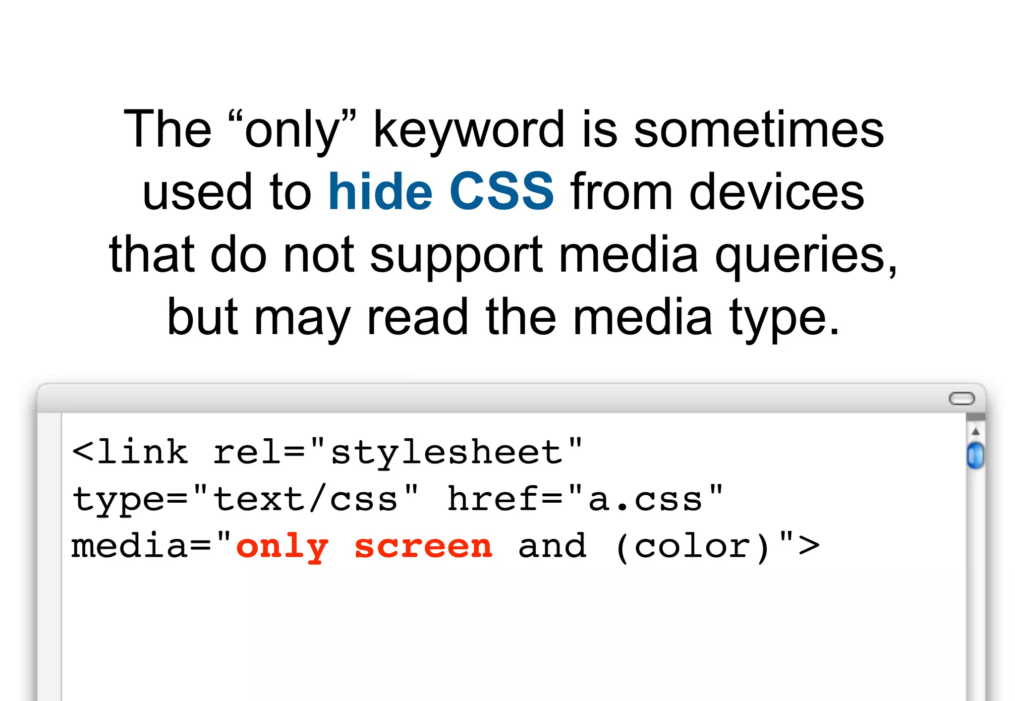
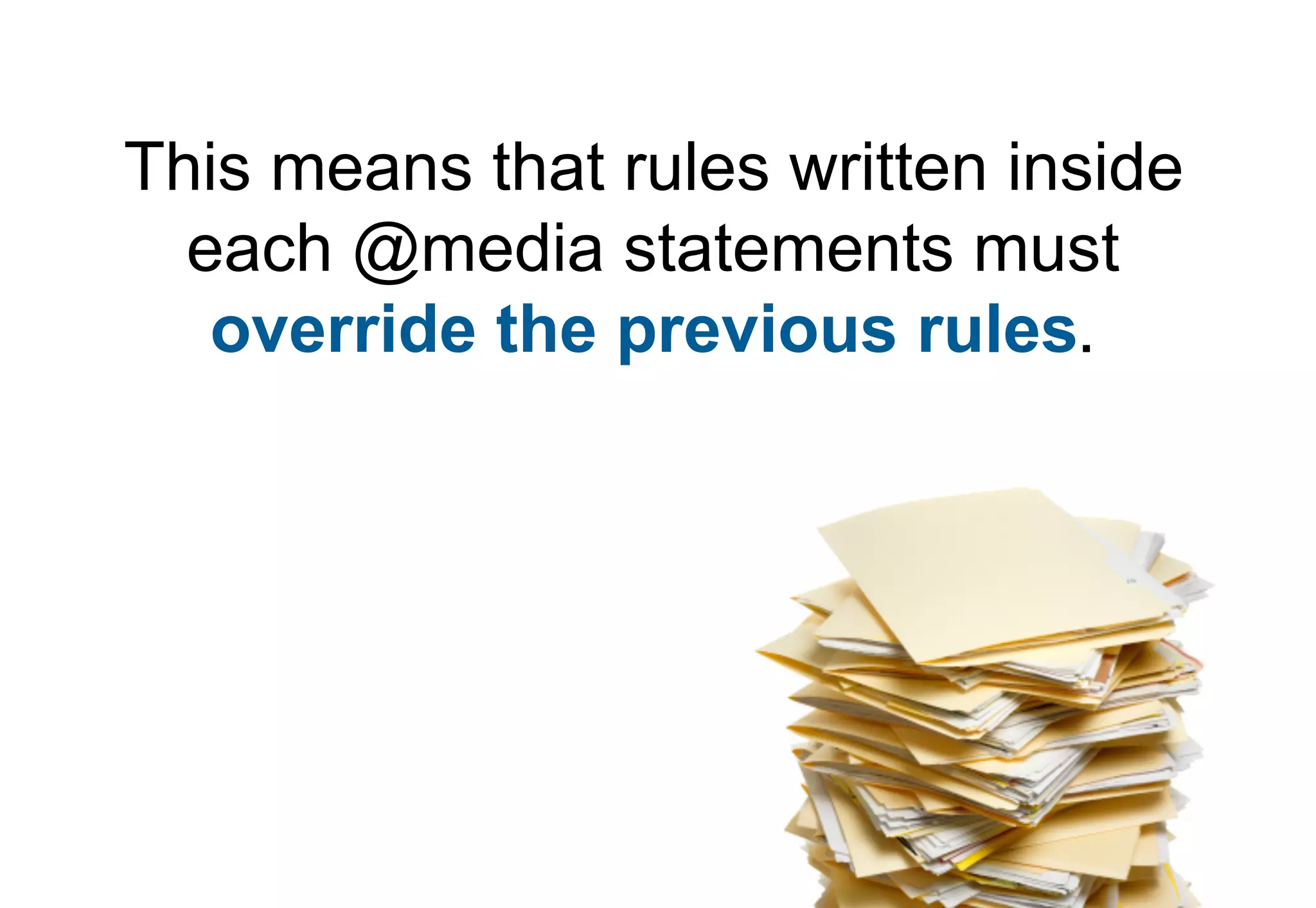
Explains how to combine multiple expressions in media queries and the use of "not" and "only" for specific targeting.
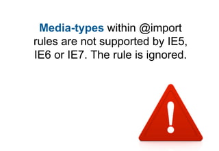
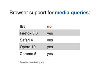
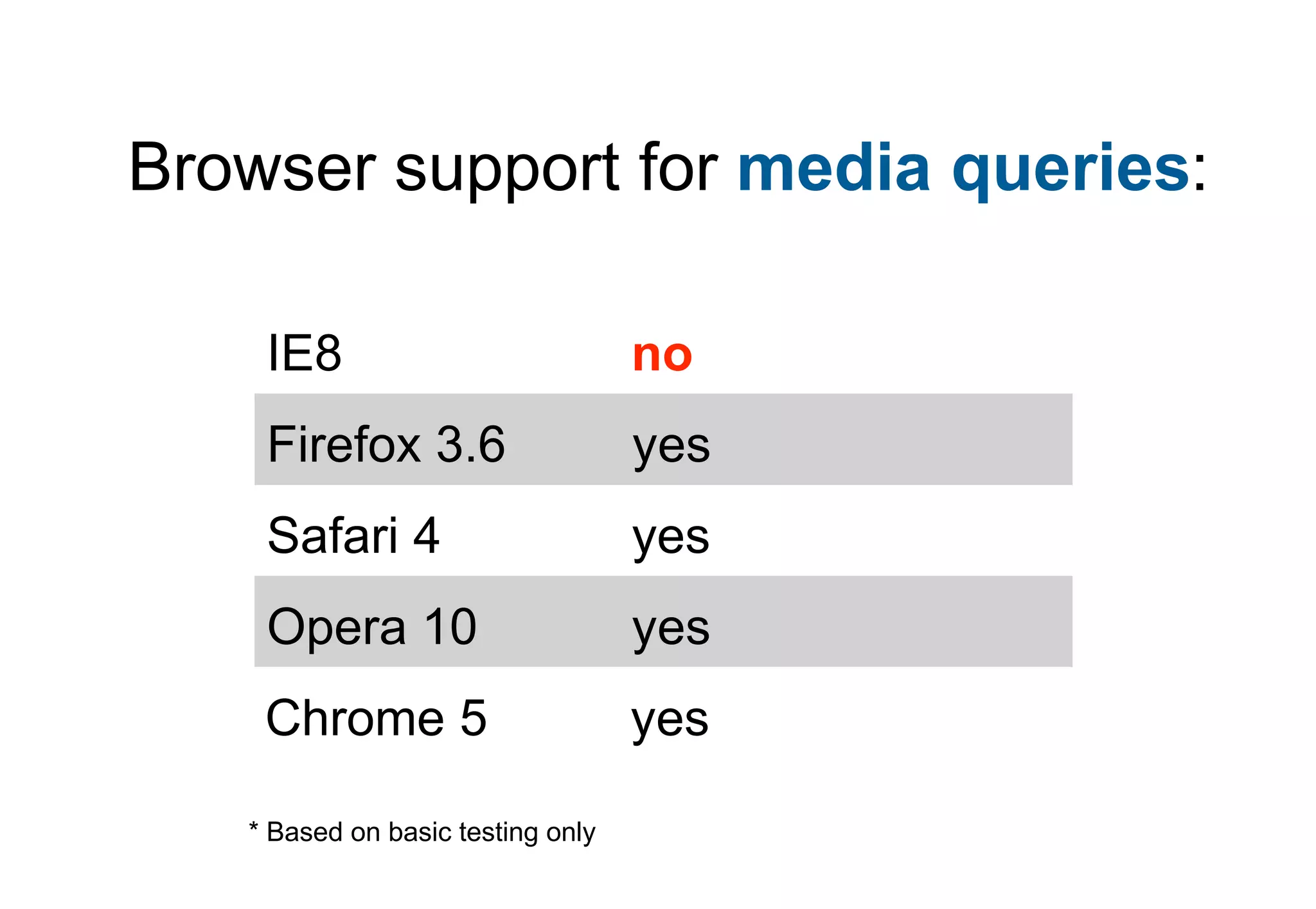
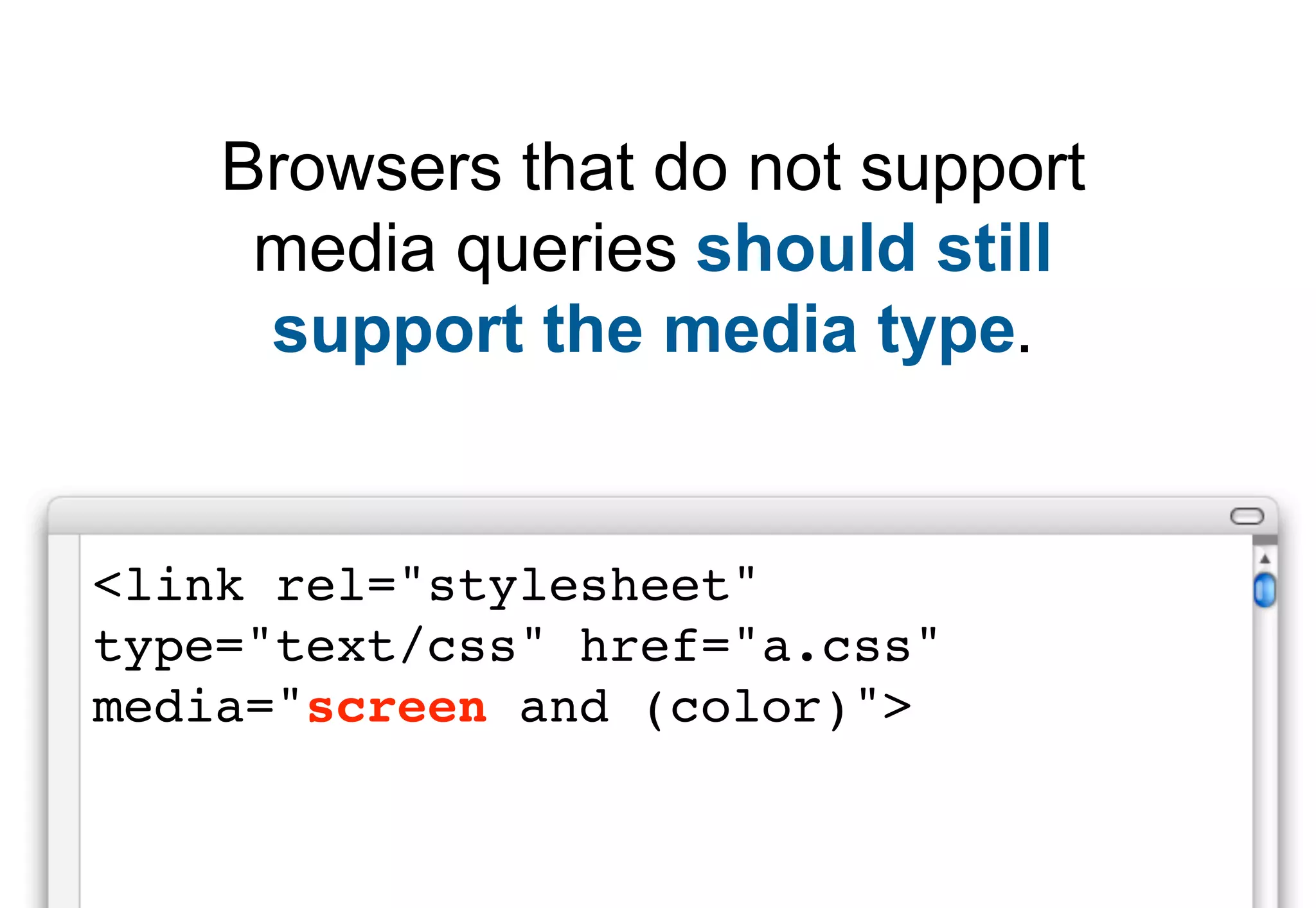
Discusses browser support for media queries and implications for styling on devices that don't support them.
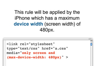
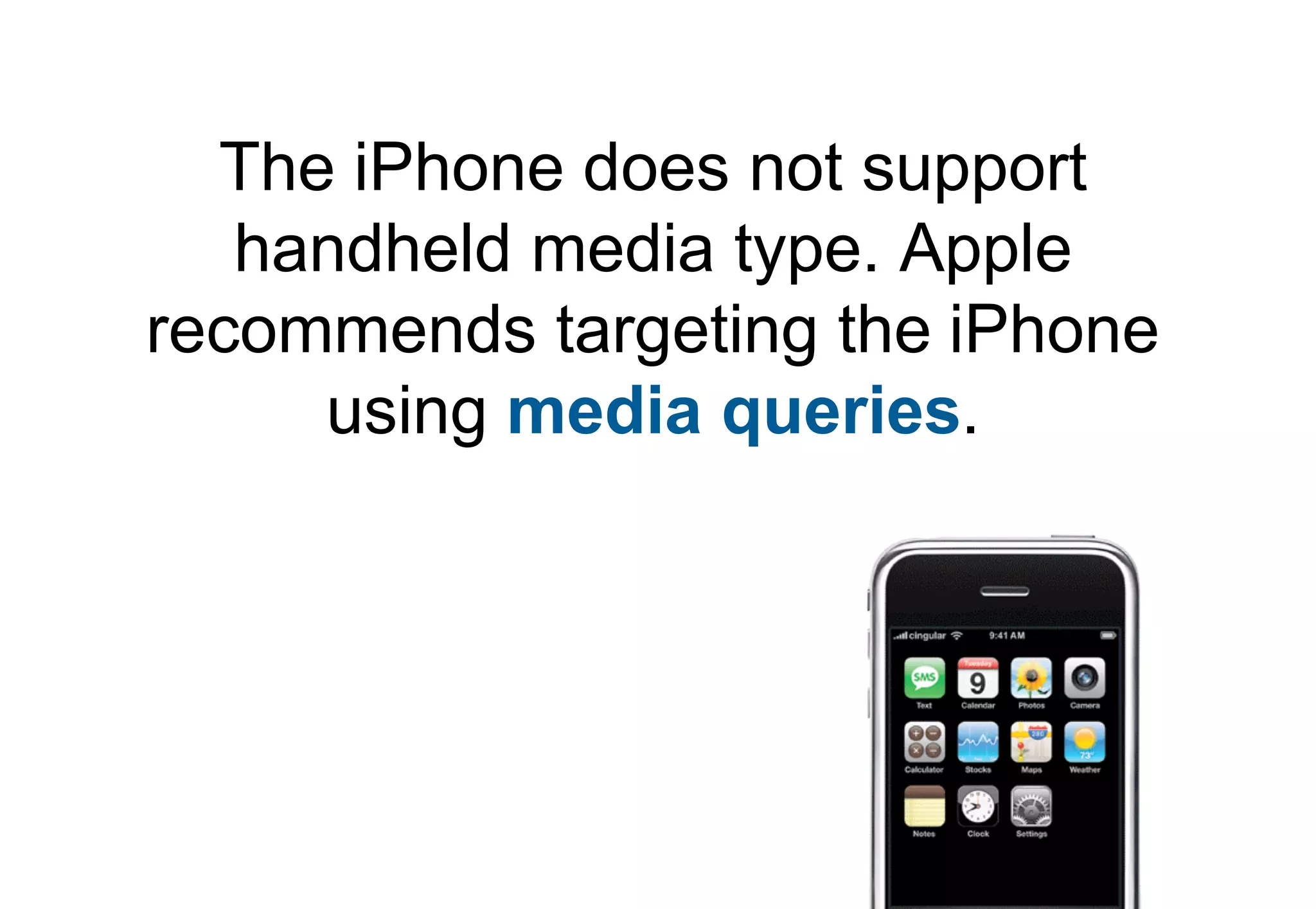
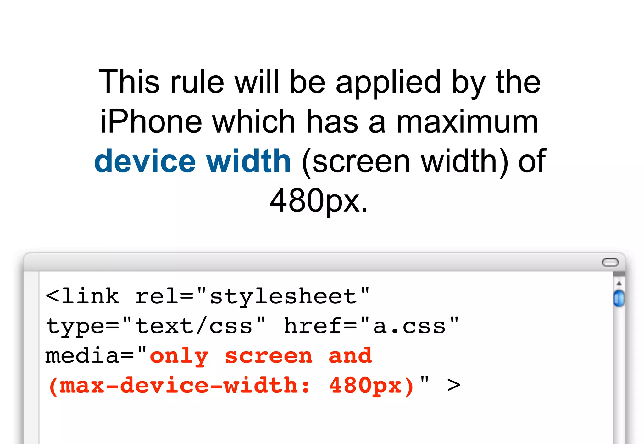
Specifically addresses targeting iPhones and describes capabilities using media query max-device-width.
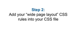
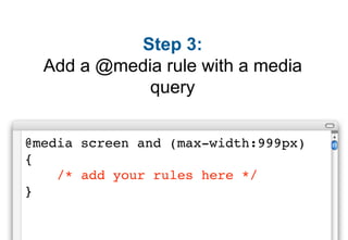
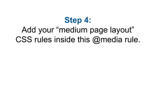
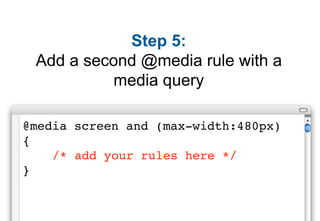
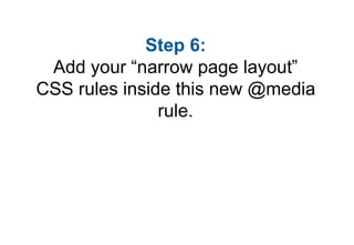
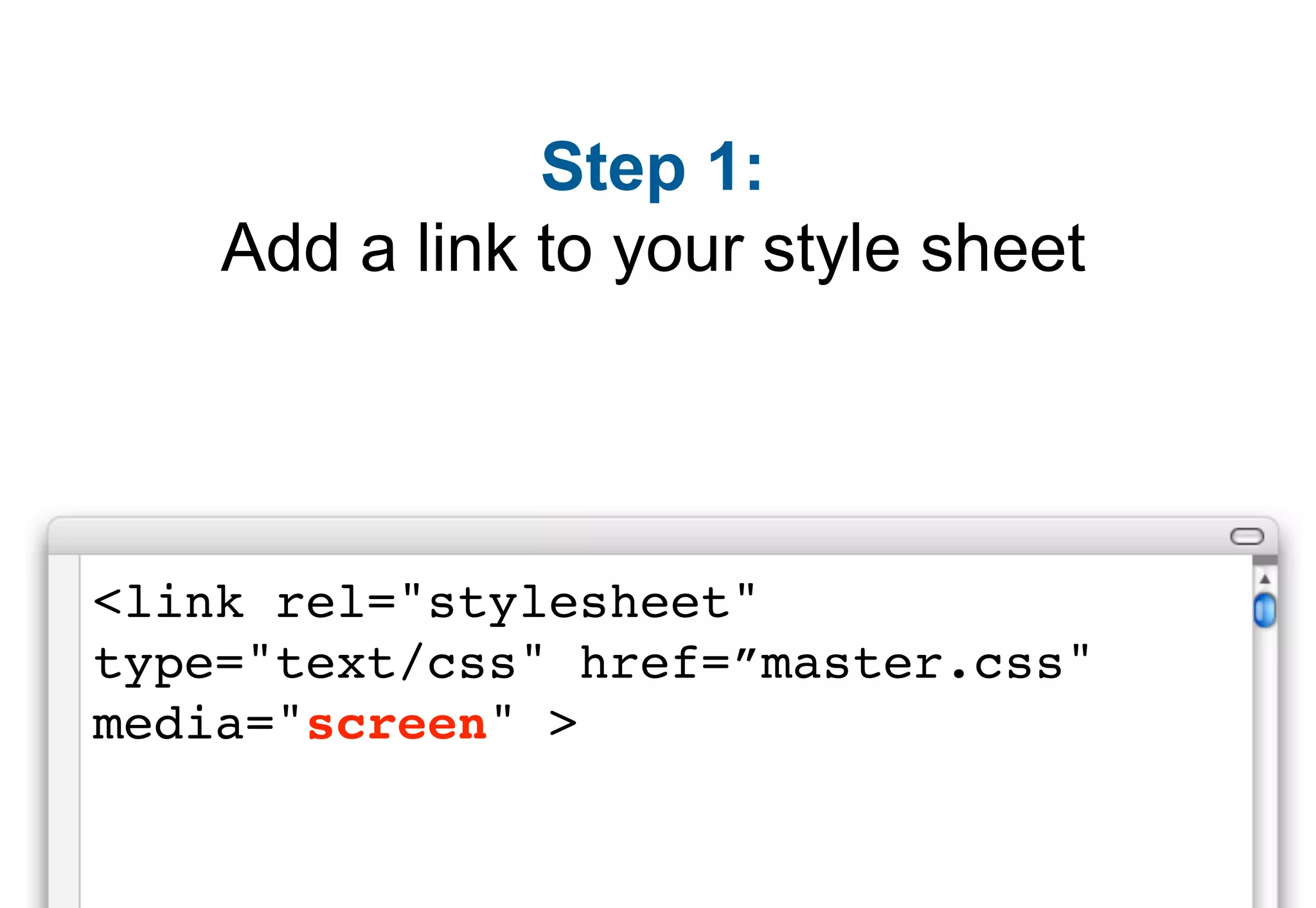
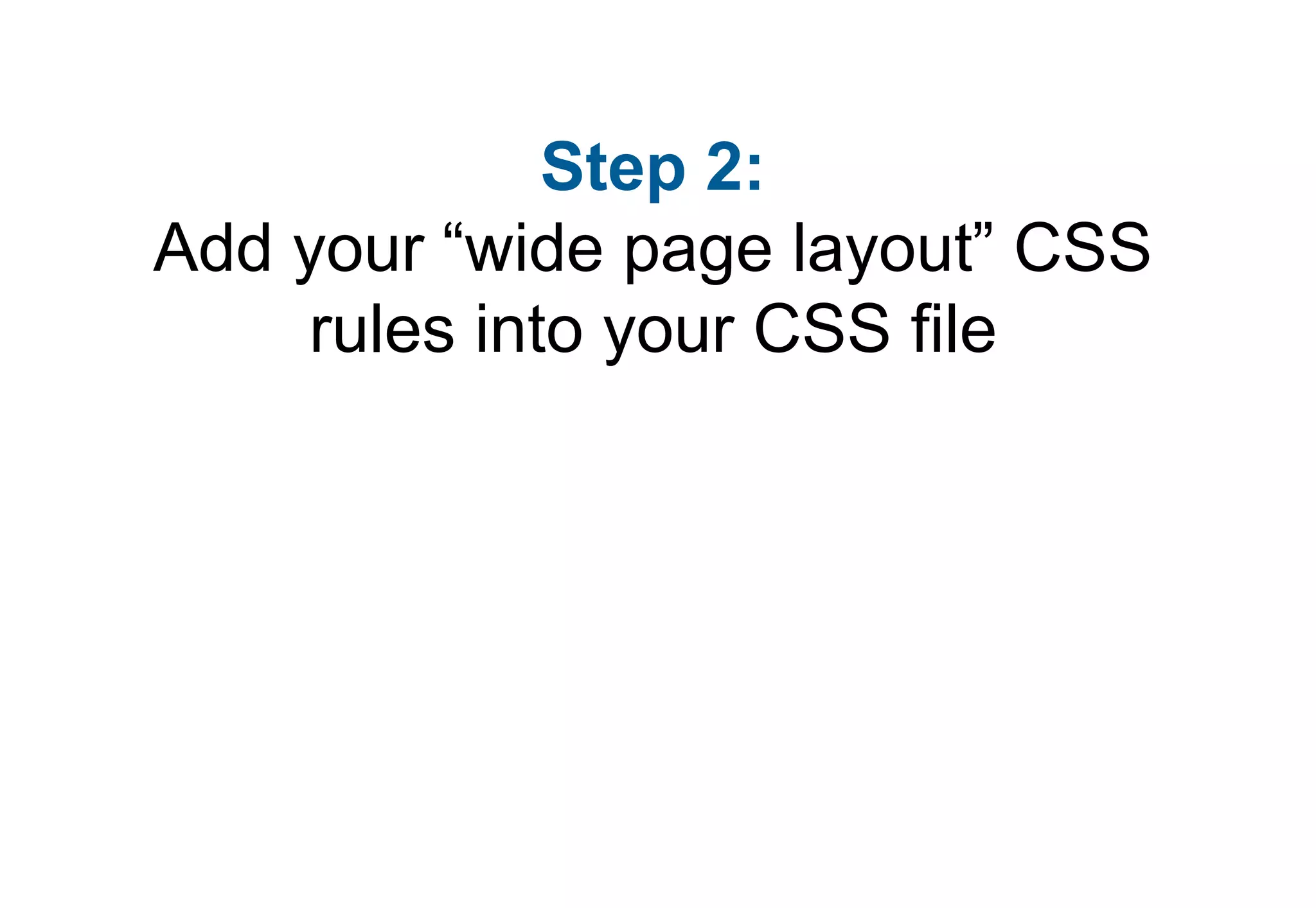
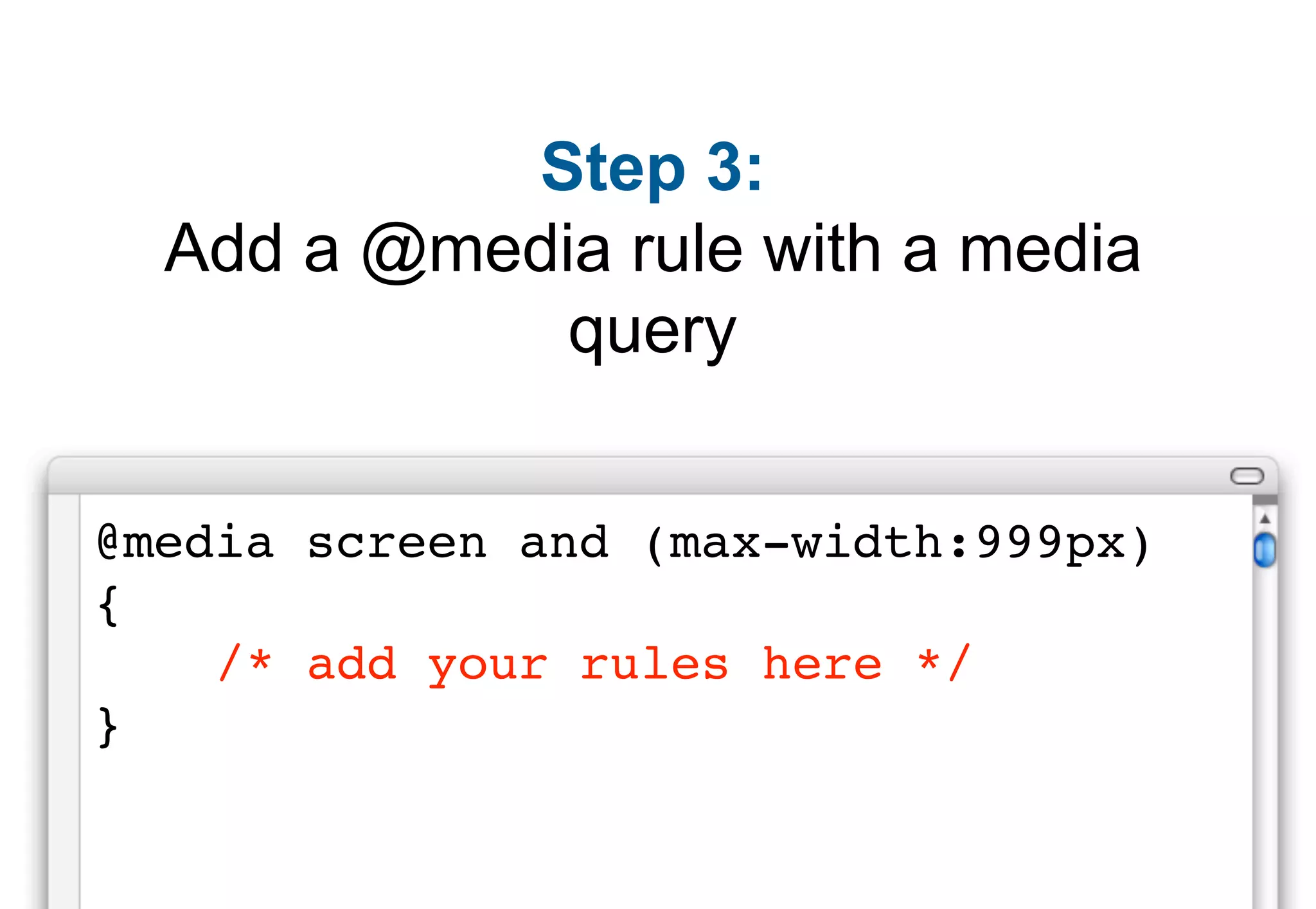
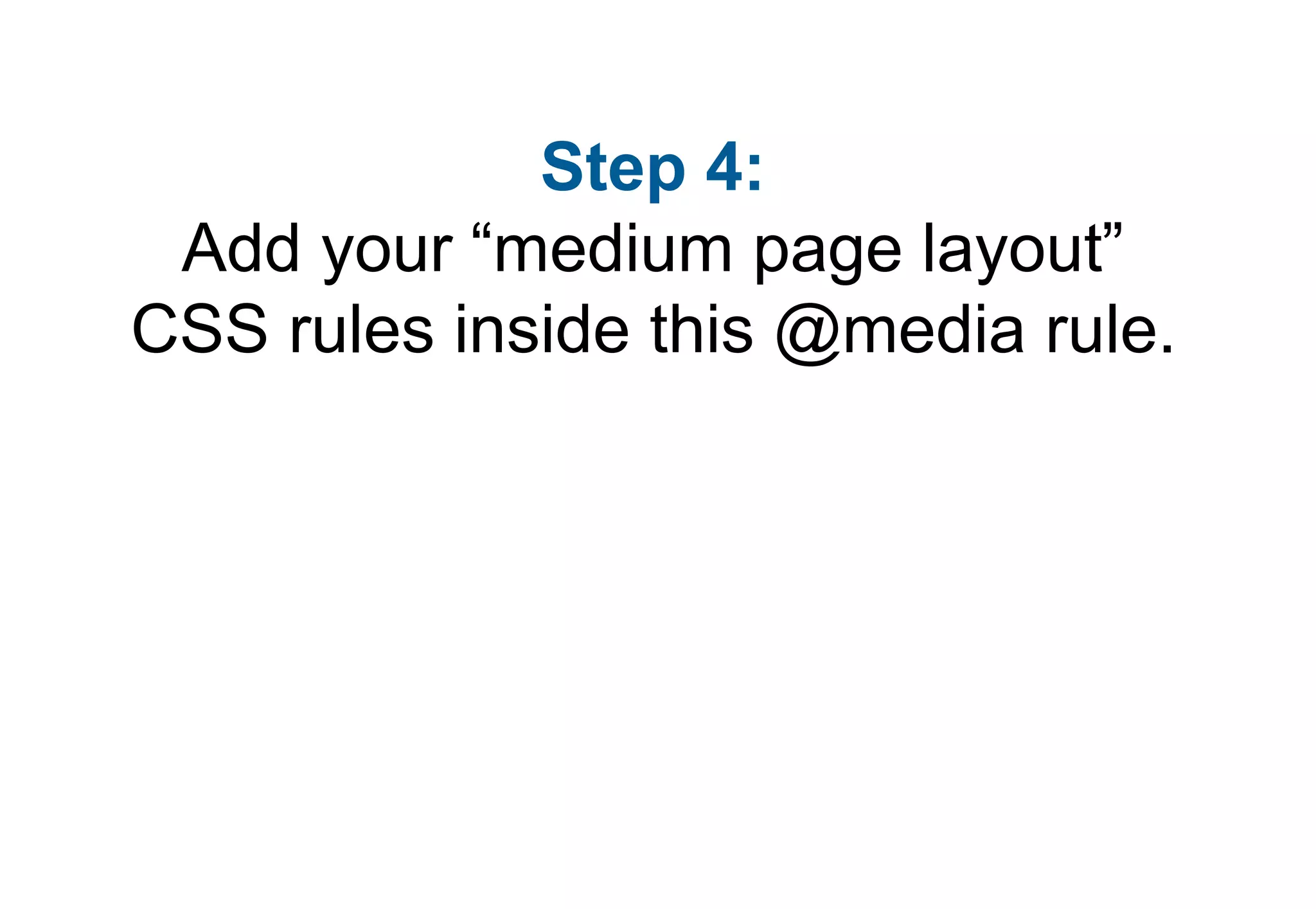
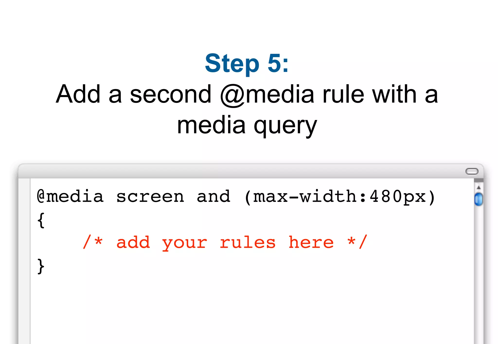
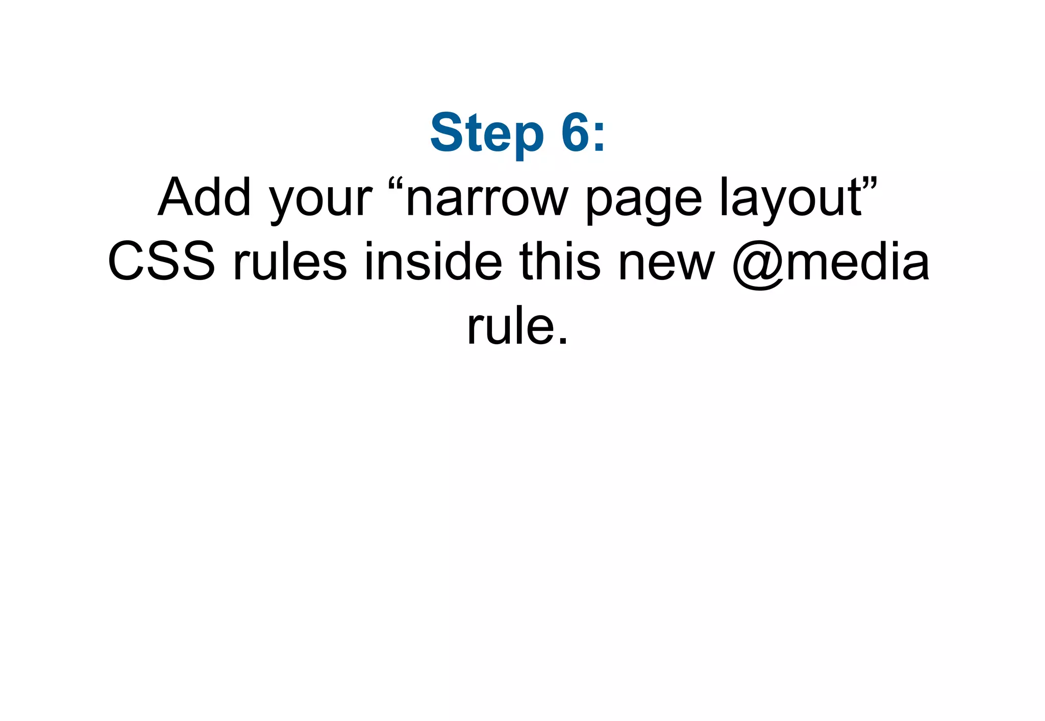
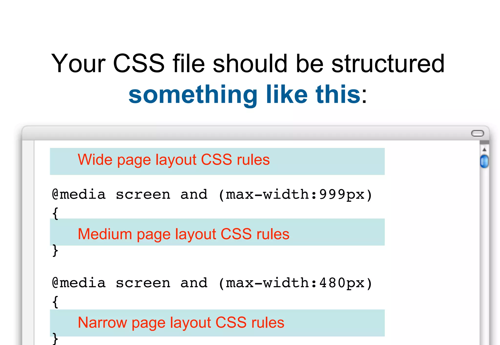
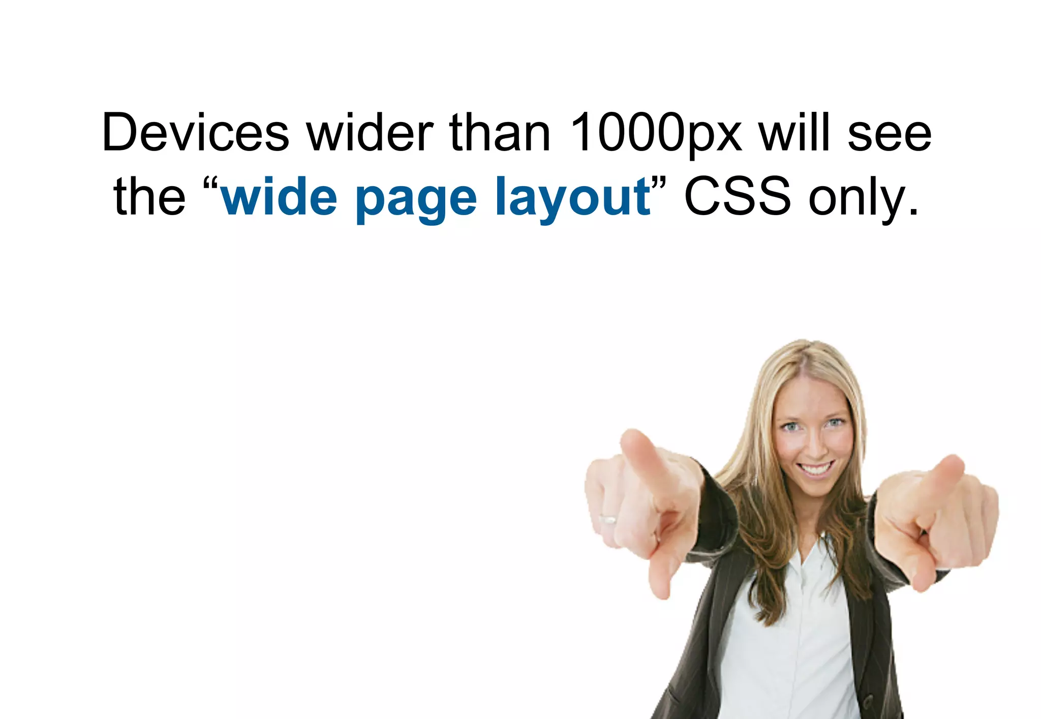
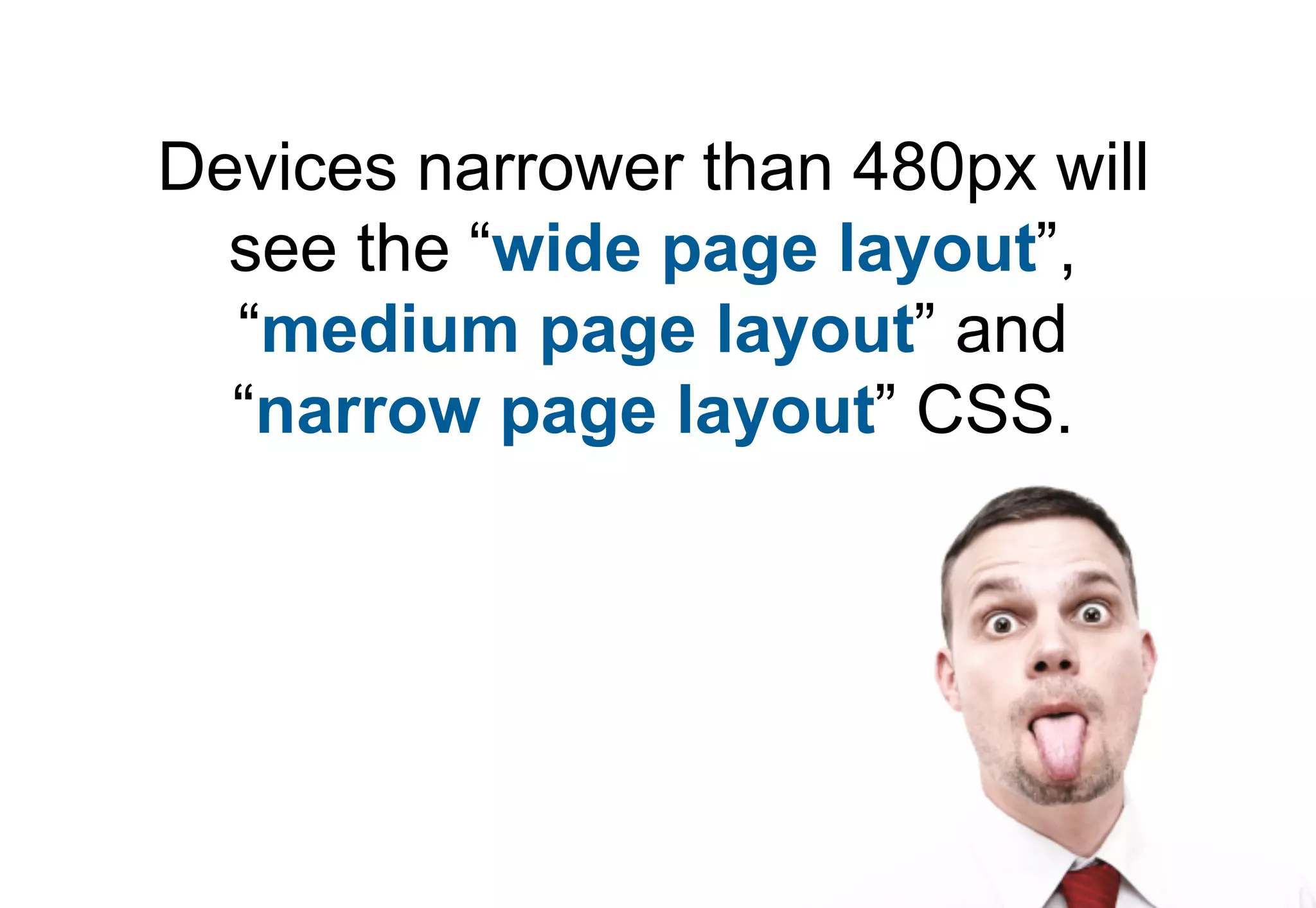
Step-by-step guide on how to leverage media queries to develop responsive layouts for various screen sizes.
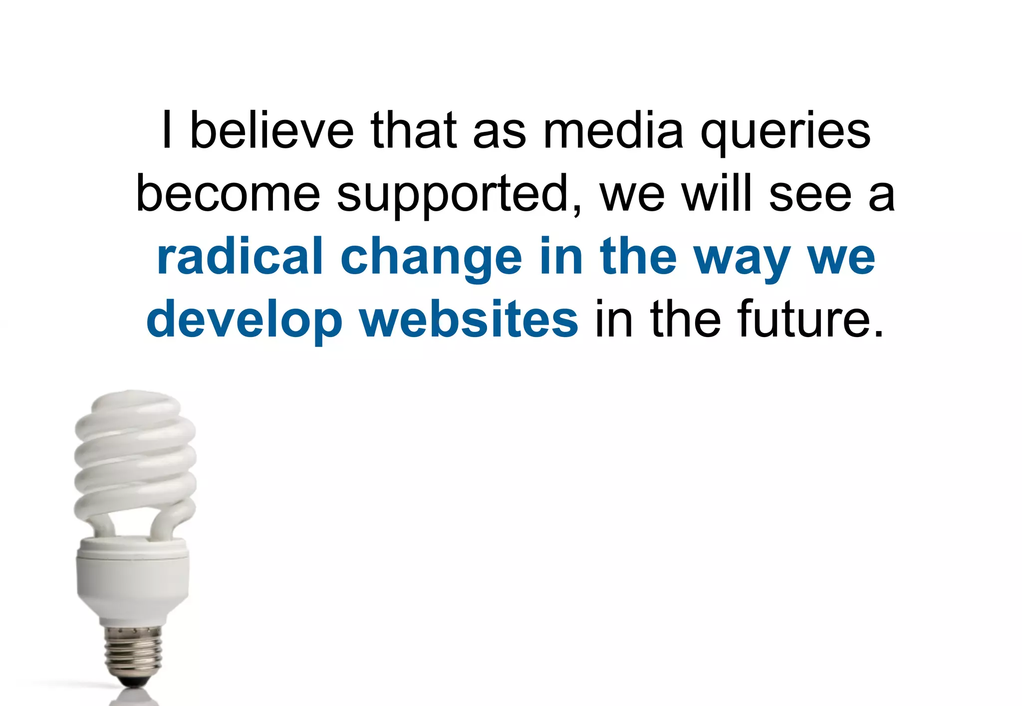
Reflects on the potential impact of media queries on web development in the future and encourages preparation.


