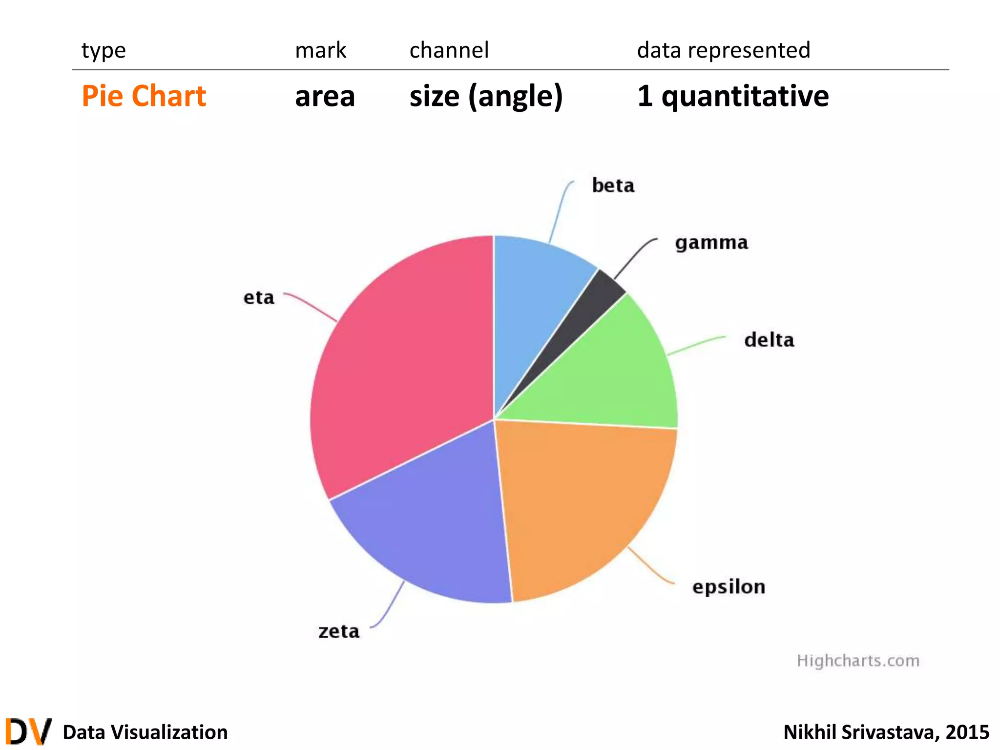
Data & Analytics Club - Data Visualization Workshop
This document provides an overview of data visualization techniques. It discusses how visualization can leverage human visual perception to more efficiently process and understand data. Various data types and encoding channels are described, along with common visualization types like scatter plots, line charts, bar charts and their applications and limitations. Design principles of integrity, effectiveness and aesthetics are also covered.
Presented by Nikhil Srivastava from Wharton Data & Analytics Club, offering a glimpse of the lecture content.
An overview of topics covered: definition, principles, building visualizations, and hands-on components.
Details on various types of visualizations including scientific, artistic, and statistical graphics. A dataset listing populations of various cities, prompting analysis of populous cities and states.
Explores the utility, importance, and power of data visualization in resolving ambiguities and telling a story.
Discussion of visual perception, emphasizing slow vs. fast processing and techniques for efficient data representation.
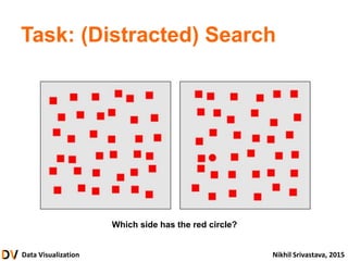
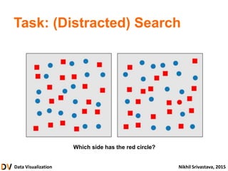
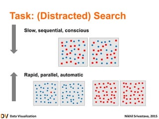
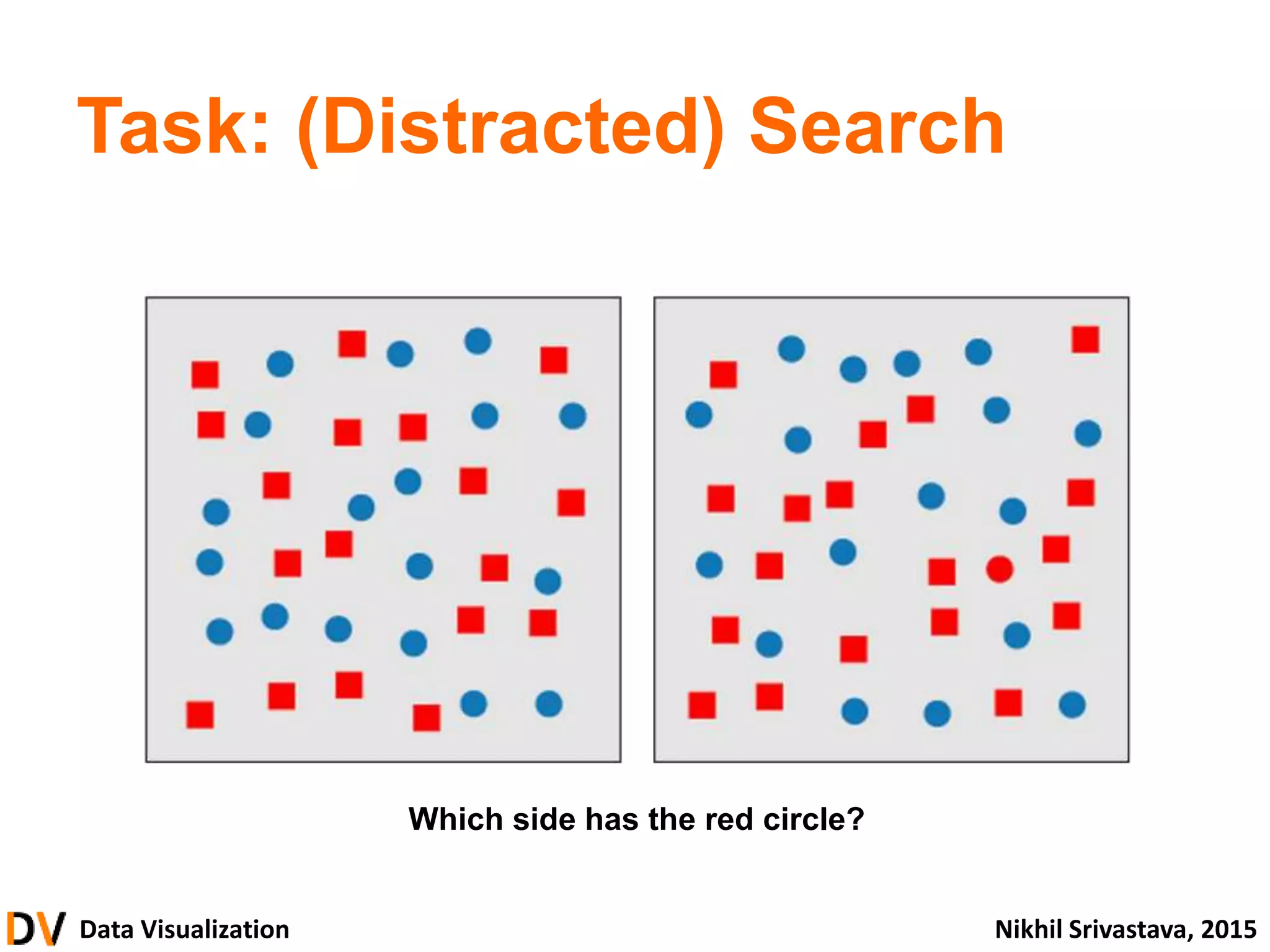
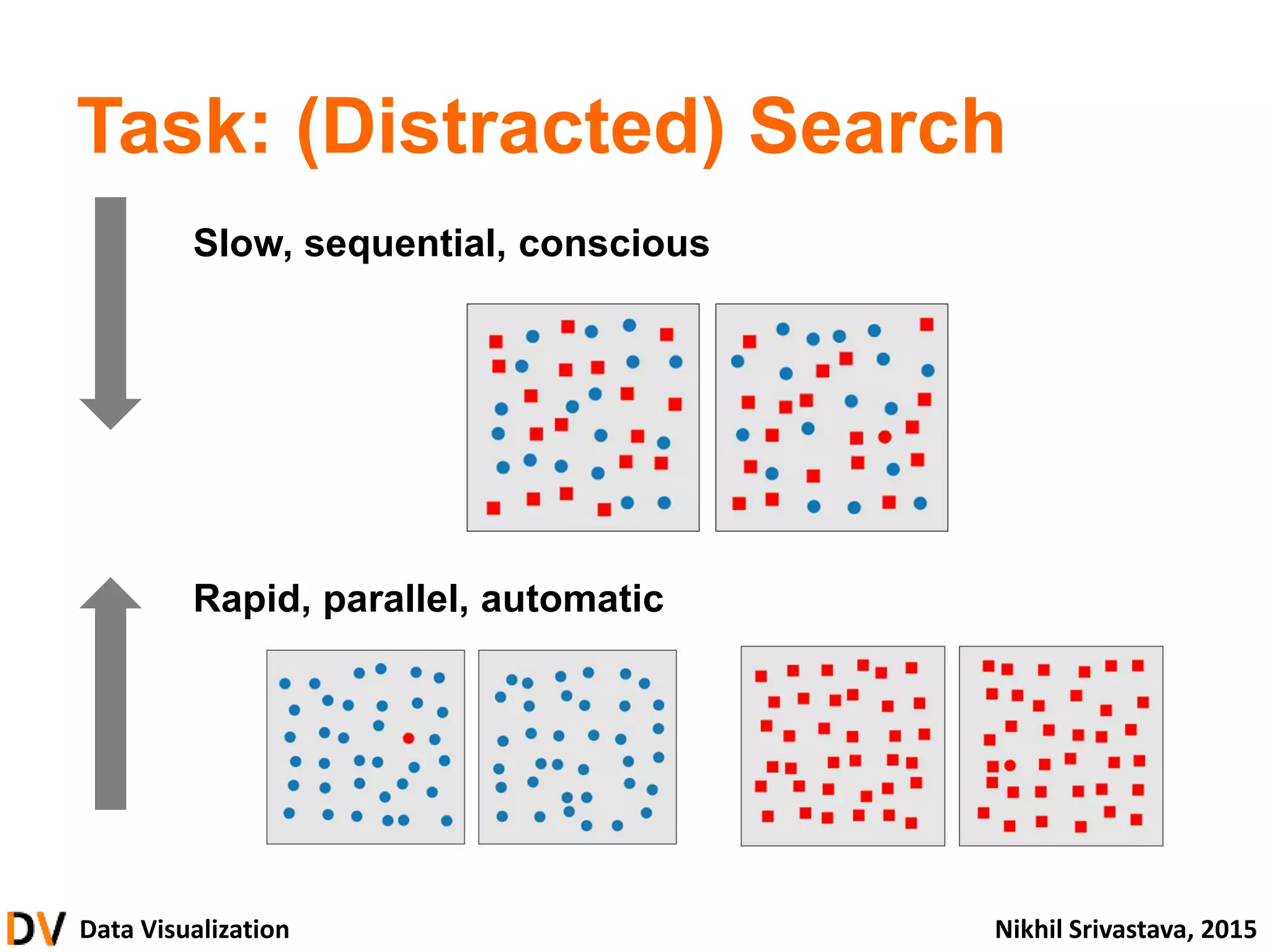
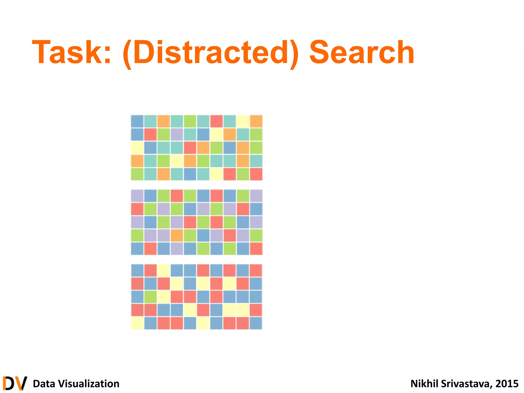
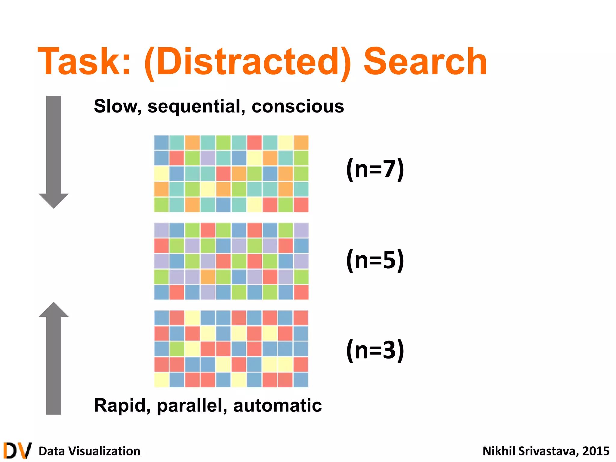
Tasks illustrating sequential vs. parallel processing in data visualization, highlighting the challenges with distractions.
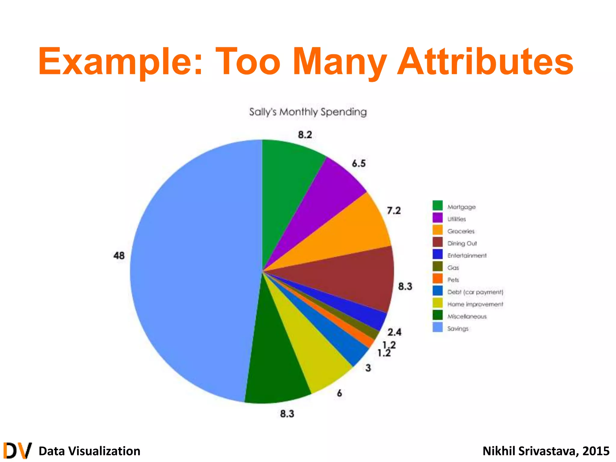
Key lessons for effective visualizations, advocating for the use of pre-attentive attributes and caution against over-complexity.
Classification of data types (categorical, ordinal, numerical) and their visual representation strategies.
Effective channels for data encoding and the significance of spatial position in visualization.
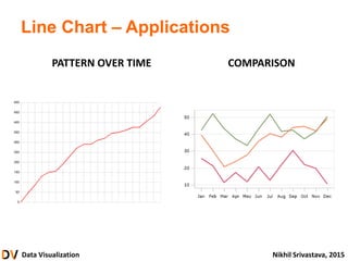
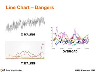
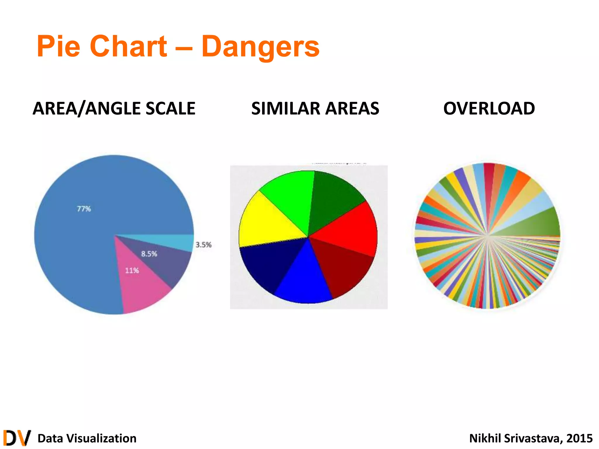
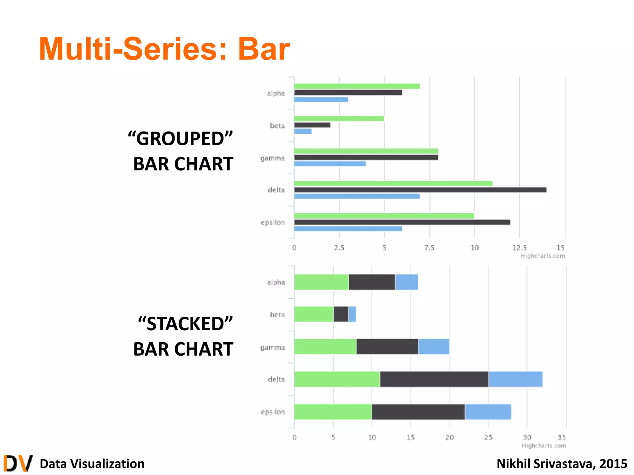
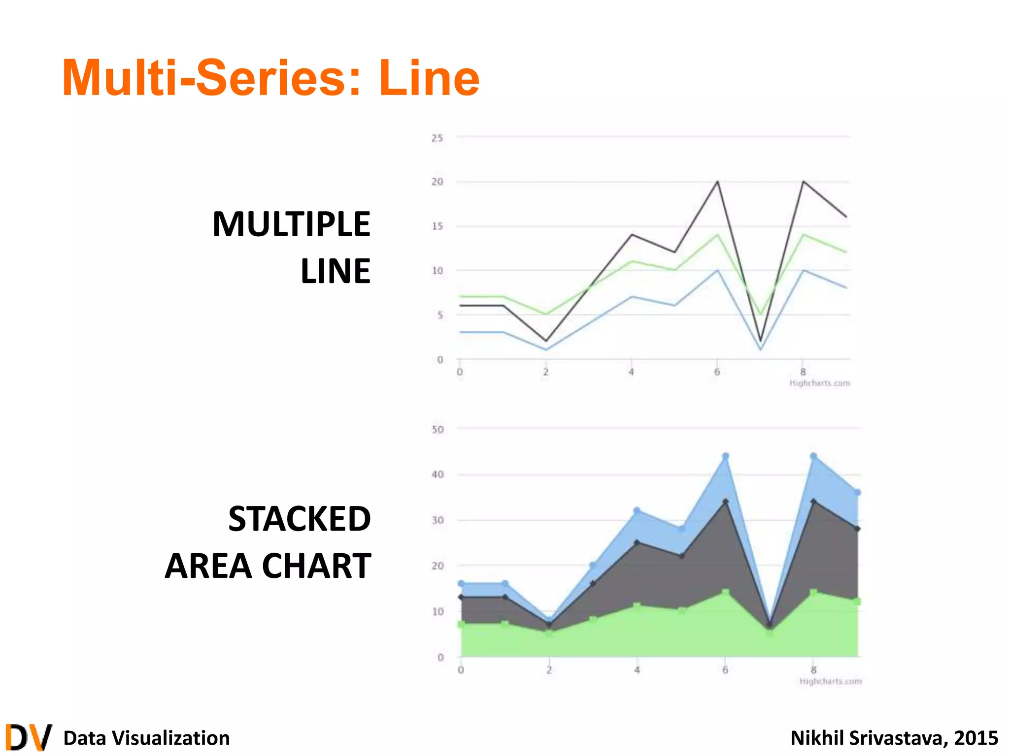
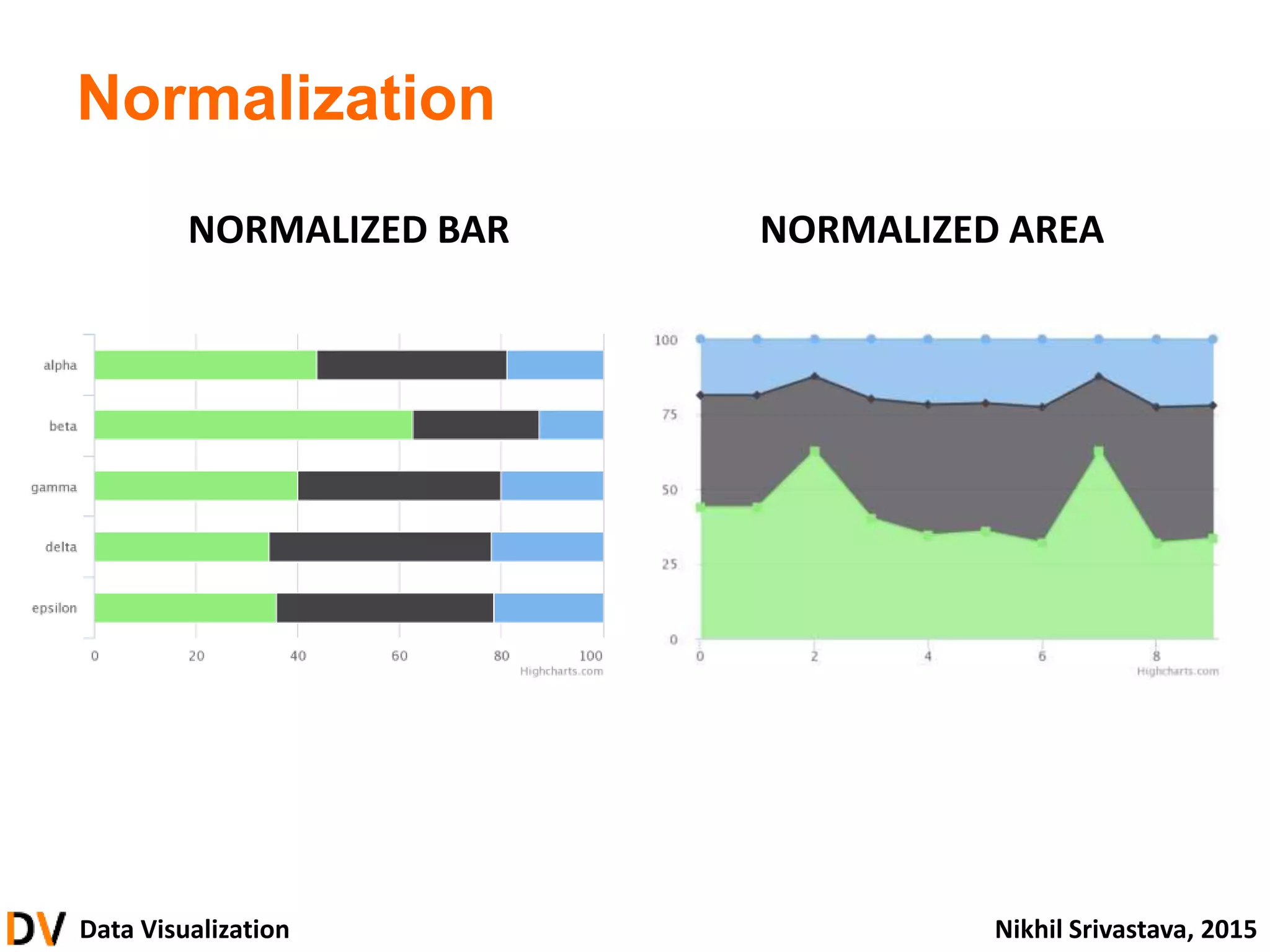
Examples of different chart types (scatter, line, bar, pie) including their applications and pitfalls.
Core design principles focusing on integrity, effectiveness, and aesthetics in data visualization.
Guidelines for using color effectively in visualizations to enhance interpretation without overwhelming the viewer.
Discussion on various visualization tools available including Excel, Tableau, and Python, along with learning considerations.
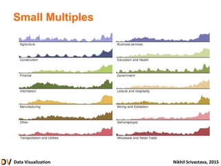
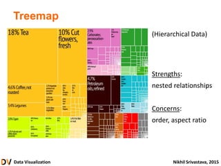
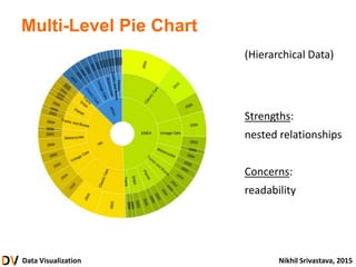
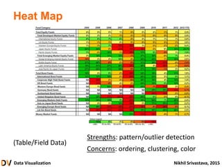
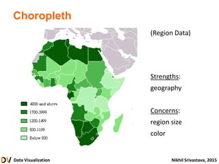
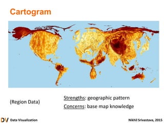
Explorations of advanced visualizations such as treemaps, heat maps, and other specialized charts.
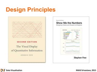
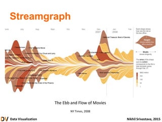
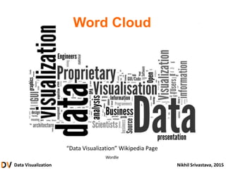
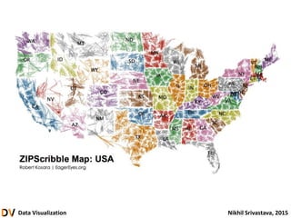
References and further reading materials for deepening understanding and exploration of data visualization.
Data Visualization NikhilSrivastava, 2015
About this Lecture
• Shortened version of longer course
– Slides, demos, extra material
– Code samples and libraries
– Sample projects
• Questions
Data Visualization NikhilSrivastava, 2015
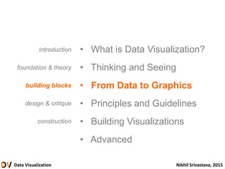
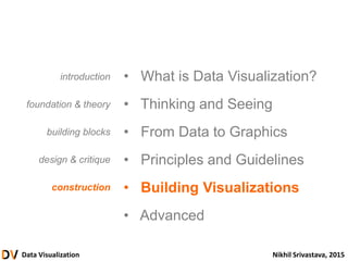
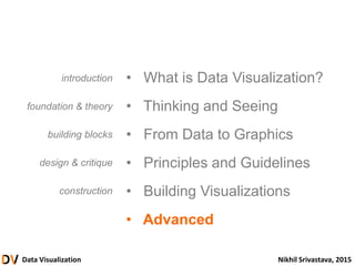
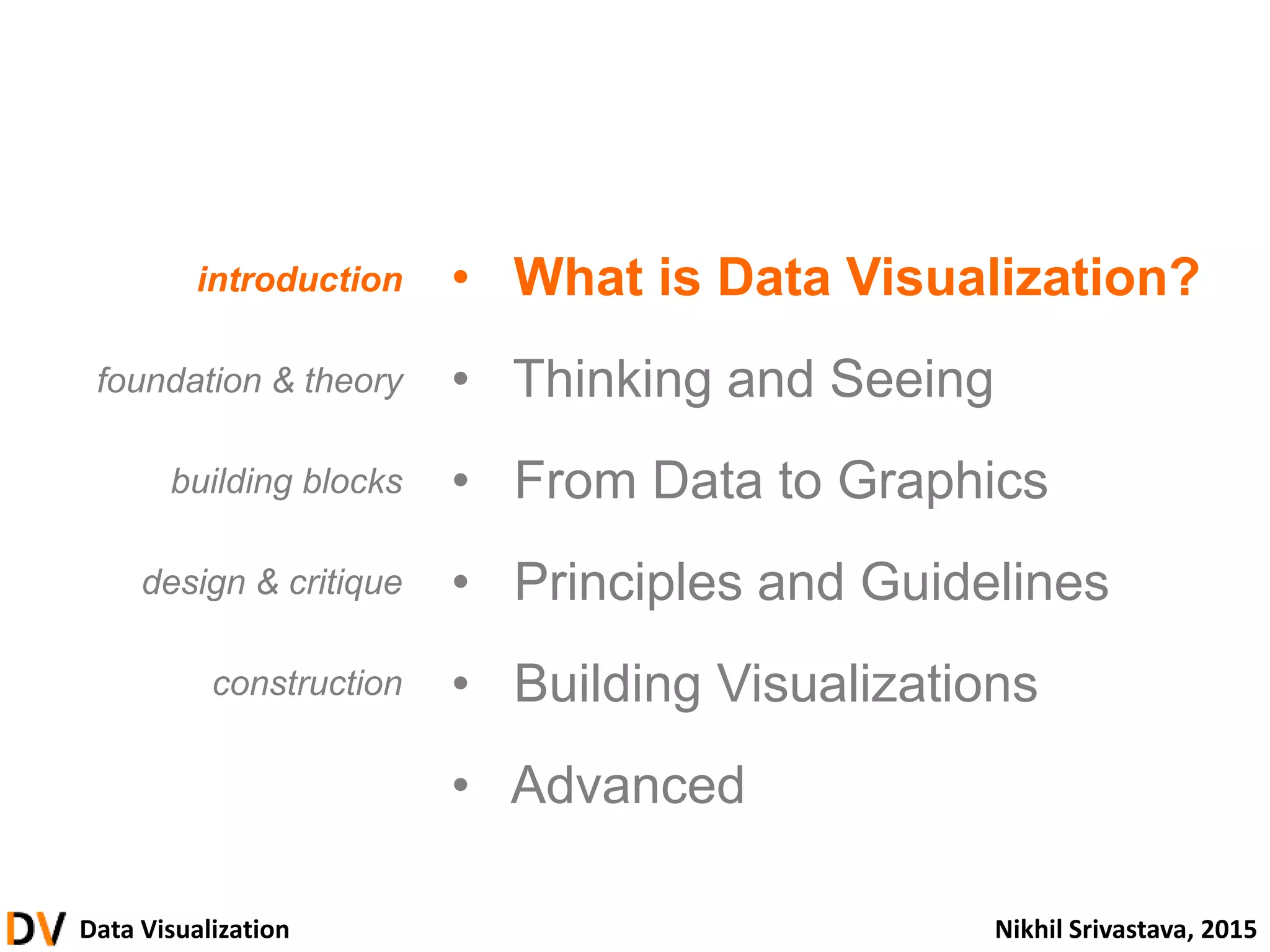
• What is Data Visualization?
• Thinking and Seeing
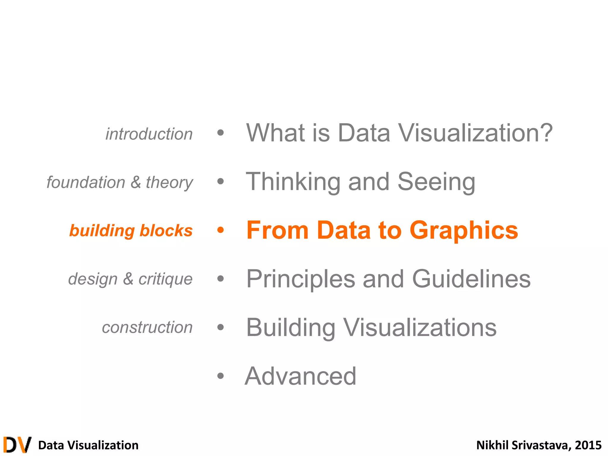
• From Data to Graphics
• Principles and Guidelines
• Building Visualizations
• Advanced
introduction
foundation & theory
building blocks
design & critique
construction
Outline
6.
Data Visualization NikhilSrivastava, 2015
• What is Data Visualization?
• Thinking and Seeing
• From Data to Graphics
• Principles and Guidelines
• Building Visualizations
• Advanced
introduction
foundation & theory
building blocks
design & critique
construction
7.
Data Visualization NikhilSrivastava, 2015
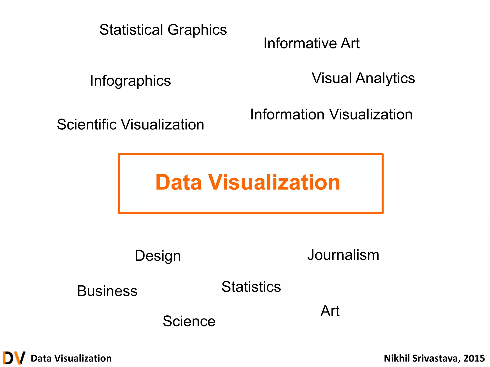
Data Visualization
Information Visualization
Scientific Visualization
Infographics
Statistical Graphics
Informative Art
Art
Science
Statistics
JournalismDesign
Visual Analytics
Business
8.
Data Visualization NikhilSrivastava, 2015
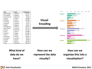
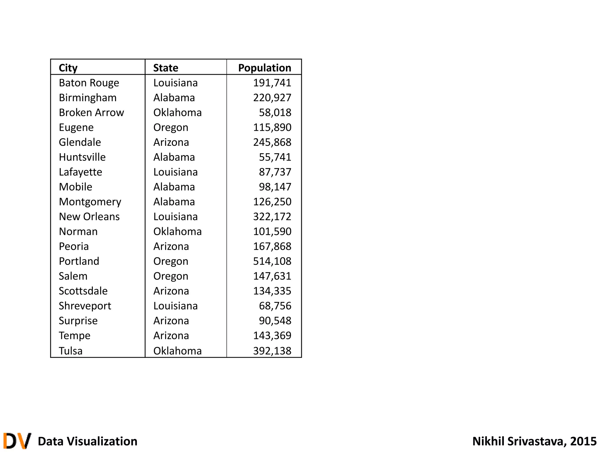
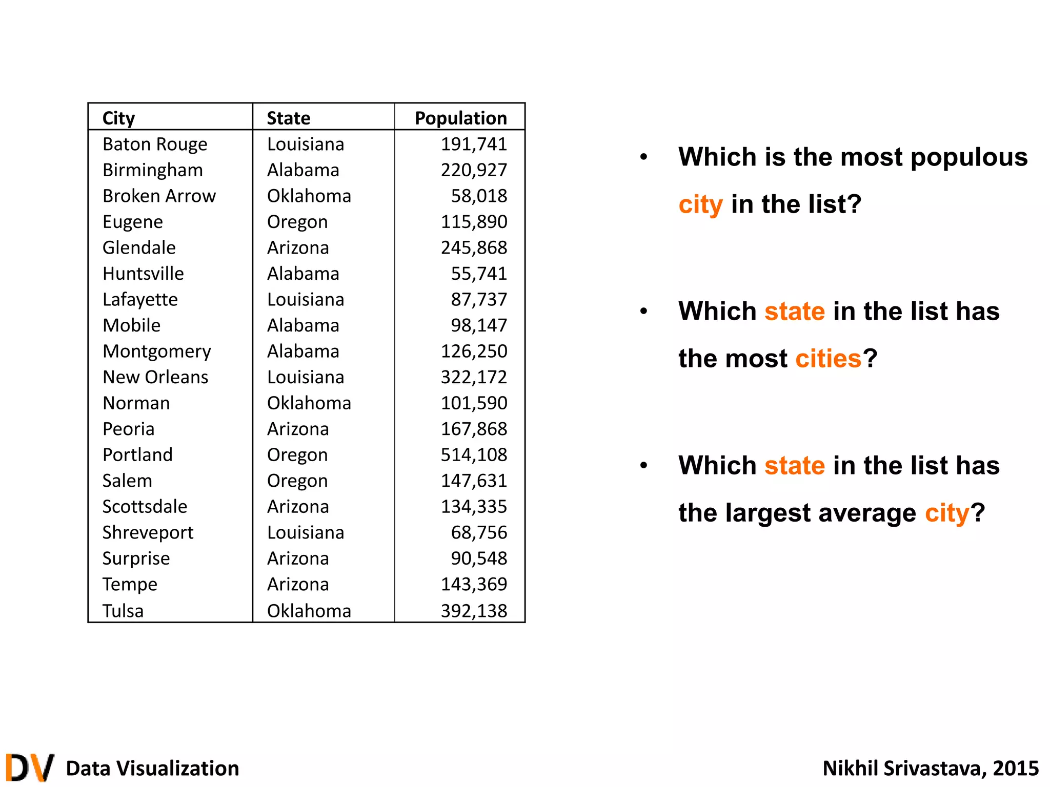
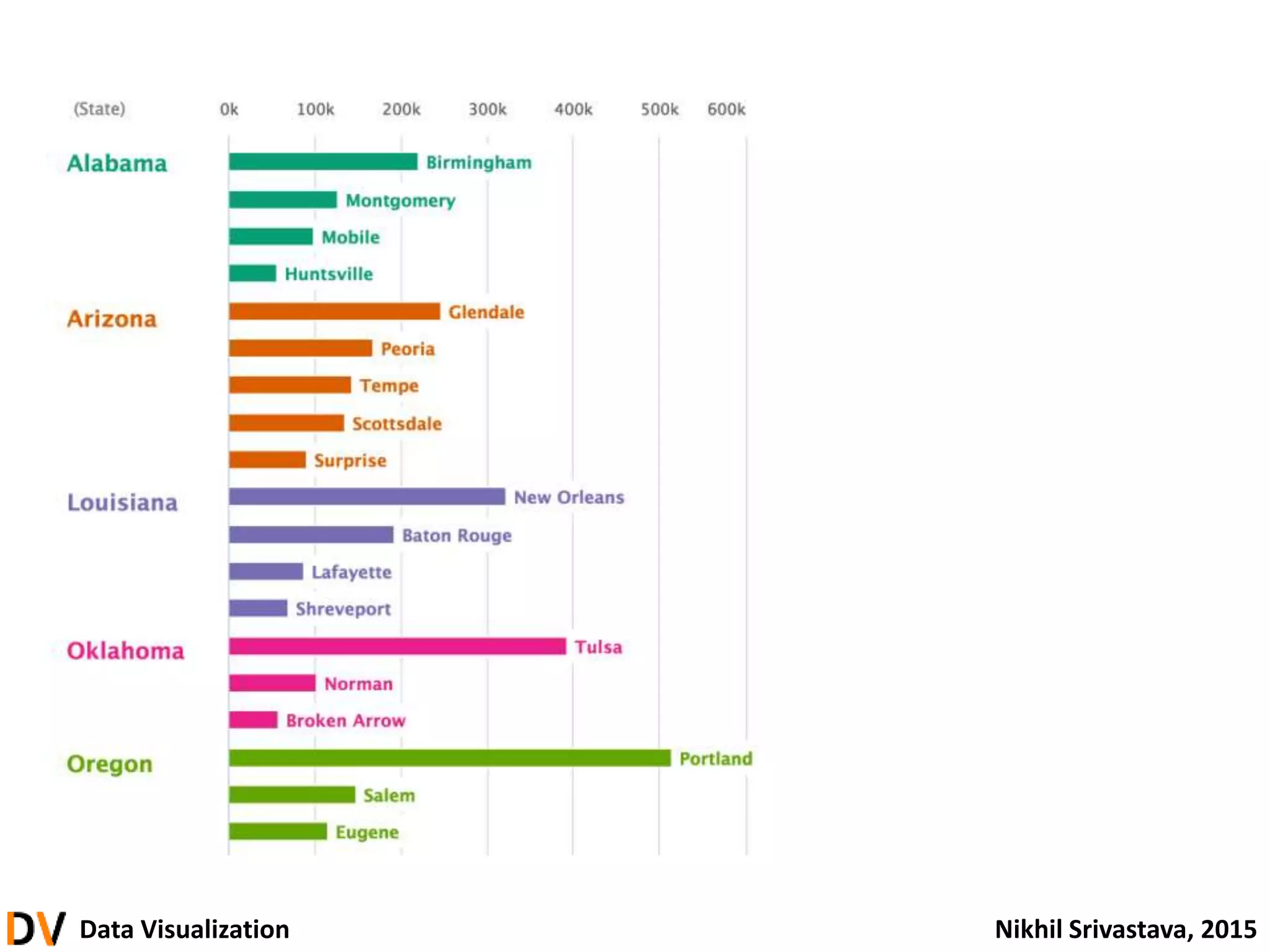
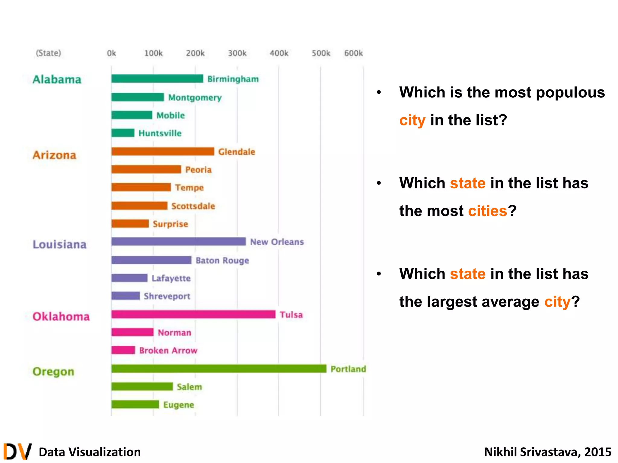
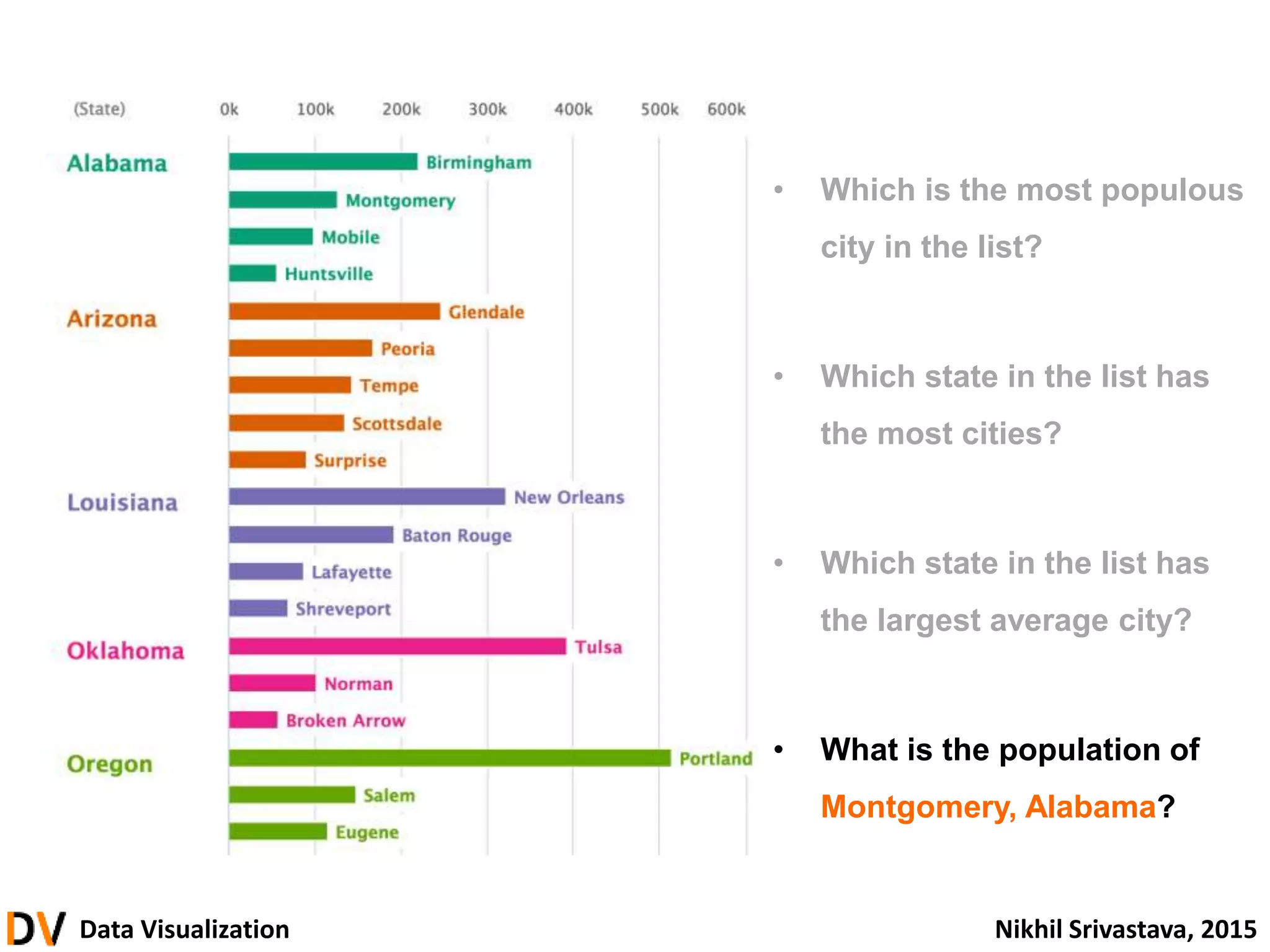
City State Population
Baton Rouge Louisiana 191,741
Birmingham Alabama 220,927
Broken Arrow Oklahoma 58,018
Eugene Oregon 115,890
Glendale Arizona 245,868
Huntsville Alabama 55,741
Lafayette Louisiana 87,737
Mobile Alabama 98,147
Montgomery Alabama 126,250
New Orleans Louisiana 322,172
Norman Oklahoma 101,590
Peoria Arizona 167,868
Portland Oregon 514,108
Salem Oregon 147,631
Scottsdale Arizona 134,335
Shreveport Louisiana 68,756
Surprise Arizona 90,548
Tempe Arizona 143,369
Tulsa Oklahoma 392,138
9.
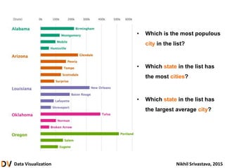
Data Visualization NikhilSrivastava, 2015
• Which is the most populous
city in the list?
• Which state in the list has
the most cities?
• Which state in the list has
the largest average city?
City State Population
Baton Rouge Louisiana 191,741
Birmingham Alabama 220,927
Broken Arrow Oklahoma 58,018
Eugene Oregon 115,890
Glendale Arizona 245,868
Huntsville Alabama 55,741
Lafayette Louisiana 87,737
Mobile Alabama 98,147
Montgomery Alabama 126,250
New Orleans Louisiana 322,172
Norman Oklahoma 101,590
Peoria Arizona 167,868
Portland Oregon 514,108
Salem Oregon 147,631
Scottsdale Arizona 134,335
Shreveport Louisiana 68,756
Surprise Arizona 90,548
Tempe Arizona 143,369
Tulsa Oklahoma 392,138
Data Visualization NikhilSrivastava, 2015
• Which is the most populous
city in the list?
• Which state in the list has
the most cities?
• Which state in the list has
the largest average city?
12.
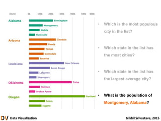
Data Visualization NikhilSrivastava, 2015
• Which is the most populous
city in the list?
• Which state in the list has
the most cities?
• Which state in the list has
the largest average city?
• What is the population of
Montgomery, Alabama?
13.
Data Visualization NikhilSrivastava, 2015
Data Visualization is:
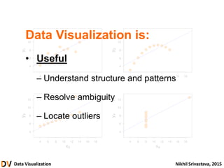
• Useful
– Answers user questions
– Reduces user workload
(by design, not by default)
Data Visualization NikhilSrivastava, 2015
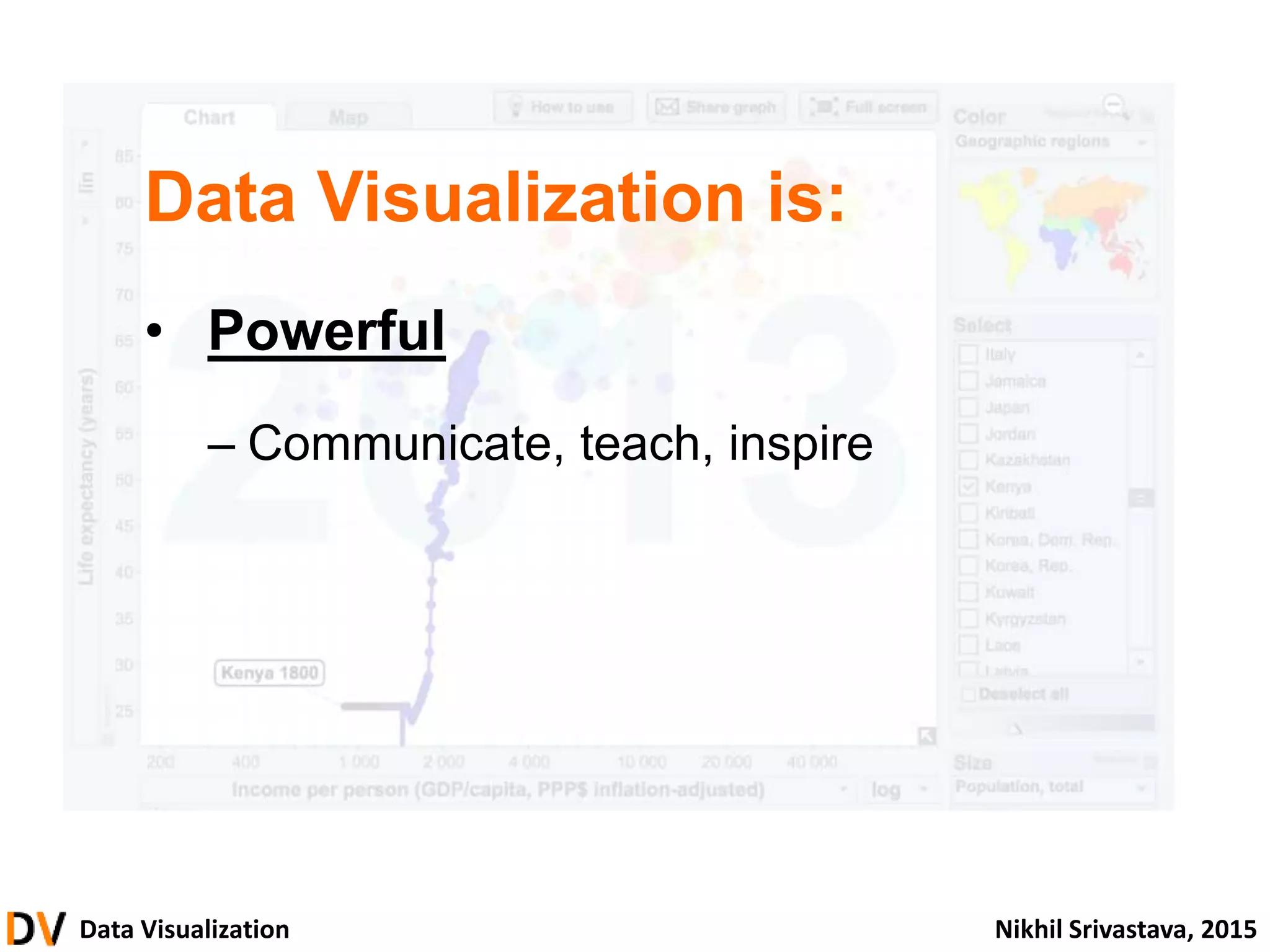
Data Visualization is:
• Powerful
– Communicate, teach, inspire
22.
Data Visualization NikhilSrivastava, 2015
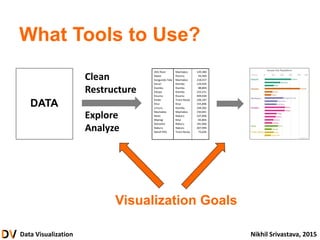
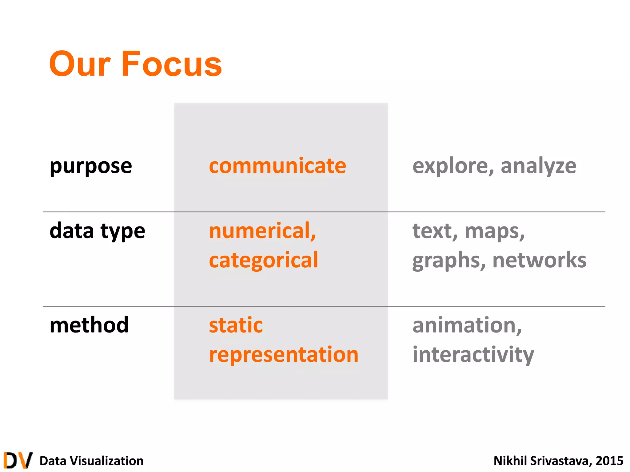
purpose communicate explore, analyze
data type numerical,
categorical
text, maps,
graphs, networks
method static
representation
animation,
interactivity
Our Focus
23.
Data Visualization NikhilSrivastava, 2015
• What is Data Visualization?
• Thinking and Seeing
• From Data to Graphics
• Principles and Guidelines
• Building Visualizations
• Advanced
introduction
foundation & theory
building blocks
design & critique
construction
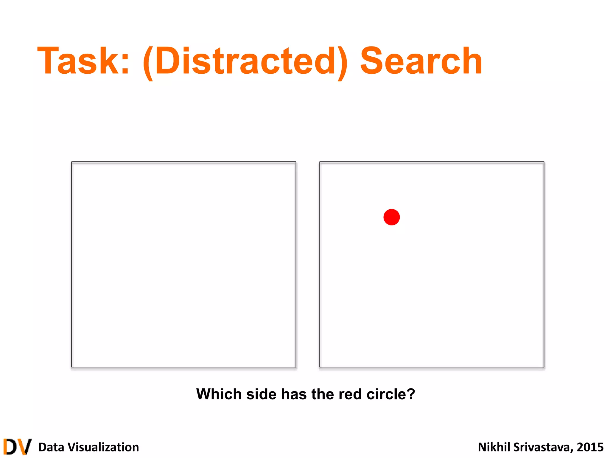
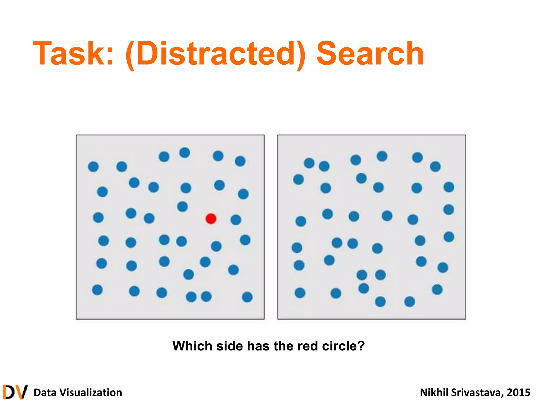
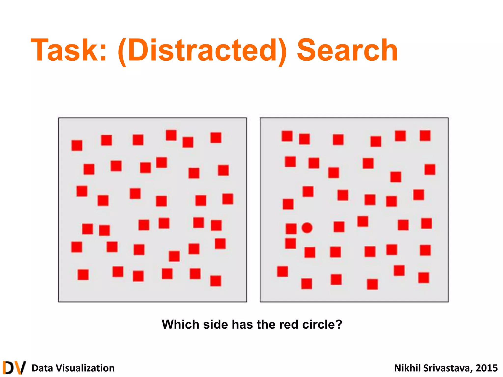
Data Visualization NikhilSrivastava, 2015
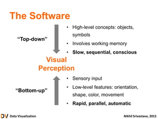
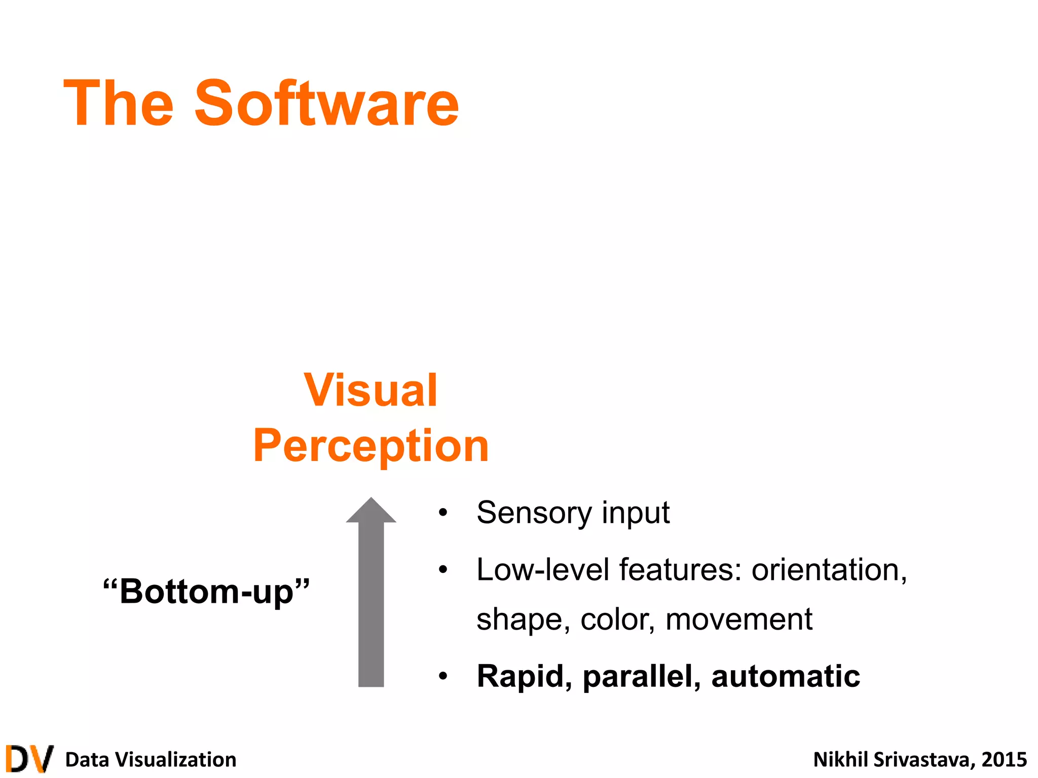
The Software
• High-level concepts: objects,
symbols
• Involves working memory
• Slower, serial, conscious
• Sensory input
• Low-level features: orientation,
shape, color, movement
• Rapid, parallel, automatic
Visual
Perception
“Bottom-up”
26.
Data Visualization NikhilSrivastava, 2015
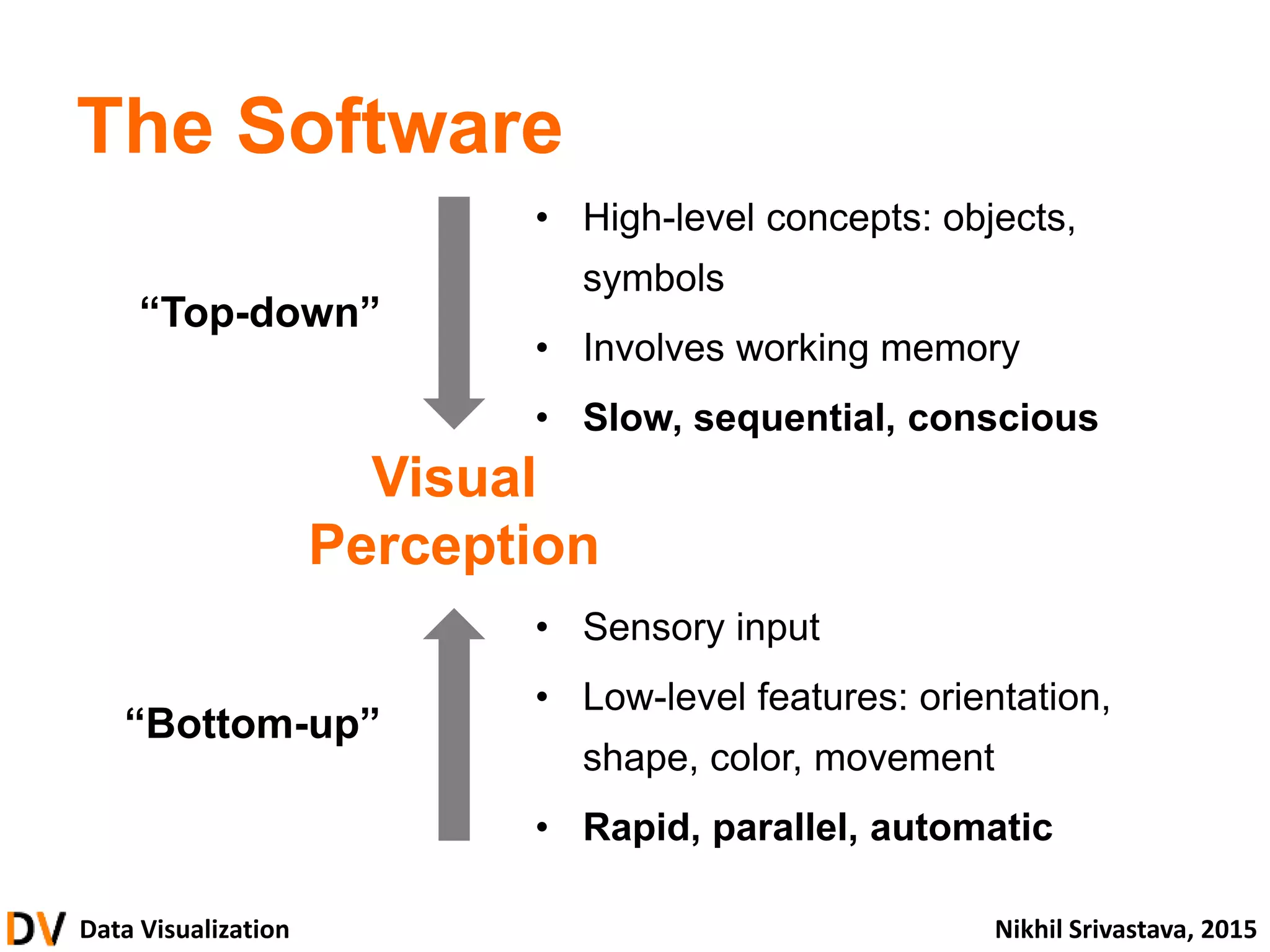
The Software
• High-level concepts: objects,
symbols
• Involves working memory
• Slow, sequential, conscious
• Sensory input
• Low-level features: orientation,
shape, color, movement
• Rapid, parallel, automatic
“Bottom-up”
“Top-down”
Visual
Perception
27.
Data Visualization NikhilSrivastava, 2015
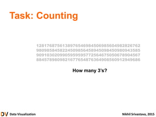
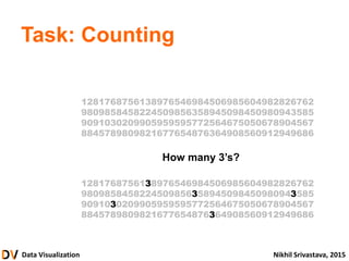
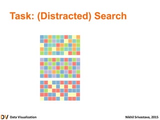
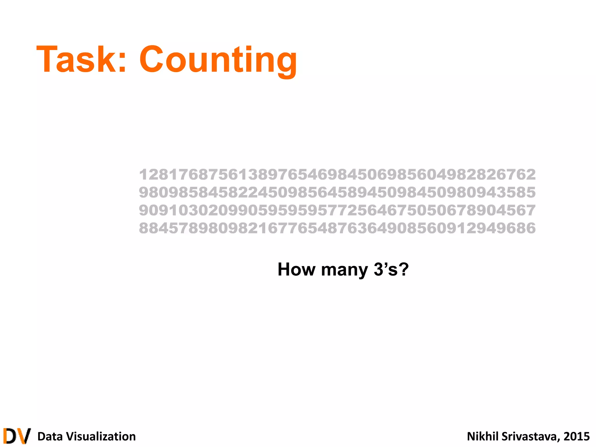
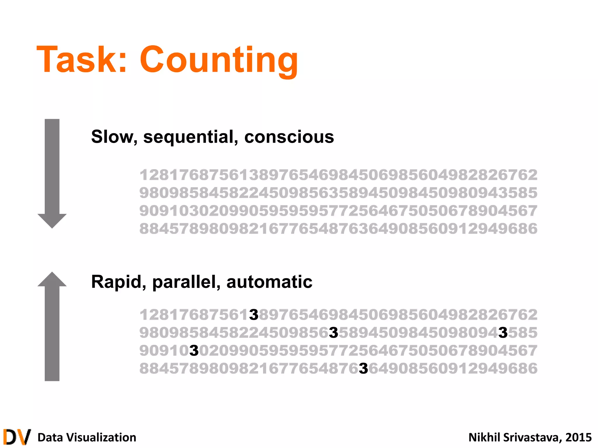
Task: Counting
How many 3’s?
1281768756138976546984506985604982826762
9809858458224509856458945098450980943585
9091030209905959595772564675050678904567
8845789809821677654876364908560912949686
28.
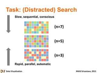
Data Visualization NikhilSrivastava, 2015
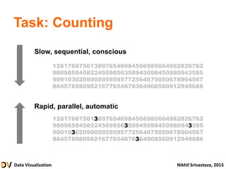
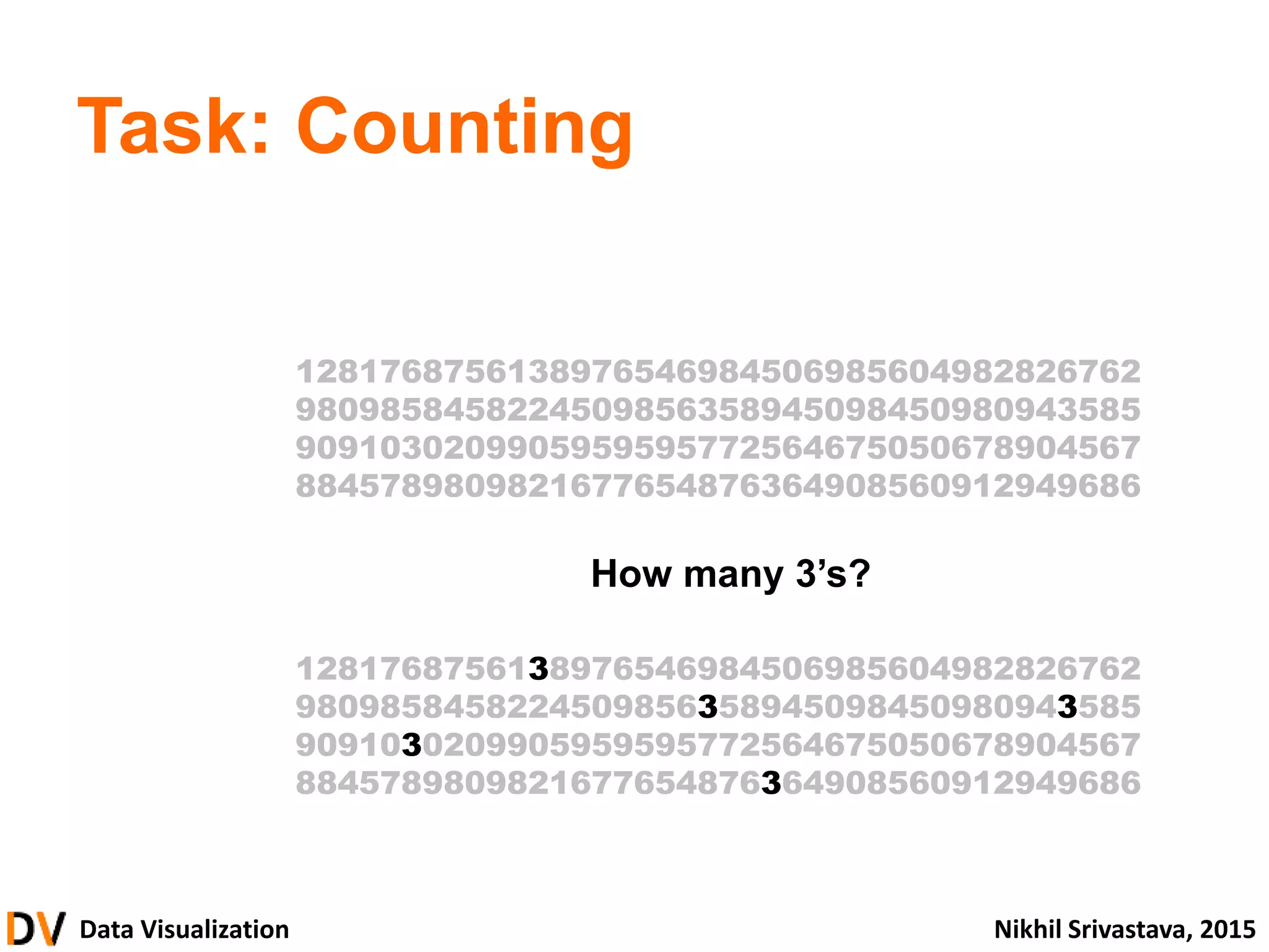
Task: Counting
How many 3’s?
1281768756138976546984506985604982826762
9809858458224509856358945098450980943585
9091030209905959595772564675050678904567
8845789809821677654876364908560912949686
1281768756138976546984506985604982826762
9809858458224509856358945098450980943585
9091030209905959595772564675050678904567
8845789809821677654876364908560912949686
Data Visualization NikhilSrivastava, 2015
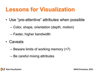
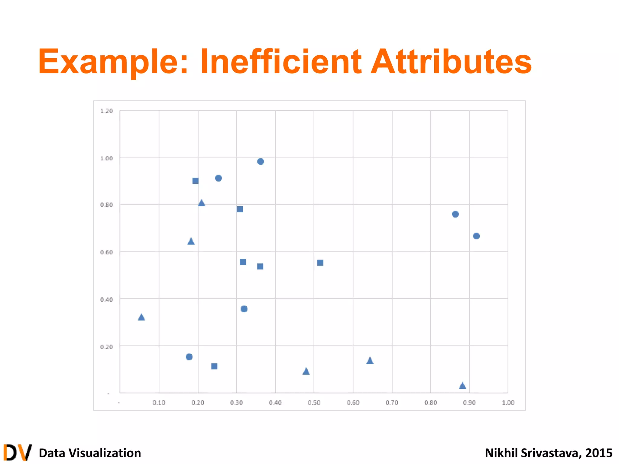
Lessons for Visualization
• Use “pre-attentive” attributes when possible
– Color, shape, orientation (depth, motion)
– Faster, higher bandwidth
• Caveats
– Beware limits of working memory (<7)
– Be careful mixing attributes
Data Visualization NikhilSrivastava, 2015
• What is Data Visualization?
• Thinking and Seeing
• From Data to Graphics
• Principles and Guidelines
• Building Visualizations
• Advanced
introduction
foundation & theory
building blocks
design & critique
construction
43.
Data Visualization NikhilSrivastava, 2015
What kind of
data do we
have?
How can we
represent the data
visually?
How can we
organize this into a
visualization?
Visual
Encoding
44.
Data Visualization NikhilSrivastava, 2015
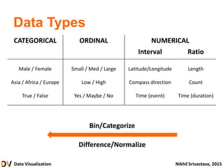
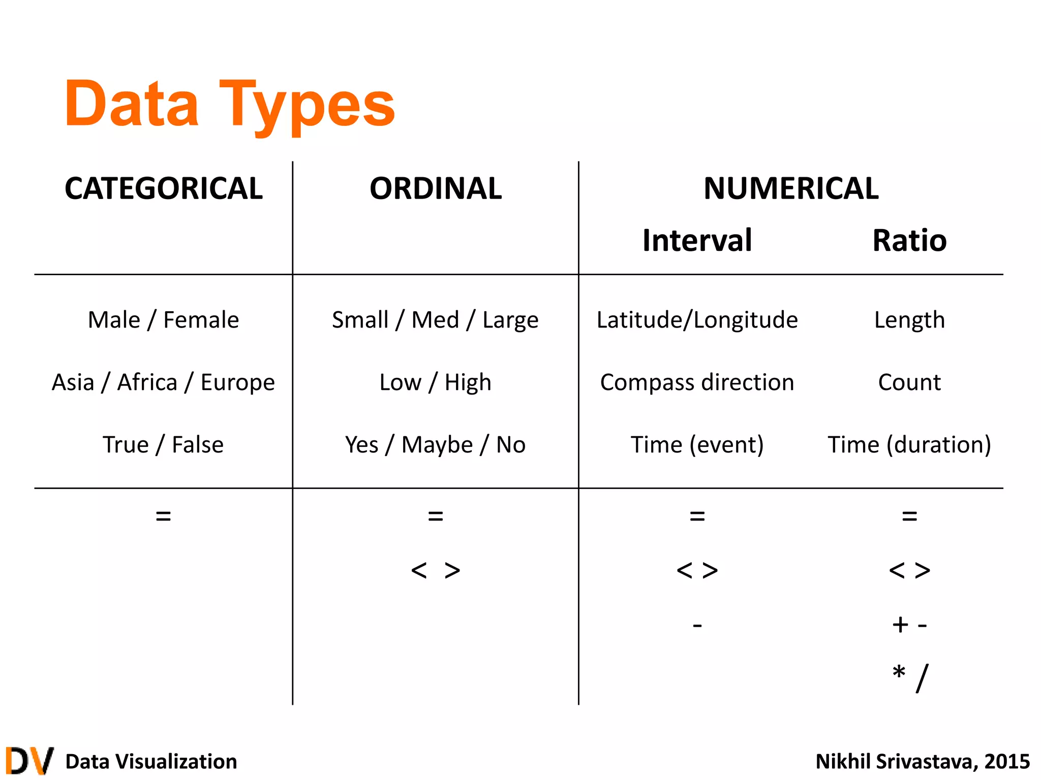
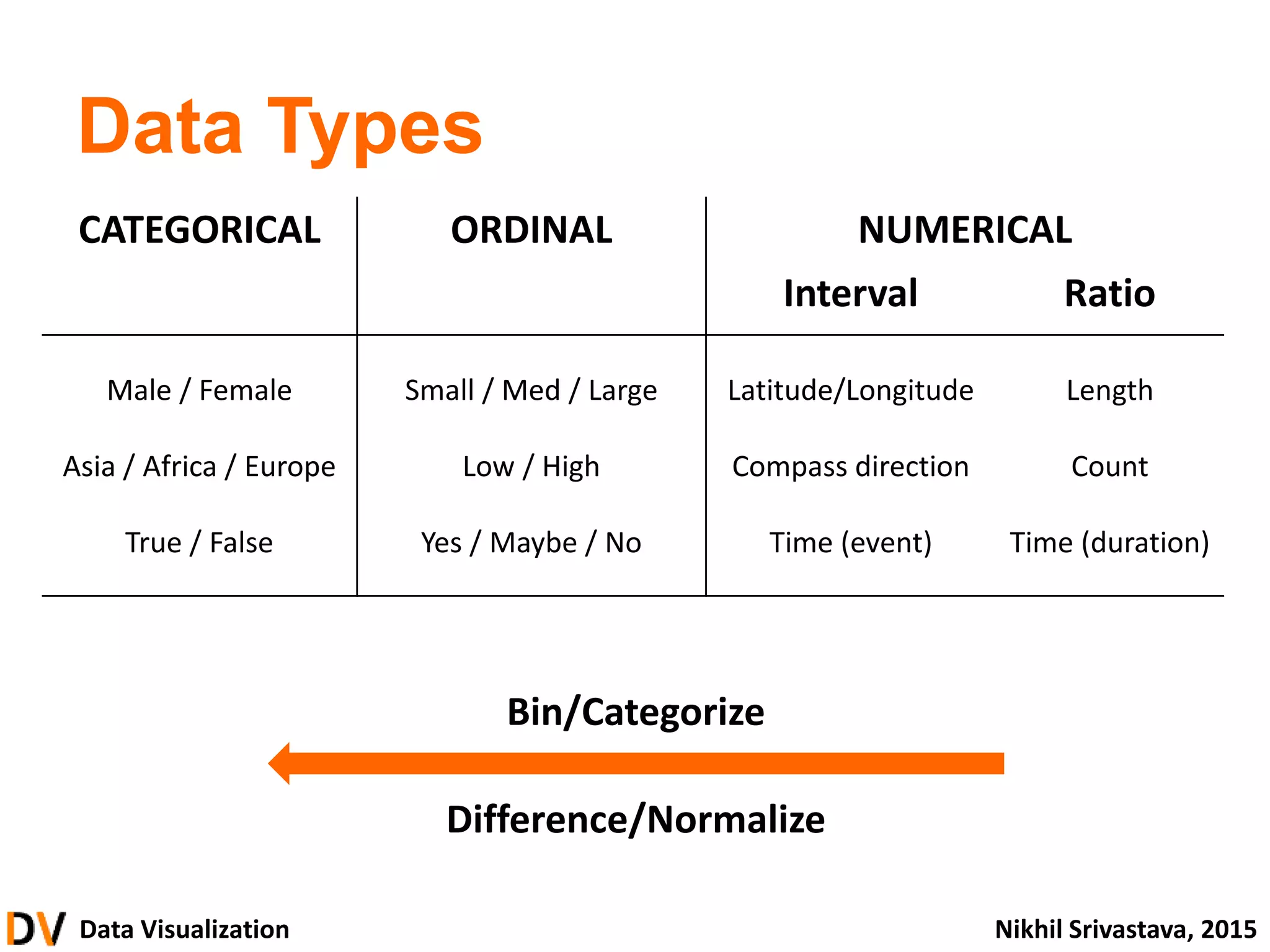
Data Types
CATEGORICAL ORDINAL NUMERICAL
Interval Ratio
Male / Female
Asia / Africa / Europe
True / False
Small / Med / Large
Low / High
Yes / Maybe / No
Latitude/Longitude
Compass direction
Time (event)
Length
Count
Time (duration)
= = = =
< > < > < >
- + -
* /
45.
Data Visualization NikhilSrivastava, 2015
Data Types
CATEGORICAL ORDINAL NUMERICAL
Interval Ratio
Male / Female
Asia / Africa / Europe
True / False
Small / Med / Large
Low / High
Yes / Maybe / No
Latitude/Longitude
Compass direction
Time (event)
Length
Count
Time (duration)
Bin/Categorize
Difference/Normalize
46.
Data Visualization NikhilSrivastava, 2015
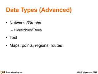
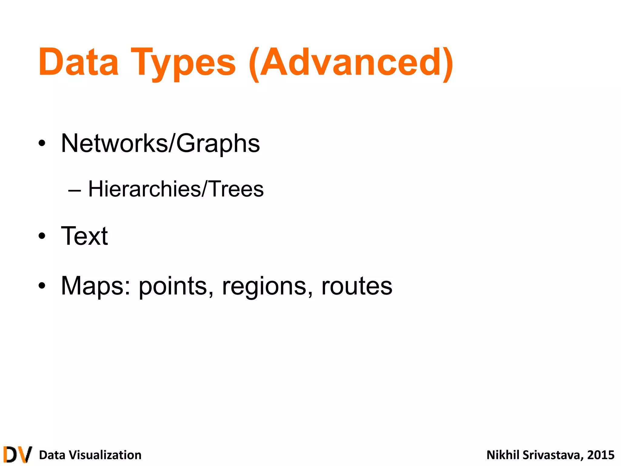
Data Types (Advanced)
• Networks/Graphs
– Hierarchies/Trees
• Text
• Maps: points, regions, routes
47.
Data Visualization NikhilSrivastava, 2015
What kind of
data do we
have?
How can we
represent the data
visually?
How can we
organize this into a
visualization?
Visual
Encoding
48.
Data Visualization NikhilSrivastava, 2015
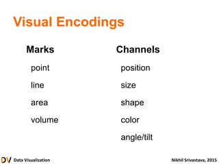
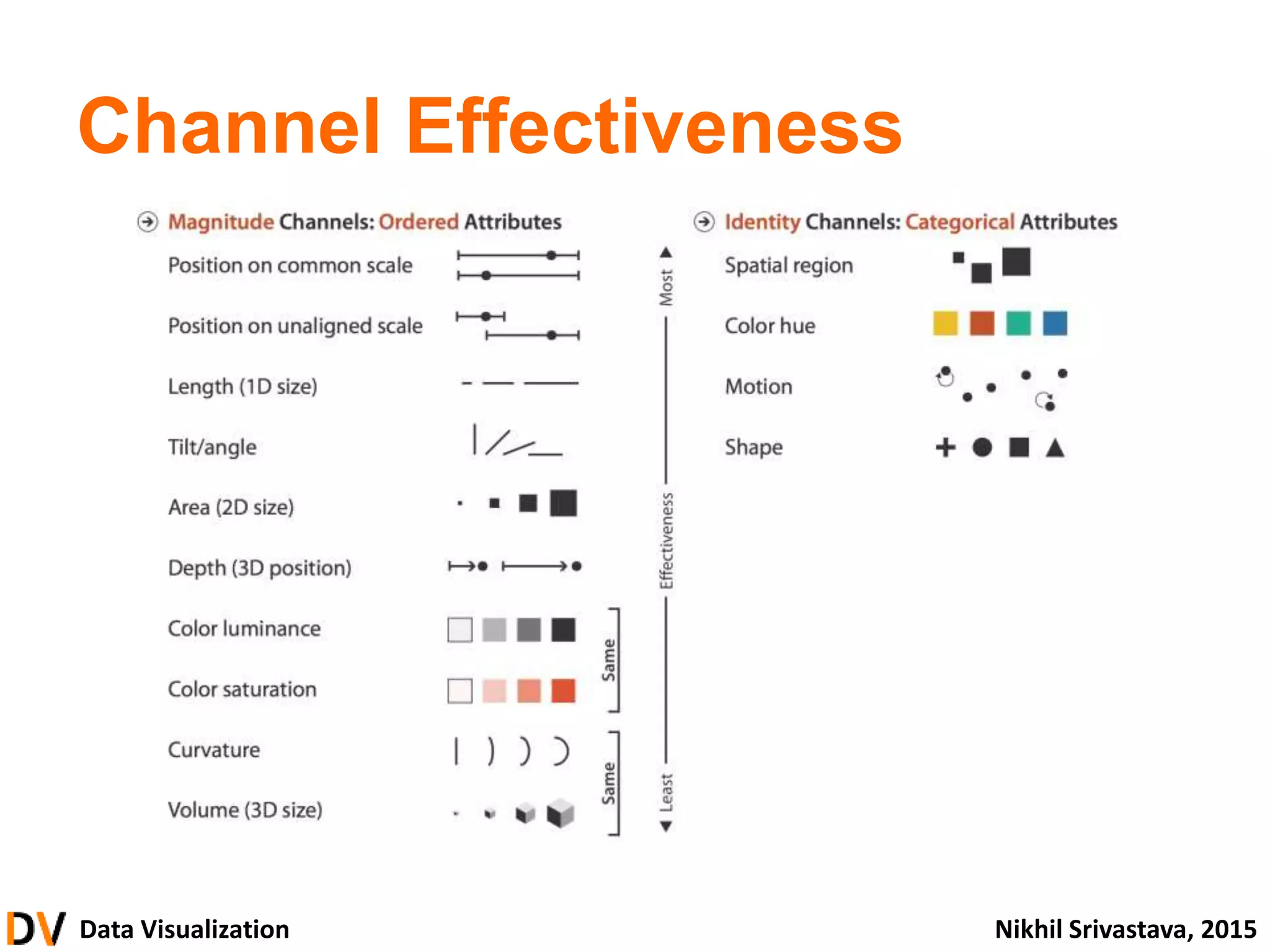
Visual Encodings
Marks
point
line
area
volume
Channels
position
size
shape
color
angle/tilt
Data Visualization NikhilSrivastava, 2015
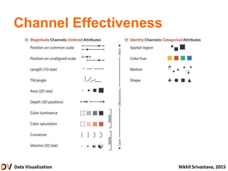
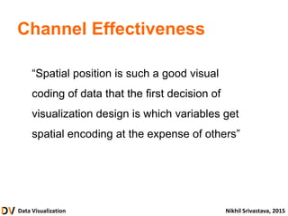
Channel Effectiveness
“Spatial position is such a good visual
coding of data that the first decision of
visualization design is which variables get
spatial encoding at the expense of others”
51.
Data Visualization NikhilSrivastava, 2015
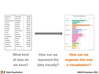
What kind
of data do
we have?
How can we
represent the
data visually?
How can we
organize this into
a visualization?
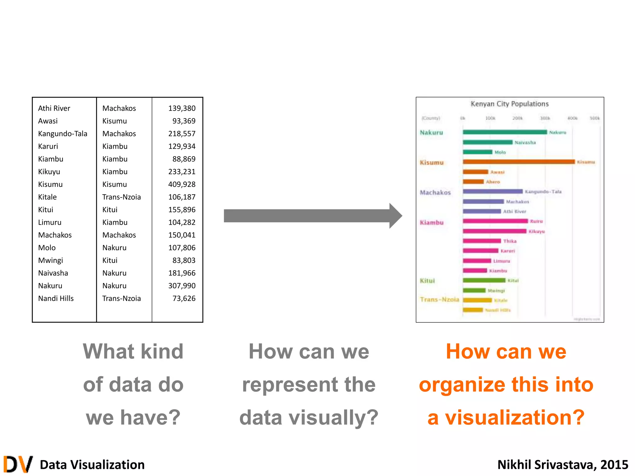
Athi River Machakos 139,380
Awasi Kisumu 93,369
Kangundo-Tala Machakos 218,557
Karuri Kiambu 129,934
Kiambu Kiambu 88,869
Kikuyu Kiambu 233,231
Kisumu Kisumu 409,928
Kitale Trans-Nzoia 106,187
Kitui Kitui 155,896
Limuru Kiambu 104,282
Machakos Machakos 150,041
Molo Nakuru 107,806
Mwingi Kitui 83,803
Naivasha Nakuru 181,966
Nakuru Nakuru 307,990
Nandi Hills Trans-Nzoia 73,626
52.
Data Visualization NikhilSrivastava, 2015
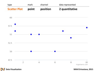
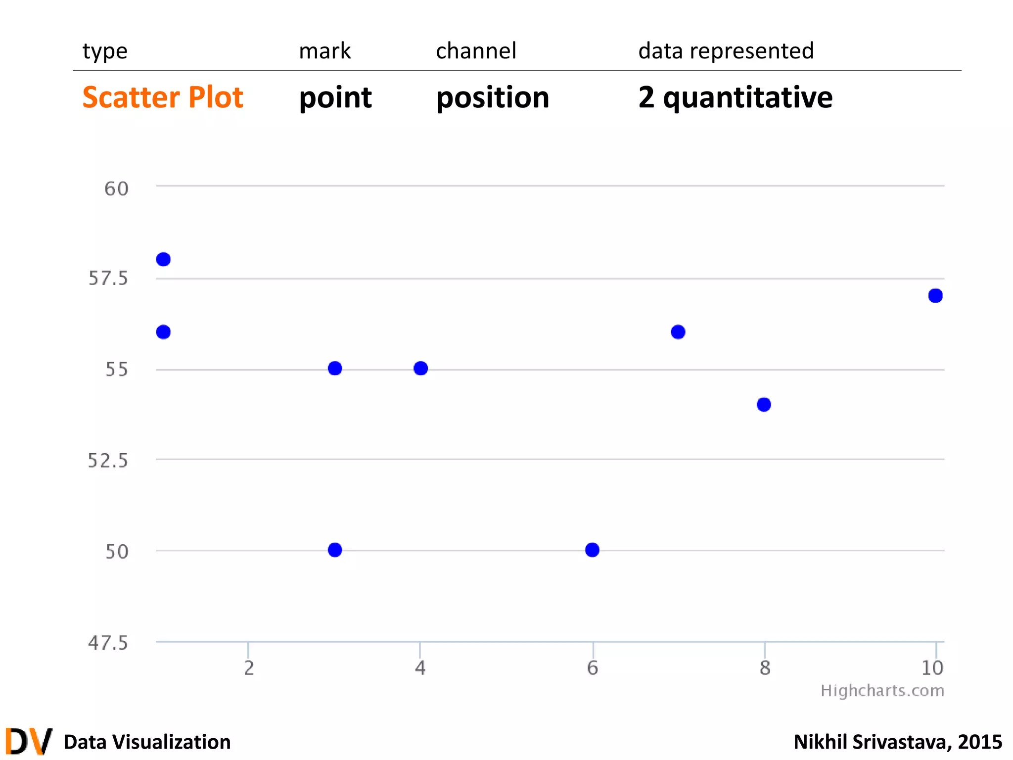
type mark channel data represented
Scatter Plot point position 2 quantitative
53.
Data Visualization NikhilSrivastava, 2015
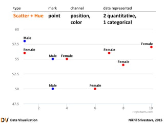
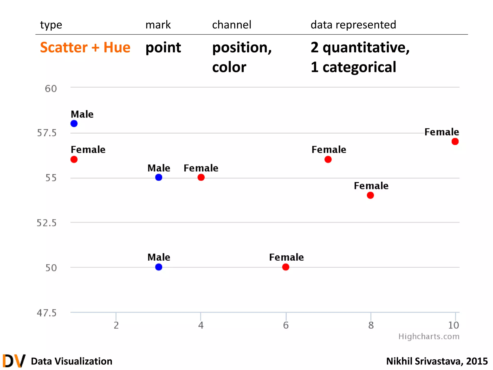
type mark channel data represented
Scatter + Hue point position,
color
2 quantitative,
1 categorical
54.
Data Visualization NikhilSrivastava, 2015
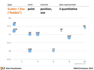
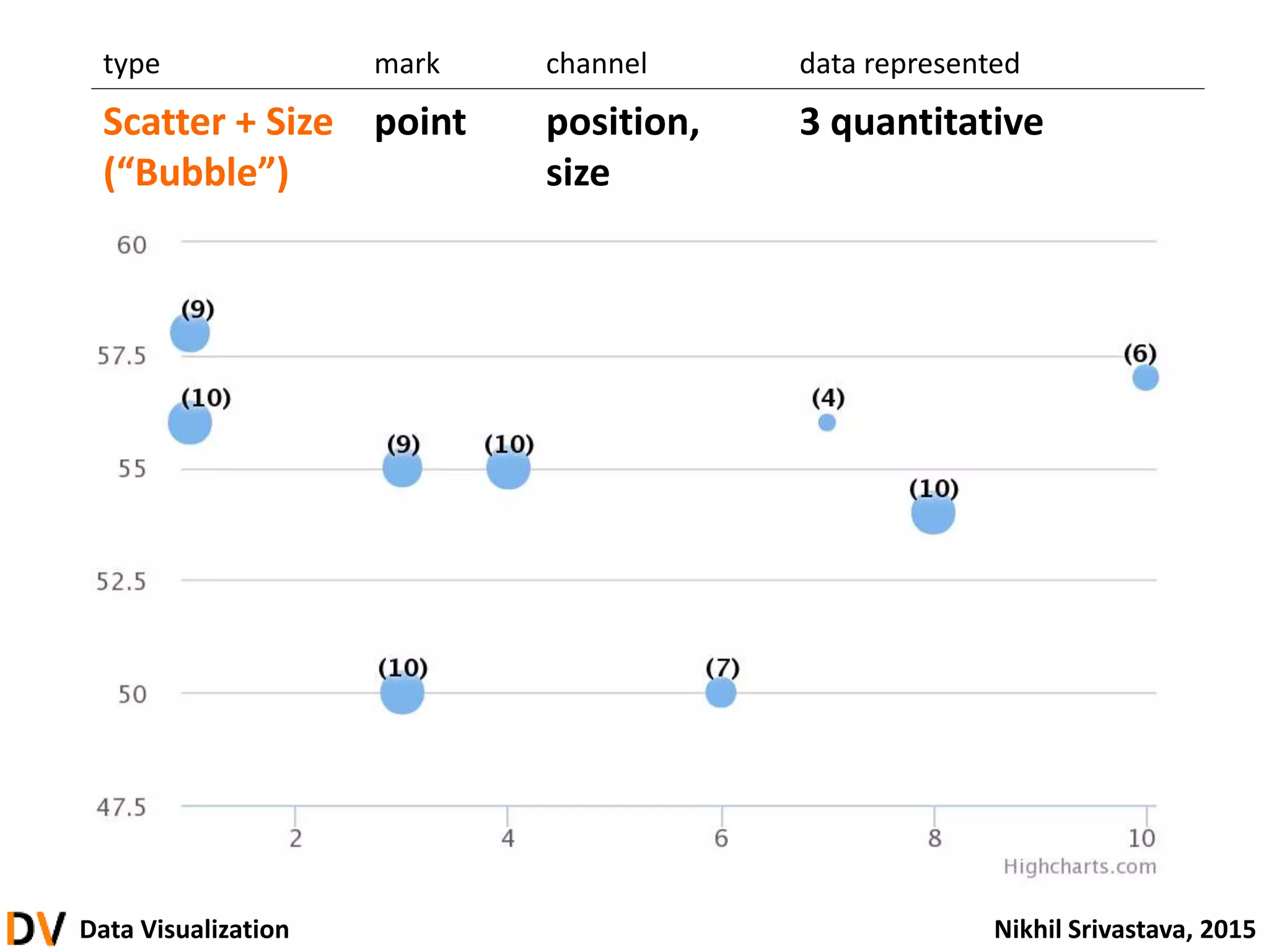
type mark channel data represented
Scatter + Size
(“Bubble”)
point position,
size
3 quantitative
Data Visualization NikhilSrivastava, 2015
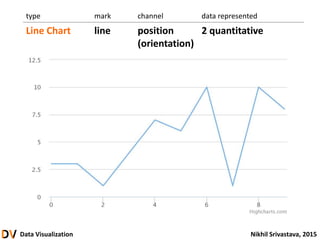
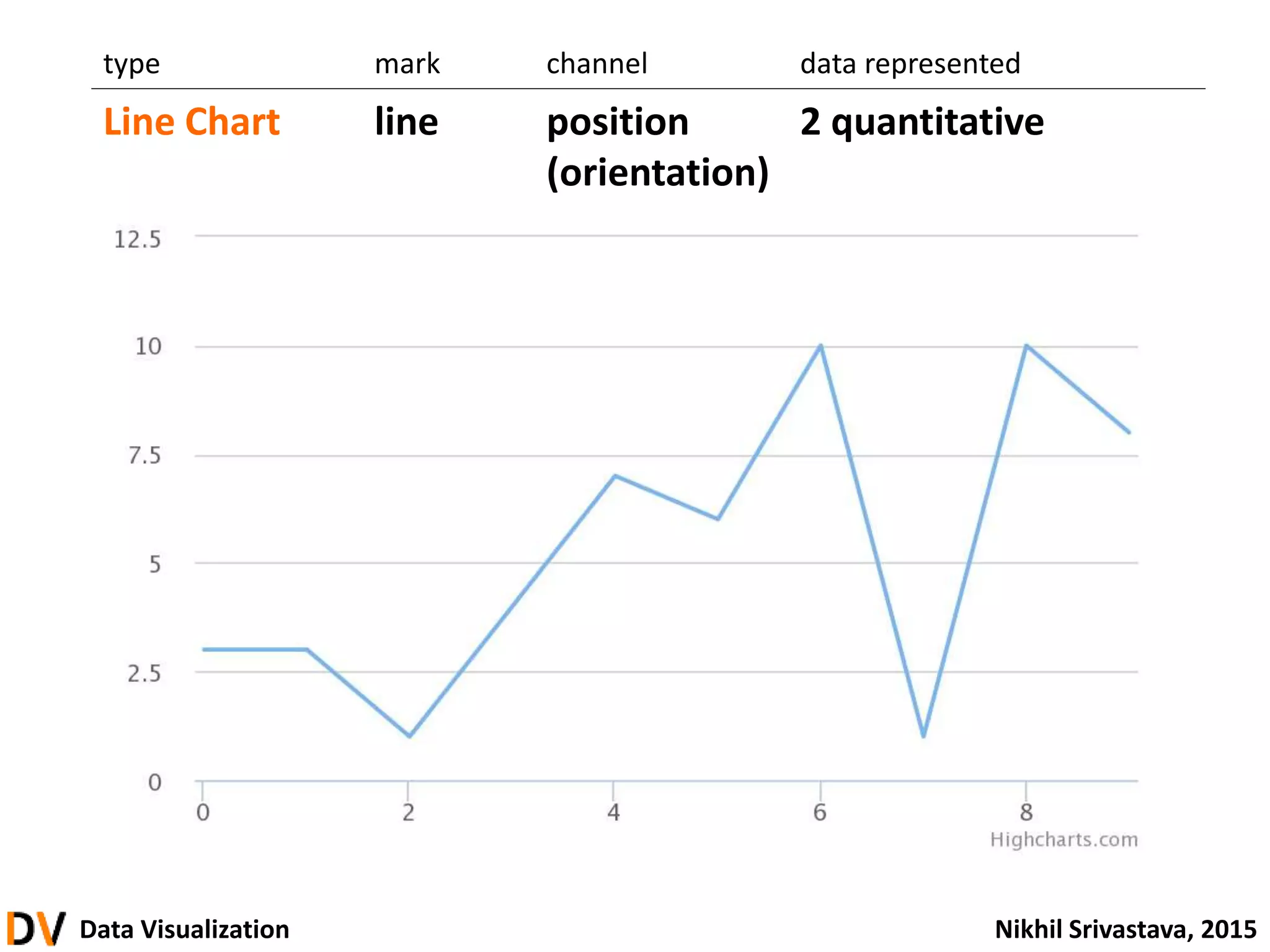
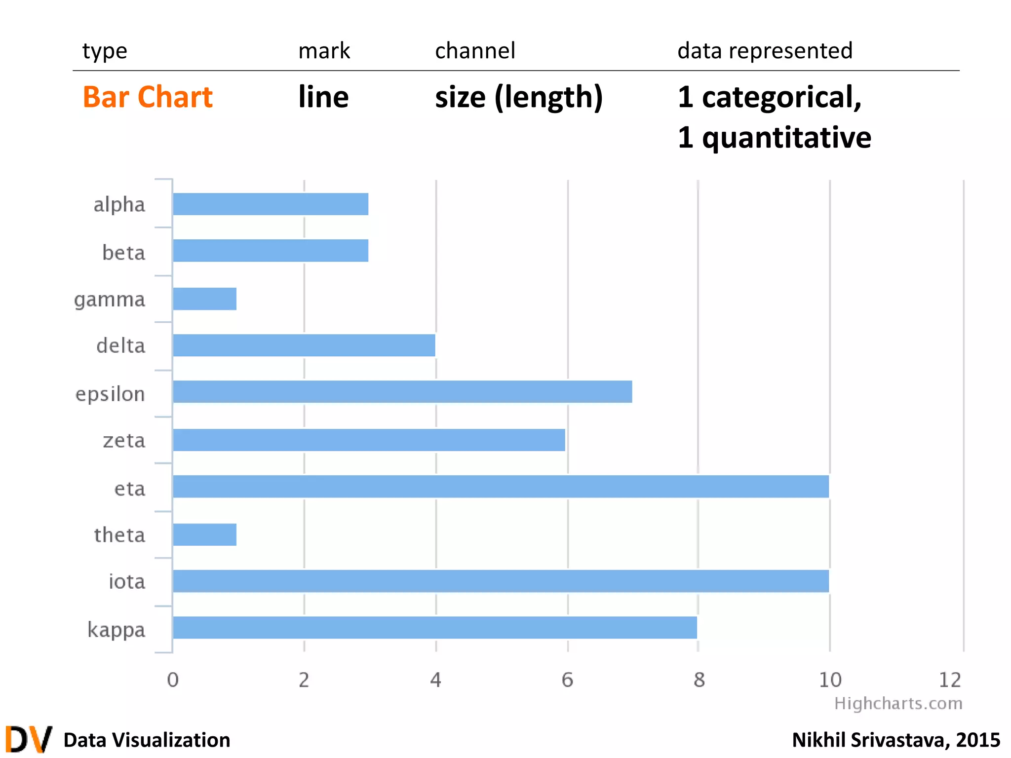
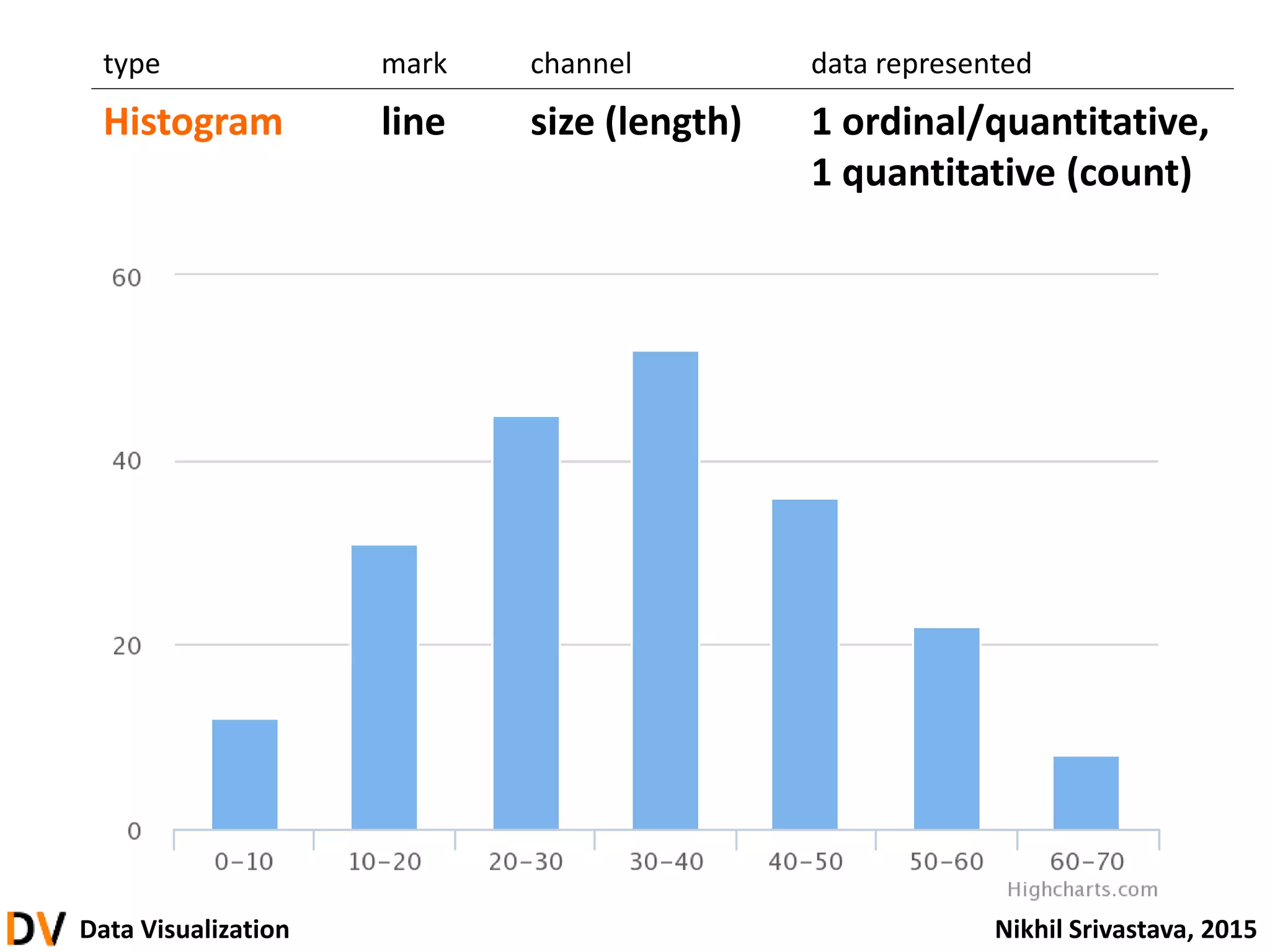
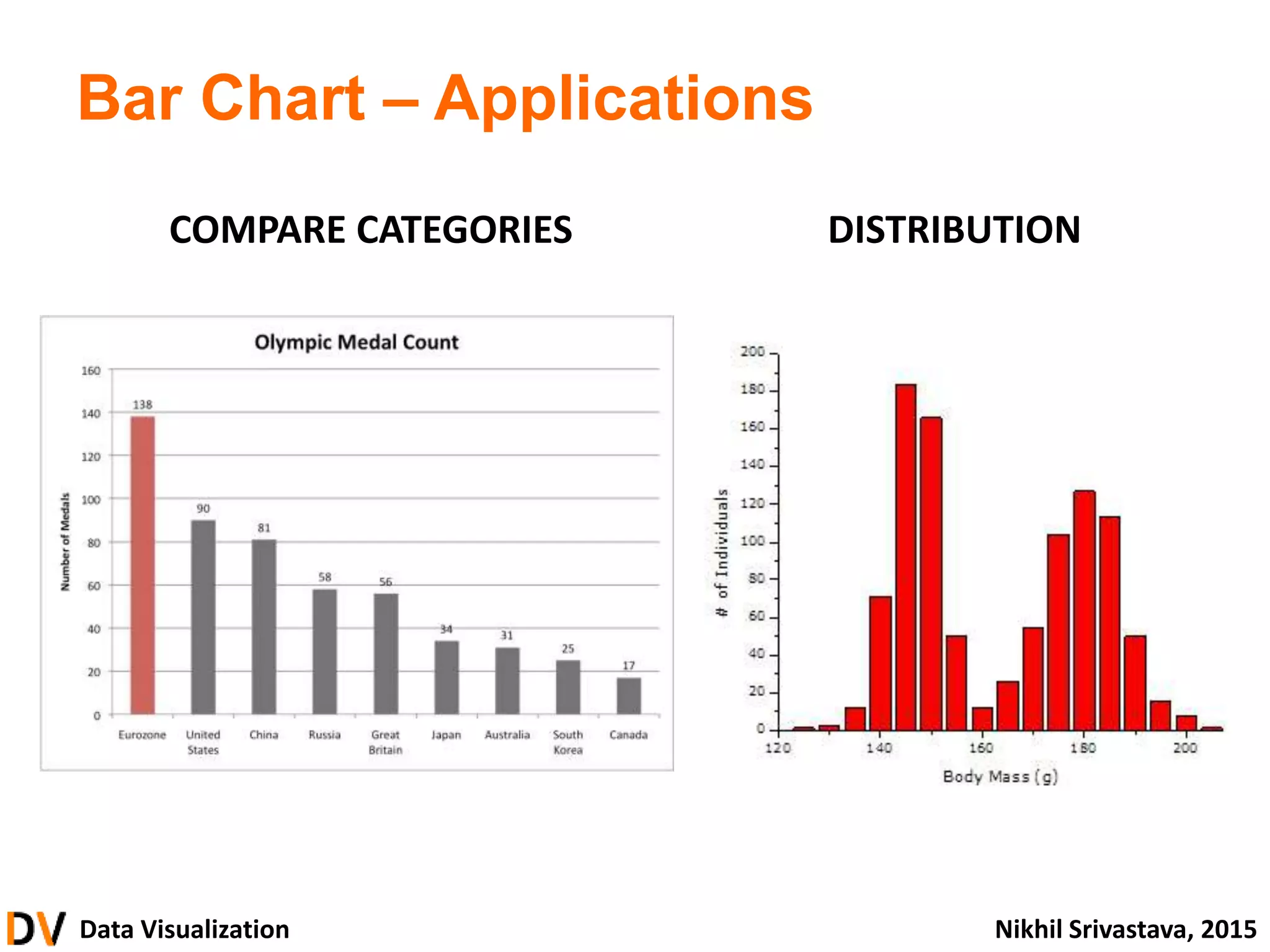
type mark channel data represented
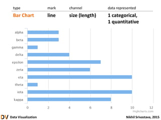
Bar Chart line size (length) 1 categorical,
1 quantitative
62.
Data Visualization NikhilSrivastava, 2015
type mark channel data represented
Histogram line size (length) 1 ordinal/quantitative,
1 quantitative (count)
Data Visualization NikhilSrivastava, 2015
• What is Data Visualization?
• Thinking and Seeing
• From Data to Graphics
• Principles and Guidelines
• Building Visualizations
• Advanced
introduction
foundation & theory
building blocks
design & critique
construction
71.
Data Visualization NikhilSrivastava, 2015
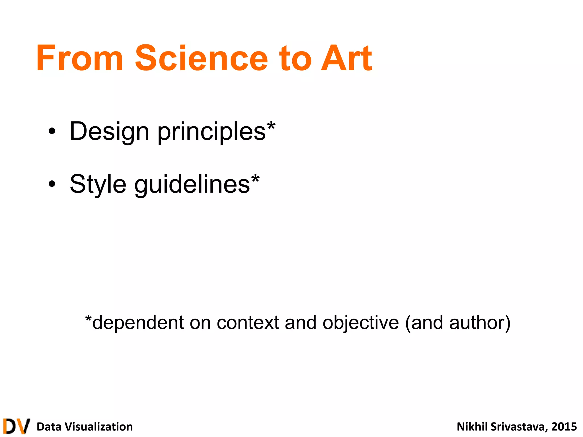
From Science to Art
• Design principles*
• Style guidelines*
*dependent on context and objective (and author)
Data Visualization NikhilSrivastava, 2015
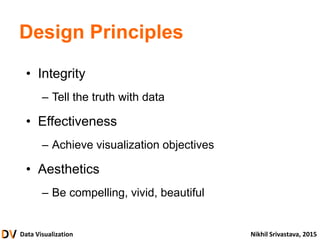
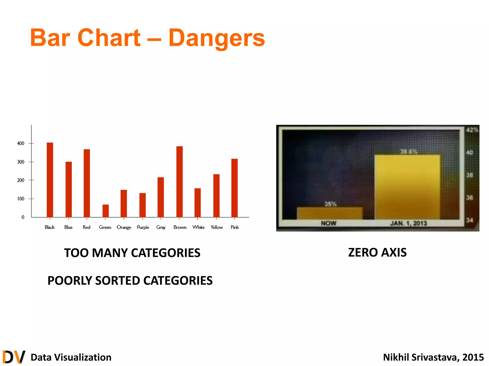
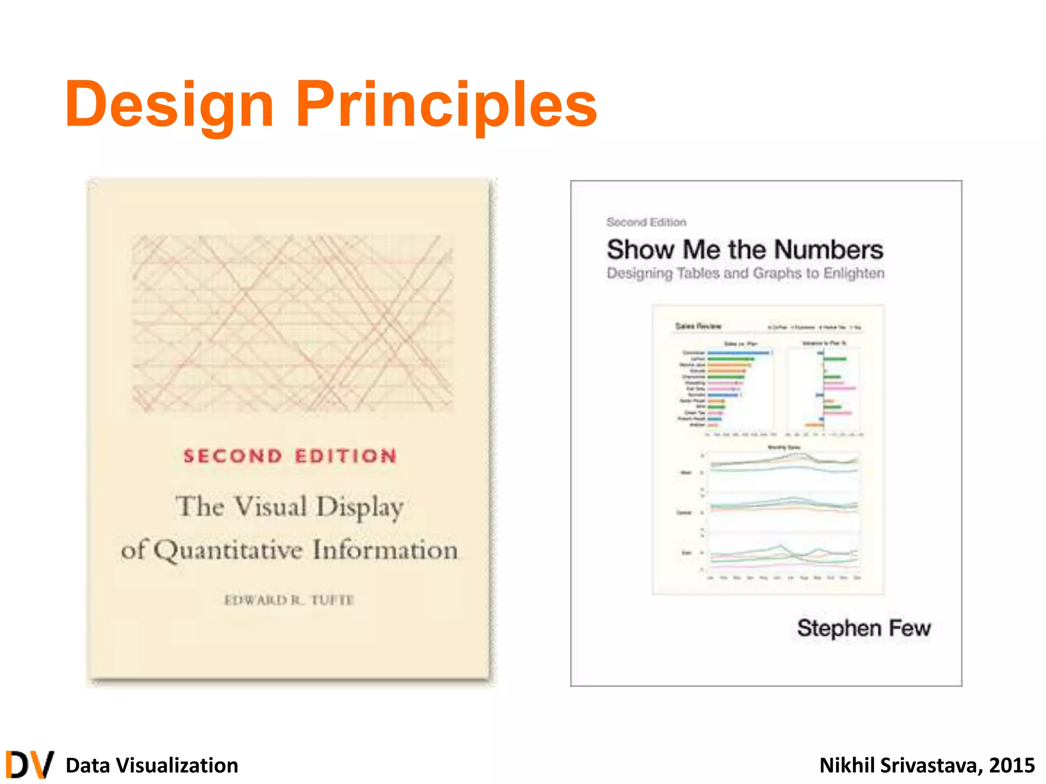
Design Principles
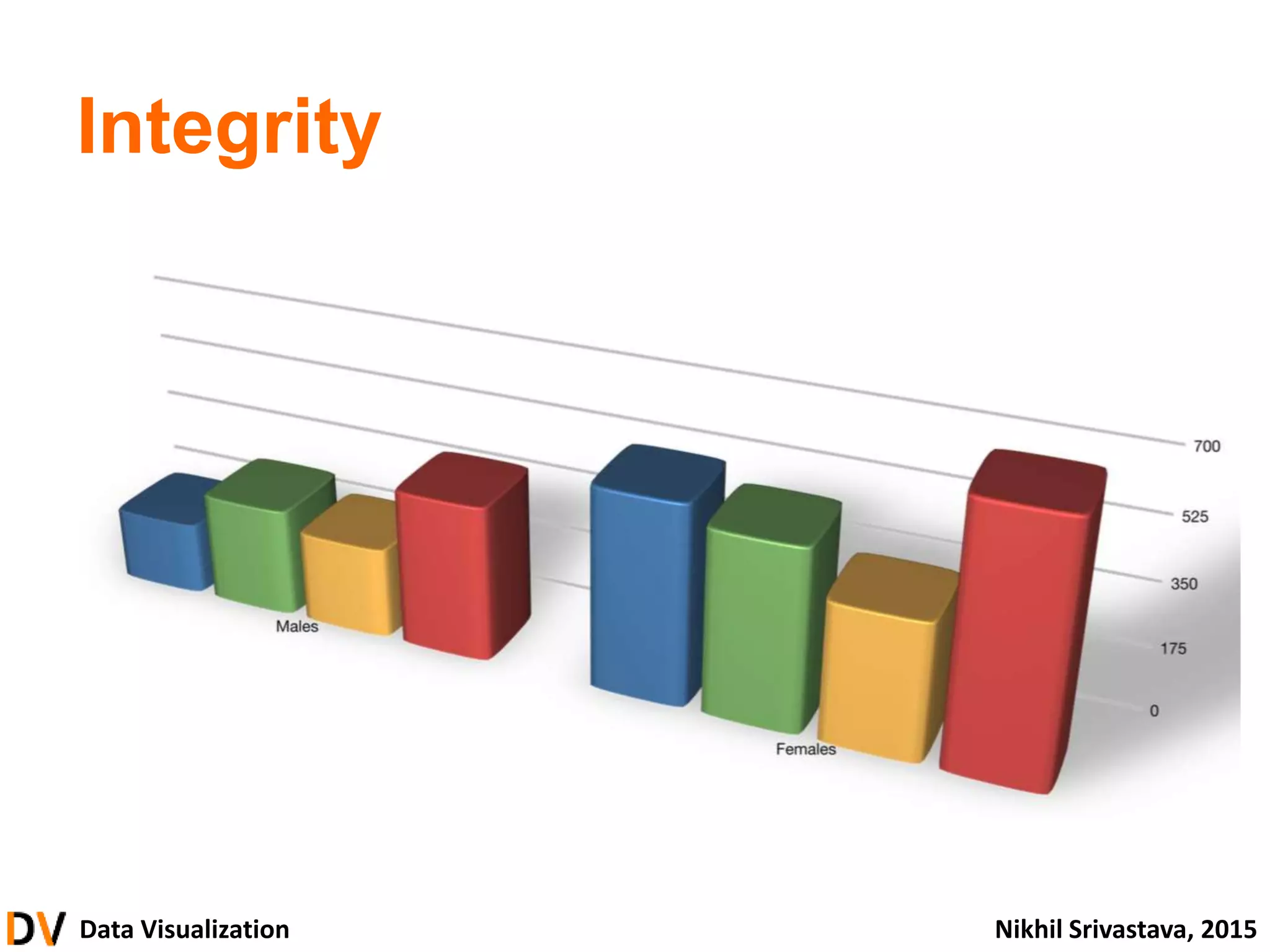
• Integrity
– Tell the truth with data
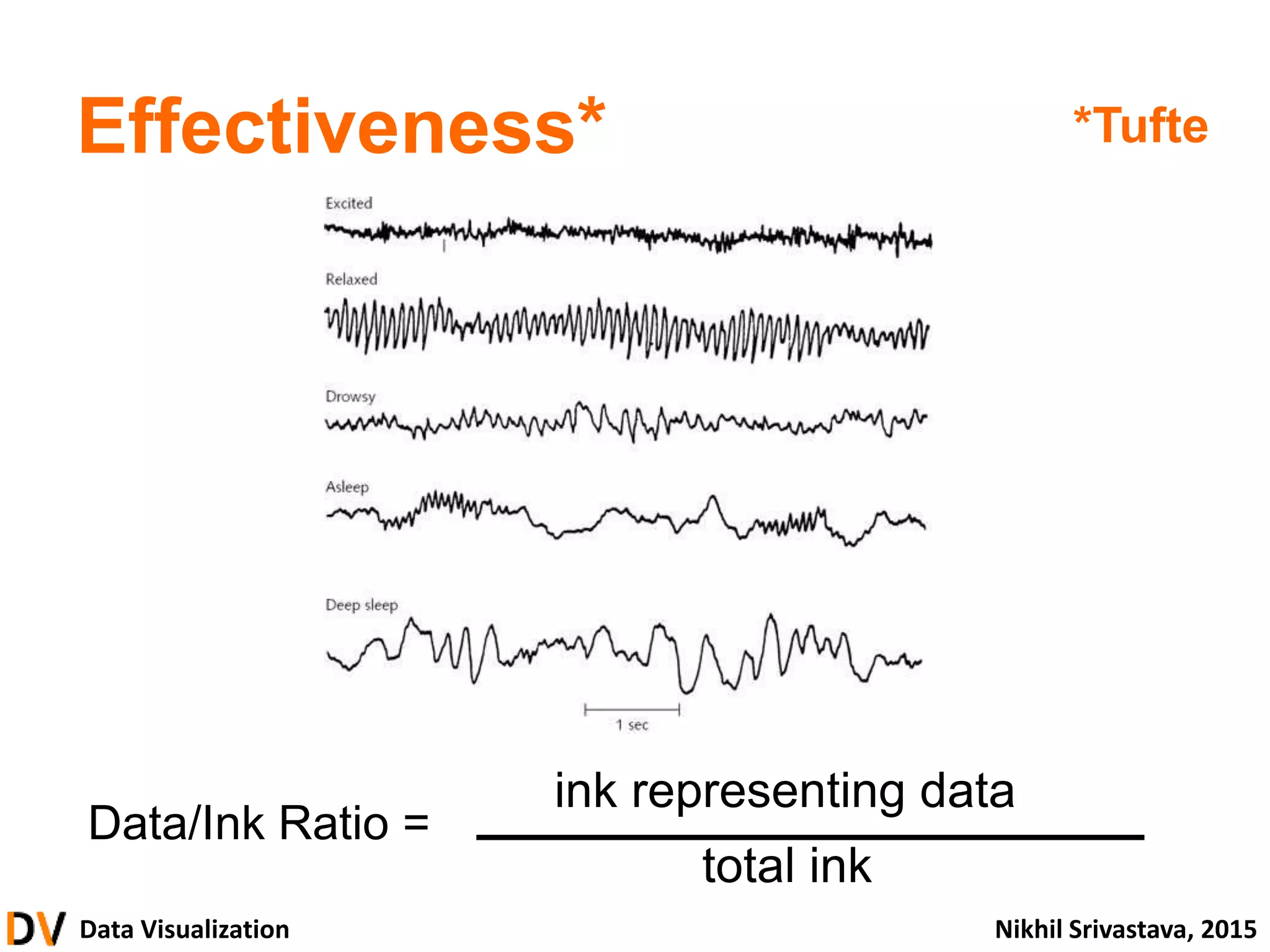
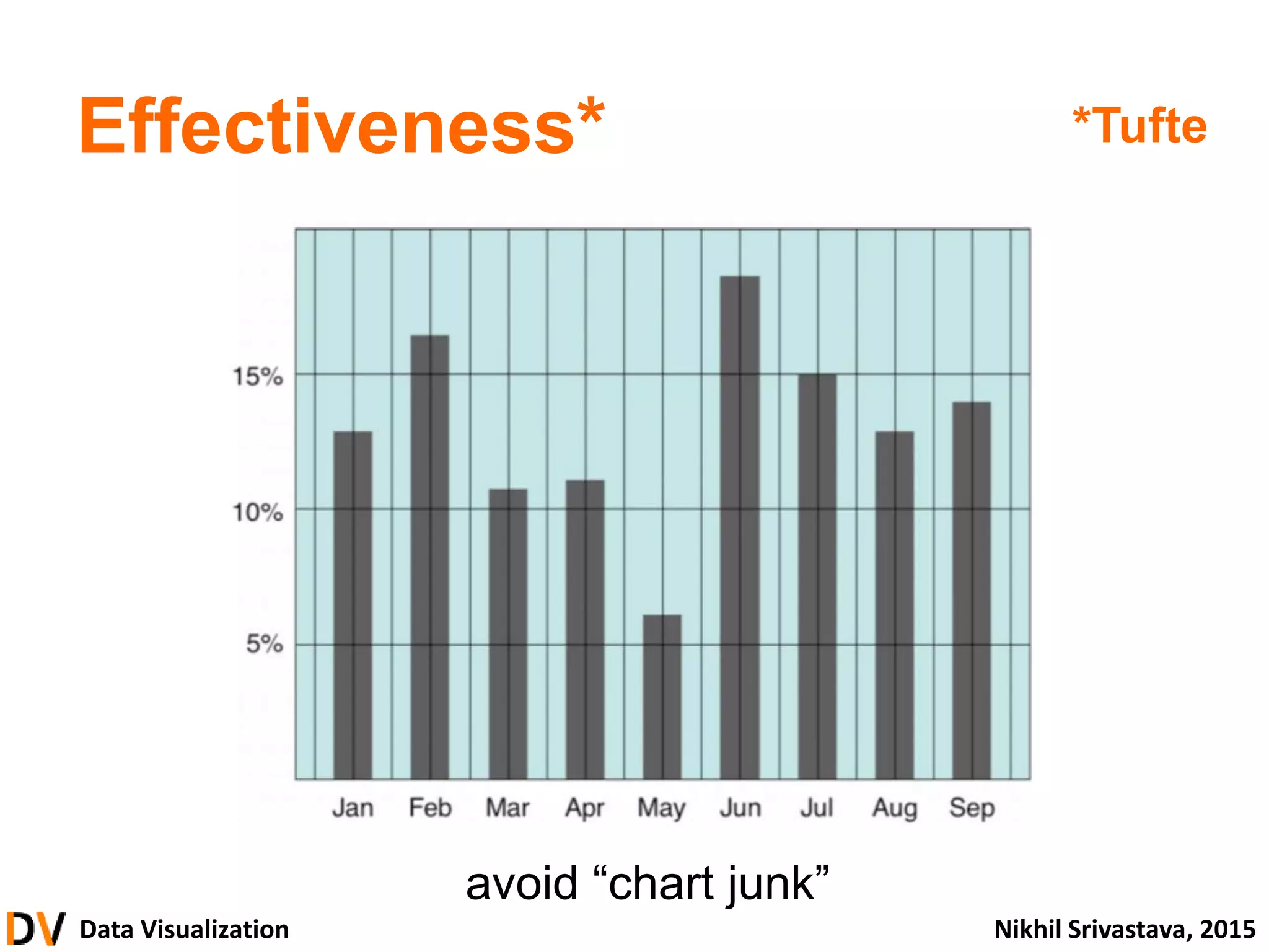
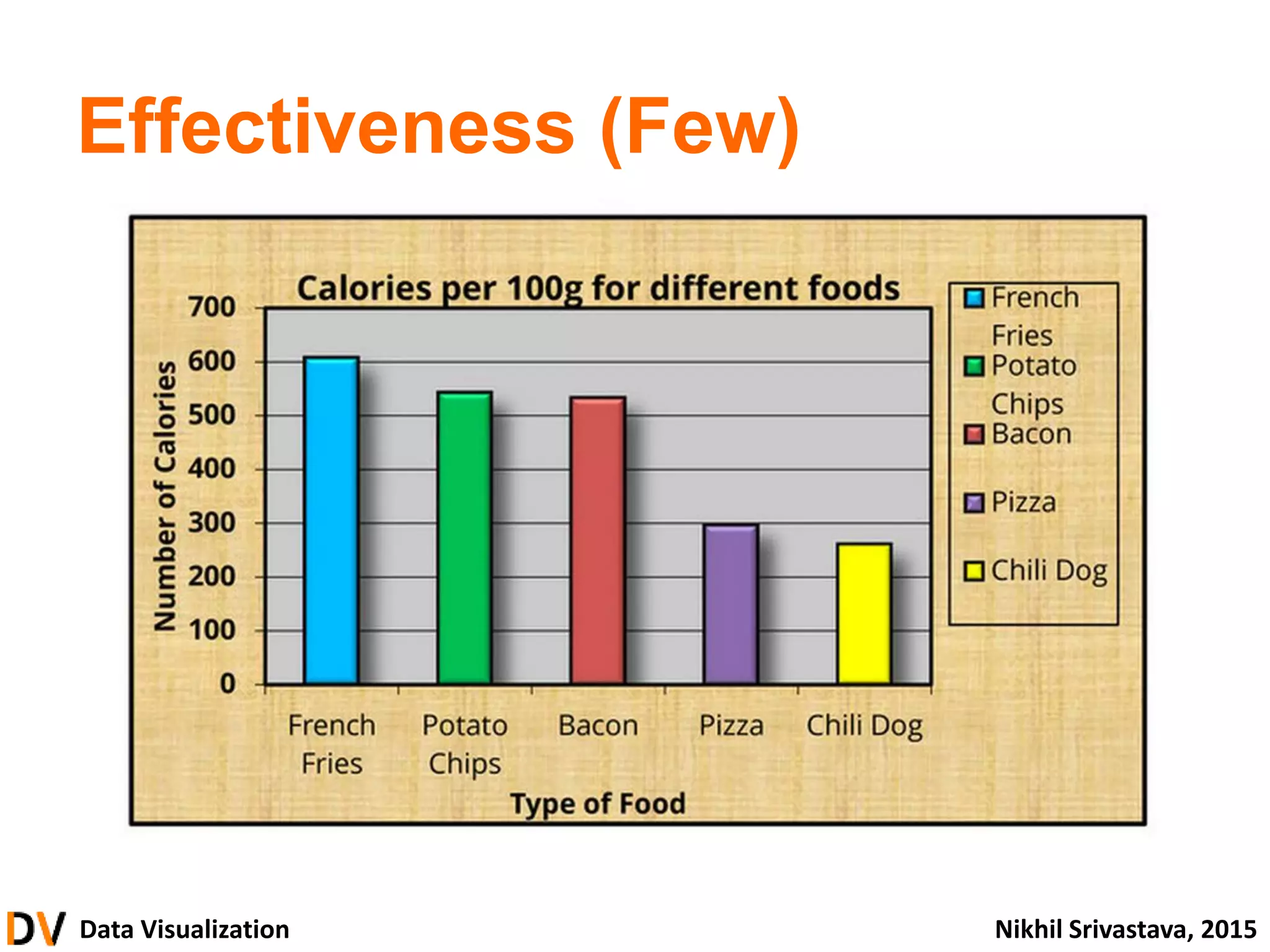
• Effectiveness
– Achieve visualization objectives
• Aesthetics
– Be compelling, vivid, beautiful
74.
Data Visualization NikhilSrivastava, 2015
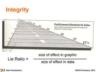
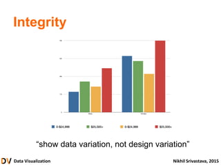
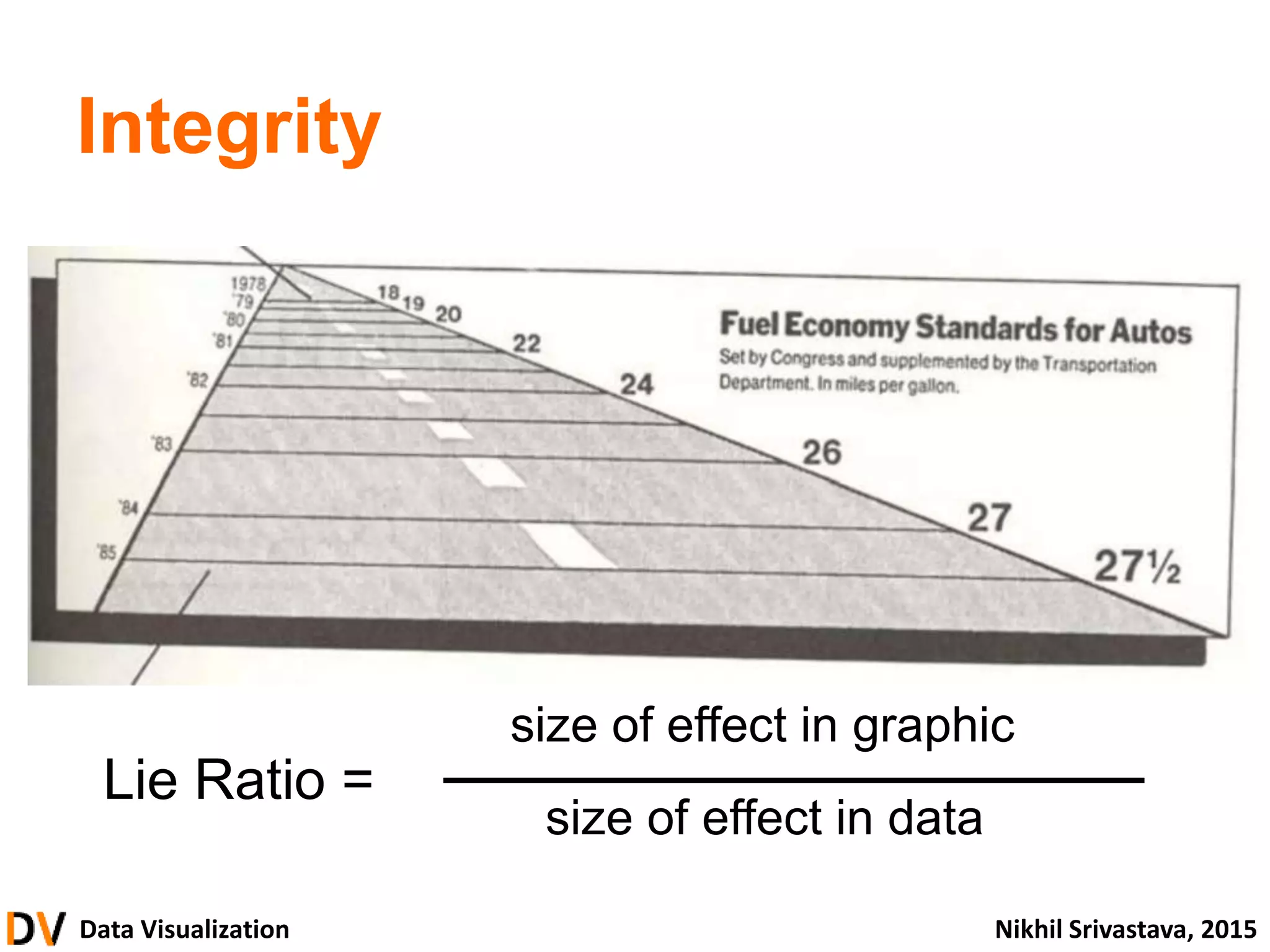
Integrity
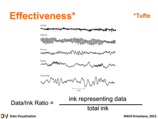
Lie Ratio =
size of effect in graphic
size of effect in data
Data Visualization NikhilSrivastava, 2015
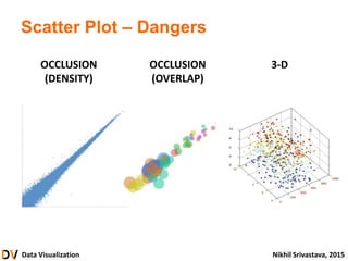
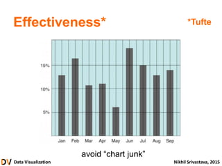
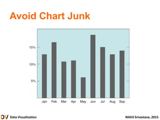
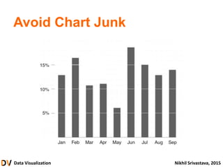
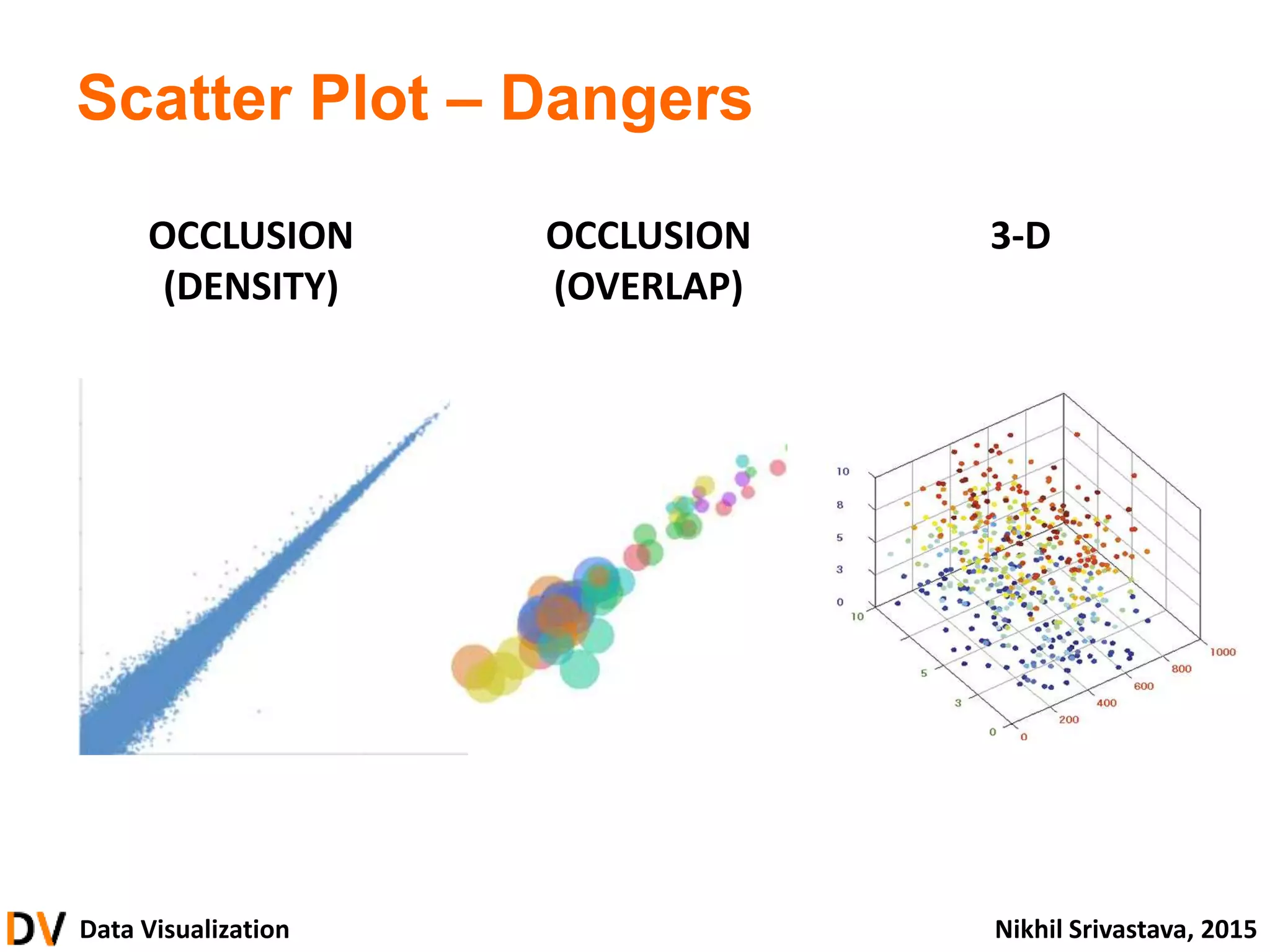
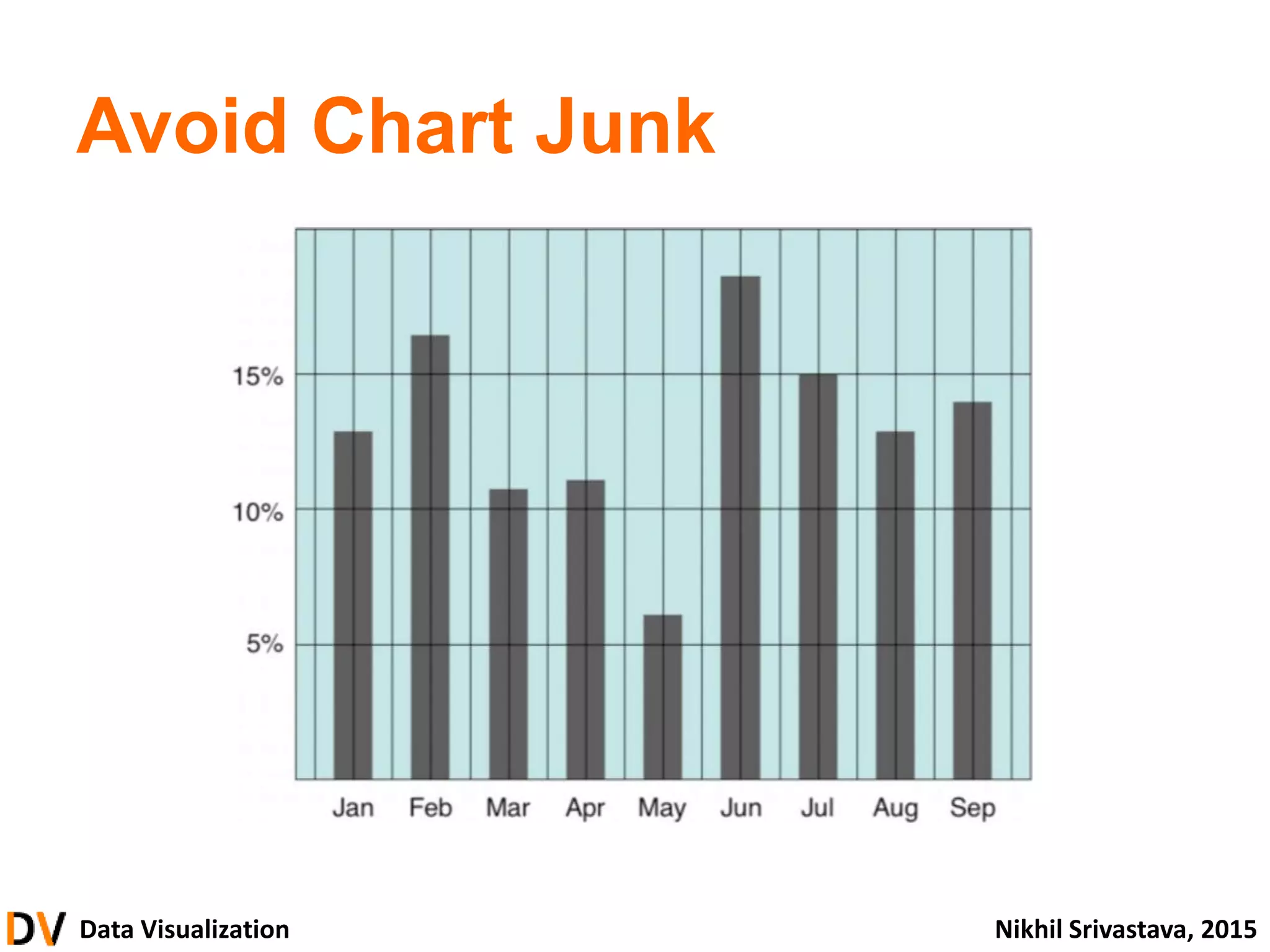
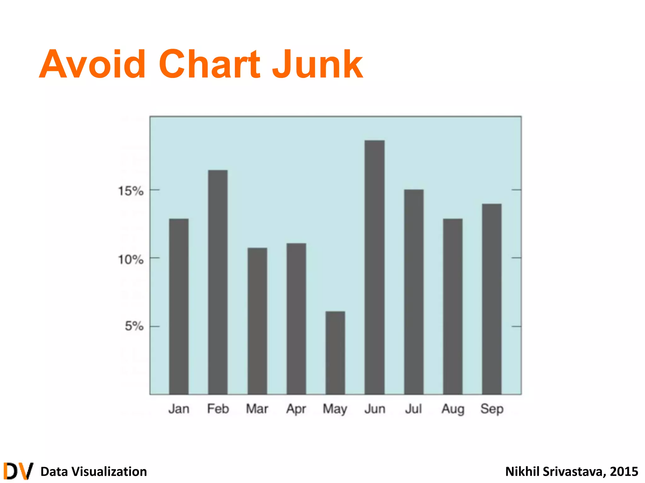
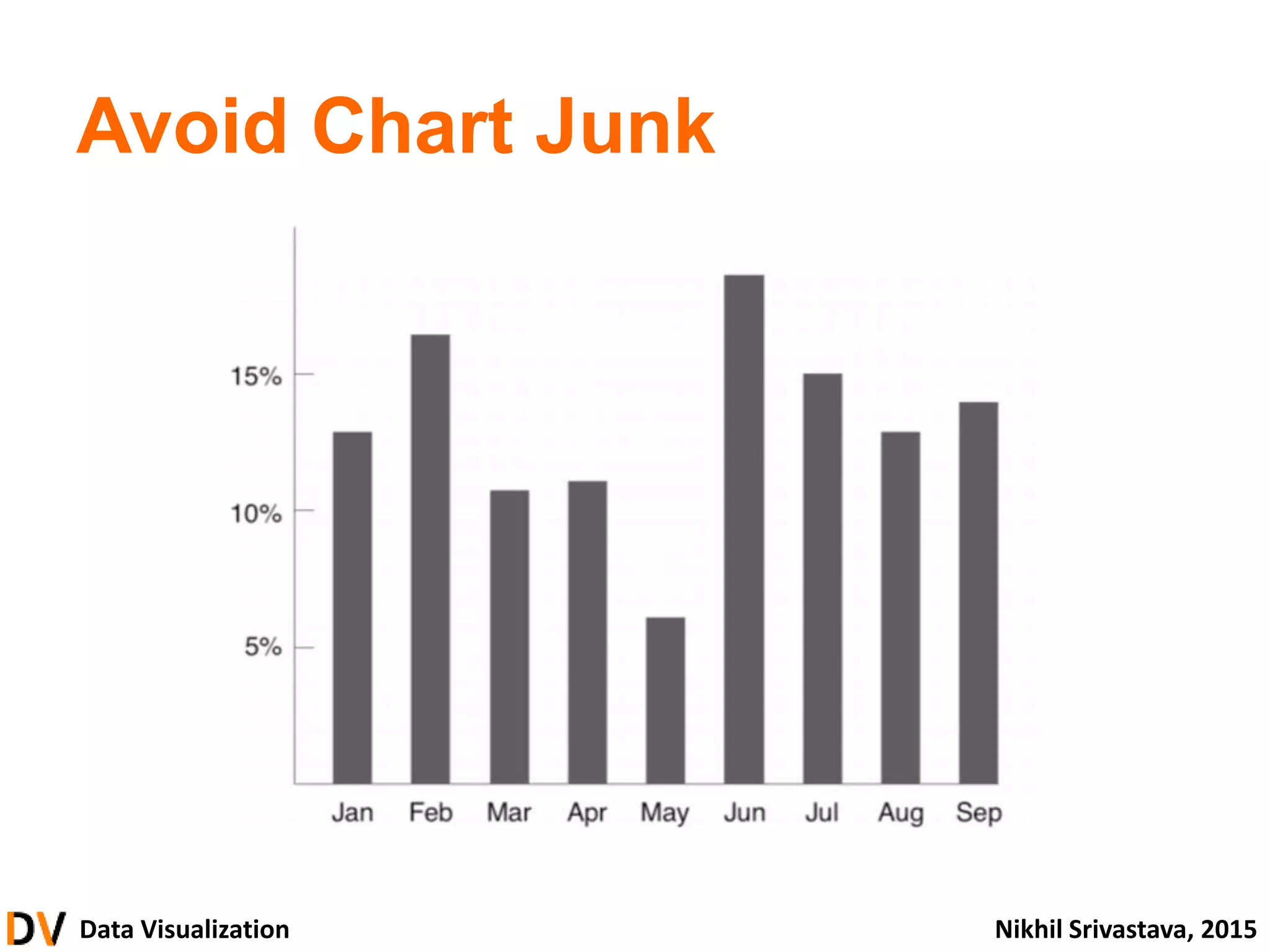
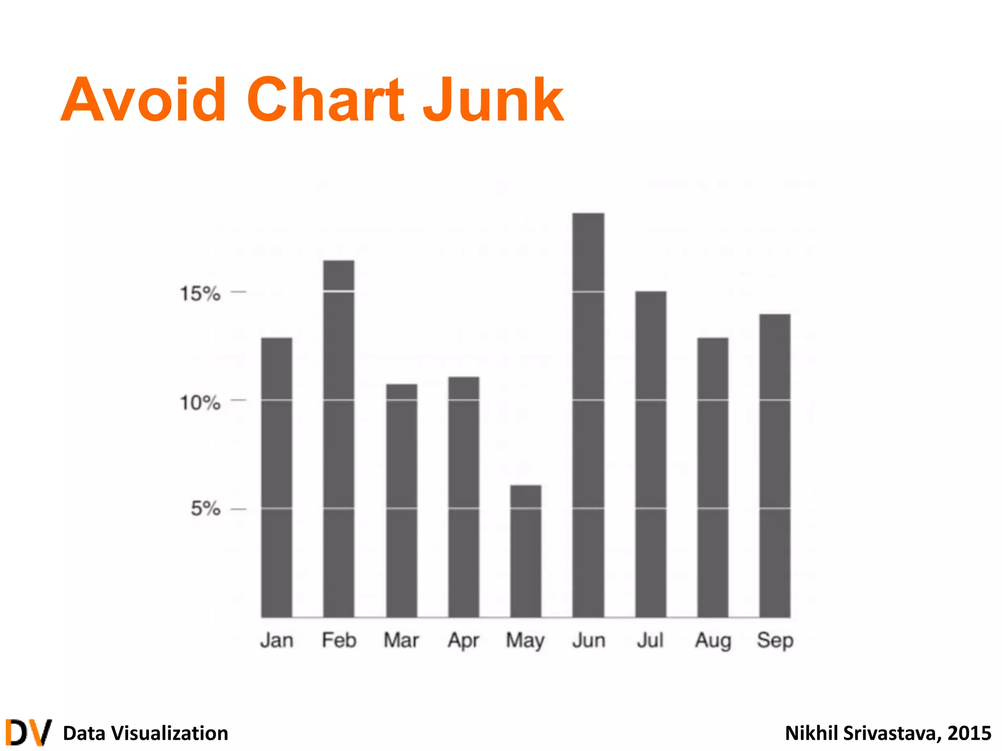
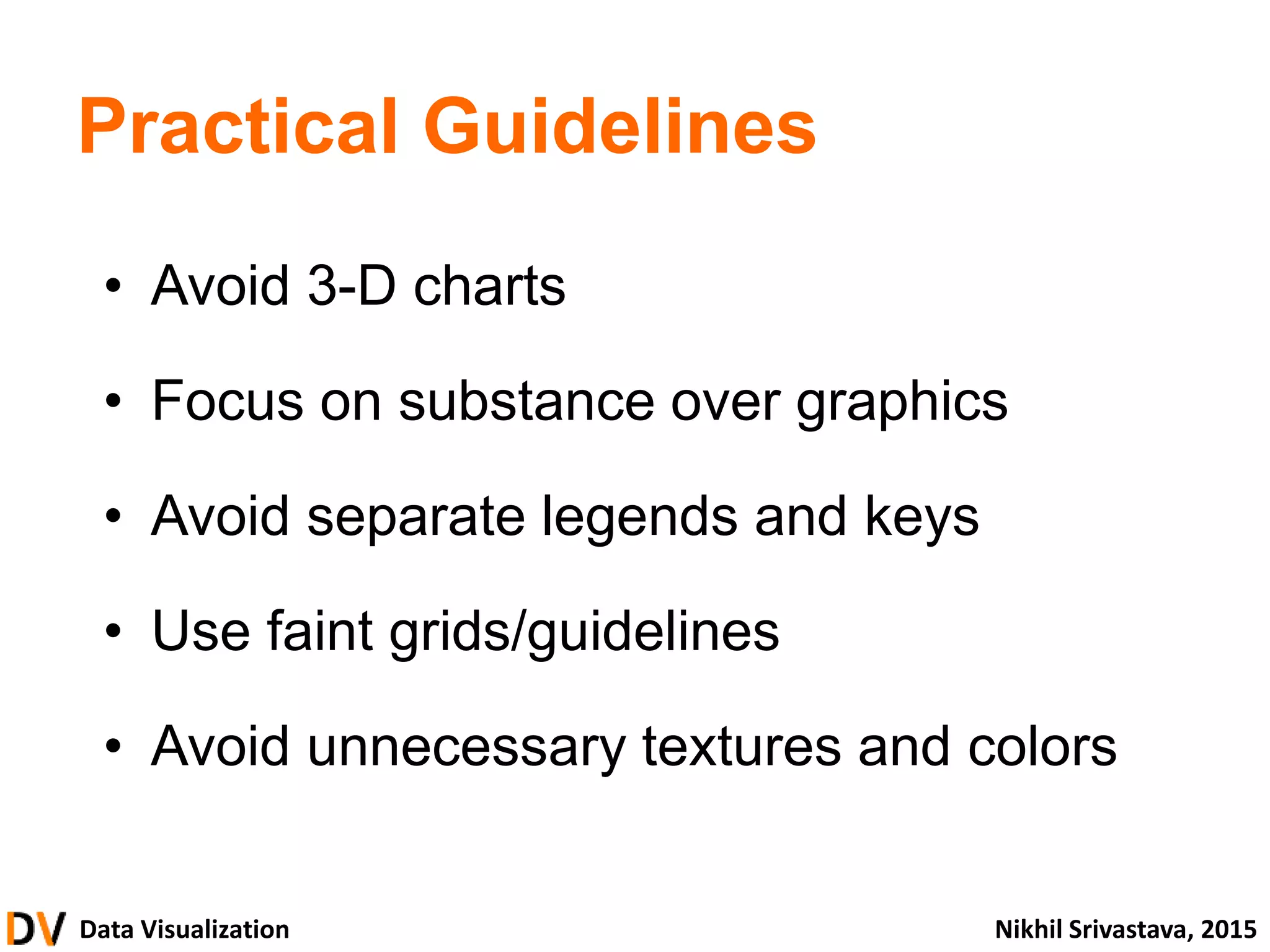
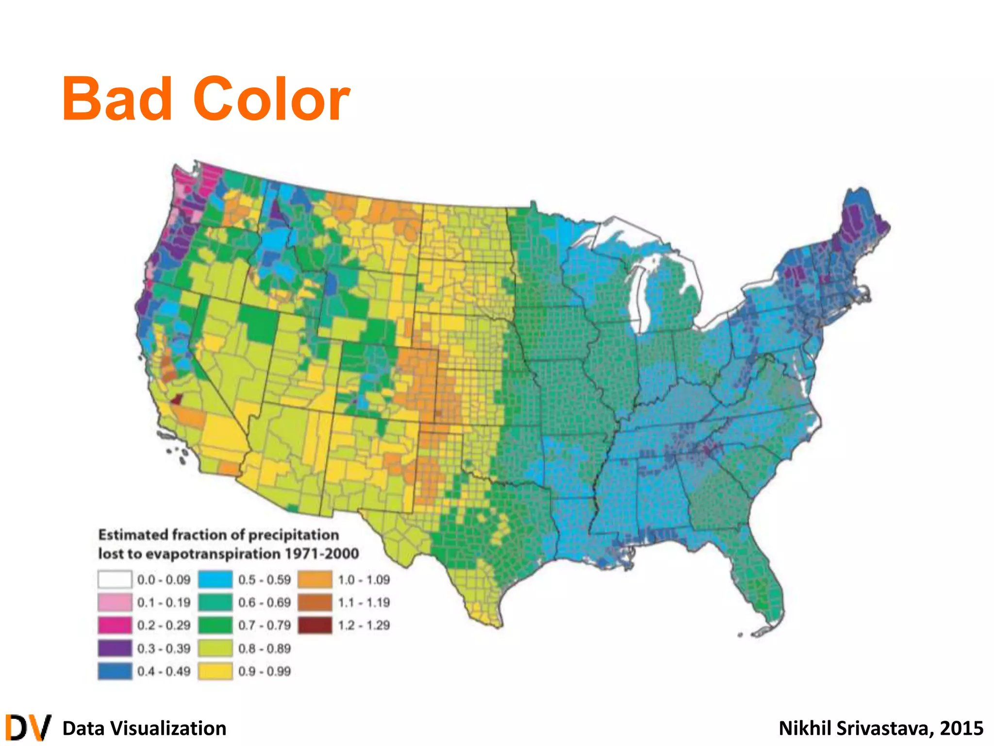
Practical Guidelines
• Avoid 3-D charts
• Focus on substance over graphics
• Avoid separate legends and keys
• Use faint grids/guidelines
• Avoid unnecessary textures and colors
87.
Data Visualization NikhilSrivastava, 2015
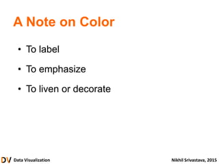
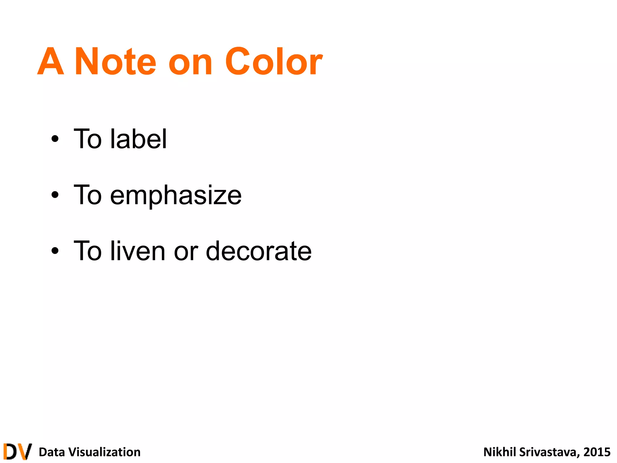
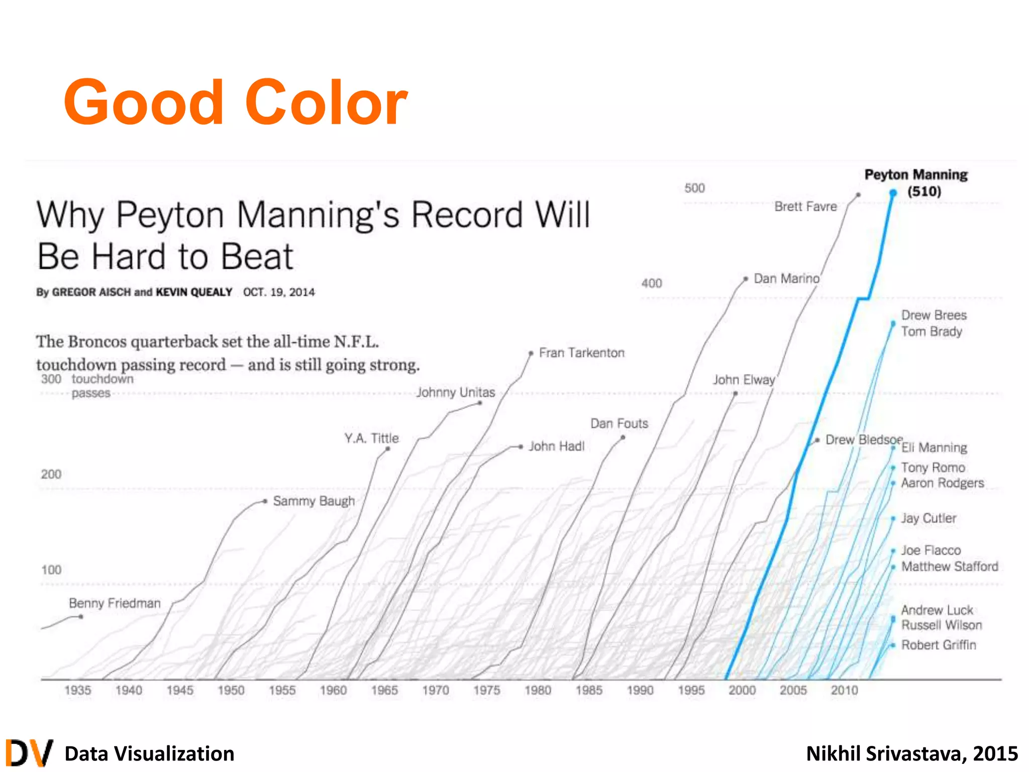
A Note on Color
• To label
• To emphasize
• To liven or decorate
88.
Data Visualization NikhilSrivastava, 2015
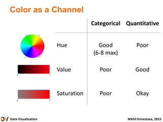
Color as a Channel
Categorical Quantitative
Hue Good
(6-8 max)
Poor
Value Poor Good
Saturation Poor Okay
Data Visualization NikhilSrivastava, 2015
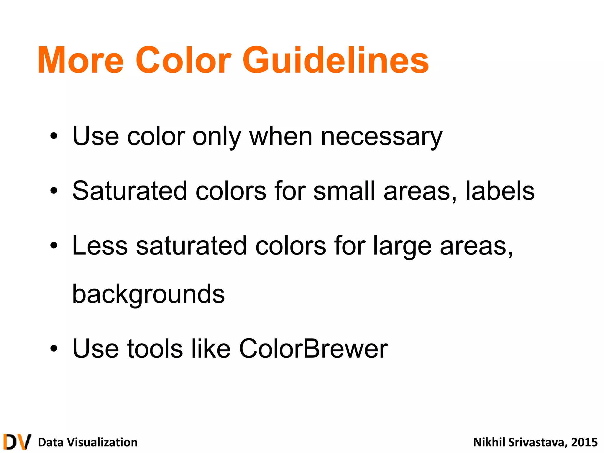
More Color Guidelines
• Use color only when necessary
• Saturated colors for small areas, labels
• Less saturated colors for large areas,
backgrounds
• Use tools like ColorBrewer
92.
Data Visualization NikhilSrivastava, 2015
• What is Data Visualization?
• Thinking and Seeing
• From Data to Graphics
• Principles and Guidelines
• Building Visualizations
• Advanced
introduction
foundation & theory
building blocks
design & critique
construction
Data Visualization NikhilSrivastava, 2015
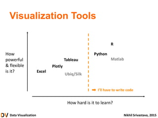
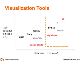
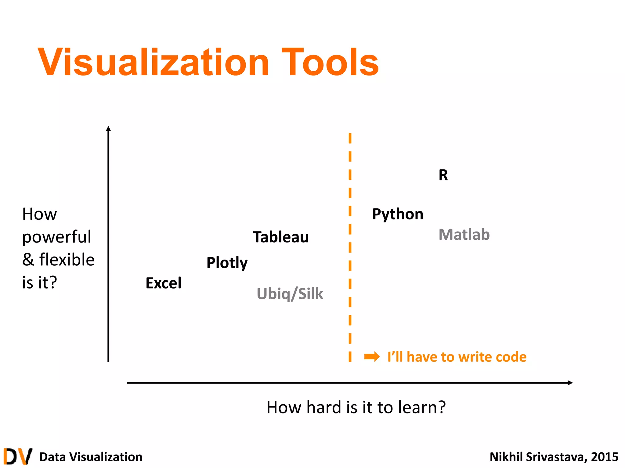
Visualization Tools
Excel
Tableau
Plotly
Python
R
Matlab
Ubiq/Silk
How hard is it to learn?
How
powerful
& flexible
is it?
I’ll have to write code
95.
Data Visualization NikhilSrivastava, 2015
Visualization Tools
Excel
Tableau
Plotly
Python
R
Matlab
Ubiq/Silk
How hard is it to learn?
How
powerful
& flexible
is it?
Google Charts
Highcharts
d3
I’ll have to write code
96.
Data Visualization NikhilSrivastava, 2015
Cheat Sheets
• For Hackathon participants
• Otherwise, email me
97.
Data Visualization NikhilSrivastava, 2015
• What is Data Visualization?
• Thinking and Seeing
• From Data to Graphics
• Principles and Guidelines
• Building Visualizations
• Advanced
introduction
foundation & theory
building blocks
design & critique
construction
#7 Alright, let’s get started – what is data visualization?
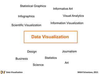
#8 It’s difficult to define precisely: as a field, DV has many related and overlapping goals and descriptions. It is often used interchangeably with different terms, and it falls under many different disciplines.
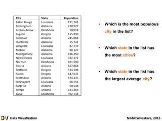
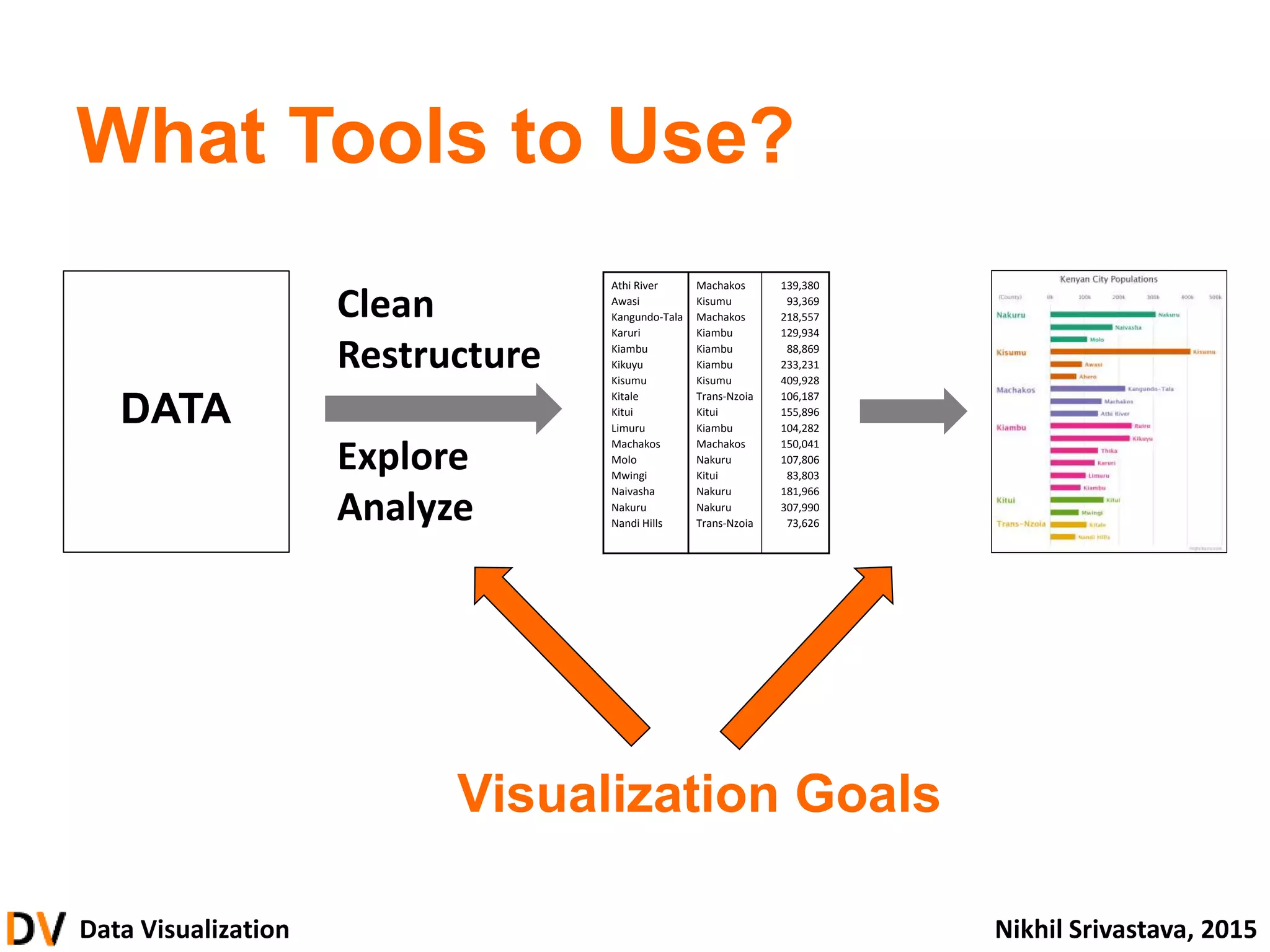
#9 Better than a definition is an example. Let’s take a look at this table of Kenyan cities showing city name, county name, and city population. Take a moment to understand the structure of this data, because I’m about to ask you a few questions on it.
#10 Better than a definition is an example. Let’s take a look at this table of Kenyan cities showing city name, county name, and city population. Take a moment to understand the structure of this data, because I’m about to ask you a few questions on it.
#11 Now, let’s answer the same questions by using the visualization.
What are the cognitive steps required?
How easy or difficult is the process?
#12 Now, let’s answer the same questions by using the visualization.
What are the cognitive steps required?
How easy or difficult is the process?
#13 Now let’s ask an additional question we didn’t ask before.
#14 We’ve learned that data visualization can be useful in telling us things about a set of data, making it easier to find information and answer questions. We’ve also learned that this usefulness depends both on the design of the visualization and the specific information we are looking for.
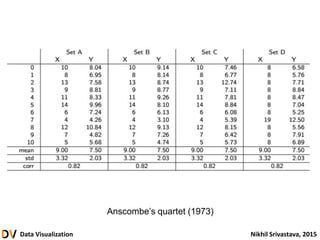
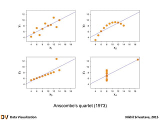
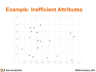
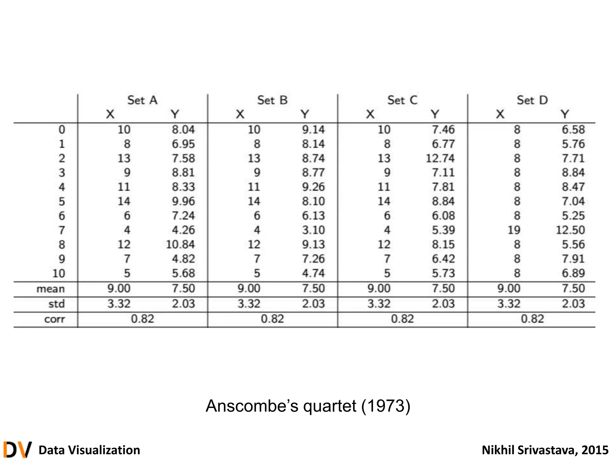
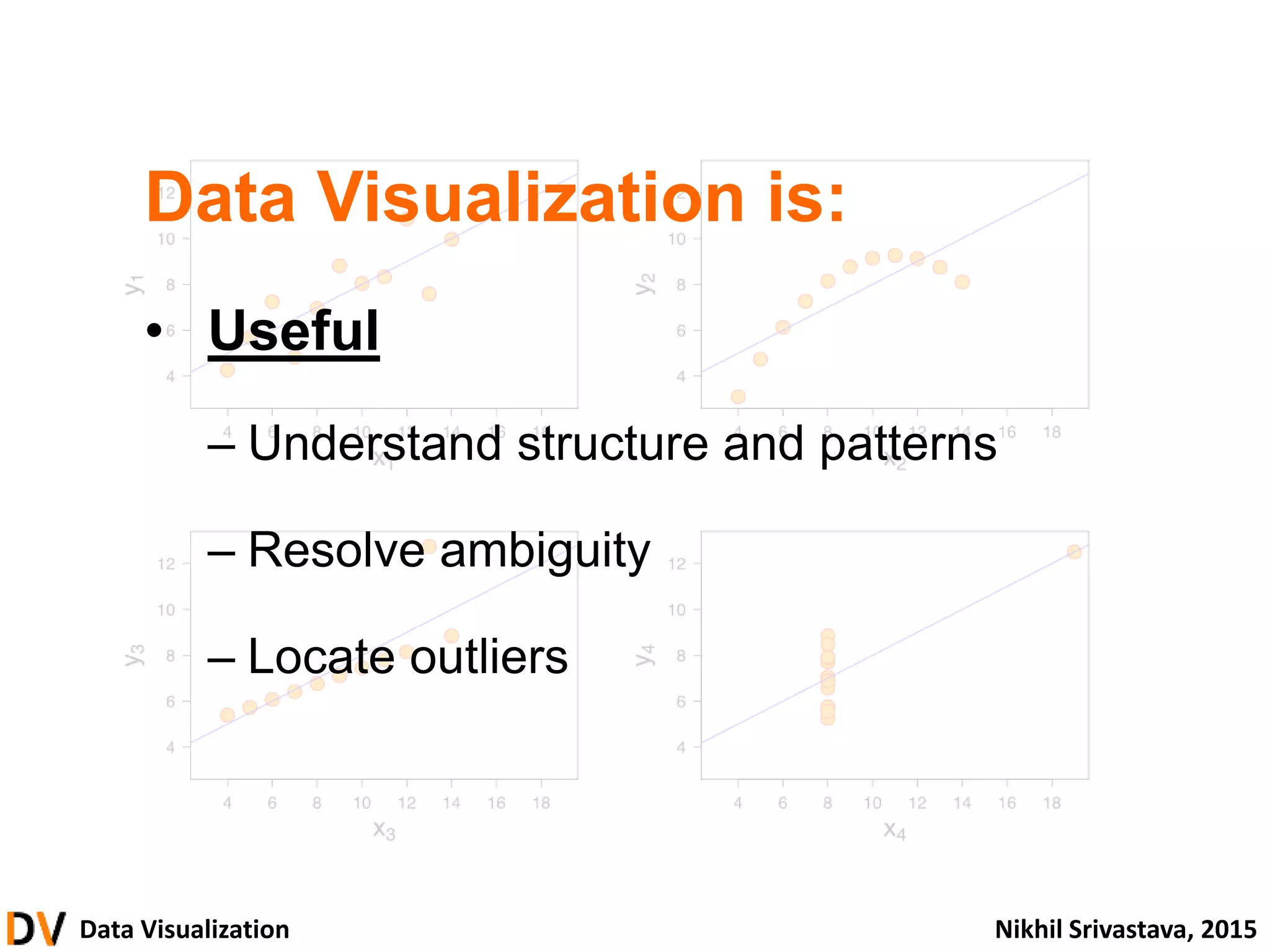
#15 Let’s take a look at another example. This is a data set called Anscombe’s Quartet, named after the statistician who devised it. It consists of four separate sets of data, each of which is a list of ten pairs of numbers. So there are ten different X and Y values that are paired. To make this a bit more concrete, you can imagine that each data set describes ten people, X represents their height and Y represents their weight.
The interesting thing is that all four of these data sets have exactly the same relationship between the X and Y numbers. All X values have the same average and standard deviation, and so do all Y values. Furthermore, the correlation between X and Y is the same for all sets.
And except for the last one (which has a bunch of 8s), there’s not much we can do to distinguish them or describe them meaningfully by just looking at the numbers in the table. Now let’s see what happens when we plot them.
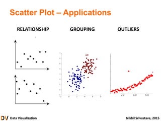
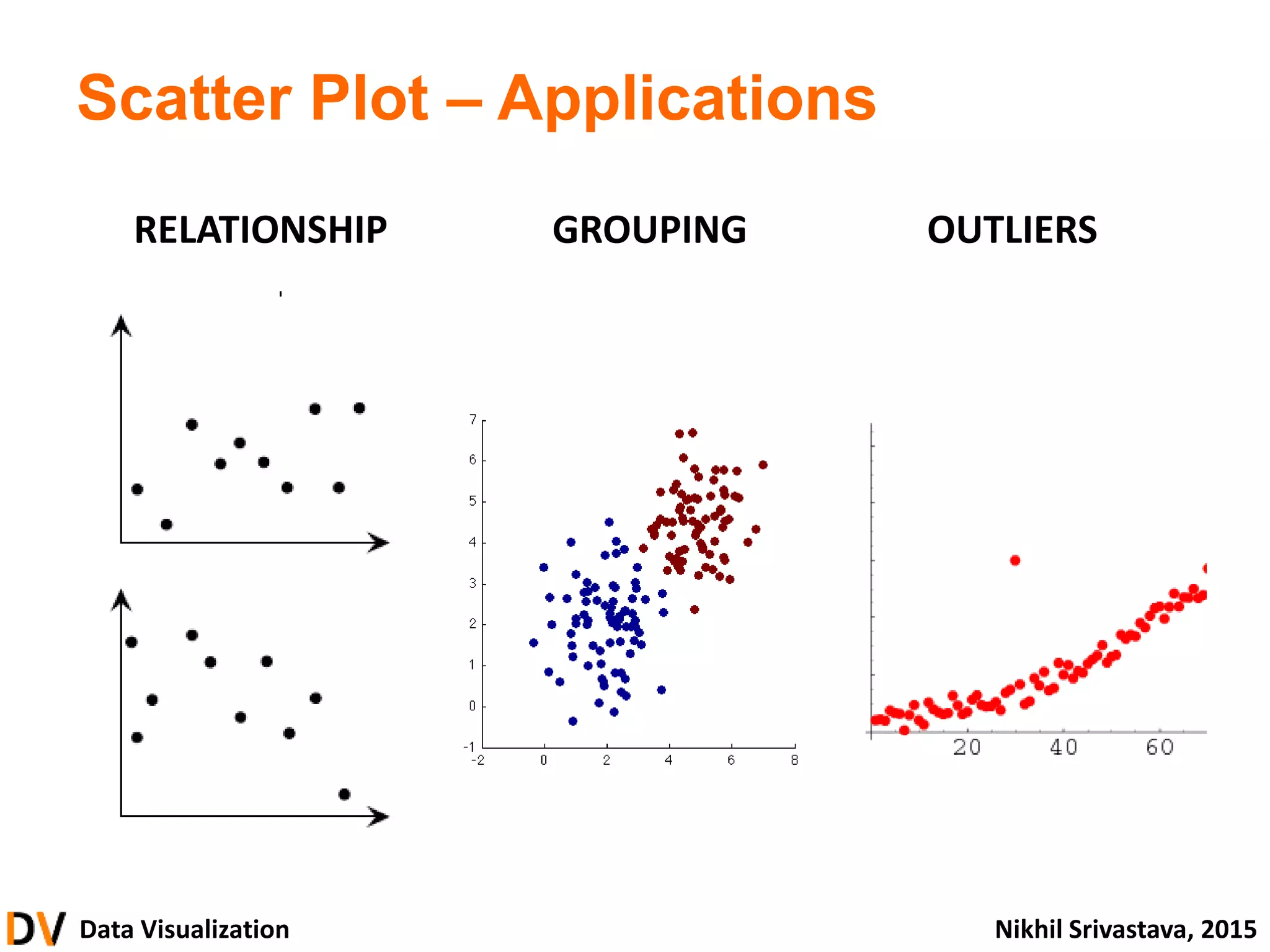
#16 Here we’ve visualized the data in what’s known as a scatter plot. Each dot represents one of the ten pairs, located on the horizontal axis by X value and on the vertical axis by Y value.
By visualizing the data, we see patterns, outliers, and relationships that were impossible to detect in the chart.
#17 So we’ve learned that DV is important. It can help us resolve ambiguous data, locate outliers, and generally understand the structure and pattern of a data set.
#20 Infographic of twitter activity in Africa in late 2013 produced by Portland Communications.
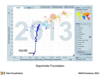
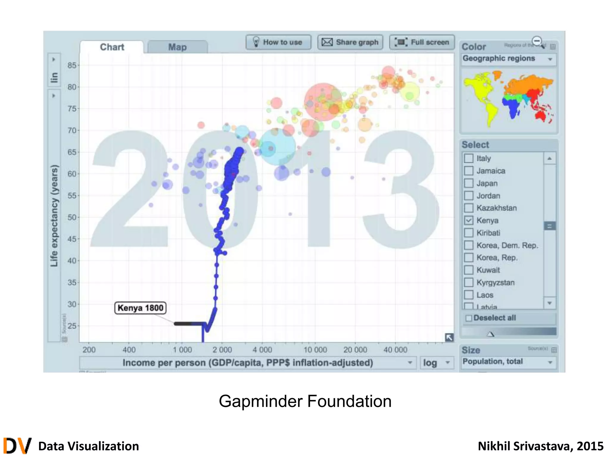
#21 Interactive tool from the Gapminder Foundation animating the health and wealth of world countries over time. This screenshot shows the historical path of Kenya from 1800 to 2013.
Note the number of data types (life expectancy, GDP, population per country and year) and variety of visual encodings (x- and y- position, size, color, time).
#24 Alright, let’s get started – what is data visualization?
#51 Readings in Information Visualization: Using Vision to Think (Ben Schneiderman et al, 1999)