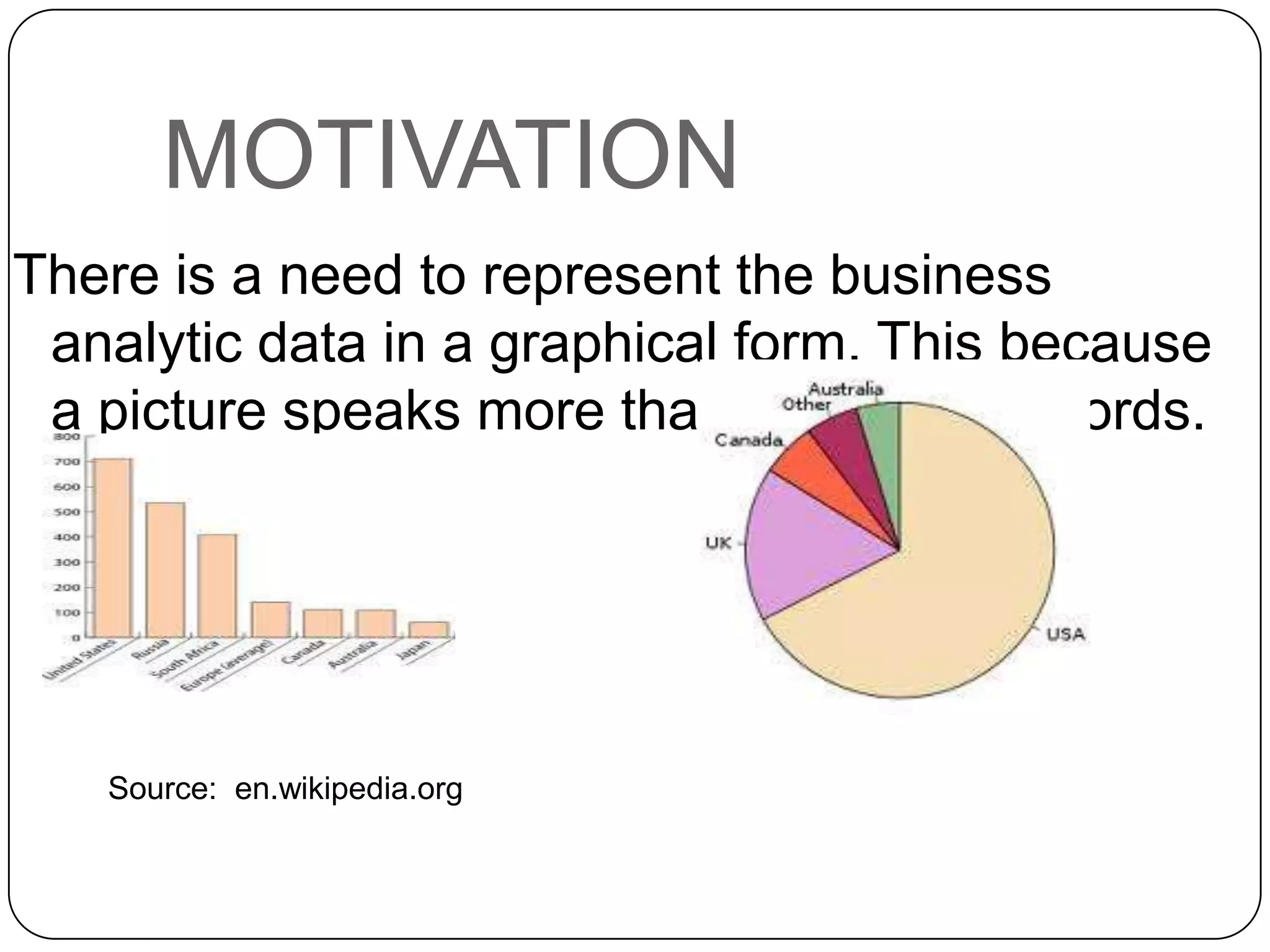
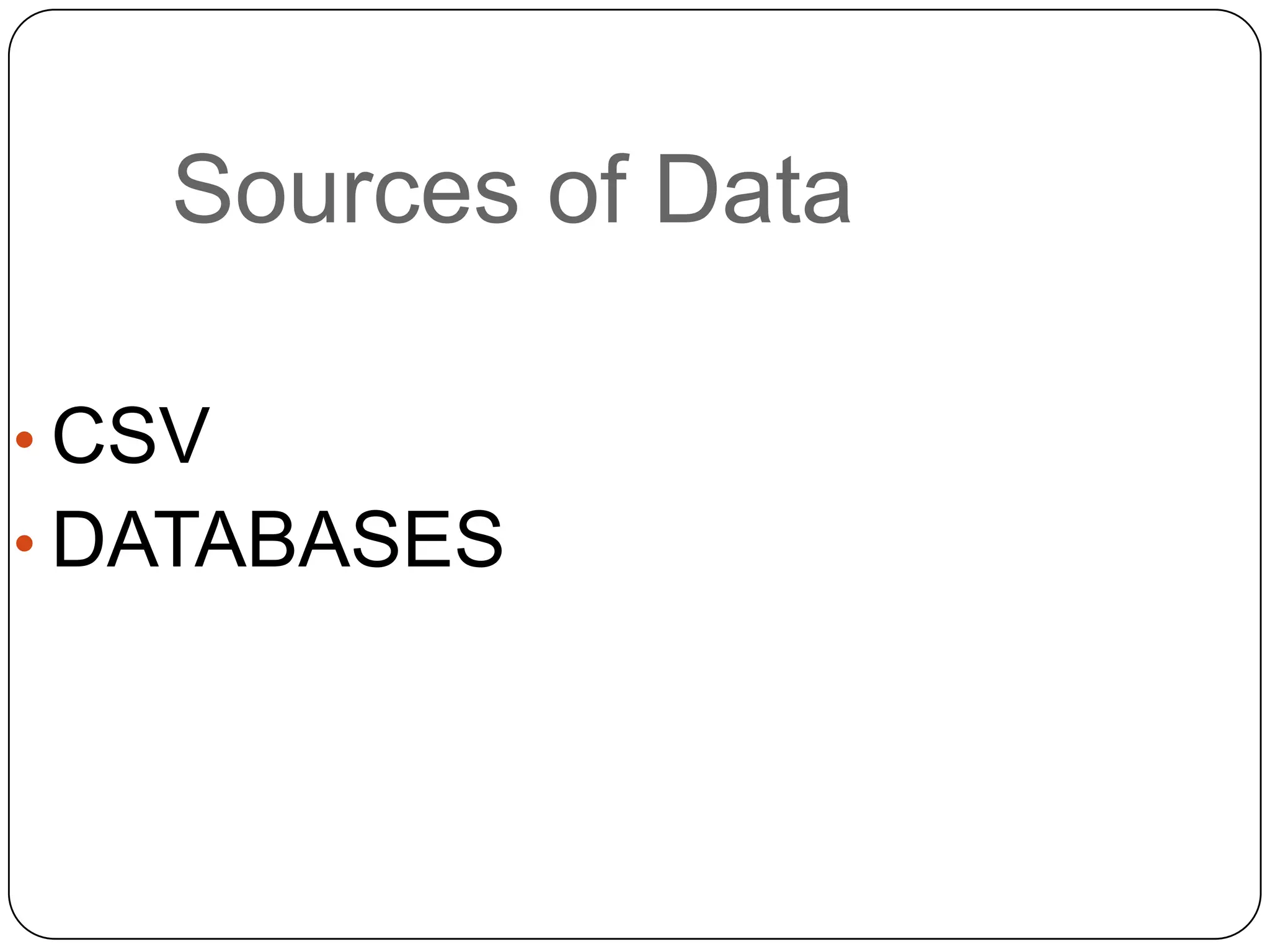
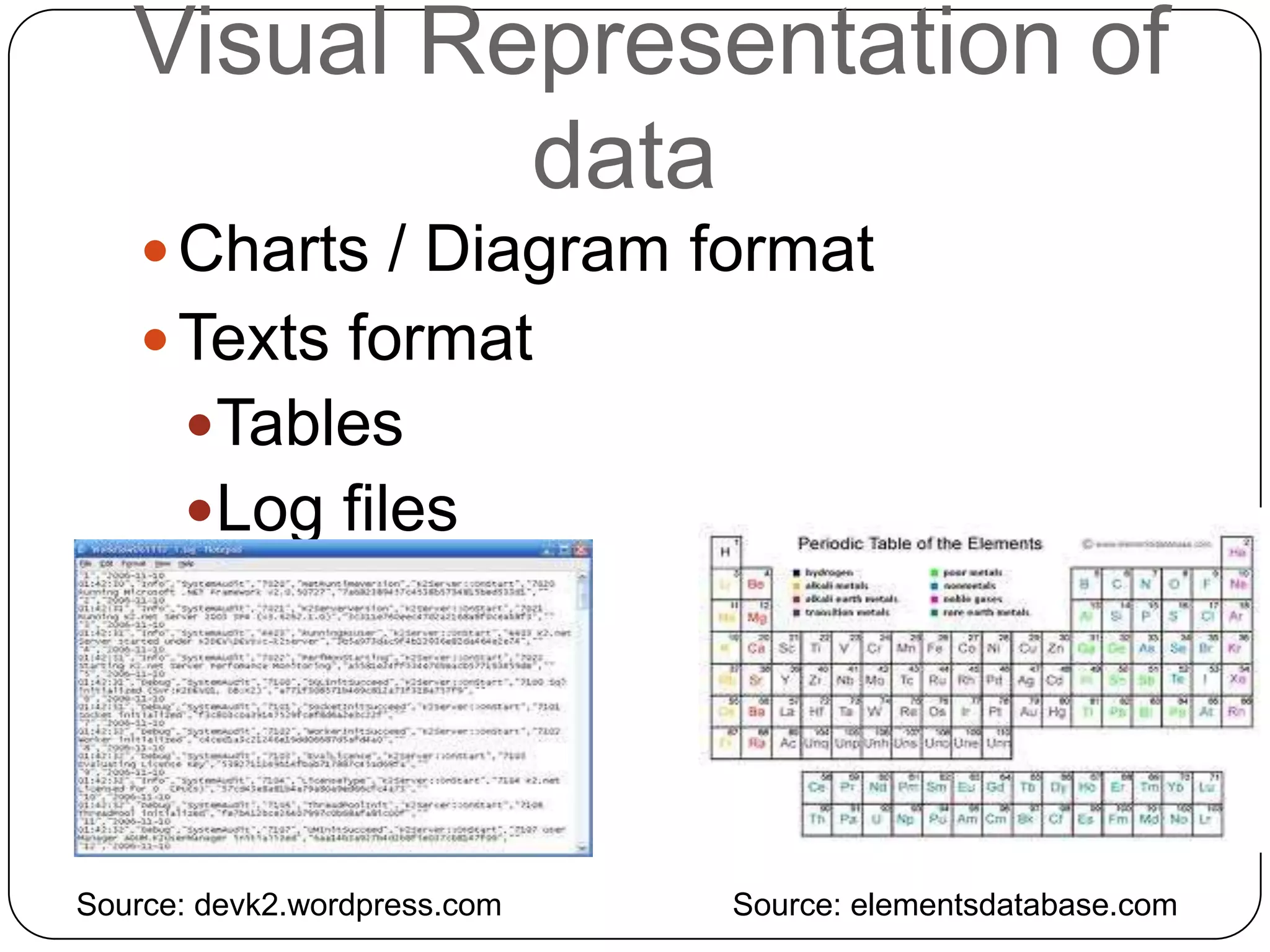
KEMBAR78
Data visualization in python/Django | PPTX
Data Visualization in
  Python/Django
   By KENNETH EMEKA ODOH
     By KENNETH EMEKA
     ODOH
Table of Contents
Introduction
Motivation
Method
Appendices
Conclusion
References
Introduction
 My background
 Requirements (
 Python, Django, Matplotlib, ajax ) and other
 third-party libraries.

 What this talk is not about ( we are not trying
 to re-implement Google analytics ).

 Source codes are available at (
  https://github.com/kenluck2001/PyCon2012
  _Talk ).
"Everything should be made as simple as
MOTIVATION
There is a need to represent the business
 analytic data in a graphical form. This because
 a picture speaks more than a thousand words.


   Source: en.wikipedia.org
Where do we find
data?


   Source: en.wikipedia.org
Sources of Data

• CSV
• DATABASES
Data Processing
 Identify the data source.
 Preprocessing of the data (
  removing nulls, wide characters
  ) e.g. Google refine.
 Actual data processing.
 Present the clean data in
  descriptive format. i.e. Data
  visualization
   See Appendix 1
Visual Representation of
            data
     Charts / Diagram format
     Texts format
      Tables
      Log files


Source: devk2.wordpress.com   Source: elementsdatabase.com
Categorization of data
Real-time
 See Appendix 2
Batch-based
  See Appendix 2
Rules of Data Collection
 Keep data in the easiest
  processable form e.g
  database, csv
 Keep data collected with
  timestamp.
 Gather data that are relevant to
  the business needs.
 Remove old data
Where is the data
   visualization done?
 Server
  See Appendix from 2 - 6
 Client
  Examples of Javascript library
  DS.js ( http://d3js.org/ )
  gRaphael.js (
   http://g.raphaeljs.com/ )
Factors to Consider for
Choice of Visualization
 Where do we perform the
  visualization processing?
 Is it Server or Client?


It depends
 Security
 Scalability
Tools needed for data
analysis
 Csvkit (
  http://csvkit.readthedocs.org/en/latest/ )
 networkx ( http://networkx.lanl.gov/ )
 pySAL ( http://code.google.com/p/pysal/
  )
Appendices
Let the codes begin


     Source:
     caseinsights.com
Appendix 1
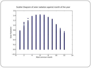
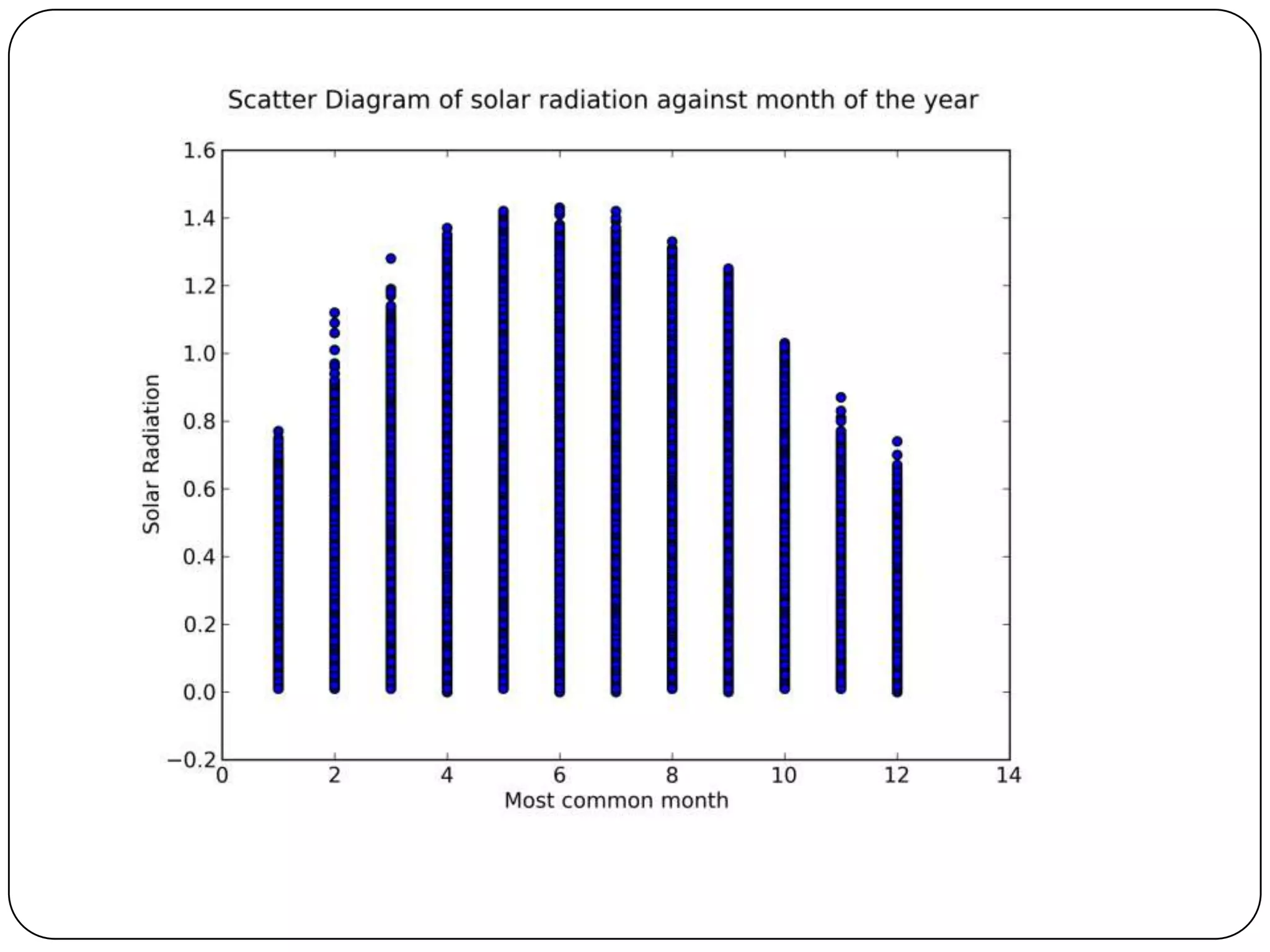
## This describes a scatter plot of solar radiation against the month.
This aim to describe the steps of data gathering.CSV file from data science
hackathon website. The source code is available in a folder named
“plotCode”

import csv
from matplotlib.backends.backend_agg
import FigureCanvasAgg as FigureCanvas
from matplotlib.figure import Figure

def prepareList(month_most_common_list):
''' Prepare the input for process by removing all unnecessary values. Replace "NA"
with 0''„
    output_list = []
    for x in month_most_common_list:
    if x != 'NA':
        output_list.append(x)
    else:
        output_list.append(0)
    return output_list
Appendix 1
def plotSolarRadiationAgainstMonth(filename):
                                                                contd.
  trainRowReader = csv.reader(open(filename, 'rb'), delimiter=',')
  month_most_common_list = []
  Solar_radiation_64_list = []
  for row in trainRowReader:
      month_most_common = row[3]
      Solar_radiation_64 = row[6]
      month_most_common_list.append(month_most_common)
      Solar_radiation_64_list.append(Solar_radiation_64)
  #convert all elements in the list to float while skipping the first element for the 1st element is a
description of the field.
  month_most_common_list = [float(i) for i in prepareList(month_most_common_list)[1:] ]
  Solar_radiation_64_list = [float(i) for i in prepareList(Solar_radiation_64_list)[1:] ]
  fig=Figure()
  ax=fig.add_subplot(111)
  title='Scatter Diagram of solar radiation against month of the year'
  ax.set_xlabel('Most common month')
  ax.set_ylabel('Solar Radiation')
  fig.suptitle(title, fontsize=14)
  try:
      ax.scatter(month_most_common_list, Solar_radiation_64_list)
      #it is possible to make other kind of plots e.g bar charts, pie charts, histogram
  except ValueError:
      pass
  canvas = FigureCanvas(fig)
  canvas.print_figure('solarRadMonth.png',dpi=500)

  if __name__ == "__main__":
      plotSolarRadiationAgainstMonth('TrainingData.csv')
Appendix 2
From the project in folder named WebMonitor

class LoadEvent:
…
def fillMonitorModel(self):
   for monObj in self.monitorObjList:
      mObj = Monitor(url = monObj[2], httpStatus =
monObj[0], responseTime = monObj[1], contentStatus
= monObj[5])
      mObj.save()

#also see the following examples in project named
YAAStasks.py This shows how the analytic tables are
loaded with real-time data.
Appendix 3
from django.http import HttpResponse
from matplotlib.backends.backend_agg
import FigureCanvasAgg as FigureCanvasfrom matplotlib.figure
import Figurefrom YAAS.stats.models import RegisteredUser, OnlineUser, StatBid #scatter diagram of number of bids
made against number of online users
# weekly report
@staff_member_required
def weeklyScatterOnlinUsrBid(request, week_no):
   page_title='Weekly Scatter Diagram based on Online user verses Bid'
   weekno=week_no
   fig=Figure()
   ax=fig.add_subplot(111)
   year=stat.getYear()
   onlUserObj = OnlineUser.objects.filter(week=weekno).filter(year=year)
   bidObj = StatBid.objects.filter(week=weekno).filter(year=year)
   onlUserlist = list(onlUserObj.values_list('no_of_online_user', flat=True))
   bidlist = list(bidObj.values_list('no_of_bids', flat=True))
    title='Scatter Diagram of number of online User against number of bids (week {0}){1}'.format(weekno,year)
   ax.set_xlabel('Number of online Users')
   ax.set_ylabel('Number of Bids')
   fig.suptitle(title, fontsize=14)
   try:
       ax.scatter(onlUserlist, bidlist)
    except ValueError:
       pass
   canvas = FigureCanvas(fig)
   response = HttpResponse(content_type='image/png')
   canvas.print_png(response)
   return response

More info. can be found in YAAS/graph/The folder named
"graph"
Appendix 4
# Example of how database may be deleted to recover some space.
From folder named “YAAS”. Check task.py
@periodic_task(run_every=crontab(hour=1, minute=30, day_of_week=
0))
def deleteOldItemsandBids():
   hunderedandtwentydays = datetime.today() -
datetime.timedelta(days=120)
   myItem = Item.objects.filter(end_date__lte=hunderedandtwentydays
).delete()
   myBid = Bid.objects.filter(end_date__lte=hunderedandtwentydays
).delete()#populate the registereduser and onlineuser model at regular
intervals
Appendix 5

Check project in
YAAS/stats/

for more information on
statistical processing
Appendix 6
 # how to refresh the views in django. To keep the charts.
 updated. See WebMonitor project

 {% extends "base.html" %}

 {% block site_wrapper %}
 <div id="messages">Updating tables ...</div>
 <script>
    function refresh() {
       $.ajax({
              url: "/monitor/",
              success: function(data) {
 $('#messages').html(data);
              }
      });
         setInterval("refresh()", 100000);
  }
 $(function(){ refresh(); });
 </script>
 {% endblock %}
References
 Python documentation ( http://www.python.org/ )
 Django documentation (
  https://www.djangoproject.com/ )
 Stack overflow ( http://stackoverflow.com/ )
 Celery documentation
  (http://ask.github.com/celery/)


Pictures
 email logo ( http:// ambrosedesigns.co.uk )
 blog logo ( http:// sociolatte.com )
Thanks for listening
           Follow me using any of


                    @kenluck2001

                    kenluck2001@yahoo.com


                    http://kenluck2001.tumblr.com
                    /

                    https://github.com/kenluck200
                    1

Data visualization in python/Django

  • 1.
    Data Visualization in Python/Django By KENNETH EMEKA ODOH By KENNETH EMEKA ODOH
  • 2.
  • 3.
    Introduction  My background Requirements ( Python, Django, Matplotlib, ajax ) and other third-party libraries.  What this talk is not about ( we are not trying to re-implement Google analytics ).  Source codes are available at ( https://github.com/kenluck2001/PyCon2012 _Talk ). "Everything should be made as simple as
  • 4.
    MOTIVATION There is aneed to represent the business analytic data in a graphical form. This because a picture speaks more than a thousand words. Source: en.wikipedia.org
  • 5.
    Where do wefind data? Source: en.wikipedia.org
  • 6.
    Sources of Data •CSV • DATABASES
  • 7.
    Data Processing  Identifythe data source.  Preprocessing of the data ( removing nulls, wide characters ) e.g. Google refine.  Actual data processing.  Present the clean data in descriptive format. i.e. Data visualization See Appendix 1
  • 8.
    Visual Representation of data  Charts / Diagram format  Texts format Tables Log files Source: devk2.wordpress.com Source: elementsdatabase.com
  • 9.
    Categorization of data Real-time See Appendix 2 Batch-based See Appendix 2
  • 10.
    Rules of DataCollection  Keep data in the easiest processable form e.g database, csv  Keep data collected with timestamp.  Gather data that are relevant to the business needs.  Remove old data
  • 11.
    Where is thedata visualization done?  Server See Appendix from 2 - 6  Client Examples of Javascript library DS.js ( http://d3js.org/ ) gRaphael.js ( http://g.raphaeljs.com/ )
  • 12.
    Factors to Considerfor Choice of Visualization  Where do we perform the visualization processing?  Is it Server or Client? It depends  Security  Scalability
  • 13.
    Tools needed fordata analysis  Csvkit ( http://csvkit.readthedocs.org/en/latest/ )  networkx ( http://networkx.lanl.gov/ )  pySAL ( http://code.google.com/p/pysal/ )
  • 14.
    Appendices Let the codesbegin Source: caseinsights.com
  • 15.
    Appendix 1 ## Thisdescribes a scatter plot of solar radiation against the month. This aim to describe the steps of data gathering.CSV file from data science hackathon website. The source code is available in a folder named “plotCode” import csv from matplotlib.backends.backend_agg import FigureCanvasAgg as FigureCanvas from matplotlib.figure import Figure def prepareList(month_most_common_list): ''' Prepare the input for process by removing all unnecessary values. Replace "NA" with 0''„ output_list = [] for x in month_most_common_list: if x != 'NA': output_list.append(x) else: output_list.append(0) return output_list
  • 16.
    Appendix 1 def plotSolarRadiationAgainstMonth(filename): contd. trainRowReader = csv.reader(open(filename, 'rb'), delimiter=',') month_most_common_list = [] Solar_radiation_64_list = [] for row in trainRowReader: month_most_common = row[3] Solar_radiation_64 = row[6] month_most_common_list.append(month_most_common) Solar_radiation_64_list.append(Solar_radiation_64) #convert all elements in the list to float while skipping the first element for the 1st element is a description of the field. month_most_common_list = [float(i) for i in prepareList(month_most_common_list)[1:] ] Solar_radiation_64_list = [float(i) for i in prepareList(Solar_radiation_64_list)[1:] ] fig=Figure() ax=fig.add_subplot(111) title='Scatter Diagram of solar radiation against month of the year' ax.set_xlabel('Most common month') ax.set_ylabel('Solar Radiation') fig.suptitle(title, fontsize=14) try: ax.scatter(month_most_common_list, Solar_radiation_64_list) #it is possible to make other kind of plots e.g bar charts, pie charts, histogram except ValueError: pass canvas = FigureCanvas(fig) canvas.print_figure('solarRadMonth.png',dpi=500) if __name__ == "__main__": plotSolarRadiationAgainstMonth('TrainingData.csv')
  • 18.
    Appendix 2 From theproject in folder named WebMonitor class LoadEvent: … def fillMonitorModel(self): for monObj in self.monitorObjList: mObj = Monitor(url = monObj[2], httpStatus = monObj[0], responseTime = monObj[1], contentStatus = monObj[5]) mObj.save() #also see the following examples in project named YAAStasks.py This shows how the analytic tables are loaded with real-time data.
  • 19.
    Appendix 3 from django.httpimport HttpResponse from matplotlib.backends.backend_agg import FigureCanvasAgg as FigureCanvasfrom matplotlib.figure import Figurefrom YAAS.stats.models import RegisteredUser, OnlineUser, StatBid #scatter diagram of number of bids made against number of online users # weekly report @staff_member_required def weeklyScatterOnlinUsrBid(request, week_no): page_title='Weekly Scatter Diagram based on Online user verses Bid' weekno=week_no fig=Figure() ax=fig.add_subplot(111) year=stat.getYear() onlUserObj = OnlineUser.objects.filter(week=weekno).filter(year=year) bidObj = StatBid.objects.filter(week=weekno).filter(year=year) onlUserlist = list(onlUserObj.values_list('no_of_online_user', flat=True)) bidlist = list(bidObj.values_list('no_of_bids', flat=True)) title='Scatter Diagram of number of online User against number of bids (week {0}){1}'.format(weekno,year) ax.set_xlabel('Number of online Users') ax.set_ylabel('Number of Bids') fig.suptitle(title, fontsize=14) try: ax.scatter(onlUserlist, bidlist) except ValueError: pass canvas = FigureCanvas(fig) response = HttpResponse(content_type='image/png') canvas.print_png(response) return response More info. can be found in YAAS/graph/The folder named "graph"
  • 20.
    Appendix 4 # Exampleof how database may be deleted to recover some space. From folder named “YAAS”. Check task.py @periodic_task(run_every=crontab(hour=1, minute=30, day_of_week= 0)) def deleteOldItemsandBids(): hunderedandtwentydays = datetime.today() - datetime.timedelta(days=120) myItem = Item.objects.filter(end_date__lte=hunderedandtwentydays ).delete() myBid = Bid.objects.filter(end_date__lte=hunderedandtwentydays ).delete()#populate the registereduser and onlineuser model at regular intervals
  • 21.
    Appendix 5 Check projectin YAAS/stats/ for more information on statistical processing
  • 22.
    Appendix 6 #how to refresh the views in django. To keep the charts. updated. See WebMonitor project {% extends "base.html" %} {% block site_wrapper %} <div id="messages">Updating tables ...</div> <script> function refresh() { $.ajax({ url: "/monitor/", success: function(data) { $('#messages').html(data); } }); setInterval("refresh()", 100000); } $(function(){ refresh(); }); </script> {% endblock %}
  • 23.
    References  Python documentation( http://www.python.org/ )  Django documentation ( https://www.djangoproject.com/ )  Stack overflow ( http://stackoverflow.com/ )  Celery documentation (http://ask.github.com/celery/) Pictures  email logo ( http:// ambrosedesigns.co.uk )  blog logo ( http:// sociolatte.com )
  • 24.
    Thanks for listening Follow me using any of @kenluck2001 kenluck2001@yahoo.com http://kenluck2001.tumblr.com / https://github.com/kenluck200 1