The document provides guidelines for designing effective PowerPoint presentations with 3 main points:
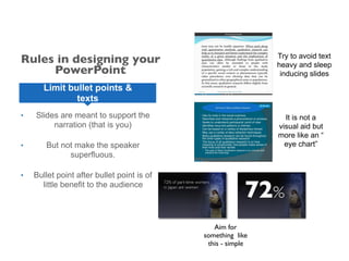
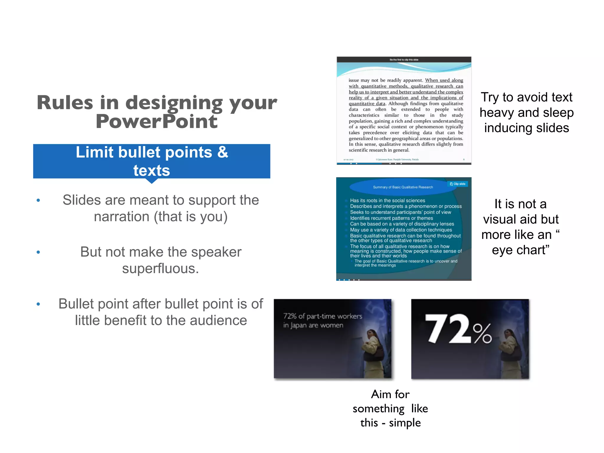
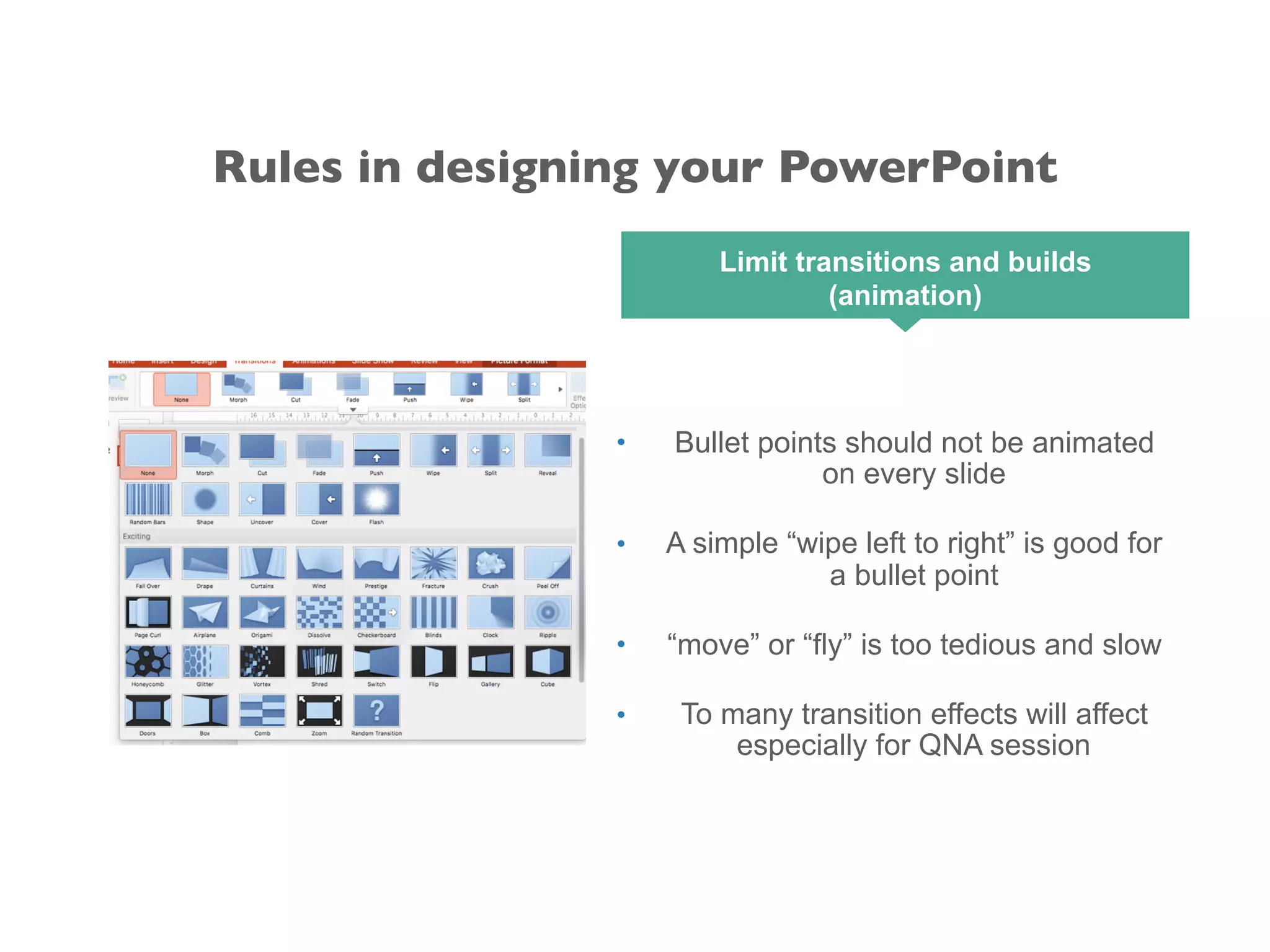
1. Keep presentations simple with plenty of white space, limited text-heavy slides, and avoid overusing transitions and animations.
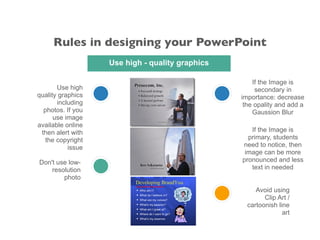
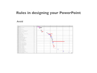
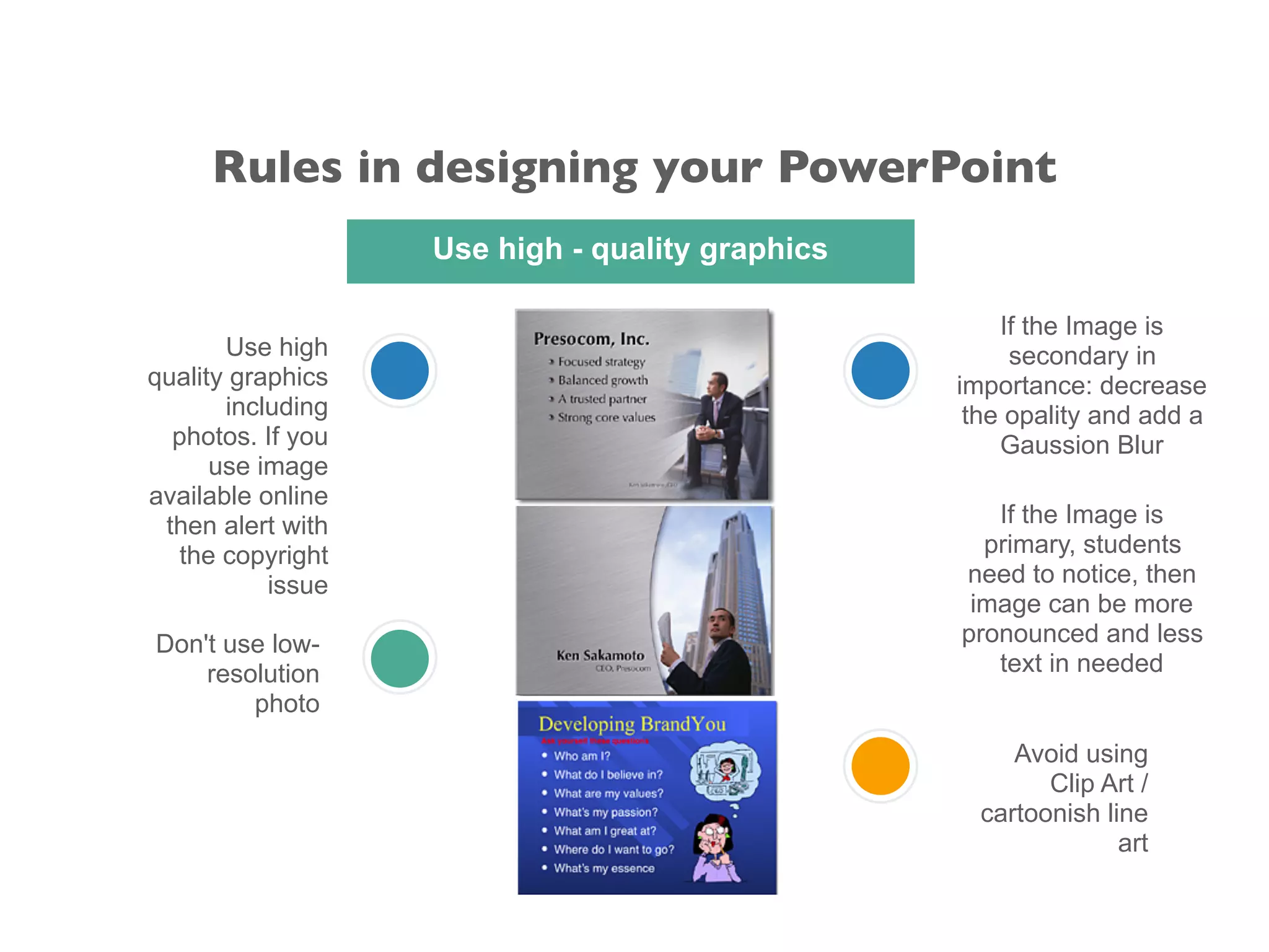
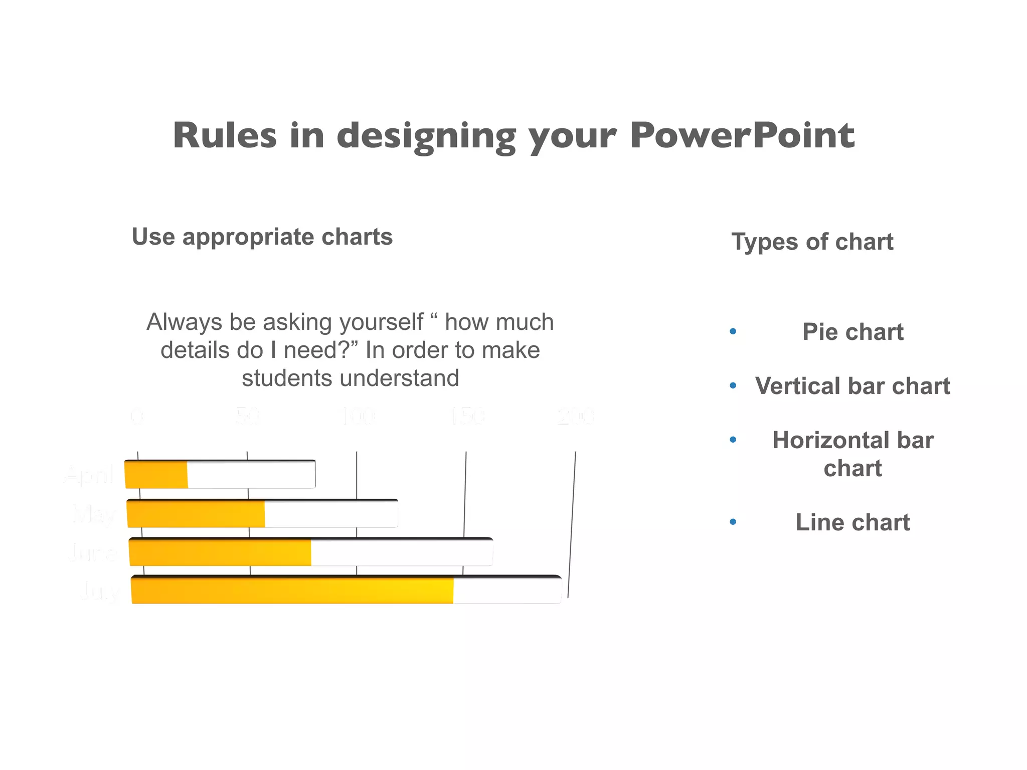
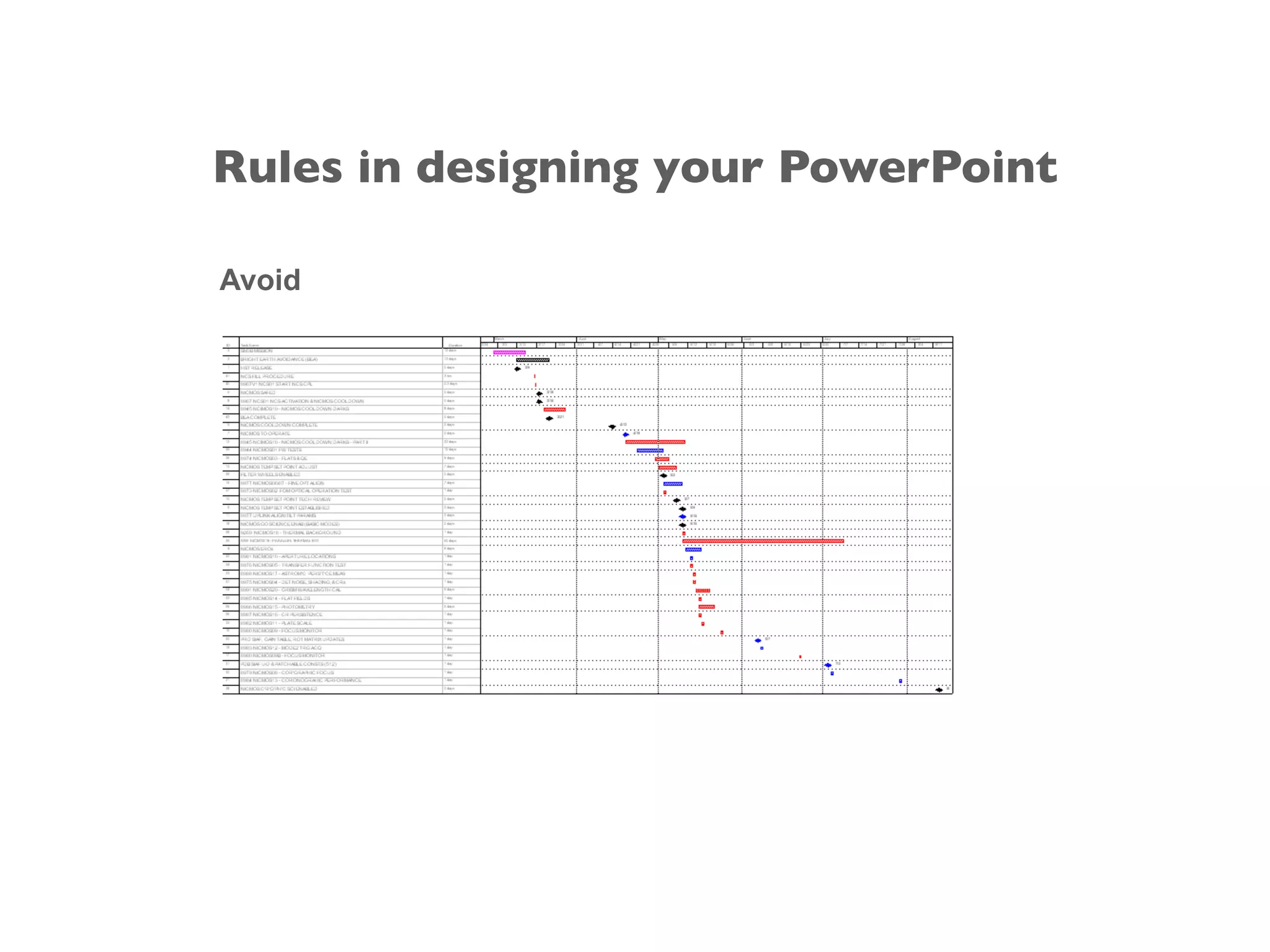
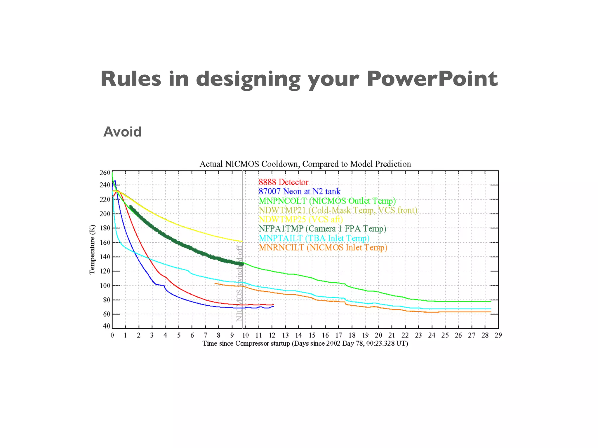
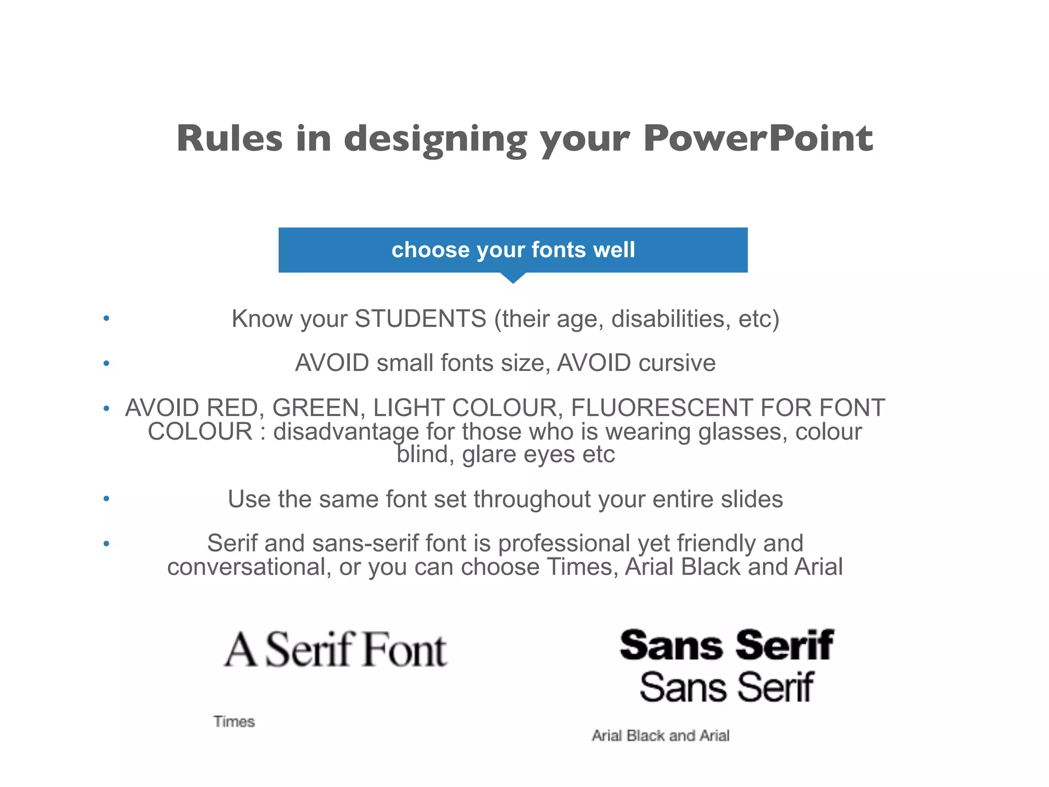
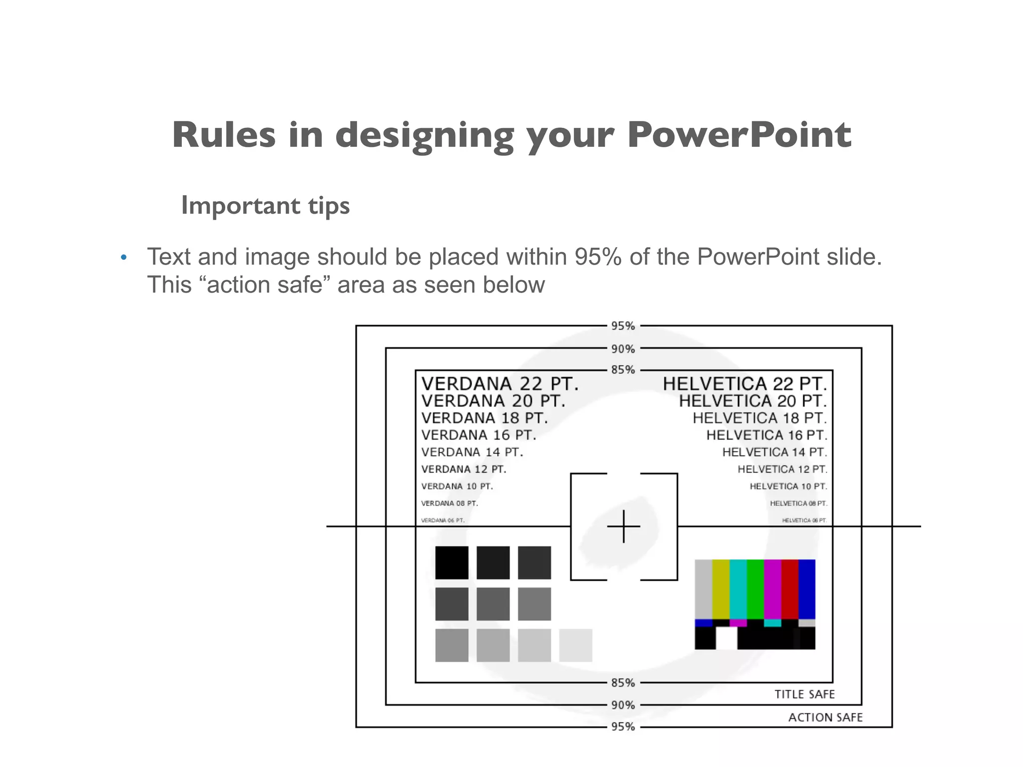
2. Use high quality graphics and images, and limit or avoid low-resolution or clip art images. Properly format charts, fonts, colors and placement of text and images.
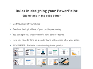
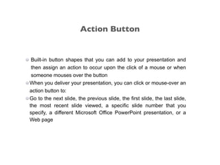
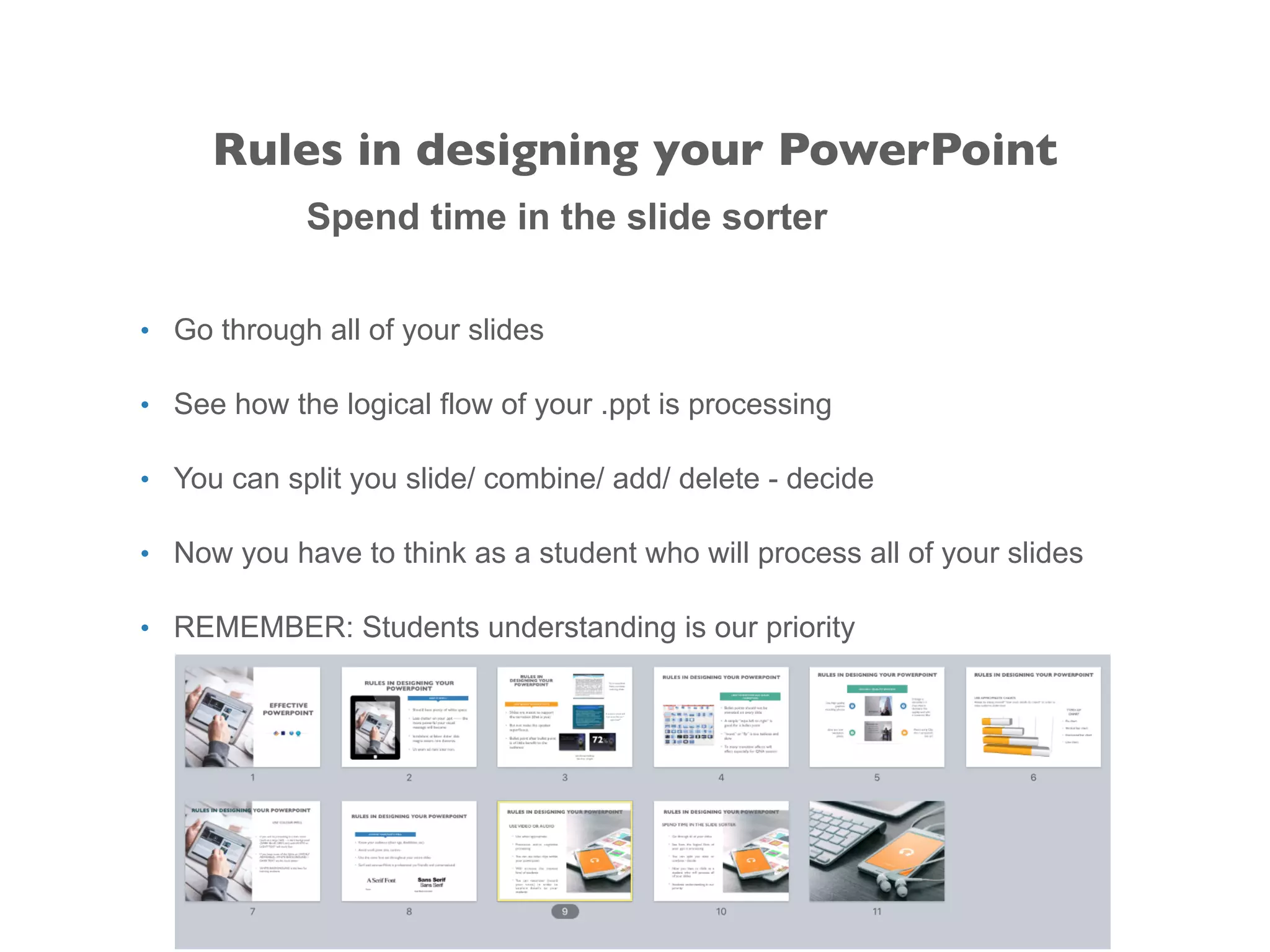
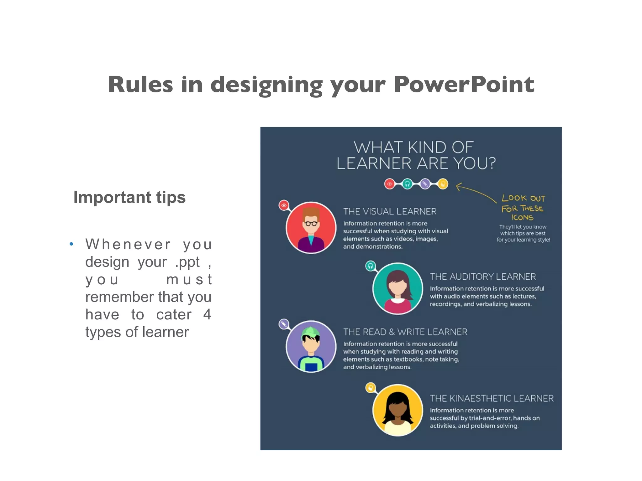
3. Spend time reviewing the logical flow of slides and customize the presentation for the intended audience. Hyperlinks, action buttons, and multimedia can be used appropriately to enhance understanding.