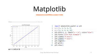
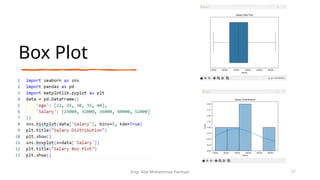
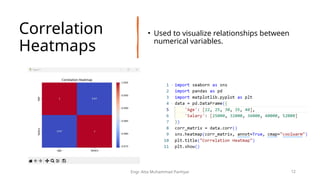
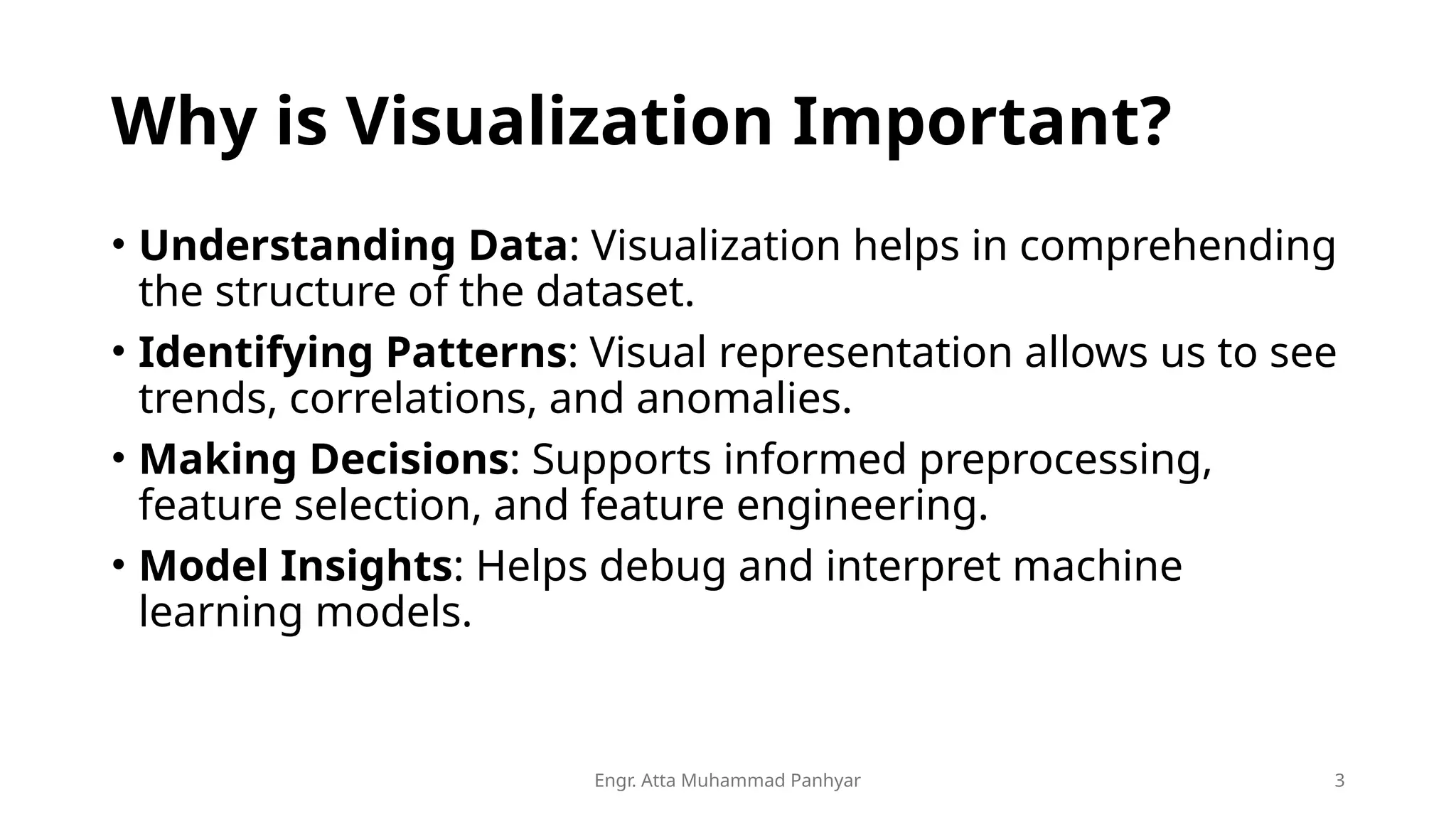
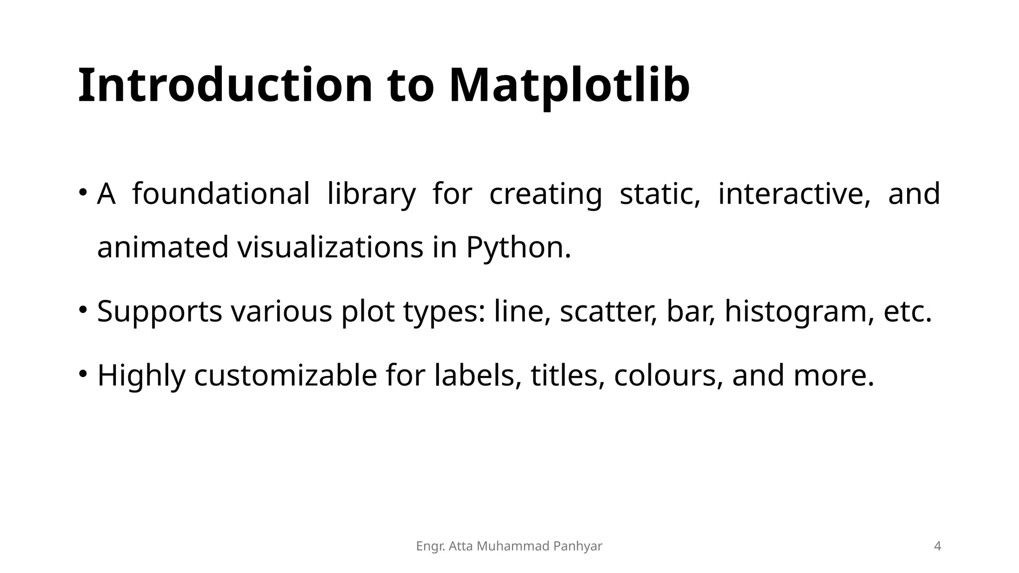
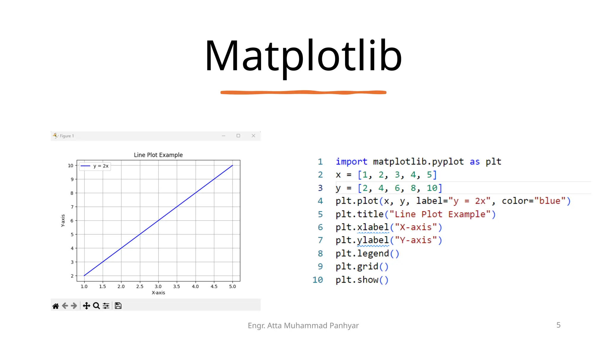
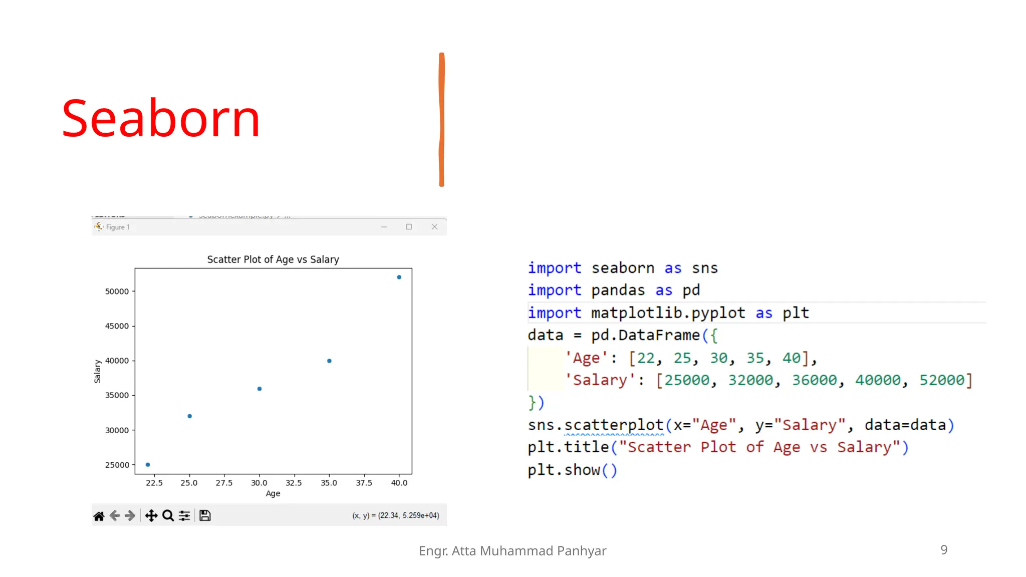
KEMBAR78
Lec 04 -Visualization dataset using Python - Copy.pptx
Engr. Atta Muhammad Panhyar 1
QUAID E AWAM UNIVERSITY OF ENGINEERING SCIENCE AND
TECHNOLOGY
DEPARTMENT OF ARTIFICIAL INTELLIGENCE
Visualizing datasets
using Python libraries
Machine Learning (03 ch)
Engr. Atta Muhammad Panhyar
attapanhyar@quest.edu.pk | +923331971110
Engr. Atta Muhammad Panhyar 3
Why is Visualization Important?
• Understanding Data: Visualization helps in comprehending
the structure of the dataset.
• Identifying Patterns: Visual representation allows us to see
trends, correlations, and anomalies.
• Making Decisions: Supports informed preprocessing,
feature selection, and feature engineering.
• Model Insights: Helps debug and interpret machine
learning models.
Engr. Atta Muhammad Panhyar 4
Introduction to Matplotlib
• A foundational library for creating static, interactive, and
animated visualizations in Python.
• Supports various plot types: line, scatter, bar, histogram, etc.
• Highly customizable for labels, titles, colours, and more.
Matplotlib
Engr. Atta Muhammad Panhyar 5
Engr. Atta Muhammad Panhyar 6
Why is Visualization Important?
• Helps identify trends, correlations, and patterns.
• Assists in understanding the dataset's structure.
• Supports decision-making during preprocessing and feature
selection.
Engr. Atta Muhammad Panhyar 7
Introduction to Matplotlib
• Matplotlib Features:
• Basic 2D plotting (line, scatter, bar).
• Fine control over chart elements (titles, labels).
Engr. Atta Muhammad Panhyar 8
Seaborn
• Seaborn Features:
• High-level interface for statistical graphics.
• Built on top of Matplotlib for ease of use.
Seaborn
Engr. Atta Muhammad Panhyar 9
Engr. Atta Muhammad Panhyar 10
Identifying Trends and Patterns
• Common Techniques:
• Histogram: Distribution of a single variable.
• Box Plot: Summary of data variation and outliers.
Box Plot
Engr. Atta Muhammad Panhyar 11
Correlation
Heatmaps
• Used to visualize relationships between
numerical variables.
Engr. Atta Muhammad Panhyar 12
Pair Plot for
Multivariate
Analysis
• Highlights pairwise relationships in
datasets.
Engr. Atta Muhammad Panhyar 13
Best Practices in
Visualization
• Choose the Right Plot: Match the plot
type to the data and objective.
• Avoid Overcrowding: Display only
relevant information to maintain clarity.
• Use Labels and Titles: Always annotate
your visualizations.
• Consistency: Maintain consistent styles
and colours for better interpretation.
• Interactivity: Use libraries like Plotly for
interactive visualizations in real-world
applications.
Engr. Atta Muhammad Panhyar 14
Engr. Atta Muhammad Panhyar 15
The End

Lec 04 -Visualization dataset using Python - Copy.pptx

  • 1.
    Engr. Atta MuhammadPanhyar 1 QUAID E AWAM UNIVERSITY OF ENGINEERING SCIENCE AND TECHNOLOGY DEPARTMENT OF ARTIFICIAL INTELLIGENCE
  • 2.
    Visualizing datasets using Pythonlibraries Machine Learning (03 ch) Engr. Atta Muhammad Panhyar attapanhyar@quest.edu.pk | +923331971110
  • 3.
    Engr. Atta MuhammadPanhyar 3 Why is Visualization Important? • Understanding Data: Visualization helps in comprehending the structure of the dataset. • Identifying Patterns: Visual representation allows us to see trends, correlations, and anomalies. • Making Decisions: Supports informed preprocessing, feature selection, and feature engineering. • Model Insights: Helps debug and interpret machine learning models.
  • 4.
    Engr. Atta MuhammadPanhyar 4 Introduction to Matplotlib • A foundational library for creating static, interactive, and animated visualizations in Python. • Supports various plot types: line, scatter, bar, histogram, etc. • Highly customizable for labels, titles, colours, and more.
  • 5.
  • 6.
    Engr. Atta MuhammadPanhyar 6 Why is Visualization Important? • Helps identify trends, correlations, and patterns. • Assists in understanding the dataset's structure. • Supports decision-making during preprocessing and feature selection.
  • 7.
    Engr. Atta MuhammadPanhyar 7 Introduction to Matplotlib • Matplotlib Features: • Basic 2D plotting (line, scatter, bar). • Fine control over chart elements (titles, labels).
  • 8.
    Engr. Atta MuhammadPanhyar 8 Seaborn • Seaborn Features: • High-level interface for statistical graphics. • Built on top of Matplotlib for ease of use.
  • 9.
  • 10.
    Engr. Atta MuhammadPanhyar 10 Identifying Trends and Patterns • Common Techniques: • Histogram: Distribution of a single variable. • Box Plot: Summary of data variation and outliers.
  • 11.
    Box Plot Engr. AttaMuhammad Panhyar 11
  • 12.
    Correlation Heatmaps • Used tovisualize relationships between numerical variables. Engr. Atta Muhammad Panhyar 12
  • 13.
    Pair Plot for Multivariate Analysis •Highlights pairwise relationships in datasets. Engr. Atta Muhammad Panhyar 13
  • 14.
    Best Practices in Visualization •Choose the Right Plot: Match the plot type to the data and objective. • Avoid Overcrowding: Display only relevant information to maintain clarity. • Use Labels and Titles: Always annotate your visualizations. • Consistency: Maintain consistent styles and colours for better interpretation. • Interactivity: Use libraries like Plotly for interactive visualizations in real-world applications. Engr. Atta Muhammad Panhyar 14
  • 15.
    Engr. Atta MuhammadPanhyar 15 The End