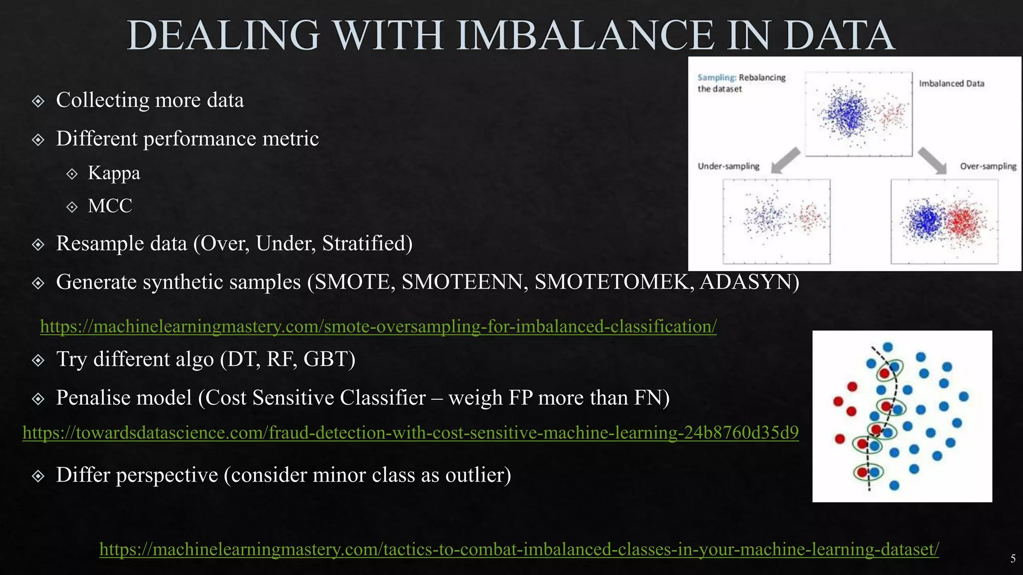
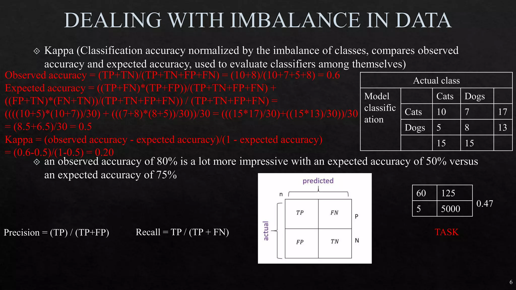
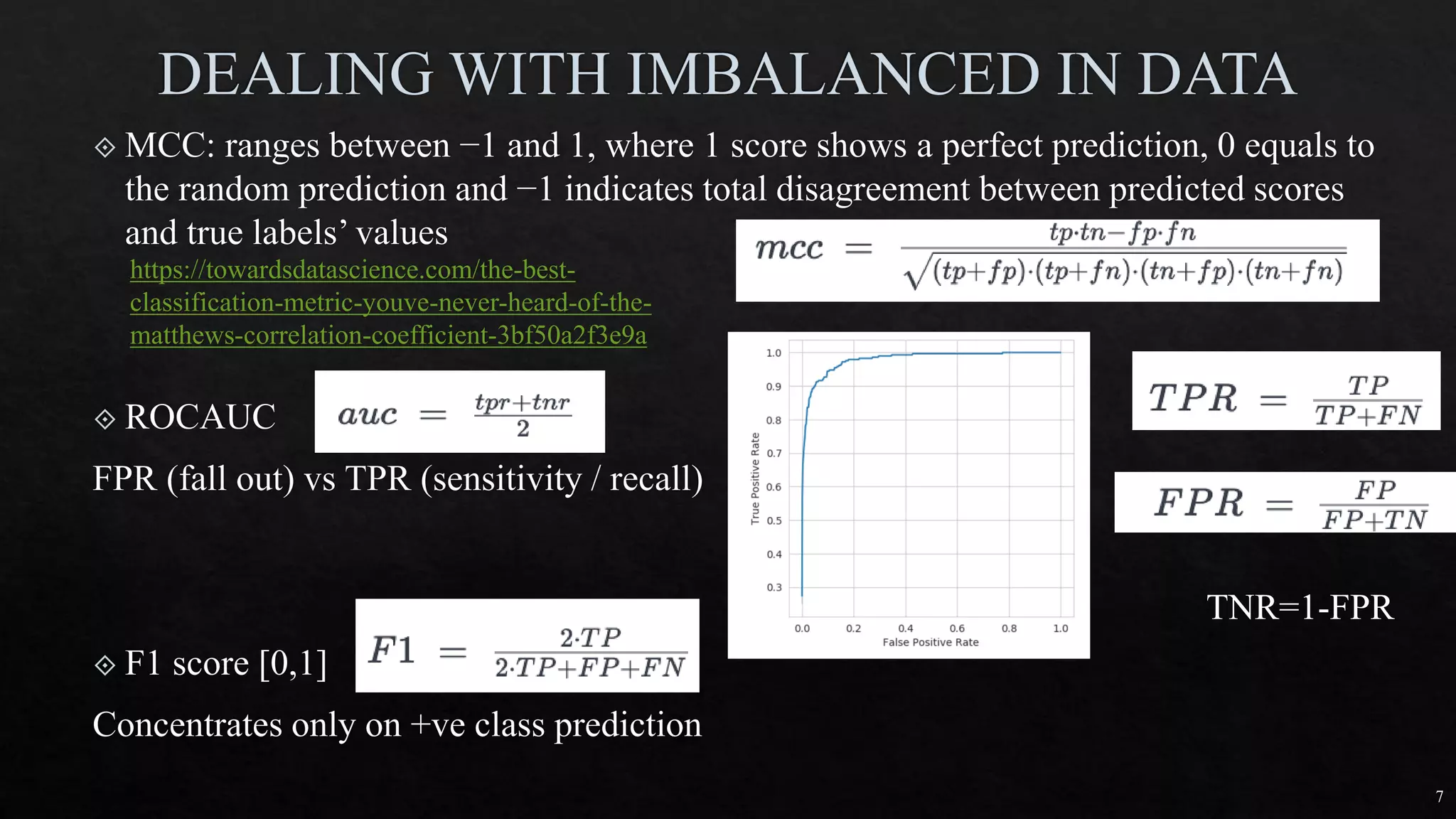
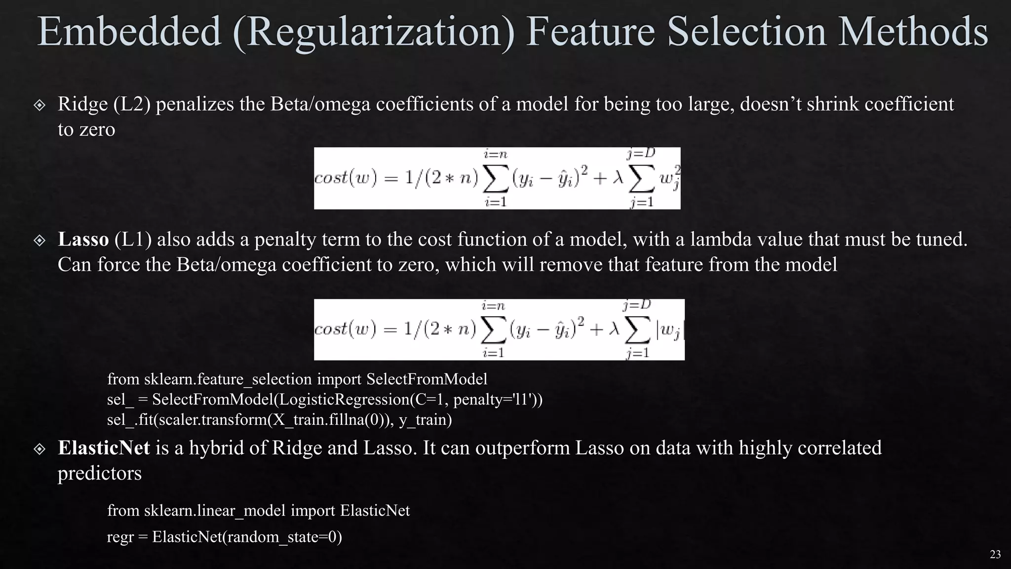
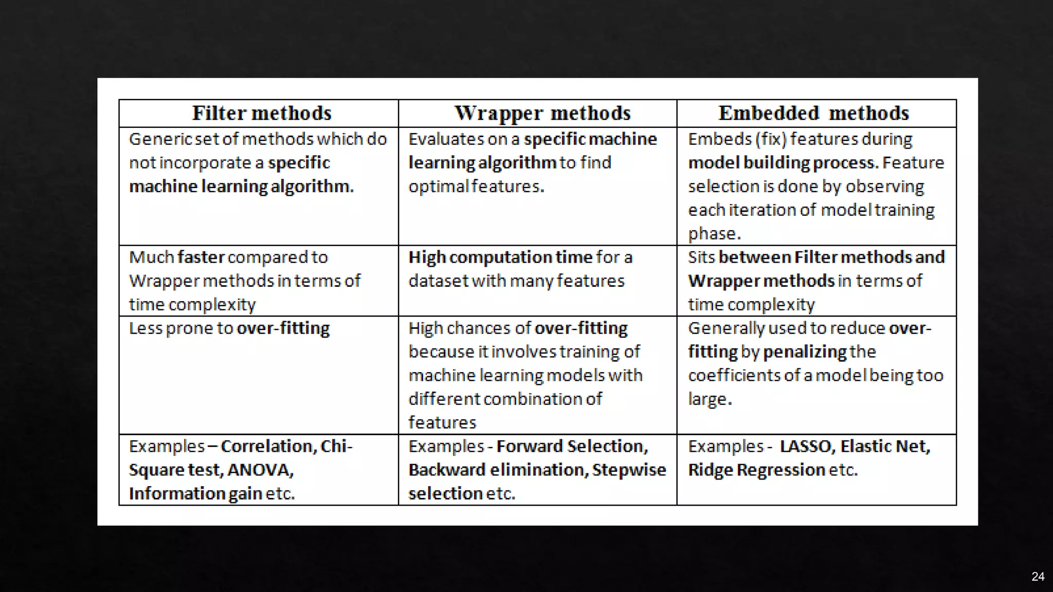
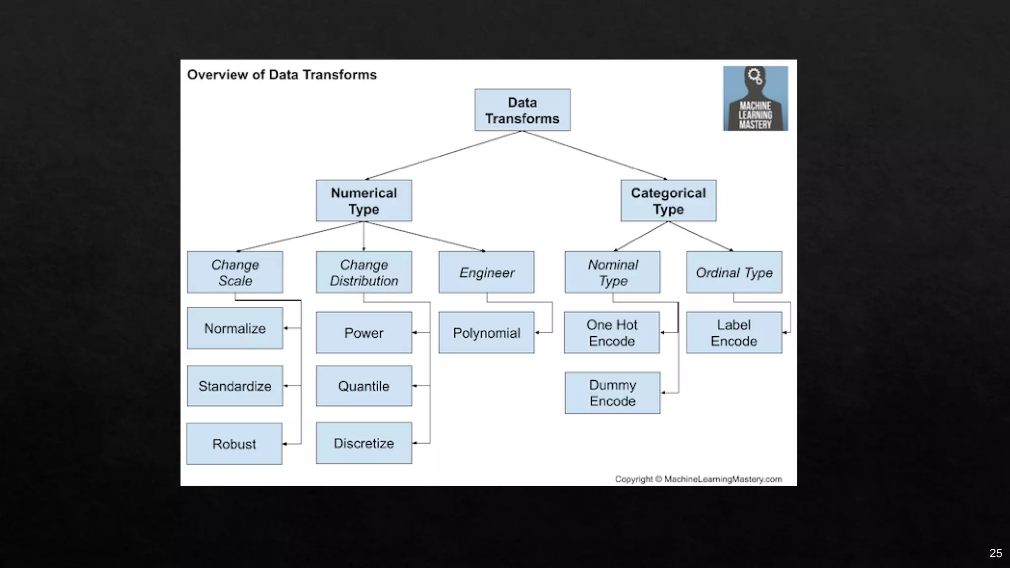
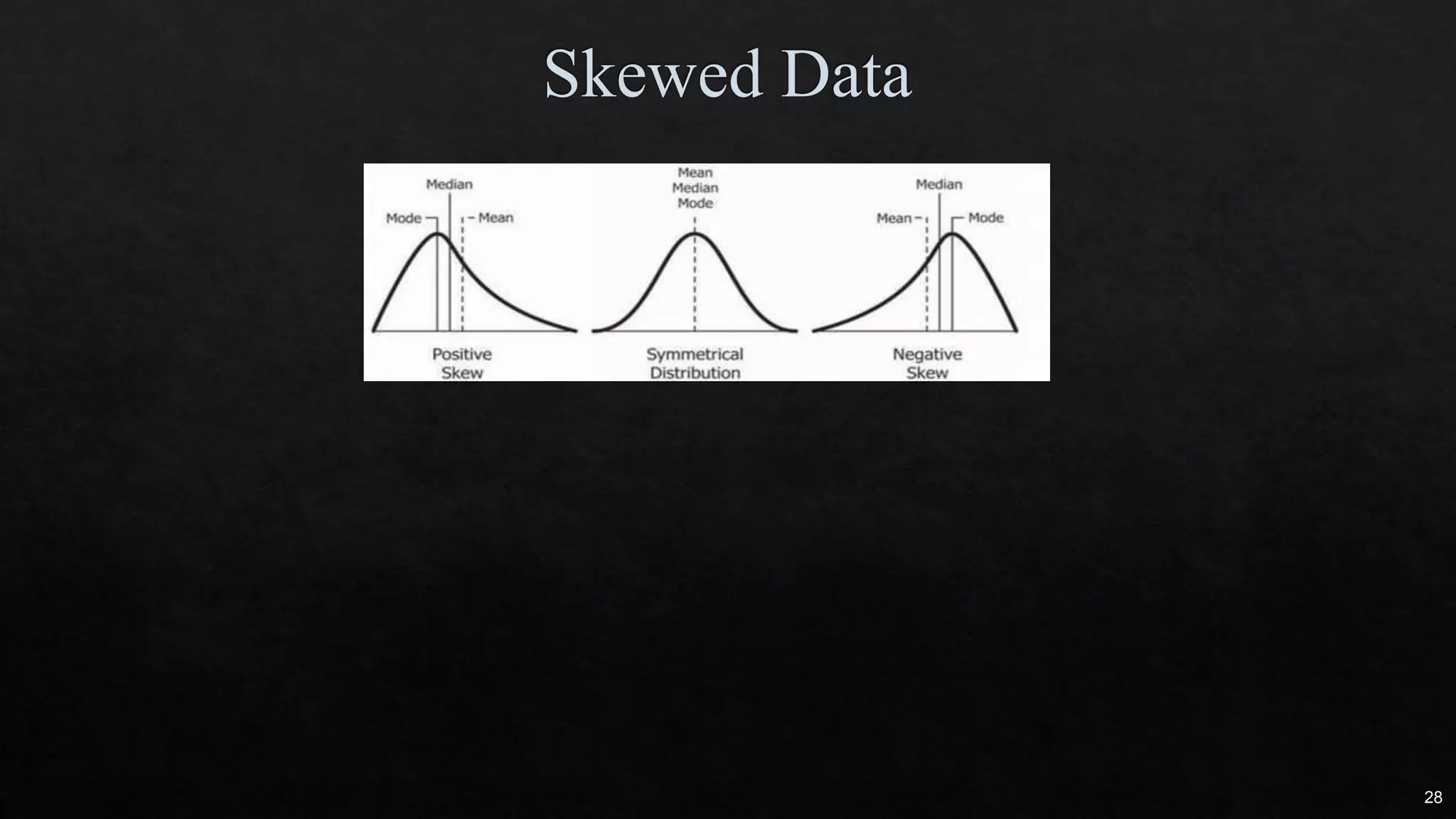
Download as PDF, PPTX


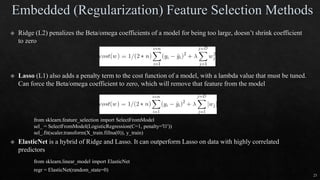
![18
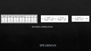
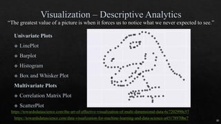
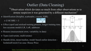
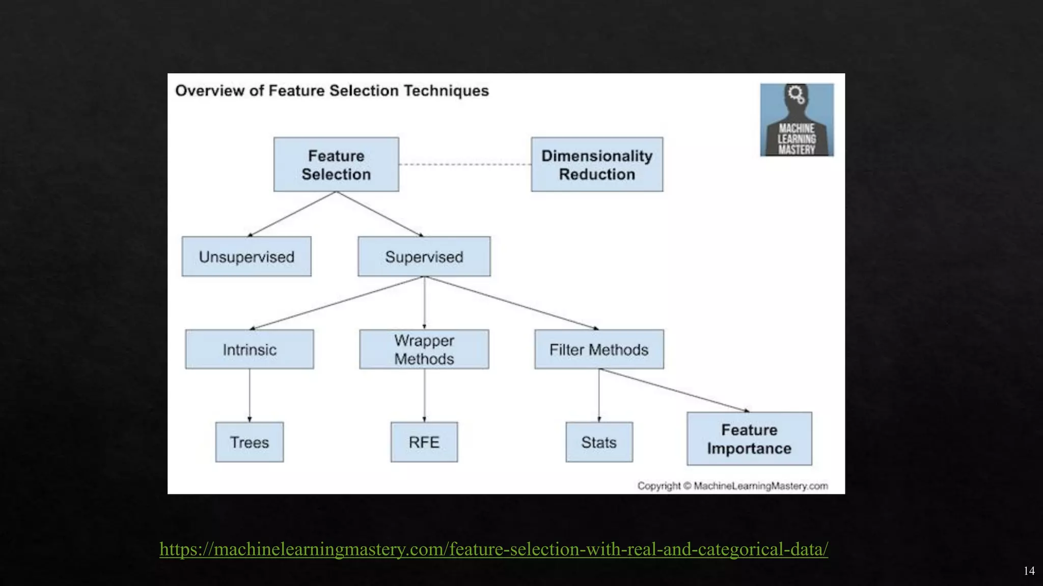
Independent
variable
# OF ANIMAL AV. DOMESTIC ANIMAL S.D. S.D.2
DOG 5 12 2 4
CAT 5 16 1 1
HAMSTER 5 20 4 16
Different groups must have equal sample size
No relationship between subjects in each sample
To test more than 2 levels within an indep var
ρ = 3 TOTAL POPULATION
n = 5 # of samples
N = 15 total # of observation
SST = 5*[(12-16)2+(16-16)2+(20-16)2] = 160
MST = SST/ ρ-1 = 160/(3-1) = 80
SSE = (4+1+16)*(n-1) = 84
MSE = SSE/(N- ρ) = 84/(15-3) = 7
F = MST/MSE = 80/7 = 11.429](https://image.slidesharecdn.com/mlmodule2-220810032902-c5cedc96/85/ML-MODULE-2-pdf-18-320.jpg)


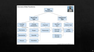

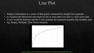
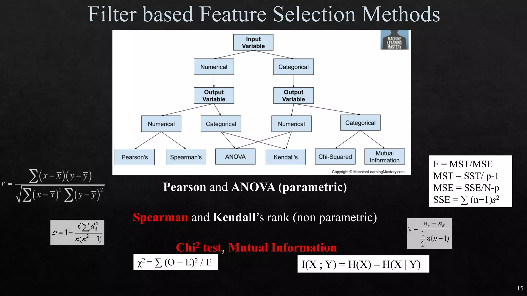
![27
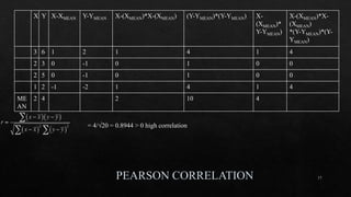
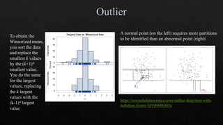
https://machinelearningmas
tery.com/one-hot-encoding-
for-categorical-data/
df_dummies = pd.get_dummies(df, columgenderns=['sex'])
https://www.marsja.se/how-to-use-pandas-get_dummies-to-create-dummy-variables-in-python/](https://image.slidesharecdn.com/mlmodule2-220810032902-c5cedc96/85/ML-MODULE-2-pdf-27-320.jpg)
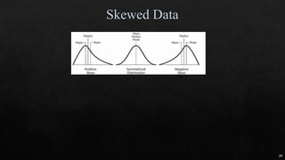
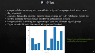


![18
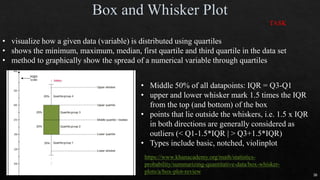
Independent
variable
# OF ANIMAL AV. DOMESTIC ANIMAL S.D. S.D.2
DOG 5 12 2 4
CAT 5 16 1 1
HAMSTER 5 20 4 16
Different groups must have equal sample size
No relationship between subjects in each sample
To test more than 2 levels within an indep var
ρ = 3 TOTAL POPULATION
n = 5 # of samples
N = 15 total # of observation
SST = 5*[(12-16)2+(16-16)2+(20-16)2] = 160
MST = SST/ ρ-1 = 160/(3-1) = 80
SSE = (4+1+16)*(n-1) = 84
MSE = SSE/(N- ρ) = 84/(15-3) = 7
F = MST/MSE = 80/7 = 11.429](https://image.slidesharecdn.com/mlmodule2-220810032902-c5cedc96/75/ML-MODULE-2-pdf-18-2048.jpg)


![27
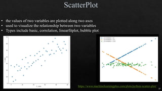
https://machinelearningmas
tery.com/one-hot-encoding-
for-categorical-data/
df_dummies = pd.get_dummies(df, columgenderns=['sex'])
https://www.marsja.se/how-to-use-pandas-get_dummies-to-create-dummy-variables-in-python/](https://image.slidesharecdn.com/mlmodule2-220810032902-c5cedc96/75/ML-MODULE-2-pdf-27-2048.jpg)
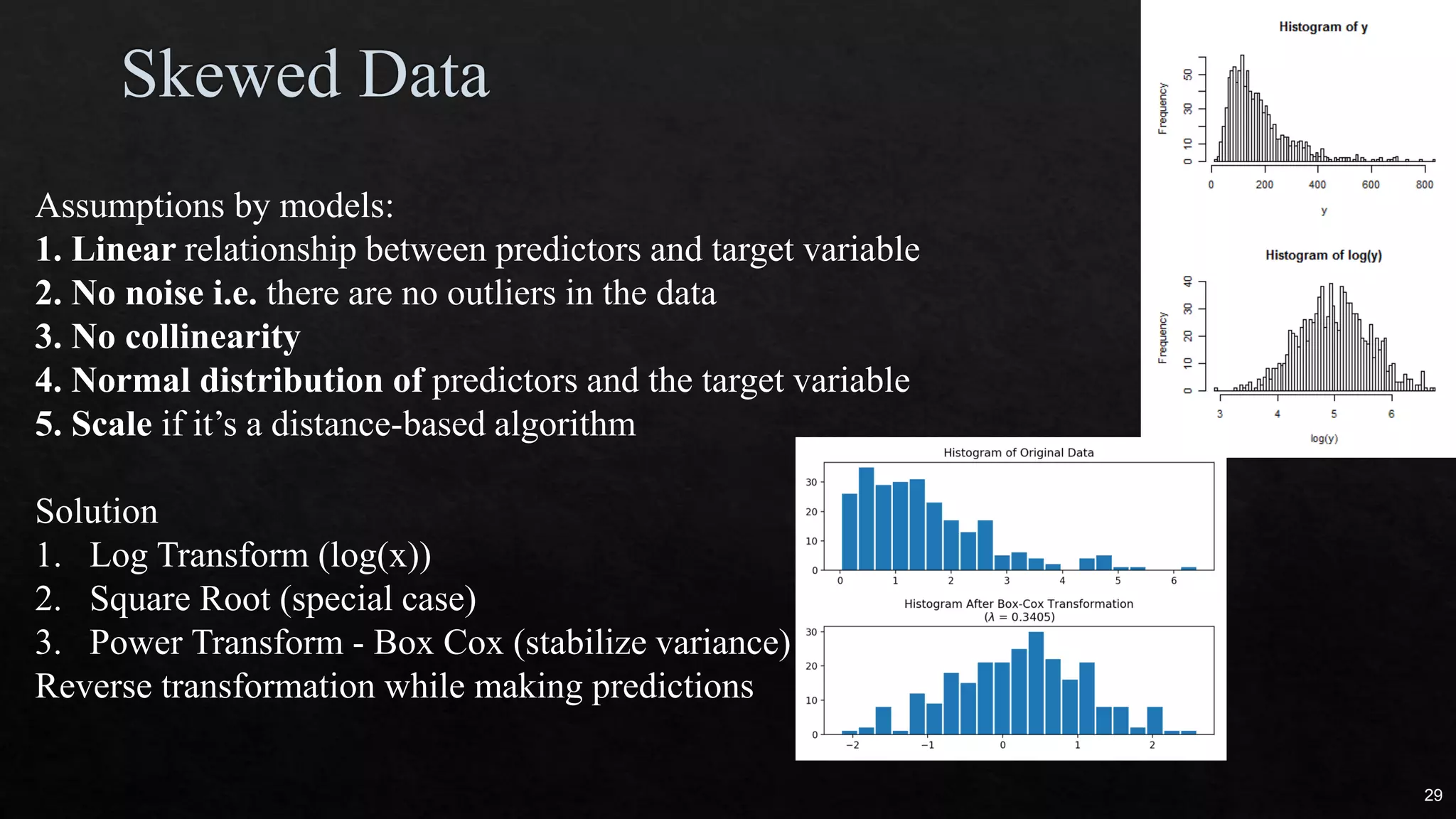
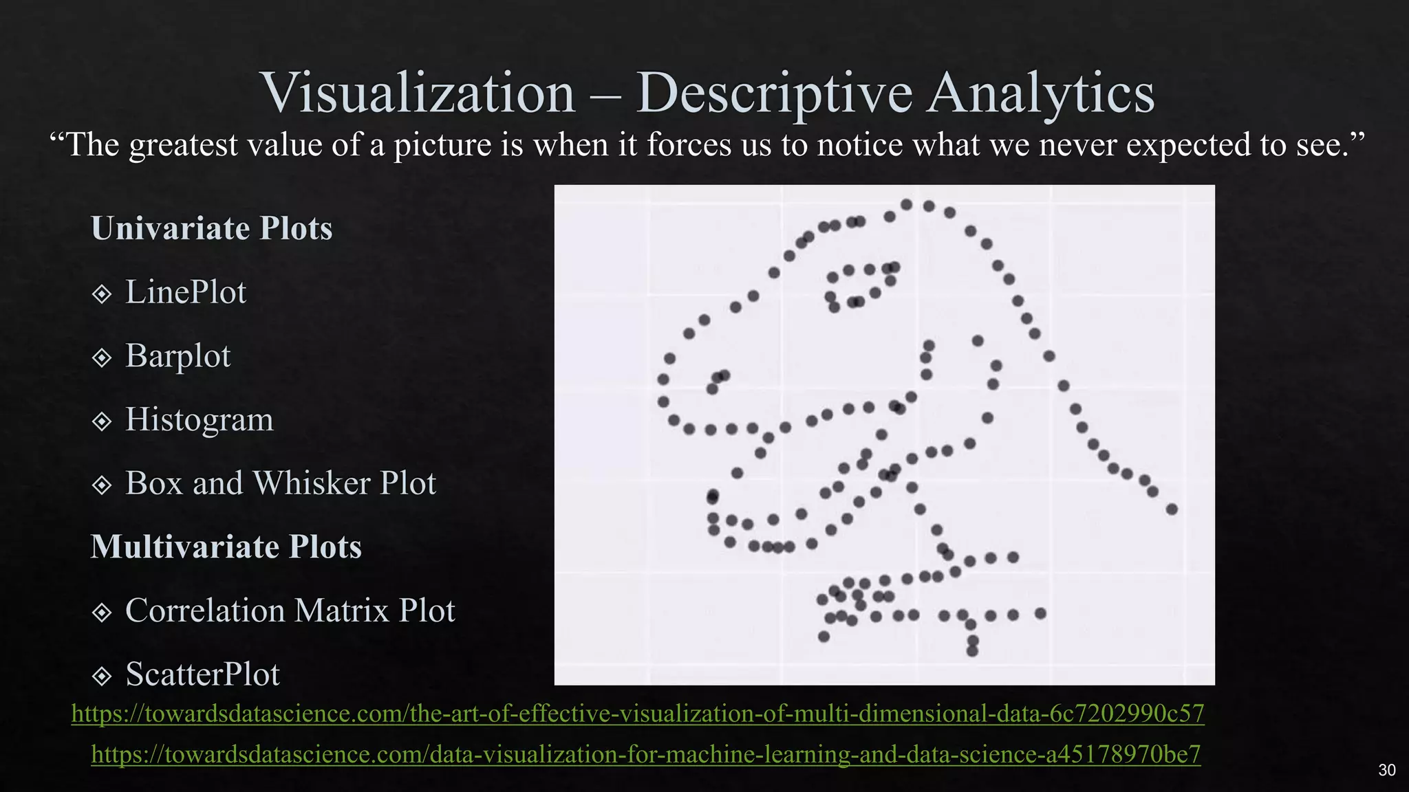
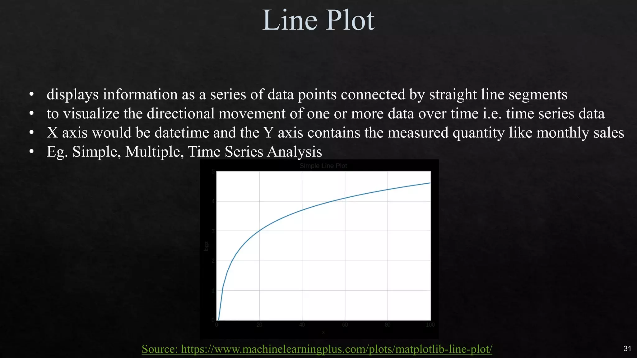
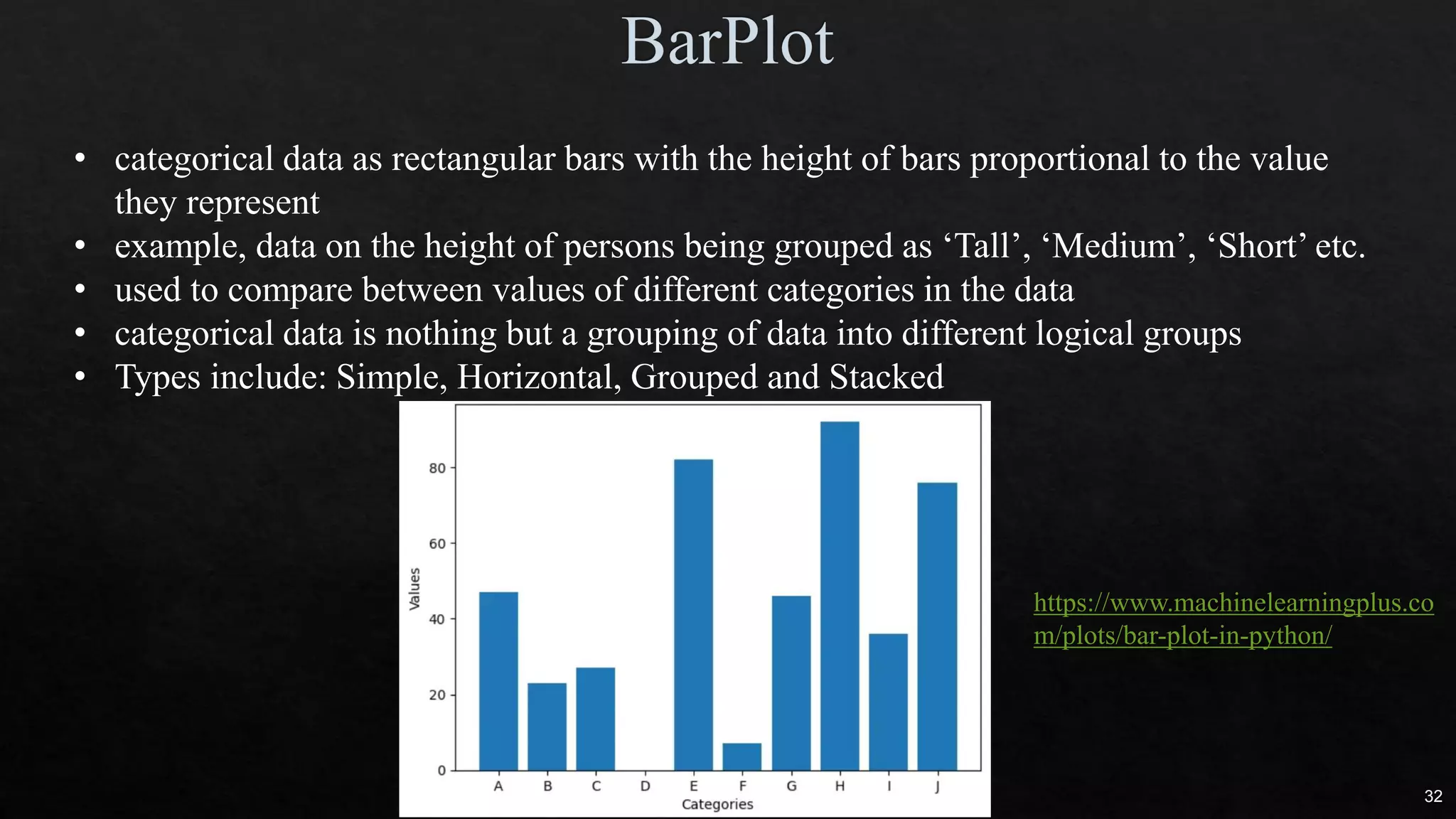


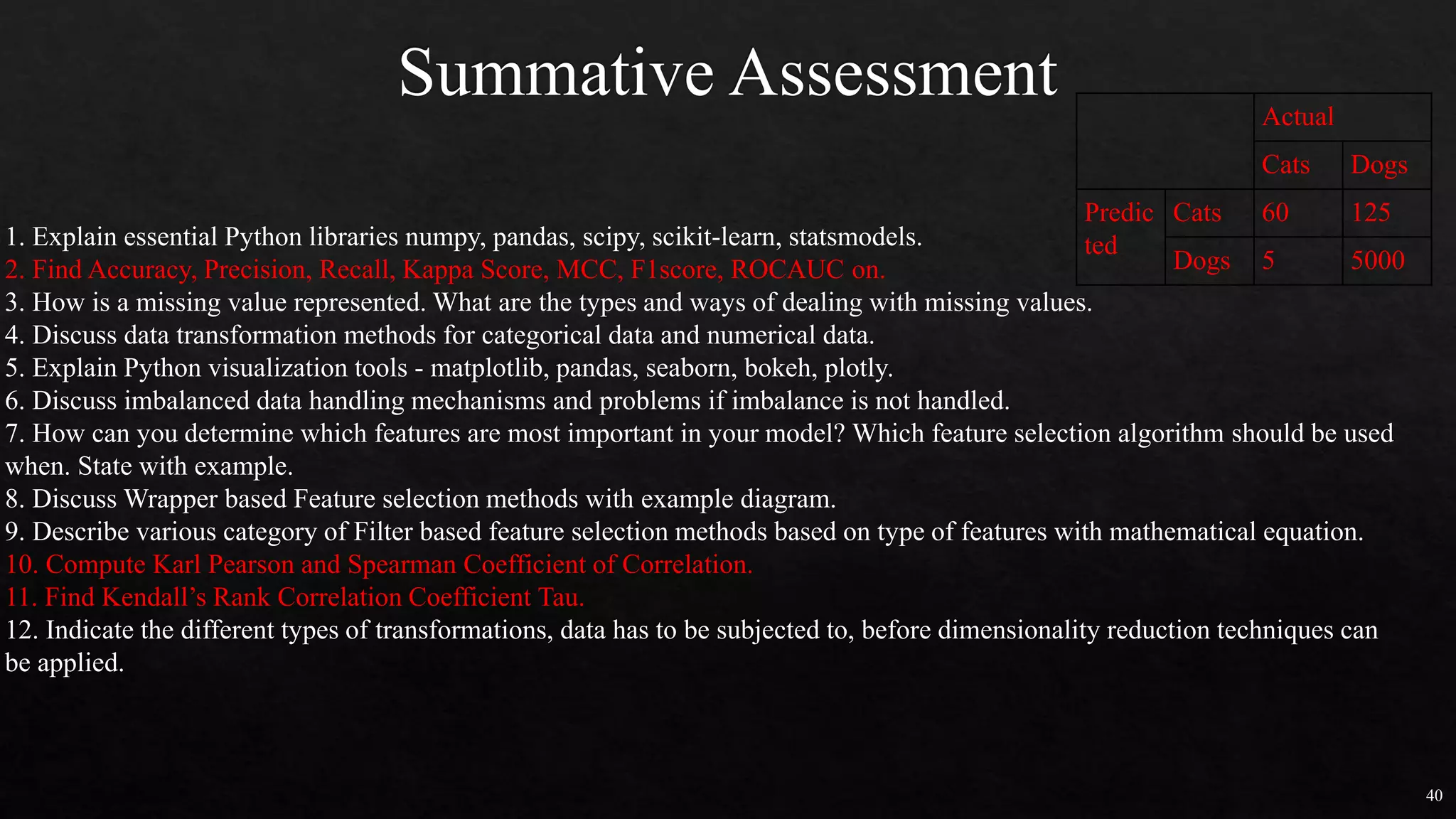


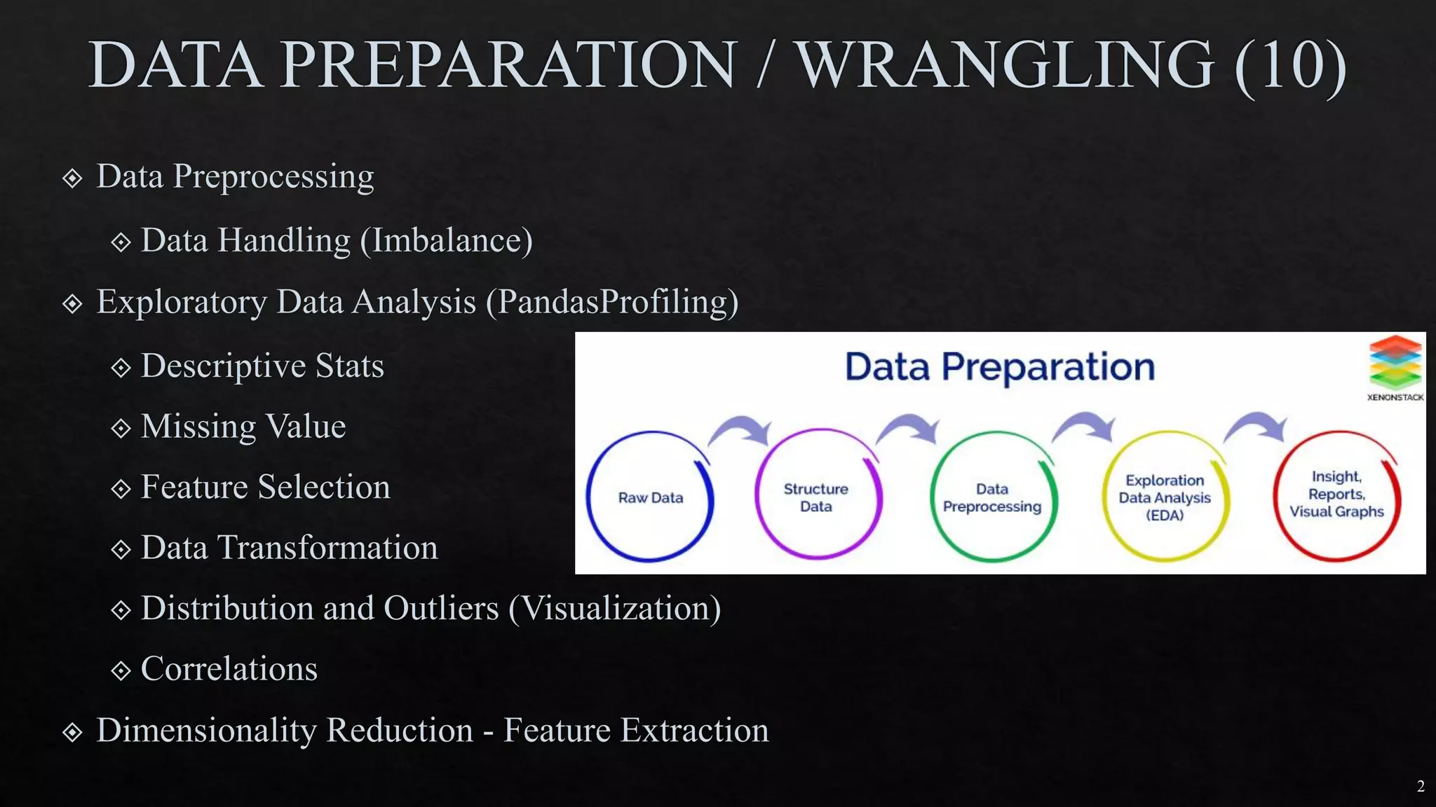
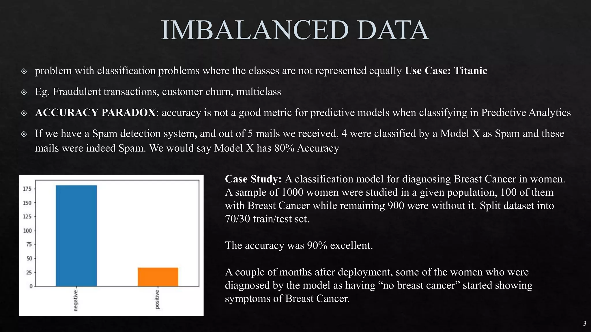
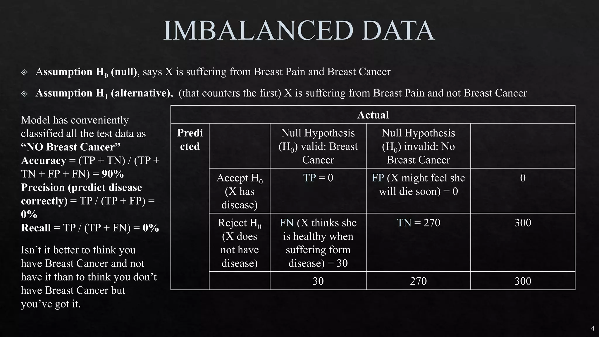
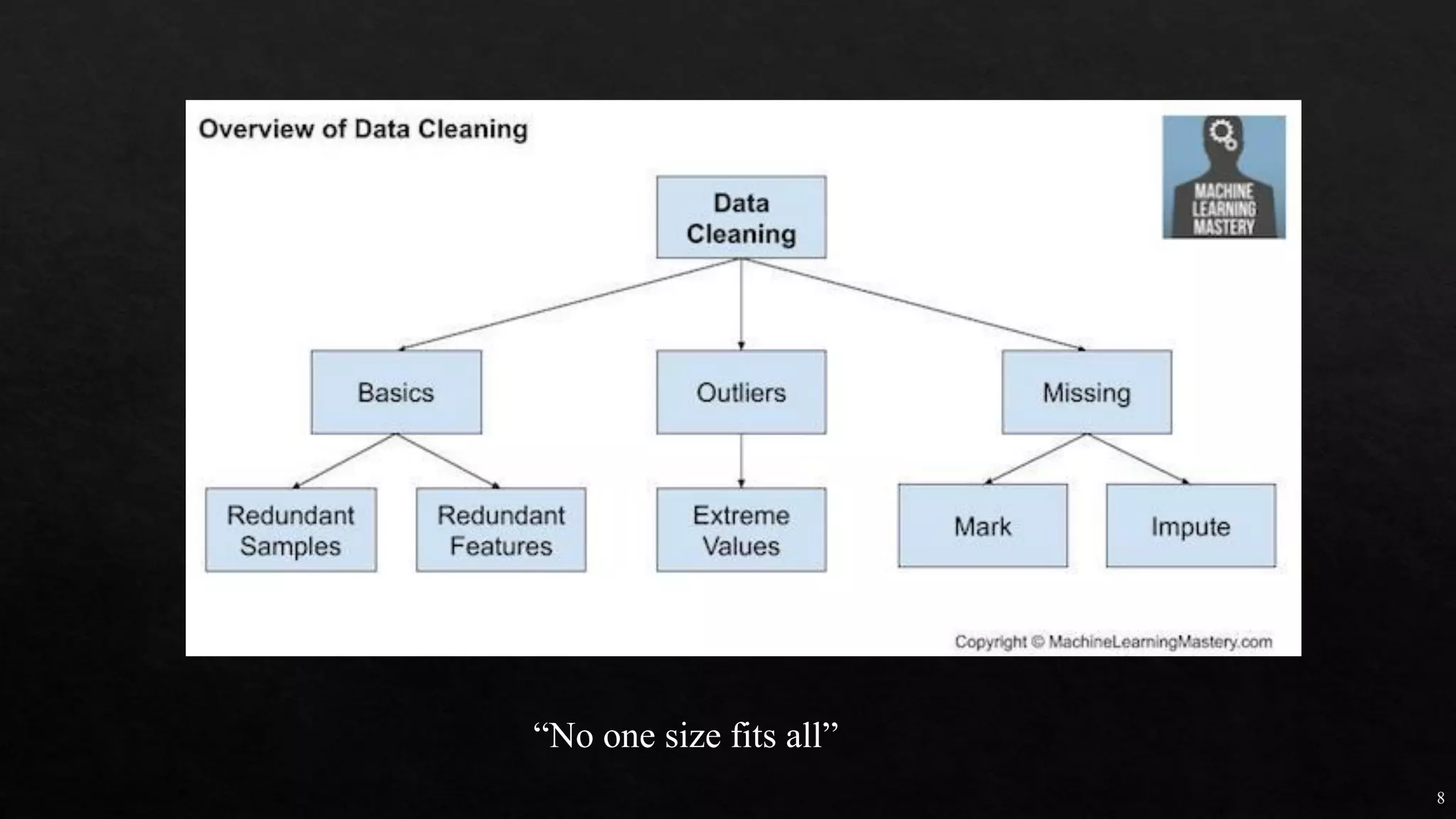
The document discusses data cleaning, exploratory data analysis, and feature engineering techniques within machine learning, highlighted by a breast cancer classification case study. It presents performance metrics such as accuracy, precision, and recall, emphasizing the model's incorrect classifications and implications of false negatives. Additionally, various methods of data visualization, correlation, and transformations are explored, alongside practical applications of feature selection and handling imbalanced data.


![Agentic Systems and Compliance - A brief intro [1.2]](https://cdn.slidesharecdn.com/ss_thumbnails/agenticsystemsandcompliace-1-251018025303-958a42ec-thumbnail.jpg?width=600ounds&width=560&fit=bounds)