Download to read offline


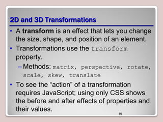
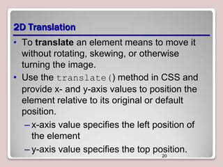

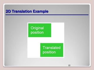
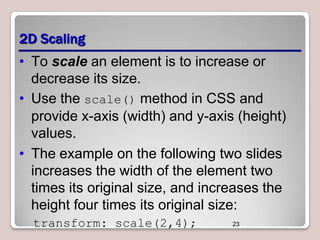
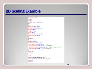
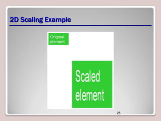
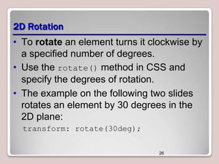
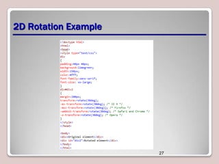
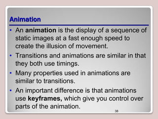
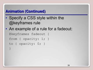
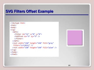
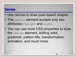
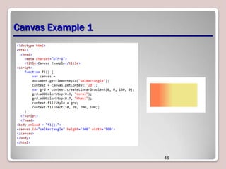

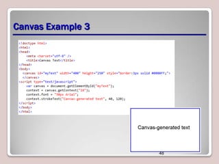
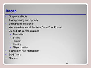
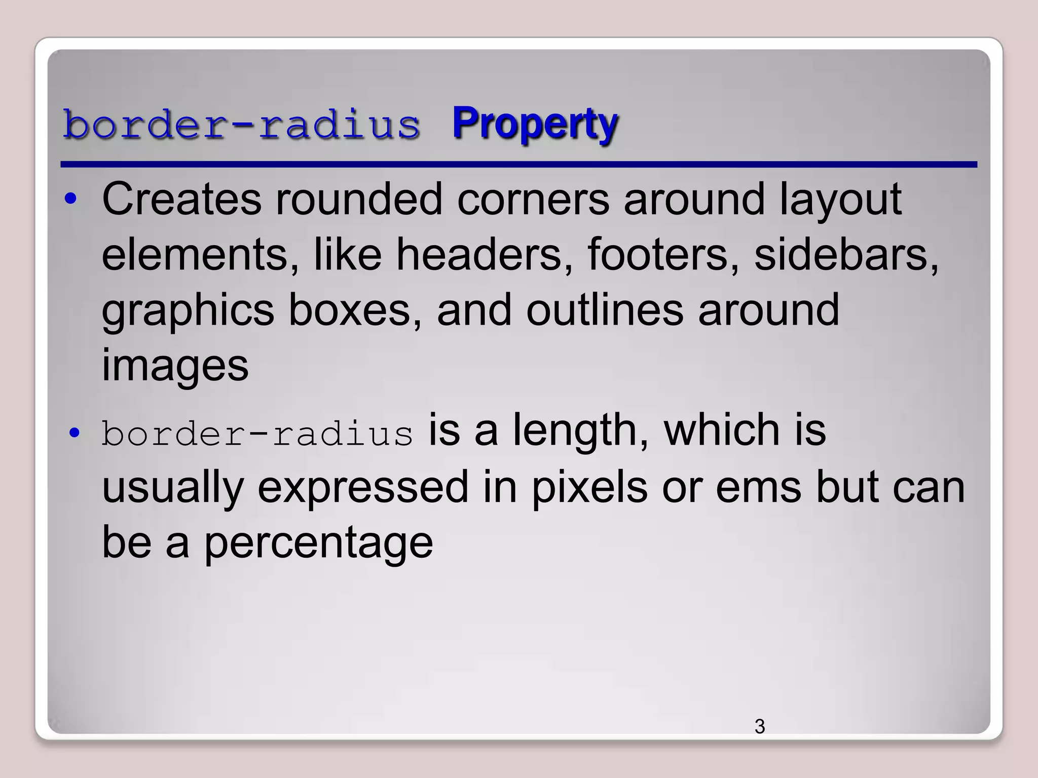
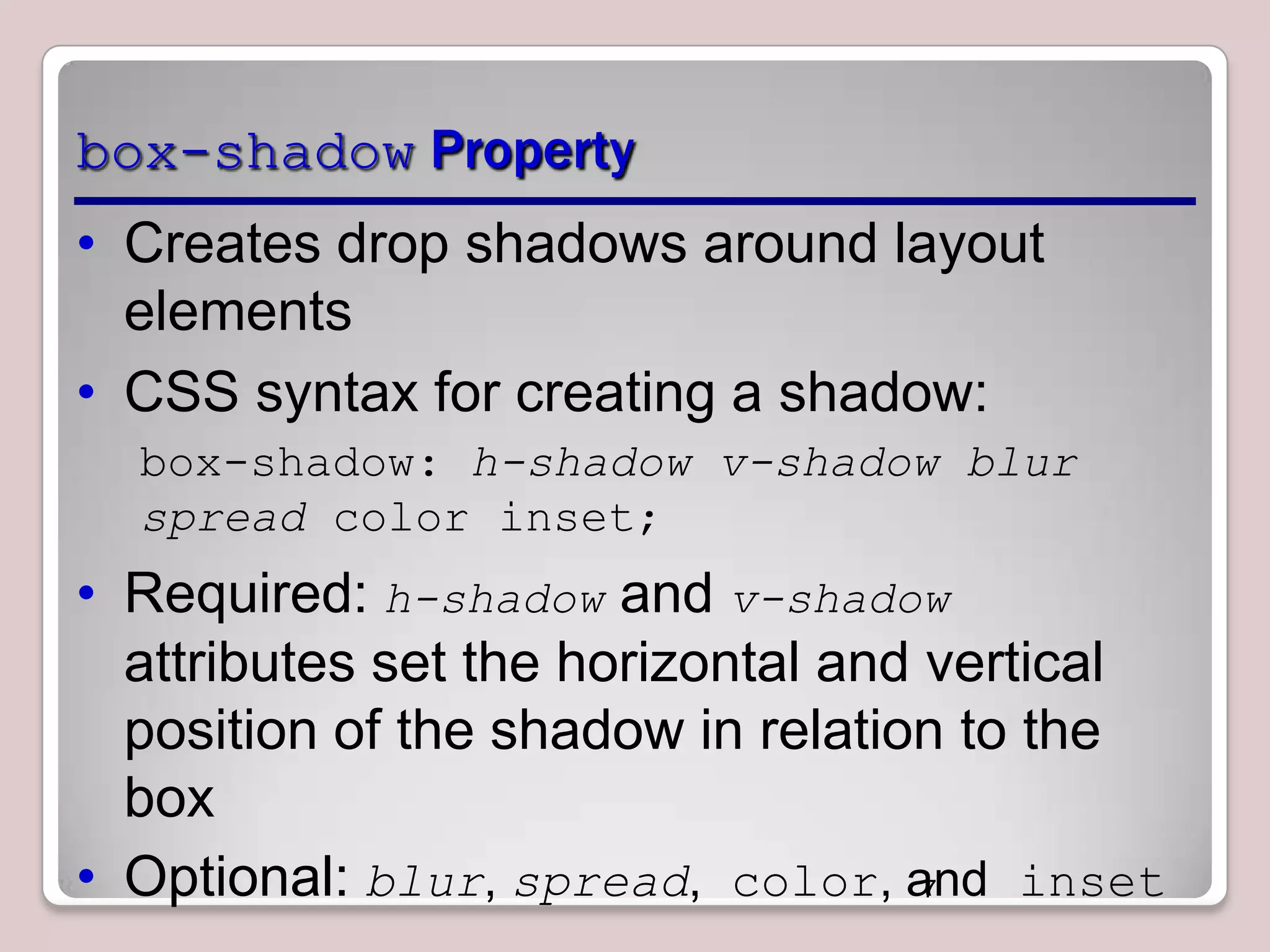
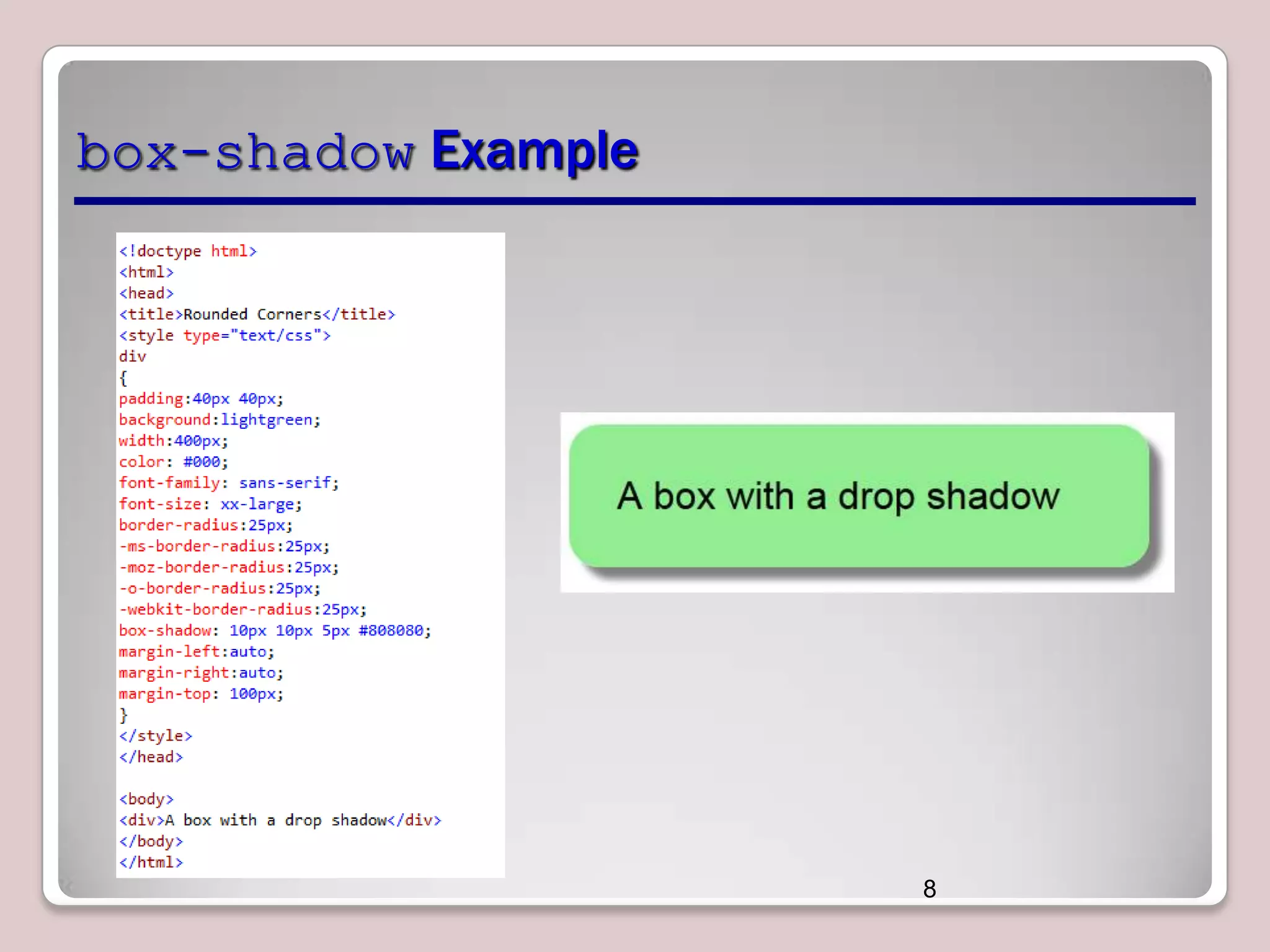
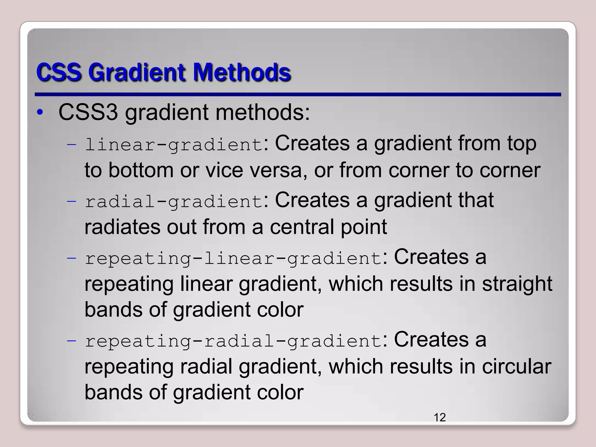
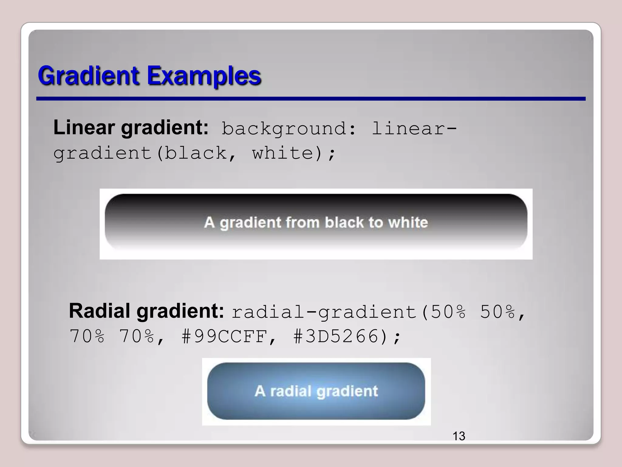
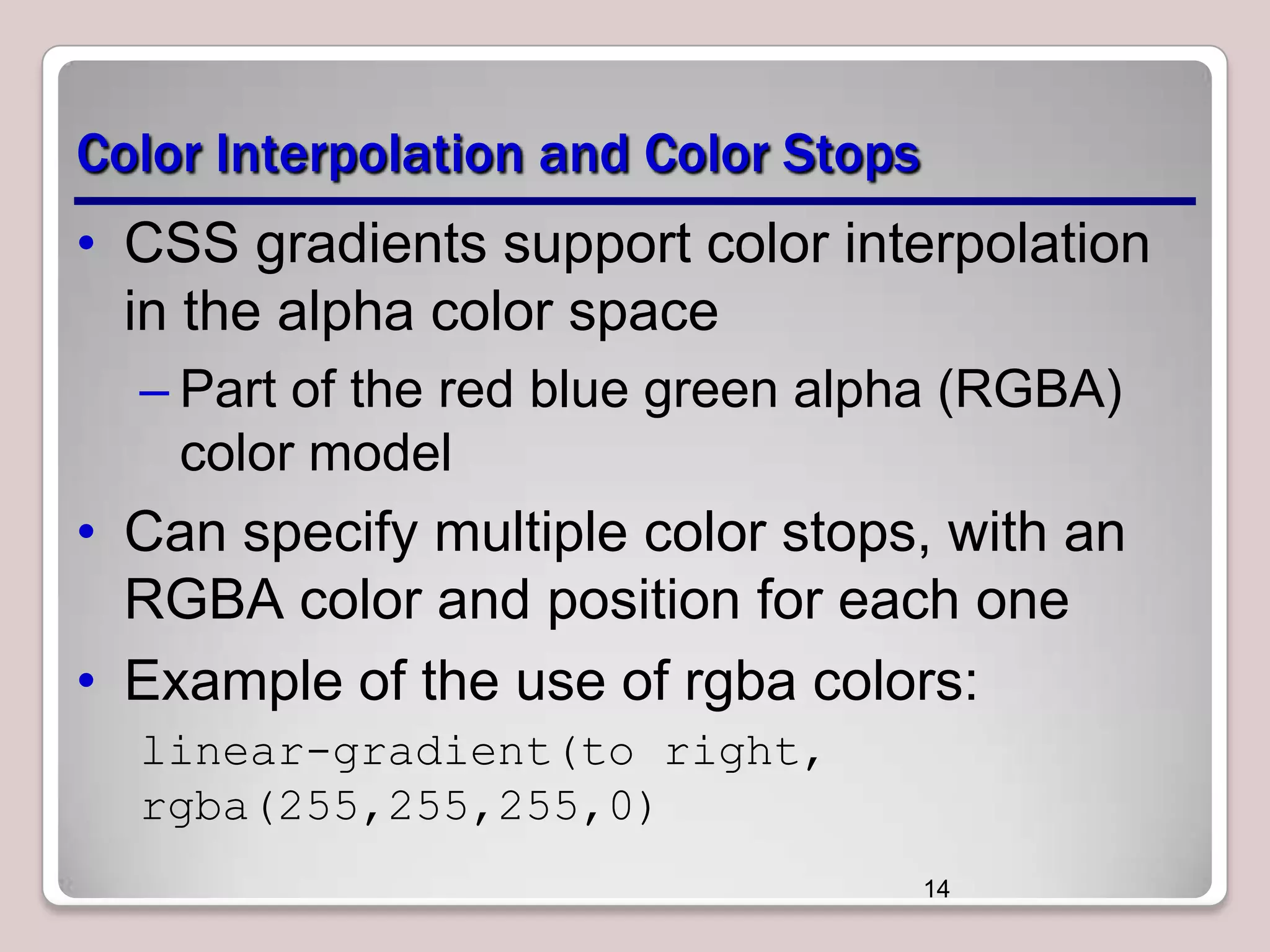
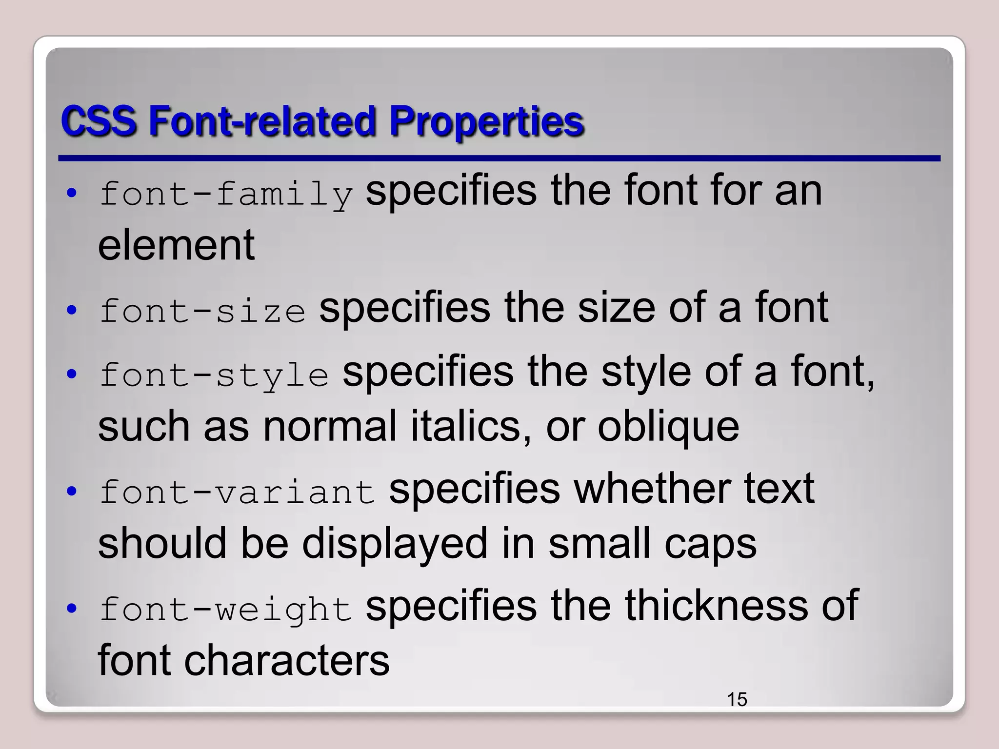

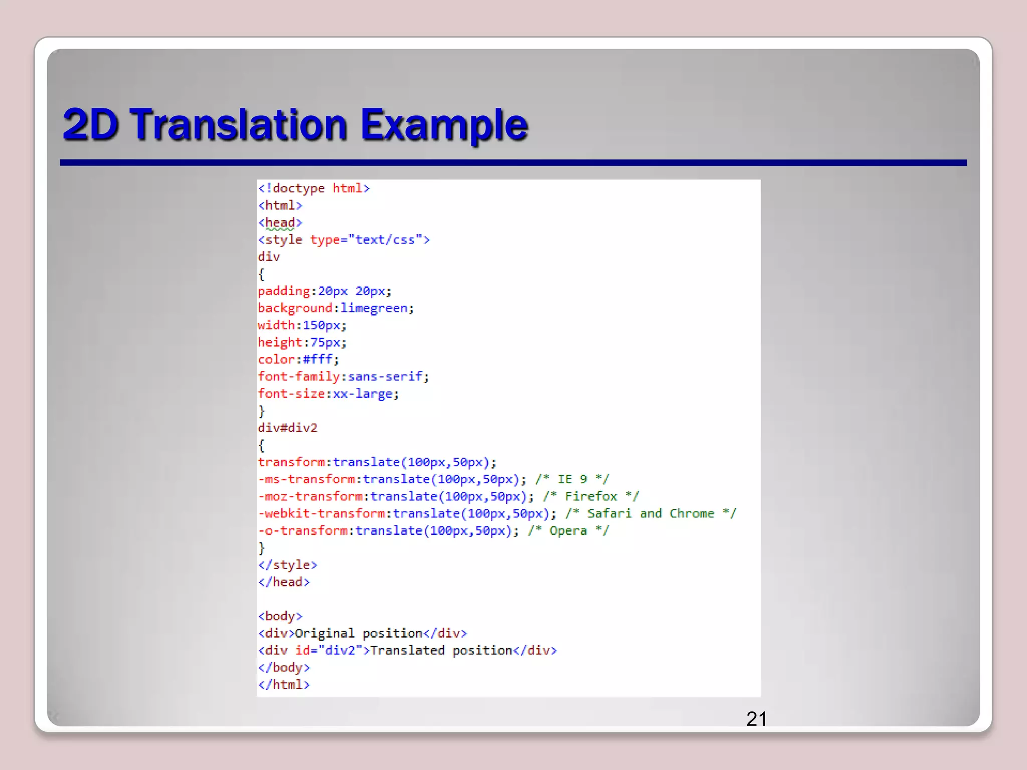
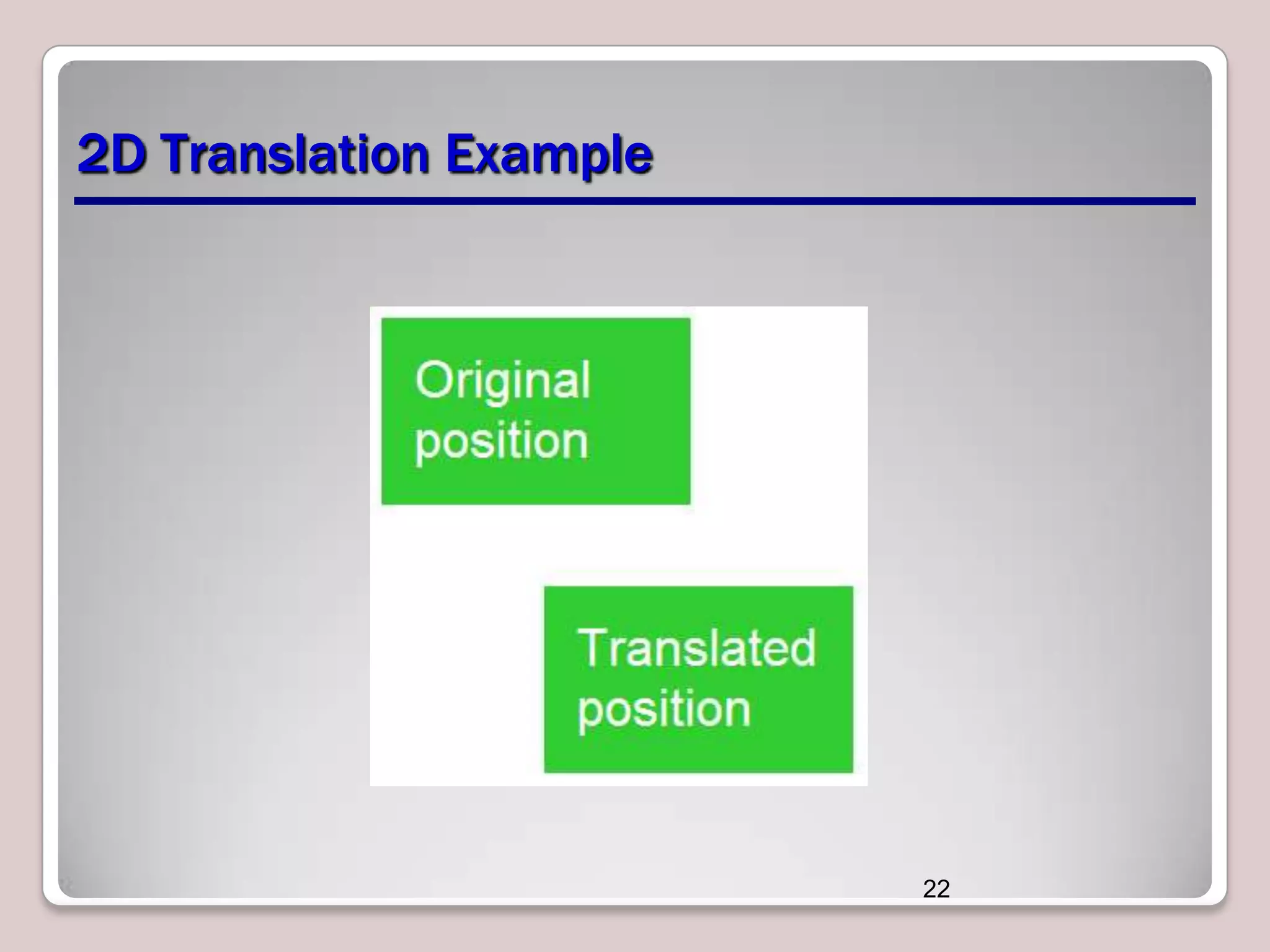
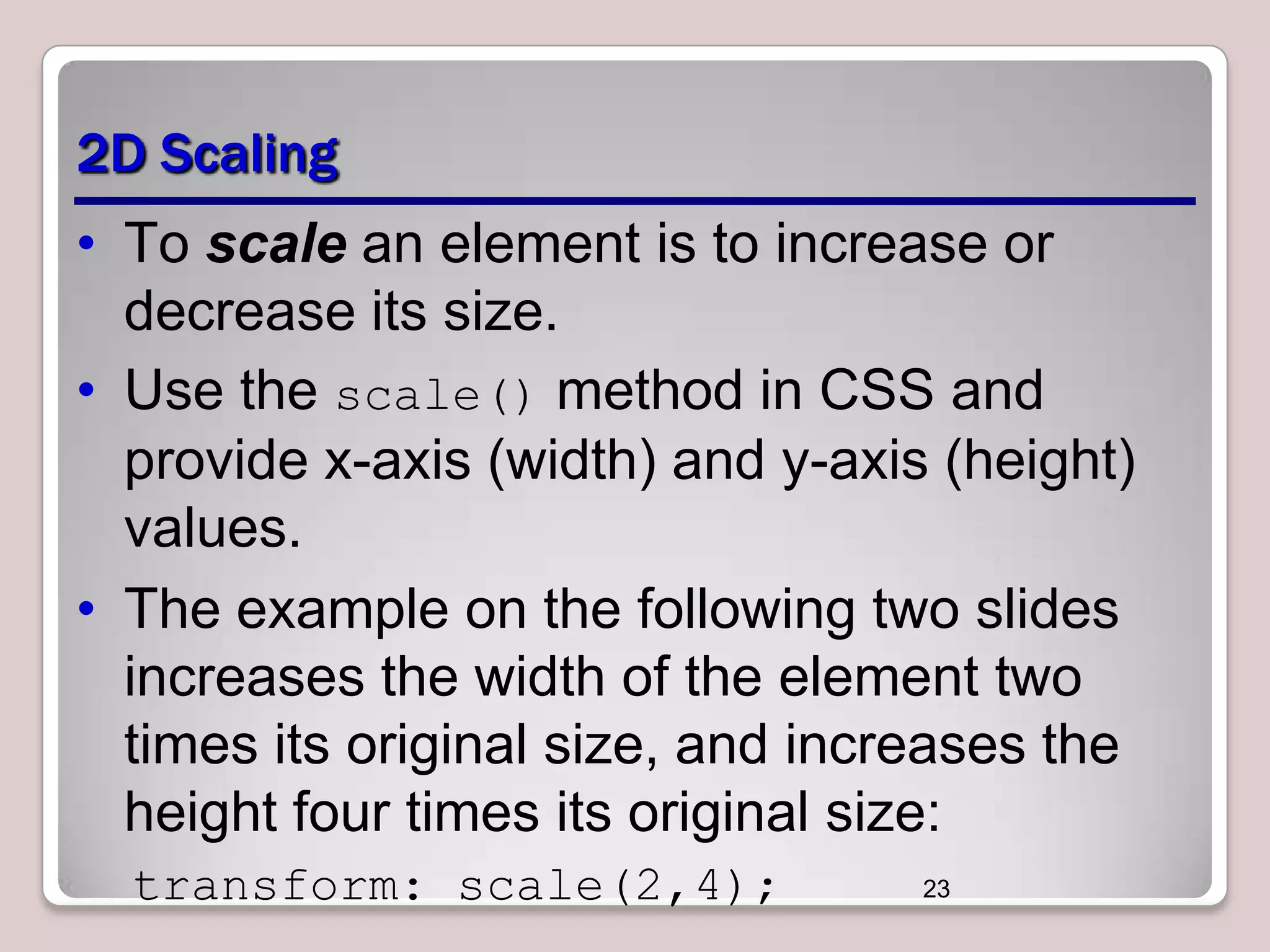
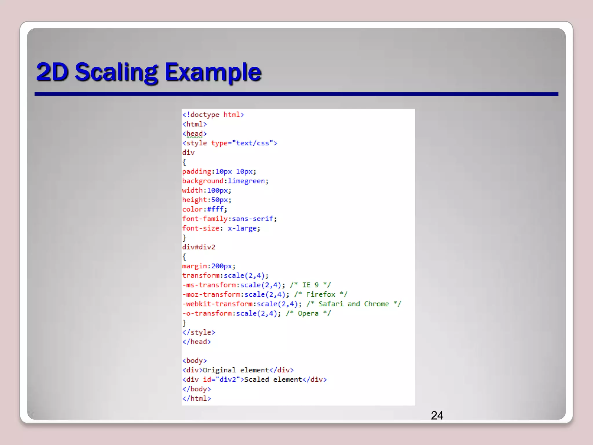

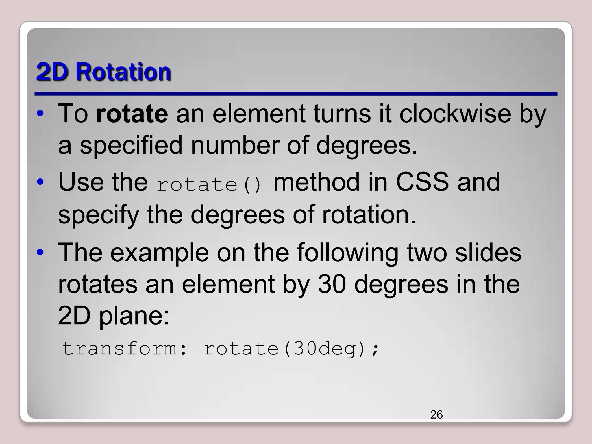
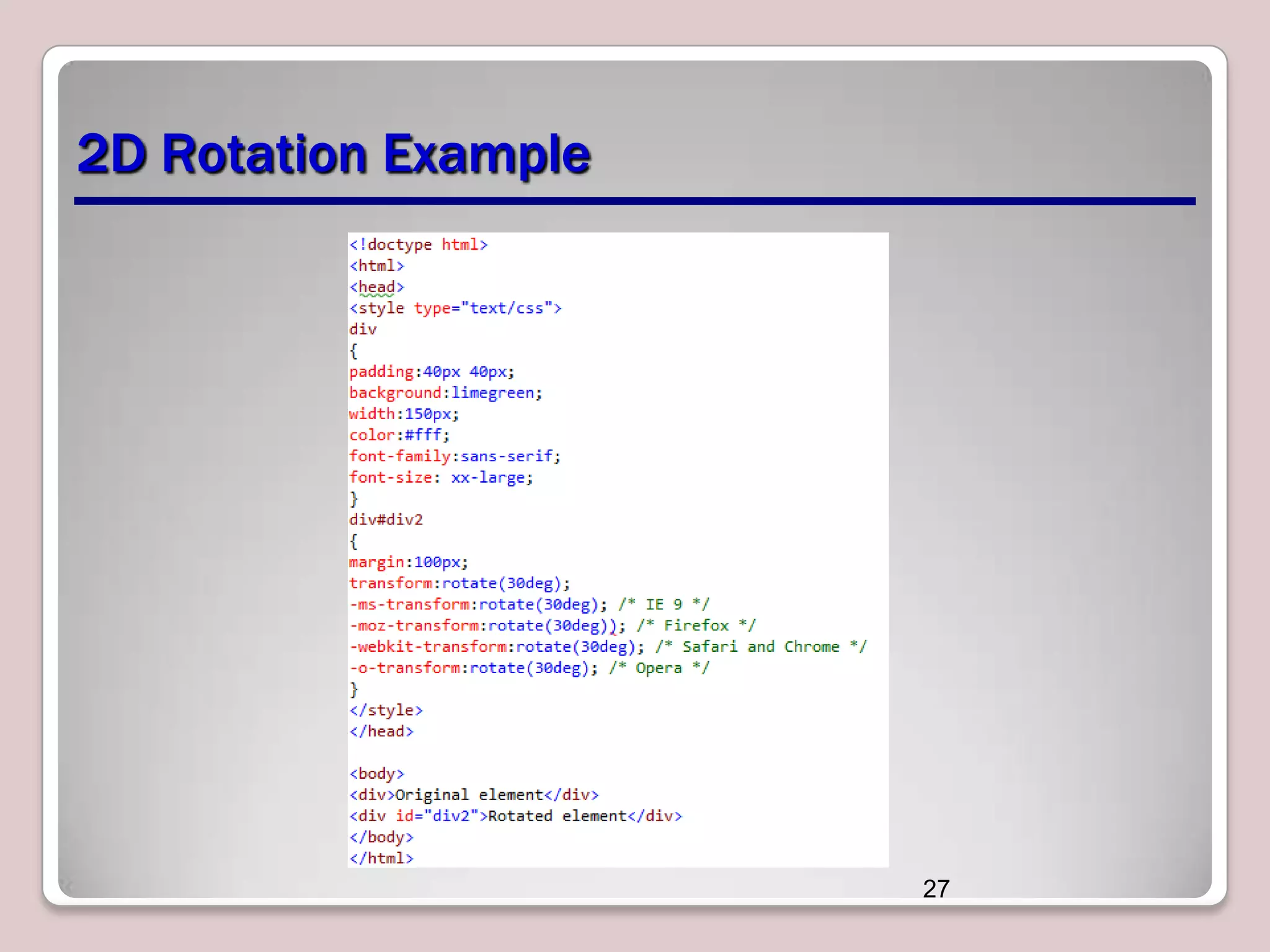

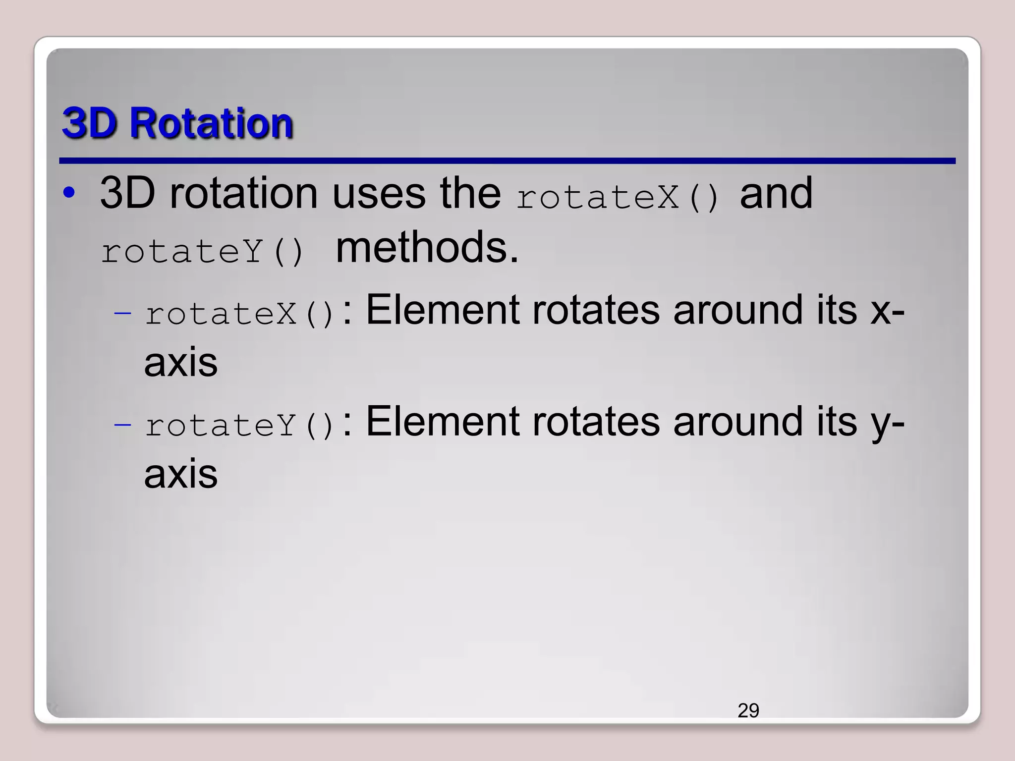
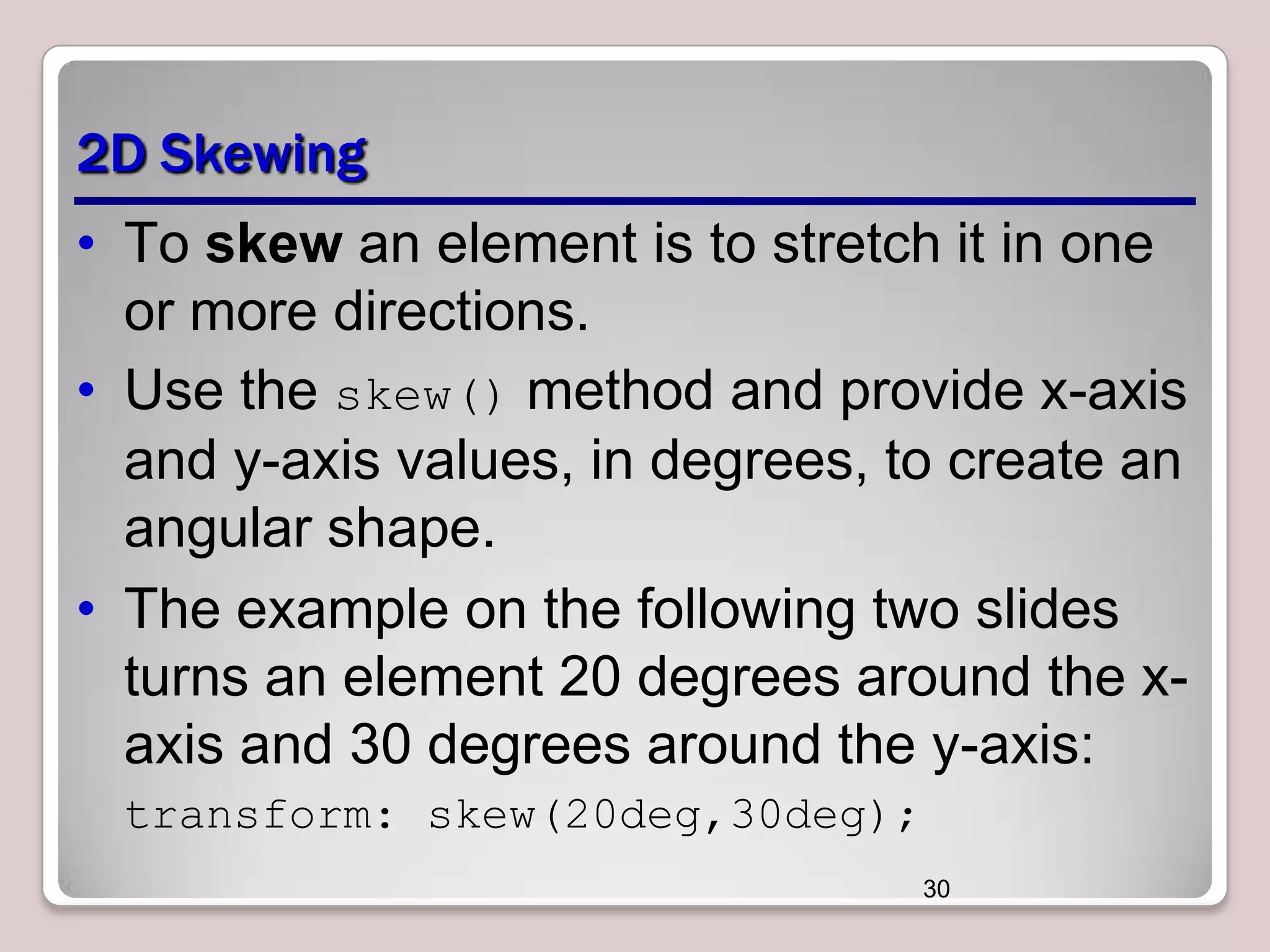
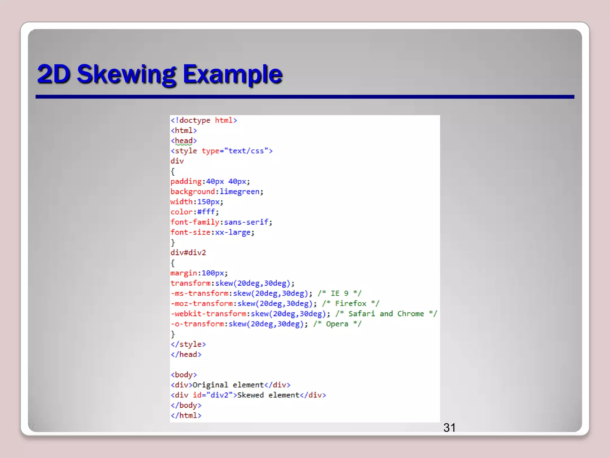
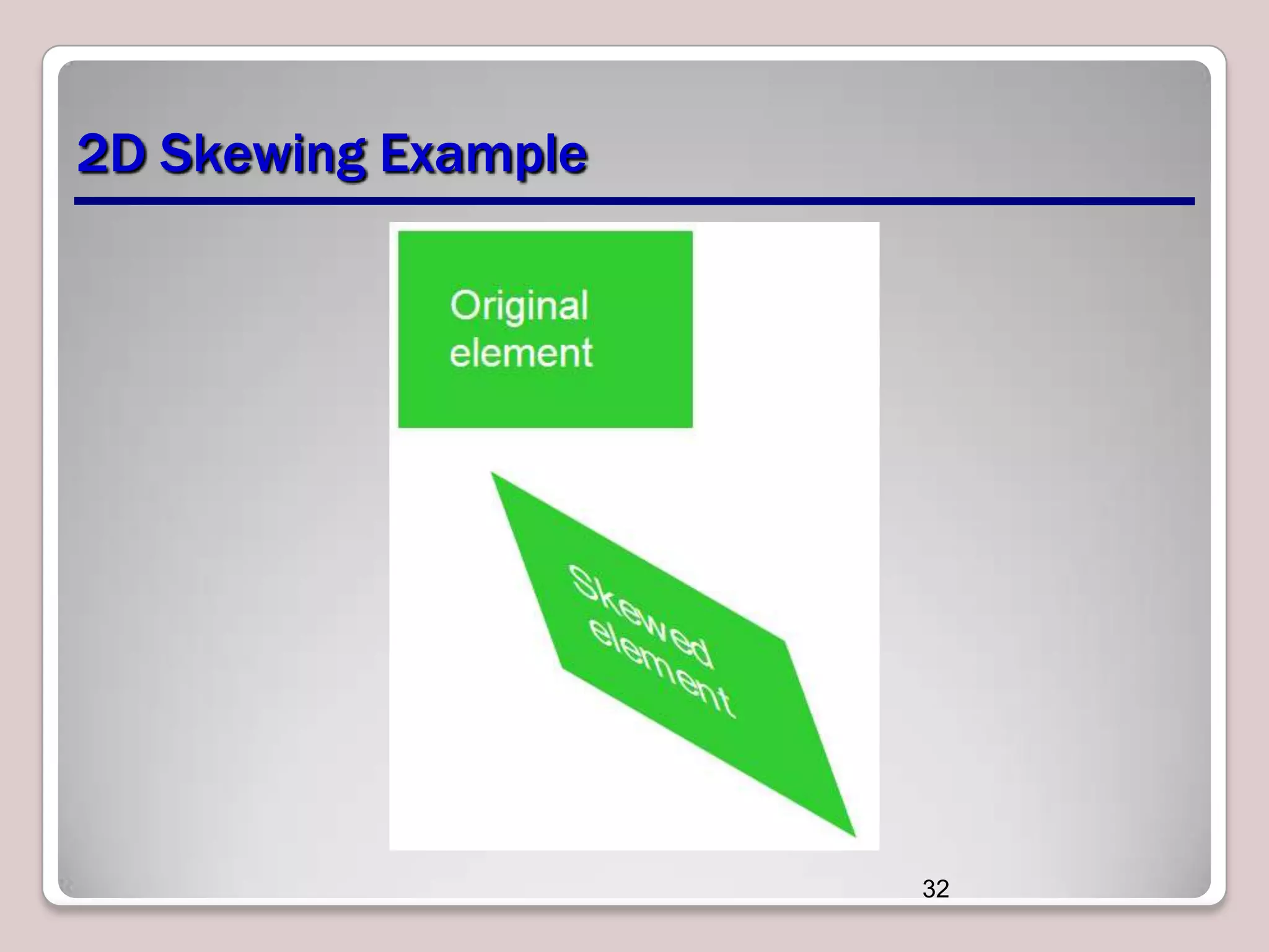
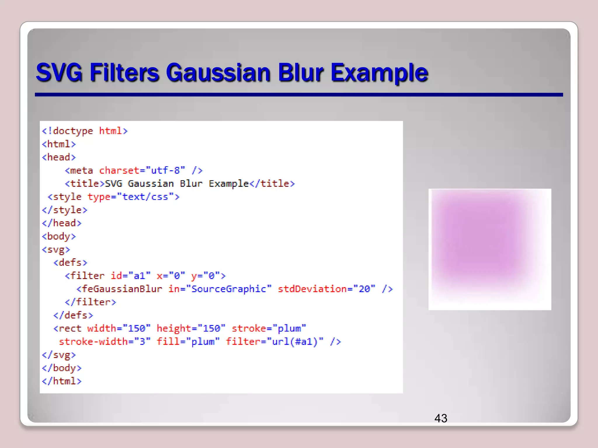
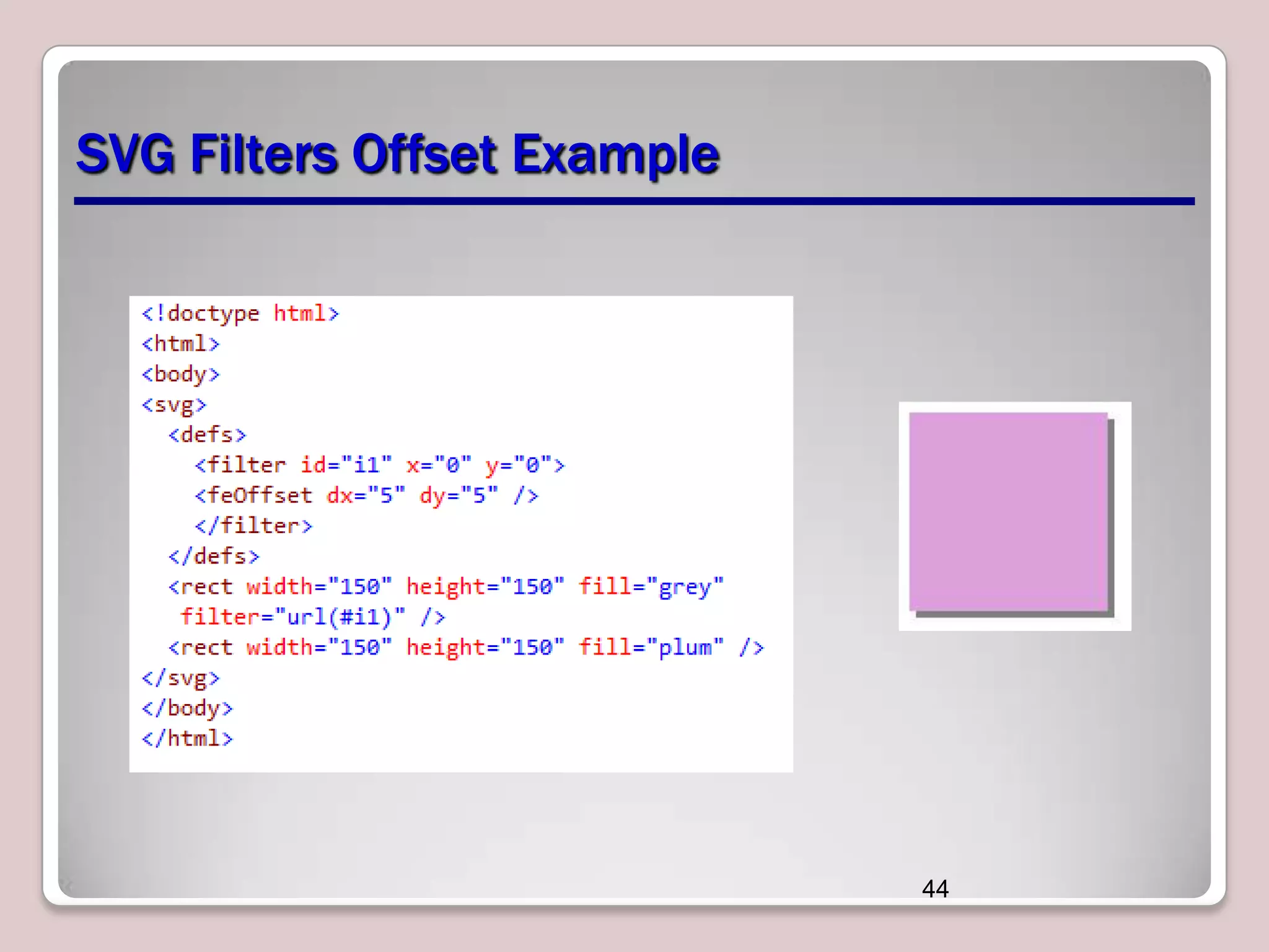


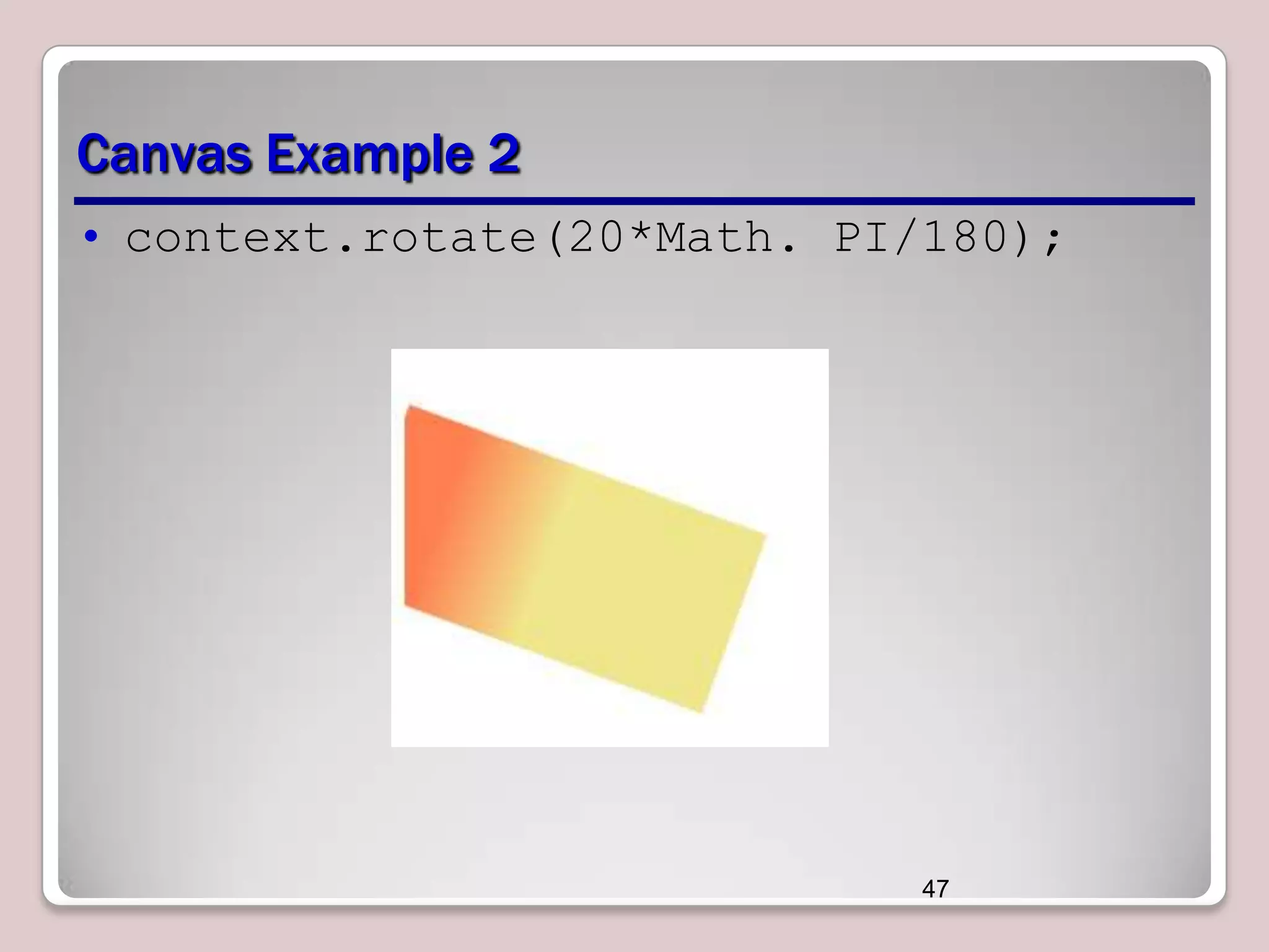
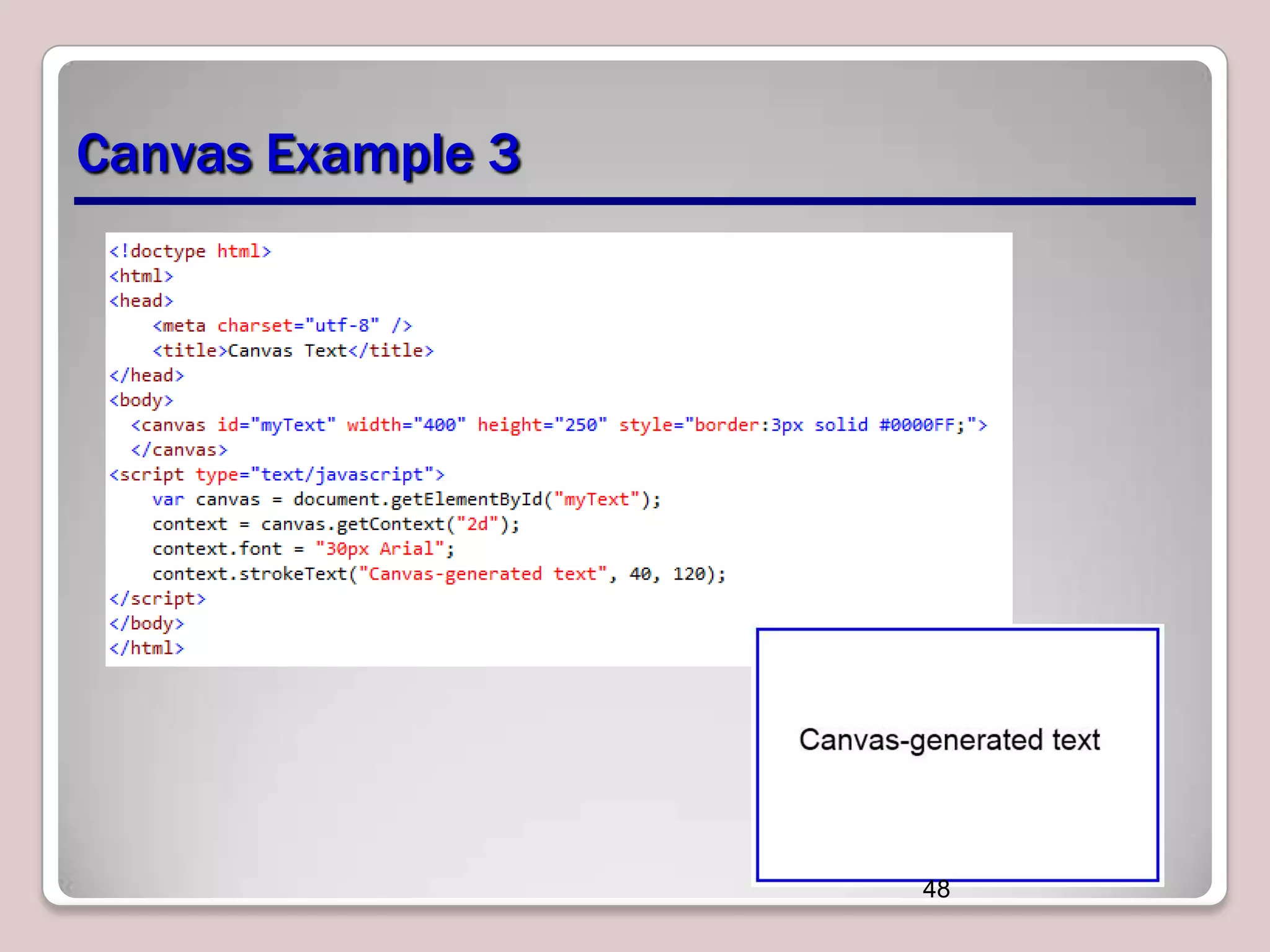


This document discusses various CSS properties and techniques for managing graphical interfaces, including border-radius for rounded corners, box-shadow for drop shadows, opacity for transparency, gradients for color blending, font properties, transformations like translation and rotation, transitions, animations, SVG filters, and the canvas element. Key topics covered are rounded corners, drop shadows, transparency, gradients, fonts, 2D and 3D transformations, transitions, animations, SVG filters, and using the canvas element to draw shapes.


