Download to read offline

![www.1stepgrow.com
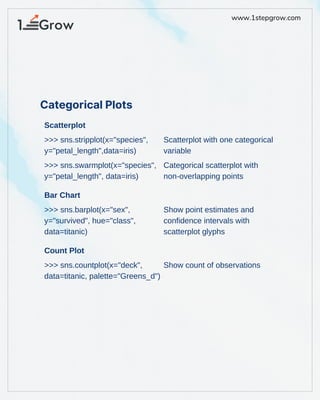
Point Plot
Violinplot
Boxplot
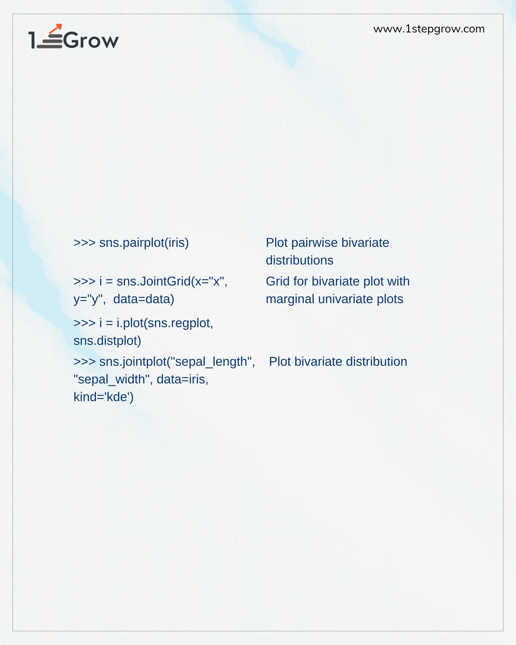
>>> sns.pointplot(x="class",
y="survived", hue="sex",
data=titanic, palette={"male":"g",
"female":"m"}, markers=["^","o"],
linestyles=["-","--"])
>>> sns.violinplot(x="age",
y="sex", hue="survived",
data=titanic)
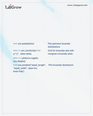
>>> h = sns.PairGrid(iris)
>>> h = h.map(plt.scatter)
>>> sns.boxplot(x="alive",
y="age", hue="adult_male",
data=titanic)
>>> sns.boxplot
(data=iris,orient="h")
Show point estimates and
confidence intervals as
rectangular bars
Violin plot
Subplot grid for plotting pairwise
relationships
Boxplot
Boxplot with wide-form data](https://image.slidesharecdn.com/mk-250208105035-c32678aa/85/Python-for-data-science-Datascience-Python-4-320.jpg)


![www.1stepgrow.com
Point Plot
Violinplot
Boxplot
>>> sns.pointplot(x="class",
y="survived", hue="sex",
data=titanic, palette={"male":"g",
"female":"m"}, markers=["^","o"],
linestyles=["-","--"])
>>> sns.violinplot(x="age",
y="sex", hue="survived",
data=titanic)
>>> h = sns.PairGrid(iris)
>>> h = h.map(plt.scatter)
>>> sns.boxplot(x="alive",
y="age", hue="adult_male",
data=titanic)
>>> sns.boxplot
(data=iris,orient="h")
Show point estimates and
confidence intervals as
rectangular bars
Violin plot
Subplot grid for plotting pairwise
relationships
Boxplot
Boxplot with wide-form data](https://image.slidesharecdn.com/mk-250208105035-c32678aa/75/Python-for-data-science-Datascience-Python-4-2048.jpg)


This document provides a cheat sheet for using Seaborn in Python for data visualization, demonstrating various plotting techniques such as scatter plots, bar charts, and boxplots. It includes examples with datasets like Titanic and Iris, showcasing how to create facet grids, conditional relationships, and display statistical information visually. Additionally, it emphasizes the use of different plot types to present categorical and bivariate data clearly.


