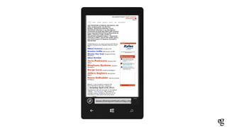
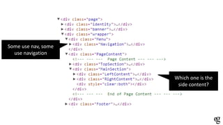
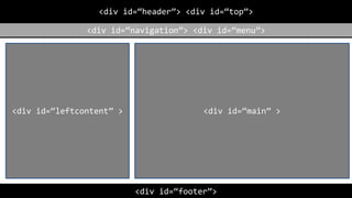
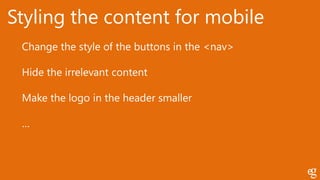
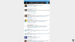
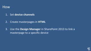
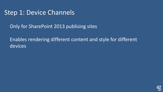
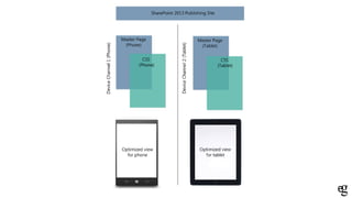
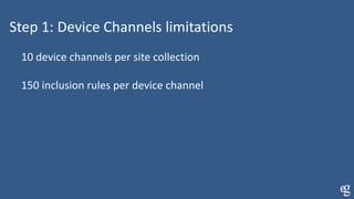
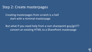
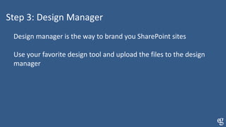
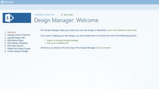
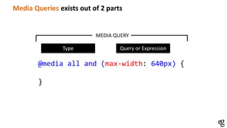
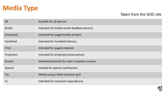
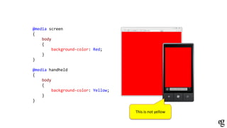
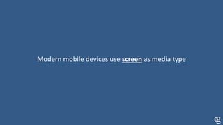
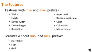
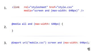
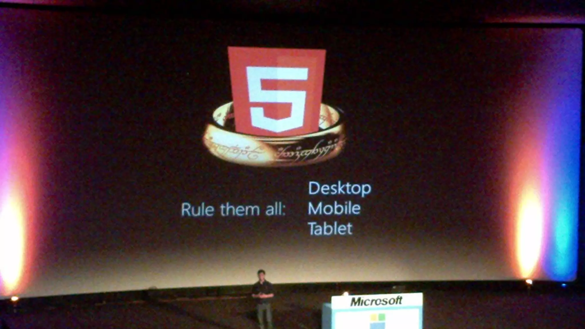
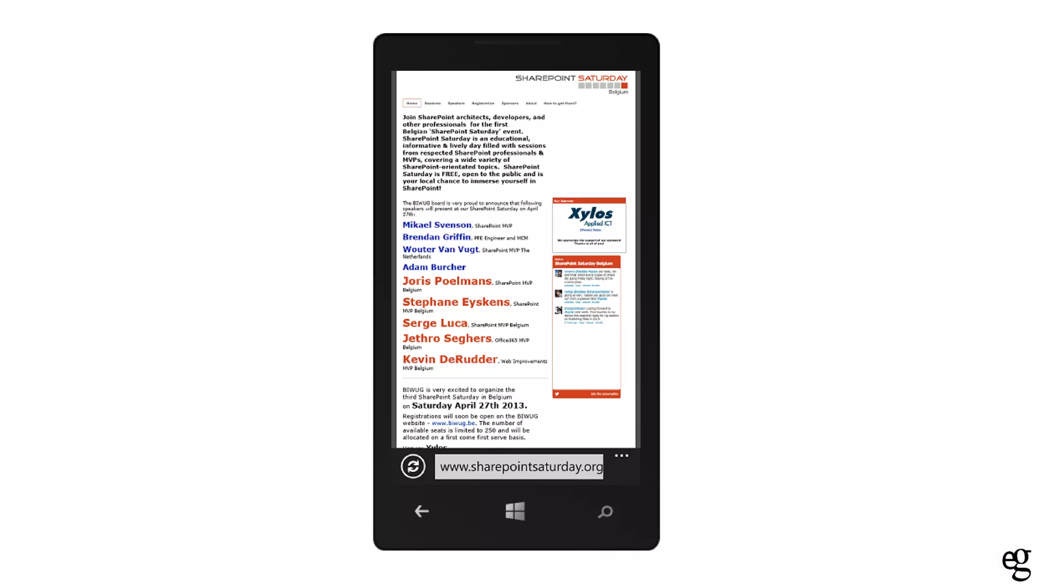
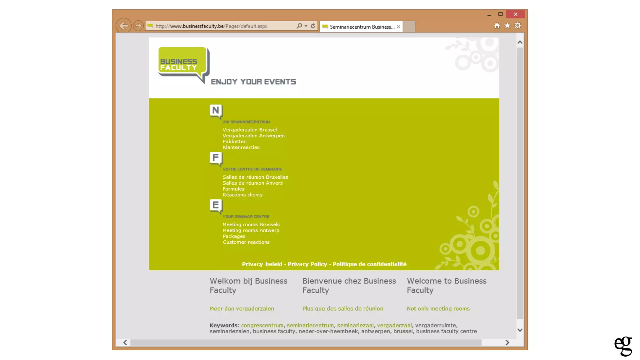
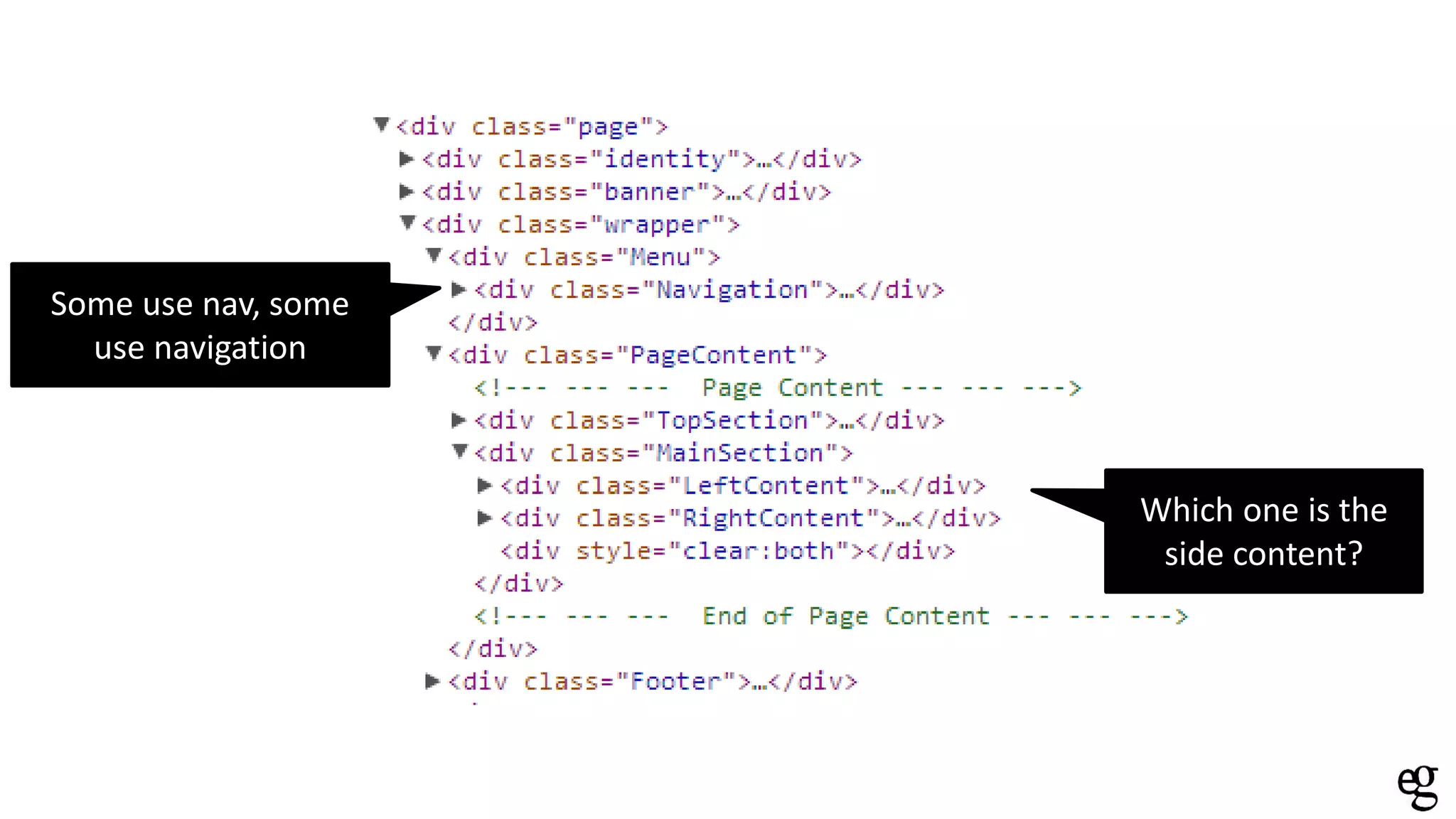
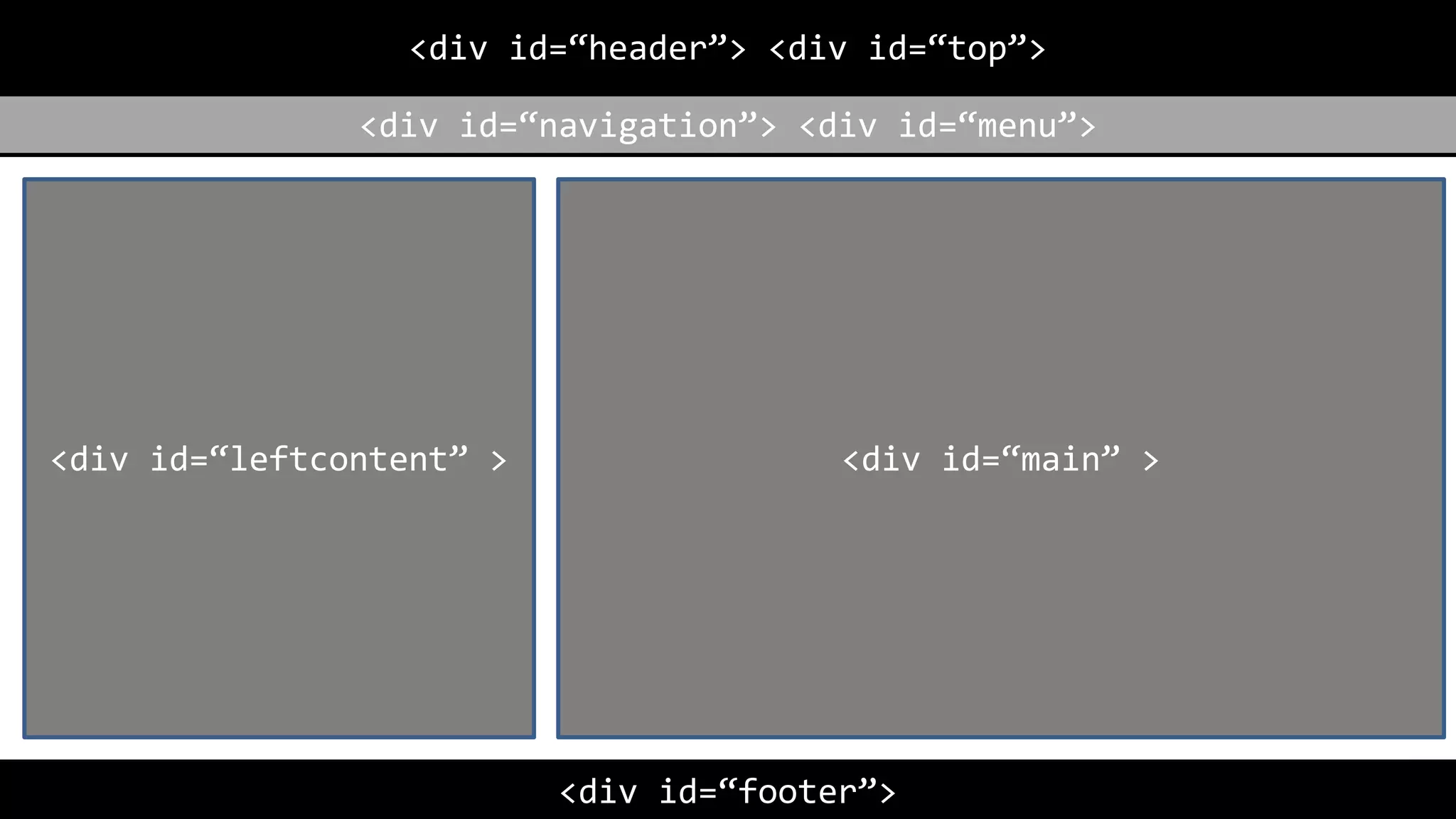
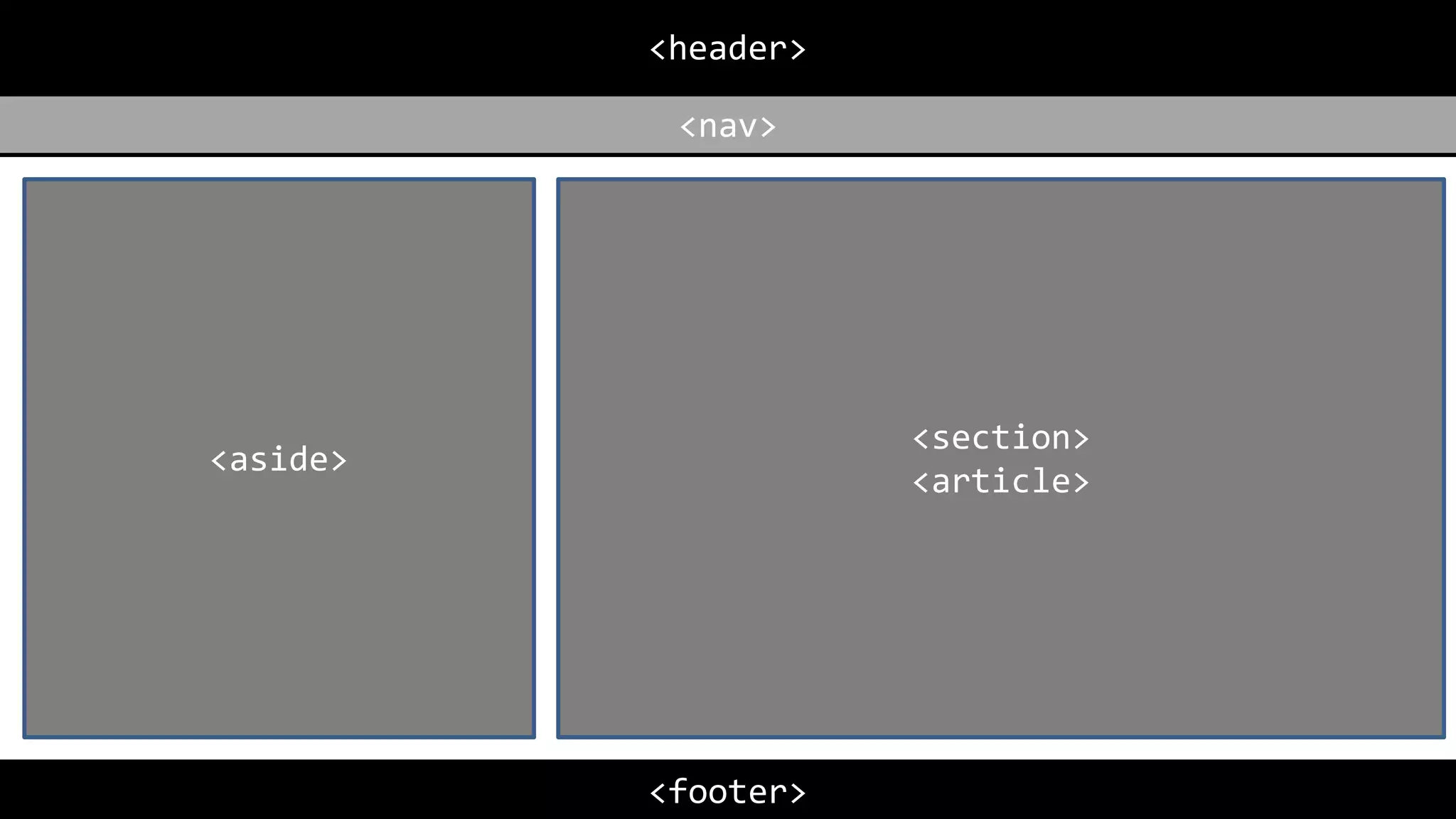
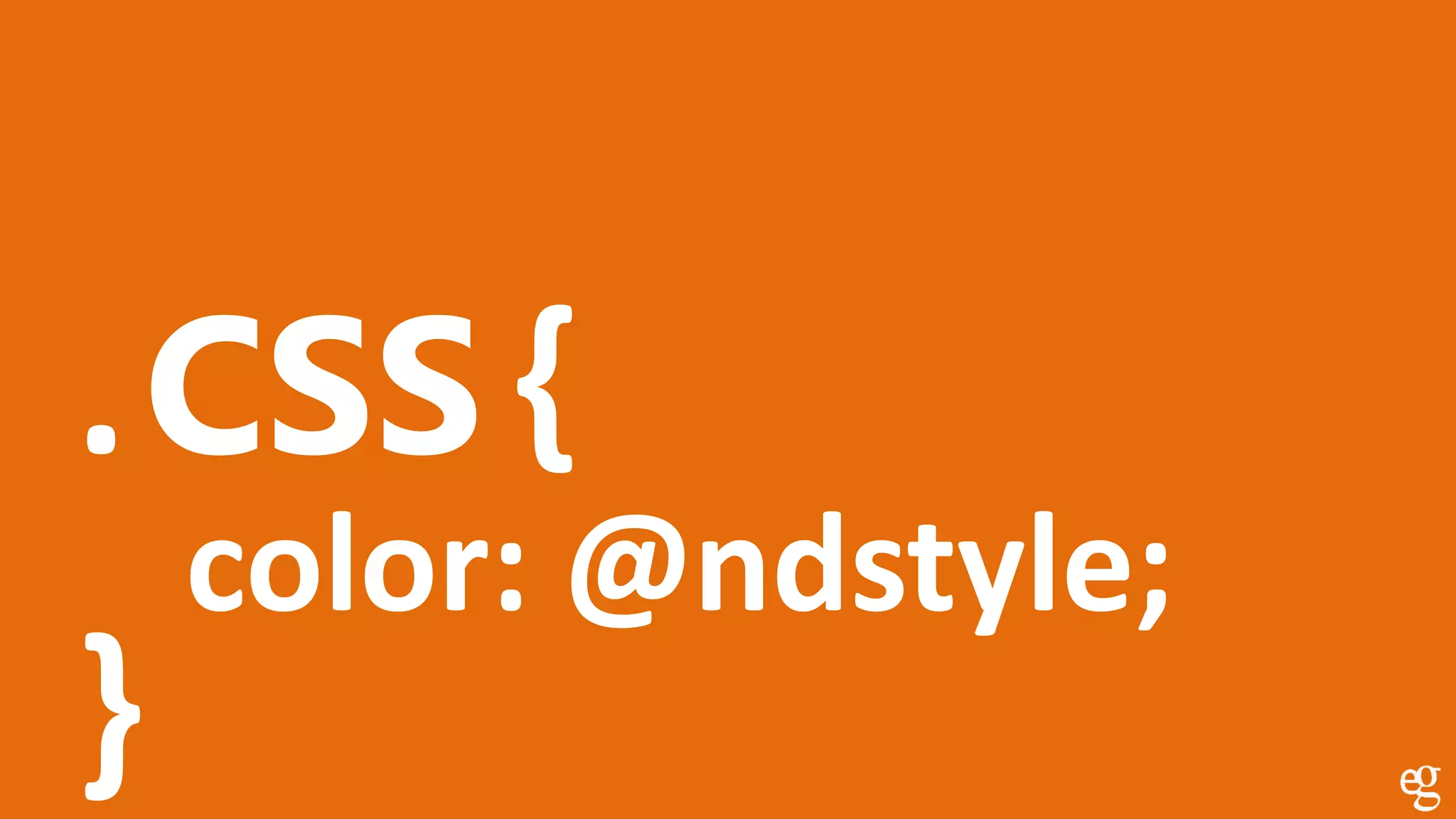
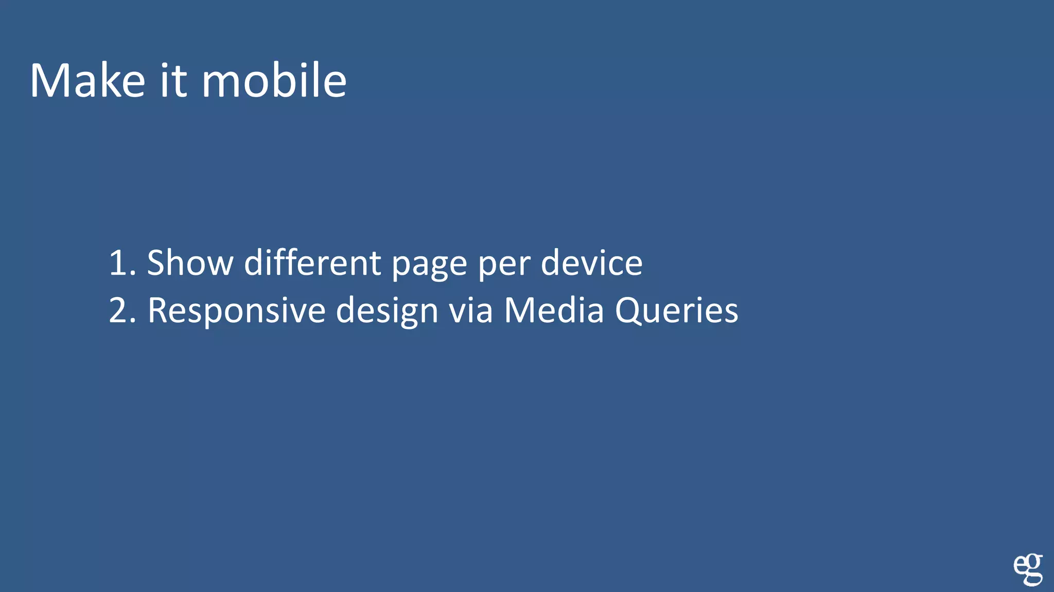
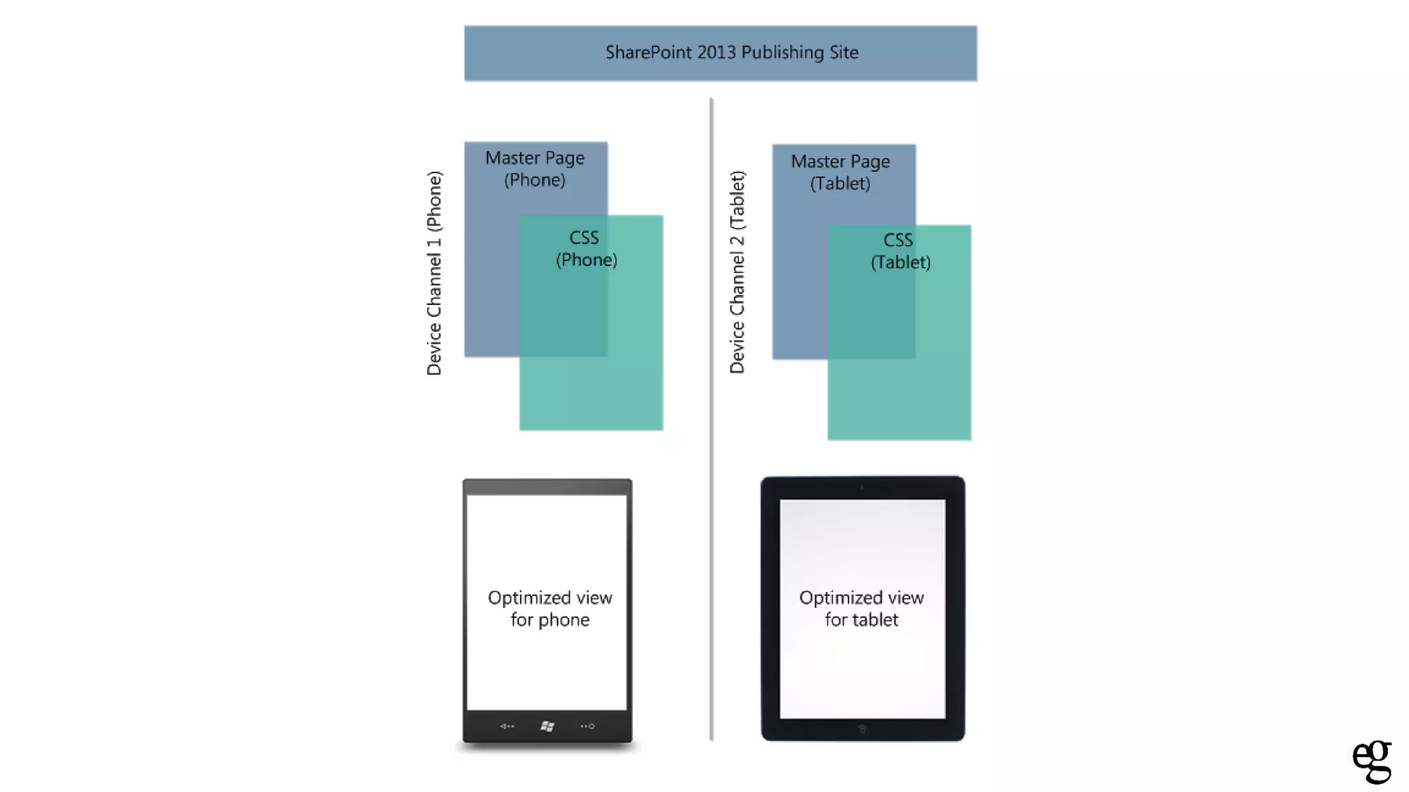
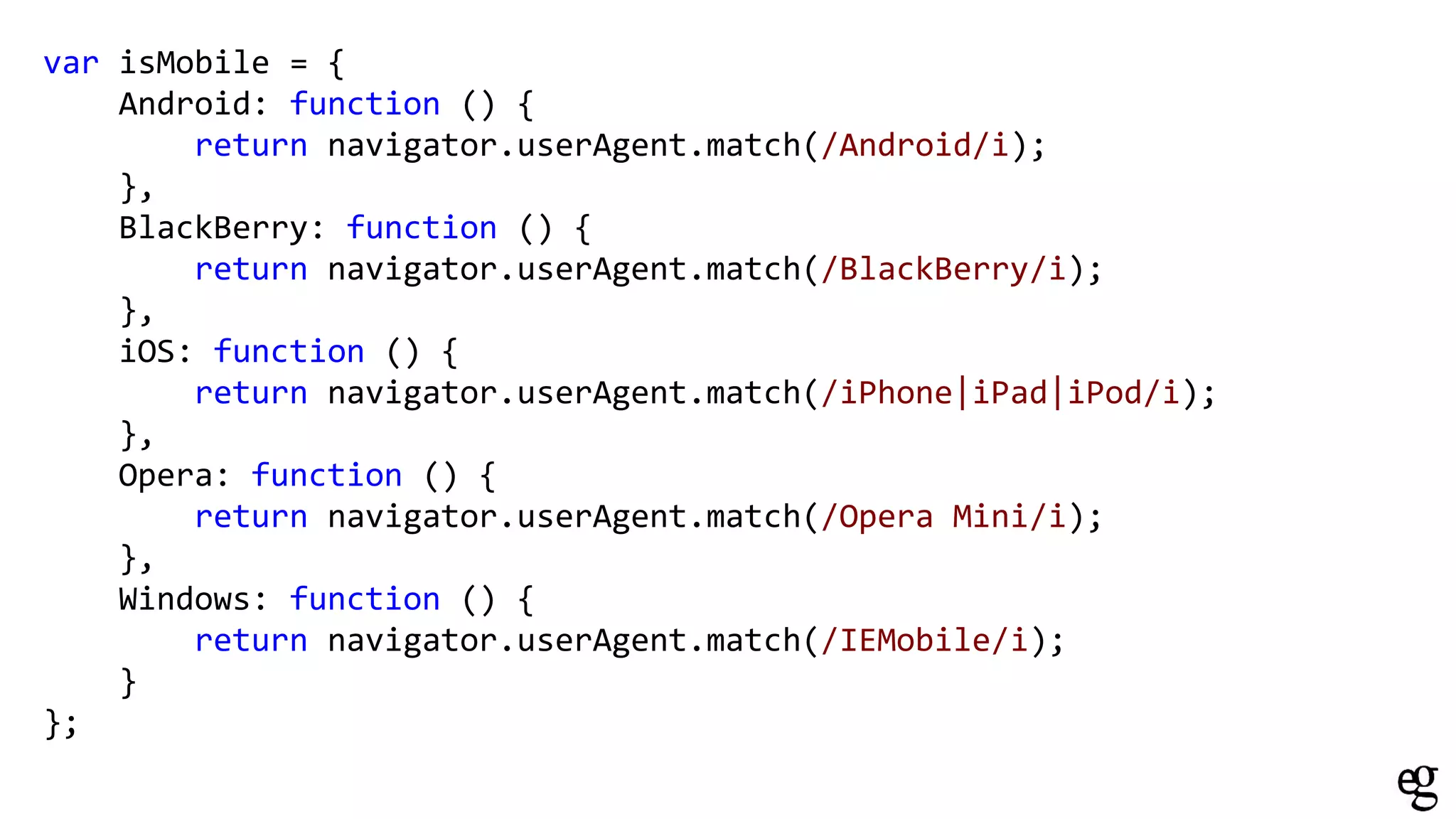
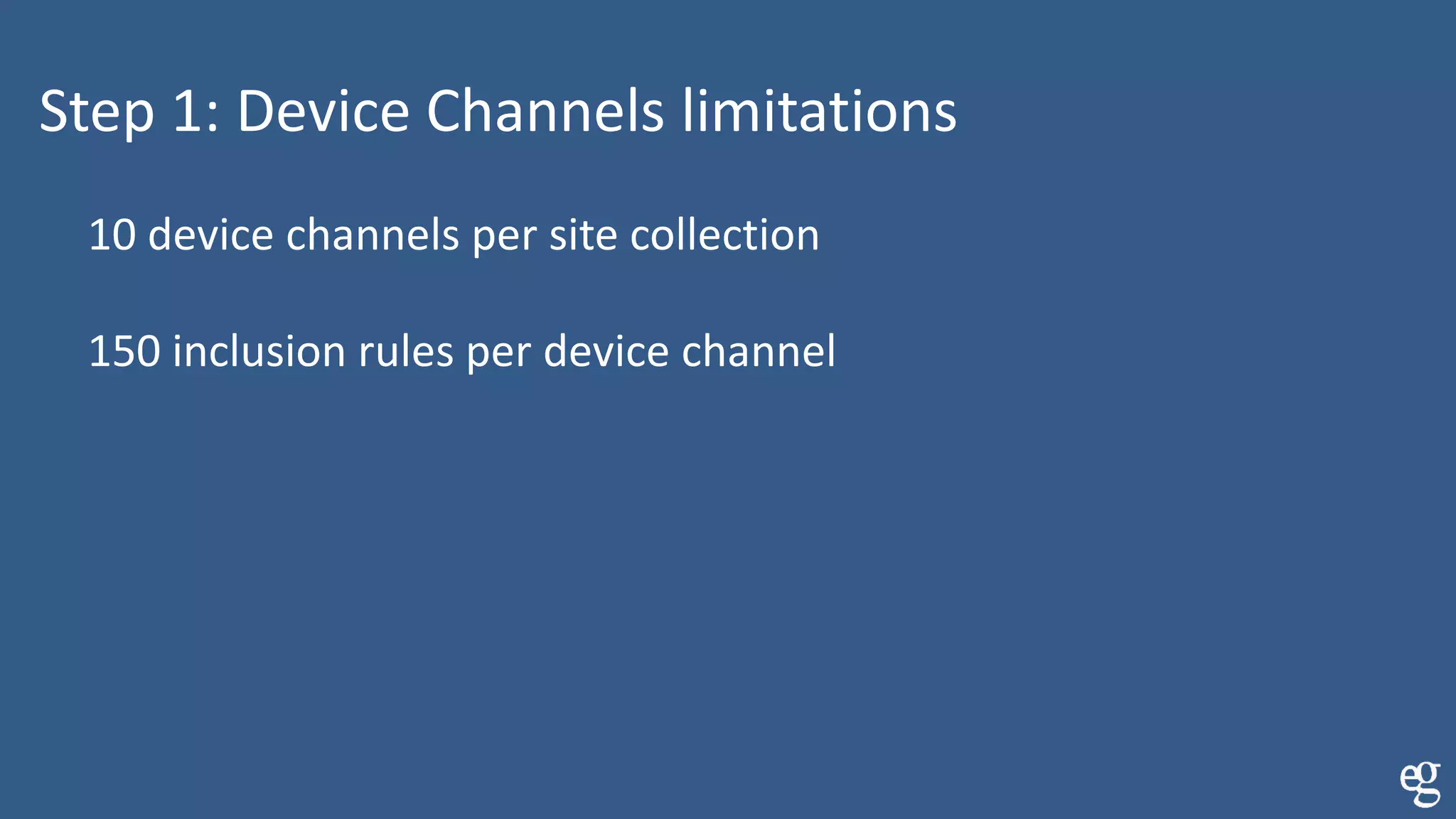
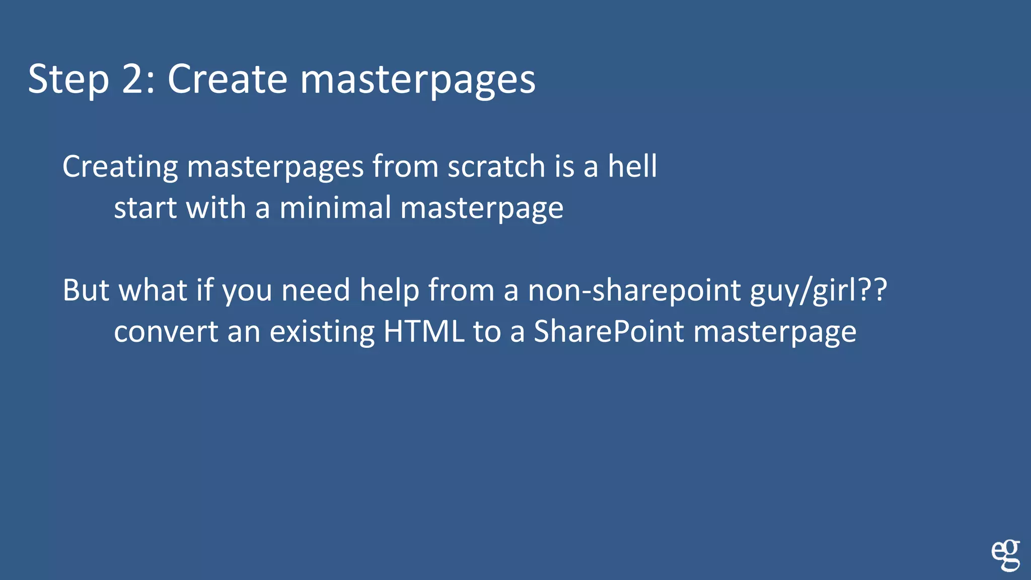
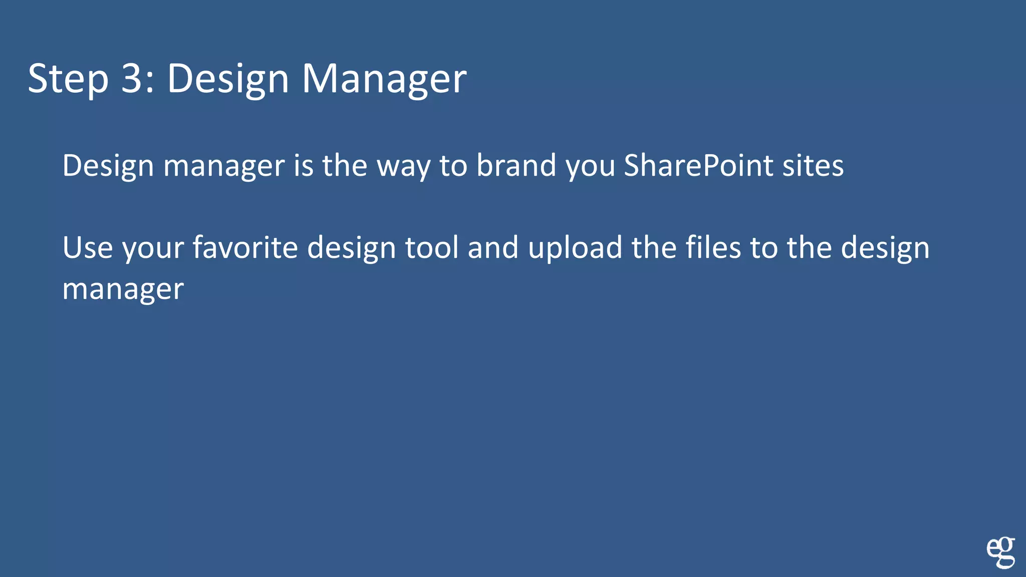
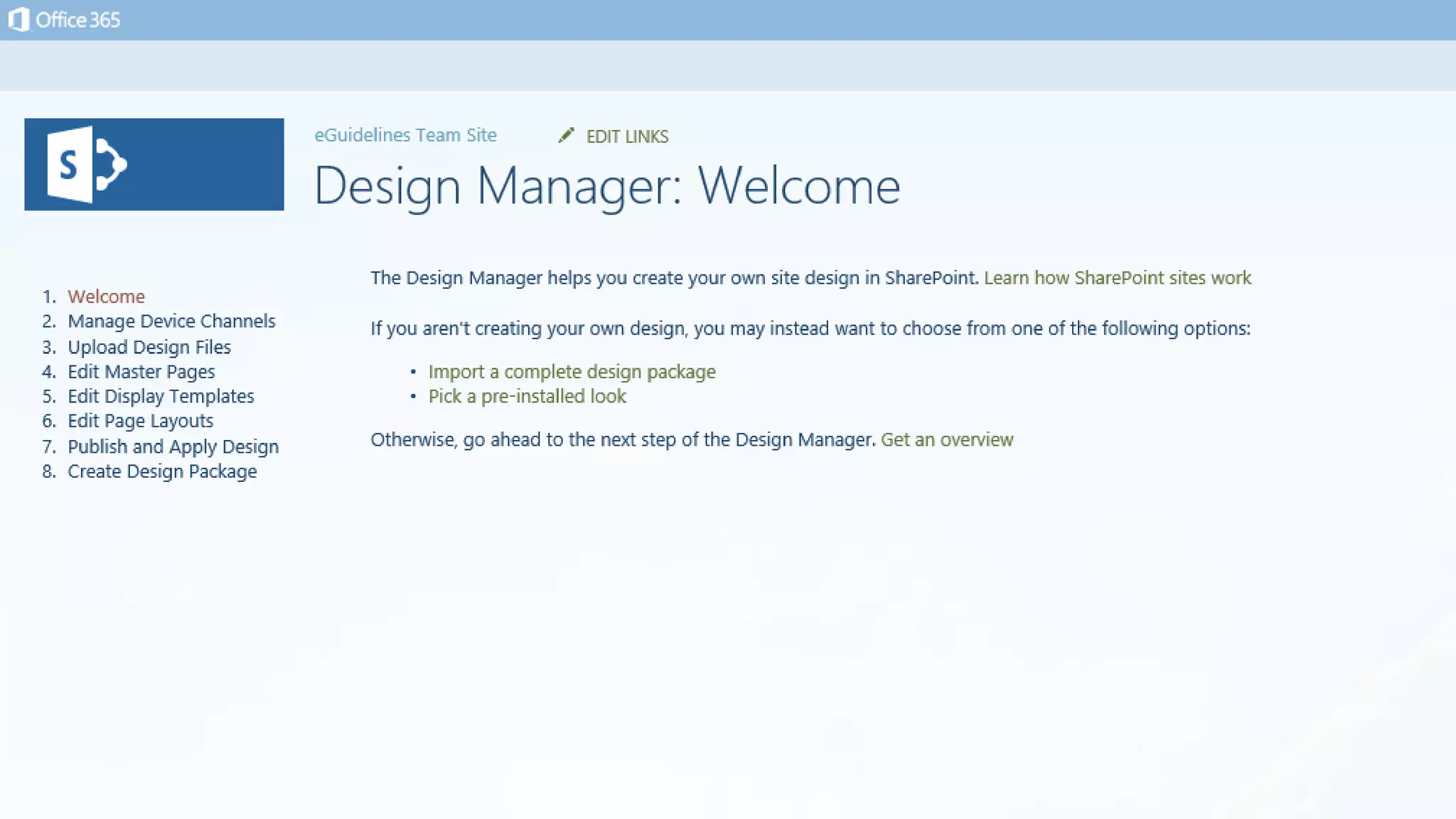
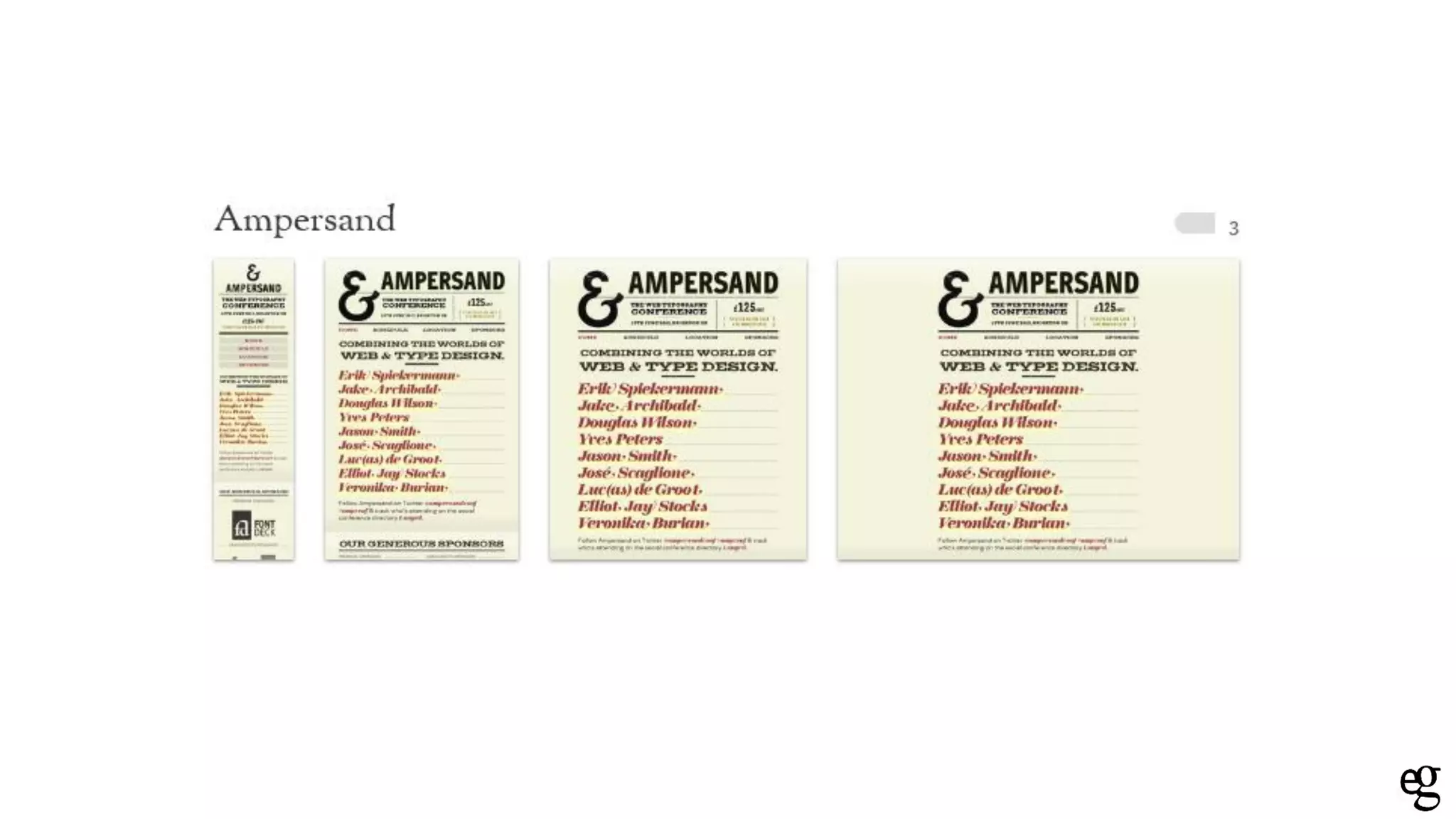
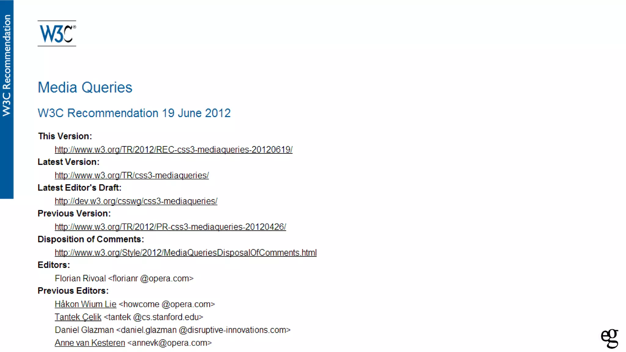
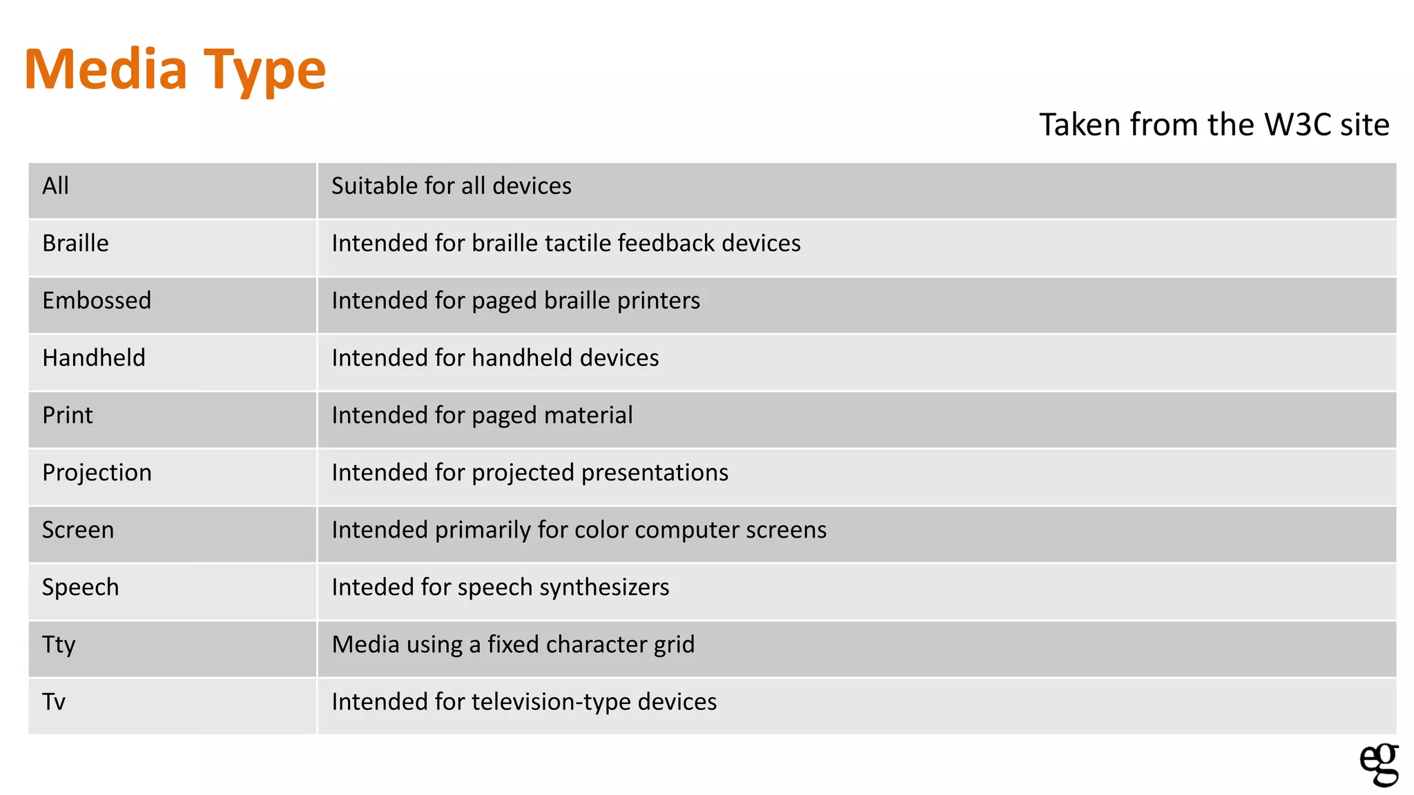
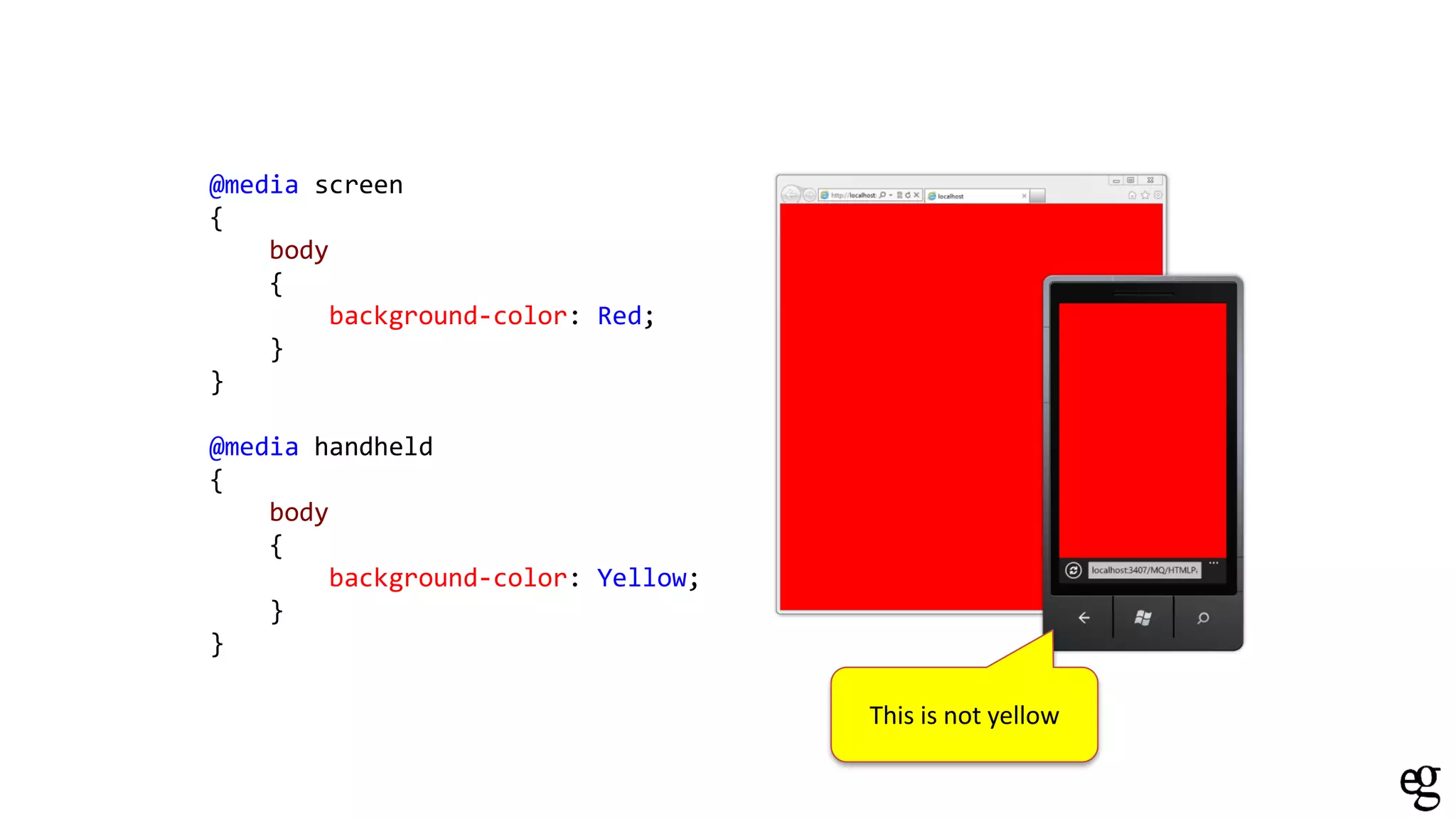
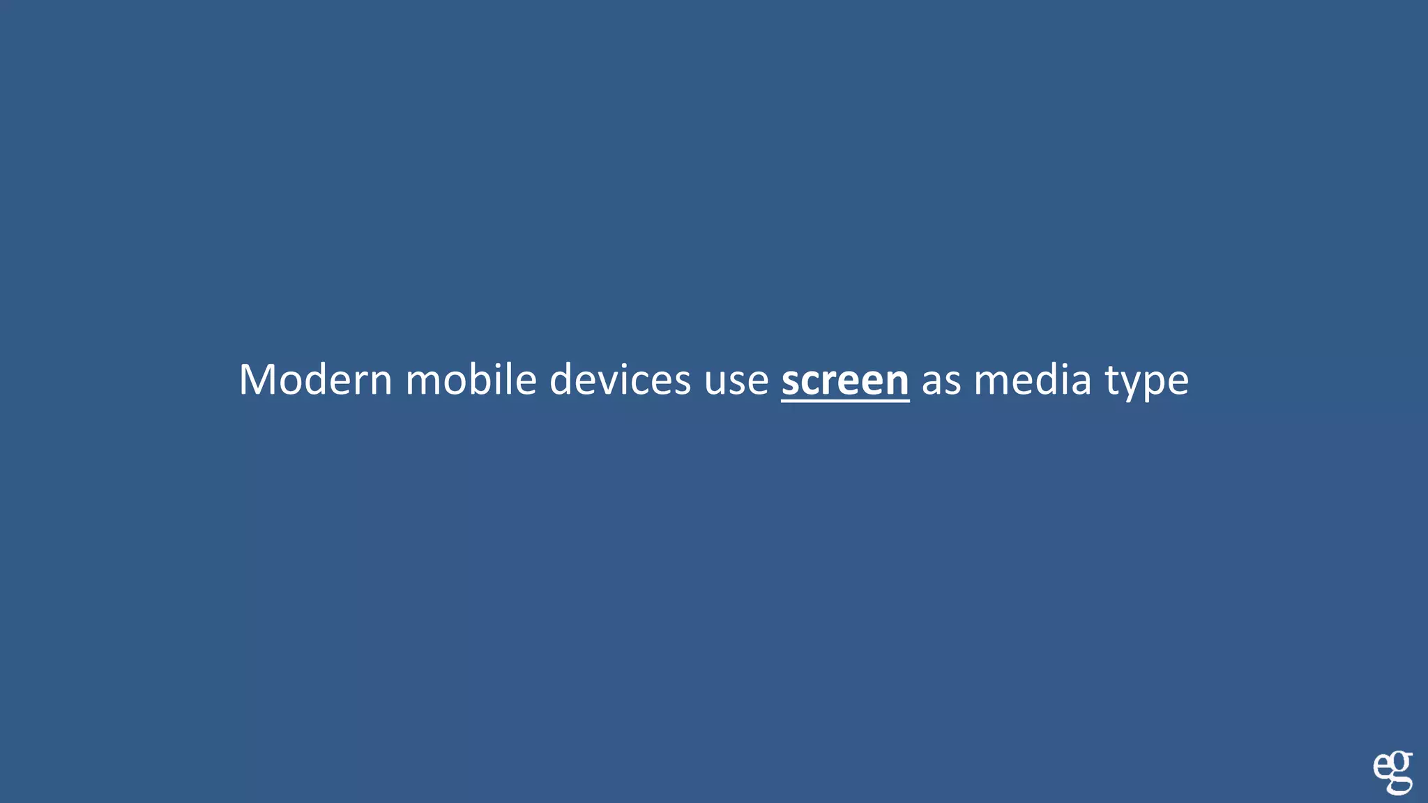
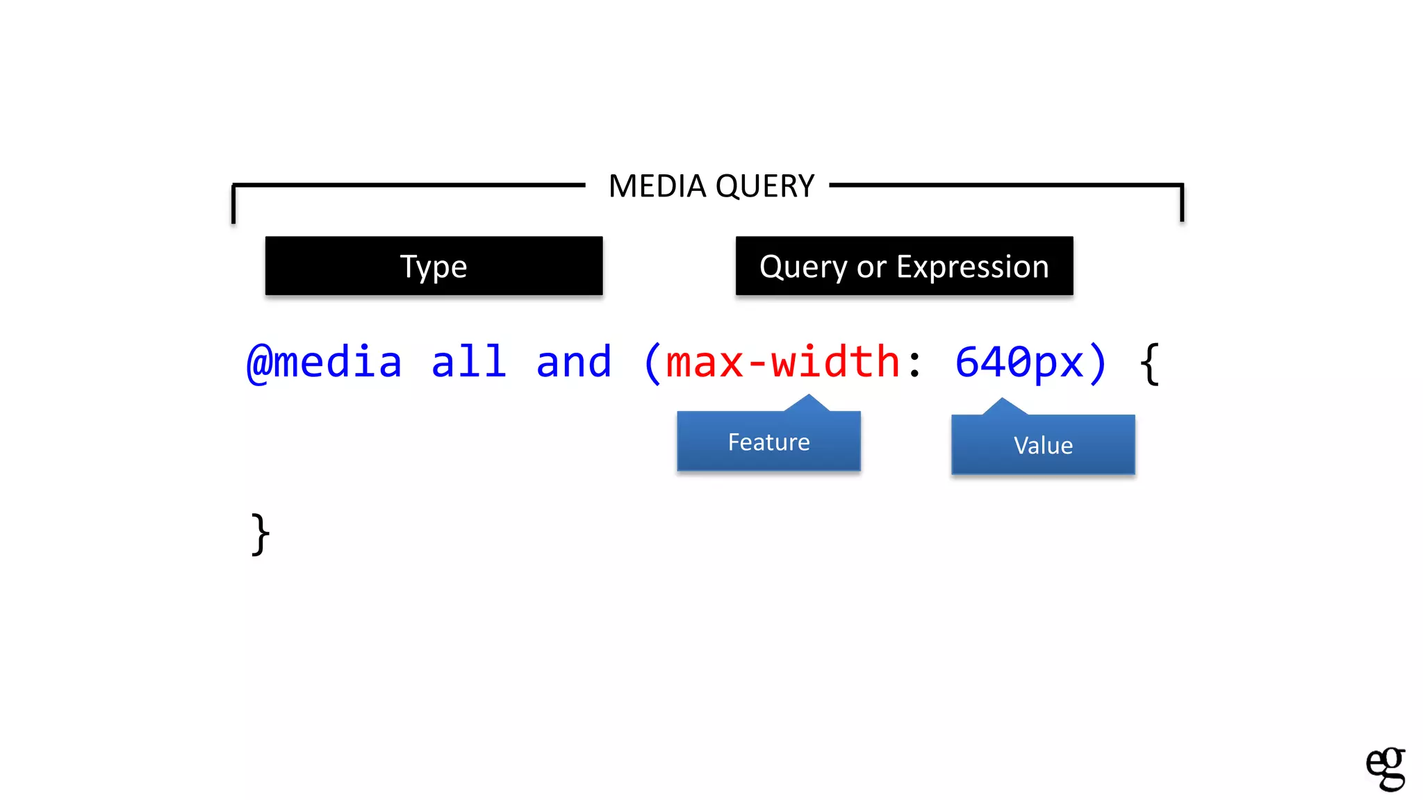
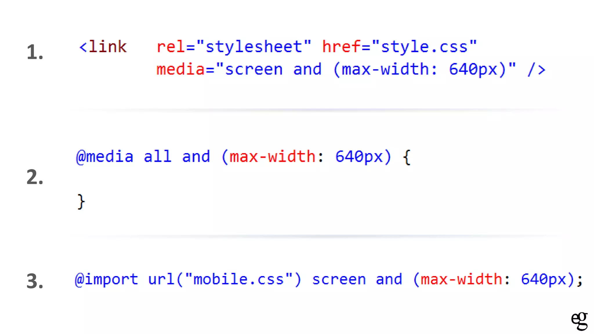
KEMBAR78
Responsive SharePoint | PDF
Get your SharePoint website on that mobile device
using HTML5 and CSS3
#spsbe
@kevinderudder
Thanks to our
Sponsors
Platinum
Gold
Silver
@kevinderudder working for
eGuidelines and a lecturer at the
Technical University of West Flanders.
Contact me on kevin@e-guidelines.be
didn’t notice the SharePoint part
SharePoint site is a site
GOAL
Why
How, what are the options
Conclusion
WHY THIS TOPIC
WHY THIS TOPIC
OR WHY SHOULD YOU CARE
Photo by http://neuroticworkaholic.blogspot.com
2013
NOW
IS
HOW? Give meaning to your content
Style that content
<HTML />
.css{}
HTML< />
IS FOR THE STRUCTURE ONLY
IMPORTANT
that you show the right content
IS
on each device
What is the right
content?
Desktop first
Mobile first
Now we’ve thought
about the content
How do you
identify it?
logo
navigation
intro
content
Side
content
footer
Which one is the
side content?
Some use nav, some
use navigation
<div id=“header”> <div id=“top”>
<div id=“navigation”> <div id=“menu”>
<div id=“footer”>
<div id=“leftcontent” > <div id=“main” >
footer
menu
title
small
text
content
header
nav
copyright
button
main
search
msonormal
date
smalltext
body
<div id=“header”> <div id=“top”>
<div id=“navigation”> <div id=“menu”>
<div id=“footer”>
<div id=“leftcontent” > <div id=“main” >
<header>
<nav>
<footer>
<aside>
<section>
<article>
CSS{.
}
color: @ndstyle;
Styling the content for mobile
Change the style of the buttons in the <nav>
Hide the irrelevant content
Make the logo in the header smaller
…
DEMO
Make it mobile
1. Show different page per device
2. Responsive design via Media Queries
Make it mobile
1. Show different page per device
How
1. Set device channels
2. Create masterpages in HTML
3. Use the Design Manager in SharePoint 2013 to link a
masterpage to a specific device
Step 1: Device Channels
Only for SharePoint 2013 publising sites
Enables rendering different content and style for different
devices
if (/MSIE (d+.d+);/.test(navigator.userAgent)) {
var ieversion = new Number(RegExp.$1)
if (ieversion >= 9)
document.write("You're using IE9 or above")
else if (ieversion >= 8)
document.write("You're using IE8 or above")
else if (ieversion >= 7)
document.write("You're using IE7.x")
else if (ieversion >= 6)
document.write("You're using IE6.x")
else if (ieversion >= 5) // <------------- Just because I can
document.write("You're using IE5.x")
}
else
document.write("hmmm, dunno")
var isMobile = {
Android: function () {
return navigator.userAgent.match(/Android/i);
},
BlackBerry: function () {
return navigator.userAgent.match(/BlackBerry/i);
},
iOS: function () {
return navigator.userAgent.match(/iPhone|iPad|iPod/i);
},
Opera: function () {
return navigator.userAgent.match(/Opera Mini/i);
},
Windows: function () {
return navigator.userAgent.match(/IEMobile/i);
}
};
Step 1: Device Channels limitations
10 device channels per site collection
150 inclusion rules per device channel
Step 2: Create masterpages
Creating masterpages from scratch is a hell
start with a minimal masterpage
But what if you need help from a non-sharepoint guy/girl??
convert an existing HTML to a SharePoint masterpage
Step 3: Design Manager
Design manager is the way to brand you SharePoint sites
Use your favorite design tool and upload the files to the design
manager
DEMO
My thoughts on this
Good
This is good if you want to deliver different content to different
devices
My thoughts on this
Bad
Do you really create different pages for different devices??
What if I want to share something by sending a link from my
mobile to your desktop?
What about SharePoint 2010, 2007????
Why do this when the rest of the world is doing it differently
Make it mobile
1. Show different page per device
2. Responsive design via Media Queries
What does it mean: RESPONSIVE??
Pictures of M. vatia
With device channels
Media Queries allow you write design code
based on the characteristics of a device
@media all and (max-width: 640px) {
}
MEDIA QUERY
Type Query or Expression
Media Queries exists out of 2 parts
All Suitable for all devices
Braille Intended for braille tactile feedback devices
Embossed Intended for paged braille printers
Handheld Intended for handheld devices
Print Intended for paged material
Projection Intended for projected presentations
Screen Intended primarily for color computer screens
Speech Inteded for speech synthesizers
Tty Media using a fixed character grid
Tv Intended for television-type devices
Taken from the W3C site
Media Type
AHA, there is something like handheld
@media screen
{
body
{
background-color: Red;
}
}
@media handheld
{
body
{
background-color: Yellow;
}
}
This is not yellow
Old devices didn’t have capable browsers
Modern mobile devices use screen as media type
@media all and (max-width: 640px) {
}
MEDIA QUERY
Feature Value
Type Query or Expression
• Width
• Height
• Device-width
• Device-height
• Resolution
• Aspect-ratio
• Device-aspect-ratio
• Color
• Color-index
• Monochrome
Features with min- and max- prefixes
The Features
Features without min- and max- prefixes
• Orientation
• Scan
• Grid
1.
2.
3.
DEMO
THANK YOU
<name>Kevin DeRudder</name>
<input type=“email”>kevin@e-guidelines.be</email>
<blog>kevinderudder.wordpress.com</blog>
<twitter>@kevinderudder</twitter>
Resources
http://iwdrm.tumblr.com/

Responsive SharePoint