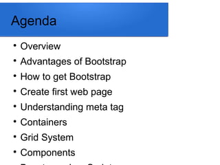
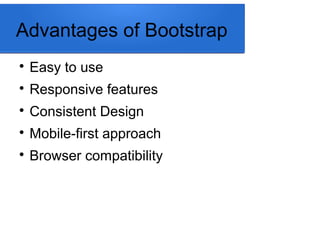
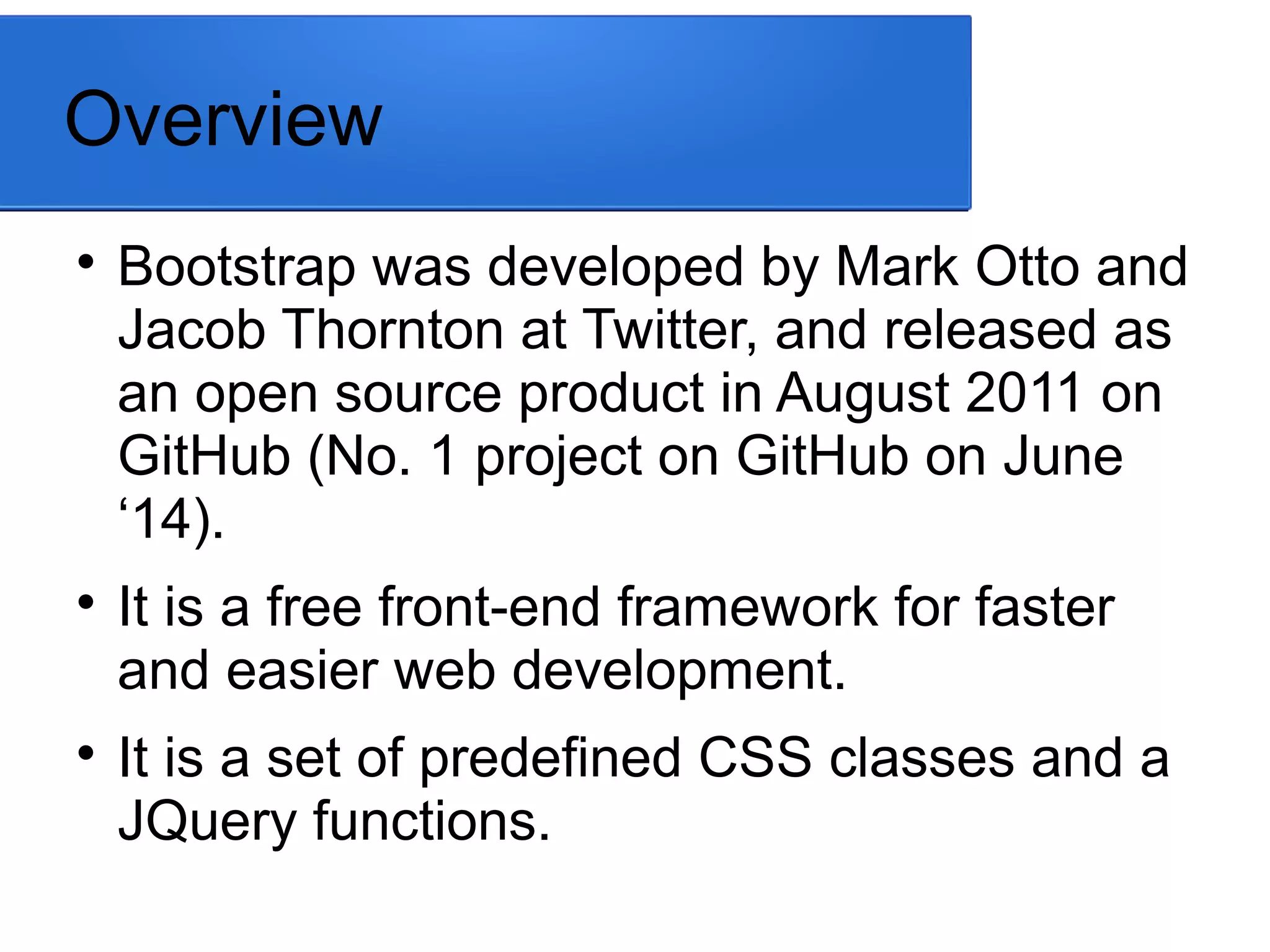
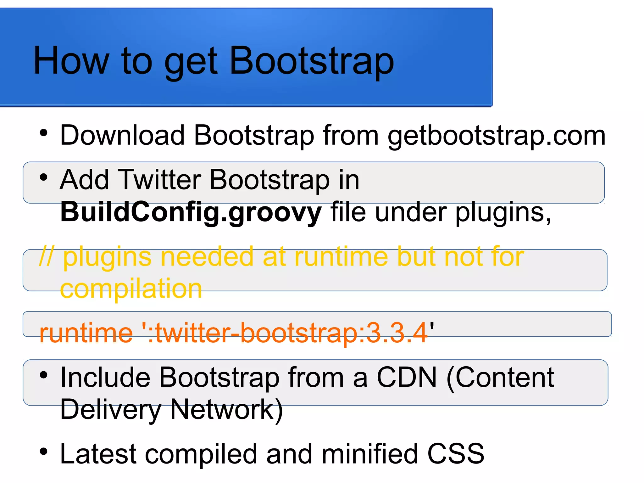
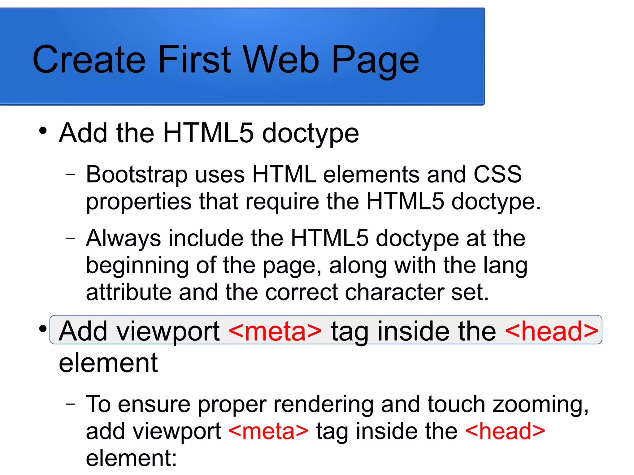
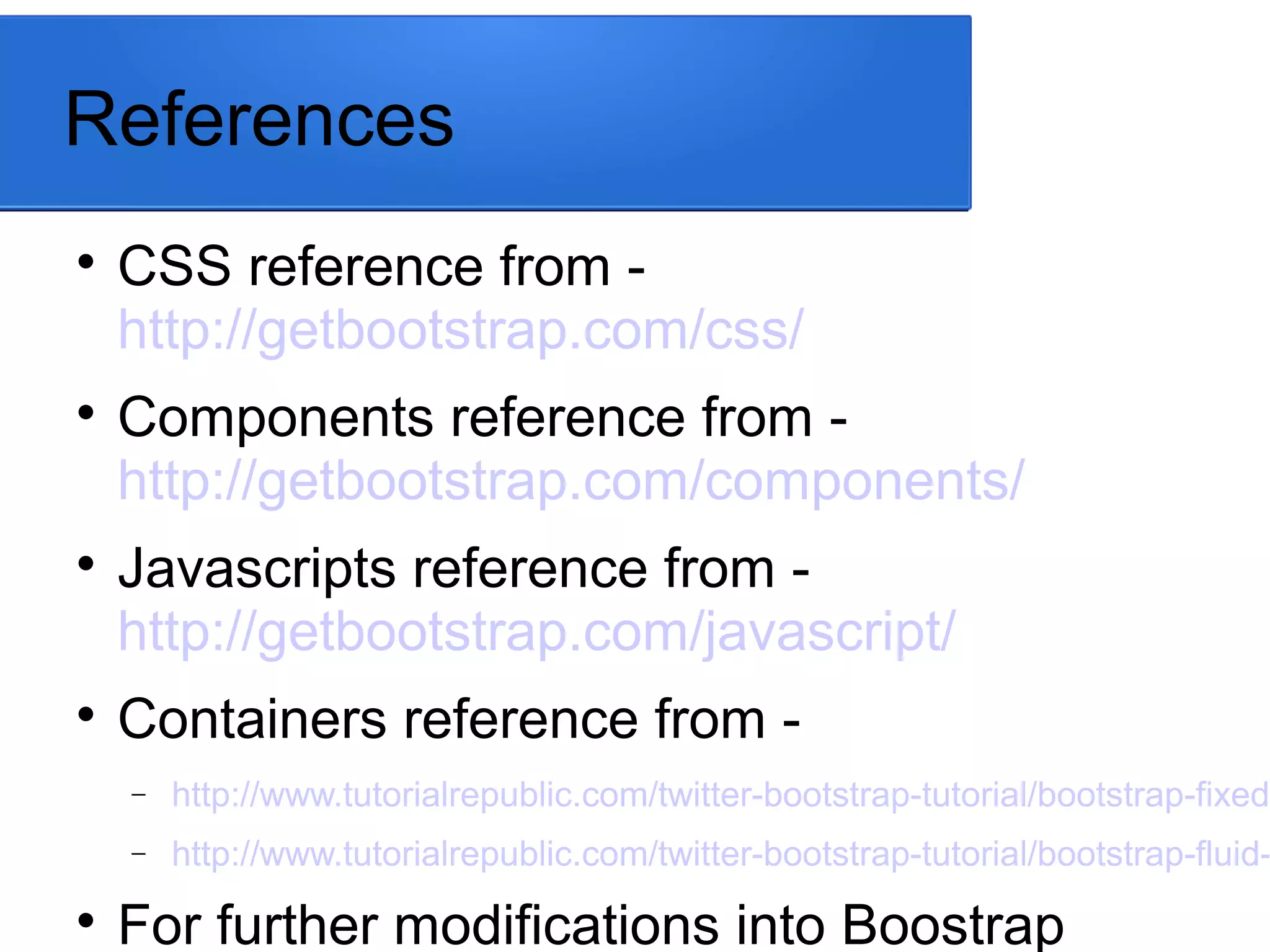
KEMBAR78
Twitter bootstrap (css, components and javascript) | PPT
Twitter Bootstrap
(Css, Components, JavaScript)
Presented By: Ali Tanwir
Agenda

Overview

Advantages of Bootstrap

How to get Bootstrap

Create first web page

Understanding meta tag

Containers

Grid System

Components
Overview

Bootstrap was developed by Mark Otto and
Jacob Thornton at Twitter, and released as
an open source product in August 2011 on
GitHub (No. 1 project on GitHub on June
‘14).

It is a free front-end framework for faster
and easier web development.

It is a set of predefined CSS classes and a
JQuery functions.
Advantages of Bootstrap

Easy to use

Responsive features

Consistent Design

Mobile-first approach

Browser compatibility
How to get Bootstrap

Download Bootstrap from getbootstrap.com

Add Twitter Bootstrap in
BuildConfig.groovy file under plugins,
// plugins needed at runtime but not for
compilation
runtime ':twitter-bootstrap:3.3.4'

Include Bootstrap from a CDN (Content
Delivery Network)

Latest compiled and minified CSS
Create First Web Page

Add the HTML5 doctype
− Bootstrap uses HTML elements and CSS
properties that require the HTML5 doctype.
− Always include the HTML5 doctype at the
beginning of the page, along with the lang
attribute and the correct character set.

Add viewport <meta> tag inside the <head>
element
− To ensure proper rendering and touch zooming,
add viewport <meta> tag inside the <head>
element:
Understanding <meta> tag
<meta name="viewport"
content="width=device-width, initial-
scale=1">

The width=device-width part sets the width
of the page to follow the screen-width of the
device (which will vary depending on the
device).

Containers

Creating Fixed Layout
The process of creating the fixed yet
responsive layout starts with the .container
class. After that create rows with the .row
class to wrap the horizontal groups of
columns. Rows must be placed within a
container for proper alignment and padding.
<div class="container">
<div class="row">
...

Creating Fluid Layout
The class .container-fluid simply applies the
horizontal margin with the value auto and
left and right padding of 15px on element to
offset the left and right margin of -15px (i.e.
margin: 0 -15px;) used on the .row.
It create the fluid layouts in order to utilize the
100% width of the viewport.
<div class="container-fluid">
<div class="row">
Grid System
Bootstrap includes a responsive, mobile first
fluid grid system that appropriately scales
up to 12 columns as the device or
viewport size increases.
Grid systems are used for creating page
layouts through a series of rows and
columns that house your content. Here's
how the Bootstrap grid system works:

Rows must be placed within a .container
(fixed-width) or .container-fluid (full-*click on the Gid System heading to open a reference webpage.

Grid columns are created by specifying the
number of 12 available columns you wish
to span. For example, 3 equal columns
would use three .col-xs-4.

If more than 12 columns are placed within a
single row, each group of extra columns
will, as one unit, wrap onto a new line.

Grid classes apply to devices with screen
widths greater than or equal to the
breakpoint sizes, and override grid classes
Grid System Table
*click on the Gid System Table image to open a reference webpage.
Components

Over a dozen reusable components built to
provide iconography, dropdowns, input
groups, navigation, alerts, and much more.
− Dropdowns
− Navs
− Navbar
− Breadcrumbs
− Pagination
*click on the Components & types of components to open a reference webpage.
Bootstrap JavaScript

Bring Bootstrap's components to life with
over a dozen custom jQuery plugins. Easily
include them all, or one by one.

Plugins can be included individually (using
Bootstrap's individual *.js files), or all at
once (using bootstrap.js or the minified
bootstrap.min.js).
*click on the Bootstrap Javascript heading to open a reference webpage.
List of Javascripts & Demo

Transitions (transition.js)

Modals (modal.js)

Dropdowns (dropdown.js)

ScrollSpy (scrollspy.js)

Togglable tabs (tab.js)

Tooltips (tooltip.js)

Popovers (popover.js)

Alert messages (alert.js)*click on the names of the list of javascripts to open a reference webpage.
References

CSS reference from -
http://getbootstrap.com/css/

Components reference from -
http://getbootstrap.com/components/

Javascripts reference from -
http://getbootstrap.com/javascript/

Containers reference from -
− http://www.tutorialrepublic.com/twitter-bootstrap-tutorial/bootstrap-fixed-
− http://www.tutorialrepublic.com/twitter-bootstrap-tutorial/bootstrap-fluid-

For further modifications into Boostrap
Thank
You !

Twitter bootstrap (css, components and javascript)

  • 1.
    Twitter Bootstrap (Css, Components,JavaScript) Presented By: Ali Tanwir
  • 2.
    Agenda  Overview  Advantages of Bootstrap  Howto get Bootstrap  Create first web page  Understanding meta tag  Containers  Grid System  Components
  • 3.
    Overview  Bootstrap was developedby Mark Otto and Jacob Thornton at Twitter, and released as an open source product in August 2011 on GitHub (No. 1 project on GitHub on June ‘14).  It is a free front-end framework for faster and easier web development.  It is a set of predefined CSS classes and a JQuery functions.
  • 4.
    Advantages of Bootstrap  Easyto use  Responsive features  Consistent Design  Mobile-first approach  Browser compatibility
  • 5.
    How to getBootstrap  Download Bootstrap from getbootstrap.com  Add Twitter Bootstrap in BuildConfig.groovy file under plugins, // plugins needed at runtime but not for compilation runtime ':twitter-bootstrap:3.3.4'  Include Bootstrap from a CDN (Content Delivery Network)  Latest compiled and minified CSS
  • 6.
    Create First WebPage  Add the HTML5 doctype − Bootstrap uses HTML elements and CSS properties that require the HTML5 doctype. − Always include the HTML5 doctype at the beginning of the page, along with the lang attribute and the correct character set.  Add viewport <meta> tag inside the <head> element − To ensure proper rendering and touch zooming, add viewport <meta> tag inside the <head> element:
  • 7.
    Understanding <meta> tag <metaname="viewport" content="width=device-width, initial- scale=1">  The width=device-width part sets the width of the page to follow the screen-width of the device (which will vary depending on the device). 
  • 8.
    Containers  Creating Fixed Layout Theprocess of creating the fixed yet responsive layout starts with the .container class. After that create rows with the .row class to wrap the horizontal groups of columns. Rows must be placed within a container for proper alignment and padding. <div class="container"> <div class="row"> ...
  • 9.
     Creating Fluid Layout Theclass .container-fluid simply applies the horizontal margin with the value auto and left and right padding of 15px on element to offset the left and right margin of -15px (i.e. margin: 0 -15px;) used on the .row. It create the fluid layouts in order to utilize the 100% width of the viewport. <div class="container-fluid"> <div class="row">
  • 10.
    Grid System Bootstrap includesa responsive, mobile first fluid grid system that appropriately scales up to 12 columns as the device or viewport size increases. Grid systems are used for creating page layouts through a series of rows and columns that house your content. Here's how the Bootstrap grid system works:  Rows must be placed within a .container (fixed-width) or .container-fluid (full-*click on the Gid System heading to open a reference webpage.
  • 11.
     Grid columns arecreated by specifying the number of 12 available columns you wish to span. For example, 3 equal columns would use three .col-xs-4.  If more than 12 columns are placed within a single row, each group of extra columns will, as one unit, wrap onto a new line.  Grid classes apply to devices with screen widths greater than or equal to the breakpoint sizes, and override grid classes
  • 12.
    Grid System Table *clickon the Gid System Table image to open a reference webpage.
  • 13.
    Components  Over a dozenreusable components built to provide iconography, dropdowns, input groups, navigation, alerts, and much more. − Dropdowns − Navs − Navbar − Breadcrumbs − Pagination *click on the Components & types of components to open a reference webpage.
  • 14.
    Bootstrap JavaScript  Bring Bootstrap'scomponents to life with over a dozen custom jQuery plugins. Easily include them all, or one by one.  Plugins can be included individually (using Bootstrap's individual *.js files), or all at once (using bootstrap.js or the minified bootstrap.min.js). *click on the Bootstrap Javascript heading to open a reference webpage.
  • 15.
    List of Javascripts& Demo  Transitions (transition.js)  Modals (modal.js)  Dropdowns (dropdown.js)  ScrollSpy (scrollspy.js)  Togglable tabs (tab.js)  Tooltips (tooltip.js)  Popovers (popover.js)  Alert messages (alert.js)*click on the names of the list of javascripts to open a reference webpage.
  • 16.
    References  CSS reference from- http://getbootstrap.com/css/  Components reference from - http://getbootstrap.com/components/  Javascripts reference from - http://getbootstrap.com/javascript/  Containers reference from - − http://www.tutorialrepublic.com/twitter-bootstrap-tutorial/bootstrap-fixed- − http://www.tutorialrepublic.com/twitter-bootstrap-tutorial/bootstrap-fluid-  For further modifications into Boostrap
  • 17.