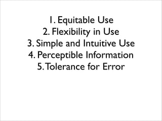
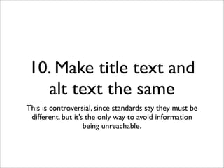
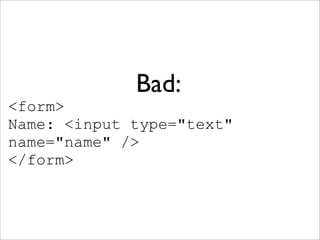
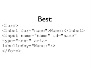
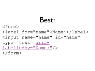
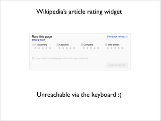
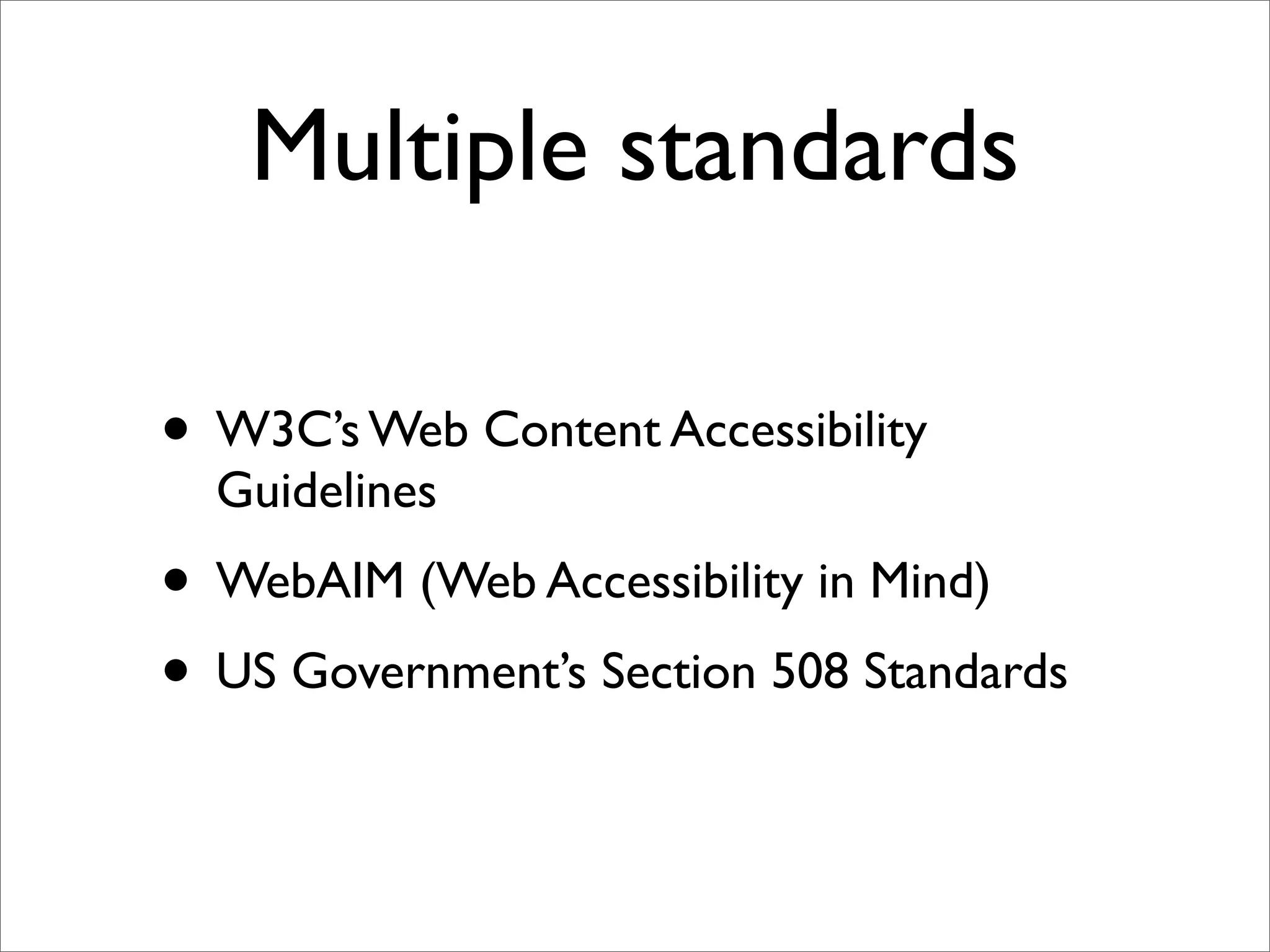
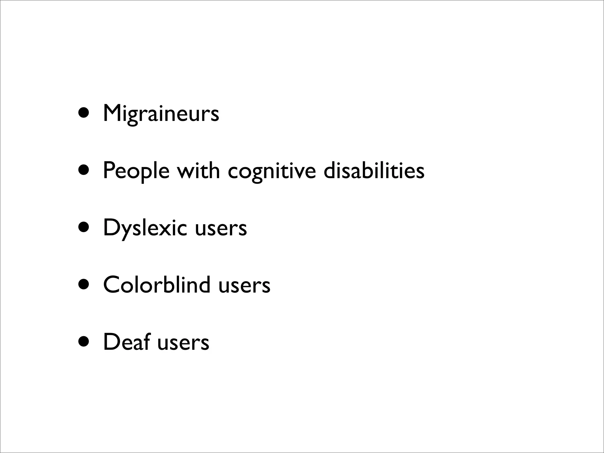
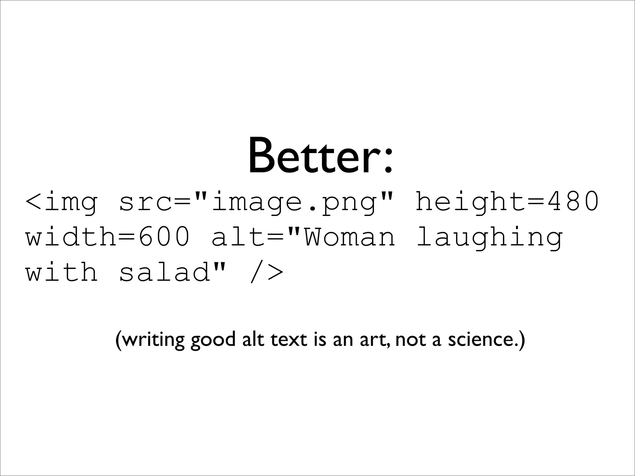
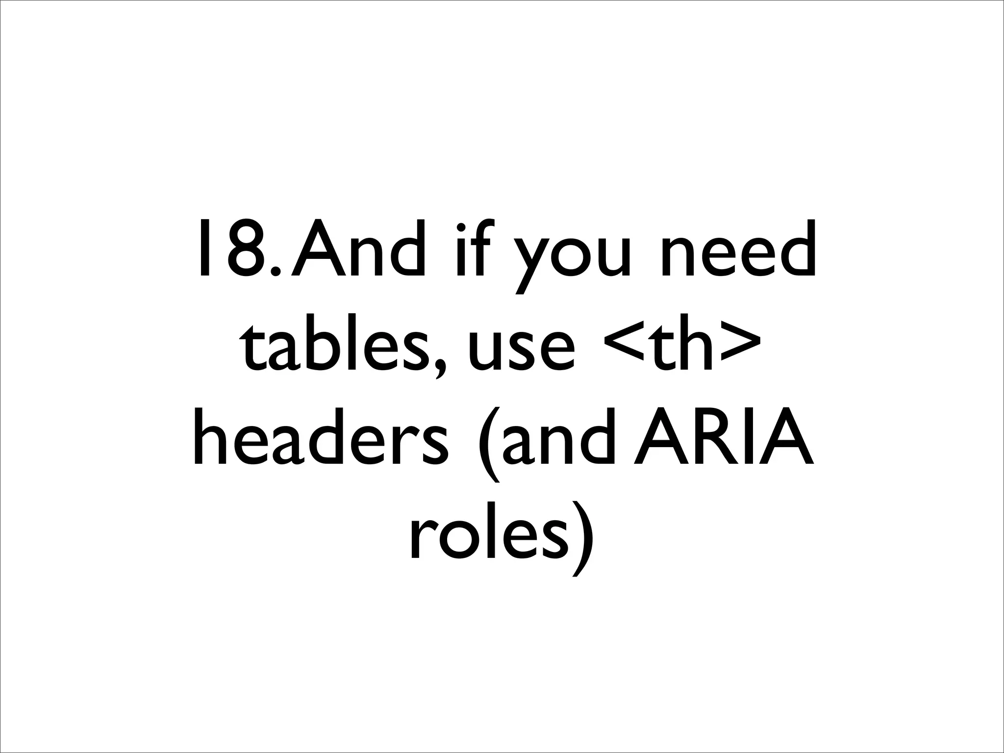
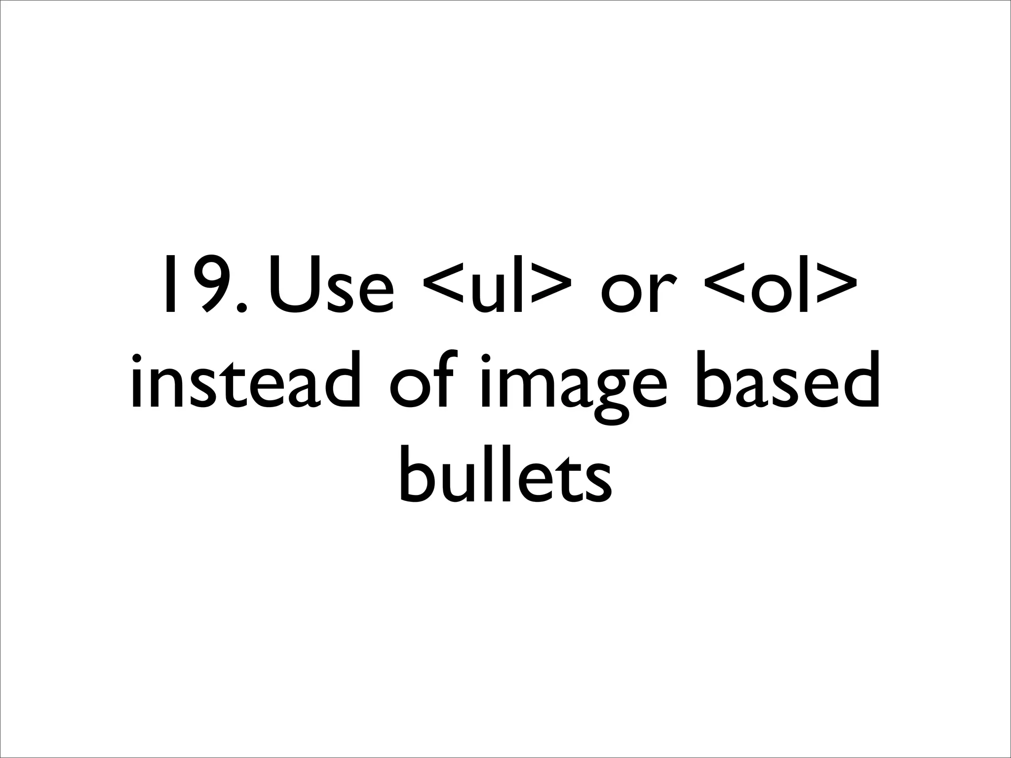
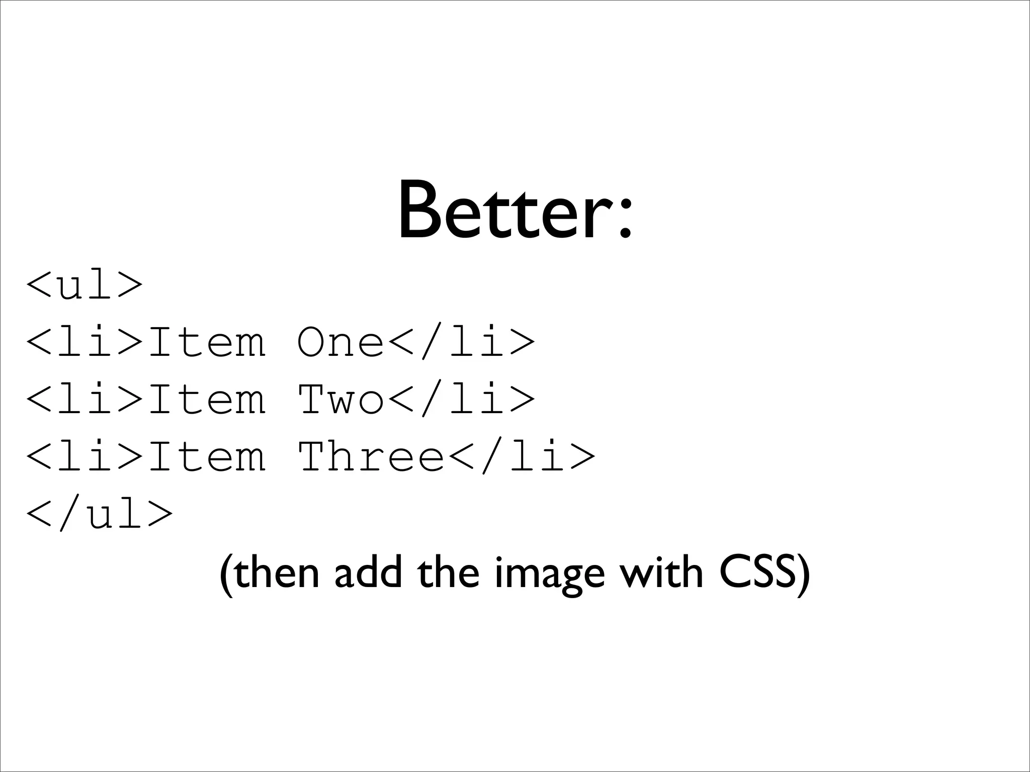
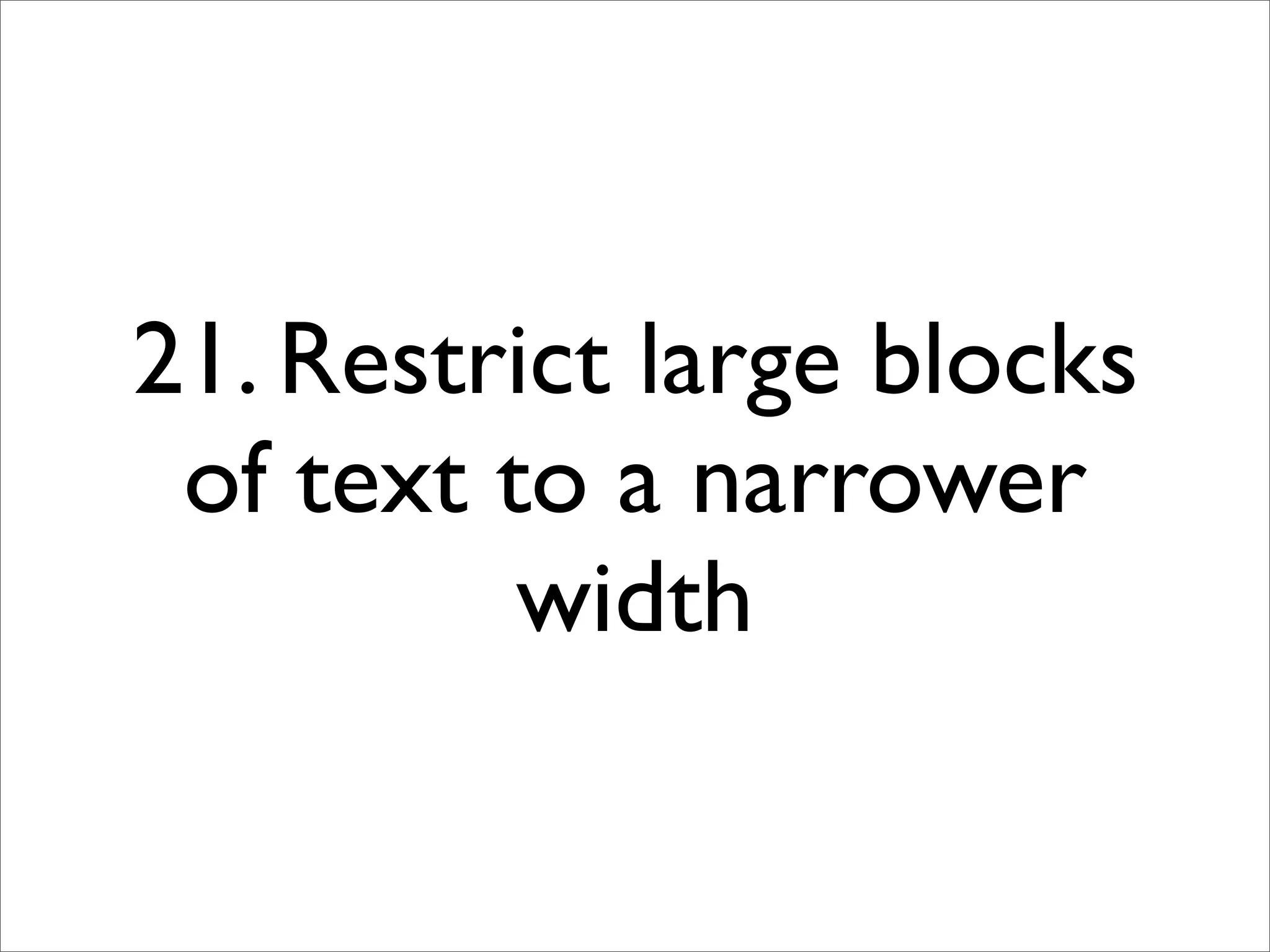
KEMBAR78
Web Accessibility for the 21st Century | PDF
Web Accessibility for
 the 21st Century

            Denise Paolucci, Dreamwidth Studios
                        denise@dreamwidth.org
                    http://denise.dreamwidth.org
Slides, resources, and
examples downloadable
     at end of talk!
What do we mean by
  “accessibility”?
“Accessibility” is about
making websites work
with assistive tech, not
       against it.
Multiple standards

• W3C’s Web Content Accessibility
  Guidelines
• WebAIM (Web Accessibility in Mind)
• US Government’s Section 508 Standards
:(

• Standards/guidelines are all very high level
• And have specific ideas about what
  accessibility needs people have
• People have more accessibility needs than
  you think
People think of:

• Blind/low-vision users using screenreaders
  (Jaws, NVDA,VoiceOver)
• Users unable to type using dictation
  software (Dragon)
• Users unable to mouse using keyboard-only
  navigation/mousekeys
It’s not just about
   screenreaders
 (or dictation, or
  keybord input)
What’s the most
  commonly used
assistive technology?
Larger text size is the
most common assistive
  tech on the internet
(even if you don’t think
    it’s assistive tech)
Also:
•   Stylish                  •   Disabling autoplay/sound

•   NoScript                 •   AdBlock

•   NoSquint                 •   AutoPager

•   F.lux                    •   Workrave

•   Disabling animation      •   TypeAhead Find

•   “Zap CSS” bookmarks      •   ....etc
• Migraineurs
• People with cognitive disabilities
• Dyslexic users
• Colorblind users
• Deaf users
So how do you serve
all these accessibility
        needs?
...sometimes you don’t
            :(
    (but you can try!)
Don’t make a special
version: it never works
Universal Design

• Improves accessibility
• Improves your cross-platform support
• And your search engine visibility
• Everybody wins!
A light speed tour of
  Universal Design
    (this will not be on the exam)
Universal Design
        Principles

• NC State University’s Center for Universal
  Design has 7 principles
• Not all of them apply to web design
• The five that do are:
1. Equitable Use
1. Equitable Use
2. Flexibility in Use
1. Equitable Use
     2. Flexibility in Use
3. Simple and Intuitive Use
1. Equitable Use
     2. Flexibility in Use
3. Simple and Intuitive Use
4. Perceptible Information
1. Equitable Use
     2. Flexibility in Use
3. Simple and Intuitive Use
4. Perceptible Information
   5. Tolerance for Error
those are REALLY high
   level guidelines :(
• There are a lot of checklists for
  implementing the high-level guidelines

• Many of them disagree
• A lot of the advice is outdated and not very
  helpful
<i>Let's</i> be <b>ACCESSIBLE!</b>

<em>Let's</em> be <strong>ACCESSIBLE!</strong>
Let’s be ACCESSIBLE!

Let’s be ACCESSIBLE!
Semantic markup isn’t
      wrong...
But most screenreaders
   don’t differentiate
(because most of the
    web doesn’t
    differentiate)
you are in a maze of
   twisty little best
practices, all competing
and automated testing
  tools don’t catch
      everything
31 Quick Techniques To
 Make Your Site Better
These are all downloadable at the end, with exercises
                and further reading :)
1. Make sure all images
   have alt attributes,
   height, and width
Bad:
<img src="image.png" />
Better:
<img src="image.png" height=480
width=600 alt="Woman laughing
with salad" />

    (writing good alt text is an art, not a science.)
2. Use blank alt text for
   purely decorative
         images
Bad:
<img   src="spacer-left-red.gif"   />
Just as bad:
<img src="spacer-left-red.gif"
       alt="spacer" />
<img src="spacer-left-red.gif"
       alt="spacer" />
<img src="spacer-left-red.gif"
       alt="spacer" />
<img src="spacer-left-red.gif"
       alt="spacer" />
<img src="spacer-left-red.gif"
       alt="spacer" />
Better:
<img src="spacer-left-red.gif"
          alt="" />
<img src="spacer-left-red.gif"
          alt="" />
<img src="spacer-left-red.gif"
          alt="" />
<img src="spacer-left-red.gif"
          alt="" />
<img src="spacer-left-red.gif"
          alt="" />
Best:
 Use CSS to place
 purely decorative
images, not <img>
3. Use header tags
(<h1>, <h2>, etc)
Screenreaders use those as jump-to points
4. Add skip links
             liberally
(Screenreaders use headers for navigation, but skip links
 still save the time of skipping through all the headers.)
5. In your source:
Content first, chrome
        after
  (and then position it visually using CSS)
6. Use CSS to hide
screenreader-useful
 things from visual
     browsers
 Use negative margins, not “display: none”
7. Write link text
   descriptively
Bad:
To manage your account, <a
href="link">click here</a>.
Better:
Visit <a href="link"> Account
Management</a> to change your
settings.
8. Don’t rely on tooltips
      or title text
Information in title tooltips is missed by large numbers
                     of your readers
9. Don’t rely on alt
         text, either
It’s nearly impossible to reach in most visual browsers
10. Make title text and
  alt text the same
This is controversial, since standards say they must be
 different, but it’s the only way to avoid information
                    being unreachable.
11. Explicitly label all
        form fields
And put any important instructions inside the form, not
              in a note outside the form
Bad:
<form>
Name: <input type="text"
name="name" />
</form>
Better:
<form>
<label for="name">Name:
</label> <input name="name"
id="name" type="text" />
</form>
Best:
<form>
<label for="name">Name:</label>
<input name="name" id="name"
type="text" aria-
labelledby="Name:"/>
</form>
Best:
<form>
<label for="name">Name:</label>
<input name="name" id="name"
type="text" aria-
labelledby="Name:"/>
</form>
ARIA or WAI-ARIA

• Web Accessibility Initiative-Accessible Rich
  Internet Applications
• Labels and describes page content and
  advanced “rich technology” like DHTML,
  Ajax, JavaScript
• Client implementation spotty, but...
12. Use WAI-ARIA
      landmark roles
Client implementation is getting better and better, and
           there’s zero downside to using it
13. Use existing
      JavaScript libraries
Don’t reinvent the wheel: JQuery isn’t 100% accessible,
         but it’s better than rolling your own
14. Make sure
everything has a
   tabindex
15. Put important things
 earlier in the tabindex
Use this VERY SPARINGLY, but less-used items can be
later in the tabindex. (But don’t interrupt visual flow.)
16. Don’t hide any
visible element from
    the keyboard
Wikipedia’s article rating widget


Unreachable via the keyboard :(
17. Never use tables
 unless presenting
    tabular data
18. And if you need
 tables, use <th>
headers (and ARIA
      roles)
19. Use <ul> or <ol>
instead of image based
        bullets
Bad:
<img src="bullet.gif">Item One
<img src="bullet.gif">Item Two
<img src="bullet.gif">Item Three
Better:
<ul>
<li>Item One</li>
<li>Item Two</li>
<li>Item Three</li>
</ul>
      (then add the image with CSS)
20. Define all sizes in
  em, not px or pt
21. Restrict large blocks
 of text to a narrower
          width
22. Check your color
       contrast
Standards say no less than 4.5:1 and recommend 7:1,
 but if possible, offer high-contrast and low-contrast
    options, or let the user set their own colors
23. Avoid large blocks
     of pure white
background (cream or
    grey is better)
24. Provide light-on-
dark and dark-on-light
        options
25. Use at least two
  ways of highlighting
information or errors
Remember earlier?
<form>
<label for="name">Name:</label>
<input name="name" id="name"
type="text" aria-
labelledby="Name:"/>
</form>
Forms of Highlights

• Color
• Outline
• Underline
• Text change
• ARIA label (role="alert")
26. Retain user input
     after errors
27. Don’t change the
screen without user
       action
28. And if you do
dynamic content, let
people turn it off --
   permanently
29. Don’t use Flash or
 PDFs: use plain text
30. Caption all audio
and video (by people,
   not machines)
31. Consider
alternatives to
  CAPTCHA
• Honeypot form field (with meaningless
  name, informative label, and display:none)

• Server-side checks (referer, secret token,
  length of time it took to submit)

• TextCaptcha.com: word-based CAPTCHA
  problems
And finally...
0. Test it yourself
You aren’t going to be as skilled with the assistive tech
  as an experienced user, but you can approximate
• Double your font size and see what breaks
• Unplug your mouse and see what you can’t
  reach or access

• Set your screen to black and white and see
  what’s unclear or invisible

• Have a screenreader read you the page and
  see what’s frustrating or missing
Thank you!
           Resources
http://denise.dreamwidth.org/tag/a11y
(that’s A, number one, number one, Y)

Web Accessibility for the 21st Century