Downloaded 33 times


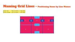
![Naming Grid Lines
Grid lines can be named when defining the grid with the grid-template-rows and grid-template-columns
properties. Line names can then be referenced to position grid items.
grid-template-rows: [row-1-start] 1fr [row-2-start] 1fr [row-2-end];
grid-template-columns: [col-1-start] 1fr [col-2-start] 1fr [col-3-start] 1fr [col-3-end];](https://image.slidesharecdn.com/worldofcssgrid-180114203100/85/World-of-CSS-Grid-32-320.jpg)
![Naming Grid Lines - Multiple Names
Multiple names can be assigned to grid lines by adding names within square brackets and separating each with a whitespace.
Each line name can then be referenced when positioning grid items by line names.
grid-template-rows: [row-start row-1-start] 1fr [row-1-end row-2-start] 1fr [row-2-end row-end];
grid-template-columns: [col-start] 1fr [col-2-start] 1fr [col-3-start] 1fr [col-end];](https://image.slidesharecdn.com/worldofcssgrid-180114203100/85/World-of-CSS-Grid-33-320.jpg)


![Naming Grid Lines
Grid lines can be named when defining the grid with the grid-template-rows and grid-template-columns
properties. Line names can then be referenced to position grid items.
grid-template-rows: [row-1-start] 1fr [row-2-start] 1fr [row-2-end];
grid-template-columns: [col-1-start] 1fr [col-2-start] 1fr [col-3-start] 1fr [col-3-end];](https://image.slidesharecdn.com/worldofcssgrid-180114203100/75/World-of-CSS-Grid-32-2048.jpg)
![Naming Grid Lines - Multiple Names
Multiple names can be assigned to grid lines by adding names within square brackets and separating each with a whitespace.
Each line name can then be referenced when positioning grid items by line names.
grid-template-rows: [row-start row-1-start] 1fr [row-1-end row-2-start] 1fr [row-2-end row-end];
grid-template-columns: [col-start] 1fr [col-2-start] 1fr [col-3-start] 1fr [col-end];](https://image.slidesharecdn.com/worldofcssgrid-180114203100/75/World-of-CSS-Grid-33-2048.jpg)


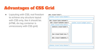
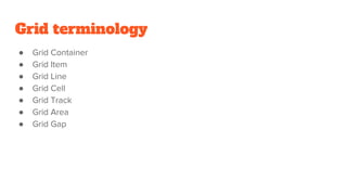
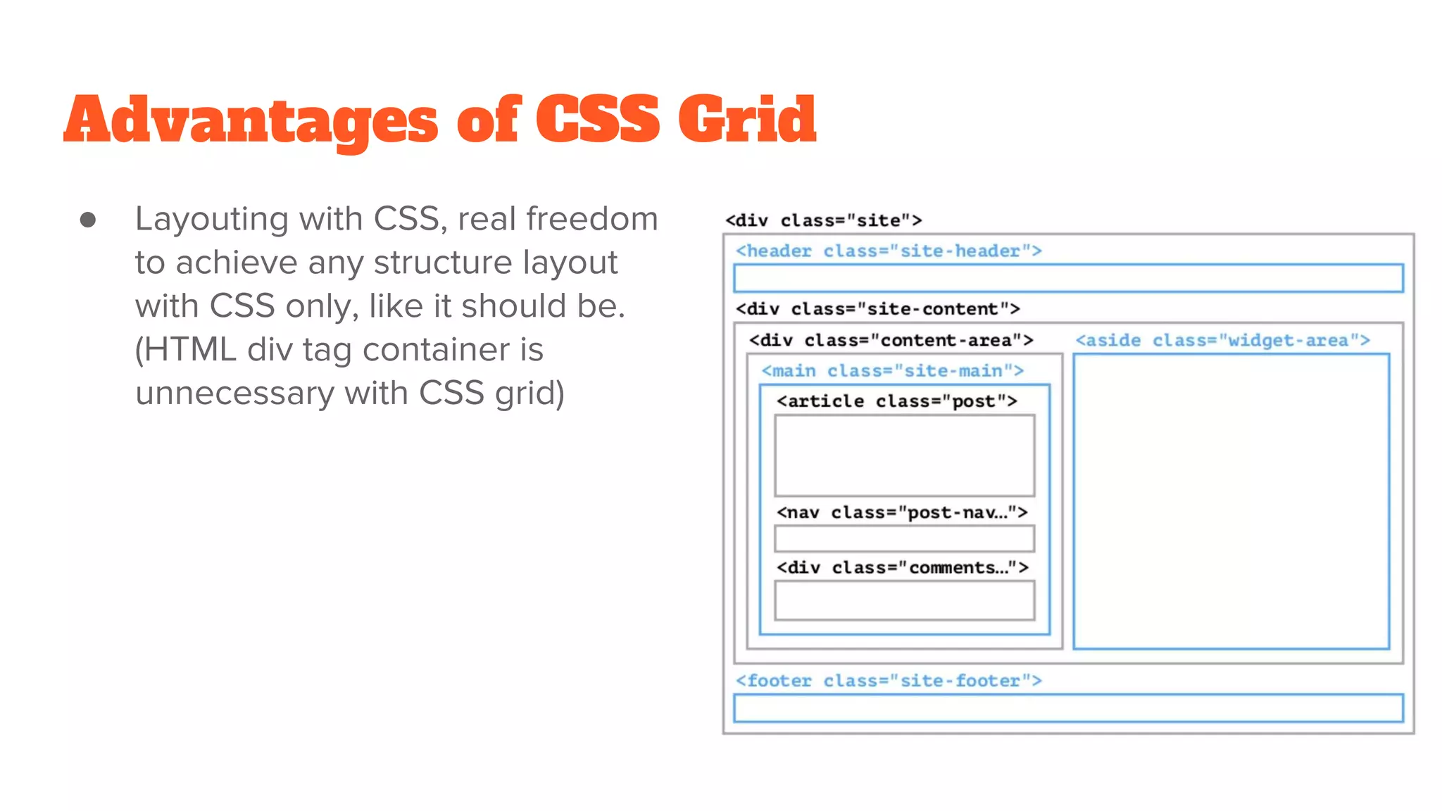
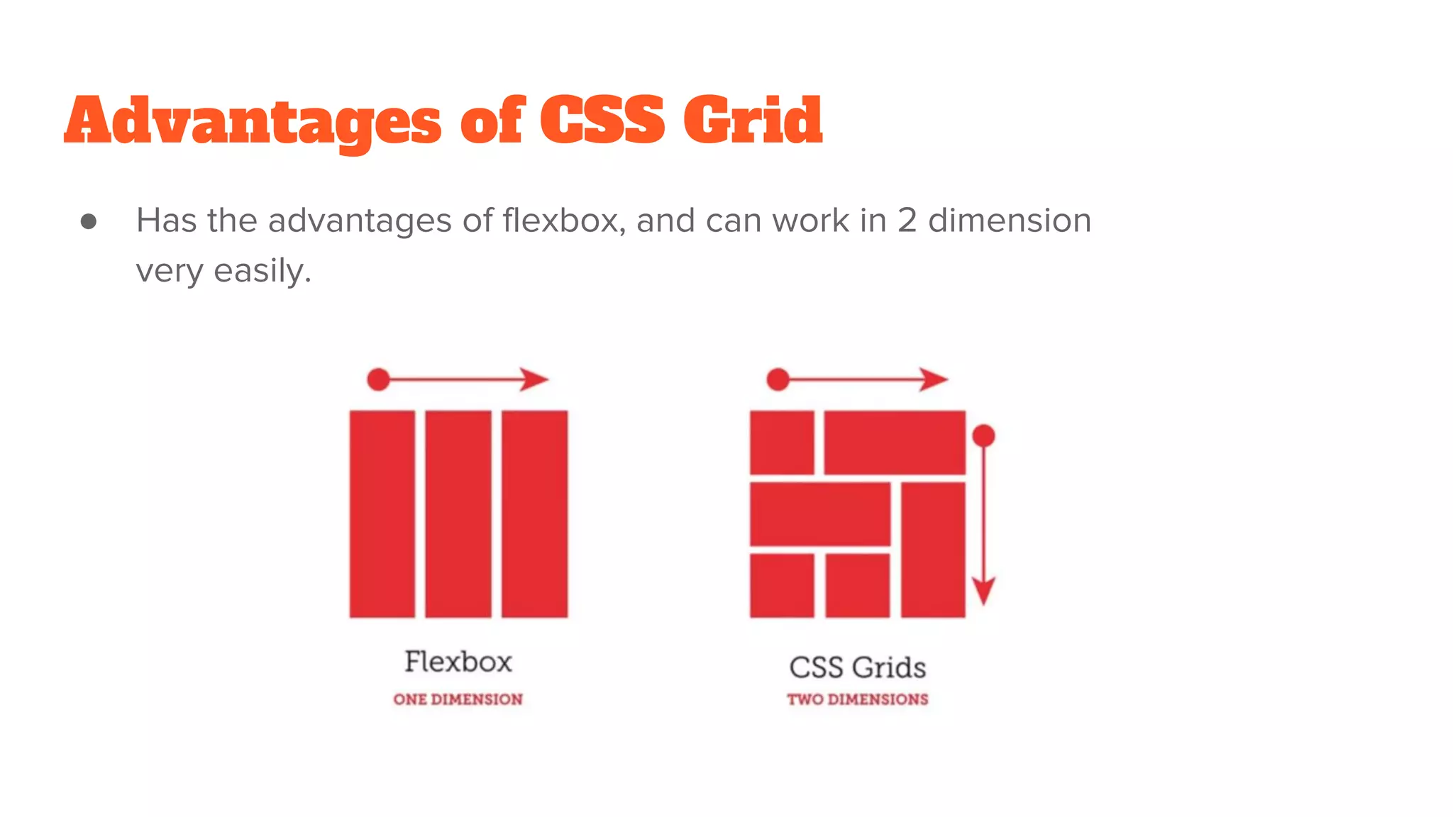
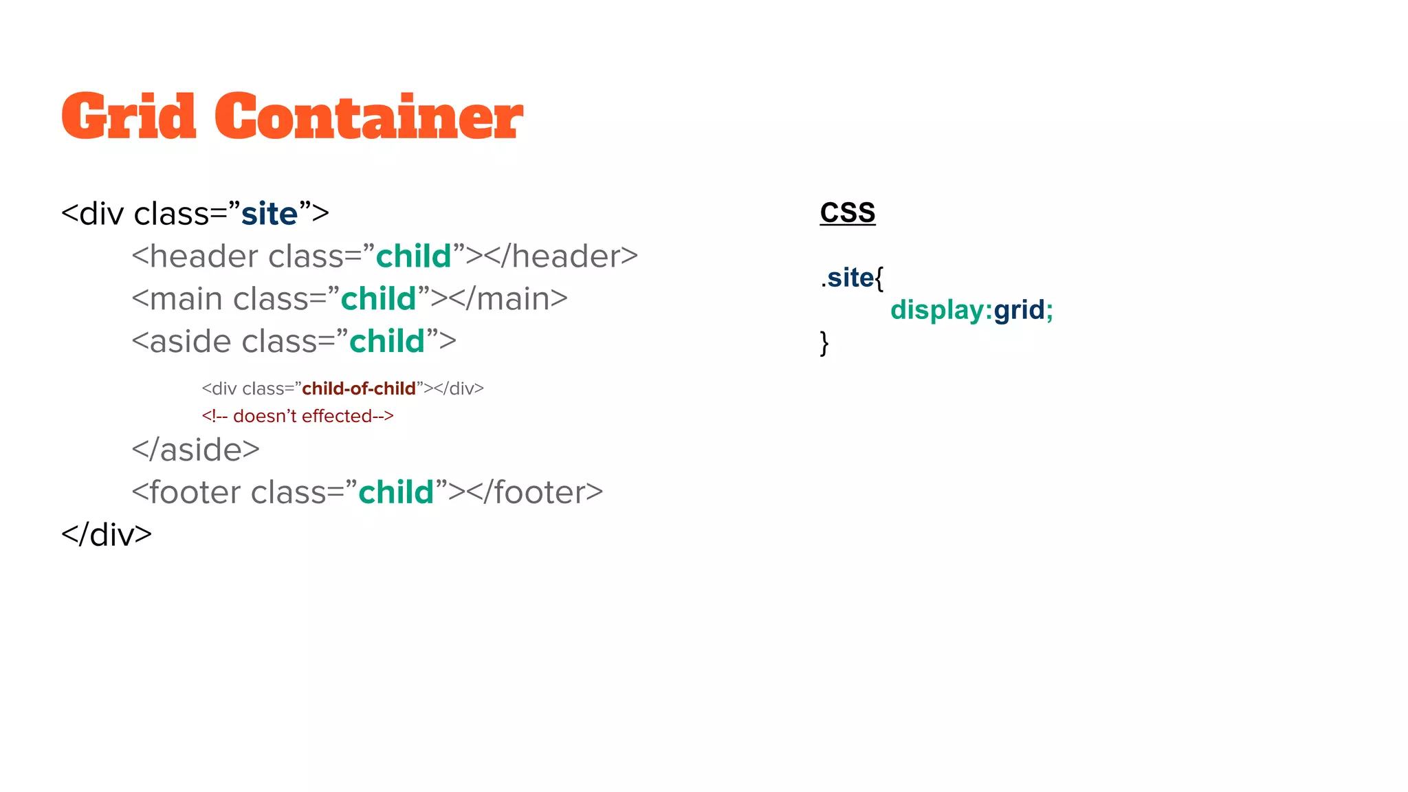
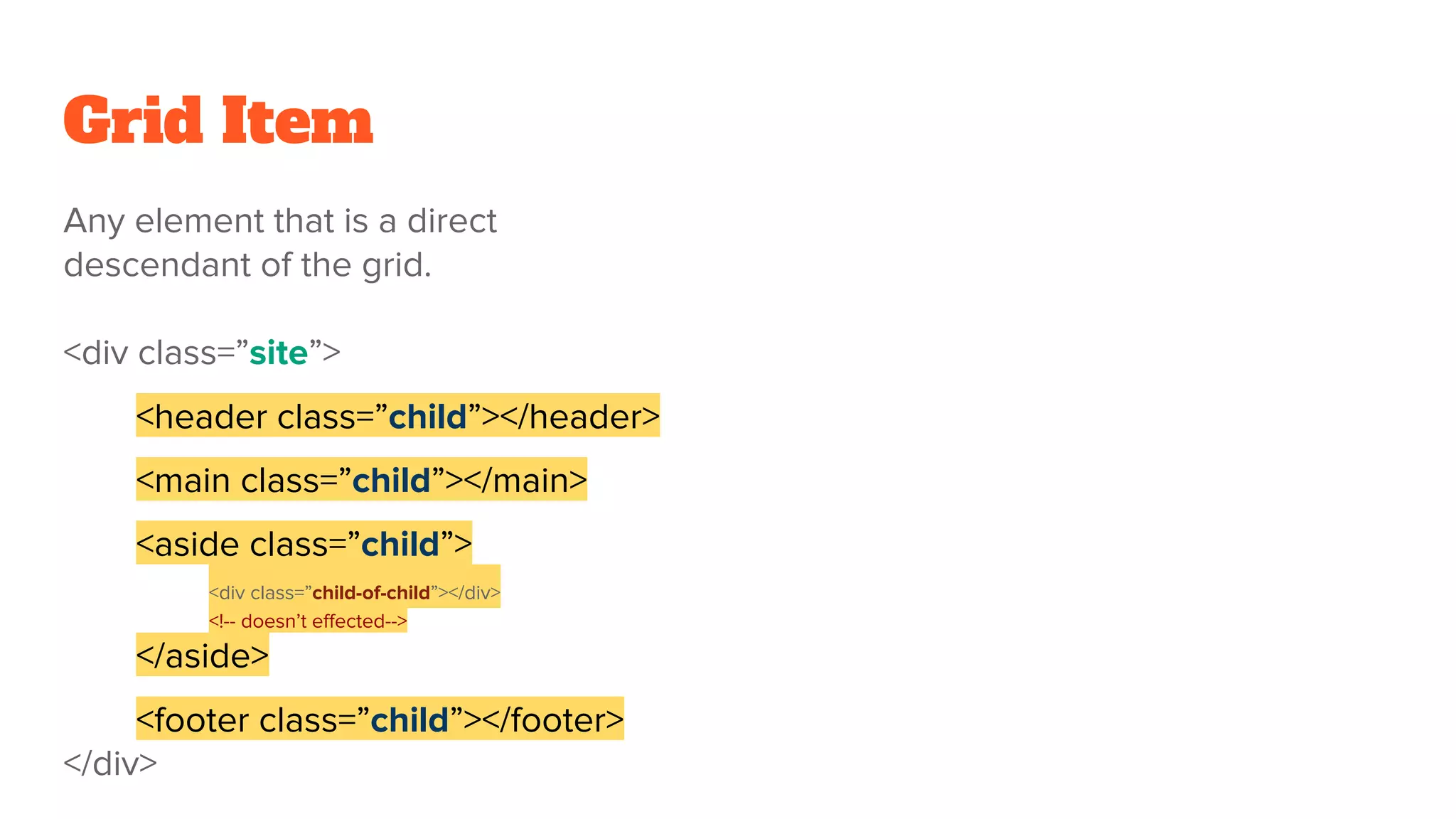
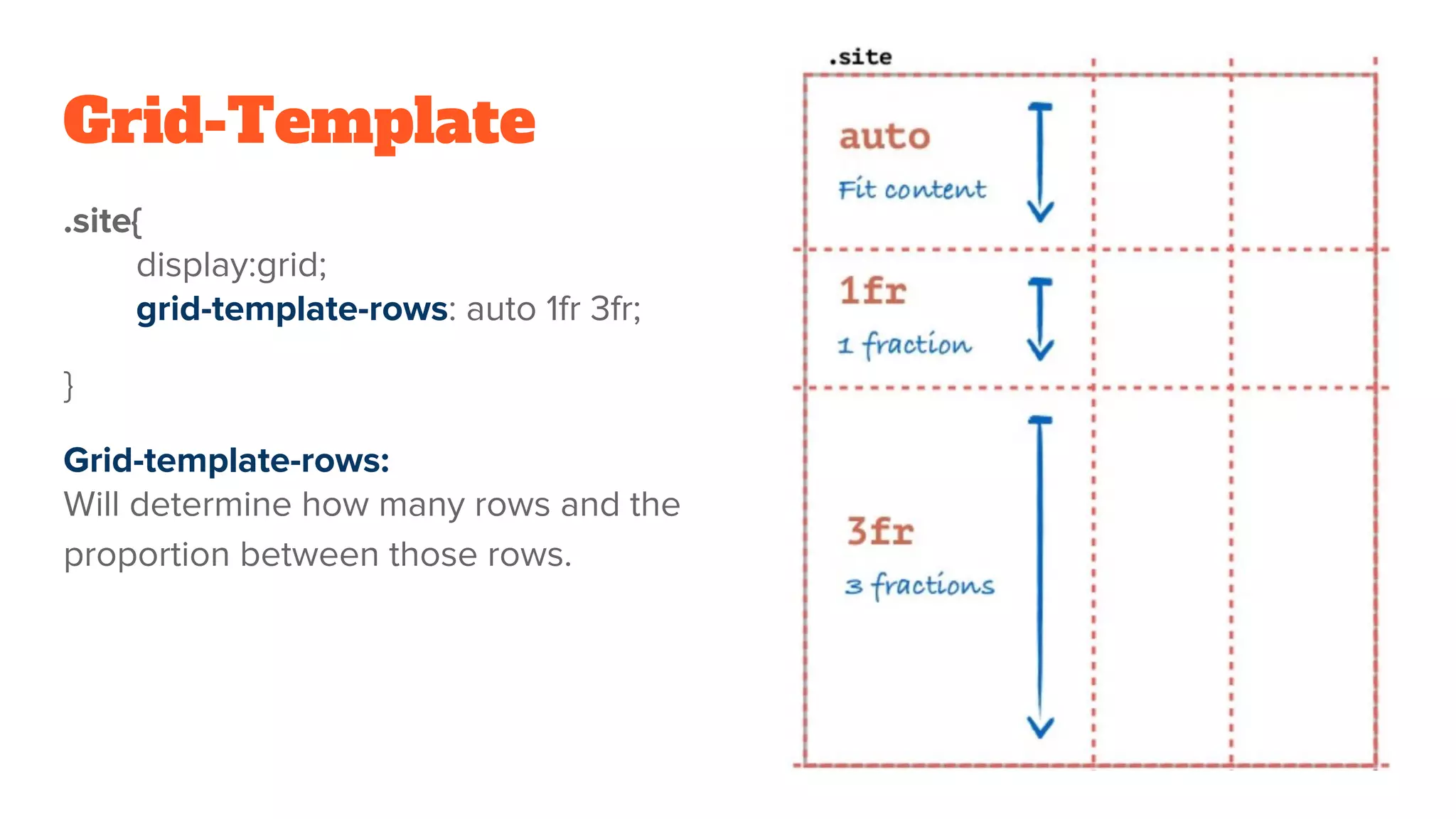
CSS Grid provides a two-dimensional grid system for page layout, allowing elements to be positioned in rows and columns. Some key advantages of CSS Grid include having full control over page layout without needing additional HTML containers, and the ability to easily create complex column-based and row-based layouts. CSS Grid terminology includes grid container, grid items, grid lines, grid cells, tracks and areas. Properties like grid-template-columns, grid-template-rows and grid-area can be used to define the grid structure and position items.
Overview of CSS Grid by Elad Shechter, highlighting its advantages for layout freedom and 2D capabilities.
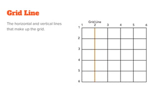
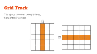
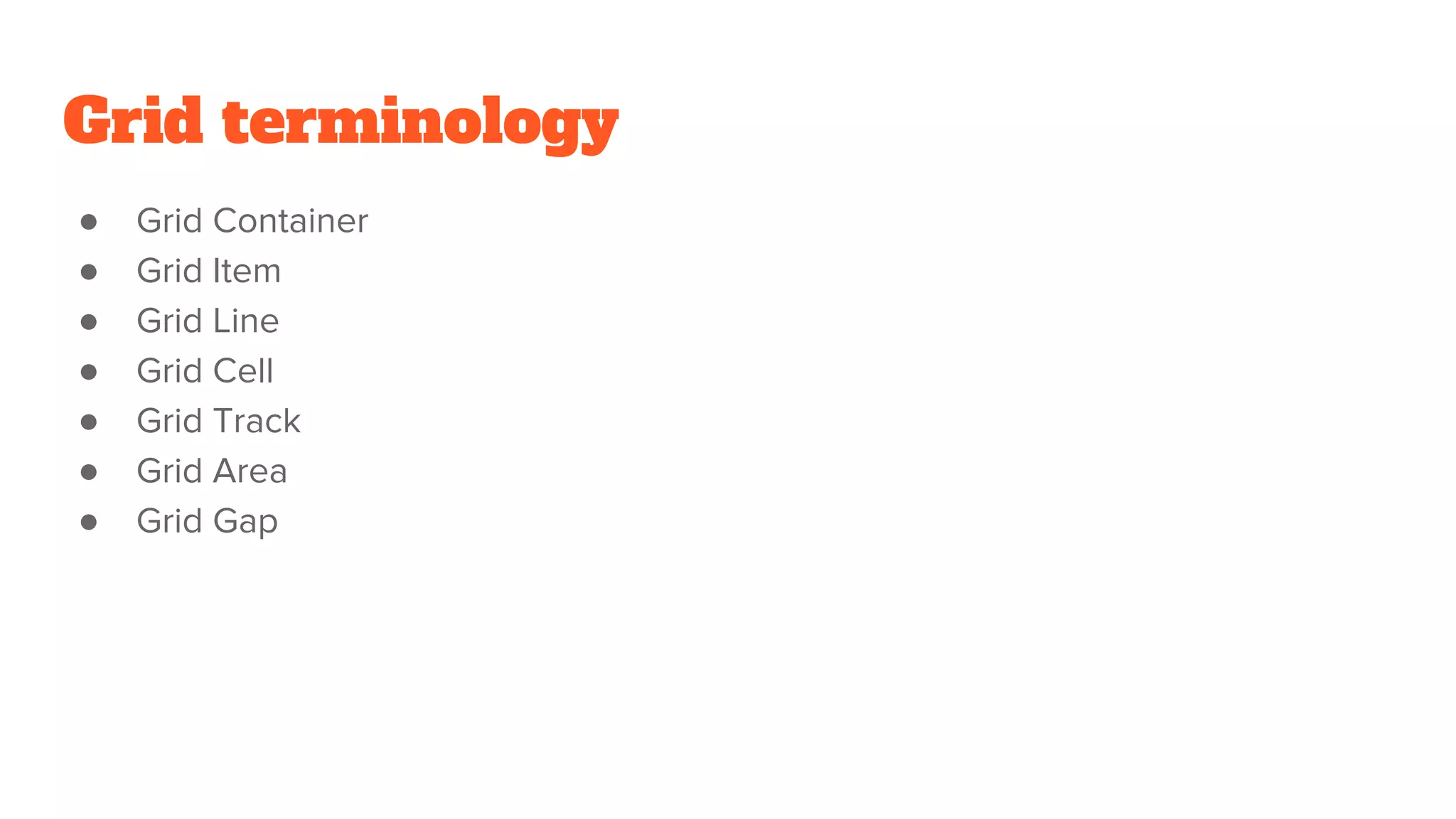
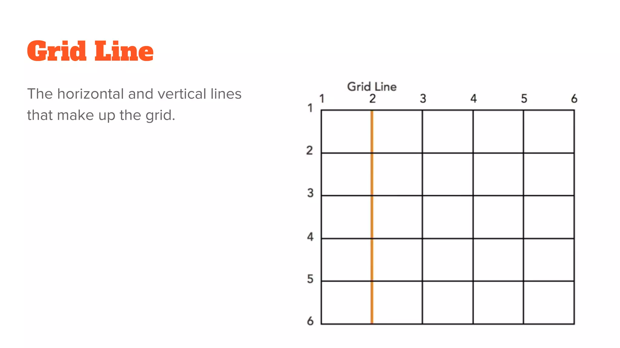
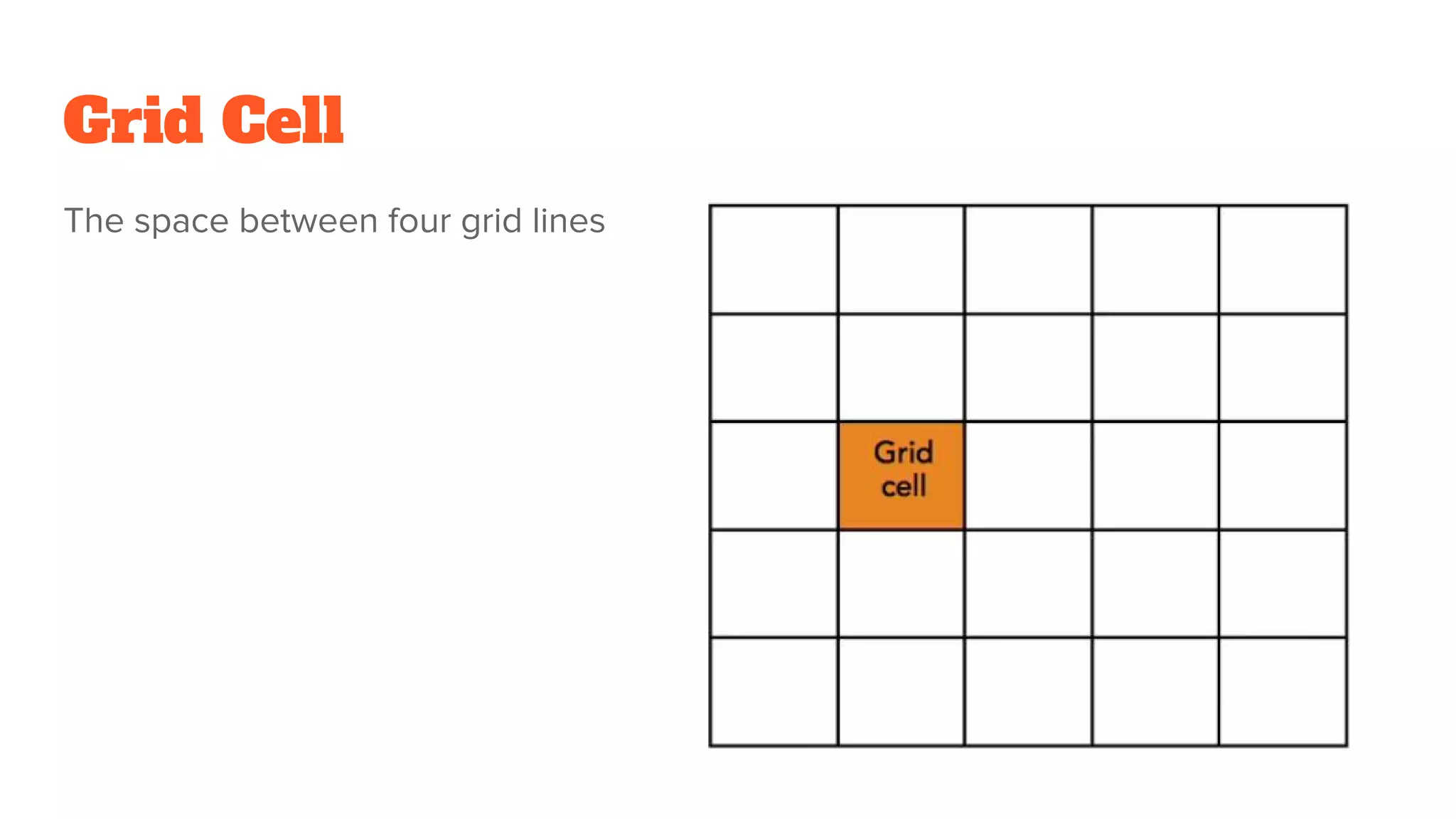
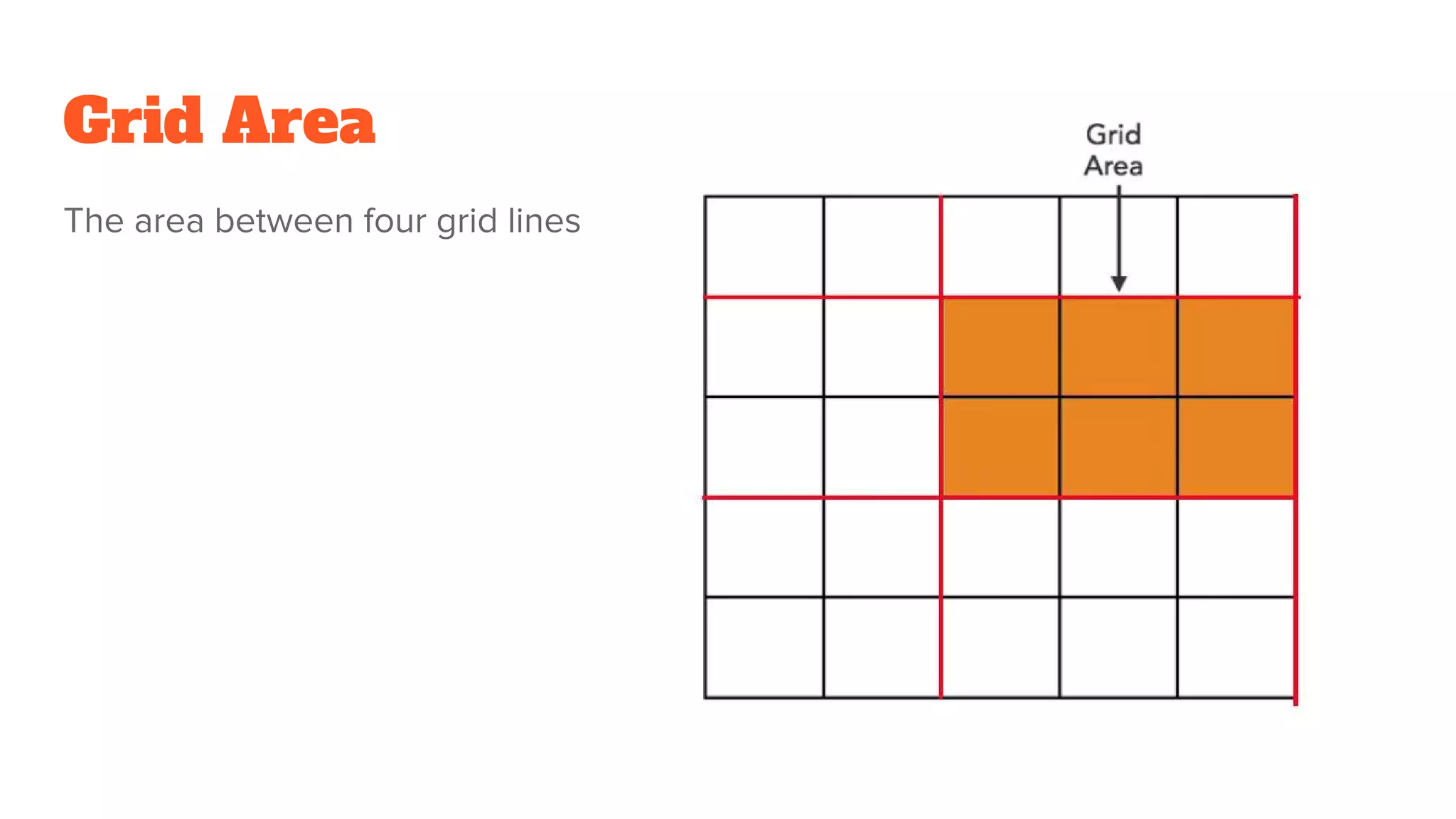
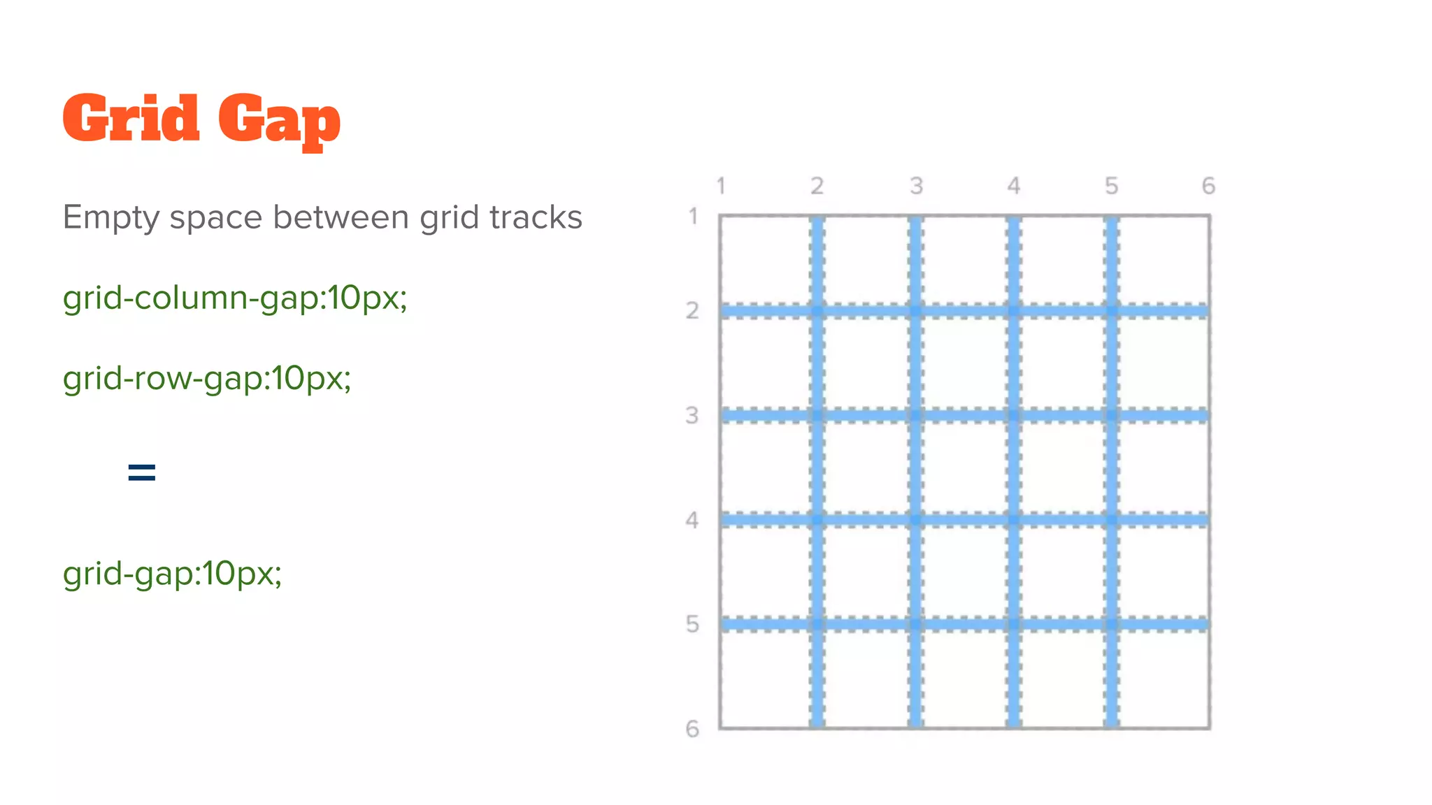
Key terms in CSS Grid including Container, Item, Line, Cell, Track, Area, and Gap with code examples.
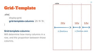
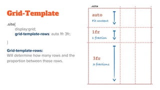
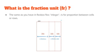
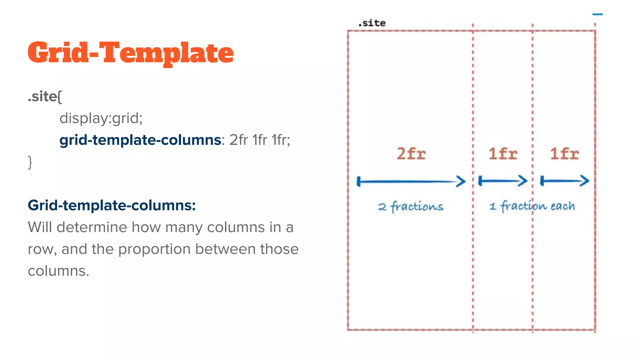
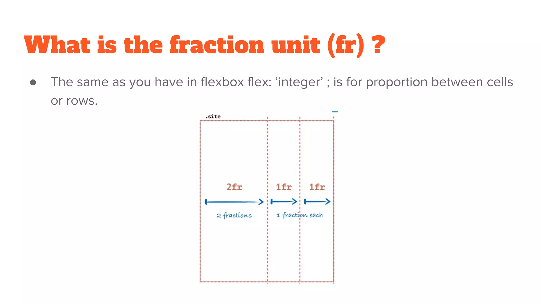
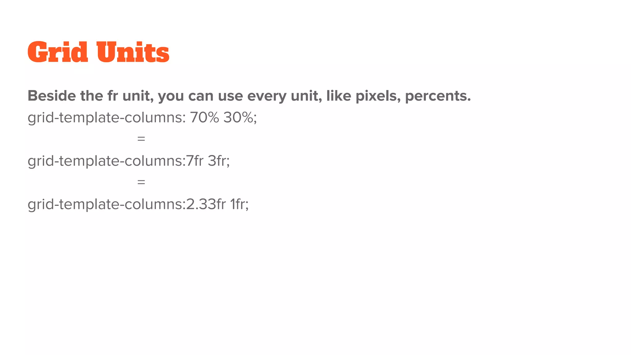
Introduction to the grid template concept, including how to define columns and rows using fr units.
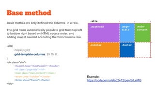
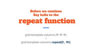
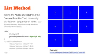
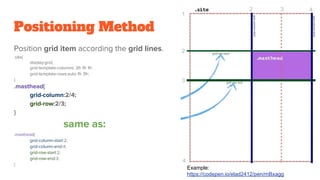
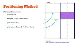
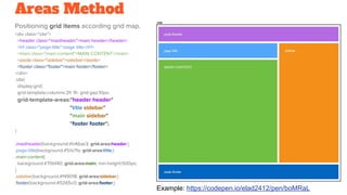
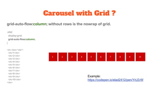
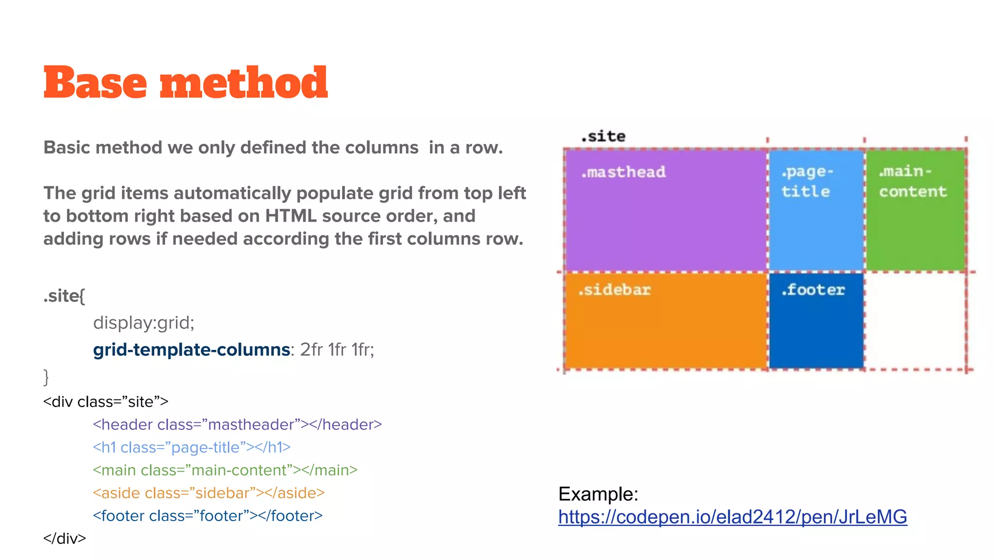
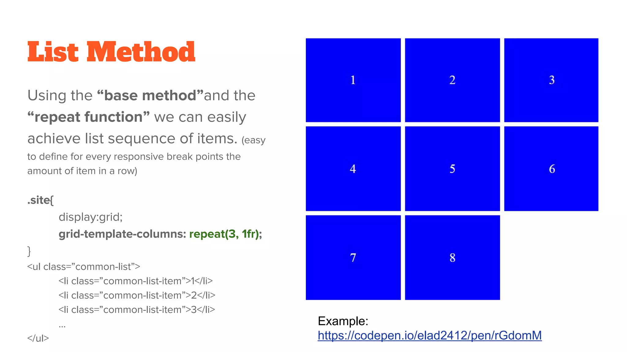
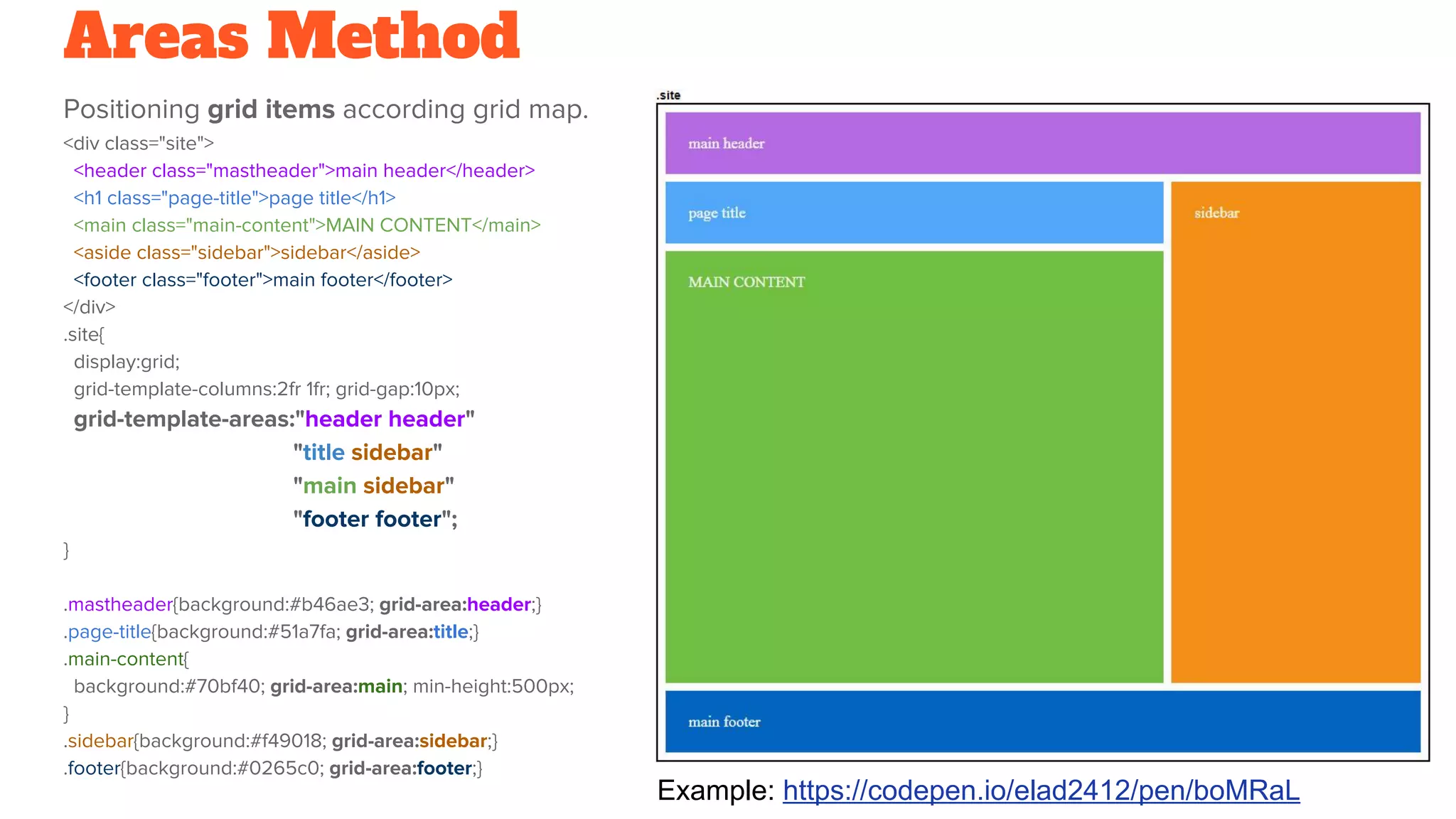
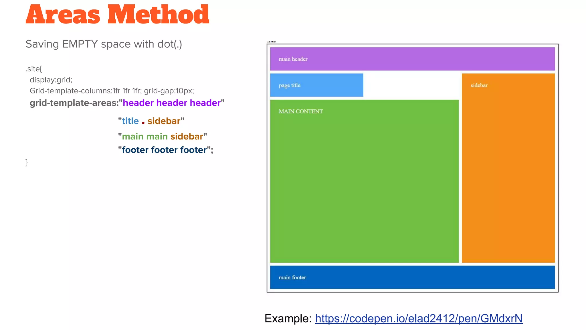
Various grid layout methods such as Base, List, and Areas methods with practical coding examples.
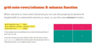
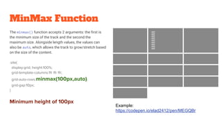
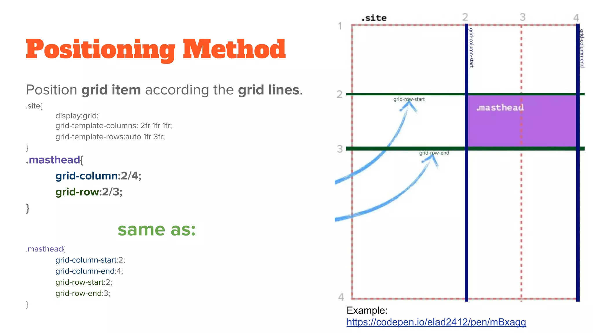
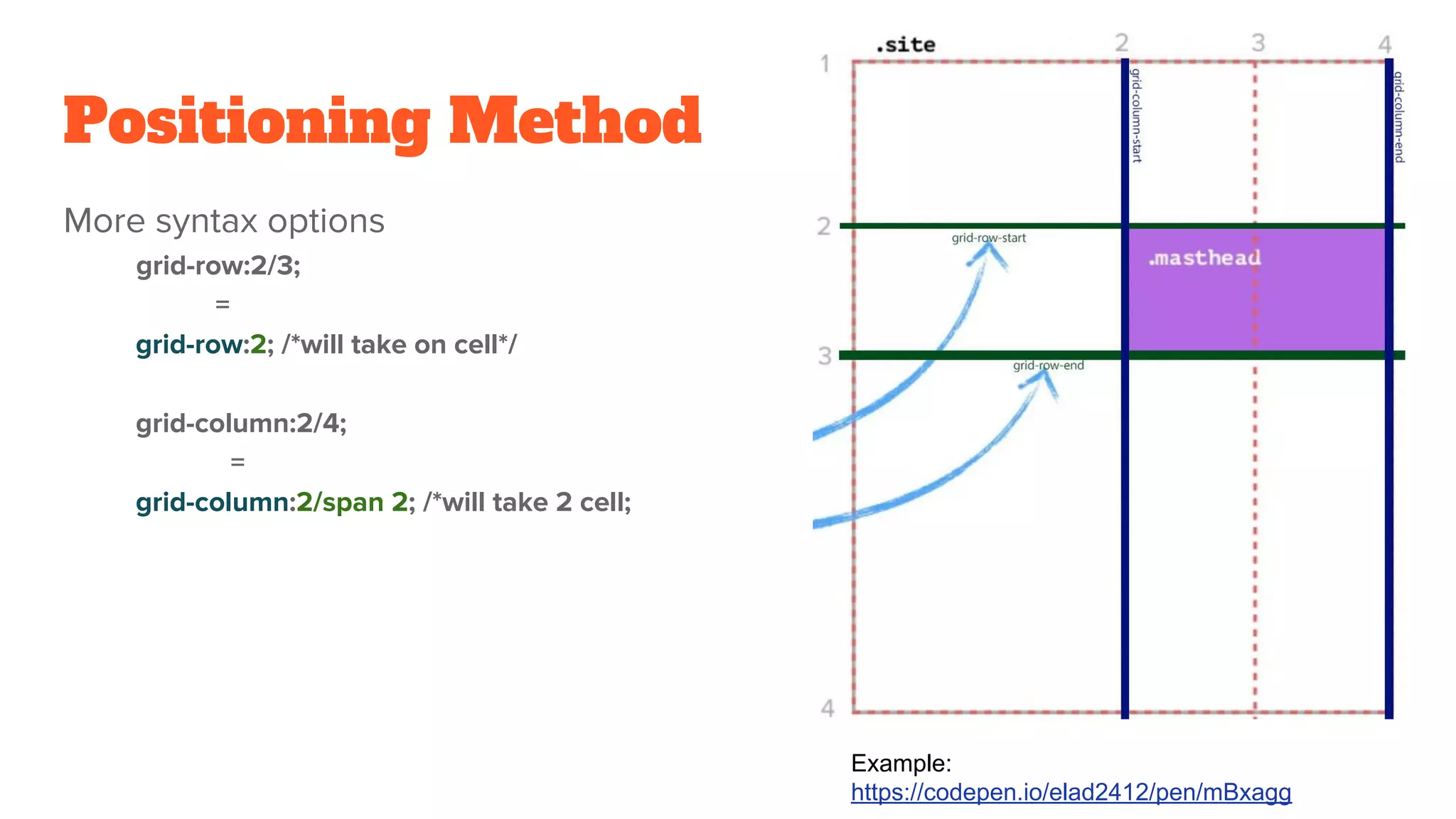
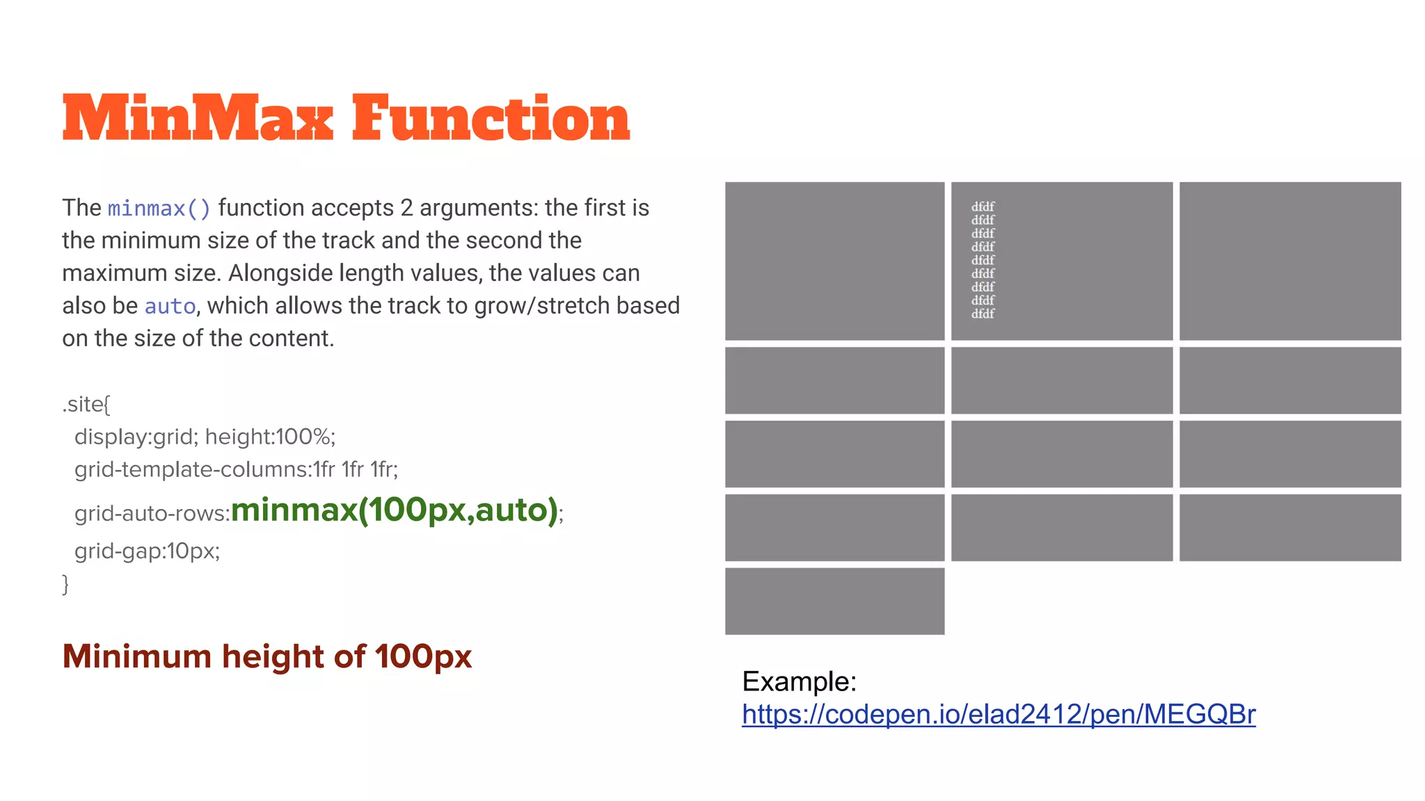
Discussing advanced grid features such as positioning items, defining empty spaces, and using minmax for flexible sizing.
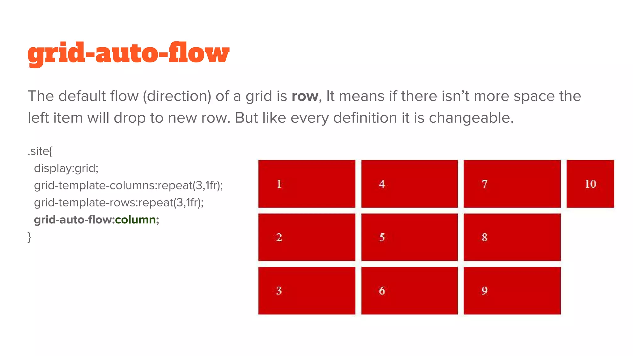
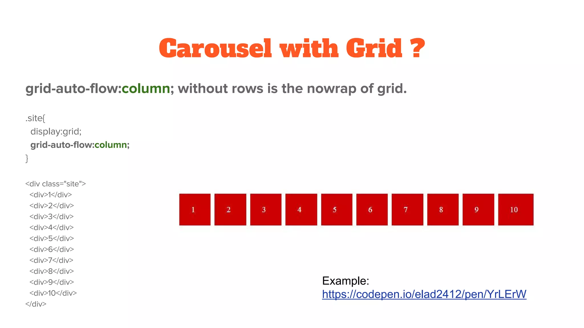
Explains grid flow direction and naming grid lines for improved item positioning within the grid.
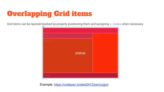
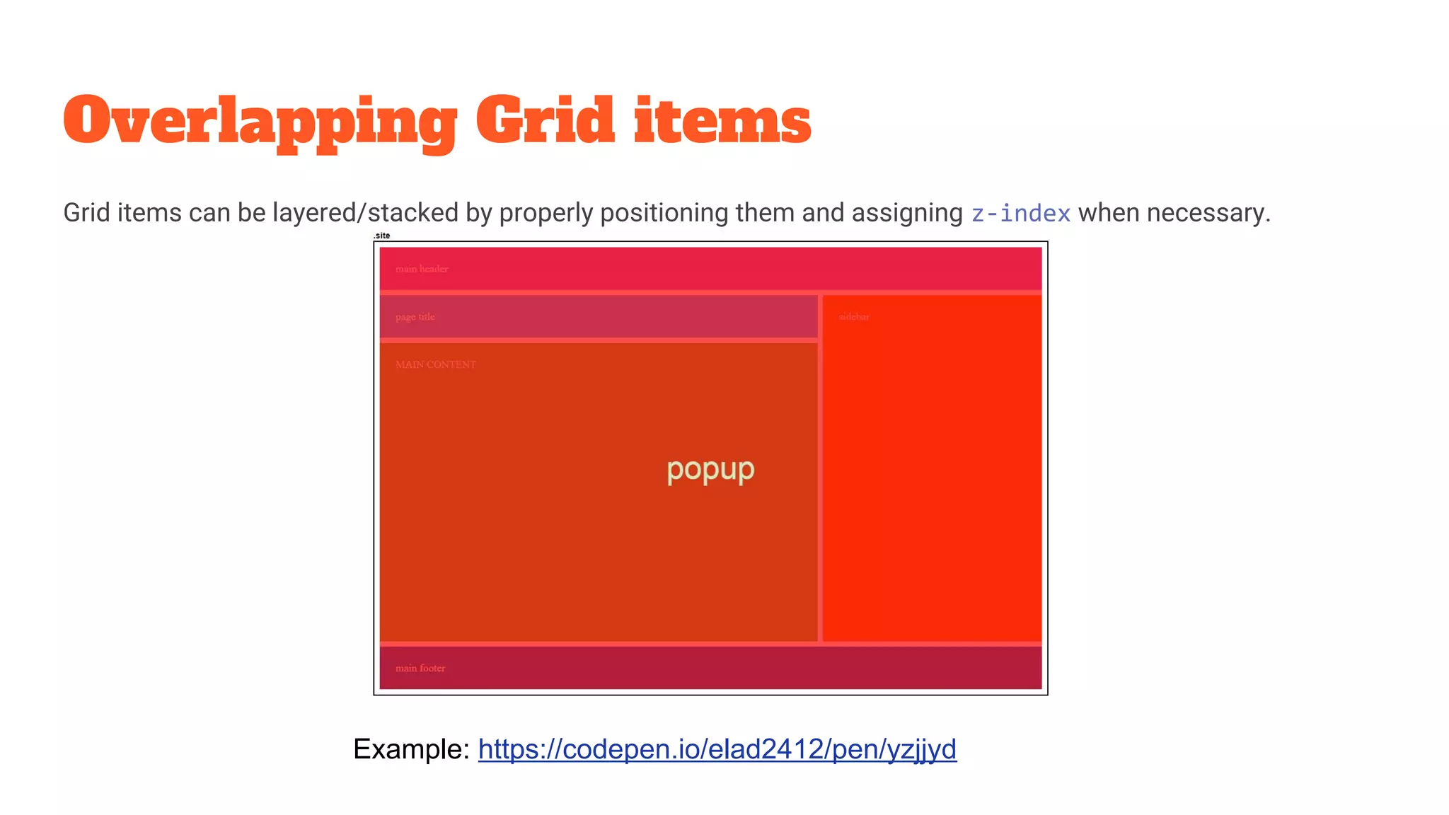
Techniques for overlapping grid items and applying flexbox-like alignment properties within CSS Grid.
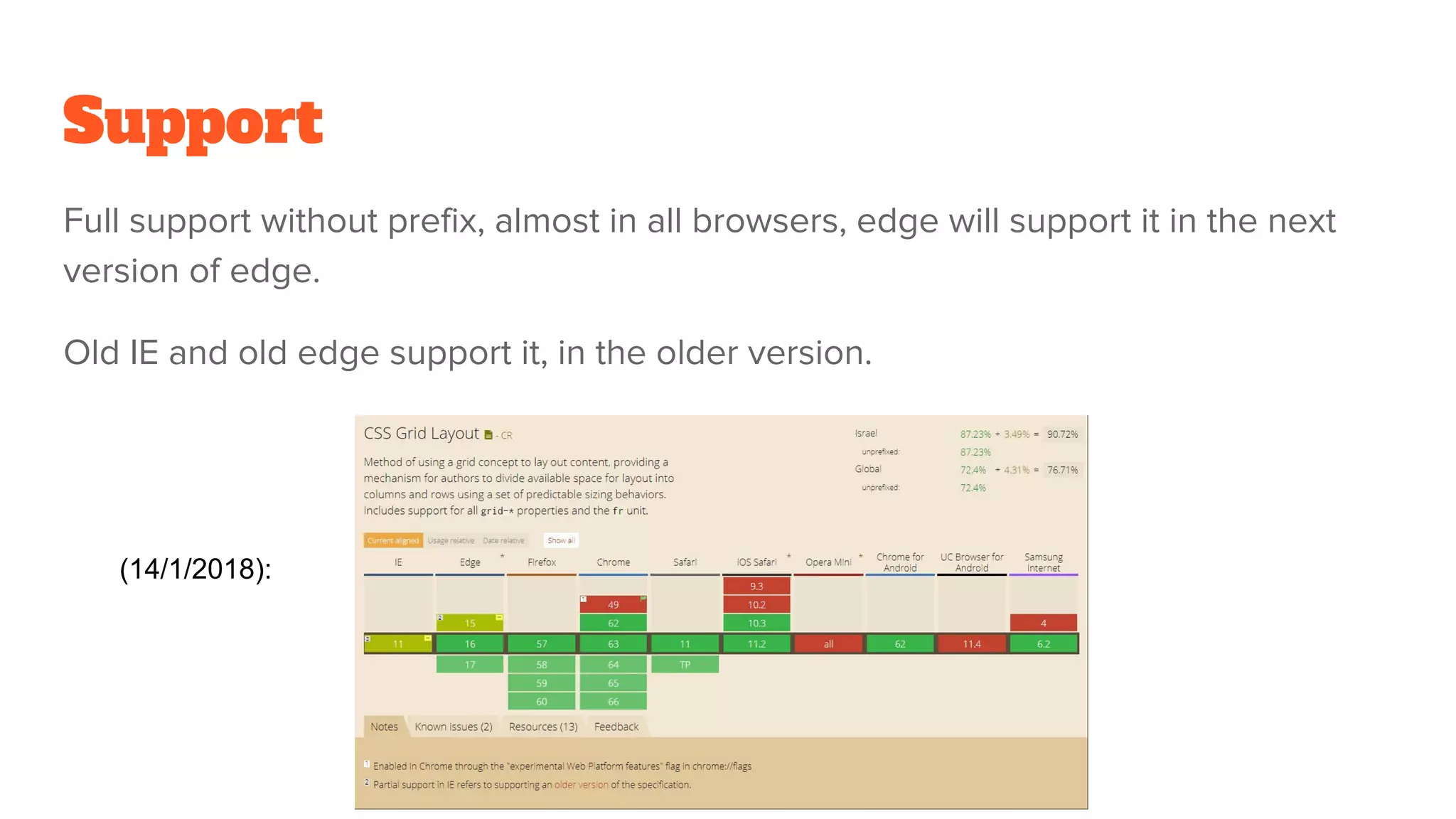
Overview of browser support for CSS Grid and additional resources for learning and examples.


