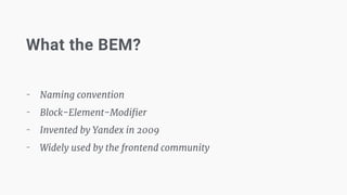
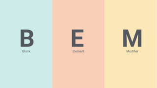
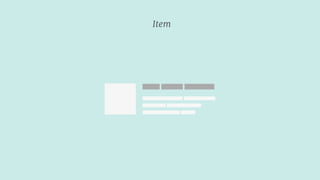
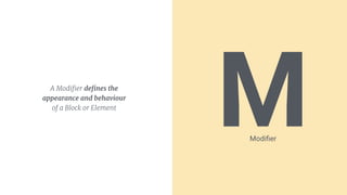
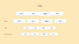
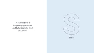
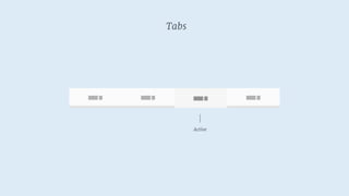
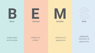
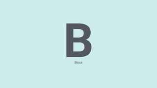
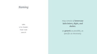
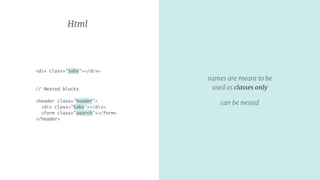
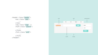
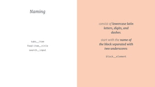
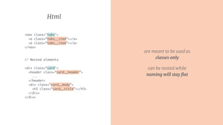
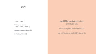
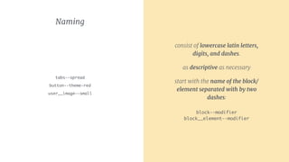
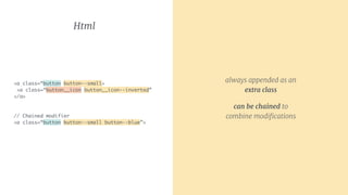
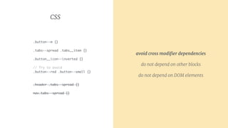
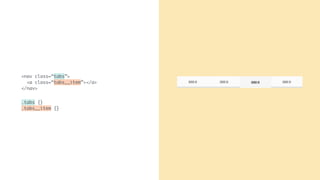
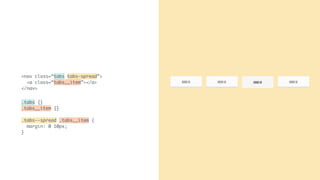
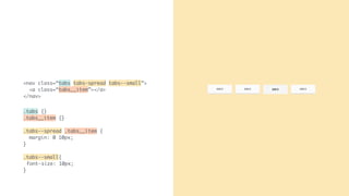
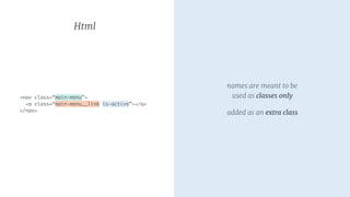
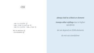
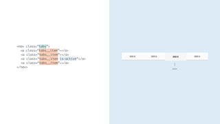
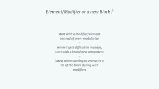
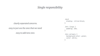
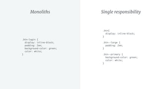
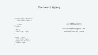
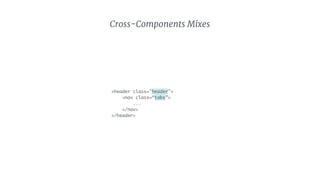
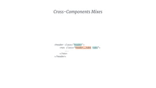
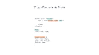
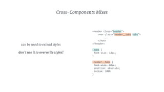
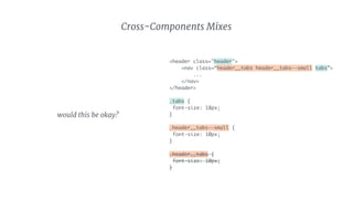
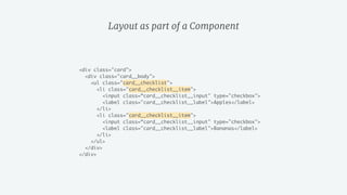
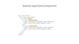
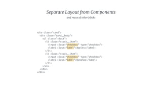
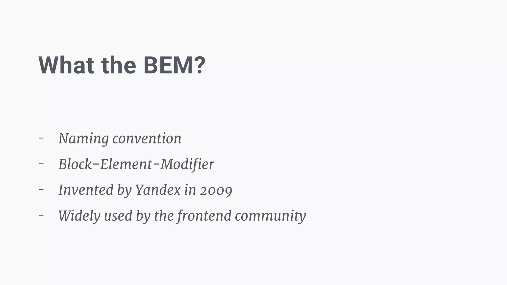
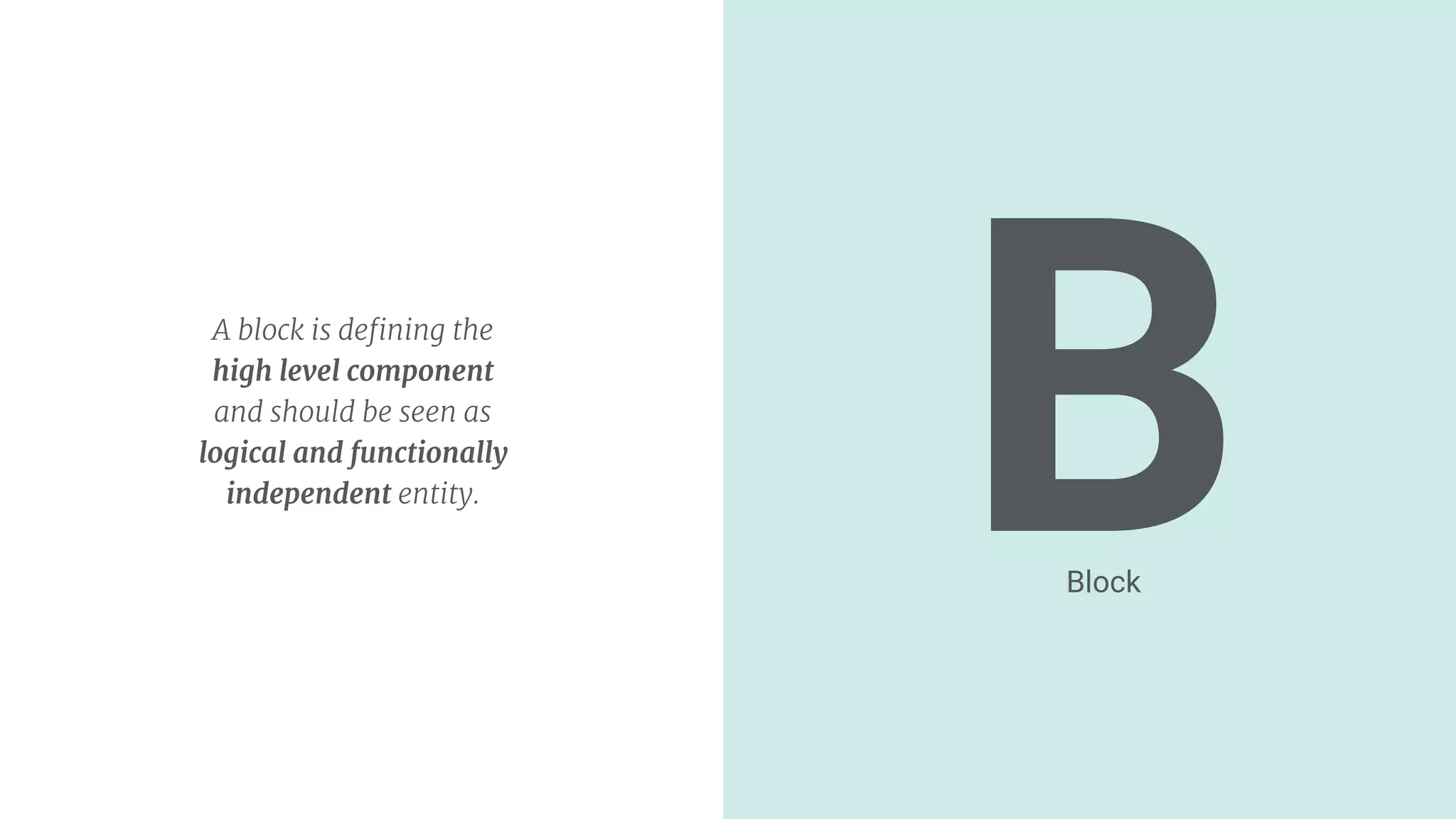
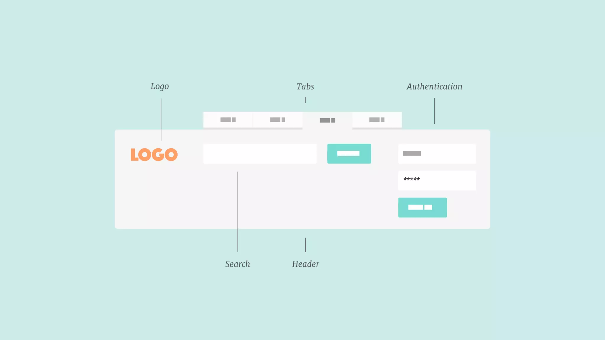
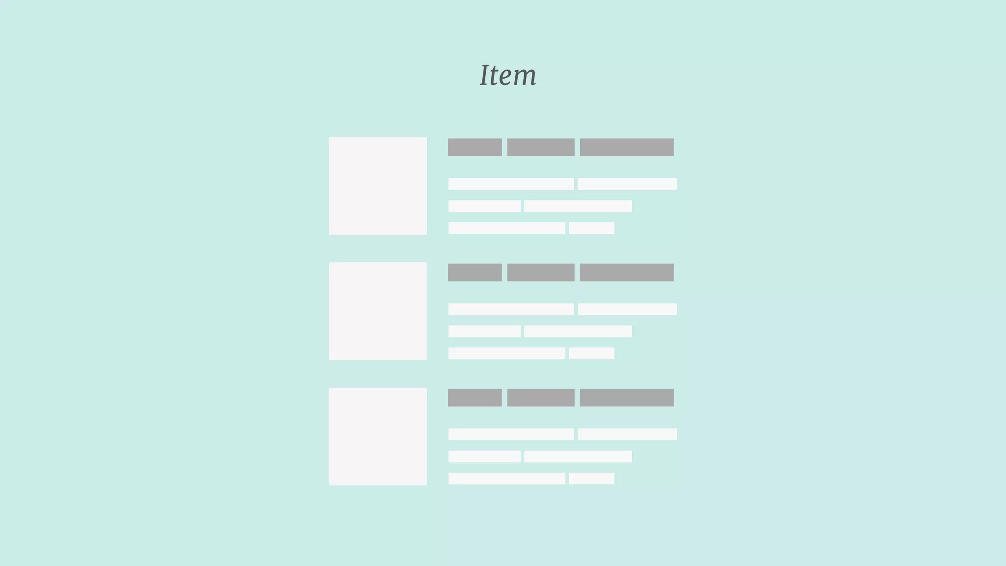
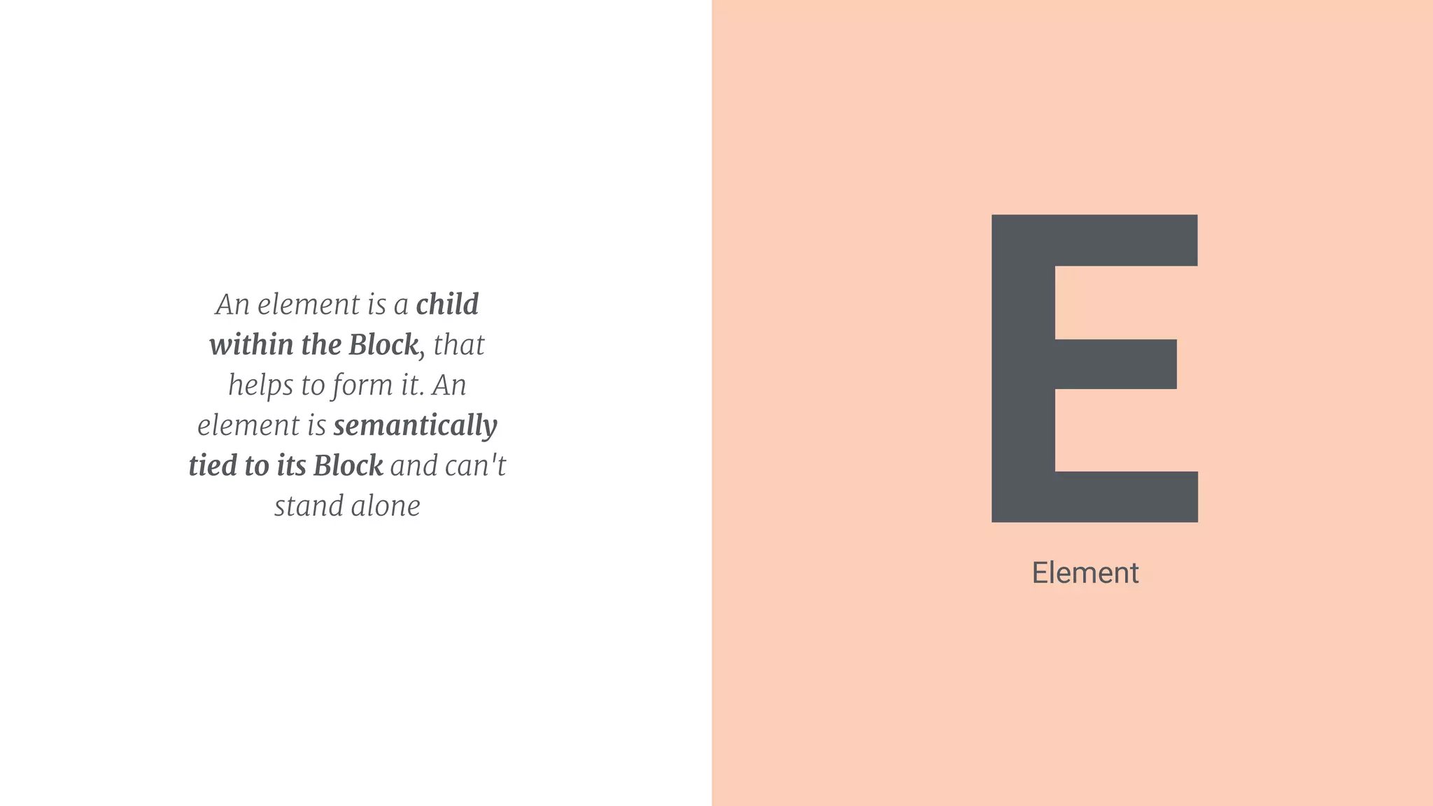
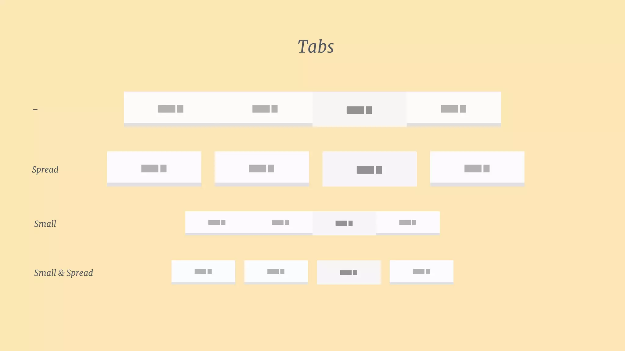
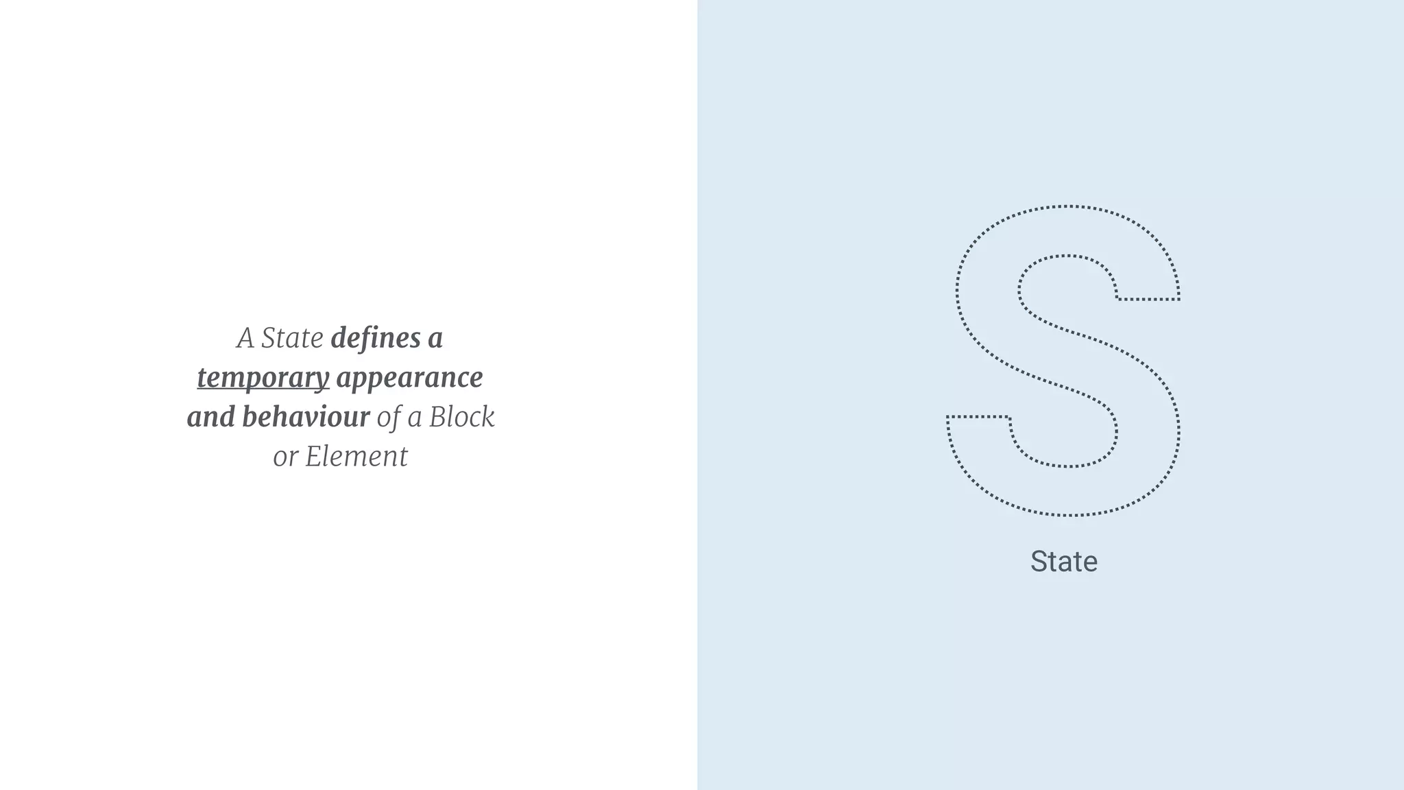
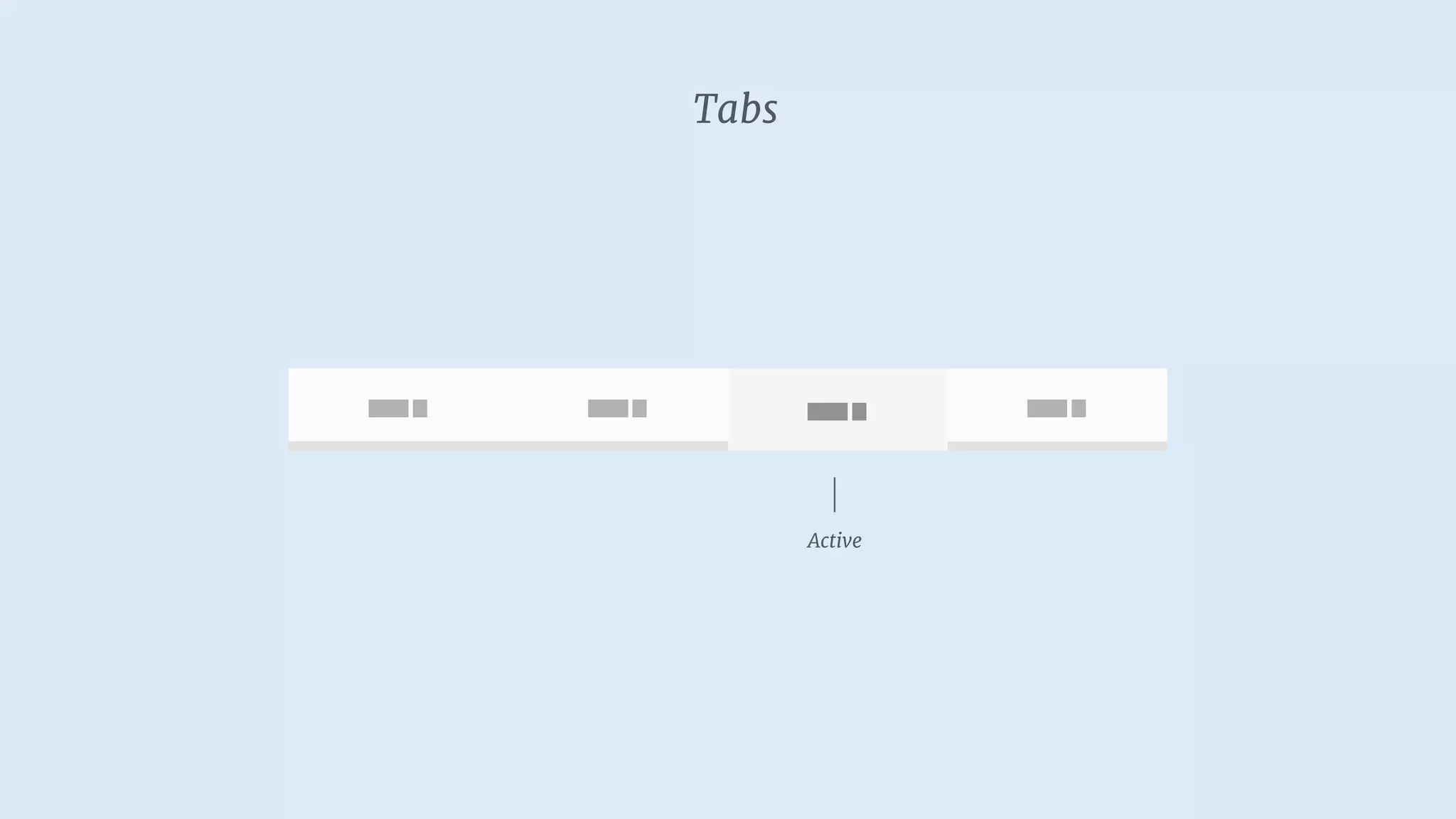
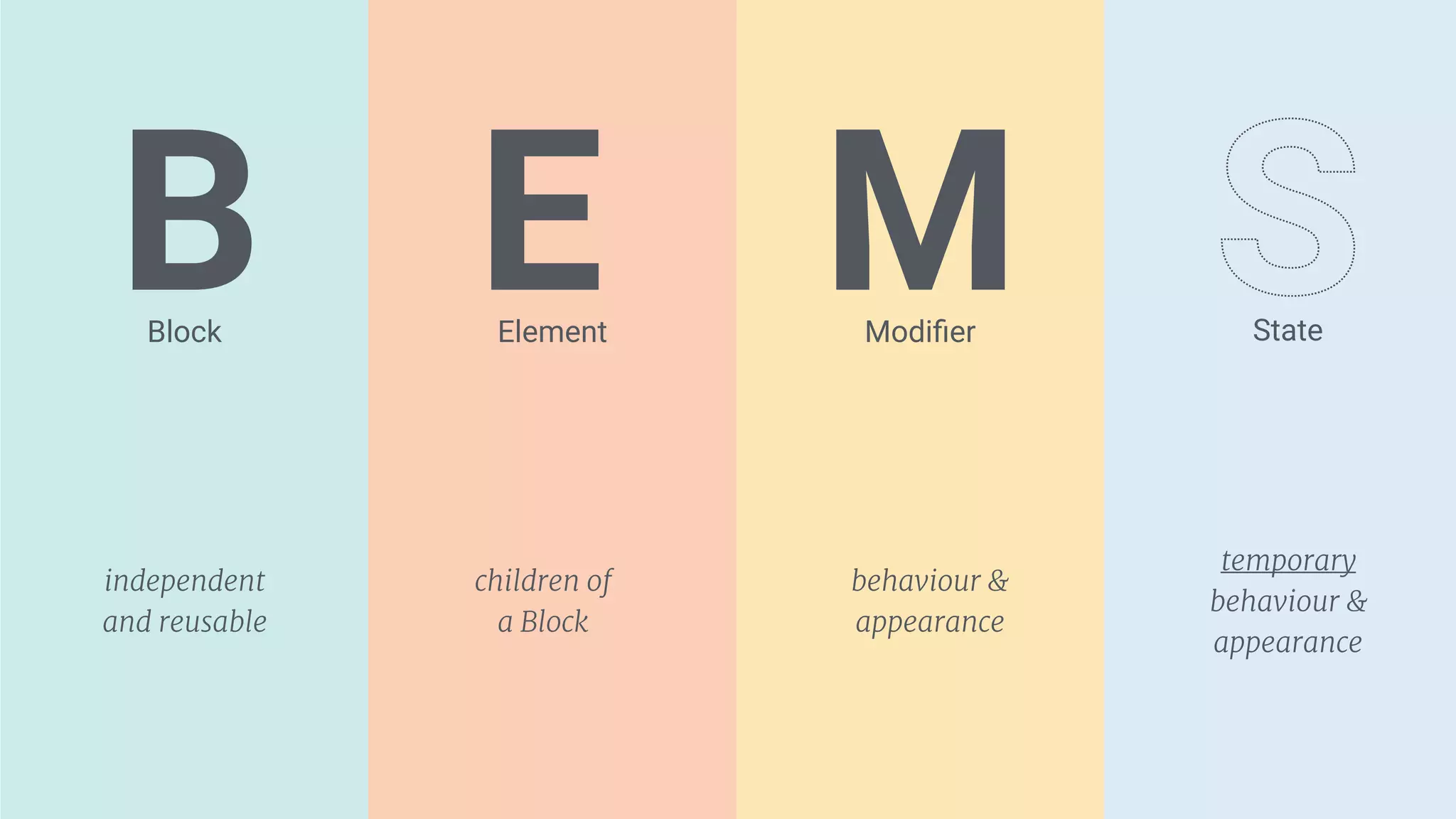
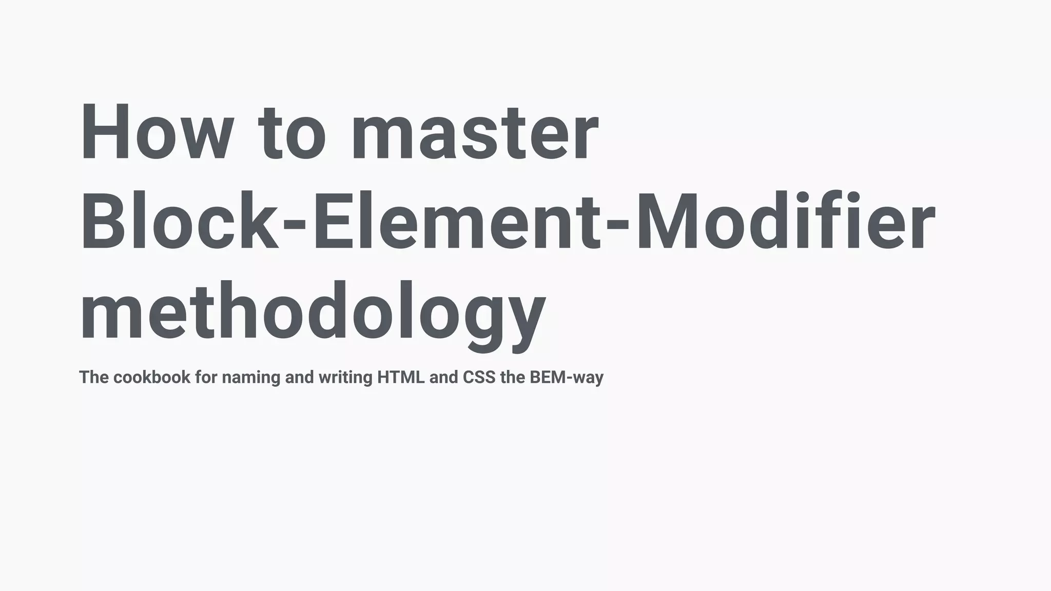
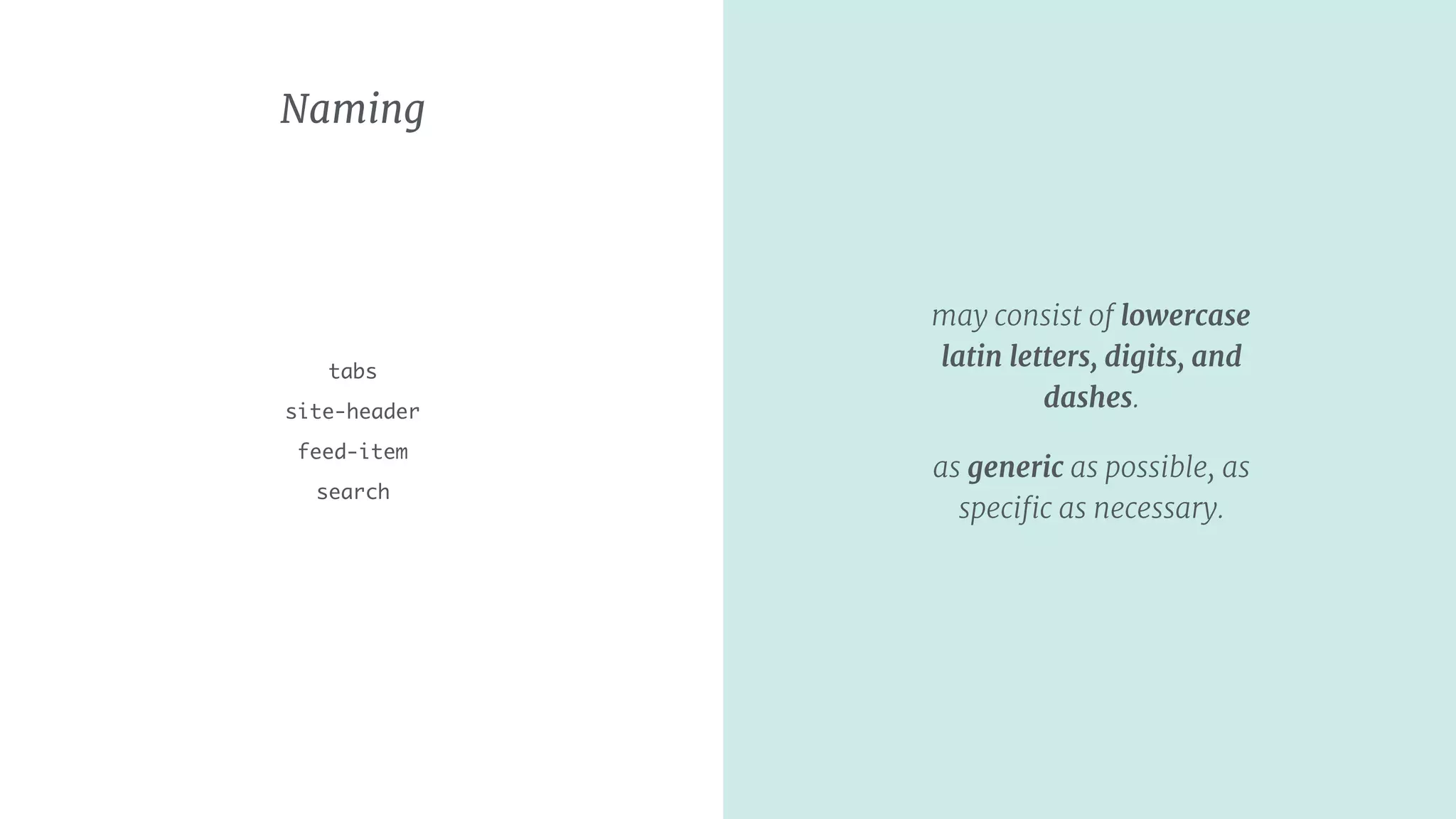
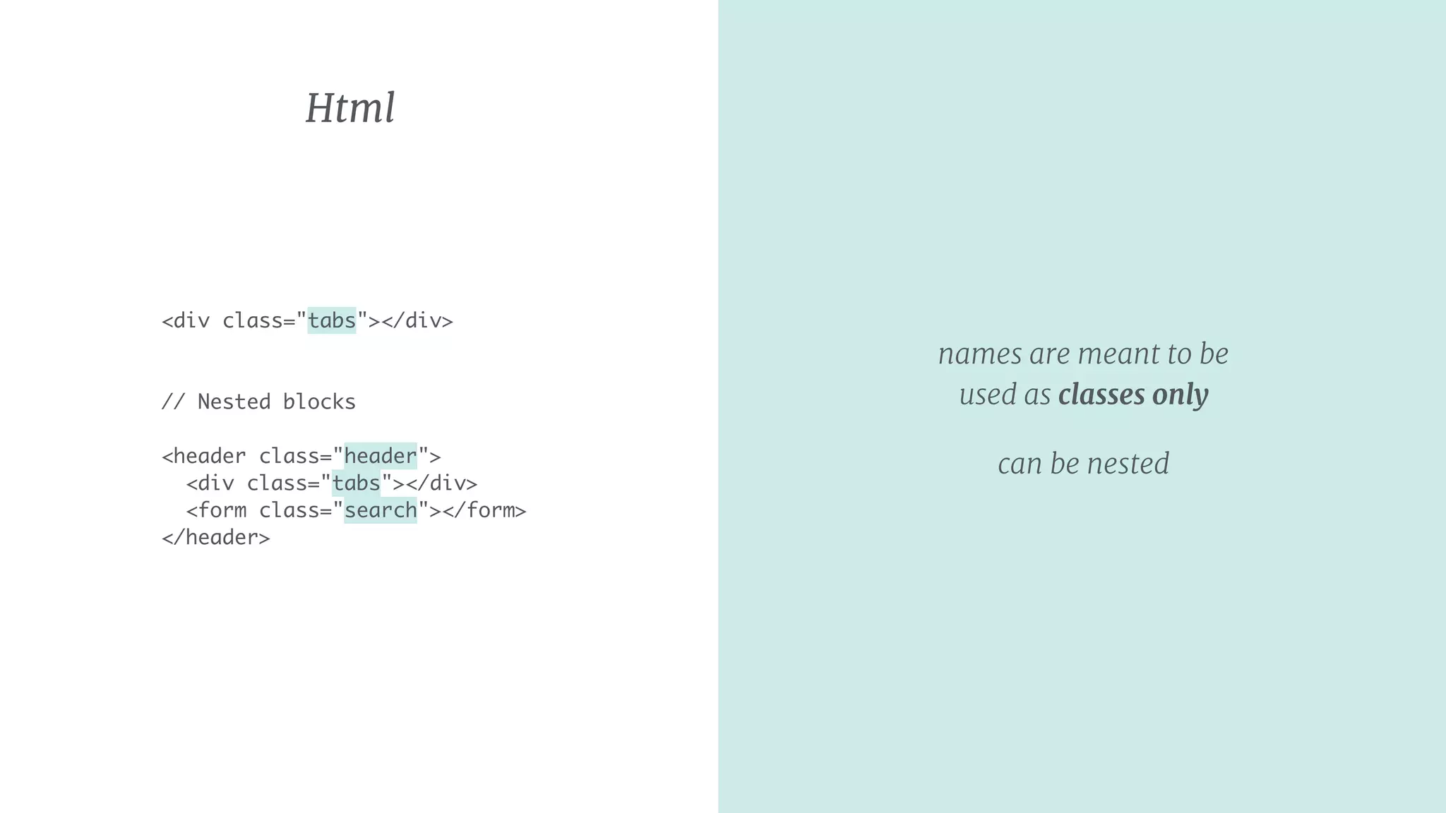
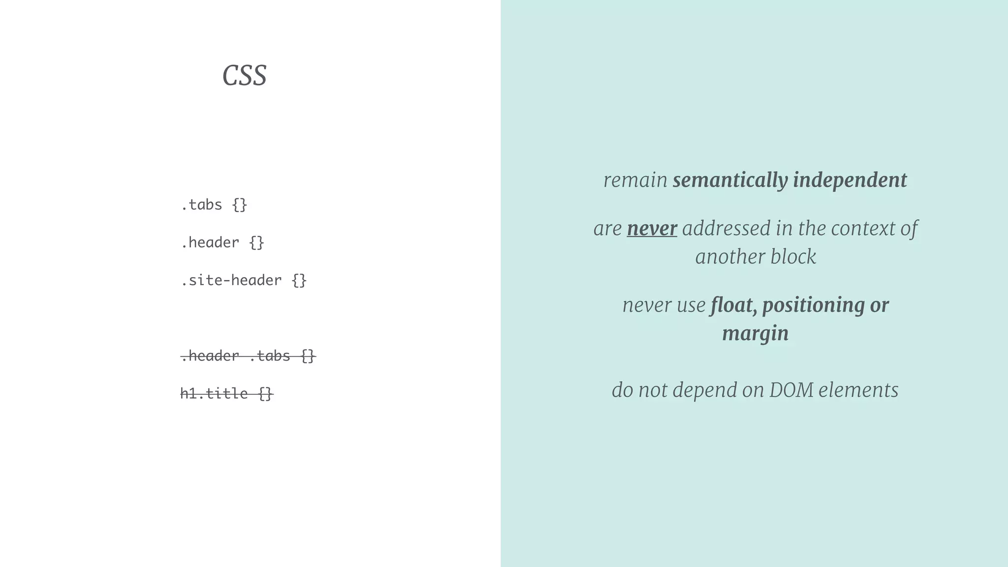
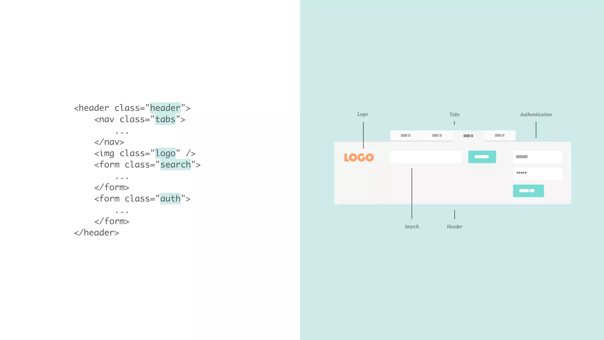
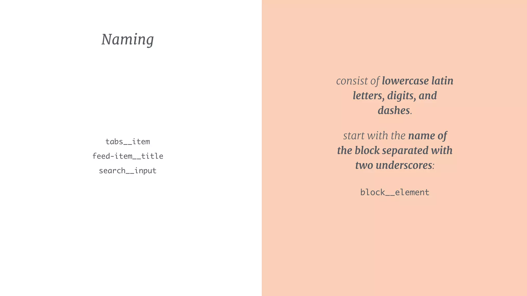
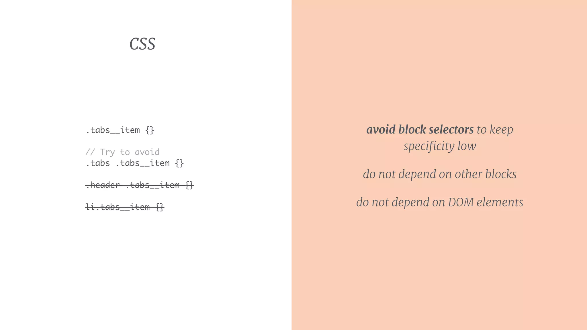
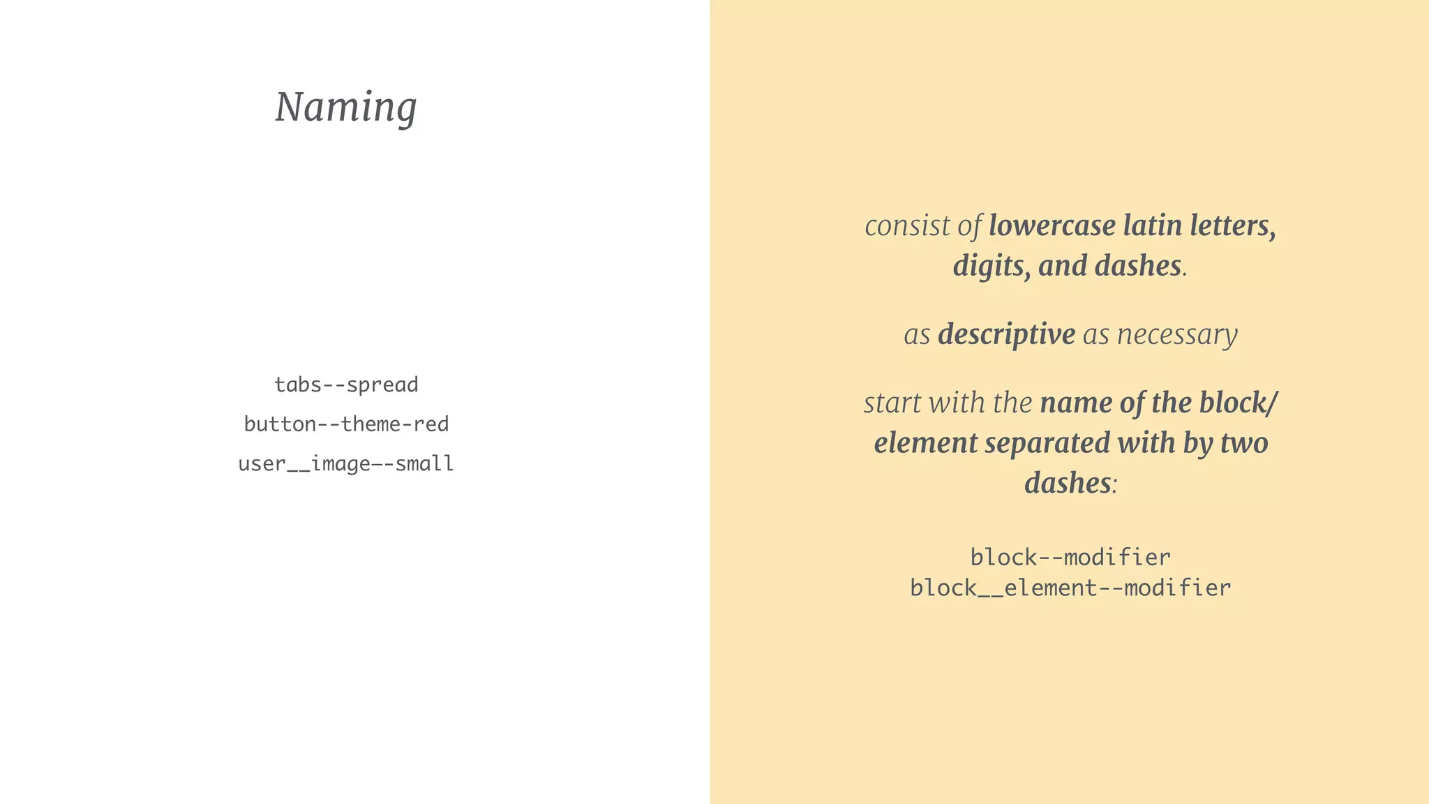
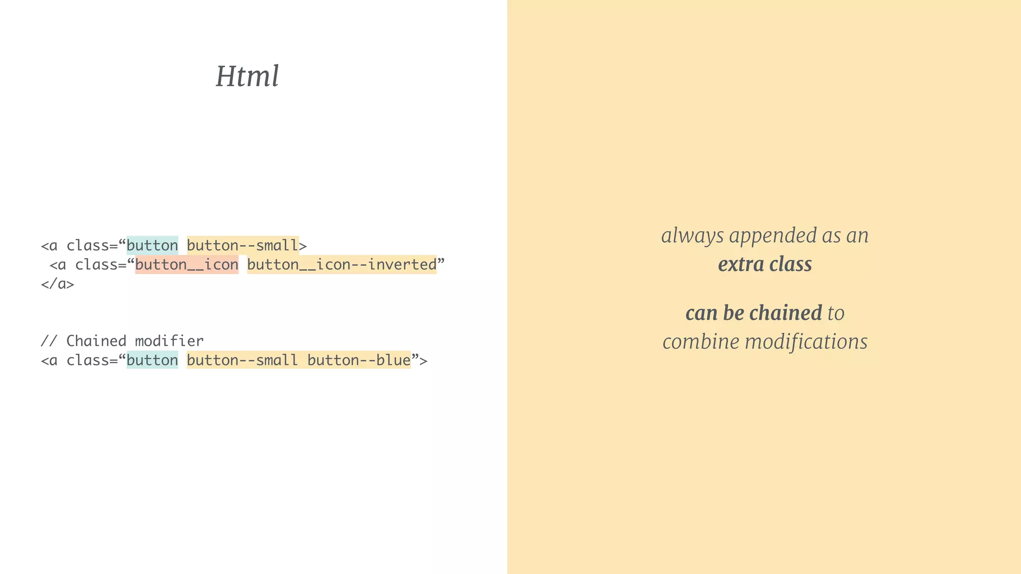
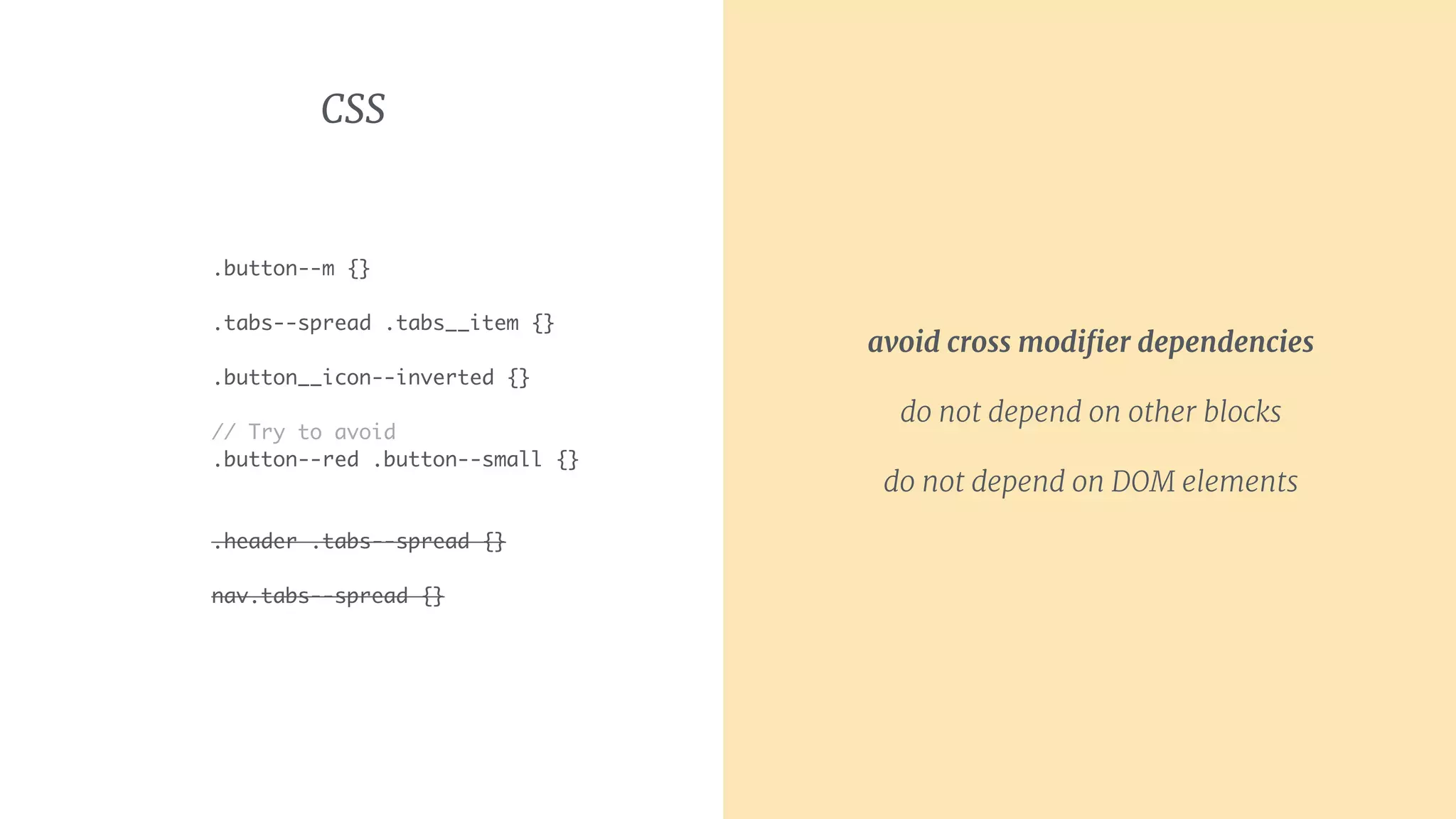
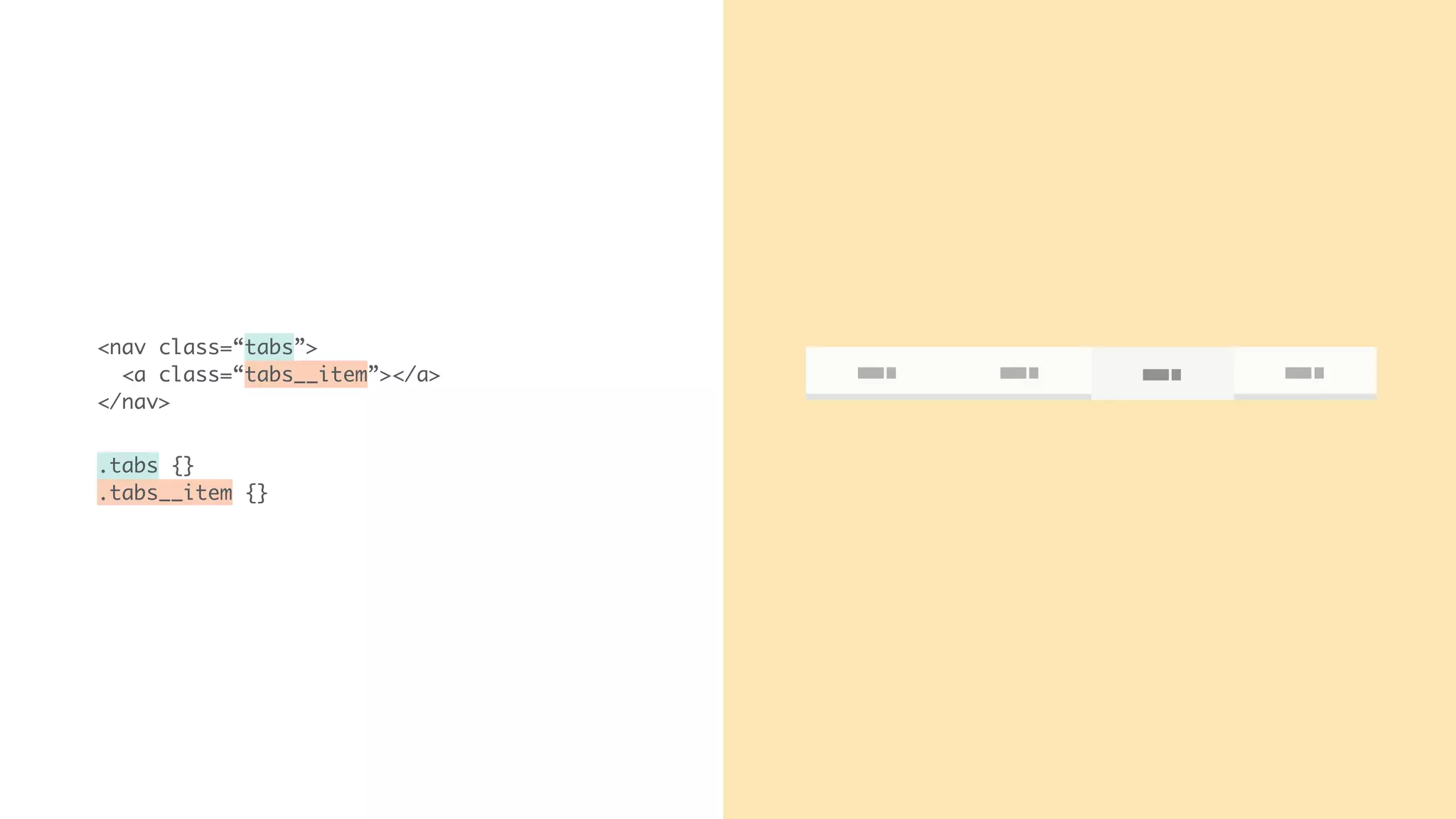
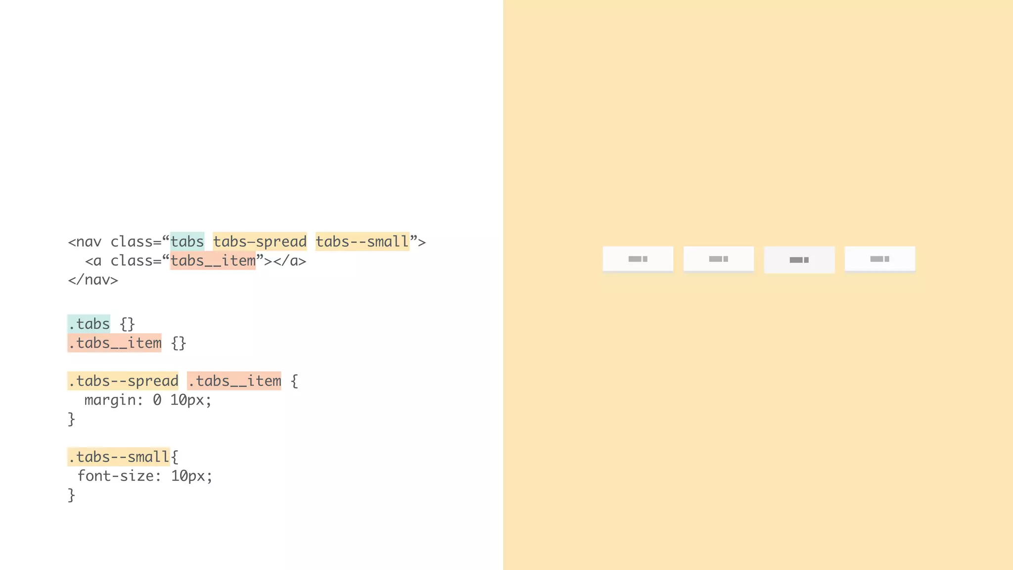
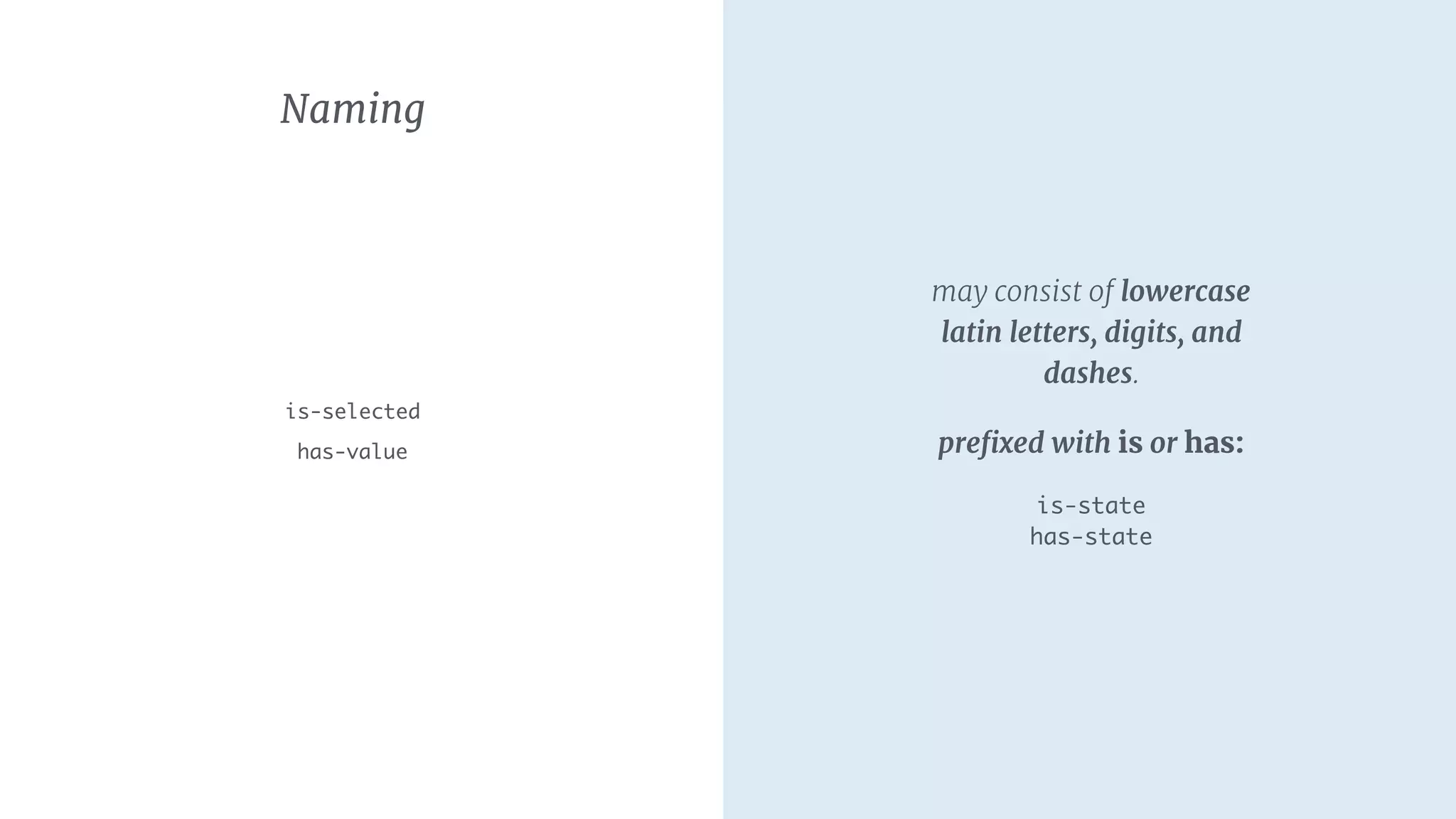
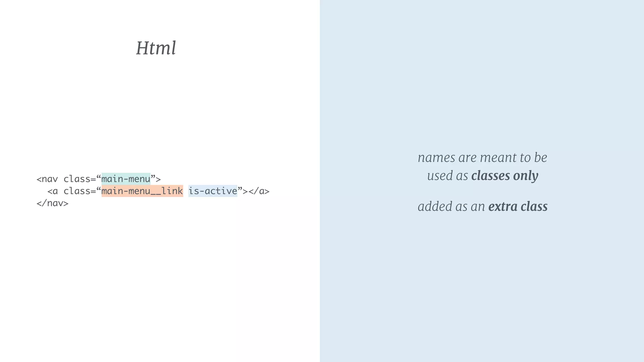
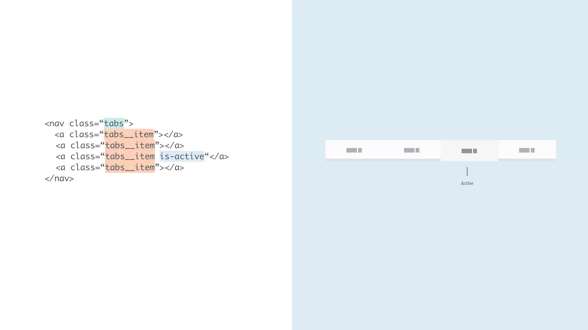
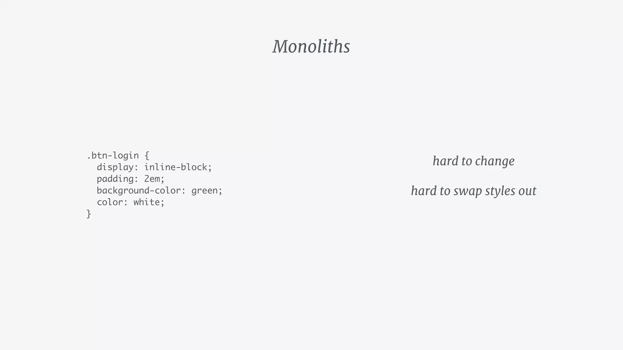
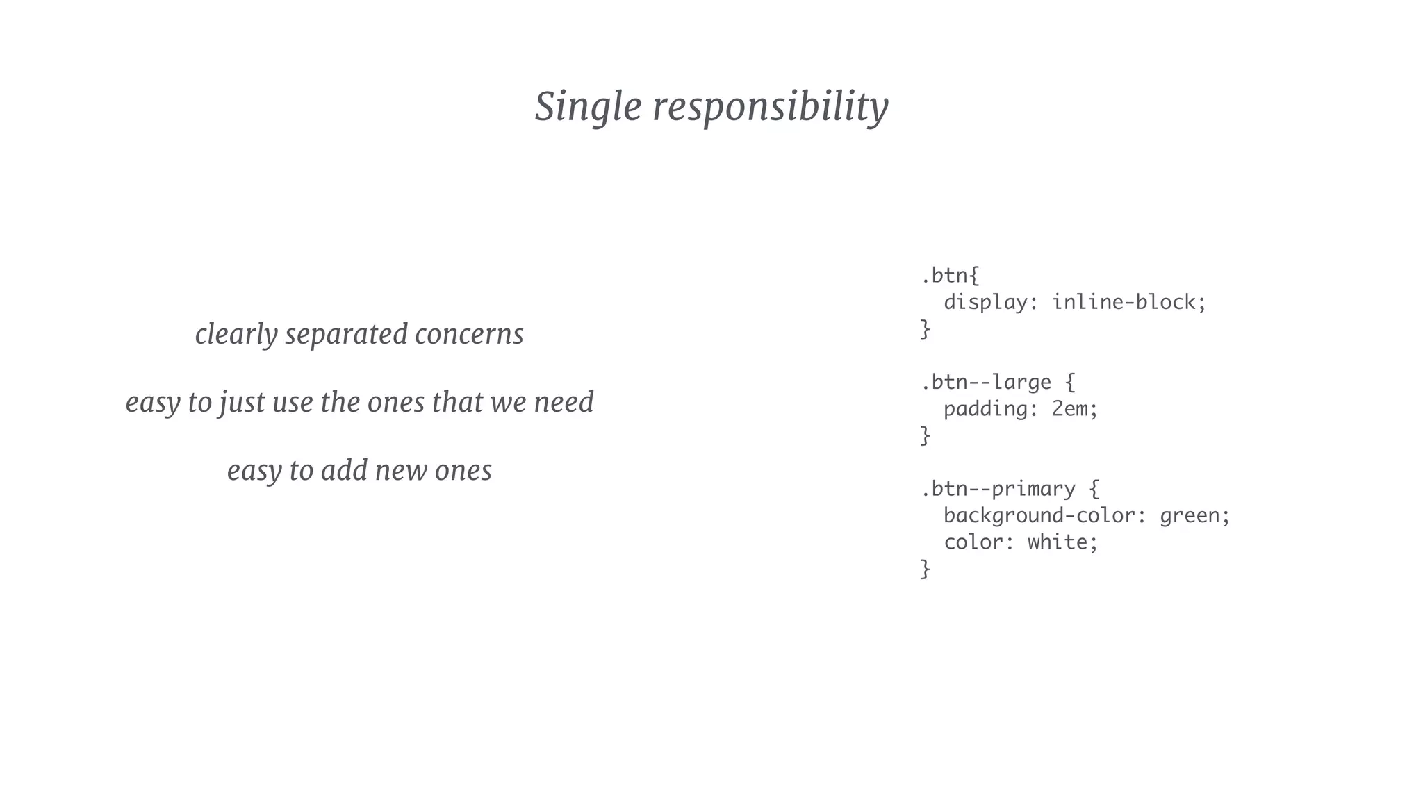
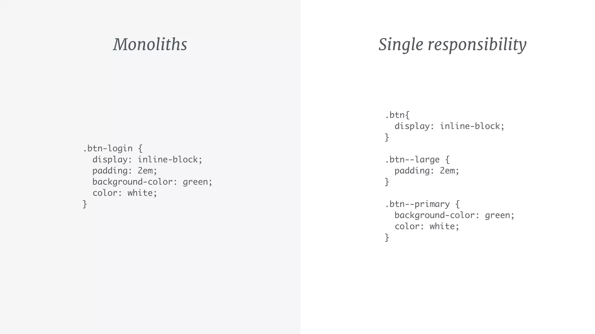
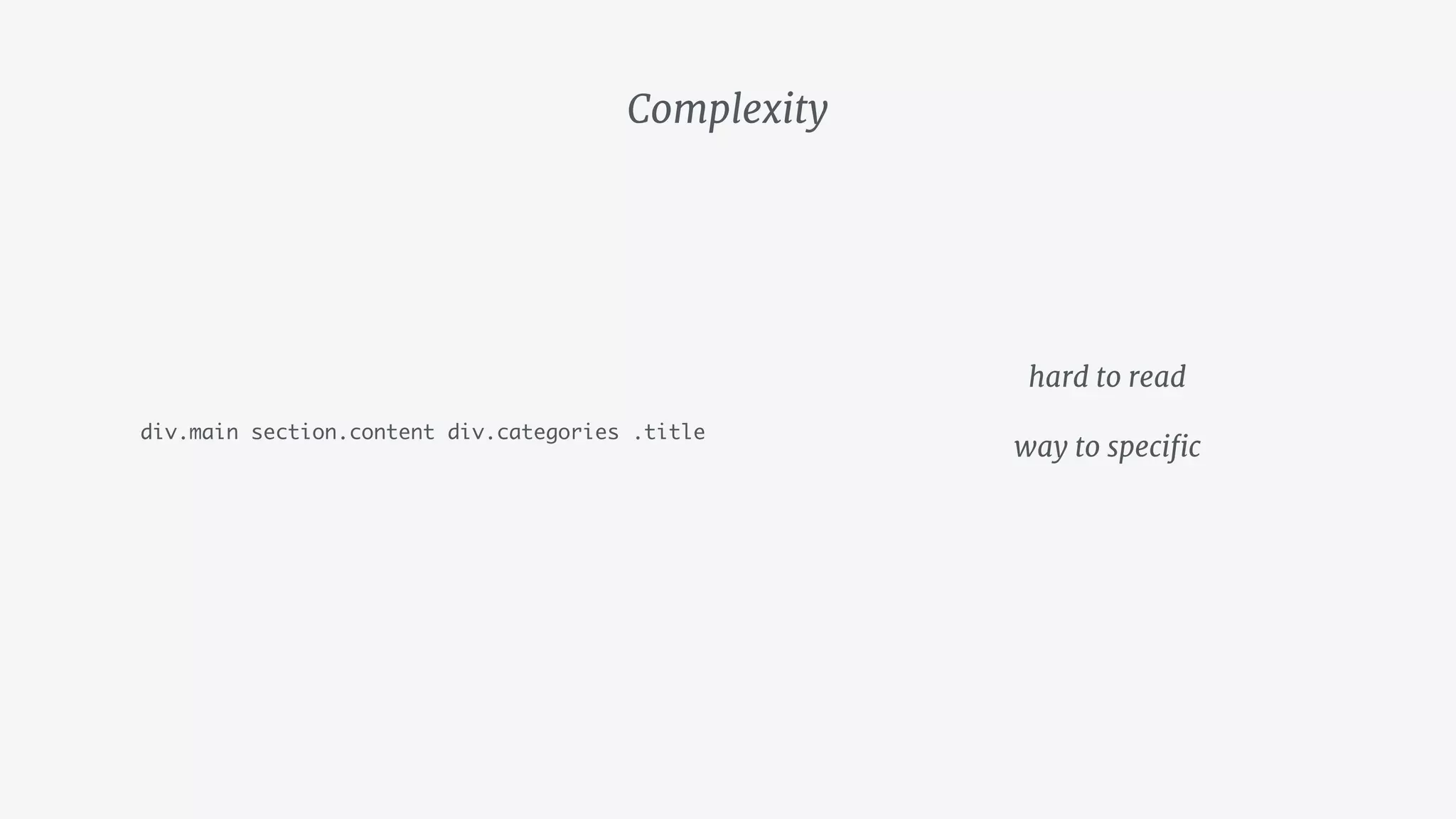
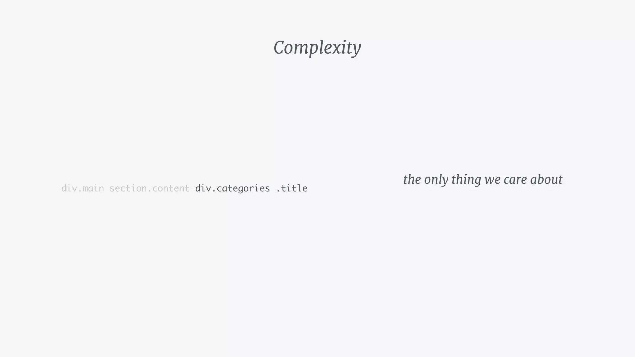
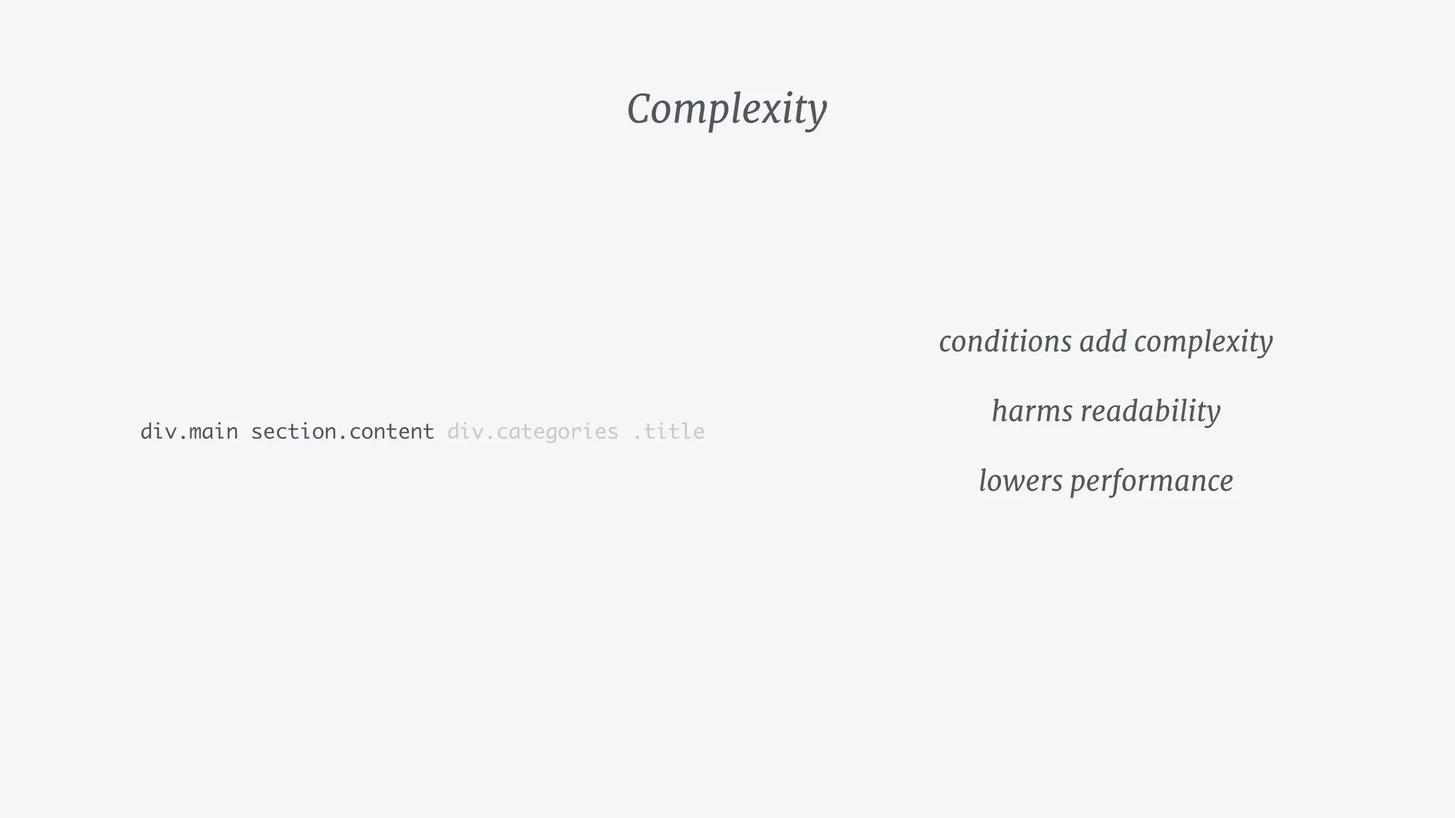
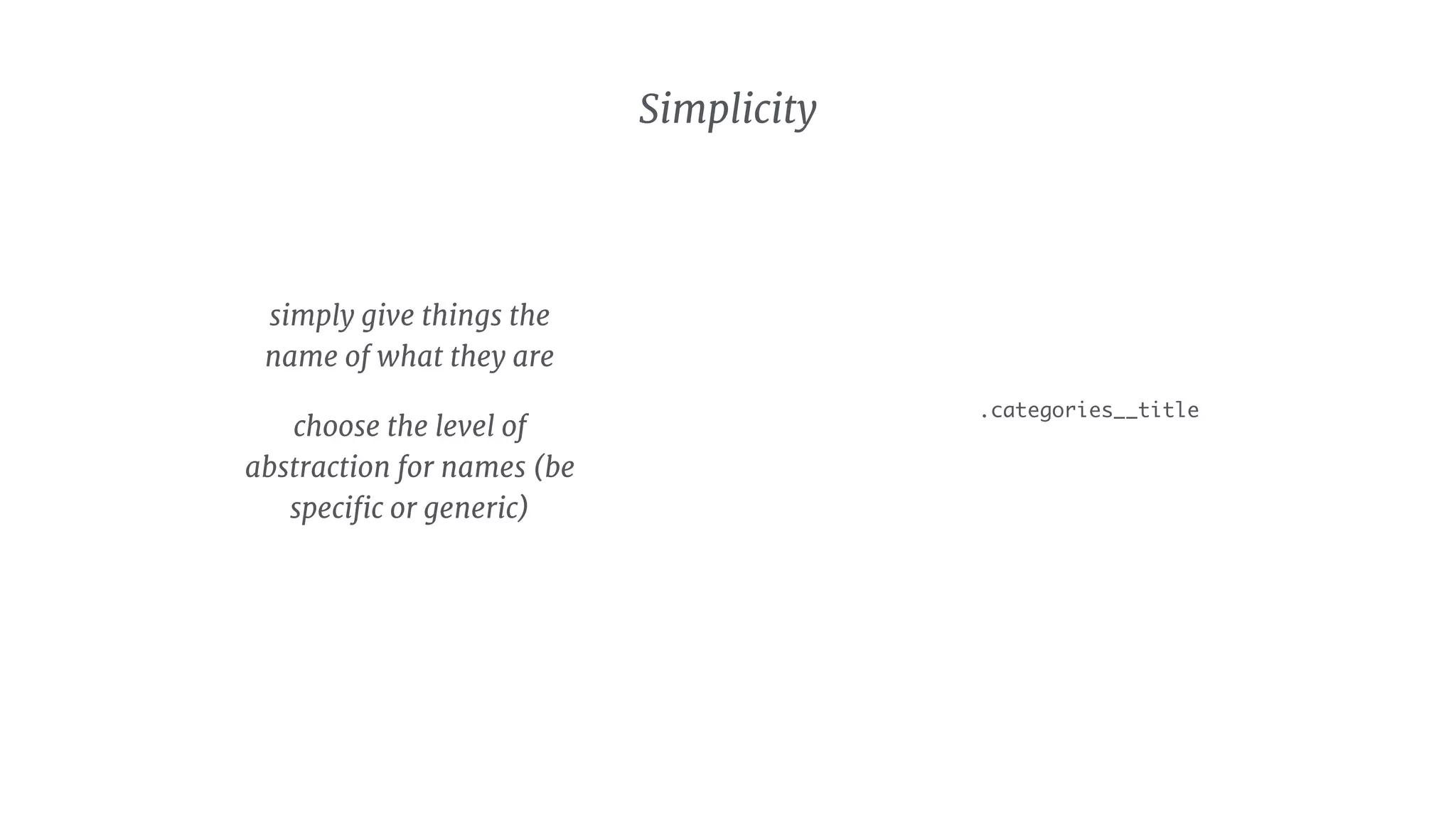
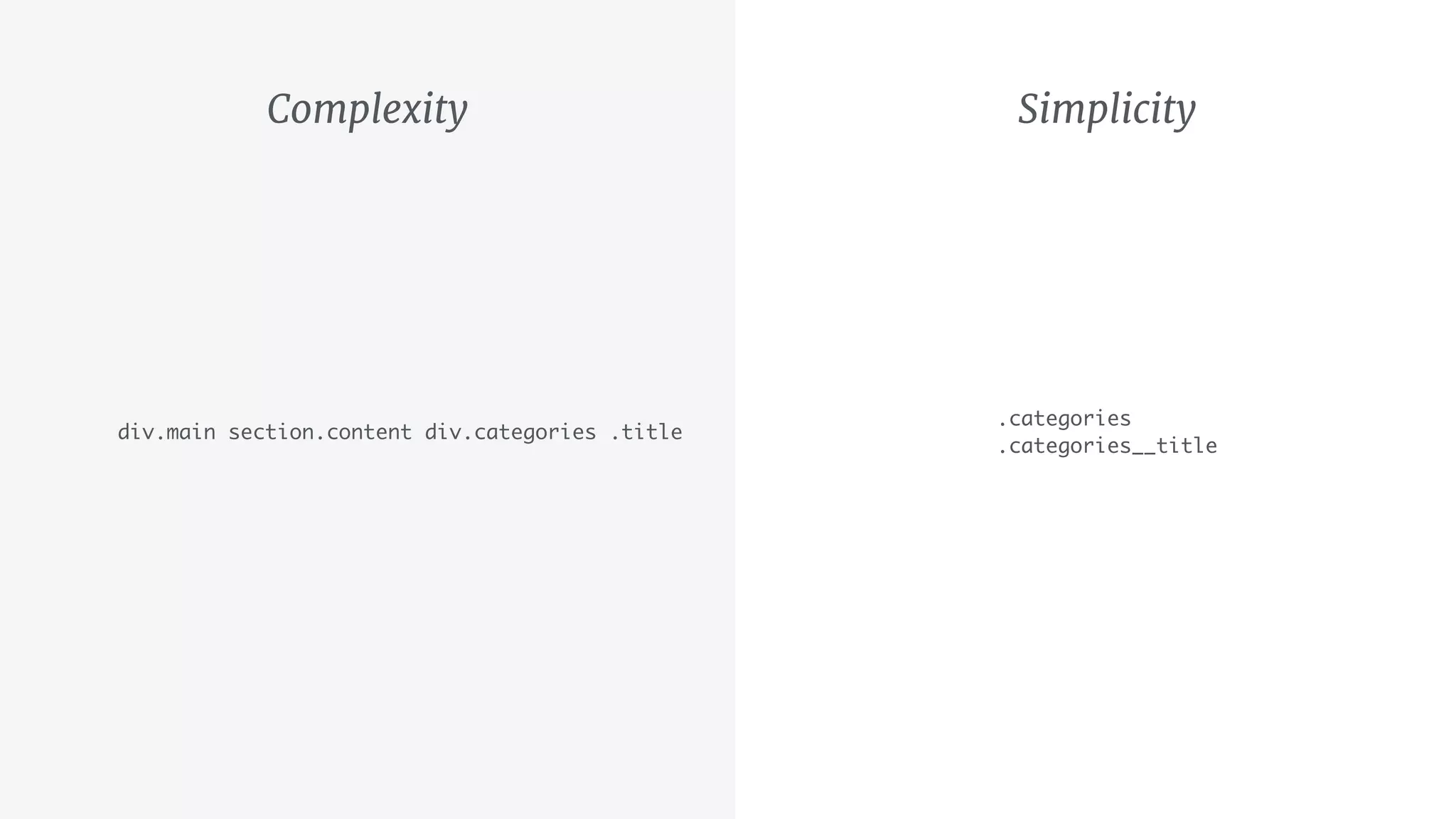
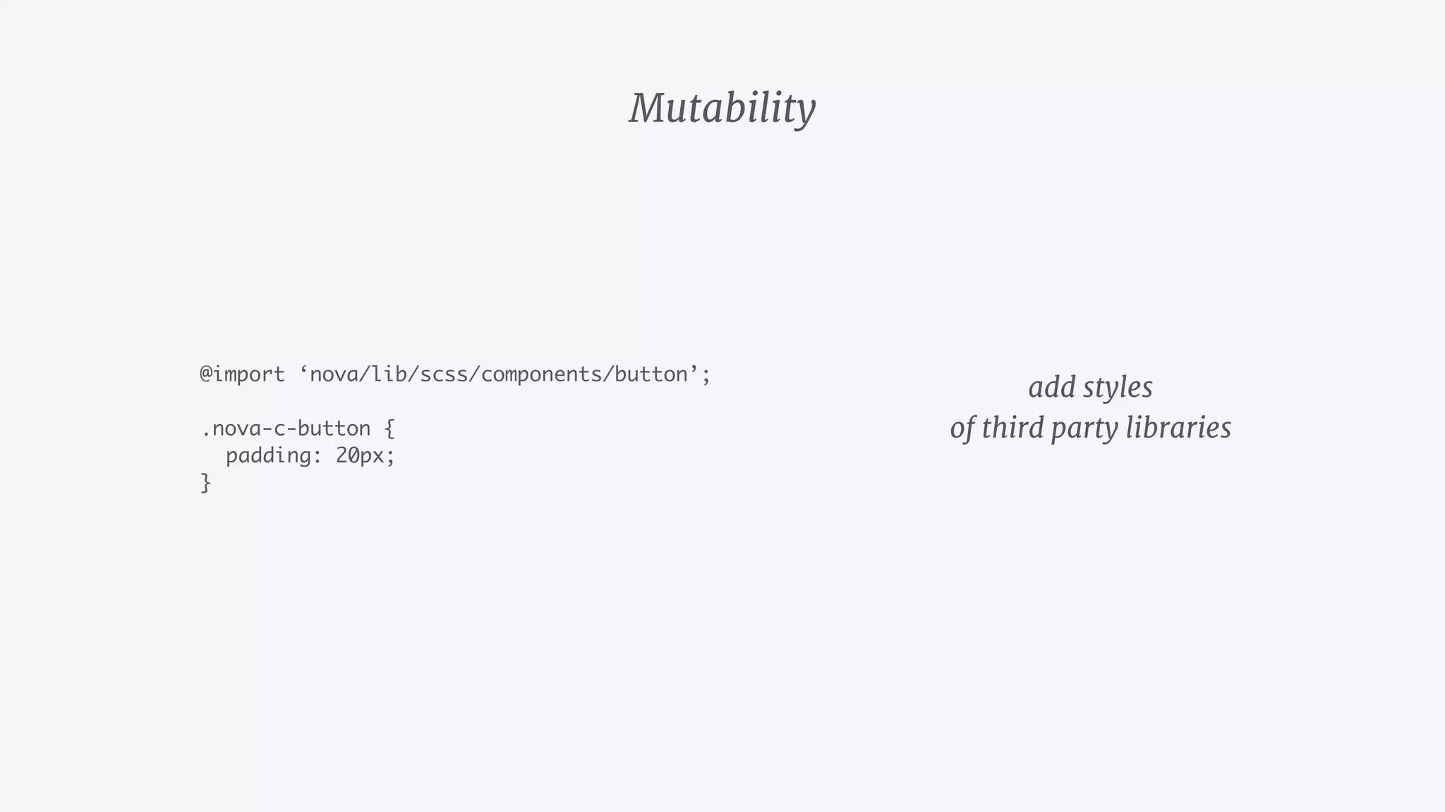
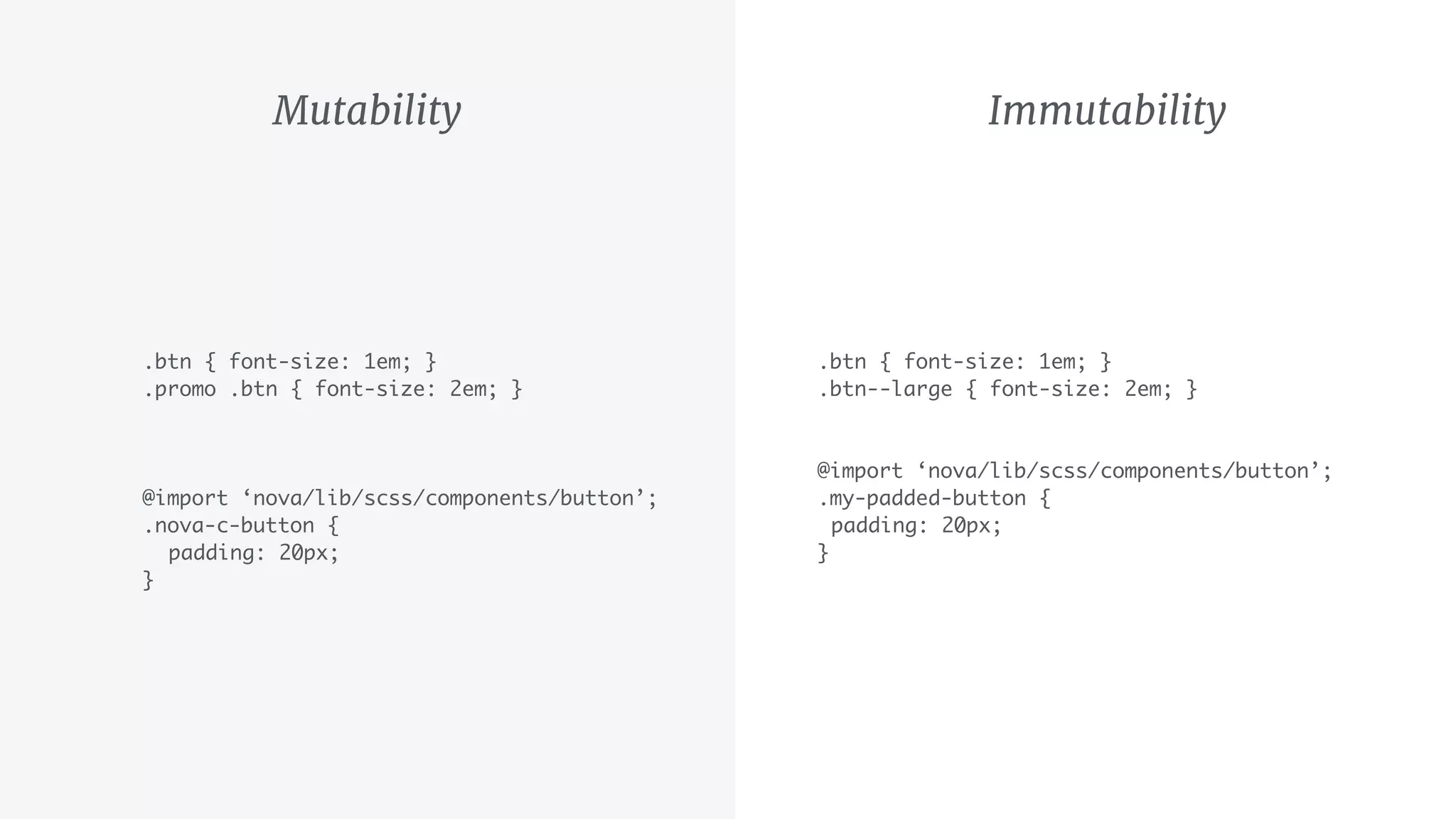
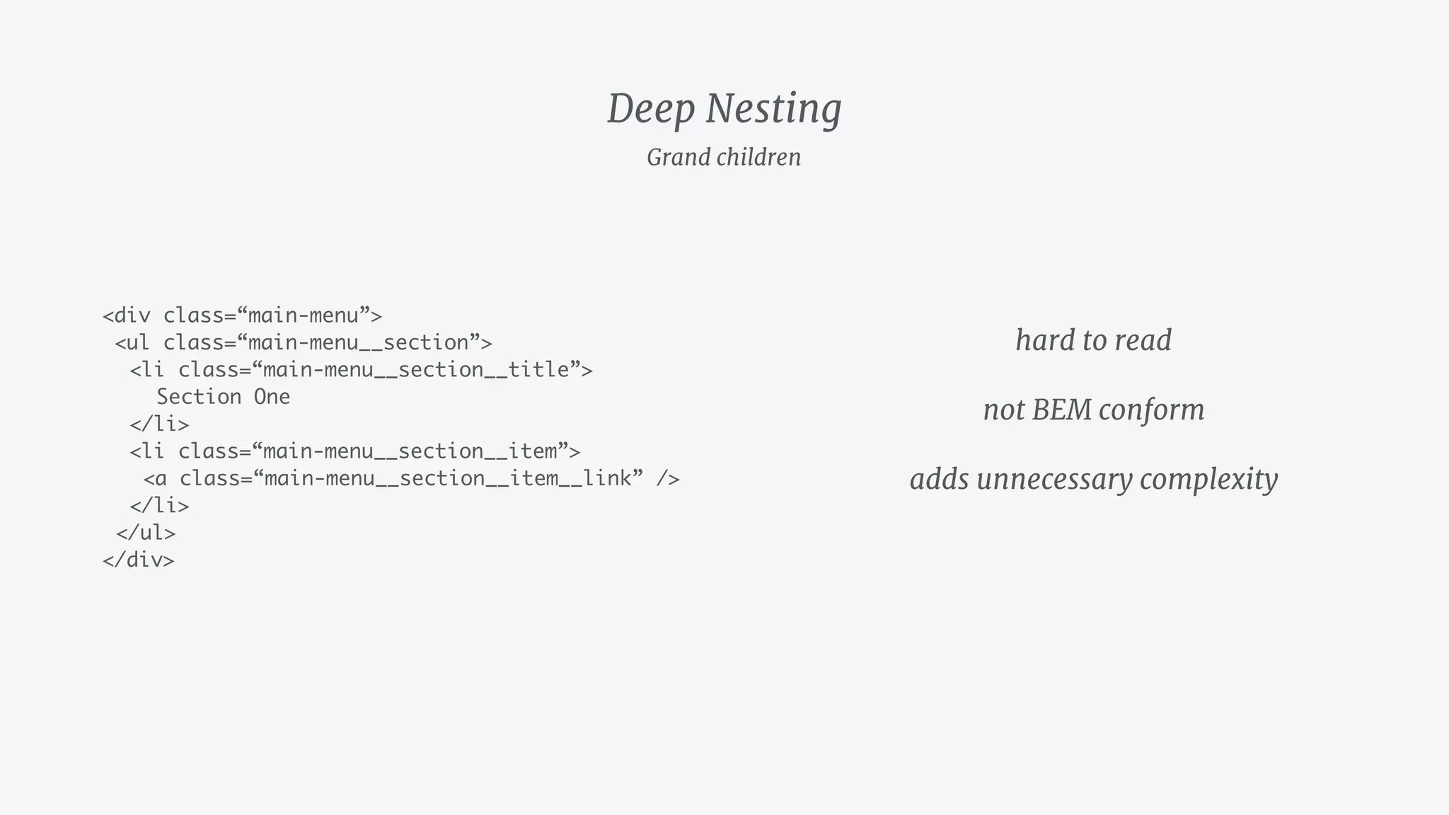
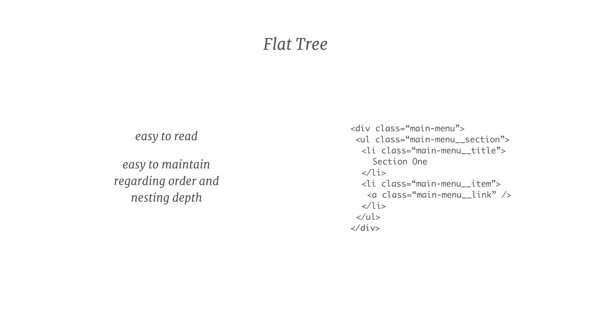
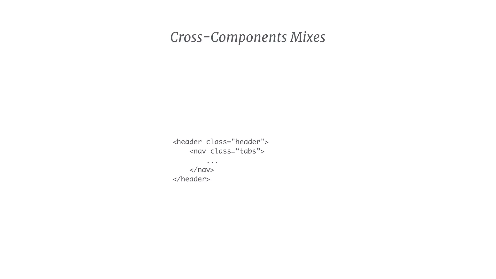
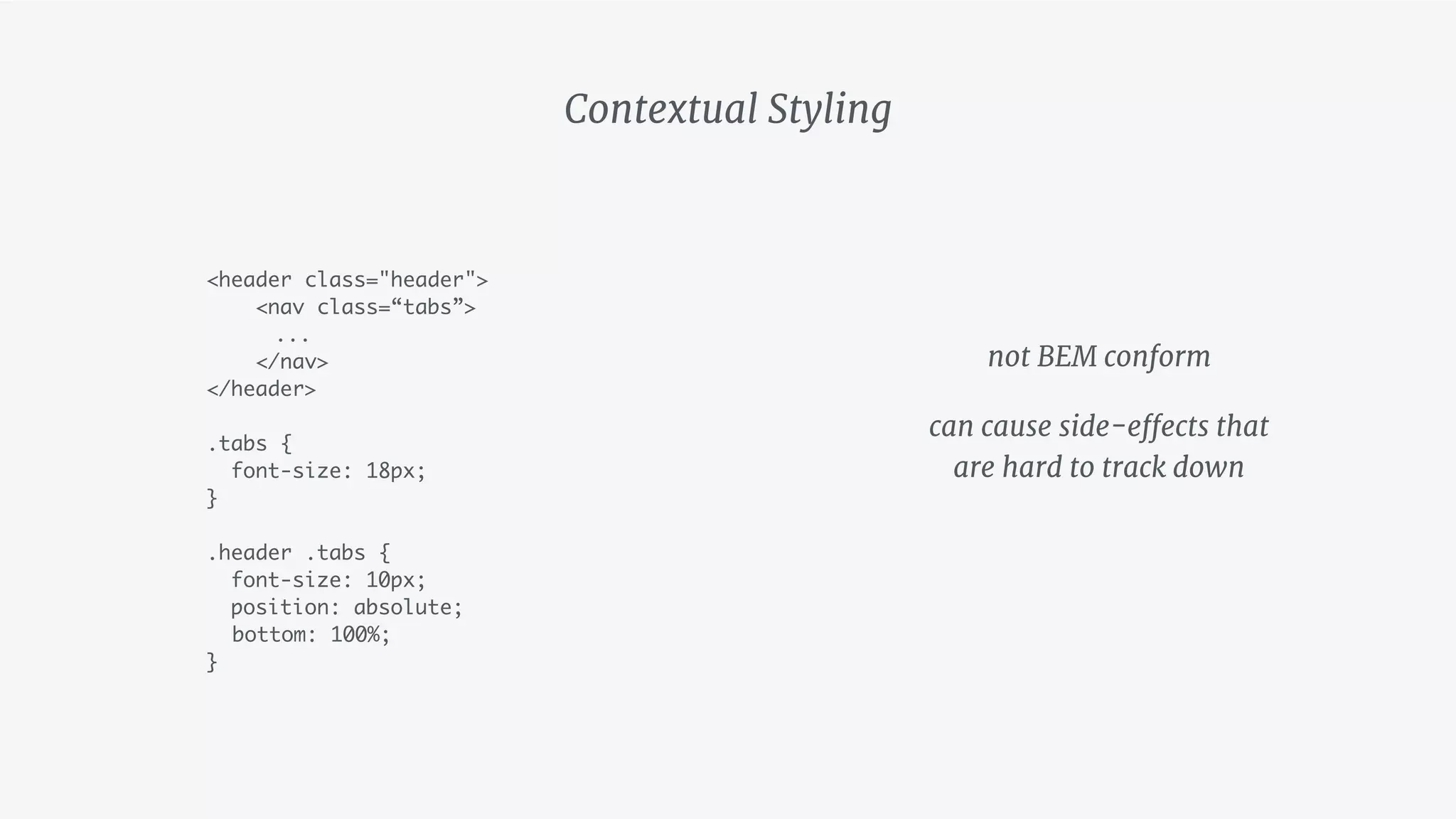
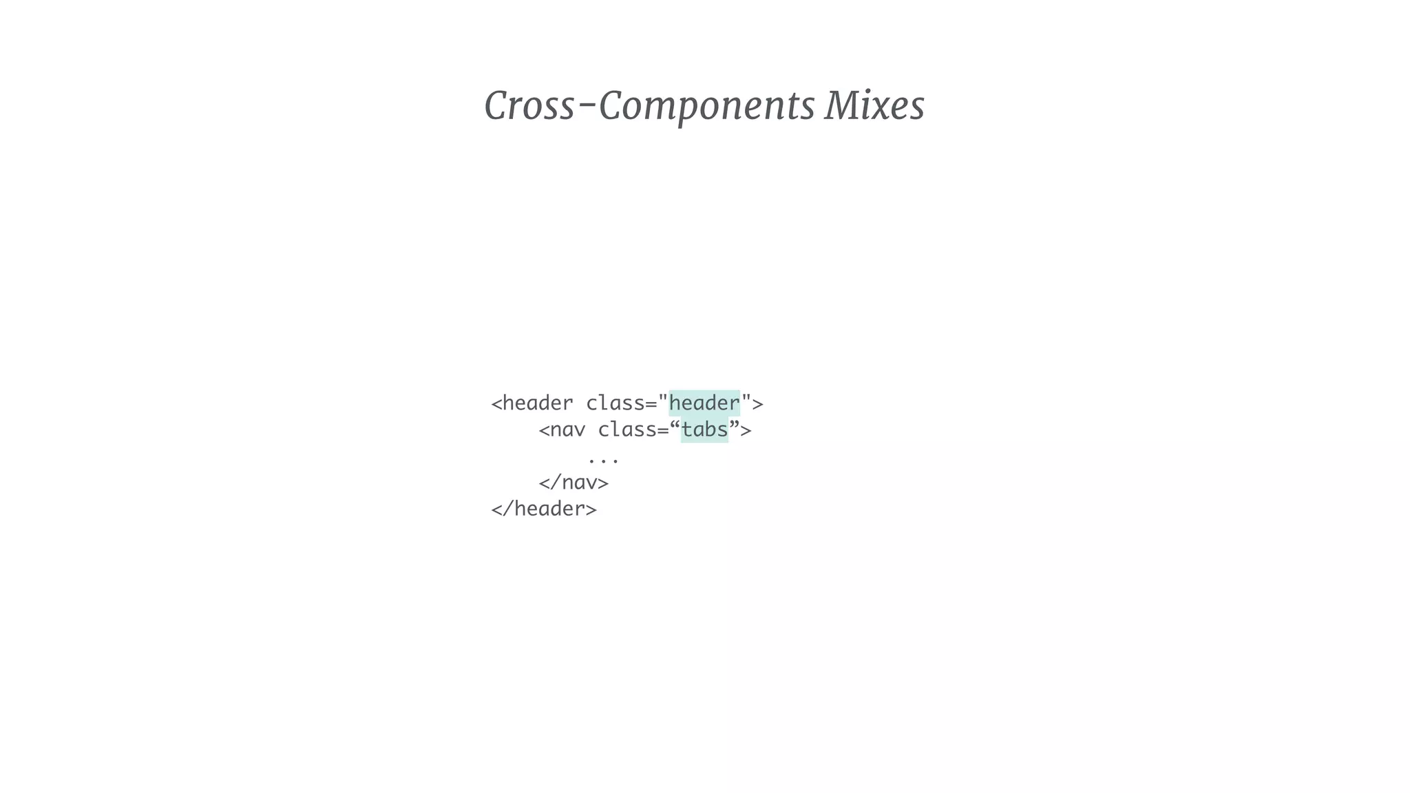
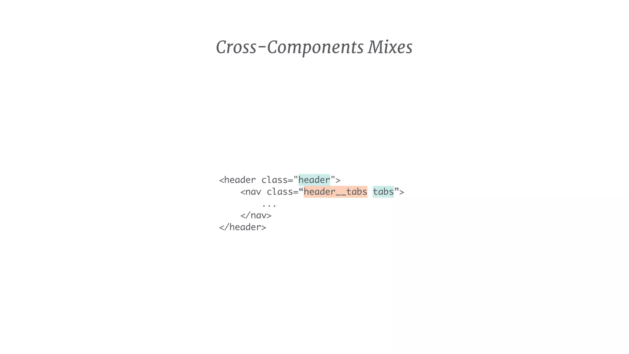
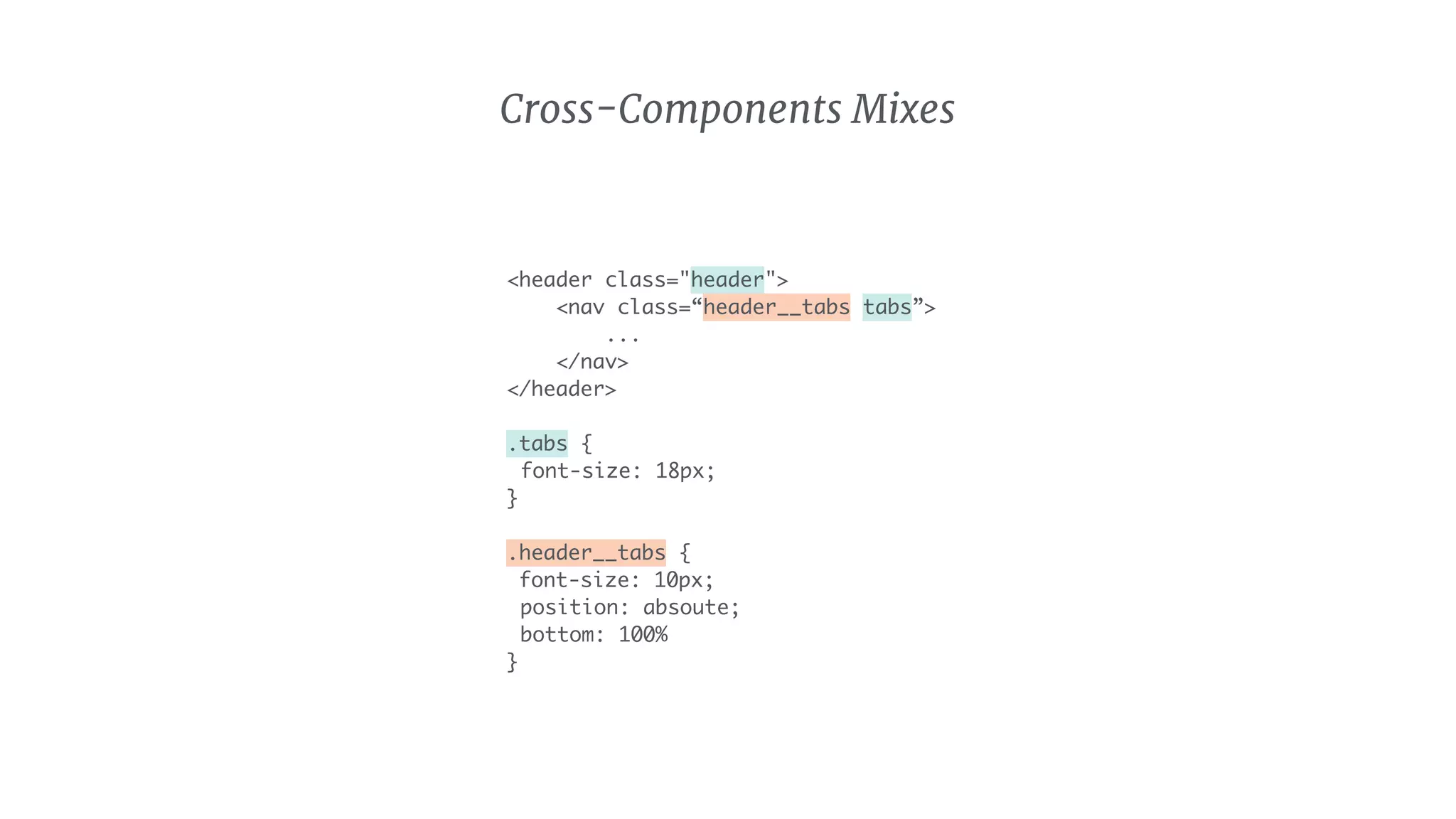
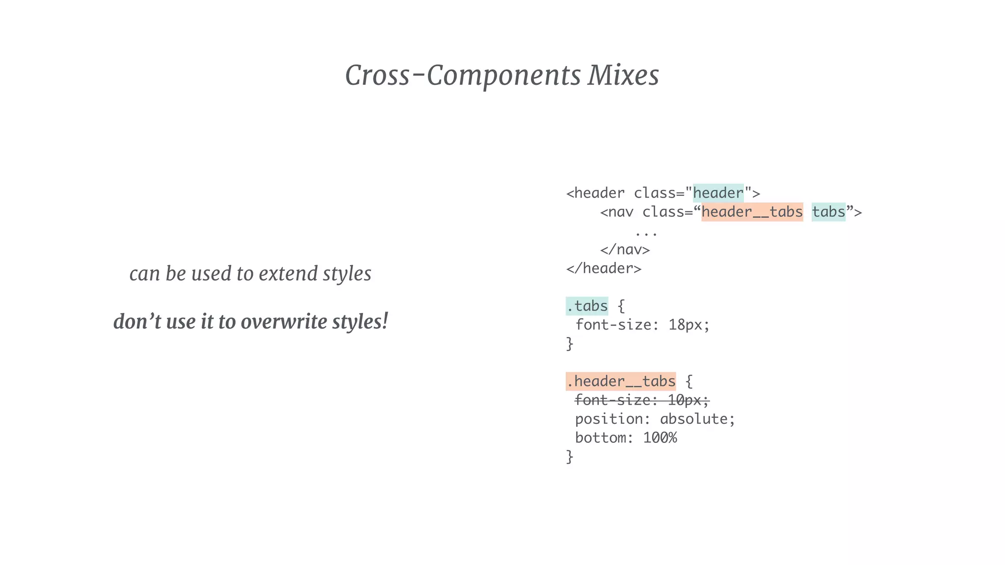
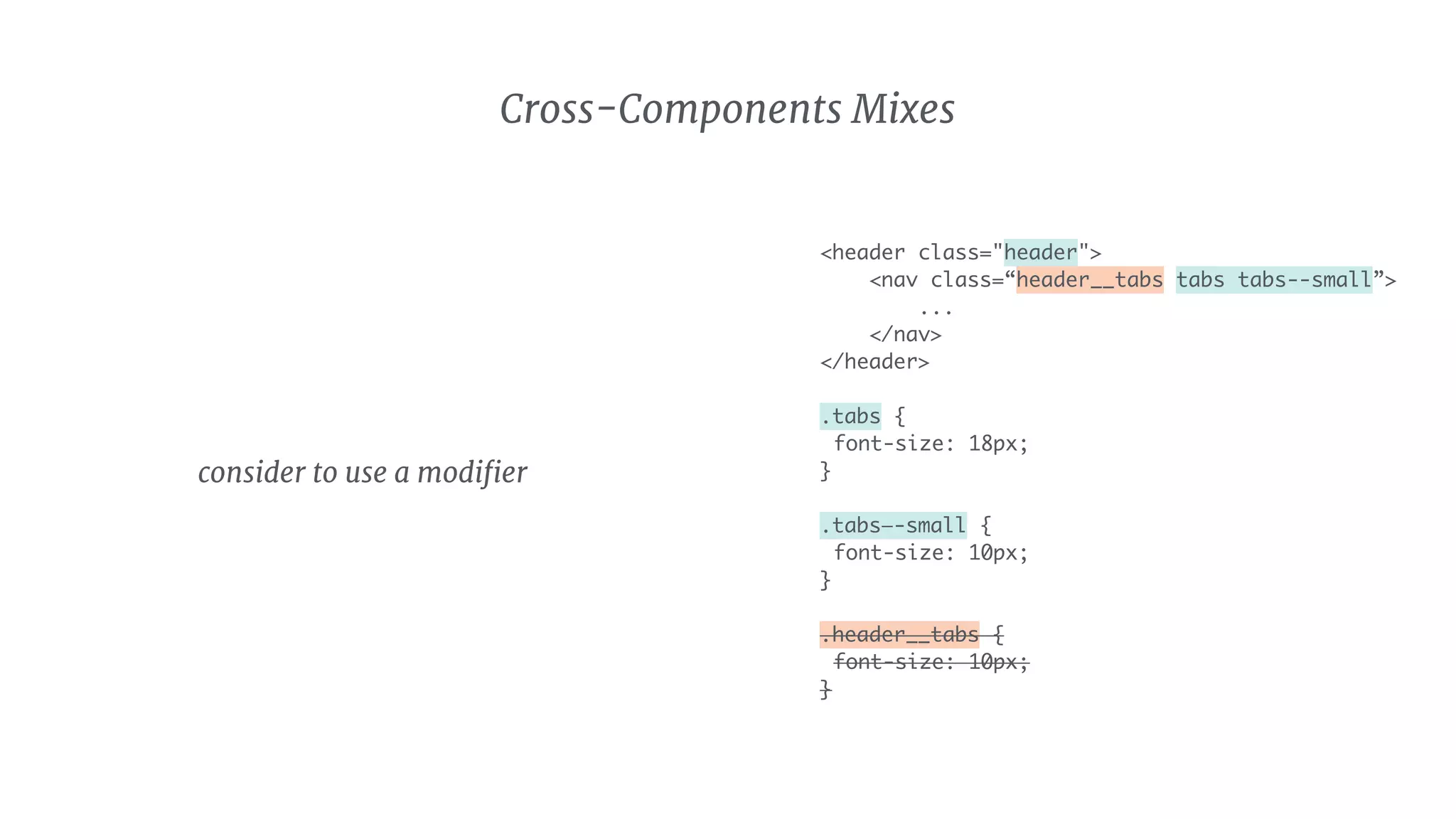
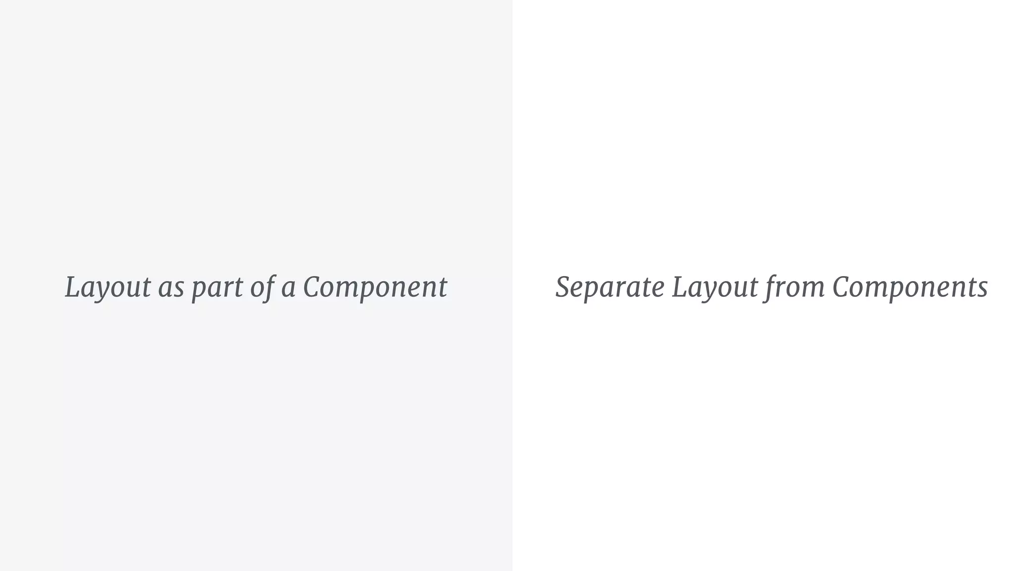
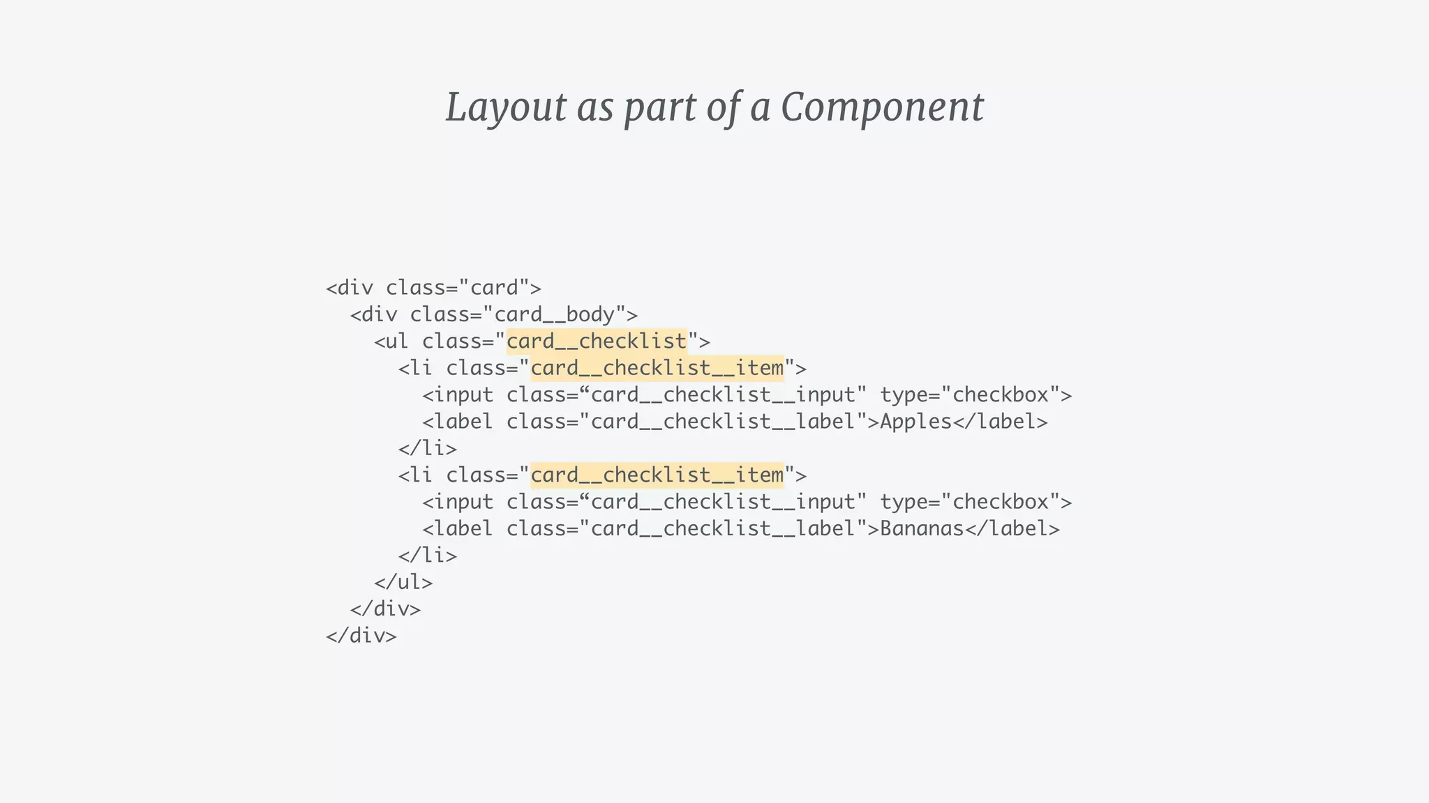
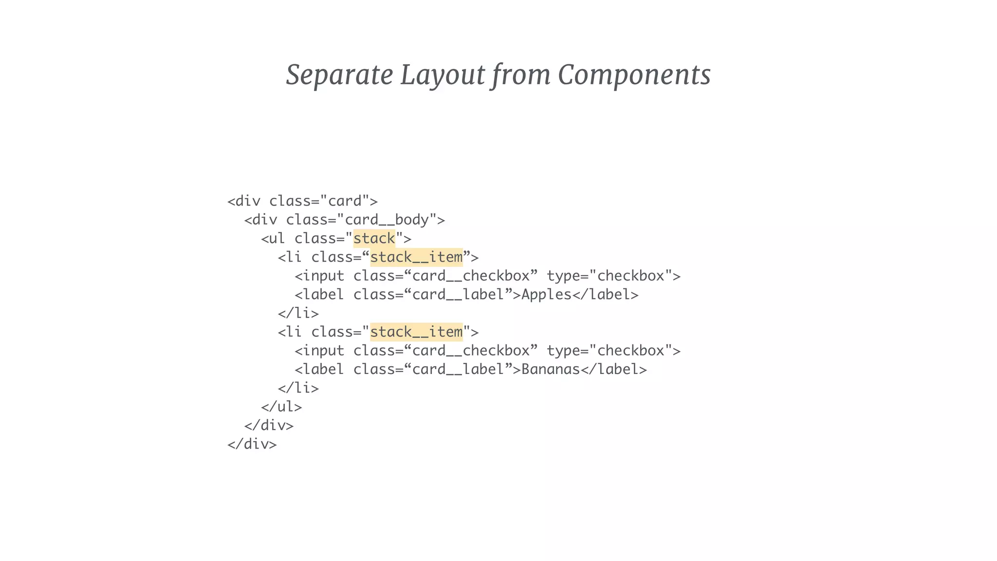
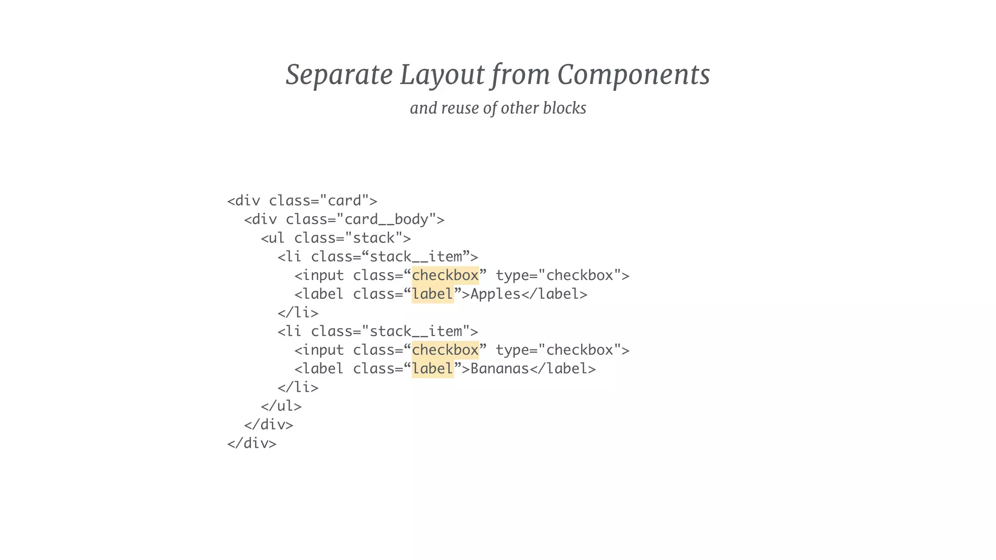
KEMBAR78
BEM - CSS, Seriously | PDF
CSS, Seriously!
Introduction to a new CSS methodology
What the BEM?
- Naming convention

- Block-Element-Modifier

- Invented by Yandex in 2009

- Widely used by the frontend community
Key concepts
How to
In the wild
In community
The Agenda
Key concepts of
Block-Element-Modifier
BBlock Element
E Modifier
M
BA block is defining the
high level component
and should be seen as
logical and functionally
independent entity.
Block
Tab 1 Tab 2 Tab 4Tab 1
LOGO Search
Sign in
Login
*****
TabsLogo Authentication
Search Header
Item
1,40 Meter breiter
Schlafbereich, Kchenzeile,
Eckbank, Waschbecken.
Stadtwohnung? Nein!
1,40 Meter breiter
Schlafbereich, Kchenzeile,
Eckbank, Waschbecken.
Stadtwohnung? Nein!
1,40 Meter breiter
Schlafbereich, Kchenzeile,
Eckbank, Waschbecken.
Stadtwohnung? Nein!
1,40 Meter breiter
Schlafbereich, Kchenzeile,
Eckbank, Waschbecken.
Stadtwohnung? Nein!
Item
EAn element is a child
within the Block, that
helps to form it. An
element is semantically
tied to its Block and can't
stand alone
Element
Tab Item Tab Item Tab Item Tab Item
Tabs
Tab 1 Tab 2 Tab 4Tab 1
Title
1,40 Meter breiter
Schlafbereich, Kchenzeile,
Eckbank, Waschbecken.
Stadtwohnung? Nein!
Image
Text
Item
MA Modifier defines the
appearance and behaviour
of a Block or Element
Modifier
Tabs
Tab 1 Tab 2 Tab 4Tab 1
Spread
Small
Small & Spread
–
A State defines a
temporary appearance
and behaviour of a Block
or Element
State
Active
Tabs
Tab 1 Tab 2 Tab 4Tab 1
BBlock Element
E Modifier State
M
independent
and reusable
children of 

a Block
behaviour &
appearance
temporary
behaviour &
appearance
How to master
Block-Element-Modifier
methodology
The cookbook for naming and writing HTML and CSS the BEM-way
BBlock
Naming
tabs
site-header
feed-item
search
may consist of lowercase
latin letters, digits, and
dashes.
as generic as possible, as
specific as necessary.
names are meant to be
used as classes only
can be nested
Html
<div class="tabs"></div>
// Nested blocks

<header class="header">
<div class="tabs"></div>
<form class="search"></form>
</header>
CSS
.tabs {}
.header {}
.site-header {}
.header .tabs {}
h1.title {}
remain semantically independent

are never addressed in the context of
another block
never use float, positioning or
margin


do not depend on DOM elements
Tab 1 Tab 2 Tab 4Tab 1
LOGO Search
Sign in
Login
*****
TabsLogo Authentication
Search Header
<header class="header">
<nav class="tabs">
...
</nav>
<img class="logo" />
<form class="search">
...
</form>
<form class="auth">
...
</form>
</header>
EElement
Naming
tabs__item
feed-item__title
search__input
consist of lowercase latin
letters, digits, and
dashes.
start with the name of
the block separated with
two underscores:


block__element
are meant to be used as
classes only
can be nested while
naming will stay flat
Html
<nav class="tabs">

<a class=“tabs__item”></a>

</nav>
// Nested elements

<div class=“card">
<header class=“card__header”>
...
</header>
<div class=“card__body”>
<h3 class=“card__title”></h3>
</div>
</div>
CSS
.tabs__item {}
// Try to avoid
.tabs .tabs__item {}
.header .tabs__item {}
li.tabs__item {}
avoid block selectors to keep
specificity low
do not depend on other blocks
do not depend on DOM elements
<nav class=“tabs">
<a class=“tabs__item”></a>
</nav>
Tab Tab Tab Tab
Tab 1 Tab 2 Tab 4Tab 1
MModifier
Naming
tabs--spread

button--theme-red
user__image—-small
consist of lowercase latin letters,
digits, and dashes.
as descriptive as necessary
start with the name of the block/
element separated with by two
dashes:


block--modifier

block__element--modifier
always appended as an
extra class

can be chained to
combine modifications
Html
<a class=“button button--small>
<a class=“button__icon button__icon--inverted”
</a>
// Chained modifier

<a class=“button button--small button--blue”>
CSS
.button--m {}
.tabs--spread .tabs__item {}
.button__icon--inverted {}
// Try to avoid
.button--red .button--small {}
.header .tabs--spread {}
nav.tabs--spread {}
avoid cross modifier dependencies

do not depend on other blocks
do not depend on DOM elements
Tab 1 Tab 2 Tab 4Tab 1
<nav class=“tabs”>
<a class=“tabs__item”></a>
</nav>
.tabs {}
.tabs__item {}
Tab 1 Tab 2 Tab 4Tab 1
<nav class=“tabs tabs—spread”>
<a class=“tabs__item”></a>
</nav>
.tabs {}
.tabs__item {}
.tabs--spread .tabs__item {
margin: 0 10px;
}
Tab 1 Tab 2 Tab 4Tab 1
<nav class=“tabs tabs—spread tabs--small”>
<a class=“tabs__item”></a>
</nav>
.tabs {}
.tabs__item {}
.tabs--spread .tabs__item {
margin: 0 10px;
}
.tabs--small{
font-size: 10px;
}
State
Naming
is-selected
has-value
may consist of lowercase
latin letters, digits, and
dashes.
prefixed with is or has:
is-state

has-state
names are meant to be
used as classes only

added as an extra class
Html
<nav class=“main-menu”>
<a class=“main-menu__link is-active”></a>
</nav>
CSS
.tab.is-visible {}
.tab__item.is-active {}
.tab.is-visible .tab__item {}
h1.is-active {}
.is-visible {}
always tied to a block or element

trumps other stylings due to higher
specificity


do not depend on DOM elements


do not use standalone
Active
Tab 1 Tab 2 Tab 4Tab 1
<nav class=“tabs”>
<a class=“tabs__item”></a>
<a class=“tabs__item is-active“</a>
<a class=“tabs__item”></a>
</nav>
start with a modifier/element
instead of over-modularize

–

when it gets difficult to manage,
start with a brand new component

– 

latest when starting to overwrite a
lot of the block styling with
modifiers
Element/Modifier or a new Block ?
BEM in the wild
Common best practices and pitfalls
Monoliths Single responsibility
Monoliths
.btn-login {
display: inline-block;
padding: 2em;
background-color: green;
color: white;
}
hard to change

hard to swap styles out
.btn{
display: inline-block;
}
.btn--large {
padding: 2em;
}
.btn--primary {
background-color: green;
color: white;
}
clearly separated concerns

easy to just use the ones that we need

easy to add new ones
Single responsibility
Monoliths
.btn-login {
display: inline-block;
padding: 2em;
background-color: green;
color: white;
}
.btn{
display: inline-block;
}
.btn--large {
padding: 2em;
}
.btn--primary {
background-color: green;
color: white;
}
Single responsibility
Complexity Simplicity
Complexity
div.main section.content div.categories .title
hard to read

way to specific
Complexity
div.main section.content div.categories .title
the only thing we care about
Complexity
div.main section.content div.categories .title
conditions add complexity

harms readability

lowers performance
Simplicity
.categories__title
simply give things the
name of what they are

choose the level of
abstraction for names (be
specific or generic)
Complexity Simplicity
.categories

.categories__title
div.main section.content div.categories .title
Mutability Immutability
Mutability
.btn { font-size: 1em; }
.promo .btn { font-size: 2em; }
Contextual styling will result in two
different outcomes for one and the
same class
Mutability
@import ‘nova/lib/scss/components/button’;
.nova-c-button {
padding: 20px;
}
add styles

of third party libraries
.btn { font-size: 1em; }
.promo .btn { font-size: 2em; }
@import ‘nova/lib/scss/components/button’;
.nova-c-button {
padding: 20px;
}
.btn { font-size: 1em; }
.btn--large { font-size: 2em; }
@import ‘nova/lib/scss/components/button’;
.my-padded-button {
padding: 20px;
}
Mutability Immutability
Deep Nesting Flat Tree
Deep Nesting
<div class=“main-menu”>
<ul class=“main-menu__section”>
<li class=“main-menu__section__title”>
Section One
</li>
<li class=“main-menu__section__item”>
<a class=“main-menu__section__item__link” />
</li>
</ul>
</div>
hard to read

not BEM conform

adds unnecessary complexity
Grand children
<div class=“main-menu”>
<ul class=“main-menu__section”>
<li class=“main-menu__title”>
Section One
</li>
<li class=“main-menu__item”>
<a class=“main-menu__link” />
</li>
</ul>
</div>
Flat Tree
easy to read

easy to maintain
regarding order and
nesting depth
Deep Nesting
<div class=“main-menu”>
<ul class=“main-menu__section”>
<li class=“main-menu__section__title”>
Section One
</li>
<li class=“main-menu__section__item”>
<a class=“main-menu__section__item__link” />
</li>
</ul>
</div>
<div class=“main-menu”>
<ul class=“main-menu__section”>
<li class=“main-menu__title”>
Section One
</li>
<li class=“main-menu__item”>
<a class=“main-menu__link” />
</li>
</ul>
</div>
Flat Tree
Contextual Styling Mixes
Tab 1 Tab 2 Tab 4Tab 1
LOGO Search
Sign in
Login
*****
Tabs
Header
Tab 1 Tab 2 Tab 4Tab 1
LOGO Search
Sign in
Login
*****
Tab 1 Tab 2 Tab 4Tab 1
LOGO Search
Sign in
Login
*****
Tabs
Header
<header class="header">
<nav class=“tabs”>
...
</nav>
</header>
Cross-Components Mixes
<header class="header">
<nav class=“tabs”>
...
</nav>
</header>
.tabs {
font-size: 18px;
}
.header .tabs {
font-size: 10px;
position: absolute;
bottom: 100%;
}
Contextual Styling
not BEM conform

can cause side-effects that

are hard to track down
Should be avoided!
<header class="header">
<nav class=“tabs”>
...
</nav>
</header>
Cross-Components Mixes
<header class="header">
<nav class=“header__tabs tabs”>
...
</nav>
</header>
Cross-Components Mixes
<header class="header">
<nav class=“header__tabs tabs”>
...
</nav>
</header>
.tabs {
font-size: 18px;
}
.header__tabs {
font-size: 10px;
position: absoute;
bottom: 100%
}
Cross-Components Mixes
can be used to extend styles

don’t use it to overwrite styles!


<header class="header">
<nav class=“header__tabs tabs”>
...
</nav>
</header>
.tabs {
font-size: 18px;
}
.header__tabs {
font-size: 10px;
position: absolute;
bottom: 100%
}
<header class="header">
<nav class=“header__tabs tabs tabs--small”>
...
</nav>
</header>
.tabs {
font-size: 18px;
}
.tabs—-small {
font-size: 10px;
}
.header__tabs {
font-size: 10px;
}
Cross-Components Mixes
consider to use a modifier
<header class="header">
<nav class=“header__tabs header__tabs--small tabs”>
...
</nav>
</header>
.tabs {
font-size: 18px;
}


.header__tabs--small {
font-size: 10px;
}
.header__tabs {
font-size: 10px;
}
Cross-Components Mixes
would this be okay?
Layout as part of a Component Separate Layout from Components
Layout as part of a Component
<div class="card">
<div class="card__body">
<ul class="card__checklist">
<li class="card__checklist__item">
<input class=“card__checklist__input" type="checkbox">
<label class="card__checklist__label">Apples</label>
</li>
<li class="card__checklist__item">
<input class=“card__checklist__input" type="checkbox">
<label class="card__checklist__label">Bananas</label>
</li>
</ul>
</div>
</div>
Separate Layout from Components
<div class="card">
<div class="card__body">
<ul class="stack">
<li class=“stack__item”>
<input class=“card__checkbox” type="checkbox">
<label class=“card__label”>Apples</label>
</li>
<li class="stack__item">
<input class=“card__checkbox” type="checkbox">
<label class=“card__label”>Bananas</label>
</li>
</ul>
</div>
</div>
Separate Layout from Components
<div class="card">
<div class="card__body">
<ul class="stack">
<li class=“stack__item”>
<input class=“checkbox” type="checkbox">
<label class=“label”>Apples</label>
</li>
<li class="stack__item">
<input class=“checkbox” type="checkbox">
<label class=“label”>Bananas</label>
</li>
</ul>
</div>
</div>
and reuse of other blocks

BEM - CSS, Seriously