Download to read offline


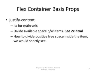
![Floats – 1 of 4
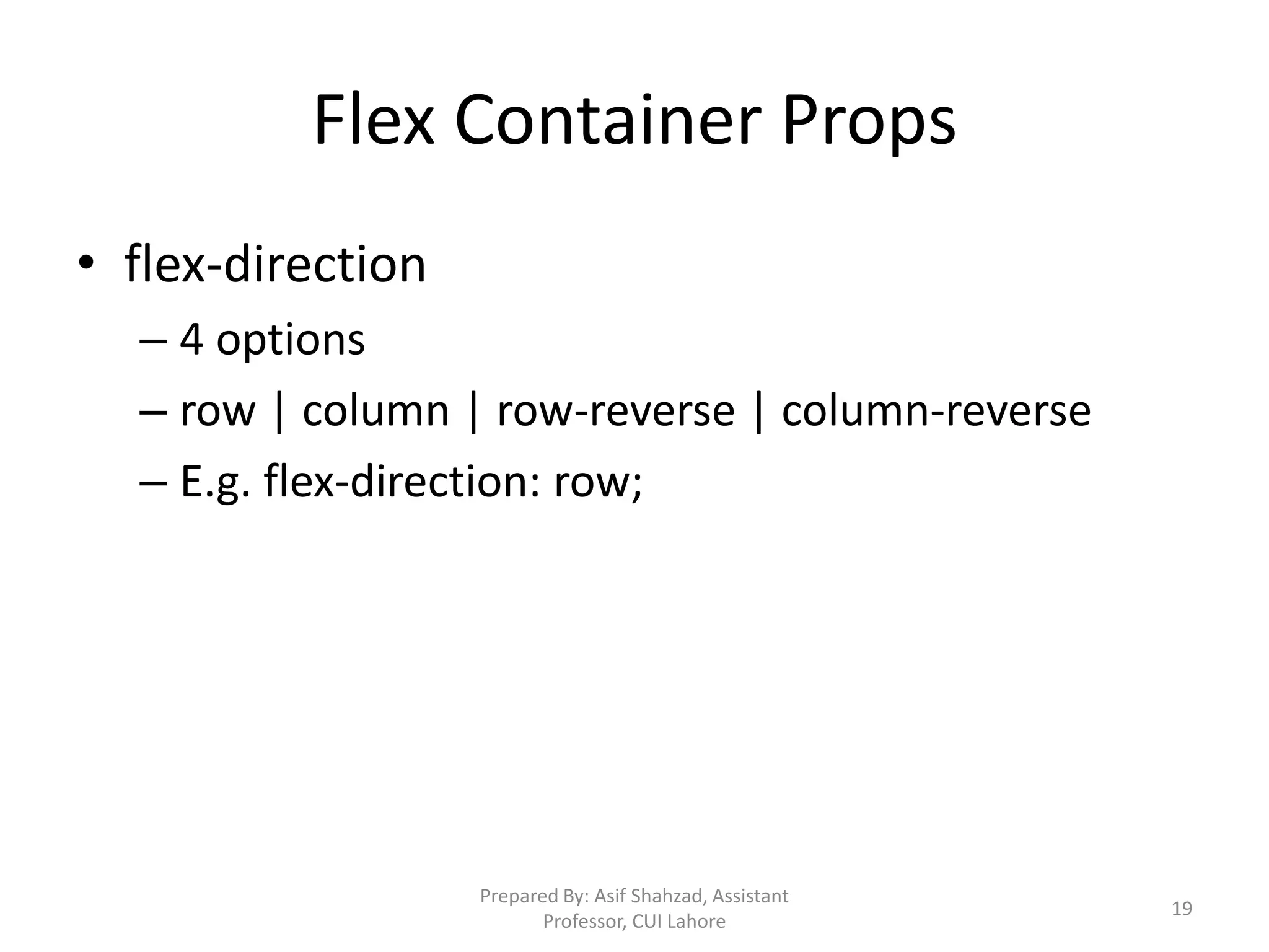
• Block elements take 100% width of container (when width is
not specified). They do not allow elements on right or left [1].
• Float property changes the way a block element is laid out by
the browser. These are taken out of the normal flow and then
placed back following some rules.
• Float property can be applied to block elements e.g. div, p,
etc. Float applies with respect to container. Usage:
float:right; float:left [2_0 to 2_1]
15](https://image.slidesharecdn.com/03css-230612063708-90dc0f3e/85/Cascading-Style-Sheets-CSS-15-320.jpg)
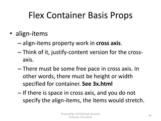
![Floats – 2 of 4
• Floated block elements shift to above row, when space is
available. If there is not enough space, elements are shifted
down automatically [2_2].
One element properties, may effect the others in layout.
• Container fails to calculate height when it contains floated
elements only. We apply some CSS to force container draw itself
correctly. [2_3 and 2_4]
16](https://image.slidesharecdn.com/03css-230612063708-90dc0f3e/85/Cascading-Style-Sheets-CSS-16-320.jpg)
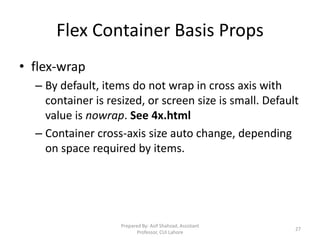
![Floats – 3 of 4
• Block elements before a floated element do not effect [3_0]. But when
upper element is applied float property, bottom non-floated elements
would wrap around [3_1] i.e. float my effect, non-floated elements.
• If bottom elements are also floated, they would shift below when
content is large [3_2]. Use width with floated elements [3_3] for
predictable behavior.
• If you want to stop non-floated elements to wrap around the floated
elements, you need to clear the float. [3_4]
17](https://image.slidesharecdn.com/03css-230612063708-90dc0f3e/85/Cascading-Style-Sheets-CSS-17-320.jpg)
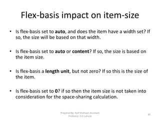
![Floats – 4 of 4
• ‘Clear’ forces the element to shift down, even when it can
adjust. clear:left allows no element be placed on left.
clear:right allows no element be placed at right. To make both
sides clear, use clear:both [3_4, 3_5]. Remember box
model, see [3_5] again
• While content will wrap - border, background image and
background color will extend underneath [4_1].
18](https://image.slidesharecdn.com/03css-230612063708-90dc0f3e/85/Cascading-Style-Sheets-CSS-18-320.jpg)


![Floats – 1 of 4
• Block elements take 100% width of container (when width is
not specified). They do not allow elements on right or left [1].
• Float property changes the way a block element is laid out by
the browser. These are taken out of the normal flow and then
placed back following some rules.
• Float property can be applied to block elements e.g. div, p,
etc. Float applies with respect to container. Usage:
float:right; float:left [2_0 to 2_1]
15](https://image.slidesharecdn.com/03css-230612063708-90dc0f3e/75/Cascading-Style-Sheets-CSS-15-2048.jpg)
![Floats – 2 of 4
• Floated block elements shift to above row, when space is
available. If there is not enough space, elements are shifted
down automatically [2_2].
One element properties, may effect the others in layout.
• Container fails to calculate height when it contains floated
elements only. We apply some CSS to force container draw itself
correctly. [2_3 and 2_4]
16](https://image.slidesharecdn.com/03css-230612063708-90dc0f3e/75/Cascading-Style-Sheets-CSS-16-2048.jpg)
![Floats – 3 of 4
• Block elements before a floated element do not effect [3_0]. But when
upper element is applied float property, bottom non-floated elements
would wrap around [3_1] i.e. float my effect, non-floated elements.
• If bottom elements are also floated, they would shift below when
content is large [3_2]. Use width with floated elements [3_3] for
predictable behavior.
• If you want to stop non-floated elements to wrap around the floated
elements, you need to clear the float. [3_4]
17](https://image.slidesharecdn.com/03css-230612063708-90dc0f3e/75/Cascading-Style-Sheets-CSS-17-2048.jpg)
![Floats – 4 of 4
• ‘Clear’ forces the element to shift down, even when it can
adjust. clear:left allows no element be placed on left.
clear:right allows no element be placed at right. To make both
sides clear, use clear:both [3_4, 3_5]. Remember box
model, see [3_5] again
• While content will wrap - border, background image and
background color will extend underneath [4_1].
18](https://image.slidesharecdn.com/03css-230612063708-90dc0f3e/75/Cascading-Style-Sheets-CSS-18-2048.jpg)


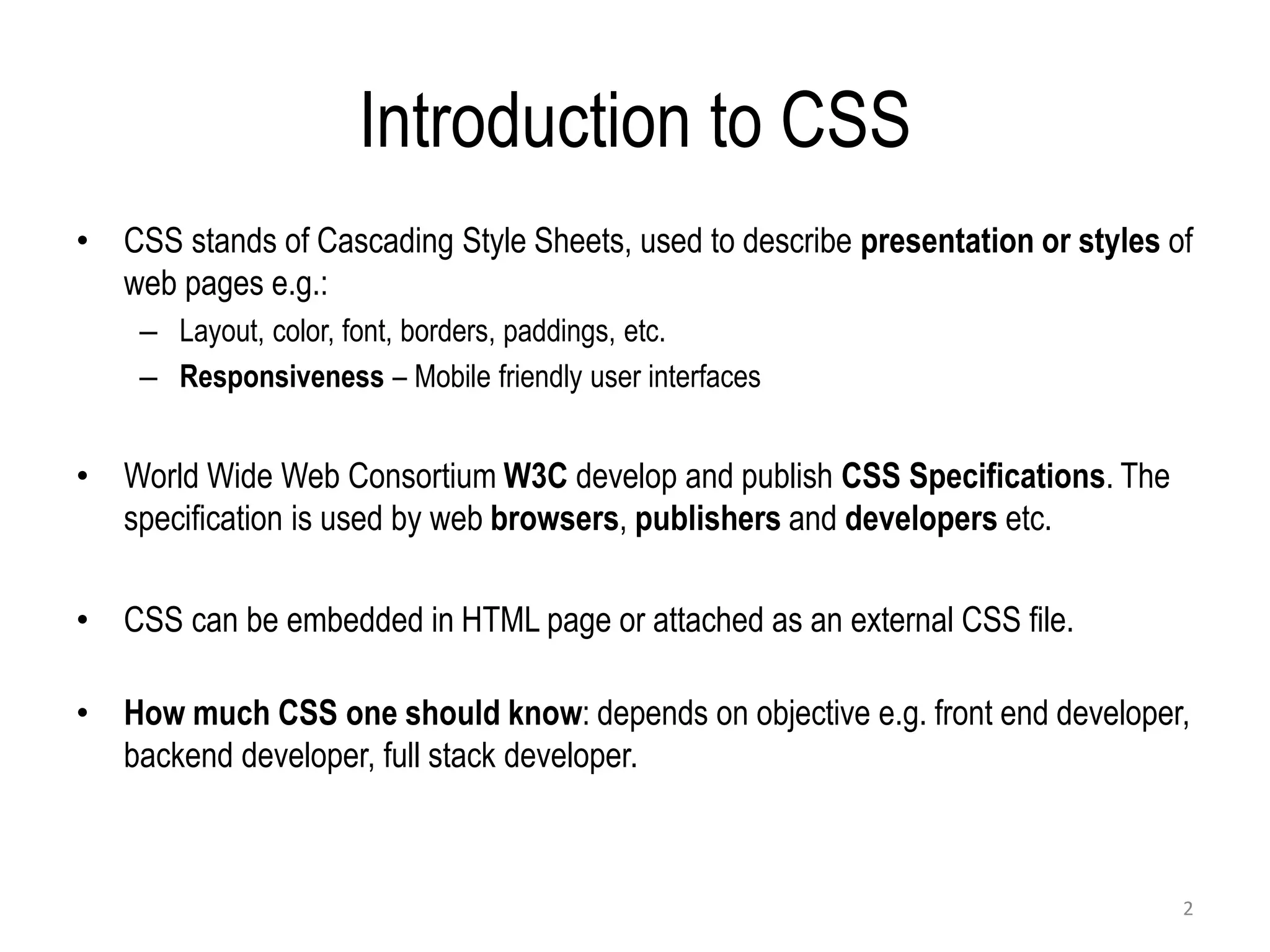
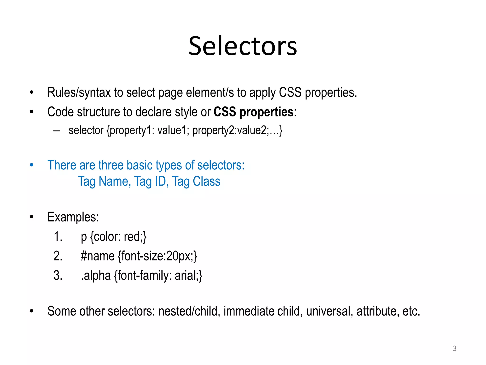
CSS (Cascading Style Sheets) is used to describe the presentation and styles of web pages, including layout, colors, fonts, borders, and paddings. CSS specifications are developed by the W3C and used by browsers, publishers, and developers. CSS can be embedded in HTML, added via internal <style> elements, or linked via external CSS files. The document discusses CSS selectors, properties for colors, sizes, fonts, text, boxes, padding/borders/margins, backgrounds, hyperlinks, positioning, lists, and layouts. It also covers floats, flex containers, media queries, and responsive design.


