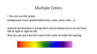
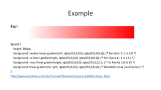
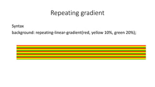
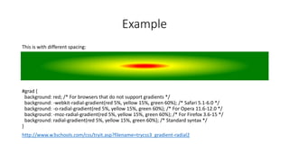
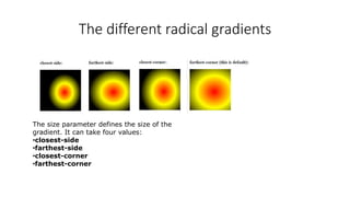
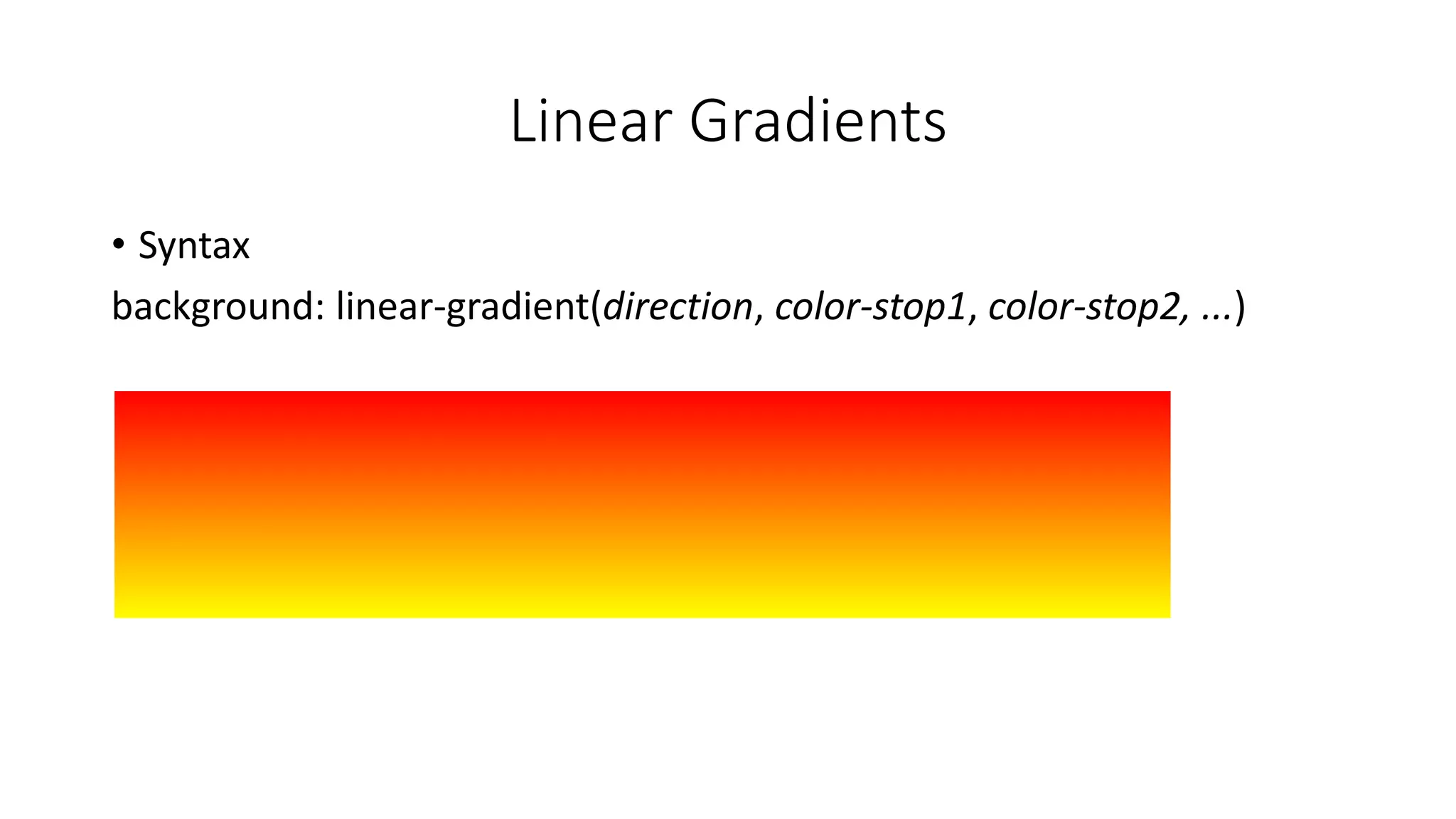
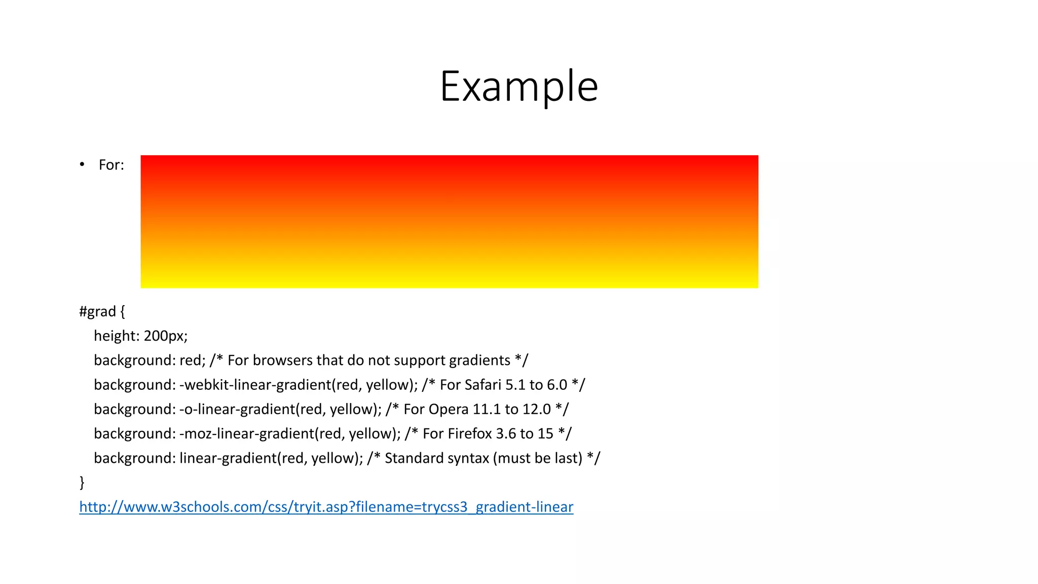
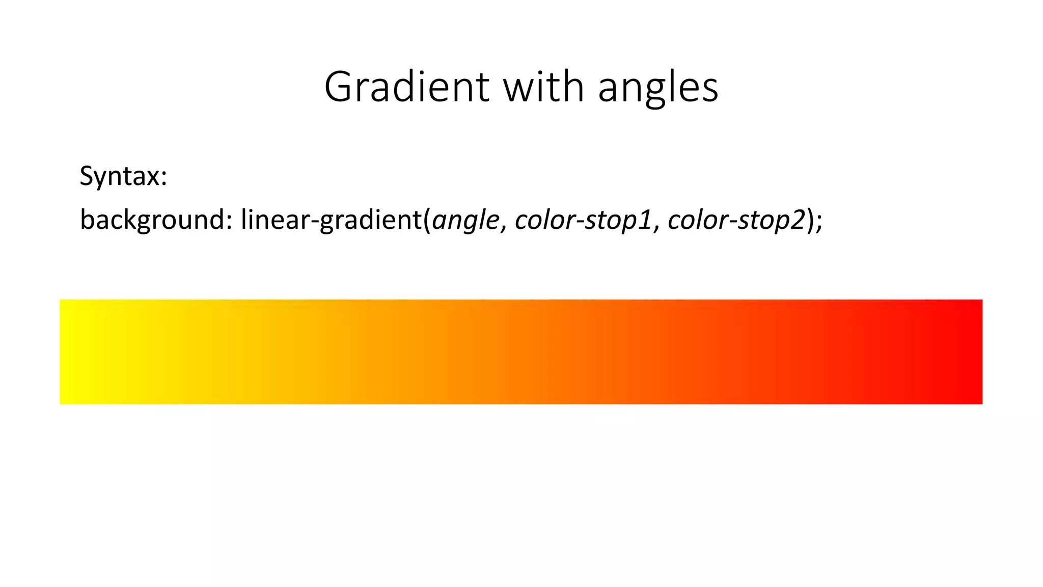
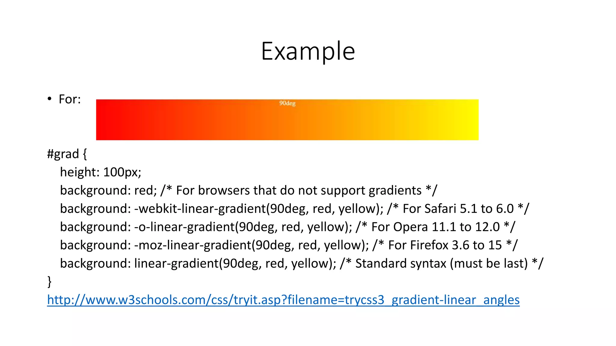
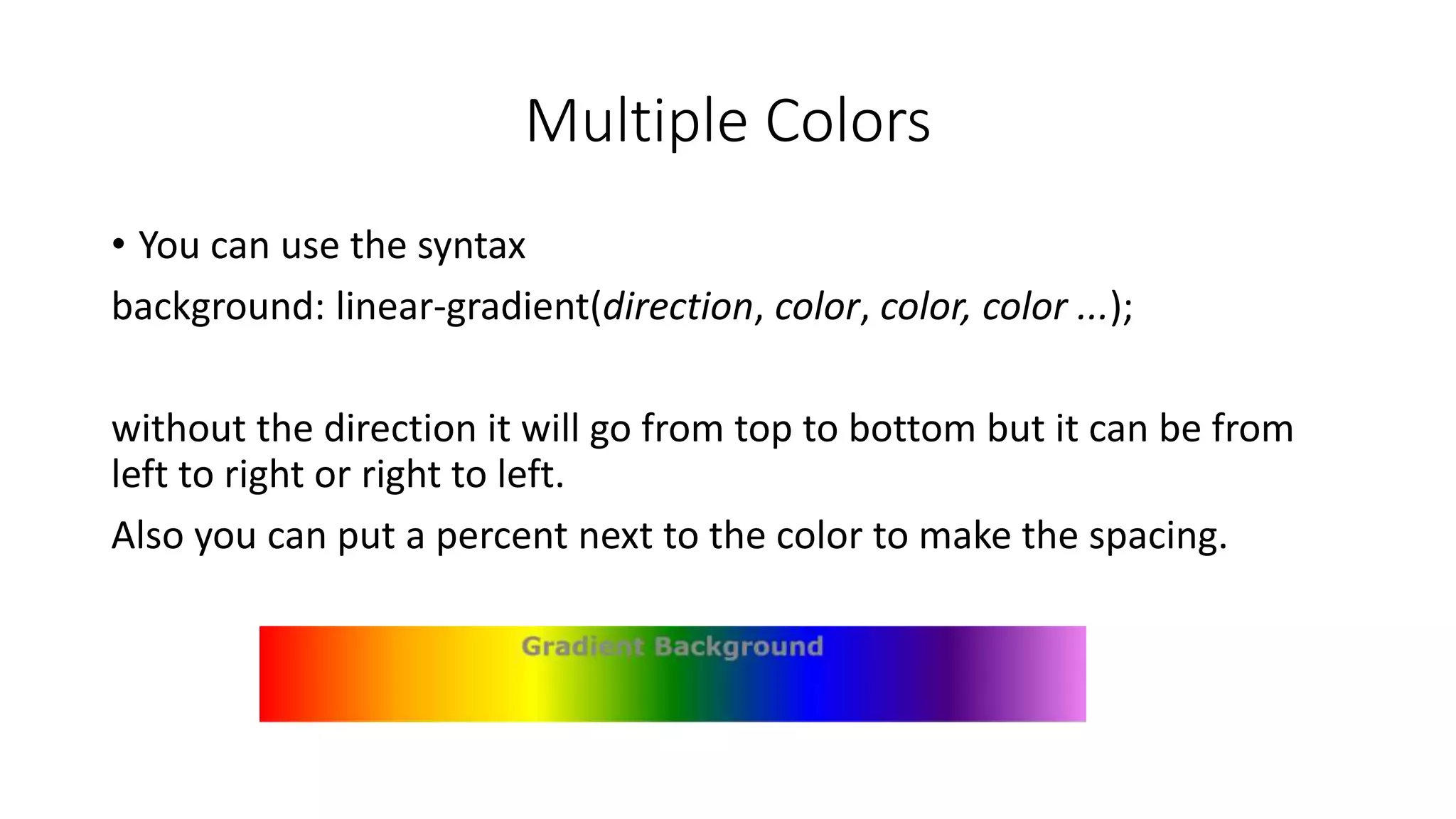
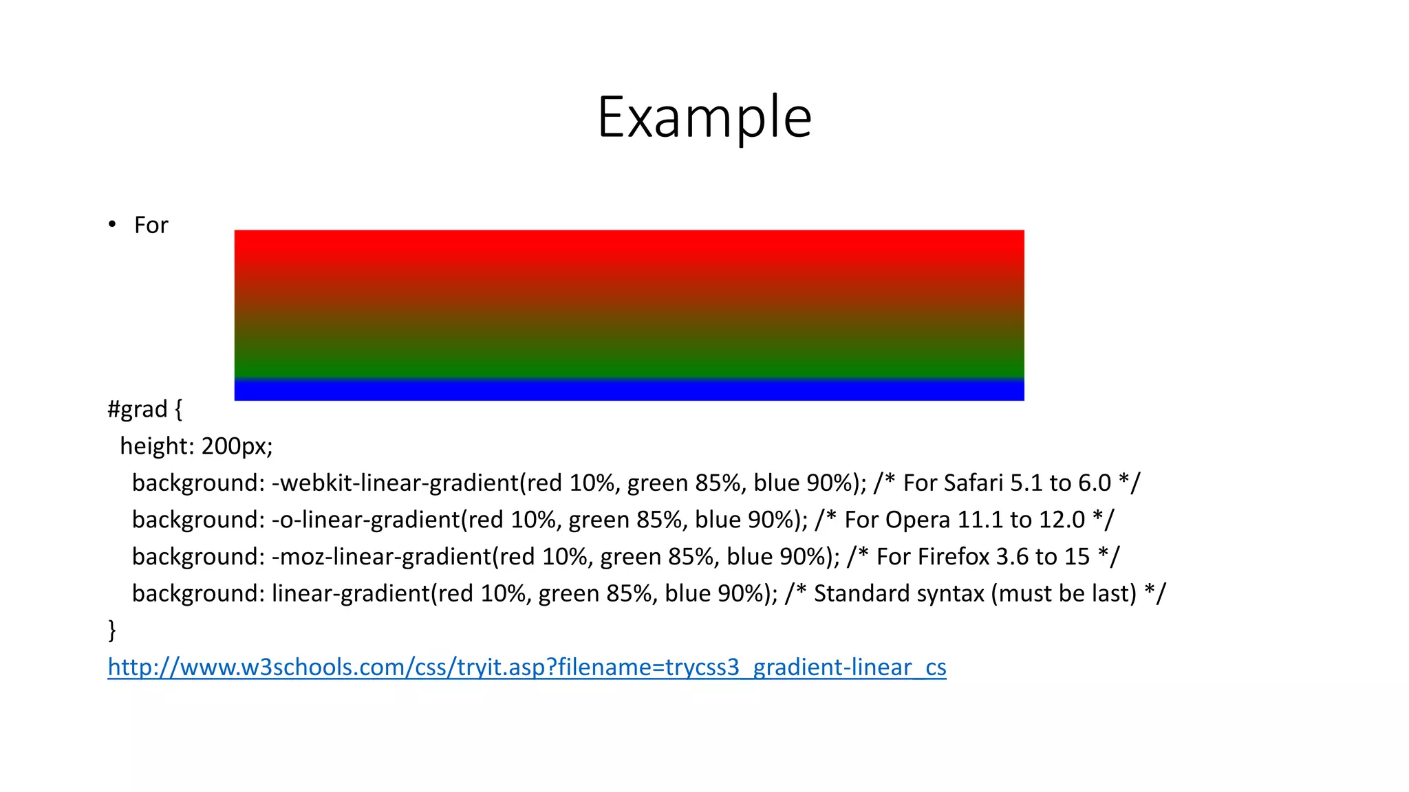
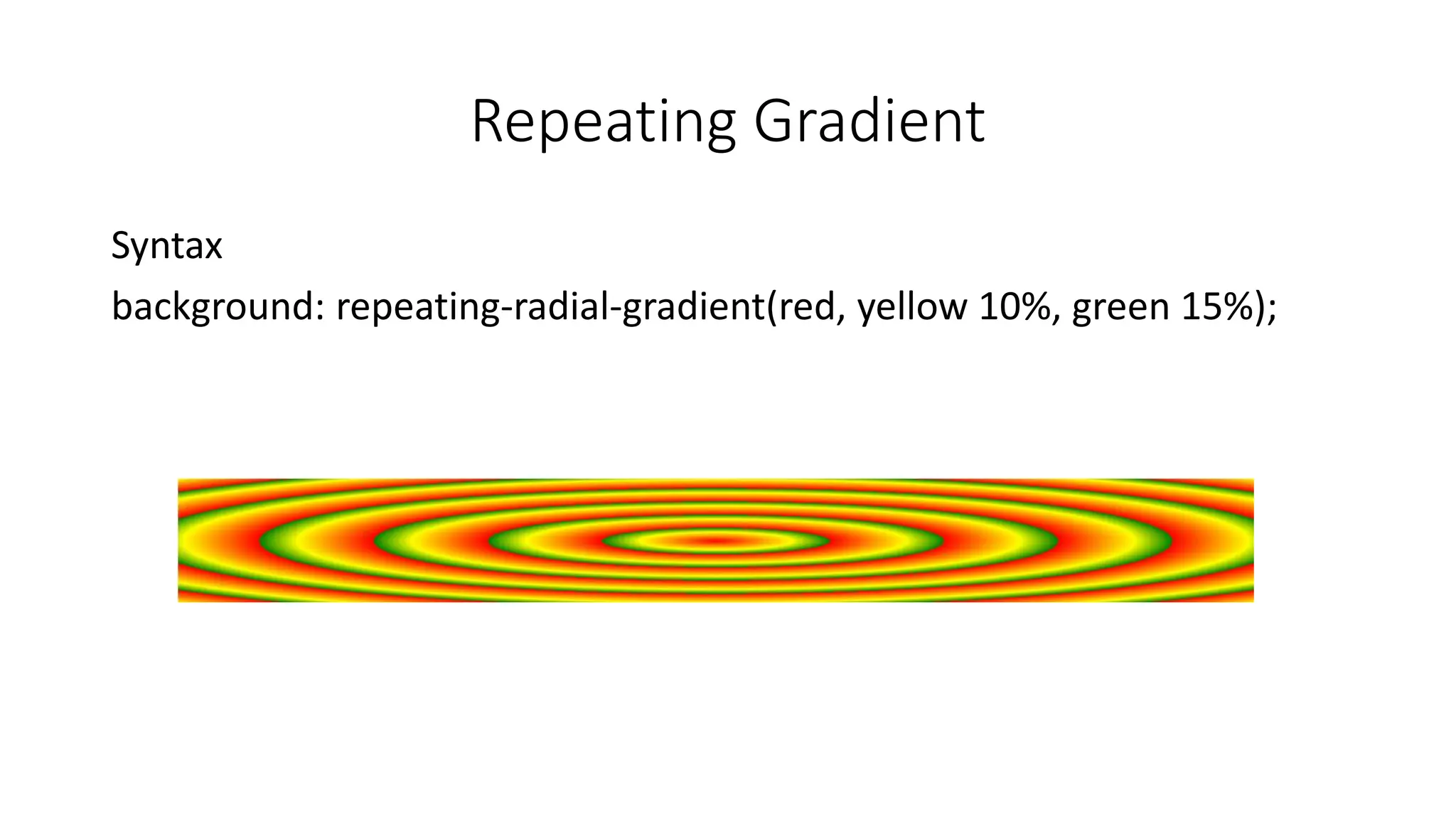
KEMBAR78
Css gradients | PPTX
CSS Gradients
Skyler Hildreth
What is Gradients
• gradients let you display smooth transitions between two or more
specified colors
• using CSS gradients you can reduce download time and bandwidth
usage. In addition, elements with gradients look better when zoomed,
because the gradient is generated by the browser
Linear Gradients
• Syntax
background: linear-gradient(direction, color-stop1, color-stop2, ...)
Example
• For:
#grad {
height: 200px;
background: red; /* For browsers that do not support gradients */
background: -webkit-linear-gradient(red, yellow); /* For Safari 5.1 to 6.0 */
background: -o-linear-gradient(red, yellow); /* For Opera 11.1 to 12.0 */
background: -moz-linear-gradient(red, yellow); /* For Firefox 3.6 to 15 */
background: linear-gradient(red, yellow); /* Standard syntax (must be last) */
}
http://www.w3schools.com/css/tryit.asp?filename=trycss3_gradient-linear
Gradient with angles
Syntax:
background: linear-gradient(angle, color-stop1, color-stop2);
Example
• For:
#grad {
height: 100px;
background: red; /* For browsers that do not support gradients */
background: -webkit-linear-gradient(90deg, red, yellow); /* For Safari 5.1 to 6.0 */
background: -o-linear-gradient(90deg, red, yellow); /* For Opera 11.1 to 12.0 */
background: -moz-linear-gradient(90deg, red, yellow); /* For Firefox 3.6 to 15 */
background: linear-gradient(90deg, red, yellow); /* Standard syntax (must be last) */
}
http://www.w3schools.com/css/tryit.asp?filename=trycss3_gradient-linear_angles
Multiple Colors
• You can use the syntax
background: linear-gradient(direction, color, color, color ...);
without the direction it will go from top to bottom but it can be from
left to right or right to left.
Also you can put a percent next to the color to make the spacing.
Example
• For
#grad {
height: 200px;
background: -webkit-linear-gradient(red 10%, green 85%, blue 90%); /* For Safari 5.1 to 6.0 */
background: -o-linear-gradient(red 10%, green 85%, blue 90%); /* For Opera 11.1 to 12.0 */
background: -moz-linear-gradient(red 10%, green 85%, blue 90%); /* For Firefox 3.6 to 15 */
background: linear-gradient(red 10%, green 85%, blue 90%); /* Standard syntax (must be last) */
}
http://www.w3schools.com/css/tryit.asp?filename=trycss3_gradient-linear_cs
Transparency
To add transparency, we use the rgba() function to define the color
stops. The last parameter in the rgba() function can be a value from 0
to 1, and it defines the transparency of the color: 0 indicates full
transparency, 1 indicates full color (no transparency).
Example
For:
#grad1 {
height: 200px;
background: -webkit-linear-gradient(left, rgba(255,0,0,0), rgba(255,0,0,1)); /* For Safari 5.1 to 6.0 */
background: -o-linear-gradient(right, rgba(255,0,0,0), rgba(255,0,0,1)); /* For Opera 11.1 to 12.0 */
background: -moz-linear-gradient(right, rgba(255,0,0,0), rgba(255,0,0,1)); /* For Firefox 3.6 to 15 */
background: linear-gradient(to right, rgba(255,0,0,0), rgba(255,0,0,1)); /* Standard syntax (must be last) */
}
http://www.w3schools.com/css/tryit.asp?filename=trycss3_gradient-linear_trans
Repeating gradient
Syntax
background: repeating-linear-gradient(red, yellow 10%, green 20%);
Radial Gradients
Syntax:
background: radial-gradient(shape size at position, start-color, ..., last-
color);
Example
This is with different spacing:
#grad {
background: red; /* For browsers that do not support gradients */
background: -webkit-radial-gradient(red 5%, yellow 15%, green 60%); /* Safari 5.1-6.0 */
background: -o-radial-gradient(red 5%, yellow 15%, green 60%); /* For Opera 11.6-12.0 */
background: -moz-radial-gradient(red 5%, yellow 15%, green 60%); /* For Firefox 3.6-15 */
background: radial-gradient(red 5%, yellow 15%, green 60%); /* Standard syntax */
}
http://www.w3schools.com/css/tryit.asp?filename=trycss3_gradient-radial2
The different radical gradients
The size parameter defines the size of the
gradient. It can take four values:
•closest-side
•farthest-side
•closest-corner
•farthest-corner
Repeating Gradient
Syntax
background: repeating-radial-gradient(red, yellow 10%, green 15%);

Css gradients

  • 1.
  • 2.
    What is Gradients •gradients let you display smooth transitions between two or more specified colors • using CSS gradients you can reduce download time and bandwidth usage. In addition, elements with gradients look better when zoomed, because the gradient is generated by the browser
  • 3.
    Linear Gradients • Syntax background:linear-gradient(direction, color-stop1, color-stop2, ...)
  • 4.
    Example • For: #grad { height:200px; background: red; /* For browsers that do not support gradients */ background: -webkit-linear-gradient(red, yellow); /* For Safari 5.1 to 6.0 */ background: -o-linear-gradient(red, yellow); /* For Opera 11.1 to 12.0 */ background: -moz-linear-gradient(red, yellow); /* For Firefox 3.6 to 15 */ background: linear-gradient(red, yellow); /* Standard syntax (must be last) */ } http://www.w3schools.com/css/tryit.asp?filename=trycss3_gradient-linear
  • 5.
    Gradient with angles Syntax: background:linear-gradient(angle, color-stop1, color-stop2);
  • 6.
    Example • For: #grad { height:100px; background: red; /* For browsers that do not support gradients */ background: -webkit-linear-gradient(90deg, red, yellow); /* For Safari 5.1 to 6.0 */ background: -o-linear-gradient(90deg, red, yellow); /* For Opera 11.1 to 12.0 */ background: -moz-linear-gradient(90deg, red, yellow); /* For Firefox 3.6 to 15 */ background: linear-gradient(90deg, red, yellow); /* Standard syntax (must be last) */ } http://www.w3schools.com/css/tryit.asp?filename=trycss3_gradient-linear_angles
  • 7.
    Multiple Colors • Youcan use the syntax background: linear-gradient(direction, color, color, color ...); without the direction it will go from top to bottom but it can be from left to right or right to left. Also you can put a percent next to the color to make the spacing.
  • 8.
    Example • For #grad { height:200px; background: -webkit-linear-gradient(red 10%, green 85%, blue 90%); /* For Safari 5.1 to 6.0 */ background: -o-linear-gradient(red 10%, green 85%, blue 90%); /* For Opera 11.1 to 12.0 */ background: -moz-linear-gradient(red 10%, green 85%, blue 90%); /* For Firefox 3.6 to 15 */ background: linear-gradient(red 10%, green 85%, blue 90%); /* Standard syntax (must be last) */ } http://www.w3schools.com/css/tryit.asp?filename=trycss3_gradient-linear_cs
  • 9.
    Transparency To add transparency,we use the rgba() function to define the color stops. The last parameter in the rgba() function can be a value from 0 to 1, and it defines the transparency of the color: 0 indicates full transparency, 1 indicates full color (no transparency).
  • 10.
    Example For: #grad1 { height: 200px; background:-webkit-linear-gradient(left, rgba(255,0,0,0), rgba(255,0,0,1)); /* For Safari 5.1 to 6.0 */ background: -o-linear-gradient(right, rgba(255,0,0,0), rgba(255,0,0,1)); /* For Opera 11.1 to 12.0 */ background: -moz-linear-gradient(right, rgba(255,0,0,0), rgba(255,0,0,1)); /* For Firefox 3.6 to 15 */ background: linear-gradient(to right, rgba(255,0,0,0), rgba(255,0,0,1)); /* Standard syntax (must be last) */ } http://www.w3schools.com/css/tryit.asp?filename=trycss3_gradient-linear_trans
  • 11.
  • 12.
    Radial Gradients Syntax: background: radial-gradient(shapesize at position, start-color, ..., last- color);
  • 13.
    Example This is withdifferent spacing: #grad { background: red; /* For browsers that do not support gradients */ background: -webkit-radial-gradient(red 5%, yellow 15%, green 60%); /* Safari 5.1-6.0 */ background: -o-radial-gradient(red 5%, yellow 15%, green 60%); /* For Opera 11.6-12.0 */ background: -moz-radial-gradient(red 5%, yellow 15%, green 60%); /* For Firefox 3.6-15 */ background: radial-gradient(red 5%, yellow 15%, green 60%); /* Standard syntax */ } http://www.w3schools.com/css/tryit.asp?filename=trycss3_gradient-radial2
  • 14.
    The different radicalgradients The size parameter defines the size of the gradient. It can take four values: •closest-side •farthest-side •closest-corner •farthest-corner
  • 15.