Download as PDF, PPTX


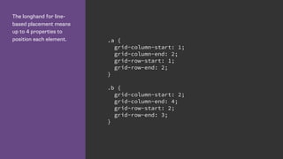


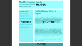
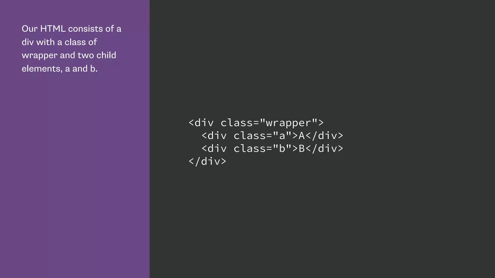
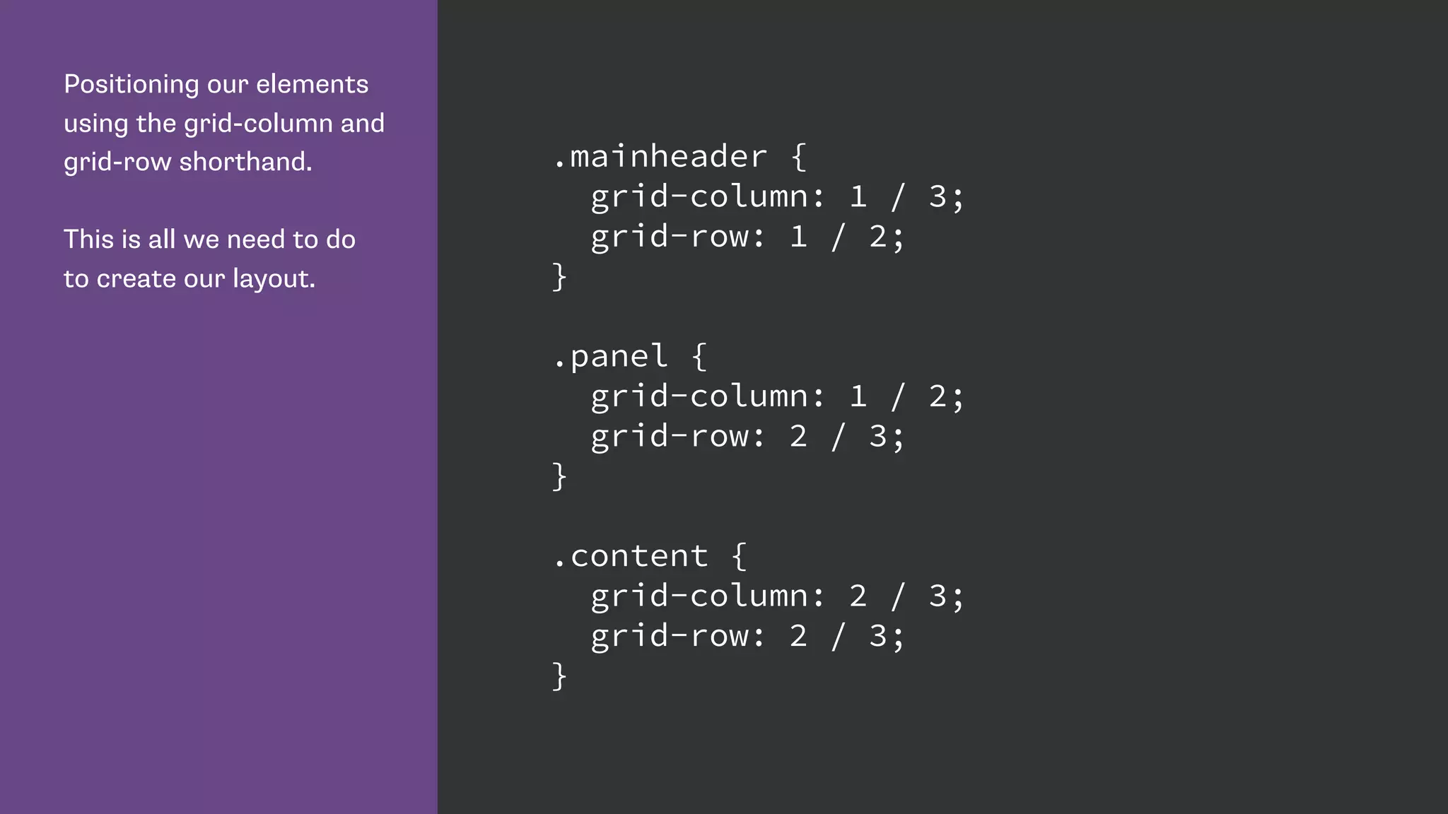
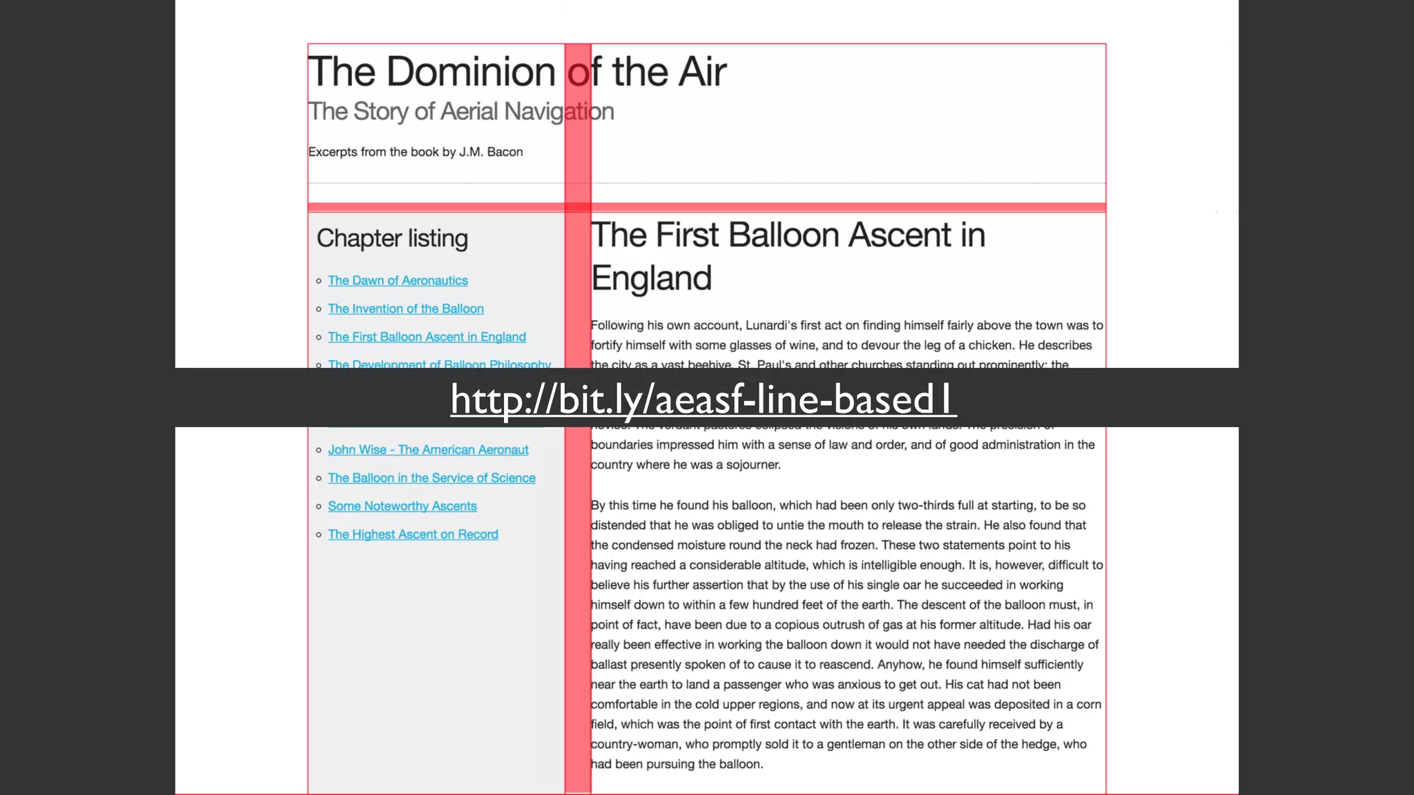
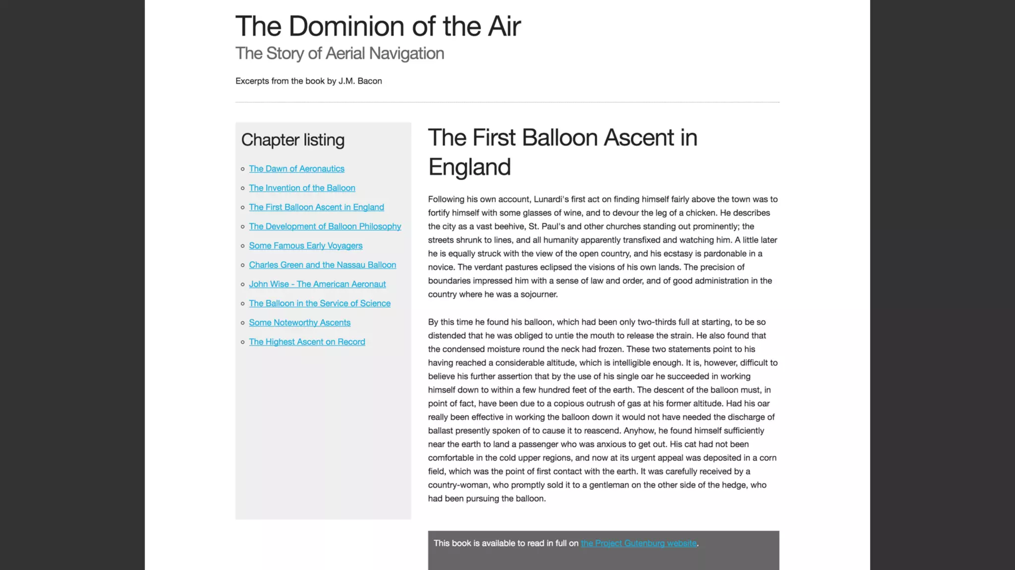
![Name lines with the name
in square brackets.
Remember we are naming
grid lines and not grid
tracks. .wrapper {
display: grid;
grid-row-gap: 10px;
grid-template-rows:
[row-header-start] auto
[row-content-start] auto
[row-panel-start] auto
[row-footer-start] auto [row-footer-end];
}](https://image.slidesharecdn.com/css-grid-40-topconf-2016-160203062052/85/CSS-Grid-Layout-for-Topconf-Linz-55-320.jpg)


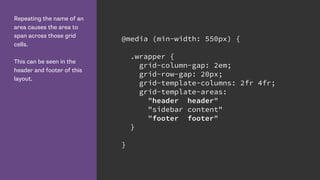


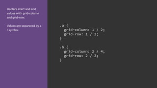
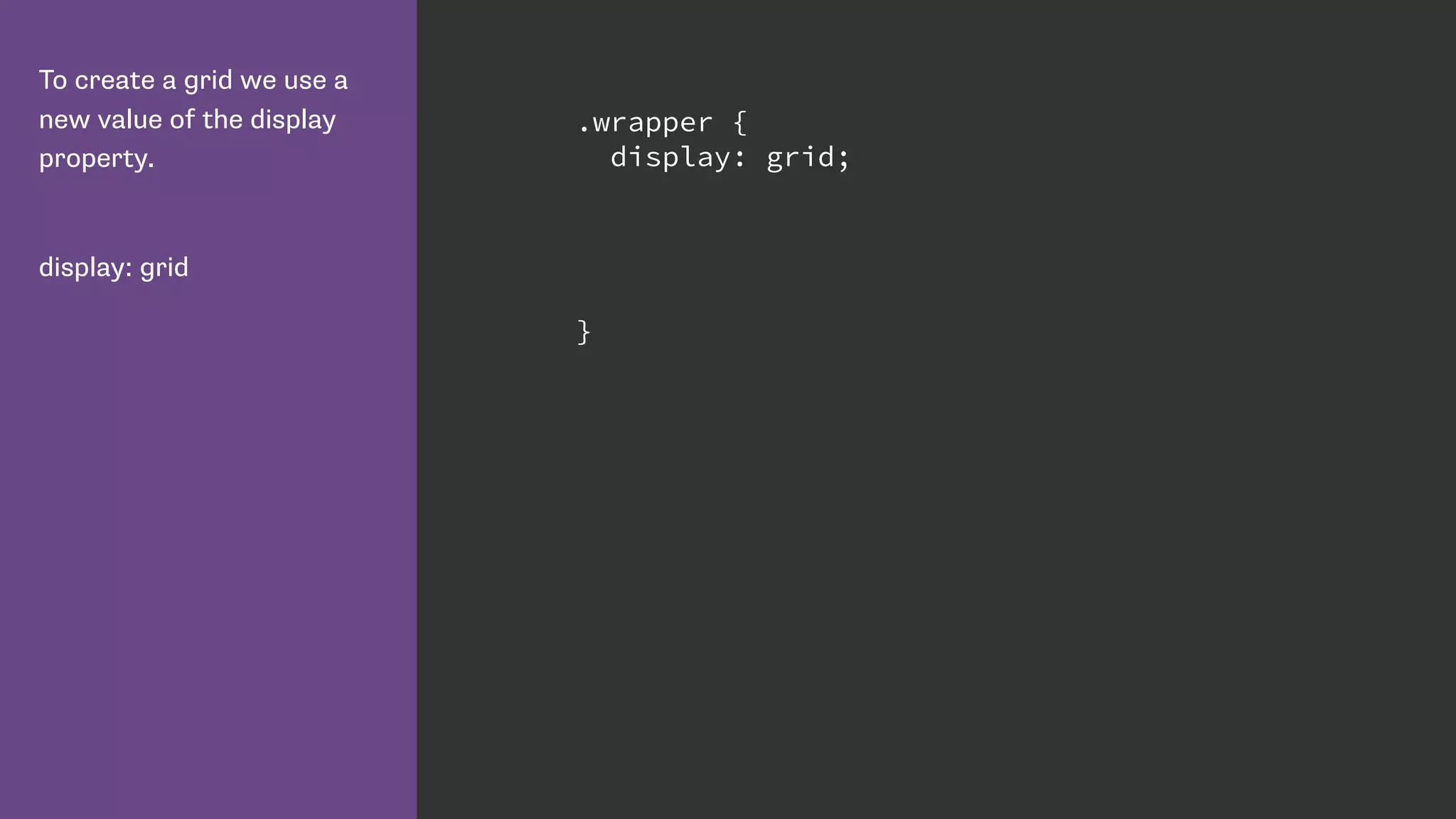
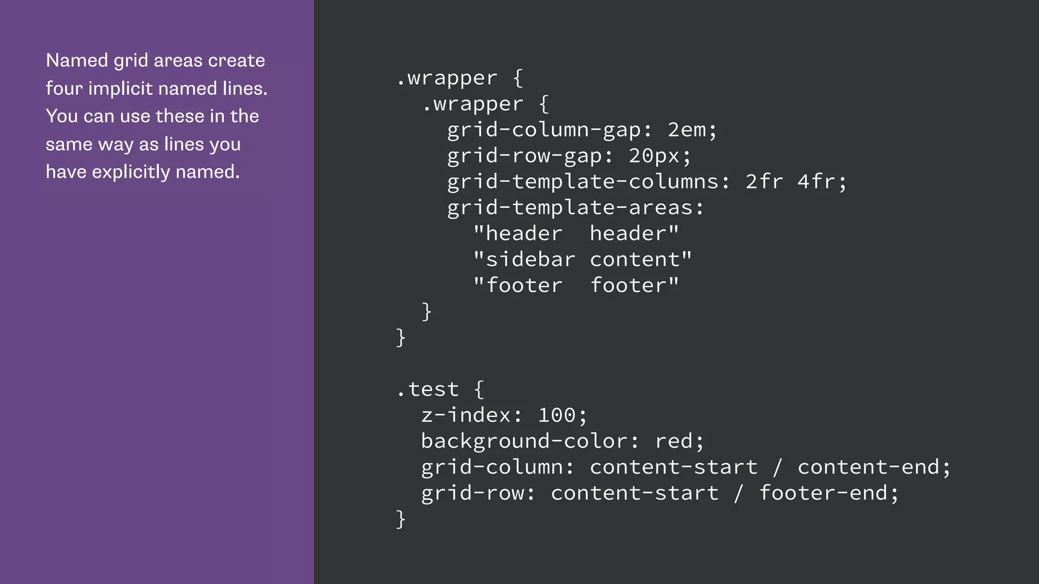
![We can give multiple grid
lines the same name.
This means we can use
the span keyword to span
n number of lines, rather
than specifying a specific
grid line.
.wrapper {
grid-template-columns:
repeat(4, [col-a] 200px [col-b] 100px);
}
.content {
grid-column: col-a 2 / span 2;
}
.aside {
grid-column: col-a 2 / span col-b 2;
}](https://image.slidesharecdn.com/css-grid-40-topconf-2016-160203062052/85/CSS-Grid-Layout-for-Topconf-Linz-79-320.jpg)
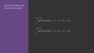
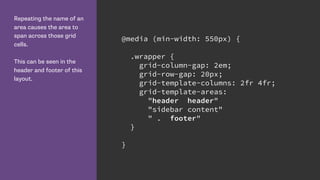
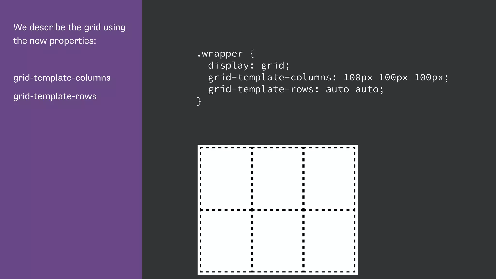
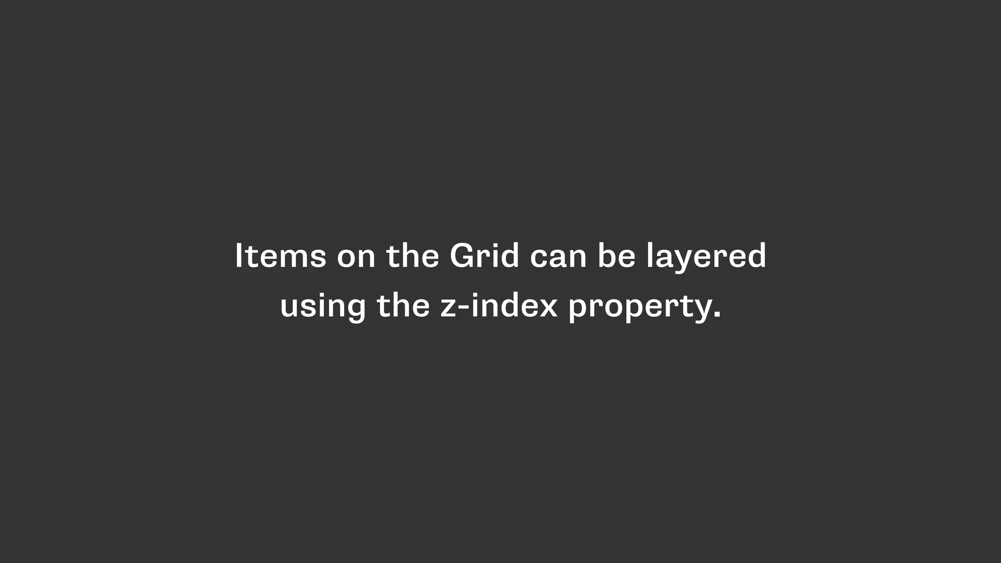
![Defining the 12 column
grid.
The repeat keyword
repeats the pattern of
columns or rows the
number of times specified
before the comma.
.wrapper {
display: grid;
grid-template-columns: repeat(12, [col] 1fr );
grid-template-rows: repeat(5, [row] auto) ;
grid-column-gap: 1em;
grid-row-gap: 15px;
}](https://image.slidesharecdn.com/css-grid-40-topconf-2016-160203062052/85/CSS-Grid-Layout-for-Topconf-Linz-83-320.jpg)


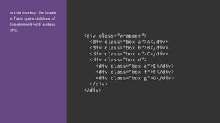
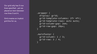
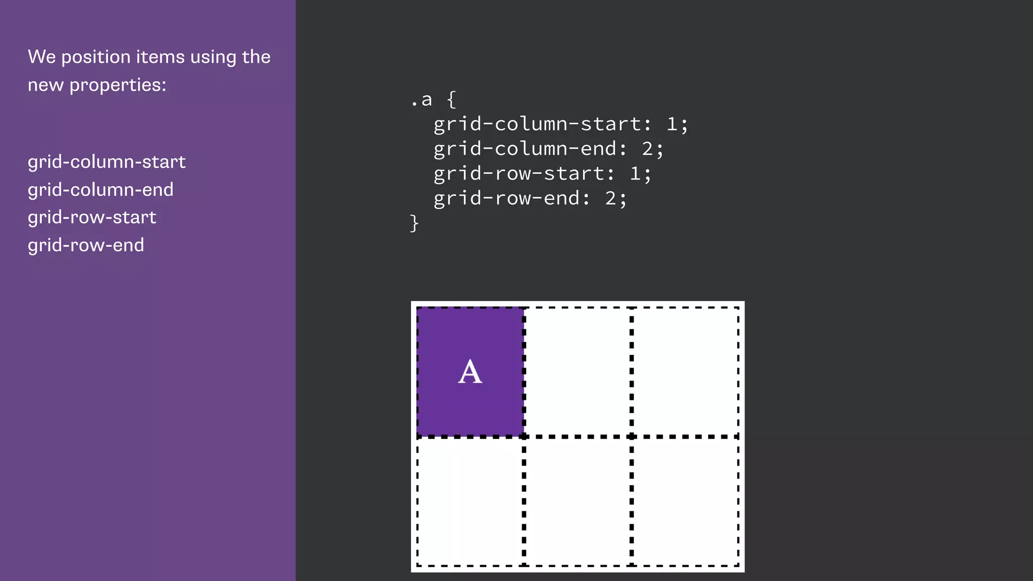
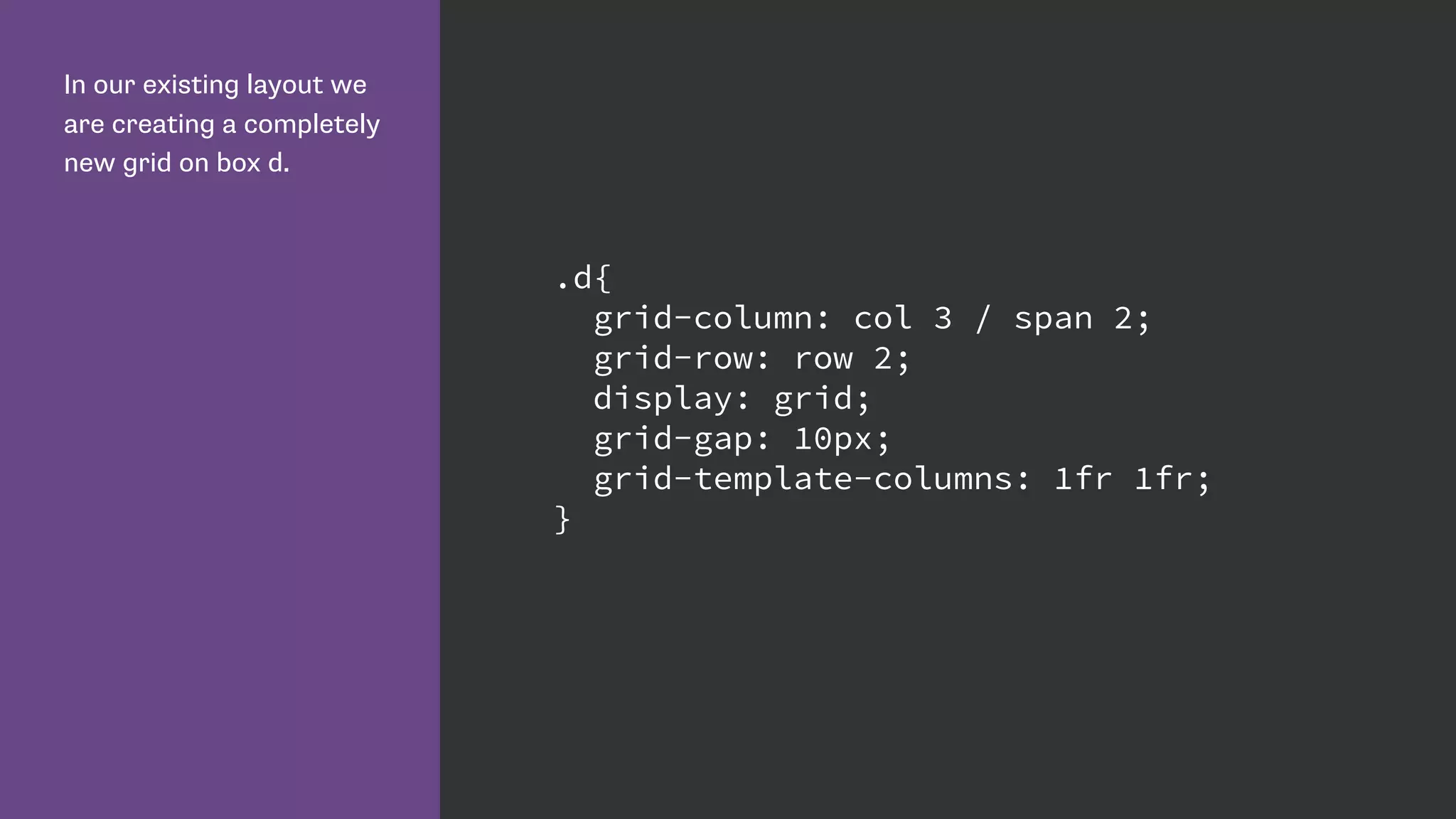
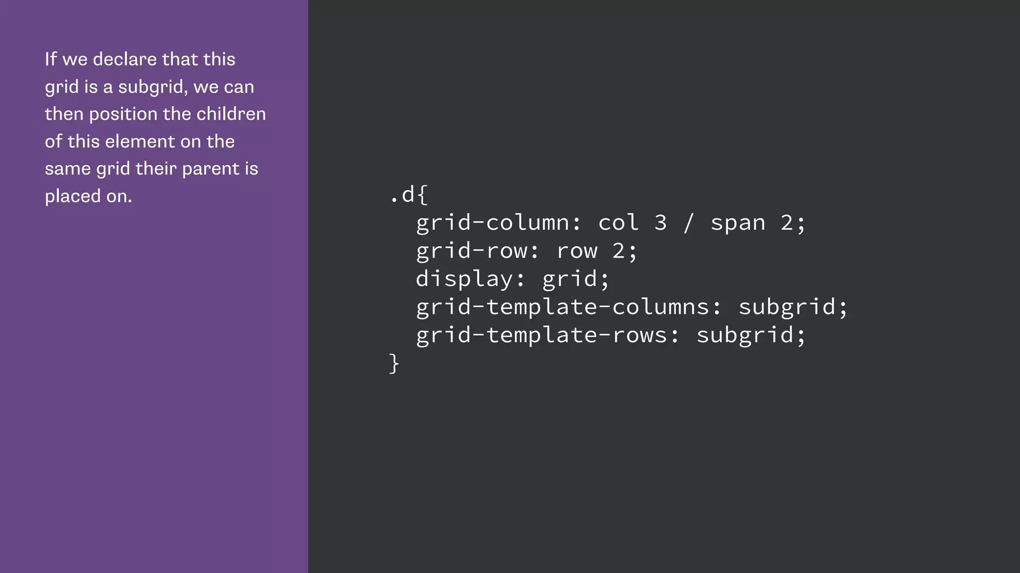
![I have declared a grid on
the wrapper div, and
positioned the immediate
children - the elements
with classes a to d.
.wrapper {
display: grid;
grid-gap: 10px;
grid-template-columns:
repeat(4, [col] 150px);
repeat(2, [row] auto);
}
.a {
grid-column: col / span 2;
grid-row: row;
}
.b {
grid-column: col 3 / span 2;
grid-row: row;
}
.c {
grid-column: col / span 2;
grid-row: row 2;
}
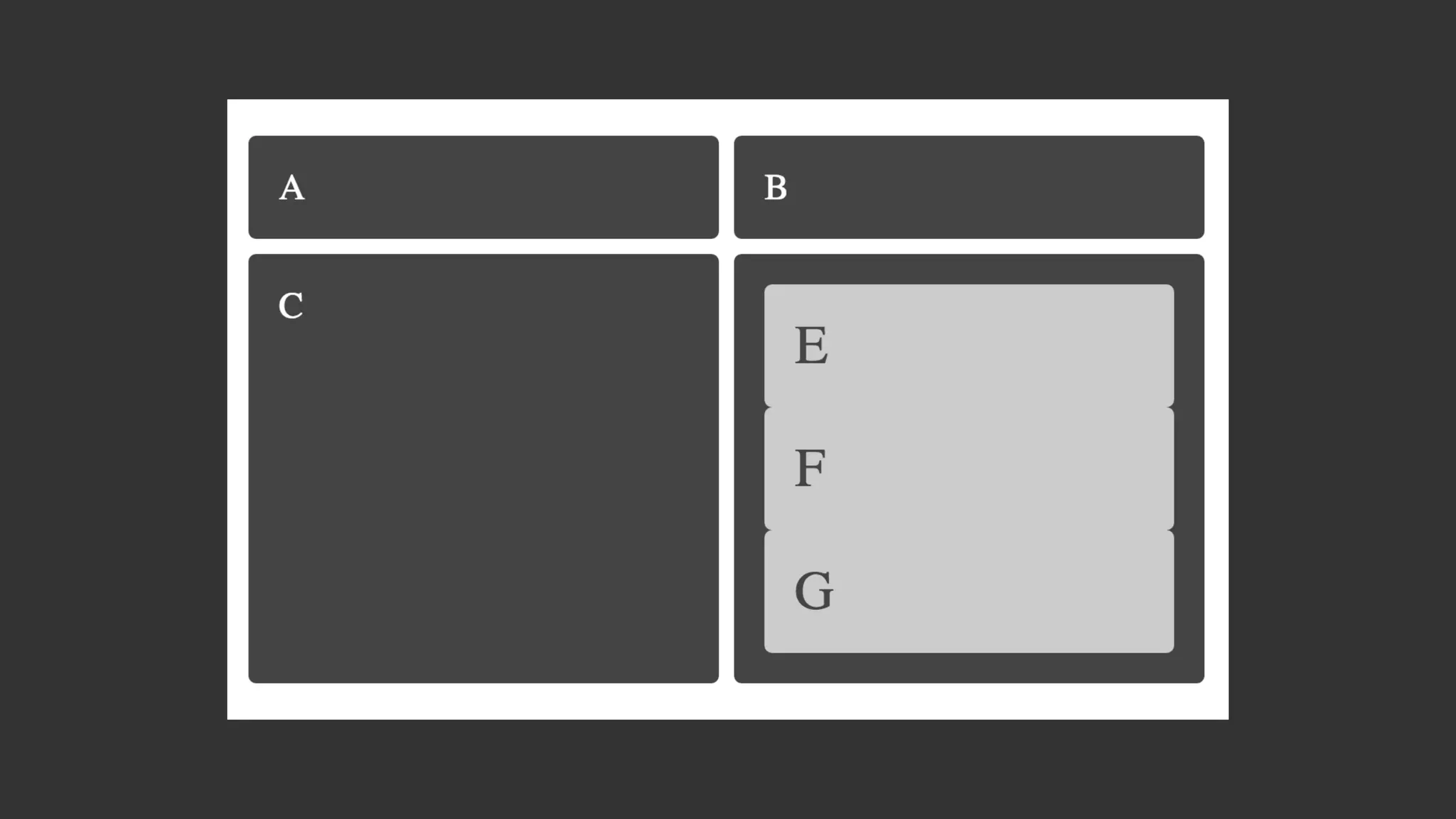
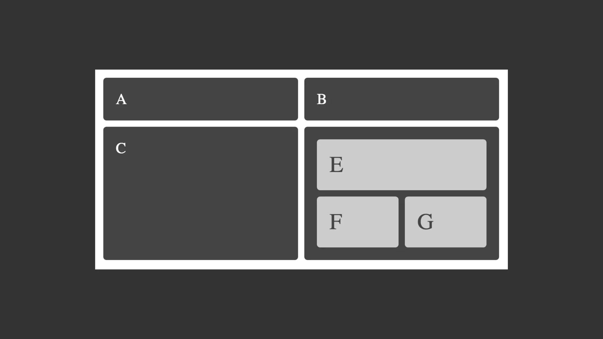
.d{
grid-column: col 3 / span 2;
grid-row: row 2;
}](https://image.slidesharecdn.com/css-grid-40-topconf-2016-160203062052/85/CSS-Grid-Layout-for-Topconf-Linz-102-320.jpg)


![Grid needs your feedback!
Enable Experimental Web Platform Features in Chrome.
Play with my examples and think up ways you would use Grid.
Follow the CSS Grid conversation on www-style by searching for [css-grid].
See the current issues in the Editor’s Draft http://dev.w3.org/csswg/css-grid/#issues-
index](https://image.slidesharecdn.com/css-grid-40-topconf-2016-160203062052/85/CSS-Grid-Layout-for-Topconf-Linz-111-320.jpg)


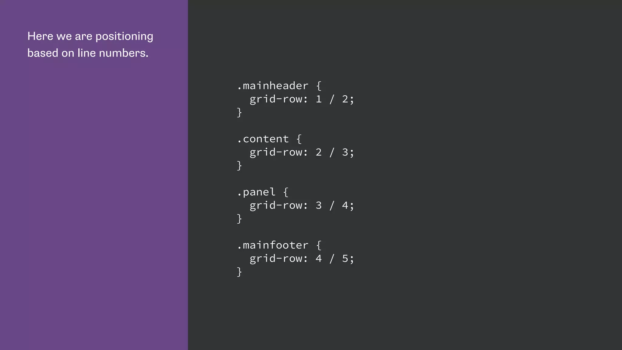
![Name lines with the name
in square brackets.
Remember we are naming
grid lines and not grid
tracks. .wrapper {
display: grid;
grid-row-gap: 10px;
grid-template-rows:
[row-header-start] auto
[row-content-start] auto
[row-panel-start] auto
[row-footer-start] auto [row-footer-end];
}](https://image.slidesharecdn.com/css-grid-40-topconf-2016-160203062052/75/CSS-Grid-Layout-for-Topconf-Linz-55-2048.jpg)
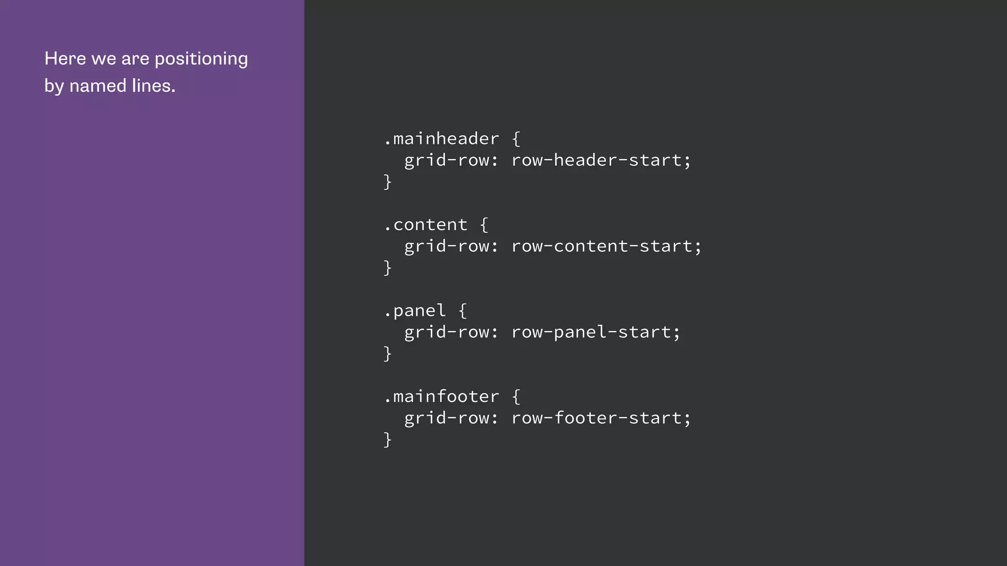


![We can give multiple grid
lines the same name.
This means we can use
the span keyword to span
n number of lines, rather
than specifying a specific
grid line.
.wrapper {
grid-template-columns:
repeat(4, [col-a] 200px [col-b] 100px);
}
.content {
grid-column: col-a 2 / span 2;
}
.aside {
grid-column: col-a 2 / span col-b 2;
}](https://image.slidesharecdn.com/css-grid-40-topconf-2016-160203062052/75/CSS-Grid-Layout-for-Topconf-Linz-79-2048.jpg)
![Defining the 12 column
grid.
The repeat keyword
repeats the pattern of
columns or rows the
number of times specified
before the comma.
.wrapper {
display: grid;
grid-template-columns: repeat(12, [col] 1fr );
grid-template-rows: repeat(5, [row] auto) ;
grid-column-gap: 1em;
grid-row-gap: 15px;
}](https://image.slidesharecdn.com/css-grid-40-topconf-2016-160203062052/75/CSS-Grid-Layout-for-Topconf-Linz-83-2048.jpg)


![I have declared a grid on
the wrapper div, and
positioned the immediate
children - the elements
with classes a to d.
.wrapper {
display: grid;
grid-gap: 10px;
grid-template-columns:
repeat(4, [col] 150px);
repeat(2, [row] auto);
}
.a {
grid-column: col / span 2;
grid-row: row;
}
.b {
grid-column: col 3 / span 2;
grid-row: row;
}
.c {
grid-column: col / span 2;
grid-row: row 2;
}
.d{
grid-column: col 3 / span 2;
grid-row: row 2;
}](https://image.slidesharecdn.com/css-grid-40-topconf-2016-160203062052/75/CSS-Grid-Layout-for-Topconf-Linz-102-2048.jpg)


![Grid needs your feedback!
Enable Experimental Web Platform Features in Chrome.
Play with my examples and think up ways you would use Grid.
Follow the CSS Grid conversation on www-style by searching for [css-grid].
See the current issues in the Editor’s Draft http://dev.w3.org/csswg/css-grid/#issues-
index](https://image.slidesharecdn.com/css-grid-40-topconf-2016-160203062052/75/CSS-Grid-Layout-for-Topconf-Linz-111-2048.jpg)


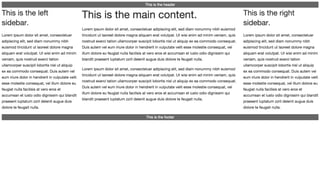
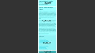
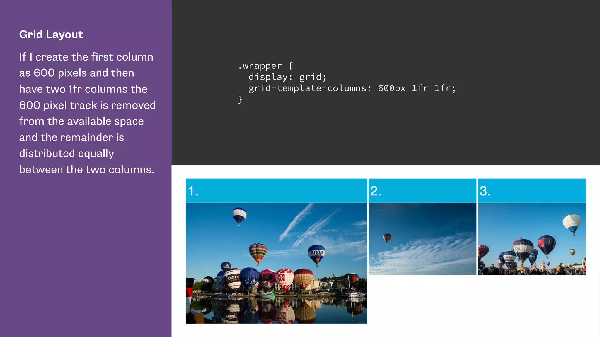
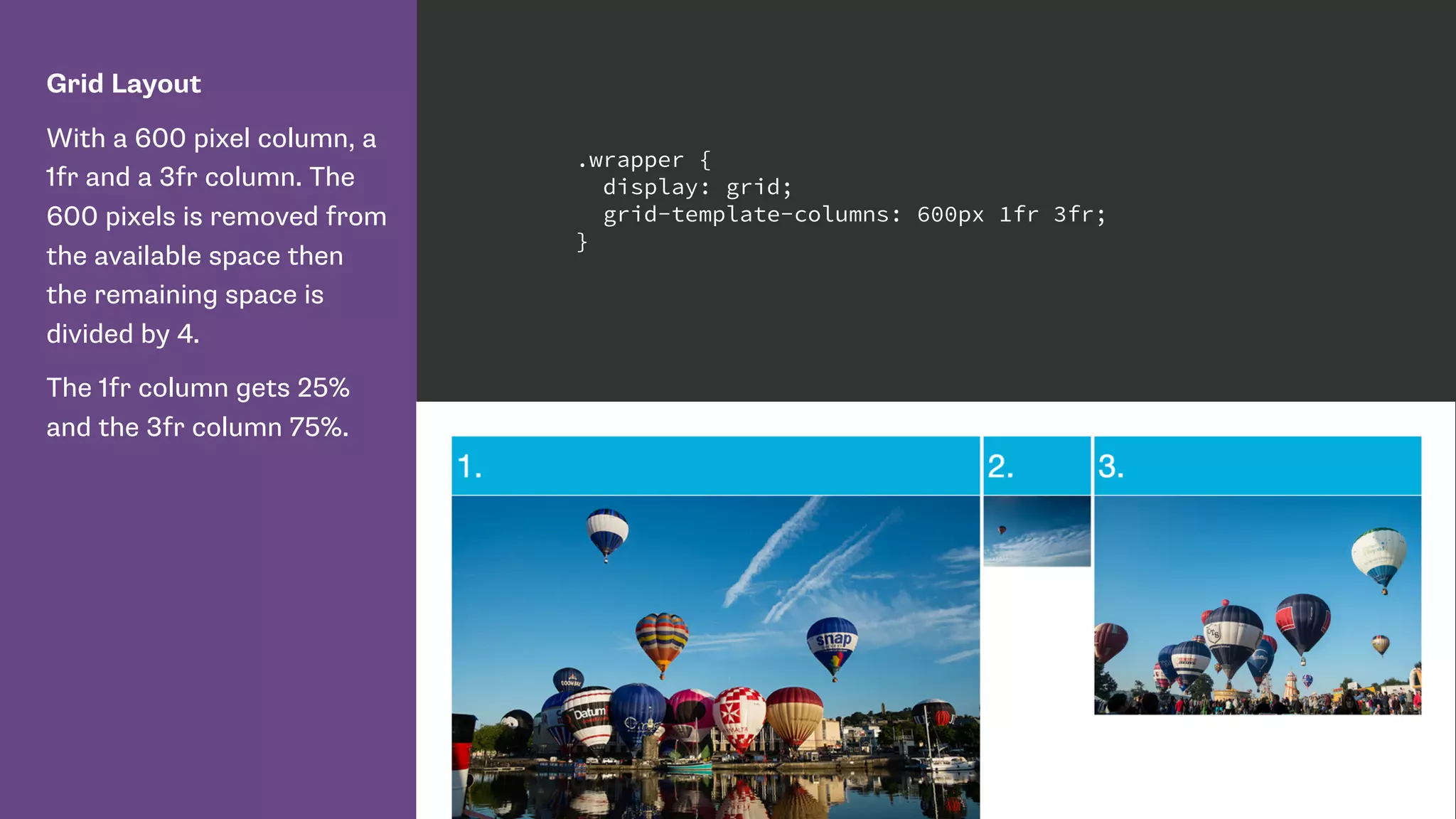
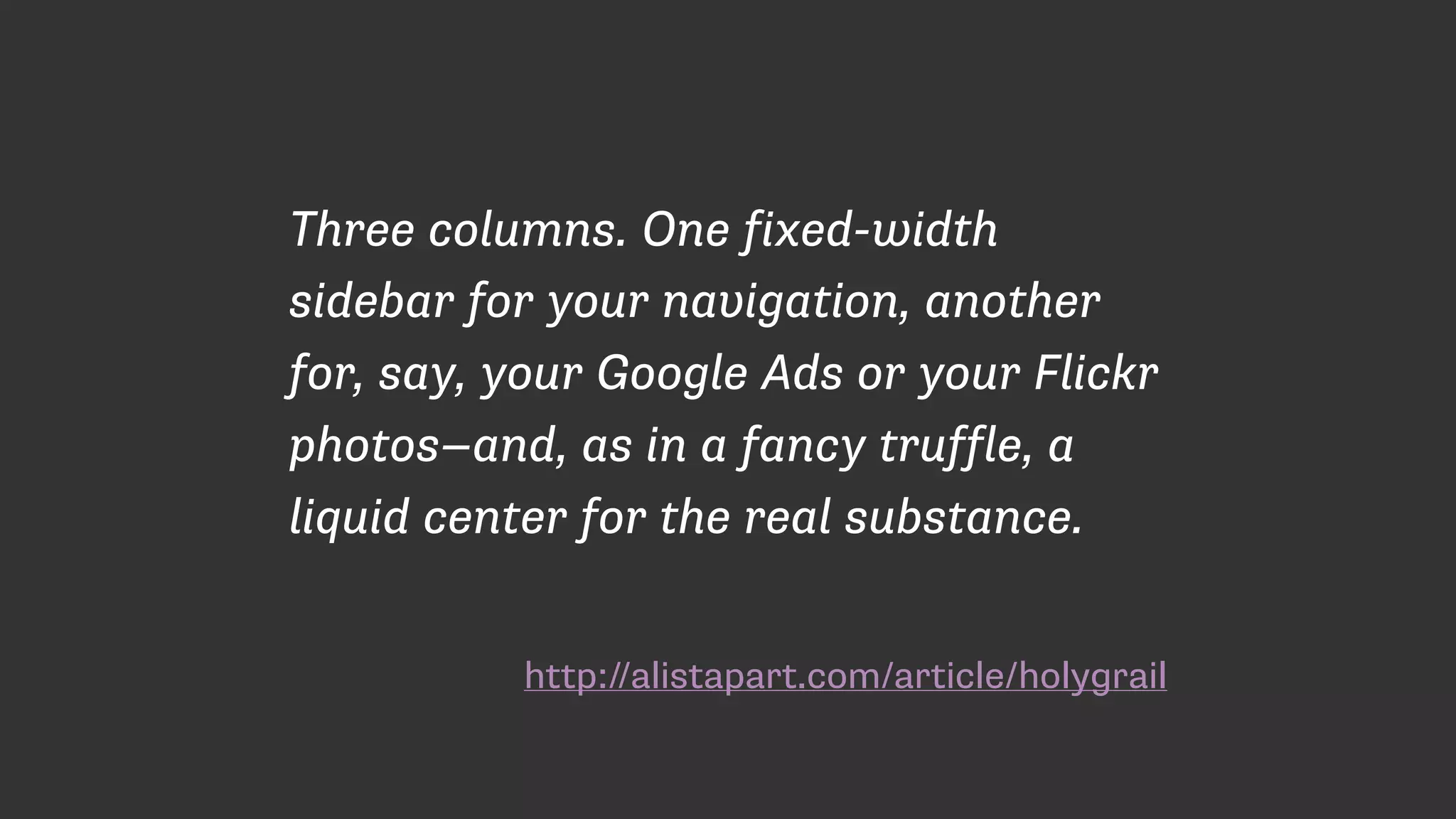
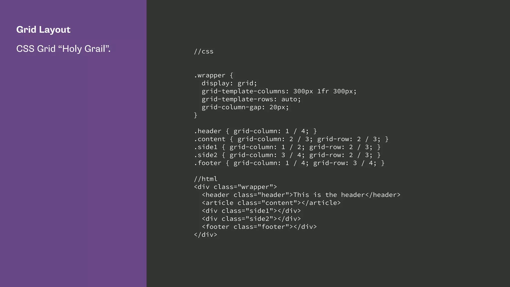
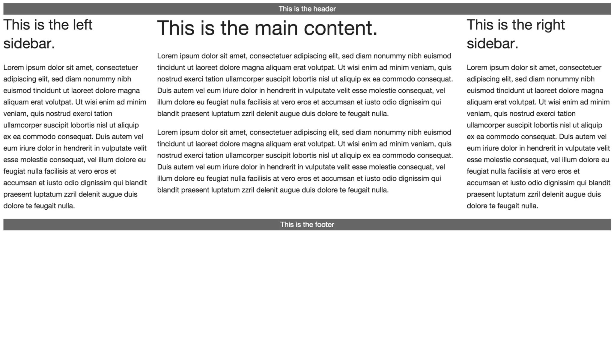
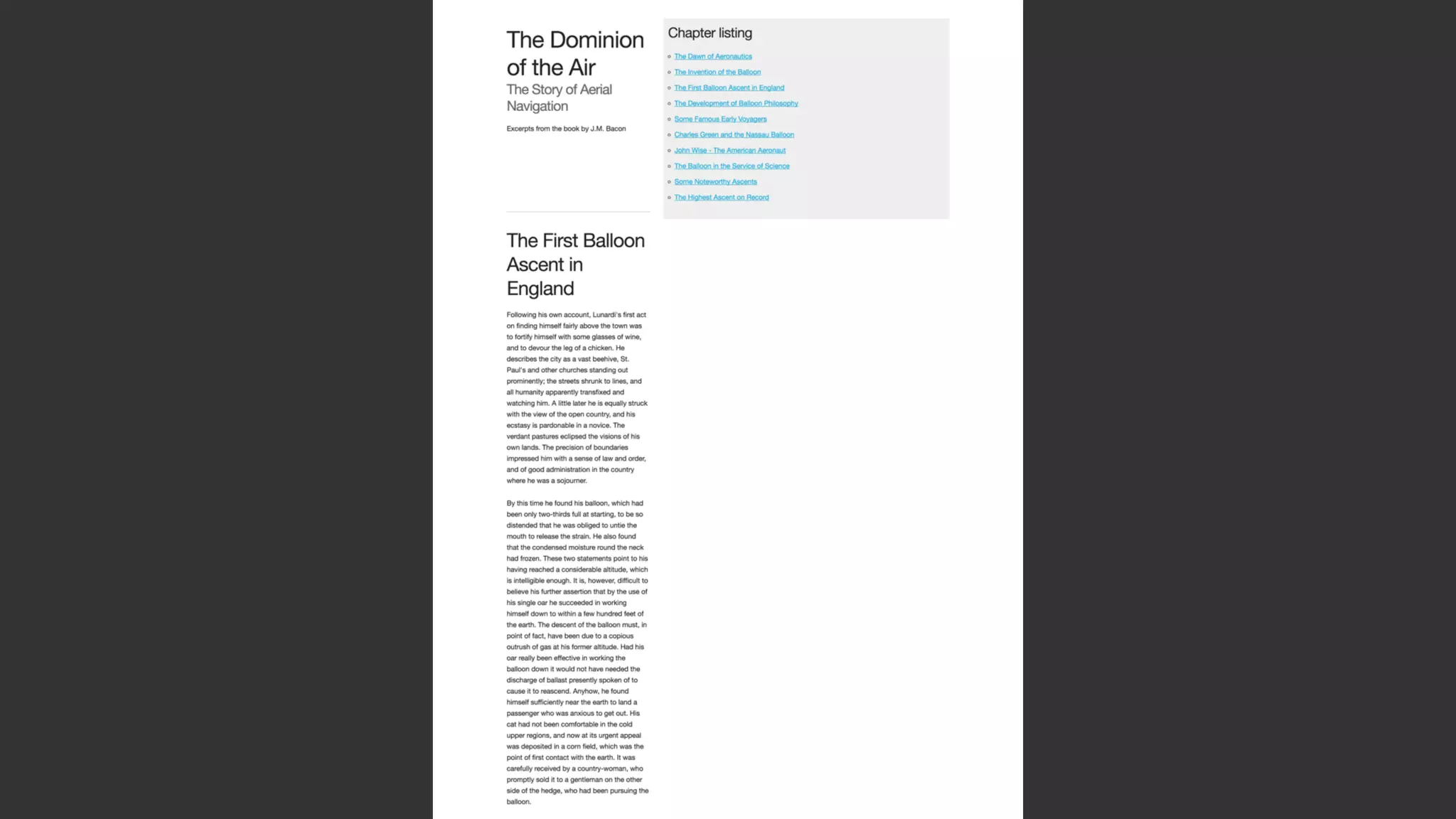
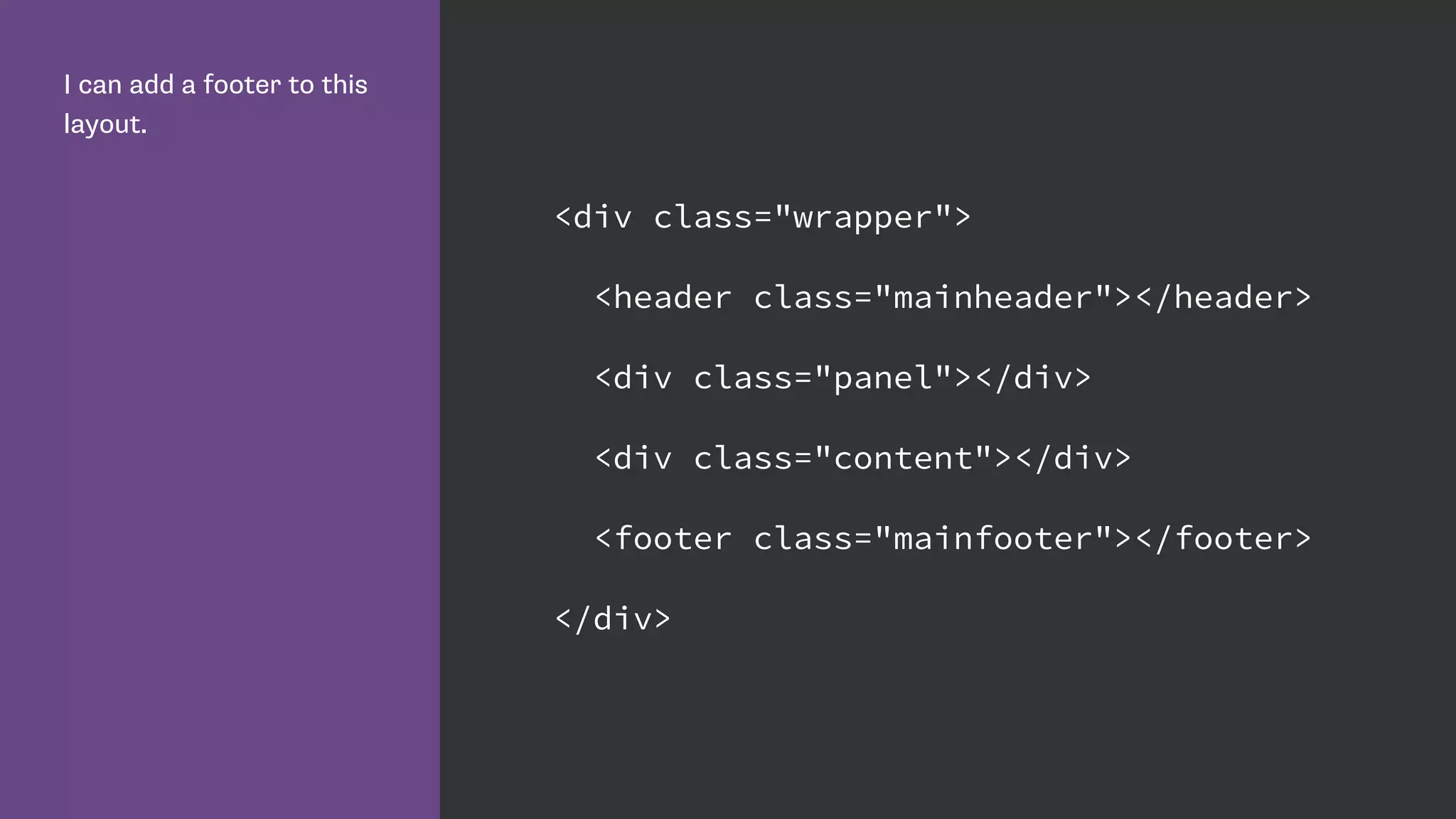
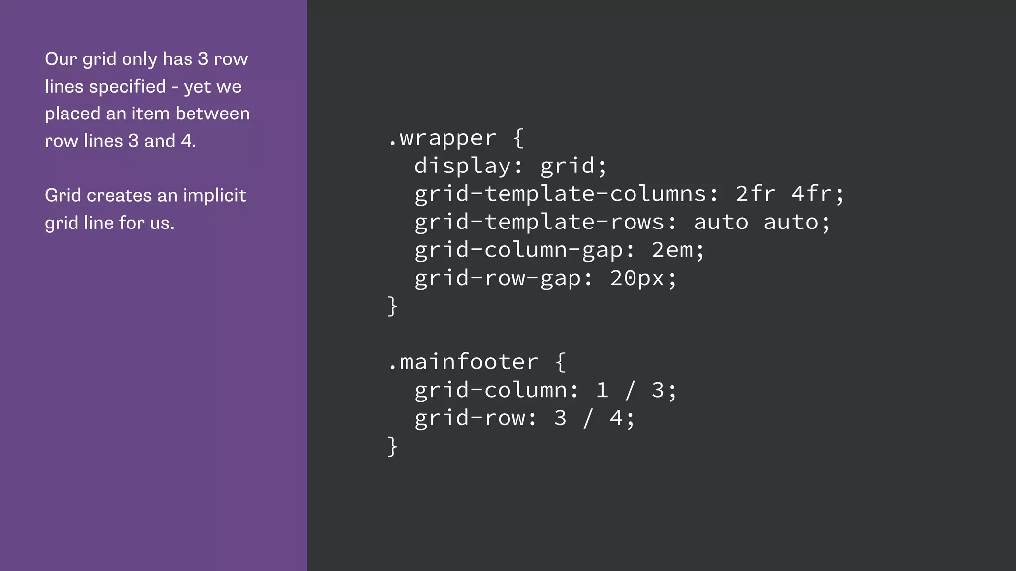
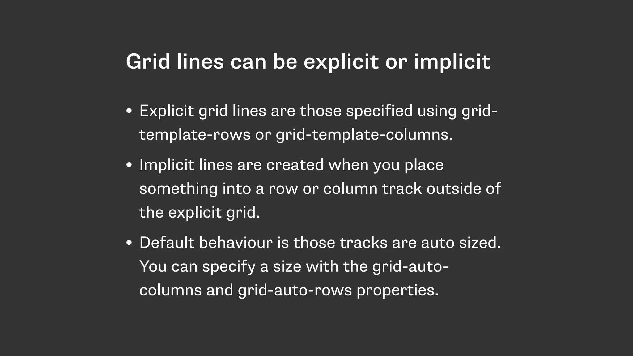
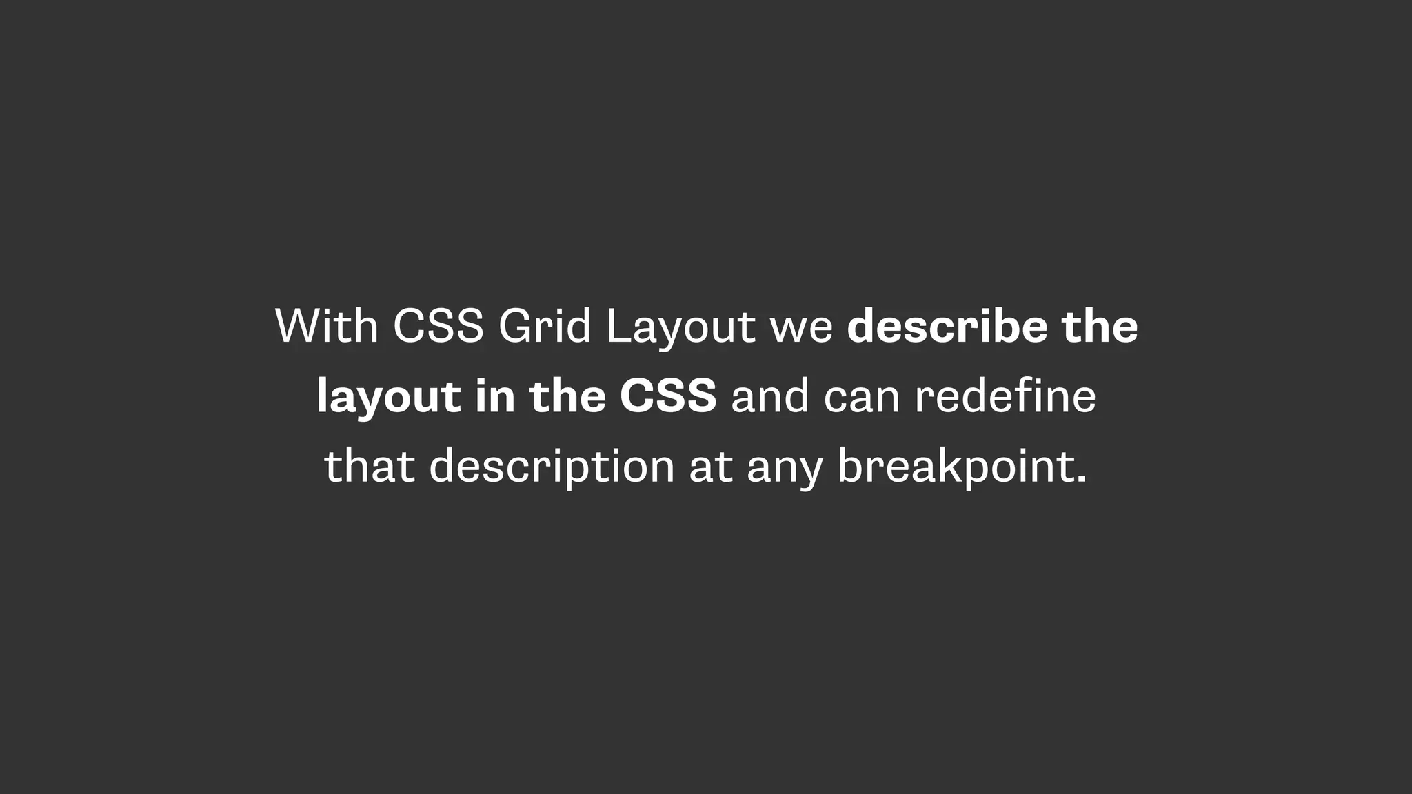
This document summarizes Rachel Andrew's presentation on CSS Grid Layout. Some key points: - CSS Grid Layout provides a new two-dimensional layout system for CSS that solves many of the problems of previous methods like floats and flexbox. - Grid uses line-based placement, with grid lines that can be explicit or implicit, to position items on the page. Properties like grid-column and grid-row position items within the grid. - The grid template establishes the structure of rows and columns. Items can span multiple tracks. Fraction units like fr distribute space proportionally. - Common layouts like Holy Grail are easily achieved with Grid. The structure can also adapt at breakpoints by redefining
Introduction by Rachel Andrew at Topconf Linz 2016, highlighting personal website and social media.
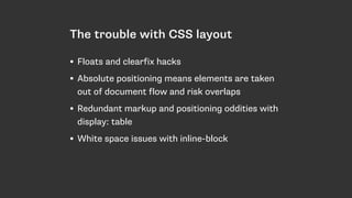
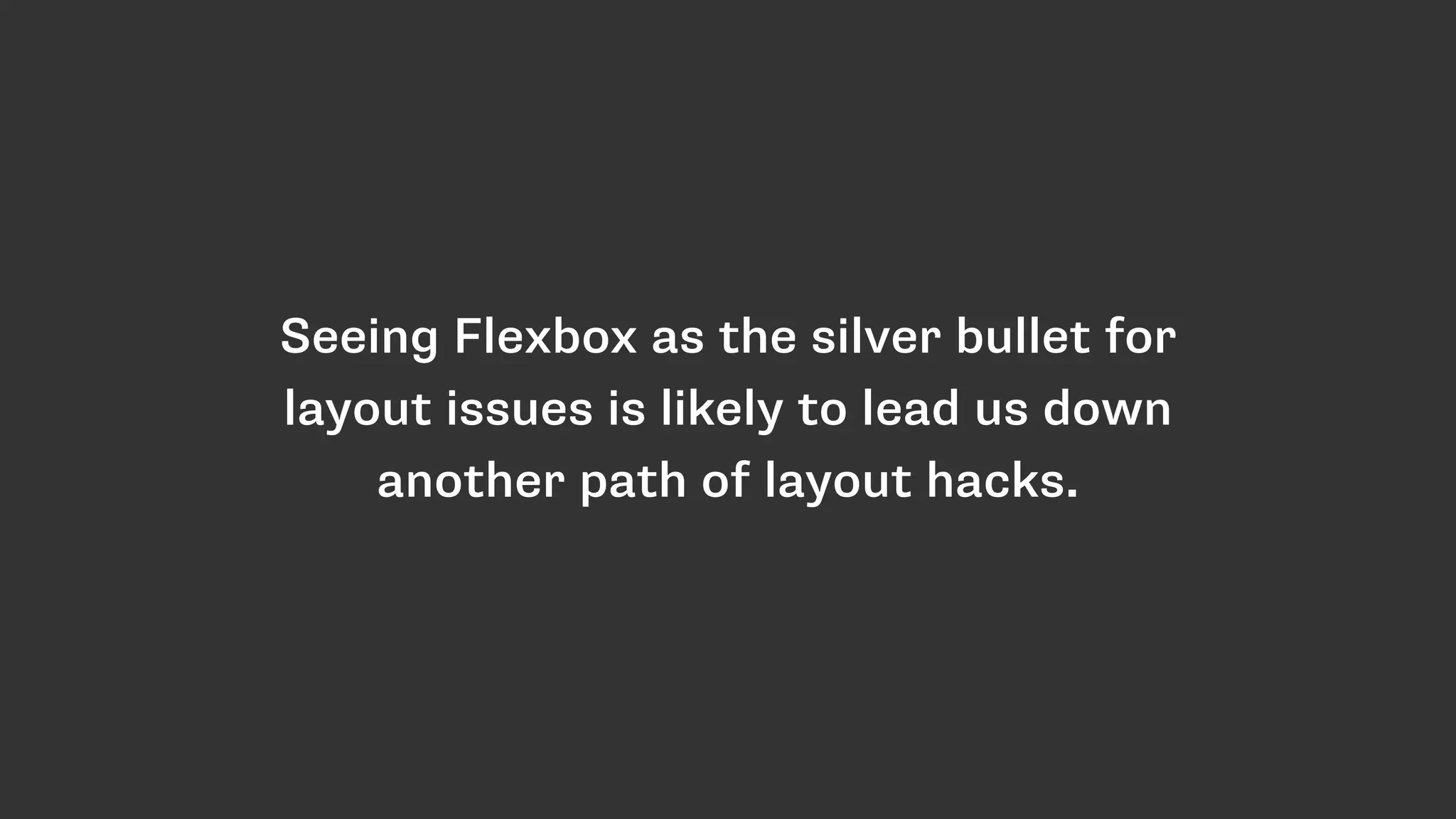
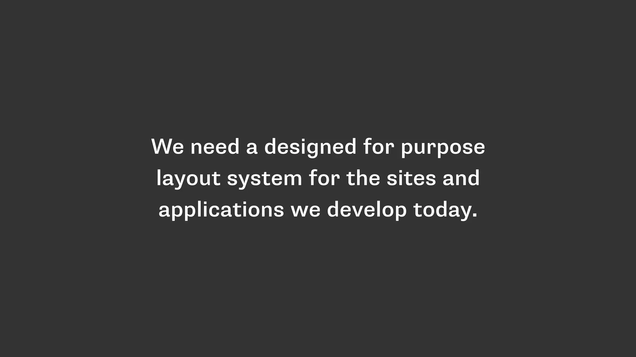
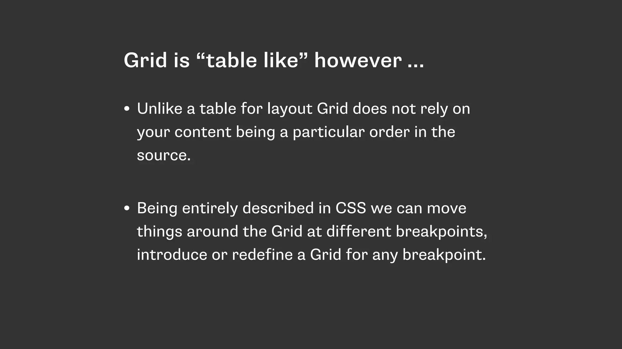
Discusses challenges in CSS layout techniques including floats, positioning, and markup issues. Emphasizes the need for a dedicated layout system.
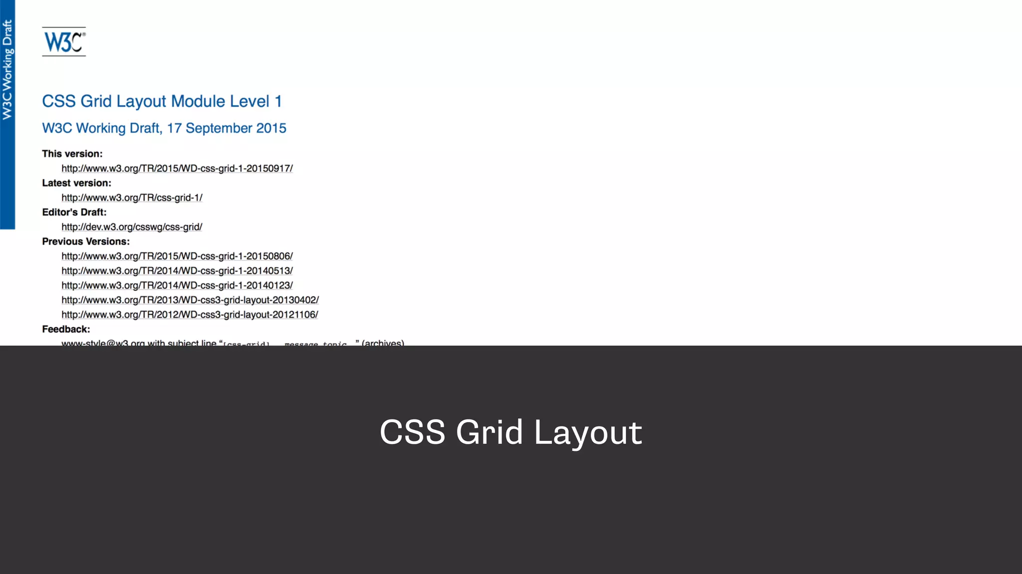
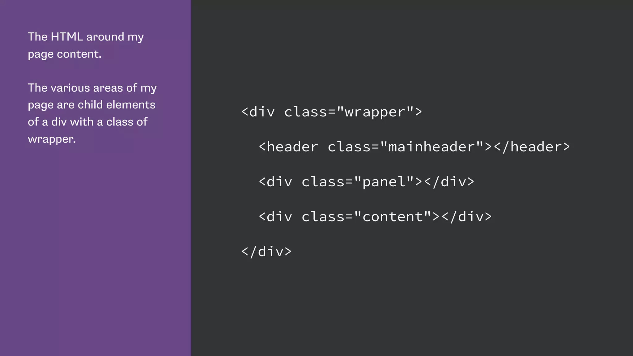
Introduction to CSS Grid; demonstrates how to set up HTML structure and initialize grid layout.
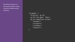
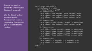
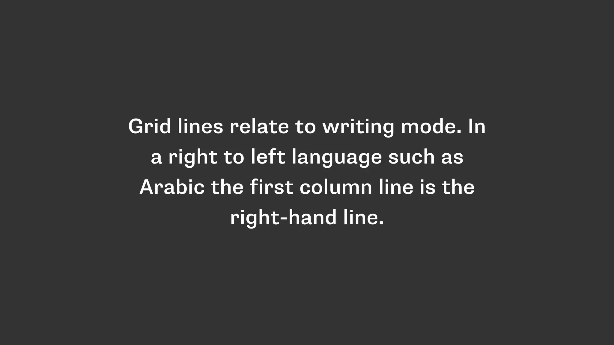
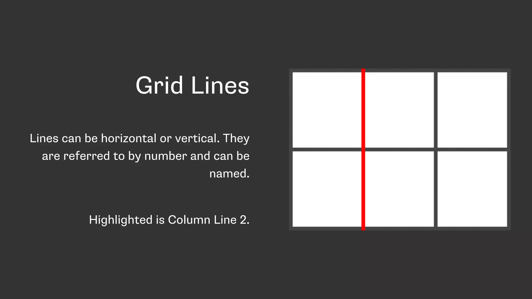
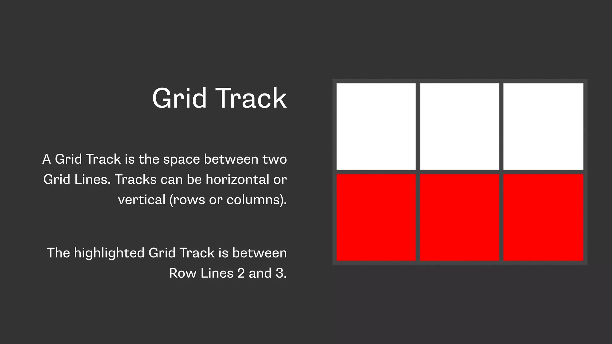
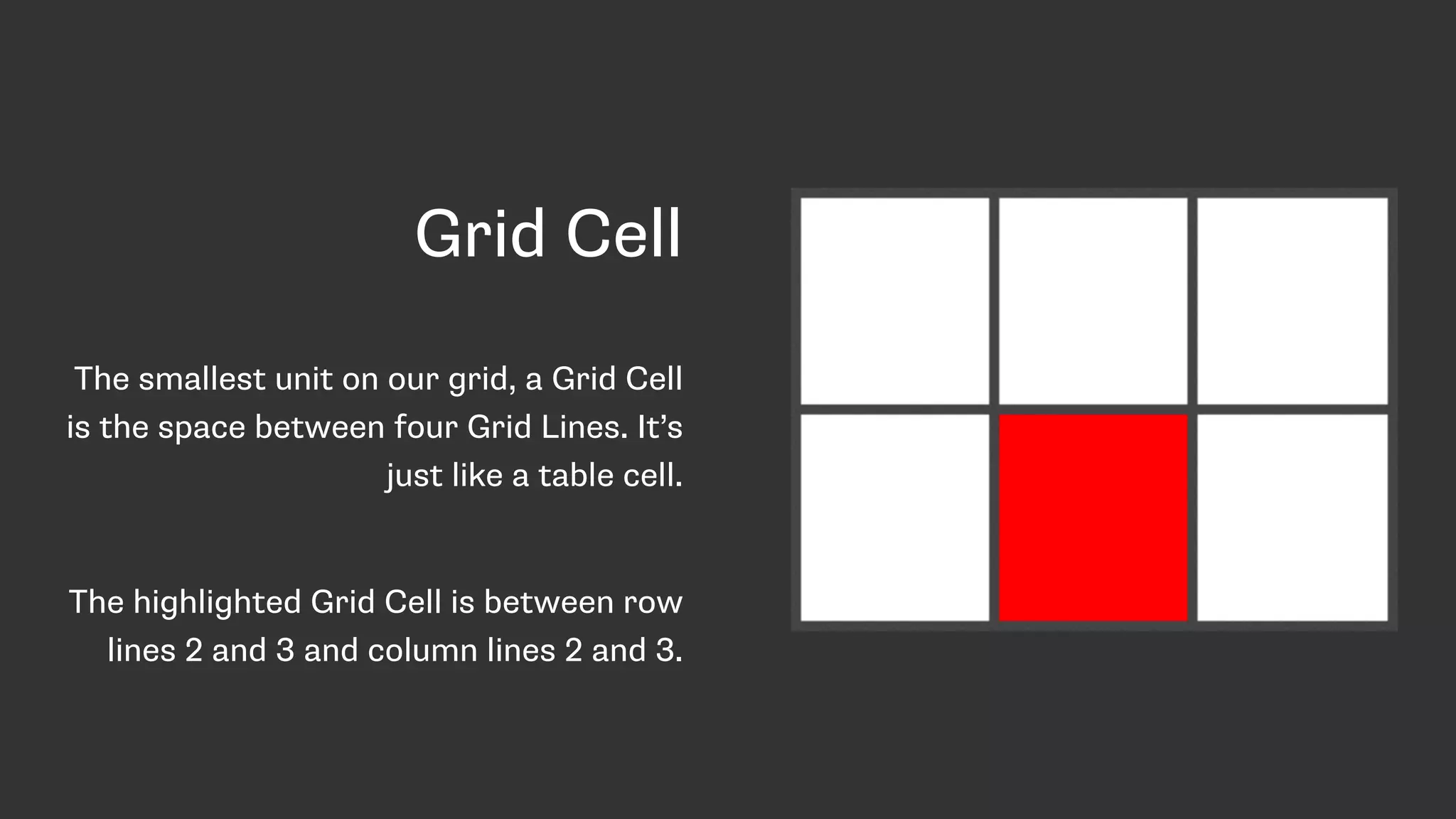
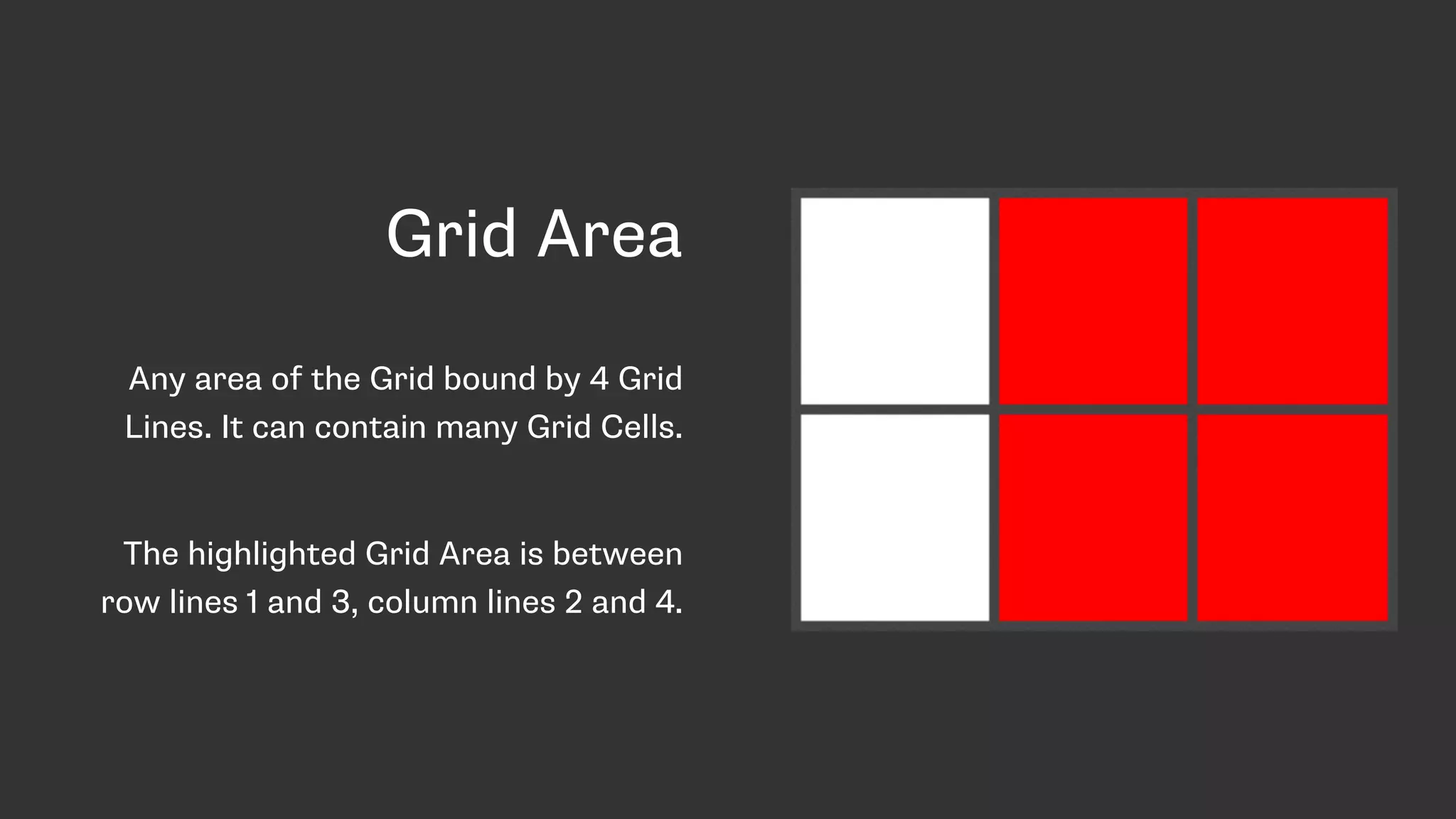
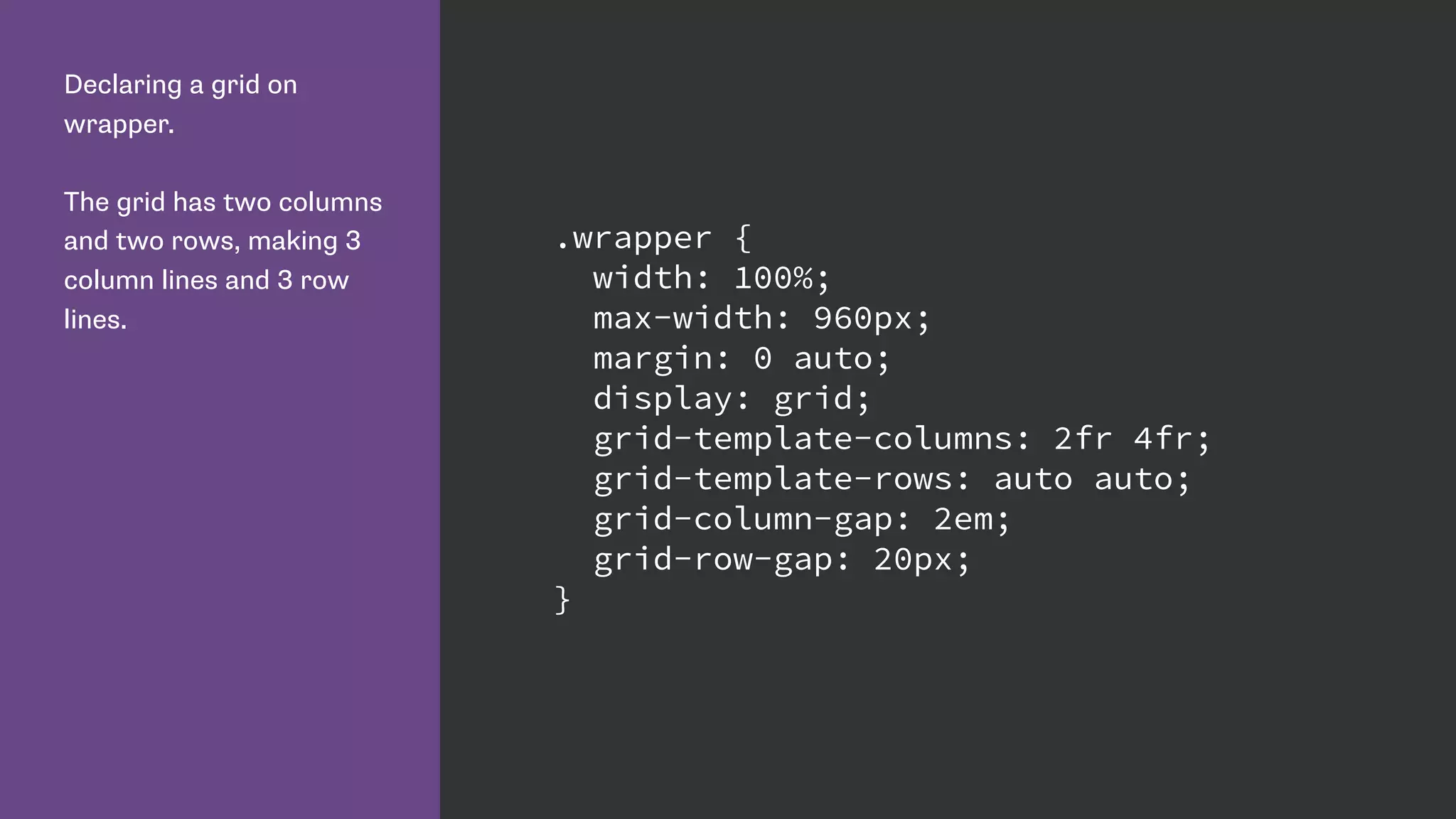
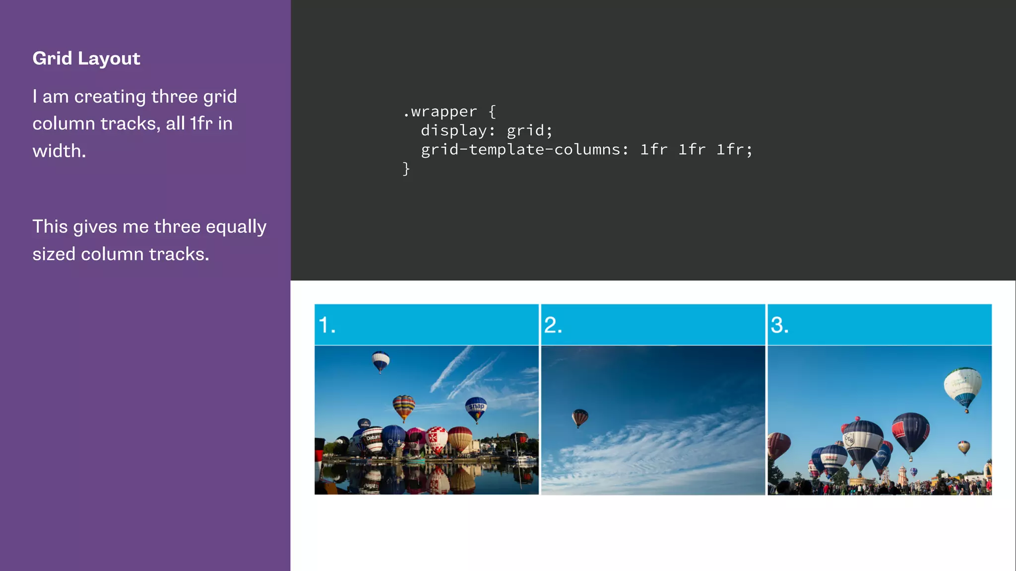
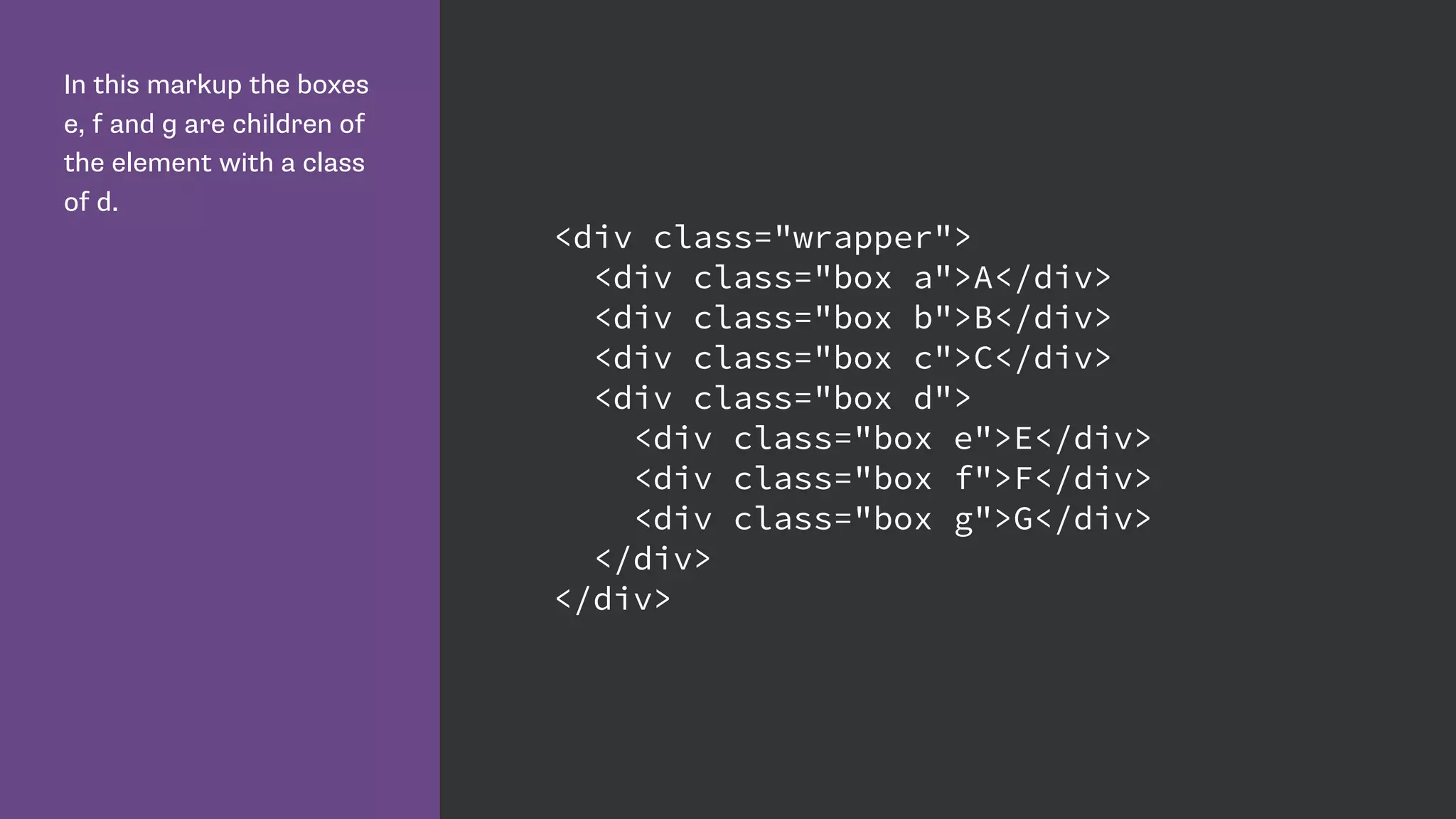
Covers grid properties like grid lines, tracks, cells, areas, and item placement using various methods.
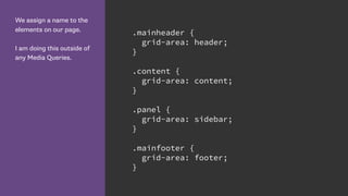
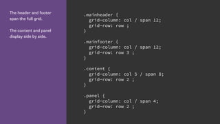
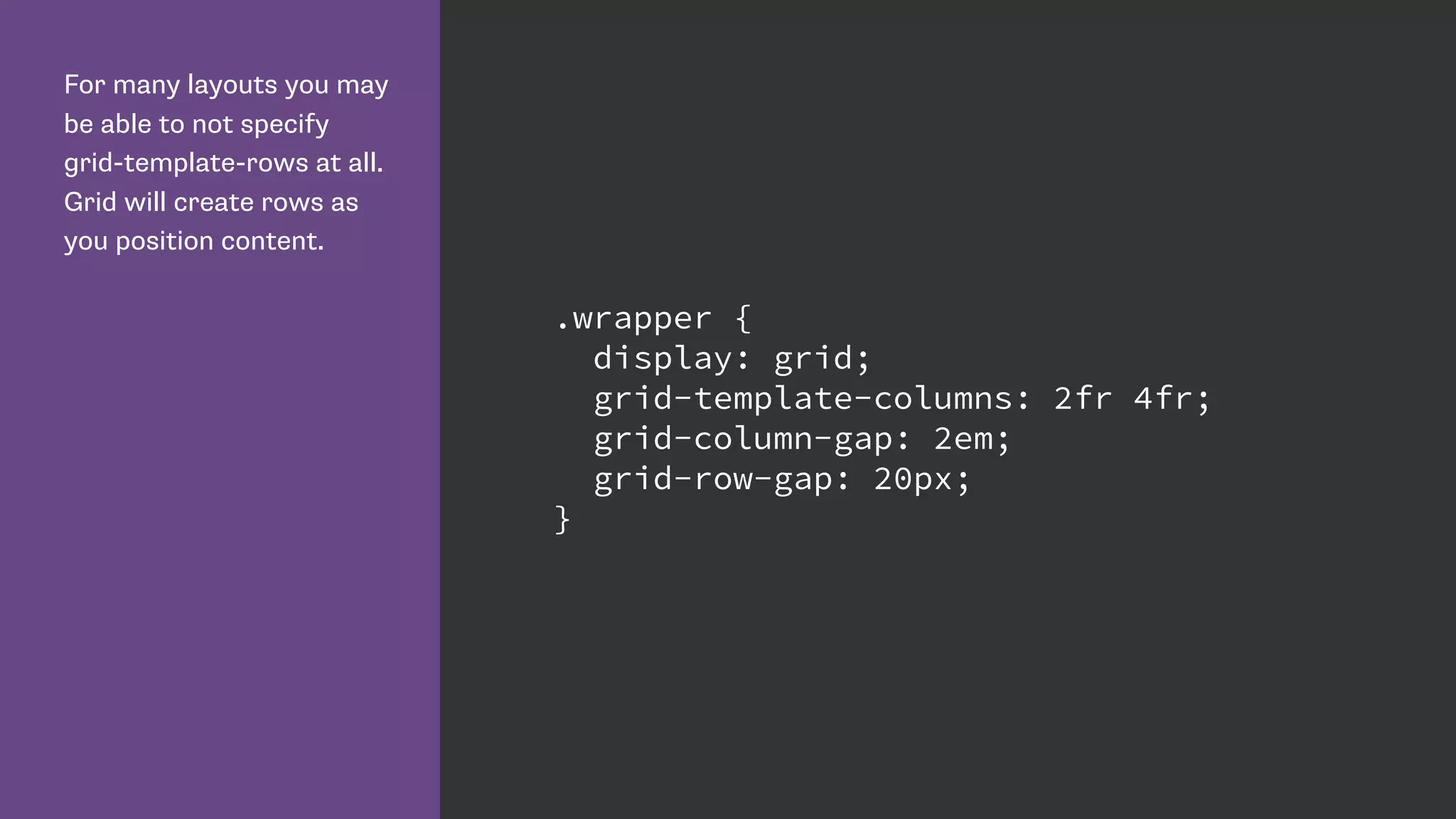
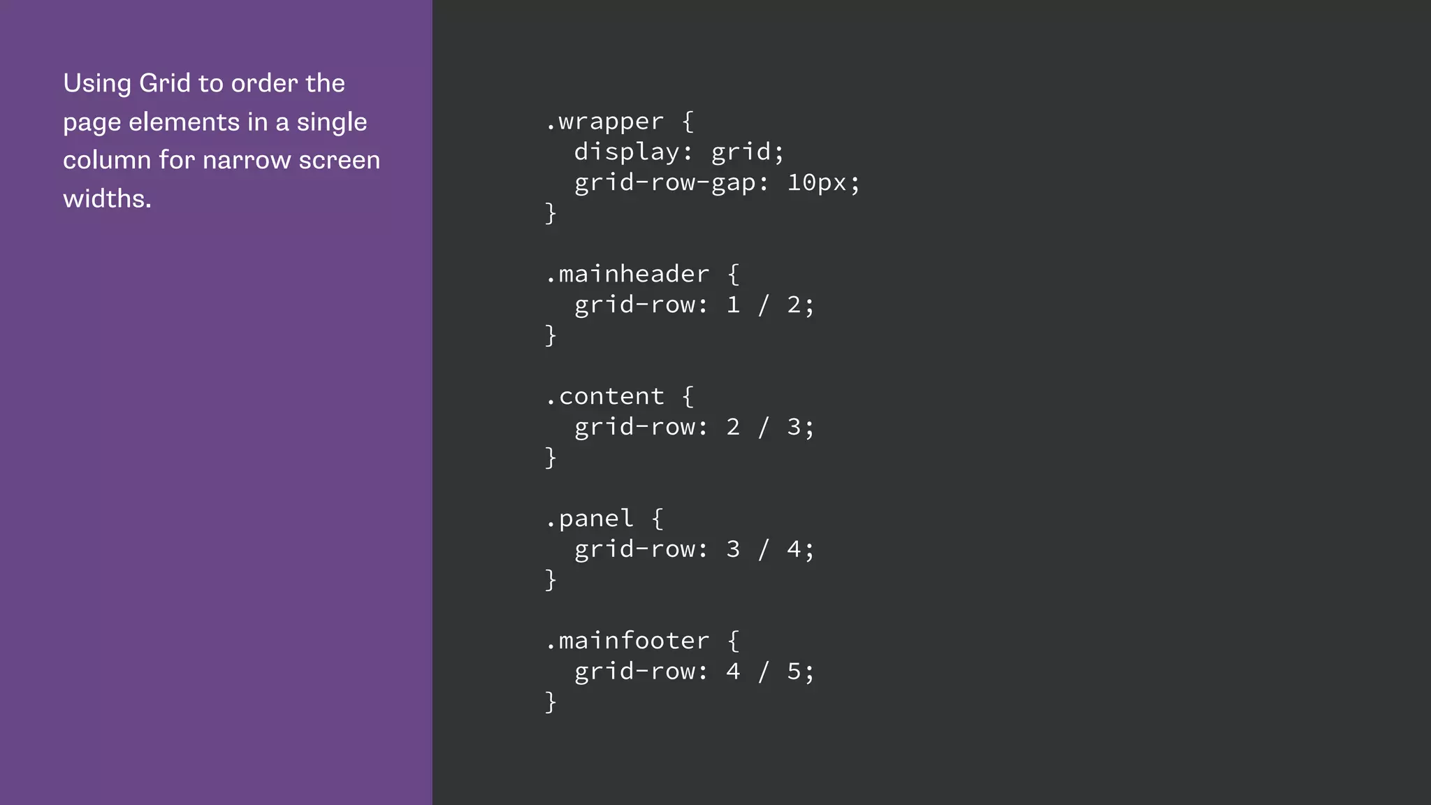
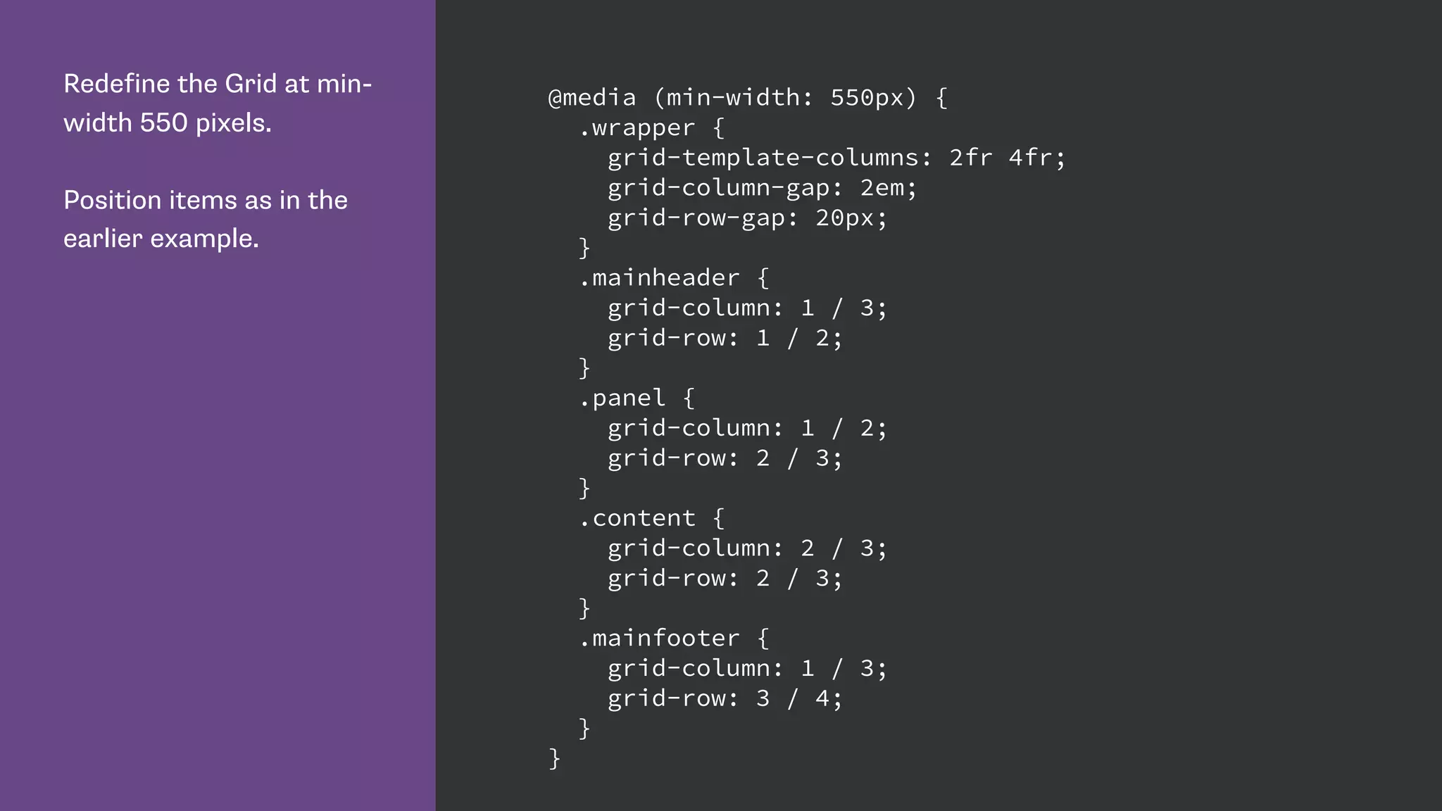
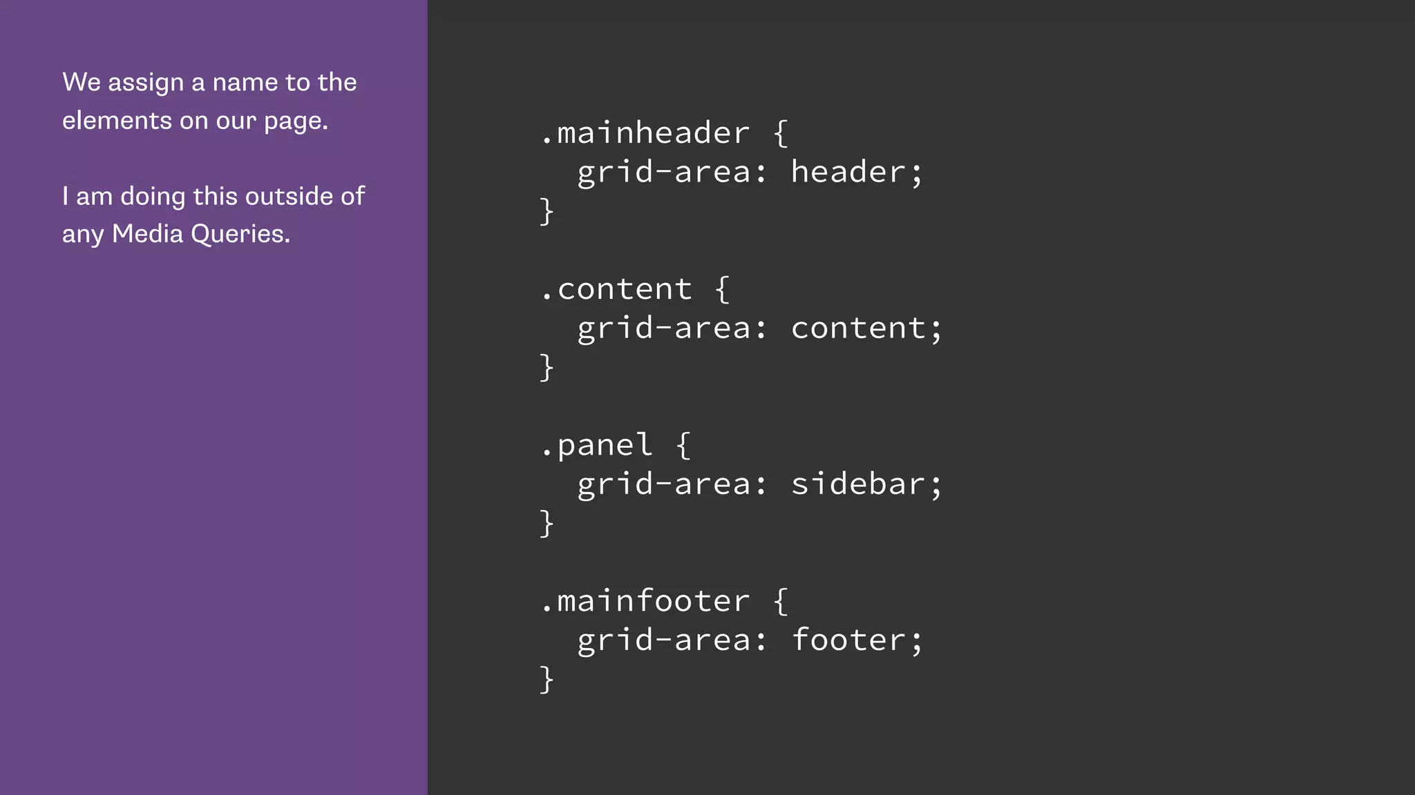
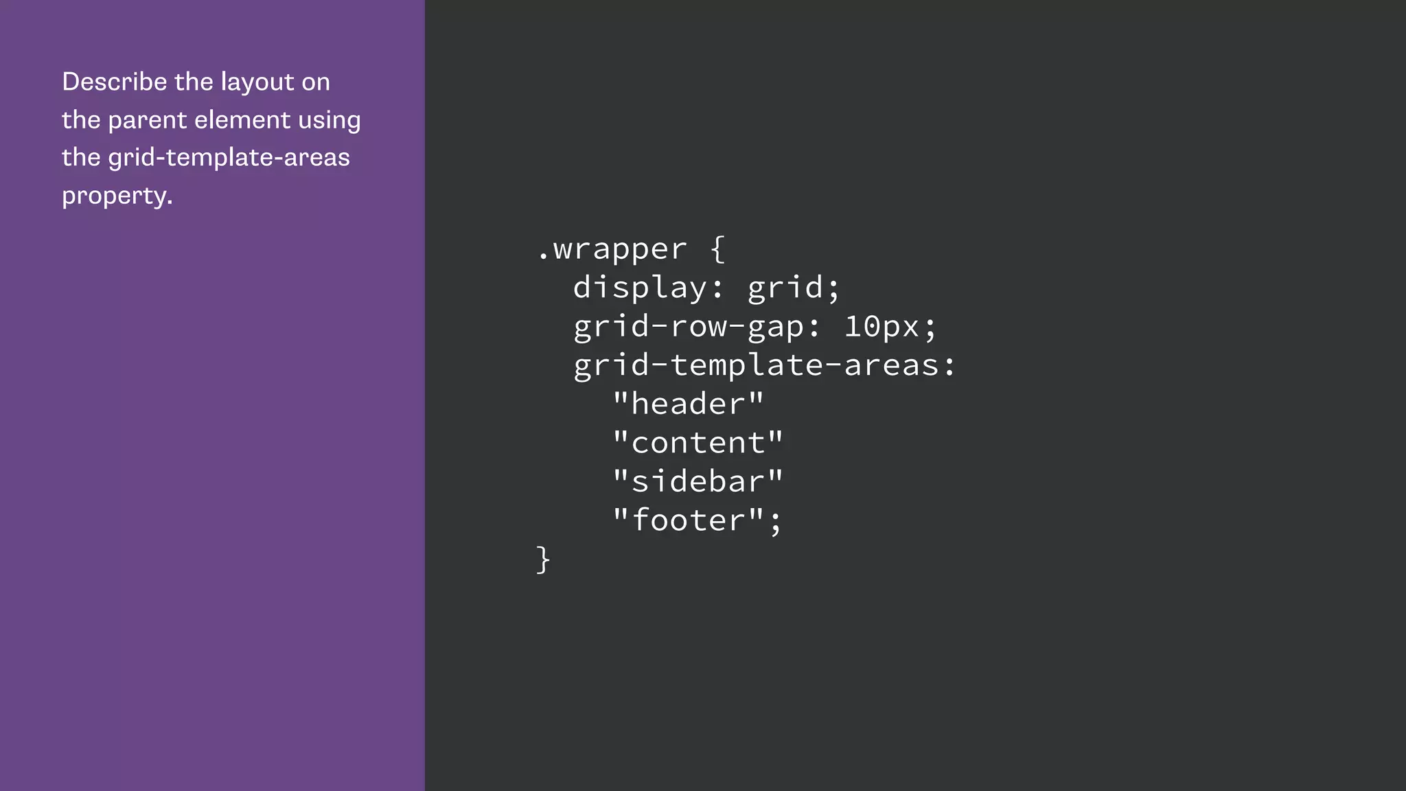
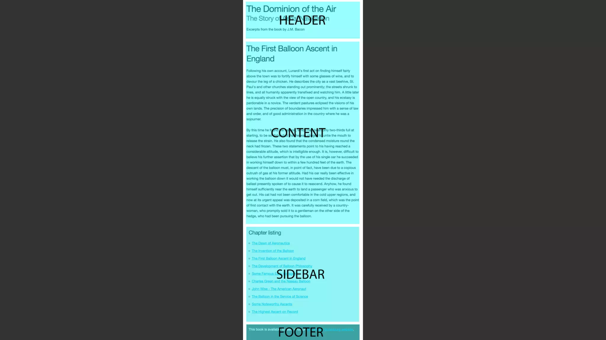
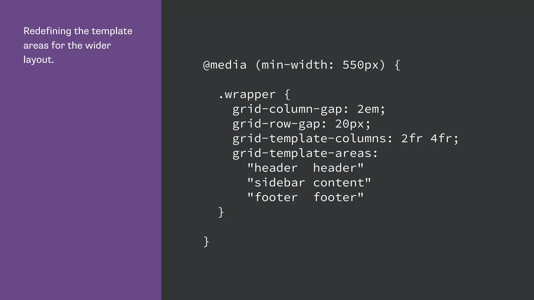
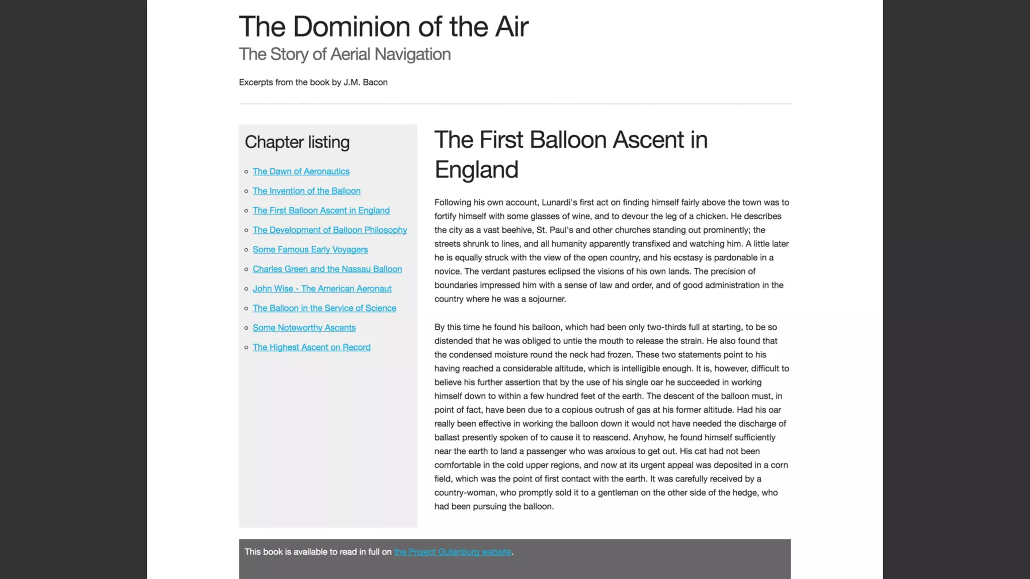
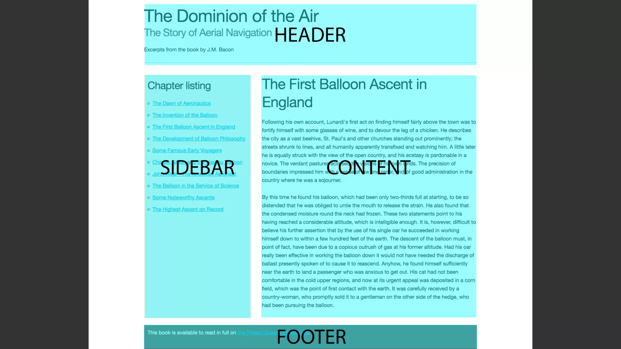
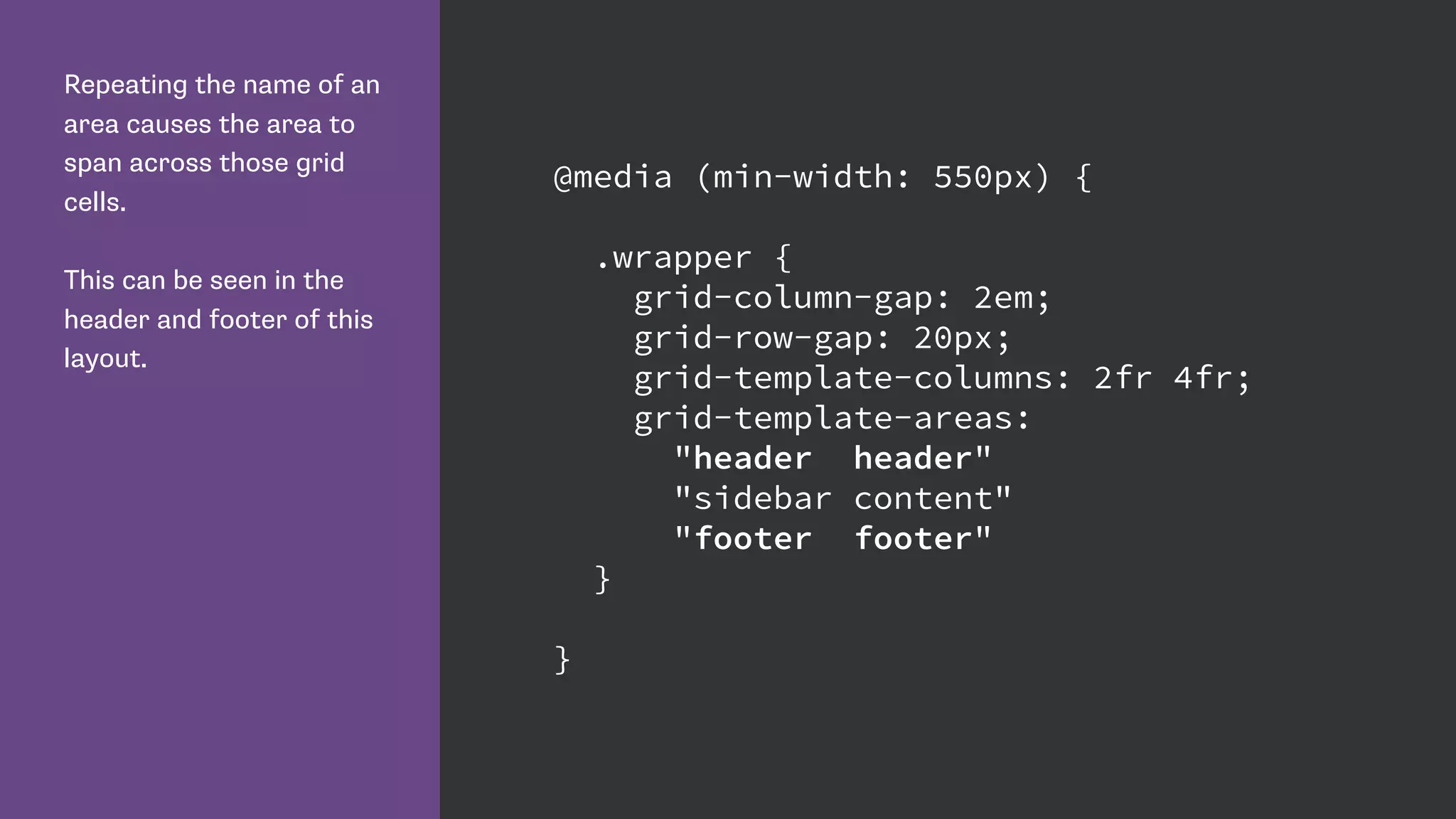
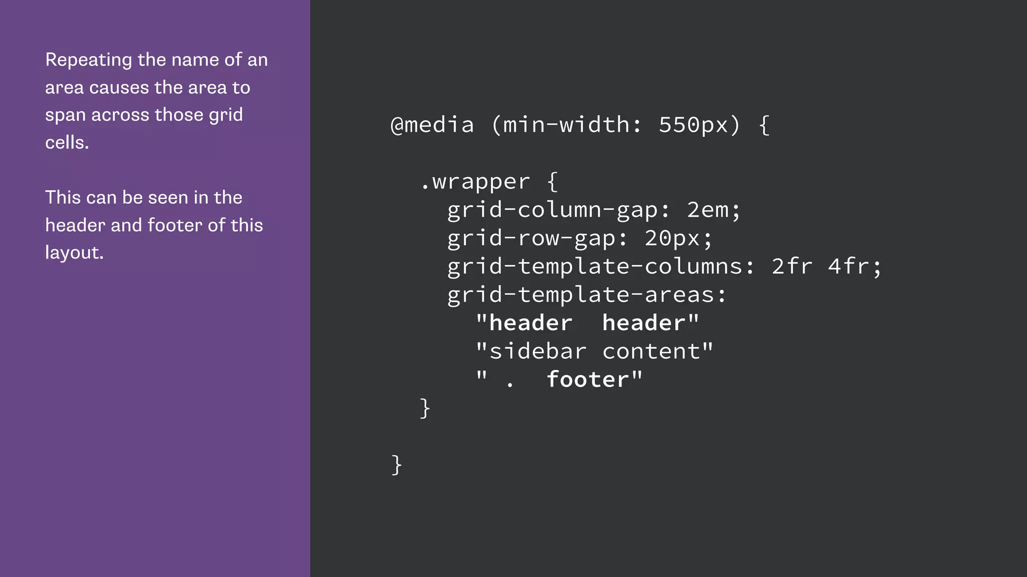
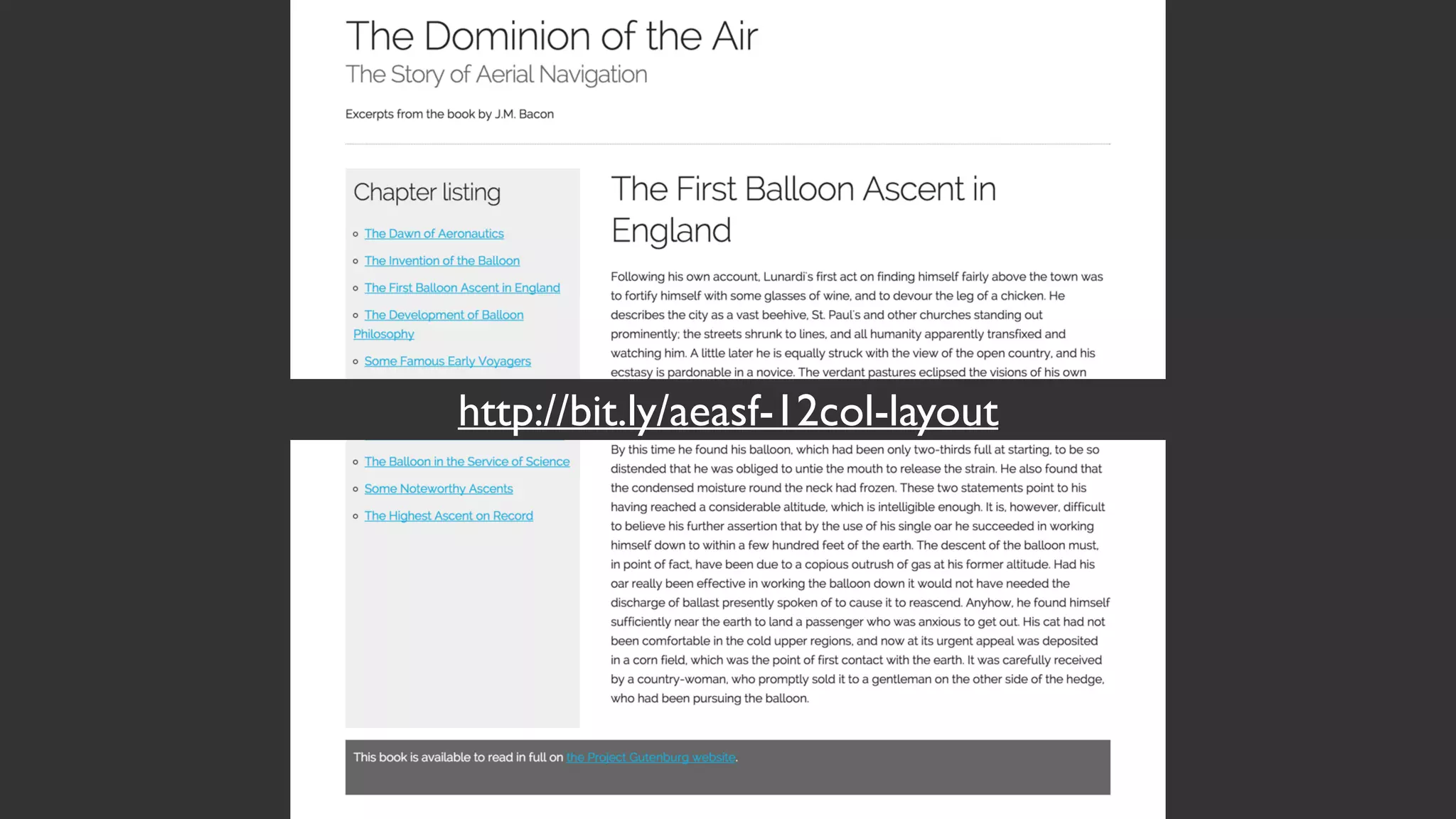
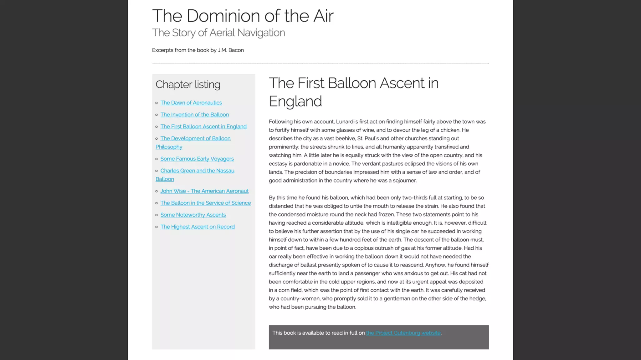
Describes how to define grid areas and layout for responsive design, including media queries for different screen widths.
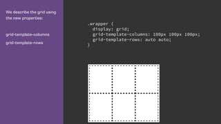
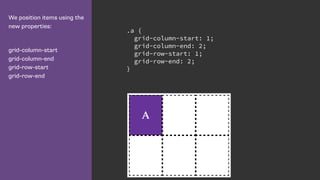
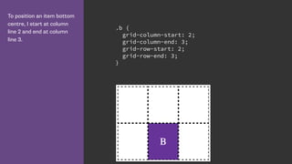
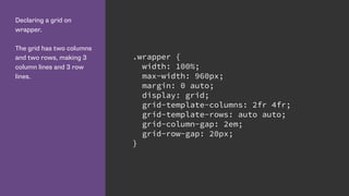
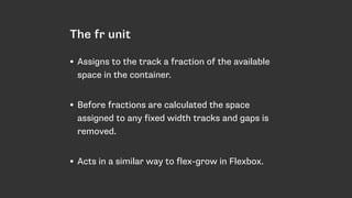
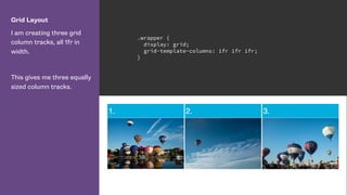
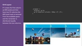
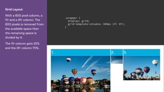
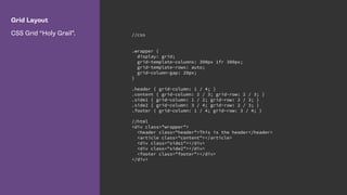
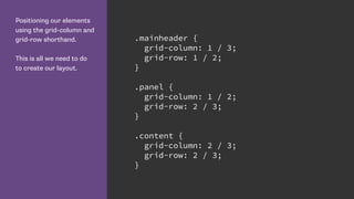
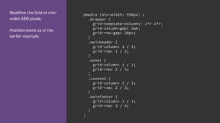
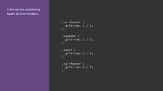
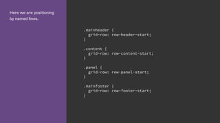
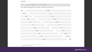
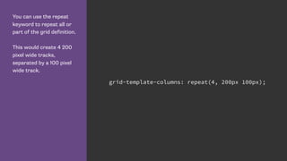
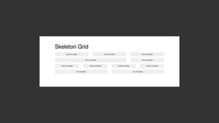
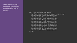
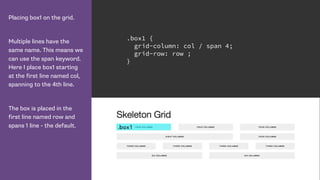
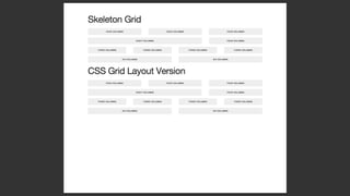
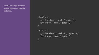
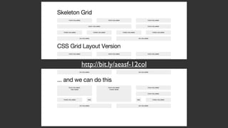
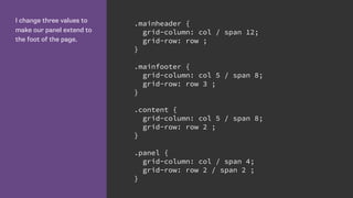
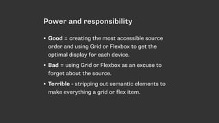
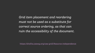
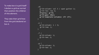
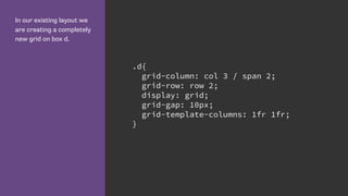
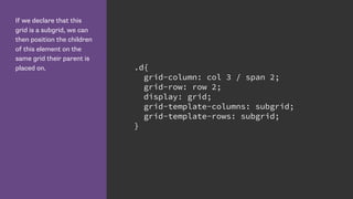
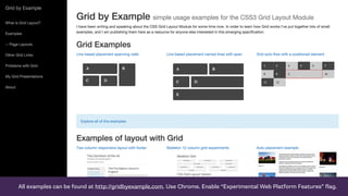
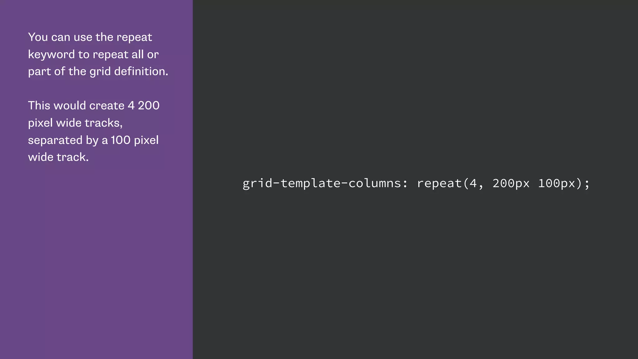
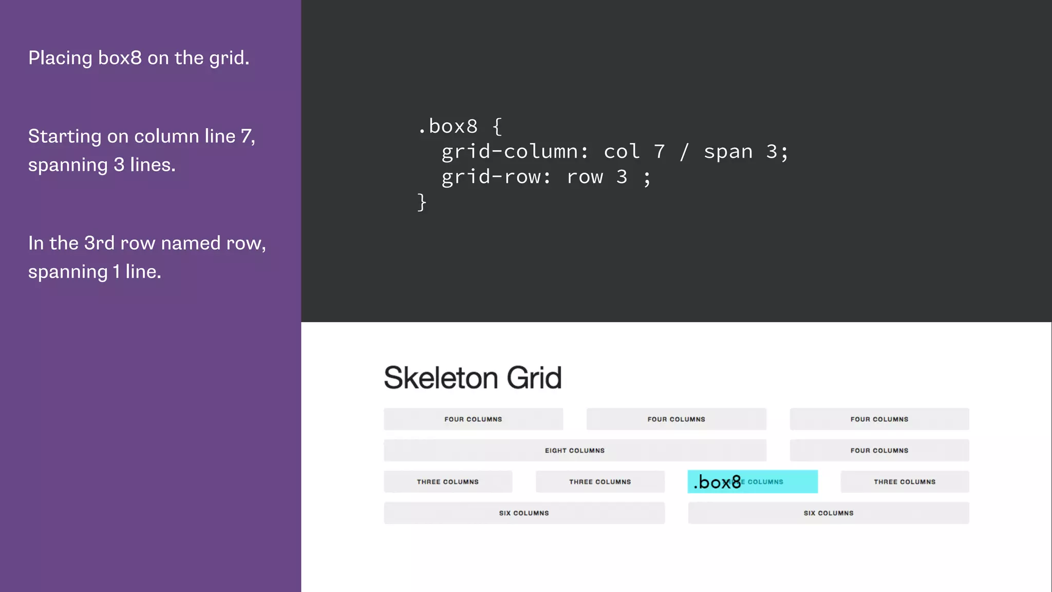
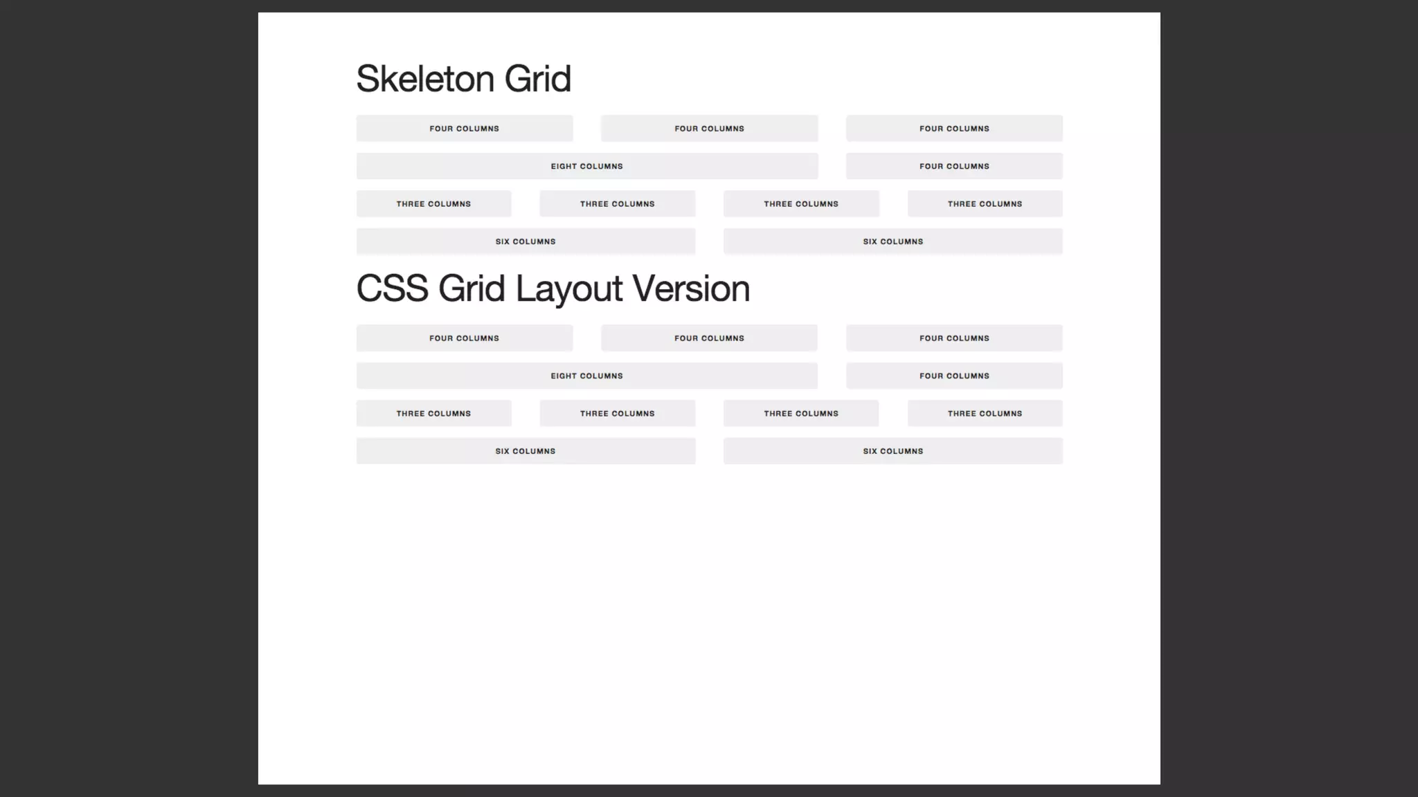
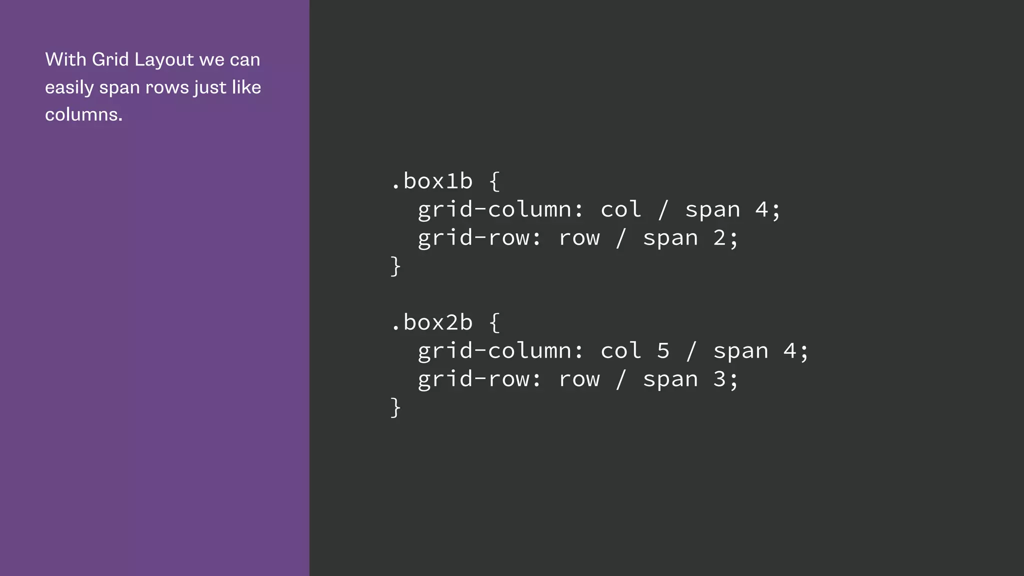
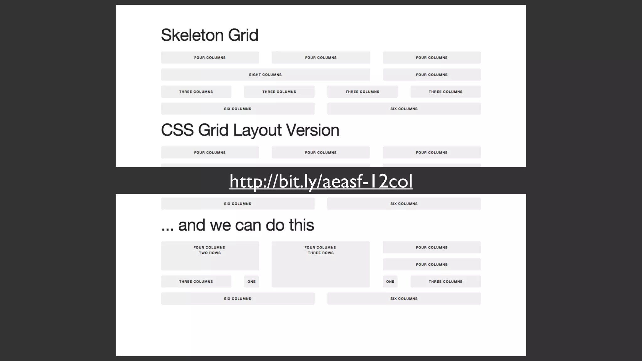
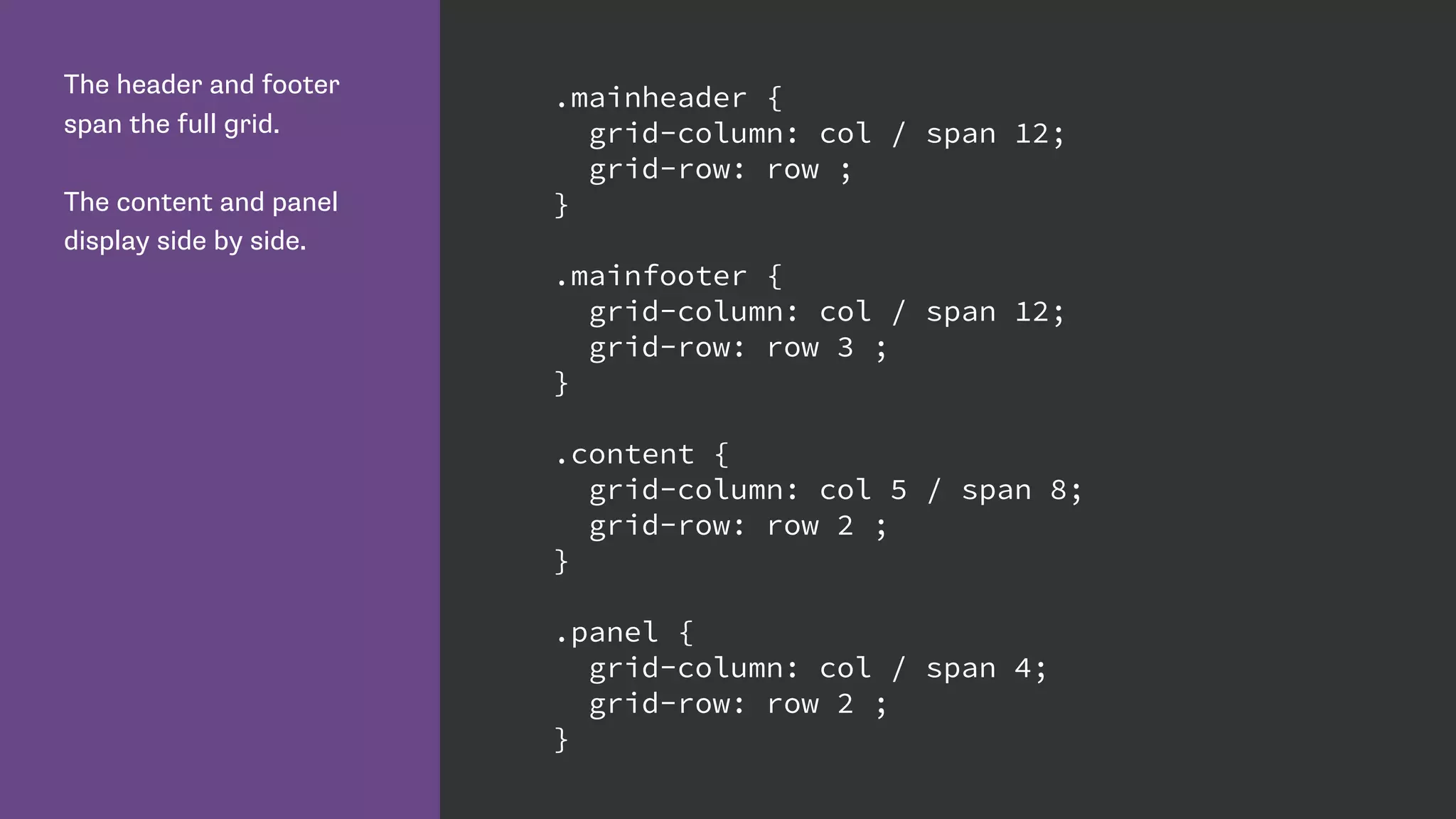
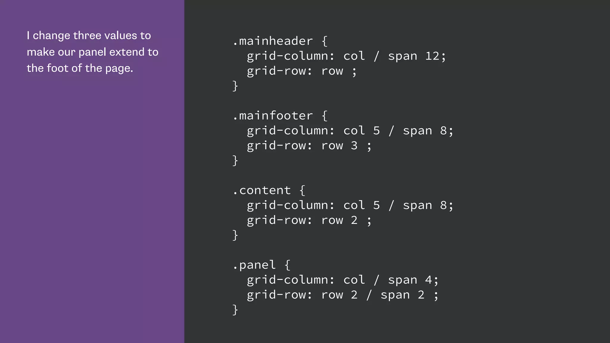
Explains named grid lines, areas, and how to use repeat and span properties for efficient grid definitions.
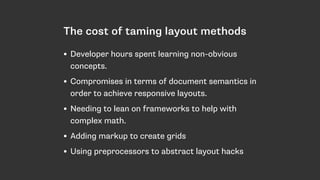
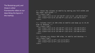
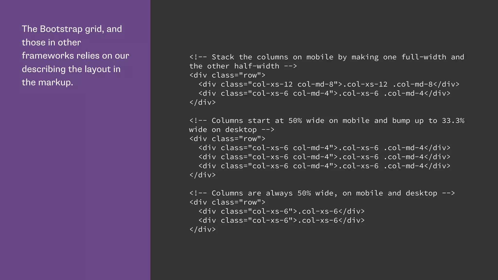
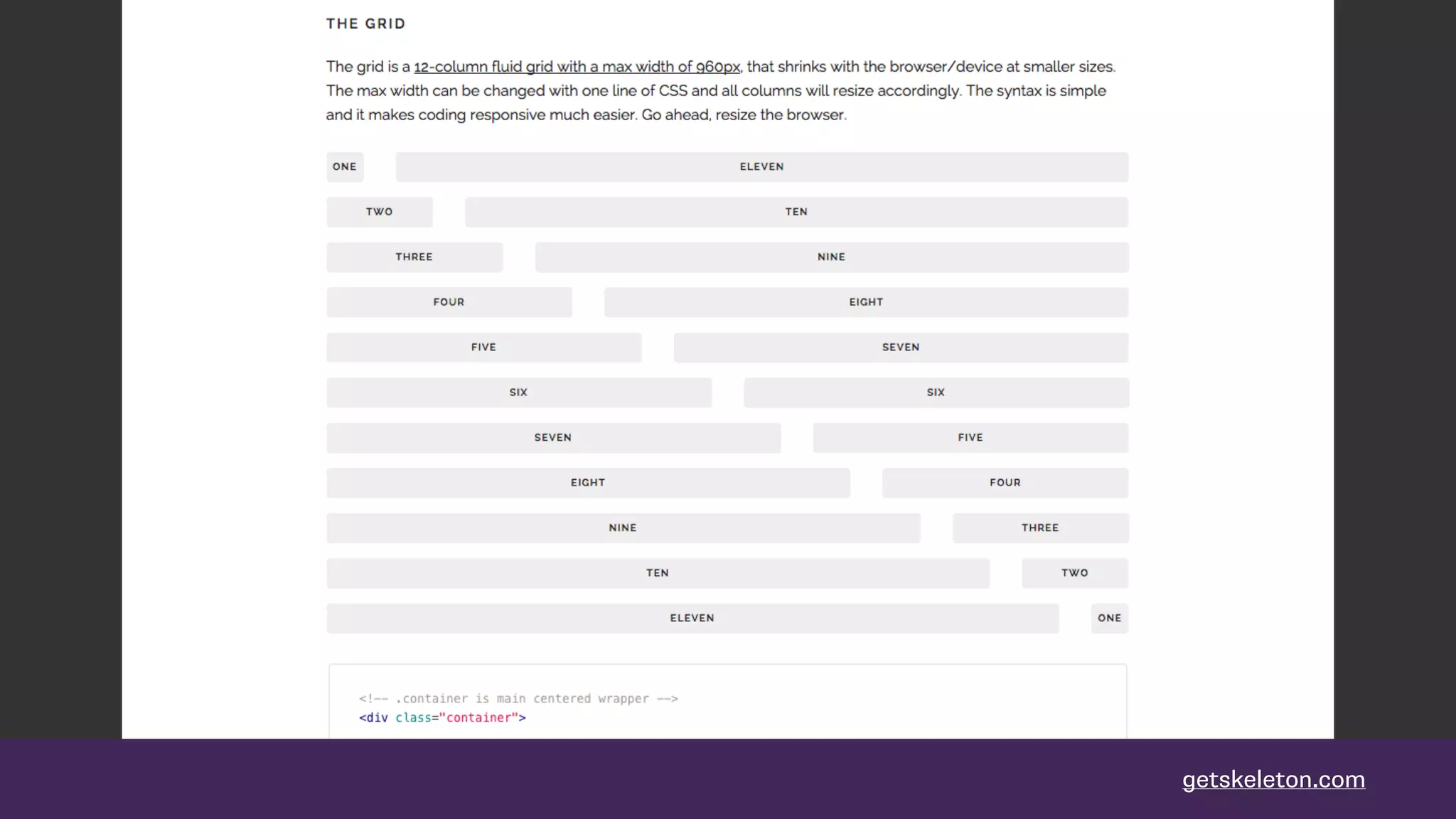
Comparison of CSS Grid with traditional frameworks like Bootstrap, highlights grid's flexibility and markup-less design.
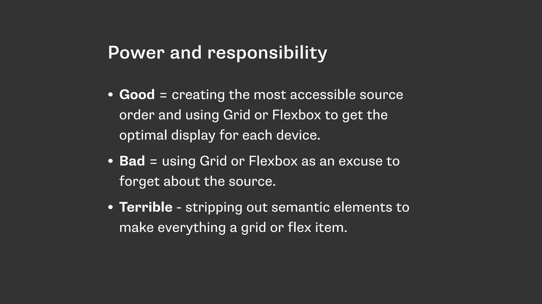
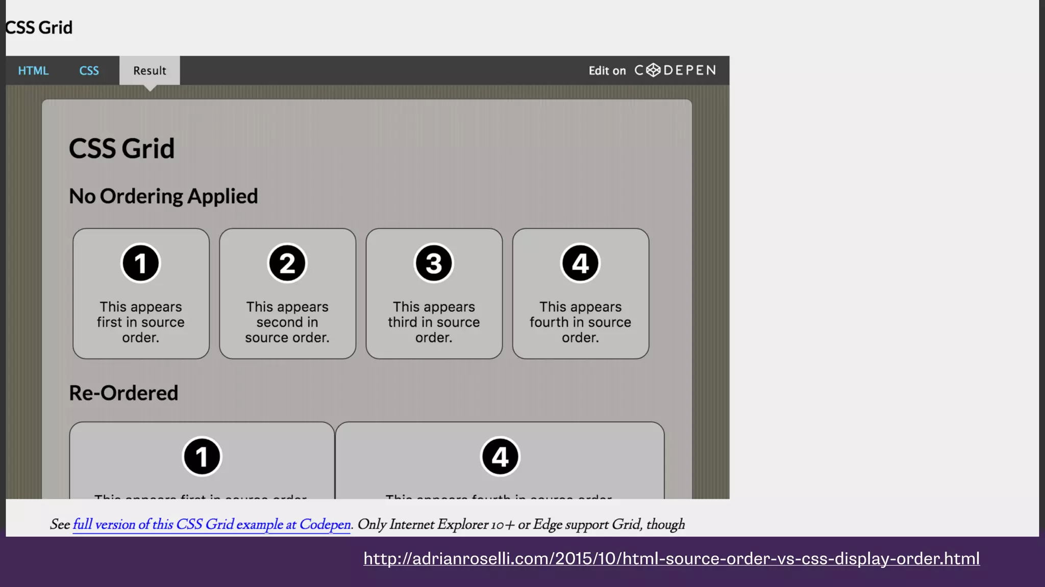
Importance of accessibility in grid layouts; emphasizes maintaining semantic structure alongside powerful layout capabilities.
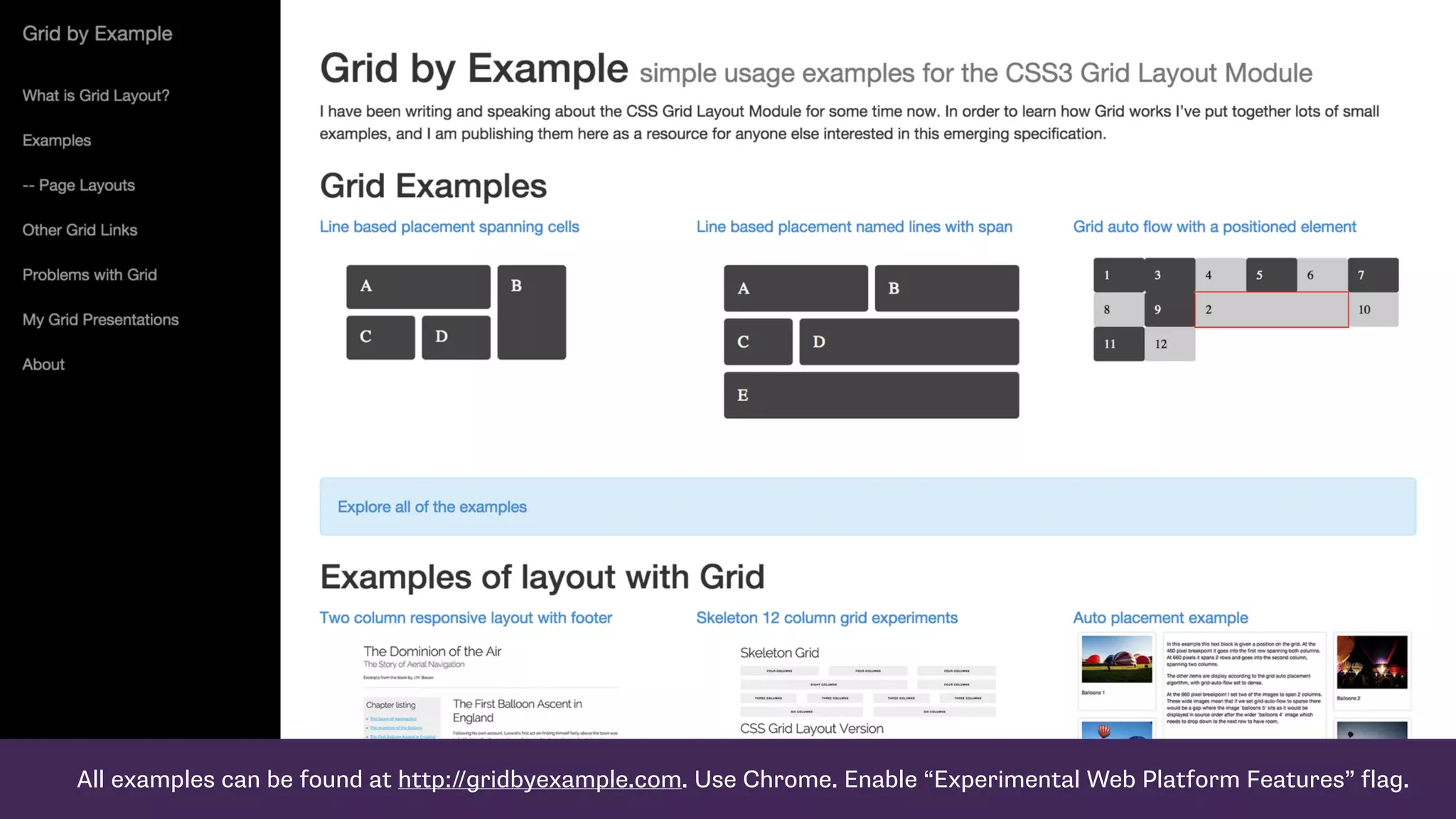
Closes with thanks, offers resources and links for further exploration of CSS Grid and ongoing support from browser developers.


![[Spring Camp 2018] 11번가 Spring Cloud 기반 MSA로의 전환 : 지난 1년간의 이야기](https://cdn.slidesharecdn.com/ss_thumbnails/201804springcamp11stmsafinalpubslideshare-180527051608-thumbnail.jpg?width=600ounds&width=560&fit=bounds)


