Download as PDF, PPTX


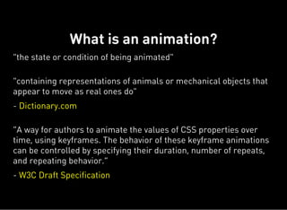
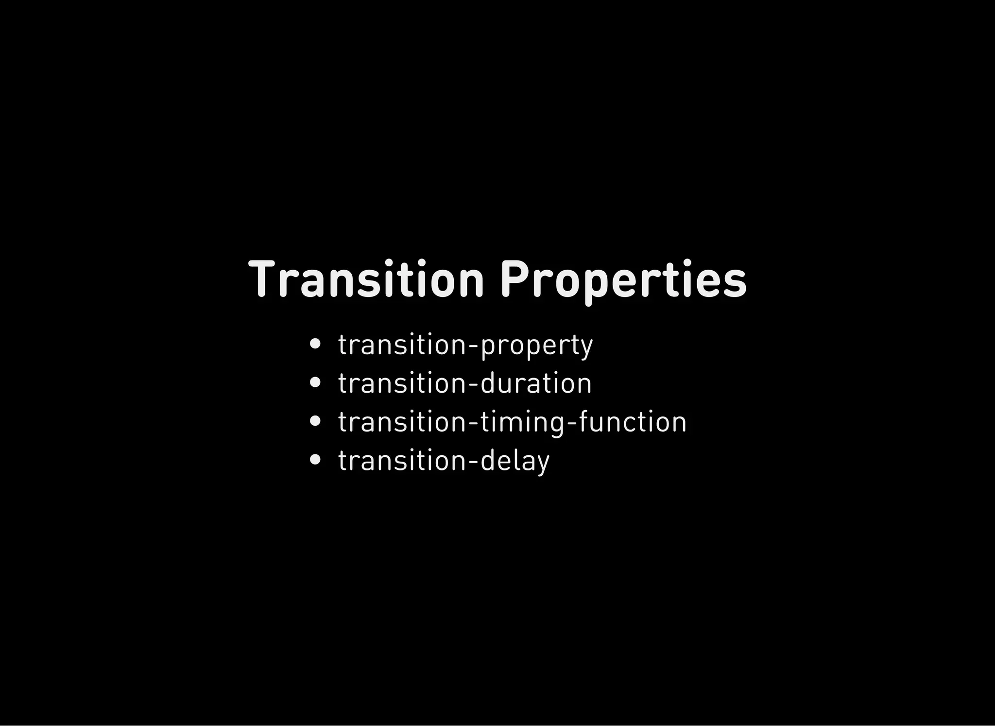
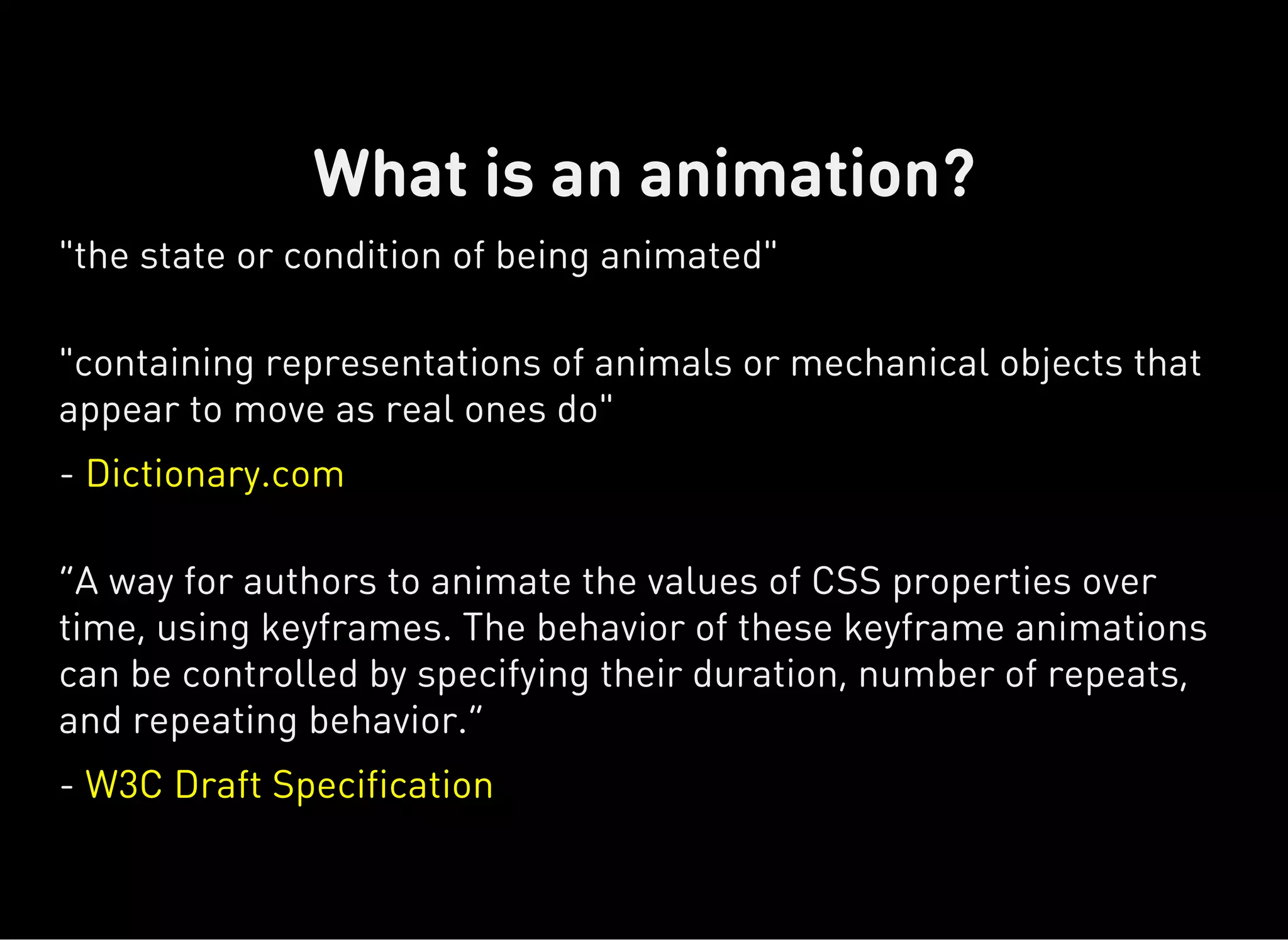
!["movement, passage, or change from one position, state, stage,
subject, concept, etc., to another; change"
- Dictionary.com
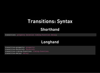
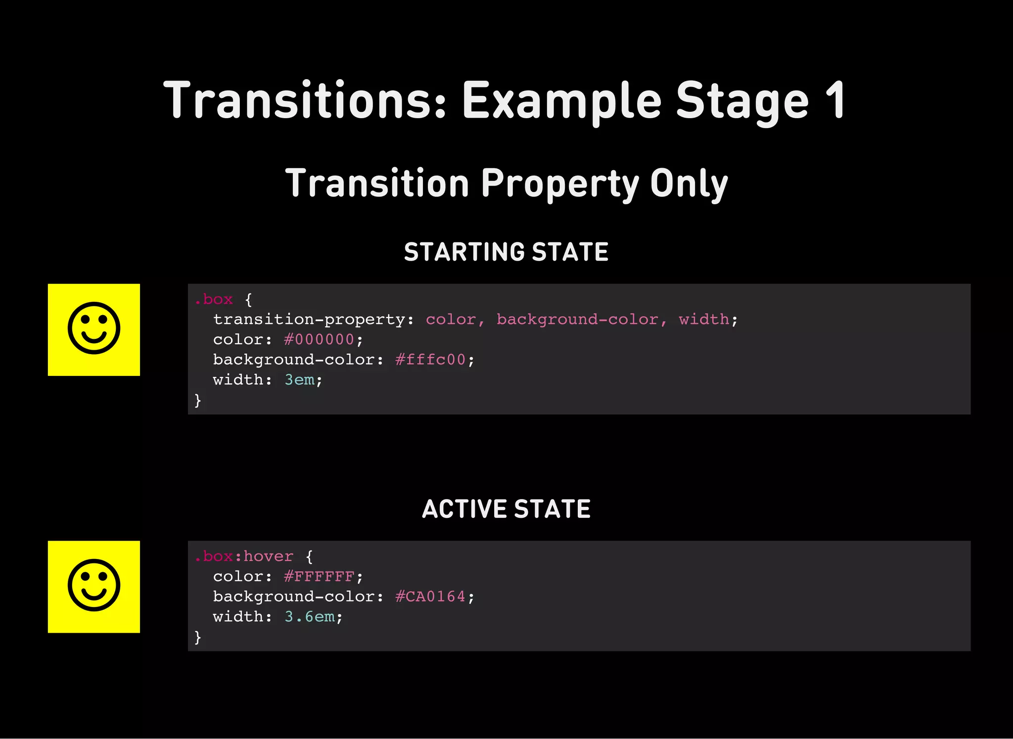
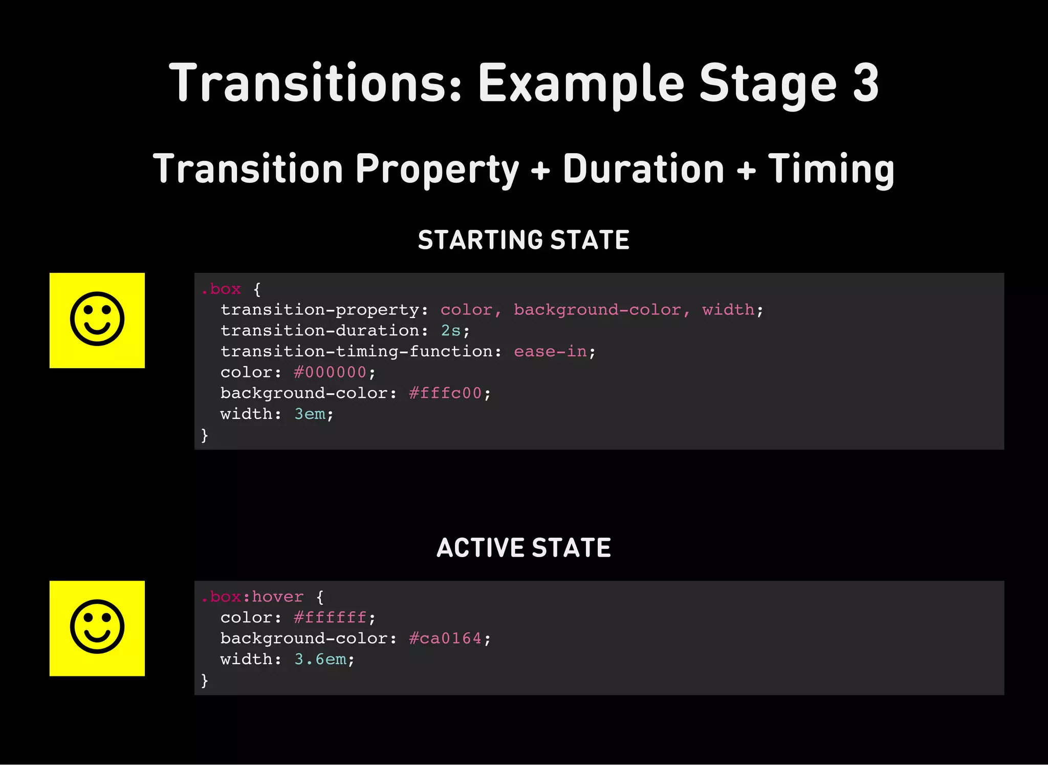
“The transition property is a shorthand property used to represent
up to four transition-related longhand properties [that] allow
elements to change values over a specified duration, animating the
property changes, rather than having them occur immediately.”
- CSS Tricks
What is a transition?](https://image.slidesharecdn.com/dynamic-css-151204162052-lva1-app6891/85/Dynamic-CSS-Transforms-Transitions-and-Animation-Basics-23-320.jpg)


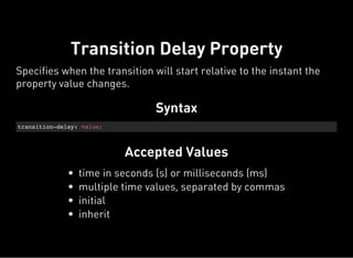

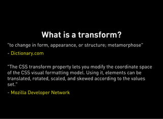
![Syntax
animation-name: [custom-value];
Accepted values
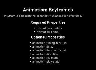
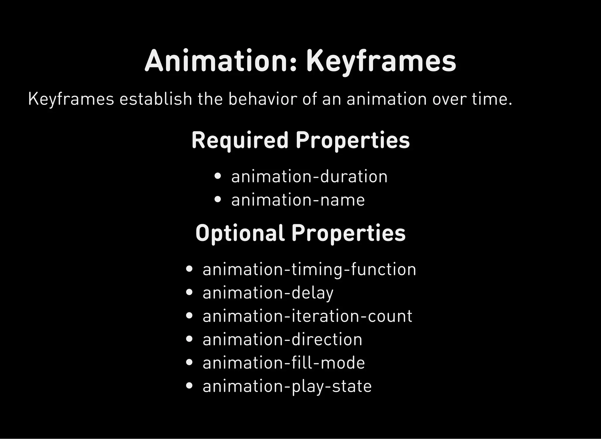
Animations: Animation Name Property
Specifies the animation/s that should be applied to the CSS
element.
Custom string with no spaces](https://image.slidesharecdn.com/dynamic-css-151204162052-lva1-app6891/85/Dynamic-CSS-Transforms-Transitions-and-Animation-Basics-38-320.jpg)


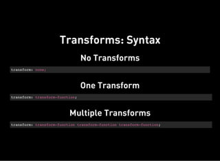
!["movement, passage, or change from one position, state, stage,
subject, concept, etc., to another; change"
- Dictionary.com
“The transition property is a shorthand property used to represent
up to four transition-related longhand properties [that] allow
elements to change values over a specified duration, animating the
property changes, rather than having them occur immediately.”
- CSS Tricks
What is a transition?](https://image.slidesharecdn.com/dynamic-css-151204162052-lva1-app6891/75/Dynamic-CSS-Transforms-Transitions-and-Animation-Basics-23-2048.jpg)


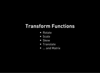
![Syntax
animation-name: [custom-value];
Accepted values
Animations: Animation Name Property
Specifies the animation/s that should be applied to the CSS
element.
Custom string with no spaces](https://image.slidesharecdn.com/dynamic-css-151204162052-lva1-app6891/75/Dynamic-CSS-Transforms-Transitions-and-Animation-Basics-38-2048.jpg)
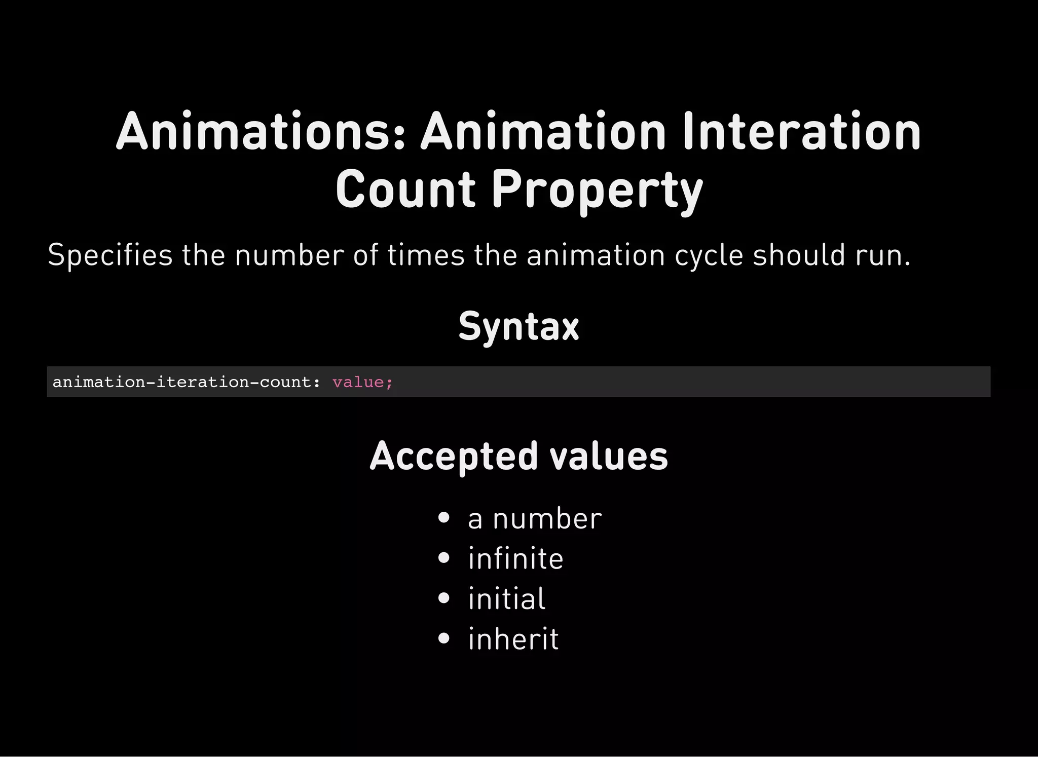
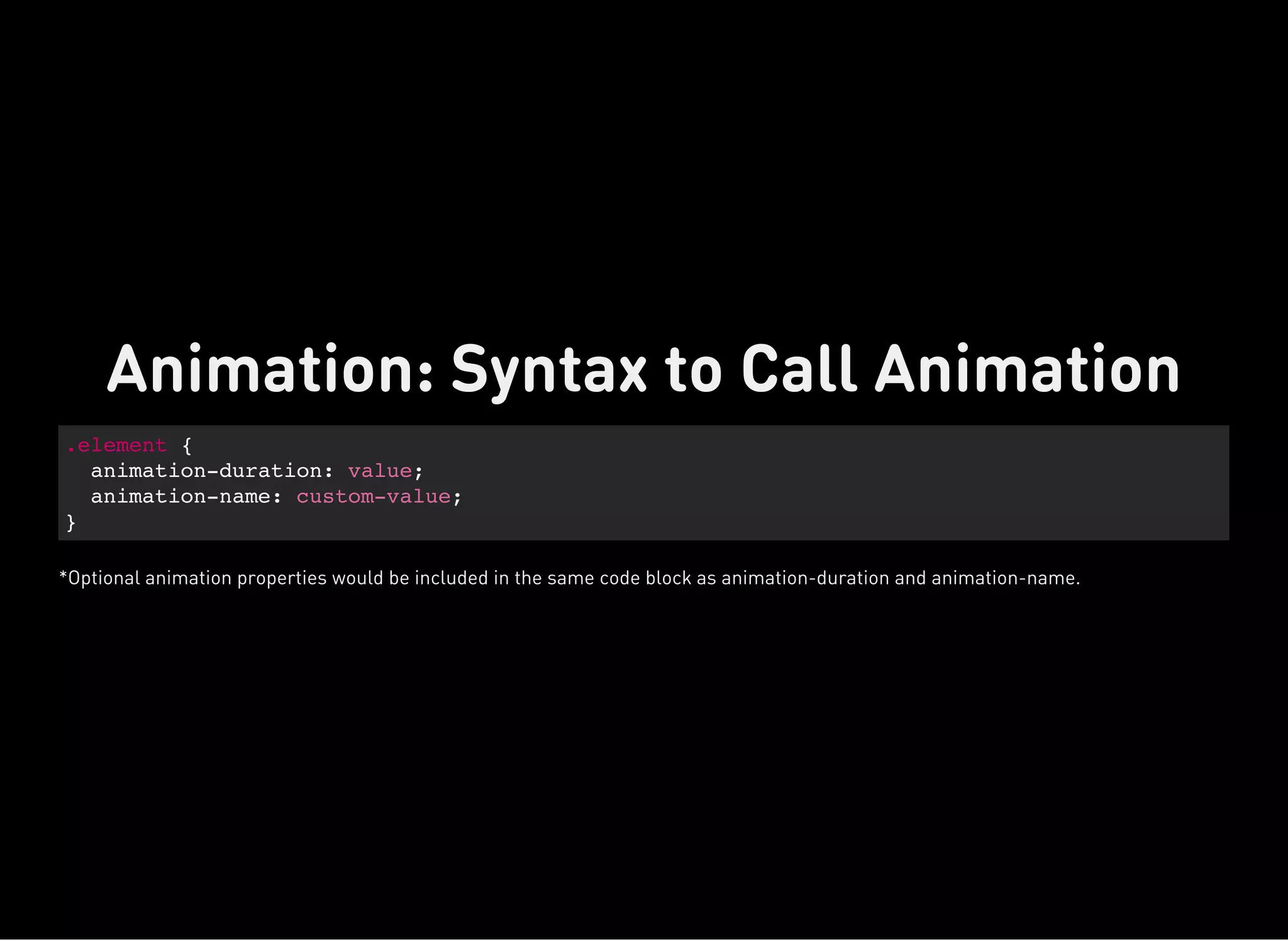
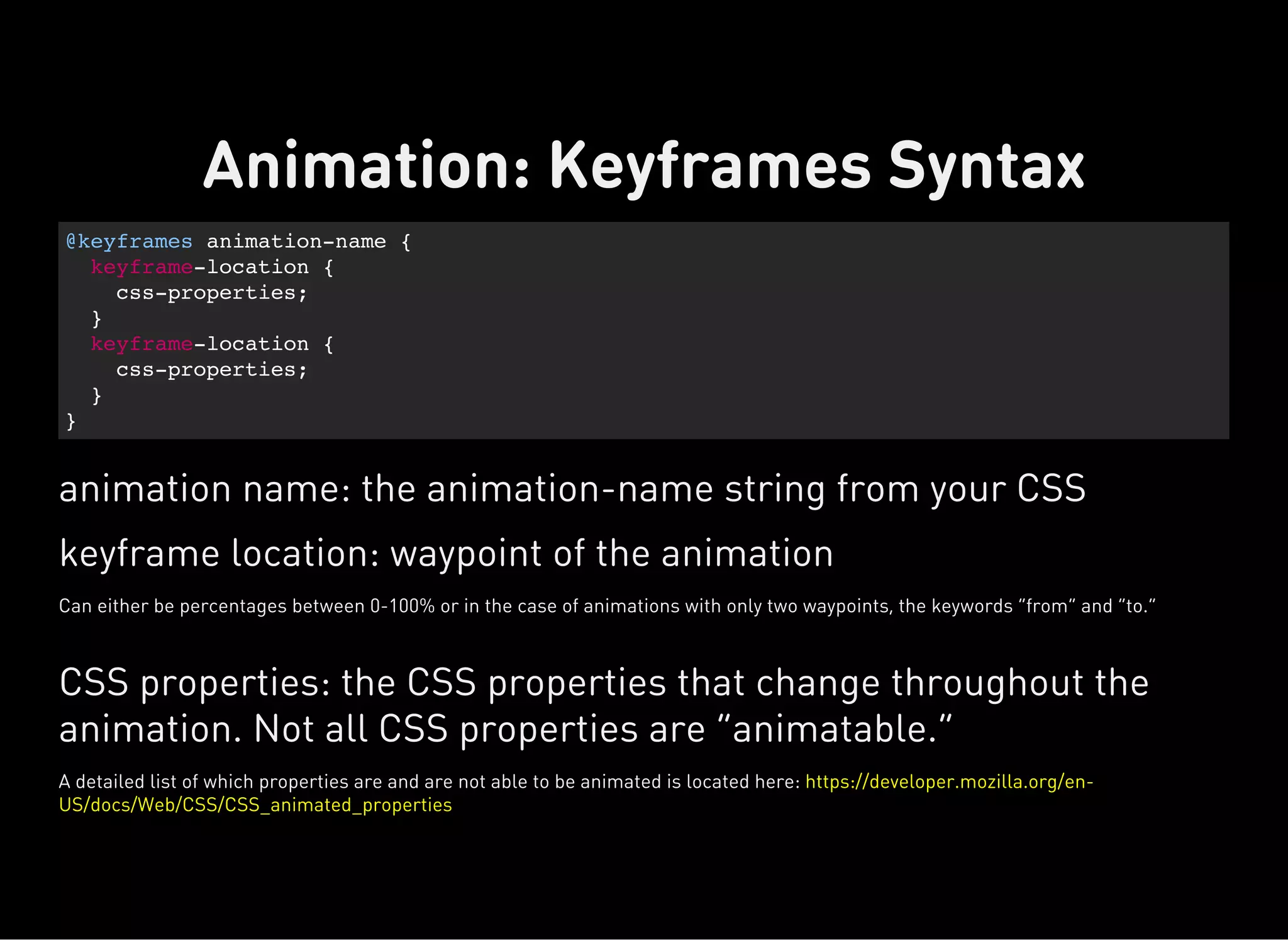


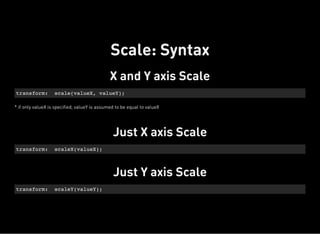
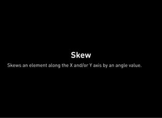
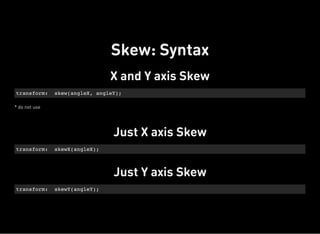
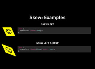
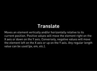
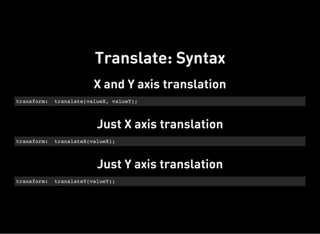
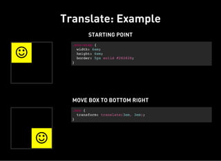
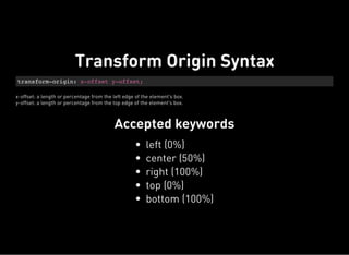
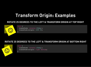
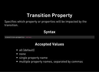
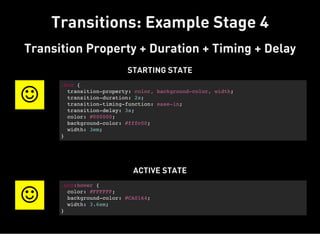
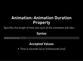
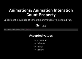
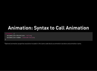
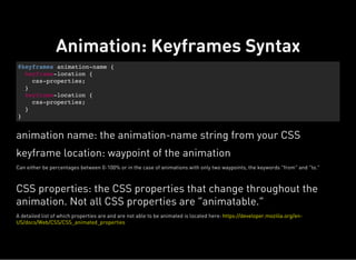
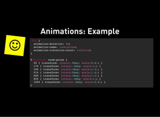
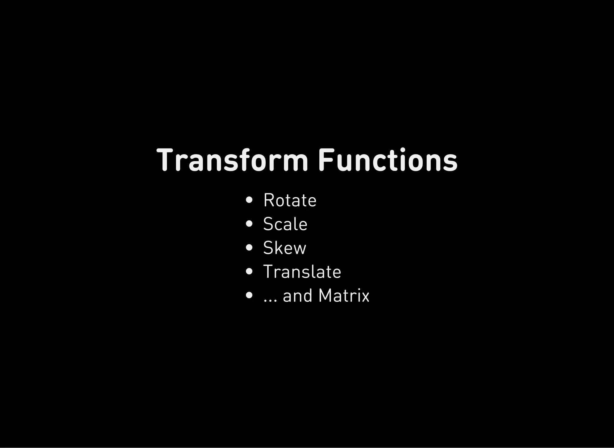
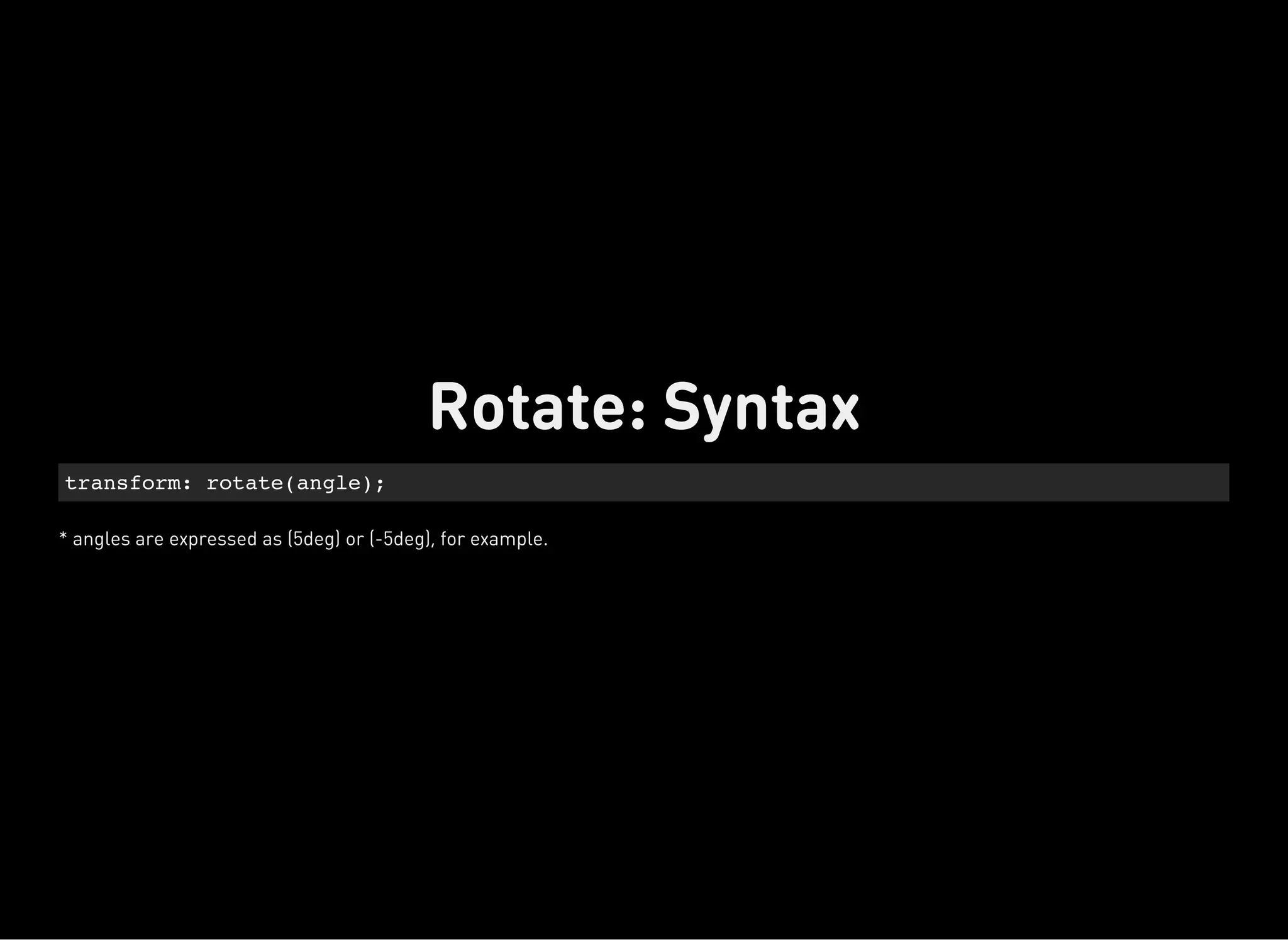
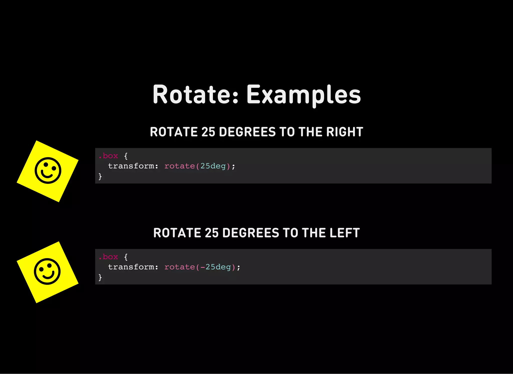
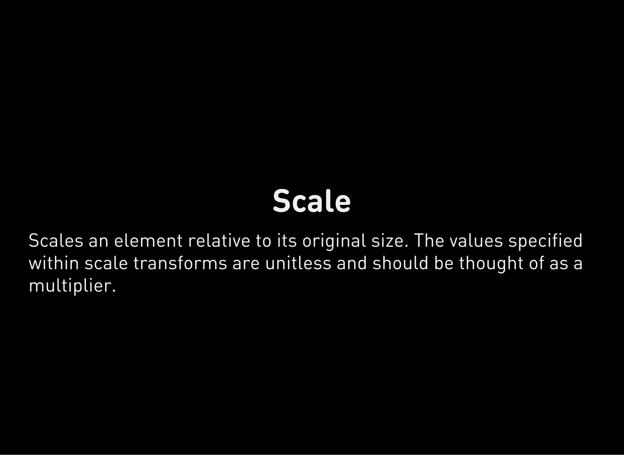
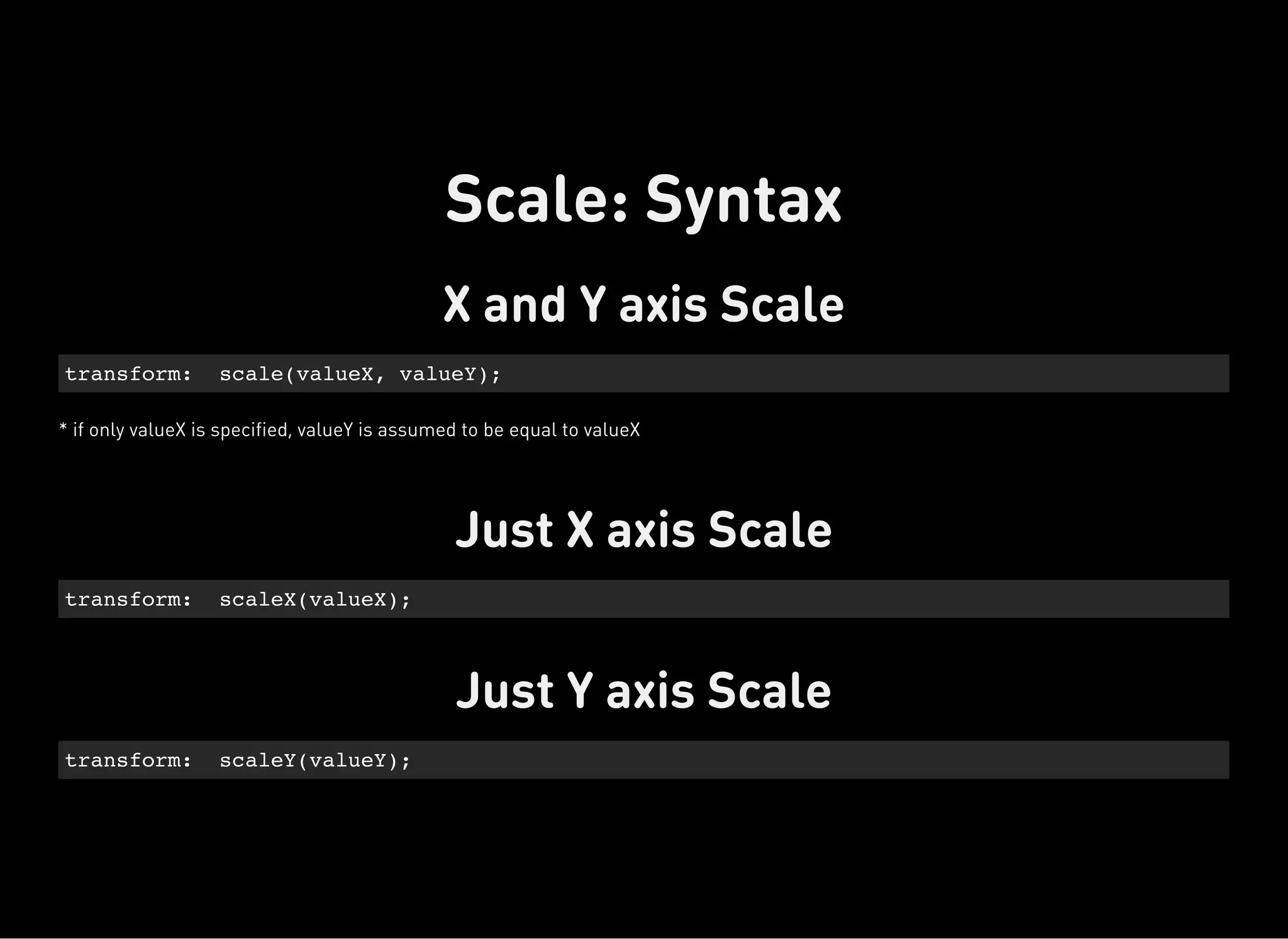
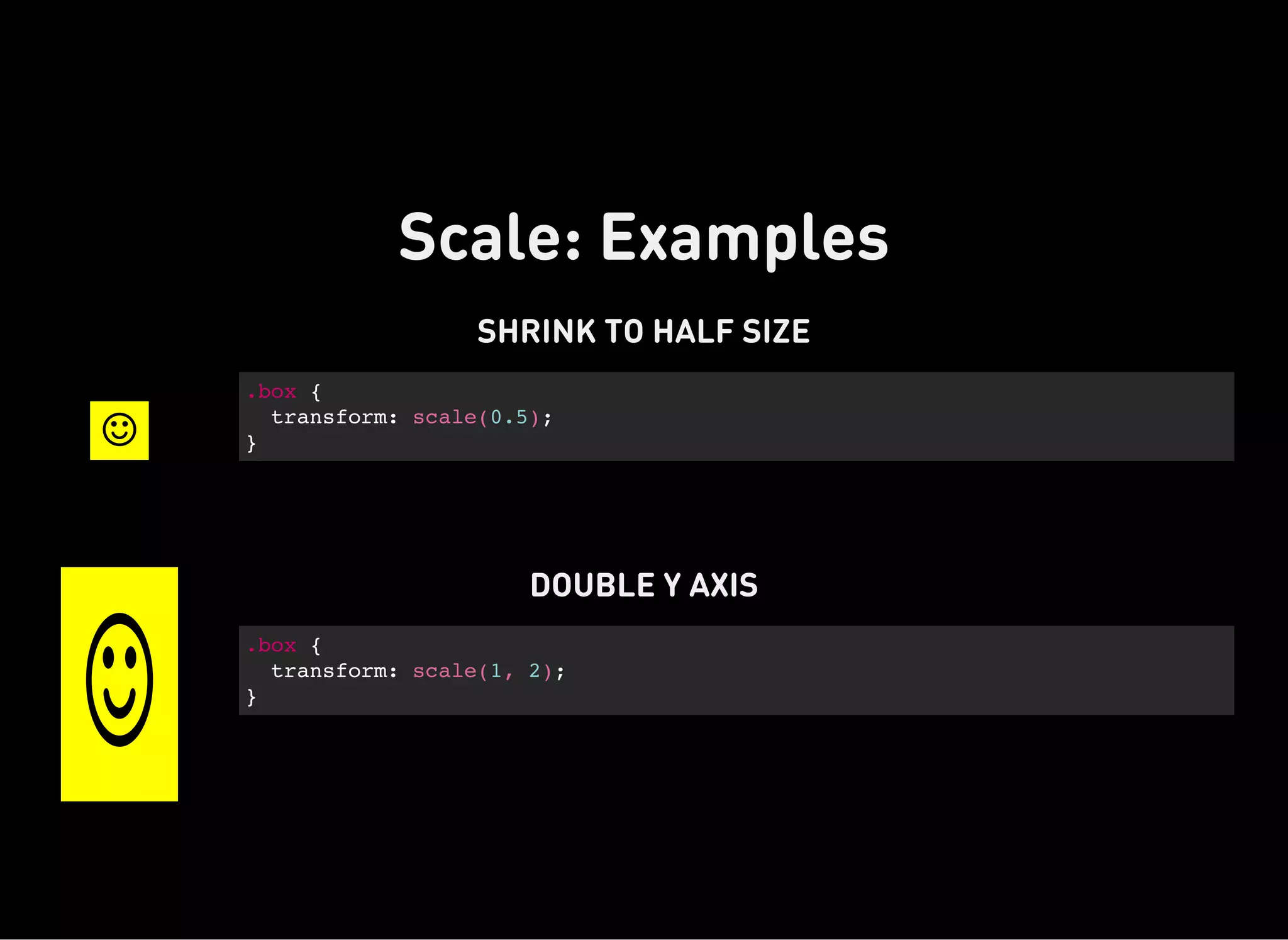
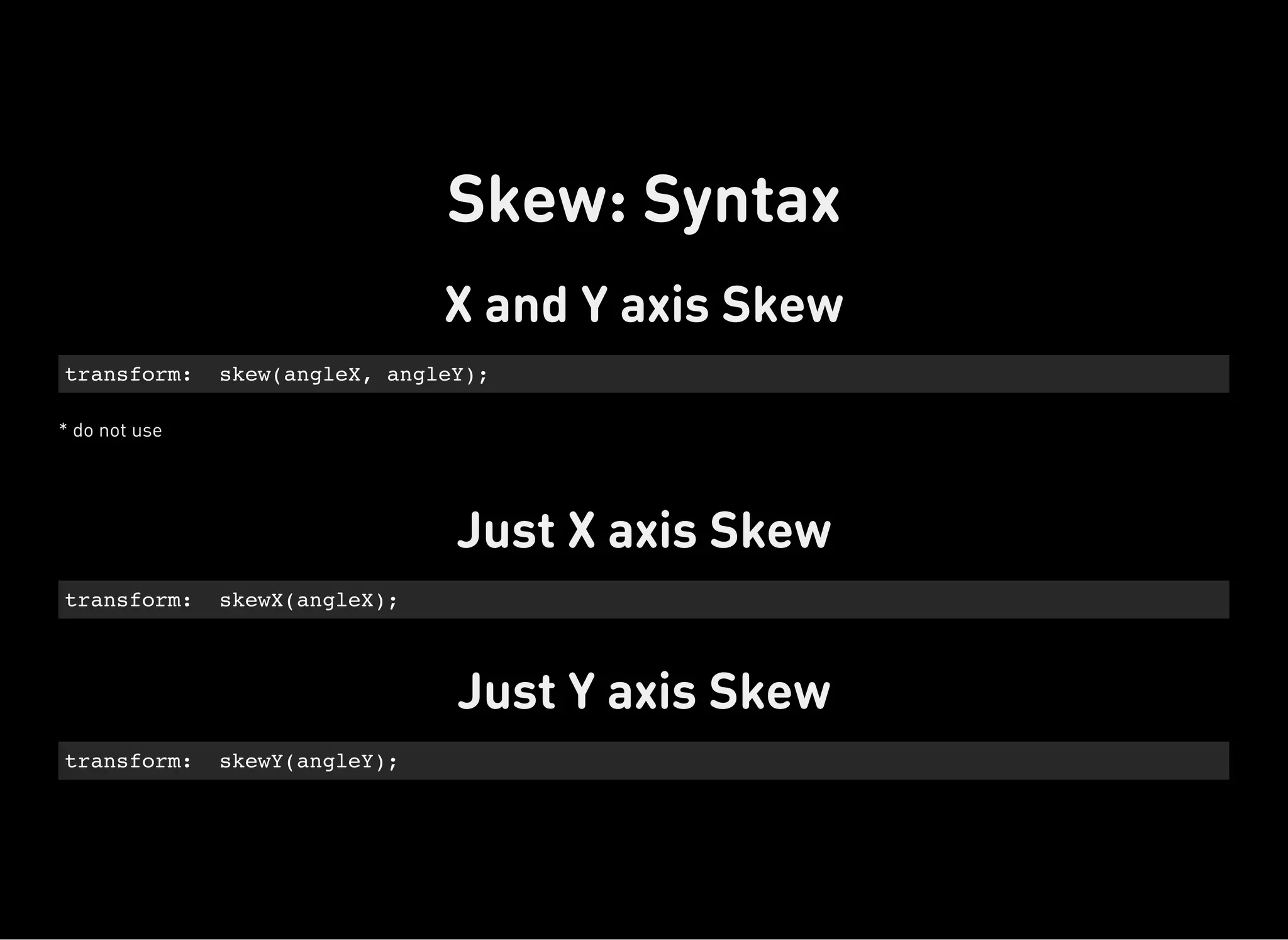
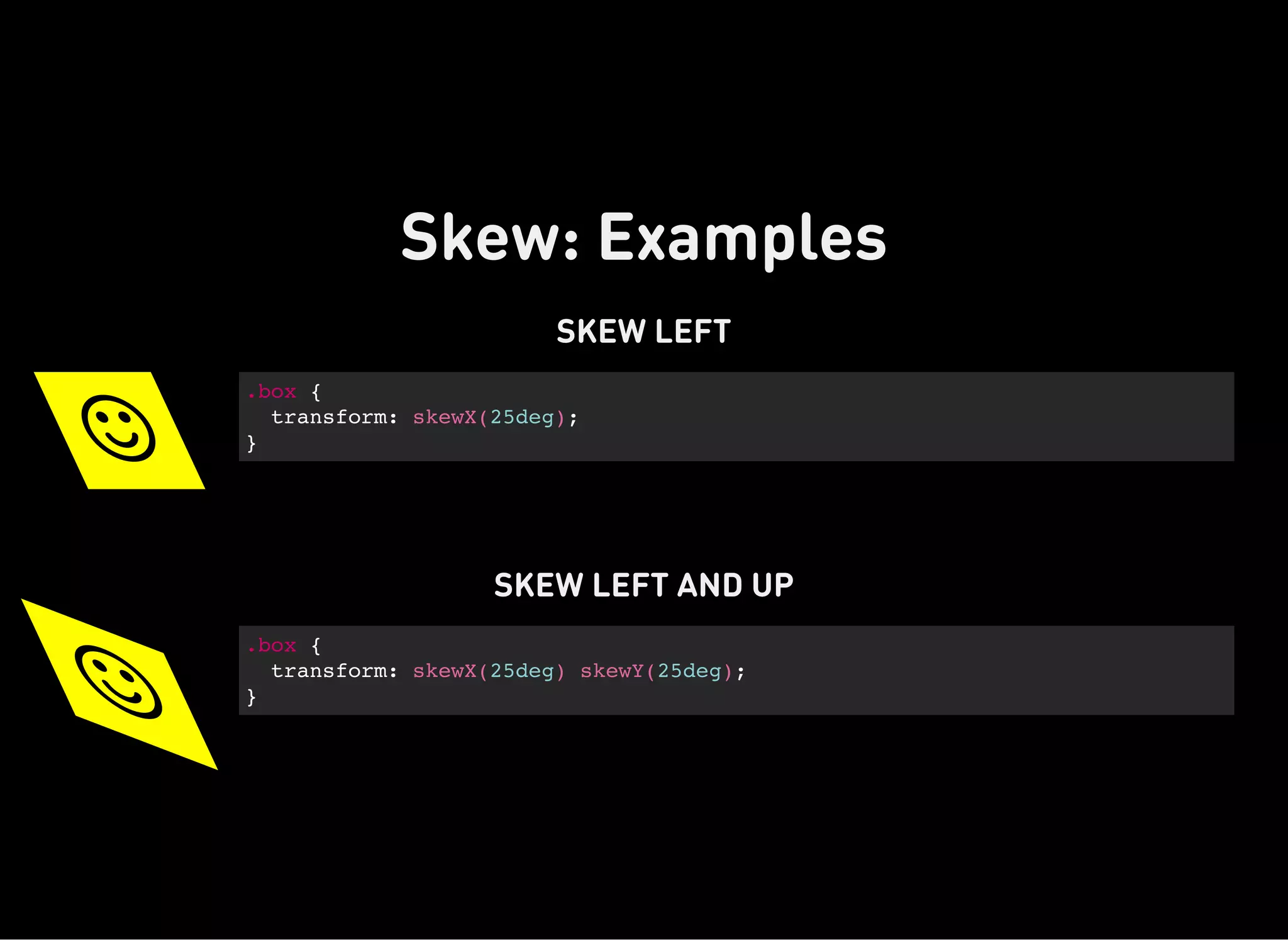
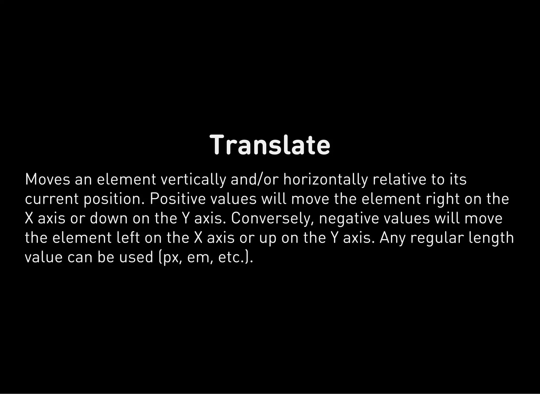
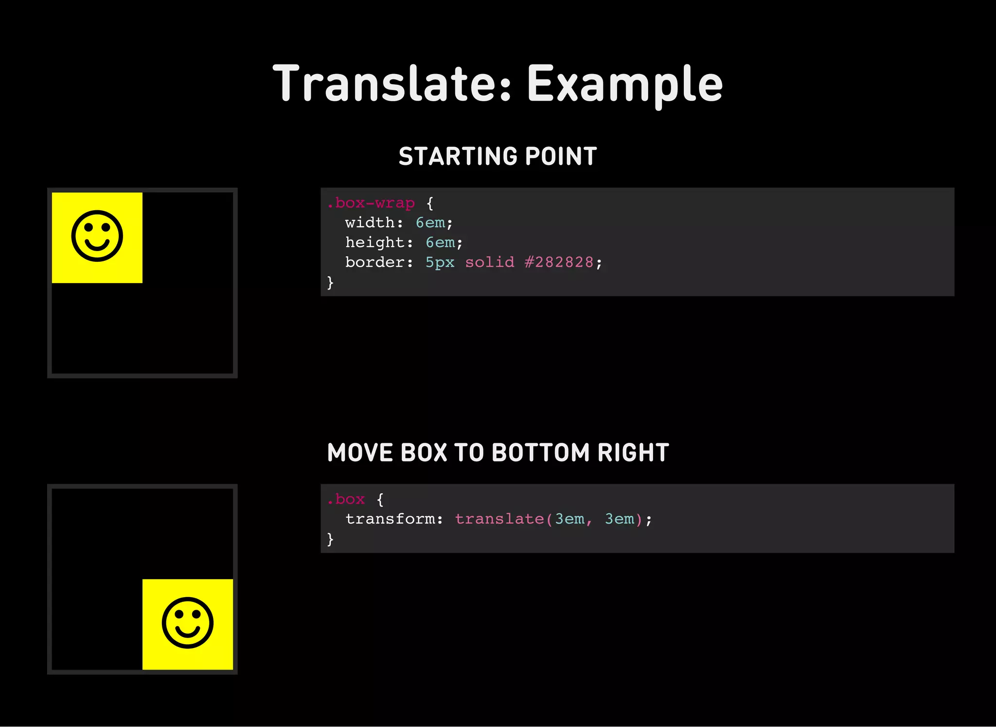
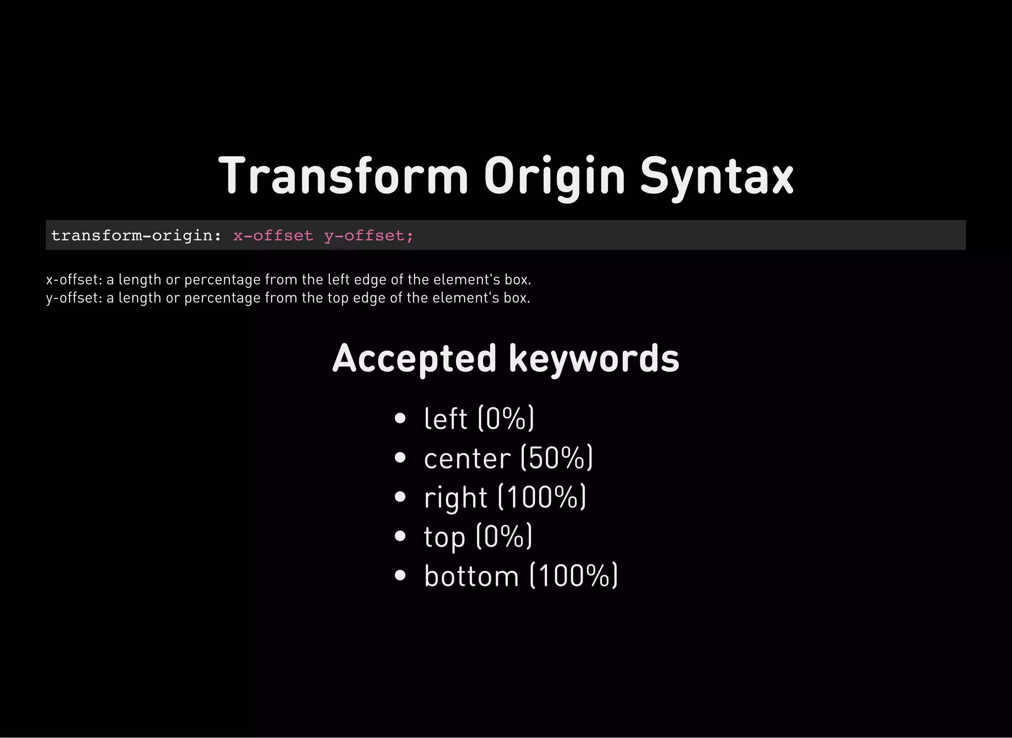
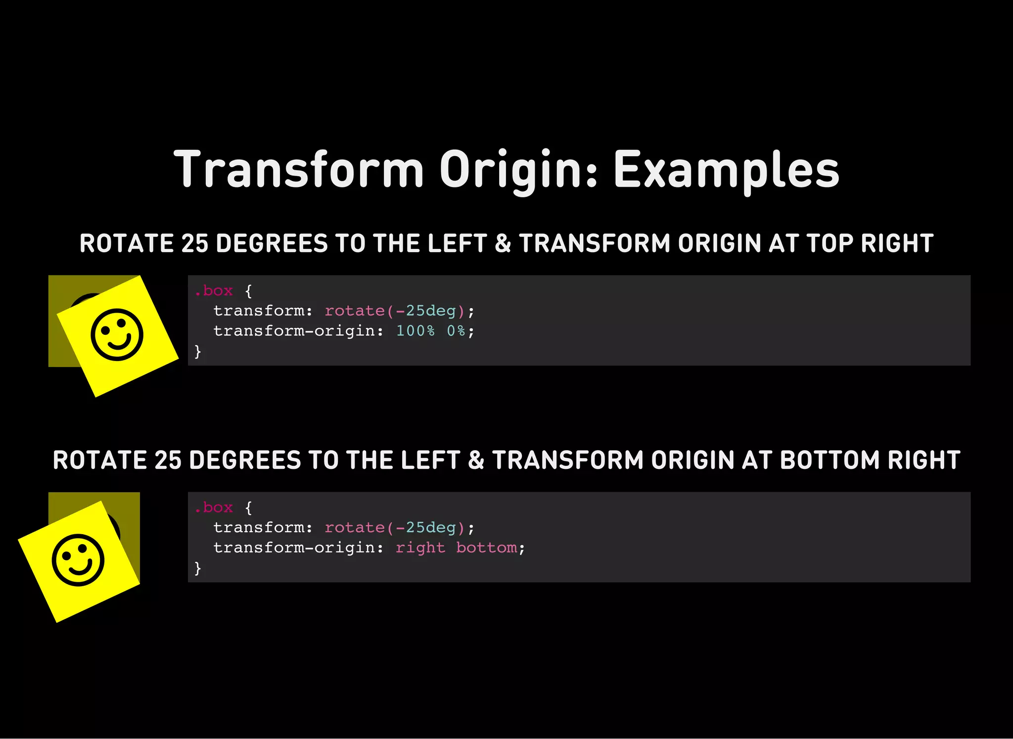
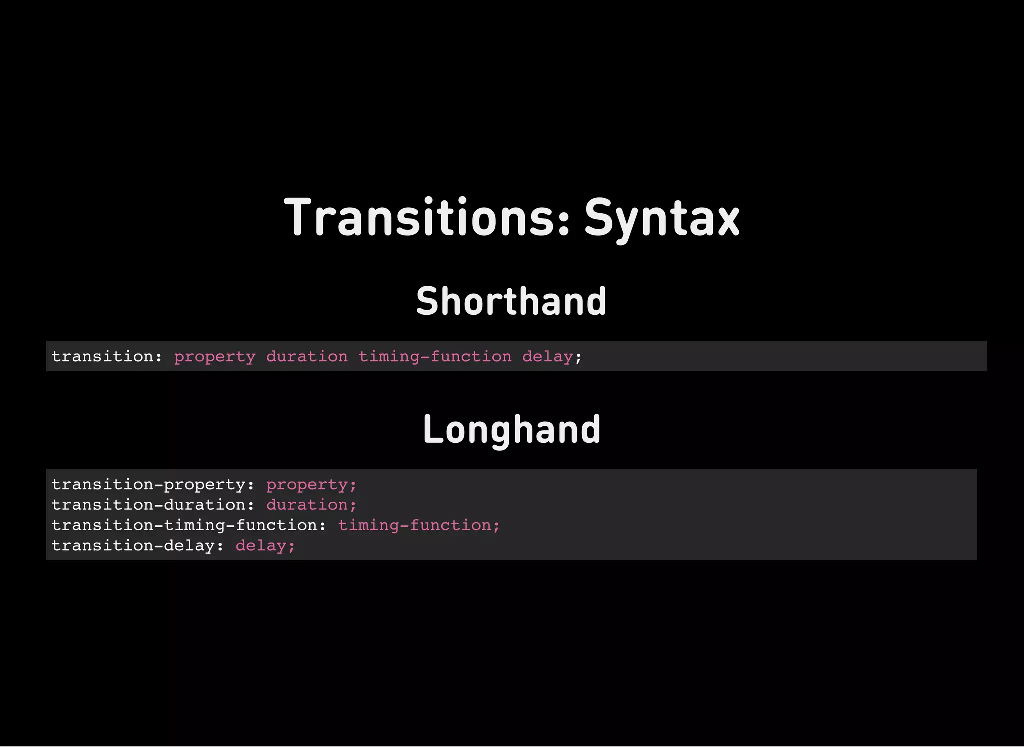
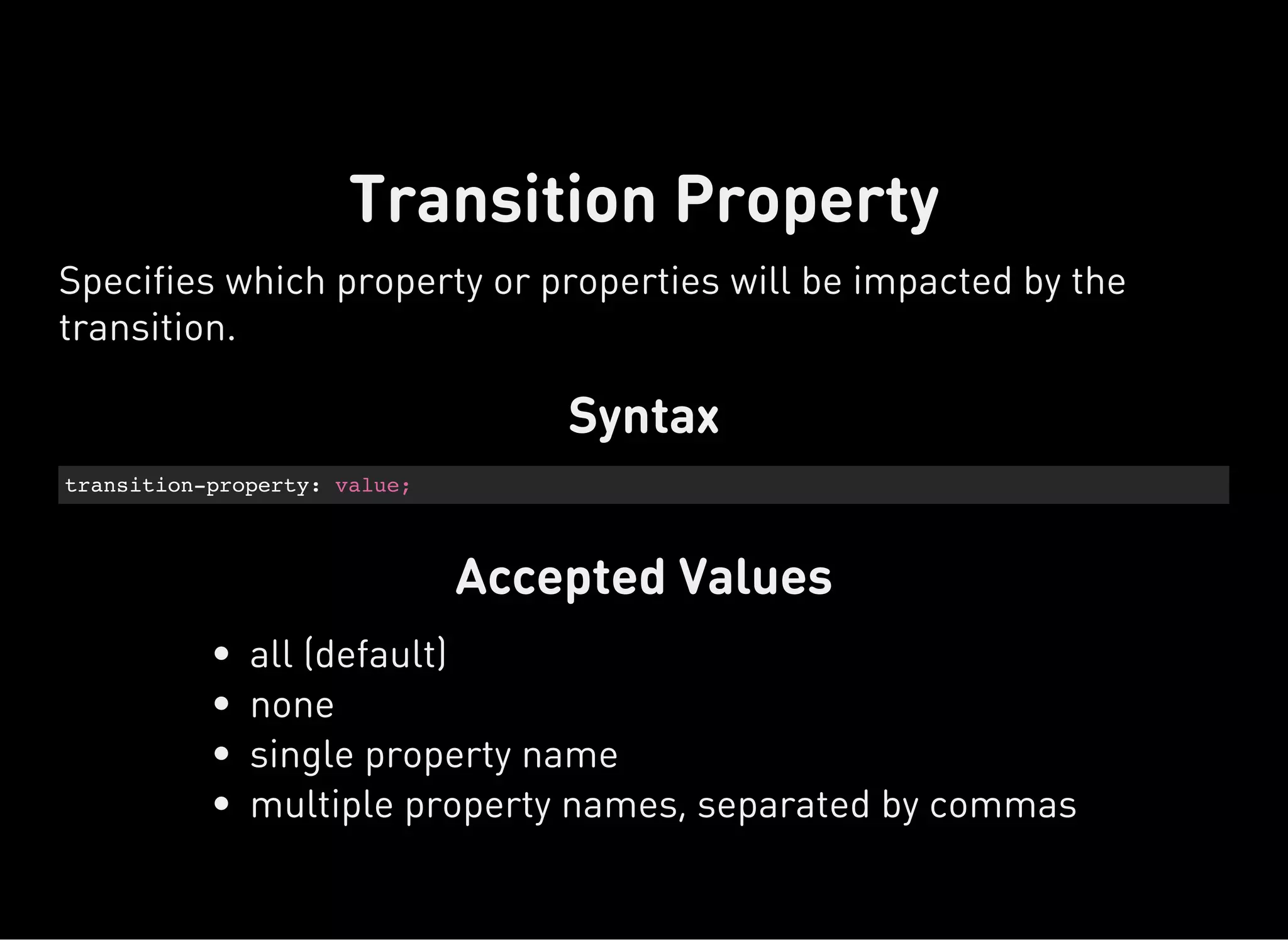
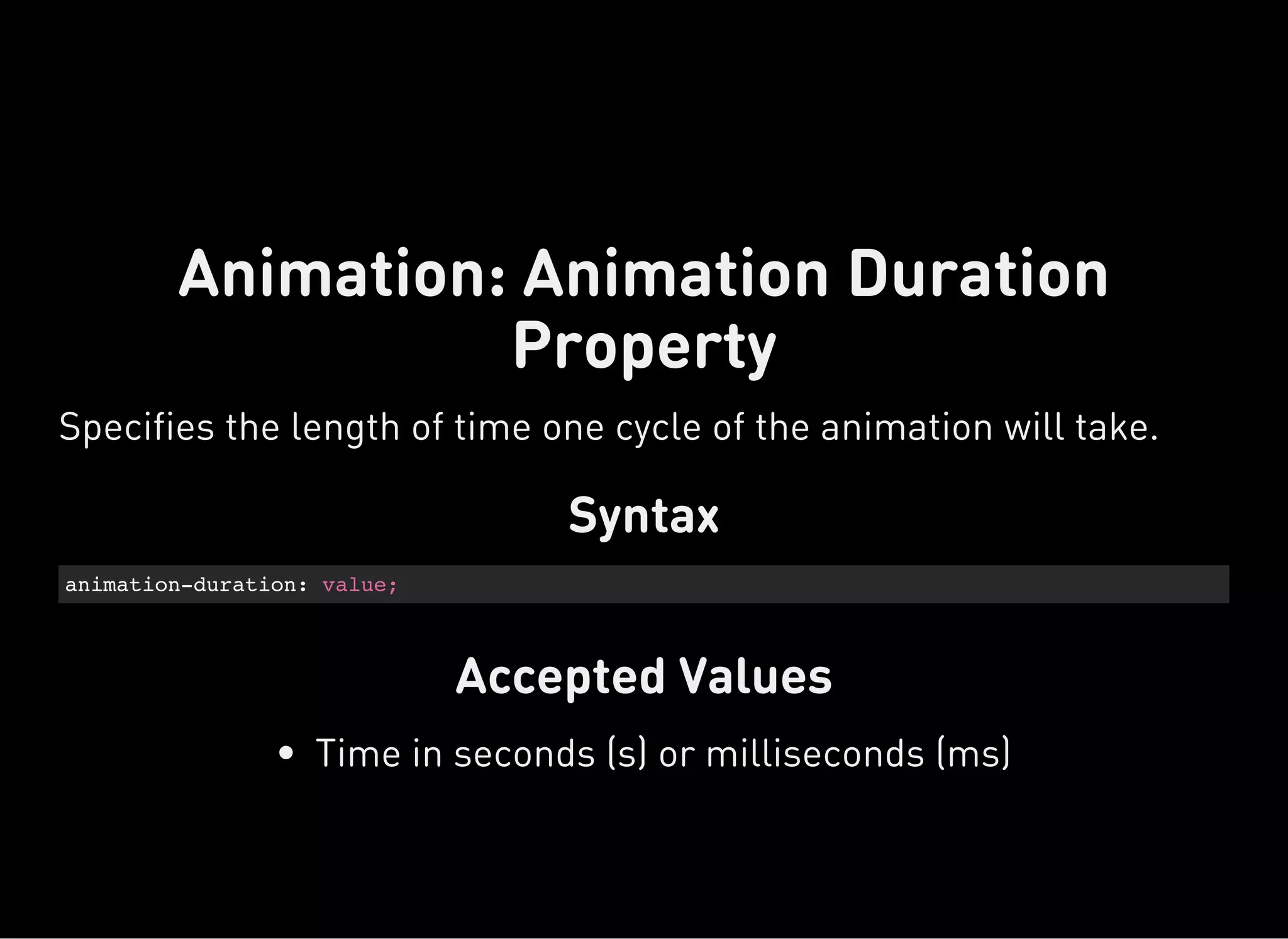
The document discusses dynamic CSS techniques including transforms, transitions, and animations. It defines each technique and provides syntax examples. Transforms allow elements to be translated, rotated, scaled and skewed. Transitions add movement between states by changing CSS properties over durations with timing functions. Animations utilize keyframe waypoints to establish the behavior of properties over durations and iterations with names. The document provides best practices and browser support details for each dynamic CSS technique.


