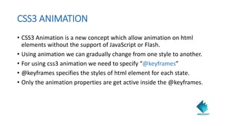
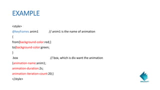
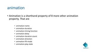
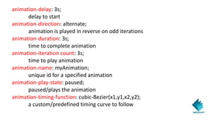
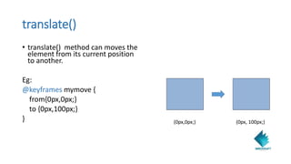
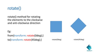
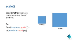
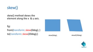
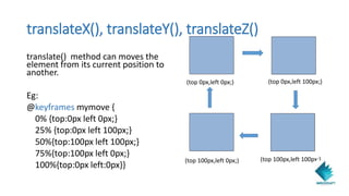
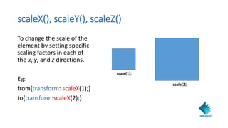
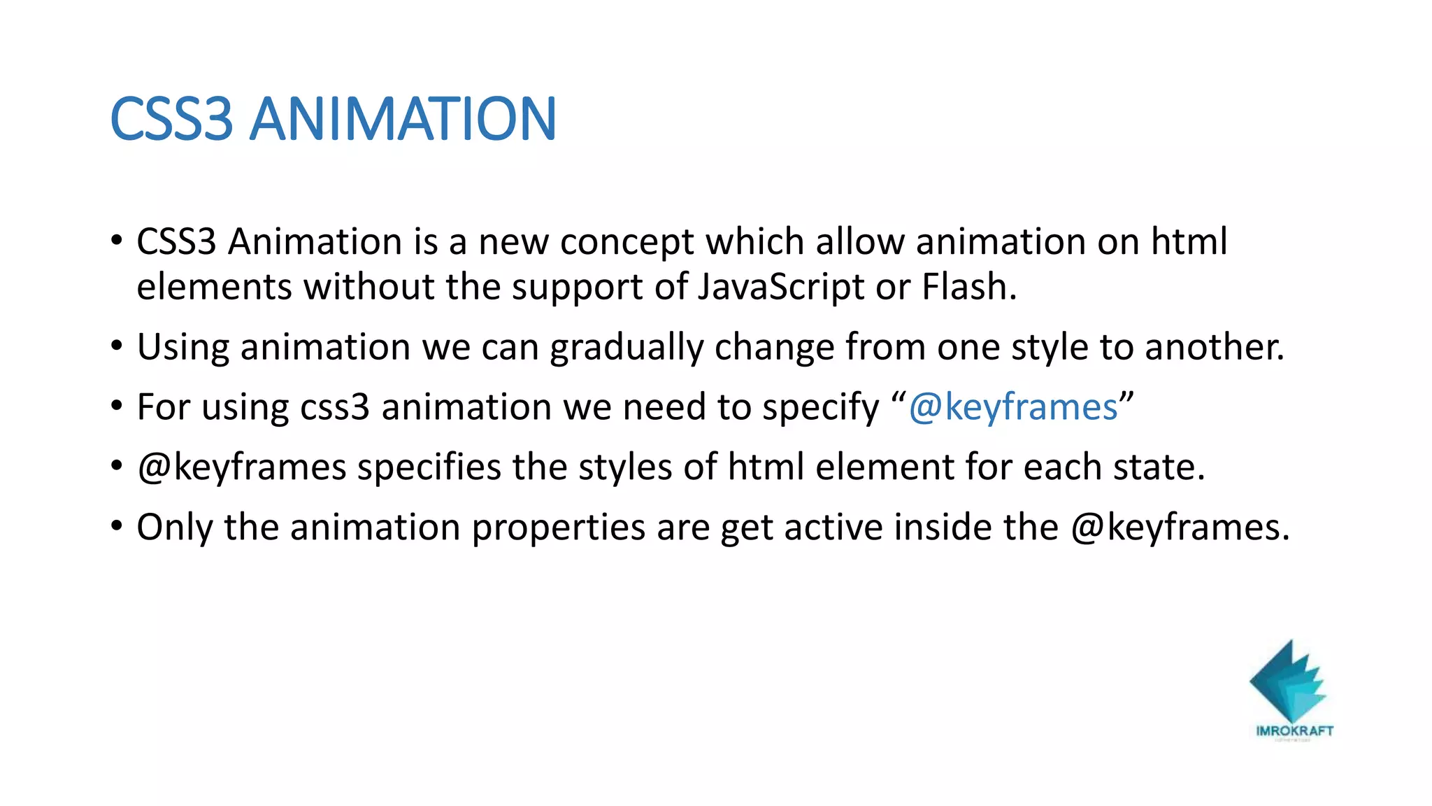
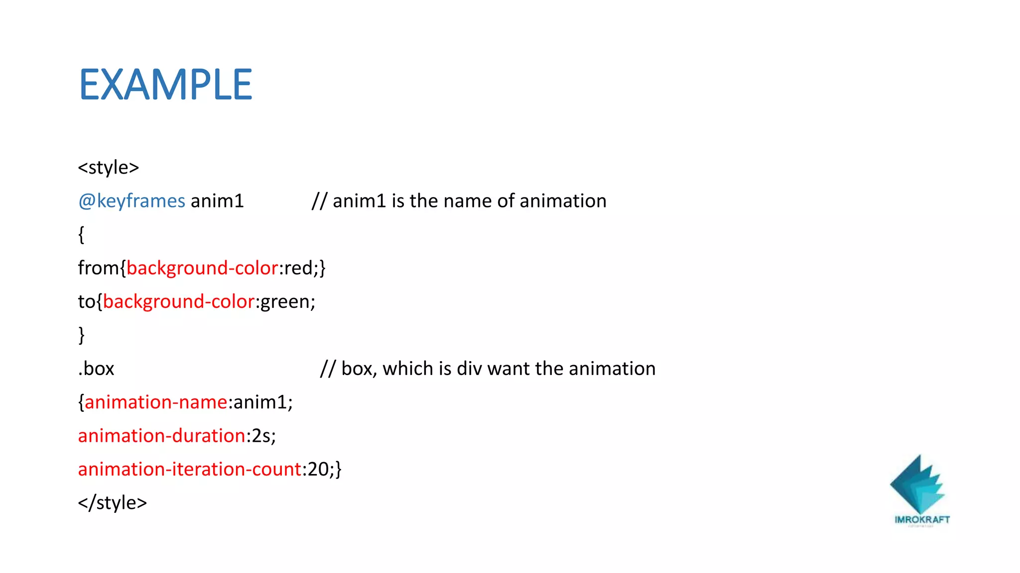
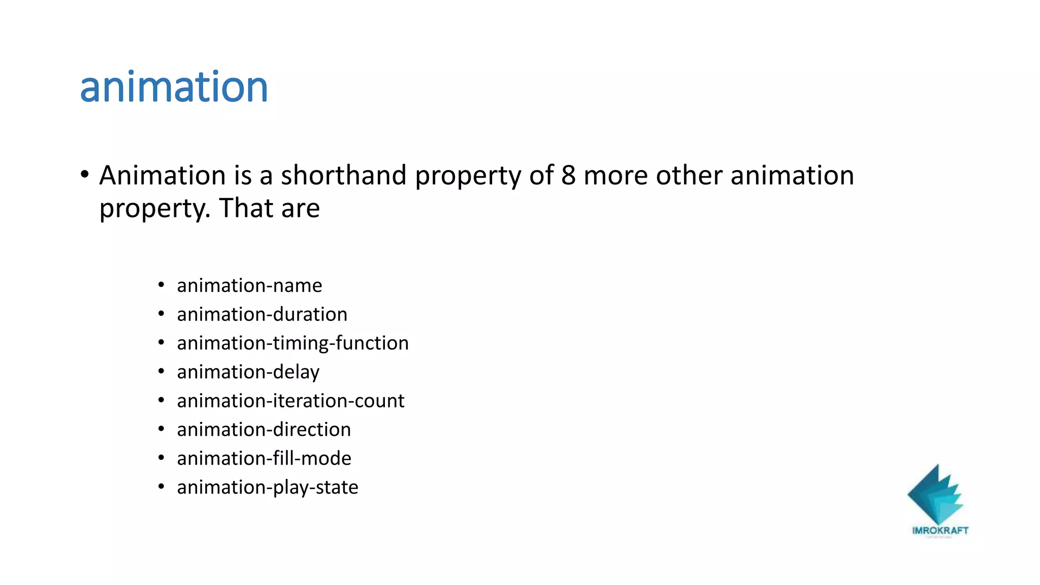
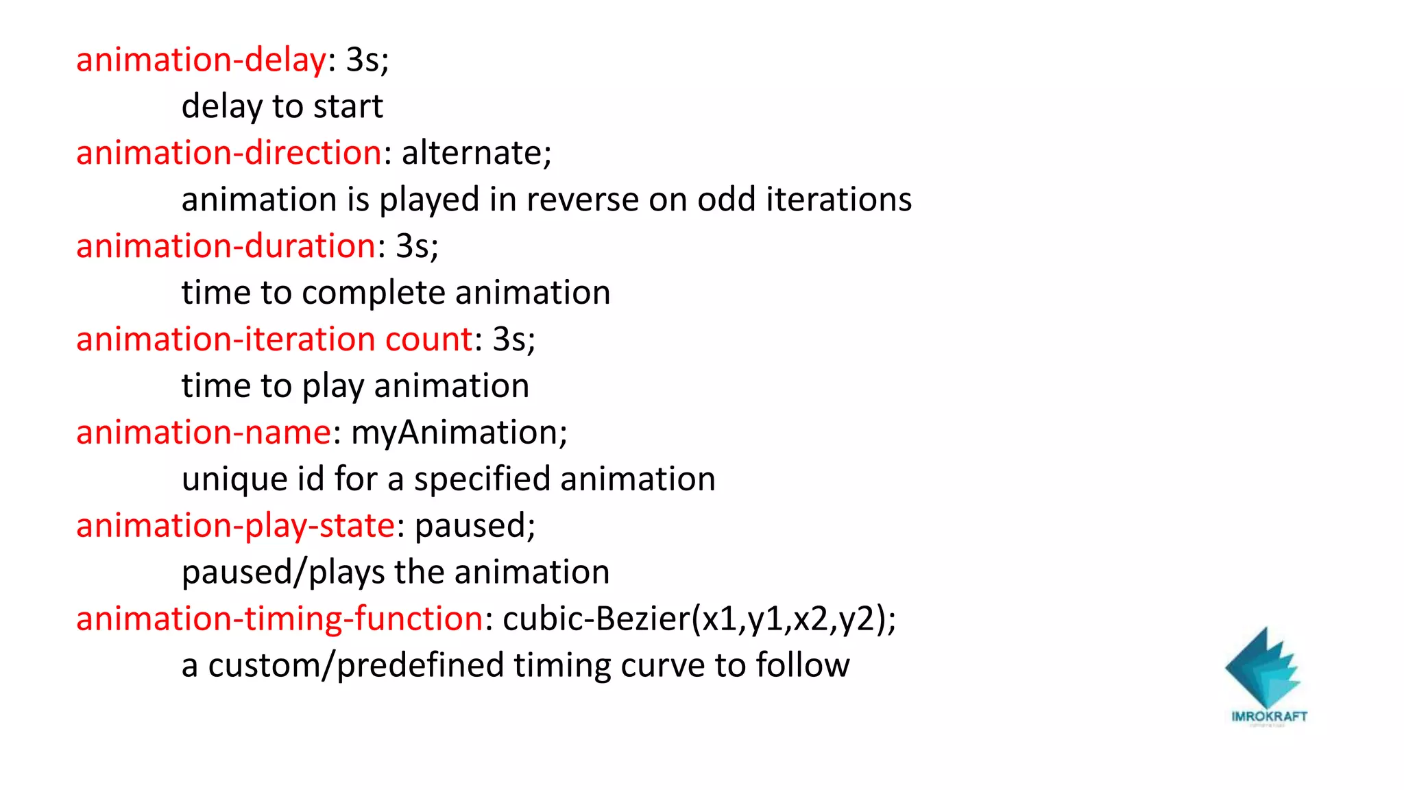
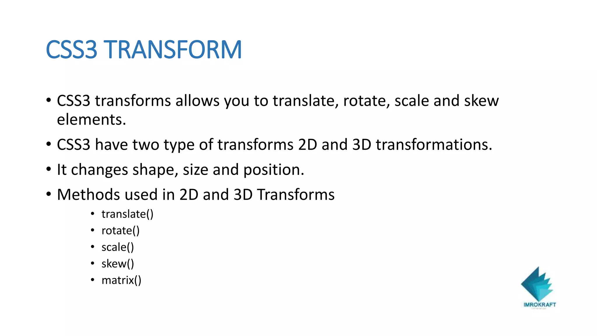
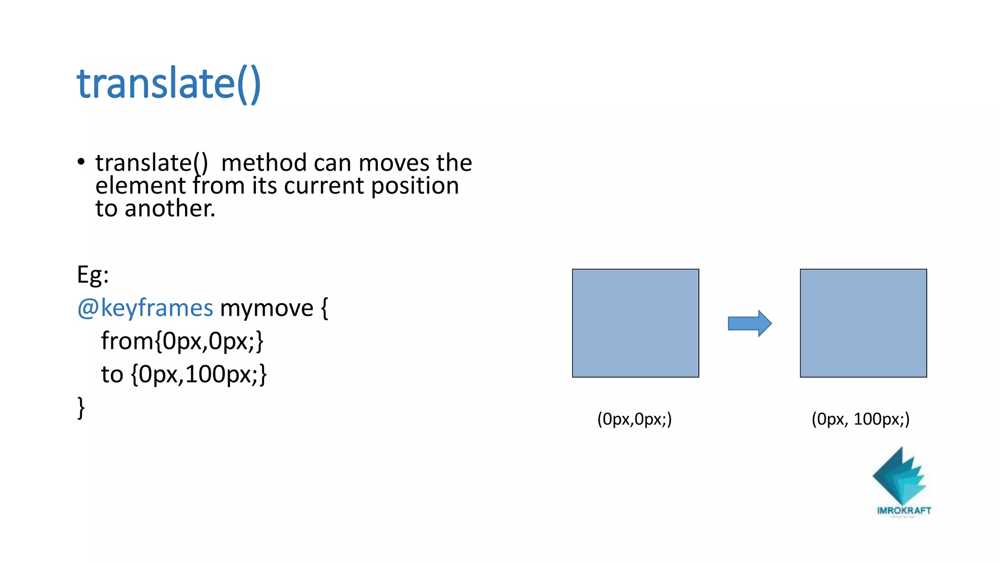
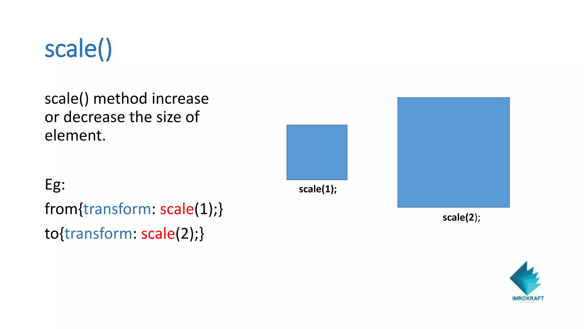
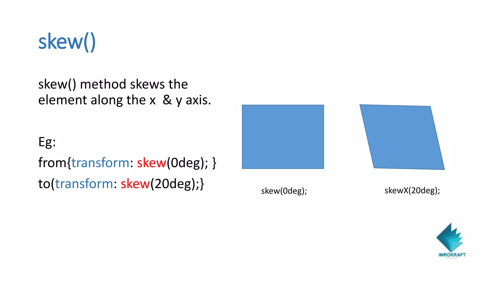
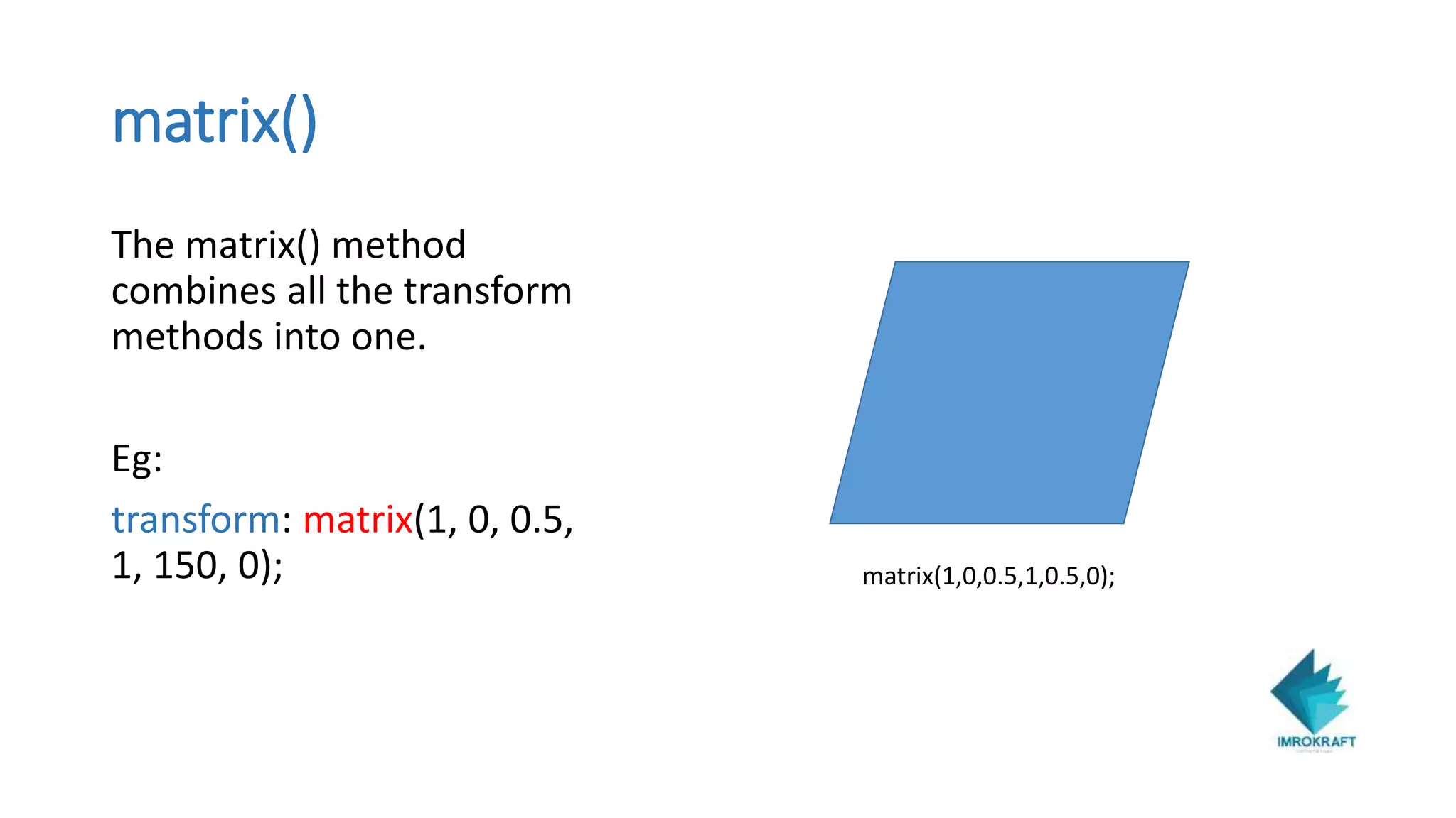
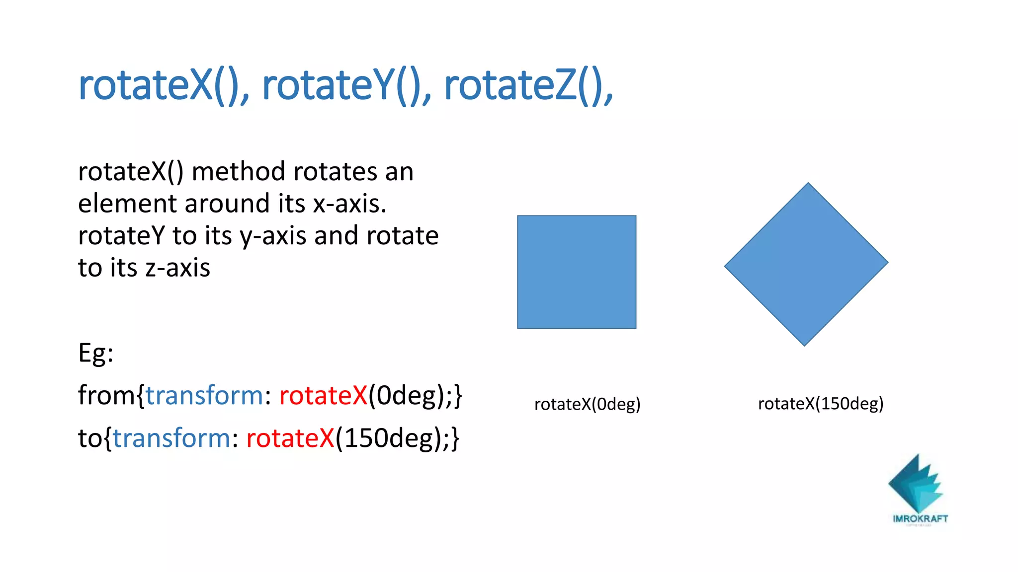
KEMBAR78
CSS3 Animation for beginners - Imrokraft | PPTX
IMROKRAFT
Crafting the future
Ph.no:(0471)6555744
Site: http://www.imrokraft.com/
Akhil Krishnan R S
Arun Solomon
Imrokraft Solution
CSS3 ANIMATION
• CSS3 Animation is a new concept which allow animation on html
elements without the support of JavaScript or Flash.
• Using animation we can gradually change from one style to another.
• For using css3 animation we need to specify “@keyframes”
• @keyframes specifies the styles of html element for each state.
• Only the animation properties are get active inside the @keyframes.
EXAMPLE
<style>
@keyframes anim1 // anim1 is the name of animation
{
from{background-color:red;}
to{background-color:green;
}
.box // box, which is div want the animation
{animation-name:anim1;
animation-duration:2s;
animation-iteration-count:20;}
</style>
DIFFERENT ANIMATION PROPERTIES
animation
• Animation is a shorthand property of 8 more other animation
property. That are
• animation-name
• animation-duration
• animation-timing-function
• animation-delay
• animation-iteration-count
• animation-direction
• animation-fill-mode
• animation-play-state
animation-delay: 3s;
delay to start
animation-direction: alternate;
animation is played in reverse on odd iterations
animation-duration: 3s;
time to complete animation
animation-iteration count: 3s;
time to play animation
animation-name: myAnimation;
unique id for a specified animation
animation-play-state: paused;
paused/plays the animation
animation-timing-function: cubic-Bezier(x1,y1,x2,y2);
a custom/predefined timing curve to follow
CSS3 TRANSFORM
• CSS3 transforms allows you to translate, rotate, scale and skew
elements.
• CSS3 have two type of transforms 2D and 3D transformations.
• It changes shape, size and position.
• Methods used in 2D and 3D Transforms
• translate()
• rotate()
• scale()
• skew()
• matrix()
2D Transforms
translate()
• translate() method can moves the
element from its current position
to another.
Eg:
@keyframes mymove {
from{0px,0px;}
to {0px,100px;}
} (0px,0px;) (0px, 100px;)
rotate()
rotate() method for rotating
the elements to the clockwise
and anti-clockwise direction
Eg:
from{transform: rotate(0deg);}
to{transform: rotate(45deg);} rotate(0deg) rotate(45deg)
scale()
scale() method increase
or decrease the size of
element.
Eg:
from{transform: scale(1);}
to{transform: scale(2);}
scale(1);
scale(2);
skew()
skew() method skews the
element along the x & y axis.
Eg:
from{transform: skew(0deg); }
to(transform: skew(20deg);} skew(0deg); skewX(20deg);
matrix()
The matrix() method
combines all the transform
methods into one.
Eg:
transform: matrix(1, 0, 0.5,
1, 150, 0); matrix(1,0,0.5,1,0.5,0);
3D Transform
translateX(), translateY(), translateZ()
translate() method can moves the
element from its current position to
another.
Eg:
@keyframes mymove {
0% {top:0px left 0px;}
25% {top:0px left 100px;}
50%{top:100px left 100px;}
75%{top:100px left 0px;}
100%{top:0px left:0px}}
(top 0px,left 0px;) (top 0px,left 100px;)
(top 100px,left 0px;) (top 100px,left 100px;)
rotateX(), rotateY(), rotateZ(),
rotateX() method rotates an
element around its x-axis.
rotateY to its y-axis and rotate
to its z-axis
Eg:
from{transform: rotateX(0deg);}
to{transform: rotateX(150deg);}
rotateX(0deg) rotateX(150deg)
scaleX(), scaleY(), scaleZ()
To change the scale of the
element by setting specific
scaling factors in each of
the x, y, and z directions.
Eg:
from{transform: scaleX(1);}
to{transform:scaleX(2);}
scale(1);
scale(2);
CSS3 Animation for beginners - Imrokraft

CSS3 Animation for beginners - Imrokraft

  • 1.
    IMROKRAFT Crafting the future Ph.no:(0471)6555744 Site:http://www.imrokraft.com/ Akhil Krishnan R S Arun Solomon Imrokraft Solution
  • 2.
    CSS3 ANIMATION • CSS3Animation is a new concept which allow animation on html elements without the support of JavaScript or Flash. • Using animation we can gradually change from one style to another. • For using css3 animation we need to specify “@keyframes” • @keyframes specifies the styles of html element for each state. • Only the animation properties are get active inside the @keyframes.
  • 3.
    EXAMPLE <style> @keyframes anim1 //anim1 is the name of animation { from{background-color:red;} to{background-color:green; } .box // box, which is div want the animation {animation-name:anim1; animation-duration:2s; animation-iteration-count:20;} </style>
  • 4.
  • 5.
    animation • Animation isa shorthand property of 8 more other animation property. That are • animation-name • animation-duration • animation-timing-function • animation-delay • animation-iteration-count • animation-direction • animation-fill-mode • animation-play-state
  • 6.
    animation-delay: 3s; delay tostart animation-direction: alternate; animation is played in reverse on odd iterations animation-duration: 3s; time to complete animation animation-iteration count: 3s; time to play animation animation-name: myAnimation; unique id for a specified animation animation-play-state: paused; paused/plays the animation animation-timing-function: cubic-Bezier(x1,y1,x2,y2); a custom/predefined timing curve to follow
  • 7.
    CSS3 TRANSFORM • CSS3transforms allows you to translate, rotate, scale and skew elements. • CSS3 have two type of transforms 2D and 3D transformations. • It changes shape, size and position. • Methods used in 2D and 3D Transforms • translate() • rotate() • scale() • skew() • matrix()
  • 8.
  • 9.
    translate() • translate() methodcan moves the element from its current position to another. Eg: @keyframes mymove { from{0px,0px;} to {0px,100px;} } (0px,0px;) (0px, 100px;)
  • 10.
    rotate() rotate() method forrotating the elements to the clockwise and anti-clockwise direction Eg: from{transform: rotate(0deg);} to{transform: rotate(45deg);} rotate(0deg) rotate(45deg)
  • 11.
    scale() scale() method increase ordecrease the size of element. Eg: from{transform: scale(1);} to{transform: scale(2);} scale(1); scale(2);
  • 12.
    skew() skew() method skewsthe element along the x & y axis. Eg: from{transform: skew(0deg); } to(transform: skew(20deg);} skew(0deg); skewX(20deg);
  • 13.
    matrix() The matrix() method combinesall the transform methods into one. Eg: transform: matrix(1, 0, 0.5, 1, 150, 0); matrix(1,0,0.5,1,0.5,0);
  • 14.
  • 15.
    translateX(), translateY(), translateZ() translate()method can moves the element from its current position to another. Eg: @keyframes mymove { 0% {top:0px left 0px;} 25% {top:0px left 100px;} 50%{top:100px left 100px;} 75%{top:100px left 0px;} 100%{top:0px left:0px}} (top 0px,left 0px;) (top 0px,left 100px;) (top 100px,left 0px;) (top 100px,left 100px;)
  • 16.
    rotateX(), rotateY(), rotateZ(), rotateX()method rotates an element around its x-axis. rotateY to its y-axis and rotate to its z-axis Eg: from{transform: rotateX(0deg);} to{transform: rotateX(150deg);} rotateX(0deg) rotateX(150deg)
  • 17.
    scaleX(), scaleY(), scaleZ() Tochange the scale of the element by setting specific scaling factors in each of the x, y, and z directions. Eg: from{transform: scaleX(1);} to{transform:scaleX(2);} scale(1); scale(2);