Downloaded 10 times


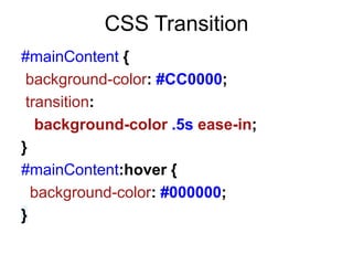
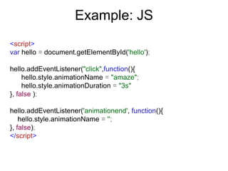
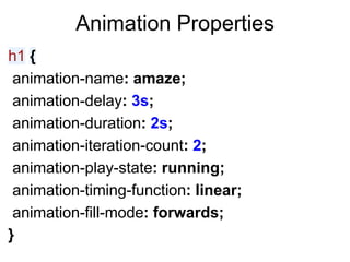
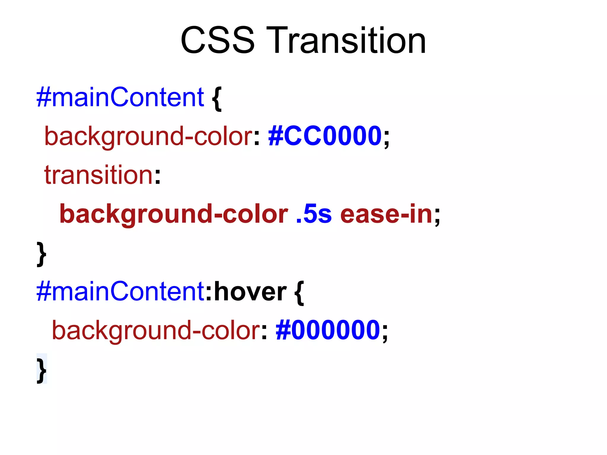
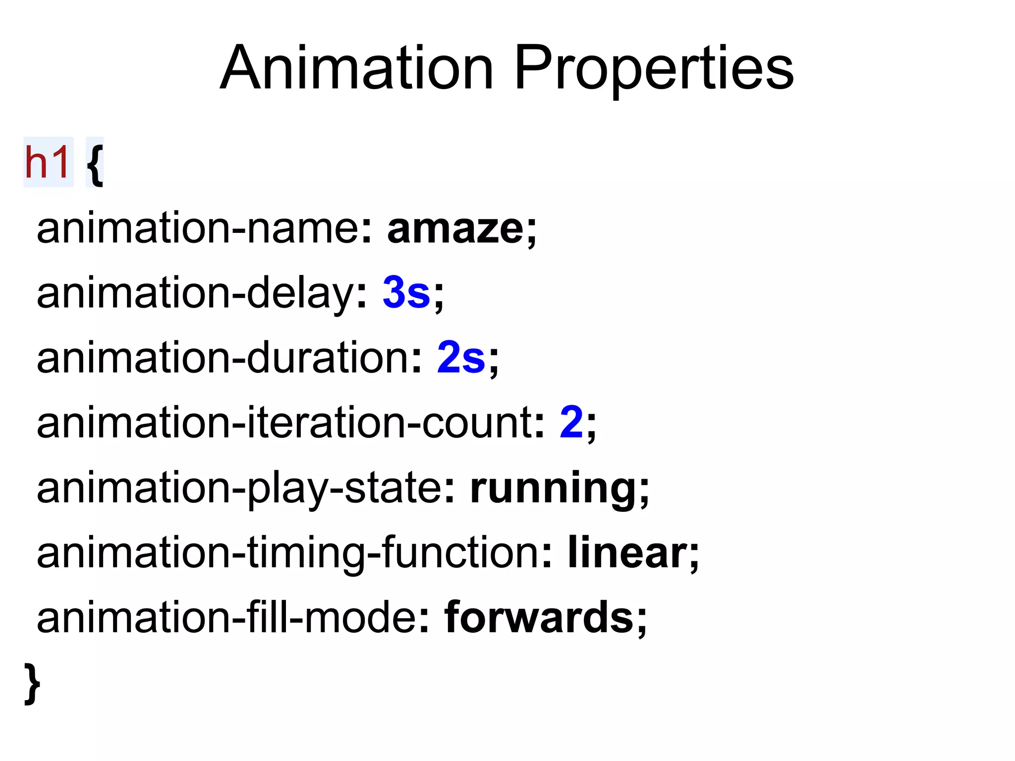
![Working JS
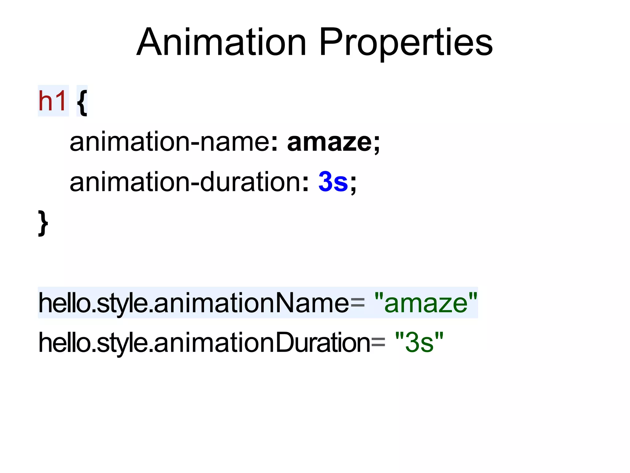
var hello = document.getElementById('hello');
hello.addEventListener("click", function(){
var prefix = "webkitAnimation" in hello.style ?
"webkit" : "Moz";
hello.style[prefix+"AnimationName"] = "amaze";
hello.style[prefix+"AnimationDuration"] = "4s"
}, false);
if( 'WebkitTransition' in hello.style){
hello.addEventListener('webkitAnimationEnd', function(){
hello.style.webkitAnimationName = '';
}, false);
} else {
hello.addEventListener('animationend', function(){
hello.style.MozAnimationName = '';
}, false);
}](https://image.slidesharecdn.com/cssanimations-120927151205-phpapp01/85/JS-Chi-CSS-Animations-9-320.jpg)


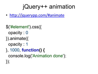
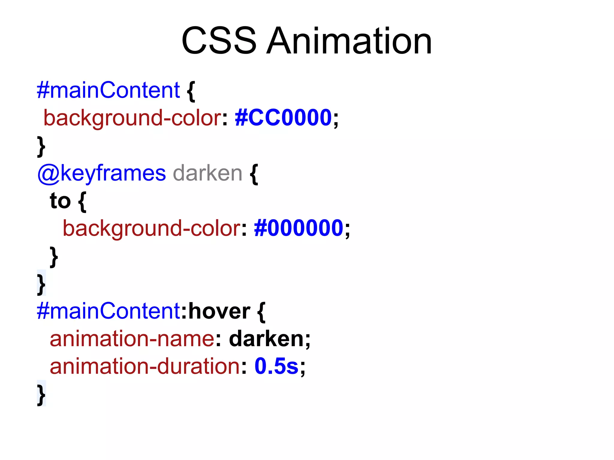

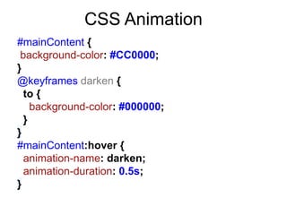
![Working JS
var hello = document.getElementById('hello');
hello.addEventListener("click", function(){
var prefix = "webkitAnimation" in hello.style ?
"webkit" : "Moz";
hello.style[prefix+"AnimationName"] = "amaze";
hello.style[prefix+"AnimationDuration"] = "4s"
}, false);
if( 'WebkitTransition' in hello.style){
hello.addEventListener('webkitAnimationEnd', function(){
hello.style.webkitAnimationName = '';
}, false);
} else {
hello.addEventListener('animationend', function(){
hello.style.MozAnimationName = '';
}, false);
}](https://image.slidesharecdn.com/cssanimations-120927151205-phpapp01/75/JS-Chi-CSS-Animations-9-2048.jpg)


The document discusses different techniques for animating elements with CSS and JavaScript, including CSS transitions, CSS animations, and jQuery animations. It provides code examples for defining CSS animations and keyframes, as well as JavaScript code for triggering animations by setting style properties and handling events. The document also outlines some issues to consider with animations like replayability, vendor prefixes, performance, and browser support.


![UiPath Automation Suite Installation (Hands-On) [2/3]](https://cdn.slidesharecdn.com/ss_thumbnails/automationsuitecommunitysession2-251015095633-a6d862f1-thumbnail.jpg?width=600ounds&width=560&fit=bounds)


