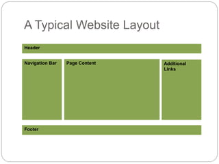
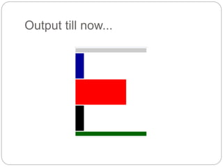
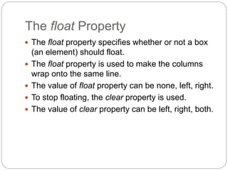
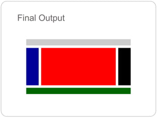
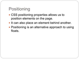
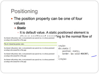
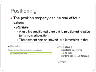
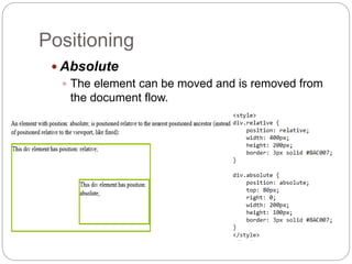
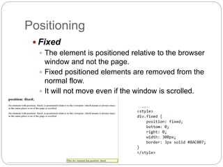
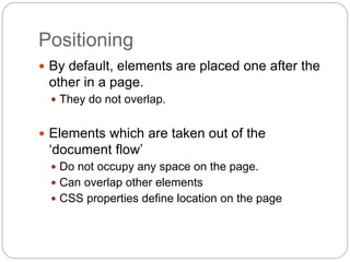
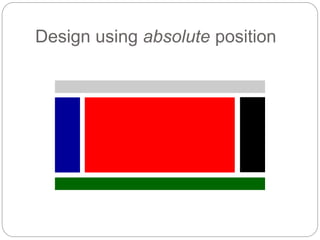
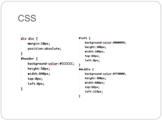
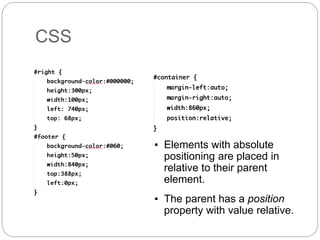
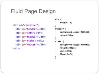
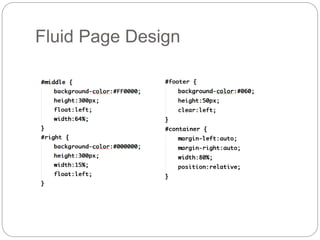
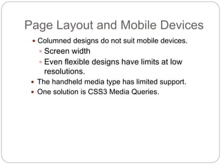
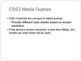
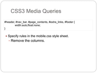
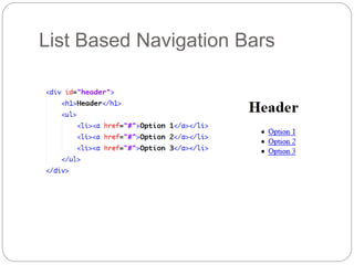
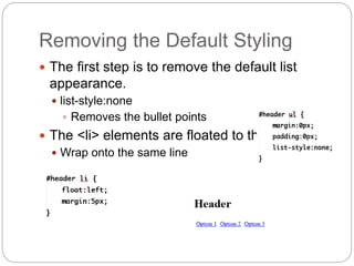
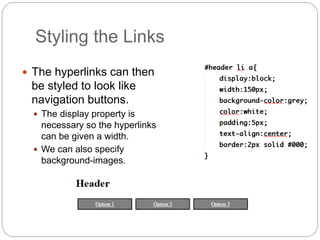
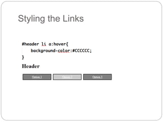
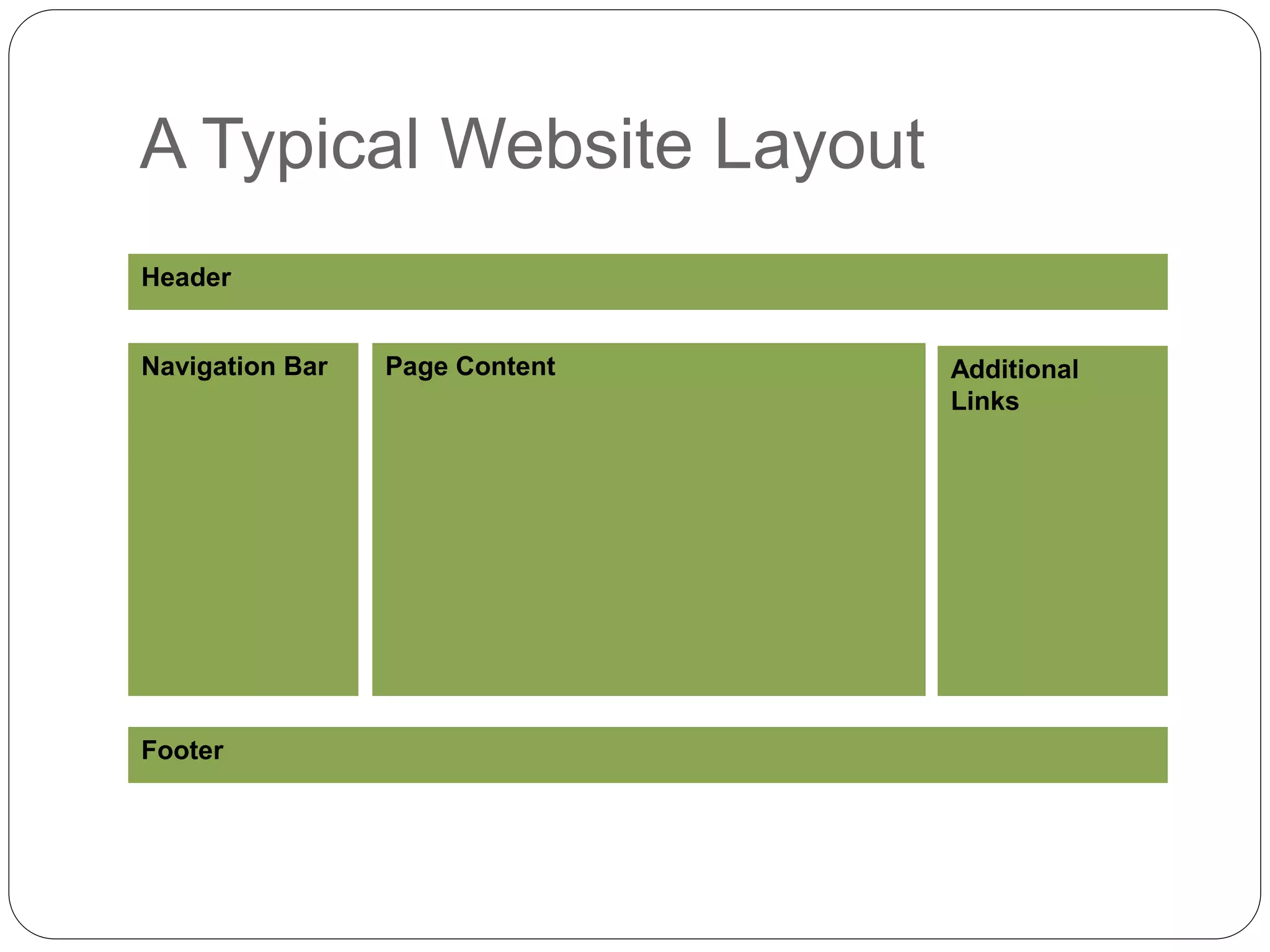
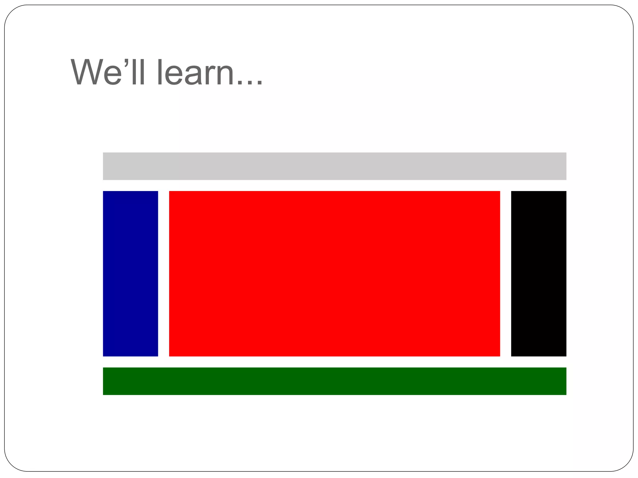
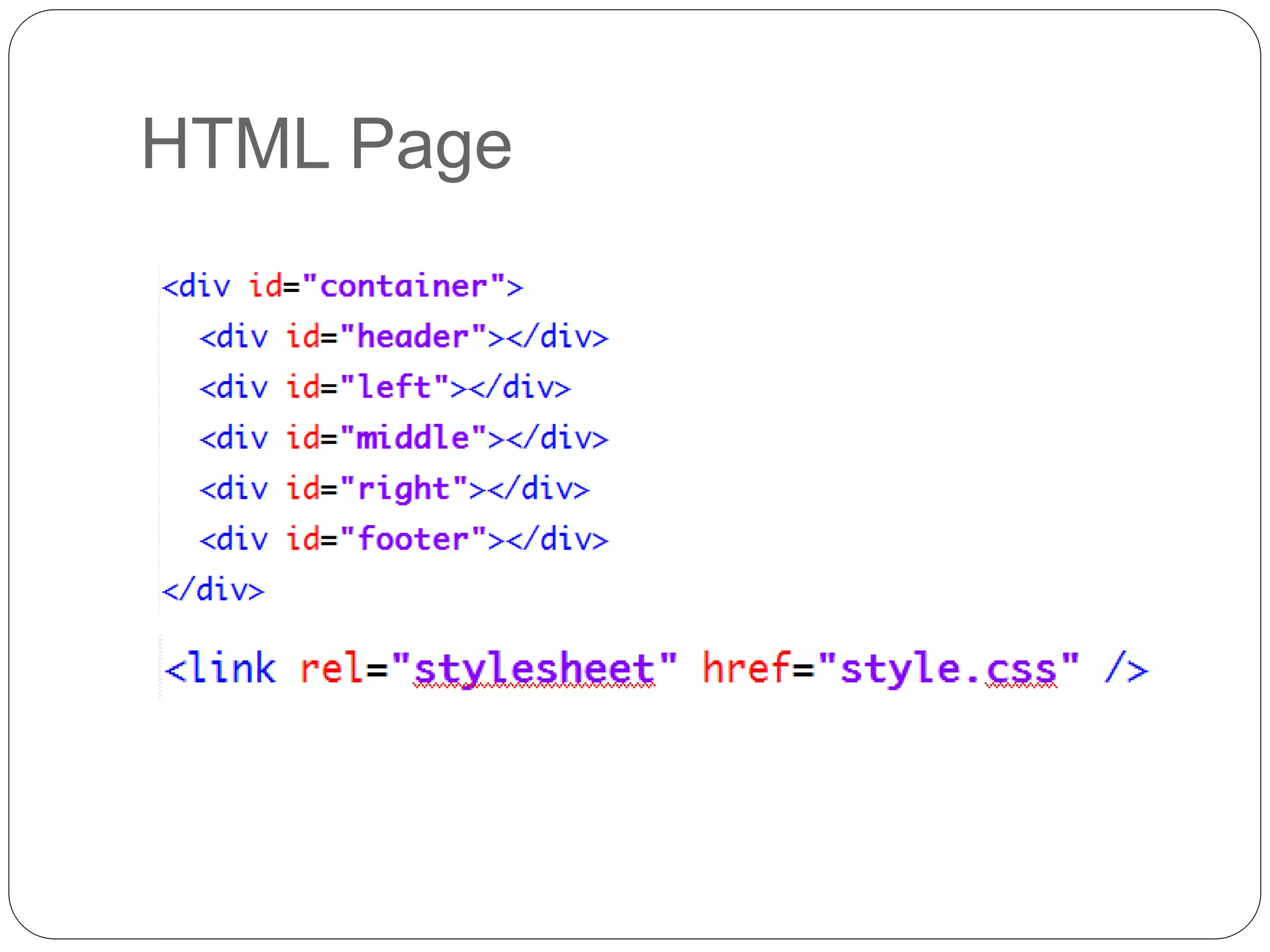
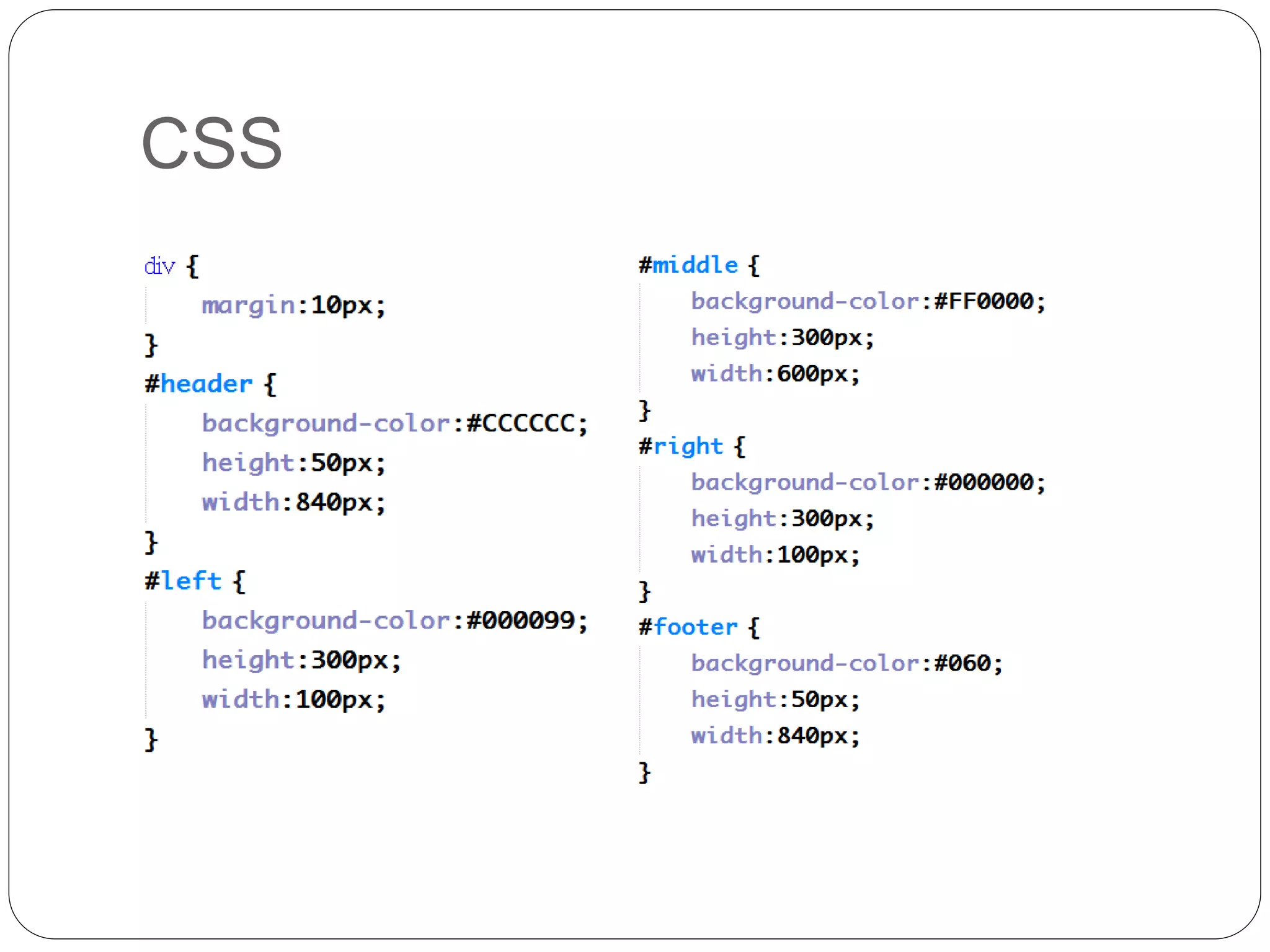
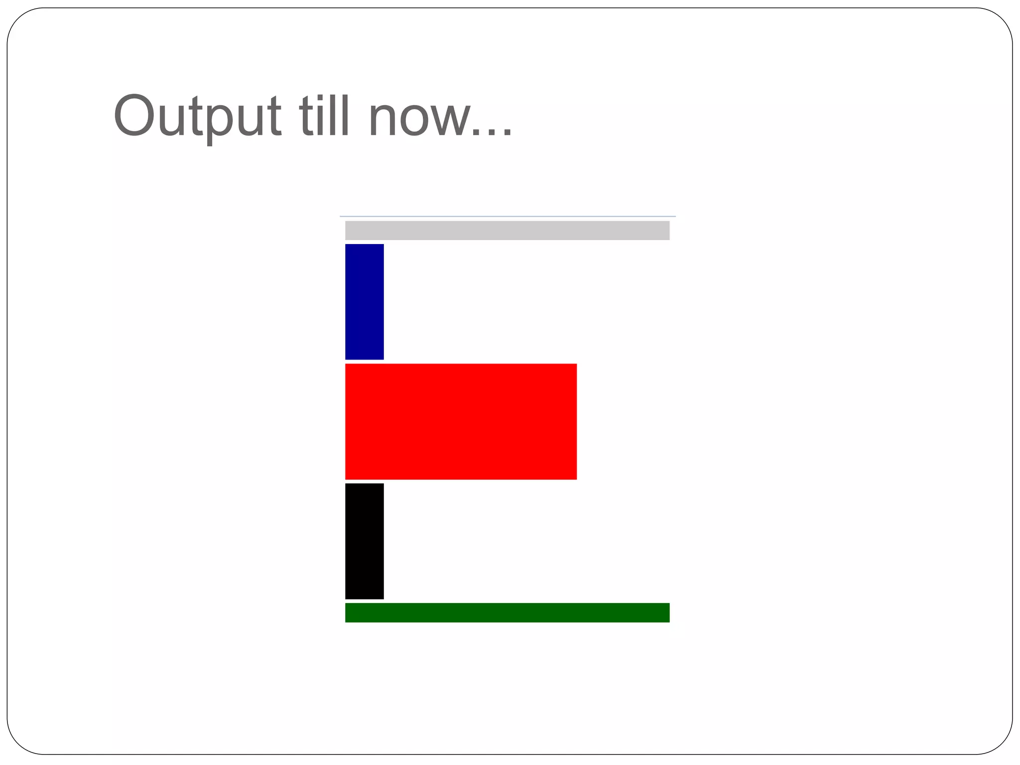
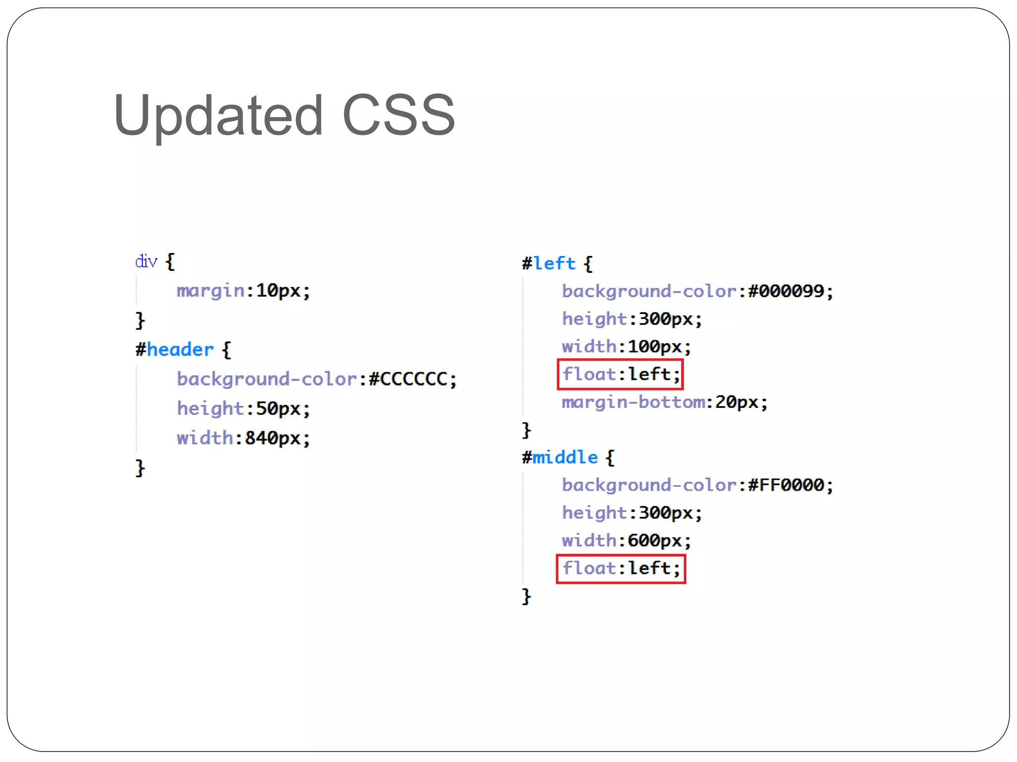
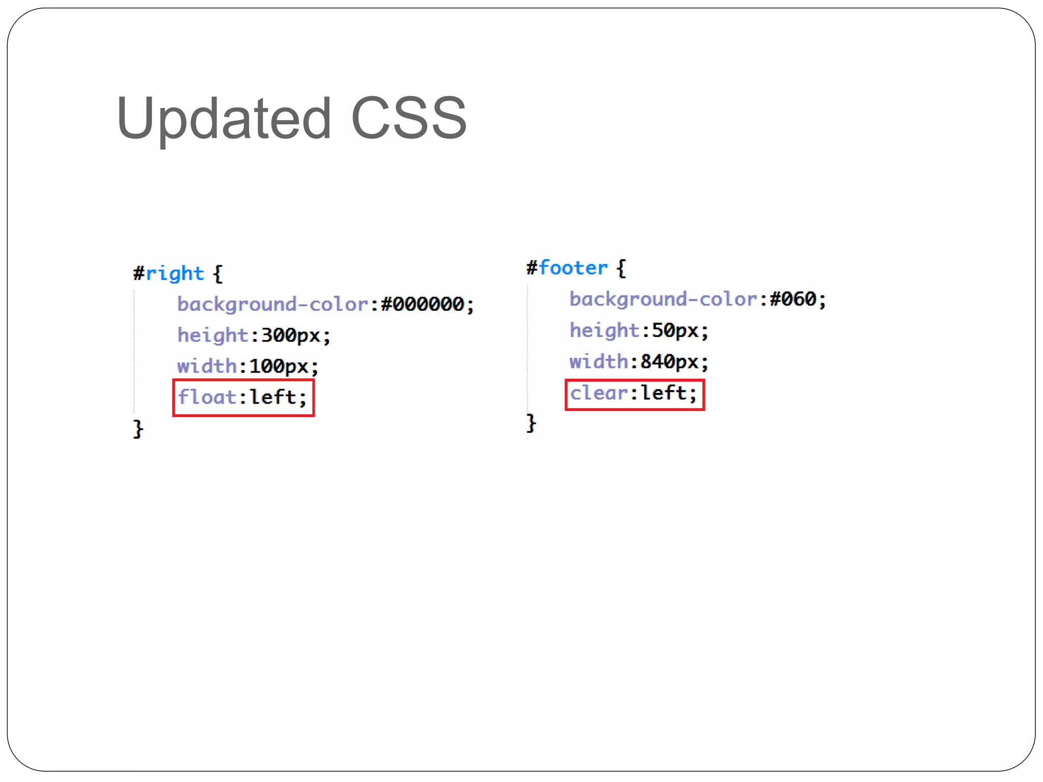
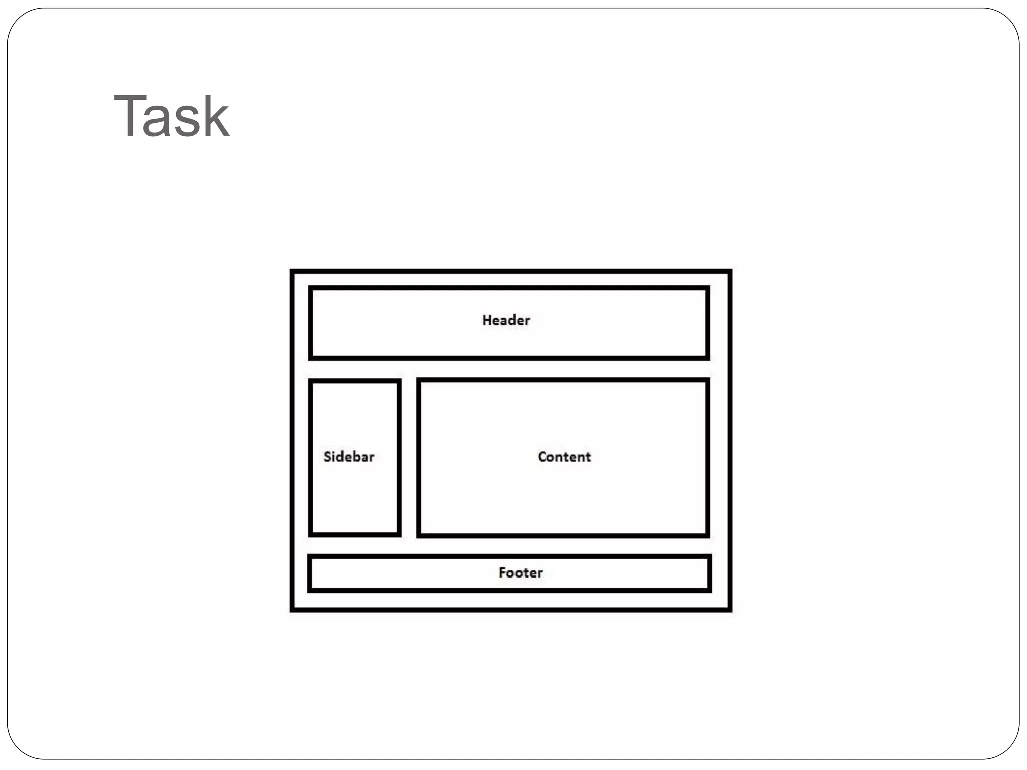
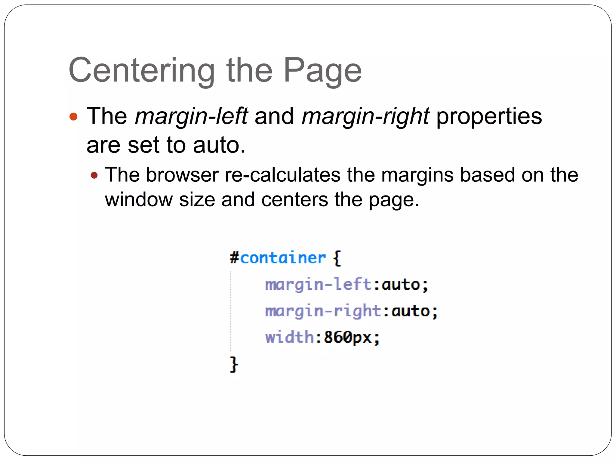
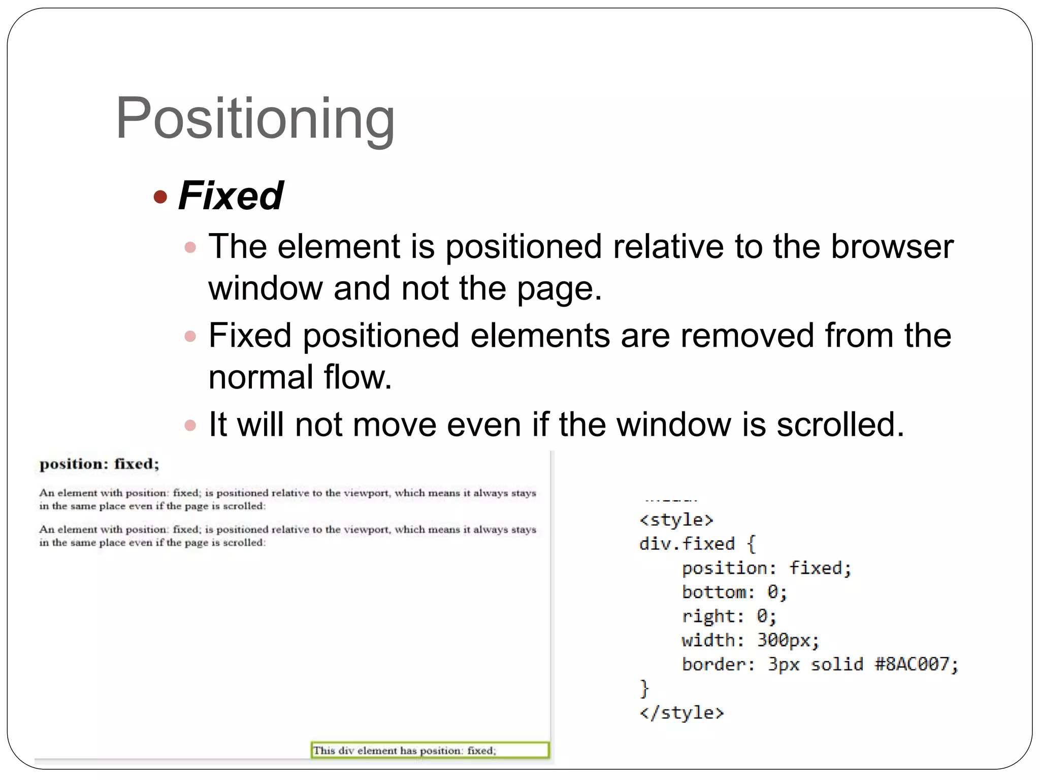
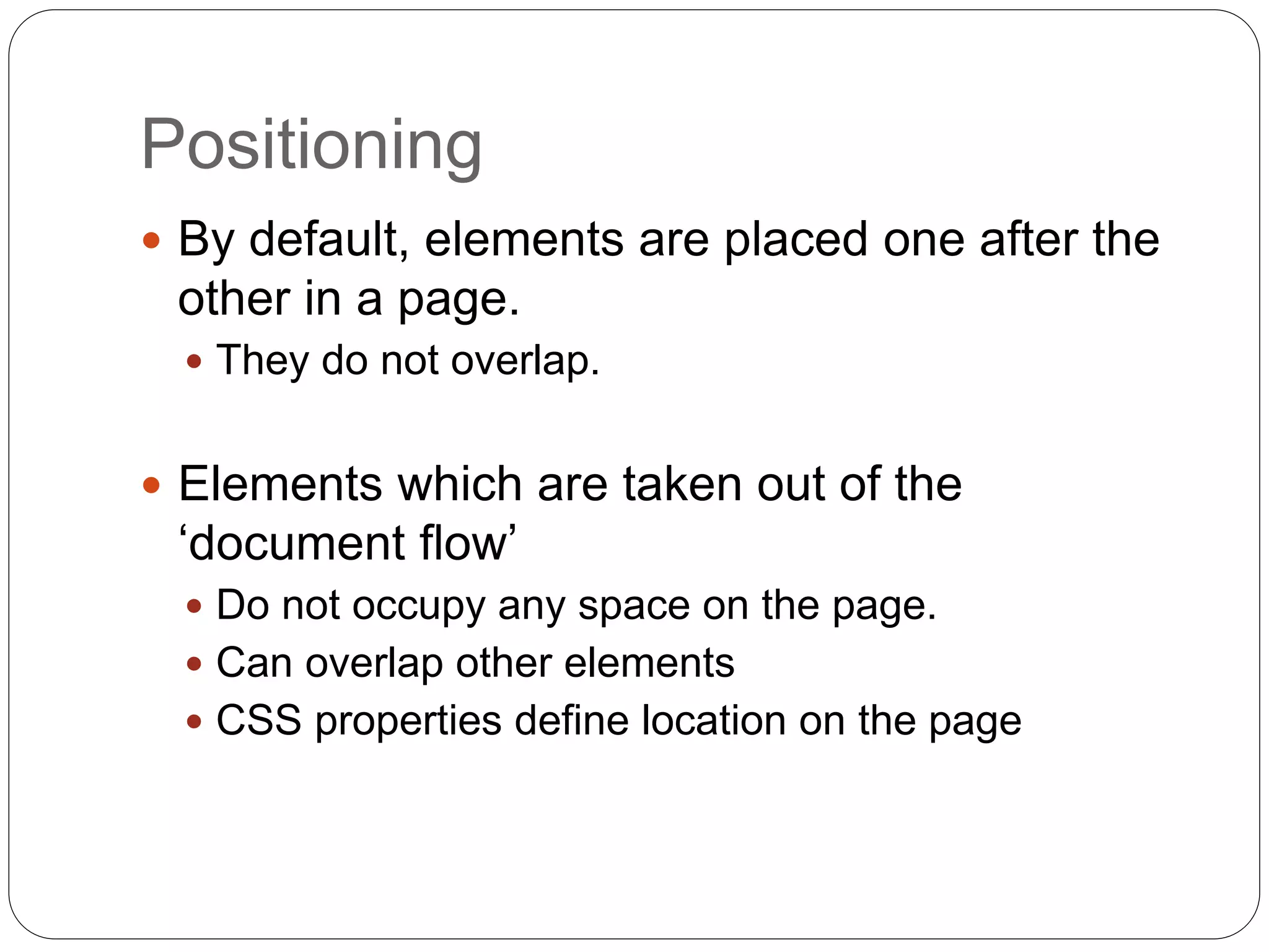
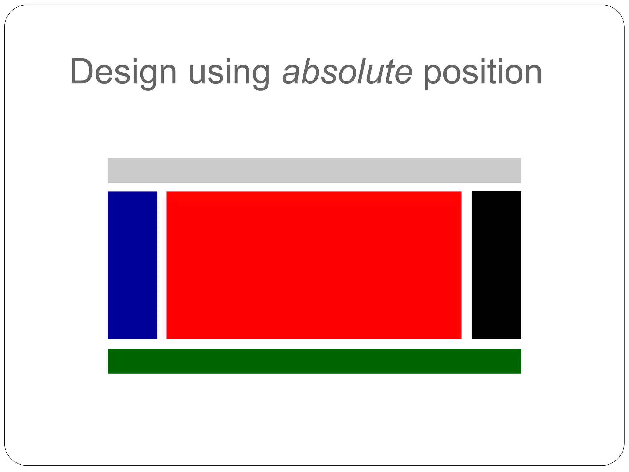
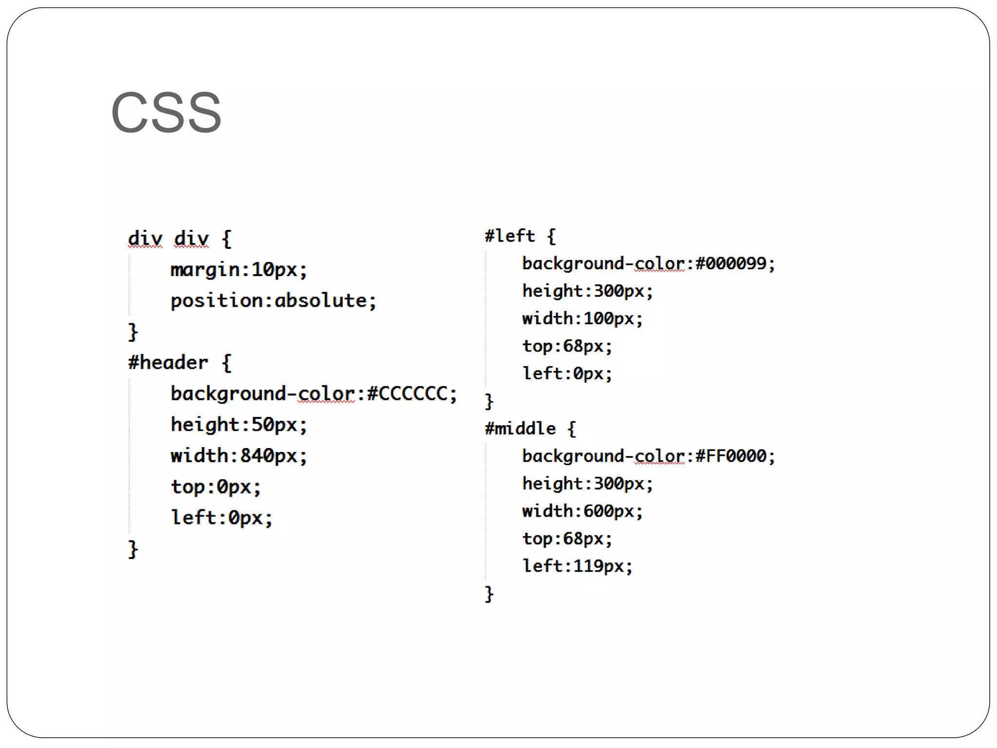
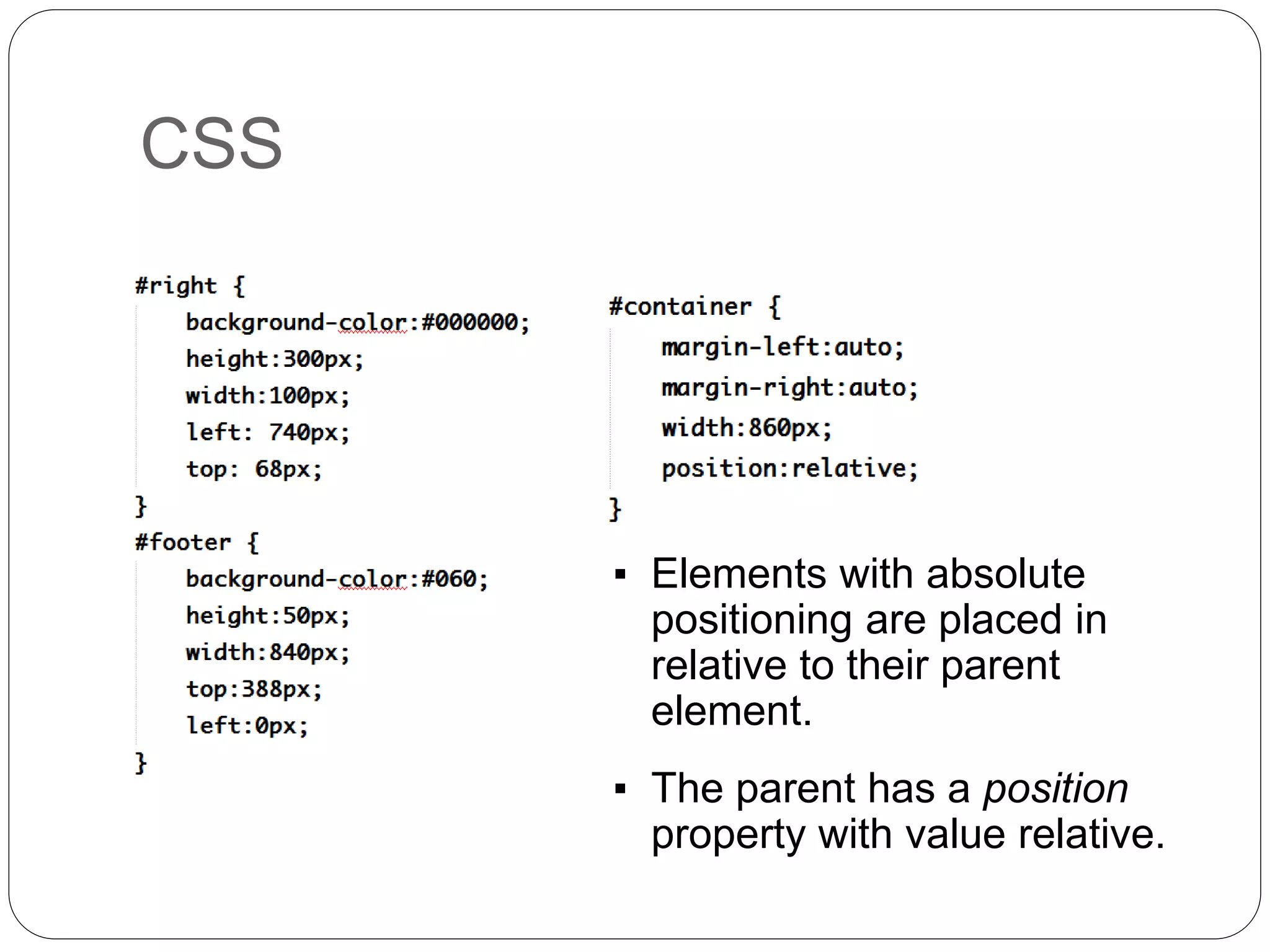
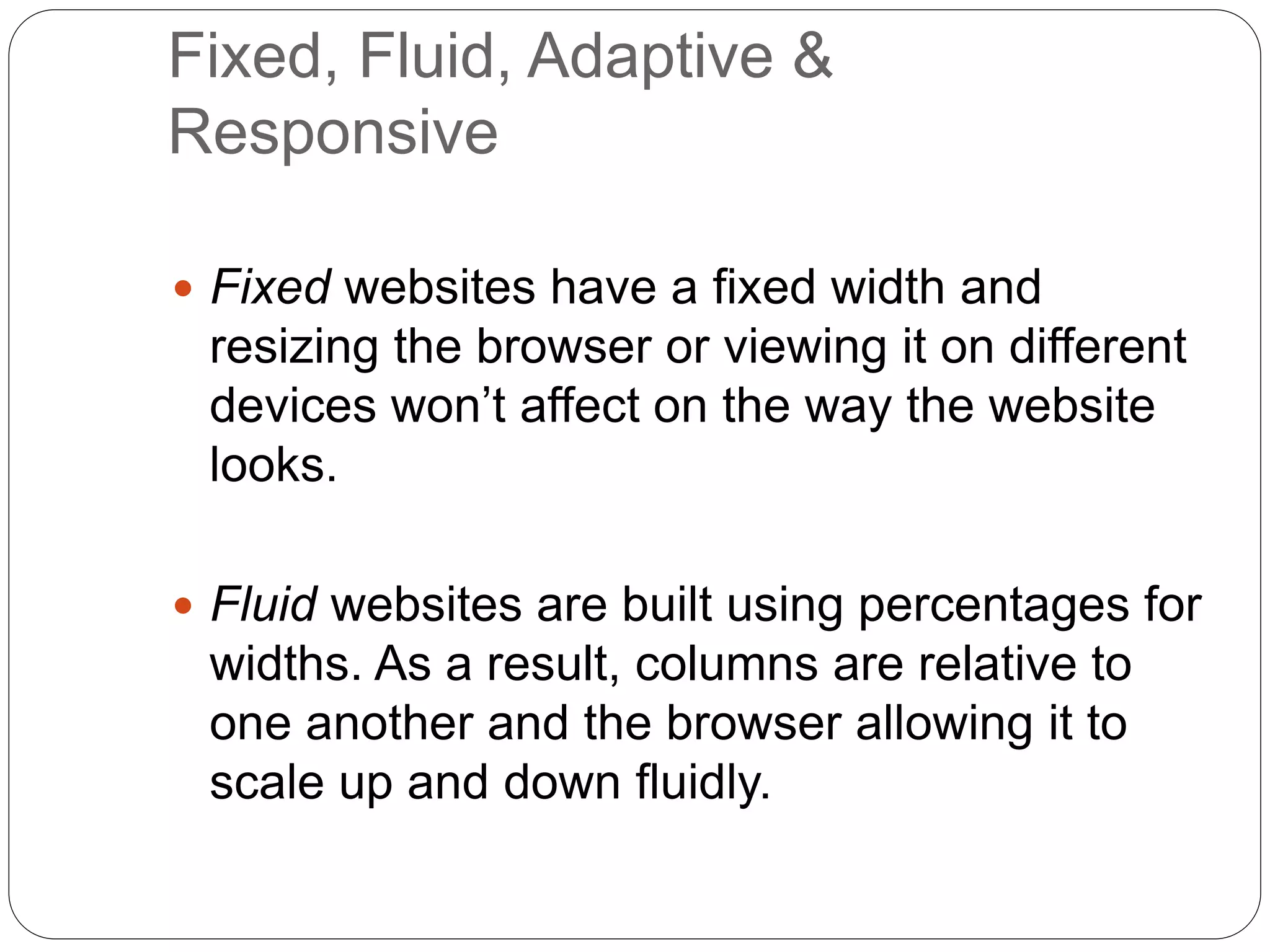
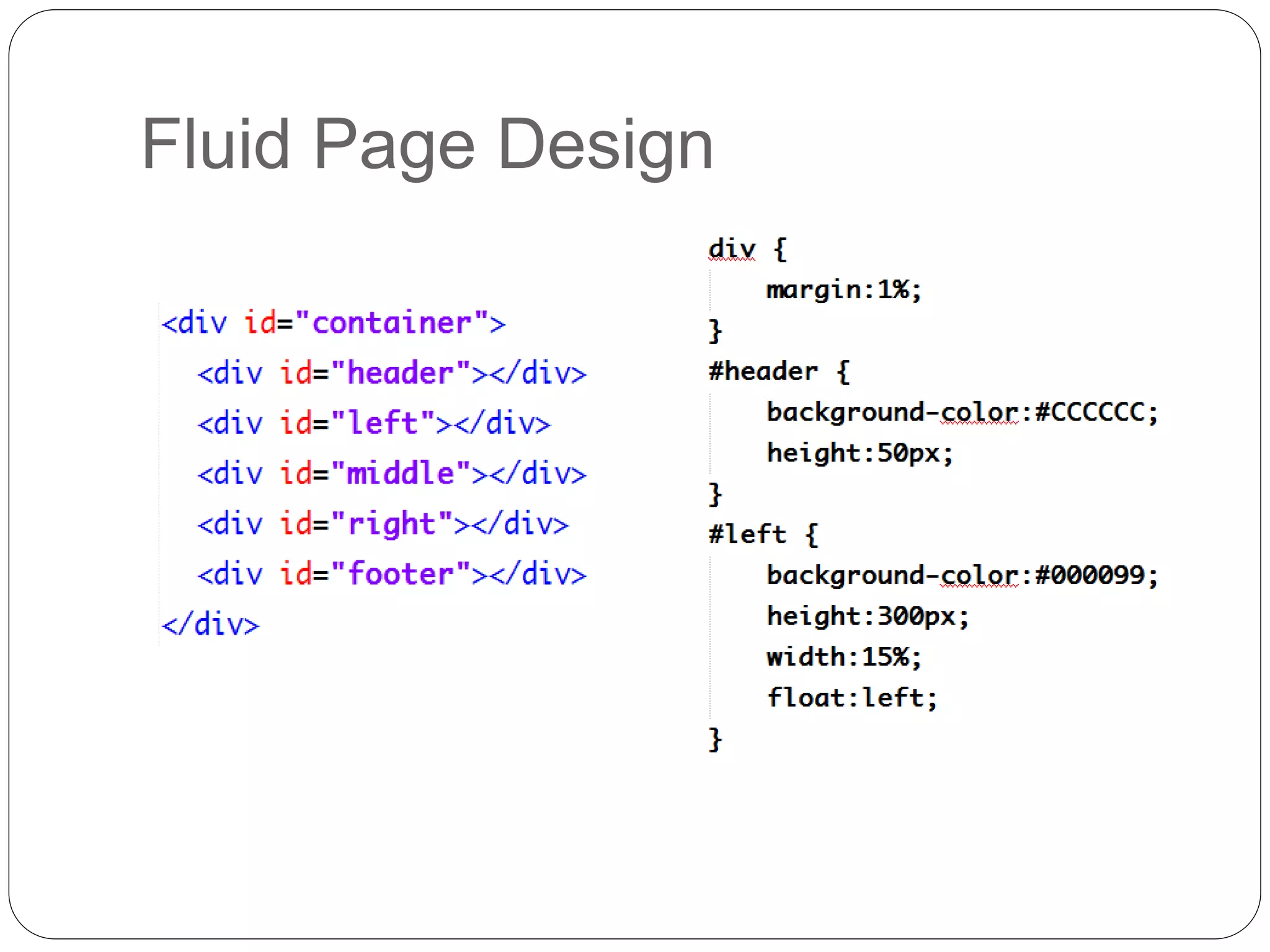
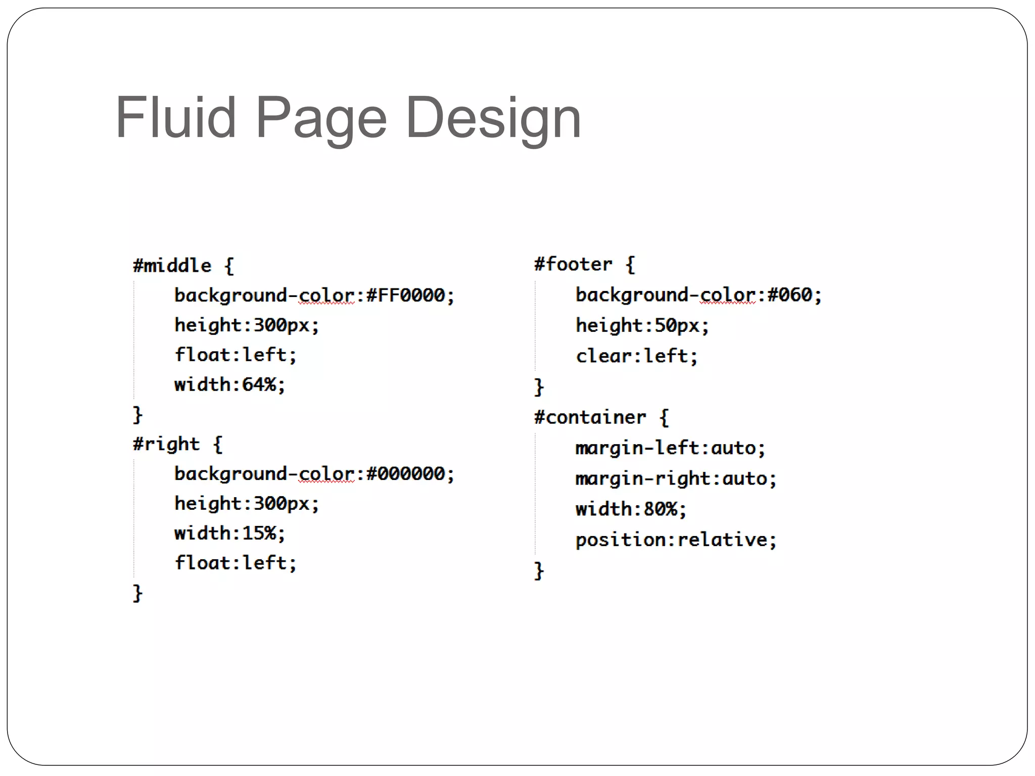
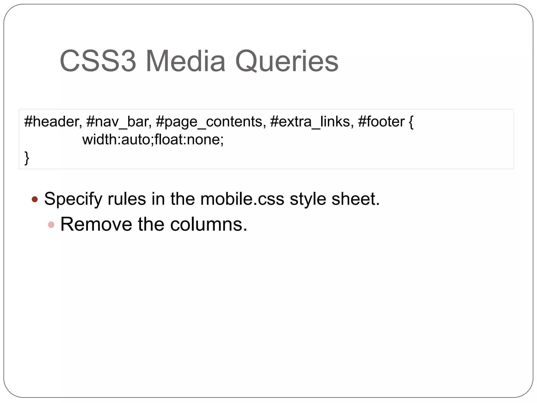
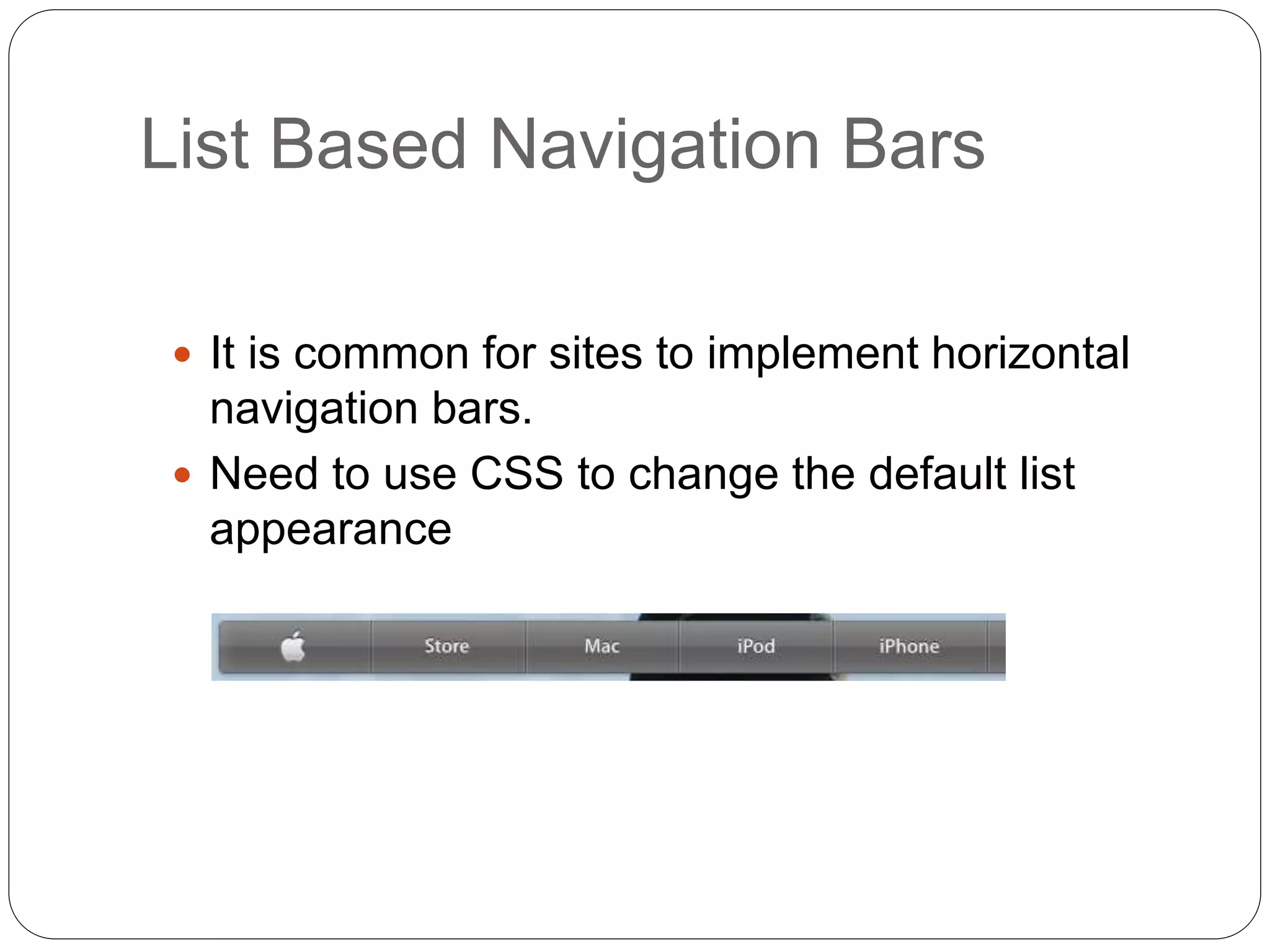
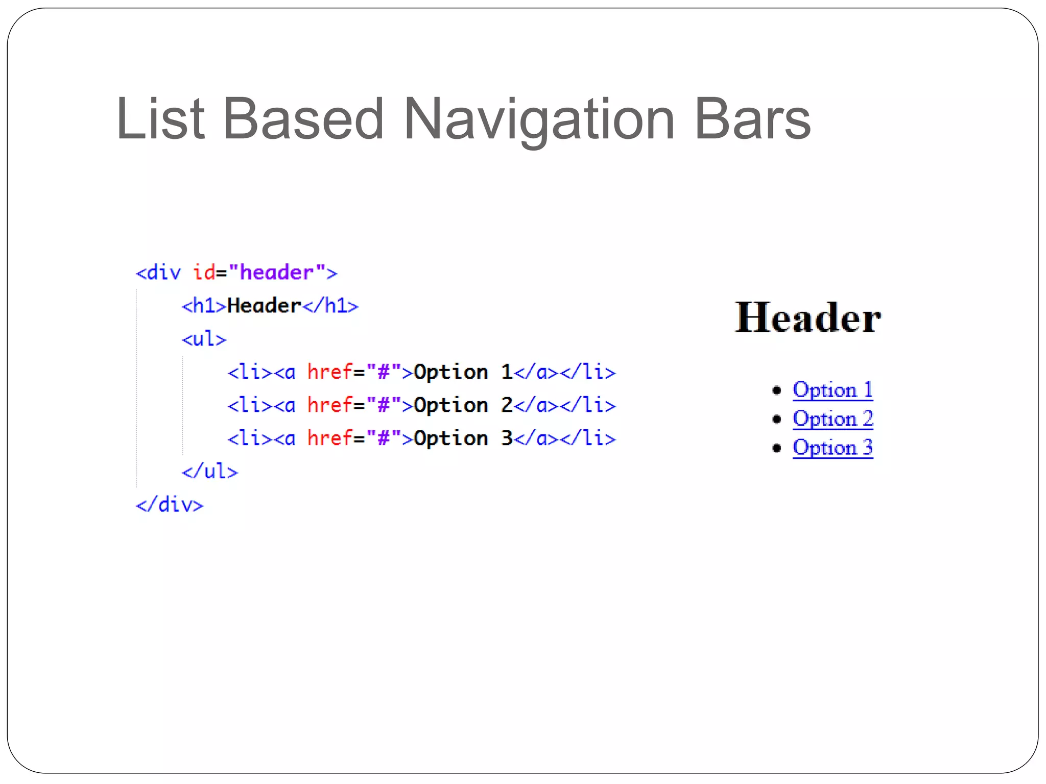
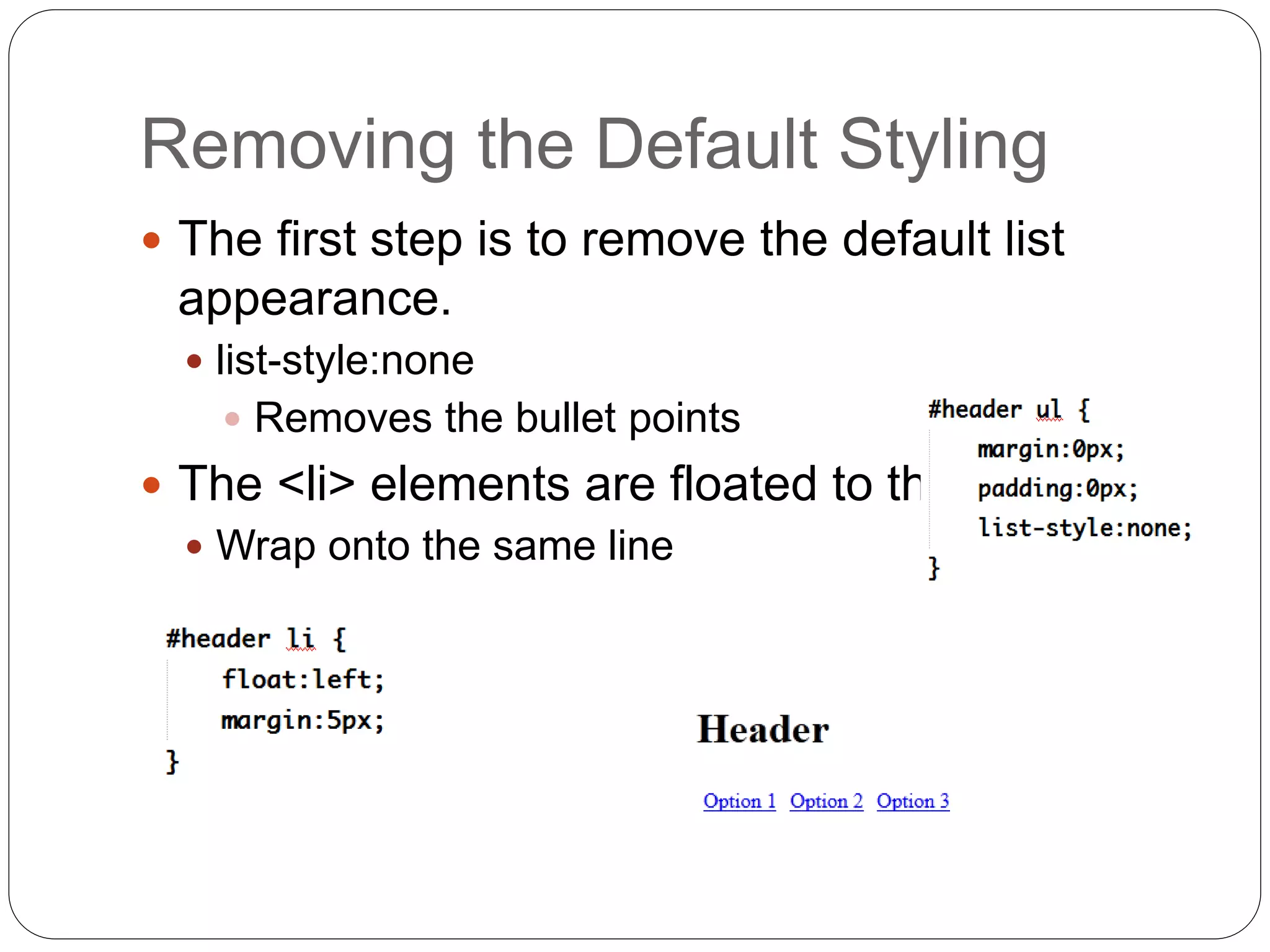
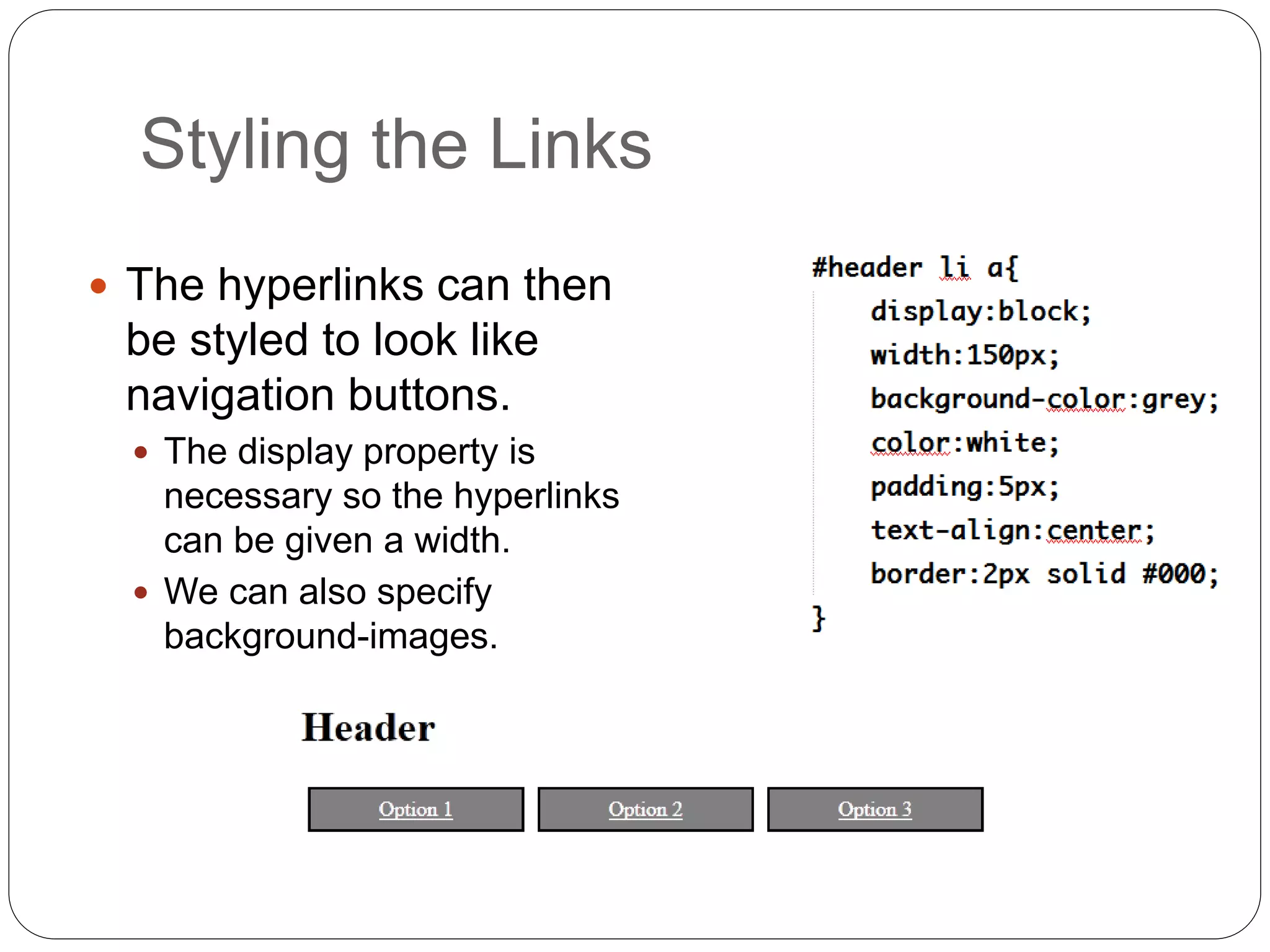
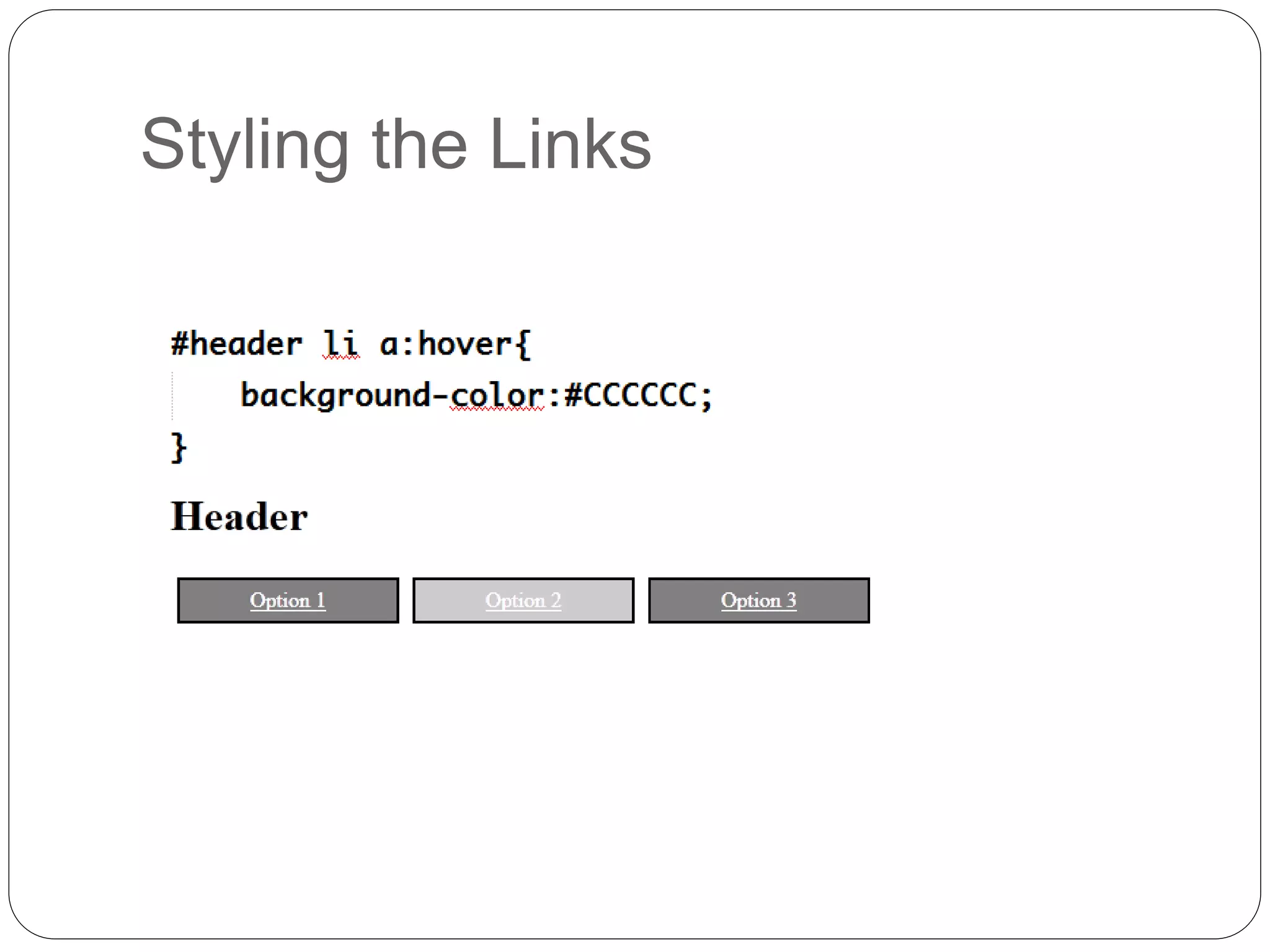
KEMBAR78
Page layout with css | PPTX
Prepared By: Er. Nawaraj
Bhandari
DESIGNING AND DEVELOPING A
WEBSITE
Topic 8:
Page Layout with CSS
A Typical Website Layout
Header
Navigation Bar Page Content
Footer
Additional
Links
We’ll learn...
Using CSS For Page Layout
 CSS is used to create complex
page layouts.
1. Using the float and clear properties
2. Using positioning properties
The Process
 Mark-up the page with HTML elements to
define meaning.
 Add <div> elements to describe different parts
of the page.
 Use the width and float properties to create a
basic page layout.
 Add finishing CSS touches – colours, fonts
etc.
HTML Page
CSS
Output till now...
The float Property
 The float property specifies whether or not a box
(an element) should float.
 The float property is used to make the columns
wrap onto the same line.
 The value of float property can be none, left, right.
 To stop floating, the clear property is used.
 The value of clear property can be left, right, both.
Updated CSS
Updated CSS
Final Output
Task
Centering the Page
 The margin-left and margin-right properties
are set to auto.
 The browser re-calculates the margins based on the
window size and centers the page.
Positioning
 CSS positioning properties allows us to
position elements on the page.
 It can also place an element behind another.
 Positioning is an alternative approach to using
floats.
Positioning
 The position property can be one of four
values
 Static
 It is default value. A static positioned element is
always positioned according to the normal flow of
the page
Positioning
 The position property can be one of four
values
 Relative
 A relative positioned element is positioned relative
to its normal position.
 The element can be moved, but it remains in the
document flow.
Positioning
 Absolute
 The element can be moved and is removed from
the document flow.
Positioning
 Fixed
 The element is positioned relative to the browser
window and not the page.
 Fixed positioned elements are removed from the
normal flow.
 It will not move even if the window is scrolled.
Positioning
 By default, elements are placed one after the
other in a page.
 They do not overlap.
 Elements which are taken out of the
‘document flow’
 Do not occupy any space on the page.
 Can overlap other elements
 CSS properties define location on the page
Design using absolute position
CSS
CSS
▪ Elements with absolute
positioning are placed in
relative to their parent
element.
▪ The parent has a position
property with value relative.
Task
Fixed, Fluid, Adaptive &
Responsive
 Fixed websites have a fixed width and
resizing the browser or viewing it on different
devices won’t affect on the way the website
looks.
 Fluid websites are built using percentages for
widths. As a result, columns are relative to
one another and the browser allowing it to
scale up and down fluidly.
Fixed, Fluid, Adaptive &
Responsive
 Adaptive websites introduce media queries to
target specific device sizes, like smaller
monitors, tablets, and mobile.
 Responsive websites are built on a fluid grid
and use media queries to control the design
and its content as it scales down or up with
the browser or device.
Fluid Page Design
Fluid Page Design
 Columned designs do not suit mobile devices.
 Screen width
 Even flexible designs have limits at low
resolutions.
 The handheld media type has limited support.
 One solution is CSS3 Media Queries.
Page Layout and Mobile Devices
 CSS 3 extends the concept of media queries.
 Provide different style sheets based on screen
resolution
 If the device’s screen resolution is less than 480px, the
mobile.css style sheet will be used.
CSS3 Media Queries
 Specify rules in the mobile.css style sheet.
 Remove the columns.
CSS3 Media Queries
#header, #nav_bar, #page_contents, #extra_links, #footer {
width:auto;float:none;
}
List Based Navigation Bars
 It is common for sites to implement horizontal
navigation bars.
 Need to use CSS to change the default list
appearance
List Based Navigation Bars
Removing the Default Styling
 The first step is to remove the default list
appearance.
 list-style:none
 Removes the bullet points
 The <li> elements are floated to the left.
 Wrap onto the same line
Styling the Links
 The hyperlinks can then
be styled to look like
navigation buttons.
 The display property is
necessary so the hyperlinks
can be given a width.
 We can also specify
background-images.
Styling the Links
Topic 8 – HTML Forms
Any Questions?

Page layout with css

  • 1.
    Prepared By: Er.Nawaraj Bhandari DESIGNING AND DEVELOPING A WEBSITE Topic 8: Page Layout with CSS
  • 2.
    A Typical WebsiteLayout Header Navigation Bar Page Content Footer Additional Links
  • 3.
  • 4.
    Using CSS ForPage Layout  CSS is used to create complex page layouts. 1. Using the float and clear properties 2. Using positioning properties
  • 5.
    The Process  Mark-upthe page with HTML elements to define meaning.  Add <div> elements to describe different parts of the page.  Use the width and float properties to create a basic page layout.  Add finishing CSS touches – colours, fonts etc.
  • 6.
  • 7.
  • 8.
  • 9.
    The float Property The float property specifies whether or not a box (an element) should float.  The float property is used to make the columns wrap onto the same line.  The value of float property can be none, left, right.  To stop floating, the clear property is used.  The value of clear property can be left, right, both.
  • 10.
  • 11.
  • 12.
  • 13.
  • 14.
    Centering the Page The margin-left and margin-right properties are set to auto.  The browser re-calculates the margins based on the window size and centers the page.
  • 15.
    Positioning  CSS positioningproperties allows us to position elements on the page.  It can also place an element behind another.  Positioning is an alternative approach to using floats.
  • 16.
    Positioning  The positionproperty can be one of four values  Static  It is default value. A static positioned element is always positioned according to the normal flow of the page
  • 17.
    Positioning  The positionproperty can be one of four values  Relative  A relative positioned element is positioned relative to its normal position.  The element can be moved, but it remains in the document flow.
  • 18.
    Positioning  Absolute  Theelement can be moved and is removed from the document flow.
  • 19.
    Positioning  Fixed  Theelement is positioned relative to the browser window and not the page.  Fixed positioned elements are removed from the normal flow.  It will not move even if the window is scrolled.
  • 20.
    Positioning  By default,elements are placed one after the other in a page.  They do not overlap.  Elements which are taken out of the ‘document flow’  Do not occupy any space on the page.  Can overlap other elements  CSS properties define location on the page
  • 21.
  • 22.
  • 23.
    CSS ▪ Elements withabsolute positioning are placed in relative to their parent element. ▪ The parent has a position property with value relative.
  • 24.
  • 25.
    Fixed, Fluid, Adaptive& Responsive  Fixed websites have a fixed width and resizing the browser or viewing it on different devices won’t affect on the way the website looks.  Fluid websites are built using percentages for widths. As a result, columns are relative to one another and the browser allowing it to scale up and down fluidly.
  • 26.
    Fixed, Fluid, Adaptive& Responsive  Adaptive websites introduce media queries to target specific device sizes, like smaller monitors, tablets, and mobile.  Responsive websites are built on a fluid grid and use media queries to control the design and its content as it scales down or up with the browser or device.
  • 27.
  • 28.
  • 29.
     Columned designsdo not suit mobile devices.  Screen width  Even flexible designs have limits at low resolutions.  The handheld media type has limited support.  One solution is CSS3 Media Queries. Page Layout and Mobile Devices
  • 30.
     CSS 3extends the concept of media queries.  Provide different style sheets based on screen resolution  If the device’s screen resolution is less than 480px, the mobile.css style sheet will be used. CSS3 Media Queries
  • 31.
     Specify rulesin the mobile.css style sheet.  Remove the columns. CSS3 Media Queries #header, #nav_bar, #page_contents, #extra_links, #footer { width:auto;float:none; }
  • 32.
    List Based NavigationBars  It is common for sites to implement horizontal navigation bars.  Need to use CSS to change the default list appearance
  • 33.
  • 34.
    Removing the DefaultStyling  The first step is to remove the default list appearance.  list-style:none  Removes the bullet points  The <li> elements are floated to the left.  Wrap onto the same line
  • 35.
    Styling the Links The hyperlinks can then be styled to look like navigation buttons.  The display property is necessary so the hyperlinks can be given a width.  We can also specify background-images.
  • 36.
  • 37.
    Topic 8 –HTML Forms Any Questions?