Download as PDF, PPTX
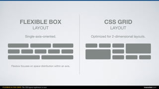
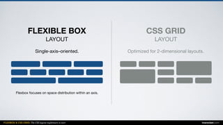
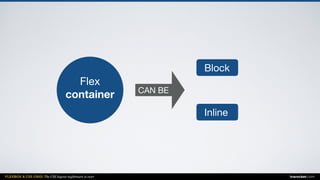
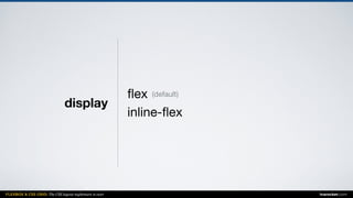
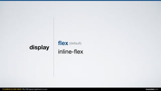
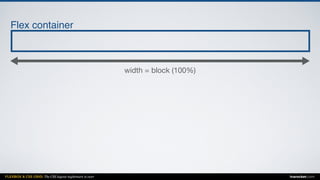
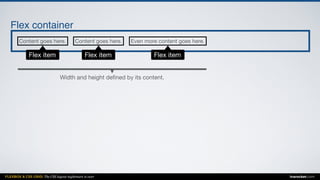
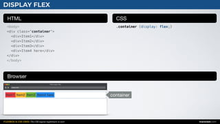
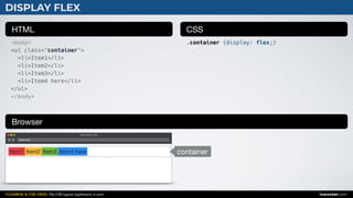
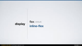

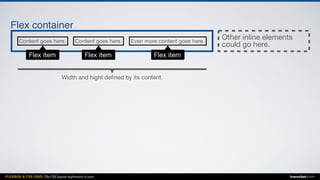
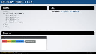
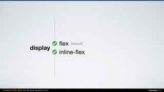


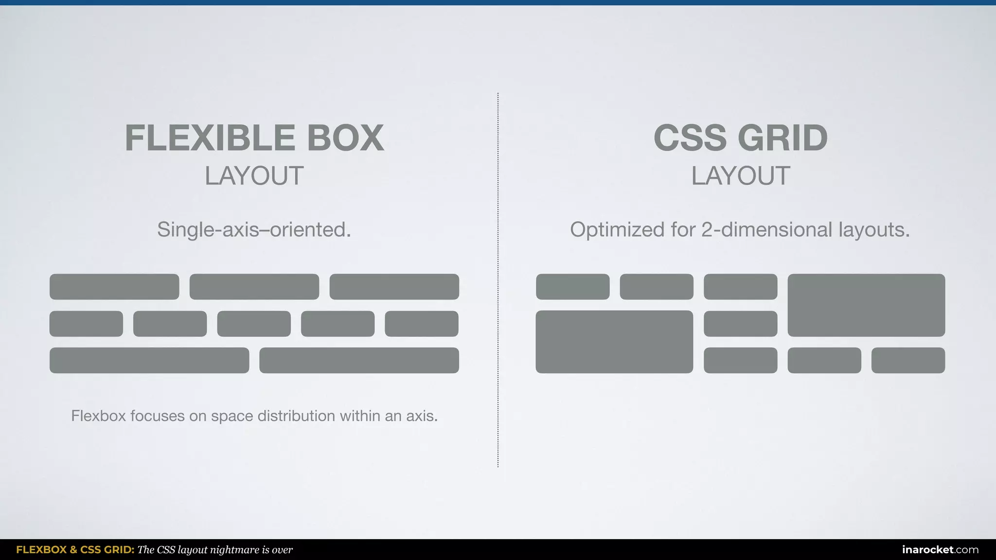
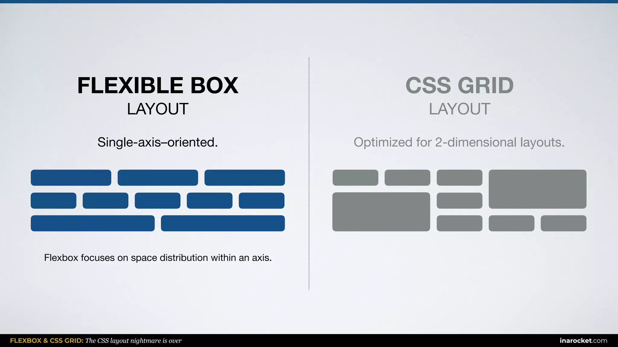
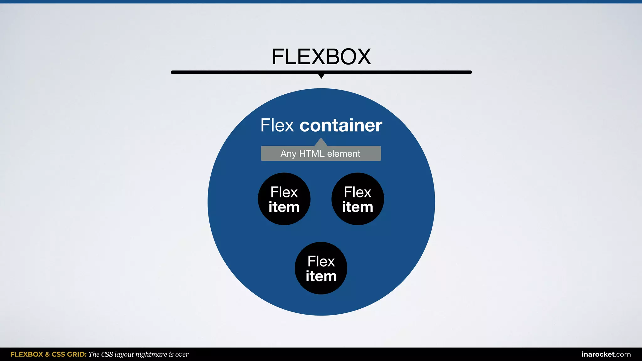
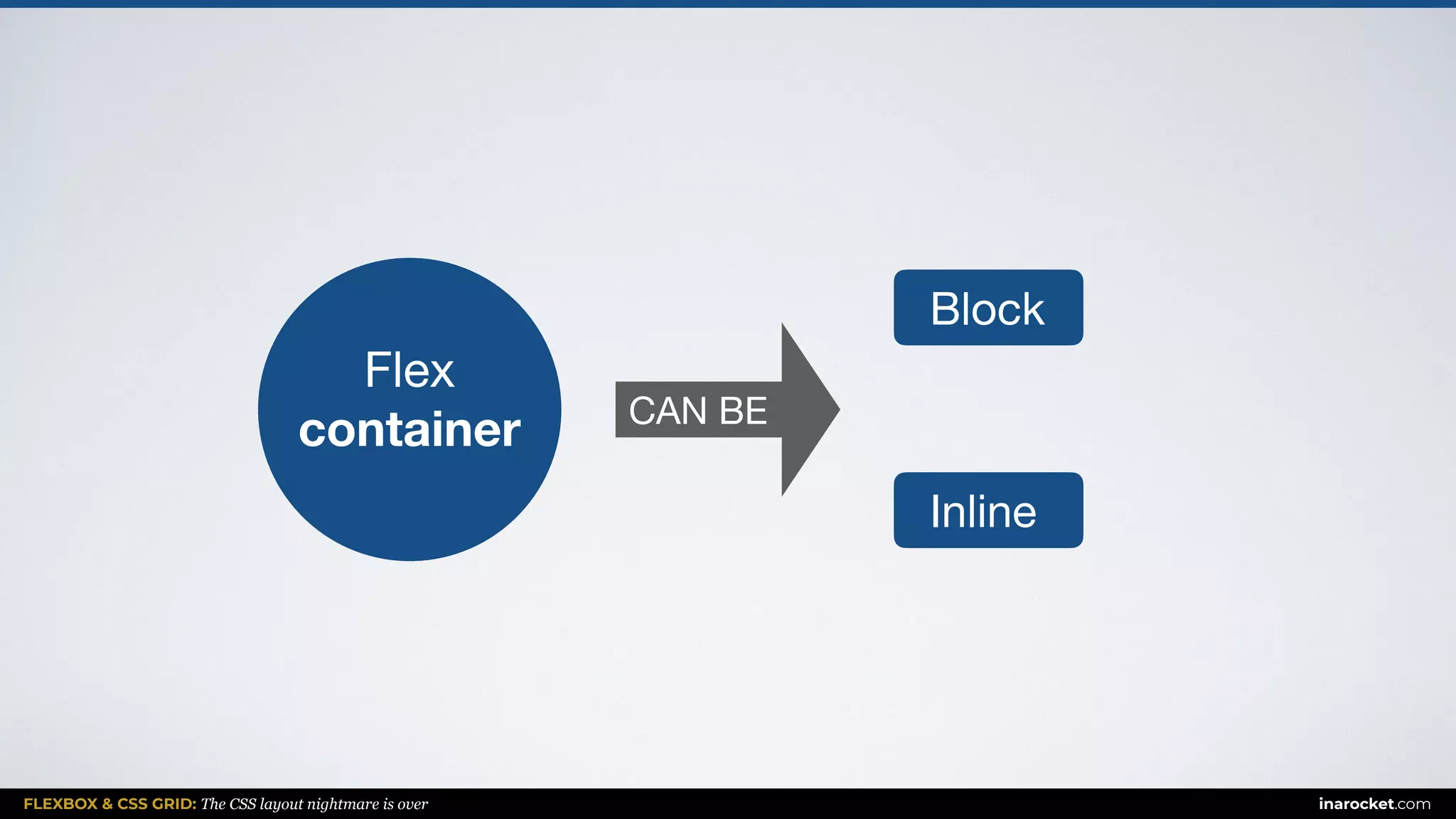
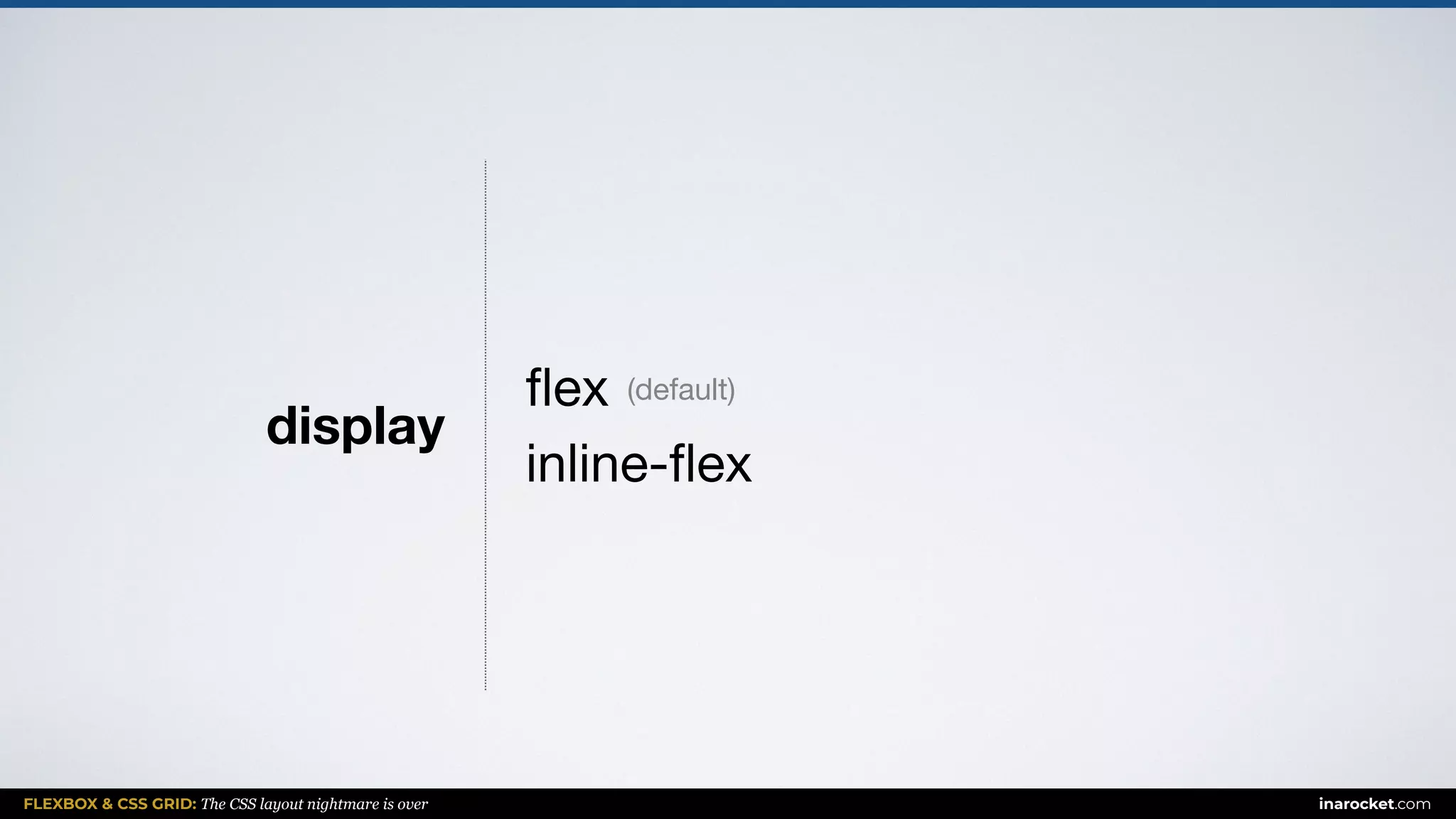
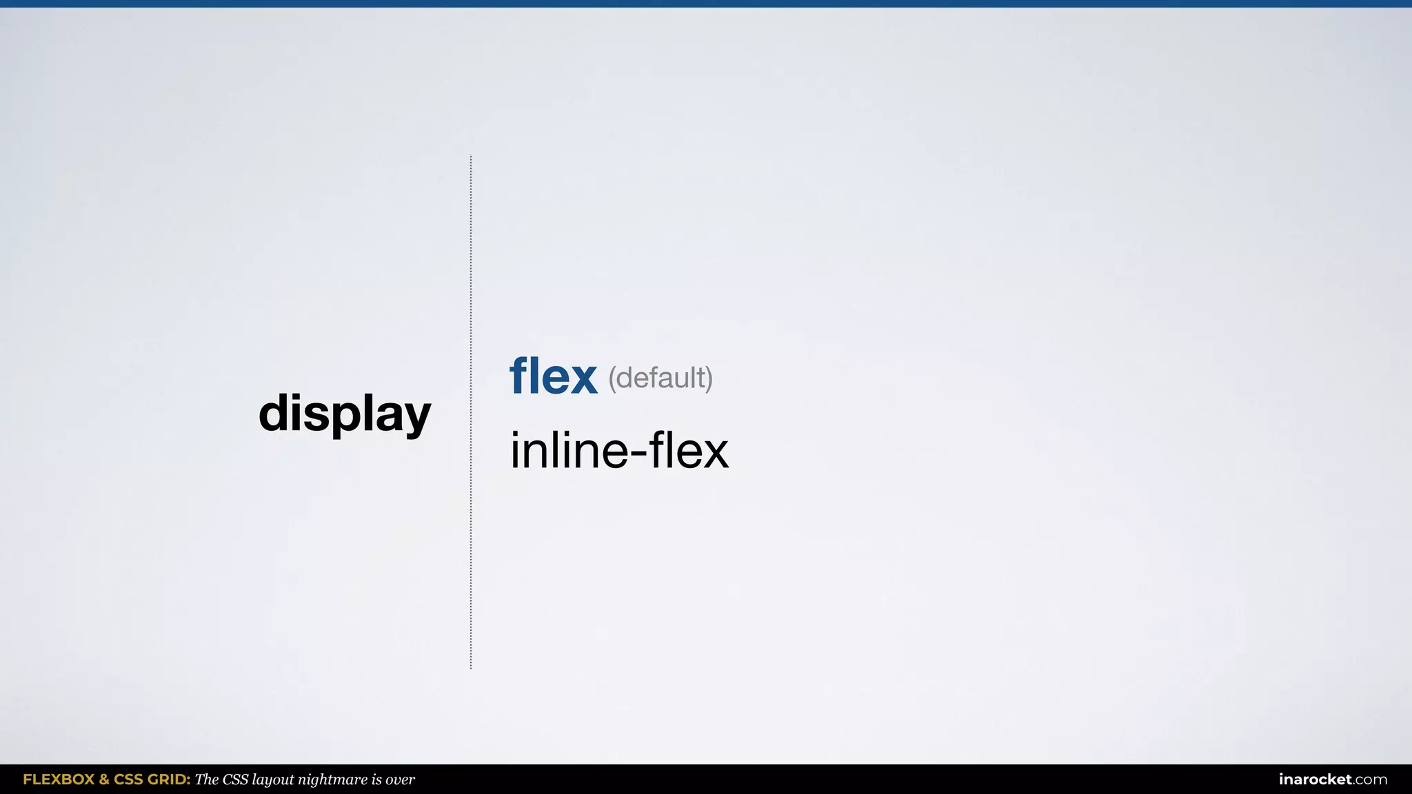
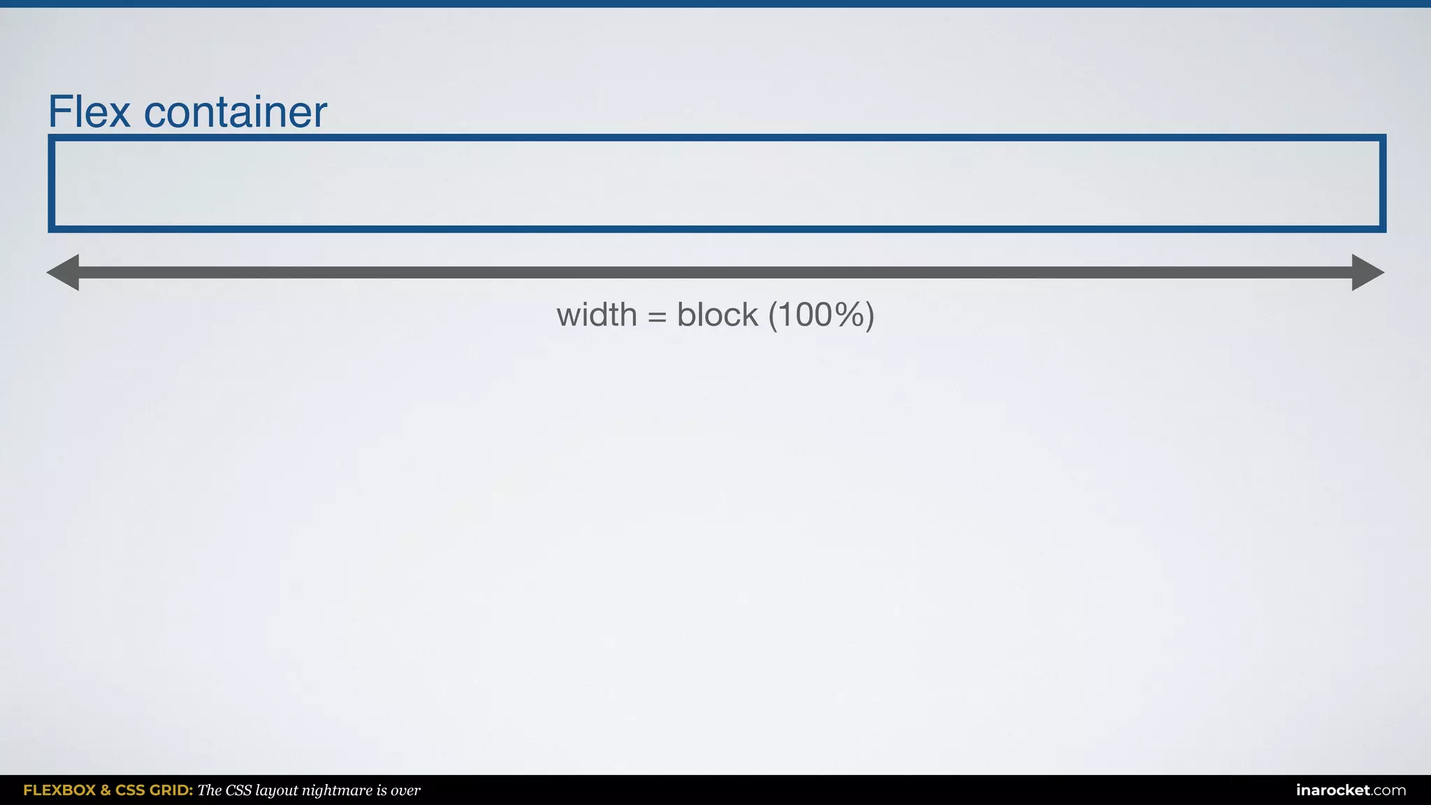
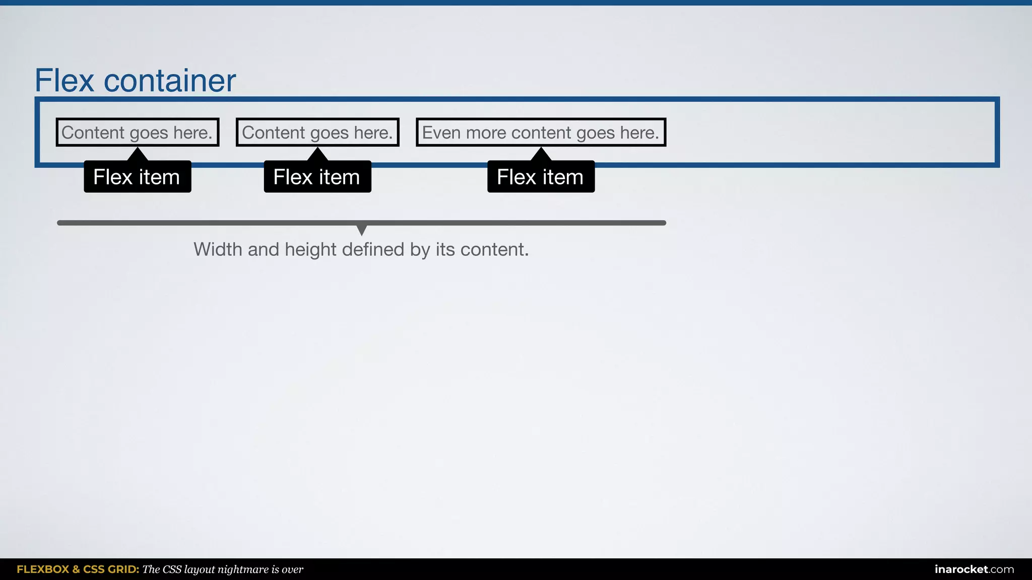

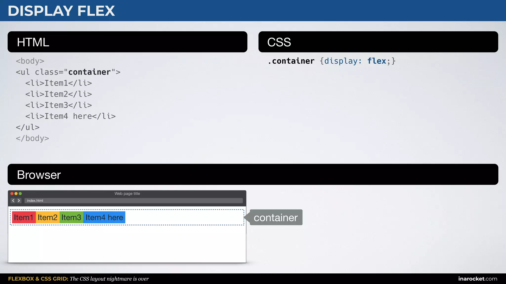
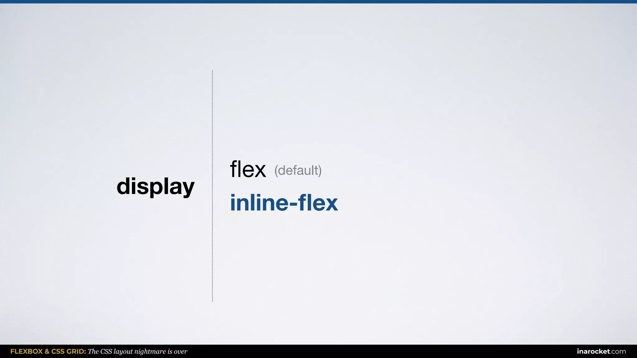
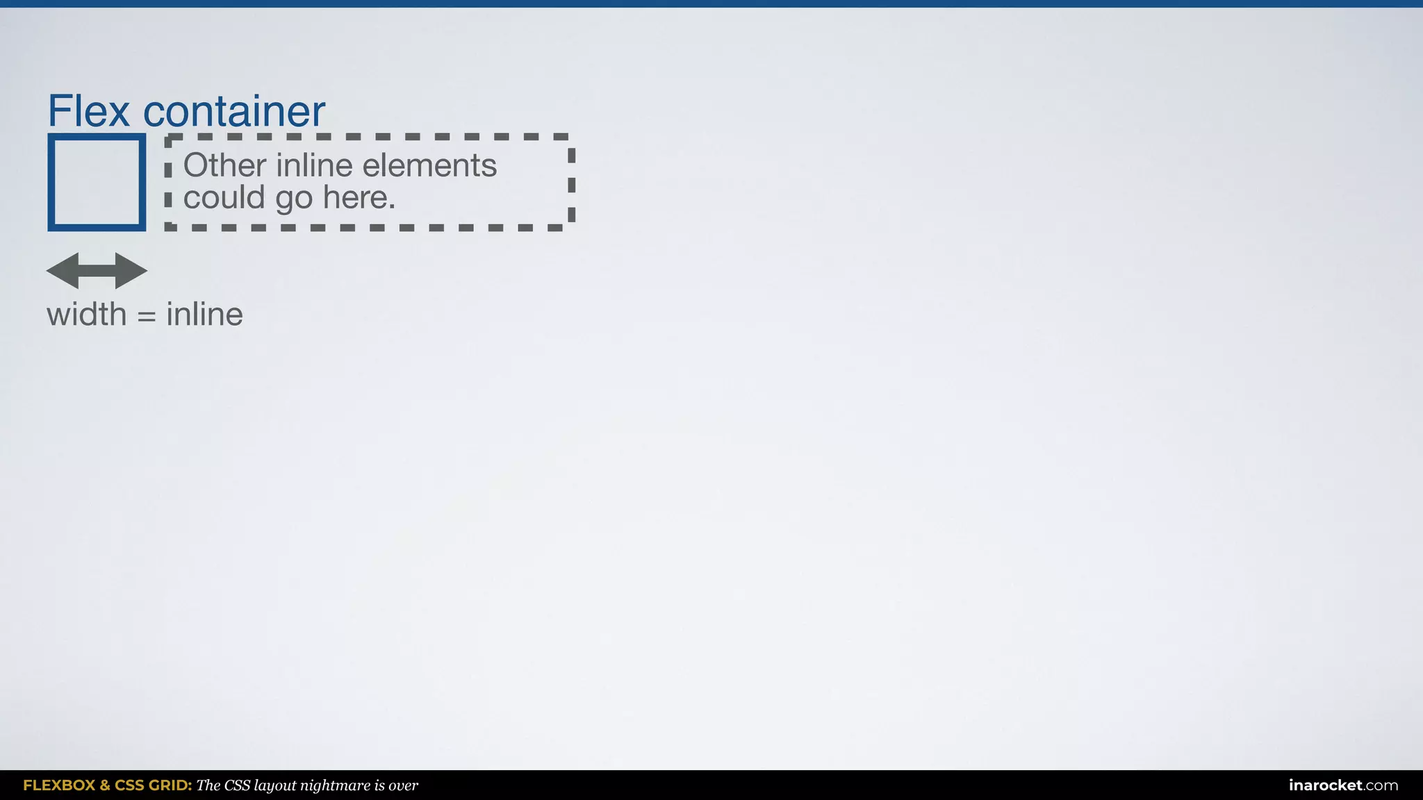
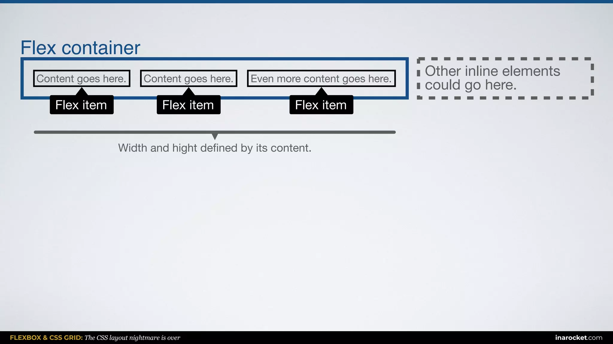
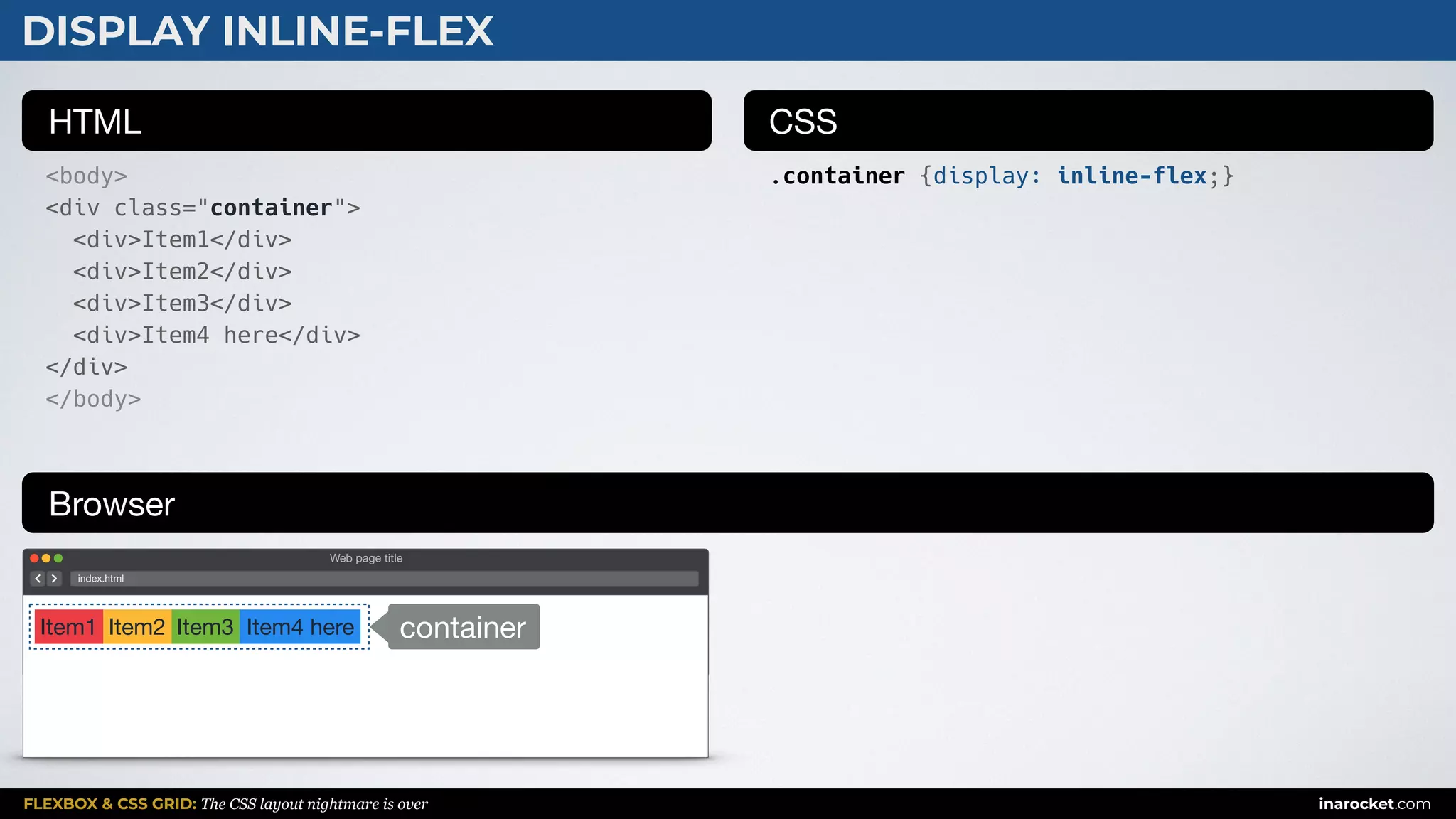
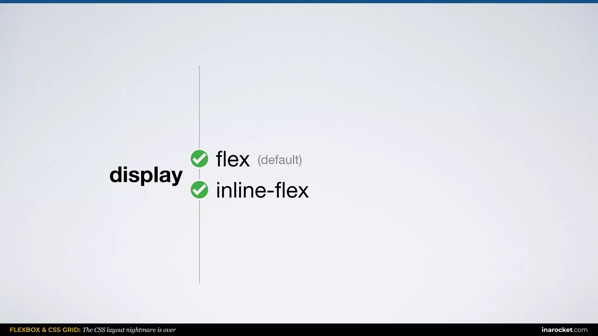


The document discusses learning front-end development using CSS Flexbox and Grid, emphasizing the ease of creating layouts. It highlights the differences between the two CSS layout systems with practical examples. The content is designed to be straightforward, allowing learners to quickly grasp the concepts and apply them in real projects.


